Create a FREE Account
Instant access to 1,000+ real slides from top companies like McKinsey, BCG, Goldman Sachs, Google and many more!
First Name
Last Name
Email
Password
I agree to all
Terms & Privacy Policy
Thank you! Your submission has been received!
Oops! Something went wrong while submitting the form.
Have an account?
Sign in
Library
Templates
Courses
Pricing
My Account
My Slides
My Templates
✦ AI
AI Prompt Library
AI Search
Sign in
Start Here
Logout
My Saved Slides
The slide is packed with horizontal column chart and textual analysis focusing on FICC net revenues, using a consistent color coding for easy comparison and comprehension. The color scheme involves shades of blue and gray.
Financial Performance
Financial Services
Reviews the financial performance within the FICC segment of global markets, comparing revenue changes over quarters and highlighting key factors influencing those changes.
global markets, FICC, revenue analysis, financial intermediation, financing
Mixed Chart
Goldman Sachs
Saved
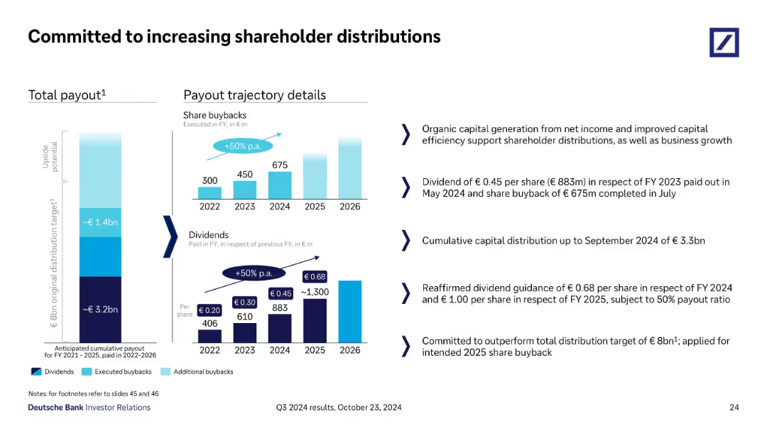
Bar chart of TBV per share from FY21–FY24 and bar graphs for payout breakdown from 2022–2025. Also includes future payout guidance.
Investment Analysis
Financial Services
Highlights Deutsche Bank’s shareholder value creation strategy through capital distributions and buybacks. TBV/share increased 21% from FY21 to FY24. Future payout targets total €8bn by 2026, with €2.1bn already announced for 2025.
shareholder value, TBV, buybacks, dividends, Deutsche Bank, capital return, investor strategy
Multiple Chart
Deutsche Bank
Saved
The slide is split into two main sections, with a red theme. On the left, bullet points are aligned vertically, detailing the SASB standard. On the right, bullet points explain the TCFD standard, alongside their respective logos.
Financial Performance
Industrial & Manufacturing
This slide explains LANXESS’s improvement in reporting standards according to SASB and TCFD, outlining key performance indicators and acknowledging the need for better climate-related financial disclosures.
LANXESS, SASB, TCFD, sustainability, reporting standards, climate-related disclosures, KPIs, financial information, environmental, governance
Table
Morgan Stanley
Saved
Horizontal bar chart comparing automation potential by education level, with and without GenAI. Right-side bullet commentary.
Human Resources and Talent Management
Education & Training
The slide shows that higher-educated workers are more affected by GenAI, with the greatest automation potential increase among those with Master’s or PhD-level education, due to knowledge-intensive work.
automation, education level, GenAI, workforce, knowledge workers, Norway, productivity
Mixed Chart
McKinsey
Saved
Dual-column chart displaying provisions for credit losses over five quarters and Stage 3 loan developments. Tables at bottom summarize coverage and loss ratios.
Risk Assessment and Management
Financial Services
This slide reports credit loss provisions and Stage 3 loans by banking segment from Q1 2024 to Q1 2025. It provides key figures on provision volumes, group and segment coverage ratios, and Stage 3 amortized cost, emphasizing changes in credit risk exposure and overall coverage strength.
credit loss, provisions, Stage 3 loans, amortized cost, risk ratios
Multiple Chart
Deutsche Bank
Saved
Features a multi-color column chart representing different challenges faced by companies in responsible production. Colors differentiate the importance ranks of each challenge.
Performance Metrics and KPIs
Agriculture & Food Production
Evaluates the top challenges in responsible production faced by companies, highlighting areas like cost pressure, ecological footprint, and the need for sustainable packaging.
responsible production, cost pressure, ecological footprint, sustainable packaging, challenge ranking
Mixed Chart
Deloitte
Saved
Standard layout with horizontal bars colored by response; historical % agreement data on the right; title spans two lines due to length.
Strategic Planning
Government & Public Sector
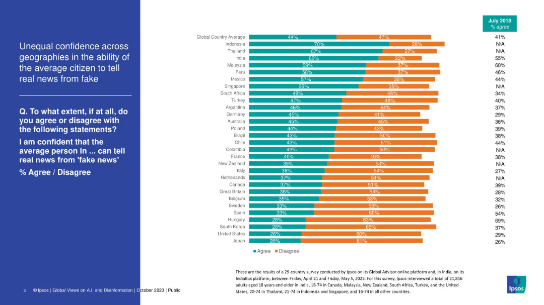
This slide explores the extent to which citizens support strong leadership that challenges elite dominance. The global average is 63% agreement, highlighting support for populist-style governance. Some countries (e.g., Thailand, South Africa) show overwhelming agreement, pointing to deep frustrations with the political status quo.
leadership, elite, governance, reform, trust, populism, survey, Ipsos, inequality
Mixed Chart
IPSOS
Saved
Similar layout to Slide 19191; bar chart on the right, with country rankings in blue
Customer and Market Segmentation
Professional Services
The slide ranks countries by the importance they place on customer service as a factor in trusting organizations. Argentina and South Africa top the list.
trust, customer service, global, Ipsos, satisfaction, ranking, trust factors, support, perception, organizations
Mixed Chart
IPSOS
Saved
Split section layout with two circular graphs: one on AI understanding, the other on product awareness.
Industry Overview
Artificial Intelligence
This slide presents New Zealanders' understanding of AI in comparison with global averages. It measures agreement with two statements: understanding AI conceptually and knowing which products/services use AI. It also includes percentage changes since 2021.
AI, understanding, awareness, Ipsos, New Zealand, global comparison, knowledge levels
Single Chart
IPSOS
Saved
Diagram explaining a holistic approach to managing financial crime, using four icons linked by arrows to represent different areas of focus: anti-bribery, anti-money laundering, anti-tax evasion, and sanctions.
Regulatory and Compliance
Financial Services
The slide describes Barclays' integrated strategy for financial crime prevention, emphasizing the synergy between different compliance areas and highlighting the supporting global finance function.
compliance, financial crime, anti-bribery, AML
Diagram
Barclays
Saved
A collection of blue column charts comparing digital economy growth to GDP growth for various SEA countries.
Financial Performance
Technology & Software
The slide demonstrates the digital economy's growth, anticipated to be twice as fast as GDP growth through 2030 in SEA countries.
digital economy, GDP growth, SEA, CAGR, forecast
Multiple Chart
Bain
Saved
Presents a timeline from 1990 to 2030 showing changes in the top semiconductor companies by revenue. Each decade is represented by a different color, and arrows indicate new entrants or drops from the list. The slide is visually dense but organized, allowing for clear comparisons across years.
Market Analysis and Trends
Technology & Software
This slide depicts the dynamic nature of leadership in the semiconductor industry, showing how top companies have shifted positions over the decades. Useful for discussions on market dynamics, industry evolution, and strategic planning in technology and industrial sectors.
semiconductor, industry leaders, market dynamics, revenue, historical comparison
Table
BCG
Saved
Slide includes bar charts depicting investment amounts in sectors like renewables and built environment, alongside icons and minimal text.
Market Analysis and Trends
Environmental Services & Sustainability
Discusses major investments in renewables by corporates, highlighting specific projects and investment amounts.
renewables, corporate investment, solar energy, built environment
Mixed Chart
Bain
Saved
Three sets of column charts compare net profit contribution, base fees, and assets under management (AUM) over fiscal years and semesters.
Financial Performance
Financial Services
Analyzes the asset management division's financial performance over time, displaying trends in profit contribution, base fees, and AUM, suitable for historical performance analysis or financial planning.
asset management, net profit, base fees, AUM, financial, performance, trends
Multiple Chart
Goldman Sachs
Saved
Table comparing various financial metrics and sector weights across different indices like S&P 500, R2000, R1000G, R1000V, MSCI World, etc. Includes a sector weight pie chart.
Market Analysis and Trends
Financial Services
This slide provides a detailed comparison of financial characteristics and sector weights for various indices, highlighting key metrics and distribution of sector weights.
sector, weights, indices, comparison, metrics
Multiple Chart
Morgan Stanley
Saved
This slide uses a three-column layout, each representing a concept: 'Scale', 'Innovation', 'Durable Differentiation'. It includes bullet points and sub-sections with graphical elements, such as icons and shaded boxes.
Financial Performance
Financial Services
The slide compares the strengths of banks and fintechs and how they combine to form J.P.Morgan's unique approach in payments, with a focus on scale, innovation, and differentiation.
Payments, Scale, Innovation, Differentiation, Banks, Fintechs, Services, J.P.Morgan, Efficiency, Relationships
Table
JP Morgan
Saved
Two stacked bar charts: left shows number of deals by series; right shows VC invested ($B). Color-coded by funding stage.
Strategic Planning
Financial Services
The slide shows a shift in VC deal distribution, with Series B and C stages seeing increased deal share and capital investment. Early-stage deals are declining in share, highlighting a shift toward mid-capital stack funding.
deal share, Series B, Series C, VC investment, funding stage, mid-cap stack, capital allocation, startup funding
Multiple Chart
KPMG
Saved
This slide has two line charts. The left chart shows the High Yield OAS from 1998 to 2023, while the right chart compares yields of Floating-Rate Loans, Emerging Markets, and High-Yield Bonds from 2015 to 2024.
Investment Analysis
Financial Services
The slide evaluates the current high yield market, showing that tight spreads offer less value and suggesting a shift to bank loans due to tighter spreads in the high yield market.
High Yield, OAS, Floating-Rate Loans, Emerging Markets, High-Yield Bonds, Investment, Market Trends
Multiple Chart
Morgan Stanley
Saved
Displays a shift in the newspaper classified revenue from predominantly newspapers in 2003 to a majority online in 2019, illustrated with a before-and-after pie chart comparison. The slide provides detailed annotations about key players in the online classified market.
Competitive Landscape
Media & Entertainment
Examines the transition of classified ad revenues from traditional newspapers to online platforms, identifying key players that dominate the new market landscape. This slide is valuable for strategic planning in media and advertising, providing insights into market dynamics and potential areas for investment or innovation.
market shift, classified ads, online platforms, media strategy, competitive analysis
Multiple Chart
Accenture
Saved
Dual chart layout on right side showing plan type offerings by year (2014–2023) and metal tier breakdowns. Left column contains explanatory text. Color-coded bar segments differentiate plan types and tiers.
Product and Service Analysis
Healthcare & Pharmaceuticals
This slide examines changes in health insurance product offerings from 2014 to 2023. It notes increased availability of managed care plans like HMOs and EPOs, and a rise in gold plans. The proportions of PPO and POS plans have decreased, while bronze plans have become more widely available, suggesting a shift in plan affordability and design preferences.
health plans, PPO, HMO, metal tiers, product availability, trends
Mixed Chart
McKinsey
Saved
Three donut charts categorizing long-term funding (163bn) by source, maturity, and currency. Minimalist, data-centered layout.
Corporate Finance and Valuation
Financial Services
Visualizes the diversification of UBS’s long-term wholesale funding, identifying concentration by issuer type (e.g., HoldCo, OpCo), maturity horizon, and currency distribution. Highlights dependency on USD and long-term maturities.
wholesale funding, long-term debt, maturity, currency, HoldCo, UBS
Single Chart
UBS
Saved
Shows an iPhone screen displaying the Chase Offers℠ app interface and a circular diagram explaining the engagement cycle with four numbered points. The design is simple with a focus on the app and the cycle.
Client Case Studies
Financial Services
Discusses the success of the Chase Offers℠ program in its initial months, focusing on customer and merchant engagement and the benefits realized through this strategy.
Chase Offers, customer engagement, marketing strategy, merchant benefits, early success
Linear Flow
JP Morgan
Saved
Slide includes multiple column charts comparing German and Global responses regarding the ethical implications and organizational investments related to Industry 4.0 technologies. It shows leaders' perspectives on ethical concerns, policy exploration, and investment strategies in technologies to protect businesses.
Regulatory and Compliance
Technology & Software
Discusses ethical considerations and investment strategies by German and Global executives in response to Industry 4.0 technologies. It explores the level of concern and proactive measures taken to mitigate unethical use and disruptions.
Ethics, Industry 4.0, Technology, Investment, Germany, Global, Business Protection, Leadership
Multiple Chart
Deloitte
Saved
The slide contains text and several column charts depicting survey data on climate action and gender equality. Quotes from CEOs are also included.
Regulatory and Compliance
Environmental Services & Sustainability
The slide addresses the critical points of climate action and gender equality, presenting survey data and CEO quotes to highlight the importance of these issues for sustainable development.
Climate Action, Gender Equality, Sustainability, Survey Data, CEO Quotes, Regulatory Compliance
Multiple Chart
Accenture
Saved
Flow chart showing the evolution of digital asset use cases: Store of value, Medium of exchange, Financial services. Icons and descriptions for each phase.
Strategic Planning
Financial Services
Describes the evolution and future potential of digital asset use cases in financial services. Ideal for strategic discussions on the adoption and integration of digital assets.
Digital Assets, Evolution, Financial Services, Use Cases, Store of Value, Medium of Exchange
Linear Flow
McKinsey
Saved
Previous
Next
If nothing, comes up, please save your slides first
Create a FREE account to continue browsing
Receive Instant Access to 1,000+ slides from companies like McKinsey, Google, and Goldman Sachs
First Name
Last Name
Email
Password
I agree to all
Terms & Privacy Policy
Thank you! Your submission has been received!
Oops! Something went wrong while submitting the form.
Have an account?
Sign in
Column Chart
Heatmap
Chevron
Org Chart
Infographic
Callouts
Timeline
List
Graphic
Picture
Process Flow
Diagram
Paragraph
Map
Table
Framework
Subtitle
Takeaway Box
Icon
Other Chart
Radar Chart
Waterfall Chart
Mekko Chart
Pie Chart
Scatter Plot
Line Chart
Bar chart
Bullet points