Create a FREE Account
Instant access to 1,000+ real slides from top companies like McKinsey, BCG, Goldman Sachs, Google and many more!
First Name
Last Name
Email
Password
I agree to all
Terms & Privacy Policy
Thank you! Your submission has been received!
Oops! Something went wrong while submitting the form.
Have an account?
Sign in
Library
Templates
Courses
Pricing
My Account
My Slides
My Templates
✦ AI
AI Prompt Library
AI Search
Sign in
Start Here
Logout
My Saved Slides
The slide includes several pie charts showing the willingness of different age groups to share their digital size and fit details with brands.
Customer and Market Segmentation
Retail & E-commerce
This slide presents data on online shoppers' willingness to share digital size and fit details with brands, highlighting generational differences.
online shoppers, digital size, fit details, brands, retail
Multiple Chart
Roland Berger
Saved
The slide includes text on pharma companies' performance and a scatter plot matrix showing financial performance by product segment.
Competitive Landscape
Healthcare & Pharmaceuticals
This slide analyzes the performance disparity among pharma companies, identifying characteristics of top-performing companies (winners).
pharma performance, winners, financial matrix, product segments, competitive analysis
Mixed Chart
Roland Berger
Saved
This slide contains multiple pie charts showing different maturity levels of second-line climate-risk management teams across various organizations. The layout is clean and structured.
Risk Assessment and Management
Financial Services
The slide presents data on how organizations rate the maturity of their second-line climate-risk management teams, distinguishing between G-SIBs and non-G-SIBs.
climate risk, maturity, pie charts, G-SIB, non-G-SIB
Multiple Chart
EY
Saved
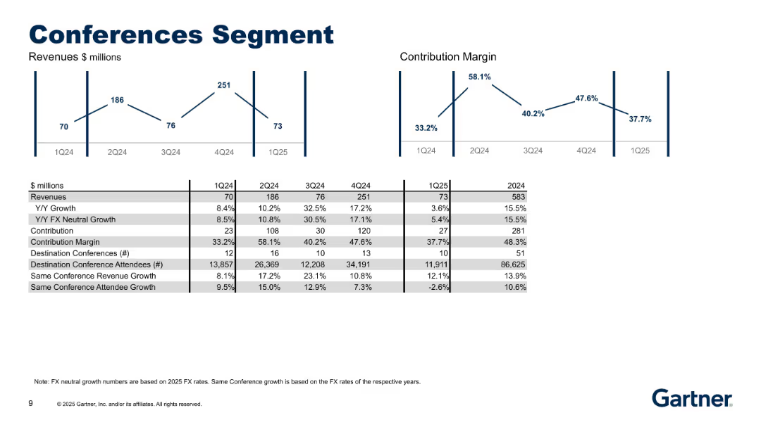
Similar format as previous slide; charts for revenues and margins; data table includes attendees and events.
Performance Metrics and KPIs
Technology & Software
This slide presents detailed performance metrics for Gartner’s Conferences segment, highlighting revenue trends, growth in events and attendance, and contribution margins. It reflects recovery and growth from past volatility.
conferences, revenue, attendees, events, contribution margin, growth, FX neutral, KPIs, Gartner
Multiple Chart
Gartner
Saved
This slide displays a comparative column chart of corporate tax rates across multiple Southern African countries, color-coded by country.
Competitive Landscape
Government & Public Sector
Compares corporate tax rates between Namibia and its neighboring countries to evaluate Namibia's competitive position in attracting business investments relative to regional peers.
Tax, Corporate, Comparison, Africa
Single Chart
PwC/Strategy&
Saved
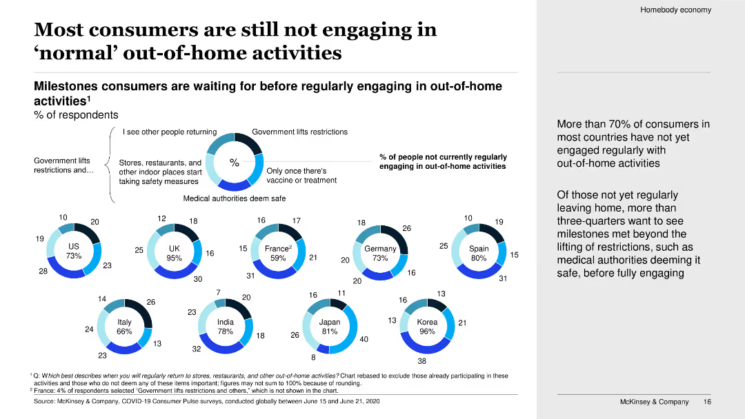
The slide uses a combination of donut charts and bullet points to show various milestones that consumers are waiting for before regularly engaging in out-of-home activities. The layout is clean with a focus on data visualization.
Market Analysis and Trends
Consumer Goods
The slide discusses the percentage of consumers in various countries who have not yet engaged in regular out-of-home activities. It highlights the milestones consumers are waiting to see before they resume such activities, such as government lifting restrictions and stores taking safety measures.
Consumer behavior, COVID-19 impact, out-of-home activities, survey data, milestones, engagement, safety measures, international, analysis, trends
Multiple Chart
McKinsey
Saved
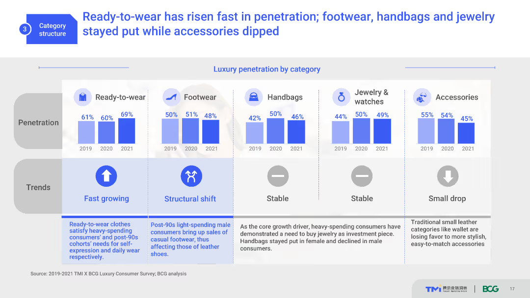
The slide features multiple column charts showing luxury penetration by category from 2019 to 2021. It includes icons for each category and trend indicators. The visual complexity is moderate, with well-organized data and clear labels.
Market Analysis and Trends
Consumer Goods
This slide presents the growth trends of various luxury categories such as ready-to-wear, footwear, handbags, and accessories. It shows the percentage penetration over three years, indicating market shifts and consumer preferences.
luxury market, category penetration, trends, consumer preferences, growth
Multiple Chart
BCG
Saved
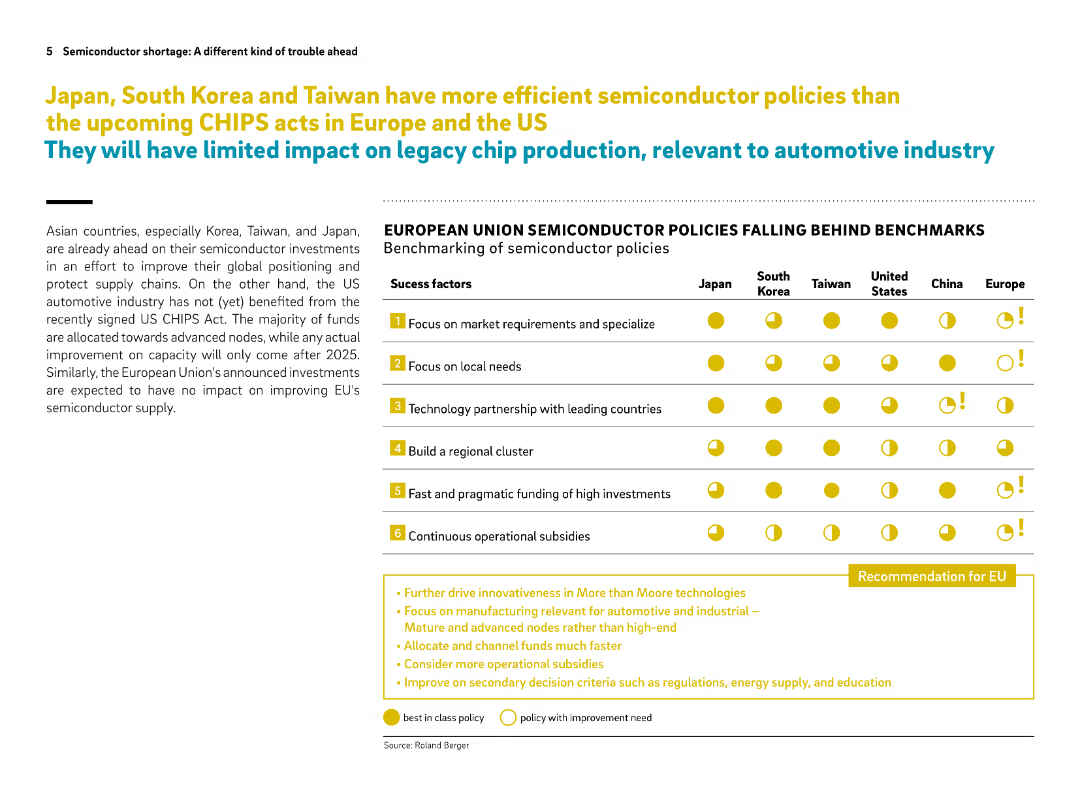
Left side contains narrative text, right side shows a benchmarking comparison table of policy success factors across regions. Bright icons emphasize comparisons.
Regulatory and Compliance
Government & Public Sector
The slide benchmarks global semiconductor policies, showing that Asian countries lead in effective policy implementation while Europe and the US lag behind. It suggests key recommendations for the EU to catch up, such as faster funding and focus on legacy chips.
semiconductor policy, CHIPS act, Europe, benchmarking, subsidies, legacy nodes, Japan, Korea, Taiwan, EU recommendations
Table
Roland Berger
Saved
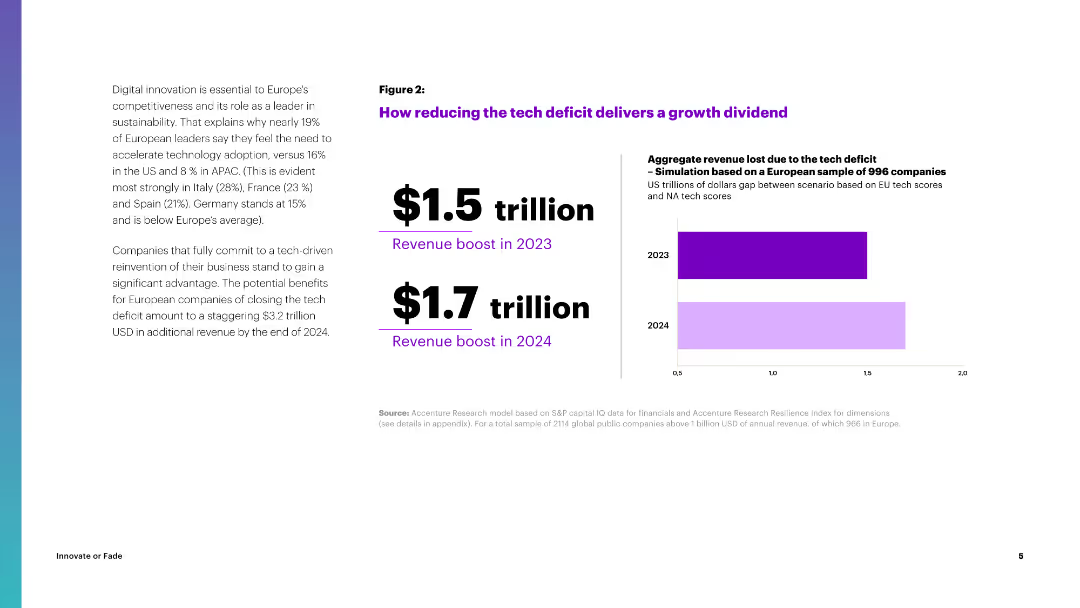
The slide features a column chart illustrating the projected revenue boost from reducing the tech deficit in Europe, with figures for 2023 and 2024.
Strategic Planning
Financial Services
It explains the potential revenue gains from reducing the tech deficit in Europe, projecting significant financial benefits by 2024, emphasizing the importance of tech adoption.
Tech Deficit, Revenue, Growth, Europe, Financial Benefits
Mixed Chart
Accenture
Saved
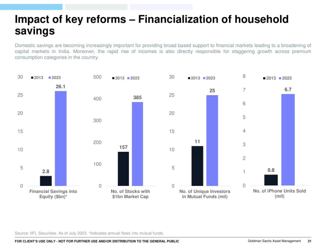
Four vertical bar charts comparing 2013 vs 2023: financial equity savings, stock market cap, mutual fund investors, and iPhone sales. Light blue and black bars on white background.
Market Analysis and Trends
Financial Services
Demonstrates the impact of financial reforms on India’s household behavior over a decade. Notable increases in equity savings, market cap stocks, mutual fund participation, and iPhone sales suggest a rapidly evolving and increasingly affluent and financially literate population.
household savings, equity investment, India reforms, financial inclusion, mutual funds, consumer behavior
Multiple Chart
Goldman Sachs
Saved
Includes a line graph comparing different entities over time and a sidebar with explanatory text and bullet points for clarity.
Regulatory and Compliance
Financial Services
Explains the requirements for the Global Systemically Important Bank framework and potential solutions for capacity expansion.
GSIB, recalibration, capacity, regulatory compliance
Mixed Chart
JP Morgan
Saved
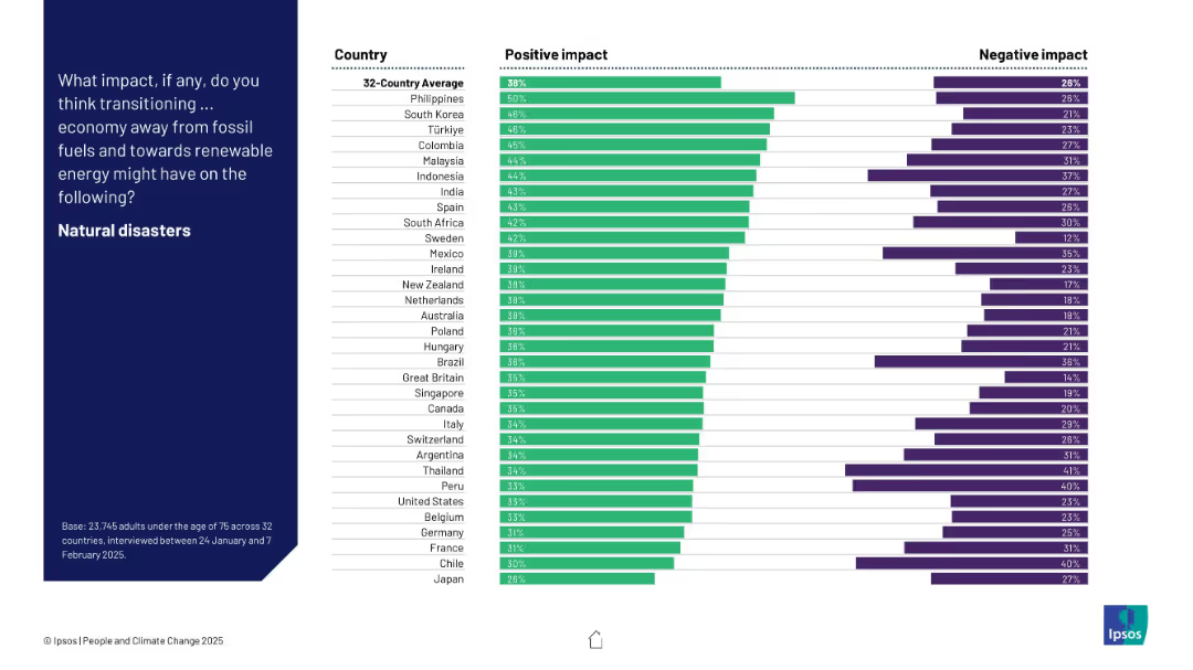
Ranked bar chart displaying countries’ perceptions of renewable energy’s effect on natural disaster occurrence, showing both positive and negative responses.
Technology and Digital Transformation
Environmental Services & Sustainability
This chart shows whether citizens believe switching to renewable energy will reduce natural disasters. Perceptions are mixed but lean slightly positive. The Philippines shows highest optimism, while Japan has the lowest confidence.
natural disasters, energy transition, perception, climate risk, Ipsos, country comparison, survey, renewables
Mixed Chart
IPSOS
Saved
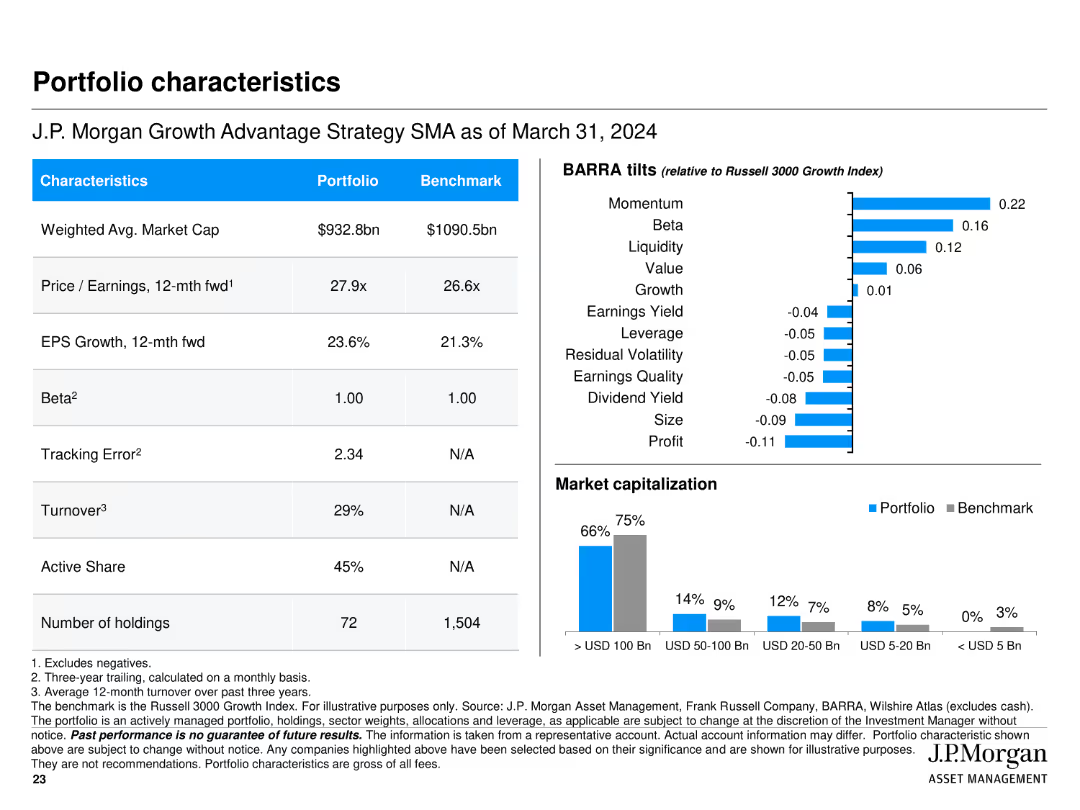
Features multiple tables and bar charts presenting portfolio characteristics such as market cap, P/E ratio, EPS growth, BARRA tilts, and market capitalization breakdown.
Financial Performance
Financial Services
Summarizes key characteristics of J.P. Morgan Growth Advantage Strategy, including market cap, P/E ratio, and EPS growth, along with comparisons to the benchmark.
portfolio, characteristics, market cap, P/E ratio, EPS growth, bar chart, table
Multiple Chart
JP Morgan
Saved
Slide includes a pathway diagram outlining steps for leveraging risk management in organizational growth, with clear visual markers and directional flow.
Strategic Planning
Professional Services
Provides a strategic guide on integrating risk management into business growth plans, emphasizing realistic goals and leadership, applicable in strategic business planning workshops or seminars.
risk management, strategy, growth, leadership
Linear Flow
PwC/Strategy&
Saved
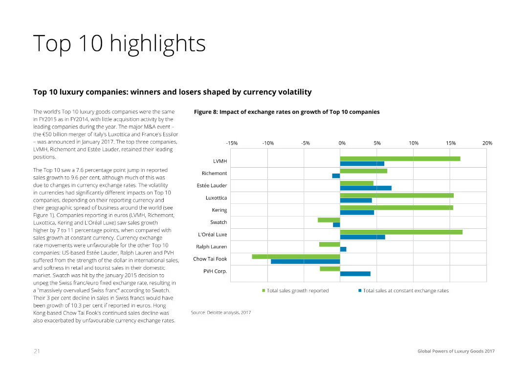
Text on the left summarizing the financial performance of the top 10 luxury companies, accompanied by a horizontal bar chart on the right comparing the impact of exchange rates on sales growth across these companies.
Financial Performance
Consumer Goods
The slide highlights the financial performance and currency exchange impact on the top 10 luxury companies, showing reported sales growth and the effects of exchange rate fluctuations. It is useful for understanding financial dynamics in the luxury sector.
Highlights, Financial, Performance, Luxury, Companies
Mixed Chart
Deloitte
Saved
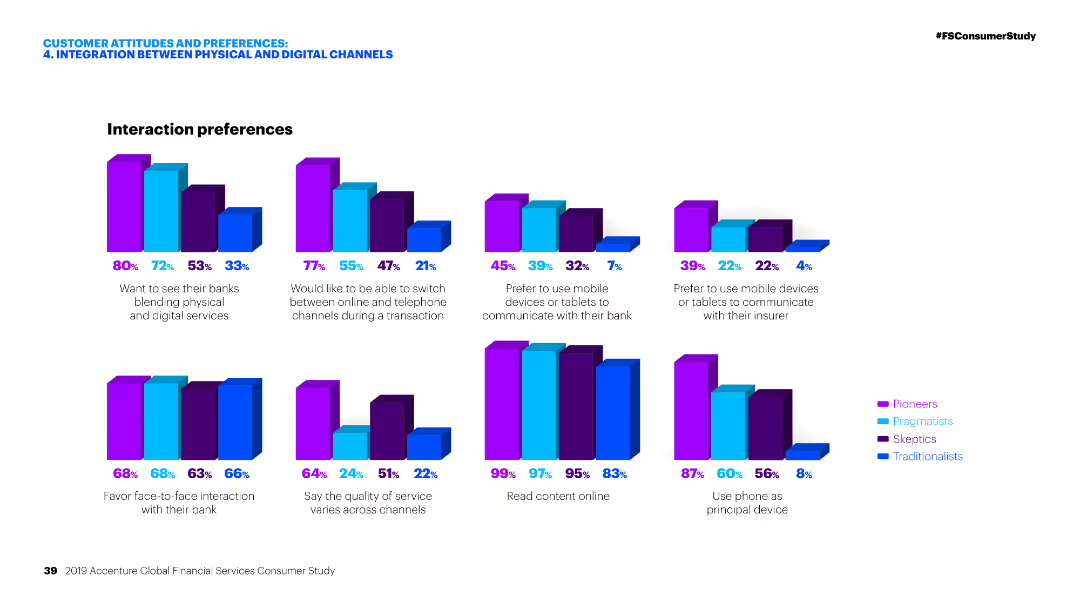
Multiple column charts depicting interaction preferences of different customer segments in banking and insurance contexts.
Customer and Market Segmentation
Financial Services
This slide presents various interaction preferences of customers when engaging with financial services, emphasizing the integration between physical and digital channels.
Interaction preferences, Financial services, Digital channels, Banking, Insurance
Multiple Chart
Accenture
Saved
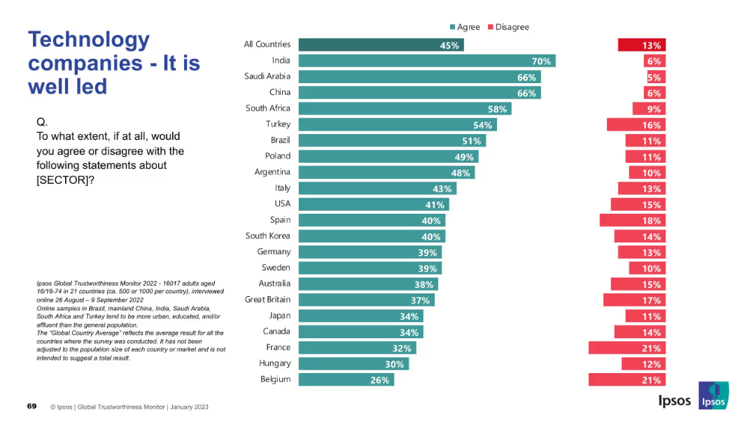
Full slide width used for horizontal bars; header and question on the left; Ipsos note at bottom.
Organizational Structure and Change
Technology & Software
Global public views on the quality of leadership in technology companies, using bar chart data to compare levels of agreement across various countries.
leadership, tech companies, trust, Ipsos, global opinion, executive quality, management, governance, perception, public trust
Mixed Chart
IPSOS
Saved
Slide presents a column chart of the economic impact of Copernicus data, alongside lists and bullet points illustrating the products related to natural disaster management.
Market Analysis and Trends
Environmental Services & Sustainability
Focuses on how Copernicus data aids in natural disaster management, emphasizing the economic benefits and the importance of satellite images in emergency responses.
natural disasters, Copernicus, economic benefits, satellite images, emergency response, data utilization
Mixed Chart
PwC/Strategy&
Saved
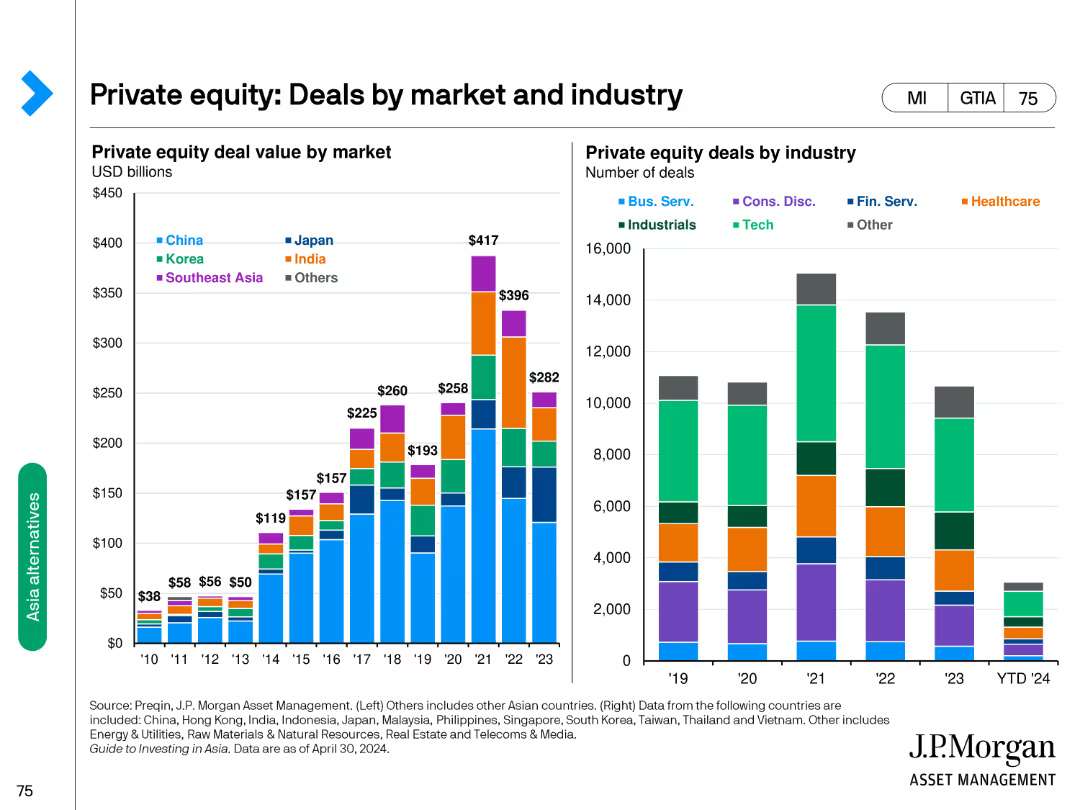
Contains column charts showing private equity deal value by market and industry, indicating variations across different regions and sectors.
Market Analysis and Trends
Financial Services
Presents private equity deal values in billions and the number of deals categorized by industry, highlighting market and industry distributions.
private equity, deals, market, industry, value
Multiple Chart
JP Morgan
Saved
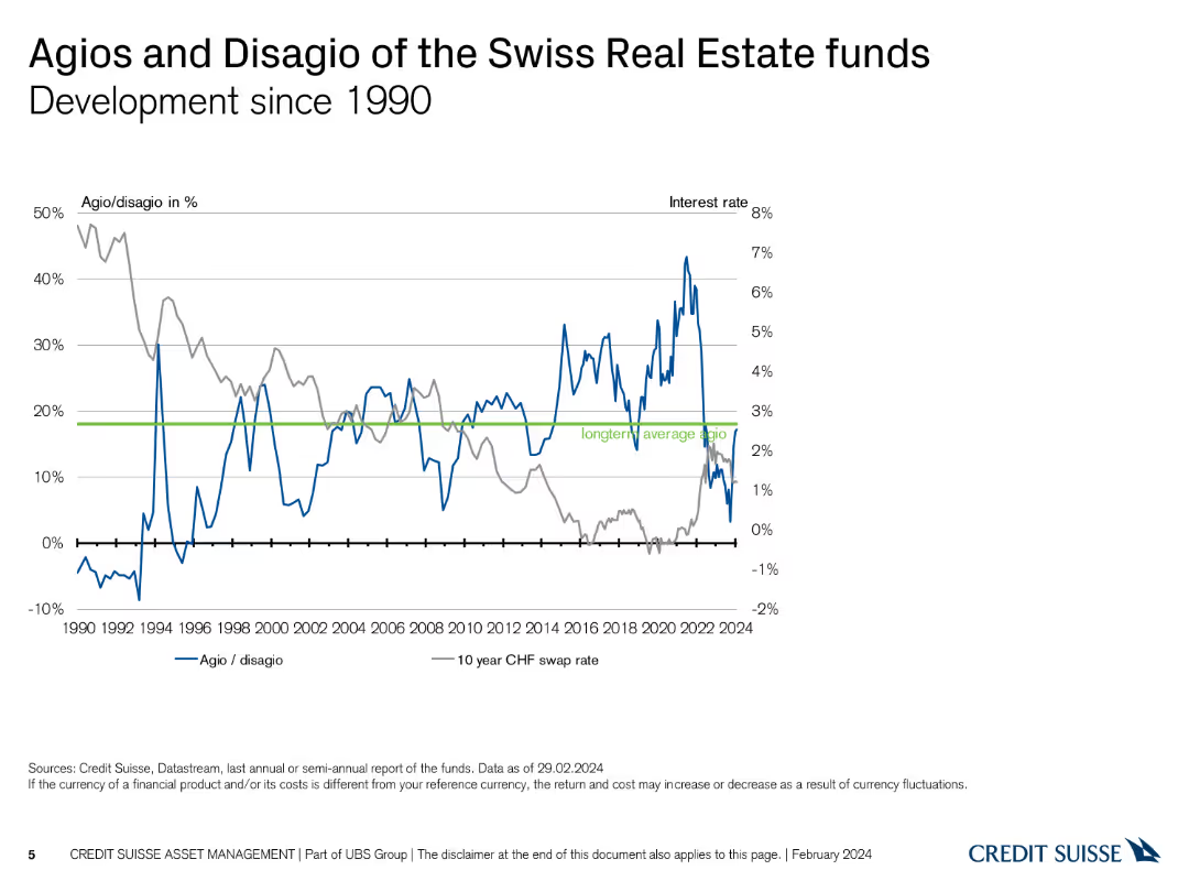
Line chart depicting the development of agios/disagios and interest rates since 1990.
Market Analysis and Trends
Real Estate & Construction
Tracks the historical development of agio/disagio percentages alongside interest rates over several decades.
real estate, agio, disagio, historical development, interest rates
Single Chart
Credit Suisse
Saved
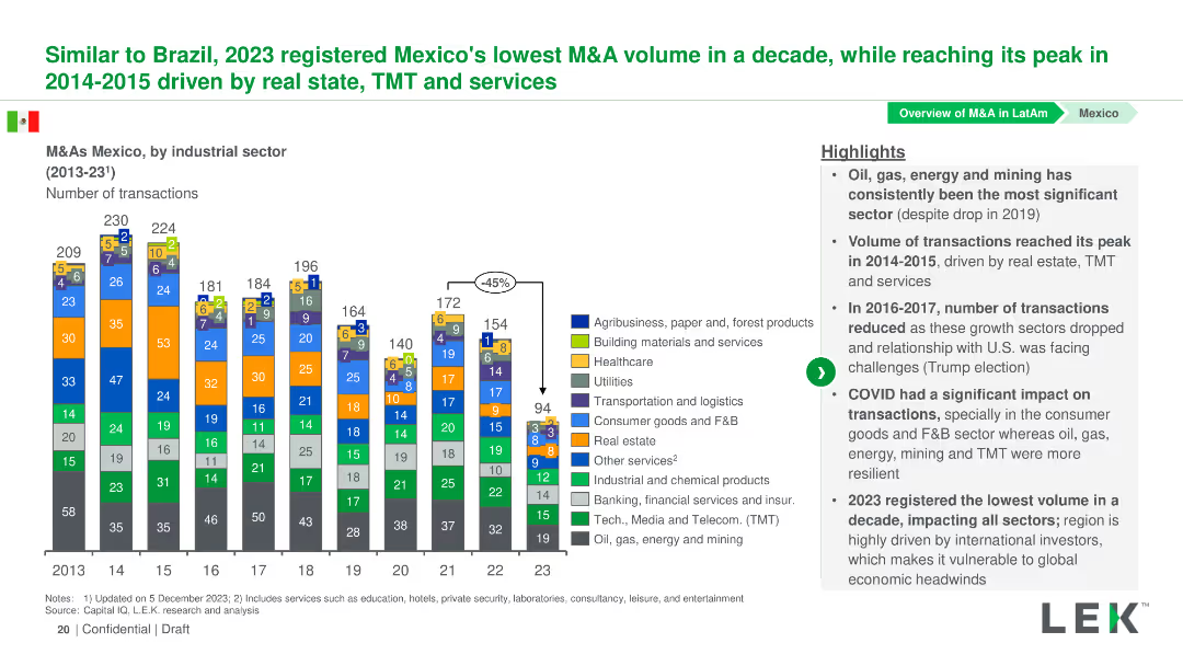
Column chart showing the number of M&A transactions by industrial sector in Mexico from 2013-2023. Sectors are color-coded and detailed in a legend.
Market Analysis and Trends
Financial Services
This slide presents the volume of M&A transactions in various industrial sectors in Mexico from 2013-2023, with an analysis of trends and significant changes.
Mexico, M&A, Industrial Sectors, Transactions, Trends
Mixed Chart
LEK
Saved
Features column charts and a line graph detailing loan loss rates and impairment charges over several quarters. The layout is straightforward, using contrasting colors to differentiate between different types of data, providing a clear visual representation of trends and specifics.
Risk Assessment and Management
Financial Services
Discusses the trends in loan delinquencies and the resulting financial strategies, such as reserve builds and write-offs, illustrating how Barclays manages financial volatility and credit risk.
delinquencies, impairment charges, financial strategy, credit risk
Multiple Chart
Barclays
Saved
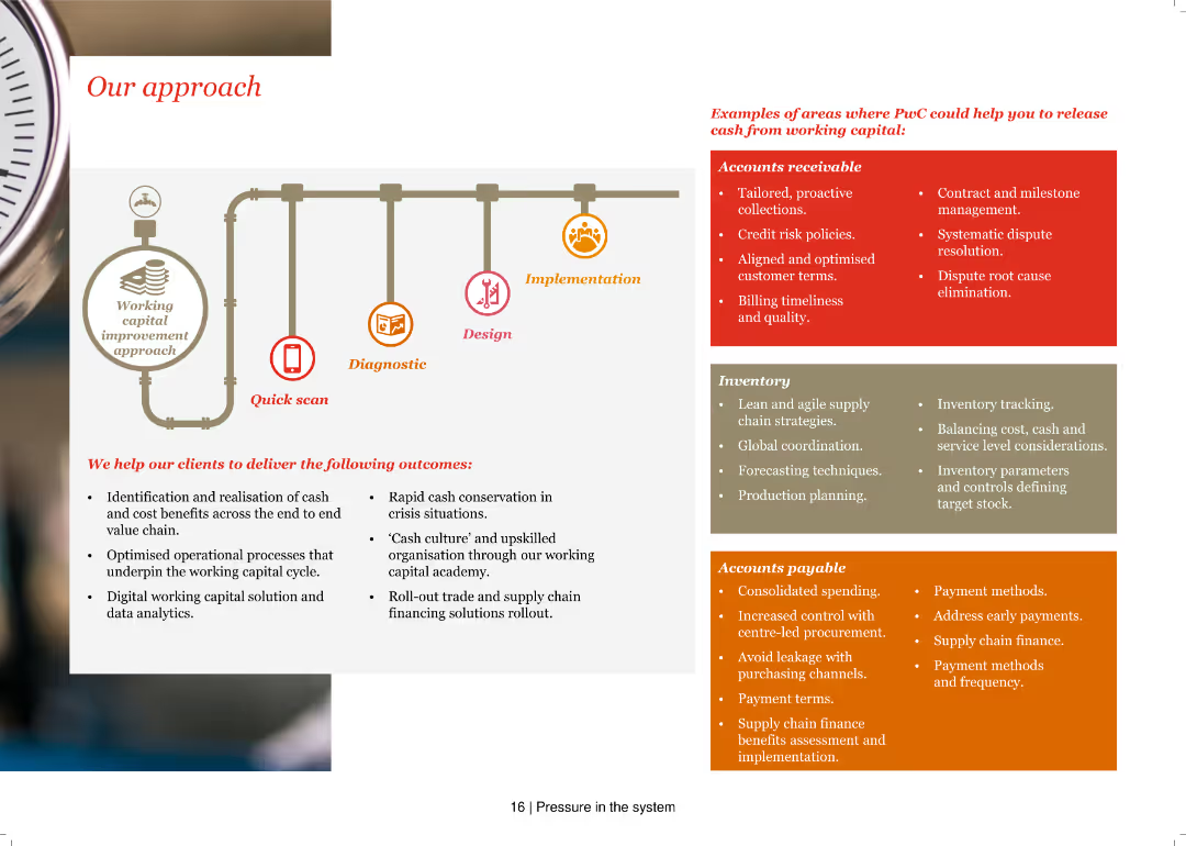
A pipeline diagram illustrating a working capital improvement approach with phases: Quick scan, Diagnostic, Design, and Implementation, accompanied by lists of specific actions and outcomes.
Operational Efficiency
Financial Services
The slide explains PwC's approach to improving working capital, detailing steps and examples in accounts receivable, inventory, and accounts payable.
Working capital, Quick scan, Diagnostic, Design, Implementation, Accounts receivable, Inventory, Accounts payable, Outcomes, Efficiency
Header Vertical
PwC/Strategy&
Saved
This slide displays a stacked column chart with annotations for half-yearly data points from 2019 to H1 2023. It uses grayscale for different sectors with a clear legend. Deal count numbers are presented at the bottom.
Investment Analysis
Financial Services
Shows private funding trends in Vietnam for different sectors, indicating a small increase in H1 2023. It suggests a focus on nascent sectors, hinting at emerging investment areas.
Vietnam, Private Funding, H1 2023, Investment Trends, Nascent Sectors, Deal Count, Travel, Digital Media, E-commerce
Single Chart
Bain
Saved
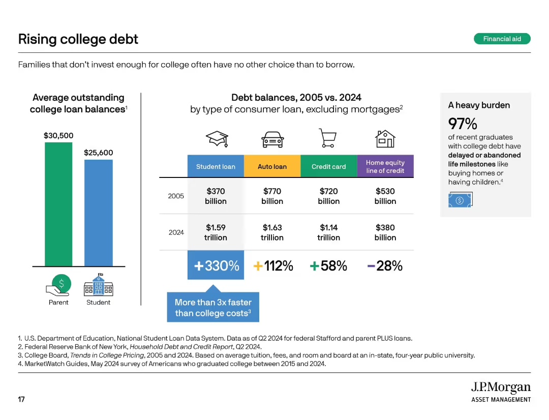
Bar chart and infographic showing loan growth and its impact, plus a statistic callout on graduate burden.
Financial Performance
Education & Training
This slide reveals how college debt has increased significantly over time, outpacing other loan types. It compares 2005 and 2024 balances for multiple loan categories and underscores the long-term burden on students, with 97% of graduates delaying or foregoing major life milestones due to debt.
student loans, debt burden, education finance, loan growth, graduates
Mixed Chart
JP Morgan
Saved
Previous
Next
If nothing, comes up, please save your slides first
Create a FREE account to continue browsing
Receive Instant Access to 1,000+ slides from companies like McKinsey, Google, and Goldman Sachs
First Name
Last Name
Email
Password
I agree to all
Terms & Privacy Policy
Thank you! Your submission has been received!
Oops! Something went wrong while submitting the form.
Have an account?
Sign in
Column Chart
Heatmap
Chevron
Org Chart
Infographic
Callouts
Timeline
List
Graphic
Picture
Process Flow
Diagram
Paragraph
Map
Table
Framework
Subtitle
Takeaway Box
Icon
Other Chart
Radar Chart
Waterfall Chart
Mekko Chart
Pie Chart
Scatter Plot
Line Chart
Bar chart
Bullet points