Create a FREE Account
Instant access to 1,000+ real slides from top companies like McKinsey, BCG, Goldman Sachs, Google and many more!
First Name
Last Name
Email
Password
I agree to all
Terms & Privacy Policy
Thank you! Your submission has been received!
Oops! Something went wrong while submitting the form.
Have an account?
Sign in
Library
Templates
Courses
Pricing
My Account
My Slides
My Templates
✦ AI
AI Prompt Library
AI Search
Sign in
Start Here
Logout
My Saved Slides
The slide features a large donut chart showing the composition of hidden workers, with smaller bar charts breaking down specific categories like missing from workforce and work.
Market Analysis and Trends
Government & Public Sector
The slide analyzes the hidden workforce in the US, highlighting that 27.4M workers are hidden due to various reasons, including long-term unemployment and family care responsibilities.
hidden workforce, US, employment, analysis, statistics
Multiple Chart
Accenture
Saved
Column charts contrasting views from different countries. Simple and clear layout with green color highlights.
Regulatory and Compliance
Environmental Services & Sustainability
Discusses the concept of a "just transition" in sustainability efforts and its varying importance across different countries.
Climate equity, just transition, regional differences, sustainability
Multiple Chart
Deloitte
Saved
Includes multiple column charts comparing top challenges faced by underwriters in different lines of business, with focus on systems inefficiencies and training needs.
Risk Assessment and Management
Financial Services
Comparative analysis of top operational and risk management challenges across different insurance lines, emphasizing inefficiencies and the need for better training.
challenges, operational risks, insurance, comparison, systems inefficiency, training, personal lines, commercial lines, specialty lines
Mixed Chart
Accenture
Saved
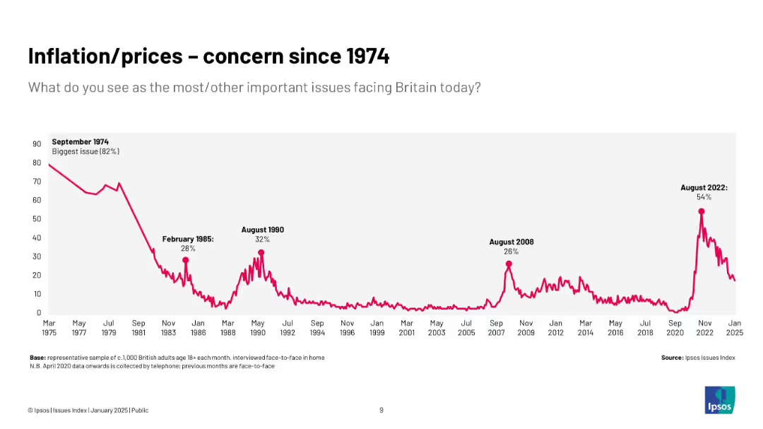
Two columns: text explanation and line chart showing stable or declining trust across generations in tech sector.
Market Analysis and Trends
Technology & Software
This slide notes declining trust in technology companies across most generations except Millennials, whose trust levels remained stable. It questions assumptions about generational divides in perception.
tech sector, trust, generational trends, Millennials, public opinion, Ipsos, period effects, marketing strategy, cohort behavior
Mixed Chart
IPSOS
Saved
The slide includes a vertical column chart showing leverage ratio movements, supported by key highlights on the right.
Risk Assessment and Management
Financial Services
The slide details Deutsche Bank's leverage ratio stability, illustrating changes and factors affecting the ratio from Q4 2023 to Q1 2024.
leverage ratio, financial stability, risk management, Deutsche Bank, Q1 2024, investor relations, financial metrics, quarterly performance, capital adequacy
Mixed Chart
Deutsche Bank
Saved
Line charts showing US existing home sales and housing starts, and y/y home price indexes from January 2006 to January 2024.
Market Analysis and Trends
Real Estate & Construction
Examines how reduced affordability constrains home sales, with construction activity supported by tight supply and easing interest rates.
home sales, housing starts, home price indexes, affordability, real estate, line chart, construction, supply conditions, interest rates
Multiple Chart
EY
Saved
A quadrant scatter plot categorizes technologies and services based on their market positioning before and after signing contracts. Dots represent companies; color indicates service or goods focus.
Risk Assessment and Management
Technology & Software
Evaluates the challenges in purchasing services versus goods, illustrating the technology landscape's division into pre and post-contract signing phases, focusing on areas like risk and contract management.
Buying, Services, Challenges, Technology, Market
Single Chart
Kearney
Saved
The slide features a structured layout with five key steps in mitigating cyber risks: "Identify," "Protect," "Detect," "Respond," and "Recover." Each step is contained in a box with an accompanying descriptive subtitle.
Operational Efficiency
Technology & Software
This slide outlines a strategy for mitigating cyber risks, emphasizing the importance of each step in the cyber risk management process. It's relevant for presentations focused on cybersecurity within financial institutions, detailing a proactive approach to protecting firm and client data.
cyber risks, mitigation, Goldman Sachs, protection, response
Boxed
Goldman Sachs
Saved
Matrix chart with purple dots indicating impact level across project phases (greenfield, brownfield, decommissioning) for each stakeholder-related capability.
Organizational Structure and Change
Real Estate & Construction
This slide maps stakeholder management capabilities across project phases. High-impact areas include clear communication with authorities and stakeholder sentiment monitoring. Technology-enabled approaches are also noted.
stakeholder engagement, communication, capabilities, AI, impact matrix
Table
Accenture
Saved
The slide shows a structured layout with a combination of text boxes detailing the key components and impacts of the TEF Entrepreneurship Programme.
Client Case Studies
Professional Services
Discusses the achievements of the Tony Elumelu Foundation's entrepreneurship programme, including its impact on job creation and business development in Africa.
entrepreneurship, Tony Elumelu Foundation, business development, Africa, impact assessment
Diagram
Accenture
Saved
Multi-panel layout: bar charts for U.S. campaign activity annually and quarterly; pie chart of market cap breakdown; sector bar chart.
Market Analysis and Trends
Financial Services
Focuses on U.S.-specific activist trends in Q1 2025. Reports 40 campaigns YTD (43% YoY growth), with Industrials, Healthcare, and Technology as dominant sectors. Majority of targets are sub-$5bn firms. Signals rising U.S. market focus and campaign intensity.
U.S. campaigns, market cap, shareholder activism, 2025 trends, sector analysis, Barclays
Multiple Chart
Barclays
Saved
This slide contains multiple bar charts and textual content. There are three bar charts arranged horizontally, comparing Australia, US, and Indonesia in terms of production costs for lithium. The bar charts are divided into categories like Feedstock, Conversion Costs, Capex, and Tax. Each country's chart is distinguished by a different color and there are annotations and percentage changes highlighted.
Competitive Landscape
Energy & Utilities
The slide details the competitive advantages in production costs for lithium hydroxide in Australia compared to the US and Indonesia, emphasizing Australia's lower costs due to integration of mining and refining activities.
Australia, lithium, refining, cost comparison, mineral reserves, production costs, competitive advantage, integration benefits, global market
Multiple Chart
Accenture
Saved
Final continuation slide featuring “Uses of Cash” and “Risk & Liquidity” strategy baskets. Includes 9 line charts with Bloomberg tickers. Each panel compares basket performance versus S&P 500 from Dec 2022 to Mar 2024.
Investment Analysis
Financial Services
The slide evaluates how different uses of cash (e.g., Capex, Buybacks, Dividends) and liquidity characteristics (e.g., High Sharpe Ratio, Low Liquidity) impact performance relative to the S&P 500. Trends indicate which corporate strategies align with investor preferences. For example, High Growth Investment Ratio and High Sharpe Ratio baskets underperformed recently.
capex, buybacks, dividend, liquidity, sharpe ratio, cash usage, S&P 500, investment themes, corporate strategy
Multiple Chart
Goldman Sachs
Saved
Column chart comparing percentages of those who believe taxes should be increased on businesses and individuals.
Regulatory and Compliance
Financial Services
Examines opinions on tax policy changes post-pandemic, focusing on who should bear increased tax burdens.
tax policy, pandemic, businesses, high-net worth individuals, tax increases
Mixed Chart
EY
Saved
The slide features a combination of text and a column chart. The background shows an aerial view of people walking on a large surface. Quotes from various CEOs are highlighted on the right side.
Strategic Planning
Professional Services
The slide discusses the importance of trust for CEOs, emphasizing how it impacts their business competitiveness and sustainability strategies. It includes quotes from CEOs and a column chart showing survey data.
Trust, CEOs, Competitiveness, Sustainability, Business Strategy, Survey Data, Professional Services, Strategic Planning
Mixed Chart
Accenture
Saved
Two line charts with historical data: Left—foreign Treasury holdings; Right—foreign equity holdings in U.S. markets.
Investment Analysis
Financial Services
Shows trends in foreign investment in U.S. assets, tracking both Treasuries and equities over time. Also includes recent statistics on foreign ownership by region, providing insight into international capital flows.
foreign investment, U.S. equities, Treasuries, ownership trends, capital flows, international markets
Multiple Chart
JP Morgan
Saved
Three-column chart with headers for WM Client Assets, Fee-Based Assets, and Client Relationships, each with key figures and ranks. Clean design with prominent blue highlights.
Financial Performance
Financial Services
Demonstrates Morgan Stanley's market position with total client assets, fee-based assets, and client relationships, emphasizing leadership and scale.
Scale, wealth management, market position, client assets, fee-based, client relationships, market leadership
Table
Goldman Sachs
Saved
Utilizes boxes with numbers and a comparison table of mineral reserves by country to show Australia's resource wealth.
Market Analysis and Trends
Energy & Utilities
Highlights Australia's significant reserves of critical battery minerals, positioning it as a leader in lithium production.
lithium production, Australia, mineral reserves, critical resources
Table
Accenture
Saved
Vertical stacked bar chart split by year (2018 and incremental growth), segmented by 75% threshold and future target cities; uses bold blue tones and annotations.
Performance Metrics and KPIs
Financial Services
The slide illustrates LIF (Locations in Force) coverage across international cities where card members are most active. It differentiates between coverage levels as of 2018 and the progress made since then, showing how many cities have surpassed the 75% target and setting goals for 2026.
LIF coverage, cities, card members, merchant acceptance, 2023 goal, 2026 target, incremental growth, Amex, bar chart
Single Chart
McKinsey
Saved
This slide features a column chart showing the percentage of Clorox's portfolio with superior consumer value over time, with data points for FY14 and FY18. The graph uses blue and yellow to highlight changes.
Market Analysis and Trends
Consumer Goods
Evaluates the consumer value of Clorox's portfolio, showing an increase in products with superior value from FY14 to FY18. Useful for market analysis and product value assessment.
consumer value, market analysis, Clorox, product assessment
Single Chart
Barclays
Saved
Stacked vertical bar chart showing digital channel preference (web, app, other) by industry; blue gradients
Technology and Digital Transformation
Technology & Software
The slide breaks down digital channel preferences, showing web as the top channel across most industries, except Social Media (apps preferred). Mobile apps are also significant in Banking and Entertainment. Public Sector users clearly prefer web (80%). The visualization provides clear cross-industry channel trends.
web vs app, digital preference, mobile usage, channel strategy, industry comparison, user behavior, Germany, COVID-19
Single Chart
McKinsey
Saved
The slide uses a simple layout with images to indicate upcoming detailed reports on different subsectors of industrial automation, including process industry, discrete, and warehouse automation.
Market Analysis and Trends
Industrial & Manufacturing
The slide provides a preview of forthcoming reports on industrial automation subsectors, scheduled for release in summer, fall, and winter 2021.
upcoming reports, industrial automation, subsectors, process industry, discrete automation, warehouse automation
Diagram
LEK
Saved
Bar graph and quotes highlighting cultural and other barriers to organizational agility.
Operational Efficiency
Professional Services
Identifies and quantifies the main barriers to achieving agility in business, with cultural issues being the most significant.
Agility Barriers, Culture, Organizational Change, Bar Graph, Executive Quotes
Mixed Chart
Kearney
Saved
Slide includes multiple column charts displaying sector-specific data.
Market Analysis and Trends
Consumer Goods
Provides a comprehensive overview of the global luxury market in 2019, highlighting growth across various sectors like personal luxury goods and fine dining.
global market, luxury sectors, 2019, growth
Single Chart
Bain
Saved
World map with blue circles showing number of QC start-ups by region in 2021 vs. 2015, labeled per country.
Market Analysis and Trends
Technology & Software
The map displays the rise of quantum computing (QC) start-ups globally, with major growth in the US (59 from 15), EU (53 from 9), and Canada. It underscores increased activity and geographic spread, especially in Western countries.
quantum computing, start-ups, global, USA, EU, growth, map, regional distribution
Single Chart
McKinsey
Saved
Previous
Next
If nothing, comes up, please save your slides first
Create a FREE account to continue browsing
Receive Instant Access to 1,000+ slides from companies like McKinsey, Google, and Goldman Sachs
First Name
Last Name
Email
Password
I agree to all
Terms & Privacy Policy
Thank you! Your submission has been received!
Oops! Something went wrong while submitting the form.
Have an account?
Sign in
Column Chart
Heatmap
Chevron
Org Chart
Infographic
Callouts
Timeline
List
Graphic
Picture
Process Flow
Diagram
Paragraph
Map
Table
Framework
Subtitle
Takeaway Box
Icon
Other Chart
Radar Chart
Waterfall Chart
Mekko Chart
Pie Chart
Scatter Plot
Line Chart
Bar chart
Bullet points