Create a FREE Account
Instant access to 1,000+ real slides from top companies like McKinsey, BCG, Goldman Sachs, Google and many more!
First Name
Last Name
Email
Password
I agree to all
Terms & Privacy Policy
Thank you! Your submission has been received!
Oops! Something went wrong while submitting the form.
Have an account?
Sign in
Library
Templates
Courses
Pricing
My Account
My Slides
My Templates
✦ AI
AI Prompt Library
AI Search
Sign in
Start Here
Logout
My Saved Slides
Presents a multi-line graph showing trends in domestic flight bookings with a forecast outlook.
Market Analysis and Trends
Transportation & Logistics
Assesses the recovery in air travel with domestic flight booking trends, indicating a slow return to pre-pandemic levels.
air travel, booking trends, recovery forecast, pandemic impact
Multiple Chart
BCG
Saved
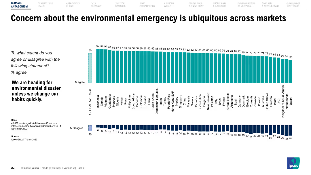
The slide features a horizontal bar chart showing agreement levels with a statement on environmental disaster across different countries.
Market Analysis and Trends
Environmental Services & Sustainability
Presents global survey data on public concern about the environmental emergency, highlighting varying levels of agreement across different countries.
Environment, concern, survey, global trends, countries
Multiple Chart
IPSOS
Saved
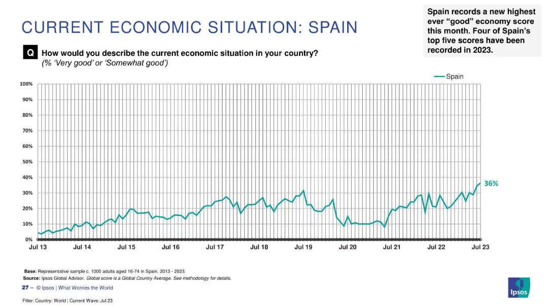
Line chart of economic sentiment from 2013–2023, with annotation showing record-high score (36%) in July 2023.
Market Analysis and Trends
Financial Services
Spain has achieved its highest recorded "good" economy rating at 36%, marking four of its top five scores in 2023. The chart highlights a decade-long upward trend in public economic perception.
Spain, record high, 2023, public sentiment, economic optimism, Ipsos survey, trend analysis, long-term improvement, economic confidence
Single Chart
IPSOS
Saved
Uses a bar graph to compare the CAGR of off-grid solar PV installed capacity across several countries.
Market Analysis and Trends
Energy & Utilities
Compares the growth rates of off-grid solar PV capacity across multiple countries, highlighting Nigeria's position relative to its peers.
solar market, CAGR, comparative analysis, off-grid, international markets
Single Chart
BCG
Saved
A slide with dual charts contrasting public market and tech performance with U.S. venture investment, accompanied by a second chart on key inflation indicators and treasury interest rates. Each chart uses different colored lines for comparison and has annotations for additional context.
Market Analysis and Trends
Technology & Software
This slide analyzes the trend of public market rallies driven by technology companies contrasted against a drop in venture investments. It also provides a secondary focus on inflation and interest rates, aiming to discuss the financial climate and its effects on investment strategies. It can be used to guide discussions on economic trends and investment decisions, especially in technology-driven markets.
Public Markets, Technology, Venture Investment, Inflation, Interest Rates, Economic Trends
Multiple Chart
JP Morgan
Saved
Two-column layout with a table on the left detailing equity and net debt and a column chart on the right showing gross debt maturity profile.
Financial Performance
Financial Services
Provides an overview of the balance sheet and liquidity position as of June 2023, including equity, net debt, gearing ratios, and liquidity with debt maturity projections.
balance sheet, liquidity, equity, debt, financials
Mixed Chart
IPSOS
Saved
A horizontal layout showing key export products of various Central American countries. Each product is listed under the respective country’s flag and accompanied by percentage data.
Market Analysis and Trends
Industrial & Manufacturing
The slide highlights the main export products from different Central American countries, showcasing their manufacturing capabilities and potential for leveraging friendshoring opportunities.
Exports, Central America, products, friendshoring, manufacturing
Linear Flow
Deloitte
Saved
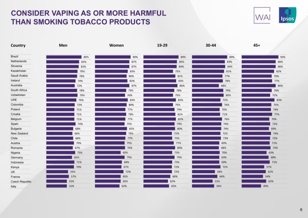
Matrix bar chart segmented by country, gender, and age groups. Purple bars aligned in columns.
Customer and Market Segmentation
Healthcare & Pharmaceuticals
This slide provides a detailed demographic breakdown (gender and age) of perceptions on vaping harm across countries. It shows consistently high concern across all groups, with notable variations between men and women and across age segments.
demographics, vaping perception, age groups, gender, tobacco harm, cross-country comparison, Ipsos, matrix chart
Single Chart
IPSOS
Saved
A column chart showing regular and supplemental dividend history from Q2'20 to Q4'23, with corresponding dividend yields.
Financial Performance
Financial Services
This slide illustrates the dividend history of the company over several quarters, indicating the consistency and growth of dividend payouts and their yields.
Dividends, Column Chart, Financial History, Yields, Q2'20-Q4'23
Mixed Chart
Morgan Stanley
Saved
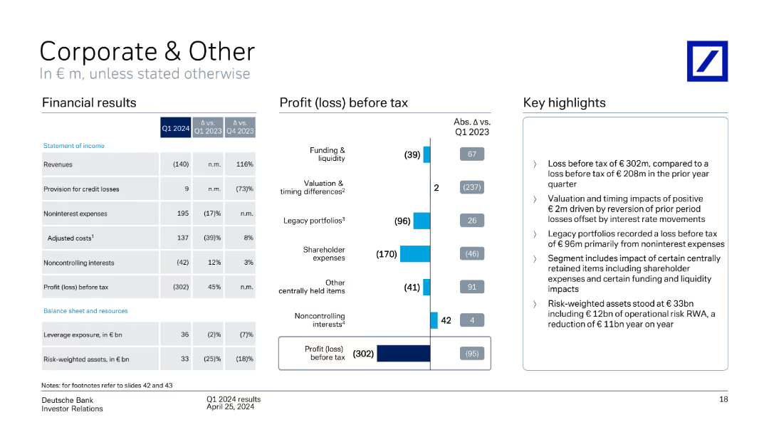
A column chart showing profit (loss) before tax by segment, with a table of financial results and key highlights. The slide is moderately dense with a mix of textual and visual elements.
Financial Performance
Financial Services
The slide details Q1 2024 financial results for the Corporate & Other segment, highlighting revenue, profit (loss) before tax, and key insights into various financial metrics and performance.
Corporate & Other, profit before tax, financial results, Q1 2024, performance
Mixed Chart
Deutsche Bank
Saved
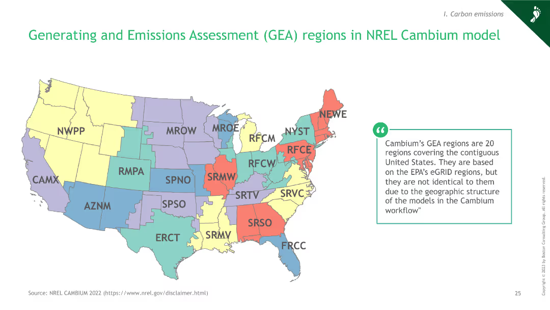
A map of the United States showing the Generating and Emissions Assessment regions as defined by the NREL Cambium model.
Regulatory and Compliance
Energy & Utilities
The slide presents the GEA regions within the NREL Cambium model, outlining the regional coverage for emissions and generation assessments.
hydrogen, GEA, regions, NREL, emissions
Graphic
BCG
Saved
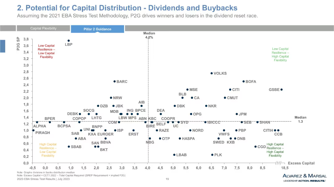
Scatter plot with P2G Spread vs. Excess Capital, divided into four quadrants. Each dot represents a bank. Median lines mark division axes.
Strategic Planning
Financial Services
This scatter plot visualizes the tradeoff between banks' excess capital and P2G spread. It categorizes institutions into four zones—highlighting strengths and vulnerabilities in capital flexibility and resilience. The layout helps stakeholders identify which banks are well-positioned for distributions and which may face regulatory constraints.
P2G spread, excess capital, stress test, capital resilience, quadrant chart, CET1, financial strength, risk-adjusted performance
Single Chart
Alvarez & Marsal
Saved
This slide features a large map of Switzerland color-coded to display investment data by canton and sector for 2020. Several bar charts depict investment amounts in different sectors like Biotech, Medtech, ICT, etc. It also includes a detailed bullet point text explaining the startup ecosystem in Switzerland.
Industry Overview
Professional Services
The slide provides an overview of the Swiss startup ecosystem, emphasizing the investments in various sectors across cantons in 2020. It highlights Switzerland's ranking in European startup ecosystems and discusses the investment trends in detail.
Switzerland, startup, investment, ecosystem, biotech, medtech, ICT, 2020
Graphic
Accenture
Saved
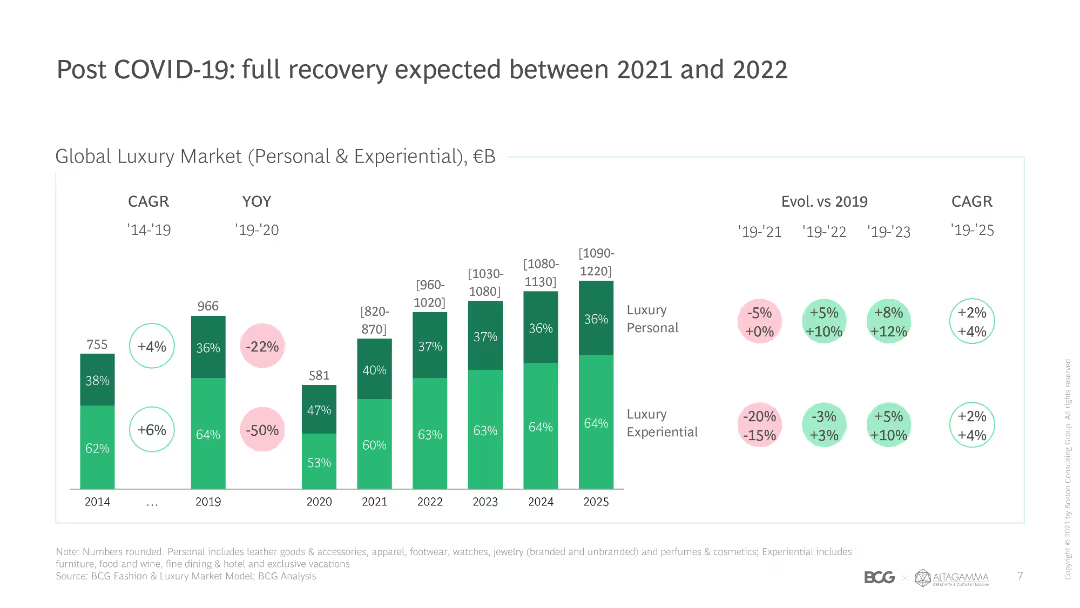
This slide features a column chart comparing global luxury market size and growth rates from 2014 to 2025, with color-coded segments for personal and experiential luxury.
Market Analysis and Trends
Retail & E-commerce
The slide projects the recovery of the global luxury market post-COVID-19, highlighting growth rates and market size for personal and experiential luxury segments.
COVID-19 recovery, luxury market, growth rates, market size, experiential luxury, personal luxury, global trends, projections, CAGR
Single Chart
BCG
Saved
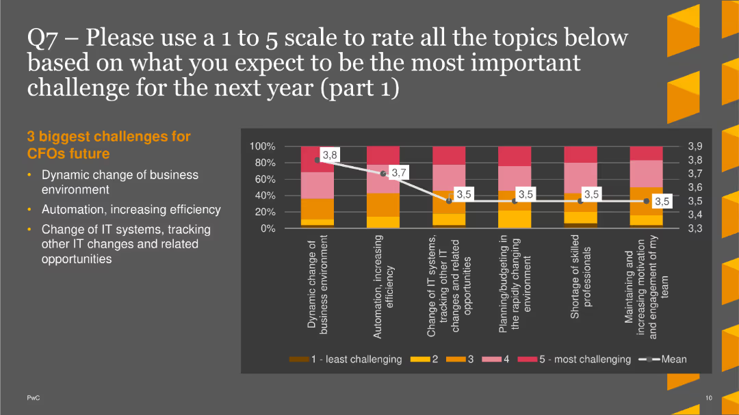
The slide includes a column chart showing anticipated challenges for CFOs, focusing on business environment changes and automation.
Market Analysis and Trends
Financial Services
This slide presents the top three expected challenges for CFOs in the coming year: dynamic business changes, automation, and IT system changes.
Future Challenges, CFOs, Column Chart, PwC, Survey, 2022, Automation
Mixed Chart
PwC/Strategy&
Saved
This content slide combines a text block discussing job impacts with two column charts. The left chart compares gray and green job changes under LCE scenarios, while the right chart shows total employment deviations from baseline over time.
Human Resources and Talent Management
Professional Services
The slide highlights the job market shifts due to the green transition, projecting job losses in fossil fuel sectors (gray jobs) and job creation in green sectors (green jobs) by 2050. It emphasizes the need for investment in eco-industries to boost employment and manage the transition smoothly.
Green Jobs, Employment, Workforce, Transition, LCE
Multiple Chart
EY
Saved
Slide includes column charts showing trends in print and digital newspaper display revenues from 2003 to 2019.
Financial Performance
Media & Entertainment
Analyzes the trends in newspaper advertising revenue, noting the substantial decline in print and the slight offset by digital gains.
print media, digital gains, advertising revenue, newspaper, trend analysis, decline, media market, revenue analysis, print vs digital
Multiple Chart
Accenture
Saved
This slide combines bullet points and icons to highlight agricultural priorities and new EU strategies. The layout is straightforward, using icons and brief descriptions to clearly communicate key strategies.
Strategic Planning
Agriculture & Food Production
Focuses on strategic changes in agriculture for sustainability, including the Biodiversity Strategy and the Farm to Fork Strategy under the European Green Deal, aiming for a sustainable competitive food system.
EU strategies, agriculture, biodiversity, sustainability, food system
Header Vertical
Deloitte
Saved
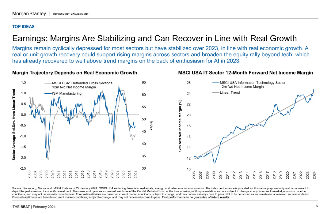
Two line charts illustrating margin trajectory based on real economic growth and MSCI USA IT sector 12-month forward net income margin.
Financial Performance
Financial Services
This slide analyzes the stabilization and potential recovery of earnings margins in relation to real economic growth, focusing on specific sector performance.
earnings, margins, economic growth, IT sector, financial performance
Multiple Chart
Morgan Stanley
Saved
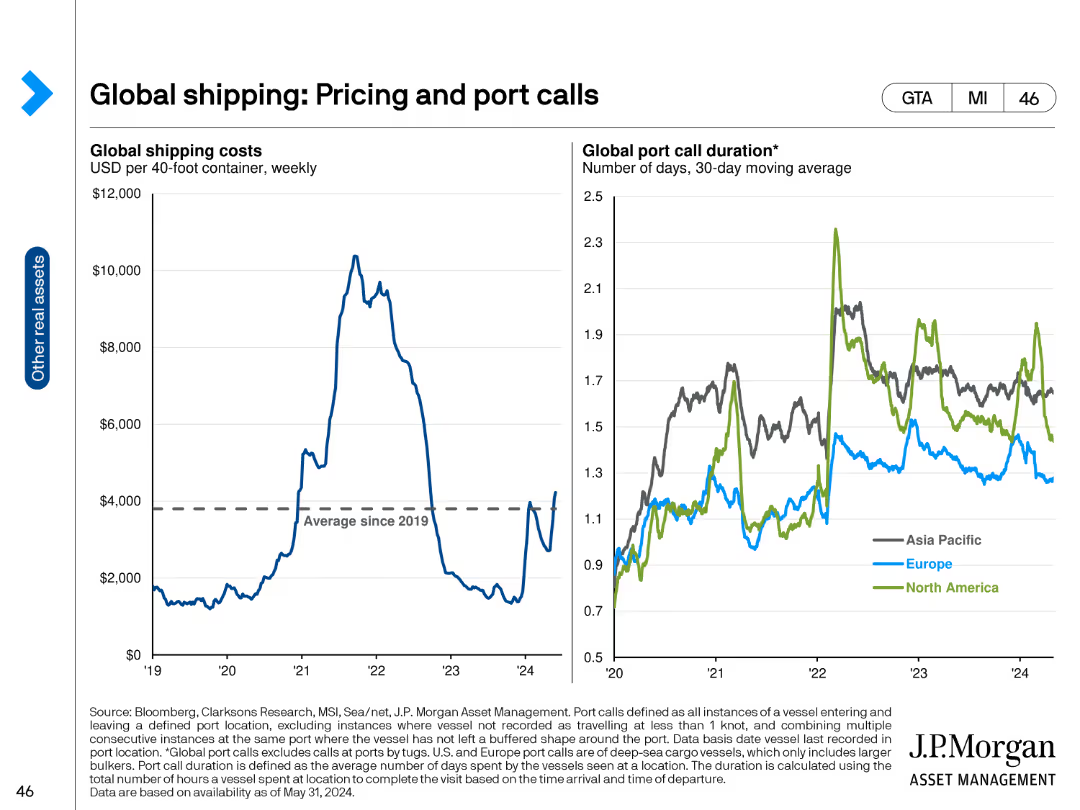
The slide includes two line charts. The left chart shows global shipping costs per 40-foot container from 2019 to 2024. The right chart presents the global port call duration in days for Asia Pacific, Europe, and North America from 2019 to 2024. The line charts use distinct colors for different regions and provide a clear visual of trends.
Market Analysis and Trends
Transportation & Logistics
This slide examines global shipping costs and port call durations, highlighting trends across different regions. It is intended to provide insights into the shipping industry’s pricing and operational efficiencies.
Shipping costs, port call duration, global shipping, pricing trends, regional analysis, shipping industry
Multiple Chart
JP Morgan
Saved
A combination of a bar chart and descriptive text detailing the results of a financial knowledge assessment among Canadians in 2023, compared to 2022.
Human Resources and Talent Management
Financial Services
This slide evaluates the financial knowledge of Canadians, showing average scores and detailed analysis of correct responses across multiple questions in 2023 and 2022.
Financial, knowledge, assessment, Canadians, 2023, 2022
Mixed Chart
IPSOS
Saved
Slide presents column charts and bullet points. The charts display luxury market projections for 2017 and 2025, emphasizing Chinese consumption. Red and gray colors differentiate data.
Market Analysis and Trends
Retail & E-commerce
This slide analyzes the future growth trends in the luxury goods market, focusing particularly on China's role. It highlights domestic versus international spending in the context of overall market growth.
China, Luxury Market, Growth, Consumption, Projections
Multiple Chart
Bain
Saved
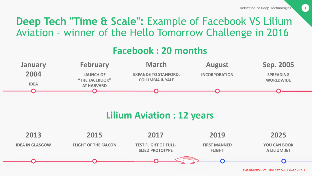
The slide features a timeline comparing the development and market entry times of Facebook and Lilium Aviation. Key milestones are marked along a horizontal timeline with distinct points for each company's progress.
Market Analysis and Trends
Technology & Software
This slide provides a comparative timeline showing the rapid growth of Facebook (20 months) versus the longer development period of Lilium Aviation (12 years). It highlights differences in market readiness and scaling between the two companies.
Facebook, Lilium Aviation, Timeline, Market Entry, Comparison, Development
Linear Flow
BCG
Saved
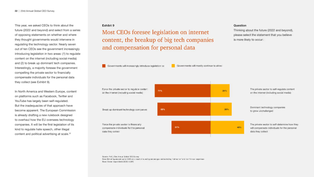
This slide includes a bar chart showing CEOs' predictions about future legislation on internet content, tech company breakups, and personal data compensation. The design is clear.
Regulatory and Compliance
Technology & Software
The slide presents survey results indicating that most CEOs believe there will be increased government regulation in internet content, tech company breakups, and data compensation.
Internet legislation, tech companies, personal data, CEO predictions, regulation
Mixed Chart
PwC/Strategy&
Saved
Shows a column chart for online media GMV with a detailed breakdown of sub-sectors like video, gaming, and music.
Market Analysis and Trends
Media & Entertainment
The slide presents a comprehensive look at the online media industry, indicating strong growth amidst changing consumption patterns due to the pandemic. It can inform media companies' strategic planning, especially in areas like video streaming and gaming.
Online Media, GMV, Growth, Trends
Mixed Chart
Bain
Saved
Previous
Next
If nothing, comes up, please save your slides first
Create a FREE account to continue browsing
Receive Instant Access to 1,000+ slides from companies like McKinsey, Google, and Goldman Sachs
First Name
Last Name
Email
Password
I agree to all
Terms & Privacy Policy
Thank you! Your submission has been received!
Oops! Something went wrong while submitting the form.
Have an account?
Sign in
Column Chart
Heatmap
Chevron
Org Chart
Infographic
Callouts
Timeline
List
Graphic
Picture
Process Flow
Diagram
Paragraph
Map
Table
Framework
Subtitle
Takeaway Box
Icon
Other Chart
Radar Chart
Waterfall Chart
Mekko Chart
Pie Chart
Scatter Plot
Line Chart
Bar chart
Bullet points