Create a FREE Account
Instant access to 1,000+ real slides from top companies like McKinsey, BCG, Goldman Sachs, Google and many more!
First Name
Last Name
Email
Password
I agree to all
Terms & Privacy Policy
Thank you! Your submission has been received!
Oops! Something went wrong while submitting the form.
Have an account?
Sign in
Library
Templates
Courses
Pricing
My Account
My Slides
My Templates
✦ AI
AI Prompt Library
AI Search
Sign in
Start Here
Logout
My Saved Slides
The slide presents bar charts comparing demographics and mobility preferences of EV prospects across APAC, EMEA, and North America. Key metrics include annual gross income, age, gender, urban living, and private parking availability.
Market Analysis and Trends
Transportation & Logistics
The slide provides a comparison of demographic and mobility factors for EV prospects in different regions, highlighting differences in income, age, gender, urban living, and private parking. It helps understand regional consumer profiles.
EV prospects, demographics, mobility, regional differences, income, urban living
Multiple Chart
PwC/Strategy&
Saved
The slide features a red and grey donut chart contrasting "Audio Only" and "Video-Enabled" podcast revenue shares for 2020, with large text highlighting the main statistic.
Market Analysis and Trends
Media & Entertainment
This slide presents the 2020 revenue share between audio-only and video-enabled podcasts, showing a significant majority in audio-only.
podcasts, revenue share, advertising, media, video-enabled, audio-only, 2020, comparison
Single Chart
PwC/Strategy&
Saved
This slide contains a column chart showing reasons for not buying crypto investment funds in 2022 and 2023, with percentages and demographic variations.
Risk Assessment and Management
Financial Services
The slide details why respondents avoid crypto investment funds, citing reasons such as high risk, volatility, lack of government guarantees, and insufficient market knowledge.
Crypto funds, non-purchase, reasons, risk, 2023, 2022, government guarantees, volatility, knowledge
Multiple Chart
IPSOS
Saved
This slide presents two column charts: one showing the breakdown of the warehouse automation market by end markets (e-commerce, grocery, apparel, etc.) and another by geography (U.S., China, Germany, etc.). It includes textual analysis of the market shares and growth trends.
Market Analysis and Trends
Industrial & Manufacturing
The slide analyzes the warehouse automation market by end markets and geography, highlighting the dominance of the U.S., China, and Germany, and the significant contributions of sectors like e-commerce and grocery.
Warehouse Automation, Market Breakdown, End Markets, Geography, E-commerce, Grocery, Apparel, U.S., China, Germany
Mixed Chart
LEK
Saved
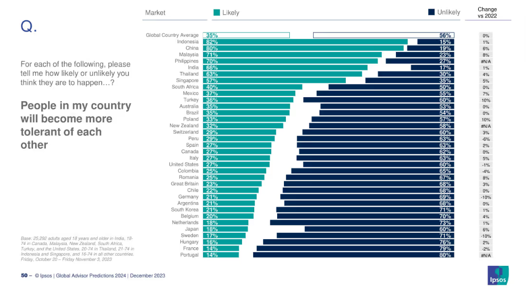
Horizontal bar chart with country-level Likely/Unlikely responses; includes delta vs. 2022 where applicable.
Strategic Planning
Education & Training
This slide measures optimism regarding increased tolerance. Indonesia (82%) is most optimistic, while France and Portugal (14%) are least. The global average is 35%. It explores shifts in social cohesion, polarization, and cultural attitudes.
tolerance, social cohesion, diversity, public opinion, 2024, Ipsos, polarization, inclusivity, societal change, perception
Mixed Chart
IPSOS
Saved
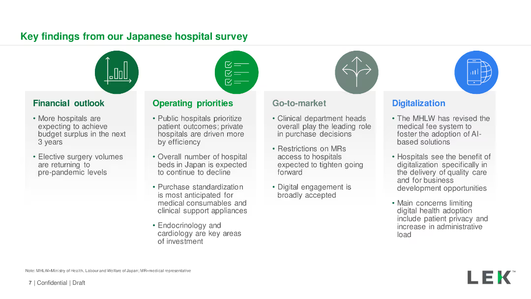
Icons and text boxes summarizing key survey findings in four categories: Financial outlook, Operating priorities, Go-to-market, Digitalization.
Market Analysis and Trends
Healthcare & Pharmaceuticals
Summary of key insights from the Japanese hospital survey, covering financial outlook, operating priorities, market strategies, and digitalization efforts.
Key Findings, Hospital Survey, Japan, Digitalization, Financial Outlook
Pillar
LEK
Saved
Column chart comparing difficulties in paying bills or accessing essentials during COVID-19, between May 2020 and December 2020.
Financial Performance
Financial Services
Highlights the challenges faced by households in paying bills and accessing essentials during the COVID-19 pandemic.
financial difficulties, COVID-19, bills, essentials, household challenges
Single Chart
IPSOS
Saved
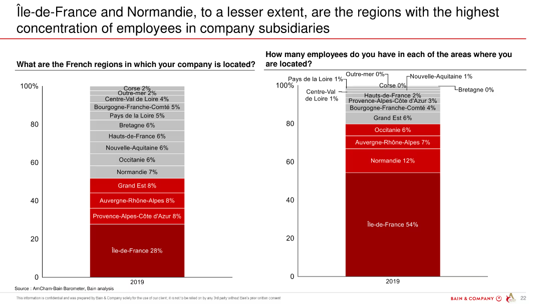
Two column charts showing the distribution of company locations and employee concentrations across various regions in France.
Market Analysis and Trends
Professional Services
The slide presents data on the concentration of employees in company subsidiaries in different French regions, highlighting Île-de-France and Normandie.
Île-de-France, Normandie, employee concentration, company subsidiaries, regions, France
Multiple Chart
Bain
Saved
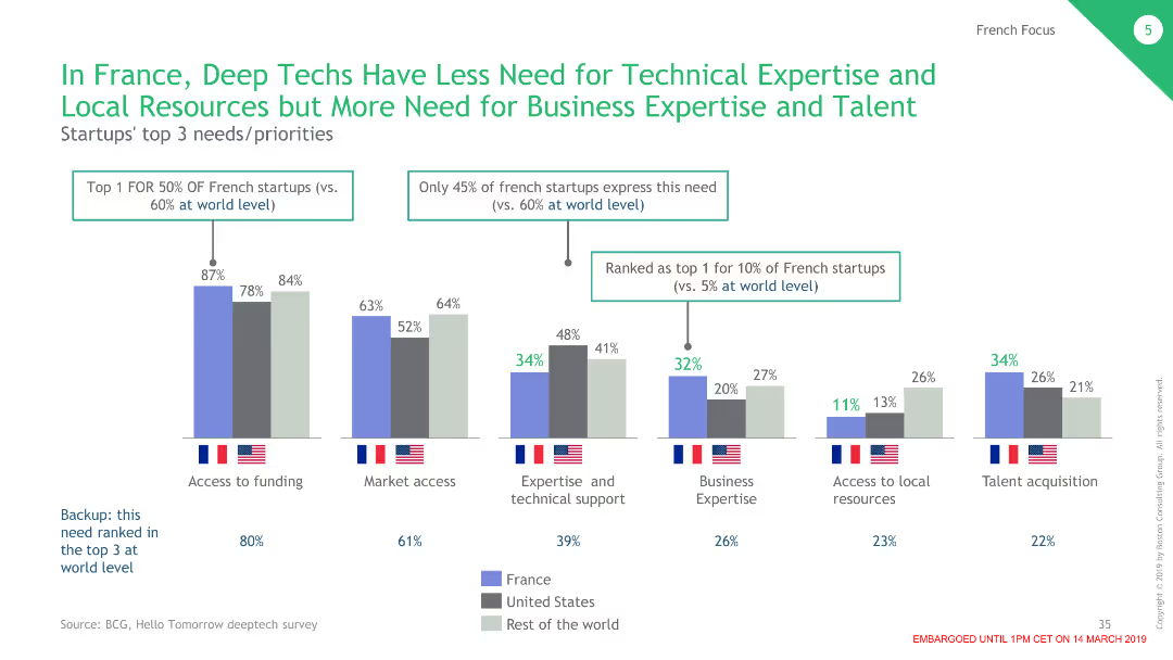
This slide includes multiple column charts comparing the needs and priorities of deep tech startups in France, the USA, and the RoW.
Operational Efficiency
Professional Services
Examines the varied needs and priorities of deep tech startups in different regions, emphasizing business expertise and local resources.
deep tech, startups, needs, priorities, France
Single Chart
BCG
Saved
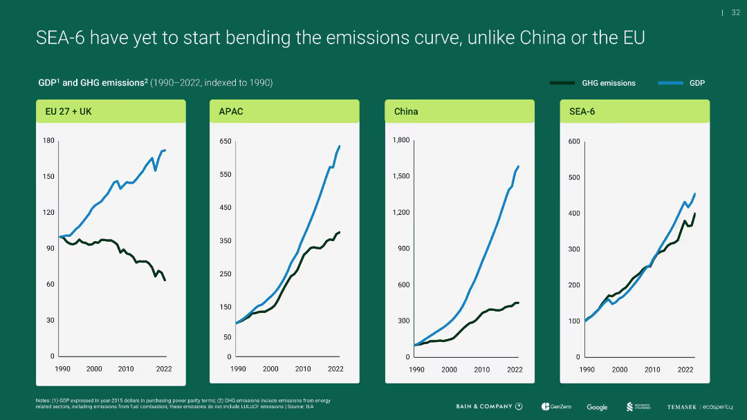
Four-panel line chart showing GDP vs. GHG emissions indexed to 1990 for EU+UK, APAC, China, and SEA-6
Performance Metrics and KPIs
Environmental Services & Sustainability
Compares emissions and economic growth over time, revealing that unlike the EU, SEA-6 and others (like APAC, China) have not decoupled emissions from GDP growth, highlighting a challenge for sustainable development.
emissions curve, GDP, SEA-6, APAC, EU, China
Multiple Chart
Bain
Saved
This slide shows a column chart assessing public opinion on reforms implemented during President Macron's second term, with detailed quotes from business leaders on the reforms' impacts.
Market Analysis and Trends
Government & Public Sector
Evaluates public and corporate opinions on various reforms implemented by President Macron, focusing on economic and social impacts, with diverse viewpoints from industry leaders.
Macron, political reforms, public opinion, France, government policy, corporate opinion, social impact, economic reforms, leadership evaluation
Mixed Chart
Bain
Saved
The slide is text-centric with a table format highlighting stages of the software development life cycle (SDLC) and corresponding technologies. Each technology is paired with a real-world company example, and the layout is direct with a clear delineation of information, utilizing minimal design elements for clarity.
Technology and Digital Transformation
Technology & Software
Highlighting successful industry applications of next-gen software development tools, this slide gives examples of companies like Decathlon and Atlassian leveraging technologies such as infrastructure-as-code and AI-based reviews. It serves as a practical insight into how these tools are applied in business contexts.
SDLC, Case Studies, Software Development, Infrastructure-as-Code, AI, Atlassian, Decathlon
Header Vertical
McKinsey
Saved
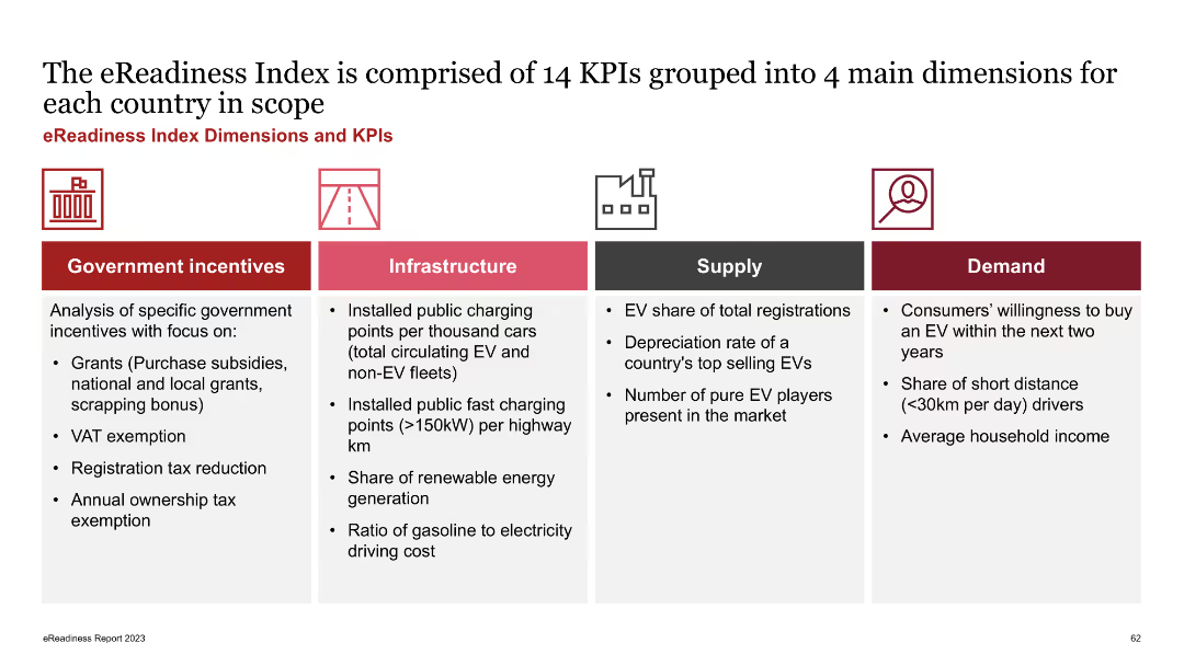
The slide is divided into four columns representing government incentives, infrastructure, supply, and demand, each listing relevant KPIs. Icons and brief descriptions accompany each category.
Strategic Planning
Transportation & Logistics
The slide outlines the key performance indicators (KPIs) used to measure eReadiness across various dimensions, including government incentives, infrastructure, supply, and demand. It aims to provide a comprehensive framework for evaluating EV market readiness.
eReadiness, KPIs, government incentives, infrastructure, supply, demand
Pillar
PwC/Strategy&
Saved
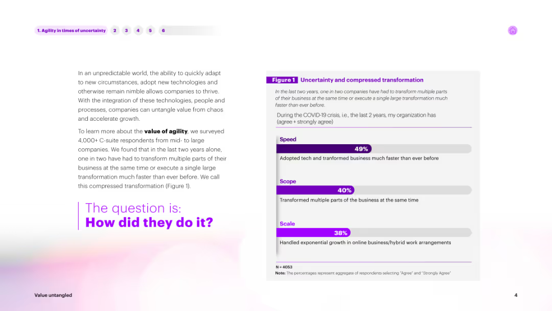
The slide includes a combination of text and a horizontal bar chart titled "Uncertainty and compressed transformation." The bars are in shades of purple, showing percentages for Speed, Scope, and Scale.
Operational Efficiency
Technology & Software
Discusses the importance of agility in an unpredictable world. Provides survey results from C-suite respondents about the value of agility, showing how companies adapted technology and transformed multiple business parts faster during COVID-19.
agility, uncertainty, transformation, survey, speed
Mixed Chart
Accenture
Saved
Slide includes column charts comparing cost-income ratios and efficiency savings across various business units.
Competitive Landscape
Financial Services
Compares financial efficiency across different sectors of the business from 2021 to 2026.
CIR, efficiency, 2026, comparison, sectors
Multiple Chart
Barclays
Saved
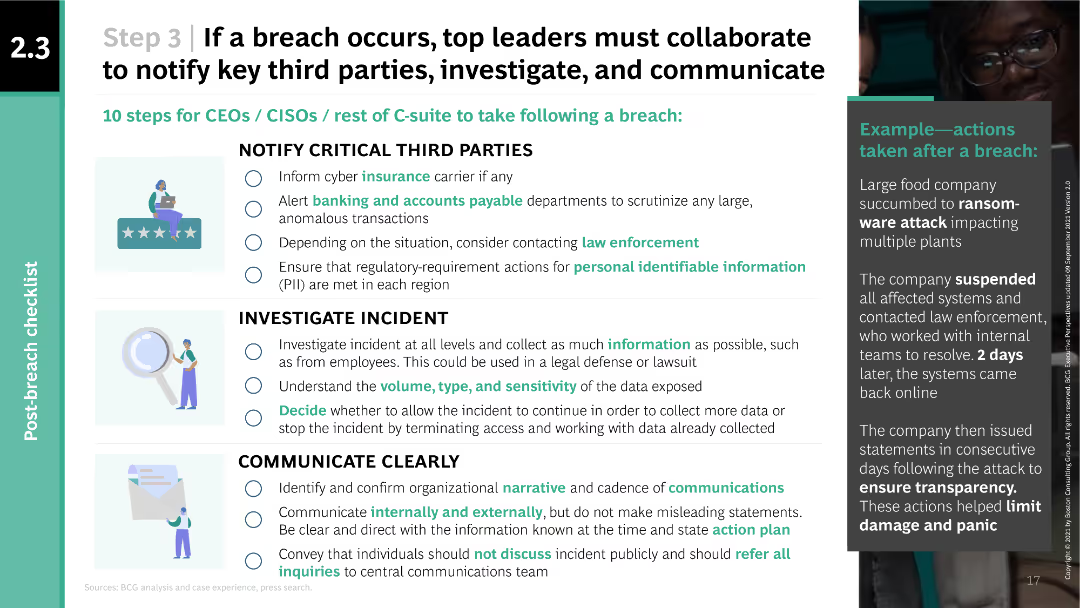
The slide uses a multi-column layout with checkboxes and icons to present a checklist of 10 steps for CEOs, CISOs, and C-suite to take following a breach. It includes an example of actions taken after a ransomware attack in a sidebar.
Risk Assessment and Management
Technology & Software
The slide provides a checklist for senior leaders to follow in the event of a cyber breach, including notifying third parties, investigating the incident, and communicating clearly. An example of a real breach response is also provided to illustrate practical application.
breach, notification, investigation, communication, example
Vertical Flow
BCG
Saved
Features bar charts displaying the percentage of electronification across various FICC asset classes from 2016 to 2020, with key observations on market trends.
Market Analysis and Trends
Financial Services
Provides insights into the electronification trends in FICC products, highlighting different asset class adaptations and market responses.
FICC, electronification, asset classes, market trends
Multiple Chart
JP Morgan
Saved
Block diagrams outline steps to create a resilient and agile organization, using a dual-tone color scheme for clarity.
Operational Efficiency
Professional Services
Details a five-step process to enhance organizational design for resilience and agility, preparing for the new reality with rapid assessment and implementation strategies.
Organizational design, Resilience, Agility, Productivity, Cost efficiency
Linear Flow
BCG
Saved
A line chart shows the CAC versus CO2 emissions from electricity generation by 2030 for various countries, comparing costs for grid, grid + wind, grid + solar, and blue hydrogen CAC setups.
Market Analysis and Trends
Energy & Utilities
The slide evaluates the cost-effectiveness of hydrogen from grid-powered electrolyzers for reducing emissions, noting the carbon footprint threshold for competitive cost.
CO2 emissions, CAC, grid, wind, solar, hydrogen, electrolyzer, cost-effectiveness
Mixed Chart
Kearney
Saved
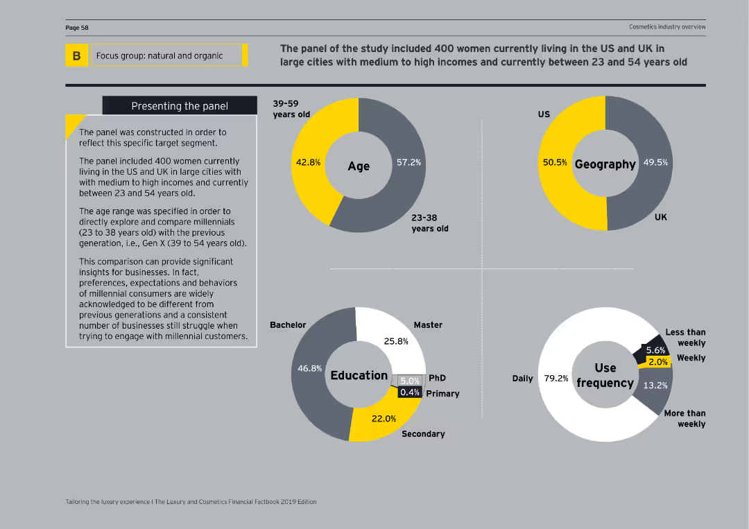
The slide includes circular diagrams representing age, geography, education, and use frequency of a focus group panel. Key statistics are visually highlighted.
Customer and Market Segmentation
Consumer Goods
This slide presents the demographic breakdown of a focus group studying natural and organic product preferences, detailing age groups, geographical distribution, and usage frequency.
demographics, focus group, natural products, age, geography
Multiple Chart
EY
Saved
Combines textual content with icons that highlight different aspects of asset management. The visual elements are arranged for easy reading, focusing on client outcomes and strategic growth areas.
Client Case Studies
Financial Services
Explains the asset management wing's strategies for ensuring strong client outcomes and sustainable growth, supported by high retention and investment rates.
client retention, asset management, investment performance, client centric, digital growth, global expansion
Pillar
JP Morgan
Saved
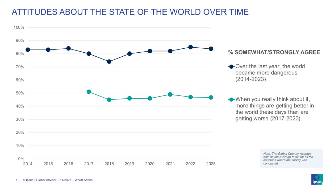
Line graph showing two trendlines over time (2014–2023): one for belief the world is more dangerous, and another for belief that more things are getting better.
Market Analysis and Trends
Media & Entertainment
The slide tracks global attitudes toward danger and optimism over nearly a decade, showing consistent concern about safety and a more fluctuating view on global progress.
world views, optimism, danger, global trends, perceptions, time-series, sentiment
Single Chart
IPSOS
Saved
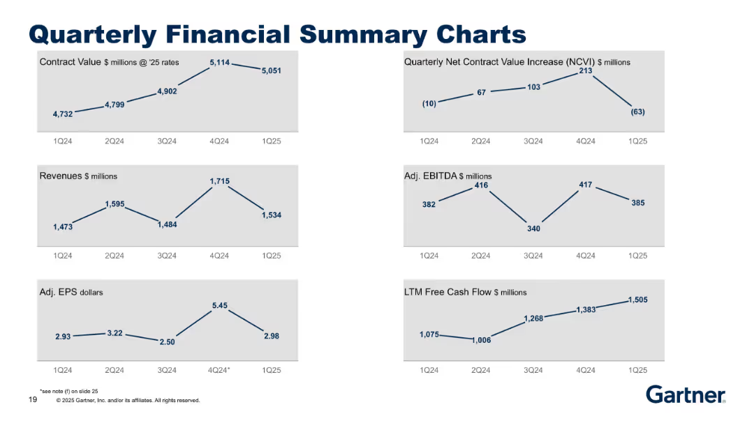
Grid of six line charts with a clean, minimalist design on a grey background, each showing quarterly data trends (1Q24–1Q25). Title is bold and centered at the top.
Financial Performance
Technology & Software
Presents Gartner's financial performance across six metrics: Contract Value, NCVI, Revenues, Adjusted EBITDA, Adjusted EPS, and LTM Free Cash Flow. Displays quarter-over-quarter trends to highlight financial health and changes in momentum.
EBITDA, revenue, earnings, contract value, cash flow, financial trends
Multiple Chart
Gartner
Saved
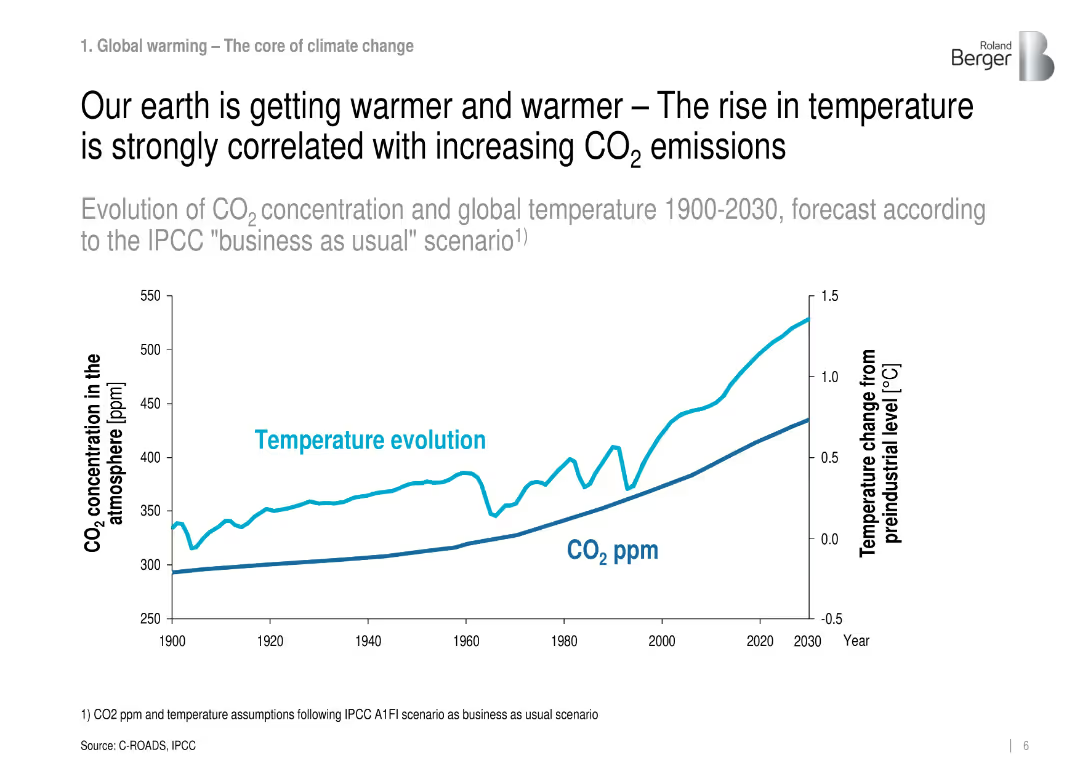
Line graph showing CO₂ concentration and temperature evolution from 1900 to 2030.
Regulatory and Compliance
Environmental Services & Sustainability
Demonstrates the strong correlation between rising CO₂ levels and temperature increases using historical and forecasted data under the IPCC scenario.
CO₂ emissions, global warming, IPCC, temperature, climate change
Single Chart
Roland Berger
Saved
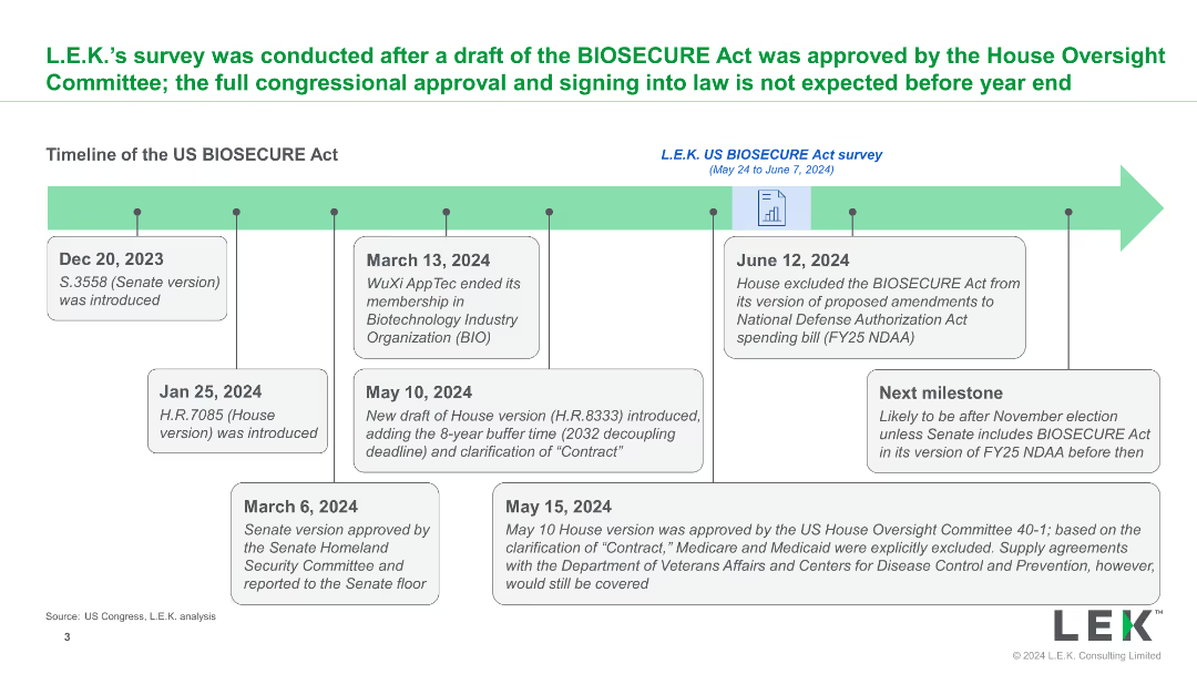
A timeline illustrating key dates and milestones in the development of the US BIOSECURE Act, with descriptive text boxes explaining each step and future projections.
Strategic Planning
Healthcare & Pharmaceuticals
The slide provides a detailed timeline of the US BIOSECURE Act, from its introduction to expected future steps, outlining significant legislative milestones and impacts.
BIOSECURE Act, timeline, legislation, milestones, U.S.
Linear Flow
LEK
Saved
Previous
Next
If nothing, comes up, please save your slides first
Create a FREE account to continue browsing
Receive Instant Access to 1,000+ slides from companies like McKinsey, Google, and Goldman Sachs
First Name
Last Name
Email
Password
I agree to all
Terms & Privacy Policy
Thank you! Your submission has been received!
Oops! Something went wrong while submitting the form.
Have an account?
Sign in
Column Chart
Heatmap
Chevron
Org Chart
Infographic
Callouts
Timeline
List
Graphic
Picture
Process Flow
Diagram
Paragraph
Map
Table
Framework
Subtitle
Takeaway Box
Icon
Other Chart
Radar Chart
Waterfall Chart
Mekko Chart
Pie Chart
Scatter Plot
Line Chart
Bar chart
Bullet points