Create a FREE Account
Instant access to 1,000+ real slides from top companies like McKinsey, BCG, Goldman Sachs, Google and many more!
First Name
Last Name
Email
Password
I agree to all
Terms & Privacy Policy
Thank you! Your submission has been received!
Oops! Something went wrong while submitting the form.
Have an account?
Sign in
Library
Templates
Courses
Pricing
My Account
My Slides
My Templates
✦ AI
AI Prompt Library
AI Search
Sign in
Start Here
Logout
My Saved Slides
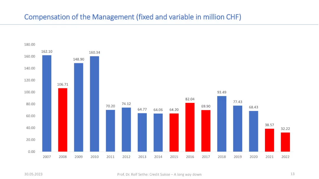
Bar chart showing annual compensation in CHF from 2007–2022; red for low/declining years, blue for higher periods.
Human Resources and Talent Management
Financial Services
This slide visualizes executive compensation trends at Credit Suisse, indicating inconsistent pay relative to performance. Years with high payouts often preceded financial losses, suggesting misalignment of incentives and shareholder value.
compensation, Credit Suisse, management, executive pay, financial alignment, HR, remuneration, performance gap
Single Chart
Credit Suisse
Saved
Horizontal bar graph showing % concerned by country; countries sorted top to bottom; past year comparison included.
Market Analysis and Trends
Environmental Services & Sustainability
Reveals national concern levels about climate change impacts already occurring. Philippines, South Africa, and Indonesia rank highest in concern, while Switzerland and Sweden show lower levels.
public concern, domestic climate effects, country ranking, Ipsos, perception tracking, environmental anxiety
Mixed Chart
IPSOS
Saved
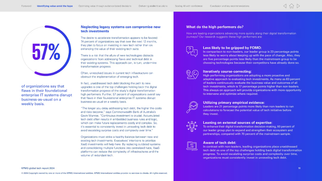
Two-column layout; left side presents text and a circular percentage visualization; right side uses an icon-text list with gradient background.
Operational Efficiency
Technology & Software
Emphasizes the risks of not addressing legacy IT systems, which disrupt operations. Explains that 57% report foundational IT flaws affect weekly operations. Right column identifies strategies high performers use—proactive evaluation, empirical data use, tech debt awareness.
Legacy systems, tech debt, operational disruption, proactive tech investment, digital transformation strategy, empirical evaluation, high performers
Mixed Chart
KPMG
Saved
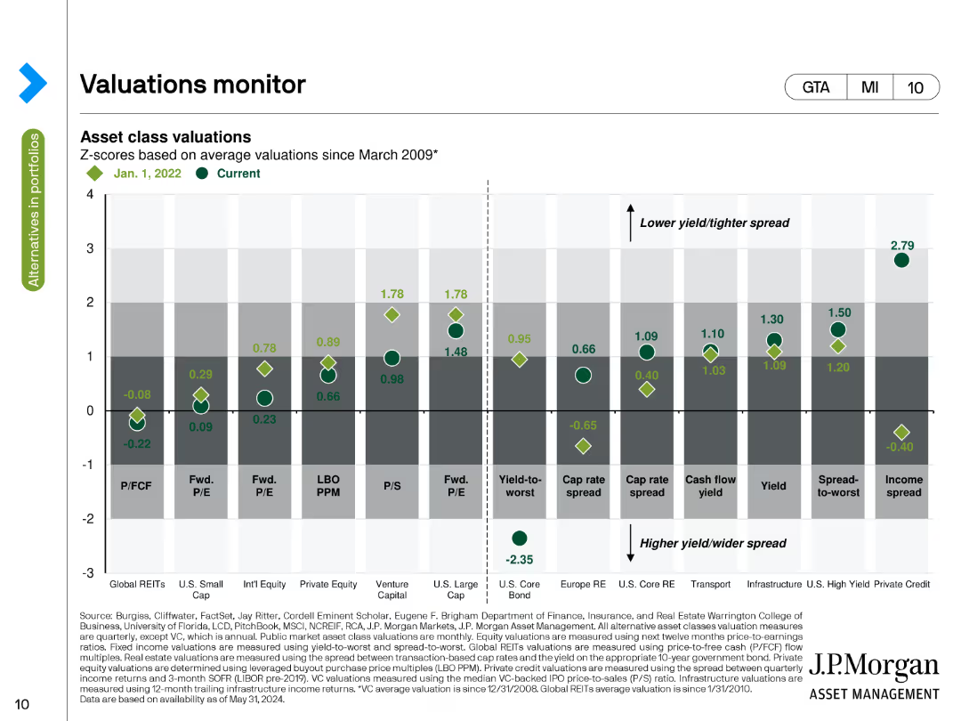
The slide includes a bar chart comparing asset class valuations using Z-scores based on average valuations since March 2009. The chart uses green and grey tones to depict current and past valuations across various asset categories.
Risk Assessment and Management
Financial Services
This slide monitors asset class valuations through Z-scores, comparing current values with historical averages since March 2009. It helps assess the relative attractiveness or risk of different asset classes.
Valuations, Z-scores, Asset Classes, Historical Average, Risk
Single Chart
JP Morgan
Saved
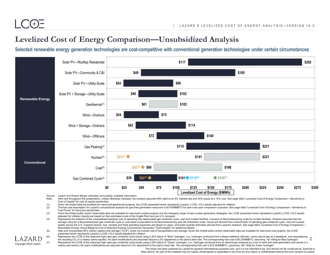
Features a comparative bar chart displaying the levelized cost of energy (LCOE) for various renewable and conventional energy sources. The chart includes both current and projected costs, highlighting the competitiveness of different technologies.
Market Analysis and Trends
Energy & Utilities
Provides an analysis of the levelized cost of energy for various renewable and conventional energy sources. Highlights the cost competitiveness and market potential of different energy generation technologies under specific conditions.
Energy, LCOE, Renewable, Conventional, Comparison
Single Chart
Roland Berger
Saved
The slide has three blue rectangular boxes with financial target metrics like ROE/ROTE, Efficiency Ratio, and CET1 Ratio, featuring percentage values.
Financial Performance
Financial Services
This slide presents Goldman Sachs' financial targets, highlighting ROE/ROTE, Efficiency Ratio, and CET1 Ratio as measures of their commitment to generating returns.
Goldman Sachs, ROE, ROTE, Efficiency, CET1 Ratio, Financial Targets, Value Driving, Business Growth
Table
Goldman Sachs
Saved
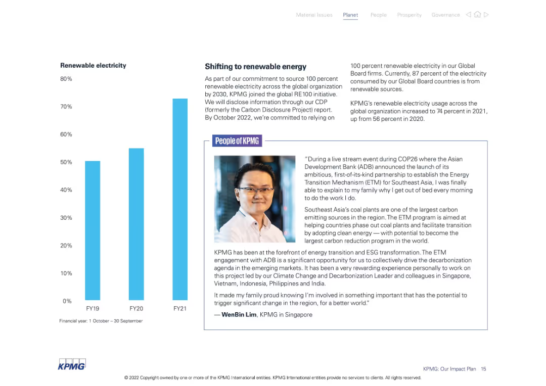
Dual-section layout with a bar chart on the left showing growth in renewable electricity usage (FY19–FY21) and a testimonial on the right. Visuals use clean white and blue tones.
Operational Efficiency
Environmental Services & Sustainability
Illustrates KPMG’s shift toward renewable electricity with a steady increase from 56% in 2020 to 74% in 2021. Also includes a personal account from a team member about the impact of ESG initiatives in Southeast Asia.
renewable electricity, ESG, sustainability, KPMG, energy transition, FY21, Southeast Asia
Mixed Chart
KPMG
Saved
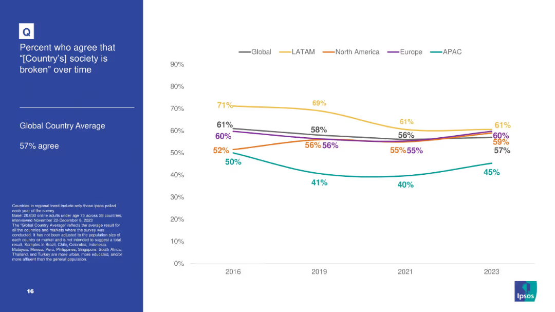
White background line chart showing agreement over time that society is broken by world region; blue info box on left.
Market Analysis and Trends
Government & Public Sector
Regional view of dissatisfaction with societal conditions, comparing LATAM, North America, Europe, and APAC regions; LATAM consistently shows higher agreement levels.
regional perception, societal issues, dissatisfaction, Ipsos, public opinion, trend
Mixed Chart
IPSOS
Saved
Diagram illustrating various touch points in the human-machine relationship, including technological inequality, social media, future of work, biotechnology, and AI.
Technology and Digital Transformation
Technology & Software
The slide explores the complex interactions between humans and machines, emphasizing the need for society to adapt and shape technological advancements. It covers topics such as technological inequality, social media impact, future work scenarios, biotechnology, and AI integration.
Human-Machine Interaction, Technological Inequality, AI
Diagram
Roland Berger
Saved
Comprises column chart and textual content for financial data presentation.
Financial Performance
Financial Services
Detailed financial results of FICC and equities, along with net revenues, expenses, and earnings.
Global, Markets, FICC, Equities, Financial, Revenue, Bar Charts, Operating, Earnings, Equity, Analysis
Mixed Chart
Goldman Sachs
Saved
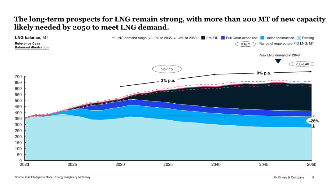
Area chart depicting LNG supply and demand balance from 2020 to 2050, including existing and future capacities (e.g., under construction, pre-FID). A demand range is overlaid.
Strategic Planning
Energy & Utilities
This slide forecasts LNG demand and required capacity growth up to 2050, indicating peak demand in 2046. It highlights the gap to be filled by new (pre-FID) projects and shows growth rates and investment needs.
LNG demand, capacity planning, energy forecast, gas supply, energy strategy, infrastructure, FID
Single Chart
McKinsey
Saved
The slide features a multi-line chart tracking sustainability-related search trends across various countries. Each country's line is color-coded, with indexed search numbers provided. The design is straightforward and clear, focusing on the graphical representation of data.
Market Analysis and Trends
Environmental Services & Sustainability
It highlights the increasing consumer interest in sustainability within the SEA region, as evidenced by search trends. This slide is particularly useful for presentations targeting market analysis and consumer behavior trends related to sustainability.
sustainability, consumer trends, SEA, search trends, market analysis, behavior
Multiple Chart
Bain
Saved
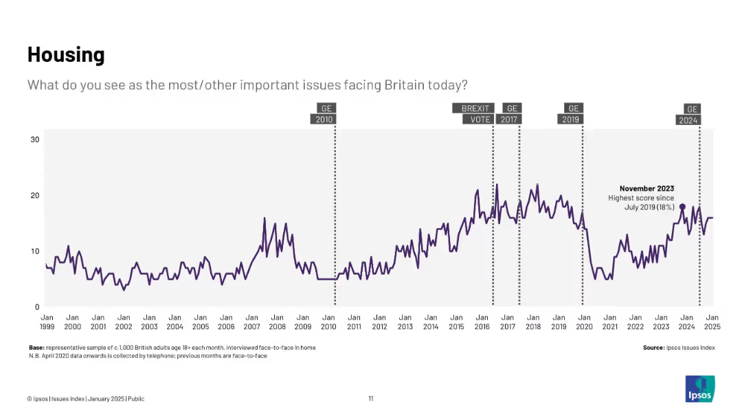
Longitudinal line graph from 1999–2025 with markers for political events (e.g., Brexit, general elections); one peak noted in Nov 2023 at 18%.
Market Analysis and Trends
Real Estate & Construction
Tracks public concern over housing issues across two decades, peaking during various political and economic shifts, with a notable spike in late 2023.
housing, affordability, UK, issues index, public opinion, trends, Brexit, elections
Single Chart
IPSOS
Saved
Bar charts showing transportation mode usage for work/study and non-work/non-study travel
Market Analysis and Trends
Transportation & Logistics
Discusses the increase in the use of personal cars for travel, comparing modes of transportation usage
Personal cars, transportation, travel, work, survey
Multiple Chart
EY
Saved
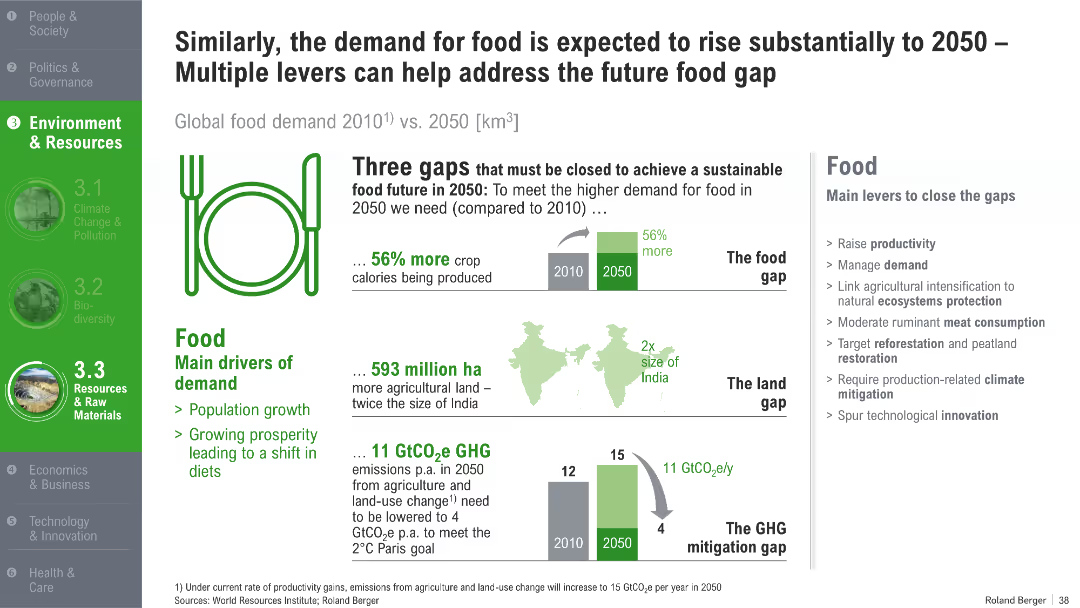
Illustrated diagrams of food, land, and GHG gaps with bars, maps, and infographics; levers listed in sidebar
Strategic Planning
Agriculture & Food Production
The slide details three critical gaps in food, land, and emissions that must be addressed by 2050 to meet rising global food demand. It proposes various mitigation levers such as productivity improvements, dietary shifts, and technological innovation.
food demand, land use, GHG emissions, 2050, food gap, sustainable agriculture, mitigation
Mixed Chart
Roland Berger
Saved
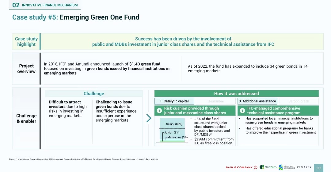
Structured case layout with challenges on the left, solutions on the right, and a fund composition pie chart in center. Color-coded risk mitigation methods.
Investment Analysis
Financial Services
Details the 2018 launch of a $1.4B green bond fund by IFC and Amundi targeting emerging markets. The case focuses on using junior and mezzanine shares to de-risk investments and outlines how technical assistance has enabled local institutions to issue green bonds. Describes the expanded reach of the fund and the IFC’s educational support programs.
green bonds, IFC, Amundi, emerging markets, junior equity, catalytic capital, technical assistance, risk cushion
Mixed Chart
Bain
Saved
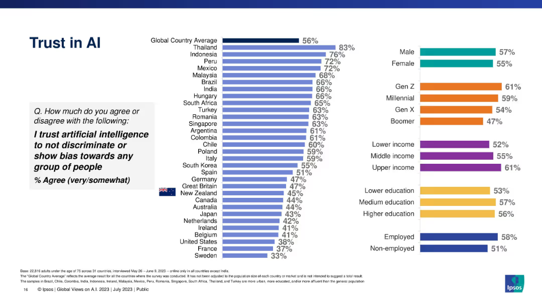
Bar chart comparing country and demographic trust levels in AI being unbiased.
Risk Assessment and Management
Artificial Intelligence
Shows percentage of respondents who trust AI not to discriminate. Data segmented by countries and demographics with a global average baseline.
trust, discrimination, bias, AI ethics, global survey, demographic trust, Ipsos
Multiple Chart
IPSOS
Saved
Depicts a central graphic with concentric circles detailing governance, strategy, risk management, and targets, accompanied by side text and logos.
Regulatory and Compliance
Industrial & Manufacturing
Discusses how Michelin adheres to the Task Force on Climate-Related Financial Disclosures (TCFD) with a focus on governance, strategy, risk management, and targets related to climate initiatives.
TCFD, Michelin, Climate Change, Financial Disclosures, Risk Management, Strategy, Governance, Environmental Targets, Corporate Responsibility, Sustainability
Framework
Morgan Stanley
Saved
The slide displays two column charts with varying backgrounds, showing survey responses by country.
Technology and Digital Transformation
Professional Services
This slide illustrates the principle of removing backgrounds to improve the clarity of data presentations in charts, following Tufte's guidelines.
Tufte, data-to-ink, ratio, survey, responses, visualization, backgrounds, chart, clarity, design
Multiple Chart
EY
Saved
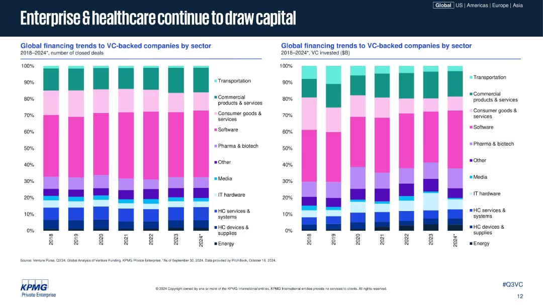
Dual stacked bar charts showing sector-wise deal and investment share, 2018–2024; sectors color-coded; consistent design with prior slides; right chart shows VC $ volume.
Market Analysis and Trends
Healthcare & Pharmaceuticals
This slide breaks down VC deal and investment volume share by industry sectors globally. Enterprise software and healthcare (pharma, biotech, HC services) remain top draws, while sectors like consumer goods and media have more modest shares. The data highlights consistent sector strength.
sector analysis, VC sectors, software, healthcare, biotech, venture funding, investment trends, 2024, sector allocation, KPMG
Multiple Chart
KPMG
Saved
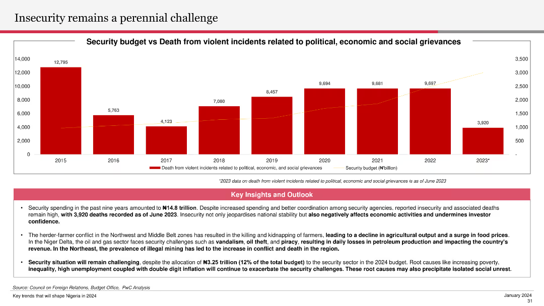
The slide features a column chart showing the security budget versus deaths from violent incidents from 2015 to 2023. Key insights and outlooks below the chart discuss the impact of insecurity on economic activities and investor confidence.
Risk Assessment and Management
Government & Public Sector
The slide highlights the ongoing security challenges and their economic implications, detailing the trend in security budgets and related deaths. It emphasizes the importance of addressing security issues to improve investor confidence and economic stability.
insecurity, security budget, violent incidents, economic impact, investor confidence
Mixed Chart
PwC/Strategy&
Saved
Includes column charts with red accents and annotations for EBITA and profitability, along with text explanations and a projection outlook.
Financial Performance
Industrial & Manufacturing
Summarizes the aircraft sector's performance, showing order and revenue trends and EBITA. Outlines expectations related to specific aircraft programs and R&D activities.
aircraft, EBITA, profitability, orders, revenue trends, R&D activities, EFA Kuwait, M-345/M-346, Tempest
Multiple Chart
Goldman Sachs
Saved
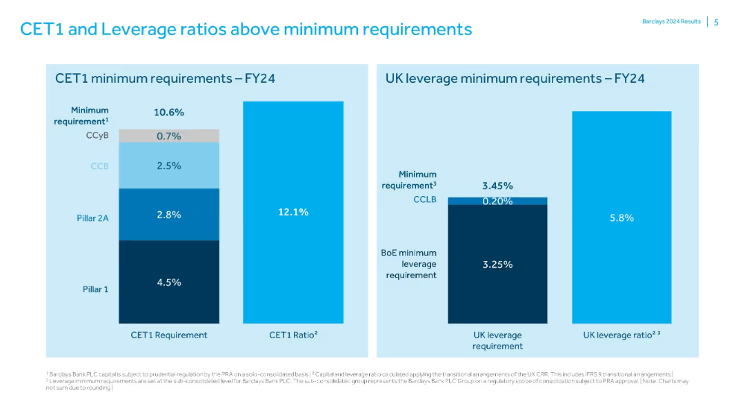
Two bar charts comparing Barclays' capital ratios to regulatory minimums; simple labeled format.
Risk Assessment and Management
Financial Services
Shows that Barclays exceeds FY24 minimum CET1 (10.6%) and UK leverage (3.45%) requirements with actual ratios of 12.1% and 5.8% respectively. Charts break down the components of regulatory minimums and the capital buffers in place.
CET1, leverage, regulatory capital, Barclays, risk management, capital ratio
Single Chart
Barclays
Saved
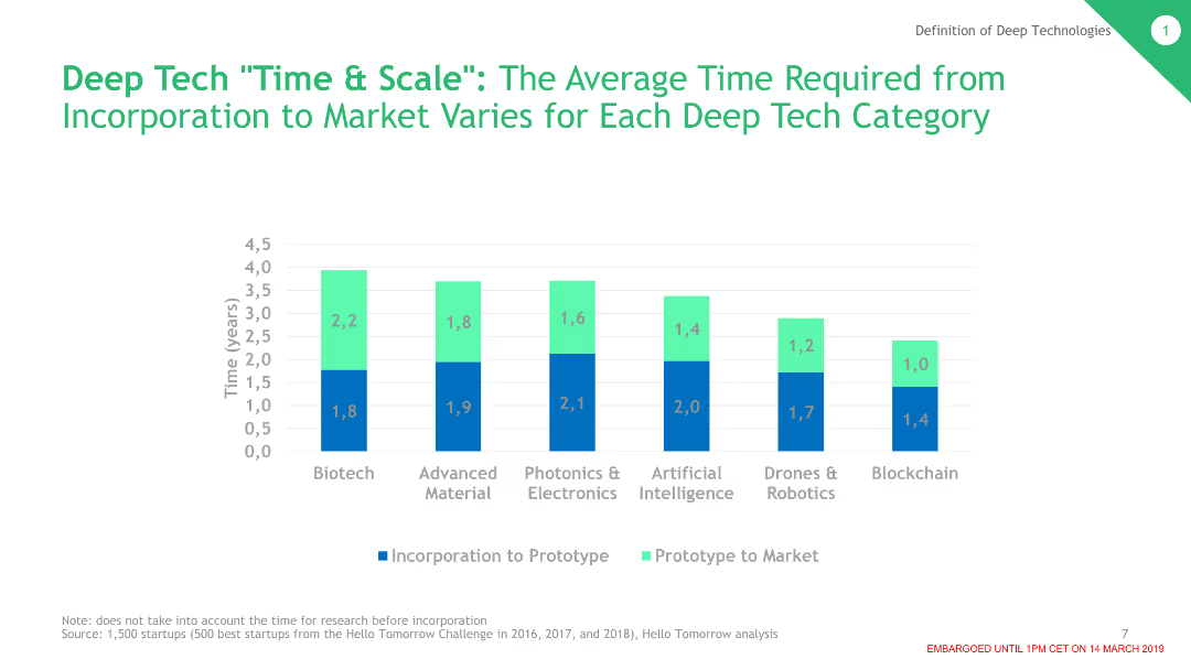
The slide contains a column chart showing the average time required from incorporation to market for various deep tech categories. Each category is represented with different colored columns indicating the stages from incorporation to prototype to market.
Technology and Digital Transformation
Technology & Software
This slide presents data on the time needed for different deep tech categories to go from incorporation to market. Categories include Biotech, Advanced Material, Photonics & Electronics, AI, Drones & Robotics, and Blockchain.
Deep Tech, Time to Market, Biotech, AI, Robotics, Blockchain
Single Chart
BCG
Saved
A pie chart on the left showing passive and active investors, with a table on the right comparing demographics, income, and financial situation changes between the two groups.
Market Analysis and Trends
Financial Services
It provides demographic and financial comparisons between passive and active investors during the pandemic, showing differences in gender, age, income, and financial situation changes.
demographics, income, financial, active, passive
Mixed Chart
IPSOS
Saved
Previous
Next
If nothing, comes up, please save your slides first
Create a FREE account to continue browsing
Receive Instant Access to 1,000+ slides from companies like McKinsey, Google, and Goldman Sachs
First Name
Last Name
Email
Password
I agree to all
Terms & Privacy Policy
Thank you! Your submission has been received!
Oops! Something went wrong while submitting the form.
Have an account?
Sign in
Column Chart
Heatmap
Chevron
Org Chart
Infographic
Callouts
Timeline
List
Graphic
Picture
Process Flow
Diagram
Paragraph
Map
Table
Framework
Subtitle
Takeaway Box
Icon
Other Chart
Radar Chart
Waterfall Chart
Mekko Chart
Pie Chart
Scatter Plot
Line Chart
Bar chart
Bullet points