My Account
My Slides
Search by Category
Companies
Slide Type
Use Case
Industry
Pricing
Templates
View All Templates
Download Template Slides
✦ AI
AI Prompt Library
AI Search
Feedback
Login
Logout
Get Started
Browse all Slides
Browse all Slides
Create a FREE Account
Instant access to 1,000+ real slides from top companies like McKinsey, BCG, Goldman Sachs, Google and many more!
First Name
Last Name
Email
Password
I agree to all
Terms & Privacy Policy
Thank you! Your submission has been received!
Oops! Something went wrong while submitting the form.
Have an account?
Sign in
Saved Slides
Features several bar graphs, a large numeric callout, and additional textual explanations. The slide is data-intensive with a focus on specific metrics.
Market Analysis and Trends
Technology & Software
Analyzes factors contributing to the increase in the number of online transactions in the SEA ecommerce market, such as internet penetration and consumer sentiment, and the impact on the ecommerce market size.
Online transactions, growth drivers, SEA, ecommerce market, bar graphs
Multiple Chart
Bain
Saved
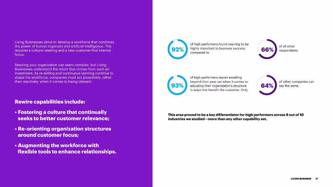
The slide features a purple background on the left and text on the right, with blue circular progress indicators. It discusses the importance of rewiring capabilities for better customer relevance.
Organizational Structure and Change
Government & Public Sector
This slide outlines the rewiring capabilities necessary for businesses to enhance customer relevance, including fostering a customer-focused culture and restructuring organizational frameworks.
rewiring, capabilities, customer relevance, culture, organizational structure
Multiple Chart
Accenture
Saved
This slide displays a bar chart with the major limiting factors to providing antenatal care in primary healthcare centers, such as poor power supply and equipment issues. Each factor is distinctly colored for emphasis.
Risk Assessment and Management
Healthcare & Pharmaceuticals
Identifies critical barriers to healthcare service provision in primary centers, focusing on power supply issues, which is crucial for risk management and service improvement in healthcare.
healthcare barriers, power supply, risk management, PHC limitations, service improvement
Single Chart
BCG
Saved
The slide has a description box, a market trends box, and an overview of technologies. It includes a small diagram showing the comparative size and cost of various storage technologies like PHES, CAES, Li-ion, and compressed H₂.
Strategic Planning
Energy & Utilities
The slide discusses the viability of compressed hydrogen storage in salt caverns for long-term energy storage, highlighting market trends, competing technologies, and economic feasibility.
Hydrogen, Storage, Salt Caverns, Market Trends, Technology
Mixed Chart
Kearney
Saved
The slide features a detailed case study on biomethane production in China, covering the description, process characteristics, global market overview, and drivers/barriers. It includes a column chart showing biomethane demand forecast by continent from 2018 to 2040.
Client Case Studies
Energy & Utilities
This slide provides an in-depth analysis of the biomethane sector in China, detailing the production process, market potential, and the benefits and challenges of developing biomethane as a renewable energy source for power and transport sectors.
biomethane, China, case study, production process, market overview, drivers, barriers, demand forecast
Mixed Chart
Kearney
Saved
This slide features multiple stacked column charts displaying the projected market share of different types of vehicle powertrains globally from 2018 to 2035. The colors differentiate types such as battery electric, plug-in hybrid, and gasoline, showing a trend towards electrification, especially after 2025.
Market Analysis and Trends
Transportation & Logistics
The slide presents data on the evolution of the vehicle powertrain market share over time, with a focus on the increasing role of electrified vehicles. It is useful for discussing the future of automotive industry trends, particularly electrification and its regulatory, technological, and market drivers.
electrification, market trends, vehicle powertrains, forecast, automotive industry
Single Chart
BCG
Saved
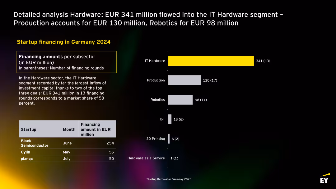
Layout with yellow-highlighted leading sector (IT Hardware), bar chart on right, and top startup table at bottom-left.
Investment Analysis
Technology & Software
The slide dissects hardware segment funding in 2024, led by IT Hardware (EUR 341M). It highlights significant investments into Black Semiconductor and others. Production and Robotics also secured notable shares.
IT hardware, robotics, production, startups, Germany, capital inflow, 2024, venture
Mixed Chart
EY
Saved
Features bar charts showing the potential production costs for battery cells and packs in various global locations, detailing cost differences and advantages in specific regions.
Financial Performance
Financial Services
Provides a comparative cost analysis for battery cell manufacturing and pack assembly, showing how Australia could be competitive globally, especially post-incentive adjustments in the US.
battery manufacturing, cost analysis, global competition, Australia
Multiple Chart
Accenture
Saved
Two content sections for different green finance initiatives. Logos of OCBC and Standard Chartered.
Financial Performance
Financial Services
Discusses green finance achievements such as a significant trade finance facility and a sustainability-linked loan. Used for financial strategy communication related to sustainability efforts.
green finance, sustainability, trade finance, loan, decarbonization, banking
Header Horizontal
Morgan Stanley
Saved
The slide includes a column chart on the left showing the number of Earths required to meet ecological demand sustainably, and a bar chart on the right showing US sales growth.
Market Analysis and Trends
Environmental Services & Sustainability
It highlights the sustainability concerns by showing the ecological footprint and the growth rate of US sales for products with and without ESG claims.
ecological footprint, sustainability, ESG, sales growth, US market, consumer concerns, environmental impact, resource consumption, J.P. Morgan, global footprint
Multiple Chart
JP Morgan
Saved
Slide with a dark background and a bold blue abstract shape, organized into sections describing benefits across financial and organizational metrics.
Operational Efficiency
Professional Services
Describes the expected benefits of successful transformations, including financial performance and organizational health. Useful for presentations to stakeholders or during strategic planning.
transformation, outcomes, financial performance, organizational health, strategy, professional services, benefits
Pillar
McKinsey
Saved
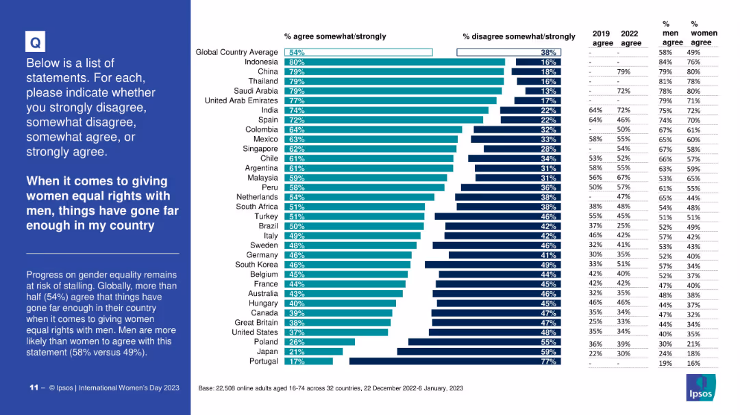
Country bar chart showing agreement levels; includes gender splits and comparison to previous years.
Human Resources and Talent Management
Government & Public Sector
Highlights where public opinion sees the gender equality debate as complete or excessive, indicating a plateau or pushback in perceived progress.
gender rights, equality plateau, public opinion, country comparison, male vs female views, Ipsos
Mixed Chart
IPSOS
Saved
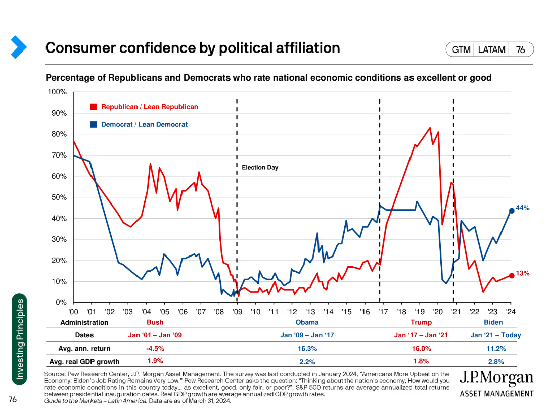
Line chart comparing the percentage of Republicans and Democrats rating national economic conditions as excellent or good. The chart spans multiple administrations.
Market Analysis and Trends
Financial Services
This slide shows the fluctuation in consumer confidence among political affiliations across different U.S. presidential administrations. It uses data to indicate partisan perspectives.
consumer confidence, political affiliation, economic conditions, administration, trend analysis
Single Chart
JP Morgan
Saved
The slide combines a column chart with an upward trend for three quarters, an accompanying high-quality image of a car, and bullet points outlining key facts about the company's offer in lighting. The visual focus is balanced between the chart and the image, with both elements prominently displayed against a clean white background. The text is concise, using bold fonts for emphasis.
Product and Service Analysis
Industrial & Manufacturing
This slide highlights the company's significant order book in lighting, emphasizing orders from major automotive OEMs and production across regions. It discusses new orders and projects future revenue targets. This visual and textual combination effectively conveys the company's capabilities in lighting and its market relevance, likely aimed at investors or partners.
Lighting, Order Book, OEMs, Production, Growth, Revenue Targets, Column Chart, Automotive, Market Relevance, Forecast
Mixed Chart
Goldman Sachs
Saved
Slide with bulleted lists and a table presenting inflation performance data. The table includes comparative inflation figures from 2009-2019 and quarterly figures from 4Q20 to 4Q22 across different regions.
Financial Performance
Financial Services
Discusses JPMorgan's inflation predictions, contrasting short-term demand surge against medium-term fiscal policy effects. The slide is used to inform financial strategies and economic expectations.
JPMorgan, inflation, forecast, financial analysis, core inflation performance, demand, fiscal policy, monetary support, pandemic impact.
Table
JP Morgan
Saved
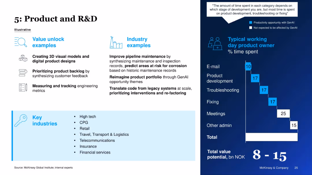
Layout shows value unlock examples and industry relevance on left; right visualizes product owner’s time usage.
Product and Service Analysis
Technology & Software
The slide explains GenAI's potential in product development and R&D, such as creating visual models, prioritizing backlogs, and translating legacy code. A daily activity breakdown for a product owner emphasizes GenAI’s role in development and troubleshooting.
R&D, Product Development, GenAI, Backlog Management, AI in Engineering, Tech Industry, Time Distribution, Innovation
Mixed Chart
McKinsey
Saved
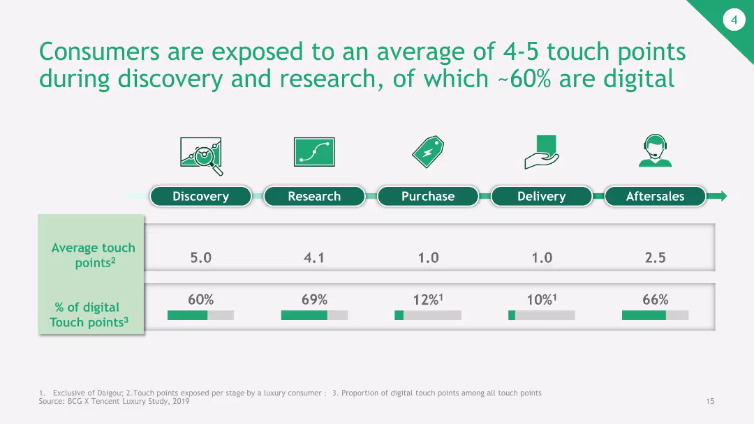
The slide presents a bar chart depicting the average number of touch points during different stages of the consumer journey, with a breakdown of digital touchpoints.
Customer and Market Segmentation
Consumer Goods
This slide shows the average touch points consumers are exposed to during various stages of the buying process, emphasizing the significant role of digital touchpoints.
consumer journey, touch points, digital touchpoints, buying process, average touch points
Single Chart
BCG
Saved
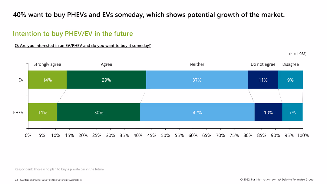
Horizontal bar chart showing consumer intentions to buy PHEV/EVs in the future. A significant portion (40%) expresses interest in purchasing these vehicles.
Market Analysis and Trends
Transportation & Logistics
The slide captures the future purchasing intentions for PHEV/EVs, indicating that 40% of consumers are interested in buying these vehicles someday, reflecting potential market growth.
PHEV, EV, future purchase, consumer intention, market growth
Single Chart
Deloitte
Saved
The slide includes a bar chart showing levels of regret in purchasing crypto assets for 2023 and 2022, with ratings from 1 to 7.
Market Analysis and Trends
Financial Services
This slide illustrates the extent of regret among crypto asset purchasers, comparing responses from 2023 to 2022. It helps in understanding investor sentiment.
Crypto, Regret, Investment, Sentiment, Comparison
Mixed Chart
IPSOS
Saved
Column chart slide showing the average time spent per day on various media, with different colors representing different activities like TV, radio, and internet.
Market Analysis and Trends
Media & Entertainment
Details the average daily media usage, emphasizing the significant amount of time adults spend consuming various forms of media.
media usage, time spent, TV, radio, internet, daily consumption
Single Chart
Nielsen
Saved
Slide contains charts and visual elements that illustrate the enhancement of digital services.
Technology and Digital Transformation
Financial Services
Discusses the role of digital transformation in enhancing service delivery, focusing on customer experience and operational efficiency.
Digital, Services, Enhancement, Technology
Single Chart
Barclays
Saved
This slide includes line charts showing hourly radio reach percentages for weekdays and weekends. Images of people using audio devices are on the left side.
Market Analysis and Trends
Media & Entertainment
The slide illustrates the daily and weekend radio usage patterns, showing peak listening times and how radio reaches consumers throughout the day, especially during commutes.
radio use, daily patterns, line chart, weekday, weekend
Mixed Chart
Nielsen
Saved
Slide with a table and line charts showing non-GAAP P&L figures, revenue, cost of services, contribution, and adjusted EBITDA over four quarters.
Financial Performance
Professional Services
This slide presents Gartner's non-GAAP profit and loss statement, including revenue, costs, and adjusted EBITDA, with accompanying quarterly trends.
Non-GAAP, P&L, revenue, EBITDA, Gartner
Multiple Chart
Gartner
Saved
With accompanying text and a circular chart illustrating marketing data strategy shifts.
Market Analysis and Trends
Technology & Software
Discusses the shift in marketing strategies towards first-party data, emphasizing the competitive advantage and strategic importance in high-growth companies.
marketing, data, strategy, first-party, high-growth, technology, cookies, GDPR, digital, transformation
Mixed Chart
Deloitte
Saved
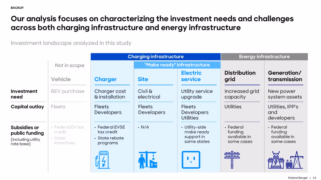
Matrix layout with colored columns for Charging Infrastructure and Energy Infrastructure; uses icons and bullets to outline capital needs and funding roles.
Investment Analysis
Energy & Utilities
The slide outlines the required investments in EV charging and energy infrastructure, distinguishing between charging hardware, site prep, utility upgrades, and grid expansion, with notes on funding sources and stakeholders.
investment, EV charging, grid, infrastructure, utilities, developers, capital, subsidies
Table
Roland Berger
Saved
Previous
Next
If nothing, comes up, please save your slides first
Create a FREE account to continue browsing
Receive Instant Access to 1,000+ slides from companies like McKinsey, Google, and Goldman Sachs
First Name
Last Name
Email
Password
I agree to all
Terms & Privacy Policy
Thank you! Your submission has been received!
Oops! Something went wrong while submitting the form.
Have an account?
Sign in
Column Chart
Heatmap
Chevron
Org Chart
Infographic
Callouts
Timeline
List
Graphic
Picture
Process Flow
Diagram
Paragraph
Map
Table
Framework
Subtitle
Takeaway Box
Icon
Other Chart
Radar Chart
Waterfall Chart
Mekko Chart
Pie Chart
Scatter Plot
Line Chart
Bar chart
Bullet points