Create a FREE Account
Instant access to 1,000+ real slides from top companies like McKinsey, BCG, Goldman Sachs, Google and many more!
First Name
Last Name
Email
Password
I agree to all
Terms & Privacy Policy
Thank you! Your submission has been received!
Oops! Something went wrong while submitting the form.
Have an account?
Sign in
Library
Templates
Courses
Pricing
My Account
My Slides
My Templates
✦ AI
AI Prompt Library
AI Search
Sign in
Start Here
Logout
My Saved Slides
This slide uses multiple data points and small bar charts to summarize IPO activities, proceeds, and sector distributions for the Americas in 2022. The layout is data-heavy but organized clearly.
Market Analysis and Trends
Financial Services
The slide provides an overview of IPO activity in the Americas for 2022, showing a significant decline in the number of IPOs and proceeds compared to 2021. It includes detailed breakdowns by stock exchanges and sectors.
IPO, Americas, stock exchange, proceeds, 2022
Multiple Chart
EY
Saved
Features a bar chart and explanatory text sections divided by headers. The chart and text provide analysis on key performance indicators for tax functions.
Performance Metrics and KPIs
Financial Services
Examines key performance indicators crucial for tax functions in the financial services industry, discussing misalignments in priorities and the need for strategic alignment of tax KPIs with overall business objectives.
tax, KPIs, performance, financial services, bar chart, alignment
Mixed Chart
PwC/Strategy&
Saved
Waterfall bar chart with segment-wise contribution to PBT and net profit; metrics listed on the right.
Financial Performance
Financial Services
Shows a detailed breakdown of UBS's Q3 2024 profit progression including revenues, costs, integration expenses, and tax effects. It also lists reported metrics like EPS, RoCET1, and cost/income ratio to communicate financial health.
net profit, EPS, integration, PBT, cost/income, RoCET1, UBS, Q3 2024
Single Chart
UBS
Saved
Split layout with left-aligned explanation text and bar chart on the right. Colored segments categorize different fund types.
Regulatory and Compliance
Government & Public Sector
This slide explains the funding allocation under the US CHIPS Act, emphasizing that only 5% is directed to legacy chip production. It breaks down how over $52B will be spent, highlighting delays in impact and lack of support for industrial/automotive applications.
CHIPS Act, funding, semiconductor, legacy chips, US policy, advanced technology, subsidies, R&D, timeline, market support
Mixed Chart
Roland Berger
Saved
Two line graphs at the top comparing "Cyclicals vs. Defensives" and "Domestic vs. Global," followed by a detailed table showing performance and fundamentals of sector baskets. The layout is grid-based with clearly labeled rows and columns.
Performance Metrics and KPIs
Financial Services
The slide highlights that cyclicals and domestic stocks have outperformed defensives and global counterparts. The bottom table includes basket names, tickers, beta, P/E ratios, and total return performance across different periods. It also shows non-US sales and earnings/sales growth projections, offering a comprehensive view of the structural and fundamental positioning of sector baskets.
sector baskets, cyclicals, defensives, domestic, global, performance, P/E ratio, sales growth, earnings, total return
Multiple Chart
Goldman Sachs
Saved
Features two column charts. The first chart depicts SACU receipts over four fiscal years. The second shows indirect tax comparisons excluding SACU receipts for three fiscal years.
Financial Performance
Government & Public Sector
Analyzing SACU receipts and indirect tax contributions in Namibia, this slide aids in understanding the impact of regional agreements and indirect taxes on the national budget.
SACU, indirect tax, Namibia, fiscal year, regional agreements, national budget, tax contributions
Multiple Chart
PwC/Strategy&
Saved
A text slide with a table showing the levels of experience in using chatbots, voicebots, and biometrics among respondents.
Strategic Planning
Technology & Software
This slide highlights the adoption levels of new technologies like chatbots, voicebots, and biometrics among respondents.
technology adoption, chatbots, voicebots, biometrics, strategic planning, user experience
Table
Deloitte
Saved
Four numbered sections with text boxes outlining benefits such as brand recognition, resilience, understanding society, and methodological rigor.
Strategic Planning
Professional Services
Explains the benefits of Ipsos' public affairs service line, focusing on brand recognition, resilience to market shocks, understanding of society, and high methodological standards.
Public Affairs, Benefits, Brand Recognition, Society, Resilience
Linear Flow
IPSOS
Saved
The slide contains a spider chart comparing 5G coverage, fixed broadband subscriptions, active mobile broadband subscriptions, ICT goods imports, and international bandwidth per internet user for Indonesia and Asia average. The background is white with text and charts.
Technology and Digital Transformation
Technology & Software
Discusses Indonesia's position in the ICT sector with a focus on mobile-first adoption, cloud infrastructure, digital payments, and IT spending.
Indonesia, 5G, ICT, mobile broadband, digital payments
Mixed Chart
Deloitte
Saved
Vertical bar chart ranking countries by perception of climate leadership; includes past agreement trends; title on left side.
Strategic Planning
Government & Public Sector
Captures public perception of each country’s leadership in climate change action. India, Indonesia, and Malaysia lead in agreement; others trail. Shows shifts in perceived leadership over time.
climate leadership, perception, strategic positioning, Ipsos, country rankings, environment, trend data
Mixed Chart
IPSOS
Saved
Features a maturity score chart across industries like aerospace, high-tech, and automotive, showing levels of resiliency maturity using a horizontal bar graph with a scoring scale.
Risk Assessment and Management
Industrial & Manufacturing
Provides a comparative analysis of resiliency maturity scores by industry, showing variations and benchmarks, and stressing the need for advanced capabilities in handling disruptions.
resiliency, industry analysis, maturity scores, benchmarking, capability advancement, disruption handling, Accenture Research
Mixed Chart
Accenture
Saved
The slide displays a complex vertical column chart tracing the company's profitability over the years, with a timeline of milestones beneath the chart.
Financial Performance
Financial Services
Reviews Macquarie's historical profitability and growth, ideal for investor relations or financial history presentations.
Profitability, Shareholder Return, Growth, Financial History, Milestones
Single Chart
Morgan Stanley
Saved
A line chart comparing 'Goods' (in blue) and 'Services' (in orange) spending by US consumers is presented on this slide. The chart tracks the spending index from December 2019, showing a sharp decline followed by a recovery with fluctuating levels for both categories.
Financial Performance
Technology & Software
This slide shows the impact of the pandemic on US consumer spending, demonstrating changes in the level and composition of expenditures on goods and services. It could be used to analyze consumer behavior during economic shocks and guide business strategy adjustments.
Pandemic, Consumer Spending, US, Goods, Services, Economic Impact, Spending Behavior
Single Chart
JP Morgan
Saved
Horizontal bar chart comparing LCOE for various renewable and conventional energy sources; categorized into two vertical sections with color-coded bars.
Market Analysis and Trends
Energy & Utilities
This slide compares the Levelized Cost of Energy (LCOE) across energy sources, highlighting the cost competitiveness of renewables vs. fossil fuels under typical assumptions.
LCOE, renewable, solar, wind, nuclear, coal, gas, comparison, $/MWh, energy costs
Single Chart
Roland Berger
Saved
The slide presents an assortment of icons representing various industries such as agriculture, healthcare, technology, and more. Each icon is accompanied by descriptive text. The layout is clear and well-organized, making it easy for viewers to identify each industry and understand the range of specialized industry models offered.
Industry Overview
Financial Services
Detailing the value derived from a specialized industry approach, this slide visually categorizes multiple sectors, illustrating the breadth of expertise and the targeted solutions provided for each. It emphasizes industry-specific risk management and client support, suggesting a comprehensive and well-rounded service model.
specialized industries, value, risk management, client support, expertise, industry model, diverse sectors, service solutions
Text Only
JP Morgan
Saved
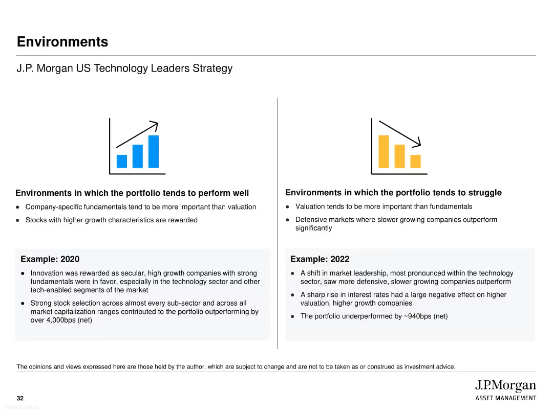
Slide contains column charts tracking litigation provisions and contingent liabilities across multiple quarters, complemented by textual highlights that summarize key changes and implications for the bank.
Regulatory and Compliance
Financial Services
Offers an update on the bank's litigation provisions and contingent liabilities, essential for legal and financial risk management. Provides insights into potential financial impacts and compliance issues, aiding in strategic planning and investor relations.
litigation, contingent liabilities, risk management, financial impact, legal compliance
Multiple Chart
Deutsche Bank
Saved
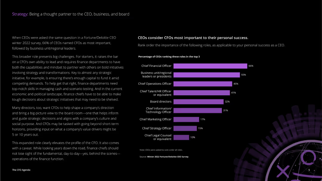
The slide includes a combination of text and a horizontal bar chart titled "Uncertainty and compressed transformation." The bars are in shades of purple, showing percentages for Speed, Scope, and Scale.
Operational Efficiency
Technology & Software
Discusses the importance of agility in an unpredictable world. Provides survey results from C-suite respondents about the value of agility, showing how companies adapted technology and transformed multiple business parts faster during COVID-19.
agility, uncertainty, transformation, survey, speed
Mixed Chart
Accenture
Saved
Blue left panel with the question; right side has a horizontal bar chart by country.
Market Analysis and Trends
Government & Public Sector
Depicts survey responses by country on the perceived unfair treatment of immigrants. Ireland, Belgium, and New Zealand rank highest, with a 22% global average.
immigration, inequality, countries, bar chart, discrimination, public opinion, Ipsos, 2023
Mixed Chart
IPSOS
Saved
The slide has a column chart comparing the number of companies by market capitalization ranges. The design is clear with well-defined data segments.
Market Analysis and Trends
Financial Services
This slide details the distribution of companies within the Global Top 100 based on market capitalization ranges, comparing data from March 2020 to March 2021.
market capitalization, company distribution, financial analysis, 2020-2021, comparative data
Mixed Chart
PwC/Strategy&
Saved
This slide includes three sets of horizontal bar charts showing the proportion of stage 1, 2, and 3 assets for Total bank, Retail, and Wholesale categories. The slide uses yellow and gray colors to differentiate data segments.
Risk Assessment and Management
Financial Services
The slide analyzes the exposure on transition to IFRS 9, detailing the proportions of stage 1, 2, and 3 assets across Total bank, Retail, and Wholesale categories, highlighting the potential impact and risks involved.
IFRS 9, stage allocation, risk assessment, transition, financial services, exposure analysis
Multiple Chart
EY
Saved
Pie charts and a column chart showing demographics of surveyed investors, firm types, and banking functions.
Market Analysis and Trends
Financial Services
This slide presents demographic information of surveyed commercial and retail banks, including their regions, firm types, and banking functions.
demographics, pie chart, column chart, investors, banking
Multiple Chart
EY
Saved
Contains a column chart on the left showing GHG emissions and a stacked column chart on the right depicting the remaining carbon budget.
Risk Assessment and Management
Energy & Utilities
Highlights GHG emissions by segment in 2018 and the estimated remaining carbon budget for global warming of 1.5°C, emphasizing the urgency of reducing emissions.
Emissions, carbon budget, GHG, climate change, global warming
Multiple Chart
Kearney
Saved
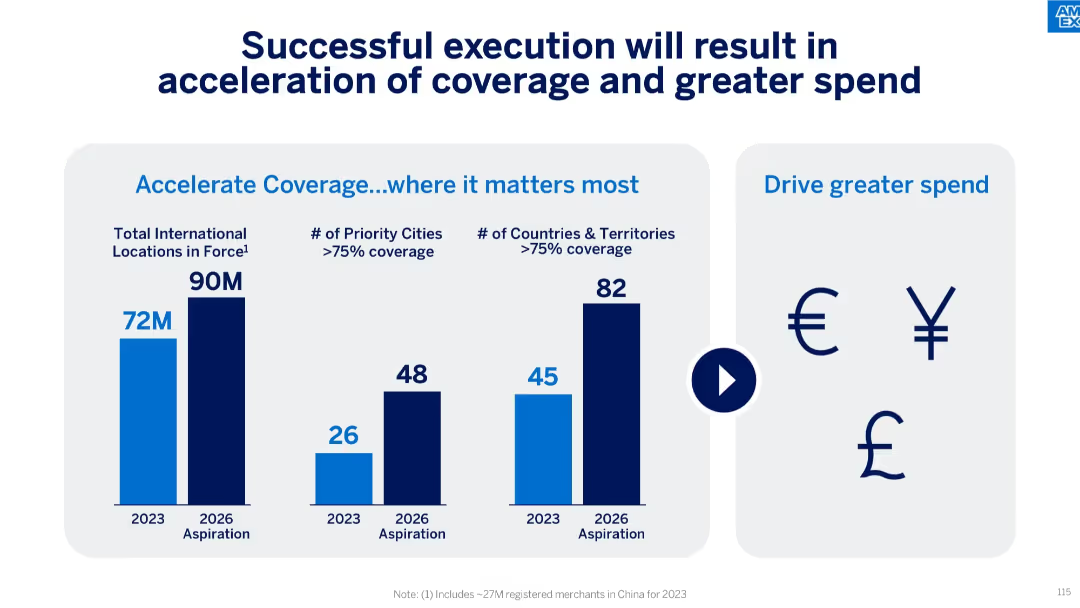
Visual of Amex Business cards, benefit icons, and two graphs showing Net Promoter Score and SBS Net Card Fee CAGR from 2019 to 2023.
Product and Service Analysis
Financial Services
The slide emphasizes Amex's customer value proposition with business-focused features, strong Net Promoter Scores, and a 16% CAGR in SBS Net Card Fees, suggesting strong customer satisfaction and profitability.
value proposition, Amex cards, NPS, net card fees, customer satisfaction, travel benefits, rewards, B2B focus
Mixed Chart
McKinsey
Saved
Grid-based layout with pie charts and bar graphs representing respondent demographics. Includes data on organization type, revenue, sector, and region. Blue tones dominate the visual elements.
Industry Overview
Professional Services
Provides background on survey respondents: 267 participants from E&C firms and project owners. Includes breakdowns by sector, revenue, geography, and entity type. Most respondents are involved in capital investment projects.
survey, demographics, sectors, E&C firms, revenue, respondent profile, industry data
Multiple Chart
KPMG
Saved
A column chart comparing revenue growth of local versus multinational companies from 2012 to 2021.
Competitive Landscape
Professional Services
Discusses the rising market share of local companies in various industries and their competitive strategies against multinationals.
Local competition, market share, industry growth, competitive strategies
Mixed Chart
Accenture
Saved
Previous
Next
If nothing, comes up, please save your slides first
Create a FREE account to continue browsing
Receive Instant Access to 1,000+ slides from companies like McKinsey, Google, and Goldman Sachs
First Name
Last Name
Email
Password
I agree to all
Terms & Privacy Policy
Thank you! Your submission has been received!
Oops! Something went wrong while submitting the form.
Have an account?
Sign in
Column Chart
Heatmap
Chevron
Org Chart
Infographic
Callouts
Timeline
List
Graphic
Picture
Process Flow
Diagram
Paragraph
Map
Table
Framework
Subtitle
Takeaway Box
Icon
Other Chart
Radar Chart
Waterfall Chart
Mekko Chart
Pie Chart
Scatter Plot
Line Chart
Bar chart
Bullet points