Create a FREE Account
Instant access to 1,000+ real slides from top companies like McKinsey, BCG, Goldman Sachs, Google and many more!
First Name
Last Name
Email
Password
I agree to all
Terms & Privacy Policy
Thank you! Your submission has been received!
Oops! Something went wrong while submitting the form.
Have an account?
Sign in
Library
Templates
Courses
Pricing
My Account
My Slides
My Templates
✦ AI
AI Prompt Library
AI Search
Sign in
Start Here
Logout
My Saved Slides
Includes text boxes and icons emphasizing the strategic benefits of cell manufacturing in Australia.
Market Analysis and Trends
Energy & Utilities
Advocates for prioritizing cell manufacturing in Australia due to its strategic importance to the battery value chain.
cell manufacturing, strategic importance, Australia, battery industry
Pillar
Accenture
Saved
Line graph showing EBITDA margins (2000–2023) by industry segments including grocery, non-grocery, CPG, and Euronext 100. Color-coded lines with shaded periods (COVID, inflation) highlight trends.
Financial Performance
Retail & E-commerce
Shows historical EBITDA margins, indicating that grocery retail consistently underperforms compared to other industries. Analysis spans pre- and post-crisis, COVID, and inflation periods, emphasizing the sector’s structural profitability challenges.
grocery, EBITDA, historical margins, retail, financial trends
Single Chart
McKinsey
Saved
The slide includes two charts: one line chart tracking the US presidential election poll tracker from January 2023 to April 2024, and a bar chart showing the average polling error over different timeframes before the election.
Market Analysis and Trends
Government & Public Sector
This slide analyzes US presidential election polling data, showing trends in voter support for Trump and Biden from January 2023 to April 2024, along with a bar chart illustrating the average polling error at various points before the election.
US politics, presidential election, polling, trends, errors
Multiple Chart
JP Morgan
Saved
The slide features a robotic hand reaching towards textual content against a dark blue background. It includes a two-column layout with selected AI technologies and use cases. Icons are used to represent different concepts like machine learning and risk management.
Industry Overview
Technology & Software
This slide discusses the application of AI in business, listing foundational methods and practical use cases such as risk management and service operations optimization. It suggests a growing adoption of AI across industries.
AI, Machine Learning, Risk Management, Service Operations, Technology Adoption, Business Use Cases
Header Horizontal
McKinsey
Saved
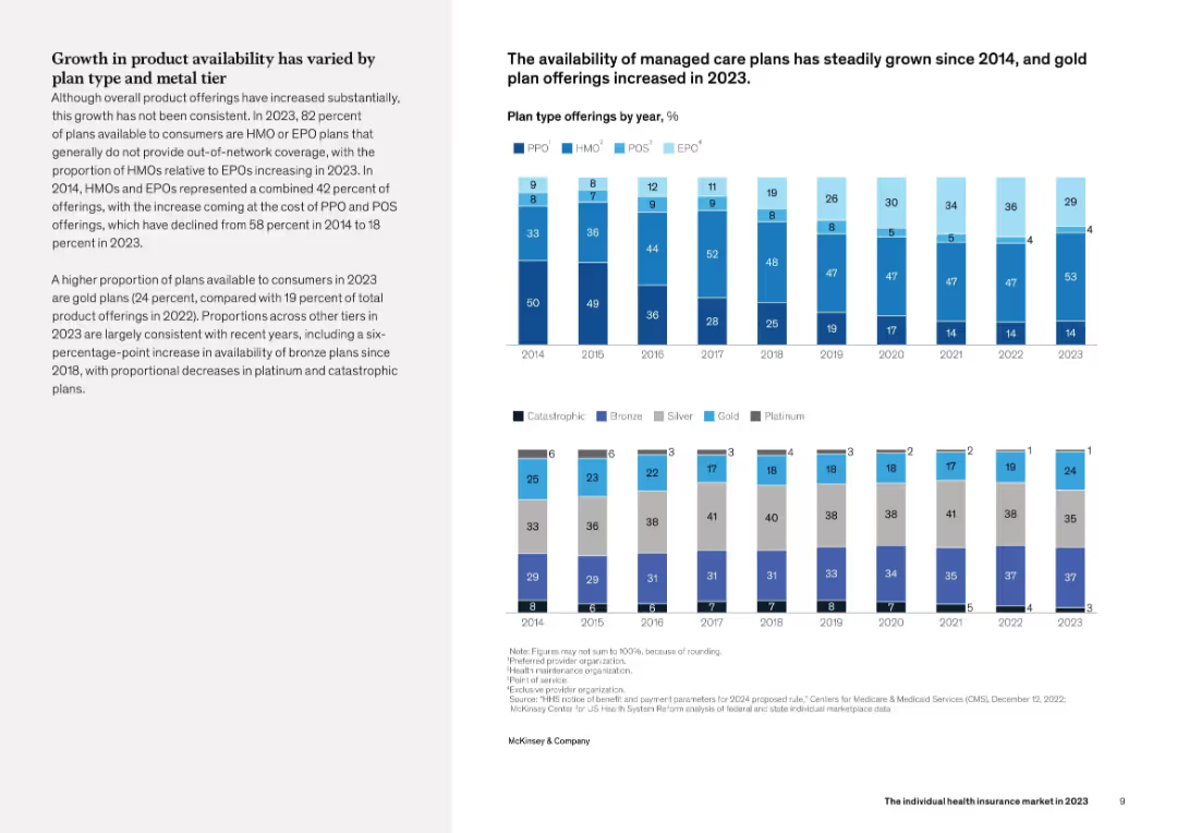
Left side has summary text; right side displays a vertical stacked bar chart showing enrollment levels by plan type from 2014 to 2022. Uses a clean visual with multiple plan types color-coded.
Industry Overview
Healthcare & Pharmaceuticals
This slide analyzes growth in the U.S. individual health insurance marketplace, noting that enrollment exceeded 16 million in 2022 for the first time since 2016. It also highlights changes in market composition, such as the decline in "Blue" plans and increase in Insurtech participation.
insurance, enrollment, health plans, insurtech, Blues, healthcare
Mixed Chart
McKinsey
Saved
The slide features a hierarchical chart with two main columns differentiated by color. On the left, a blue column lists the supervisory board's structure, and on the right, a darker blue column outlines the general partners' responsibilities.
Organizational Structure and Change
Industrial & Manufacturing
This slide illustrates the governance structure of Michelin, detailing the roles and relationships between the supervisory board and general partners. It can be used to explain company management and oversight practices.
Governance, Structure, Roles, Oversight, Partners, Liability, Management
Diagram
Morgan Stanley
Saved
Standard Ipsos layout with question on the left and sentiment-based ranking chart on the right.
Market Analysis and Trends
Government & Public Sector
This slide captures global opinions on the United States' projected influence on global affairs. It displays country-by-country approval percentages and highlights changes from the prior year.
United States, global influence, perception, international opinion, bar graph, Ipsos, geopolitical standing, trend analysis, 2024
Mixed Chart
IPSOS
Saved
Includes text descriptions with accompanying icons related to survey insights on hospital priorities in SEA.
Market Analysis and Trends
Healthcare & Pharmaceuticals
Provides an overview of an annual survey conducted by L.E.K. to understand hospital priorities in the SEA region, highlighting key decision areas.
SEA region, hospital priorities, survey, healthcare, MedTech
Diagram
LEK
Saved
The slide includes a column chart comparing vacancy rates and a bar chart showing timely application processing. It has a mix of text and visual data elements, with a clear focus on workforce metrics.
Operational Efficiency
Professional Services
Slide includes bar charts and a text block. Displays vacancy comparisons and application processing timeliness over time.
Highlights workforce capacity issues within DEHS, comparing vacancy rates and analyzing the timeliness of application processing over a specified period.
Multiple Chart
Alvarez & Marsal
Saved
Slide includes pie charts and textual analysis on the state of tax functions within financial services, focusing on structure and optimization.
Operational Efficiency
Financial Services
Discusses the evolution and optimization of tax functions in financial services, suggesting trends towards more robust functions.
tax functions, financial services, optimization, pie chart, analysis, trends
Multiple Chart
PwC/Strategy&
Saved
A column chart comparing investment returns of CDs, bonds, and portfolios during past rate hiking cycles.
Investment Analysis
Financial Services
Analyzes investment opportunities beyond cash, focusing on CDs, bonds, and portfolio performance during rate hikes.
Investment, CDs, bonds, portfolios, rate hikes, performance, analysis, opportunities, returns
Single Chart
JP Morgan
Saved
Mixed visuals: bar charts by gender, party, social grade, age + regional heat map.
Market Analysis and Trends
Government & Public Sector
This slide analyzes economic concern by subgroup. Middle-aged (45–54), higher social grades, and those in London show the most concern. Visuals highlight geographical and demographic splits on economic anxiety.
economy, region, age, gender, Ipsos, concern, segmentation
Multiple Chart
IPSOS
Saved
Line graph (2016–2025) showing how belief in economic rigging has trended across selected countries. Each country is shown with a distinct color-coded line.
Market Analysis and Trends
Government & Public Sector
This chart illustrates rising belief that national economies are biased in favor of elites. Italy, France, Canada, and Germany show sharp upward trends—especially since 2021—suggesting an impact from inflation and affordability concerns.
inflation, economy rigged, cost-of-living, public sentiment, trend data, Ipsos, inequality
Mixed Chart
IPSOS
Saved
A flowchart showing the range of partnership options between OEMs and tech players, highlighting levels of control and involvement.
Strategic Planning
Transportation & Logistics
Analyzes the necessity for OEMs to partner with technology players to deliver digital services, discussing different levels of control and partnership.
OEMs, technology partnership, digital services, control, involvement
Linear Flow
PwC/Strategy&
Saved
Column chart showing changes in waste treatment methods in the EU from 2004-2020.
Regulatory and Compliance
Environmental Services & Sustainability
Highlights the impact of regulations on recycling and waste management.
waste treatment, EU regulations, recycling rates, incineration, sustainability
Mixed Chart
Roland Berger
Saved
Features a column chart and lists of companies showing changes in market composition and capitalization. The slide is moderately dense with visual and textual data.
Market Analysis and Trends
Financial Services
This slide compares the market composition and capitalization changes of the top 100 companies between March 2020 and March 2021, noting new entrants and exits.
market composition, 2020-2021, new entrants, exits, capitalization changes, financial comparison
Mixed Chart
PwC/Strategy&
Saved
Left: narrative explanation; Right: circular infographic showing SDG reporting rates (2017–2022) for N100 and G250. Bottom panel explains SDGs.
Regulatory and Compliance
Environmental Services & Sustainability
The slide shows a high and gradually increasing rate of corporate reporting against the UN Sustainable Development Goals (SDGs). It explains the relevance of SDGs and highlights that three-quarters of G250 companies now report against them.
SDGs, sustainability goals, reporting, UN, ESG, corporate responsibility
Mixed Chart
KPMG
Saved
This slide features pie charts showing the distribution of research participants globally across different industries and job levels. The layout is straightforward, focusing on the data.
Market Analysis and Trends
Professional Services
This slide details the demographic and market analysis of global research participants, categorizing them by industry, job level, and organizational size. It provides a comprehensive view of the participant pool, aiding in understanding the global scope of the research and its relevance across different sectors and professional standings.
Research, Global, Demographics, Industry, Job Levels
Multiple Chart
Deloitte
Saved
Left side has a stacked bar chart (ICE vs EV & HEV) and line chart (% EV of total PV); right side features detailed text on market drivers including incentives, infrastructure, and OEM strategies.
Technology and Digital Transformation
Industrial & Manufacturing
Explores Indonesia’s EV market growth through 2030. Highlights the rise in EV share of total passenger vehicles, supported by government incentives, battery production, VAT exemptions, and favorable road regulations. Forecasts 2 million BEVs by 2030 and positions Indonesia as a future battery and EV production hub.
Indonesia, EV market, BEVs, battery production, incentives, infrastructure, government policy
Mixed Chart
PwC/Strategy&
Saved
Includes a column chart listing additional governmental priorities as perceived by the public and a bar graph showing concerns about public debt from 2022 to 2023.
Strategic Planning
Government & Public Sector
Highlights additional public priorities for government commitment beyond existing reforms and tracks public sentiment regarding national debt over two years.
government priorities, public debt, public opinion, fiscal policy, national budget, government commitment, debt concerns, economic strategy, policy development
Multiple Chart
Bain
Saved
The slide presents a series of column charts comparing APAC Financing Group's net revenues over different periods. The design is minimalistic with blue and white tones and clear labels for each data point.
Financial Performance
Financial Services
The slide demonstrates the consistent revenue growth of the APAC Financing Group while emphasizing disciplined risk management. It shows net revenues over various periods with significant non-recurring items highlighted.
Revenue Growth, Risk Management, APAC, Financing, Net Revenues
Multiple Chart
Credit Suisse
Saved
A slide with multiple charts showing EV/EBITDA multiples, median deal size, and valuation differences between PE-backed and non-financial-backed IPOs. The visual complexity is advanced, with detailed financial data.
Investment Analysis
Financial Services
The slide presents the momentum for PE-backed IPO exits in 2024, with statistics on deal sizes, valuation multiples, and survey findings predicting a rise in IPO activity. It highlights the superior performance and valuations of PE-backed IPOs compared to non-financial-backed IPOs.
PE, IPO, Valuation, Exit, 2024, Investment
Multiple Chart
EY
Saved
Continues the list of industries with circular icons, exploring further impacts of connectivity trends.
Technology and Digital Transformation
Telecommunications
Extends the discussion of disruptive potential across various industries due to connectivity technologies.
Connectivity, Industry Impact, Telecommunications, Aviation, Construction, IT
Header Vertical
McKinsey
Saved
Consists of a large blue column chart illustrating different capital components against regulatory requirements with a dotted line representing required thresholds. Key points are summarized to the right, explaining the strategic significance of the buffer levels.
Risk Assessment and Management
Financial Services
Analyzes the capital adequacy of a financial institution, showing various capital ratios in relation to regulatory requirements. It highlights the strategic management of capital to maintain regulatory compliance and financial health.
capital ratios, regulatory, compliance, financial
Mixed Chart
Deutsche Bank
Saved
Features column charts and a complex table. The design utilizes shades of blue, gray, and white and is dense with both graphics and text.
Financial Performance
Financial Services
It provides a detailed account of net interest income and loan distribution, offering insights into the financial health and lending practices of the firm.
Interest, Income, Loans, Financial, Health, Lending, Practices, Insights, Distribution, Firm
Mixed Chart
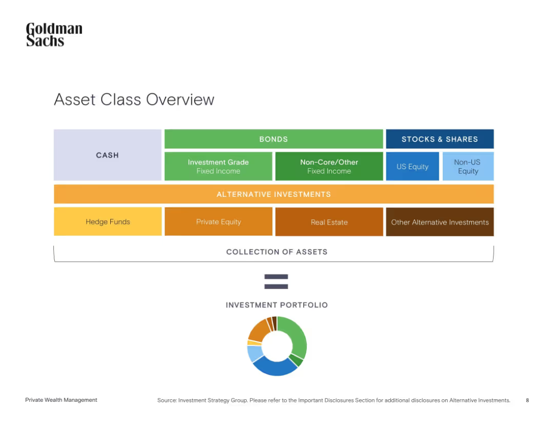
Goldman Sachs
Saved
Previous
Next
If nothing, comes up, please save your slides first
Create a FREE account to continue browsing
Receive Instant Access to 1,000+ slides from companies like McKinsey, Google, and Goldman Sachs
First Name
Last Name
Email
Password
I agree to all
Terms & Privacy Policy
Thank you! Your submission has been received!
Oops! Something went wrong while submitting the form.
Have an account?
Sign in
Column Chart
Heatmap
Chevron
Org Chart
Infographic
Callouts
Timeline
List
Graphic
Picture
Process Flow
Diagram
Paragraph
Map
Table
Framework
Subtitle
Takeaway Box
Icon
Other Chart
Radar Chart
Waterfall Chart
Mekko Chart
Pie Chart
Scatter Plot
Line Chart
Bar chart
Bullet points