Create a FREE Account
Instant access to 1,000+ real slides from top companies like McKinsey, BCG, Goldman Sachs, Google and many more!
First Name
Last Name
Email
Password
I agree to all
Terms & Privacy Policy
Thank you! Your submission has been received!
Oops! Something went wrong while submitting the form.
Have an account?
Sign in
Library
Templates
Courses
Pricing
My Account
My Slides
My Templates
✦ AI
AI Prompt Library
AI Search
Sign in
Start Here
Logout
My Saved Slides
Four bar graphs for revenue, adjusted EBITDA, free cash flow, and EBITDA margin, with CAGR labels.
Financial Performance
Technology & Software
This slide showcases Gartner’s financial growth from 2015 to 2024, with double-digit CAGR in revenue, EBITDA, and free cash flow. It emphasizes operational stability and strong EBITDA margins nearing 25%.
revenue growth, EBITDA, cash flow, CAGR, success, financials, track record, margin, Gartner
Multiple Chart
Gartner
Saved
Clustered vertical bar charts for RoTE, income by business, risk weighted assets, and cost overview.
Financial Performance
Financial Services
Summarizes Investment Bank’s Q125 performance. RoTE reached 16.2%, with 16% YoY income growth. Shows income split across various business lines and notes RWA and cost trends. Highlights stable financing income and improved CIR.
Investment Bank, RoTE, Income, RWA, Financing, CIR, Q125, Intermediation, Fees
Multiple Chart
Barclays
Saved
Slide features multiple data visualizations: pie charts, bar charts, detailing job roles, premium ranges, company sizes, age, and tenure within the insurance industry.
Market Analysis and Trends
Financial Services
Provides a demographic breakdown of insurance industry respondents, covering aspects like job title, focus area, account premiums, and company's net premiums, useful for market analysis.
demographics, insurance, market analysis, job roles, premiums, company size, age distribution, tenure, industry trends
Multiple Chart
Accenture
Saved
The slide uses a flow diagram to show the positive impact of digital transformation on key performance indicators like productivity, AUM, revenue, market share, and shareholder value.
Operational Efficiency
Financial Services
The slide demonstrates how digital transformation enhances performance in wealth and asset management through various key indicators.
Digital transformation, Key indicators, Financial Services, Performance, Productivity
Linear Flow
Deloitte
Saved
The slide is visually dense with a mix of tables, column charts, and process diagrams. It includes a structured presentation of statistics on thematic bonds issuance and a strategic roadmap for sustainable finance.
Strategic Planning
Financial Services
This slide covers the development of Indonesia’s sustainable finance ecosystem and its potential for fostering ESG investments. It details the issuance of thematic bonds, the implementation of regulatory frameworks, and the Sustainable Finance Roadmap Phase II. The slide also includes case studies and structural details of green bond issuance, emphasizing Indonesia's growth in ESG-related financing.
Sustainable finance, ESG, thematic bonds, regulatory framework, case study
Linear Flow
PwC/Strategy&
Saved
Two-column layout with text and bullet points on talent development and AI champions. Includes a visual quote box. Light background with purple accents.
Organizational Structure and Change
Artificial Intelligence
Explains the importance of hands-on AI training and the role of internal AI champions. Emphasizes the human element of digital transformation through continuous learning and structured adoption processes.
talent, AI fluency, champions, training, transformation
Header Horizontal
Accenture
Saved
The slide includes a bar chart showing the percentage of global IPOs by sector and the number and proceeds of IPOs for 2022 compared to 2021.
Market Analysis and Trends
Financial Services
Shows the dominance of the technology sector in IPO volume and the leading role of the energy sector in IPO proceeds in 2022.
Technology, energy, IPO, sector comparison, 2022
Multiple Chart
EY
Saved
A column chart compares the levelized cost of hydrogen as a feedstock for different grid utilizations (wind, solar, grid wind, grid solar) over different capacities (1 MW, 10 MW, 100 MW) by 2030.
Market Analysis and Trends
Energy & Utilities
The slide discusses the potential competitiveness of green hydrogen as a feedstock, noting the current higher cost compared to brown sources but highlighting future cost reductions.
green hydrogen, feedstock, levelized cost, grid, wind, solar, competitiveness, future cost, hydrogen production
Multiple Chart
Kearney
Saved
Two-line charts and two bar charts with multiple valuation and return metrics; structured in a matrix with explanations.
Financial Performance
Technology & Software
This slide presents the valuation premiums in public markets for Global and India ER&D post-COVID. It explores the correlation between digital/offshore capabilities and higher returns. It shows how investors favor niche engineering and automotive-focused firms with high profitability and innovation.
ER&D, valuation, digital, offshore, automotive, premium, public markets, returns
Multiple Chart
EY
Saved
The slide features a left panel with text analysis and a right panel with a horizontal bar chart showing the percentage of respondents taking action to allow workers to disconnect, by region.
Human Resources and Talent Management
Professional Services
This slide addresses the issue of employees being expected to be 'always on,' highlighting regional differences in efforts to allow workers to disconnect and reduce burnout.
Always on, employee pressure, disconnection, regional differences, burnout
Mixed Chart
PwC/Strategy&
Saved
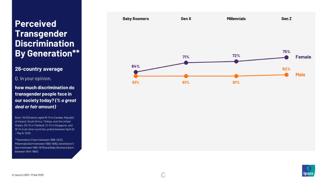
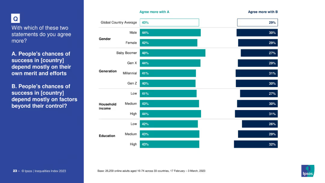
Similar layout as 19721; right side features a line chart split by gender across generations.
Market Analysis and Trends
Government & Public Sector
This slide tracks generational trends in supporting LGBT representation in media, noting that Gen Z women are significantly more supportive than their male counterparts.
support, TV, advertising, LGBT, generations, gender difference, Gen Z, Ipsos
Mixed Chart
IPSOS
Saved
Horizontal bar chart with country rankings on unemployment concerns; annotated text box at right.
Performance Metrics and KPIs
Financial Services
Unemployment ranks as the fourth top global worry. South Africa leads with 68% concern. The commentary highlights month-over-month changes and notable movements in countries like Indonesia and Colombia.
energy transition, net impact, sustainability, climate benefit, public sentiment, environmental policy, Ipsos data
Mixed Chart
IPSOS
Saved
This slide features horizontal bar charts comparing the importance of companies paying the correct amount of tax versus reducing environmental harm. The bars are color-coded for clarity, accompanied by text highlighting the key findings.
Market Analysis and Trends
Environmental Services & Sustainability
The slide shows that a higher percentage of respondents prioritize companies reducing environmental harm over paying the correct amount of tax. This can be used to discuss corporate social responsibility, public expectations from companies, and the prioritization of environmental issues over traditional financial concerns.
corporate responsibility, environmental harm, tax compliance, public opinion, sustainability
Multiple Chart
IPSOS
Saved
Horizontal bar chart by country; agree/disagree percentages with trend deltas
Regulatory and Compliance
Government & Public Sector
The slide explores global opinions on whether transgender teens should access gender-affirming care with parental consent. Thailand leads with 79% agreement, while Hungary ranks lowest at 34%. Opposition is substantial in several Western countries, with notable trend declines from 2023 to 2025.
gender-affirming care, transgender youth, healthcare, public opinion, parental consent, Ipsos, countries
Mixed Chart
IPSOS
Saved
A mix of text and a bar chart comparing world trade growth to global GDP growth over different periods.
Market Analysis and Trends
Professional Services
The slide explores changes in global trade patterns and their implications for globalization, using data from IMF and PwC analysis.
globalization, trade, GDP, economic trends, disruption
Mixed Chart
PwC/Strategy&
Saved
This slide displays a bar graph showing the percentage composition of different tax sources including customs & excise, VAT, individual income tax, and corporate income tax. Each category is represented by a different color and clearly labeled, making it straightforward to interpret.
Financial Performance
Government & Public Sector
This slide provides a breakdown of various sources of tax revenue in Namibia, highlighting the significant contributions of each type. It is commonly used in financial or economic presentations to illustrate how different taxes contribute to the national budget.
tax revenue, fiscal analysis, revenue sources, Namibia
Single Chart
PwC/Strategy&
Saved
The slide is text-heavy, outlining the methods and progress of the firm's development target, with a column chart on the right depicting distribution of funds in various areas such as "Green", "Community Development", and "Development Finance".
Financial Performance
Financial Services
Discussing the strategic foundation and progress of JPMorgan Chase's sustainable development target, the slide offers insights into the allocation of funds and the company's overarching goals. The column chart visualizes the investment distribution, underlining the firm's commitment to supporting green initiatives and community development. Could be used to provide transparency about strategic decisions to investors or stakeholders.
development target, strategy, progress, investment, sustainability, green finance, community, JPMorgan Chase
Uncategorized
JP Morgan
Saved
Waterfall-style chart projecting RoCET1 progression from 2024 (8.7%) to 2026 (~15%) exit rate with factors contributing to growth.
Strategic Planning
Financial Services
Illustrates UBS’s planned increase in underlying RoCET1 to ~15% by 2026 through core business growth, cost savings, and tax management. Each driver is annotated with expected quantitative and qualitative impacts.
UBS, RoCET1, profitability, growth drivers, core business, tax rate, financial return, 2026 projection
Single Chart
UBS
Saved
The slide provides an overview of a survey conducted by Deloitte, including objectives, methodology, and firmographics. It features various charts and maps showing the survey coverage and representation of different regions and economic sectors.
Market Analysis and Trends
Professional Services
This slide presents an overview of Deloitte's cost management survey, covering the survey's objectives, methodology, and demographic representation. It includes charts showing the survey coverage and firmographics of respondents across various regions.
survey, Deloitte, cost management, methodology, objectives
Multiple Chart
Deloitte
Saved
Features a circular diagram with segments and corresponding bullet points, focusing on leveraging the CIB for Securities Services.
Competitive Landscape
Financial Services
Discusses the positioning of Securities Services for the future by leveraging the Corporate & Investment Bank to enhance client relationships and service excellence.
Securities Services, CIB, Clients, Excellence
Framework
JP Morgan
Saved
Split design. Left: bar and line chart showing capex by major AI hyperscalers from 2004 to projected 2026. Right: bar chart ranking industry AI adoption rates as of June 2025 and future intent.
Technology and Digital Transformation
Artificial Intelligence
Shows the surge in AI investment by major hyperscalers like AWS, Microsoft, and Alphabet. It also identifies sectors with highest AI adoption—led by Information and Professional Services—and expectations for broader deployment in the next 6 months.
AI investment, hyperscalers, technology adoption, AI implementation, industry adoption, digital transformation, capex, cloud
Multiple Chart
JP Morgan
Saved
Contains a matrix comparing potential applications of various decarbonization technologies, including hydrogen, across different sectors consuming fossil fuels.
Competitive Landscape
Energy & Utilities
Compares hydrogen's role and applicability with other decarbonization technologies in sectors like aviation, shipping, rail, trucks, industry, and power.
Hydrogen, decarbonization, low carbon, fossil fuels, competitive analysis
Table
Kearney
Saved
Combination of line chart and bar chart; left side tracks consensus growth estimate evolution, right side shows sector-specific 2025 growth forecasts.
Financial Performance
Financial Services
This slide outlines 2025 growth expectations for revenue, EBITDA, and net income across major sectors. Analysts forecast moderate growth, with semiconductors leading in all three metrics. Visuals show how estimates evolved over 2024.
Growth Forecast, Revenue, EBITDA, Net Income, 2025 Estimates, Sector Analysis, Consensus Estimates, Financial Performance
Multiple Chart
McKinsey
Saved
The slide features a comparative column chart showing year-over-year inflation rates and month-to-month changes for various countries, with color-coded arrows indicating trends.
Market Analysis and Trends
Financial Services
The slide presents a global view of CPI inflation rates, comparing changes across multiple countries and highlighting trends in disinflation.
inflation, CPI, global, trends, comparative
Multiple Chart
Accenture
Saved
Horizontal bar chart; shows % agreement/disagreement per country; gender-specific agreement percentages; simple and clean layout
Customer and Market Segmentation
Professional Services
This slide reveals the proportion of people globally and by country who identify as feminists. It compares gender agreement levels and includes 2019 and 2022 agreement rates, offering insights into self-identification trends related to feminism.
feminism, identity, self-definition, gender, agreement rates, survey, country-level data, Ipsos
Mixed Chart
IPSOS
Saved
Previous
Next
If nothing, comes up, please save your slides first
Create a FREE account to continue browsing
Receive Instant Access to 1,000+ slides from companies like McKinsey, Google, and Goldman Sachs
First Name
Last Name
Email
Password
I agree to all
Terms & Privacy Policy
Thank you! Your submission has been received!
Oops! Something went wrong while submitting the form.
Have an account?
Sign in
Column Chart
Heatmap
Chevron
Org Chart
Infographic
Callouts
Timeline
List
Graphic
Picture
Process Flow
Diagram
Paragraph
Map
Table
Framework
Subtitle
Takeaway Box
Icon
Other Chart
Radar Chart
Waterfall Chart
Mekko Chart
Pie Chart
Scatter Plot
Line Chart
Bar chart
Bullet points