Create a FREE Account
Instant access to 1,000+ real slides from top companies like McKinsey, BCG, Goldman Sachs, Google and many more!
First Name
Last Name
Email
Password
I agree to all
Terms & Privacy Policy
Thank you! Your submission has been received!
Oops! Something went wrong while submitting the form.
Have an account?
Sign in
Library
Templates
Courses
Pricing
My Account
My Slides
My Templates
✦ AI
AI Prompt Library
AI Search
Sign in
Start Here
Logout
My Saved Slides
Features a column chart comparing the importance of risk analysis views and third-party data by account size, using different colors for clarity.
Strategic Planning
Financial Services
Focuses on how underwriters of various account sizes value different aspects of risk analysis and data availability for enhancing underwriting quality.
risk analysis, data availability, account sizes, underwriting enhancement
Mixed Chart
Accenture
Saved
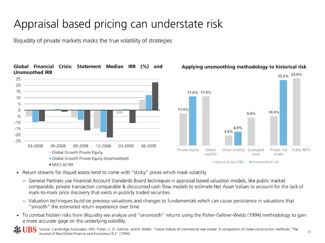
Two charts: one column chart showing IRR during the financial crisis, and another column chart comparing historical risk with unsmoothed risk.
Risk Assessment and Management
Financial Services
The slide discusses how illiquidity in private markets can mask true volatility. It shows the difference in performance when using smoothed vs. unsmoothed valuation models.
Appraisal, Risk, Volatility, Private Equity, Financial Crisis
Multiple Chart
UBS
Saved
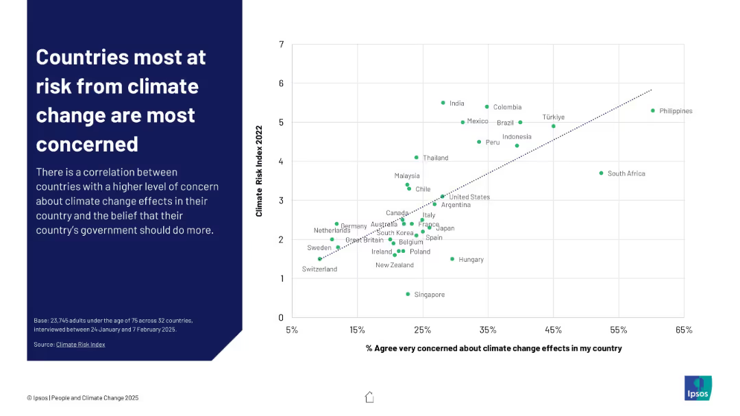
Scatterplot graph comparing % of people "very concerned" with each country's climate risk index ranking
Risk Assessment and Management
Environmental Services & Sustainability
This slide illustrates a positive correlation between climate vulnerability and public concern. Nations with higher Climate Risk Index scores like the Philippines and India show greater levels of worry, suggesting perception aligns with actual threat levels.
climate risk, concern, correlation, perception, Ipsos, vulnerability, risk index, government responsibility, public sentiment
Mixed Chart
IPSOS
Saved
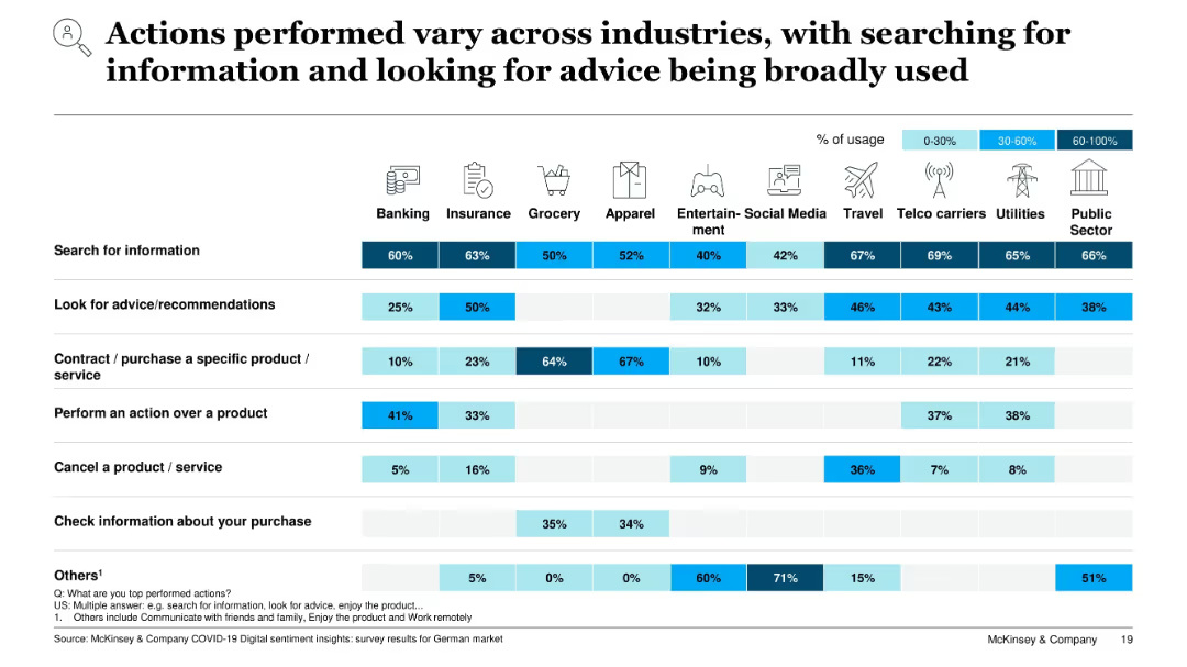
Matrix layout comparing consumer digital actions by industry; horizontal bars shaded by usage percentage bands (0–30%, 30–60%, 60–100%)
Market Analysis and Trends
Technology & Software
This slide shows how different industries exhibit varying digital behaviors. Actions like searching for information and seeking recommendations are widespread, while actions like purchase or service cancellation vary significantly by sector. The visual highlights digital engagement levels across multiple industries in Germany.
digital behavior, industry comparison, user actions, search, recommendations, purchase, utilities, telecom, COVID-19 impact
Single Chart
McKinsey
Saved
Contains bar charts and a narrative section. The charts illustrate media coverage trends focusing on AI-related topics like job displacement and privacy, using different shades of purple to represent varying amounts of media mentions over time.
Technology and Digital Transformation
Technology & Software
Discusses shifts in public and media focus regarding AI, from job displacement concerns to privacy and job creation opportunities.
AI, Media, Job Displacement, Privacy, Trust, Public Perception, Coverage, Trends, Technology
Multiple Chart
Accenture
Saved
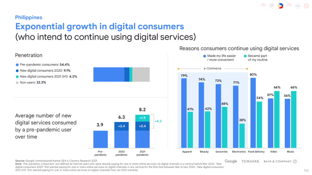
This slide has bar charts and graphs to represent the growth of digital consumers. The layout is balanced with textual information on one side and graphical data on the other.
Market Analysis and Trends
Technology & Software
Analyzes the digital consumer penetration and growth in the Philippines. It also explores the reasons consumers prefer to continue using digital services, highlighting e-commerce adoption.
Digital consumers, Market penetration, E-commerce, Consumer preferences
Multiple Chart
Bain
Saved
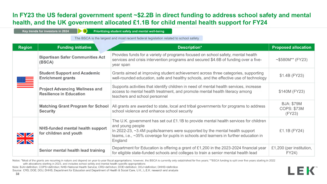
The slide features a table with columns for Region, Funding Initiative, Description, and Proposed Allocation. It includes flags for the US and UK and descriptions of funding initiatives.
Regulatory and Compliance
Government & Public Sector
This slide details government funding initiatives for school safety and mental health in the US and UK, outlining specific programs and their proposed budgets.
Government, Funding, Safety, Mental Health, School, Initiatives, US, UK, Budget, Support
Table
LEK
Saved
A table outlines the top criteria LGBT+ talents consider when choosing an employer in various countries.
Human Resources and Talent Management
Professional Services
Prioritizes the aspects most important to LGBT+ talents in their employment decisions.
LGBT+, employment criteria, employer choice, top criteria
Table
BCG
Saved
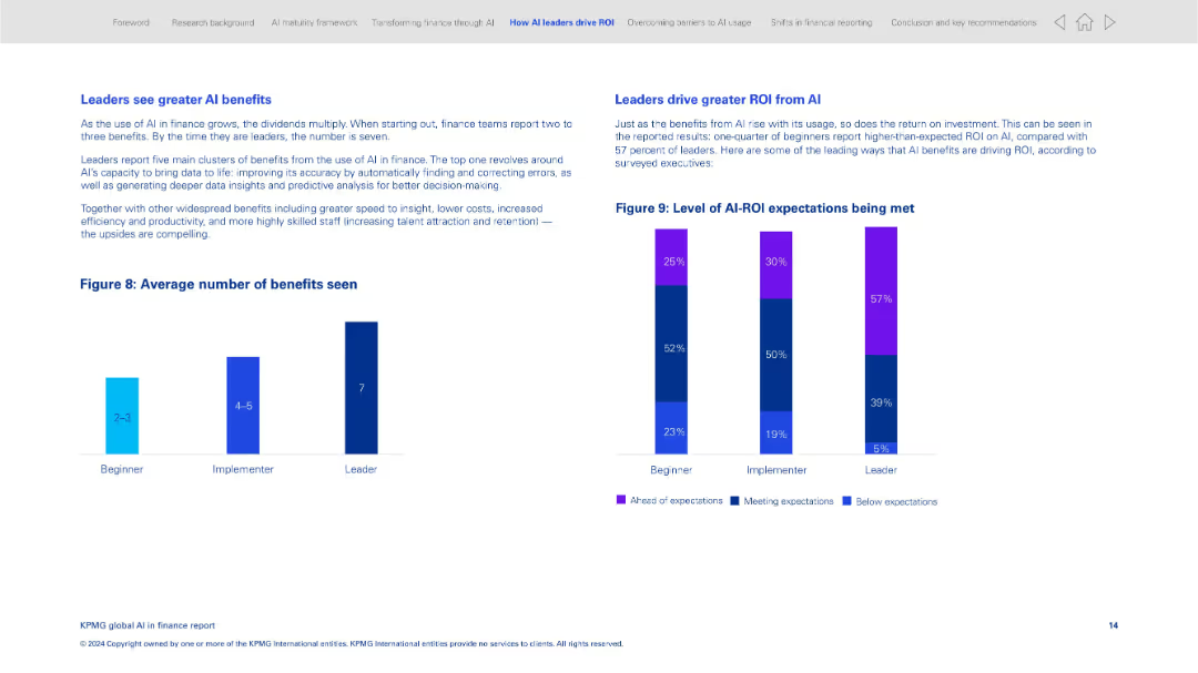
Side-by-side charts and text boxes; minimal layout with bar graph and stacked columns
Performance Metrics and KPIs
Financial Services
The slide compares the average number of benefits seen from AI across beginner, implementer, and leader organizations. It emphasizes how leaders derive greater ROI and more significant benefits from AI implementation, including faster insights and talent retention.
AI benefits, ROI, implementation stages, performance, insights, finance leaders, benchmarking
Multiple Chart
KPMG
Saved
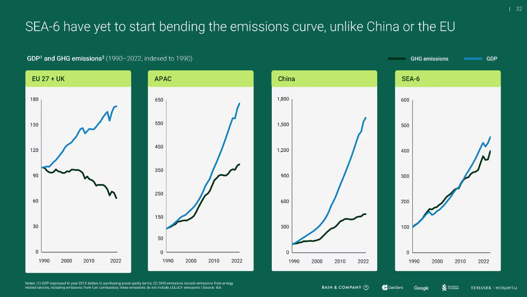
Four-panel line chart showing GDP vs. GHG emissions indexed to 1990 for EU+UK, APAC, China, and SEA-6
Performance Metrics and KPIs
Environmental Services & Sustainability
Compares emissions and economic growth over time, revealing that unlike the EU, SEA-6 and others (like APAC, China) have not decoupled emissions from GDP growth, highlighting a challenge for sustainable development.
emissions curve, GDP, SEA-6, APAC, EU, China
Multiple Chart
Bain
Saved
The slide includes a pie chart and column charts, with text describing the evolution of ESG awareness.
Regulatory and Compliance
Environmental Services & Sustainability
This slide discusses how organizations are evolving in their focus on ESG risks, with statistics and survey results.
ESG, risks, evolution, awareness, survey
Single Chart
Deloitte
Saved
Slide shows bar graphs comparing economic conditions globally, with a focus on how perceptions have shifted over the last six months.
Market Analysis and Trends
Financial Services
Discusses the economic impact of COVID-19 worldwide, showing trends in economic perception and conditions over recent months. Essential for financial analysts and economic forecasters.
COVID-19, economic impact, global economy, market conditions, financial analysis, trend analysis
Multiple Chart
McKinsey
Saved
Column chart showing the levelized cost of energy for gas peaking plants with a 25% hydrogen blend, comparing various technologies and subsidy scenarios.
Financial Performance
Energy & Utilities
The slide presents cost comparisons for gas peaking plants using a 25% hydrogen blend, highlighting differences in levelized costs under different technologies and subsidies.
Energy, Hydrogen blend, Cost analysis, Gas peaking plant, Subsidies
Single Chart
Roland Berger
Saved
Comparative bar charts displaying GDP growth forecasts against baseline for 2020 and 2021, offering a global perspective with specific focus on major economies.
Financial Performance
Financial Services
Offers insights into the projected global economic downturn in 2020 and recovery prospects for 2021, based on GDP growth forecasts from various sources.
GDP growth, economic forecasts, 2020 downturn, 2021 recovery, global economy, financial analysis, investment planning
Multiple Chart
BCG
Saved
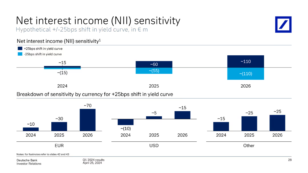
This slide includes column charts showing the sensitivity of net interest income to shifts in the yield curve for different currencies (EUR, USD, Other) across 2024, 2025, and 2026.
Financial Performance
Financial Services
The slide discusses the sensitivity of Deutsche Bank's net interest income to hypothetical shifts in the yield curve, broken down by currency (EUR, USD, Other) and year (2024-2026). It provides projections and potential impacts.
net interest income, sensitivity, yield curve, projections, currency, Deutsche Bank, Q1 2024
Multiple Chart
Deutsche Bank
Saved
An updated world map from slide 2933, now indicating growth with more markers and comparative data from 1990 to 2019. Same minimal design but with more data points.
Industry Overview
Financial Services
Showcases significant growth in international presence over 29 years with data on revenues, headcount, and offices to depict expansion success.
Global presence, development, business growth, headcount
Graphic
Goldman Sachs
Saved
Scatter plot comparing the Global Innovation Index with GDP per capita PPP for 2019, with emerging markets and advanced countries highlighted. Text discusses the relationship between innovation and prosperity.
Technology and Digital Transformation
Technology & Software
The slide illustrates the correlation between innovation capabilities and economic prosperity, showing how countries with higher Global Innovation Index scores tend to have higher GDP per capita. It highlights the importance of innovation for economic growth and development.
Innovation, GDP, Global Index, Prosperity
Mixed Chart
Roland Berger
Saved
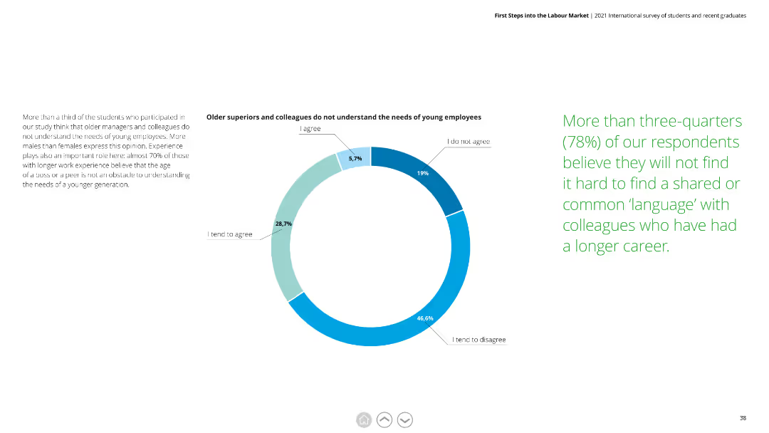
This slide features a pie chart with blue and green segments. Text is divided into three columns, explaining the findings. There is minimal graphical clutter, making the data easy to interpret.
Human Resources and Talent Management
Professional Services
Analyzes the perception that older managers do not understand the needs of young employees. Highlights gender differences and the importance of experience.
young employees, older managers, needs, perception, gender differences, experience
Mixed Chart
Deloitte
Saved
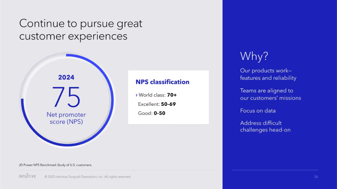
Split layout; left side has a circular graphic showing NPS score, right side contains text on a blue background explaining reasons for high performance.
Performance Metrics and KPIs
Healthcare & Pharmaceuticals
Highlights a high Net Promoter Score (NPS) of 75 for 2024, classified as "World class". The slide attributes the score to product reliability, customer alignment, data focus, and challenge handling.
NPS, customer satisfaction, 2024, performance, healthcare, product quality, data focus, client alignment
Mixed Chart
JP Morgan
Saved
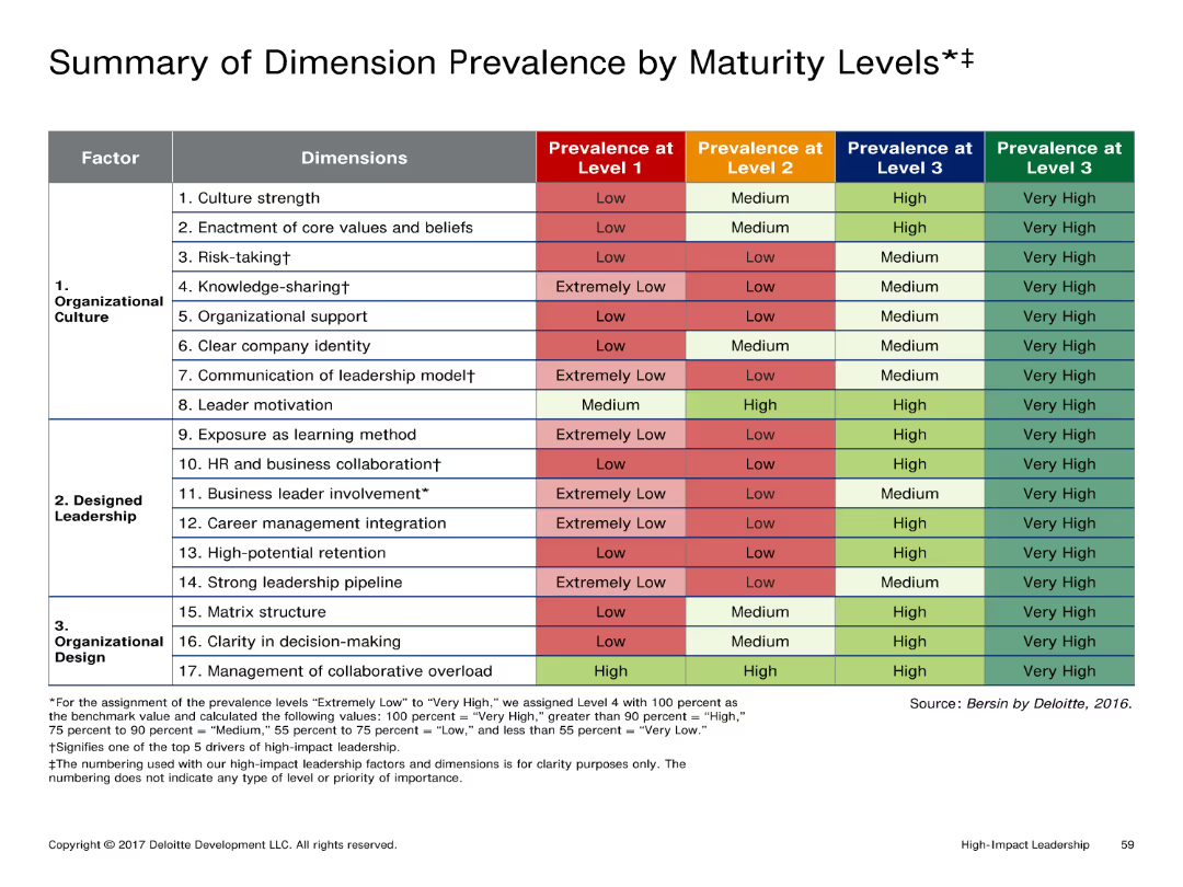
Table showing the prevalence of various dimensions by maturity levels (Low, Medium, High, Very High). The table is color-coded for easy visual differentiation.
Performance Metrics and KPIs
Professional Services
Summarizes how different organizational dimensions are prevalent at various maturity levels, useful for assessing organizational development stages.
Table, dimension prevalence, maturity levels, color-coded
Table
Deloitte
Saved
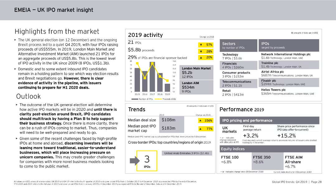
This slide features column charts, numerical data points, and textual highlights. It focuses on the UK IPO market within the EMEIA region, covering activity levels, sectors, and performance metrics for 2019.
Market Analysis and Trends
Financial Services
The slide summarizes the UK IPO market within the EMEIA region for 2019, noting the number of IPOs, proceeds, sector activity, performance metrics, and the outlook for 2020.
UK, IPO, EMEIA, Market Analysis, Financial Services, Trends, Activity, Sectors, 2019
Mixed Chart
EY
Saved
Contains column charts and tables. Blue shades differentiate between Private, Corporate, and Investment Banks. Dense with numerical data.
Financial Performance
Financial Services
Analyzes credit loss provisions and stage 3 loans across different banking segments over several quarters. Used for financial analysis.
Credit losses, stage 3 loans, banking, financial data, provisions, coverage ratios, amortized cost, investment calls
Multiple Chart
Deutsche Bank
Saved
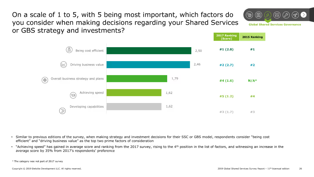
Bar chart ranking factors on a scale of 1 to 5, with being cost efficient and driving business value as top considerations. Comparison with 2017 rankings shown. Summary points on the bottom discuss trends and findings.
Strategic Planning
Professional Services
The slide outlines key factors considered in Shared Services strategy decisions. A bar chart ranks factors such as cost efficiency and business value on a scale of 1 to 5. Comparison with 2017 rankings is included. Summary points discuss the rise in importance of achieving speed and other notable trends.
SSC, strategy, decision factors, cost efficiency, business value
Mixed Chart
Deloitte
Saved
Slide with three sets of column charts displaying deposit share growth in different cities. Each set is complemented by corresponding branch share and deposit growth statistics.
Market Analysis and Trends
Financial Services
Examines regional market growth by comparing deposit shares and branch expansion in Los Angeles, Atlanta, and Boston, showcasing the bank's adaptability and market penetration.
market growth, regional strategy, banking, deposit share, branch expansion, Los Angeles, Atlanta, Boston, financial services, market penetration
Multiple Chart
JP Morgan
Saved
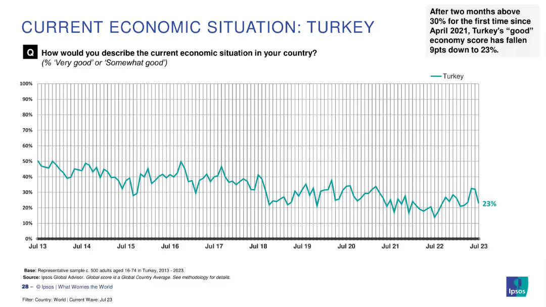
Line graph showing a declining trend from 2013 to 2023 with a recent 9-point drop to 23% marked in the annotation.
Market Analysis and Trends
Financial Services
Turkey's economic sentiment saw a sharp 9-point drop in July 2023, falling to 23% after briefly surpassing 30%. The slide captures fluctuating public confidence over time, reflecting recent instability.
Turkey, sentiment decline, economic outlook, 2023 drop, public perception, Ipsos, confidence fluctuation, barometer, historical data
Single Chart
IPSOS
Saved
Previous
Next
If nothing, comes up, please save your slides first
Create a FREE account to continue browsing
Receive Instant Access to 1,000+ slides from companies like McKinsey, Google, and Goldman Sachs
First Name
Last Name
Email
Password
I agree to all
Terms & Privacy Policy
Thank you! Your submission has been received!
Oops! Something went wrong while submitting the form.
Have an account?
Sign in
Column Chart
Heatmap
Chevron
Org Chart
Infographic
Callouts
Timeline
List
Graphic
Picture
Process Flow
Diagram
Paragraph
Map
Table
Framework
Subtitle
Takeaway Box
Icon
Other Chart
Radar Chart
Waterfall Chart
Mekko Chart
Pie Chart
Scatter Plot
Line Chart
Bar chart
Bullet points