Create a FREE Account
Instant access to 1,000+ real slides from top companies like McKinsey, BCG, Goldman Sachs, Google and many more!
First Name
Last Name
Email
Password
I agree to all
Terms & Privacy Policy
Thank you! Your submission has been received!
Oops! Something went wrong while submitting the form.
Have an account?
Sign in
Library
Templates
Courses
Pricing
My Account
My Slides
My Templates
✦ AI
AI Prompt Library
AI Search
Sign in
Start Here
Logout
My Saved Slides
It displays column chart comparing different types of capital against regulatory requirements, using a clean layout with direct visual comparisons to enhance understanding.
Regulatory and Compliance
Financial Services
Details the financial institution’s buffer over minimum required levels for loss-absorbing capacity, important for regulatory compliance and financial health discussions in the banking sector.
financial health, regulatory, banking, compliance
Multiple Chart
Deutsche Bank
Saved
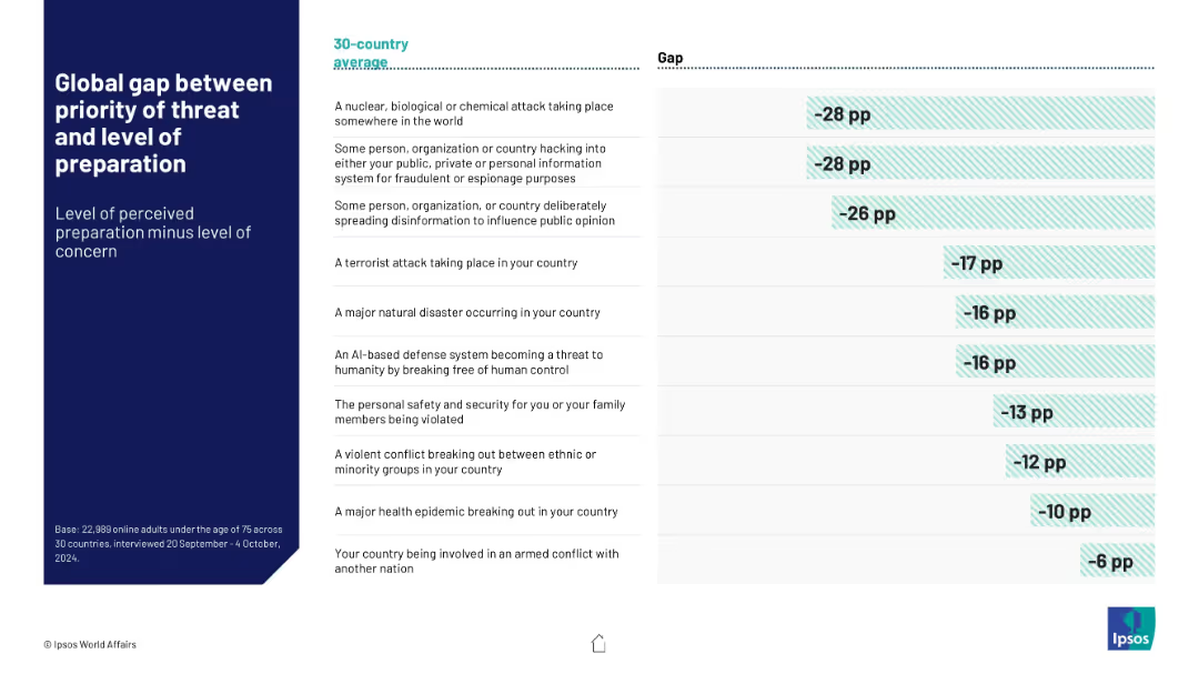
Table with two columns: threat types and corresponding global preparedness gap (concern minus confidence). Horizontal bars visualize the negative gaps.
Risk Assessment and Management
Government & Public Sector
Visualizes the global discrepancy between concern about various threats and perceived governmental preparedness. Highlights largest concern-preparedness gaps in NBC attacks and hacking across a 30-country average.
preparedness gap, risk perception, global concern, NBC threats, cyber attacks, Ipsos data
Mixed Chart
IPSOS
Saved
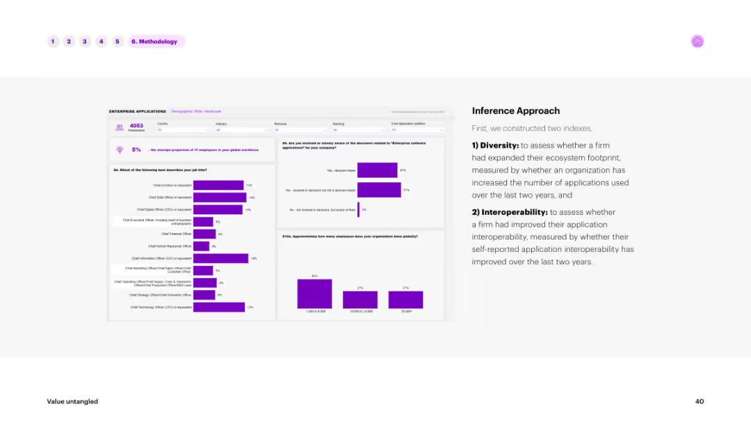
The slide includes text on the right explaining the inference approach and multiple bar charts on the left showing data distributions. The charts and text are in shades of purple against a white background.
Market Analysis and Trends
Technology & Software
Describes the inference approach used in the survey, focusing on diversity and interoperability indices. The bar charts show the distribution of responses, providing insights into ecosystem footprints and application interoperability improvements.
inference, approach, survey, diversity, interoperability
Multiple Chart
Accenture
Saved
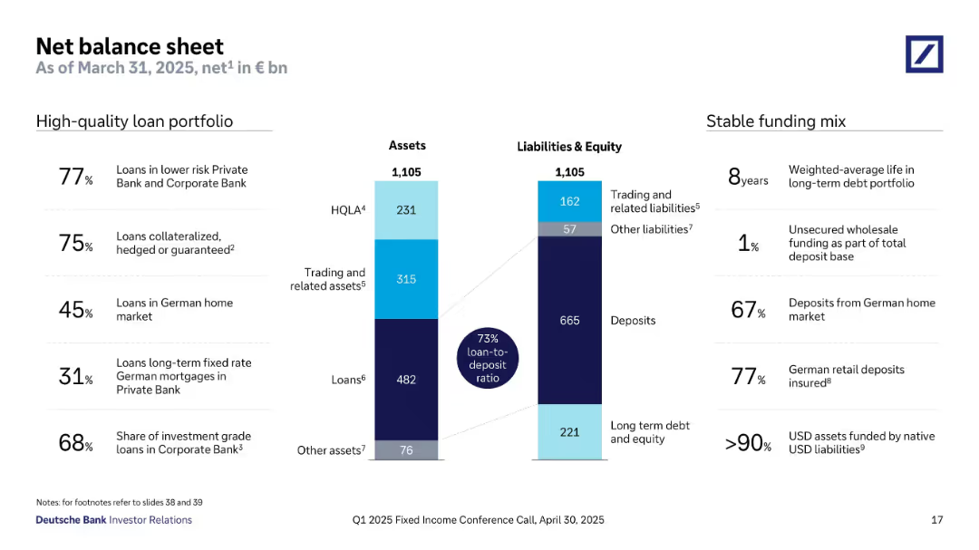
Two vertical bar charts represent total assets and liabilities (€1,105bn each), segmented into loans, HQLA, trading assets, deposits, etc. Annotations and stats highlight portfolio quality and funding mix. Side notes list loan quality and deposit stability percentages.
Financial Performance
Financial Services
This slide presents a balanced asset-liability snapshot with a 73% loan-to-deposit ratio. Key asset categories include loans and trading assets, while liabilities are dominated by deposits. High-quality metrics show a strong deposit base and minimal reliance on unsecured wholesale funding. The asset breakdown reflects conservative lending, strong deposit coverage, and high collateralization levels. The funding mix is shown to be stable and mostly domestic.
net balance sheet, loan-to-deposit ratio, HQLA, deposits, trading assets, stable funding, German market
Mixed Chart
Deutsche Bank
Saved
Donut chart showing the breakdown of loans and advances by type, with details on mortgages, lombard, corporates, and other categories.
Financial Performance
Financial Services
Overview of UBS's loan portfolio quality, detailing various loan categories and highlighting the composition and collateral.
Loans, portfolio, mortgages, lombard, corporates
Mixed Chart
UBS
Saved
The slide features a bar chart showing the progression of CET1 ratio targets over time, with explanatory text on each contributing factor.
Financial Performance
Financial Services
The slide presents the target CET1 ratio of greater than 13.5% by 2025, outlining the steps and capital actions required to achieve this financial stability goal.
CET1, ratio, target, financial, stability
Single Chart
Credit Suisse
Saved
Slide showcases a client lifecycle on a gentle curve graph, with text boxes and icons for different stages and a data section detailing financial services.
Investment Analysis
Financial Services
Outlines the firm's coverage and solutions throughout the client's growth phases, providing financial insights.
Lifecycle, IB Coverage, Solutions, Growth, M&A, Private Equity, IPO, Strategic Growth
Table
JP Morgan
Saved
This text-heavy slide offers a detailed look at impactful technologies across the software development life cycle. It has a clear structure with headers and bullet points, and uses blue to highlight key terms. Visual complexity is moderate due to the amount of text and information provided.
Operational Efficiency
Technology & Software
The slide details pivotal technologies that enhance developer velocity, targeting a technical audience with interest in improving software development processes. It aims to provide insights into tools that streamline various stages of development, from planning to deployment and maintenance.
Noteworthy, Technologies, Software, Development, Tools, Efficiency, Life Cycle
Linear Flow
McKinsey
Saved
This slide features a green and white line chart against a black background, showing the performance of the "50 Most Innovative Companies of 2021." The slide is labeled with key percentages in bold green, providing a visual comparison to the "MSCI World Index." The data is clearly depicted for easy comparison, and the slide's overall design is straightforward, emphasizing the financial data presented.
Investment Analysis
Financial Services
The slide provides evidence of the financial performance of innovative companies, illustrating their continued outperformance during the COVID-19 crisis. It could be used by financial analysts or investment strategists to evaluate the merits of investing in innovative companies, demonstrating their potential for resilience and growth. The inclusion of an index comparison provides a benchmark for assessing the relative success of innovation-led strategies.
financial performance, innovative companies, COVID-19, MSCI World Index, investment strategy
Single Chart
BCG
Saved
This slide presents a world map illustrating the geographic distribution of respondents from the pulse survey. Green and blue dots of various sizes represent the number of Millennials and Gen Z participants from different regions.
Market Analysis and Trends
Media & Entertainment
The slide shows the geographical distribution of respondents from the pulse survey conducted between April and May 2020. It helps in understanding the global coverage of the survey and the regional variations in responses, providing a basis for analyzing changes in sentiment over time and the impact of the pandemic across different locations.
Geographic Distribution, Pulse Survey, Millennials, Gen Z, Map
Graphic
Deloitte
Saved
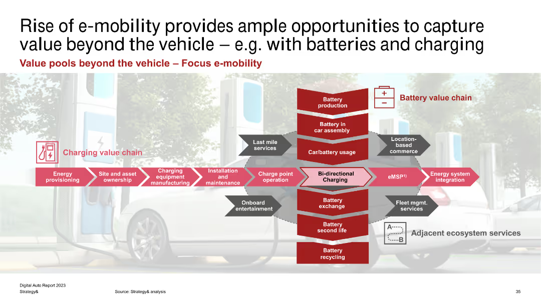
The slide features a complex diagram showing the charging value chain and battery value chain, with multiple red arrows and text boxes. The background image is of an electric car and charging station.
Market Analysis and Trends
Energy & Utilities
The slide illustrates the different value pools in the e-mobility ecosystem, focusing on the charging and battery value chains. It identifies various stages like energy provisioning, site ownership, and battery production as areas for potential value capture.
E-mobility, Charging, Battery, Value Chain, Energy Provisioning, Asset Ownership, Maintenance, Integration, Fleet Management
Linear Flow
PwC/Strategy&
Saved
A column chart comparing the approximate values lost by users during incidents such as hacking, fraud, or scams in 2023 and 2022.
Risk Assessment and Management
Financial Services
This slide displays the reported financial losses during incidents involving hacking or fraud on crypto trading platforms, comparing 2023 and 2022.
Value, loss, incident, hacking, fraud, 2023, 2022
Mixed Chart
IPSOS
Saved
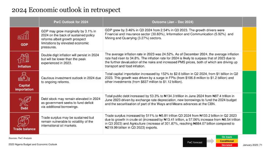
Table comparing PwC forecast vs actual outcomes for GDP, inflation, debt, etc., with color-coded status
Strategic Planning
Financial Services
The slide reviews Nigeria's 2024 economic outcomes against PwC’s forecasts across five areas: GDP, inflation, capital importation, debt, and trade balance. Color-coded indicators (green, yellow, red) show varied performance, with trade balance and capital importation exceeding expectations, while inflation and debt deviated negatively.
GDP, inflation, debt, trade, importation, Nigeria, economic outlook, PwC
Table
PwC/Strategy&
Saved
Column charts showing RWA, LRD, CET1 capital ratio, and total loss absorbing capacity
Risk Assessment and Management
Financial Services
Highlights actions taken to reinforce balance sheet strength and maintain capital ratios
balance, sheet, capital, reinforcement
Multiple Chart
UBS
Saved
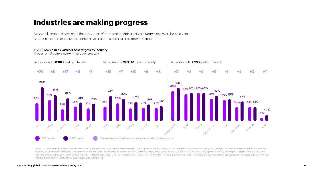
The slide shows three sets of column charts categorizing industries by carbon intensity and their net zero target progress.
Market Analysis and Trends
Environmental Services & Sustainability
The slide presents data on the progress of industries with different carbon intensities in setting net zero targets, showing significant improvements across sectors.
industries, carbon intensity, net zero targets, progress, high carbon, medium carbon, low carbon
Multiple Chart
Accenture
Saved
This slide is advanced with a complex design that integrates a full text section and column chart. It provides a comprehensive view with various textual elements and data visualizations with a focus on CEO opinions on climate change initiatives over a decade.
Market Analysis and Trends
Environmental Services & Sustainability
It delves into the shift in CEO perspectives on climate change, comparing data from 2010 and 2020. The bar charts highlight the increased recognition of climate change initiatives' benefits. This slide would be relevant in discussions regarding business strategies in the context of environmental sustainability and corporate responsibility.
CEO, Climate Change, Survey, Decade Comparison, Benefits, Investments, Sustainability, Corporate Responsibility
Mixed Chart
PwC/Strategy&
Saved
Pie charts and images depicting the share of digital ad spending and consumer behavior on mobile devices.
Technology and Digital Transformation
Media & Entertainment
This slide explores how the mobile user experience is transforming advertising and user behavior, with a focus on app usage and digital spending.
mobile user experience, digital advertising, app usage, platform shift
Multiple Chart
PwC/Strategy&
Saved
Features growth curves and financial data represented through line graphs and comparative data points.
Financial Performance
Financial Services
The slide reviews a decade of growth in asset management at JPMorgan, focusing on client assets, revenue, and pre-tax income.
Asset management, growth, financial performance, revenue, client assets, investment returns
Multiple Chart
JP Morgan
Saved
The slide presents a horizontal bar chart listing various investment products owned by respondents.
Market Analysis and Trends
Financial Services
The slide details the ownership distribution of various investment products such as mutual funds, stocks, and bonds.
Investment, Products, Ownership, Mutual Funds, Stocks
Single Chart
IPSOS
Saved
This slide includes a bar chart contrasting the percentage share of dynamically inserted ads (DAI) vs. edited-in/baked-in ads from 2019 to 2021.
Technology and Digital Transformation
Media & Entertainment
Highlights the significant shift towards dynamically inserted ads in podcast advertising, indicating a trend towards more agile ad delivery.
Podcast, Ads, Dynamic Insertion, Trends
Single Chart
PwC/Strategy&
Saved
Featuring pie charts and a column chart, this slide focuses on client transaction frequencies and wallet composition across fee sizes.
Client Case Studies
Financial Services
The slide assesses the frequency of large episodic transactions for clients and the annual wallet composition by transaction size.
Client Transactions, Frequency, Pie Chart, Wallet Composition, Episodic Transactions, Fee Size, Financial Services
Multiple Chart
JP Morgan
Saved
This slide presents column charts showing the growth of gaming revenues in Hong Kong and Singapore from 2020 to 2025, differentiating between traditional and social/casual gaming with red and grey bars. The slide layout is clear with annotations explaining shifts due to the pandemic.
Market Analysis and Trends
Media & Entertainment
Discusses the shifting dynamics of the gaming industry in Hong Kong and Singapore between 2020 and 2025, highlighting how pandemic-related changes affected traditional and social/casual gaming revenues. It points out Singapore's rise as a gaming hub due to policy support.
gaming industry, Hong Kong, Singapore, revenue trends, pandemic impact
Multiple Chart
PwC/Strategy&
Saved
Contains two grouped column charts representing revenue and EBITDA from 2016 to 2020, comparing Telkom with competitors. Color-coded to distinguish between companies, with additional details on profitability margins included.
Financial Performance
Telecommunications
Analyzes Telkom's market leadership in terms of revenue and EBITDA, attributing its higher profitability to its scale advantage and leading market share in both mobile and fixed broadband sectors. Notes the financial strategies that keep it ahead of competitors like Indosat and XL.
market share, profitability, Telkom, revenue, EBITDA, competitors
Multiple Chart
BCG
Saved
Two columns of text with graphics, image of shopping experience on the side.
Customer and Market Segmentation
Retail & E-commerce
Insights into the top reasons for consumers shifting to offline channels, like 'look and feel' and easing of restrictions.
offline shopping, consumer behavior, market trends, retail, shopping
Boxed
Bain
Saved
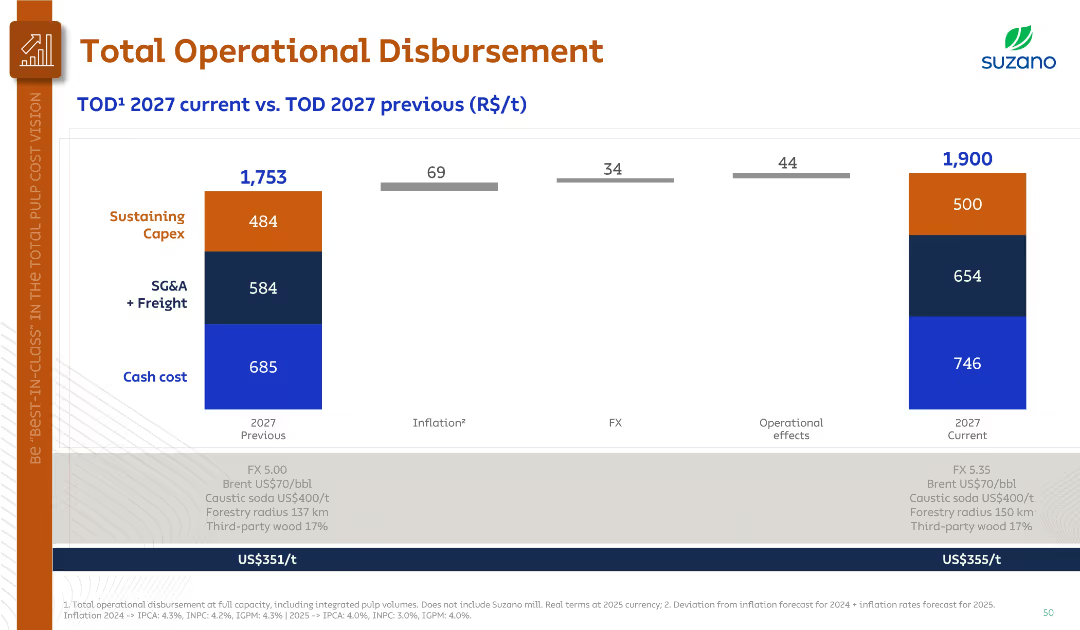
Bar chart comparison of 2027 previous vs. current estimates, with inflation, FX, and operational effects marked.
Financial Performance
Industrial & Manufacturing
Compares prior and current 2027 operational disbursement forecasts, showing increased cost due to inflation and FX despite prior lower projections. Updated inputs like FX 5.35 and adjusted Brent and caustic soda prices are noted.
operational disbursement, 2027 forecast, inflation, FX, cost comparison
Single Chart
Goldman Sachs
Saved
Previous
Next
If nothing, comes up, please save your slides first
Create a FREE account to continue browsing
Receive Instant Access to 1,000+ slides from companies like McKinsey, Google, and Goldman Sachs
First Name
Last Name
Email
Password
I agree to all
Terms & Privacy Policy
Thank you! Your submission has been received!
Oops! Something went wrong while submitting the form.
Have an account?
Sign in
Column Chart
Heatmap
Chevron
Org Chart
Infographic
Callouts
Timeline
List
Graphic
Picture
Process Flow
Diagram
Paragraph
Map
Table
Framework
Subtitle
Takeaway Box
Icon
Other Chart
Radar Chart
Waterfall Chart
Mekko Chart
Pie Chart
Scatter Plot
Line Chart
Bar chart
Bullet points