Create a FREE Account
Instant access to 1,000+ real slides from top companies like McKinsey, BCG, Goldman Sachs, Google and many more!
First Name
Last Name
Email
Password
I agree to all
Terms & Privacy Policy
Thank you! Your submission has been received!
Oops! Something went wrong while submitting the form.
Have an account?
Sign in
Library
Templates
Courses
Pricing
My Account
My Slides
My Templates
✦ AI
AI Prompt Library
AI Search
Sign in
Start Here
Logout
My Saved Slides
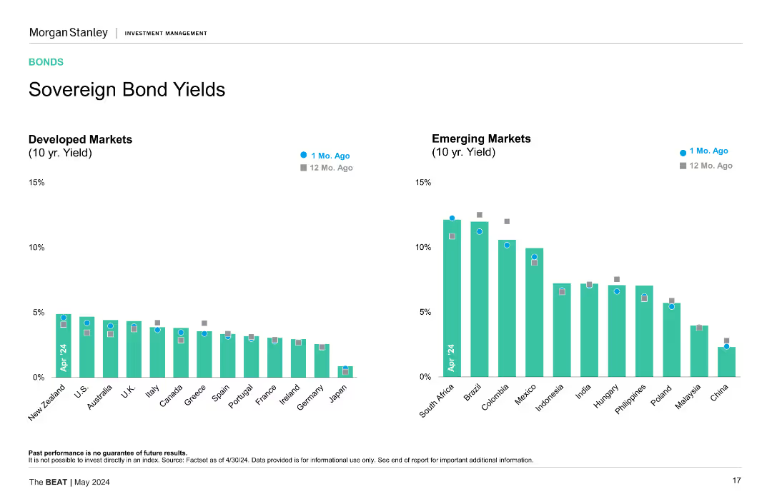
This slide displays two vertical bar charts side by side. The left chart shows 10-year yields for developed markets, while the right chart shows the same for emerging markets, comparing data from 1 month ago and 12 months ago.
Market Analysis and Trends
Financial Services
The slide presents a comparison of sovereign bond yields between developed and emerging markets over the past year, highlighting yield changes and potential market implications.
Sovereign Bonds, Yields, Developed Markets, Emerging Markets, Comparison, Financial Analysis
Multiple Chart
Morgan Stanley
Saved
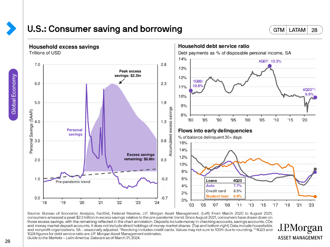
The slide contains three charts: a line chart showing household excess savings, another line chart depicting household debt service ratio, and a line chart for flows into early delinquencies for different loan types.
Market Analysis and Trends
Financial Services
This slide analyzes consumer savings and borrowing trends, highlighting excess savings, debt service ratios, and delinquency rates. Useful for understanding consumer financial health.
consumer savings, borrowing, debt service, delinquencies, financial health, household savings
Multiple Chart
JP Morgan
Saved
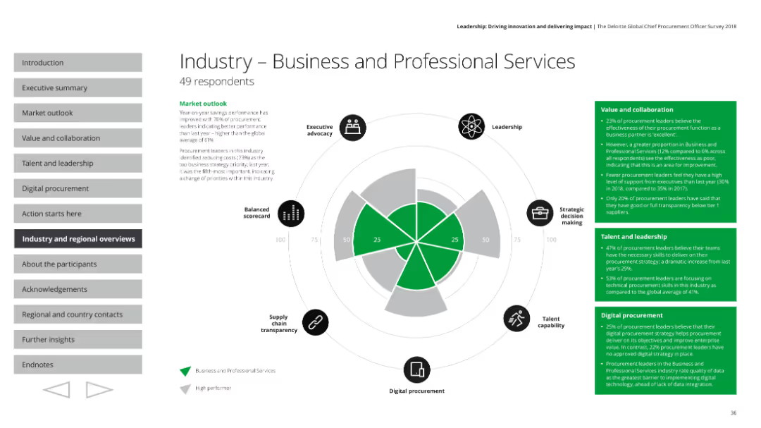
Includes a radar chart and text blocks summarizing key performance areas like market outlook, value and collaboration, and leadership in the industry.
Industry Overview
Professional Services
Provides an overview of the business and professional services industry, detailing performance metrics, strategic priorities, and leadership challenges.
Industry overview, performance, strategy, leadership
Mixed Chart
Deloitte
Saved
This slide features a circular chart showing Australian consumers' ratings of the healthcare system's performance in optimizing health experiences across different personal circumstances.
Market Analysis and Trends
Healthcare & Pharmaceuticals
It evaluates Australian consumers' ratings of their healthcare system's ability to optimize health experiences irrespective of personal circumstances, with a focus on equitable treatment.
healthcare system, performance, optimization, personal circumstances, equitable treatment
Mixed Chart
EY
Saved
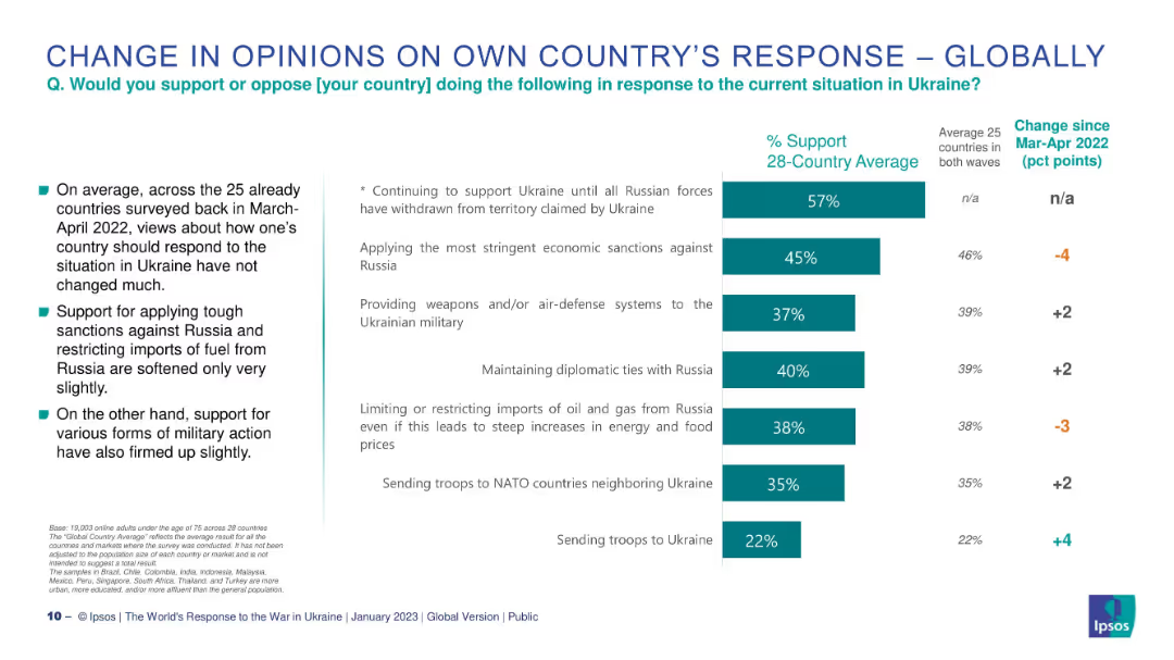
Chart identical in structure to 19953 but includes change indicators since Mar-Apr 2022.
Market Analysis and Trends
Government & Public Sector
This slide examines how public opinion on government response to Ukraine has shifted over time. It shows percentage changes in support for various actions, such as sanctions, military involvement, and diplomacy, across countries surveyed in both 2022 and 2023.
opinion change, Ukraine, comparison, sanctions, diplomacy, Ipsos, military support
Mixed Chart
IPSOS
Saved
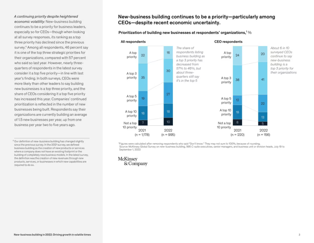
Bar chart with dual segmentation (all respondents vs CEOs), aligned with descriptive text on the left; neutral color palette.
Strategic Planning
Professional Services
This slide shows survey data highlighting that business leaders, especially CEOs, prioritize new-business building despite economic uncertainty. CEOs were more likely to rate it as a top 5 priority compared to other roles.
new-business, CEOs, survey, prioritization, growth, uncertainty, strategic planning, McKinsey survey
Mixed Chart
McKinsey
Saved
A color-coded horizontal bar graph contrasted against a black background, assessing CEO beliefs about the impact of AI compared to the internet.
Market Analysis and Trends
Technology & Software
Evaluates CEO perspectives on AI's potential impact versus the internet revolution, highlighting significant regional insights.
AI impact, internet revolution, CEO survey, global regions, data comparison, technology adoption, business insights, future outlook, market research
Mixed Chart
PwC/Strategy&
Saved
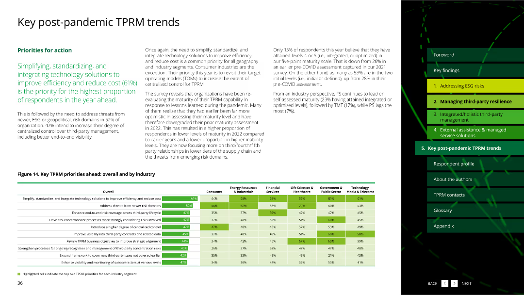
The slide includes a column chart and a detailed table, showing key TPRM priorities ahead by overall and by industry.
Market Analysis and Trends
Professional Services
It outlines the priorities for TPRM post-pandemic, focusing on simplifying, standardizing, and integrating technology solutions to improve efficiency and reduce costs.
TPRM priorities, post-pandemic, column chart, table, technology solutions, professional services
Mixed Chart
Deloitte
Saved
A photo of Cologne Cathedral with a graph showing Germany's GDP growth and a detailed text explanation.
Market Analysis and Trends
Financial Services
This slide discusses Germany's economic conditions, highlighting GDP growth trends and the impact of COVID-19 on the economy.
Germany, GDP growth, economy, financial services, market analysis
Multiple Chart
Deloitte
Saved
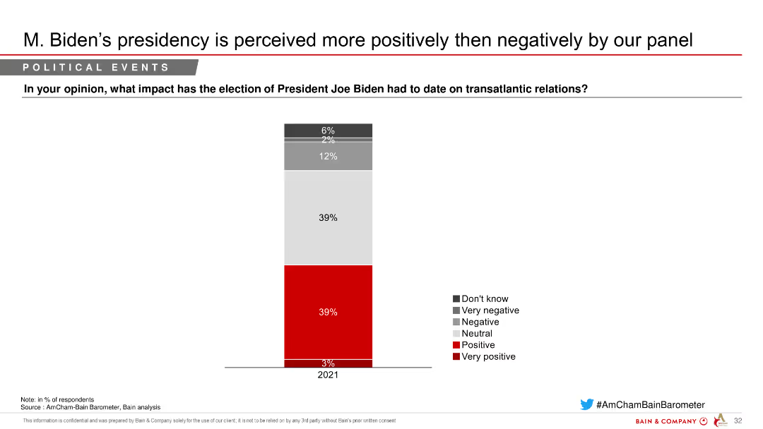
Column chart depicting perceptions of President Joe Biden's impact on transatlantic relations, with segmented responses indicating varying degrees of positivity and negativity.
Market Analysis and Trends
Government & Public Sector
Shows the impact of President Joe Biden's election on transatlantic relations, with a majority seeing it positively, as indicated by a survey of respondents.
Biden, transatlantic, relations, perceptions, survey
Single Chart
Bain
Saved
Features a multi-part diagram describing various aspects of successful loyalty programs, like simplicity and functionality.
Strategic Planning
Retail & E-commerce
Explains the components of effective loyalty programs, including gamification and personalization, to enhance customer engagement.
loyalty, gamification, personalization, engagement, diagram
Diagram
BCG
Saved
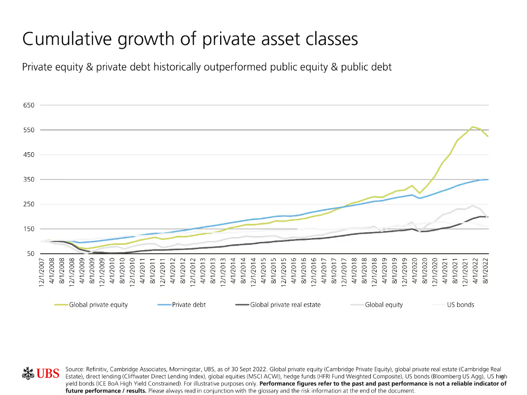
Shows a line chart comparing the cumulative growth of different private asset classes over time, including private equity, private debt, and global private real estate.
Investment Analysis
Financial Services
Illustrates the superior cumulative growth of private asset classes compared to public equity and debt, indicating stronger long-term performance.
Cumulative growth, private asset classes, private equity, private debt, real estate
Single Chart
UBS
Saved
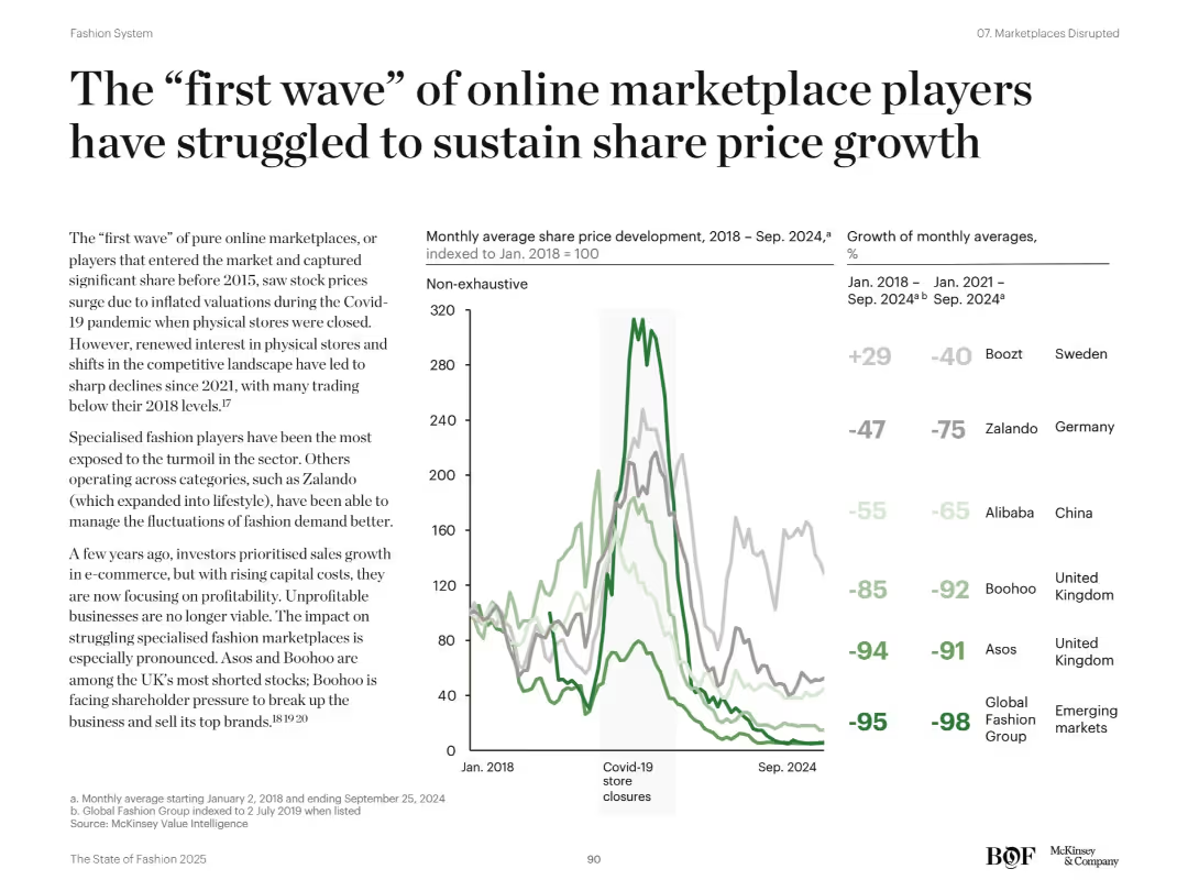
Left-aligned narrative on online marketplaces and right-side line chart and bar graph comparing stock performance of fashion e-commerce players. Green and gray lines show trends.
Strategic Planning
Retail & E-commerce
Analyzes decline in share prices for early e-commerce marketplace players post-Covid boom. Highlights underperformance of specialized players like Boohoo and Asos. Attributes decline to increased competition, profit pressure, and consumer return to physical stores.
e-commerce decline, stock trends, Boohoo, Asos, profitability, market correction
Mixed Chart
McKinsey
Saved
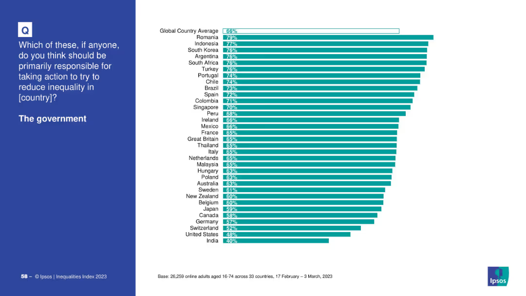
Bar chart ranking countries by % choosing “the government” as primarily responsible.
Market Analysis and Trends
Government & Public Sector
This chart presents country-by-country data on views about government responsibility for inequality. Romania, Indonesia, and South Korea top the list, with India and the U.S. lowest.
government, country data, inequality, Ipsos, bar chart, Romania, responsibility, public opinion
Mixed Chart
IPSOS
Saved
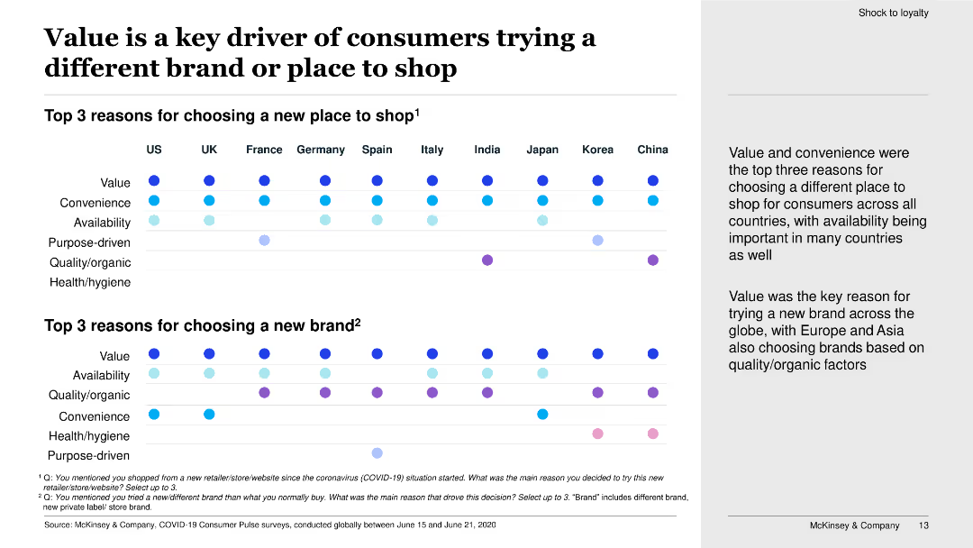
This slide features dot plots showing the top three reasons for choosing a new place to shop and a new brand in various countries.
Market Analysis and Trends
Retail & E-commerce
The slide explores the key reasons consumers choose different brands or places to shop, with value and convenience being primary factors across multiple countries.
value, convenience, new brand, new place to shop, consumer choice, dot plots, survey, shopping behavior
Boxed
McKinsey
Saved
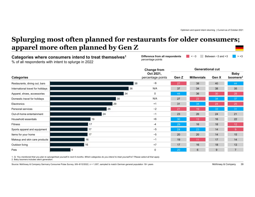
Horizontal bar chart with category-wise splurge intent; includes generational differences
Customer and Market Segmentation
Consumer Goods
Shows intended splurge categories for 2022 by generation. Older groups prioritize restaurants and holidays, while Gen Z favors apparel. Color-coded differences indicate deviation from average.
splurge intent, restaurants, apparel, generational differences, Gen Z, Baby Boomers, Germany, 2022 spending plans
Multiple Chart
McKinsey
Saved
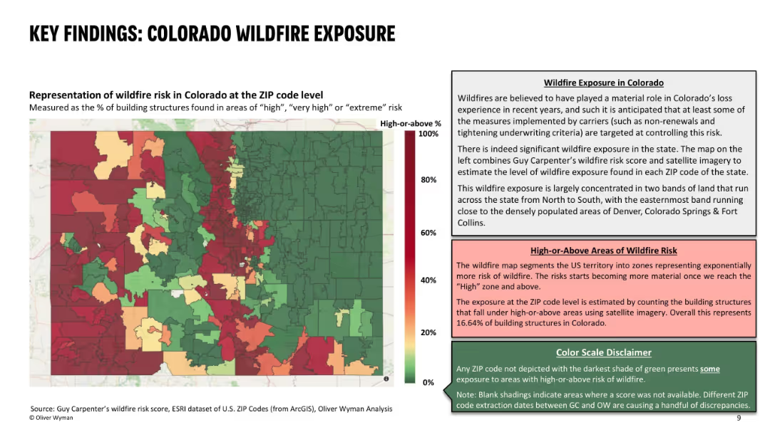
Left side features a color-coded ZIP code heat map of wildfire risk; right side contains descriptive text explaining the data and risk interpretation; uses red-green gradient with three text boxes for context and definitions.
Risk Assessment and Management
Environmental Services & Sustainability
This slide presents the wildfire exposure in Colorado at ZIP code level, identifying areas with high percentages of structures at significant wildfire risk. It highlights concentrated wildfire zones and their correlation with recent underwriting actions by insurers. About 16.6% of Colorado structures are in high-risk zones, influencing carrier decisions.
wildfire risk, ZIP code, building exposure, insurance, risk zones, high-risk areas, Colorado, wildfire impact, underwriting decisions
Mixed Chart
Oliver Wyman
Saved
The slide contains a mixture of pie chart and statistical data presentations. The layout is moderately dense with a clear division between graphical and textual information. Colored icons are used to represent different market segments.
Financial Performance
Financial Services
This slide presents financial data and market engagement statistics, such as net profit contribution, years in markets, and client relationships. It is meant to showcase the company’s financial standing and breadth in the commodities and global markets.
Finance, Global Markets, Commodities, Client Relationships, Profit
Mixed Chart
Goldman Sachs
Saved
A series of stacked column charts and labeled circles denote data points, complemented by explanatory text on the side.
Financial Performance
Financial Services
This slide analyzes the composition of 2023 revenues, indicating a shift towards more durable revenue sources. Utilized for financial analysis or strategic planning discussions.
Revenue Breakdown, Financial Analysis, Growth
Mixed Chart
Goldman Sachs
Saved
Similar to slide 11, with the addition of 'Opportunities' in a third column; uses a simple and clean layout.
Strategic Planning
Financial Services
Strategic insights into future business development, focusing on opportunities stemming from secular changes.
Business Development, Opportunities, Strategy, Future
Linear Flow
Goldman Sachs
Saved
Features column charts depicting barriers to cost program success and lessons learned from such programs in the Nordics.
Operational Efficiency
Professional Services
Analyzes key barriers to the success of cost programs in Nordic countries and the lessons learned, highlighting management challenges and the underestimation of technology improvements.
Barriers, Lessons Learned, Nordic, Management Challenges, Technology
Multiple Chart
Deloitte
Saved
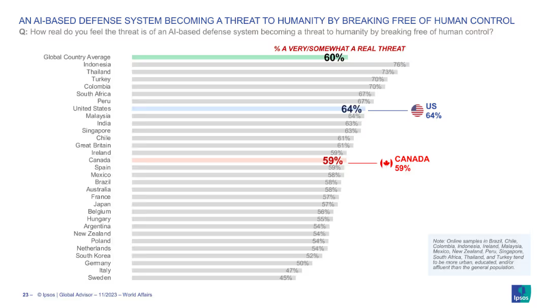
Horizontal bar chart depicting global views on AI-based defense systems becoming uncontrollable; highlights Canada and the US.
Risk Assessment and Management
Artificial Intelligence
This chart illustrates global concern over AI-based defense systems potentially becoming a threat to humanity by escaping human control. With the global average at 60%, the US and Canada register 64% and 59% respectively, reflecting moderate anxiety over emerging AI risks in military contexts.
AI threat, defense systems, artificial intelligence, control risk, public perception, survey, technology, Ipsos
Single Chart
IPSOS
Saved
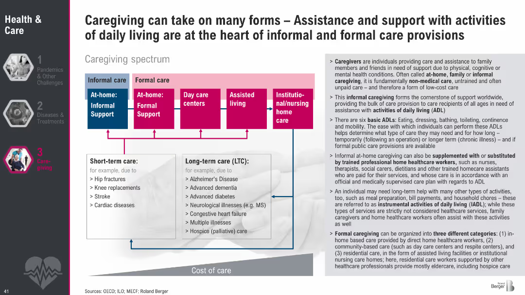
Diagram of caregiving spectrum from informal to formal care with color-coded boxes; side text explains caregiving types, ADLs, and care roles.
Human Resources and Talent Management
Healthcare & Pharmaceuticals
This slide outlines the caregiving spectrum, showing informal vs. formal care types and short-term vs. long-term needs. It also defines the roles of caregivers and the activities they support, emphasizing the importance of both unpaid and professional care structures in supporting daily living.
caregiving, informal care, formal care, ADLs, long-term care, support systems, care spectrum, eldercare
Diagram
Roland Berger
Saved
Contains a pie chart detailing reasons for vaccine wastage, and a column chart showing the impact of unreliable power on vaccine preservation in Nigerian healthcare centers.
Regulatory and Compliance
Healthcare & Pharmaceuticals
Focuses on the critical issues of vaccine wastage linked to inadequate power supply in Nigeria, advocating for solar energy solutions to ensure vaccine preservation and enhance immunization rates.
vaccine wastage, unreliable power, healthcare, Nigeria, solar power, immunization, public health
Mixed Chart
BCG
Saved
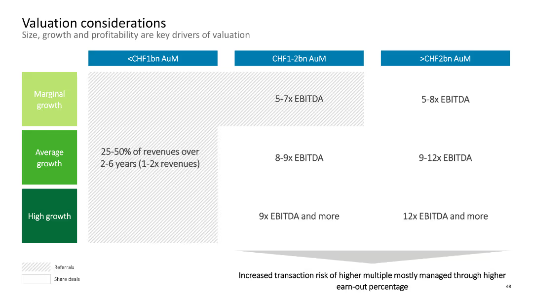
The slide contains a matrix chart with three columns representing AuM ranges and three rows representing growth levels. Each cell indicates EBITDA multiples. The layout is simple with colored sections for clarity.
Corporate Finance and Valuation
Financial Services
This slide discusses valuation considerations, focusing on size, growth, and profitability as key drivers. It provides EBITDA multiples based on AuM and growth levels. Suitable for analyzing company valuation for mergers and acquisitions.
Valuation, EBITDA, AuM, Growth, Financials
Table
Deloitte
Saved
Previous
Next
If nothing, comes up, please save your slides first
Create a FREE account to continue browsing
Receive Instant Access to 1,000+ slides from companies like McKinsey, Google, and Goldman Sachs
First Name
Last Name
Email
Password
I agree to all
Terms & Privacy Policy
Thank you! Your submission has been received!
Oops! Something went wrong while submitting the form.
Have an account?
Sign in
Column Chart
Heatmap
Chevron
Org Chart
Infographic
Callouts
Timeline
List
Graphic
Picture
Process Flow
Diagram
Paragraph
Map
Table
Framework
Subtitle
Takeaway Box
Icon
Other Chart
Radar Chart
Waterfall Chart
Mekko Chart
Pie Chart
Scatter Plot
Line Chart
Bar chart
Bullet points