Create a FREE Account
Instant access to 1,000+ real slides from top companies like McKinsey, BCG, Goldman Sachs, Google and many more!
First Name
Last Name
Email
Password
I agree to all
Terms & Privacy Policy
Thank you! Your submission has been received!
Oops! Something went wrong while submitting the form.
Have an account?
Sign in
Library
Templates
Courses
Pricing
My Account
My Slides
My Templates
✦ AI
AI Prompt Library
AI Search
Sign in
Start Here
Logout
My Saved Slides
Slide showcasing L.E.K.'s healthcare sector overview, detailing their vertical and horizontal practices, and key capabilities.
Industry Overview
Healthcare & Pharmaceuticals
This slide provides an overview of L.E.K.'s comprehensive coverage of the healthcare ecosystem, including their practices and specialized capabilities.
Healthcare ecosystem, L.E.K., vertical practices, horizontal practices, capabilities
Diagram
LEK
Saved
This slide features multiple line graphs representing GDP forecast levels for various regions (US, Europe, China, Japan, India) indexed to 2019 values. Each region's graph is color-coded, with different years marked by points and accompanied by percentage values, illustrating GDP changes over 2019, 2020, and 2021. The layout is divided into columns for each region, clearly labeled and with forecast ranges at the bottom. This structured arrangement aids in comparative analysis of economic trends across different geopolitical areas.
Market Analysis and Trends
Financial Services
The slide is used to compare GDP forecasts across different regions, illustrating economic downturns and recovery predictions. The indexed values to 2019 serve as a baseline for understanding the impact of economic events over the years, making it suitable for financial analysis and strategic planning. This can guide decisions in financial and investment planning, highlighting regions with resilient economic structures or significant downturns.
GDP, forecasts, economic downturn, recovery, financial analysis, strategic planning, 2020, 2021
Multiple Chart
BCG
Saved
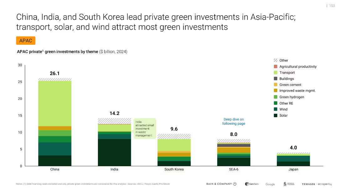
Bar chart comparing green investments by country and theme, labeled and color-coded
Investment Analysis
Environmental Services & Sustainability
Compares private green investments in APAC by theme and country for 2024. China leads with $26.1B, followed by India and South Korea. Main investment themes include solar, wind, and transport. Highlights regional differences and India’s underinvestment in waste management.
green investments, APAC, solar, wind, transport, China, India, South Korea, private capital
Single Chart
Bain
Saved
This slide contains two vertical column charts. The left chart, 'Quarterly CLO Creation and Mutual Fund Flows', shows data in blue tones, with pattern differentiation for CLOs, Loan Funds, and the total. The right chart, 'Institutional Loan Volume Backing M&A', features dark and light blue bars representing different types of loans.
Investment Analysis
Financial Services
The left chart analyzes the trends in CLO creation versus mutual fund flows, suggesting an investment climate. The right chart details the volume of institutional loans supporting mergers and acquisitions, indicating market activity and investor sentiment.
CLO Creation, Mutual Fund Flows, Institutional Loans, M&A, LBO, PE-backed, Corporate, Investment Climate, Market Activity
Multiple Chart
Morgan Stanley
Saved
This slide consists of six line graphs, each for a different country, showing search volume trends for food delivery services over time, indexed to 2017 levels. The graphs are accompanied by annotations indicating the fold increase in search interest. The layout is clean, with each graph neatly separated and clearly labeled.
Market Analysis and Trends
Hospitality & Tourism
The slide details the enduring high interest in food delivery services post-COVID, as demonstrated by search volume data from Google Trends. Each country's graph underscores the sustained increase in consumer interest, with annotations providing a quick reference to the scale of change compared to 2017 levels.
food delivery, search trends, COVID-19 impact, consumer interest, Southeast Asia, Google Trends, index comparison, market analysis
Multiple Chart
Bain
Saved
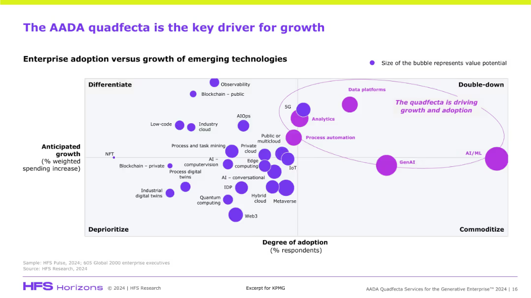
Scatterplot chart mapping emerging technologies based on adoption and anticipated growth. Bubble size denotes value potential. Purple elements highlight AADA’s prominence.
Market Analysis and Trends
Artificial Intelligence
This slide visualizes the strategic positioning of AADA technologies (Analytics, AI/ML, Automation, Data Platforms) as high-growth, high-adoption drivers. GenAI and AI/ML appear as key focal areas for investment and differentiation in enterprise tech.
emerging tech, AADA, GenAI, AI/ML, analytics, data platforms, adoption, growth, quadrant chart
Single Chart
KPMG
Saved
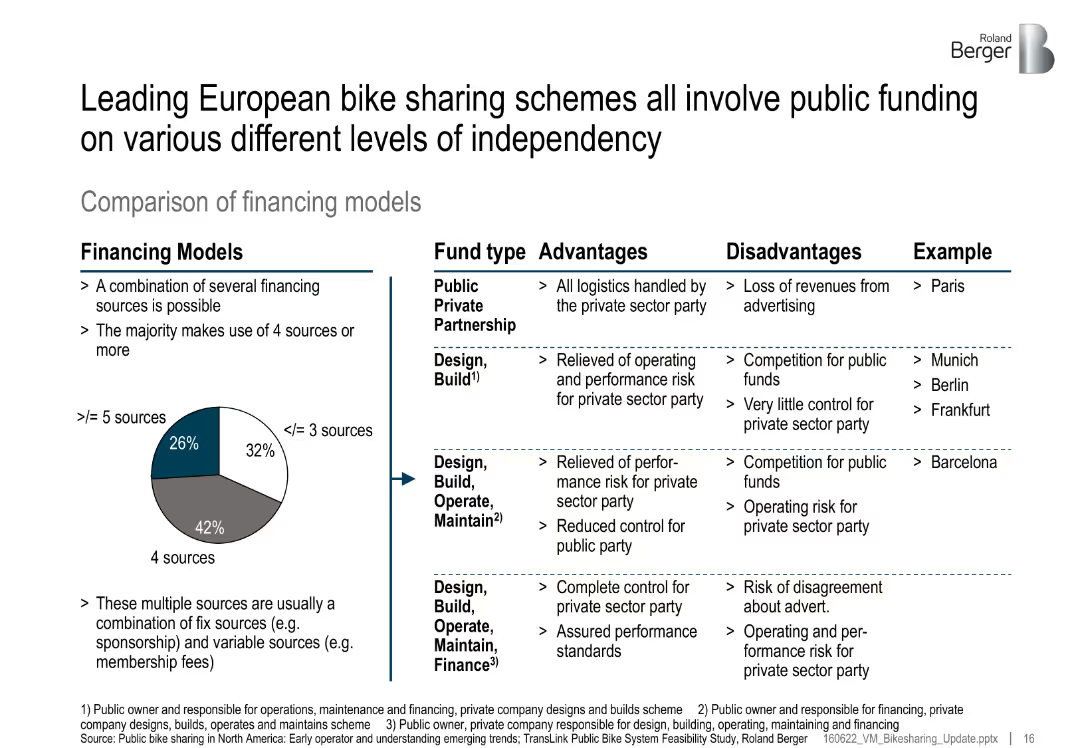
Split layout: left pie chart of financing model distribution, right table comparing fund types; advantages, disadvantages, and examples listed
Investment Analysis
Transportation & Logistics
The slide categorizes various financing models used in European bike-sharing schemes, showing a mix of public-private partnerships and government-led models. Each model is evaluated for pros and cons with city examples.
financing models, bike sharing, PPP, public funds, investment, Europe, urban mobility
Mixed Chart
Roland Berger
Saved
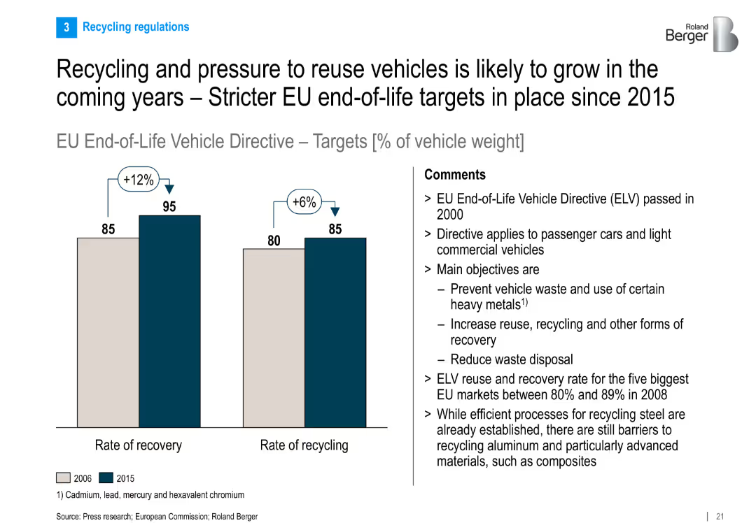
Bar chart compares 2006 vs. 2015 recovery and recycling rates per EU directive; comments discuss policy goals and challenges
Regulatory and Compliance
Industrial & Manufacturing
Discusses EU End-of-Life Vehicle Directive and its targets for recovery and recycling of vehicle weight. Highlights improvements over time and ongoing challenges, particularly with advanced materials.
recycling, ELV directive, EU regulation, vehicle reuse, sustainability, recovery rate, automotive waste
Mixed Chart
Roland Berger
Saved
An advanced slide that features four sets of line graphs depicting total net charge-offs and non-performing loans, complemented by text summaries on the right-hand side. The graphs are detailed, using blue tones to represent different data points over time. The right side of the slide provides bullet points highlighting key actions taken since the financial crisis to improve credit profile.
Risk Assessment and Management
Financial Services
This slide aims to demonstrate the significant improvements in the company's credit profile, featuring historical data on net charge-offs and non-performing loans, as well as selected actions taken since the financial crisis. The goal is to show effective risk management and financial stability to stakeholders.
Credit Profile, Risk Management, Net Charge-Offs, Non-Performing Loans, Financial Stability, Strategic Actions, Financial Crisis
Multiple Chart
Morgan Stanley
Saved
Involves a collection of column charts, tables, and textual analysis with a consistent color scheme. The layout is systematic and packed with data.
Risk Assessment and Management
Financial Services
Discusses the supervision of firmwide assets, their classes, and distribution, which is pertinent for risk management and strategic planning.
Firmwide, Assets, Supervision, Risk, Management, Strategic, Planning, Asset Class, Distribution, Classes
Multiple Chart
Goldman Sachs
Saved
A single line chart showing the Global Supply Chain Pressure Index from 2015 to 2023, highlighting significant events and pressures.
Market Analysis and Trends
Transportation & Logistics
The slide discusses the return of global supply chain pressures to pre-pandemic levels and the impact of various global events on these pressures.
supply chain, global pressures, pre-pandemic, transportation, logistics, market trends
Mixed Chart
Accenture
Saved
The slide displays a large pie chart in the center with colored segments indicating the cost breakdown of raw materials like natural rubber, synthetic rubber, chemicals, and more. To the right, there are three images that presumably relate to the materials: tapped rubber tree, a pile of rubber, and workers in protective gear.
Financial Performance
Industrial & Manufacturing
This slide presents a breakdown of raw material costs for H1 2023, totaling €3.2BN. The chart shows the percentage share of each material, such as natural rubber, synthetic rubber, steel cord, and others. It is likely used for a financial overview or cost analysis within the automotive or manufacturing industry.
raw materials, cost breakdown, pie chart, H1 2023, automotive industry
Single Chart
Morgan Stanley
Saved
The slide includes two charts: one showing oil price scenarios and associated US CO2-EOR production forecasts, and another showing the proportion of CO2-EOR in total EOR production. The charts are color-coded with projections until 2040.
Market Analysis and Trends
Energy & Utilities
The slide analyzes the impact of oil prices on the demand for CO2-EOR projects and forecasts the production of CO2-EOR in the US, indicating potential future trends and challenges due to price fluctuations.
CO2-EOR, oil prices, production forecasts, US market, future trends
Multiple Chart
Kearney
Saved
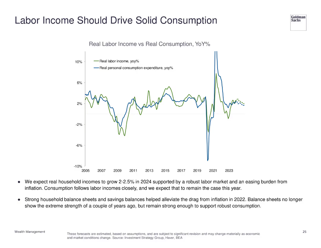
The slide features a line chart comparing real labor income vs. real personal consumption expenditure from 2005 to 2023, with annotations for key trends.
Market Analysis and Trends
Financial Services
This slide examines the relationship between labor income and consumption, predicting robust household income growth and solid consumption.
labor income, personal consumption, economic analysis, household income, consumption trends
Mixed Chart
Goldman Sachs
Saved
The slide displays two column charts showing survey responses by country with varying data-to-ink ratios.
Technology and Digital Transformation
Professional Services
The slide explains Tufte's data-to-ink ratio principle, demonstrating how reducing non-data ink can make charts clearer and more efficient.
Tufte, data-to-ink, ratio, survey, responses, visualization, chart, efficiency, clarity, design
Multiple Chart
EY
Saved
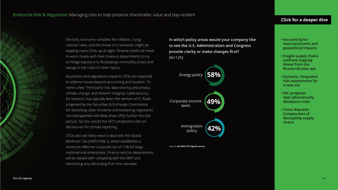
The slide has detailed text on the left discussing economic variables and policies affecting CFOs, and a column chart on the right showing policy areas needing clarity or changes.
Risk Assessment and Management
Professional Services
This slide focuses on managing risks and regulatory challenges, emphasizing the importance of clarity in energy policy, corporate income taxes, and immigration policy for CFOs to preserve shareholder value and resilience.
risk management, regulation, economic variables, policies, energy policy, corporate taxes, immigration policy, CFO, shareholder value, resilience
Mixed Chart
Deloitte
Saved
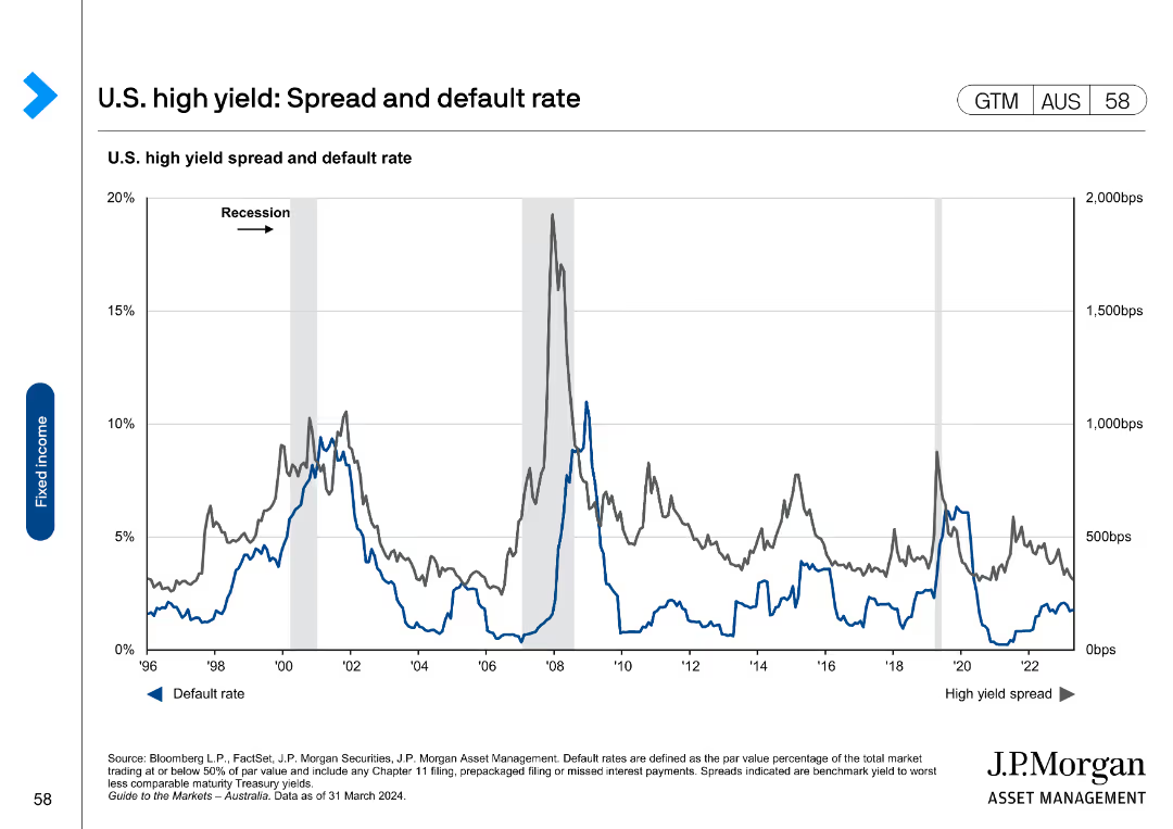
The slide contains a line chart showing the U.S. high yield spread and default rate over time, with marked recessions for context.
Market Analysis and Trends
Financial Services
It provides historical data on the spread and default rates of U.S. high-yield bonds, useful for assessing the risk and performance of high-yield markets.
high yield, spread, default rate, U.S., bonds
Single Chart
JP Morgan
Saved
Includes column chart showcasing 'Platform Solutions Net Revenues' and financial results tables focusing on consumer platforms and banking services, accompanied by textual highlights of key data points.
Operational Efficiency
Financial Services
Discusses the financial outcomes of Platform Solutions, highlighting net revenue changes and factors affecting profitability. This slide is essential for assessing the segment's operational efficiency and financial trends.
Platform Solutions, Net Revenues, Consumer Platforms, Transaction Banking, Operational Expenses, Revenue Growth, Profitability Analysis
Mixed Chart
Goldman Sachs
Saved
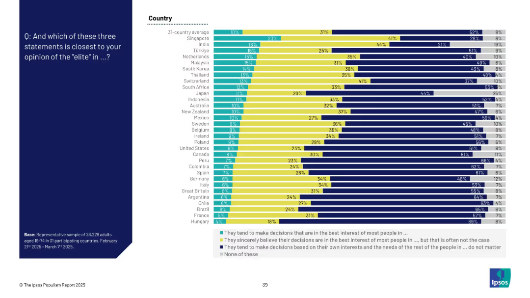
Stacked horizontal bar chart showing distribution among three opinion categories about elites plus a “none” category
Market Analysis and Trends
Government & Public Sector
This slide examines three interpretations of elite behavior: acting in the people’s best interest, sincerely believing they do, or prioritizing self-interest. Most people believe elites act out of self-interest. Country-wise differences are clearly shown with comparative data.
elite perception, decision-making, trust, public sentiment, global views, Ipsos, political sociology, influence, cynicism
Mixed Chart
IPSOS
Saved
Contains a central text block with three surrounding icons representing Work, Workforce, and Workplace. Each icon is connected with a line to the central text, suggesting a relationship between the three dimensions.
Strategic Planning
Professional Services
Slide explores the deeply integrated dimensions of workforce transformation, addressing the work, workforce, and workplace. Useful for discussions on the integration of these elements in strategic business planning.
Workforce, Transformation, Strategy, Integration
Diagram
Deloitte
Saved
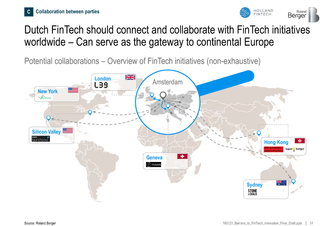
World map showing major FinTech hubs and their connections to Amsterdam
Sales and Business Development
Financial Services
The slide positions Amsterdam as a central hub in global FinTech collaborations, suggesting potential for Dutch FinTechs to connect with international initiatives across the U.S., Europe, and Asia-Pacific.
Amsterdam, collaboration, global FinTech, gateway, international, initiatives
Uncategorized
Roland Berger
Saved
A world map colored in shades of blue indicating the percentage of activities that can be automated in different regions, accompanied by a pie chart showing economic figures for key regions.
Market Analysis and Trends
Industrial & Manufacturing
Analyzes the potential impact of automation globally, presenting the percentage of activities that can be automated by region and the economic impact in terms of total full-time equivalents (FTEs) and dollars.
Global, Automation, Economy, Impact, Regions
Multiple Chart
McKinsey
Saved
A column chart showing the market cap of Brazil's top companies in 2010, 2015, and 2019 with significant downturns and recoveries noted.
Investment Analysis
Financial Services
Presents Brazil's top 10 companies' market cap fluctuations and recovery over the decade, providing insights into the economic conditions and recovery phases.
market cap, Brazil, top companies, economic recovery, investment
Mixed Chart
McKinsey
Saved
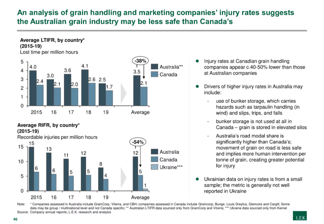
The slide presents column charts comparing lost time injury frequency rates (LTIFR) and recordable injury frequency rates (RIFR) in Australia, Canada, and Ukraine.
Risk Assessment and Management
Agriculture & Food Production
The slide analyzes safety metrics in the grain handling industry, showing that injury rates in Australia are higher than in Canada, with detailed notes on contributing factors and implications for safety management.
Grain handling, injury rates, safety, Australia, Canada, Ukraine, risk assessment, agriculture, food production
Multiple Chart
LEK
Saved
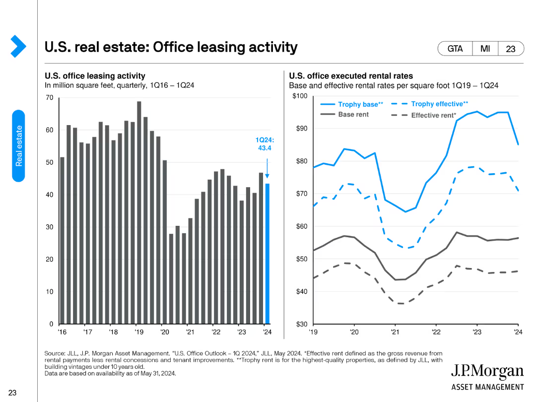
The slide contains two column charts. The left chart shows U.S. office leasing activity in million square feet from 1Q16 to 1Q24. The right chart compares base and effective rental rates per square foot from 1Q19 to 1Q24.
Market Analysis and Trends
Real Estate & Construction
This slide tracks U.S. office leasing activity and rental rates over time, providing insights into office space demand and rent dynamics. It's useful for understanding the office market's performance and trends in leasing and rental rates.
office leasing, rental rates, market performance, leasing activity, office space demand
Multiple Chart
JP Morgan
Saved
Previous
Next
If nothing, comes up, please save your slides first
Create a FREE account to continue browsing
Receive Instant Access to 1,000+ slides from companies like McKinsey, Google, and Goldman Sachs
First Name
Last Name
Email
Password
I agree to all
Terms & Privacy Policy
Thank you! Your submission has been received!
Oops! Something went wrong while submitting the form.
Have an account?
Sign in
Column Chart
Heatmap
Chevron
Org Chart
Infographic
Callouts
Timeline
List
Graphic
Picture
Process Flow
Diagram
Paragraph
Map
Table
Framework
Subtitle
Takeaway Box
Icon
Other Chart
Radar Chart
Waterfall Chart
Mekko Chart
Pie Chart
Scatter Plot
Line Chart
Bar chart
Bullet points