Create a FREE Account
Instant access to 1,000+ real slides from top companies like McKinsey, BCG, Goldman Sachs, Google and many more!
First Name
Last Name
Email
Password
I agree to all
Terms & Privacy Policy
Thank you! Your submission has been received!
Oops! Something went wrong while submitting the form.
Have an account?
Sign in
Library
Templates
Courses
Pricing
My Account
My Slides
My Templates
✦ AI
AI Prompt Library
AI Search
Sign in
Start Here
Logout
My Saved Slides
Left side has percentage boxes, right side has a bar chart and text
Operational Efficiency
Transportation & Logistics
Use of generative AI in supply chain management, focusing on knowledge enhancement and predictive models
supply chain, AI, knowledge enhancement, predictive models
Mixed Chart
Gartner
Saved
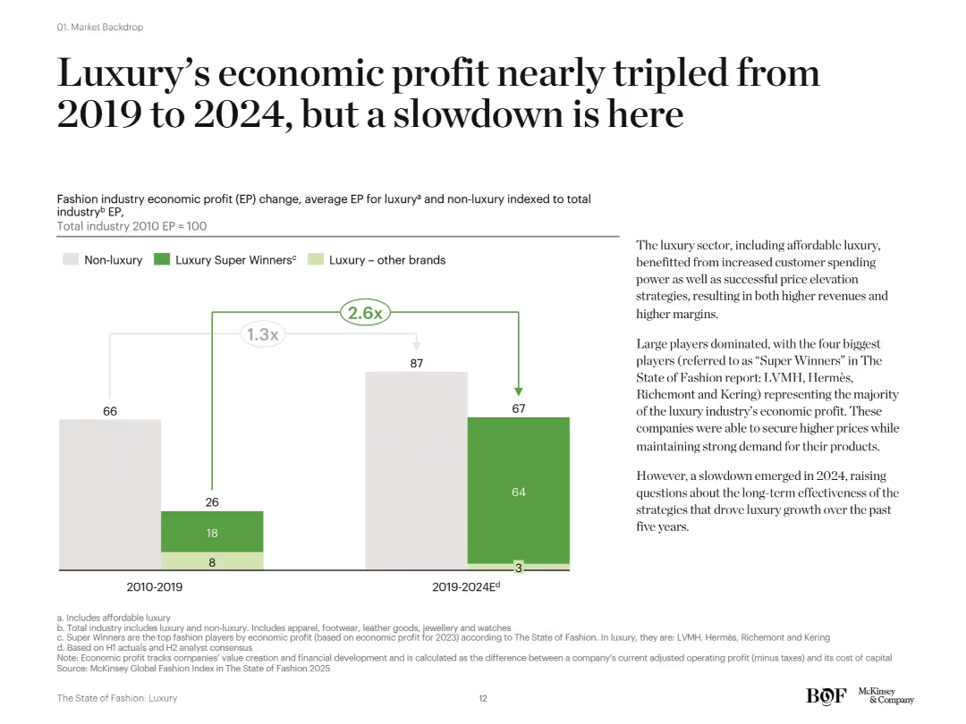
Vertical stacked bar chart comparing luxury and non-luxury EP across two periods. Right side has descriptive text with large headline and explanation of industry concentration and future risks.
Financial Performance
Consumer Goods
The fashion industry’s economic profit, especially from top luxury brands ("Super Winners"), significantly increased between 2019 and 2024, nearly tripling compared to 2010–2019. The growth was driven by pricing power and brand dominance, but signs of a 2024 slowdown have emerged.
luxury profit, economic profit, super winners, LVMH, fashion industry, slowdown, McKinsey
Mixed Chart
McKinsey
Saved
Contains a line chart and an area chart illustrating fiscal revenue and expenditure, and the pace of central and local government bond issuance over time.
Regulatory and Compliance
Government & Public Sector
Analyzes China's fiscal policy with data on revenue, expenditure, and bond issuance, providing insights into government financial strategies and public sector funding.
Fiscal policy, China, Government, Revenue, Expenditure, Bonds, Public sector, Financial analysis, Economic data
Multiple Chart
JP Morgan
Saved
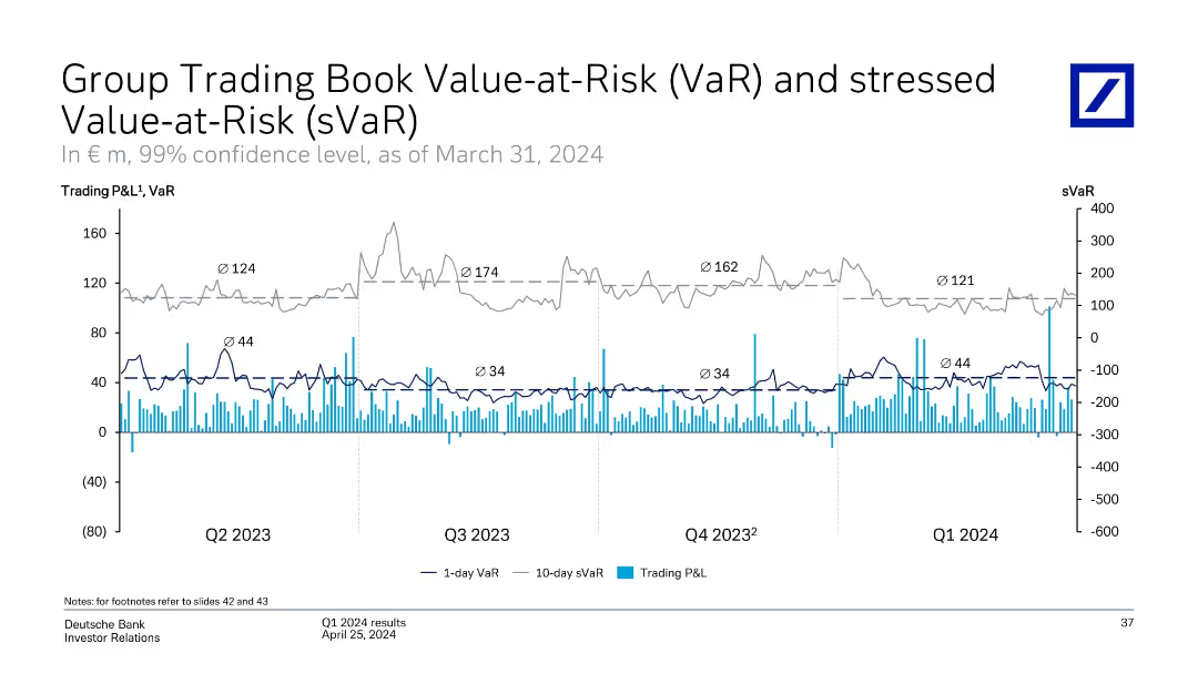
Line and bar graph showing 1-day VaR, 10-day sVaR, and daily trading P&L trends across Q2 2023 to Q1 2024.
Risk Assessment and Management
Financial Services
Tracks Deutsche Bank’s market risk exposure via Value-at-Risk metrics and trading P&L fluctuations over time. Average sVaR and VaR are labeled quarterly. Highlights include risk peaks and P&L volatility patterns, helping assess the bank’s trading risk profile.
VaR, sVaR, trading risk, market risk, P&L volatility, Deutsche Bank
Single Chart
Deutsche Bank
Saved
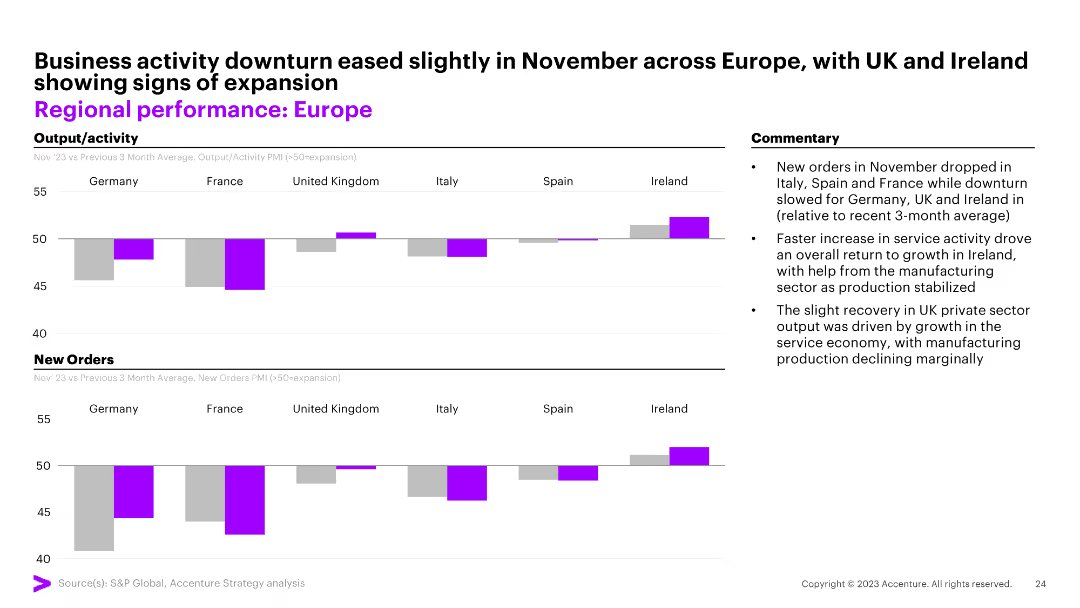
Two column charts comparing output/activity and new orders across European countries. The slide also includes commentary on business activity in November.
Market Analysis and Trends
Financial Services
This slide analyzes the performance of different European countries, comparing their output/activity and new orders, with a focus on changes observed in November.
Europe, performance, activity, orders, November
Multiple Chart
Accenture
Saved
Showcases a bar chart comparing the duration of ICT classes in Nigerian schools to those in other countries, emphasizing the gaps in technology education.
Strategic Planning
Education & Training
Critiques the current state of ICT education in Nigeria, showing significantly lower hours dedicated to practical ICT training compared to other nations, arguing for improved infrastructure to bridge this gap.
ICT, education, Nigeria, technology training, international comparison, infrastructure gaps
Single Chart
BCG
Saved
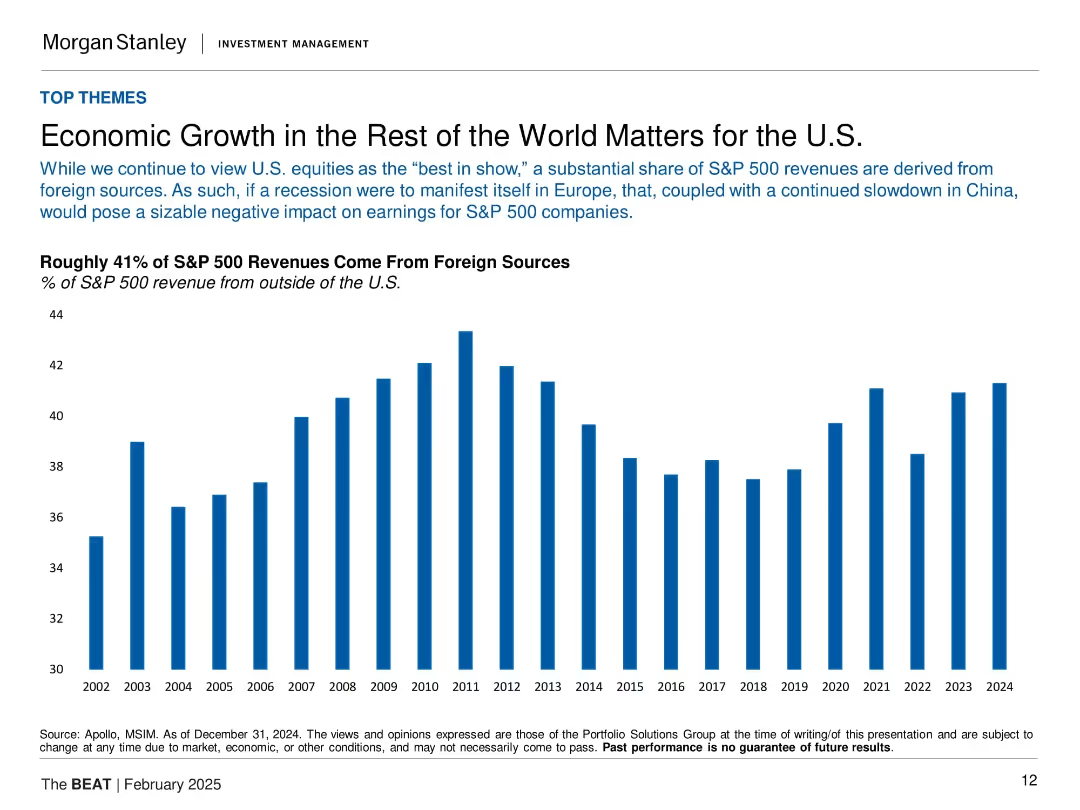
Vertical bar chart (2002–2024) showing % of S&P 500 revenue from outside the U.S.
Market Analysis and Trends
Financial Services
The slide emphasizes the global exposure of U.S. equities, noting that about 41% of S&P 500 revenues come from foreign markets. It warns that economic slowdowns abroad, especially in Europe and China, could negatively impact earnings. The long-term chart visualizes the steady foreign contribution to revenue, underscoring global interdependence.
S&P 500, foreign revenue, globalization, earnings impact, Europe, China, economic exposure, U.S. equities
Single Chart
Morgan Stanley
Saved
The slide displays a complex table comparing different expense categories over various quarters, alongside a single column chart showing the efficiency ratio. It utilizes a muted color palette with highlights in blue.
Operational Efficiency
Financial Services
This slide presents an in-depth look at the company's expenses, showing changes over time and highlighting operational efficiency through an efficiency ratio metric. It is used to evaluate financial management and cost-efficiency within the company.
Expenses, Efficiency Ratio, Operational, Financial Data
Mixed Chart
Goldman Sachs
Saved
The slide features a bar chart and table displaying financial results, specifically profit and loss data.
Financial Performance
Financial Services
Slide provides financial results for the 'Corporate & Other' segment, detailing profit/loss before tax, and highlighting impacts from funding, liquidity, legacy portfolios, and shareholder expenses. Major losses and minor gains are outlined.
financial results, profit loss, corporate, Q1 2023
Mixed Chart
Deutsche Bank
Saved
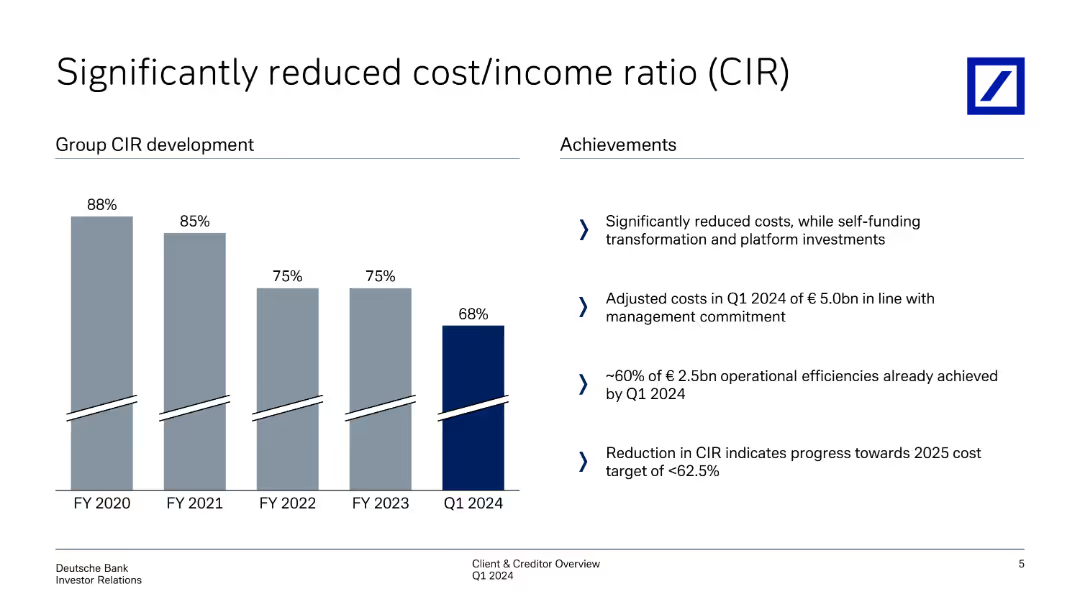
This slide shows column charts depicting the development of cost/income ratio (CIR) over fiscal years, with achievements listed on the right side.
Operational Efficiency
Financial Services
Analyzes the significant reduction in cost/income ratio over time, detailing operational efficiencies and management strategies that contributed to the reduction.
cost/income ratio, CIR, operational efficiency, cost reduction, management strategies
Mixed Chart
Deutsche Bank
Saved
The slide features a column chart showing adjusted revenue progression in USD mn from 3Q16 to 2019, with segmented revenue sources and costs.
Financial Performance
Financial Services
This slide outlines expected improvements in revenue loss by 2019, driven by de-risking and legacy funding reduction.
revenue progression, adjusted revenue, de-risking, legacy funding, financial performance
Single Chart
Credit Suisse
Saved
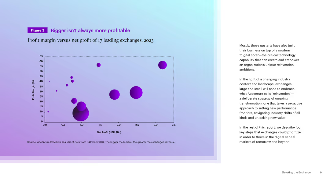
Left-aligned scatter plot with bubble chart (profit margin vs. net profit), accompanied by paragraph text on the right. Purple gradient background.
Financial Performance
Financial Services
The slide presents a bubble chart comparing the profit margins and net profits of 17 global exchanges in 2023, demonstrating that size does not equate to profitability. The accompanying text discusses the need for reinvention driven by digital transformation.
Profitability, Exchanges, Net Profit, Profit Margin, Digital Core, Reinvention, Financials, Market Performance, 2023
Mixed Chart
Accenture
Saved
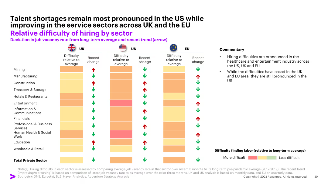
The slide contains a comparative bar chart showing the relative difficulty of hiring by sector for the UK, US, and EU, with color-coded arrows indicating trends.
Human Resources and Talent Management
Professional Services
The slide examines the hiring difficulties across various sectors in the UK, US, and EU, highlighting sector-specific challenges and improvements.
hiring, sector, difficulty, UK, US, EU
Table
Accenture
Saved
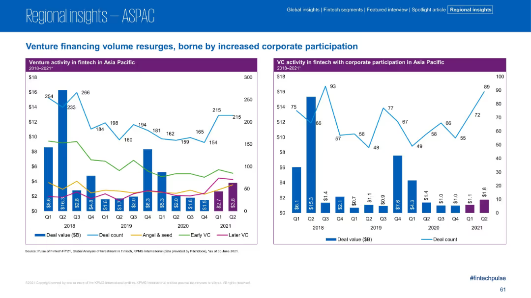
Dual charts showing deal value trends by financing stage and corporate participation.
Strategic Planning
Financial Services
The left chart disaggregates venture financing by stage, while the right shows corporate participation trends in VC deals. The slide highlights resurgence in corporate-backed VC deals after a decline, signaling renewed strategic interest.
VC, Corporate Participation, Financing Stages, Early VC, Later VC
Multiple Chart
KPMG
Saved
Features a comparison of different battery technologies, including lithium-ion, flow batteries, and sodium-ion. The slide uses bar graphs to depict expected global demand and Australia's relative strength in these technologies. Color coding and icons are used to visually differentiate each technology type, with additional textual descriptions providing context on their applications and advantages.
Competitive Landscape
Energy & Utilities
Analyzes the market potential and advantages of various battery technologies, focusing on Australia's strengths and opportunities in sectors like lithium-ion and flow batteries.
battery technologies, Australia, global market, lithium-ion, flow batteries, sodium-ion, market analysis, technology strengths, future potential, energy storage
Mixed Chart
Accenture
Saved
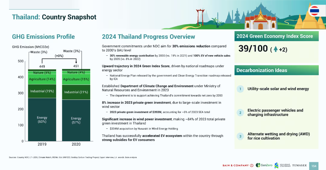
Layout mirrors previous country snapshots with emissions bar chart, 2024 progress narrative, index score, and decarbonization ideas.
Strategic Planning
Government & Public Sector
Thailand’s emissions profile remained stable between 2019–2020. The 2024 Green Index Score increased to 39/100. Green investments reached $393M in 2023, driven by wind power. Strategies emphasize EV adoption, utility-scale renewables, and rice cultivation water management.
Thailand, emissions, EV, wind power, solar, agriculture, AWD, 2024, Green Index
Mixed Chart
Bain
Saved
A complex visual with text blocks and a large pie chart detailing the distribution of investments in resiliency across sectors like automation and digitization.
Strategic Planning
Industrial & Manufacturing
The slide provides an analysis of the overall investment strategy by companies to enhance resilience, highlighting how funds are allocated across various activities such as resourcing, industrial automation, and digitization.
investment, strategy, resilience, automation, business analysis
Mixed Chart
Accenture
Saved
Three-part text layout detailing blockchain applications in payments, loyalty rewards, and Metaverse engagement.
Technology and Digital Transformation
Technology & Software
Explores blockchain's role in transforming consumer engagement through payment solutions, rewards, and virtual experiences.
Blockchain, Consumer, Metaverse, Payments, Rewards
Pillar
McKinsey
Saved
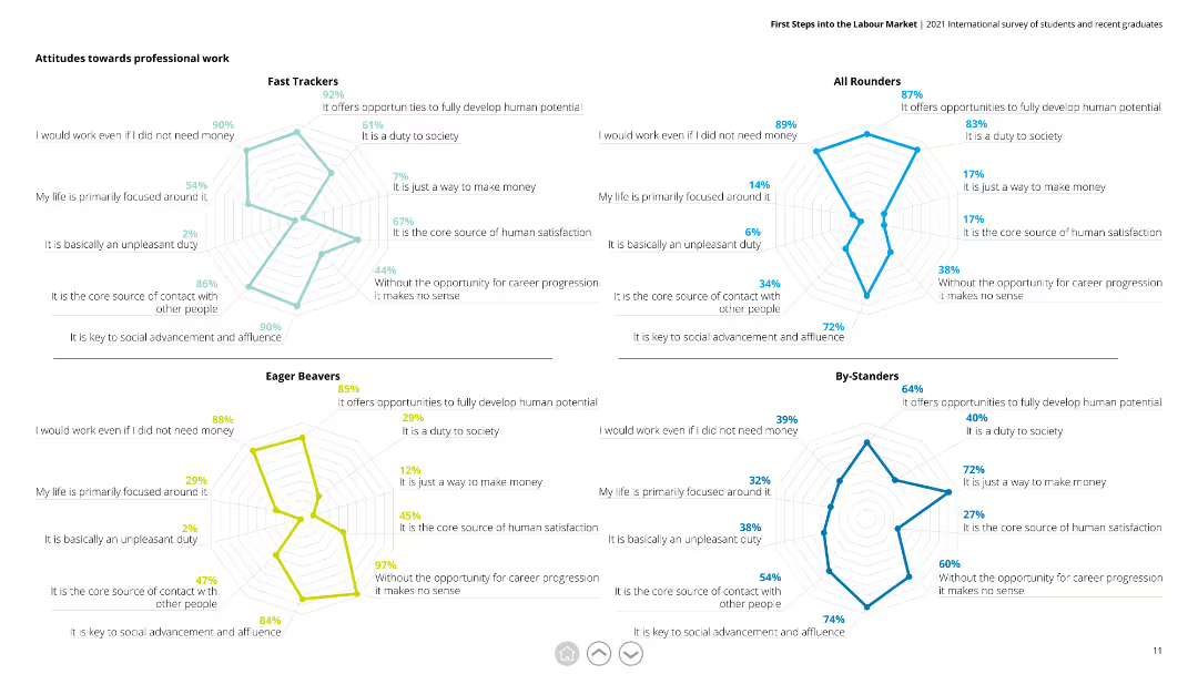
This slide contains four radar charts, each representing a different respondent group (Fast Trackers, All Rounders, Eager Beavers, By-Standers). Each chart evaluates attitudes towards professional work based on various statements.
Market Analysis and Trends
Education & Training
The slide illustrates how different groups perceive professional work, with metrics like duty to society, core satisfaction source, and need for money. It is useful for understanding diverse attitudes and tailoring career advice or programs.
professional work, radar chart, attitudes, respondents, Fast Trackers, All Rounders, Eager Beavers, By-Standers
Multiple Chart
Deloitte
Saved
A Venn diagram centralizes the slide, flanked by bulleted text that presents the bank's criteria, competitive advantages, and value proposition. The layout is engaging, using color to differentiate between elements.
Technology and Digital Transformation
Financial Services
The slide provides insights into the firm's vision and strategic criteria for establishing a leading digital consumer bank, emphasizing its strengths and customer-centric value proposition.
digital banking, consumer finance, strategy, value proposition
Table
Goldman Sachs
Saved
This slide displays multiple column charts segmented by underwriter type and account size, analyzing the impact of new organizational models and rating platforms. Each segment is color-coded based on impact level, with clear labels for each category, making it easy to distinguish between different sections.
Risk Assessment and Management
Financial Services
This slide offers a detailed breakdown of the impact of new processes and underwriting platforms across different segments of the industry, including personal and commercial lines. It is valuable for understanding specific impacts in diverse operational scales and could guide tailored strategic adjustments.
underwriting, segmentation, impact analysis, personal lines, commercial lines, processes
Multiple Chart
Accenture
Saved
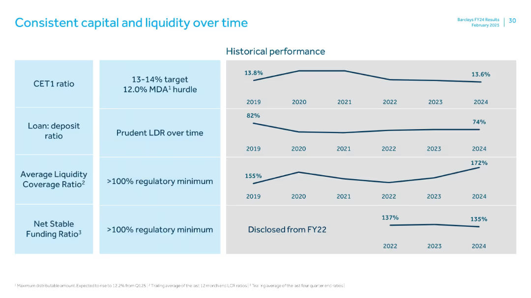
Grid layout with four metrics: CET1 ratio, loan:deposit ratio, liquidity coverage ratio, and funding ratio. Each metric has a trend line from 2019–2024.
Regulatory and Compliance
Financial Services
The slide highlights long-term stability in Barclays' capital and liquidity metrics. CET1 ratio stays within target range; LDR remains conservative; liquidity and funding ratios consistently exceed regulatory minimums.
CET1, LDR, LCR, NSFR, capital, liquidity, funding, 2024 trends
Single Chart
Barclays
Saved
The slide contains two main sections with column charts: the top section shows total PE/VC exits over time, and the bottom section splits exits across different asset classes.
Investment Analysis
Financial Services
This slide presents monthly trends in PE/VC exits, displaying total exit values and the distribution across various asset classes over a specific period.
PE/VC exits, monthly trends, asset classes, exit values, financial analysis
Multiple Chart
EY
Saved
The slide features a column chart detailing broadband satisfaction levels in the UK. It has simple, clean visual elements with colors like blue and green denoting different satisfaction levels.
Market Analysis and Trends
Telecommunications
The slide presents data on the high levels of satisfaction among UK broadband users, highlighting potential market inertia against switching providers or upgrading. Intended to analyze market trends and customer satisfaction in telecommunications.
broadband, satisfaction, market trends, UK, telecommunications
Mixed Chart
Deloitte
Saved
Contains a stacked column chart showing market size by segment and a bulleted list on the left, with annotations and a footnote.
Industry Overview
Technology & Software
Summarizes the internet economy's expected growth in Southeast Asia by 2025, breaking down the market into ecommerce, travel, and online media segments with a focus on the significant share of ecommerce and travel in online retail spend.
Internet economy, SEA, market size, ecommerce, travel, online media
Single Chart
Bain
Saved
Previous
Next
If nothing, comes up, please save your slides first
Create a FREE account to continue browsing
Receive Instant Access to 1,000+ slides from companies like McKinsey, Google, and Goldman Sachs
First Name
Last Name
Email
Password
I agree to all
Terms & Privacy Policy
Thank you! Your submission has been received!
Oops! Something went wrong while submitting the form.
Have an account?
Sign in
Column Chart
Heatmap
Chevron
Org Chart
Infographic
Callouts
Timeline
List
Graphic
Picture
Process Flow
Diagram
Paragraph
Map
Table
Framework
Subtitle
Takeaway Box
Icon
Other Chart
Radar Chart
Waterfall Chart
Mekko Chart
Pie Chart
Scatter Plot
Line Chart
Bar chart
Bullet points