Create a FREE Account
Instant access to 1,000+ real slides from top companies like McKinsey, BCG, Goldman Sachs, Google and many more!
First Name
Last Name
Email
Password
I agree to all
Terms & Privacy Policy
Thank you! Your submission has been received!
Oops! Something went wrong while submitting the form.
Have an account?
Sign in
Library
Templates
Courses
Pricing
My Account
My Slides
My Templates
✦ AI
AI Prompt Library
AI Search
Sign in
Start Here
Logout
My Saved Slides
Contains tables and bullet points detailing alternative investments, their average AUS, and effective fees, alongside column chart summarizing historical principal investments rollforward.
Investment Analysis
Financial Services
Analyzes the alternative investment portfolio's performance, with a focus on average assets under supervision and fee structures. It's aimed at investors seeking detailed information on the sector's financial dynamics and investment potential.
Alternative Investments, AUS, Effective Fees, Corporate Equity, Hedge Funds, Principal Investments, Investment Portfolio, Fee Structure
Mixed Chart
Goldman Sachs
Saved
Column chart showing the contribution to revenue from different data collection methods (online, face-to-face, telephone, postal) from 2019 to 2022, with a notable increase in online methods.
Technology and Digital Transformation
Telecommunications
This slide tracks the shift in data collection methods over the years, emphasizing the growing reliance on online data collection methods compared to traditional methods.
data collection, online, revenue, survey methods, trend
Single Chart
IPSOS
Saved
Detailed illustrations and descriptions of various immersive-reality technologies such as AR and VR.
Technology and Digital Transformation
Technology & Software
Describes the different types of immersive-reality technologies, their applications, and how they blend technology into the world.
immersive reality, spatial computing, mixed reality, augmented reality, virtual reality
Header Horizontal
McKinsey
Saved
This slide contains multiple line graphs comparing incremental GDP changes with broadband speeds. Graphs are color-coded, representing different models from Briglauer et al. (2021) and Accenture (2023). Includes textual annotations on the right.
Market Analysis and Trends
Technology & Software
Analyzes the impact of broadband speed on GDP growth, contrasting different models and their implications for economic forecasting. Discusses methodological differences and data interpretations.
GDP, broadband, economic analysis, models, line graph
Mixed Chart
Accenture
Saved
Bar chart comparing public health staff counts and budgets per 100,000 residents across states. Text explains findings and implications.
Operational Efficiency
Healthcare & Pharmaceuticals
Review of NH public health staff and budget allocation per resident, identifying NH as understaffed relative to peer states during COVID-19 pandemic.
Public Health, Staffing, Budget, COVID-19, Comparison
Mixed Chart
Alvarez & Marsal
Saved
Multiple column charts detailing material inflation and commodity price trends over 5 years. Includes World Bank data, focus on crude palm, soybean oil, and Brent crude. Blue and red bars/columns to show price trends and inflation.
Risk Assessment and Management
Consumer Goods
Evaluates the impact of rising commodity prices on Unilever's operations, focusing on strategies to manage cost inflation and its effects on profitability. Highlights the urgency of managing operational costs in volatile market conditions.
Cost Inflation, Commodity Prices, Risk Management, Operational Costs, Profitability
Multiple Chart
Deutsche Bank
Saved
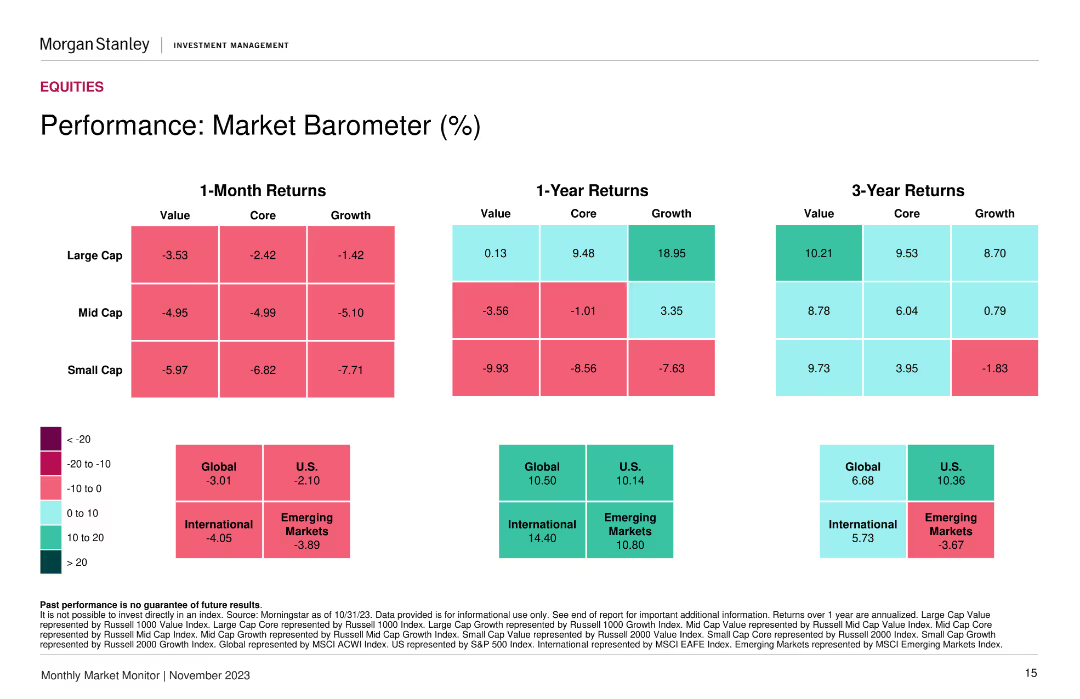
Heatmap showing returns for value, core, and growth across large, mid, and small caps over 1 month, 1 year, and 3 years.
Financial Performance
Financial Services
A market barometer showing performance metrics across different market segments and time periods, aiding in evaluating market performance and trends.
Market performance, returns, segments
Table
Morgan Stanley
Saved
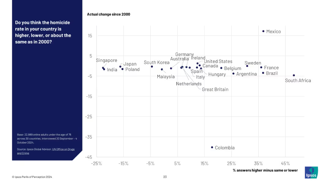
Scatter plot on a white grid background; x-axis shows public perception (% answers higher minus same or lower), y-axis shows actual change since 2000. Country names are plotted as data points. Blue panel on the left with survey details.
Market Analysis and Trends
Government & Public Sector
This slide compares public perception of homicide rates versus actual changes since 2000 across 30 countries. Countries are plotted by perceived change vs actual change, showing a disconnect between belief and reality in many regions.
homicide rate, perception vs reality, public opinion, crime statistics, international comparison, Ipsos survey, public safety, UN data, misperception, violence trends
Mixed Chart
IPSOS
Saved
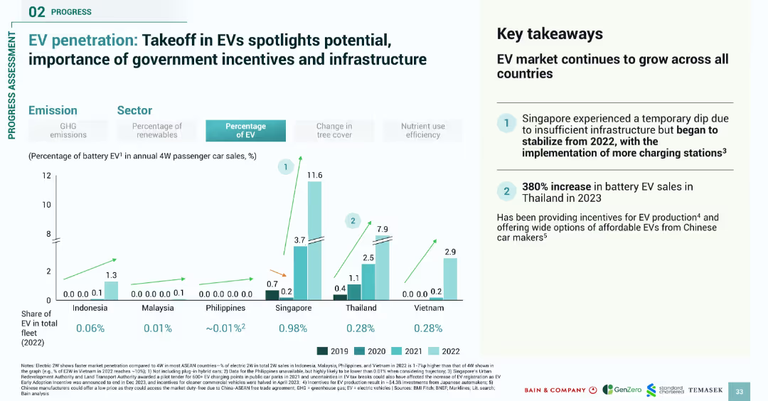
Bar chart comparing EV adoption from 2019 to 2022; right-side summary box with key findings
Market Analysis and Trends
Transportation & Logistics
Analyzes electric vehicle (EV) penetration across SEA countries from 2019–2022, revealing growth in EV sales, particularly in Singapore and Thailand. Highlights government incentives and infrastructure as critical drivers of EV market expansion.
EV, electric vehicles, SEA, adoption trends, incentives, infrastructure, passenger cars
Mixed Chart
Bain
Saved
Uses dual-line graphs to contrast online and offline retail trends. The layout is clean, with markers for the lockdown period.
Market Analysis and Trends
Retail & E-commerce
Evaluates the shift in retail sales channels due to COVID-19, emphasizing the growth of online retail and decline in offline sales.
retail shift, online sales, offline sales, COVID-19 impact
Single Chart
BCG
Saved
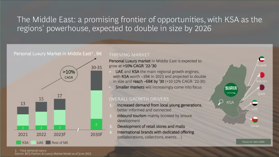
Infographic with a bar chart projecting Middle East luxury market growth and a map showing key Gulf countries
Market Analysis and Trends
Consumer Goods
The Middle Eastern luxury market is expected to double by 2030, growing at over 10% CAGR. KSA and UAE are the primary growth engines, driven by increased demand from younger consumers, tourism, retail development, and international brand expansion.
Middle East, KSA, luxury market, CAGR, retail growth, tourism, youth demand, market size
Mixed Chart
BCG
Saved
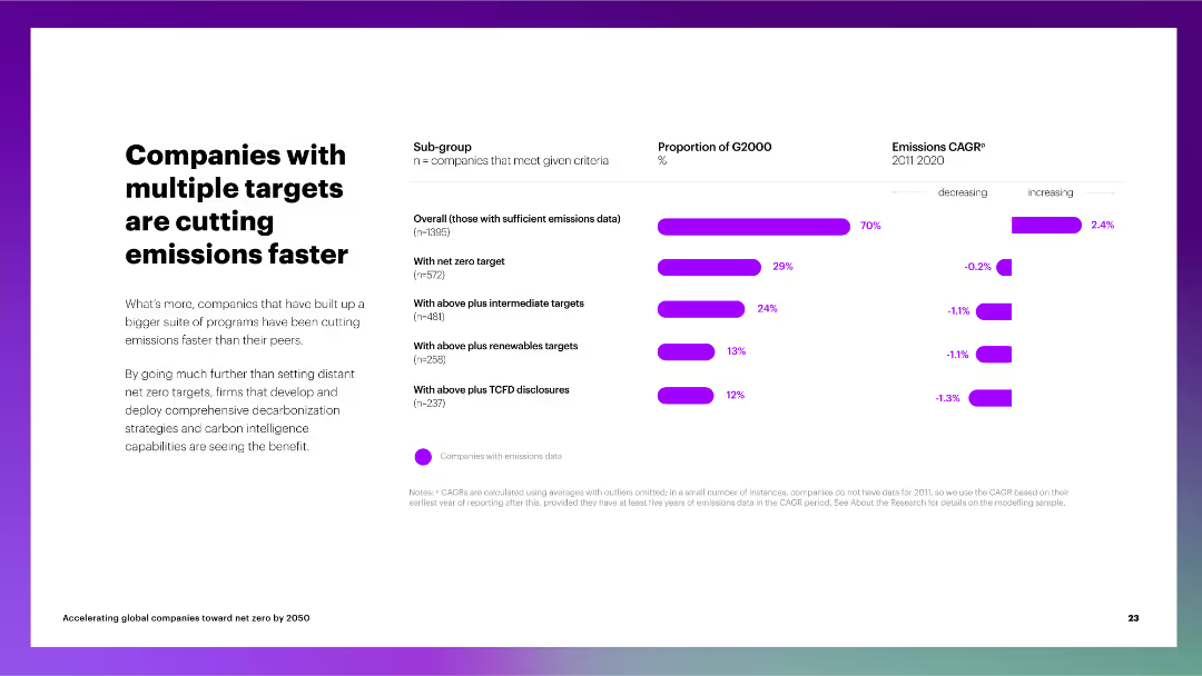
The slide includes a column chart depicting the proportion of G2000 companies with multiple emissions targets and their CAGR for emissions reduction.
Performance Metrics and KPIs
Environmental Services & Sustainability
The slide discusses the impact of multiple net zero targets on emissions reduction, showing that companies with comprehensive strategies perform better than their peers.
multiple targets, emissions reduction, G2000, net zero, intermediate targets, renewable targets, TCFD disclosures, CAGR
Multiple Chart
Accenture
Saved
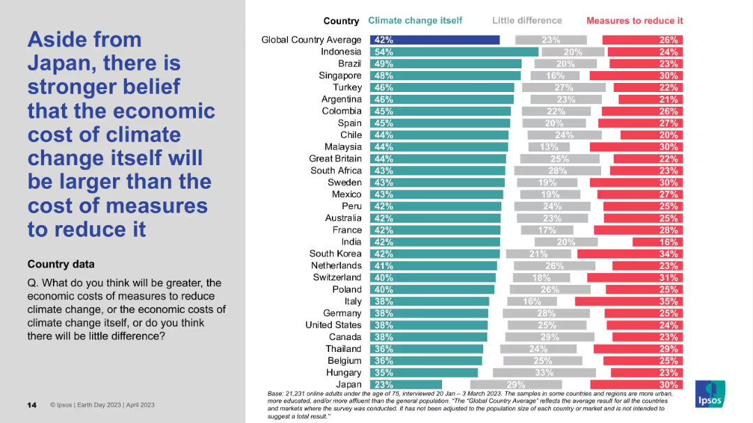
Detailed country-by-country horizontal bar chart; shows comparative belief in economic cost of climate change vs. action.
Market Analysis and Trends
Environmental Services & Sustainability
This chart shows that, aside from Japan, most countries believe the economic cost of inaction on climate change exceeds the cost of mitigation. Indonesia, Brazil, and Singapore lead this sentiment, while Japan stands out for its skepticism.
Economic impact, Climate cost, Mitigation, Global survey, Ipsos data
Mixed Chart
IPSOS
Saved
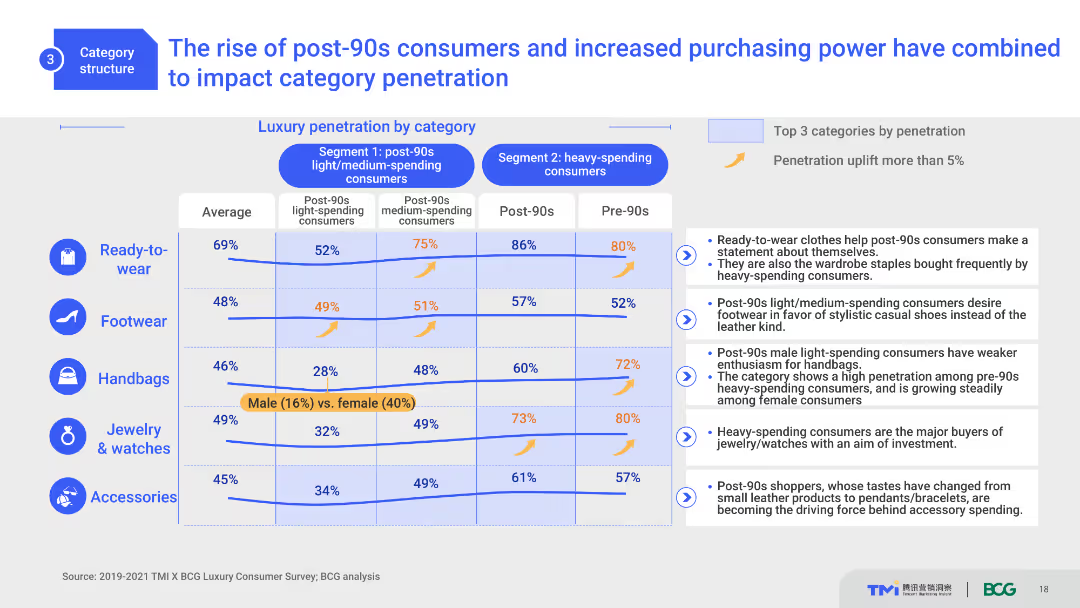
This slide includes a comparative layout with column charts and a table. It shows luxury category penetration by different consumer segments, highlighting the impact of post-90s consumers. The design is moderately complex with clear distinctions between segments and categories.
Market Analysis and Trends
Consumer Goods
This slide analyzes the influence of post-90s consumers on luxury market penetration across different categories. It compares segment-specific data, highlighting purchasing trends and the significant impact of younger consumers.
post-90s consumers, luxury market, category penetration, trends, consumer segments
Mixed Chart
BCG
Saved
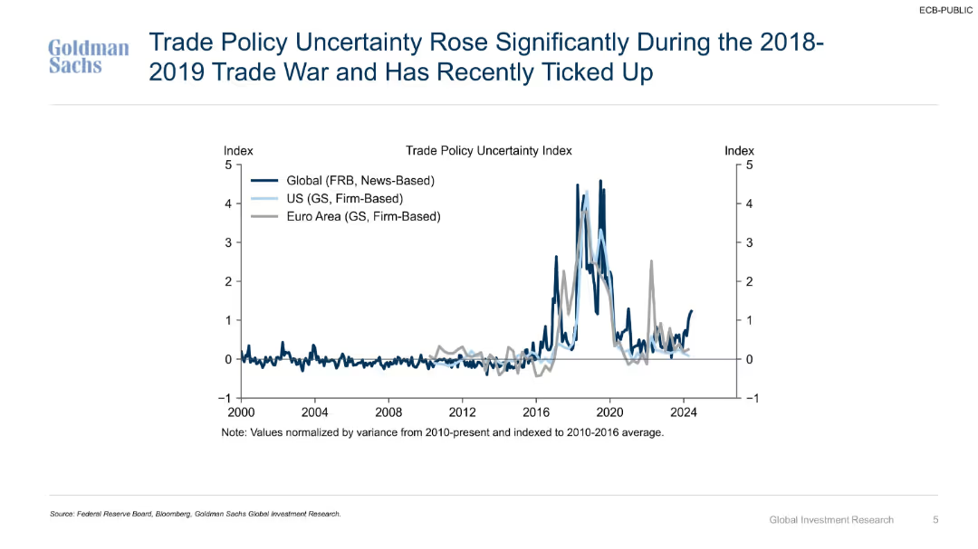
Time series line chart showing trade policy uncertainty indexes for global, U.S., and Euro Area from 2000–2024.
Risk Assessment and Management
Government & Public Sector
Tracks trade policy uncertainty using multiple indices, noting a major spike during the 2018–2019 trade war and a recent uptick. Demonstrates variance in global, U.S., and Euro Area trends over time.
trade war, uncertainty index, policy risk, historical trend, U.S., global, Euro Area, volatility, index analysis
Single Chart
Goldman Sachs
Saved
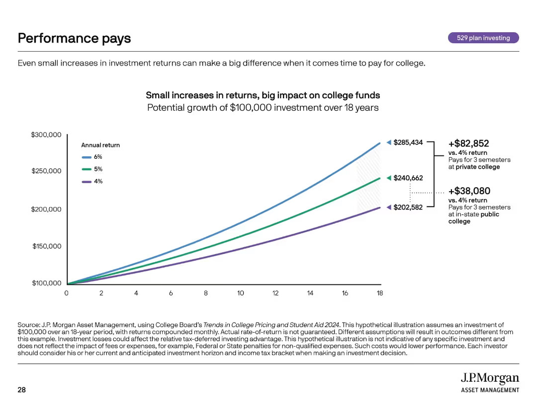
Line graph visual with growth projections for different return rates over time. Clean, minimal design.
Investment Analysis
Financial Services
Shows how small differences in annual return rates (4%, 5%, 6%) significantly affect the total value of a $100,000 college fund over 18 years. Demonstrates the power of compounding and return performance in long-term investing.
compound interest, investment returns, college savings, 529 plan, ROI
Single Chart
JP Morgan
Saved
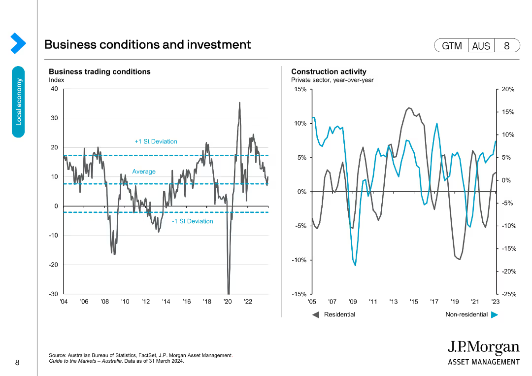
This slide includes two line charts: one showing business trading conditions with average and standard deviation lines, and the other showing construction activity.
Market Analysis and Trends
Financial Services
Analyzes business trading conditions and construction activity, comparing current performance to historical averages and deviations, useful for market analysis.
business conditions, investment, trading, construction, trends
Multiple Chart
JP Morgan
Saved
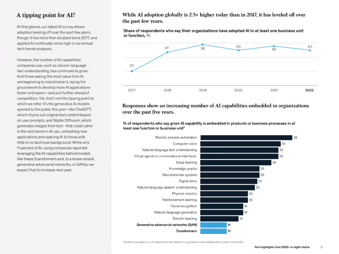
Line chart (top) and bar chart (bottom). Left-aligned text explains key insight. Minimalist black-and-blue theme.
Technology and Digital Transformation
Artificial Intelligence
The slide evaluates AI adoption trends (flatlining at ~50% post-2018) and shows growing diversity in AI use cases (e.g., robotic process automation, NLP). Emphasis is placed on emerging generative AI models like GANs and transformers.
AI adoption, transformers, GANs, NLP, robotic automation, McKinsey, business unit, survey
Multiple Chart
McKinsey
Saved
Includes column charts, tables, and text boxes showing the impact of geopolitical situations on IPO numbers and proceeds.
Risk Assessment and Management
Financial Services
It analyzes the decline in IPOs and proceeds in EMEIA, highlighting the rise in MENA IPO proceeds due to two major IPOs.
MENA, EMEIA, IPOs, geopolitical, mega IPOs
Multiple Chart
EY
Saved
Features a column chart showing the trends in global M&A volumes from 2002-2018 and a circular diagram depicting the expectations of organizations regarding the number of deals in the next 12 months, split by 2018 and 2019 data.
Mergers and Acquisitions
Financial Services
Summarizes global M&A trends, highlighting the increase in transaction volumes over time and the anticipations for future deals. It provides a historical context to understand the growing significance of M&A activities.
M&A, Trends, Global, Future, Deals, Volumes, Growth, Expectations
Multiple Chart
Deloitte
Saved
Column charts comparing financial ratios and targets over time. Simple and clean layout.
Financial Performance
Energy & Utilities
Analyzes the financial strength of the company, highlighting debt management and financial targets.
financial, strength, debt, targets, management
Mixed Chart
Barclays
Saved
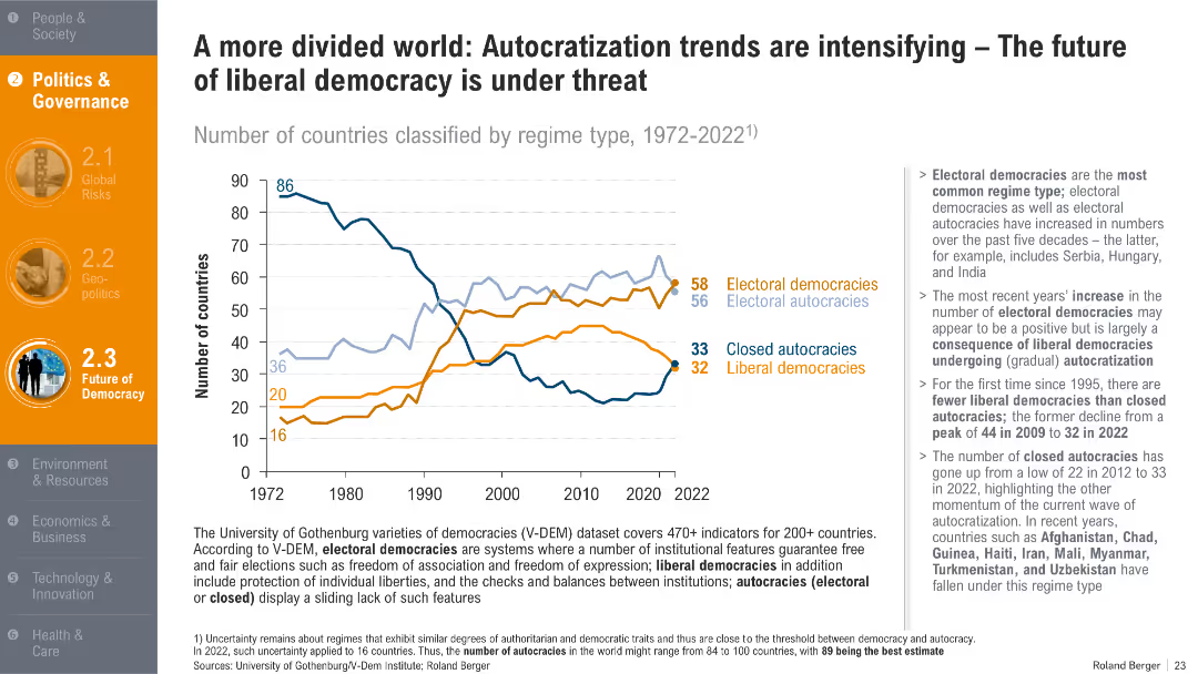
Line graph showing regime classification trends from 1972–2022; categorized by liberal/electoral democracies and autocracies.
Regulatory and Compliance
Government & Public Sector
The slide tracks the increase in electoral autocracies and decline in liberal democracies. It signals concern for the future of democratic governance and institutional freedoms.
autocracy, democracy, regime type, governance, liberal decline, political trends
Mixed Chart
Roland Berger
Saved
The slide contains a pie chart detailing revenue distribution across market segments in 2018. There are also three images illustrating each sector—subsea robotics, wind turbines, and offshore cables.
Industry Overview
Energy & Utilities
This slide provides a breakdown of a company's revenue across different market segments in 2018, highlighting its diversification and strength in areas like subsea operations and renewable energy solutions.
revenue, market segments, energy, subsea, renewables
Mixed Chart
Barclays
Saved
The slide features a project timeline with key phases and dates, including interviews, data collection, analysis, and reporting. The layout includes text boxes for each phase, detailing activities and objectives, and is visually structured with arrows and icons.
Strategic Planning
Professional Services
The slide features a project timeline with key phases and dates, including interviews, data collection, analysis, and reporting. The layout includes text boxes for each phase, detailing activities and objectives, and is visually structured with arrows and icons.
backlog, contract performance, book-to-bill, fiscal years, growth
Linear Flow
Alvarez & Marsal
Saved
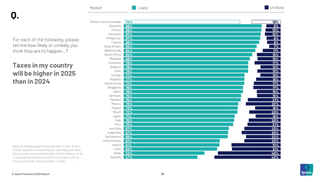
Horizontal bar chart ranked by countries on likelihood of increased taxes in 2025; includes "Likely" and "Unlikely" percentages.
Market Analysis and Trends
Financial Services
This slide explores expectations of tax increases by country in 2025. It lists survey results indicating where people most strongly believe taxes will rise, including global average.
tax policy, public opinion, economic forecasts, government revenue, Ipsos, survey results, 2025
Mixed Chart
IPSOS
Saved
Previous
Next
If nothing, comes up, please save your slides first
Create a FREE account to continue browsing
Receive Instant Access to 1,000+ slides from companies like McKinsey, Google, and Goldman Sachs
First Name
Last Name
Email
Password
I agree to all
Terms & Privacy Policy
Thank you! Your submission has been received!
Oops! Something went wrong while submitting the form.
Have an account?
Sign in
Column Chart
Heatmap
Chevron
Org Chart
Infographic
Callouts
Timeline
List
Graphic
Picture
Process Flow
Diagram
Paragraph
Map
Table
Framework
Subtitle
Takeaway Box
Icon
Other Chart
Radar Chart
Waterfall Chart
Mekko Chart
Pie Chart
Scatter Plot
Line Chart
Bar chart
Bullet points