Create a FREE Account
Instant access to 1,000+ real slides from top companies like McKinsey, BCG, Goldman Sachs, Google and many more!
First Name
Last Name
Email
Password
I agree to all
Terms & Privacy Policy
Thank you! Your submission has been received!
Oops! Something went wrong while submitting the form.
Have an account?
Sign in
Library
Templates
Courses
Pricing
My Account
My Slides
My Templates
✦ AI
AI Prompt Library
AI Search
Sign in
Start Here
Logout
My Saved Slides
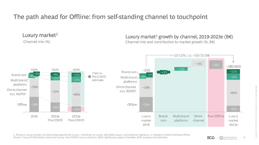
Stacked column charts showing the channel mix and growth in the luxury market from 2019 to post-COVID 2023, with a focus on offline and omnichannel strategies.
Strategic Planning
Retail & E-commerce
Discusses the shift in the luxury market from offline to omnichannel strategies, showing pre and post-COVID projections for channel growth and contributions.
luxury market, channel mix, growth, offline, omnichannel
Multiple Chart
BCG
Saved
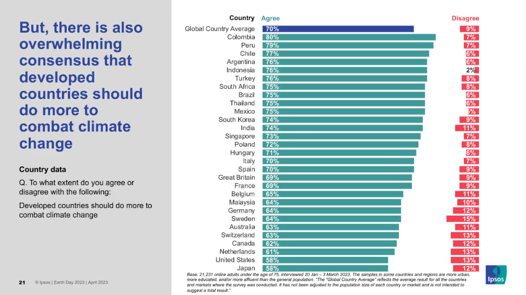
Left-side statement in bold blue; right side is a ranked horizontal bar chart by country with percentage agreement and disagreement.
Strategic Planning
Environmental Services & Sustainability
This slide highlights a strong international consensus that developed countries should take more proactive steps to address climate change. Most countries reflect agreement levels well above the global average, underscoring expectations for greater developed-world leadership.
climate action, developed nations, responsibility, global consensus, policy pressure, survey data, Earth Day 2023
Mixed Chart
IPSOS
Saved
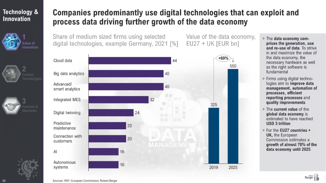
Bar chart showing the share of medium-sized firms using selected digital technologies in Germany in 2021 and a bar chart projecting the value of the data economy in the EU and UK from 2019 to 2025.
Technology and Digital Transformation
Technology & Software
This slide showcases the adoption of various digital technologies by medium-sized firms in Germany and projects the growth of the data economy in the EU and UK. It underscores the significance of digital technologies like cloud data and AI in driving economic value and efficiency.
Data Economy, Digital Technologies, Germany, EU
Multiple Chart
Roland Berger
Saved
Features a column chart showing the rising costs of SOC advanced design at various technology nodes from 2006 to 2020, with the costs represented in millions and a significant upward trend as the technology node size decreases. The slide is visually straightforward with a focus on the trend line highlighted in green.
Market Analysis and Trends
Technology & Software
This slide outlines the escalating costs of semiconductor design with advancements in technology, from 65nm in 2006 to 5nm in 2020. It highlights the financial implications of technological progress in the semiconductor industry, suitable for financial analysis or strategic investment discussions in technology sectors.
semiconductor, design costs, technology nodes, financial analysis, trend
Single Chart
BCG
Saved
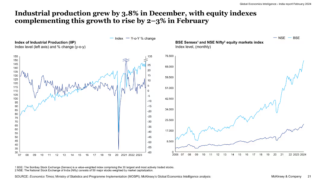
Two line charts are shown: the left chart illustrates the index and year-on-year change in industrial production, while the right chart depicts the BSE Sensex and NSE Nifty equity market indexes.
Market Analysis and Trends
Industrial & Manufacturing
The slide highlights a 3.8% growth in industrial production for December, supported by rising equity indexes in February. It provides an analysis of industrial output and stock market performance in India.
industrial production, equity indexes, BSE Sensex, NSE Nifty, market performance
Multiple Chart
McKinsey
Saved
Includes multiple line graphs with a color-coded key, focusing on global GDP forecasts versus baselines.
Investment Analysis
Financial Services
Analyzes global economic forecasts with a focus on GDP growth projections and comparisons between baseline forecasts and actuals.
economy, GDP forecast, baseline, rebound, downturn, financial analysis
Multiple Chart
BCG
Saved
Column and dot graphs showing the density of highly skilled workers and total labor force in various countries.
Strategic Planning
Professional Services
Analyzes the labor market potential by assessing the density of skilled workers and their distribution across multiple countries.
Labor market, skilled workers, workforce density, strategic planning
Single Chart
Accenture
Saved
Features a series of column chart and trend arrows with annotations. It is color-coded to differentiate between various financial metrics over time.
Financial Performance
Financial Services
Slide details factors contributing to profitability, using ROTE and efficiency ratio metrics. Intended for financial analysis or investor briefings.
Profitability, ROTE, Efficiency, Financial Analysis, Performance, Metrics, Trends, Improvement
Single Chart
Goldman Sachs
Saved
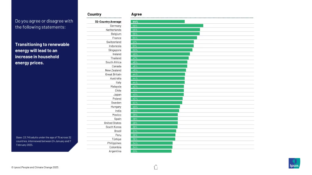
Left panel with bold white statement; right panel shows bar chart with 32-country responses, sorted by agreement level.
Market Analysis and Trends
Energy & Utilities
The slide presents survey results on public belief that shifting to renewable energy will raise energy prices. Germany leads agreement; Argentina is least concerned.
renewable energy, energy prices, household costs, public opinion, country comparison, Ipsos, energy transition, affordability, sustainability, global attitudes
Mixed Chart
IPSOS
Saved
The slide presents a large circular progress chart indicating a 67% reduction, accompanied by icons and text detailing the benefits of connected reporting systems.
Operational Efficiency
Professional Services
Highlights the success of a connected reporting system in reducing reporting times and improving data integrity and visibility over financial performance, with an emphasis on standardization and remote capabilities.
Connected reporting, data integrity, financial visibility, reduction in time, standardization, remote reporting, process improvement
Mixed Chart
Deloitte
Saved
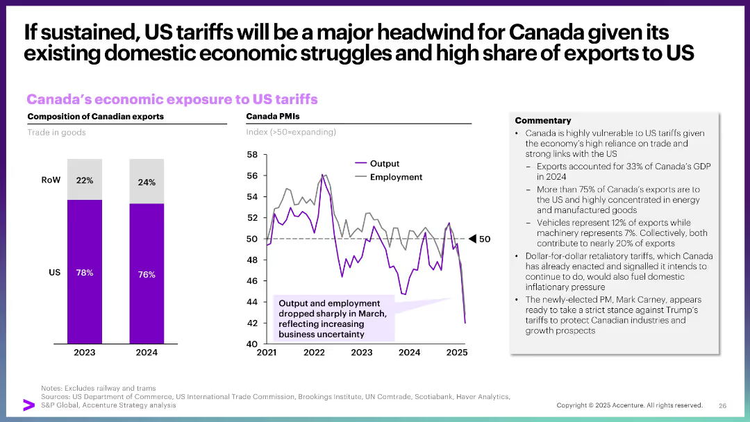
Left: bar chart of Canadian exports by destination. Right: line graph of Canada PMIs. Commentary box summarizes economic vulnerability.
Market Analysis and Trends
Government & Public Sector
This slide presents how US tariffs affect Canada, emphasizing high reliance on US trade. Canadian exports are heavily US-oriented, and economic indicators like PMIs show rising business uncertainty and declining performance, particularly in output and employment.
Canada, US tariffs, exports, PMI, economic impact, trade reliance, policy risk
Multiple Chart
Accenture
Saved
This slide features a dark background with column charts about virtual primary care preferences, with white and yellow text.
Technology and Digital Transformation
Healthcare & Pharmaceuticals
It shows consumer openness to virtual primary care consultations, with 34% definitely considering it, 26% maybe, and 40% definitely not.
virtual care, primary care, consumer, survey, Germany
Mixed Chart
EY
Saved
The slide contains two column charts displaying operating expenses and risk-weighted assets over different periods. It uses a minimalistic design with blue and white colors and clear annotations.
Operational Efficiency
Financial Services
The slide explains the efficient utilization of resources with a focus on cost management and RWA efficiency. It shows changes in operating expenses and risk-weighted assets, emphasizing disciplined expense management.
Resource Utilization, Cost Efficiency, RWA, Operating Expenses, Capital Management
Multiple Chart
Credit Suisse
Saved
The slide includes column charts and a line chart illustrating the sensitivity of group revenues to interest rates and CHF yield curve shifts.
Financial Performance
Financial Services
This slide discusses the cumulative group revenues sensitivity of CHF ~0.9 bn by 2025 vs. 2022 and the impact of higher forward rate expectations.
revenues, interest rates, forward rate, yield curve, funding costs
Multiple Chart
Credit Suisse
Saved
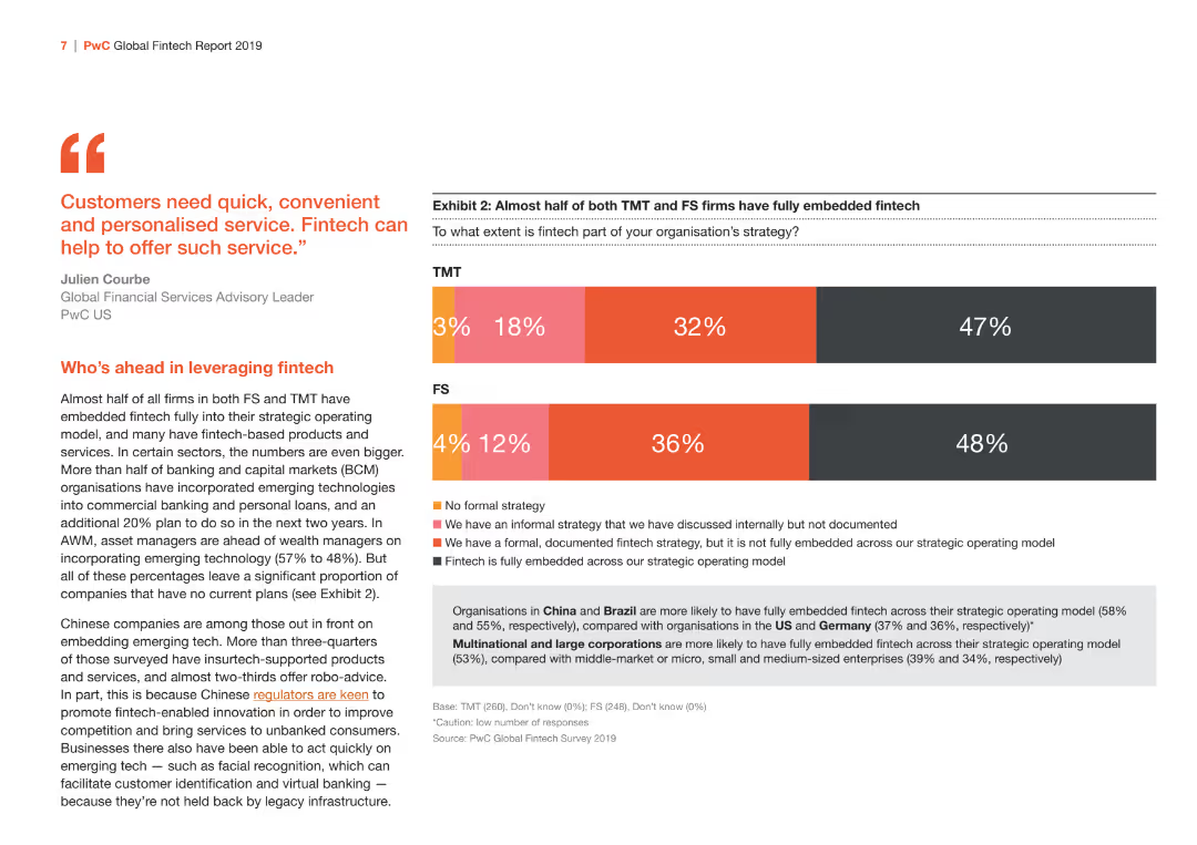
This slide contains a bar chart showing the extent of fintech strategy adoption between TMT and FS sectors. The color scheme is orange and red.
Market Analysis and Trends
Financial Services
Analyzes the level of fintech strategy adoption in TMT and FS sectors, highlighting the differences in embedding fintech within strategic operating models.
fintech, strategy, TMT, FS, adoption
Mixed Chart
PwC/Strategy&
Saved
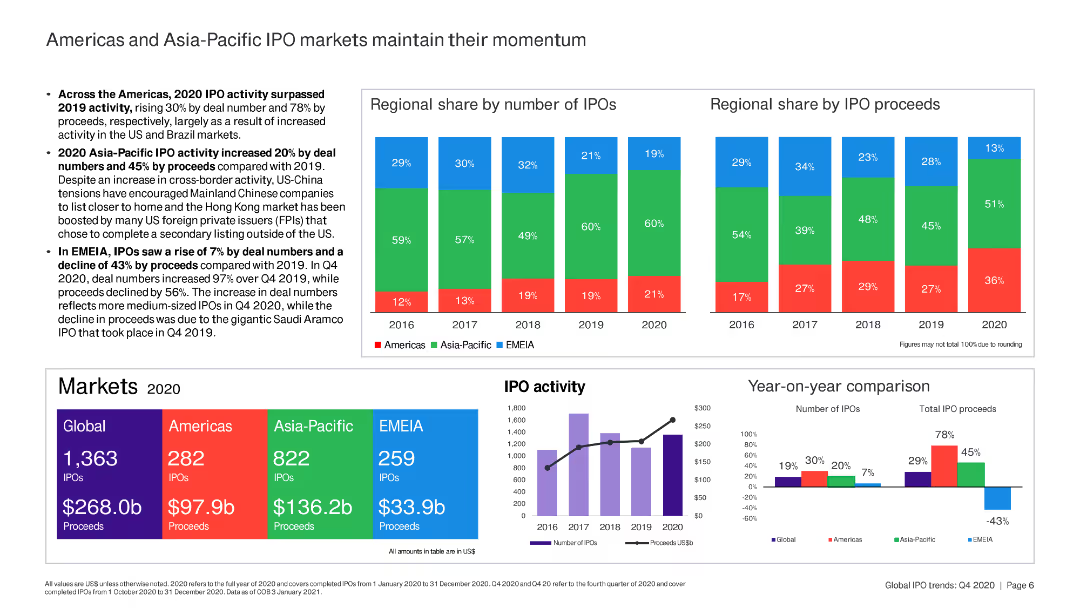
The slide combines text and bar charts to compare IPO market activities and proceeds in the Americas and Asia-Pacific regions.
Market Analysis and Trends
Financial Services
This slide analyzes the momentum of IPO markets in the Americas and Asia-Pacific, comparing deal numbers and proceeds over time.
IPO, Americas, Asia-Pacific, market momentum, deal numbers, proceeds
Multiple Chart
EY
Saved
Simple design with a title and subtitle, vibrant blue background with abstract shapes, and the logos of the collaborating companies.
Market Analysis and Trends
Technology & Software
Introduces the 'e-Conomy SEA 2021' report, indicating a focus on the digital economy of Southeast Asia during the 2020s.
e-Conomy, SEA, digital decade, market overview, technology, 2021, collaboration
Title
Bain
Saved
This slide includes a table with bar charts comparing commuting habits, car tenure, and daily travel distances of EV sceptics across APAC, EMEA, and North America. Colors and percentages are clearly marked.
Market Analysis and Trends
Transportation & Logistics
The slide examines the commuting patterns and car ownership tenure of EV sceptics, highlighting differences across regions. It aims to identify key mobility challenges that affect EV adoption.
commuting habits, car tenure, daily travel, EV sceptics, regional analysis
Multiple Chart
PwC/Strategy&
Saved
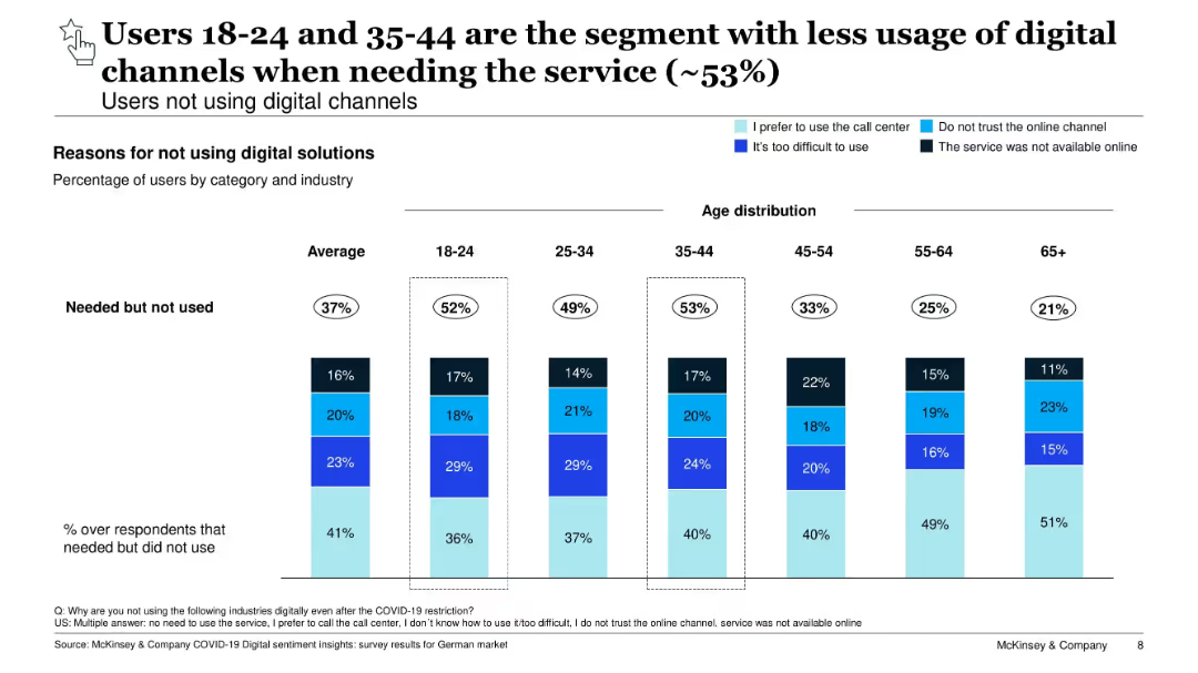
Vertical bar chart segmented by age group, showing digital service non-usage reasons. Highlights barriers for younger segments.
Customer and Market Segmentation
Technology & Software
Explores digital service non-usage by age. Despite high access, younger groups (18–24 and 35–44) report the highest unmet need. Barriers include difficulty, trust issues, and service unavailability, pointing to UX gaps.
age segmentation, digital access, trust, barriers, customer insights
Single Chart
McKinsey
Saved
This slide features three column charts comparing energy consumption costs in EUR/100 km for H2 ICE, FCEV, and BEV across PC, LCV, and HDT segments. Key assumptions are listed.
Market Analysis and Trends
Energy & Utilities
The slide analyzes energy consumption costs for different vehicle types, highlighting that FCEV is more competitive in heavy-duty trucks compared to BEV, with BEV being lower in LCV and PC.
Energy, Consumption, FCEV, BEV, H2 ICE
Multiple Chart
Roland Berger
Saved
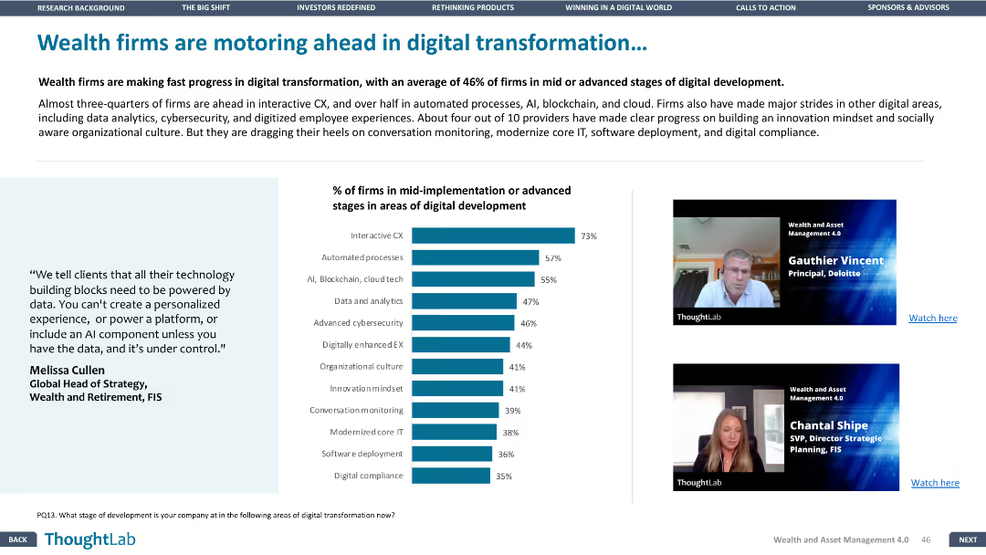
The slide includes a column chart and images of two speakers. The layout is moderately dense, with a focus on visual elements.
Technology and Digital Transformation
Financial Services
The slide details the progress of wealth firms in digital transformation, highlighting areas such as interactive customer experience, automated processes, and data analytics.
Digital transformation, customer experience, automation, analytics, wealth firms
Mixed Chart
Deloitte
Saved
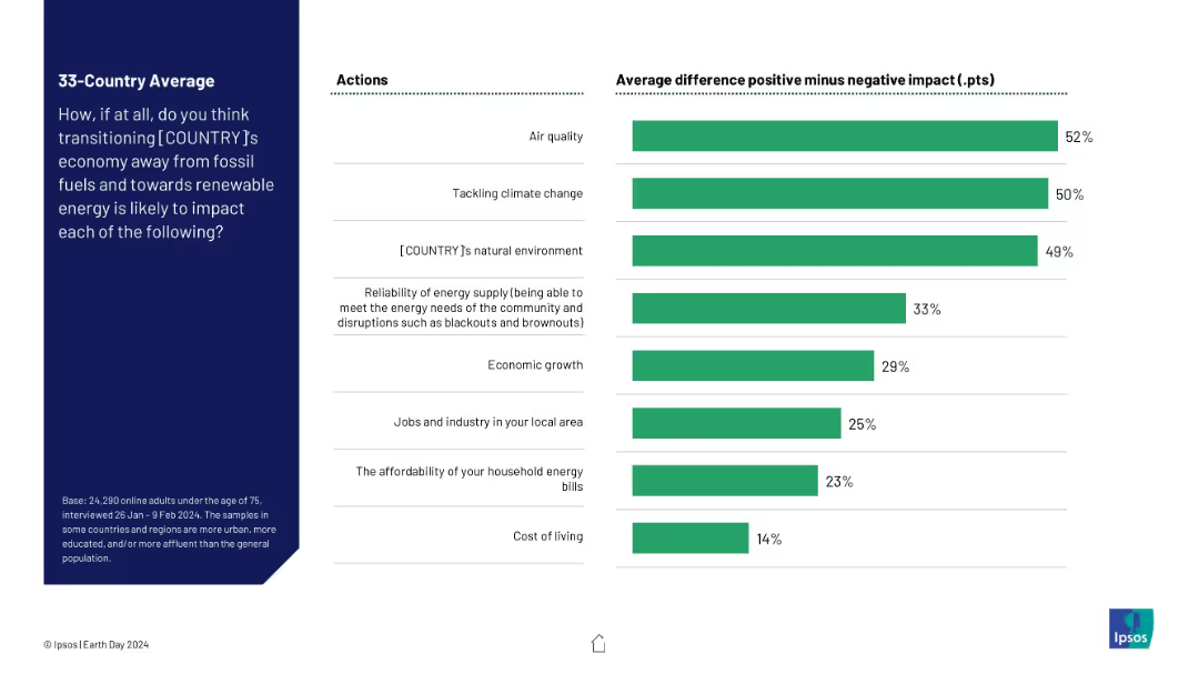
Horizontal bar chart showing net positive perception (positive minus negative) for various outcomes of switching to renewable energy.
Technology and Digital Transformation
Environmental Services & Sustainability
This slide presents a clearer comparison of public sentiment, showing net support for renewable energy transition across multiple domains. Air quality, climate change, and natural environment are seen as most positively impacted, with cost of living seen as least.
net impact, renewable transition, energy policy, public perception, sustainability, Ipsos, climate benefits, economic effects
Mixed Chart
IPSOS
Saved
A vibrant title slide with a blend of textual information and a large, bold header.
Strategic Planning
Professional Services
This slide introduces the Roland Berger Trend Compendium 2050, which discusses global megatrends influencing future developments, aiming to incorporate these insights into strategic business planning.
megatrends, strategic planning, future, global development, Roland Berger
Header Vertical
Roland Berger
Saved
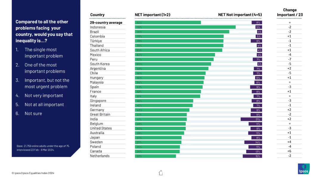
Horizontal bar chart on right, ranking countries by how many say inequality is important; color-coded bars (green = important, purple = not important); question and answer scale on left.
Market Analysis and Trends
Government & Public Sector
This slide presents country-by-country perceptions on the importance of inequality as a national problem. It compares the net percentage of people who consider it important vs. not important, highlighting changes over time and country averages.
inequality, global opinion, country ranking, importance scale, perceptions, Ipsos, net important, comparative chart, public opinion
Mixed Chart
IPSOS
Saved
Features a line graph projecting economic growth under different AI adoption scenarios against a baseline. The graph is color-coded to distinguish between aggressive, cautious, and people-centric adoption scenarios, showing potential gains in trillions of dollars.
Strategic Planning
Technology & Software
Outlines the economic potential of adopting AI responsibly, highlighting different scenarios and their impact on economic growth.
AI, Economy, Growth, Adoption Scenarios, Potential, Trillions, Impact, Responsible, Technology
Single Chart
Accenture
Saved
Previous
Next
If nothing, comes up, please save your slides first
Create a FREE account to continue browsing
Receive Instant Access to 1,000+ slides from companies like McKinsey, Google, and Goldman Sachs
First Name
Last Name
Email
Password
I agree to all
Terms & Privacy Policy
Thank you! Your submission has been received!
Oops! Something went wrong while submitting the form.
Have an account?
Sign in
Column Chart
Heatmap
Chevron
Org Chart
Infographic
Callouts
Timeline
List
Graphic
Picture
Process Flow
Diagram
Paragraph
Map
Table
Framework
Subtitle
Takeaway Box
Icon
Other Chart
Radar Chart
Waterfall Chart
Mekko Chart
Pie Chart
Scatter Plot
Line Chart
Bar chart
Bullet points