Create a FREE Account
Instant access to 1,000+ real slides from top companies like McKinsey, BCG, Goldman Sachs, Google and many more!
First Name
Last Name
Email
Password
I agree to all
Terms & Privacy Policy
Thank you! Your submission has been received!
Oops! Something went wrong while submitting the form.
Have an account?
Sign in
Library
Templates
Courses
Pricing
My Account
My Slides
My Templates
✦ AI
AI Prompt Library
AI Search
Sign in
Start Here
Logout
My Saved Slides
This slide features a dark background with a header, body text, and a column chart showing three percentage indicators. Each indicator is accompanied by descriptive text explaining consumer openness to virtual primary care consultations versus in-person consultations.
Technology and Digital Transformation
Healthcare & Pharmaceuticals
The slide discusses the openness of Irish consumers to switch to virtual primary care consultations, despite a general preference for in-person consultations. It highlights the percentage of consumers willing to consider virtual consultations.
healthcare, virtual care, primary care, Ireland, consultations
Mixed Chart
EY
Saved
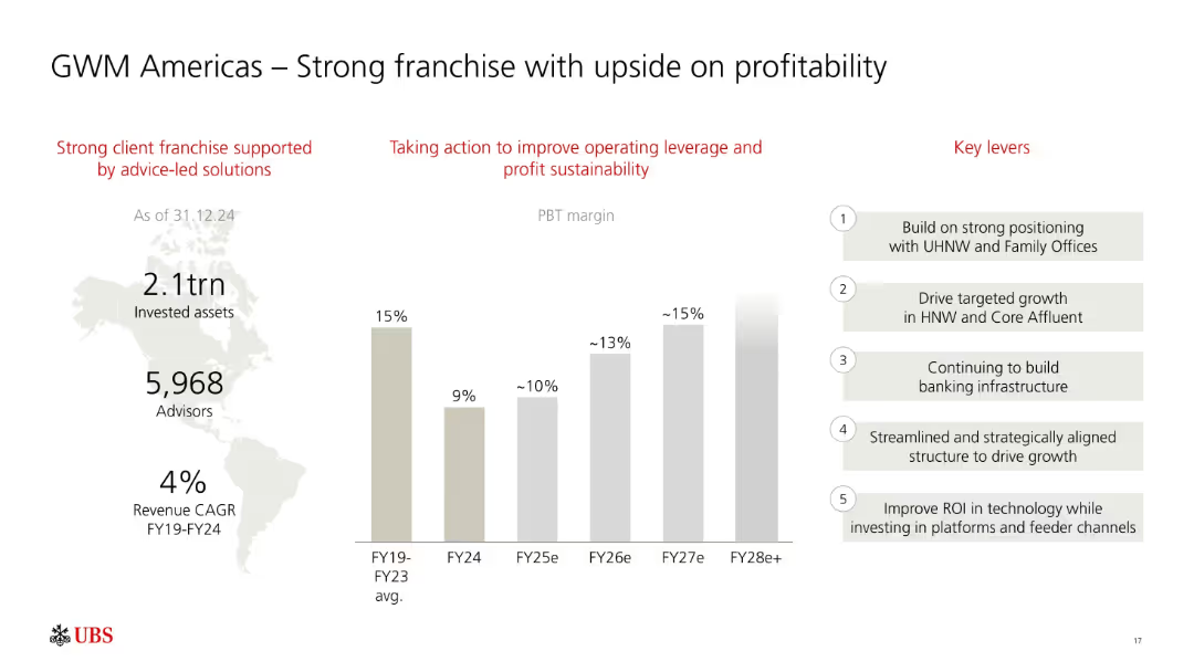
Three-column layout: infographic on left, PBT margin bar chart in center, and key levers on right. Red headings and grayscale bars.
Sales and Business Development
Financial Services
Focuses on UBS’s GWM Americas business, showing consistent PBT margin growth potential from FY24 to FY28e. Lists key strategic levers like HNW growth, infrastructure, and ROI-driven tech investments.
UBS, GWM Americas, profitability, PBT margin, high-net-worth, growth strategy, advisory, assets, FY28
Mixed Chart
UBS
Saved
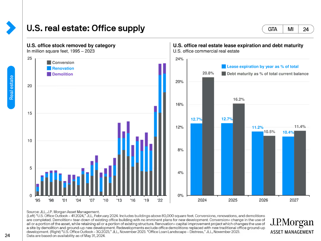
The slide features two charts. The left chart categorizes U.S. office stock removed by conversion, renovation, and demolition from 1995 to 2023. The right chart presents U.S. office real estate lease expiration and debt maturity as percentages of total current balance from 2024 to 2027.
Market Analysis and Trends
Real Estate & Construction
The slide provides an overview of the changes in U.S. office supply through different removal methods and outlines the lease expiration and debt maturity schedules for office real estate. It's useful for understanding supply dynamics and future lease/debt obligations.
office supply, lease expiration, debt maturity, conversion, renovation, demolition
Multiple Chart
JP Morgan
Saved
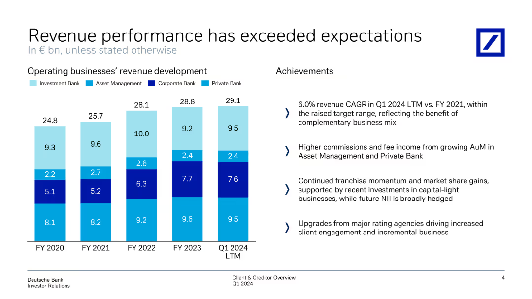
Includes a series of column charts displaying operating businesses' revenue development across fiscal years, with an achievements section on the right.
Financial Performance
Financial Services
Highlights revenue performance exceeding expectations across different business units, with achievements in growth and operational metrics.
revenue performance, expectations, operating businesses, revenue development, achievements
Mixed Chart
Deutsche Bank
Saved
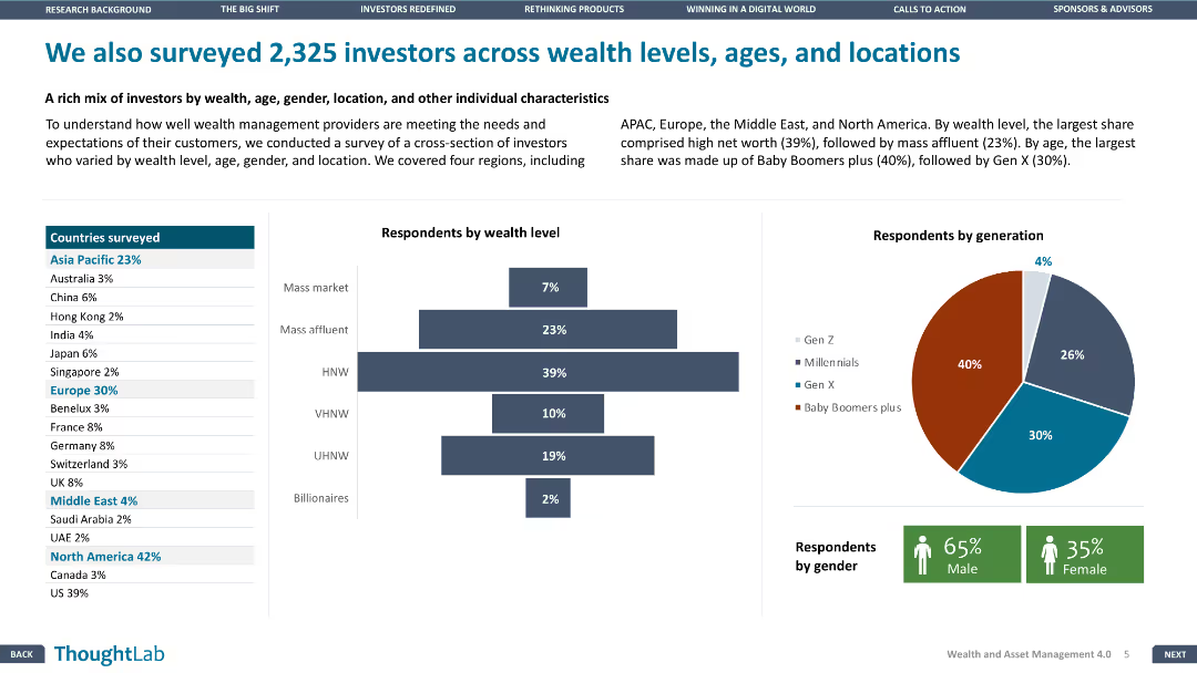
This slide contains multiple data visualizations, including a map, bar chart, and pie chart, illustrating the demographics of 2,325 investors by wealth level, age, gender, and location, across various regions.
Market Analysis and Trends
Financial Services
Presents survey data of 2,325 investors, analyzing their wealth levels, age groups, gender distribution, and geographical locations, offering insights into investor demographics and preferences.
investor demographics, survey, wealth levels, age groups, gender distribution, geographical locations, market insights
Multiple Chart
Deloitte
Saved
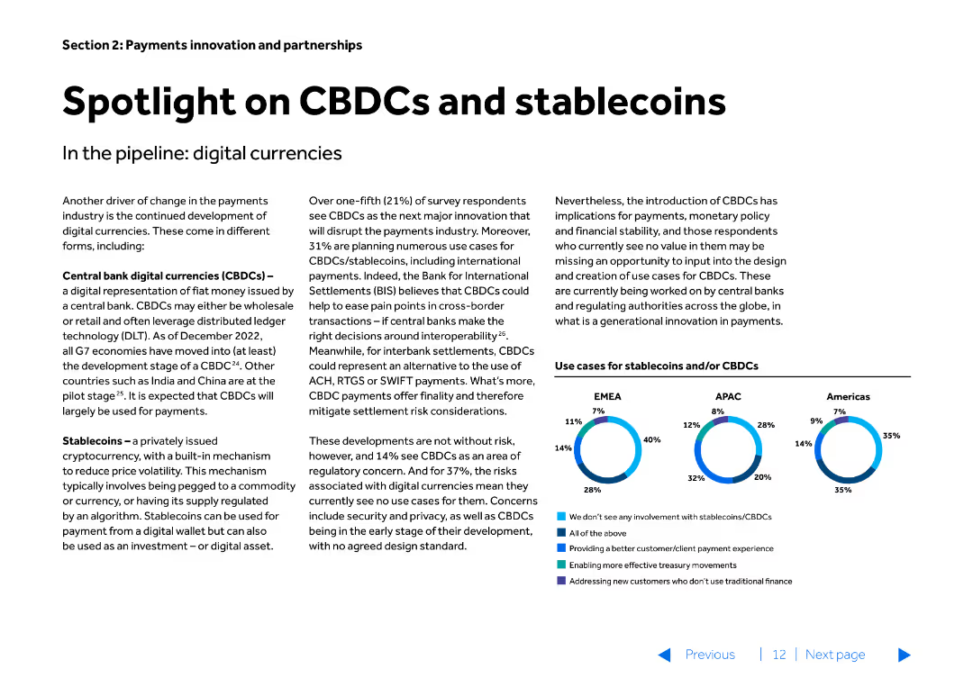
The slide features text-heavy content with a small column chart at the bottom. The slide is divided into two main sections discussing CBDCs and stablecoins, and their implications in digital currencies.
Market Analysis and Trends
Financial Services
Discusses the development and implications of Central Bank Digital Currencies (CBDCs) and stablecoins, highlighting their potential impact on the payments industry.
CBDCs, stablecoins, digital currencies, payments, trends
Mixed Chart
Barclays
Saved
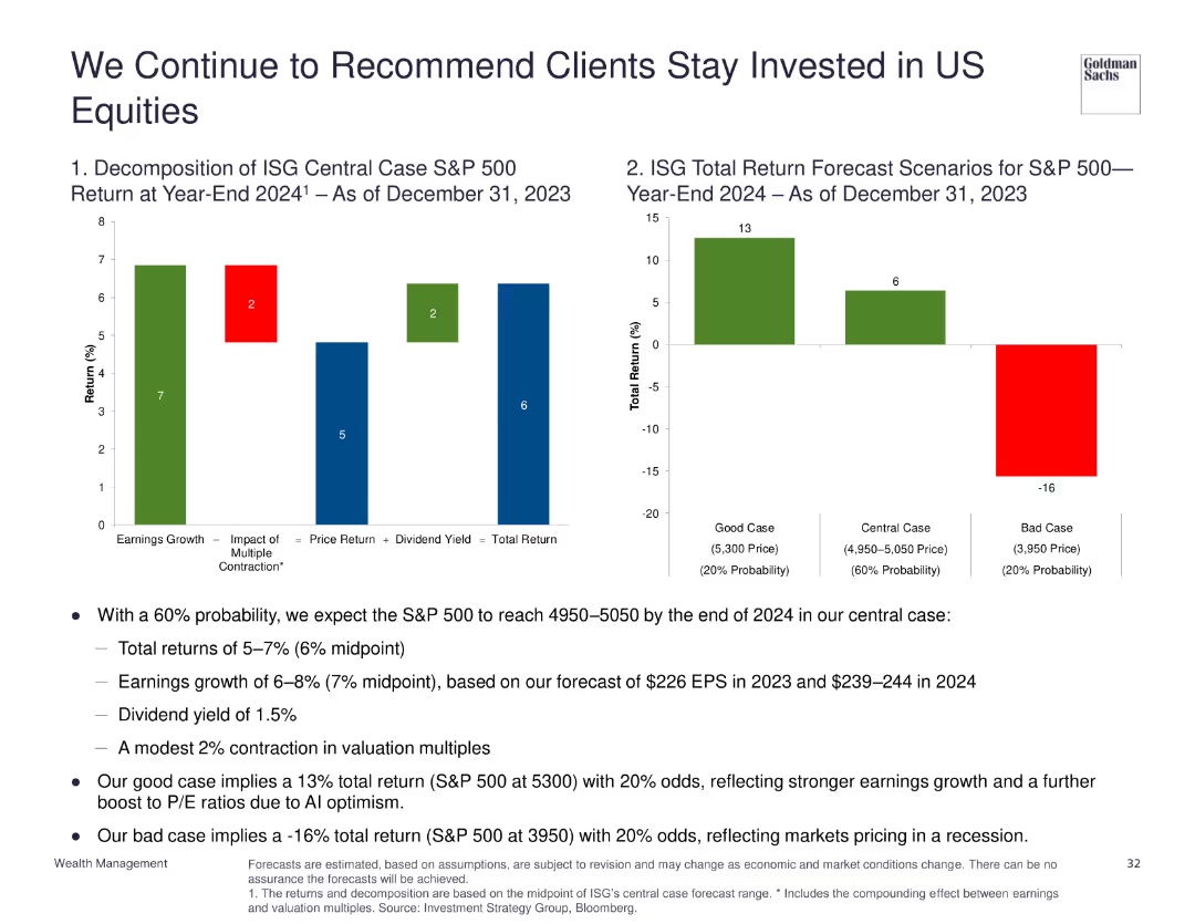
Two column charts: one showing the decomposition of ISG central case S&P 500 return for year-end 2024, another showing total return forecast scenarios.
Investment Analysis
Financial Services
Recommends staying invested in US equities with a 60% probability of reaching 4950-5050 by end of 2024, discussing various return scenarios and factors influencing S&P 500 performance.
US equities, investment, forecast, S&P 500, returns
Multiple Chart
Goldman Sachs
Saved
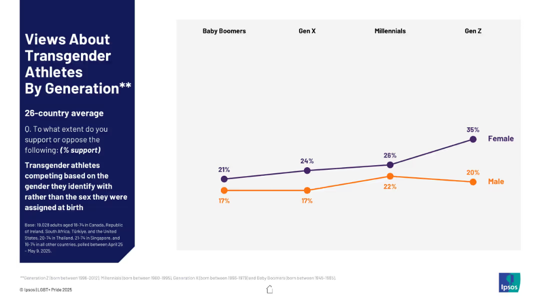
Line chart showing generational support trends, separated by gender, with a focus on Gen Z to Baby Boomers.
Regulatory and Compliance
Government & Public Sector
This slide shows generational differences in support for transgender athletes competing by gender identity. The data is segmented by gender and highlights increasing support among younger generations, especially among Gen Z females.
generational support, transgender athletes, Gen Z, gender identity, sports, gender split, LGBTQ+ survey, opinion by age
Mixed Chart
IPSOS
Saved
Bar chart showing the percentage of "Yes" responses regarding HR information system adoption across various sectors.
Human Resources and Talent Management
Professional Services
Explores the adoption rate of HR information systems across different sectors.
HR, information system, adoption, sectors, rate
Multiple Chart
PwC/Strategy&
Saved
Features two column charts displaying percentages of revenue from after-sales and add-on sales services. The charts are shaded in blue with varying heights.
Operational Efficiency
Environmental Services & Sustainability
This slide highlights unexploited areas of customer engagement through after-sales and add-on services, reflecting on the economic potential lost in not maximizing material and energy regeneration.
customer engagement, revenue, after-sales, add-on sales, material regeneration, energy, sustainability
Multiple Chart
Accenture
Saved
This slide has a map of Europe with highlighted countries, and to the left, a series of mini-tables with property details per country.
Market Analysis and Trends
Real Estate & Construction
The slide provides an overview of CEREIT's real estate portfolio by country in Europe as of a specific date. It is useful for analyzing geographical diversification, property valuation, and occupancy rates across various European markets.
Real Estate, Portfolio, Europe, Valuation, Occupancy, Yield, Diversification, Property, Country
Graphic
Morgan Stanley
Saved
Combines informative text with simple iconography to contrast the growth of online retail markets in Southeast Asia and India.
Competitive Landscape
Retail & E-commerce
Analyzes the recent developments in the online retail market in Southeast Asia, demonstrating how it has outpaced India's growth.
Online retail, market analysis, Southeast Asia, India, comparative growth
Single Chart
Bain
Saved
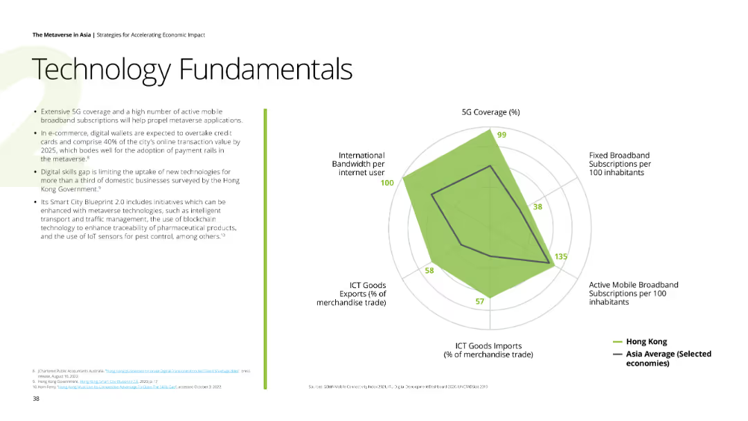
Text and a radar chart showing various technology metrics like 5G coverage and broadband subscriptions for Hong Kong.
Technology and Digital Transformation
Technology & Software
The slide details the technological fundamentals necessary for the metaverse, focusing on Hong Kong’s tech readiness.
technology, fundamentals, 5G, broadband, Hong Kong
Mixed Chart
Deloitte
Saved
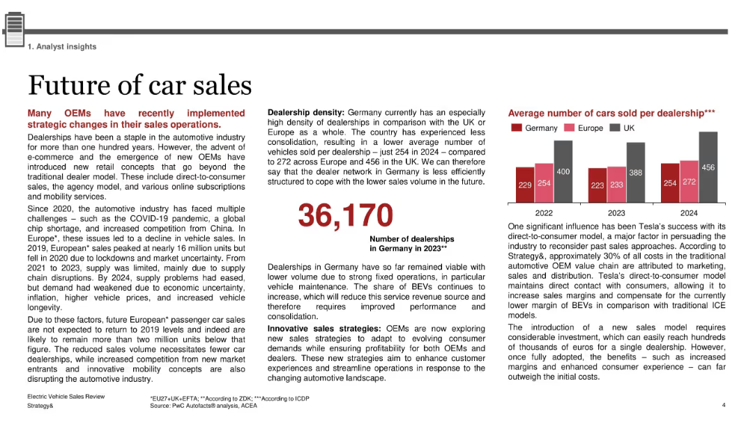
Text-heavy layout with two main columns; bold red headings; bar chart to the right and large numeric callout in center; minimal icons; dense analytical formatting
Strategic Planning
Industrial & Manufacturing
The slide explores shifts in car sales models, highlighting how OEMs are adopting direct-to-consumer models, online subscriptions, and innovative retail strategies. It also discusses dealership density in Germany, with insights into sales volume per dealership. Tesla’s influence and cost structures are also noted.
OEMs, dealership density, Tesla, direct-to-consumer, BEV, ICE, agency model, car sales, Germany, automotive retail
Mixed Chart
PwC/Strategy&
Saved
This slide has two main sections. The left section features a column chart tracking deposit growth over two periods with arrows indicating changes. The right section contains two pie charts showing the composition of funding mix at two different points in time, illustrating a shift towards an even split between deposits and wholesale unsecured funding.
Market Analysis and Trends
Financial Services
It illustrates the growth trajectory of deposits and the evolving mix of unsecured funding, which can be instrumental for financial analysts or business strategists evaluating market trends and deposit strategies.
deposit growth, funding mix, bar chart, pie chart, market trend, financial analysis, strategic planning, unsecured funding, banking sector, resource allocation
Multiple Chart
Goldman Sachs
Saved
Features a circular flow diagram connecting three key aspects: Mix Advantage, Performance Advantage, and Create Value, using blue and white color scheme for clarity. The layout is simple and focused on the central idea without unnecessary details.
Operational Efficiency
Agriculture & Food Production
The slide explains Tyson's strategic model for its prepared foods division, emphasizing the interconnection between market positioning, operational performance, and value creation. This model could serve as a case study or inspiration for similar businesses aiming to refine their operational strategies.
Food, Tyson, Operational Efficiency, Strategy, Value Creation
Linear Flow
Barclays
Saved
The slide features multiple visualizations, including a line graph for daily exceptions, a pie chart for open exceptions per department, and various data tables showing exceptions by category and aging analysis.
Operational Efficiency
Energy & Utilities
The slide provides insights into managing business exceptions, displaying data on daily exceptions, departmental exceptions, and aging analysis of open exceptions, helping in operational decision-making.
Business, Exceptions, Management, Analysis, Operational
Multiple Chart
EY
Saved
A column chart showing Namibia's total revenue versus expenditure over three fiscal years, depicting a budget deficit in each year as represented by different shades of red in the lower section of the bars.
Financial Performance
Government & Public Sector
Examines Namibia's fiscal performance over three years, highlighting the ongoing budget deficits. This visual comparison is crucial for discussions on governmental budget management and fiscal policy.
fiscal, budget, Namibia, government finance
Multiple Chart
PwC/Strategy&
Saved
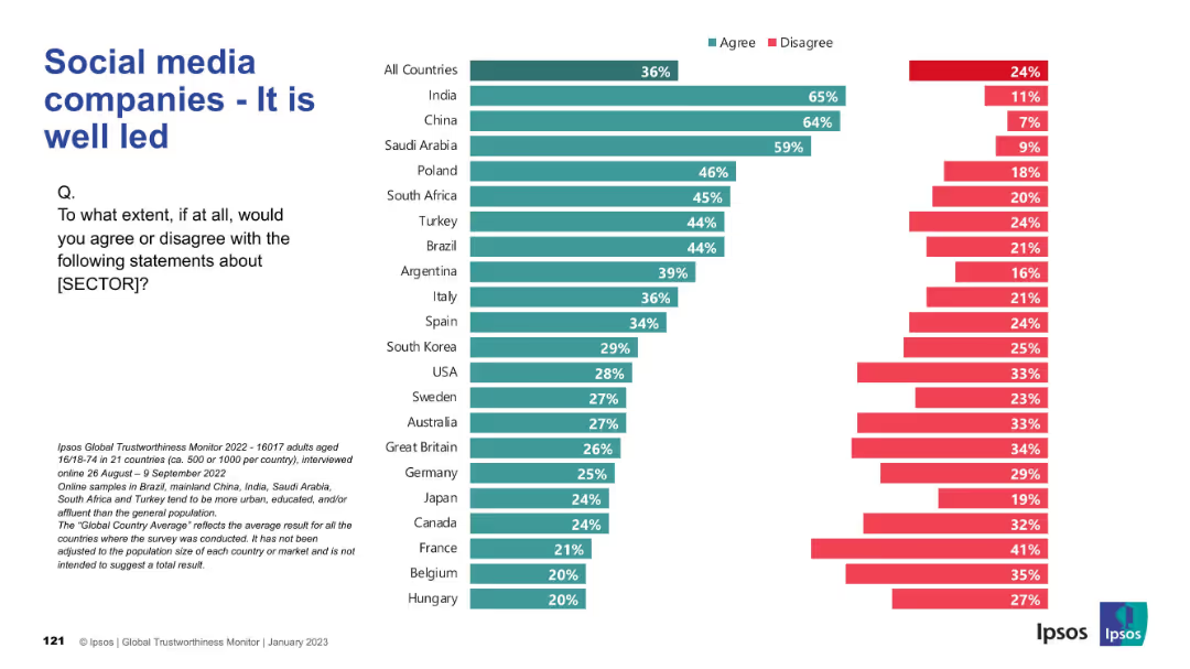
Bar chart layout with green and red horizontal bars representing agreement/disagreement by country; left-aligned title and question; legend for agree/disagree colors; Ipsos logo in bottom corners.
Market Analysis and Trends
Technology & Software
This slide presents public perceptions of leadership quality in social media companies across 21 countries. It shows that agreement levels vary significantly, with India and China reporting high trust and countries like France and Belgium showing low trust in leadership.
leadership, social media, perception, international, Ipsos, trust, agree, disagree, global, reputation
Mixed Chart
IPSOS
Saved
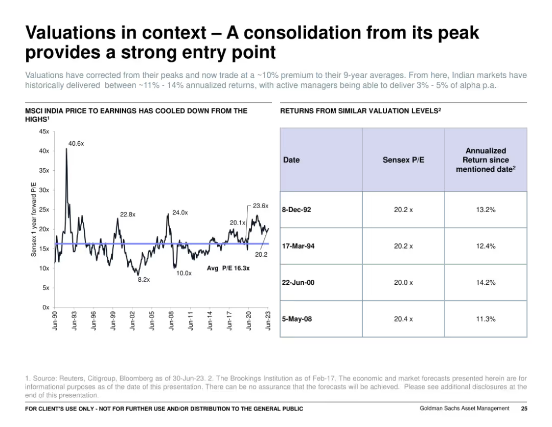
Split layout: left side features a historical P/E line graph, right side shows a table comparing Sensex P/E and returns at past valuation levels. Clean, data-centric design with minimal color use.
Investment Analysis
Financial Services
The slide highlights that Indian equity valuations have corrected and now present a favorable entry point. It shows the MSCI India Price to Earnings ratio historically and compares similar valuation levels to long-term annualized returns, supporting the case for future upside.
valuations, India, Sensex, P/E ratio, annual returns, investment, entry point, MSCI, equity markets, historical data
Mixed Chart
Goldman Sachs
Saved
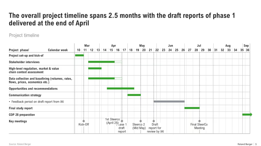
Gantt chart showing tasks across calendar weeks from March to July. Phases include setup, interviews, data collection, and reporting.
Strategic Planning
Professional Services
This slide provides a structured timeline for a project, detailing phases like stakeholder engagement, data analysis, and report drafting. It marks key milestones such as Steering Committee meetings and COP28 prep.
project plan, timeline, Gantt chart, stakeholder interviews, COP28, deliverables, report drafting
Single Chart
Roland Berger
Saved
This slide is highly detailed, containing both textual information and multiple graphical elements. There's a pie chart detailing commercial portfolio balances by industry, a column chart comparing CRE as a percentage of total loans, and a small table with key statistics about office CRE. The color scheme is blue and green, with the graphs clearly labeled and information bullet-pointed for clarity.
Financial Performance
Financial Services
The slide presents a disciplined client selection strategy and a well-diversified commercial portfolio. It's aimed at showcasing strong credit results through economic cycles, indicating a conservative approach to commercial real estate concentration among peers and a stable criticized asset ratio. Intended to convey the company’s robust underwriting standards and focused banking coverage.
Credit, Underwriting, Portfolio, CRE, Diversification, Strategy, Risk, Financial Stability, Commercial Banking, Asset Ratio
Multiple Chart
Morgan Stanley
Saved
Multiple data presentations including bullet points and column charts on financial metrics like RoTE, CIR, and CET1 ratio.
Operational Efficiency
Financial Services
Discusses financial outcomes for H1 2023, showing growth in revenue and operational efficiency with strong capital and resilience.
financial, H1 2023, momentum, efficiency, growth, capital, bar graph, column chart, RoTE, CET1 ratio
Multiple Chart
Deutsche Bank
Saved
Two columns with icons and text detailing inefficiencies in the value chain for the machinery and equipment sector, focusing on production and end-of-life stages.
Operational Efficiency
Industrial & Manufacturing
Discusses inefficiencies specifically in the machinery and equipment sector, identifying areas for improvement at different stages of the value chain. The slide provides insights into how companies can optimize production and extend the life cycle of machinery and equipment.
machinery, inefficiencies, value chain, optimization, production
Header Vertical
Accenture
Saved
Features two line graphs and a bar chart illustrating the historical and predicted oil demand, key drivers for peak demand, and global EV sales share.
Risk Assessment and Management
Energy & Utilities
Details the potential peak in oil demand due to electric vehicle uptake, highlighting key factors like historical growth rates and changes in road transport, aiding in risk assessment for the oil industry.
Oil Demand Peak, EV Adoption, Historical Data, Transport Sector, Growth Rates, Risk Management
Multiple Chart
McKinsey
Saved
Previous
Next
If nothing, comes up, please save your slides first
Create a FREE account to continue browsing
Receive Instant Access to 1,000+ slides from companies like McKinsey, Google, and Goldman Sachs
First Name
Last Name
Email
Password
I agree to all
Terms & Privacy Policy
Thank you! Your submission has been received!
Oops! Something went wrong while submitting the form.
Have an account?
Sign in
Column Chart
Heatmap
Chevron
Org Chart
Infographic
Callouts
Timeline
List
Graphic
Picture
Process Flow
Diagram
Paragraph
Map
Table
Framework
Subtitle
Takeaway Box
Icon
Other Chart
Radar Chart
Waterfall Chart
Mekko Chart
Pie Chart
Scatter Plot
Line Chart
Bar chart
Bullet points