Create a FREE Account
Instant access to 1,000+ real slides from top companies like McKinsey, BCG, Goldman Sachs, Google and many more!
First Name
Last Name
Email
Password
I agree to all
Terms & Privacy Policy
Thank you! Your submission has been received!
Oops! Something went wrong while submitting the form.
Have an account?
Sign in
Library
Templates
Courses
Pricing
My Account
My Slides
My Templates
✦ AI
AI Prompt Library
AI Search
Sign in
Start Here
Logout
My Saved Slides
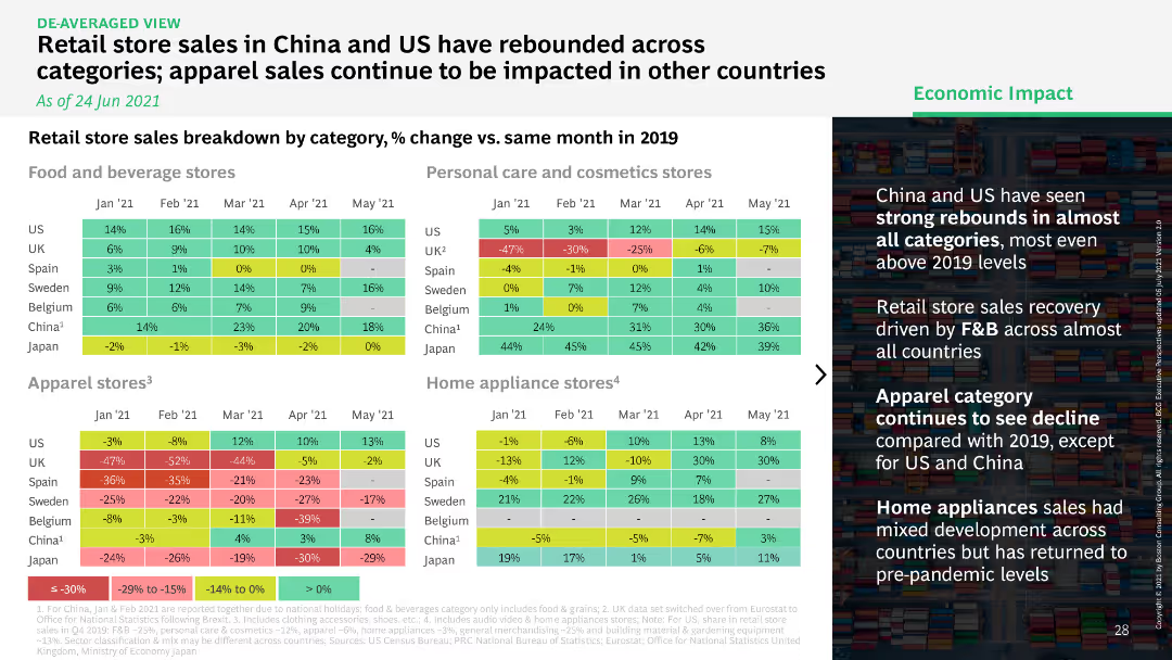
Heatmap comparing retail store sales by category in multiple countries, showing percentage change versus 2019.
Market Analysis and Trends
Retail & E-commerce
Highlights the rebound in retail store sales across categories in China and the US, while apparel sales in other countries continue to struggle.
retail store, sales rebound, categories, China
Table
BCG
Saved
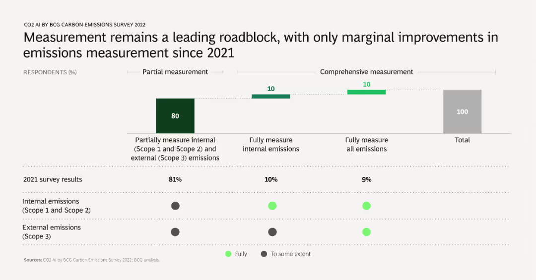
A column chart comparing 2021 and 2022 survey results on emissions measurement practices. Shows percentages of companies performing partial and comprehensive measurements of internal and external emissions.
Risk Assessment and Management
Environmental Services & Sustainability
Discusses the challenges and slow progress in improving emissions measurement accuracy and comprehensiveness. Highlights the need for better measurement practices to enhance emissions management.
emissions measurement, challenges, survey comparison, partial, comprehensive
Mixed Chart
BCG
Saved
The slide contains two horizontal bar charts on a background image of an airplane, with a cityscape in the background. The charts illustrate investment impacts.
Risk Assessment and Management
Financial Services
Discusses how the Covid-19 pandemic might affect investment strategies in Italy, focusing on sector and country-specific changes, based on investor opinions.
Covid-19, investment, strategy, Italy, impact, sector focus, country focus, investor opinion
Multiple Chart
EY
Saved
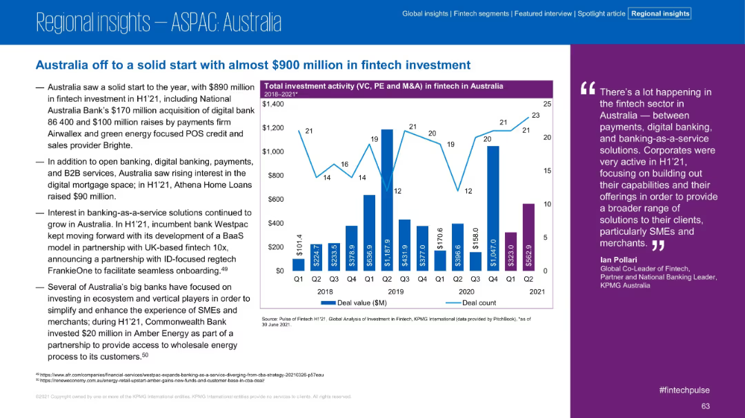
Split layout with bullet insights and bar-line graph for quarterly investments in Australia.
Market Analysis and Trends
Financial Services
Australia’s fintech sector saw a strong H1’21 with $890 million in investment. The slide details contributions from digital banks, B2B, payments, and BaaS platforms. A graph tracks deal volume from 2018 to 2021.
Australia, Fintech, VC, BaaS, Investment, Digital Banking
Mixed Chart
KPMG
Saved
Diagram highlighting AI's entrance into the creative industries, with examples from performing, literary, media, and visual arts.
Market Analysis and Trends
Media & Entertainment
The slide explores how AI has been successfully integrated into creative fields, providing examples of AI-generated works in music, art, literature, and media. It highlights the diverse applications of AI in the creative realm, showcasing its potential to innovate and transform traditional artistic processes.
AI, Creative Industries, Music, Art
Framework
Roland Berger
Saved
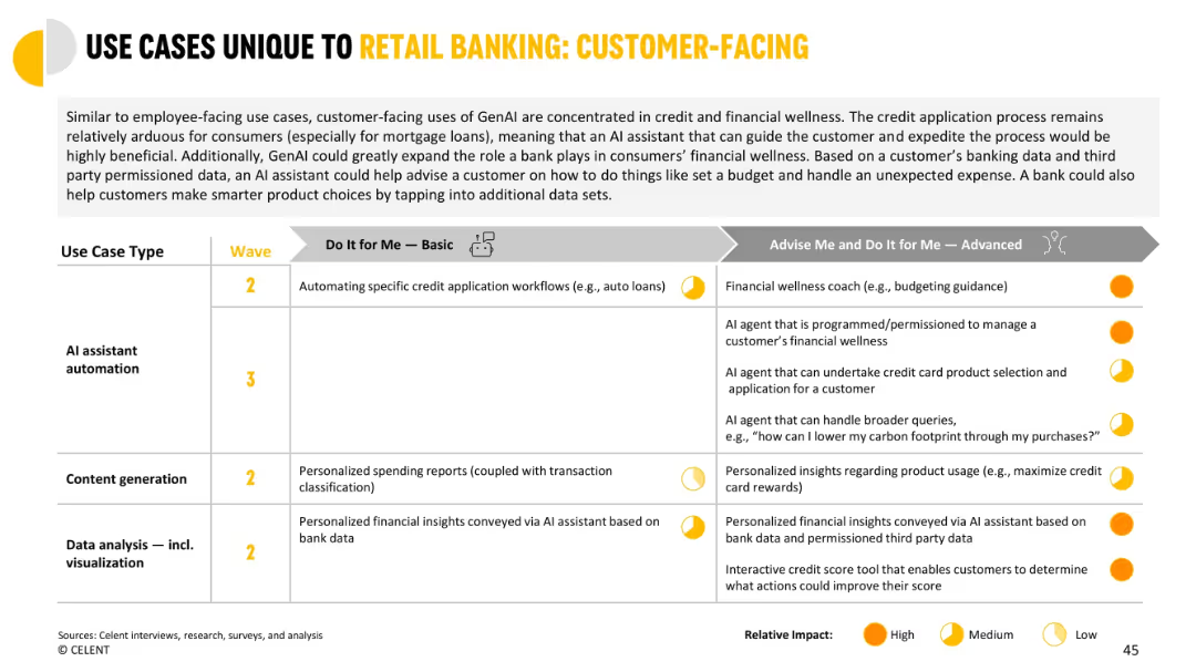
Split table showing customer-facing use cases mapped to waves and impact categories across functions.
Customer and Market Segmentation
Financial Services
Shows GenAI applications for guiding consumers in credit workflows and financial wellness. Includes personalized insights, automated assistance, and financial coaching, progressing from simple automation to fully autonomous AI agents.
credit workflow, customer-facing, personalization, insights, automation, financial coach
Mixed Chart
Oliver Wyman
Saved
This slide features a side-by-side column chart comparison for Millennials and Gen Z's top concerns from 2020 to 2021. The chart is color-coded in green and blue, respectively, with a clear label for each concern.
Market Analysis and Trends
Healthcare & Pharmaceuticals
The slide presents comparative data on the evolving personal concerns of Millennials and Gen Z, highlighting health care/disease prevention as a top priority due to the pandemic.
Health, Concerns, Millennials, Gen Z, Pandemic, Data, Column Chart, Survey, Environment, Prevention
Single Chart
Deloitte
Saved
The slide features an area chart showing global energy sector CO2 emission reductions by measure (technology performance, electrification, etc.) up to 2070. The chart is color-coded and has a detailed legend.
Strategic Planning
Energy & Utilities
This slide emphasizes that CCUS technologies need to be combined with other solutions like electrification and technology improvements to decarbonize the energy sector effectively.
CCUS, decarbonization, energy sector, emission reductions, technology solutions
Mixed Chart
Kearney
Saved
The slide includes two line charts: one for overall food prices by category and another for fertilizer prices, both from 2019 to 2023.
Market Analysis and Trends
Agriculture & Food Production
The slide examines the trends in food and fertilizer prices, highlighting easing pressures and potential risks affecting these prices.
food prices, fertilizer, agriculture, market trends, pricing risks
Multiple Chart
Accenture
Saved
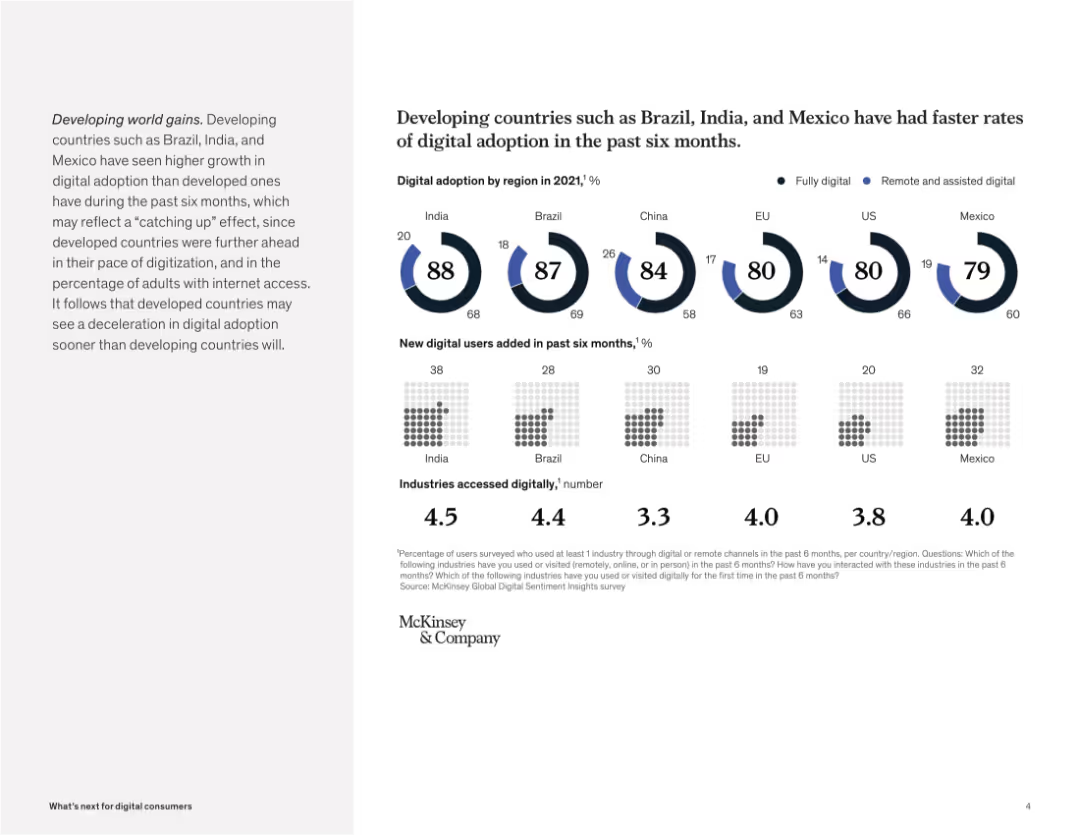
Circular progress charts and grids display digital adoption levels, new digital users, and industries accessed across countries.
Industry Overview
Telecommunications
The slide compares digital adoption across developed and developing countries, showing that emerging markets like India and Brazil are growing faster in adoption and new user generation, though this may be a catch-up effect.
digital adoption, emerging markets, Brazil, India, Mexico, remote access, industry engagement, technology growth, McKinsey
Multiple Chart
McKinsey
Saved
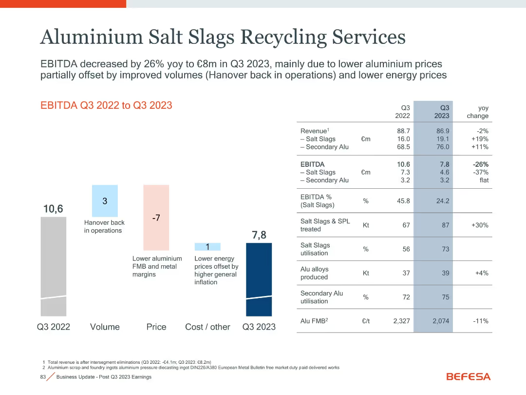
Waterfall bar chart with financial table and YoY comparisons
Operational Efficiency
Industrial & Manufacturing
This slide details the performance of aluminium salt slags recycling operations, showing a decrease in EBITDA due to pricing pressure, partially offset by volume growth.
Aluminium, Recycling, EBITDA, Salt Slags, Energy Prices, Q3 2023
Mixed Chart
Goldman Sachs
Saved
This slide is divided into two halves with large icons—a human figure and a monitor. There are percentages next to each visual, with a clear title above and a background that provides contrast for readability.
Market Analysis and Trends
Financial Services
This slide reflects the consensus between employees and HR leaders on the negative impact of financial stress on workplace performance, suggesting a focus on well-being in HR policies. It's likely to be used for presentations discussing the intersection of personal finance and workplace efficiency.
financial stress, productivity, HR leaders, employees, workplace
Boxed
Goldman Sachs
Saved
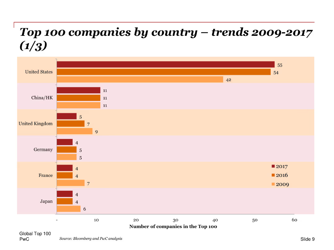
A bar chart comparing the number of top 100 companies by country for the years 2009, 2016, and 2017, with emphasis on changes over time.
Market Analysis and Trends
Financial Services
Compares the number of companies in the top 100 across different countries, highlighting the dominance of the United States and trends in other key regions like China and Europe.
Top 100 companies, countries, trends, bar chart, United States, China, Europe, comparison, changes
Single Chart
PwC/Strategy&
Saved
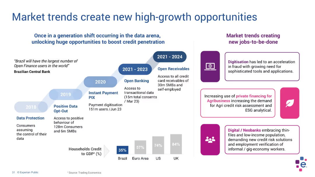
Timeline and side panel layout; blue timeline with icons and purple callouts
Market Analysis and Trends
Technology & Software
This slide highlights the evolution of Brazil's data ecosystem and regulatory shifts enabling credit expansion. It includes market trends such as digitization, agribusiness financing, and fintech adoption, supported by a historical data timeline.
credit penetration, Brazil, Open Finance, trends, agribusiness, fintech
Mixed Chart
Barclays
Saved
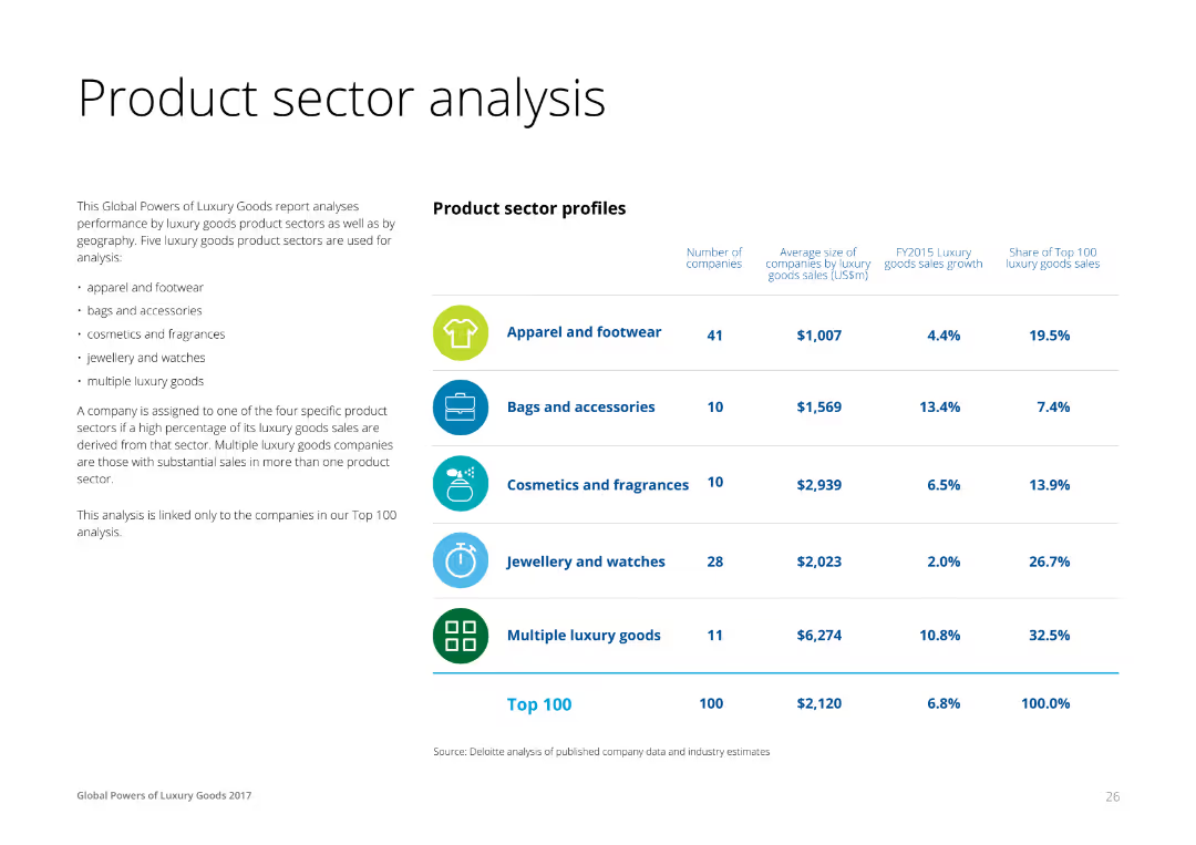
A combination of text and a table on the right, profiling luxury product sectors like apparel, accessories, cosmetics, and jewelry. Each row lists the number of companies, average size, sales growth, and share of top 100 sales for each sector.
Product and Service Analysis
Consumer Goods
This slide analyzes the performance of different luxury product sectors, providing insights into the number of companies, average size by sales, and growth rates for apparel, accessories, cosmetics, and jewelry sectors.
Product, Sector, Analysis, Luxury, Goods
Table
Deloitte
Saved
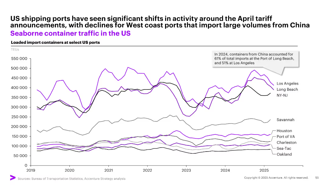
Multiline time-series graph showing TEUs of loaded imports at major US ports, color-coded by port.
Performance Metrics and KPIs
Transportation & Logistics
Depicts changes in import container volumes at key US ports from 2019–2025, noting a decline in West Coast ports due to April tariff shifts. Notes China's dominance in import origin volumes, with Long Beach and LA most affected.
shipping, TEU, tariffs, imports, China, ports, Long Beach, Los Angeles, NY-NJ, container traffic
Single Chart
Accenture
Saved
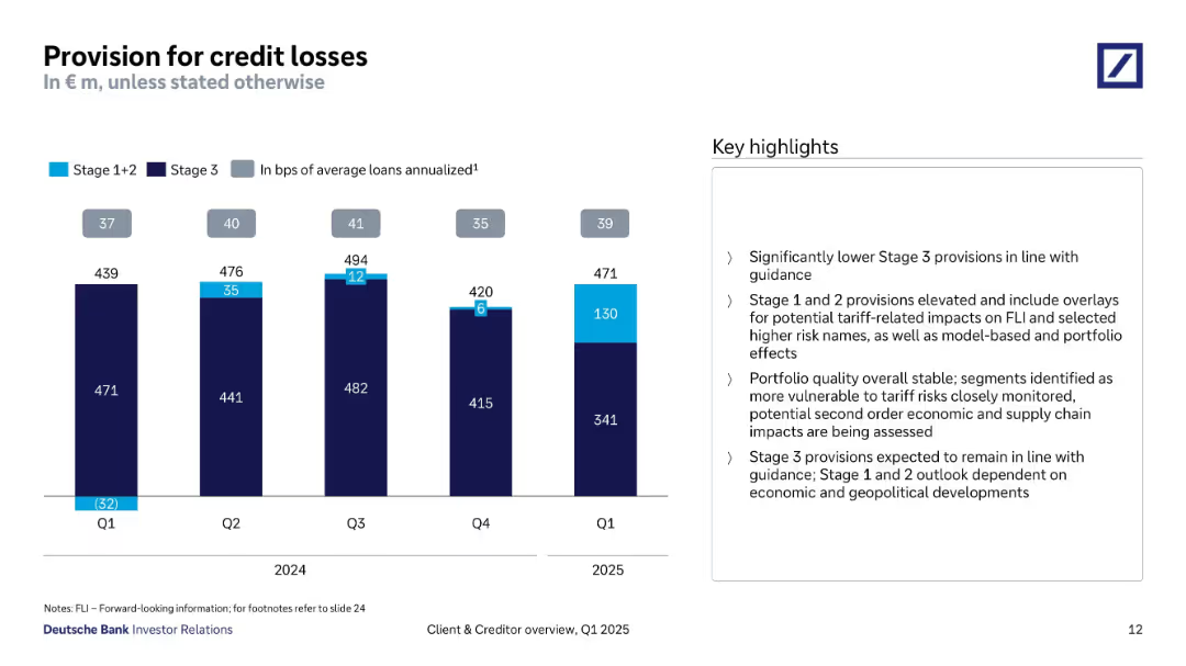
Bar chart tracking provision breakdown (Stage 1+2 vs Stage 3) from Q1 2024 to Q1 2025; bullet points on right.
Risk Assessment and Management
Financial Services
The slide tracks provisions for credit losses over five quarters, indicating a shift toward Stage 1+2 provisions driven by tariff and geopolitical risks. It notes stable portfolio quality and stresses on monitoring vulnerable segments.
credit losses, provisions, Stage 1+2, Stage 3, tariff risk, portfolio quality, Q1 2025, risk overlays
Mixed Chart
Deutsche Bank
Saved
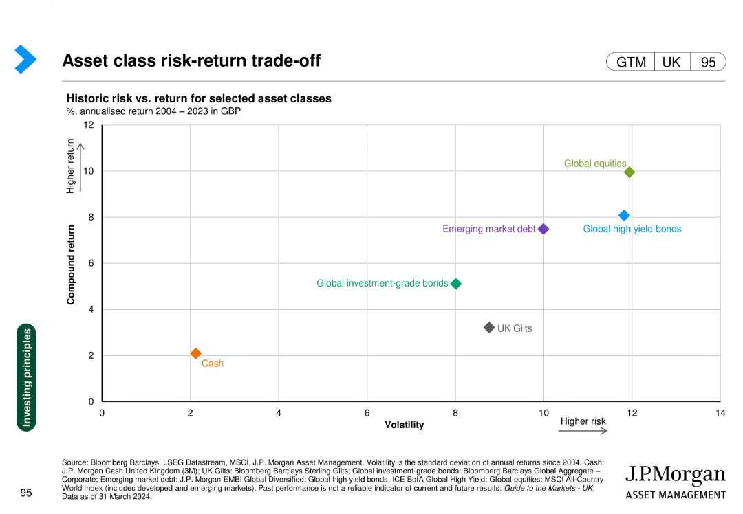
The slide displays a scatter plot showing the historic risk vs. return for selected asset classes, with axes labeled for compound return and volatility.
Risk Assessment and Management
Financial Services
This slide evaluates the risk-return trade-off for various asset classes from 2004-2023, aiding in understanding investment risk profiles.
risk, return, asset classes, volatility, investment
Single Chart
JP Morgan
Saved
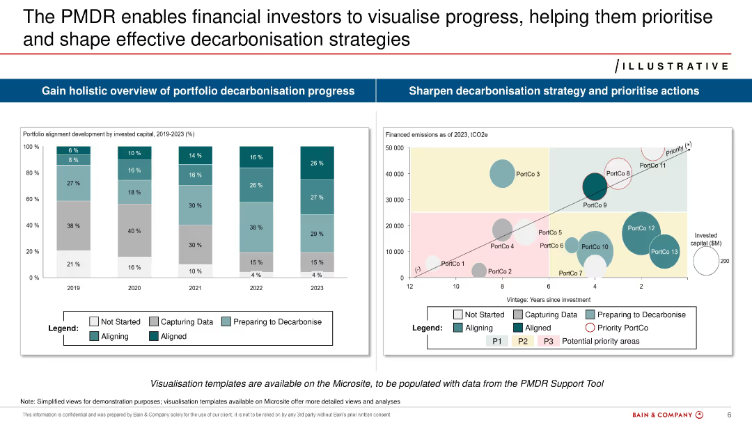
Split layout with two main graphs: bar chart of portfolio alignment (2019–2023) and bubble chart of financed emissions vs. investment age.
Risk Assessment and Management
Financial Services
Demonstrates how financial investors can use PMDR to assess decarbonization progress. Provides alignment metrics over time and visualizes emissions by portfolio company. Aims to guide prioritization and strategy.
PMDR, investors, decarbonization, emissions, portfolio, alignment, risks
Multiple Chart
Bain
Saved
The slide displays two column charts, one illustrating EPS from FY14 to FY20, and the other showing operating income for the same period. The bars are shaded differently to indicate H1 and H2 for each fiscal year.
Financial Performance
Financial Services
Focused on Macquarie's earnings performance over several years, the slide reveals a positive trend in EPS and operating income, crucial for financial analysts and investors reviewing company performance.
earnings, growth, performance, financial, fiscal, income, EPS, trend, analysis, investors
Multiple Chart
Goldman Sachs
Saved
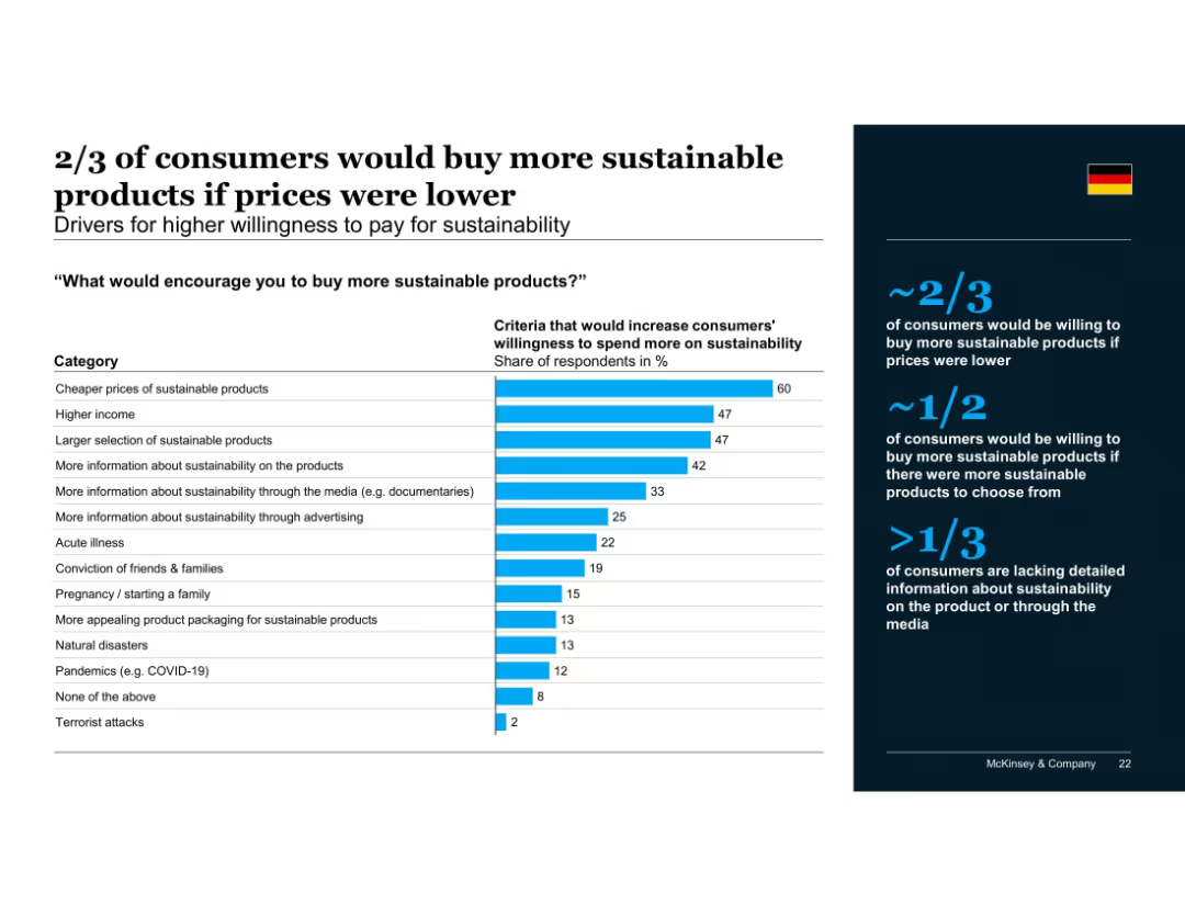
Vertical bar chart showing criteria that would increase willingness to pay, sorted by response rate; summary panel on the right with supporting percentages and insights.
Pricing Strategies
Consumer Goods
Shows that price is the most important barrier to buying sustainable products. Income level, product availability, and lack of information also limit consumer willingness to pay. Over one-third cite the need for more information to make sustainable choices.
pricing, willingness to pay, consumer motivation, affordability, product selection, media influence, sustainable products
Mixed Chart
McKinsey
Saved
The slide features a pie chart showing 37% optimism, bullet points on the right with blue headings, and demographics at the bottom. Simple white background with minimalistic design.
Market Analysis and Trends
Financial Services
The slide presents data indicating that optimistic investors are more likely to invest actively and have confidence in a quick economic recovery. Demographic details are included.
optimism, investment, confidence, demographics, COVID-19
Mixed Chart
IPSOS
Saved
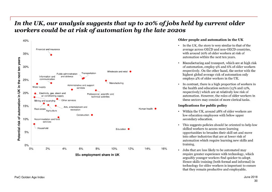
The slide features a scatter plot chart showing the potential risk of automation for older workers in various industries in the UK over the next ten years. A section of bullet points on the right provides additional context and implications.
Risk Assessment and Management
Government & Public Sector
The slide discusses the potential automation risk faced by older workers in the UK, with specific industry data and public policy implications. It highlights the proportion of older workers and their risk levels across different sectors.
automation, older workers, UK, risk, industries, public policy, employment, sectors, implications
Mixed Chart
PwC/Strategy&
Saved
The slide includes a column chart showing daily crew rates for vessels carrying domestic cargoes, comparing internationally and Australian flagged vessels before and after the Coastal Trading Act 2012.
Regulatory and Compliance
Transportation & Logistics
It examines how cabotage regulations have increased coastal shipping costs for the cement industry in Australia, comparing costs before and after the Coastal Trading Act 2012 and highlighting cost implications.
cabotage, coastal shipping, cement industry, Australia, Coastal Trading Act
Mixed Chart
LEK
Saved
Displays pie charts and a column chart, using blue shades to show geographical and sector-based CRE data.
Risk Assessment and Management
Real Estate & Construction
Continues risk analysis of CRE, focusing on loan modifications and defaults, providing insights for financial strategy.
CRE, risk management, loans, defaults, modifications, stress test, US market, financial analysis
Multiple Chart
Deutsche Bank
Saved
Previous
Next
If nothing, comes up, please save your slides first
Create a FREE account to continue browsing
Receive Instant Access to 1,000+ slides from companies like McKinsey, Google, and Goldman Sachs
First Name
Last Name
Email
Password
I agree to all
Terms & Privacy Policy
Thank you! Your submission has been received!
Oops! Something went wrong while submitting the form.
Have an account?
Sign in
Column Chart
Heatmap
Chevron
Org Chart
Infographic
Callouts
Timeline
List
Graphic
Picture
Process Flow
Diagram
Paragraph
Map
Table
Framework
Subtitle
Takeaway Box
Icon
Other Chart
Radar Chart
Waterfall Chart
Mekko Chart
Pie Chart
Scatter Plot
Line Chart
Bar chart
Bullet points