Create a FREE Account
Instant access to 1,000+ real slides from top companies like McKinsey, BCG, Goldman Sachs, Google and many more!
First Name
Last Name
Email
Password
I agree to all
Terms & Privacy Policy
Thank you! Your submission has been received!
Oops! Something went wrong while submitting the form.
Have an account?
Sign in
Library
Templates
Courses
Pricing
My Account
My Slides
My Templates
✦ AI
AI Prompt Library
AI Search
Sign in
Start Here
Logout
My Saved Slides
A complex flow diagram details the litigation process cost and duration, with red and orange color coding for different court paths.
Regulatory and Compliance
Government & Public Sector
Analyzes the litigation process for family law in different courts, discussing costs and duration, emphasizing efficiency.
litigation, family law, court costs, process timeline, case study, legal system
Diagram
PwC/Strategy&
Saved
Features multiple small column charts detailing urbanization percentages in various countries by 2050, arranged by region.
Market Analysis and Trends
Government & Public Sector
Compares urbanization rates to highlight regional development and planning challenges.
urbanization, regional comparison, 2050, development
Multiple Chart
Roland Berger
Saved
A column chart compare the year-on-year growth of different luxury product categories like shoes, jewelry, and beauty products.
Market Analysis and Trends
Retail & E-commerce
Examines the specific categories driving growth in the luxury market in 2018, highlighting the success of accessories and beauty products.
market growth, luxury products, beauty industry, accessories, sales analysis
Mixed Chart
Bain
Saved
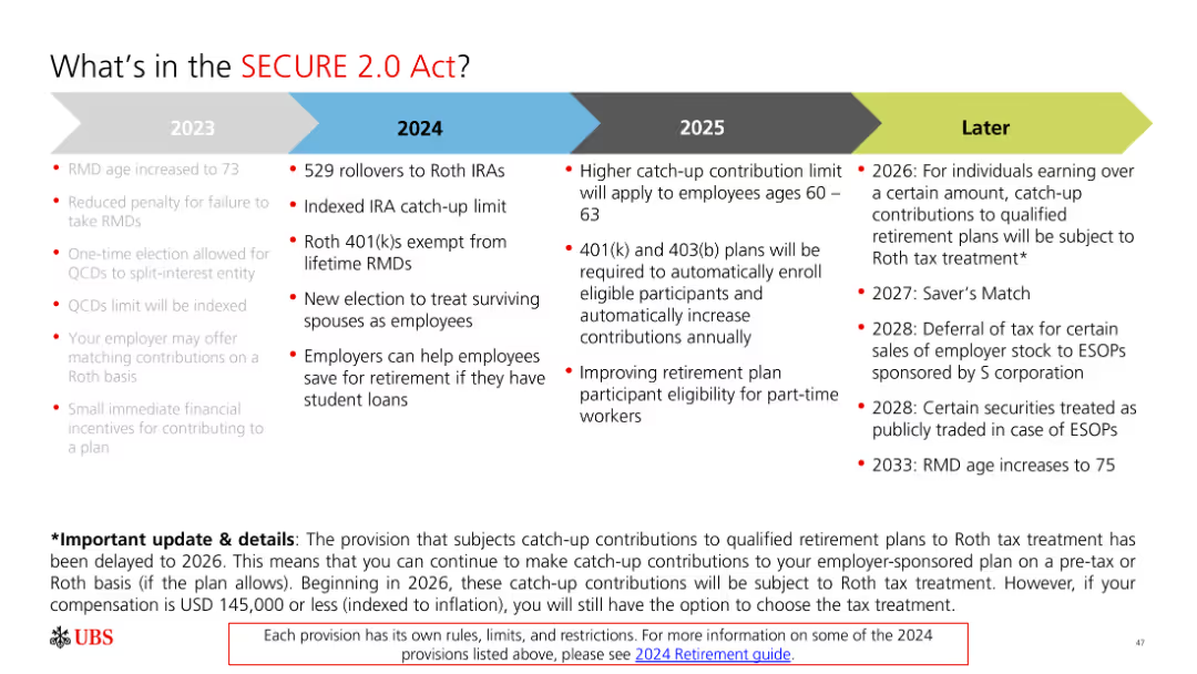
The slide includes a timeline and bullet points with text. It is moderately complex with clear visual differentiation between different years and provisions.
Regulatory and Compliance
Financial Services
The slide outlines key provisions of the SECURE 2.0 Act from 2023 to 2026 and later, emphasizing changes in retirement savings regulations.
SECURE Act, retirement, provisions, 2023, 2024, 2025, 2026
Linear Flow
UBS
Saved
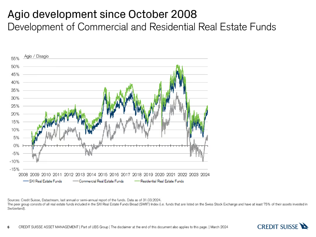
The slide shows a line chart with three lines representing the development of agio/disagio for different types of real estate funds from 2008 to 2024, using blue, green, and grey.
Market Analysis and Trends
Real Estate & Construction
This slide compares the performance of commercial, residential, and SXI Real Estate funds in terms of agio/disagio rates since the financial crisis of 2008.
agio, disagio, commercial, residential, comparison
Single Chart
Credit Suisse
Saved
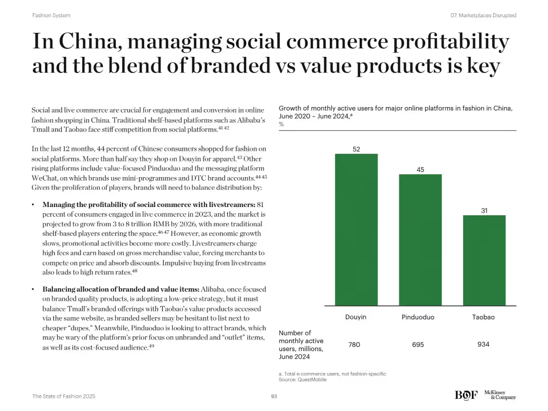
Balanced layout with left-aligned bullets and a bar chart showing MAU growth on the right; clean visual design
Market Analysis and Trends
Retail & E-commerce
The slide emphasizes the importance of social commerce and livestreaming in China’s fashion market. It discusses challenges around profitability and distribution between branded and value products. The bar chart presents monthly active user growth across Douyin, Pinduoduo, and Taobao. Strategic considerations include fee pressure from livestreamers and the shift in platform branding strategies.
China, social commerce, Douyin, livestreaming, Pinduoduo, Taobao, branded vs value, MAU
Mixed Chart
McKinsey
Saved
A complex slide with pie charts and bar graphs comparing the percentages of different types of shoppers and their preferences, also lists the barriers and benefits of online shopping in the fashion industry.
Market Analysis and Trends
Retail & E-commerce
This detailed slide dissects the barriers faced by non-buyers and occasional shoppers in the fashion e-commerce domain, juxtaposing them with the preferences of frequent shoppers. It serves to analyze factors affecting consumer decisions in online fashion purchasing.
Fashion e-commerce, shopping barriers, consumer preferences
Mixed Chart
BCG
Saved
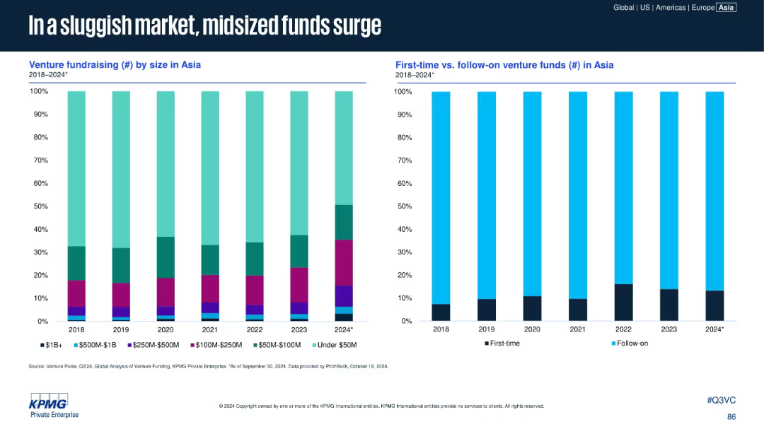
Two vertical stacked bar charts: left shows venture fundraising by size; right compares first-time vs. follow-on funds in Asia (2018–2024).
Market Analysis and Trends
Financial Services
The slide reveals a rise in mid-sized funds ($100M–$500M) and a consistent dominance of follow-on funds over first-time venture funds. The market favors experienced fund managers in a more cautious fundraising environment, with under-$50M funds also growing in proportion in 2024.
midsize funds, first-time funds, follow-on funds, Asia, venture capital, fundraising
Multiple Chart
KPMG
Saved
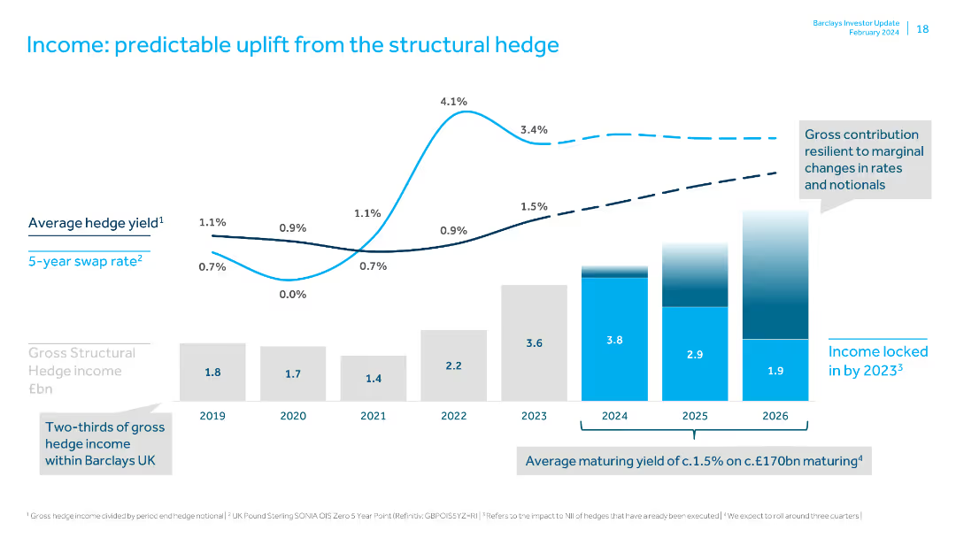
Displays a line chart for average hedge yield and column charts for gross structural hedge income. Text boxes highlight future projections.
Financial Performance
Financial Services
Details the predictable income uplift from structural hedges, showing past and projected hedge yields and income, emphasizing future income security.
structural hedge, income, hedge yield, financial performance, future projections, swap rate, gross income, financial security, hedging strategy
Multiple Chart
Barclays
Saved
Diagrams and descriptive text explain the concept of smart contracts, showing examples of how they operate in transactions and loan processes, with visual aids like flowcharts and character illustrations.
Technology and Digital Transformation
Technology & Software
Outlines the functionality of smart contracts in blockchain, detailing their role in automating transactions and enforcing agreements digitally. Ideal for illustrating innovative contract management solutions in technology applications.
smart contracts, blockchain, automation, digital agreements, transactions
Boxed
McKinsey
Saved
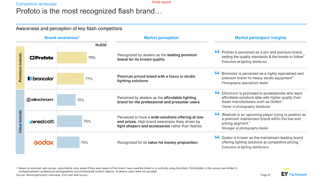
A combination of a bar chart and text boxes presents brand awareness data for key flash competitors, along with market perception and participant insights.
Pricing Strategies
Media & Entertainment
It showcases the brand awareness levels of key flash brands like Profoto, Broncolor, Elinchrom, Westcott, and Godox, with market perception and insights.
Brand awareness, flash brands, Profoto, market perception, participant insights, media, entertainment, analysis, trends
Mixed Chart
EY
Saved
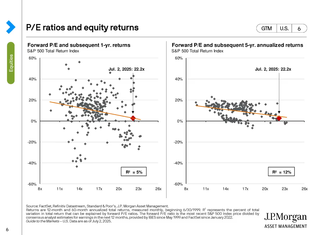
Two scatter plots with trendlines; left shows 1-year returns, right shows 5-year annualized returns, based on forward P/E ratio.
Investment Analysis
Financial Services
This slide analyzes the relationship between forward P/E ratios and subsequent equity returns. It demonstrates weak correlations, with R² values of 5% (1-year) and 12% (5-year), suggesting limited predictive power of P/E for short- and mid-term returns. Current P/E is marked at 22.2x.
P/E ratio, returns, scatter plot, S&P 500, equity analysis, forward valuation, performance forecasting, R-squared, investment strategy
Multiple Chart
JP Morgan
Saved
Stacked bar chart shows FGA internal R&D spending versus technology venture investing, with annotations for key years and percentages.
Investment Analysis
Technology & Software
Analyzing the ratio of FGA internal R&D investments to the overall technology venture investing market, this slide is valuable for discussions on internal vs. external investment strategies.
FGA, R&D, Investment, Technology, Market Analysis
Mixed Chart
Oliver Wyman
Saved
Presents a column chart illustrating the podcast ad revenue percentage share by content genre between 2021 and 2022. Each genre is represented by a pair of bars for each year, with detailed annotations. The slide background and bar colors enhance readability.
Market Analysis and Trends
Media & Entertainment
Examines shifts in revenue generation across different podcast genres, noting a decrease in news content and increase in entertainment genres. Useful for content creators and advertisers to strategize genre-focused marketing efforts.
Content Genres, Revenue Share, Podcasting, Market Trends, Advertising
Mixed Chart
PwC/Strategy&
Saved
The slide features column charts identifying the departments across front and back office functions that are expected to realize the greatest time and cost savings from GenAI implementation, with a large image.
Customer and Market Segmentation
Financial Services
The slide identifies customer service, onboarding, risk management, and operations as the departments most impacted by GenAI, showing expected time and cost savings from its implementation.
GenAI, customer service, onboarding, risk management, operations
Multiple Chart
EY
Saved
The slide presents a scatter plot and column chart showing the variation in Australian road freight costs with distance, with annotations highlighting key findings.
Market Analysis and Trends
Transportation & Logistics
The slide analyzes the variation in road freight costs across different distances and regions in Australia, noting that costs decrease with distance but are highest in South Australia and Victoria.
Road freight costs, Australia, distance, cost variation, transportation, logistics, scatter plot, market analysis, freight efficiency
Multiple Chart
LEK
Saved
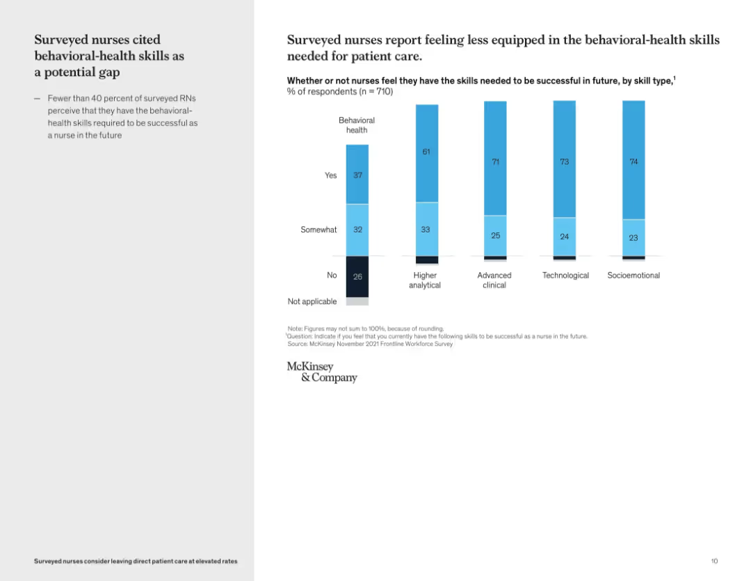
Vertical bar graph showing self-perceived skill gaps by skill type; left-side text summary
Organizational Structure and Change
Healthcare & Pharmaceuticals
This slide reveals that many nurses feel underprepared in behavioral-health skills compared to other domains like technological or clinical capabilities. Only 37% of nurses feel confident in their behavioral health skills, pointing to a critical development area for future readiness.
skills gap, behavioral health, workforce training, nursing education, competency assessment, professional development
Mixed Chart
McKinsey
Saved
Texts with adjacent icons, highlighting various strategies and achievements of J.P.Morgan's Commercial Banking division.
Operational Efficiency
Financial Services
Emphasizes J.P.Morgan's strategies in client franchise expansion, innovation, enhancing client experience, and financial results. Aimed at showcasing business strategies and operational excellence.
commercial banking, client franchise, innovation, client experience, data-driven, team empowerment, financial results, ROE
Header Vertical
JP Morgan
Saved
Slide with four separate graphs (bar, line, bar, line) corresponding to four key drivers of upskilling. The layout is structured with each graph and its explanation in quadrants.
Market Analysis and Trends
Financial Services
Addresses the factors contributing to the need for upskilling in the workforce, such as job automation, talent availability, mobility of skilled labor, and aging talent.
Upskilling, Automation, Talent Scarcity, Workforce Mobility, Aging Population
Multiple Chart
PwC/Strategy&
Saved
The slide features a column chart with vertical bars indicating the approximate value lost during a crypto incident, fraud, or scam.
Risk Assessment and Management
Financial Services
The slide describes the distribution of losses among crypto asset holders due to hacking incidents, fraud, or scams.
Crypto, Loss, Hacking, Fraud, Scam
Single Chart
IPSOS
Saved
Multiple column charts display financial performance over several years with projections up to 2026, accompanied by textual analysis.
Financial Performance
Financial Services
Reiterates Barclays' financial data focusing on RoTE, income, and other key financial indicators, setting performance targets for 2026 and illustrating past performance trends and future aspirations.
financials, RoTE, targets, 2026, performance
Multiple Chart
Barclays
Saved
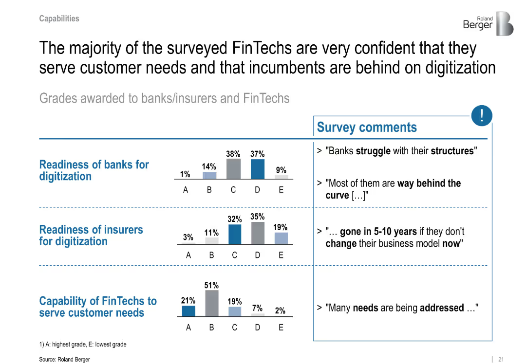
Two-column layout with text summary on the left and survey comments on the right; bar graphs show grading distributions; minimalistic style with blue highlight
Performance Metrics and KPIs
Financial Services
This slide shows FinTechs’ confidence in their customer-serving capabilities compared to banks and insurers, who are viewed as lagging in digitization. Survey comments emphasize institutional sluggishness and structural inefficiencies among incumbents.
FinTech, digitization, survey, customer needs, banks, insurers, grading, readiness, structural issues
Mixed Chart
Roland Berger
Saved
A table and indicators showing performance in data-driven marketing strategies.
Technology and Digital Transformation
Media & Entertainment
Details the performance of companies in data-driven marketing, highlighting leaders and laggards in various activators.
data-driven, marketing, targeting, content, feedback
Multiple Chart
BCG
Saved
This slide features two column layout with labels "Top 5" and "Top 3" and text blocks explaining targets for 2025 and 2030 in terms of GW. A map of Chile highlights northern and southern hydrogen valleys.
Industry Overview
Energy & Utilities
The slide outlines Chile's aspirations to be among the top global producers and exporters of green hydrogen by 2025 and 2030, with specific GW capacity targets. Also indicates geographic areas of development.
Chile, hydrogen, exporters, 2025, 2030
Graphic
McKinsey
Saved
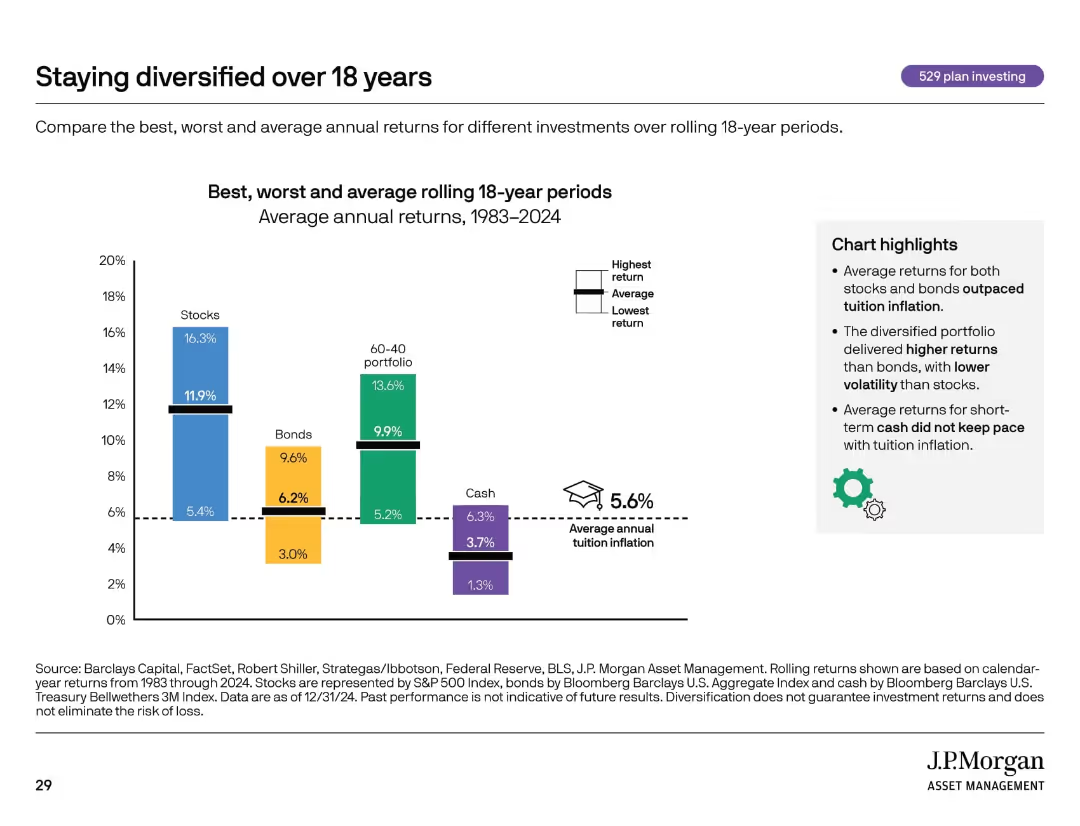
Bar chart comparing returns of different asset classes. Includes icons, dotted lines, and callout text boxes.
Investment Analysis
Financial Services
Compares average, best, and worst returns for stocks, bonds, cash, and diversified portfolios over 18-year rolling periods. Emphasizes that diversification and long-term investing can outperform tuition inflation.
diversification, investment returns, asset classes, inflation, 529 plan
Mixed Chart
JP Morgan
Saved
Previous
Next
If nothing, comes up, please save your slides first
Create a FREE account to continue browsing
Receive Instant Access to 1,000+ slides from companies like McKinsey, Google, and Goldman Sachs
First Name
Last Name
Email
Password
I agree to all
Terms & Privacy Policy
Thank you! Your submission has been received!
Oops! Something went wrong while submitting the form.
Have an account?
Sign in
Column Chart
Heatmap
Chevron
Org Chart
Infographic
Callouts
Timeline
List
Graphic
Picture
Process Flow
Diagram
Paragraph
Map
Table
Framework
Subtitle
Takeaway Box
Icon
Other Chart
Radar Chart
Waterfall Chart
Mekko Chart
Pie Chart
Scatter Plot
Line Chart
Bar chart
Bullet points