Create a FREE Account
Instant access to 1,000+ real slides from top companies like McKinsey, BCG, Goldman Sachs, Google and many more!
First Name
Last Name
Email
Password
I agree to all
Terms & Privacy Policy
Thank you! Your submission has been received!
Oops! Something went wrong while submitting the form.
Have an account?
Sign in
Library
Templates
Courses
Pricing
My Account
My Slides
My Templates
✦ AI
AI Prompt Library
AI Search
Sign in
Start Here
Logout
My Saved Slides
Slide includes two sets of column charts depicting the currency mix for net revenues and noninterest expenses across divisions.
Financial Performance
Financial Services
This slide details the divisional currency distribution for net revenues and noninterest expenses, aiding financial strategy and risk assessment.
Currency mix, revenues, expenses, analysis
Multiple Chart
Deutsche Bank
Saved
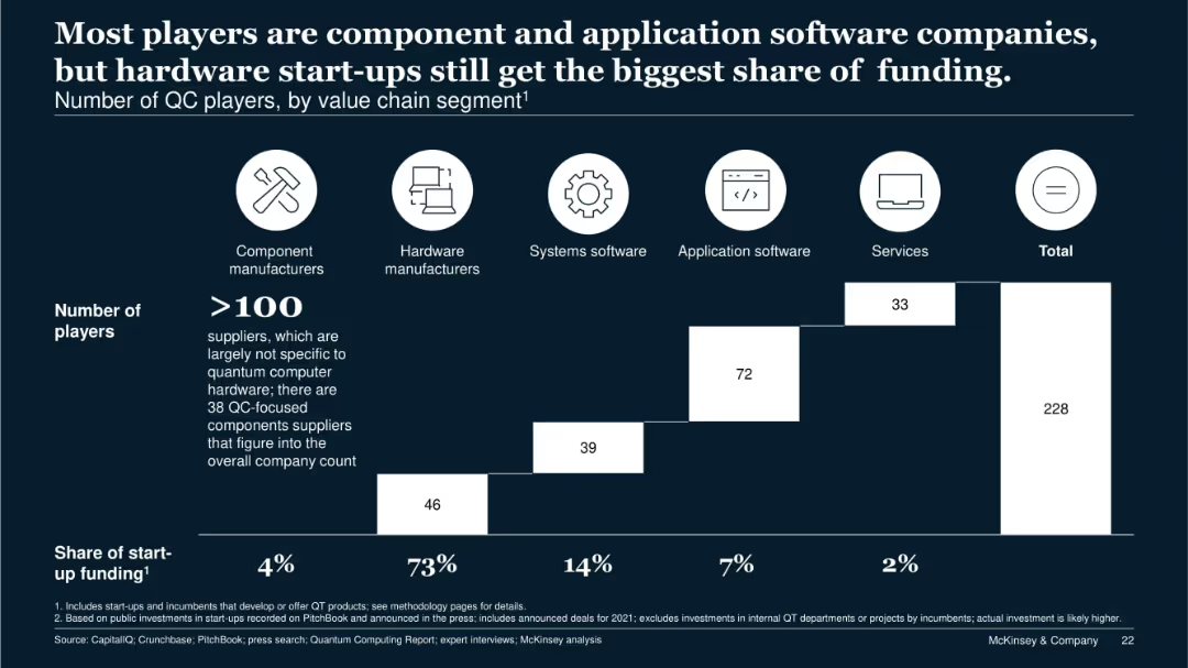
Stacked bar chart segmented by company type; icons for categories above the chart; funding share noted below.
Competitive Landscape
Technology & Software
This slide segments 228 quantum computing companies by value chain role. Although hardware manufacturers represent only a fraction of players, they receive 73% of total startup funding. It illustrates market imbalance and the dominant capital flow toward hardware.
value chain, QC players, startup funding, hardware, components, services
Single Chart
McKinsey
Saved
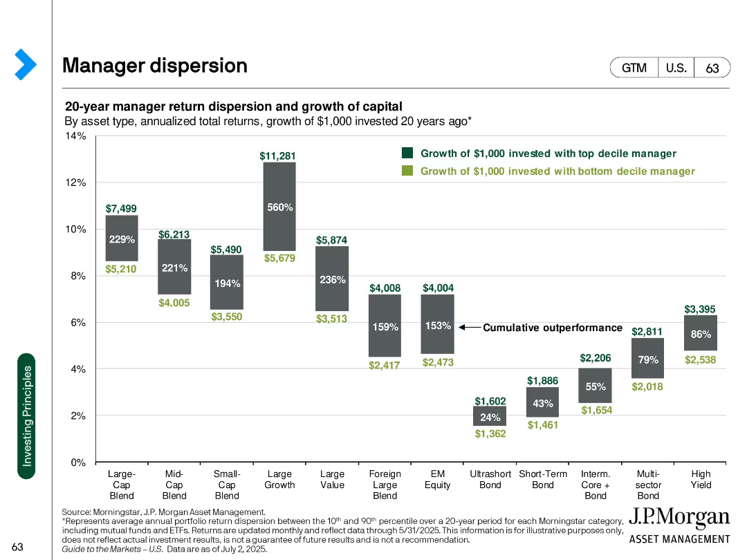
Bar chart comparing top vs. bottom decile manager returns across asset types; values labeled in $ terms
Performance Metrics and KPIs
Financial Services
Shows 20-year dispersion in returns among investment managers across asset categories, emphasizing the large performance gap between top and bottom decile performers.
manager performance, return dispersion, asset types, long-term returns, growth of capital, performance gap, mutual funds
Single Chart
JP Morgan
Saved
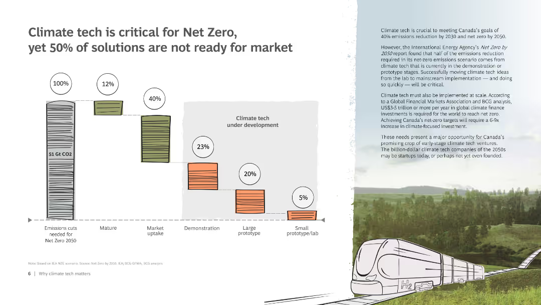
Bar chart comparing development cycles of past and current climate tech solutions. The chart shows the time from prototype to market for different technologies.
Technology and Digital Transformation
Environmental Services & Sustainability
Analyzes innovation cycles for climate tech, comparing historical and current examples to emphasize the need for faster development to meet emissions targets.
Innovation, climate tech, development, cycles, comparison
Mixed Chart
BCG
Saved
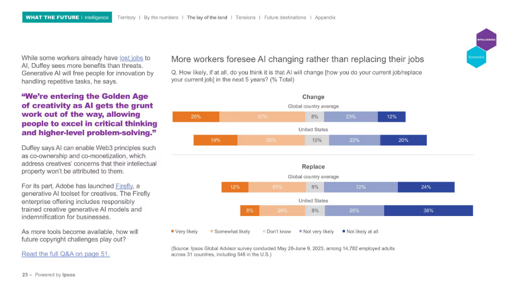
Left-aligned text with a quote in purple, right-aligned horizontal bar graphs showing survey results on "Change" and "Replace" expectations by country.
Market Analysis and Trends
Technology & Software
This slide explores perceptions of how AI will impact jobs over the next five years, showing that workers believe AI will more likely change than replace their roles. A quote highlights AI’s role in enhancing creativity. Survey data compares global and U.S. perspectives.
AI, jobs, survey, automation, creativity, change
Mixed Chart
IPSOS
Saved
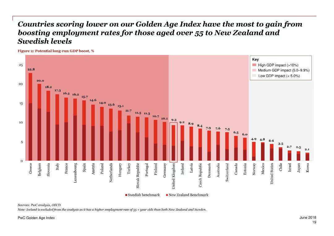
A column chart and text blocks, predominantly red and white color scheme.
Technology and Digital Transformation
Government & Public Sector
Discusses technological advances like automation and their impact on job prospects, highlighting the need for retraining and lifelong learning for older workers.
technology, automation, jobs, older workers, impact, retraining, lifelong learning, digital transformation, trends, future
Single Chart
PwC/Strategy&
Saved
Consists of multiple line and column charts analyzing the seasonal variations in dry bulk freight rates and the factors influencing these rates.
Market Analysis and Trends
Transportation & Logistics
Evaluates the seasonal fluctuations in dry bulk freight rates, identifying external influences like maintenance schedules and new vessel deliveries.
freight rates, dry bulk, market trends, seasonal variations, economic impact
Multiple Chart
Deutsche Bank
Saved
Features a timeline with three column charts at different time intervals, showcasing the growth in digitization. The background and charts use a minimal color palette for clarity.
Market Analysis and Trends
Technology & Software
Examines the increasing digital divide over time, with specific focus on leading sectors versus the rest of the US economy. It provides a clear, historical perspective on the progression of digitization.
digitization, digital divide, leading sectors, growth
Single Chart
McKinsey
Saved
A process flow slide with three main sections: Objective, Feedback, and Time Frame, each represented by icons and brief descriptions.
Technology and Digital Transformation
Media & Entertainment
Outlines the objective, feedback process, and timeline for Nielsen ONE Content Alpha, focusing on client collaboration and iterative feedback.
Nielsen ONE, content, feedback, timeline, collaboration, software, versions
Pillar
Nielsen
Saved
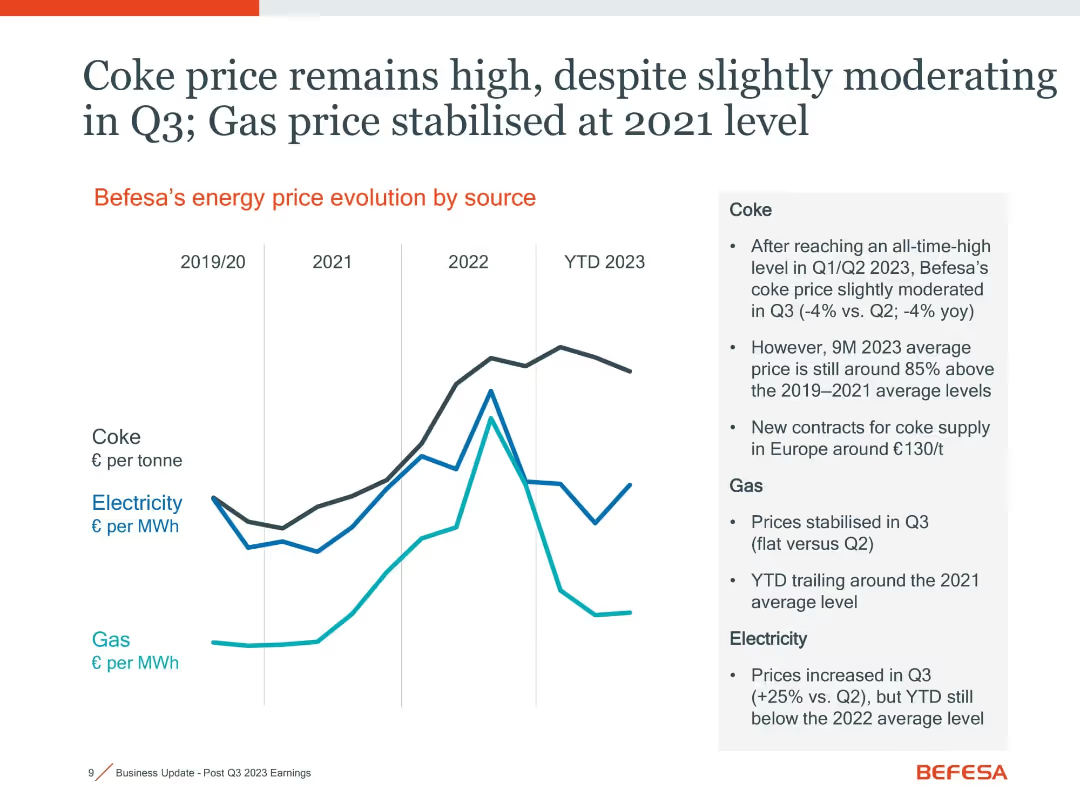
Line graph showing price evolution for coke, electricity, and gas with summary text on the side
Operational Efficiency
Industrial & Manufacturing
Energy prices, especially coke, have stayed high in 2023. Coke prices are 85% above 2019–21 levels, while gas prices have stabilized and electricity costs slightly increased in Q3. Highlights cost pressures on operations.
coke price, energy cost, gas, electricity, operational cost
Mixed Chart
Goldman Sachs
Saved
The slide includes pie charts, and a table, all showing assets under supervision (AUS). It has a title at the top and key highlights on the right, using a moderate design.
Investment Analysis
Financial Services
This slide focuses on the distribution and changes in assets under supervision for asset and wealth management. Ideal for financial reviews, investor updates, or internal strategic planning, providing insight into asset allocation and client channels.
Assets Under Supervision, AUS Mix, Net Inflows, Equity
Multiple Chart
Goldman Sachs
Saved
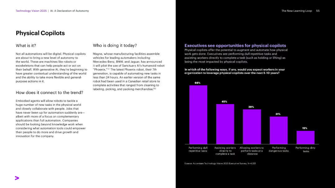
Standard split: text left, chart with purple bars right showing survey responses.
Operational Efficiency
Industrial & Manufacturing
Defines physical copilots (robots, exoskeletons) that collaborate with humans. It features Sanctuary AI’s Phoenix robot as an example and shows how executives expect to leverage these robots, especially for dull or repetitive tasks.
Copilots, physical automation, Sanctuary AI, Phoenix robot, collaboration
Mixed Chart
Accenture
Saved
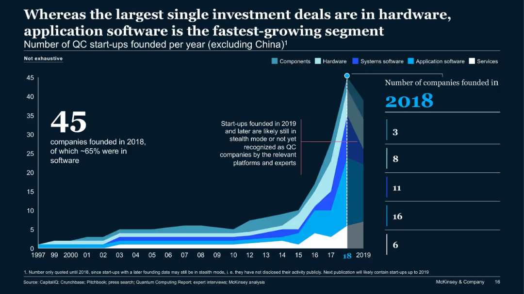
Area chart showing number of QC start-ups founded annually by segment type, excluding China. Emphasizes 2018 as peak year.
Investment Analysis
Technology & Software
The chart illustrates trends in QC start-up formations, peaking in 2018 with 45 companies—65% focused on software. It indicates investment spikes in hardware, while application software shows rapid growth. Start-ups after 2019 may still be in stealth.
QC start-ups, funding, hardware, application software, 2018, stealth, investment trends
Single Chart
McKinsey
Saved
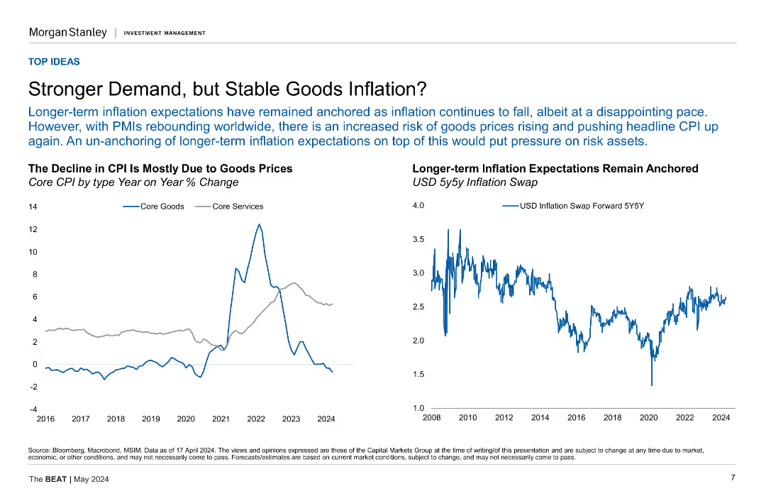
The slide features two line charts side by side. The left chart shows Core CPI by type (Goods and Services) over time, with data points from 2016 to 2024. The right chart displays USD 5y5y Inflation Swap rates from 2008 to 2024.
Market Analysis and Trends
Financial Services
The slide discusses how long-term inflation expectations have remained anchored despite recent CPI declines due to stable goods prices, while also highlighting the risks of rising goods prices amid rebounding PMIs.
Inflation, CPI, Core Goods, Core Services, USD, 5y5y, Inflation Swap, PMIs, Market Trends
Multiple Chart
Morgan Stanley
Saved
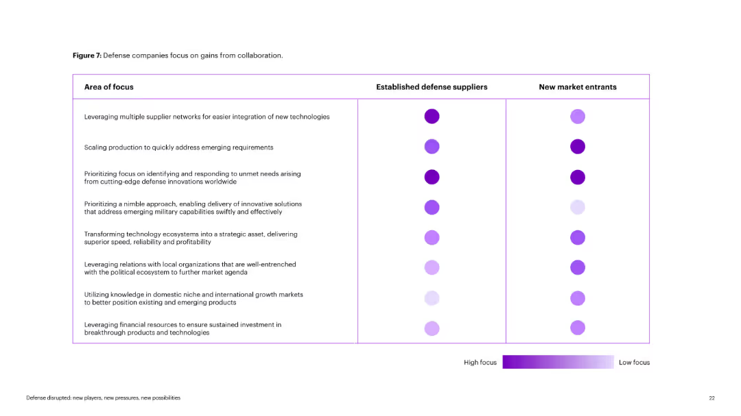
Matrix-style chart with rows as "Area of Focus" and columns comparing defense suppliers vs. new entrants. Circle intensity indicates focus level. Purple color gradient from dark (high) to light (low).
Operational Efficiency
Government & Public Sector
Visual comparison of focus areas between incumbents and startups in defense. Highlights contrasts in agility, production scaling, and innovation adoption. High-focus areas are differentiated by darker circle shades.
collaboration, defense, focus areas, startups, incumbents, innovation
Table
Accenture
Saved
Features a detailed diagram with labeled circles around a central gray circle, representing market participants. The layout includes blue accents and a clear separation between U.S. and Non-U.S. regulations. The slide is numbered 5.
Regulatory and Compliance
Financial Services
The slide offers a comprehensive look at increased regulations affecting market structure, distinguishing between U.S. and global frameworks. It serves as a detailed regulatory reference for market participants.
regulations, compliance, market structure, U.S., global
Framework
Goldman Sachs
Saved
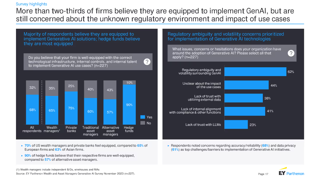
The slide features a column chart on the left and a bar chart on the right. The column chart shows the percentage of firms across different financial sectors that believe they are well-equipped to implement GenAI. The bar chart on the right highlights concerns related to regulatory ambiguity and other issues.
Risk Assessment and Management
Financial Services
The slide indicates that more than two-thirds of firms believe they are equipped to implement Generative AI, with hedge funds being the most confident. It also highlights major concerns like regulatory ambiguity, impact of use cases, and lack of trust with external data.
Generative AI, financial firms, regulatory concerns, implementation, survey results, hedge funds, technological readiness, data trust
Multiple Chart
EY
Saved
Slide with a pie chart showing the 2017 Equities Client Mix, a column chart depicting investment growth, and several bullet points. The design integrates visual data representation and narrative elements.
Market Analysis and Trends
Financial Services
Discusses the progress in equities execution, with emphasis on electronic execution, acquisitions, and partnerships. It details the improvement in client service and the growth of the quant industry.
Equities, Electronic Execution, Client Service, Investment Growth, Acquisitions, Partnerships, Quant Industry, AUM, Latency Improvement
Multiple Chart
Goldman Sachs
Saved
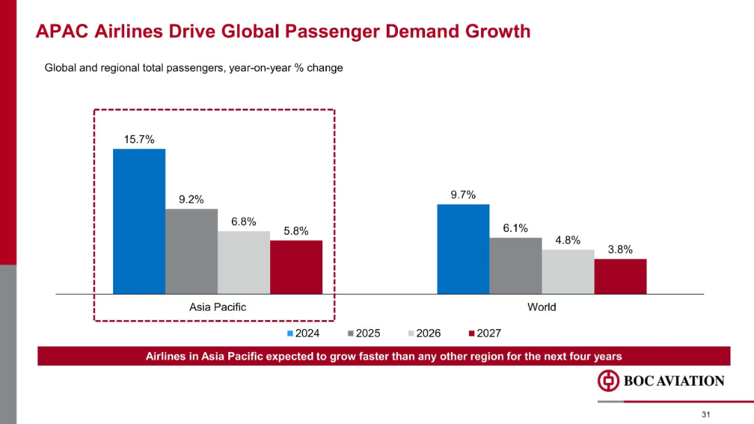
Comparative bar chart; color-coded by year and region; highlight box emphasizes Asia Pacific performance
Market Analysis and Trends
Transportation & Logistics
Projects strong growth in passenger demand across Asia-Pacific through 2027, with 2024 seeing a 15.7% YoY increase. Establishes the region as the primary driver of global air travel growth, reinforcing market opportunity focus.
APAC growth, passenger demand, global air travel, YoY change, aviation trends, Asia Pacific, demand forecast
Mixed Chart
Goldman Sachs
Saved
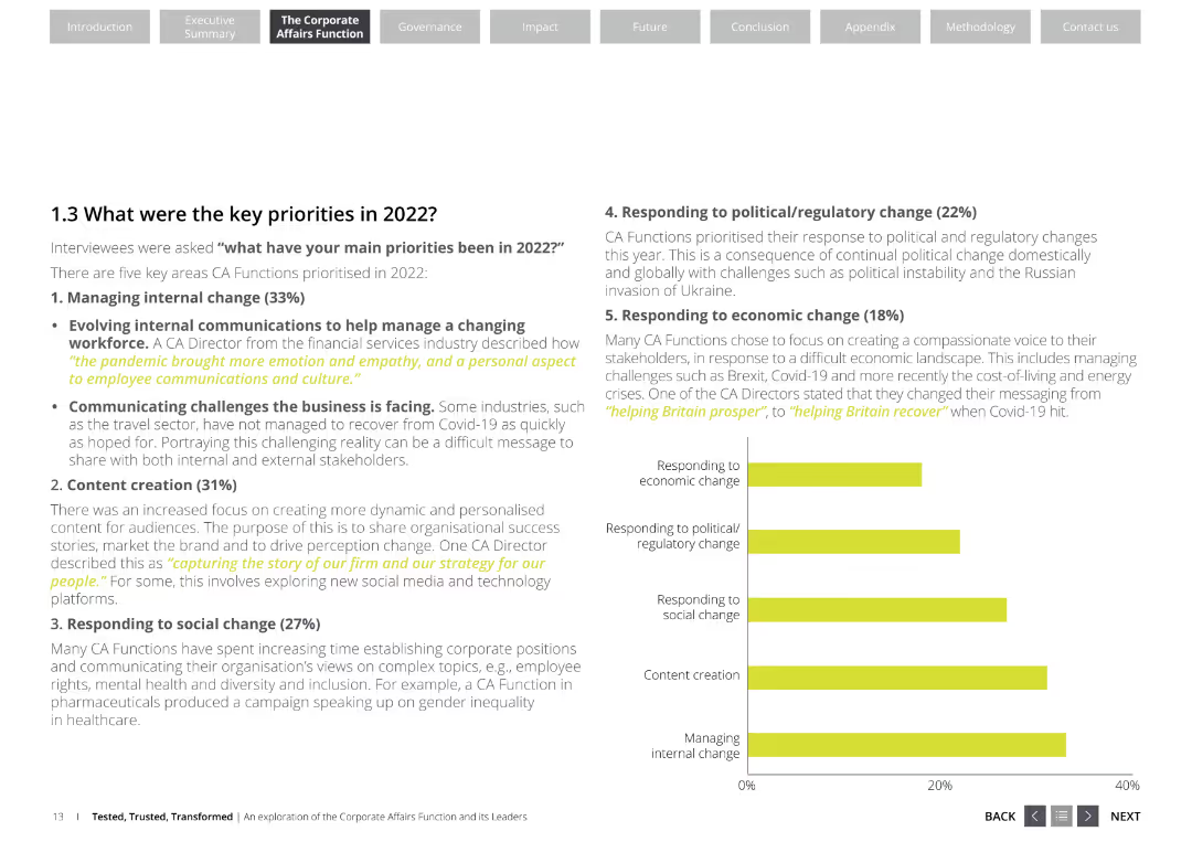
The slide features a list of key priorities for corporate affairs functions, including managing internal change, content creation, responding to social change, political/regulatory change, and economic change. It uses a professional layout with white and yellow colors.
Strategic Planning
Professional Services
This slide outlines the key priorities for corporate affairs functions in 2022, emphasizing areas like internal change management, content creation, and responses to social, political, and economic changes. It highlights the focus areas for corporate affairs directors.
corporate affairs, key priorities, internal change, content creation, social change, political change, economic change
Mixed Chart
Deloitte
Saved
This slide features two column charts and text descriptions comparing year-over-year changes. The colors orange, blue, and grey dominate, with clear labels and percentage values.
Financial Performance
Transportation & Logistics
Discusses Faurecia's H1 2018 financial results, emphasizing sales growth, operating income, and performance across different business groups and regions. Useful for assessing financial trends and operational efficiency within the automotive sector.
Sales Growth, Operating Income, Automotive, Global, Profitability
Multiple Chart
Deutsche Bank
Saved
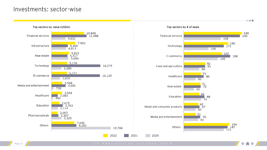
Column charts showing top sectors by value and number of deals for 2020-2022.
Market Analysis and Trends
Financial Services
Sector-wise analysis of investments by value and number of deals, highlighting top-performing sectors.
sectors, investments, value, deals, analysis
Multiple Chart
EY
Saved
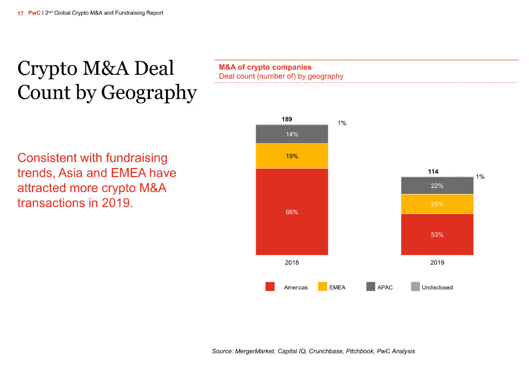
The slide features a column chart comparing the M&A deal count by geography for 2018 and 2019. The regions include the Americas, EMEA, APAC, and undisclosed.
Market Analysis and Trends
Financial Services
The slide shows the geographic distribution of M&A deals in the crypto sector, with an increase in deals in Asia and EMEA in 2019 compared to 2018, aligning with fundraising trends.
crypto, M&A, geography, column chart, comparison
Mixed Chart
PwC/Strategy&
Saved
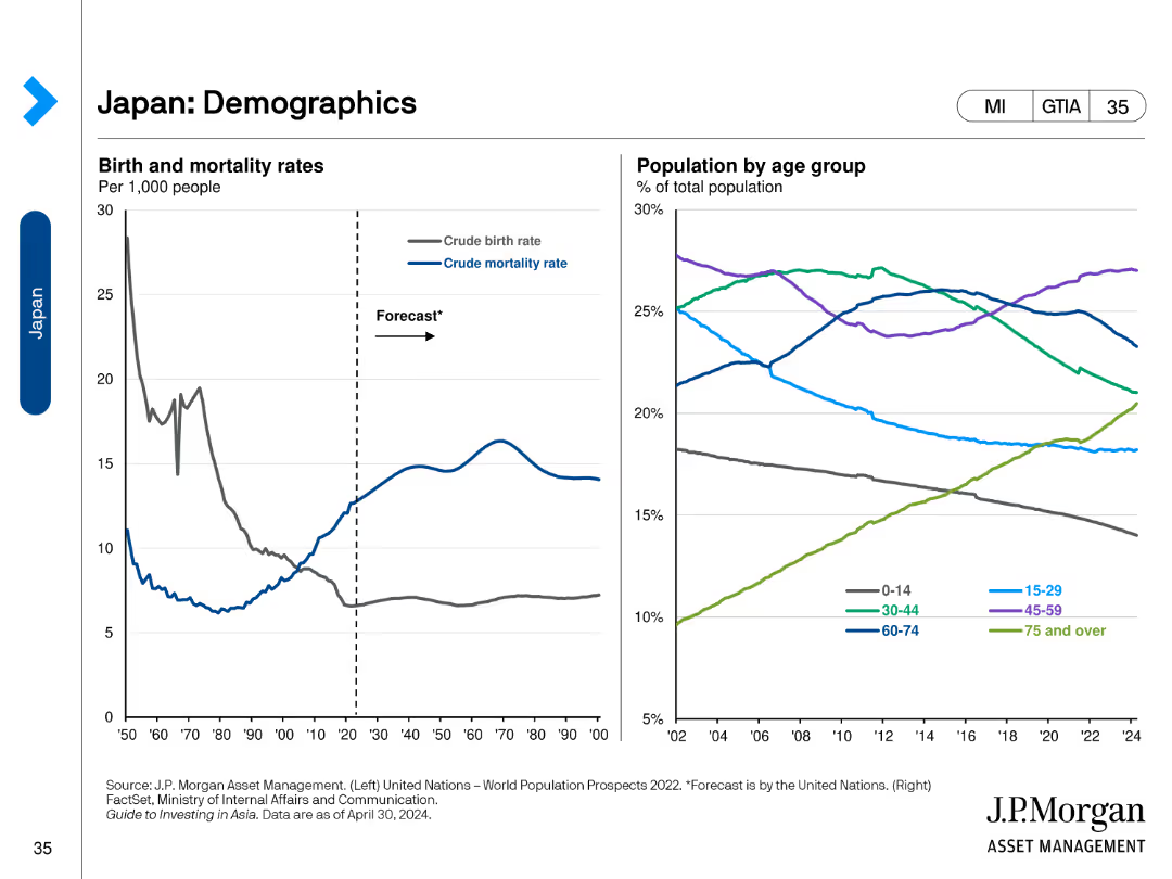
The slide includes two line charts. The left chart shows birth and mortality rates per 1,000 people. The right chart shows the population by age group.
Market Analysis and Trends
Healthcare & Pharmaceuticals
This slide reviews demographic trends in Japan, presenting data on birth and mortality rates and the population distribution by age group.
Demographics, Japan, Birth Rate, Mortality, Age
Multiple Chart
JP Morgan
Saved
Features a column chart detailing the evolution of employee numbers in companies in France from 2013-2018, alongside quotes from business leaders.
Human Resources and Talent Management
Professional Services
Discusses trends in job creation within companies in France, noting a positive outlook and highlighting factors influencing hiring practices.
job creation, employee numbers, France, business trends, hiring practices
Mixed Chart
Bain
Saved
Previous
Next
If nothing, comes up, please save your slides first
Create a FREE account to continue browsing
Receive Instant Access to 1,000+ slides from companies like McKinsey, Google, and Goldman Sachs
First Name
Last Name
Email
Password
I agree to all
Terms & Privacy Policy
Thank you! Your submission has been received!
Oops! Something went wrong while submitting the form.
Have an account?
Sign in
Column Chart
Heatmap
Chevron
Org Chart
Infographic
Callouts
Timeline
List
Graphic
Picture
Process Flow
Diagram
Paragraph
Map
Table
Framework
Subtitle
Takeaway Box
Icon
Other Chart
Radar Chart
Waterfall Chart
Mekko Chart
Pie Chart
Scatter Plot
Line Chart
Bar chart
Bullet points