Create a FREE Account
Instant access to 1,000+ real slides from top companies like McKinsey, BCG, Goldman Sachs, Google and many more!
First Name
Last Name
Email
Password
I agree to all
Terms & Privacy Policy
Thank you! Your submission has been received!
Oops! Something went wrong while submitting the form.
Have an account?
Sign in
Library
Templates
Courses
Pricing
My Account
My Slides
My Templates
✦ AI
AI Prompt Library
AI Search
Sign in
Start Here
Logout
My Saved Slides
Contains pie charts and horizontal bar graphs in purple and gray, reflecting technology's impact on underwriters' workload.
Human Resources and Talent Management
Financial Services
Evaluates how technological advancements have affected the workload of underwriters over the years.
technology, workload, underwriters, pie chart, bar graph
Multiple Chart
Accenture
Saved
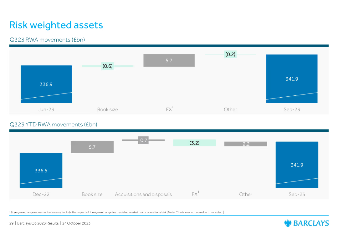
Features two horizontal bar charts showing Q323 RWA movements and year-to-date RWA movements. The slide is visually simple, with a clear emphasis on data trends.
Financial Performance
Financial Services
The slide presents data on risk-weighted assets (RWA) movements for Q323 and year-to-date, providing insights into financial risk management and asset quality.
risk-weighted assets, RWA, Q323, financial risk, asset quality, data trends, bar charts
Multiple Chart
Barclays
Saved
The slide contains pie charts showing improvements in self-confidence, presentation skills, and business networking skills among workshop participants.
Performance Metrics and KPIs
Education & Training
The slide showcases employability workshops delivered in schools, connecting young people with local labor market opportunities and key employability skills.
employability workshops, self-confidence, labor market, skills development
Multiple Chart
EY
Saved
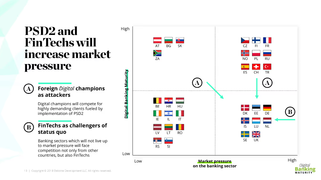
The slide features a quadrant chart with flags of various countries, representing different levels of digital banking maturity and market pressure. It also includes descriptive text boxes labeled A and B explaining the roles of digital champions and FinTechs as challengers.
Market Analysis and Trends
Financial Services
This slide discusses how PSD2 and FinTechs are increasing market pressure in banking, categorizing countries based on their digital banking maturity. It emphasizes the roles of foreign digital champions and FinTechs as challengers to the status quo.
PSD2, FinTechs, digital banking, market pressure, challengers
Diagram
Deloitte
Saved
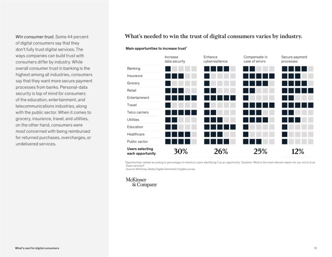
Grid chart with industries on the y-axis and trust factors on the x-axis. Icons filled based on user selections.
Human Resources and Talent Management
Technology & Software
The slide shows factors needed to increase trust in digital services, such as data security, error compensation, and secure payments. Each industry shows a different priority, emphasizing tailored approaches to building user trust.
trust, digital consumers, security, cybersecurity, industry variation, compensation, payment, McKinsey survey
Mixed Chart
McKinsey
Saved
Shows a bar chart with financial advisor recommendations on purchasing crypto investment funds, by recommendation level.
Market Analysis and Trends
Financial Services
This slide details the recommendations by financial advisors regarding crypto investment funds, indicating that most investors have not discussed or received recommendations, and presents demographic differences in these advisory interactions.
Advisor recommendations, crypto funds
Mixed Chart
IPSOS
Saved
The slide includes a strategy diagram similar to slide 8017, with actions and priority-actions for improving freight location and performance data.
Strategic Planning
Transportation & Logistics
It emphasizes strategic actions for enhancing freight location and performance, focusing on data improvement and regulatory approaches.
Strategy, freight, supply chain, data, improvement, regulatory, planning, actions, priorities
Diagram
LEK
Saved
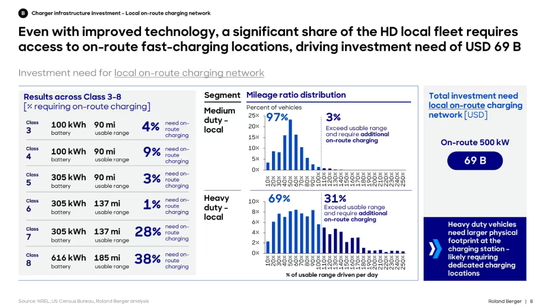
Bar and distribution charts showing on-route charging need by vehicle class. Right panel shows total investment required.
Strategic Planning
Transportation & Logistics
The slide explains that despite advancements, a large portion of heavy-duty fleets still require on-route charging. It quantifies investment needs and shows distribution of daily mileage, indicating infrastructure must serve vehicles exceeding daily range limits.
charging, on-route, heavy-duty, investment, EV, Class 3–8, distribution, infrastructure, fast-charging
Mixed Chart
Roland Berger
Saved
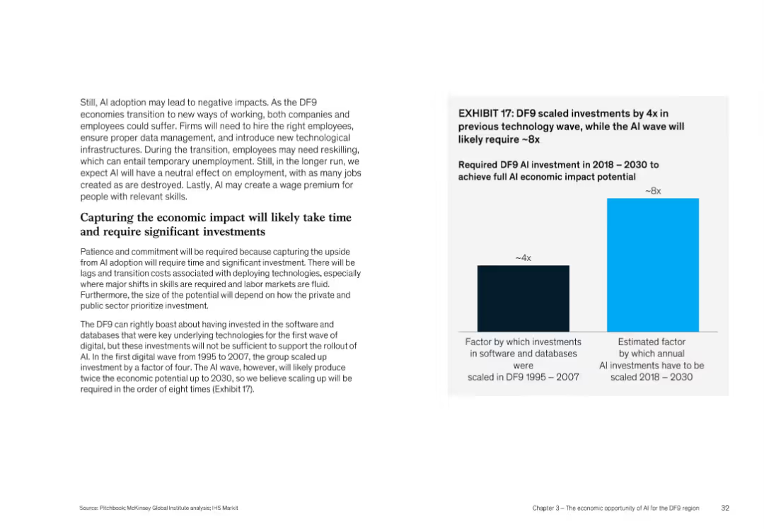
Split layout with bar chart on right and dense text on left, uses bold headers and blue highlights
Investment Analysis
Artificial Intelligence
This slide highlights that AI's economic potential in DF9 will require scaling investment by 8x compared to a 4x increase during earlier tech waves (1995–2007). It discusses the need for reskilling, proper infrastructure, and how private/public sectors must prioritize investment to capture AI benefits.
AI investment, economic impact, scaling, DF9, reskilling, infrastructure
Mixed Chart
McKinsey
Saved
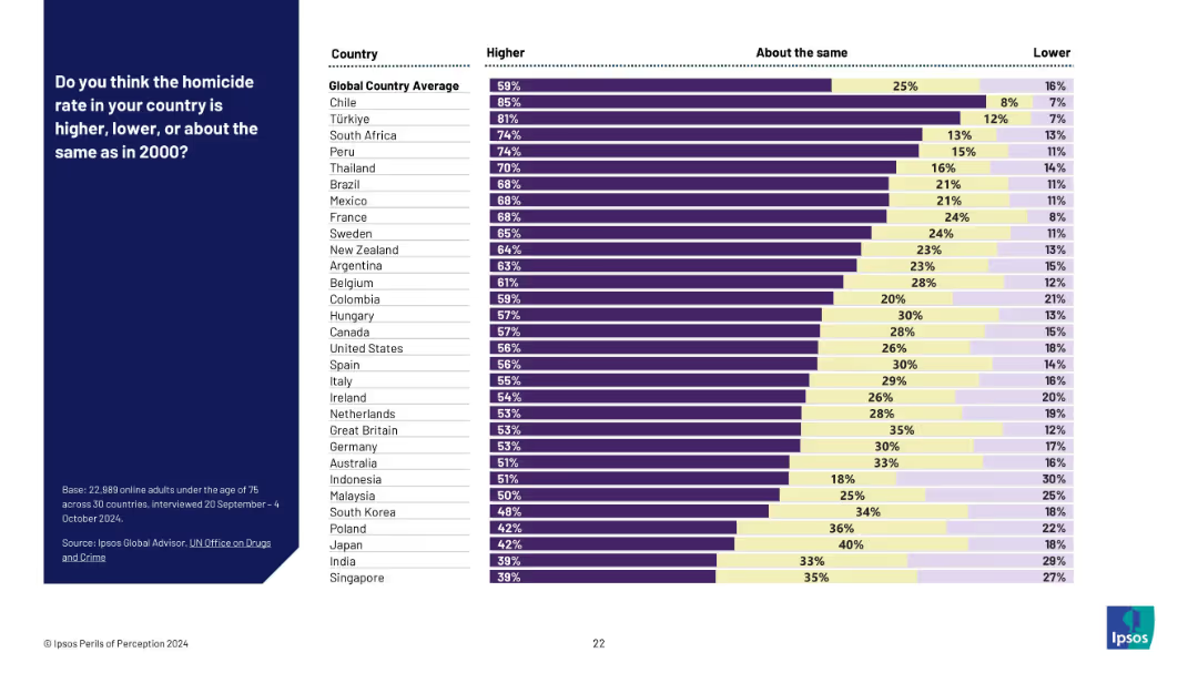
Stacked bar chart with three categories: higher, about the same, and lower; results by country.
Risk Assessment and Management
Government & Public Sector
This slide explores public perceptions about crime trends, specifically homicide rates since 2000. The chart reveals that in most countries, a majority believe rates have risen, even where they have declined or remained stable.
crime perception, homicide trends, public opinion, time comparison, Ipsos global data, fear of crime, social perception bias
Mixed Chart
IPSOS
Saved
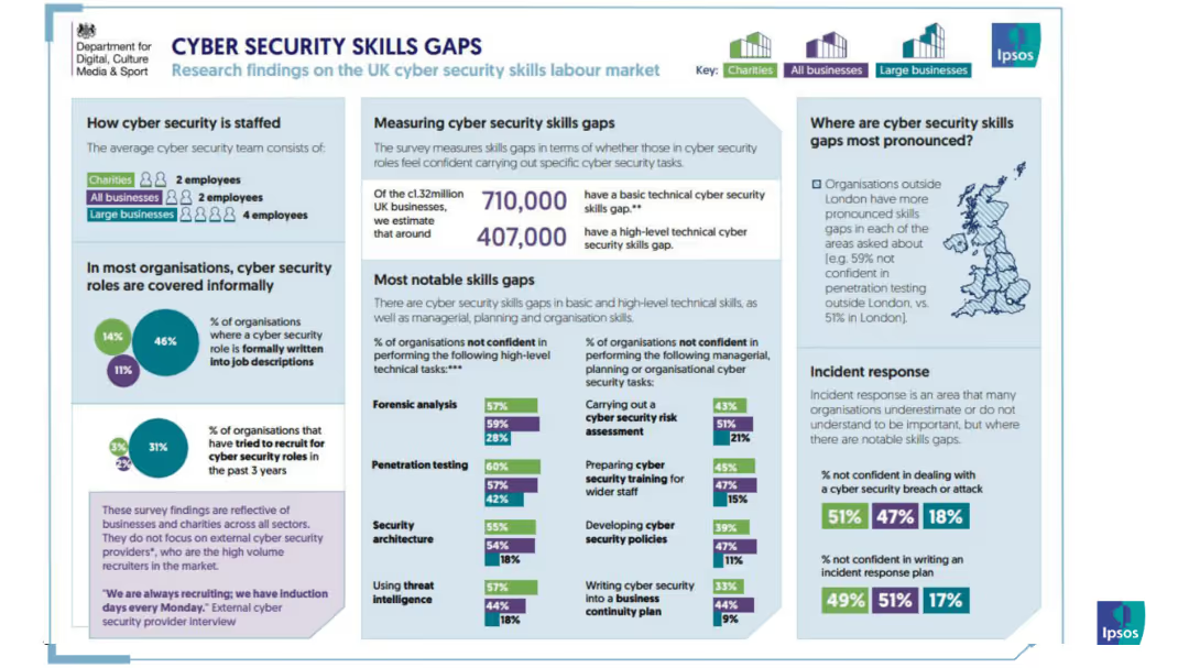
A detailed infographic presenting data on cybersecurity skill gaps, staffing, notable gaps, and confidence levels in various skills among UK organizations.
Human Resources and Talent Management
Technology & Software
The slide explores the gaps in cybersecurity skills within UK organizations, including staff levels and areas of improvement needed.
infographic, cybersecurity, skills gap, UK, staffing, organizations, talent
Multiple Chart
IPSOS
Saved
Includes a column chart displaying changes in visibility for investment decisions.
Investment Analysis
Financial Services
Discusses how C-suite executives' visibility into making investment decisions has improved from 2023 to 2024, driven by various factors including capital availability and regulatory changes.
investment decisions, C-suite, visibility, factors
Multiple Chart
BCG
Saved
A global map highlighted in purple shades with yield percentages for various countries prominently displayed, facilitates a geographical comparison of equity yields.
Market Analysis and Trends
Financial Services
This visual slide displays global equity yields, simplifying the comparison of investment returns across countries, which can guide international investment strategies.
global, equity yields, investment returns, geographical comparison, countries, map, strategy, finance
Graphic
Morgan Stanley
Saved
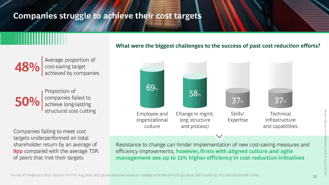
Left panel shows metrics on underperformance. Right has vertical bar charts showing barriers to cost reduction (culture, management, skills). Footer text links resistance to change to cost-saving failures.
Performance Metrics and KPIs
Professional Services
Demonstrates that only 48% of cost-saving targets are met, with organizational culture and management structure as key obstacles. Links cost target failures to lower shareholder return. Suggests culture alignment improves outcomes.
cost reduction, culture, performance, shareholder return, management change, implementation barriers
Mixed Chart
BCG
Saved
This slide presents three separate graphs on crop, livestock, and dairy production, using a blue and gray color scheme. It gives an overview of the US agriculture industry's financial output in these sectors.
Investment Analysis
Agriculture & Food Production
A financial breakdown of the US agriculture industry, highlighting the production value of crops, livestock, and dairy, and their respective growth figures over time.
agriculture, US industry, financial data, crops, livestock, dairy, production value
Multiple Chart
EY
Saved
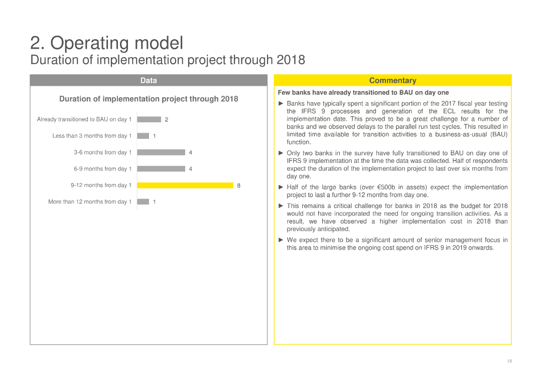
Shows column charts detailing the duration of the implementation project through 2018, segmented by time frames from less than 3 months to more than 12 months, with commentary on the project duration and implementation challenges.
Operational Efficiency
Financial Services
Examines the duration of IFRS 9 implementation projects, providing insights into the time frames banks experienced during the transition and the associated challenges, emphasizing the need for ongoing transition activities.
implementation project, duration, IFRS 9, transition challenges, financial services
Mixed Chart
EY
Saved
The slide presents a bar chart with different statements on the benefits of investing in early childhood, highlighting mental health and other societal benefits.
Market Analysis and Trends
Education & Training
It emphasizes that investing in early childhood is seen as crucial for reducing future mental health issues and creating a happier society.
Early childhood, mental health, investment, bar chart, public opinion, Ipsos, education, development, survey
Single Chart
IPSOS
Saved
Contains three overlapping circles, each representing a different aspect of engaging with Web3 (Explore, Partner, Upskill), set against a dark background.
Strategic Planning
Technology & Software
Offers guidance for business leaders on how to begin engaging with Web3, suggesting a reevaluation of business models and partnerships, and highlighting the importance of upskilling the workforce in Web3 technologies.
Leadership, Web3, Business Strategy, Partnerships, Training
Diagram
McKinsey
Saved
A bar chart depicts consumer expectations for BEV driving range, categorized by urban and sub-urban/rural responses, showing varying preferences.
Market Analysis and Trends
Transportation & Logistics
Discusses consumer expectations for battery electric vehicle (BEV) driving ranges, essential for understanding market needs and vehicle design in the automotive sector.
BEV, driving range, consumer expectations, urban, rural, market needs, vehicle design, automotive trends
Single Chart
Deloitte
Saved
The slide has two bar charts: one on the left showing correlations of regions and styles to the US 10-year Treasury yield, and one on the right showing sector correlations to the US 10-year Treasury yield.
Investment Analysis
Financial Services
The slide analyzes how different regions, styles, and sectors correlate with the US 10-year Treasury yield, providing insights for investment decisions.
correlations, Treasury yield, regions, sectors, investment analysis, US Treasury, market correlations
Multiple Chart
JP Morgan
Saved
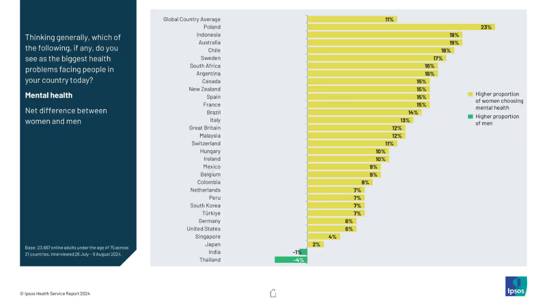
Split-panel layout with a vertical question prompt on the left in a dark blue block, and a horizontal bar chart on the right side using yellow and green bars.
Market Analysis and Trends
Healthcare & Pharmaceuticals
This slide shows the gender-based net difference in selecting mental health as the biggest health concern across countries. Yellow bars represent higher female concern, while green shows male. Poland leads with the highest female-male gap, while Thailand has a higher male concern rate.
mental health, gender gap, health perception, global comparison, survey
Mixed Chart
IPSOS
Saved
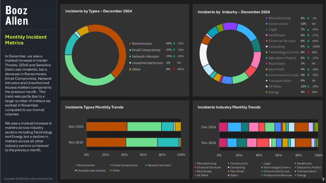
Four-panel dashboard layout with pie and bar charts showing incident types and affected industries; left panel includes summary text; uses a dark background with color-coded data elements.
Risk Assessment and Management
Technology & Software
This dashboard highlights cybersecurity incidents by type and industry for December 2024. Ransomware and email compromise are dominant threats, while financial services and healthcare industries were notably impacted. The slide also shows trends over the previous month and mentions increased threats in Technology and Energy sectors.
cybersecurity, incident metrics, ransomware, email compromise, unauthorized access, threat trends, Booz Allen, industry risk, data loss
Multiple Chart
Booz Allen Hamilton
Saved
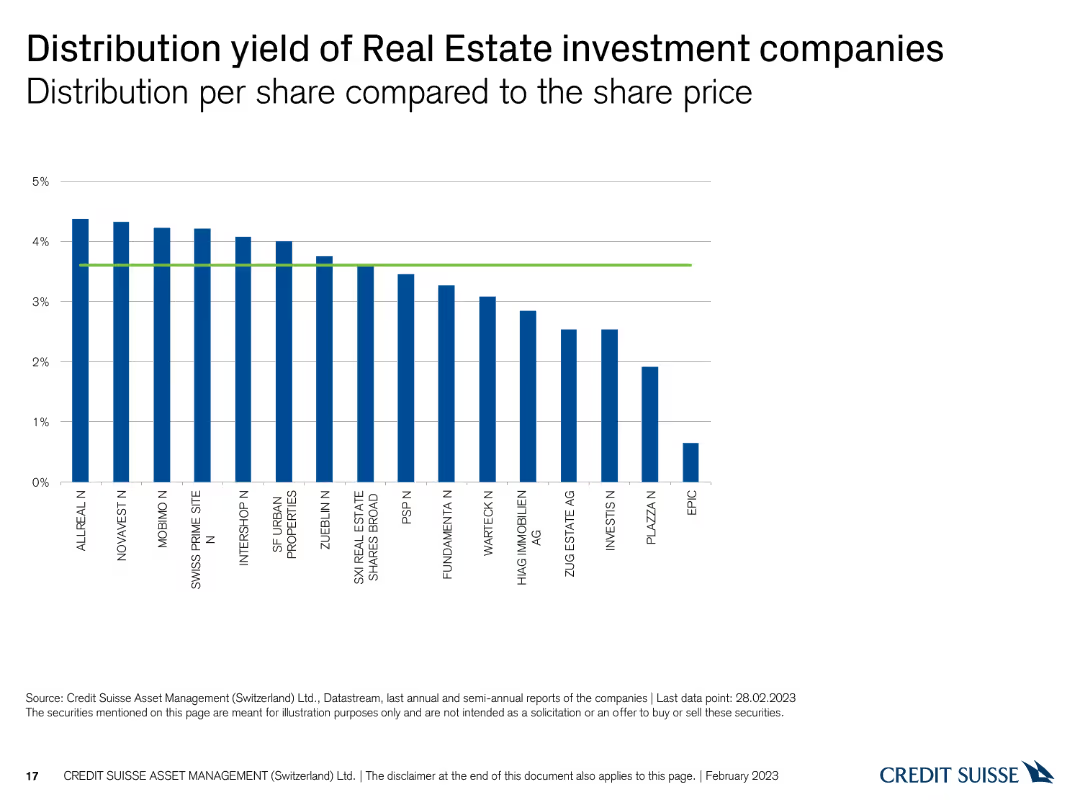
This slide displays a column chart showing the distribution yield per share for Swiss real estate investment companies, with vertical bars representing yield percentages and a green reference line.
Financial Performance
Real Estate & Construction
The slide presents the distribution yields of real estate investment companies, comparing their returns. It is used for evaluating income potential and investment performance.
Real estate, distribution yield, investment companies, returns, comparison
Single Chart
Credit Suisse
Saved
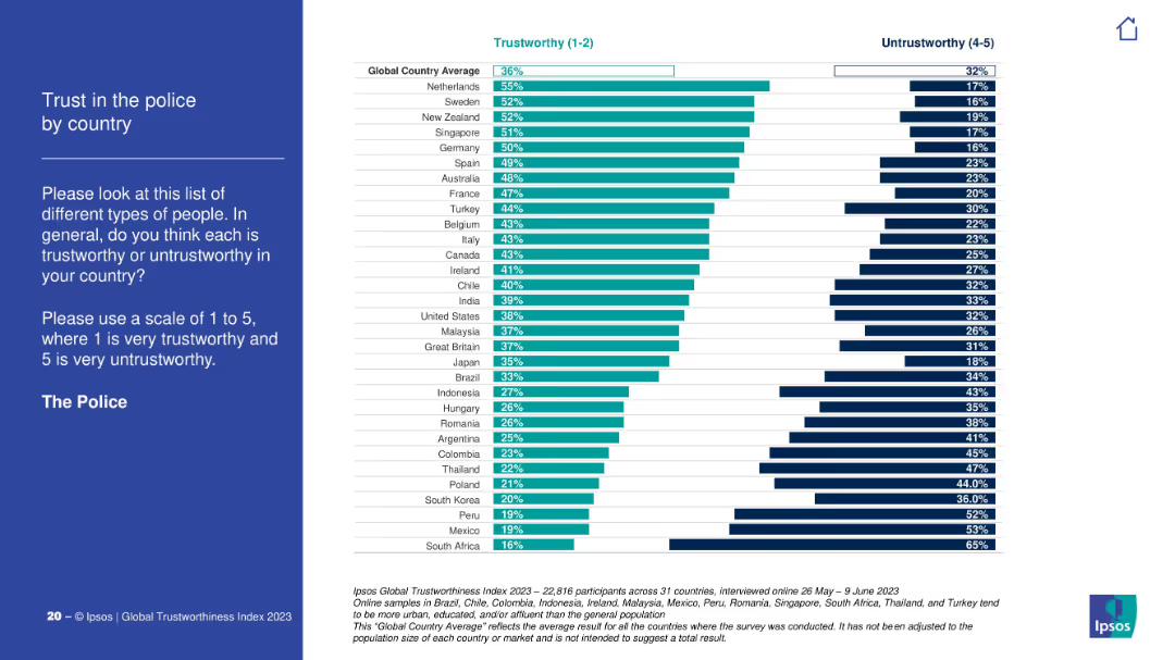
Vertical bars showing % trust in police across countries. Includes trust and untrust levels side-by-side. Ranked by trust.
Customer and Market Segmentation
Government & Public Sector
The chart analyzes global trust in police forces. The Netherlands, Sweden, and New Zealand show the highest trust levels. South Africa, Mexico, and Peru have the lowest. Global trust average is 36%, with notable disparities.
police, law enforcement, trust, global trust index, Ipsos, regional attitudes
Mixed Chart
IPSOS
Saved
The slide lists core, business, procurement, and digital skills, categorized by yesterday's, today's, and tomorrow's skills with a detailed skills layout table.
Technology and Digital Transformation
Professional Services
It outlines the evolving skills needed for procurement success, emphasizing digital transformation, strategic alliances, and advanced analytics.
Procurement skills, digital transformation, strategic alliances, analytics, talent development, future skills
Multiple Chart
Kearney
Saved
Previous
Next
If nothing, comes up, please save your slides first
Create a FREE account to continue browsing
Receive Instant Access to 1,000+ slides from companies like McKinsey, Google, and Goldman Sachs
First Name
Last Name
Email
Password
I agree to all
Terms & Privacy Policy
Thank you! Your submission has been received!
Oops! Something went wrong while submitting the form.
Have an account?
Sign in
Column Chart
Heatmap
Chevron
Org Chart
Infographic
Callouts
Timeline
List
Graphic
Picture
Process Flow
Diagram
Paragraph
Map
Table
Framework
Subtitle
Takeaway Box
Icon
Other Chart
Radar Chart
Waterfall Chart
Mekko Chart
Pie Chart
Scatter Plot
Line Chart
Bar chart
Bullet points