Create a FREE Account
Instant access to 1,000+ real slides from top companies like McKinsey, BCG, Goldman Sachs, Google and many more!
First Name
Last Name
Email
Password
I agree to all
Terms & Privacy Policy
Thank you! Your submission has been received!
Oops! Something went wrong while submitting the form.
Have an account?
Sign in
Library
Templates
Courses
Pricing
My Account
My Slides
My Templates
✦ AI
AI Prompt Library
AI Search
Sign in
Start Here
Logout
My Saved Slides
A column chart shows liquidity coverage ratio trends alongside bullet points detailing liquidity risk management strategies, presented on a white and blue slide.
Risk Assessment and Management
Financial Services
The slide describes liquidity risk management strategies and trends in liquidity coverage ratios, underlining the company's robust position and regulatory compliance. It's meant to communicate a strong and adaptable approach to liquidity risk.
liquidity risk, management, trends, compliance
Mixed Chart
Goldman Sachs
Saved
This slide contains three sets of column charts detailing net charge-offs in dollars and percentages, with additional explanatory text and callouts on the right side.
Risk Assessment and Management
Financial Services
The slide provides a positive credit outlook by showing historical and current net charge-offs, suggesting strong economic fundamentals and risk management strategies.
credit, outlook, net charge-offs, economic, risk management, column charts, JPMorgan
Mixed Chart
JP Morgan
Saved
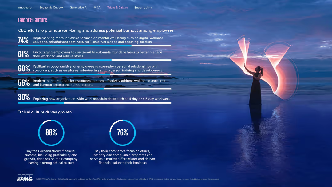
Similar design to 17508 with horizontal bar metrics; emphasis on well-being and ethics.
Human Resources and Talent Management
Professional Services
Discusses strategies to enhance employee well-being and reduce burnout, such as mental health initiatives and GenAI automation. Highlights ethics as a growth driver, with most CEOs affirming its financial significance.
well-being, burnout, GenAI, ethics, employee experience, culture
Multiple Chart
KPMG
Saved
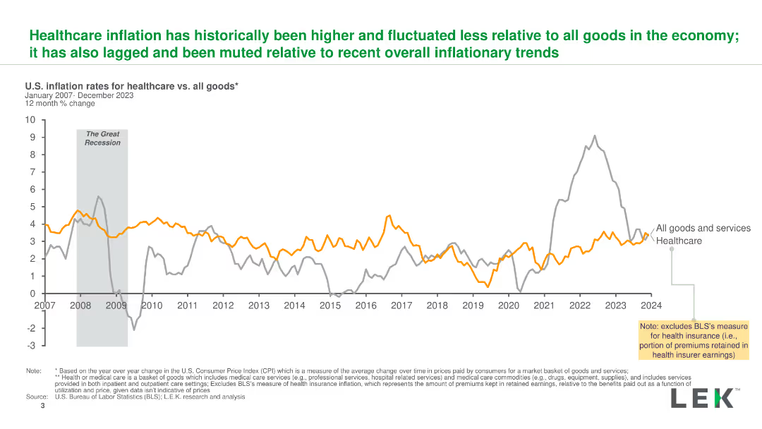
A line chart comparing U.S. inflation rates for healthcare and all goods from 2007 to 2023, highlighting key events and trends with clear lines and labels.
Market Analysis and Trends
Healthcare & Pharmaceuticals
The slide illustrates the historical inflation rates for healthcare versus all goods, showing how healthcare inflation has been higher and more stable over time.
inflation, healthcare, trends, comparison, U.S.
Single Chart
LEK
Saved
The slide features a complex line graph showing the percentage draw-down of the United States Real GDP from the 1900s to the projected 2020s. Two scenarios are highlighted post-2020 with projected impacts of -8% and -13%. The timeline is divided into Pre-WWII and Post-WWII periods. The color scheme includes grey for historical data and blue for future projections.
Market Analysis and Trends
Financial Services
The slide presents a historical analysis of the U.S. GDP over a century, with a focus on the projected economic impact of COVID-19. It suggests that the pandemic could have unprecedented negative effects on the economy, surpassing post-WWII figures.
COVID-19, U.S. GDP, economic impact, historical analysis, projection, WWII, financial crisis, market trends, scenario analysis
Single Chart
McKinsey
Saved
Four distinct categories with associated images and lists
Strategic Planning
Industrial & Manufacturing
Overview of LANXESS's business portfolio and strengths
Portfolio, Business, Resilience, Cash Generation, Growth
Table
Morgan Stanley
Saved
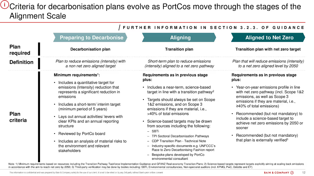
Three-column structured slide with vertical dividers and horizontal row labels. Each column corresponds to a decarbonisation stage: Preparing to Decarbonise, Aligning, Aligned to Net Zero. Includes detailed bullets under “Definition” and “Plan Criteria”. Color-coded headers for clarity.
Strategic Planning
Financial Services
Outlines progressive criteria for PortCos (portfolio companies) to qualify for decarbonisation plan classifications. It defines each stage and sets minimum requirements like emissions targets, science-based alignment, and board review. The goal is to help firms advance towards net-zero emissions through structured guidance.
decarbonisation, net zero, emissions, PortCo, strategic planning, KPI, transition, sustainability, compliance, board review
Table
Bain
Saved
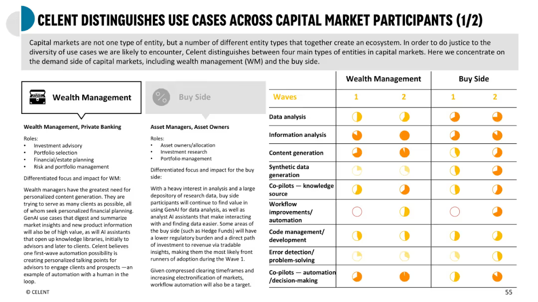
Two-column comparison between Wealth Management and Buy Side with icons and colored impact indicators across use case types and wave timelines
Customer and Market Segmentation
Financial Services
Compares GenAI adoption and use case impact between wealth managers and asset managers (buy side), covering content generation, data analysis, and AI co-pilots. Uses icons to identify unique value drivers per segment.
wealth management, buy side, GenAI adoption, use case comparison, capital markets
Mixed Chart
Oliver Wyman
Saved
This slide features a bar chart and column chart, bullet points, and a detailed methodology explanation. The design is dense with both textual and graphical information.
Market Analysis and Trends
Technology & Software
Projects the growth of the SEA ecommerce market, outlining the methodology of the calculation and the anticipated market size by 2025. It includes a bar chart representing the current and projected ecommerce spend, and a detailed explanation of the forecasting process.
eCommerce, SEA, market forecast, growth, methodology, bar chart, column chart
Mixed Chart
Bain
Saved
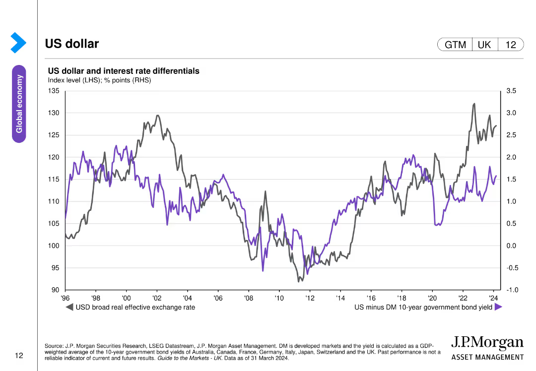
The slide contains a line chart depicting the US dollar's broad real effective exchange rate and interest rate differentials between the US and developed markets.
Investment Analysis
Financial Services
The slide analyzes the performance of the US dollar and its relationship with interest rate differentials, relevant for currency and investment strategies.
US dollar, exchange rate, interest rates, currency performance, investment
Single Chart
JP Morgan
Saved
Uses line and column charts to compare preferences for luxury goods made in Italy, France, and US.
Competitive Landscape
Consumer Goods
Analyzes the growing preference for Italian-made luxury goods among Millennials and Chinese consumers.
luxury goods, Made-in Italy, Millennials, Chinese consumers
Multiple Chart
BCG
Saved
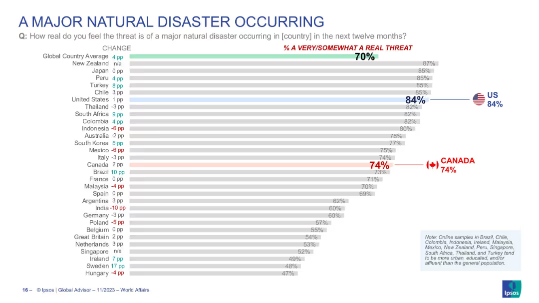
Horizontal bar chart with country-level data on perceived threat of a major natural disaster occurring. Highlights the U.S. and Canada values.
Risk Assessment and Management
Environmental Services & Sustainability
Survey-based assessment of global views on the risk of a major natural disaster. U.S. leads with 84% perceiving a real threat. Canada also shows high concern (74%). Slide presents the global average and individual country results, indicating increasing awareness or anxiety over climate-driven disasters.
natural disaster, climate risk, perception, Canada, USA, threat awareness, environmental concern, Ipsos
Single Chart
IPSOS
Saved
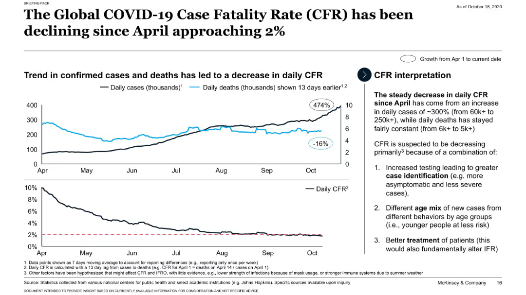
Line charts showing CFR decline alongside increase in daily cases and relative constancy in deaths.
Performance Metrics and KPIs
Healthcare & Pharmaceuticals
Analyzes the inverse relationship between rising COVID-19 cases and falling case fatality rates globally, with three main causes: better identification, different age mix, and improved treatment.
CFR decline, COVID-19, testing, treatment, case surge
Mixed Chart
McKinsey
Saved
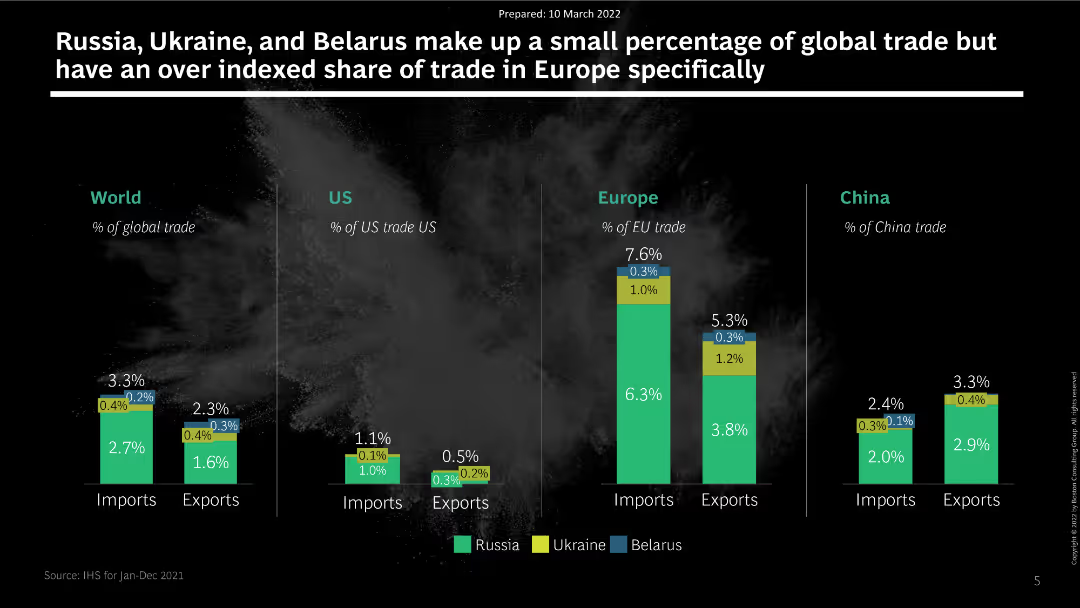
The slide features a series of column charts comparing the trade impact of Russia, Ukraine, and Belarus across different regions: World, US, Europe, and China. Each chart displays percentage shares of imports and exports.
Market Analysis and Trends
Transportation & Logistics
The slide analyzes the trade impact of Russia, Ukraine, and Belarus on global trade, particularly focusing on their over-indexed share of trade in Europe. It presents data on import and export percentages for various regions, highlighting significant dependencies.
trade, impact, Russia, Ukraine, Belarus, Europe, imports, exports
Multiple Chart
BCG
Saved
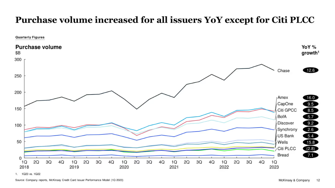
Line graph showing quarterly purchase volumes from 2018 to 1Q23. Different colored lines represent various issuers. YoY % growth is listed on the right.
Financial Performance
Financial Services
The slide tracks changes in credit card purchase volume over time, noting that all issuers except Citi PLCC experienced YoY growth. Chase and Amex show significant upward trends, while Citi PLCC declines slightly.
Purchase Volume, Credit Cards, Issuers, Amex, Citi PLCC, Chase, Trends
Single Chart
McKinsey
Saved
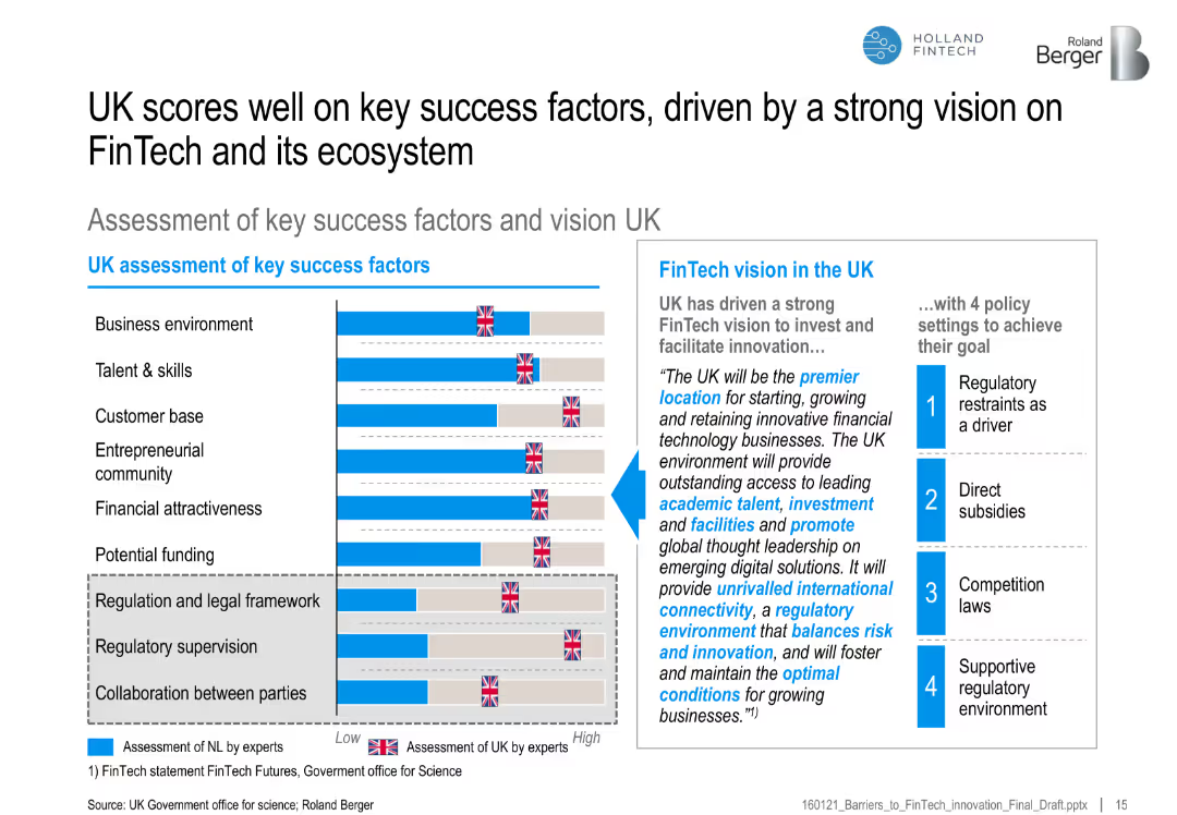
Bar chart of UK vs. benchmark on FinTech success factors, with a vision statement and four supporting policy actions
Strategic Planning
Financial Services
Highlights the UK’s strong performance across FinTech-enabling factors, backed by a clear vision and regulatory framework, promoting its position as a FinTech hub.
UK FinTech, ecosystem, regulatory vision, success factors, funding, policy, entrepreneurship, talent
Mixed Chart
Roland Berger
Saved
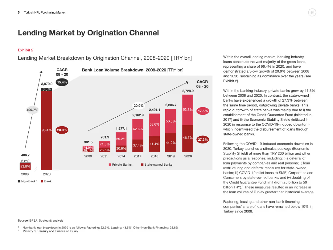
This slide includes a column chart breaking down the lending market by origination channel from 2008 to 2020, with an accompanying explanation of trends and growth rates.
Market Analysis and Trends
Financial Services
The slide analyzes the breakdown of the Turkish lending market by origination channel, highlighting the growth of private and state-owned banks and overall market dynamics.
Lending Market, Origination Channel, Turkey, Private Banks, State-owned Banks
Multiple Chart
PwC/Strategy&
Saved
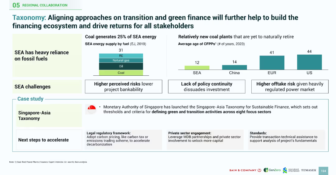
Bar charts and infographics comparing SEA with global coal plant data, case study on Singapore-Asia taxonomy included
Regulatory and Compliance
Financial Services
Emphasizes the importance of a unified green finance taxonomy in SEA to address fossil fuel reliance, reduce risks, and encourage investments, showcasing Singapore’s leadership in sustainable finance standards
taxonomy, coal power, Singapore, green finance, sustainable finance, investor risk, regulation
Multiple Chart
Bain
Saved
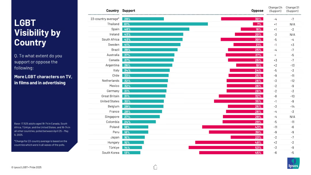
Horizontal bar chart with support vs oppose data by country; left side has title and question details.
Market Analysis and Trends
Government & Public Sector
This chart ranks 23 countries by support for more LGBT characters in media. Thailand leads with 61% support, while South Korea shows the lowest at 13%. Trend changes from previous years are also shown.
visibility, LGBT, countries, media, support, opposition, trend, Ipsos, advertising
Mixed Chart
IPSOS
Saved
The slide includes a quote from Ariane Le Port and a column chart showing organic Q1 growth in TMT vs. total Ipsos.
Client Case Studies
Telecommunications
It highlights Ipsos's success with advanced TMT firms, including a quote from Google’s Creative Effectiveness Lead and growth data for the TMT sector.
TMT, growth, clients, revenues, Ipsos
Mixed Chart
IPSOS
Saved
Features a pie chart and a graph illustrating the growth rates of different luxury market categories, emphasizing personal luxury goods.
Market Analysis and Trends
Consumer Goods
Highlights the superior performance of personal luxury goods compared to other segments in 2018. Useful for market trend analysis and strategic planning in the luxury sector.
luxury goods, market trends, growth rates, strategic planning, superior performance
Mixed Chart
Bain
Saved
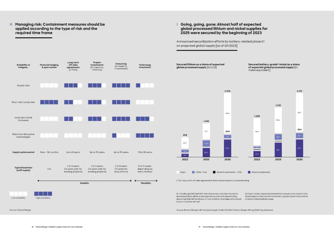
Left side features a grid assessing risk mitigation methods by suitability and time horizon. Right shows lithium and nickel securitization projections to 2030.
Risk Assessment and Management
Energy & Utilities
The slide evaluates strategic options for mitigating different types of supply risks for battery materials. It compares approaches like LTAs, hedging, and tech investments. Also displays how much of the 2025/2030 lithium and nickel supply is already secured.
risk management, battery materials, hedging, LTOA, supply security, lithium, nickel
Multiple Chart
Roland Berger
Saved
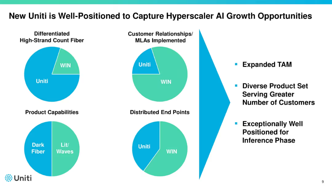
Four pie charts illustrating Uniti vs. WIN across different categories. Right side lists benefits such as expanded TAM and customer diversity. Uses bold black titles and teal highlights.
Sales and Business Development
Telecommunications
Highlights Uniti’s competitive advantages over WIN in fiber, relationships, product capabilities, and endpoints. Uses pie charts to show comparative share. Emphasizes positioning to benefit from AI-driven infrastructure growth.
Uniti, AI growth, fiber, market position, customer base
Mixed Chart
Goldman Sachs
Saved
Column charts showing current NTM P/E vs. 10-year high, low, and average for various indices and sectors.
Investment Analysis
Financial Services
Evaluates valuation metrics, comparing current price-to-earnings ratios with historical data for different indices and sectors.
Valuation, NTM P/E, Indices, Historical Data, Investment Analysis
Mixed Chart
Morgan Stanley
Saved
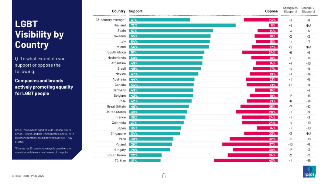
Horizontal bar chart format; countries listed on the left; right bars split between support and oppose.
Market Analysis and Trends
Government & Public Sector
This slide shows country-wise public support for brands promoting LGBT equality. Thailand, Spain, and Sweden top the list, while Türkiye and South Korea show the lowest support levels.
brands, equality, countries, LGBT, visibility, consumer sentiment, Ipsos
Mixed Chart
IPSOS
Saved
Previous
Next
If nothing, comes up, please save your slides first
Create a FREE account to continue browsing
Receive Instant Access to 1,000+ slides from companies like McKinsey, Google, and Goldman Sachs
First Name
Last Name
Email
Password
I agree to all
Terms & Privacy Policy
Thank you! Your submission has been received!
Oops! Something went wrong while submitting the form.
Have an account?
Sign in
Column Chart
Heatmap
Chevron
Org Chart
Infographic
Callouts
Timeline
List
Graphic
Picture
Process Flow
Diagram
Paragraph
Map
Table
Framework
Subtitle
Takeaway Box
Icon
Other Chart
Radar Chart
Waterfall Chart
Mekko Chart
Pie Chart
Scatter Plot
Line Chart
Bar chart
Bullet points