Create a FREE Account
Instant access to 1,000+ real slides from top companies like McKinsey, BCG, Goldman Sachs, Google and many more!
First Name
Last Name
Email
Password
I agree to all
Terms & Privacy Policy
Thank you! Your submission has been received!
Oops! Something went wrong while submitting the form.
Have an account?
Sign in
Library
Templates
Courses
Pricing
My Account
My Slides
My Templates
✦ AI
AI Prompt Library
AI Search
Sign in
Start Here
Logout
My Saved Slides
The slide displays a bar graph depicting levels of agreement among leaders on trust-building within organizations. The graph uses varying shades of orange to represent different degrees of agreement, complemented by a minimalistic design for clear communication.
Organizational Structure and Change
Professional Services
This slide explores leadership perspectives on building trust within organizations, emphasizing the need for intentional actions to foster trust and alignment between workers and supervisors. It is useful for discussions on organizational culture and leadership strategies.
Trust Building, Leadership, Organizational Culture, Bar Graph
Mixed Chart
PwC/Strategy&
Saved
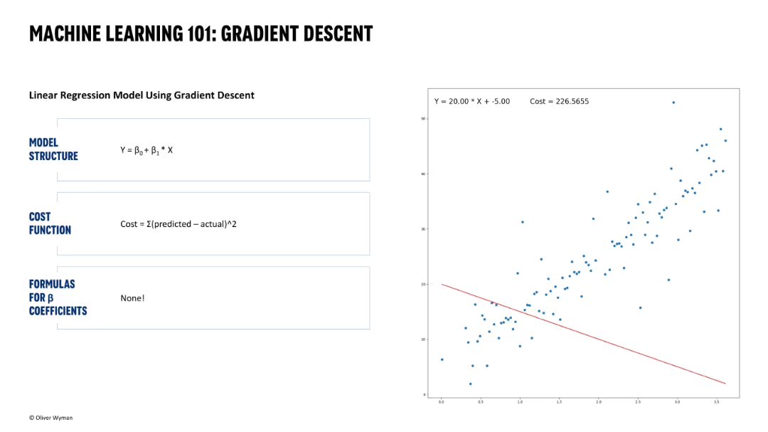
Same layout. Text explains model and cost function. Scatter plot shows a poor-fit regression line with high cost value (226.5655).
Technology and Digital Transformation
Artificial Intelligence
Illustrates an early stage of gradient descent where the regression line is poorly aligned with the data. High cost indicates the need for further optimization.
poor fit, high cost, gradient descent, regression line, model training, machine learning, data science, optimization, early iteration
Single Chart
Oliver Wyman
Saved
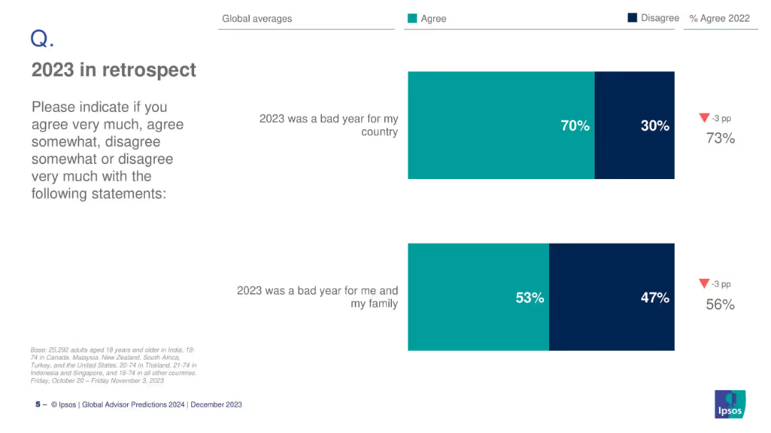
Horizontal bar charts with survey data on public sentiment about 2023.
Market Analysis and Trends
Government & Public Sector
The slide presents global survey results showing that 70% believe 2023 was a bad year for their country, and 53% for their family. It reflects public sentiment and perceived socio-economic challenges.
public sentiment, 2023 review, Ipsos, survey data, global averages, country outlook, personal impact, socio-economic sentiment
Mixed Chart
IPSOS
Saved
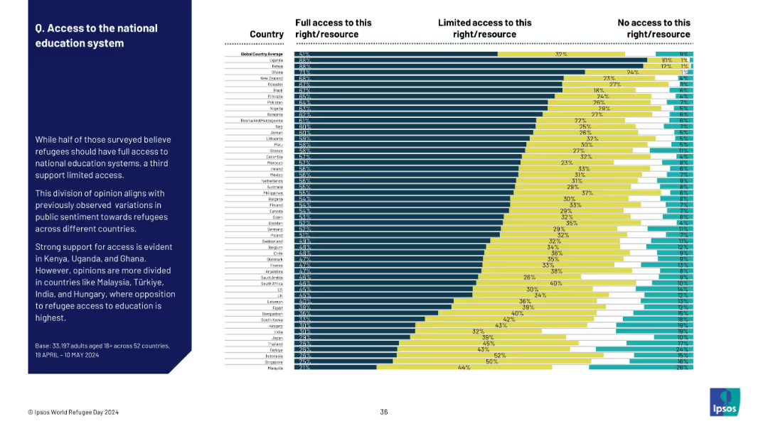
Ranked bar chart by country showing levels of support for refugee education access; detailed segmentation.
Regulatory and Compliance
Government & Public Sector
The slide shows that most countries support some level of refugee access to national education systems. Uganda and Kenya show the strongest support, while Türkiye, India, and Hungary show the most opposition.
refugees, education access, national systems, public opinion, support levels, global comparison, sentiment
Mixed Chart
IPSOS
Saved
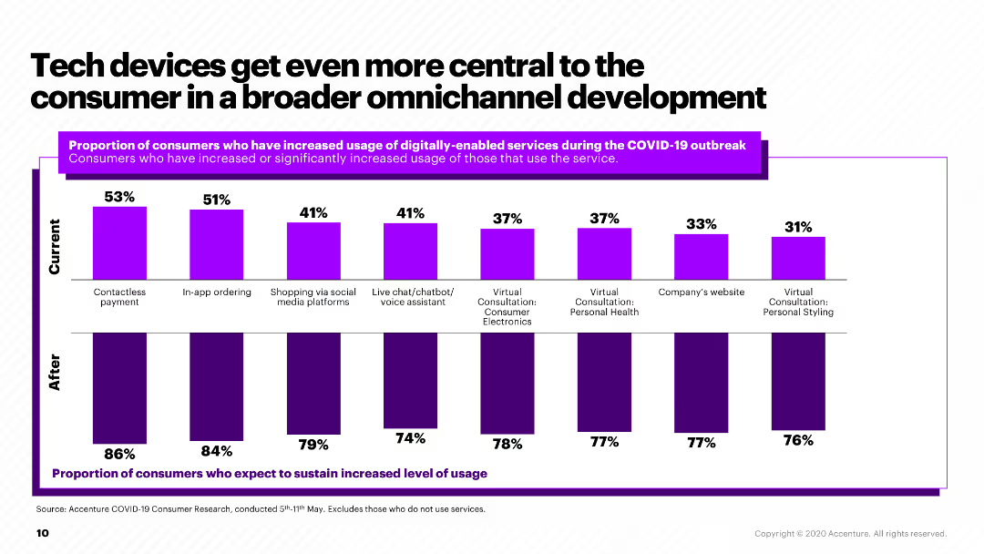
The slide features a column chart showing the increase in usage of various digitally-enabled services during and after the COVID-19 outbreak.
Market Analysis and Trends
Retail & E-commerce
The slide highlights the growth in the use of digital services, such as contactless payments and in-app ordering, during the COVID-19 pandemic and projected continuation.
digital services, COVID-19, consumer electronics, omnichannel, tech adoption
Multiple Chart
Accenture
Saved
This slide includes multiple triangular diagrams illustrating the impact of technology, process, data, and talent on operational maturity. The visuals are effectively used to compare the influence of each factor.
Strategic Planning
Professional Services
Highlights how different operational levers affect the maturity and efficiency of business operations. Essential for strategic decision-making and resource allocation in organizational development.
Operational Efficiency, Maturity Levels, Strategy
Mixed Chart
Accenture
Saved
Line graph comparing consumer sentiment over time in five countries regarding the ongoing impact of COVID-19.
Market Analysis and Trends
Consumer Goods
Tracks changes in consumer sentiment during the COVID-19 pandemic across different regions, useful for market analysis in consumer goods industries.
COVID-19, consumer sentiment, market analysis, trends, regions
Single Chart
BCG
Saved
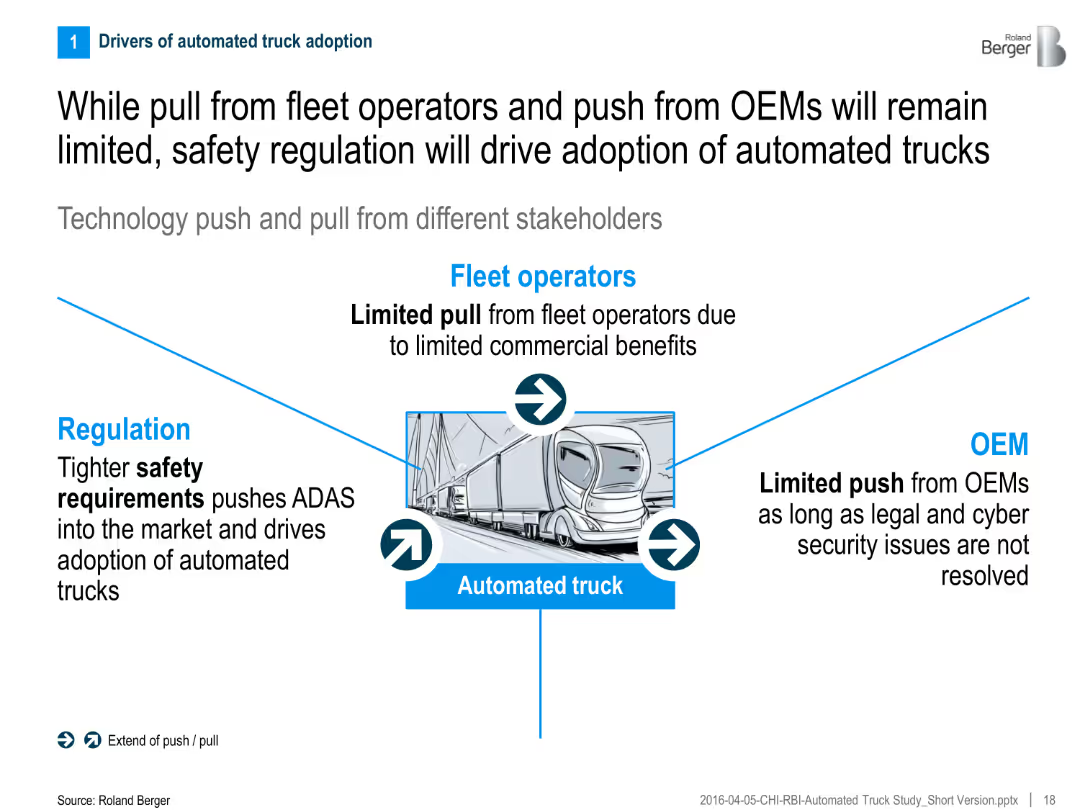
Central graphic showing push/pull from regulation, fleet operators, and OEMs toward automated truck adoption
Regulatory and Compliance
Transportation & Logistics
The slide highlights the limited commercial incentives from fleet operators and OEMs, stressing that regulation—especially safety requirements—is the key driver for automated truck adoption.
Regulation, OEMs, fleet operators, safety, automated trucks, adoption drivers, technology push/pull
Linear Flow
Roland Berger
Saved
Displays a hierarchical pyramid diagram illustrating the House of Purchasing and Supply ManagementTM, with detailed categorizations.
Strategic Planning
Professional Services
Assesses internal effectiveness of client's procurement function through the AEP framework, covering various performance metrics.
procurement, assessment, excellence, AEP, internal effectiveness, pyramid diagram, House of Purchasing, performance metrics
Framework
Kearney
Saved
Features multiple line graphs showing mobility trends in different sectors across various countries.
Strategic Planning
Transportation & Logistics
Analyzes recovery in mobility across sectors like retail and public transit post-COVID-19, comparing several countries to highlight varying speeds of economic recovery.
mobility, retail, public transit, trends
Multiple Chart
BCG
Saved
This slide uses multiple pie charts to show the percentage impact of nbn on various domains like health, education, and income.
Client Case Studies
Telecommunications
This slide illustrates the broad impact of nbn-enabled internet on users' overall wellbeing, segmented into areas like health, education, and social connectivity.
nbn, internet impact, wellbeing, health, education, social connectivity
Multiple Chart
Accenture
Saved
Contains a circular ecosystem diagram showcasing connections between different roles like Circular Designer, and IT-sharing platform provider, supported by icons and arrows.
Operational Efficiency
Industrial & Manufacturing
Discusses the collaboration across the value chain to maximize resource efficiency in machinery and equipment, featuring role descriptions and industry examples.
ecosystem, collaboration, value chain, circular economy, roles
Diagram
Accenture
Saved
This slide presents a comparative analysis with two distinct sections. The left side displays a blue column chart depicting 'ADJUSTED OPERATING PROFIT' in euros for five quarters. Beside it, a pie chart illustrates the 'Q1 adjusted operating profit margin.' The right side shows a column chart breaking down profits by business segment. Images of a modern office space are shown in the upper and lower right corners, offering a visual context for the financial data.
Financial Performance
Financial Services
Compares profitability across different business segments, highlighting improvements and variations, relevant for financial segment analysis or presentations to investors.
profitability, financial segments, adjusted operating profit, profit margin, quarter comparison, financial data, segment analysis, real estate, construction, financial services
Multiple Chart
Goldman Sachs
Saved
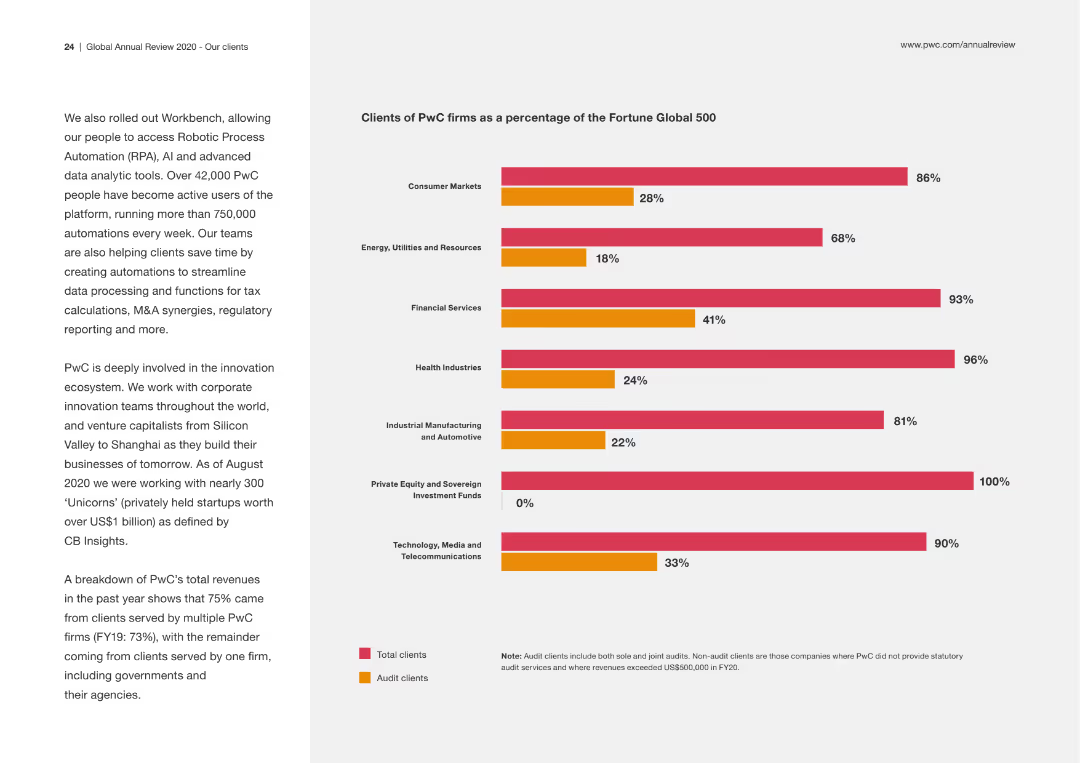
This slide includes a column chart showing the percentage of PwC clients within different industries, using two colors to differentiate between total clients and audit clients. The left side contains a brief description of PwC's involvement in innovation.
Market Analysis and Trends
Professional Services
The slide details the distribution of PwC clients across various industries, highlighting the firm's reach and specialization in different sectors. It underscores PwC's role in driving innovation.
PwC, clients, industries, market analysis, audit clients, innovation
Mixed Chart
PwC/Strategy&
Saved
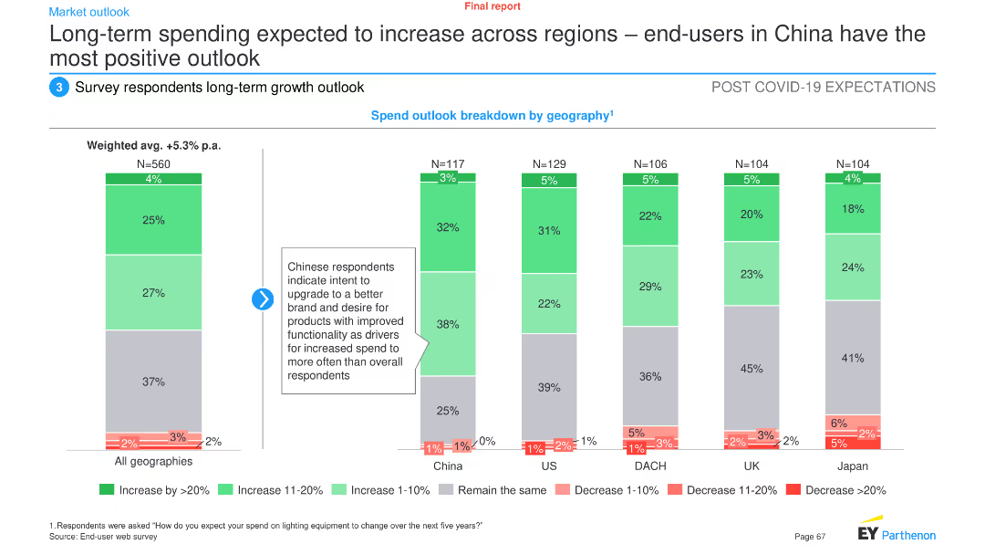
Column chart showing spend outlook breakdown by geography, highlighting the most positive outlook from end-users in China
Market Analysis and Trends
Consumer Goods
The slide analyzes long-term spending trends on lighting solutions across regions, with China showing the most positive outlook
spending, regions, outlook, China, trends
Multiple Chart
EY
Saved
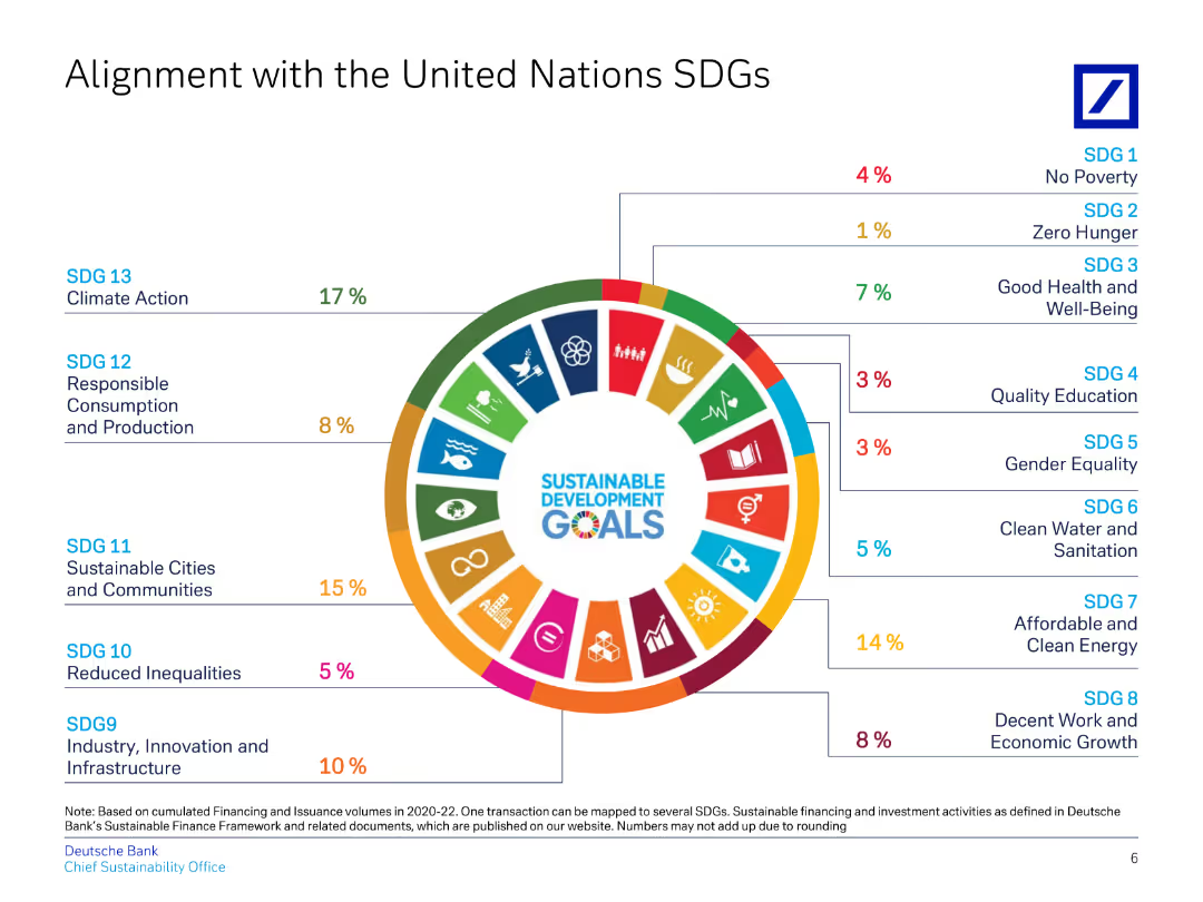
This slide uses a circular diagram to align Deutsche Bank's initiatives with various UN Sustainable Development Goals (SDGs).
Regulatory and Compliance
Financial Services
Highlights Deutsche Bank's contributions to specific UN SDGs, detailing percentages for each goal, showcasing commitment to ESG.
SDGs, UN, alignment, sustainability, ESG
Single Chart
Deutsche Bank
Saved
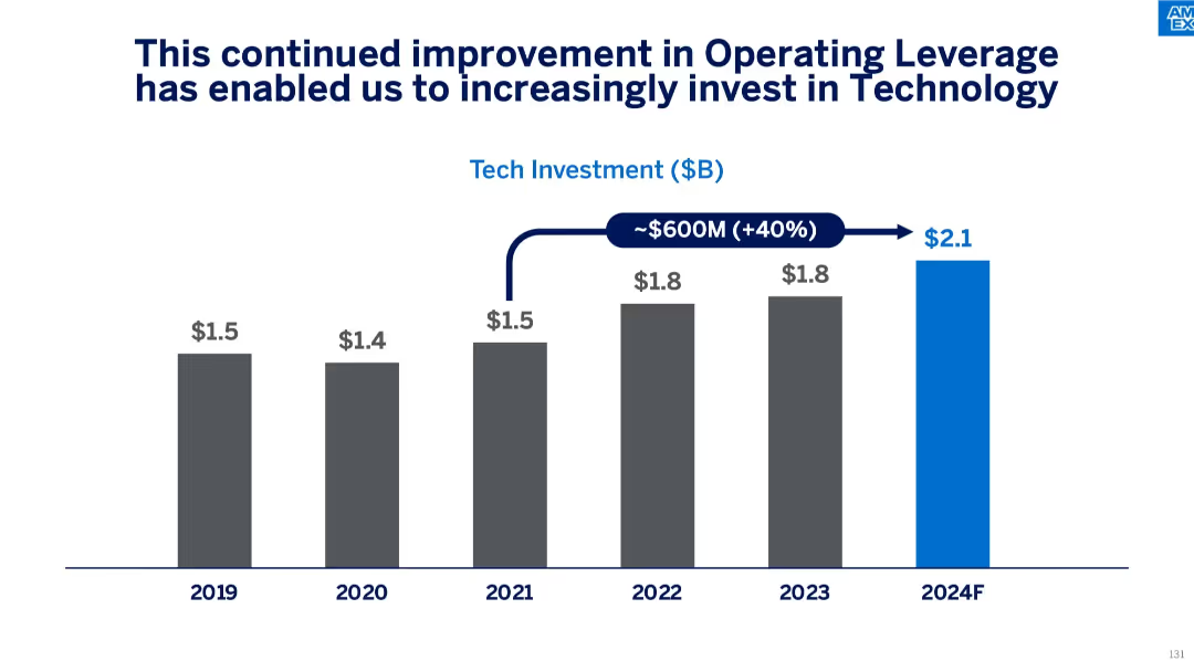
Vertical bar chart showing annual tech investment ($B) from 2019 to 2024F, indicating a $600M increase and 40% growth. Blue bar highlights projected 2024 investment.
Strategic Planning
Financial Services
This slide illustrates how improved operating leverage has led to increased technology investments, with spending rising from $1.5B in 2019 to a forecasted $2.1B in 2024. The message emphasizes the company’s strategic focus on long-term tech enablement and innovation.
technology investment, operating leverage, forecasting, cost efficiency, budget growth, financial planning, digital innovation
Single Chart
McKinsey
Saved
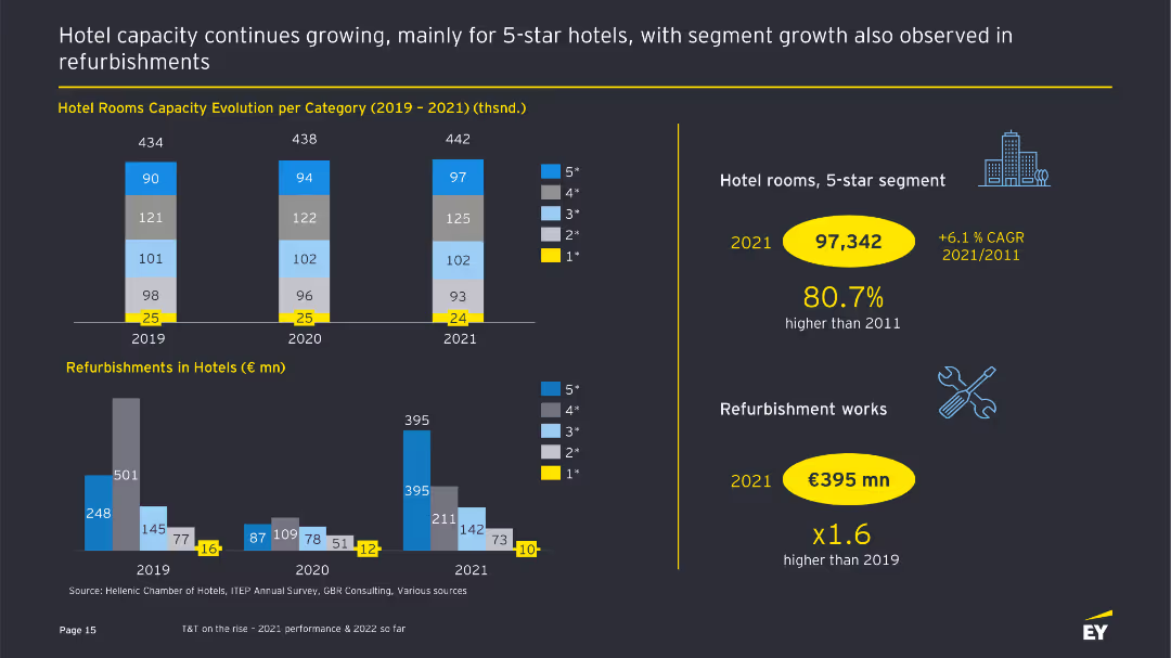
The slide features bar charts showing the evolution of hotel room capacities and refurbishments from 2019 to 2021, with text providing additional context.
Operational Efficiency
Hospitality & Tourism
This slide presents data on hotel room capacity evolution and refurbishment activities, highlighting growth in the 5-star segment and significant investments in refurbishments.
Hotel capacity, refurbishments, operational efficiency, tourism sector, bar charts
Multiple Chart
EY
Saved
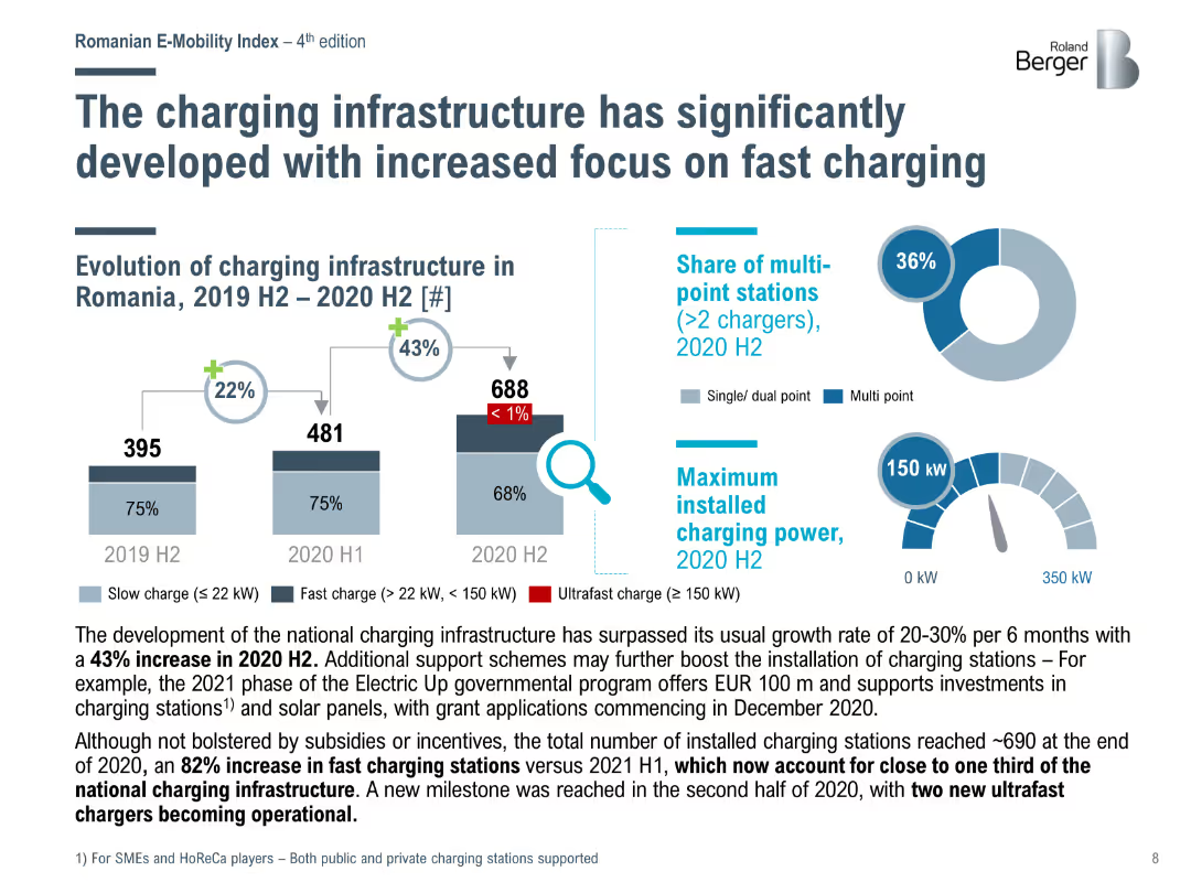
Bar chart showing the evolution of charging infrastructure in Romania from 2019 H2 to 2020 H2, highlighting the increase in fast and ultrafast charging stations.
Market Analysis and Trends
Energy & Utilities
Analyzes the significant development of charging infrastructure in Romania, with a notable increase in fast and ultrafast charging stations and support from government programs.
charging infrastructure, fast charging, Romania, development
Multiple Chart
Roland Berger
Saved
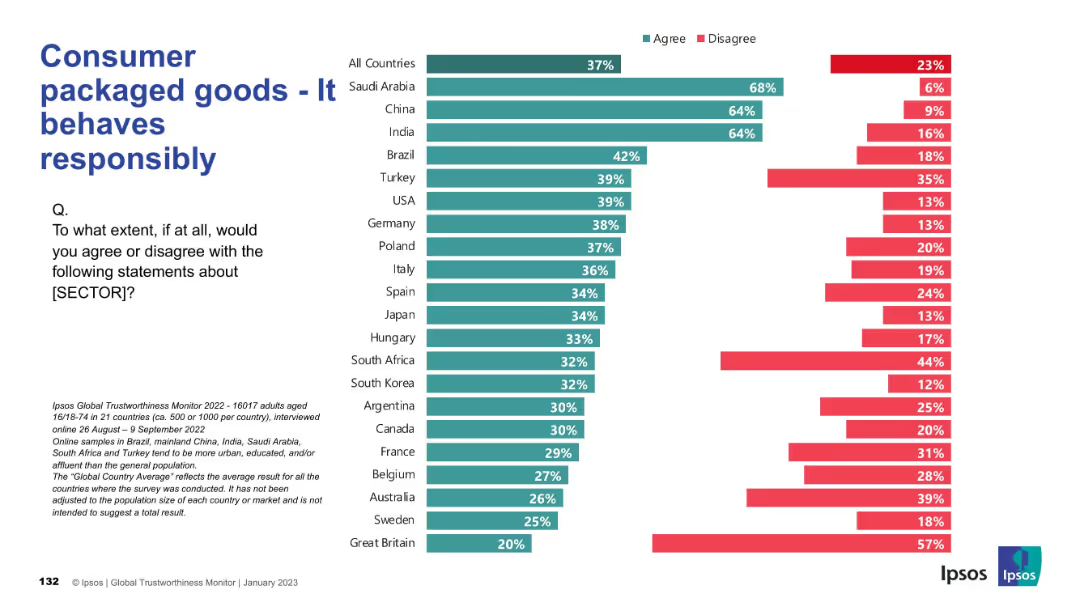
Horizontal bar chart with green (agree) and red (disagree) bars for multiple countries. Title and survey question on left, bars on the right.
Market Analysis and Trends
Consumer Goods
This slide shows survey results on public perception of the Consumer Packaged Goods (CPG) sector’s responsibility across 21 countries, highlighting agreement and disagreement rates.
responsibility, perception, trust, consumer goods, Ipsos, survey, international, behavior, public opinion, global comparison
Mixed Chart
IPSOS
Saved
A comparative chart showcasing GDP forecasts for various economies with indicators for past and projected levels.
Financial Performance
Financial Services
This slide compares GDP levels of major economies, predicting recovery trends post-2021, relevant for economic forecasting and policy planning.
GDP, economic recovery, forecast, policy planning, financial analysis
Multiple Chart
BCG
Saved
A mix of checkmarks, icons, and arrows indicate progress and future goals with text describing key milestones, current platforms, and upcoming developments in payment technology.
Operational Efficiency
Financial Services
It highlights the advancements and roadmap for payment platforms, showcasing the progress and future plans to improve global scalability and technology. Useful for operational strategy and tech innovation discussions.
Payments, Milestones, Technology, Scalability, Innovation, Roadmap
Table
JP Morgan
Saved
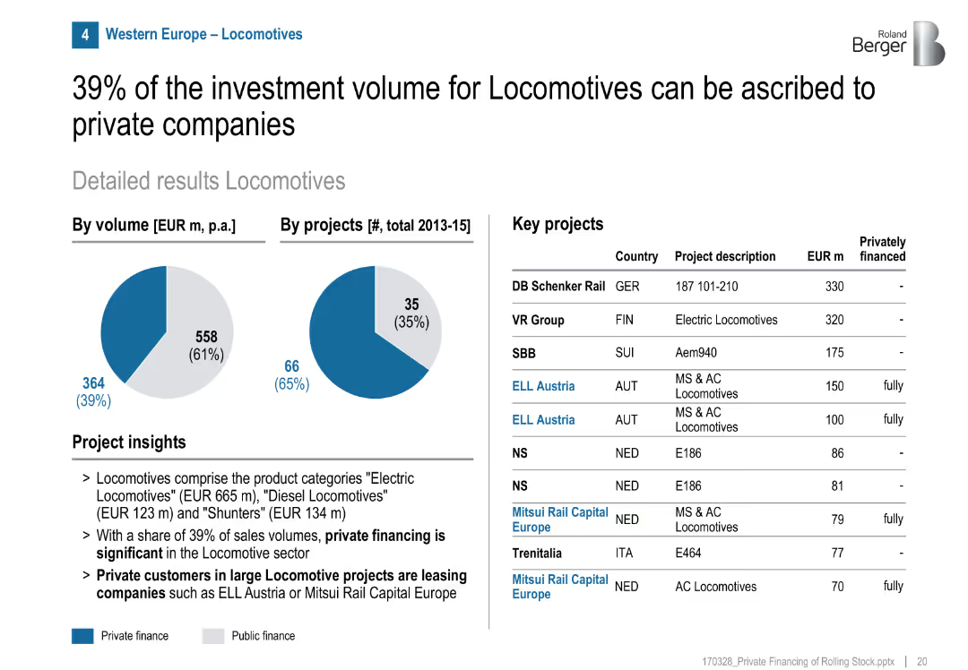
Pie charts (volume/projects), project list, highlights private leasing model
Product and Service Analysis
Transportation & Logistics
Locomotives have a high private financing share (39%), especially through leasing models with firms like ELL Austria and Mitsui Rail Capital Europe. Many projects fully privately financed.
locomotives, private leasing, rolling stock, ELL Austria, Mitsui, Europe, rail, investment
Mixed Chart
Roland Berger
Saved
Column chart showing rolling three-year net new assets with a $1Tn target line. Years listed below each bar. Graph has blue color coding and is simple in design.
Financial Performance
Financial Services
Outlines Morgan Stanley's achievement of a $1 trillion target for net new assets over three-year periods, showing consistent growth.
Net new assets, financial target, Morgan Stanley, growth, wealth management, three-year period, $1Tn
Single Chart
Goldman Sachs
Saved
The slide features text and percentage data, along with a column chart with horizontal bars showing the adoption barriers for marketing and supply chain leaders.
Risk Assessment and Management
Technology & Software
The slide outlines the barriers to adopting Generative AI for marketing and supply chain leaders, including skills gaps, technology integration, and security threats.
Generative AI, Barriers, Marketing Leaders, Supply Chain, Security
Mixed Chart
Gartner
Saved
Previous
Next
If nothing, comes up, please save your slides first
Create a FREE account to continue browsing
Receive Instant Access to 1,000+ slides from companies like McKinsey, Google, and Goldman Sachs
First Name
Last Name
Email
Password
I agree to all
Terms & Privacy Policy
Thank you! Your submission has been received!
Oops! Something went wrong while submitting the form.
Have an account?
Sign in
Column Chart
Heatmap
Chevron
Org Chart
Infographic
Callouts
Timeline
List
Graphic
Picture
Process Flow
Diagram
Paragraph
Map
Table
Framework
Subtitle
Takeaway Box
Icon
Other Chart
Radar Chart
Waterfall Chart
Mekko Chart
Pie Chart
Scatter Plot
Line Chart
Bar chart
Bullet points