My Account
My Slides
Search by Category
Companies
Slide Type
Use Case
Industry
Pricing
Templates
View All Templates
Download Template Slides
✦ AI
AI Prompt Library
AI Search
Feedback
Login
Logout
Get Started
Browse all Slides
Browse all Slides
Create a FREE Account
Instant access to 1,000+ real slides from top companies like McKinsey, BCG, Goldman Sachs, Google and many more!
First Name
Last Name
Email
Password
I agree to all
Terms & Privacy Policy
Thank you! Your submission has been received!
Oops! Something went wrong while submitting the form.
Have an account?
Sign in
Saved Slides
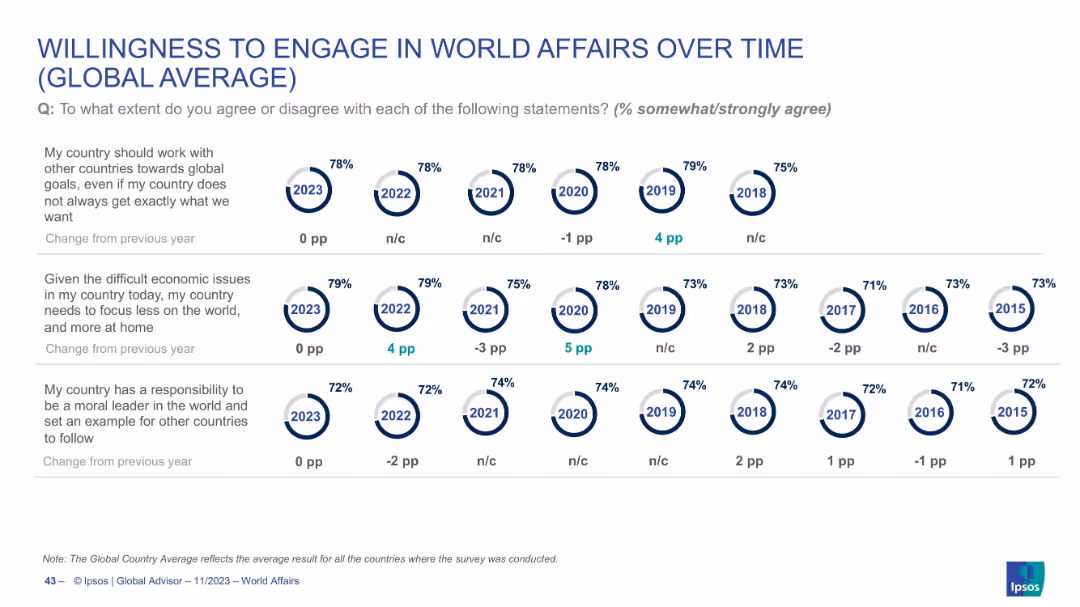
Circular icons and line-style comparisons from 2015–2023, segmented by engagement themes
Market Analysis and Trends
Government & Public Sector
Tracks trends in global attitudes from 2015–2023 on cooperation, internal economic focus, and moral leadership. Provides visual history of public opinion shifts, with data consistency or modest changes across years.
trend analysis, world affairs, global opinion, survey history, policy engagement, Ipsos
Single Chart
IPSOS
Saved
This slide presents two column charts comparing the usage of brand safety and suitability solutions among podcast publishers. The charts are color-coded to distinguish between active usage and planning stages.
Risk Assessment and Management
Media & Entertainment
Discusses the low adoption rates of brand safety and suitability solutions in podcast advertising and anticipates future growth as AI-driven tools become more prevalent. This slide points towards a necessary evolution in the industry to manage ad content adjacency and maintain brand integrity in a dynamic digital environment.
brand safety, podcast, advertising, AI, 2021
Mixed Chart
PwC/Strategy&
Saved
Two pie charts showing the percentage of people using VPNs to access crypto trading platforms, divided into 'Outside of Canada' and 'Inside of Canada' for 2023 and 2022.
Regulatory and Compliance
Financial Services
This slide analyzes the use of VPNs by individuals accessing crypto trading platforms inside and outside Canada, comparing 2023 data to 2022.
VPN, crypto, trading, Canada, 2023, 2022, comparison
Multiple Chart
IPSOS
Saved
A two-column slide, the left side shows column charts with market share and industry wallet, while the right side lists key focus areas for discussion with check marks.
Market Analysis and Trends
Financial Services
Discussing the ranking in investment banking fees, the slide covers historical data, market share, regional performance, and focus areas for in-depth discussion regarding future strategy and client relationships.
Banking, Fees, Market Share, Strategy
Mixed Chart
JP Morgan
Saved
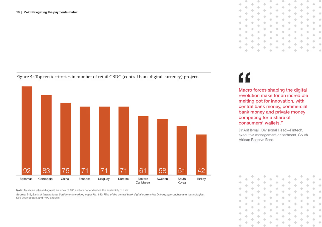
Bar chart displaying the number of retail central bank digital currency (CBDC) projects in various countries.
Technology and Digital Transformation
Financial Services
The slide highlights the leading countries in retail CBDC projects, indicating the adoption and experimentation of digital currencies.
retail, CBDC, projects, countries, digital currency, adoption, leading, territories, 2020
Mixed Chart
PwC/Strategy&
Saved
Bar chart illustrating the expected time for economic recovery post-COVID-19, ranging from one year to more than five years. Additional text provides insights.
Risk Assessment and Management
Financial Services
The slide outlines expectations for the Canadian economy's recovery time post-COVID-19, showing a range of predictions from one year to more than five years. It highlights the divide between optimists and pessimists regarding the economic rebound timeline.
COVID-19, Economic Recovery, Canadian, Timeline, Prediction
Mixed Chart
IPSOS
Saved
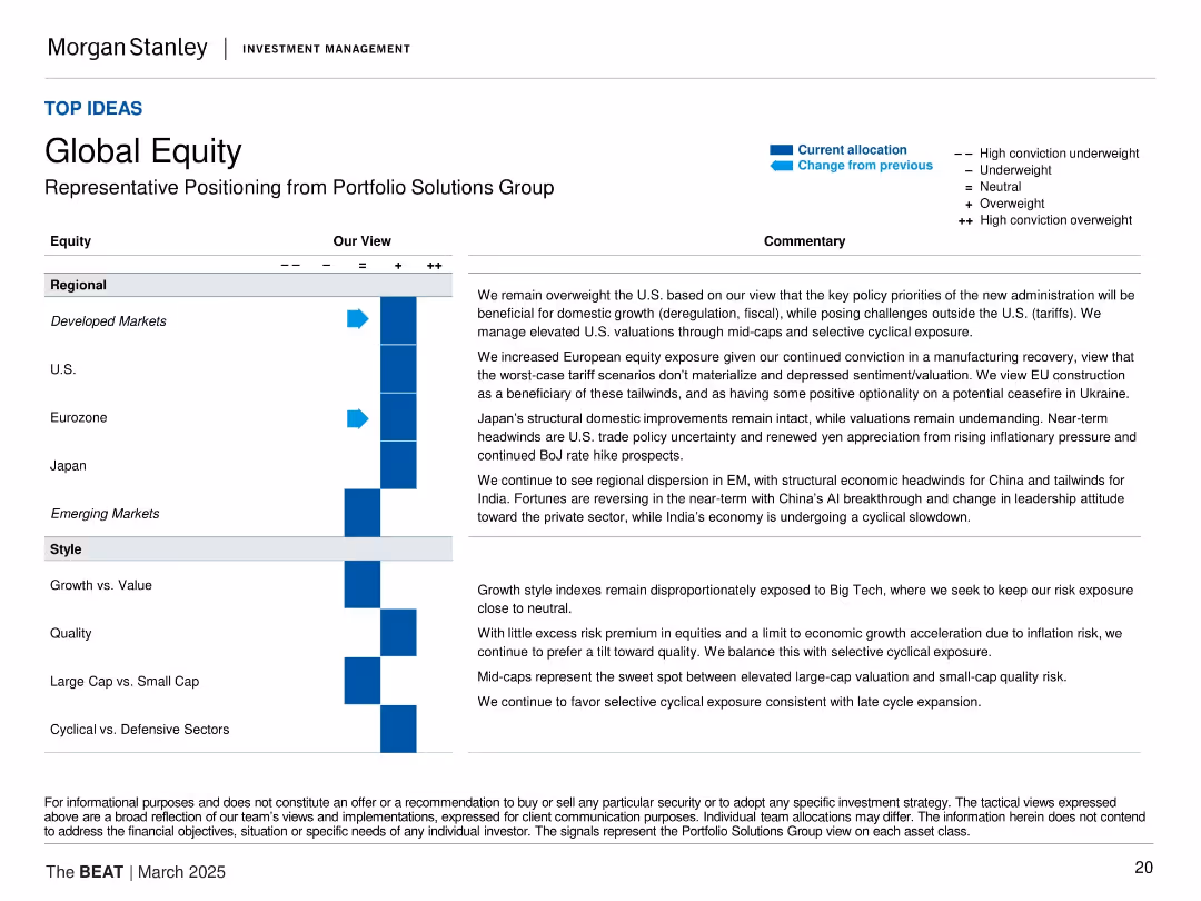
Same format as previous slides: allocation matrix on left, with categories like Developed Markets, U.S., Eurozone, Japan, etc. Commentary on right justifies views based on macroeconomic themes and regional developments.
Strategic Planning
Financial Services
The slide provides Morgan Stanley's global equity views, emphasizing overweight in developed markets, especially the U.S. and Europe. It discusses improving economic prospects, fiscal policies, and favorable tailwinds in construction and manufacturing as key drivers for equity exposure.
global equity, developed markets, U.S. economy, EU recovery, macro themes, Japan, emerging markets, cyclical exposure, fiscal policy
Table
Morgan Stanley
Saved
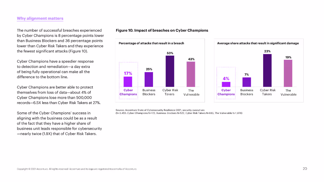
The slide has a white background with two column charts on the right side. The left side contains text discussing successful breaches and the effectiveness of cyber champions.
Risk Assessment and Management
Technology & Software
This slide highlights the lower breach rates of cyber champions compared to other groups and their ability to protect against significant data loss.
Cyber risk, breaches, protection, champions, business, cybersecurity, data loss, effectiveness, survey
Multiple Chart
Accenture
Saved
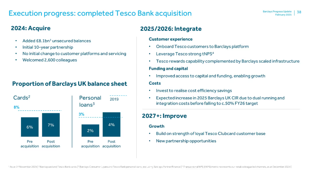
Split layout with bullet points on left, timeline structure on right, and bar charts at bottom. Clean, corporate design.
Mergers and Acquisitions
Financial Services
Details the acquisition of Tesco Bank by Barclays, including key metrics from 2024 (e.g., £8.1bn unsecured balances, 2,600 employees onboarded), integration plans for 2025–2026 (customer experience, capital, and cost considerations), and future improvements (growth, new partnerships). Also includes balance sheet impact visuals.
Tesco Bank, acquisition, integration, balance sheet, Barclays, M&A, unsecured debt, tNPS, CIR
Mixed Chart
Barclays
Saved
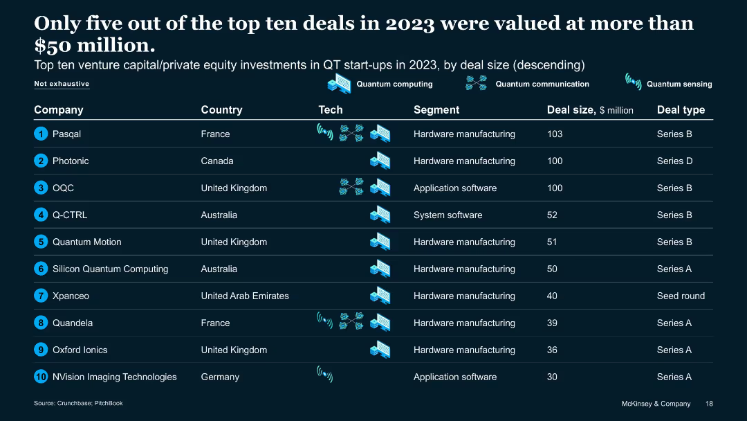
Tabular format with rankings by deal size, country, tech, and funding type
Financial Performance
Artificial Intelligence
Lists top ten QT VC/PE deals in 2023. Only five exceeded $50M. Includes information on country, segment, and deal type. Highlights QT investment concentration in QC hardware and software across France, UK, Australia, and Germany.
VC funding, QT deals, top startups, 2023 investments, hardware focus
Table
McKinsey
Saved
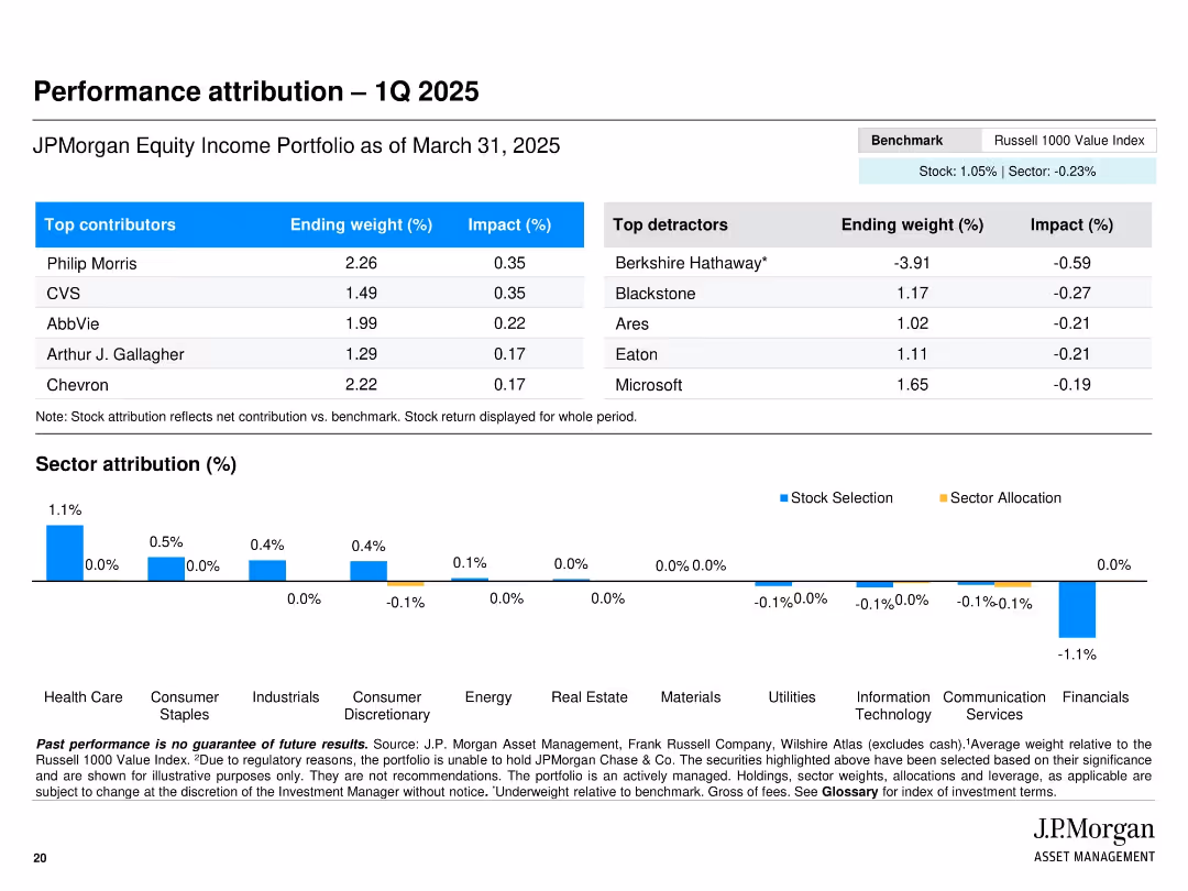
Table of top contributors/detractors alongside sector attribution bar charts.
Performance Metrics and KPIs
Financial Services
Breaks down Q1 2025 performance attribution by highlighting best and worst performing stocks and sectors. Includes impact percentages and stock weights. A stacked bar chart shows attribution by stock selection vs. sector allocation.
attribution, Q1 2025, top contributors, performance, financials, benchmark, sector allocation
Mixed Chart
JP Morgan
Saved
Column charts depicting operating expenses over three years, alongside metrics on digital transformation and branch closures.
Operational Efficiency
Financial Services
Details the reduction in operating expenses and highlights initiatives in digital transformation and efficiency improvements.
Operating expenses, digital transformation, efficiency, branch closures, expenses reduction
Multiple Chart
Credit Suisse
Saved
This slide presents multiple bar charts showing the year-over-year change in vehicle sales per country.
Strategic Planning
Transportation & Logistics
Highlights trends in passenger vehicle sales post-COVID-19, with data showing significant recovery or growth spikes in various regions.
vehicle sales, trends, COVID-19, recovery
Multiple Chart
BCG
Saved
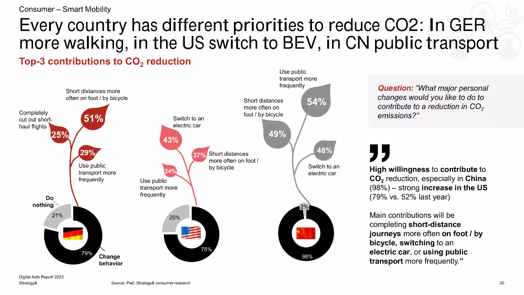
A combination of column charts showing CO2 reduction methods for Germany, the US, and China. The charts are accompanied by text highlighting key points and percentages.
Market Analysis and Trends
Transportation & Logistics
The slide compares the top three methods for reducing CO2 emissions in Germany, the US, and China, emphasizing walking, BEV, and public transport use.
CO2 reduction, Germany, US, China, walking, BEV, public transport
Multiple Chart
PwC/Strategy&
Saved
The slide displays a series of bar charts detailing the percentage of respondents planning cost actions in 2023, segmented by region and type of action like redesigning processes or simplifying organizational structures.
Market Analysis and Trends
Financial Services
This slide presents the strategic plans for cost reduction and improving efficiency in 2023 across different regions, comparing North America, Europe, and Asia in their approaches to handling operational models and organizational structures.
cost actions, organizational efficiency, operational model, regional comparison
Multiple Chart
BCG
Saved
The slide includes two columns of text with images, and trend assessments.
Technology and Digital Transformation
Technology & Software
Describes consumer profiling and supply chain transparency, highlighting the importance of data analysis and blockchain technology.
Consumer Profiling, Supply Chain, Data Analysis, Blockchain, Transparency, Data Privacy
Multiple Chart
Deloitte
Saved
Scatter plot showing the relationship between the Shiller CAPE and subsequent calendar-year total return since 1945.
Investment Analysis
Financial Services
Examines how the Shiller CAPE has historically explained only 6% of the variation in equity returns in the subsequent year, questioning its reliability as a timing signal.
valuations, Shiller CAPE, equity returns, timing signal
Mixed Chart
Goldman Sachs
Saved
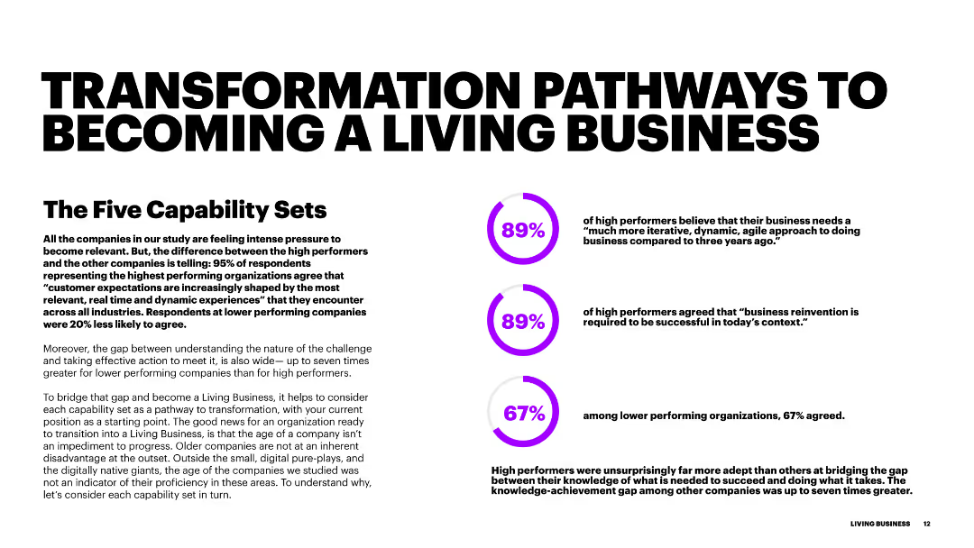
The slide has a large title at the top with three circular progress indicators on the right. Each circle has a percentage and a brief statement related to transformation and performance.
Strategic Planning
Professional Services
This slide outlines the key pathways for businesses to become 'living businesses,' focusing on agility, relevance, and innovation as crucial transformation areas.
transformation, pathways, business, performance, agility, innovation
Multiple Chart
Accenture
Saved
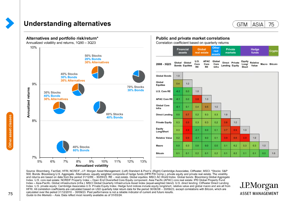
The slide consists of two charts: a scatter plot showing the risk/return profile of different portfolio compositions and a correlation matrix for various asset classes.
Market Analysis and Trends
Financial Services
This slide explains the risk and return dynamics of alternative investments and their correlation with traditional assets, aiding in portfolio diversification strategies.
risk return, portfolio, alternative investments, correlation, diversification
Mixed Chart
JP Morgan
Saved
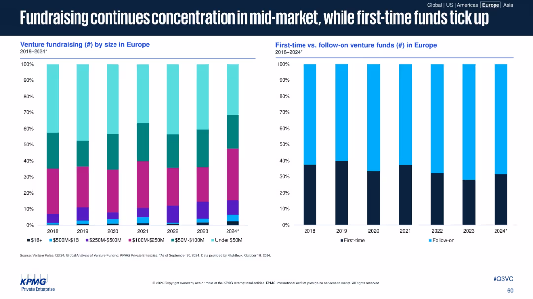
Two side-by-side stacked bar charts showing European venture fundraising data from 2018 to 2024: the left chart splits by fund size; the right splits first-time vs. follow-on funds. Clean, data-centric layout with no clutter.
Market Analysis and Trends
Financial Services
This slide illustrates a trend of mid-market fundraising dominance in Europe from 2018 to 2024, while also showing a gradual increase in first-time venture funds. It reflects investor behavior and evolving fund allocation strategies over time.
Venture funds, Europe, mid-market, first-time funds, follow-on funds, fundraising, fund sizes, capital allocation, investment trends, 2024 forecast
Multiple Chart
KPMG
Saved
Slide with a large central image, three sections each with a heading and bullet points discussing various aspects of quantum technology.
Technology and Digital Transformation
Technology & Software
Covers the state of quantum technology, its potential impact and disruption, and the organizational preparedness needed for its integration.
quantum technology, debate topics, technology readiness, impact, organizational preparedness
Header Vertical
McKinsey
Saved
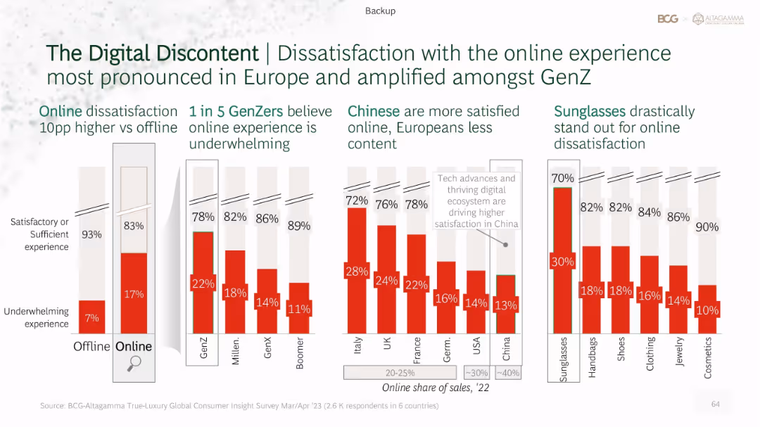
Multi-bar layout comparing dissatisfaction rates by shopping mode, generation, region, and product type. Red bars highlight underwhelming experience percentages.
Customer and Market Segmentation
Retail & E-commerce
Investigates online shopping dissatisfaction in luxury retail. Gen Z reports highest discontent. Europeans are less satisfied than Chinese consumers. Sunglasses have the highest dissatisfaction among product categories. Emphasizes need for better online experience design.
digital discontent, Gen Z, regional variation, online retail, dissatisfaction, product types
Single Chart
BCG
Saved
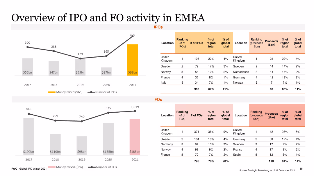
This slide presents line charts and column charts showing the number and proceeds of IPOs and FOs in EMEA from 2017 to 2021, with a regional ranking breakdown.
Market Analysis and Trends
Financial Services
It offers a detailed analysis of IPO and FO activities in the EMEA region, highlighting key countries and financial performance over the years.
IPOs, FOs, EMEA, regional trends, financial analysis
Multiple Chart
PwC/Strategy&
Saved
Slide features a bar chart illustrating the main challenges organizations face in their transition to ESG-focused operations. Challenges such as lack of expertise and policy incentives are shown, with bars horizontally displayed.
Risk Assessment and Management
Environmental Services & Sustainability
Highlights the significant barriers to adopting ESG practices within organizations, including gaps in expertise and insufficient governmental support. This insight is crucial for understanding the hurdles that companies must overcome to fully integrate ESG principles into their business strategies.
ESG, challenges, transition, barriers, 2023
Single Chart
PwC/Strategy&
Saved
The slide includes a column chart comparing challenges in upskilling initiatives, with different colors representing the beginning and advanced stages of such programs.
Organizational Structure and Change
Professional Services
Discusses the initial challenges organizations face when starting upskilling programs, such as motivation, resource allocation, and employee retention.
Upskilling Challenges, Resource Allocation, Employee Retention, Skill Development
Single Chart
PwC/Strategy&
Saved
Previous
Next
If nothing, comes up, please save your slides first
Create a FREE account to continue browsing
Receive Instant Access to 1,000+ slides from companies like McKinsey, Google, and Goldman Sachs
First Name
Last Name
Email
Password
I agree to all
Terms & Privacy Policy
Thank you! Your submission has been received!
Oops! Something went wrong while submitting the form.
Have an account?
Sign in
Column Chart
Heatmap
Chevron
Org Chart
Infographic
Callouts
Timeline
List
Graphic
Picture
Process Flow
Diagram
Paragraph
Map
Table
Framework
Subtitle
Takeaway Box
Icon
Other Chart
Radar Chart
Waterfall Chart
Mekko Chart
Pie Chart
Scatter Plot
Line Chart
Bar chart
Bullet points