My Account
My Slides
Search by Category
Companies
Slide Type
Use Case
Industry
Pricing
Templates
View All Templates
Download Template Slides
✦ AI Search
Feedback
Login
Logout
Get Started
Browse all Slides
Browse all Slides
Create a FREE Account
Instant access to 1,000+ real slides from top companies like McKinsey, BCG, Goldman Sachs, Google and many more!
First Name
Last Name
Email
Password
I agree to all
Terms & Privacy Policy
Thank you! Your submission has been received!
Oops! Something went wrong while submitting the form.
Have an account?
Sign in
Saved Slides
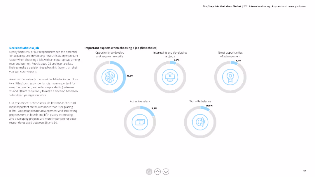
Circular diagrams showing percentages for various factors when choosing a job, including skill development and salary.
Market Analysis and Trends
Professional Services
Highlights key considerations for job selection among respondents, with a focus on skill acquisition, interesting projects, and salary.
Job Selection, Factors, Skill Development, Salary, Projects, Considerations
Multiple Chart
Deloitte
Saved
The slide features a column chart depicting primary energy demand by fuel from 2000 to 2040 under stated policies scenario. It includes advanced biofuels, primary solid biofuels, hydro, nuclear, other renewables, gas, oil, and coal, with growth rates for each type.
Market Analysis and Trends
Energy & Utilities
This slide analyzes the projected growth rates of different energy sources, showing that wind and solar energies are expected to grow faster than advanced biomass by 2040.
primary energy demand, fuel, growth rate, wind energy, solar energy, biomass, 2040, stated policies scenario
Mixed Chart
Kearney
Saved
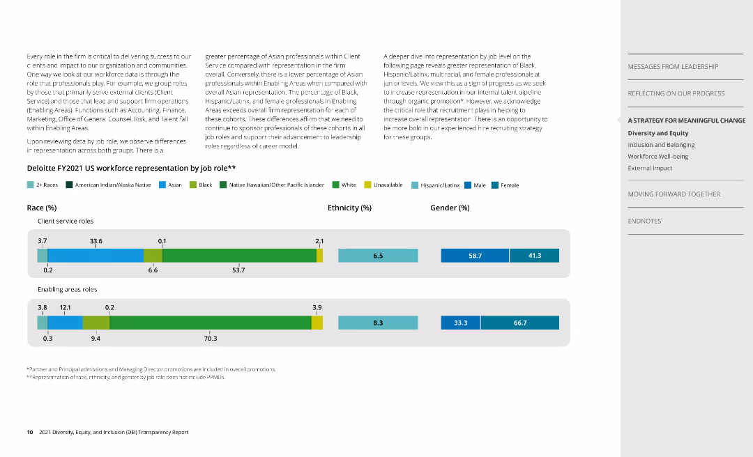
Two column charts display workforce representation by race, ethnicity, and gender for client service and enabling roles.
Human Resources and Talent Management
Professional Services
Analyzes Deloitte's workforce composition, highlighting representation disparities among different roles.
race, ethnicity, gender, workforce, Deloitte
Multiple Chart
Deloitte
Saved
Box plot showing the spread of HRST scores by total paid amount with outlier analysis.
Market Analysis and Trends
Government & Public Sector
Evaluates the distribution of HRST scores and their corresponding costs, identifying outliers and highlighting the discrepancies in service expenditures relative to assessed needs.
HRST scores, total paid amount, outlier analysis, health risk screening tool, service expenditures, funding discrepancies, NH's DD population
Mixed Chart
Alvarez & Marsal
Saved
Left side has percentage boxes, right side has a bar chart and text
Technology and Digital Transformation
Technology & Software
Usage of generative AI in software engineering, focusing on pair programming and code generation
software engineering, generative AI, governance
Mixed Chart
Gartner
Saved
The slide uses a green color scheme and includes four connected icons, each representing a stage of semiconductor design: Product Definition, Architecture/System Design, Integrated Circuit Design, and Post-Silicon Validation. Text descriptions provide brief insights into the activities performed at each stage.
Market Analysis and Trends
Technology & Software
This slide outlines the four critical stages of semiconductor design, from product definition to post-silicon validation, with emphasis on the technical aspects and design intricacies at each stage. Useful for educational purposes in engineering courses or professional seminars focused on semiconductor manufacturing processes.
semiconductor, design stages, product definition, system design, circuit design, validation
Linear Flow
BCG
Saved
Features a bar chart ranking the top outcomes automotive companies target through digital transformation, like anomaly detection and improved supply chain efficiencies.
Risk Assessment and Management
Transportation & Logistics
Highlights specific outcomes automotive companies aim to achieve by scaling digital proofs of concept, emphasizing improvements in operations and management efficiencies.
automotive, digital transformation, anomaly detection, supply chain, operational efficiency
Single Chart
Accenture
Saved
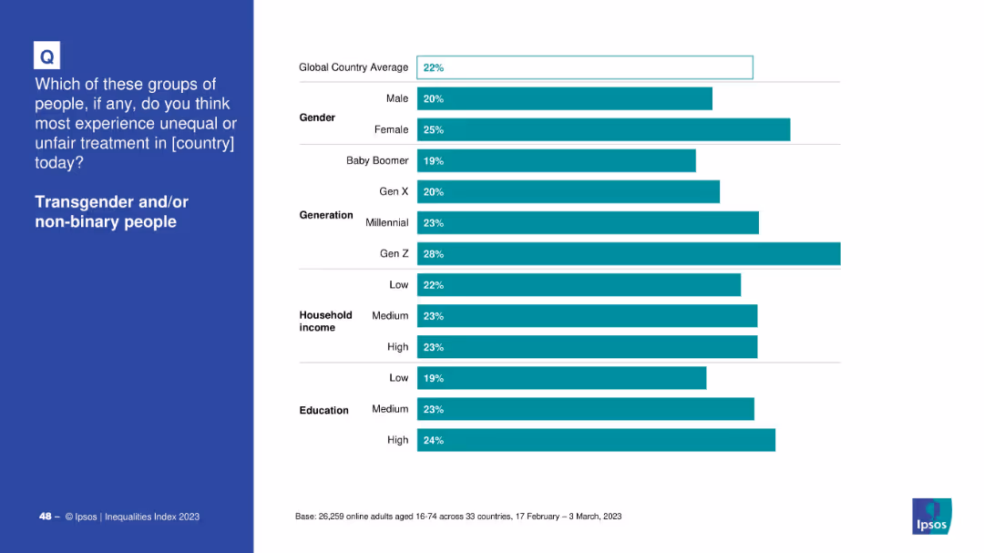
Bar chart segmented by demographics: gender, generation, income, and education
Market Analysis and Trends
Government & Public Sector
The slide shows perceptions of unfair treatment of transgender and non-binary people across global demographics. Gen Z and females perceive the highest levels of discrimination, suggesting generational awareness and gendered perspectives.
transgender, demographics, Gen Z, gender gap, Ipsos, income, education, inequality, survey
Mixed Chart
IPSOS
Saved
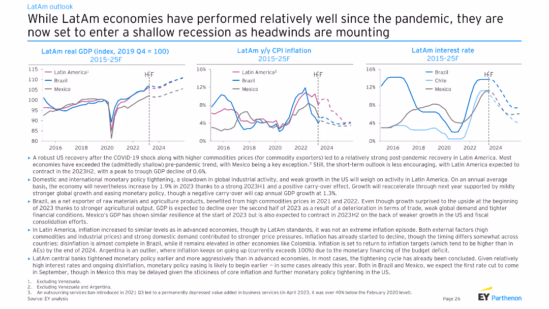
Three line charts depicting LatAm real GDP (index), y/y CPI inflation, and interest rate trends for Brazil, Chile, and Mexico from 2015-25F. Moderate complexity, well-suited for presenting regional economic trends.
Market Analysis and Trends
Financial Services
This slide provides an economic outlook for Latin American countries, highlighting post-pandemic recovery, commodity prices, and the anticipated shallow recession. It discusses GDP growth, inflation, and interest rate trends in Brazil, Chile, and Mexico.
LatAm, GDP, CPI, interest rate, recession
Multiple Chart
EY
Saved
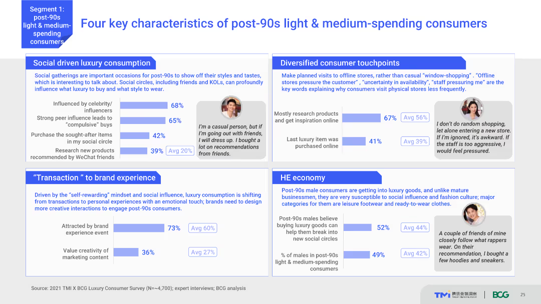
The slide uses a content layout with text, charts, and testimonials. It highlights four key characteristics of post-90s light & medium-spending consumers, supported by survey data and personal quotes. The visual complexity is moderate with clear segmentation and relevant visuals.
Customer and Market Segmentation
Consumer Goods
This slide outlines the main characteristics of post-90s light and medium-spending consumers, focusing on their social-driven luxury consumption, diversified touchpoints, and specific economic behaviors. It includes testimonials for context.
consumer characteristics, post-90s, luxury consumption, social influence, economic behavior
Multiple Chart
BCG
Saved
A combination of bar charts and graphs show digital consumer growth and the reasons for using digital services, with a clean layout.
Market Analysis and Trends
Technology & Software
Analyzes the dramatic increase in digital consumers in Thailand and their commitment to continue using digital services.
Digital, Consumers, Thailand, Growth, Services, Penetration, E-commerce, Reasons, Continuation
Multiple Chart
Bain
Saved
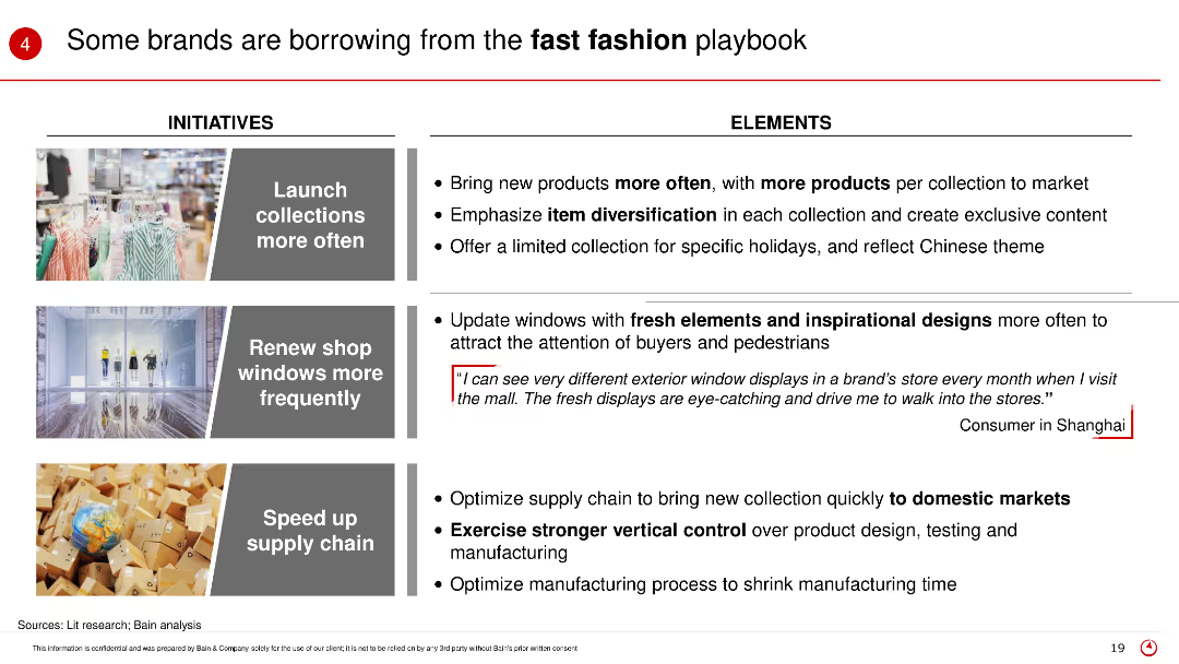
The slide presents initiatives and elements of the fast fashion strategy, including launching collections more often, updating shop windows, and speeding up supply chains, with corresponding images and consumer feedback.
Product and Service Analysis
Retail & E-commerce
This slide describes how some brands are adopting fast fashion tactics to remain competitive, focusing on frequent product launches, fresh window displays, and efficient supply chains.
Fast fashion, brand strategy, product launch, supply chain, retail trends
Table
Bain
Saved
The slide includes column charts depicting net revenues, cost/income ratio, assets under management, and more for Asset Management.
Financial Performance
Financial Services
This slide details the financial performance of Credit Suisse's Asset Management sector, focusing on revenues, cost/income ratio, and return on capital.
asset management, net revenues, cost/income ratio, assets under management, return on capital
Multiple Chart
Credit Suisse
Saved
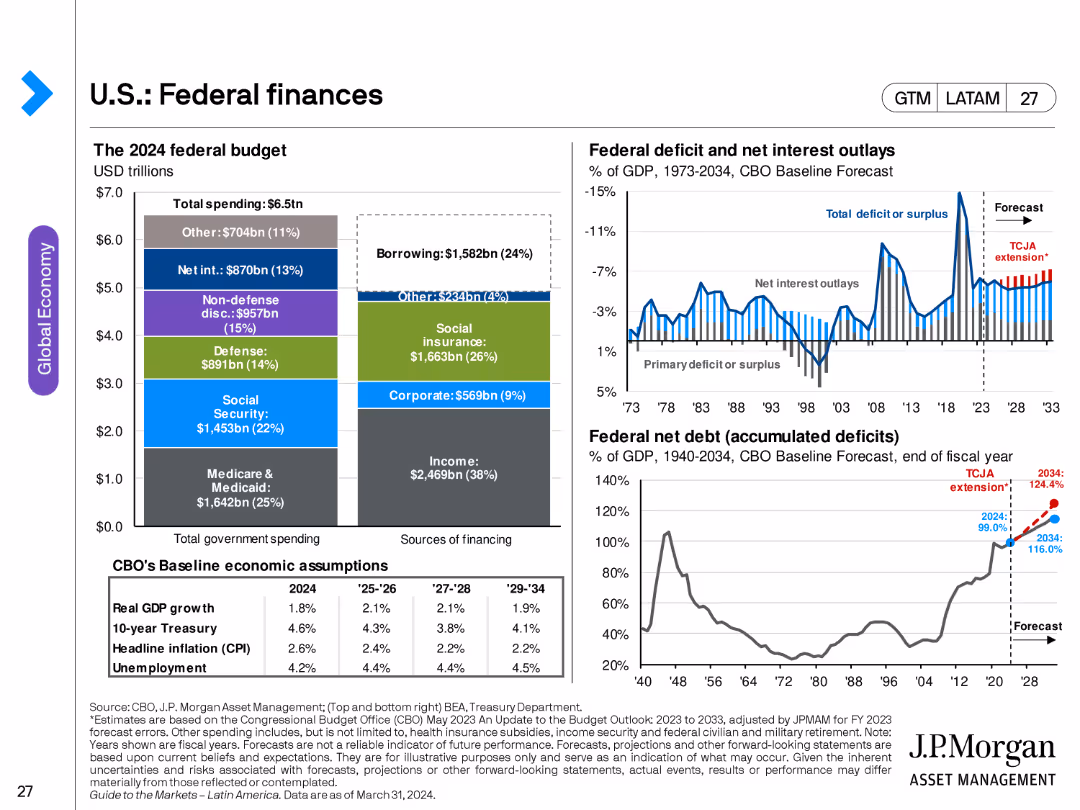
The slide features multiple charts: a pie chart showing the 2024 federal budget breakdown, a line chart for federal deficit and net interest outlays, and another line chart for federal net debt as a percentage of GDP.
Financial Performance
Government & Public Sector
This slide examines the U.S. federal finances, including budget allocation, deficit, and debt projections, providing insights into government spending and fiscal policy.
federal budget, deficit, debt, fiscal policy, government spending, U.S. finances
Multiple Chart
JP Morgan
Saved
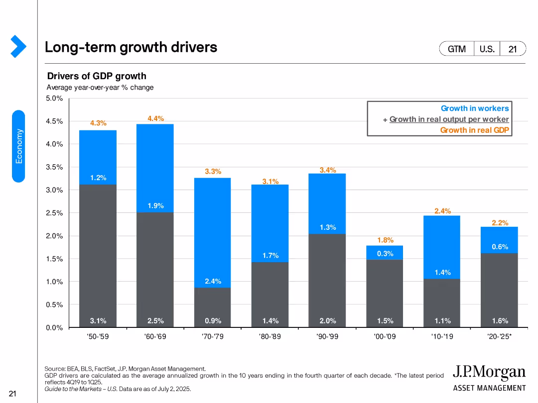
Vertical bar chart showing decade-wise GDP growth since the 1950s. Each bar is split into components: growth in workers and productivity per worker. The most recent bar shows 2020–2025 as a partial period.
Strategic Planning
Financial Services
Highlights long-term GDP growth drivers by decade, emphasizing shifts in labor force expansion and productivity. It notes slowing growth in the 2020s, with output per worker now a more significant contributor than workforce growth.
GDP growth, productivity, workforce, output per worker, historical trends, long-term planning, economic potential
Single Chart
JP Morgan
Saved
Features two column charts side by side comparing Gen Zs’ and millennials’ satisfaction with their organizations' societal impact, diversity and inclusion efforts, and sustainability commitments.
Human Resources and Talent Management
Professional Services
The slide examines the correlation between job loyalty and satisfaction with companies' commitments to societal impact, diversity, and sustainability among Gen Zs and millennials. It includes data visuals comparing satisfaction levels and job loyalty metrics.
Job loyalty, societal impact, diversity, inclusion, sustainability
Multiple Chart
Deloitte
Saved
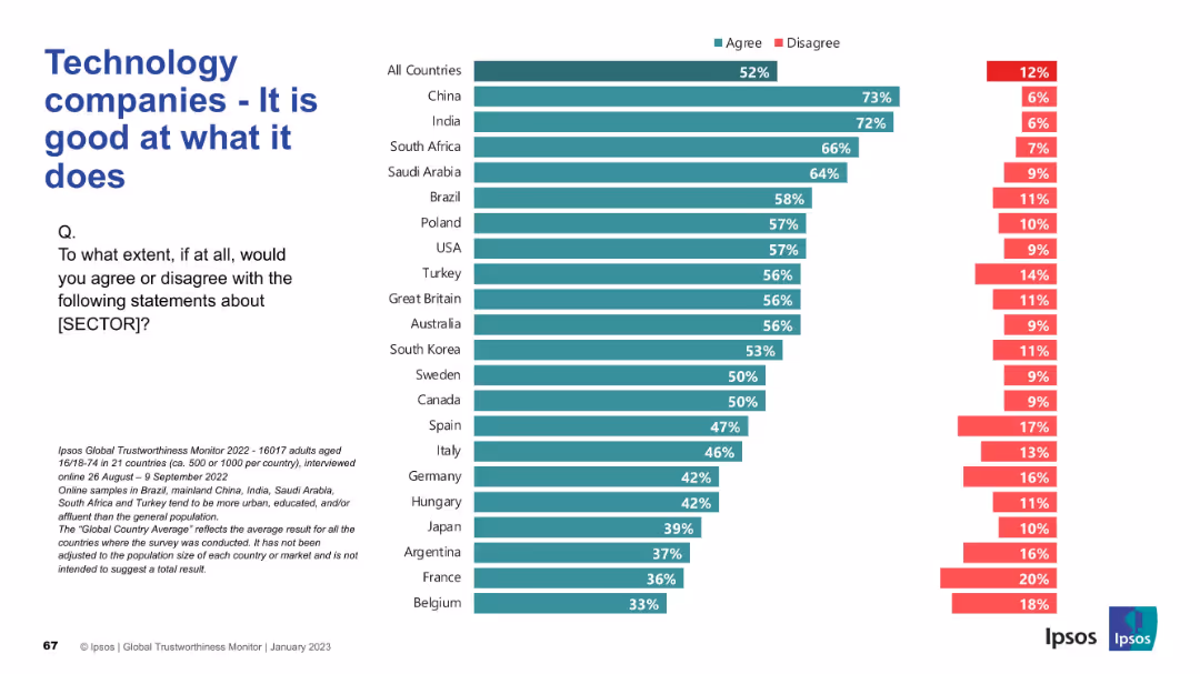
Bar chart ranking countries by agreement/disagreement on sector competence; question on left side.
Market Analysis and Trends
Technology & Software
This slide presents opinions from multiple countries on whether people believe technology companies are competent in their work, showing agreement and disagreement rates.
technology, competence, global opinion, trust, Ipsos, survey, perception, agreement, sector reputation, public trust
Mixed Chart
IPSOS
Saved
This slide contains a column chart showing gross cost reductions (~13bn) by year-end 2026, with additional columns for reinvestment in infrastructure, growth, and net cost reduction. To the right, there are boxes listing investment priorities: improving client experience and investing in infrastructure, each with further details.
Financial Performance
Financial Services
The slide shows a plan to achieve a cost/income ratio below 70% by the end of 2026 through cost reductions and reinvestments. It highlights investment priorities in client experience and infrastructure. This slide can be used to present cost management strategies and investment plans to stakeholders.
investment, cost reduction, client experience, infrastructure, priorities
Mixed Chart
UBS
Saved
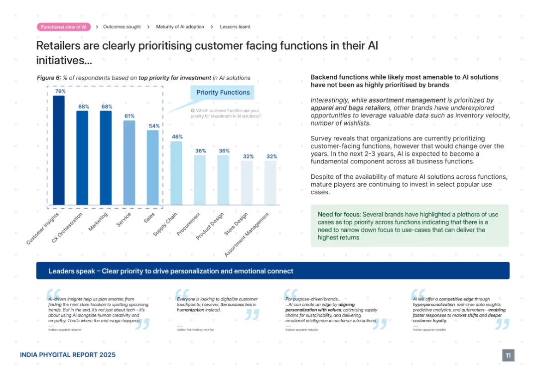
Mixed chart and commentary layout. Bar graph on left side, supporting commentary on right with highlighted callout box and quotes at the bottom. Follows dotted grid background.
Product and Service Analysis
Retail & E-commerce
This slide reveals that retailers are prioritizing customer-facing AI functions such as customer insights, CX orchestration, and marketing over backend operations. It highlights the trend of using AI for personalization and emotional connection. Despite backend potential, most investments are going toward functions with visible customer impact and faster returns.
AI investment, customer insights, marketing, CX orchestration, personalization, emotional connect, priorities
Mixed Chart
PwC/Strategy&
Saved
A balanced layout with text and a radar chart depicting high performance capabilities. The layout includes sections for different focus areas.
Strategic Planning
Professional Services
Summarizes procurement focus on innovation and value, highlighting key capabilities for high performance in procurement.
procurement, summary, performance, innovation, capabilities
Multiple Chart
Deloitte
Saved
Slide displays two sets of bar charts for a cross-geography view and France-specific data, comparing employee satisfaction with managers using shades of green and red.
Organizational Structure and Change
Professional Services
Analyzes employee satisfaction with their managers in a comparative perspective, highlighting managerial influence on workforce stability.
employee satisfaction, managers, comparison, France, bar chart
Multiple Chart
BCG
Saved
Three pairs of bullet points, each with an icon, describing different aspects of the strategy supported by integrated global platforms, with text headers above.
Strategic Planning
Financial Services
This slide explains the wholesale payments strategy, supported by pillars like product variety, client connectivity, and analytics, useful for strategic planning discussions.
Strategy, Wholesale Payments, Global, Analytics, Connectivity, Innovation
Pillar
JP Morgan
Saved
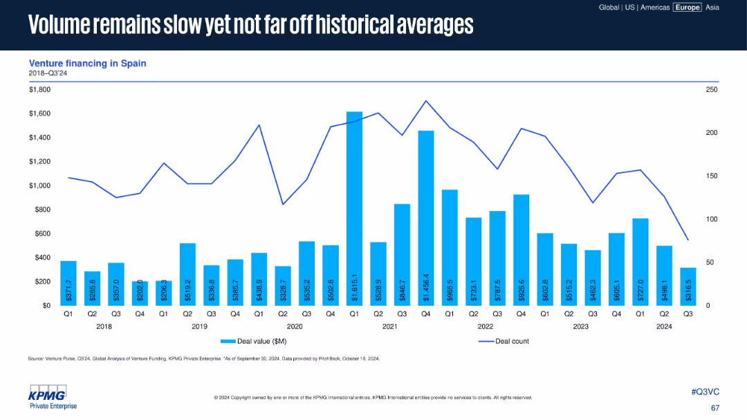
Spain-focused venture financing chart with deal values and counts from 2018 to Q3 2024. Steady layout, minimal design.
Market Analysis and Trends
Financial Services
Spain's VC volume remains subdued in 2024 but aligns with historical norms. Despite occasional surges, overall activity trends remain modest. The layout provides a clear long-term perspective with no interpretive commentary.
Spain, venture financing, historical average, VC volume, investment trend, 2024, steady performance, capital flow
Single Chart
KPMG
Saved
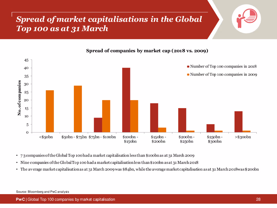
Column chart showing the distribution of market capitalizations of the Global Top 100 companies in 2009 and 2018, with textual analysis below.
Market Analysis and Trends
Financial Services
Comparison of the spread of market capitalizations among the Global Top 100 companies between 2009 and 2018, highlighting growth and changes.
market capitalisation, global top 100, 2009, 2018, spread
Mixed Chart
PwC/Strategy&
Saved
The slide presents a column chart illustrating the division of capital across different factors, with negative impacts represented in gray and positive in blue. A summary box on the right provides context with key drivers in bulleted form. The design is simple yet informative.
Financial Performance
Financial Services
Analyzes financial results for Macquarie Capital, including areas such as investment-related income and credit impairments, suited for discussions on capital allocation, financial strategy, and performance evaluation in the financial sector.
Macquarie Capital, financial results, investment income, credit, performance evaluation, financial strategy
Mixed Chart
Goldman Sachs
Saved
Previous
Next
If nothing, comes up, please save your slides first
Create a FREE account to continue browsing
Receive Instant Access to 1,000+ slides from companies like McKinsey, Google, and Goldman Sachs
First Name
Last Name
Email
Password
I agree to all
Terms & Privacy Policy
Thank you! Your submission has been received!
Oops! Something went wrong while submitting the form.
Have an account?
Sign in
Column Chart
Heatmap
Chevron
Org Chart
Infographic
Callouts
Timeline
List
Graphic
Picture
Process Flow
Diagram
Paragraph
Map
Table
Framework
Subtitle
Takeaway Box
Icon
Other Chart
Radar Chart
Waterfall Chart
Mekko Chart
Pie Chart
Scatter Plot
Line Chart
Bar chart
Bullet points