Create a FREE Account
Instant access to 1,000+ real slides from top companies like McKinsey, BCG, Goldman Sachs, Google and many more!
First Name
Last Name
Email
Password
I agree to all
Terms & Privacy Policy
Thank you! Your submission has been received!
Oops! Something went wrong while submitting the form.
Have an account?
Sign in
Library
Templates
Courses
Pricing
My Account
My Slides
My Templates
✦ AI
AI Prompt Library
AI Search
Sign in
Start Here
Logout
My Saved Slides
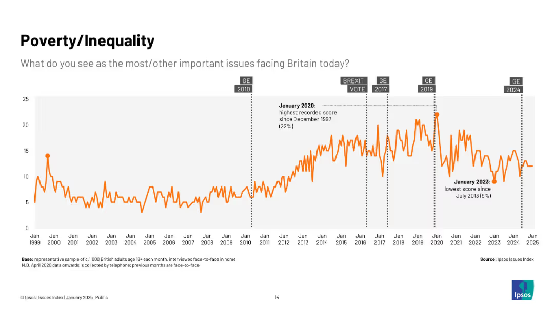
Line chart from 1999–2025; orange line tracks concern over poverty/inequality, with annotations at high (2020) and low (2023) points.
Market Analysis and Trends
Government & Public Sector
Shows growing concern over poverty and inequality, especially post-2010, with a spike in 2020 and a notable dip in 2023.
poverty, inequality, economic concern, trends, UK, public sentiment, Ipsos, social issues
Single Chart
IPSOS
Saved
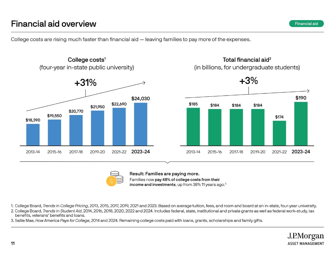
Two vertical bar charts comparing college costs and total financial aid over time. Summary box notes shifting burden to families.
Financial Performance
Education & Training
This slide highlights how college costs have risen 31% over 10 years, while financial aid increased only 3%. Families now bear a larger share of expenses, with 48% of college costs covered from income and investments compared to 38% a decade ago.
financial aid, rising costs, student burden, tuition trends, aid gap, college expenses, cost growth, funding shortfall, family responsibility
Multiple Chart
JP Morgan
Saved
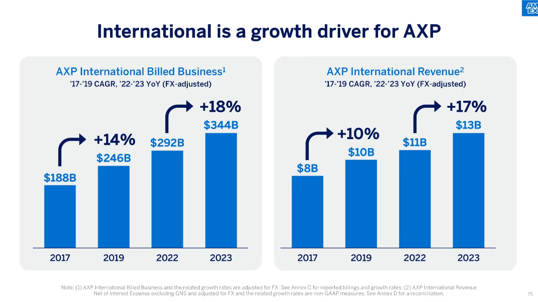
Dual-bar chart slide showing growth in billed business and revenue from 2017 to 2023.
Market Analysis and Trends
Financial Services
The slide illustrates AXP’s strong international growth, with billed business rising from $188B to $344B and revenue increasing from $8B to $13B. It reflects compounded annual growth rates (CAGR) and year-over-year (YoY) increases post-2022.
international growth, AXP, CAGR, billed business, revenue, financial growth, global expansion, FX-adjusted, business strategy
Single Chart
McKinsey
Saved
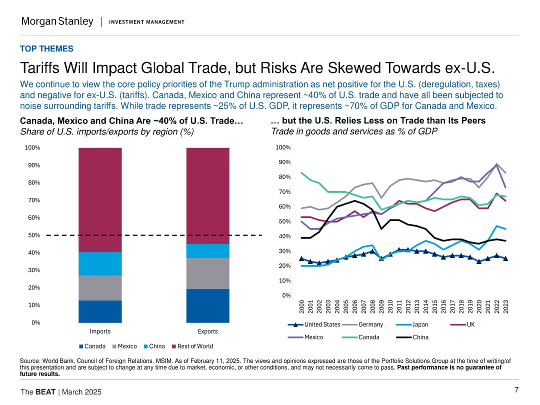
Split layout: bar chart on the left (share of U.S. trade by region), line chart on the right (trade as % of GDP by country). Clean, structured design.
Market Analysis and Trends
Government & Public Sector
Highlights the concentration of U.S. trade with Canada, Mexico, and China, and compares trade dependence globally. It underscores the Trump administration's trade policies, noting greater risk to ex-U.S. economies than to the U.S. itself.
tariffs, global trade, U.S., Canada, China, Mexico, imports, exports, GDP, policy risk
Multiple Chart
Morgan Stanley
Saved
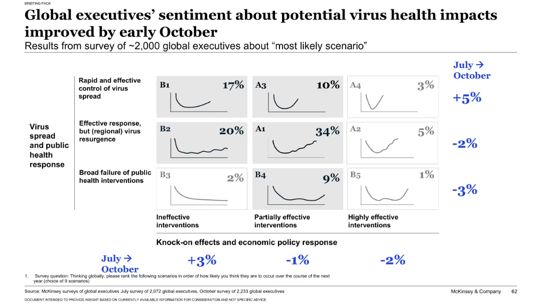
Matrix chart similar to slide 17431, displaying October survey results of ~2,000 executives across nine virus/economic scenarios. Percentages indicate perceived likelihood. Delta from July shown in blue on the right.
Strategic Planning
Professional Services
Presents October sentiment from executives on the most likely virus and economic response scenarios. Scenario A1 (recurring virus, partial economic intervention) is seen as most likely (34%). Compares shifts in opinion from July to October.
executive opinion, survey results, scenario analysis, virus impact, economic intervention, business outlook, trend shift, October update, strategic expectations
Single Chart
McKinsey
Saved
Donut chart displaying 78% registration with the Office of the Information and Data Protection Commissioner.
Regulatory and Compliance
Professional Services
Assists in understanding compliance levels with data protection standards, crucial for regulatory and compliance discussions.
compliance, data protection, registration, standards, evaluation
Single Chart
PwC/Strategy&
Saved
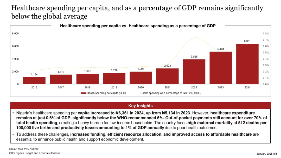
Bar chart showing healthcare spending per capita (2016–2024) and line chart overlay of GDP percentage. Red insights section below.
Regulatory and Compliance
Healthcare & Pharmaceuticals
This slide reveals Nigeria's underfunded healthcare system, with per capita spending far below WHO guidelines and just 0.6% of GDP. It points to critical issues such as maternal mortality and high out-of-pocket costs, calling for urgent funding increases.
healthcare spending, GDP, Nigeria, maternal mortality, public health, WHO standards, funding gap
Mixed Chart
PwC/Strategy&
Saved
Three-column layout with icons and callout text in white on a dark background. Focused action points on AI strategy, data standardization, and technology pilots.
Strategic Planning
Professional Services
Encourages firms to act by developing AI-based strategies, standardizing data, and testing technologies before scaling. Practical advice is visualized clearly for quick interpretation.
AI strategy, data, standardization, pilots, transformation, M&A
Linear Flow
Accenture
Saved
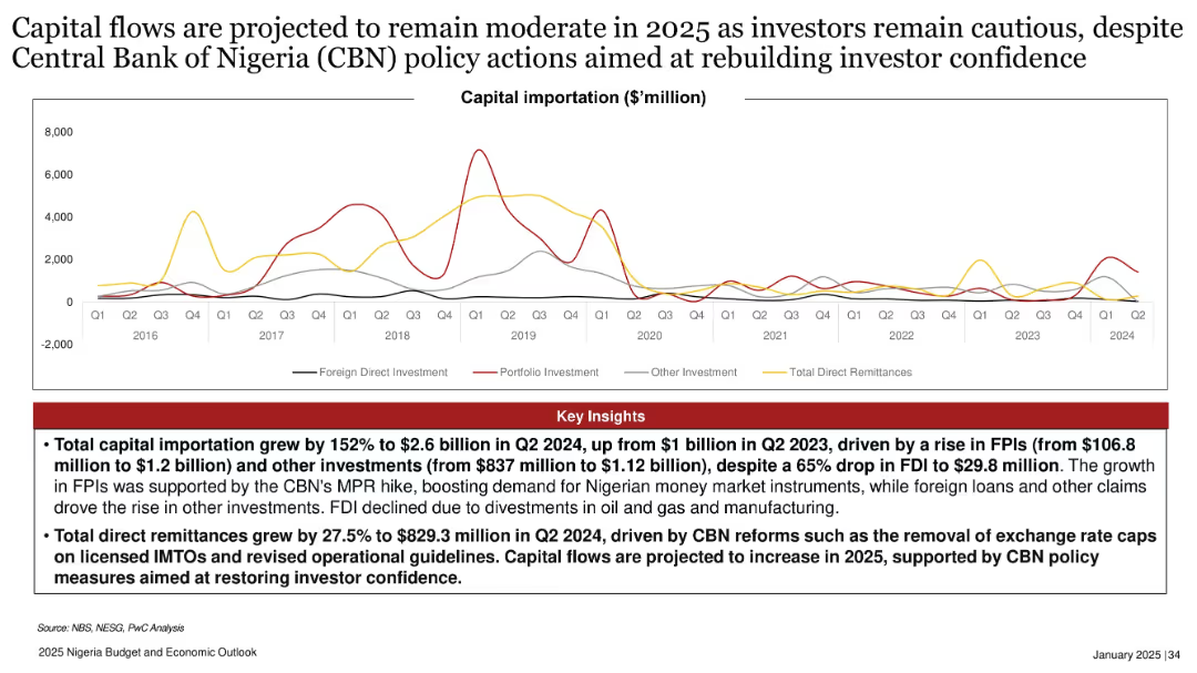
Multi-line chart tracking different types of capital importation; red insights box below; spans from 2016–2024.
Investment Analysis
Financial Services
Capital importation rose sharply in 2024 driven by FPIs and policy reforms, but FDI dropped significantly. The slide forecasts cautious capital flow in 2025, supported by CBN reforms and increased remittances amid efforts to rebuild investor confidence.
capital importation, FPI, FDI, CBN reforms, investor confidence, Nigeria, 2025, policy action, remittances, investment
Mixed Chart
PwC/Strategy&
Saved
The slide portrays two line graphs, one depicting the mean and the other the median of central bank balance sheets relative to GDP, spanning over a century. The graphs show an increasing trend, particularly in recent years. The title, subtitle, and quote from the US Federal Reserve are also present.
Regulatory and Compliance
Financial Services
The slide examines central bank balance sheet trends and discusses the innovations in quantitative easing (QE) and Flexible Average Inflation Targeting (FAIT). It can serve to explain modern monetary policy tools and strategies, especially in response to economic crises.
Central Banks, Balance Sheets, GDP, Quantitative Easing, Inflation Targeting, Monetary Policy, Trends
Single Chart
JP Morgan
Saved
The slide features a scatter plot with annotations for various transportation authorities like MTA, WMATA, etc., showing trends in annual ridership versus year-over-year growth rates, using different colored circles to represent each entity.
Market Analysis and Trends
Transportation & Logistics
This slide analyzes trends in bus ridership across different systems, comparing annual ridership rates and growth, highlighting how entities like MTA and others are performing. Useful for assessing transportation trends and planning.
transit, ridership, trends, comparison, analysis, bus, MTA, growth, decline
Single Chart
BCG
Saved
The slide features a column chart displaying the expected price range for new EVs among prospects. It shows cumulative percentages for different price points, with regional comparisons indicated by colored bars for EMEA, APAC, and North America.
Market Analysis and Trends
Transportation & Logistics
This slide presents the expected price range for new EVs among prospects, highlighting that 50-60% expect to pay between 20-40k€. It includes regional comparisons to show variations in price expectations across different markets.
EV price range, column chart, price expectations, regional comparison
Single Chart
PwC/Strategy&
Saved
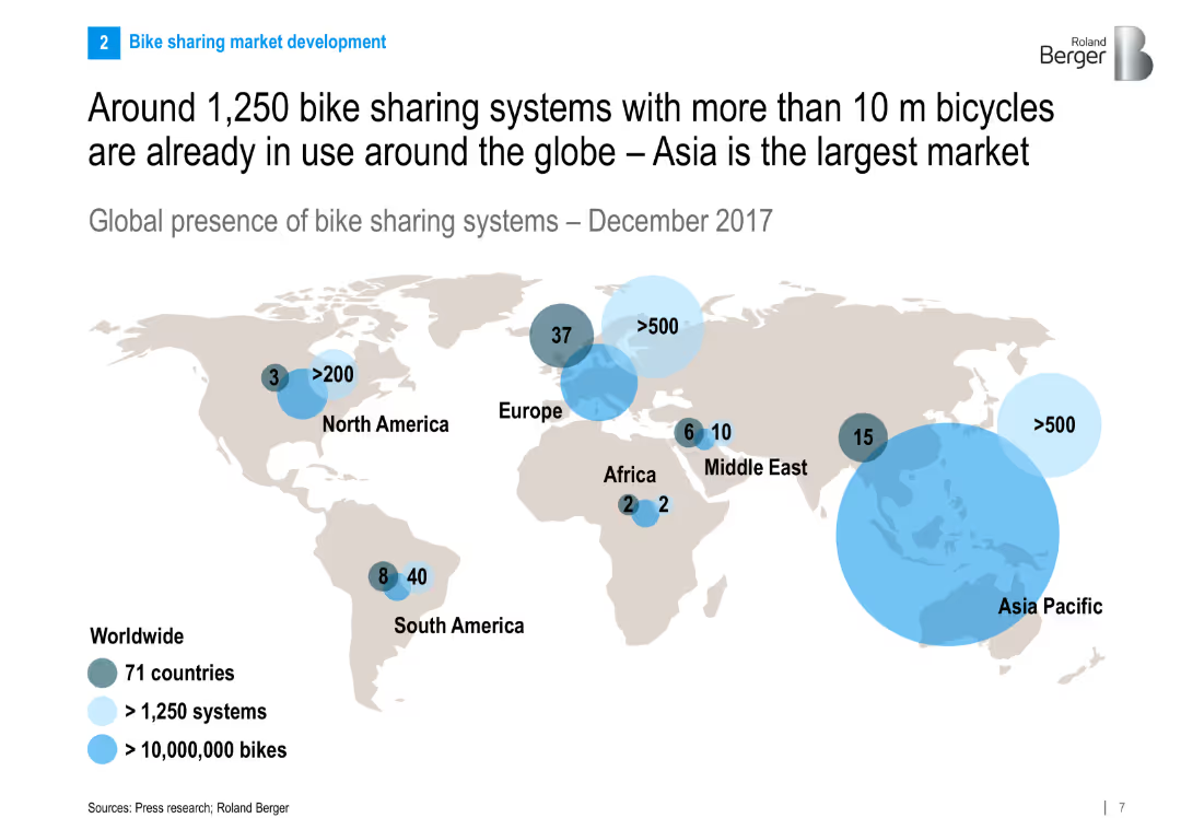
World map showing global presence of bike sharing systems with bubble markers for number of systems and bikes per region. Clean and global infographic design.
Market Analysis and Trends
Transportation & Logistics
The slide presents a global snapshot of bike sharing systems, highlighting Asia Pacific as the largest market. It shows the number of systems and bikes by region, indicating the global spread and significance of the industry.
bike sharing, global distribution, Asia Pacific, market size, transportation, infographic, global trends, 2017
Multiple Chart
Roland Berger
Saved
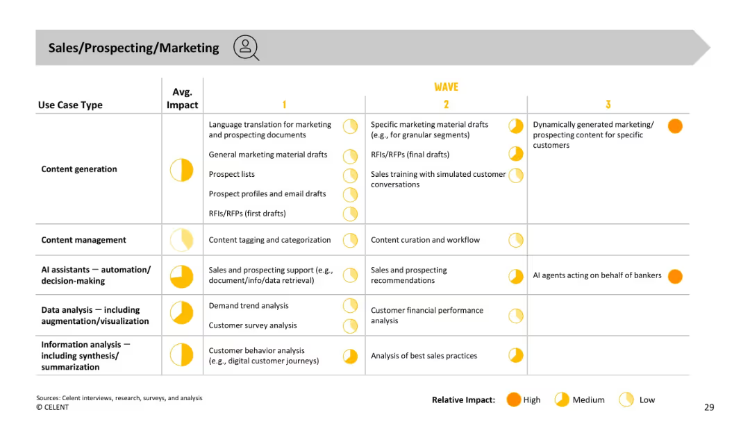
Similar format to previous slide. Use cases listed by type and impact, across three waves. Focus on prospecting materials, sales documents, and AI support.
Sales and Business Development
Financial Services
Outlines AI applications in sales and marketing—from early content generation and support tools to future-state autonomous agents generating hyper-personalized content and acting on behalf of bankers. Emphasizes high-impact opportunities in customer engagement and prospect outreach.
sales, marketing, prospecting, content, AI agent, automation, personalization
Single Chart
Oliver Wyman
Saved
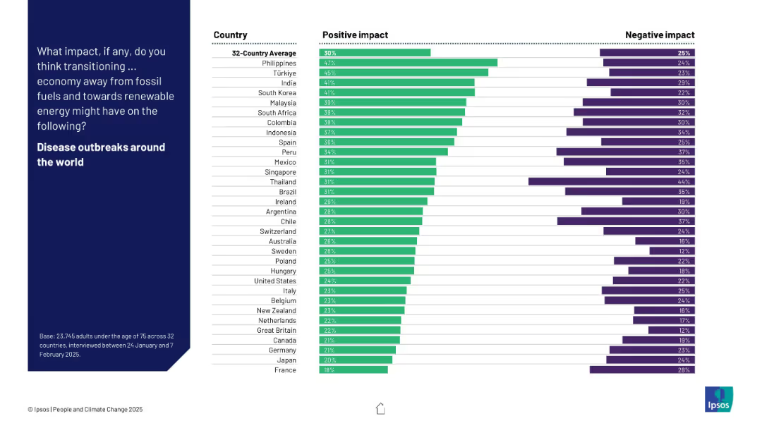
Horizontal bar chart showing positive vs. negative perceptions by country about how energy transition affects disease outbreaks globally.
Technology and Digital Transformation
Environmental Services & Sustainability
The slide visualizes global perceptions of how the transition from fossil fuels might influence disease outbreaks. The Philippines, Türkiye, and India are most optimistic. However, most countries show a lower degree of confidence on this metric.
disease outbreaks, health, perception, renewables, energy shift, bar chart, survey, Ipsos
Mixed Chart
IPSOS
Saved
This visually complex slide combines pie charts, bar charts, and icons to convey growth and strategic focus areas. It displays a market trend pie chart, a bar chart illustrating segment share over time, and four iconographic sections highlighting strategies. The design includes a blue and yellow color scheme, consistent with the company's branding. There is a mix of large text for headlines and smaller text for details.
Strategic Planning
Transportation & Logistics
The slide demonstrates strategic planning for market leadership in tire segments, focusing on growth and the introduction of a new product. It emphasizes the importance of specific market segments and geographical strategies for the company.
leadership, market segments, growth, strategy, tire, product launch, geographical focus, planning, market trends
Multiple Chart
Morgan Stanley
Saved
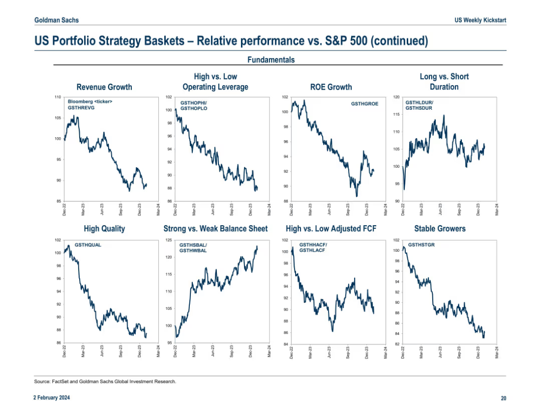
Continuation of the previous slide, featuring strategy baskets by fundamentals (e.g., ROE Growth, High Quality) and balance sheet quality. Layout mirrors Slide 17978 with 9 line charts labeled with Bloomberg tickers.
Investment Analysis
Financial Services
This slide adds depth by comparing strategy baskets on fundamentals such as ROE Growth, Balance Sheet Strength, and Operating Leverage. It helps identify which quality or growth factors outperform in current market conditions. For instance, baskets like Strong Balance Sheet show upward trends, suggesting investor preference for financially sound companies.
ROE growth, fundamentals, balance sheet, stable growers, operating leverage, FCF, S&P 500 comparison, quality investing
Multiple Chart
Goldman Sachs
Saved
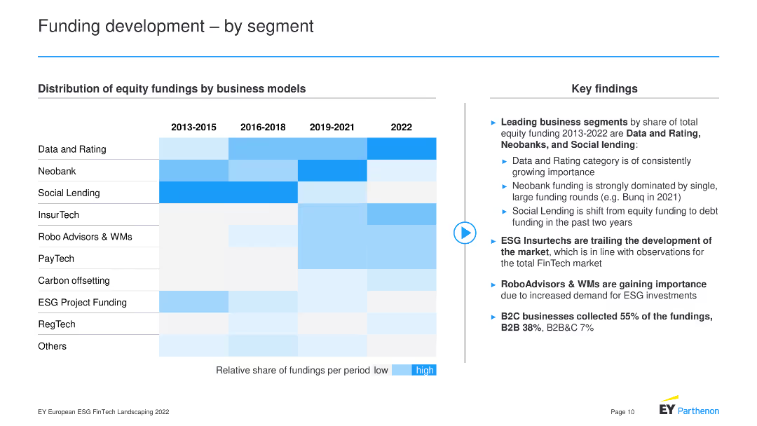
A heatmap chart displaying distribution of equity fundings by business models over different periods.
Market Analysis and Trends
Financial Services
The slide illustrates the distribution of equity fundings across various business models from 2013 to 2022, noting leading segments like Data and Rating, Neobank, and Social Lending, with insights into the growth trends and shifts in ESG investments, RoboAdvisors, and B2C business funding.
Business Models, Equity Funding, Segments, Trends
Header Horizontal
EY
Saved
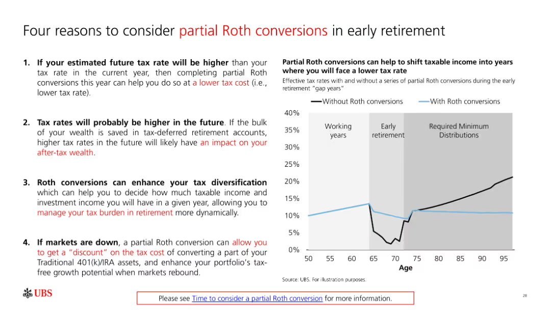
A slide with bullet points and a graph explaining reasons to consider partial Roth conversions in early retirement. The graph compares tax rates with and without conversions.
Financial Performance
Financial Services
The slide discusses the benefits of partial Roth conversions for tax management in retirement, supported by a graph illustrating the impact on tax rates.
Roth conversion, tax planning, retirement strategy, financial management, tax diversification
Mixed Chart
UBS
Saved
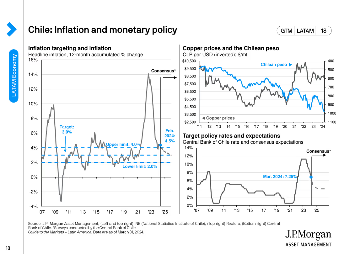
The slide includes three charts: a line chart for inflation targeting, another for copper prices vs. the Chilean peso, and a chart for target policy rates.
Regulatory and Compliance
Financial Services
This slide examines Chile's inflation and monetary policy, emphasizing inflation targeting, copper prices, and target policy rates as of February 2024.
Chile, inflation, monetary policy, copper prices, policy rates
Multiple Chart
JP Morgan
Saved
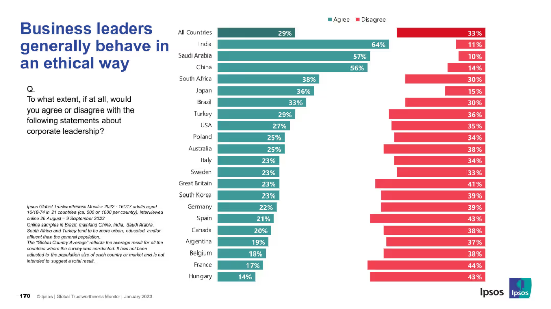
Familiar bar chart layout with agree/disagree metrics; countries displayed along the vertical axis; standard visual structure and color-coding.
Risk Assessment and Management
Professional Services
This slide examines global trust in business leaders’ ethics. India stands out positively while Western countries show skepticism, revealing a divide in corporate reputation and ethical perceptions.
ethics, corporate behavior, trust, leadership perception, global disparity, Ipsos, morality
Mixed Chart
IPSOS
Saved
Features a column chart comparing the economic impact of tourism in Europe's top countries versus the rest of Europe.
Financial Performance
Hospitality & Tourism
Provides a financial analysis of tourism's economic impact in Europe, focusing on the contribution of key countries.
European tourism, Economic impact, Financial analysis, Germany, Spain, UK, Italy, France
Multiple Chart
Bain
Saved
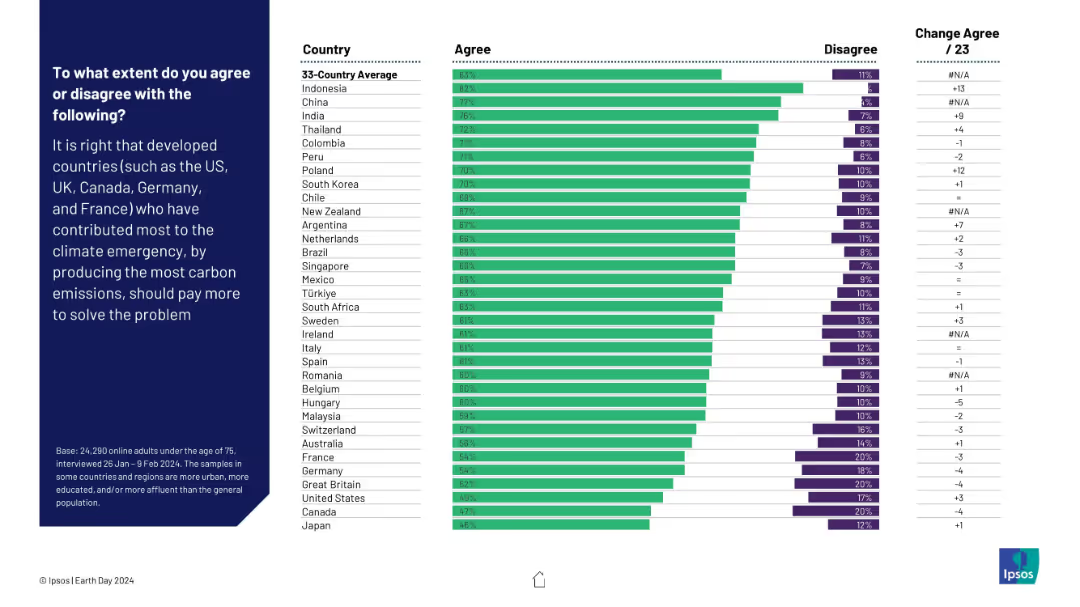
Horizontal bar chart showing agreement/disagreement by country on whether developed countries should pay more due to higher carbon contributions. Change from 2023 is noted.
Regulatory and Compliance
Environmental Services & Sustainability
This slide reflects opinions on climate justice—whether developed nations should pay more for their historic carbon emissions. Strong support is evident in Indonesia, China, and India. The data shows a global push for equitable climate responsibility distribution.
climate justice, carbon emissions, responsibility, financial contribution, global fairness, sustainability, Ipsos, Earth Day
Mixed Chart
IPSOS
Saved
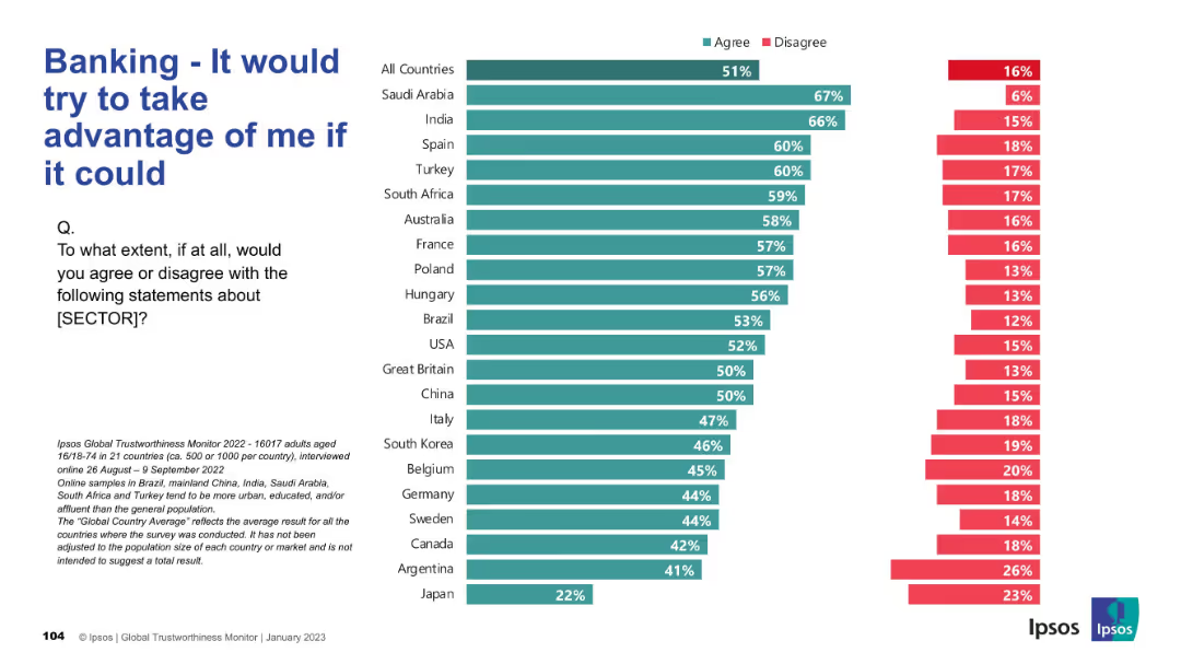
Same visual layout. High agreement values are colored green, indicating agreement with a negative statement.
Risk Assessment and Management
Financial Services
Illustrates the public’s skepticism and fear of exploitation by banks. Over half of respondents globally agree with this distrustful sentiment, showing significant reputational challenges for the industry in many regions.
exploitation risk, distrust, banking, Ipsos, customer sentiment, fear, finance
Mixed Chart
IPSOS
Saved
The slide provides a straightforward layout with a column of text on the left and a corresponding column with icons and examples of impacts on the right. It utilizes images to represent different industries, which complements the textual information provided and allows for quick visual association.
Industry Overview
Technology & Software
Addressing the cross-industry impact of quantum technologies, this slide outlines specific applications in fields ranging from IT to pharmaceuticals. The slide's structured format aids in communicating the broad relevance of quantum innovations and their transformative potential, making it useful for a diverse business audience.
Quantum Technologies, Industries, IT, Pharmaceuticals, Impact
Header Vertical
McKinsey
Saved
Previous
Next
If nothing, comes up, please save your slides first
Create a FREE account to continue browsing
Receive Instant Access to 1,000+ slides from companies like McKinsey, Google, and Goldman Sachs
First Name
Last Name
Email
Password
I agree to all
Terms & Privacy Policy
Thank you! Your submission has been received!
Oops! Something went wrong while submitting the form.
Have an account?
Sign in
Column Chart
Heatmap
Chevron
Org Chart
Infographic
Callouts
Timeline
List
Graphic
Picture
Process Flow
Diagram
Paragraph
Map
Table
Framework
Subtitle
Takeaway Box
Icon
Other Chart
Radar Chart
Waterfall Chart
Mekko Chart
Pie Chart
Scatter Plot
Line Chart
Bar chart
Bullet points