Create a FREE Account
Instant access to 1,000+ real slides from top companies like McKinsey, BCG, Goldman Sachs, Google and many more!
First Name
Last Name
Email
Password
I agree to all
Terms & Privacy Policy
Thank you! Your submission has been received!
Oops! Something went wrong while submitting the form.
Have an account?
Sign in
Library
Templates
Courses
Pricing
My Account
My Slides
My Templates
✦ AI
AI Prompt Library
AI Search
Sign in
Start Here
Logout
My Saved Slides
This slide presents a scatter plot and column chart comparing rail freight costs across different distances and states within Australia, focusing on Western Australia's lower costs.
Market Analysis and Trends
Transportation & Logistics
The slide analyzes rail freight costs in Australia, noting that Western Australia's network is the cheapest due to higher throughput capacity and shorter turnaround times, with detailed comparative data.
Rail freight, Australia, cost analysis, transportation, logistics, Western Australia, cost comparison, market trends
Multiple Chart
LEK
Saved
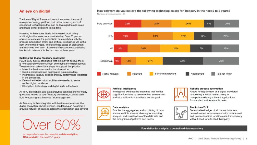
Column chart showing relevance of technologies like data analytics, RPA, AI, and blockchain for treasury in the next 2-3 years, with detailed descriptions for each technology.
Technology and Digital Transformation
Financial Services
The slide discusses the potential impact of various digital technologies on treasury operations, emphasizing the importance of data analytics, RPA, and AI over the next few years.
Digital technology, treasury, data analytics, RPA, AI
Mixed Chart
PwC/Strategy&
Saved
Horizontal bar chart ranking country agreement levels on immigration's job impact; includes 2016–2023 trend data on the right
Market Analysis and Trends
Government & Public Sector
This slide presents global sentiment toward the belief that immigrants take jobs from native citizens. The global average agreement is 42%, with highest levels in India, Türkiye, and Malaysia. Trends from 2016 to 2023 are included.
immigration, labor market, native workers, job displacement, public opinion, sentiment, Ipsos, employment, nationalism
Mixed Chart
IPSOS
Saved
The slide contrasts manual vs. automated development techniques. It features text on both sides with a central image of a human and a robot shaking hands, symbolizing the collaboration between humans and AI. The design is straightforward, focusing on the comparison.
Technology and Digital Transformation
Technology & Software
The content compares traditional and modern software development practices, emphasizing the efficiency of automated, AI-driven approaches. It's likely designed for audiences considering the transition to more advanced development workflows, illustrating the shift from manual to automated processes in the tech industry.
Automation, AI, Development, Efficiency, Technology, Transformation, Software
Boxed
McKinsey
Saved
Stacked horizontal bars showing agree/disagree by country; historical trend data for prior years; title on left side in blue box.
Regulatory and Compliance
Government & Public Sector
Assesses global public sentiment regarding whether governments have a clear, collaborative climate action plan. Most countries show low agreement, indicating skepticism about coordinated governmental planning.
climate policy, government planning, public opinion, regulation, environmental strategy, Ipsos, citizen trust, multi-year data
Mixed Chart
IPSOS
Saved
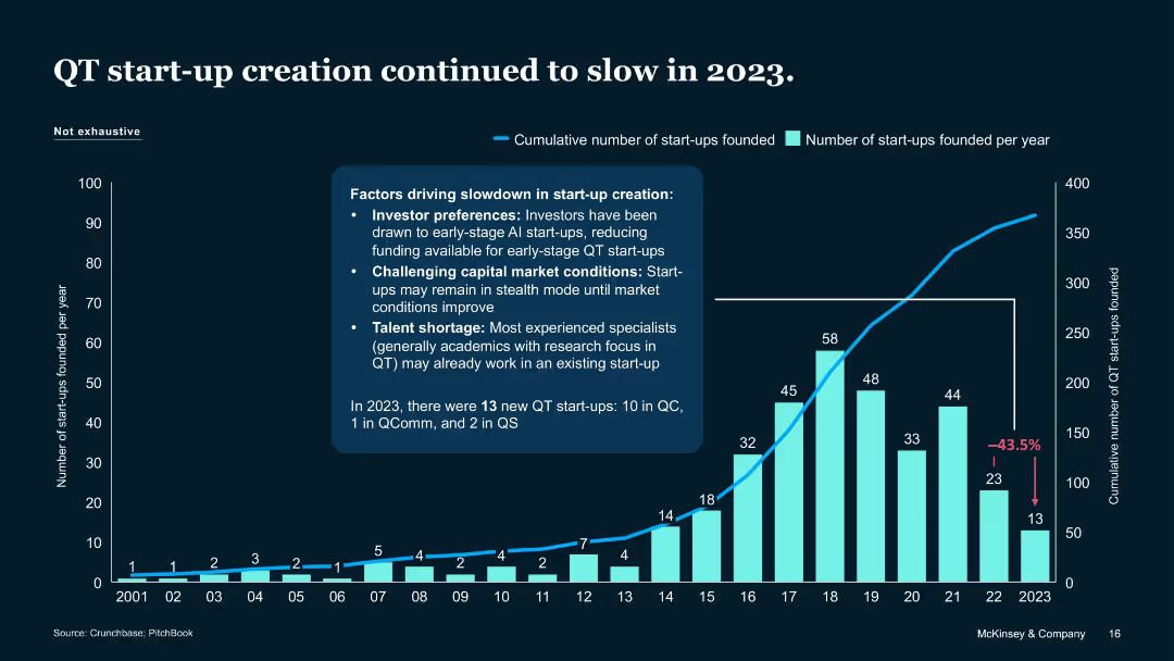
Column and line chart with annotation and bullet-pointed factors
Market Analysis and Trends
Artificial Intelligence
Reports a 43.5% drop in QT start-up formation in 2023. Attributes slowdown to investor preference for Gen AI, tough market conditions, and talent scarcity. Indicates only 13 QT start-ups were founded in 2023.
Start-up creation, QT trends, slowdown factors, 2023, Crunchbase
Mixed Chart
McKinsey
Saved
The slide presents a side-by-side comparison of digital spending across various sectors, represented through colored horizontal bars, contrasting online spenders among internet users in India, China, and the US.
Market Analysis and Trends
Financial Services
It compares the percentage of internet users engaging in digital spending across different sectors such as e-commerce, travel & hotel, and financial services in three countries, highlighting the evolution of digital consumer behavior.
Digital spending, internet users, e-commerce, travel, financial services
Single Chart
BCG
Saved
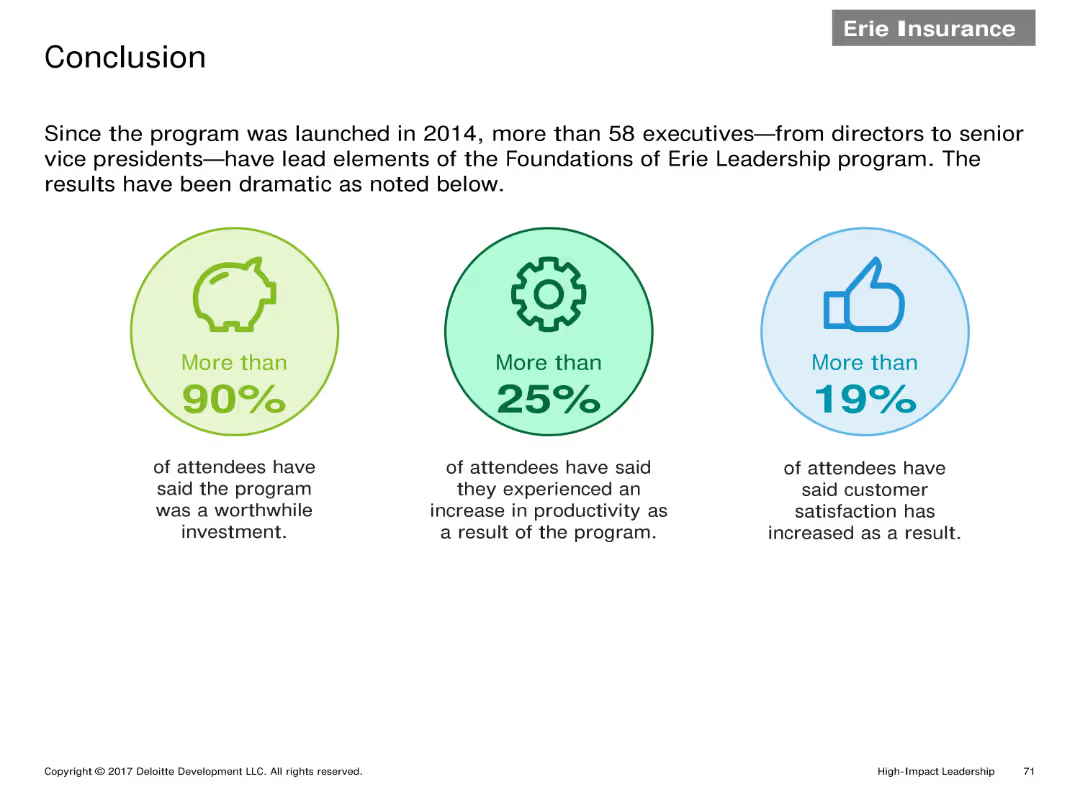
Three infographic elements highlighting key statistics: More than 90% found the program worthwhile, More than 25% saw productivity increase, More than 19% saw customer satisfaction improvement.
Client Case Studies
Financial Services
Summarizes the impact of the Erie Leadership program with key statistics showing high satisfaction rates, increased productivity, and improved customer satisfaction among participants.
Conclusion, statistics, leadership program, satisfaction, productivity
Pillar
Deloitte
Saved
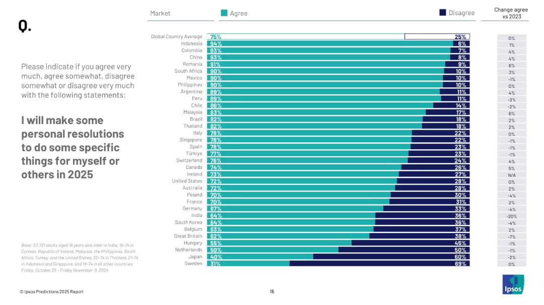
Ranked bar chart of country responses; shows % agree, % disagree, and change from 2023.
Human Resources and Talent Management
Professional Services
The slide highlights intent to make personal resolutions in 2025, with countries like Indonesia (94%) and Colombia (93%) showing strong agreement. Global average is 75%. Sweden ranks lowest at 31%, reflecting wide cultural differences in resolution-setting.
personal goals, behavior change, public resolution, 2025 plans, Ipsos survey, global comparison
Mixed Chart
IPSOS
Saved
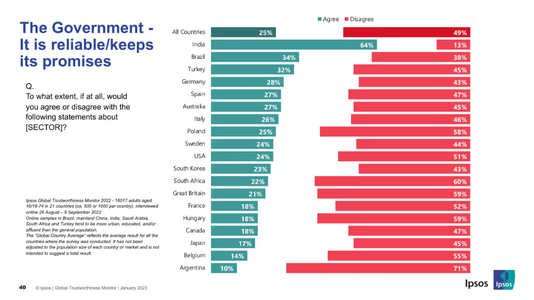
Country-wise bar chart showing perceptions of government reliability
Risk Assessment and Management
Government & Public Sector
The slide assesses public confidence in governments keeping promises. India stands out in agreement; most countries show high levels of skepticism.
promises, reliability, trust, governance, survey, Ipsos, international, skepticism, expectations
Mixed Chart
IPSOS
Saved
Title slide announcing the BCG Investor Perspectives Series with a backdrop of an architectural image.
Market Analysis and Trends
Financial Services
Introduces a report focusing on investor perspectives, indicating it's a regular series of publications by BCG.
investors, perspectives, pulse check, BCG, economy, stock market
Title
BCG
Saved
The slide showcases three column charts displaying net profit contribution, BFS deposits, and loan and lease portfolio amounts over time. The visual layout is well-structured with a timeline and financial metrics clearly labeled.
Financial Performance
Financial Services
Displaying the firm's financial performance metrics, this slide provides a historical trend analysis of net profit contributions, BFS deposits, and Australian loan and lease portfolios. The time-sequenced data enables a snapshot comparison of performance across key financial areas.
net profit, BFS deposits, loan, lease, portfolio, financial services, trend analysis
Multiple Chart
Morgan Stanley
Saved
This slide has two parts: the upper part features a bar graph comparing governance effectiveness between Australia, the US, China, and the EU; the lower part includes two maps highlighting Australia's free trade agreements in North and South America and the Asia-Pacific region. The maps are colored in purple to denote countries with active trade agreements. Annotations provide additional context on the importance of these agreements.
Competitive Landscape
Energy & Utilities
Explains Australia's strong governance and the strategic benefit of its widespread free trade agreements, positioning Australia as a reliable partner for diversifying supply chains internationally.
governance, trade agreements, reliability, export markets, Australia, diversification, Asia-Pacific, North America, free trade, global strategy
Mixed Chart
Accenture
Saved
Two line charts showing U.S. unemployment rate vs. Atlanta Fed wage growth and EU unemployment vs. compensation growth.
Market Analysis and Trends
Financial Services
This slide evaluates the labor market trends in the U.S. and EU, highlighting signs of normalization in the U.S. and decline in EU wages compared to the U.S.
Labor Markets, Unemployment, Wage Growth, U.S., EU, Comparison
Multiple Chart
Morgan Stanley
Saved
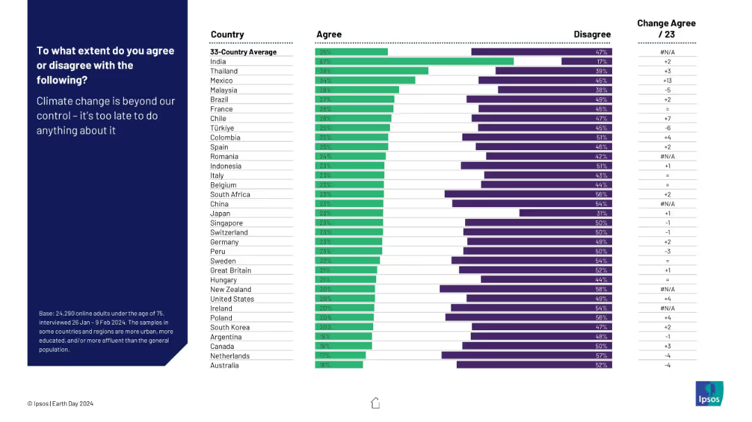
Horizontal bar chart of agreement by country on climate fatalism. Standard chart layout with bars, ranks, and text left-aligned.
Risk Assessment and Management
Environmental Services & Sustainability
This slide shows the level of climate fatalism—whether people think it's too late to stop climate change. Country responses range from resignation to optimism.
climate fatalism, urgency, climate control, belief systems, Ipsos, pessimism, public attitude
Mixed Chart
IPSOS
Saved
The slide shows a column chart illustrating operating expenses progression in USD mn from 3Q16 to 2019 targets, with simple color coding.
Operational Efficiency
Financial Services
The slide highlights the track to reduce quarterly expenses to approximately USD 110 mn by 4Q19, showing the ambition levels for 2018 and 2019.
operating expenses, cost reduction, expense progression, financial targets, operational efficiency
Single Chart
Credit Suisse
Saved
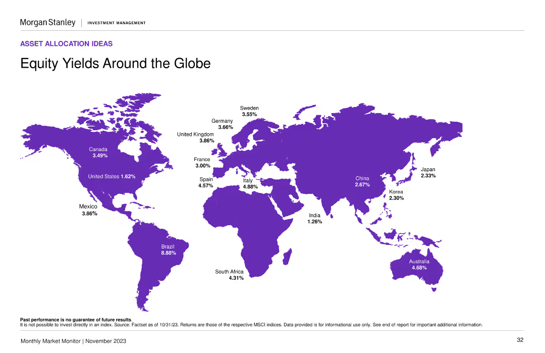
A world map displaying various countries highlighted in purple, with equity yield percentages annotated next to each country. The layout is clean with a central focus on the map.
Market Analysis and Trends
Financial Services
This slide provides a comparison of equity yields across different countries, showing investors where they might find the highest yields. Useful for global market analysis and investment decisions.
equity yields, global market, investment, countries, percentages
Graphic
Morgan Stanley
Saved
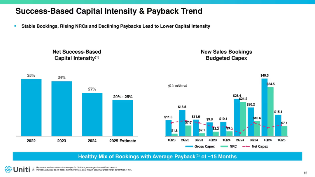
Dual chart layout with capital intensity bar chart (left) and capex trend line/bar chart (right). Accompanied by notes and metrics. Uses blue bars and magenta lines.
Corporate Finance and Valuation
Telecommunications
Tracks declining capital intensity and improving payback period (~15 months) across 2023–2025. Provides insight into Uniti’s booking strategy, NRC growth, and efficient capital deployment for infrastructure expansion.
capex, bookings, ROI, capital intensity, Uniti, fiber infrastructure
Multiple Chart
Goldman Sachs
Saved
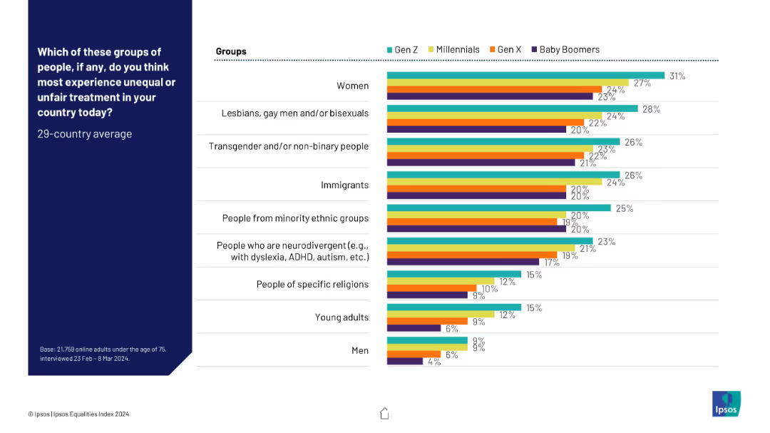
Multi-colored bar chart comparing generational views (Gen Z, Millennials, Gen X, Boomers); horizontal alignment by group type.
Risk Assessment and Management
Government & Public Sector
Generational views on who suffers the most inequality are compared here. Gen Z consistently rates higher concern for several minority groups, while Baby Boomers rate them lower across the board.
generational attitudes, inequality perception, discrimination awareness, Ipsos, group disparities
Mixed Chart
IPSOS
Saved
Three sections comparing historical growth, IRA impact, and forecast growth for solar energy
Market Analysis and Trends
Energy & Utilities
Analyzes the growth of solar energy despite challenges in 2022, emphasizing the impact of the IRA and future forecast
solar energy, growth, IRA, historical dynamics, forecast
Multiple Chart
LEK
Saved
Two line charts: one showing Euro area central bank interest rate from 2021 to 2025F and one showing US central bank interest rate for the same period, with historical data, market expectations, and forecasts.
Market Analysis and Trends
Financial Services
This slide discusses how easing inflation and slowing economic momentum will push central banks to recalibrate policies, with gradual rate cuts expected instead of rapid reductions.
interest rates, central banks, inflation, economic momentum, rate cuts, forecast
Multiple Chart
EY
Saved
Two column charts presenting RWA movements for different time frames.
Risk Assessment and Management
Financial Services
Provides a breakdown of risk-weighted assets movements and contributing factors.
RWA, risk management, financial metrics, assets, policy changes
Multiple Chart
Barclays
Saved
This slide features a prominent title, a column chart on the left comparing FICC and Equities revenues from 2017 and 2021, and a list of focus areas for discussions on the right. It uses blue as the primary color for charts and bullet points, with a clean, professional layout.
Financial Performance
Financial Services
The slide communicates the maintenance of a leading position in the Markets franchise by JPMorgan Chase, with comparative revenue data from 2017 and 2021 and strategic focus areas. It could be used in financial performance reviews or strategic meetings to discuss key business areas and strategies for growth and customer relationship management.
Markets, Revenue, FICC, Equities, Leadership, Strategy, Growth, Performance, Clients, Trading
Mixed Chart
JP Morgan
Saved
Slide features a large column chart comparing annual sales losses from various sources of market fire, and a pie chart illustrating percentage of total sales lost from fires.
Market Analysis and Trends
Energy & Utilities
This slide presents data on the financial impact of generator-linked fires on MSMEs in markets, highlighting significant sales losses which account for approximately 1% of gross sales annually.
MSMEs, generator, fire, sales, loss
Mixed Chart
BCG
Saved
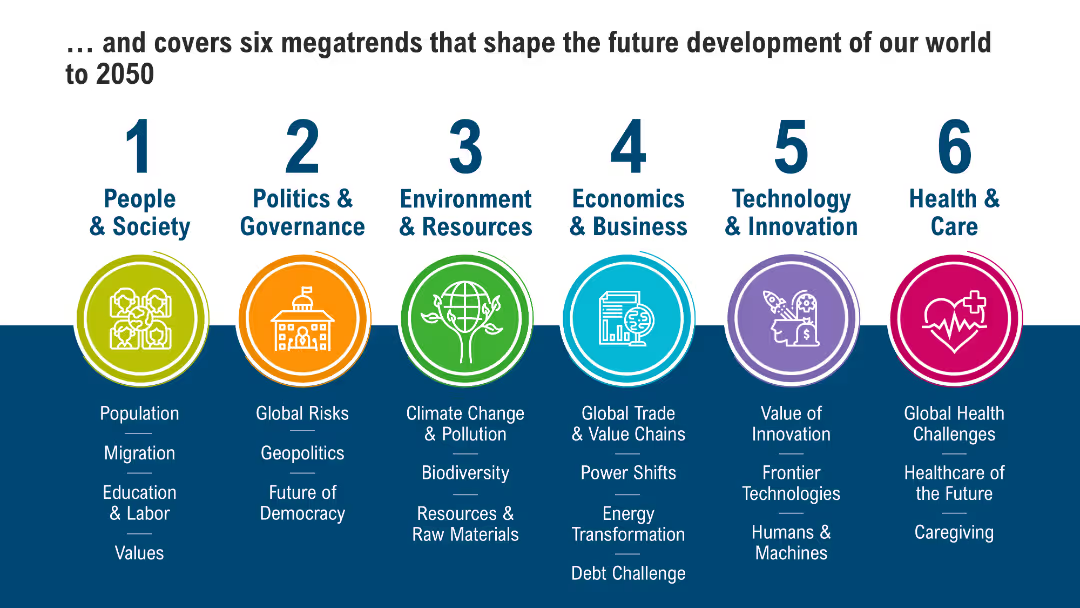
Infographic-style layout with icons and color-coded sections representing six global megatrends (People, Politics, Environment, Business, Tech, Health)
Strategic Planning
Professional Services
This slide presents six global megatrends projected to shape societal and economic development through 2050, spanning demographics, governance, climate, business, innovation, and healthcare. Each trend is categorized and visually represented.
Megatrends, Society, Environment, Governance, Innovation, Future, Global Trends, 2050
Pillar
Roland Berger
Saved
Previous
Next
If nothing, comes up, please save your slides first
Create a FREE account to continue browsing
Receive Instant Access to 1,000+ slides from companies like McKinsey, Google, and Goldman Sachs
First Name
Last Name
Email
Password
I agree to all
Terms & Privacy Policy
Thank you! Your submission has been received!
Oops! Something went wrong while submitting the form.
Have an account?
Sign in
Column Chart
Heatmap
Chevron
Org Chart
Infographic
Callouts
Timeline
List
Graphic
Picture
Process Flow
Diagram
Paragraph
Map
Table
Framework
Subtitle
Takeaway Box
Icon
Other Chart
Radar Chart
Waterfall Chart
Mekko Chart
Pie Chart
Scatter Plot
Line Chart
Bar chart
Bullet points