Create a FREE Account
Instant access to 1,000+ real slides from top companies like McKinsey, BCG, Goldman Sachs, Google and many more!
First Name
Last Name
Email
Password
I agree to all
Terms & Privacy Policy
Thank you! Your submission has been received!
Oops! Something went wrong while submitting the form.
Have an account?
Sign in
Library
Templates
Courses
Pricing
My Account
My Slides
My Templates
✦ AI
AI Prompt Library
AI Search
Sign in
Start Here
Logout
My Saved Slides
Line chart showing Japan's policy rate and yield curve control band. Another chart shows BOJ's holdings of government bonds and ETFs.
Market Analysis and Trends
Financial Services
Examines the Bank of Japan's monetary policy, highlighting the policy rate and bond holdings to understand its impact on the market.
Bank of Japan, monetary policy, yield curve, bonds, ETFs
Multiple Chart
JP Morgan
Saved
Displays column and line graphs comparing equities and FICC market share growth over time, with blue and dark tones.
Market Analysis and Trends
Financial Services
Exhibits the market share gains in Equities and FICC from 2017, showing progress and ranking improvements.
equities, FICC, market share growth, financial trends, rankings
Mixed Chart
JP Morgan
Saved
Features a column chart detailing Copernicus contributions to air quality monitoring and its economic impacts.
Market Analysis and Trends
Environmental Services & Sustainability
Discusses the benefits and economic impacts of using Copernicus for air quality monitoring across different regions and its significance for health and environment.
Copernicus, air quality, health, economic impact, environmental monitoring, data accuracy, public health
Mixed Chart
PwC/Strategy&
Saved
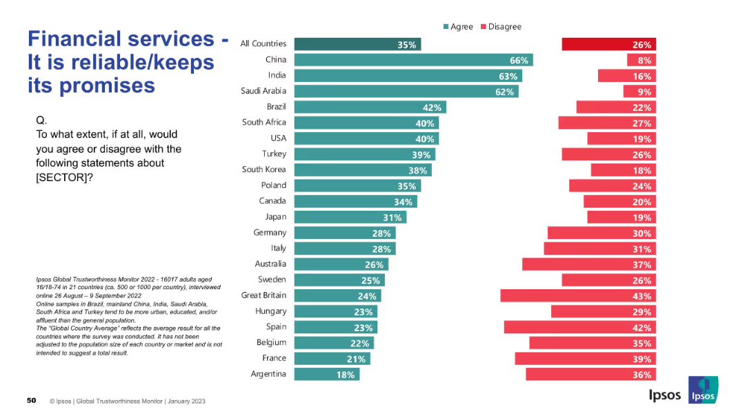
Bar chart format as with previous slides; left-aligned text and question; strong visual consistency
Strategic Planning
Financial Services
This slide assesses whether financial services are seen as reliable. China, India, and Saudi Arabia show high levels of agreement, while France, Argentina, and Belgium are among the least trusting. The global average is 35%.
reliability, promises, financial trust, countries, agreement, Ipsos, perception, strategic
Mixed Chart
IPSOS
Saved
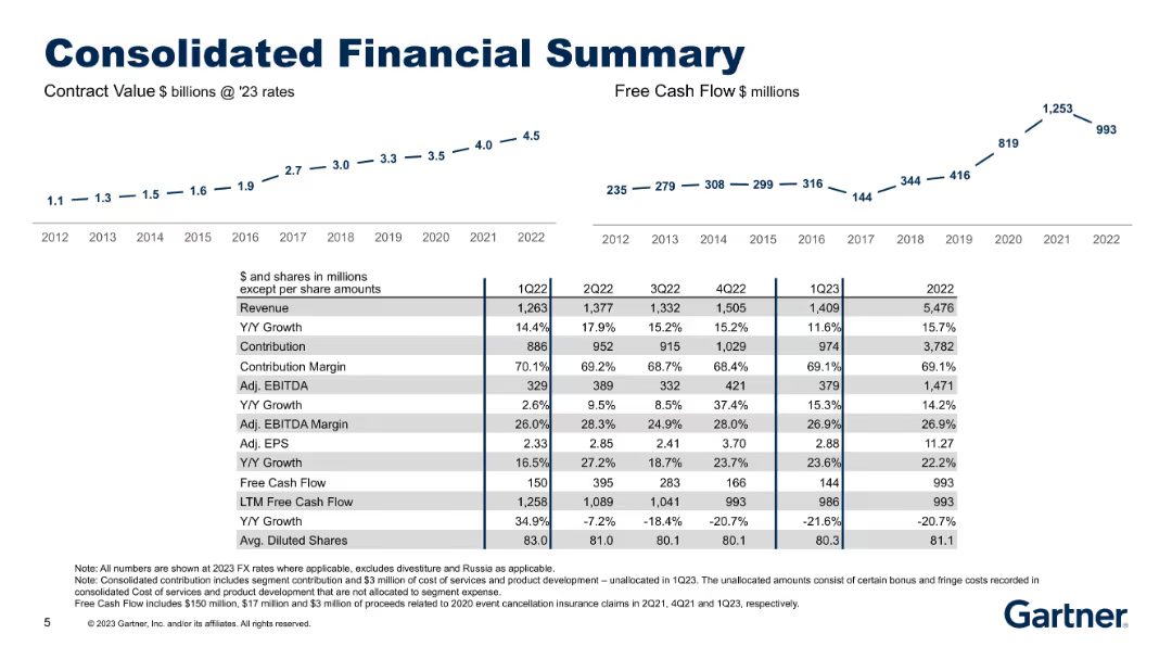
Dual time-series line charts (Contract Value, Free Cash Flow) with a comprehensive table summarizing revenue, EBITDA, EPS, and margins over several years.
Financial Performance
Technology & Software
Provides a historical view of the company’s consolidated financials from 2012–2022, including revenue, contribution, EBITDA, EPS, margins, and free cash flow. Useful for tracking long-term growth and financial health.
consolidated financials, historical trends, contract value, EBITDA, EPS
Multiple Chart
Gartner
Saved
Graphic slide showcasing the healthcare sector opportunity, including dedicated icons and statistics related to U.S. healthcare expenditure.
Market Analysis and Trends
Healthcare & Pharmaceuticals
Highlights the potential in the healthcare market, detailing JPMorgan Chase & Co.'s positioning and strategic focus.
Healthcare market, expenditure, U.S. GDP, banking strategy, JPMorgan Chase, financial services, market opportunity, client targeting
Linear Flow
JP Morgan
Saved
Line graph plotting agreement levels over years for five countries plus average; simple layout with legend.
Market Analysis and Trends
Government & Public Sector
The line graph visualizes the percentage of people agreeing that their society is "broken" over several years across selected countries. It tracks trends in Mexico, South Africa, U.S., UK, and global average from 2016 to 2023.
social trends, public dissatisfaction, political sentiment, Ipsos trend, global outlook, system broken, cross-country comparison
Mixed Chart
IPSOS
Saved
Slide includes column charts and segmented bar charts with revenue data across years.
Market Analysis and Trends
Media & Entertainment
Presents the forecasted growth of music, radio, and podcasts revenue in India, mentioning shifts in media consumption patterns.
music, radio, podcasts, India, revenue
Multiple Chart
PwC/Strategy&
Saved
Continues the format of the previous slide with added industries. The layout is consistent, featuring a list format with industry icons.
Market Analysis and Trends
Transportation & Logistics
Continues from the previous slide, discussing the secondary implications of mobility trends on various industries and the shifts in resource demands and value pools.
materials usage, electricity demand, solutions integration, claims portfolio, city infrastructure
Header Vertical
McKinsey
Saved
This slide includes text, a column chart depicting social media's impact on mental health, and bullet points summarizing key findings.
Risk Assessment and Management
Media & Entertainment
The slide discusses the mixed feelings Gen Zs and millennials have about social media's impact on their mental health, highlighting both positive and negative aspects.
social media, mental health, Gen Z, millennials, mixed impact, news consumption
Multiple Chart
Deloitte
Saved
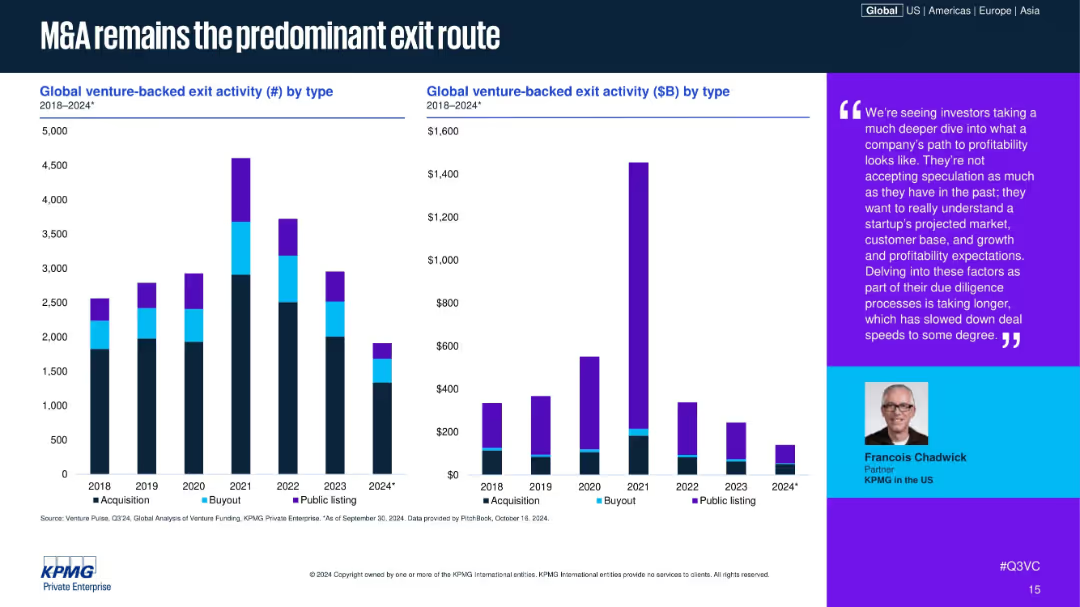
Bar charts showing exit activity by type (count & $ value), 2018–2024; color-coded by exit type (Acquisition, Buyout, Public); includes expert quote on right side.
Mergers and Acquisitions
Financial Services
The slide shows that M&A continues to be the dominant form of venture-backed exits, with public listings and buyouts significantly declining. An analyst quote underscores the increased scrutiny in due diligence, leading to slower deal speeds and more cautious exits.
M&A, venture exits, IPO, buyouts, exit strategy, acquisition trends, investor caution, startup exit, due diligence, Q3 2024
Multiple Chart
KPMG
Saved
Slide includes multiple column charts showing trends in net debt to EBITDA and fixed charge coverage ratios over several quarters. Colors differentiate consolidated from net recourse debt.
Financial Performance
Financial Services
Analyzes credit metrics, focusing on net debt to EBITDA ratios and fixed charge coverage to assess financial health and risk in financial services. Shows trends and financial strategies over time.
debt, financial health, EBITDA, risk assessment, credit metrics, financial services
Multiple Chart
Barclays
Saved
Three sections: a column chart on the use of economic incentives, a column chart on awareness sources, and satisfaction with incentive information.
Market Analysis and Trends
Transportation & Logistics
Explores the role of public incentives in EV purchases, sources of awareness about incentives, and satisfaction with the information provided.
public incentives, EV purchases, awareness sources, survey, satisfaction
Multiple Chart
PwC/Strategy&
Saved
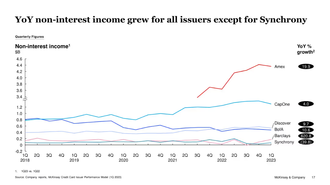
Multi-line graph of issuer-level non-interest income from 1Q18 to 1Q23. Amex stands out with significant growth. Synchrony declined. YoY % growth values listed on right.
Financial Performance
Financial Services
The slide shows YoY growth in non-interest income for most issuers, with Amex leading. Synchrony is the only issuer with a negative trend. The slide indicates strengthening of fee-based revenue for most firms, contributing to financial resilience.
Non-interest Income, Amex, Synchrony, Fee Revenue, Financial Trends, Credit Cards
Single Chart
McKinsey
Saved
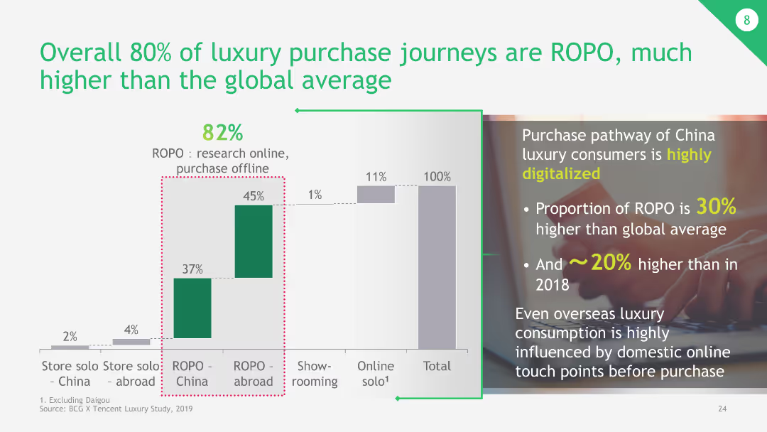
The slide has a column chart comparing different luxury purchase journeys, focusing on ROPO (Research Online, Purchase Offline) versus other purchasing behaviors.
Market Analysis and Trends
Retail & E-commerce
The slide highlights that 80% of luxury purchase journeys in China are ROPO, significantly higher than the global average. It emphasizes the impact of digital touchpoints in luxury purchase decisions.
luxury purchase, ROPO, digital touchpoints, China, global average
Mixed Chart
BCG
Saved
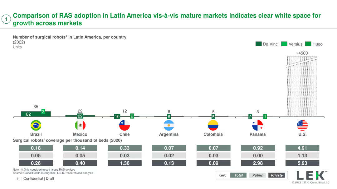
A column chart showing the number of surgical robots in various countries with coverage per thousand beds
Market Analysis and Trends
Healthcare & Pharmaceuticals
Compares the adoption of robotic-assisted surgery (RAS) systems in Latin America with mature markets, identifying growth opportunities
RAS adoption, market comparison, Latin America, growth, healthcare
Mixed Chart
LEK
Saved
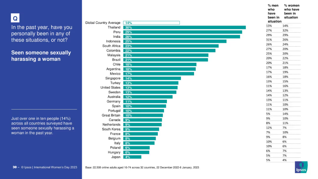
Country-wise bar chart on witnessing sexual harassment, with gender breakdown. Global average line included.
Risk Assessment and Management
Government & Public Sector
This slide presents global data on the percentage of people who witnessed sexual harassment of women in the past year. Thailand and Peru report the highest percentages, while Japan is lowest.
harassment, gender issues, observation statistics, global variance, witness data
Mixed Chart
IPSOS
Saved
Timeline diagram projecting the evolution of space activities up to geostationary orbit by 2050, with different activities categorized by their orbital distances.
Technology and Digital Transformation
Technology & Software
The slide outlines the projected growth in human space activities, categorizing them by orbital distances from Earth. It highlights the various commercial and scientific endeavors in space, emphasizing the potential for continuous growth and innovation in space exploration and utilization.
Space Activities, Orbital Distances, Growth
Mixed Chart
Roland Berger
Saved
An image with network visualizations complements the textual information which includes key metrics regarding the firm's global technological reach.
Technology and Digital Transformation
Technology & Software
This slide aims to illustrate the firm's expansive technological capabilities and global customer reach through significant figures.
global scale, technology, digital customers, data storage, network visualization, JPMorgan
Text Only
JP Morgan
Saved
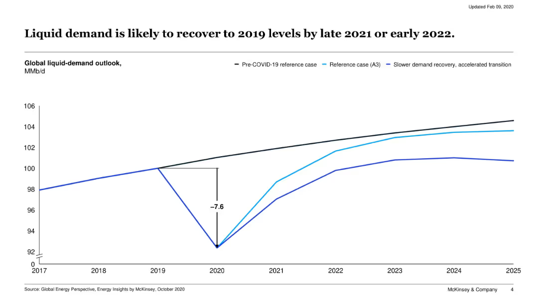
Line chart showing three global liquid-demand outlook scenarios from 2017 to 2025: pre-COVID, reference case, and accelerated transition.
Market Analysis and Trends
Energy & Utilities
This slide models the impact of COVID-19 on global liquid fuel demand, showing a sharp dip in 2020 followed by a recovery trajectory. It compares multiple scenarios including slower and faster transitions.
oil demand, COVID-19 impact, recovery, energy demand, liquid fuels, 2020, forecast
Single Chart
McKinsey
Saved
This slide features a table listing bond redemptions with details like ISIN, instrument, currency, notional amount, coupon rate, and maturity date.
Financial Performance
Financial Services
It details bond redemptions for the year to date, providing specific information on each redemption, including financial terms and figures.
bond redemptions, financial, ISIN, instrument, currency, notional amount, coupon rate, maturity date, UBS
Mixed Chart
UBS
Saved
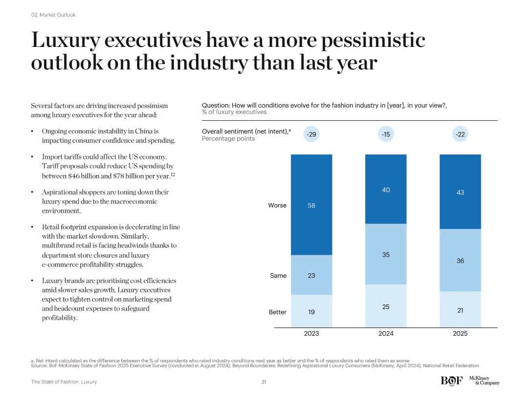
Bar chart showing net sentiment of luxury executives (better/same/worse) for 2023–2025. Accompanied by bullet points listing reasons for pessimism.
Strategic Planning
Consumer Goods
The slide illustrates declining optimism among luxury executives, with a majority expecting worse industry conditions in 2023–2025. Key concerns include macroeconomic headwinds, China’s instability, tariffs, and reduced spending from aspirational shoppers.
executive sentiment, pessimism, luxury outlook, 2024 forecast, tariffs, consumer behavior
Mixed Chart
McKinsey
Saved
The slide features two column charts comparing the number and proceeds of IPOs across various sectors for Q1 2023 and Q1 2022. Colors differentiate the years, with specific focus on technology and energy sectors.
Market Analysis and Trends
Financial Services
The slide presents a comparison of IPO activities across different sectors in Q1 2023 versus Q1 2022, highlighting the dominance of the energy sector in proceeds despite fewer deals.
IPOs, sectors, technology, energy, Q1 2023, column charts, market trends, financial services, comparison, proceeds
Multiple Chart
EY
Saved
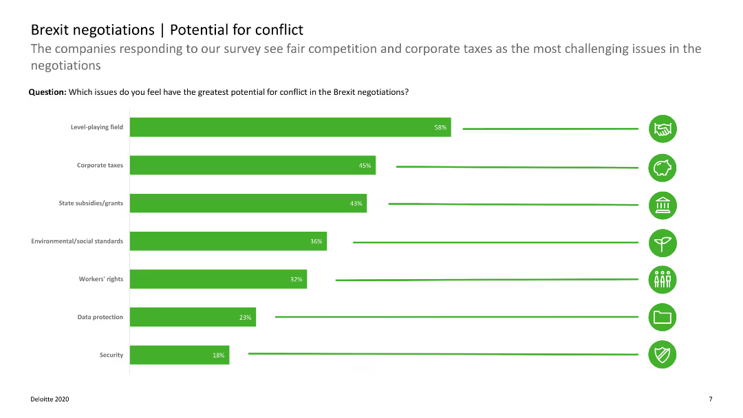
The slide includes horizontal bar charts showing potential conflict areas in Brexit negotiations, such as corporate taxes and state subsidies.
Regulatory and Compliance
Government & Public Sector
The slide outlines areas of potential conflict in Brexit negotiations, emphasizing issues like corporate taxes and fair competition. It aids in identifying key negotiation concerns.
Brexit, conflict, negotiations, corporate taxes, state subsidies
Single Chart
Deloitte
Saved
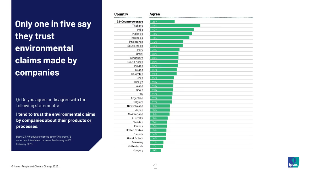
Horizontal bar chart with green bars showing agreement levels by country, average at top
Customer and Market Segmentation
Consumer Goods
This slide presents global trust levels in environmental claims made by companies. The 32-country average is 22%, with higher trust in Thailand and India and lowest in Hungary and the Netherlands, showing widespread skepticism.
environmental claims, trust, companies, Ipsos, public opinion, greenwashing, corporate credibility, perception, consumer behavior
Mixed Chart
IPSOS
Saved
Previous
Next
If nothing, comes up, please save your slides first
Create a FREE account to continue browsing
Receive Instant Access to 1,000+ slides from companies like McKinsey, Google, and Goldman Sachs
First Name
Last Name
Email
Password
I agree to all
Terms & Privacy Policy
Thank you! Your submission has been received!
Oops! Something went wrong while submitting the form.
Have an account?
Sign in
Column Chart
Heatmap
Chevron
Org Chart
Infographic
Callouts
Timeline
List
Graphic
Picture
Process Flow
Diagram
Paragraph
Map
Table
Framework
Subtitle
Takeaway Box
Icon
Other Chart
Radar Chart
Waterfall Chart
Mekko Chart
Pie Chart
Scatter Plot
Line Chart
Bar chart
Bullet points