Create a FREE Account
Instant access to 1,000+ real slides from top companies like McKinsey, BCG, Goldman Sachs, Google and many more!
First Name
Last Name
Email
Password
I agree to all
Terms & Privacy Policy
Thank you! Your submission has been received!
Oops! Something went wrong while submitting the form.
Have an account?
Sign in
Library
Templates
Courses
Pricing
My Account
My Slides
My Templates
✦ AI
AI Prompt Library
AI Search
Sign in
Start Here
Logout
My Saved Slides
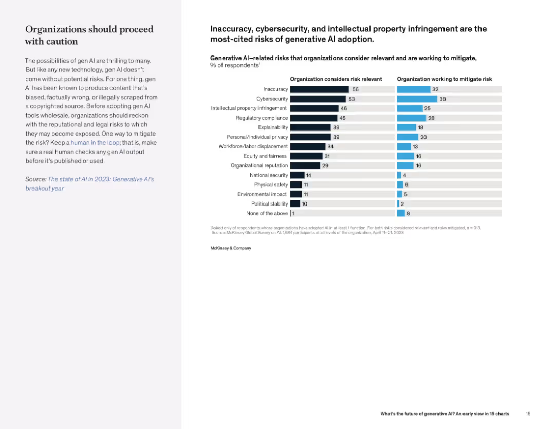
Split layout with text on left and dual horizontal bar chart on right showing perceived risks and mitigation efforts.
Risk Assessment and Management
Artificial Intelligence
Organizations cite content inaccuracy, cybersecurity, and IP risks as major concerns in adopting generative AI. There is a notable gap between risk awareness and active mitigation.
AI risk, cybersecurity, IP infringement, organizational risk, mitigation, compliance
Mixed Chart
McKinsey
Saved
The slide features a dual-axis line chart tracking cumulative flows of US and European high yield bonds from 2013 to 2023. It uses a blue color scheme with two distinct lines, one for each region.
Market Analysis and Trends
Financial Services
This slide presents a comparison of high yield bond funds in the US and Europe, showing a trend of shrinkage since the end of 2020. It is useful for analyzing market movements and investment strategies in the corporate credit sector.
High Yield, Bonds, US, Europe, Trend, Market Analysis, Investment, Corporate Credit, Data Visualization
Single Chart
Morgan Stanley
Saved
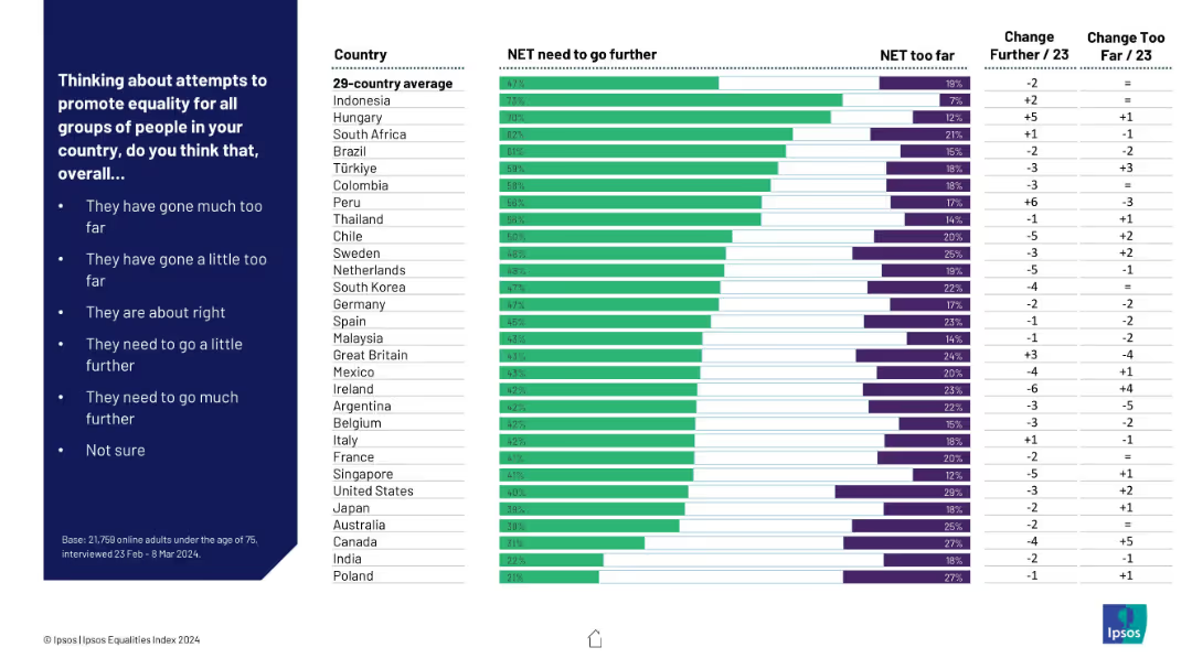
Bar chart ranking countries by agreement that “more needs to be done” vs. “gone too far”; green vs. purple bars; includes change from prior data.
Regulatory and Compliance
Government & Public Sector
This slide assesses global perceptions of efforts to promote equality. It shows which populations think more action is needed and where efforts are considered excessive, including directional trends over time.
equality efforts, too far, not enough, policy perception, international comparison, Ipsos, country ranking
Mixed Chart
IPSOS
Saved
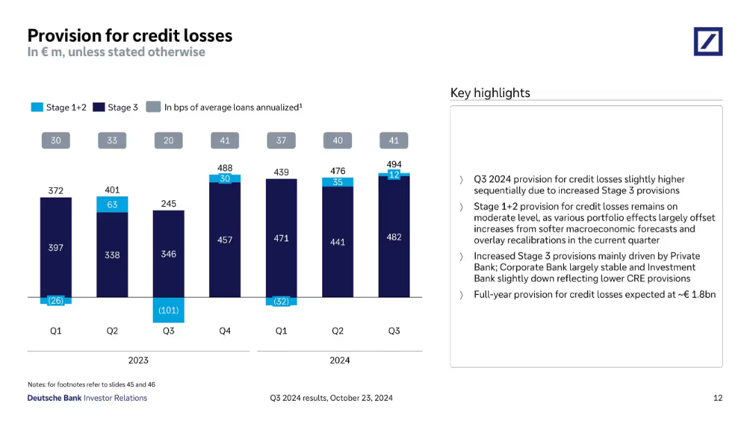
Bar chart with Stage 1+2 vs Stage 3 provisions; numerical and visual breakdown by quarter.
Risk Assessment and Management
Financial Services
Illustrates quarterly credit loss provisions split by stage, showing a slight increase in Q3 2024 due to Stage 3 provisions. Includes analysis of underlying drivers and expected full-year provision (~€1.8bn).
credit losses, provisions, Stage 3, risk, quarterly comparison
Mixed Chart
Deutsche Bank
Saved
Slide combines text, checklists, and an upward arrow graphic to depict growth. It uses blue tones and icons to represent different strategic areas.
Market Analysis and Trends
Financial Services
Discusses the expansion of services to deliver more client value and the strategic areas of focus for the business to unlock higher margins.
Service expansion, client value, strategic focus, embedded finance, SaaS, AI/ML, payments innovation, margin expansion
Table
JP Morgan
Saved
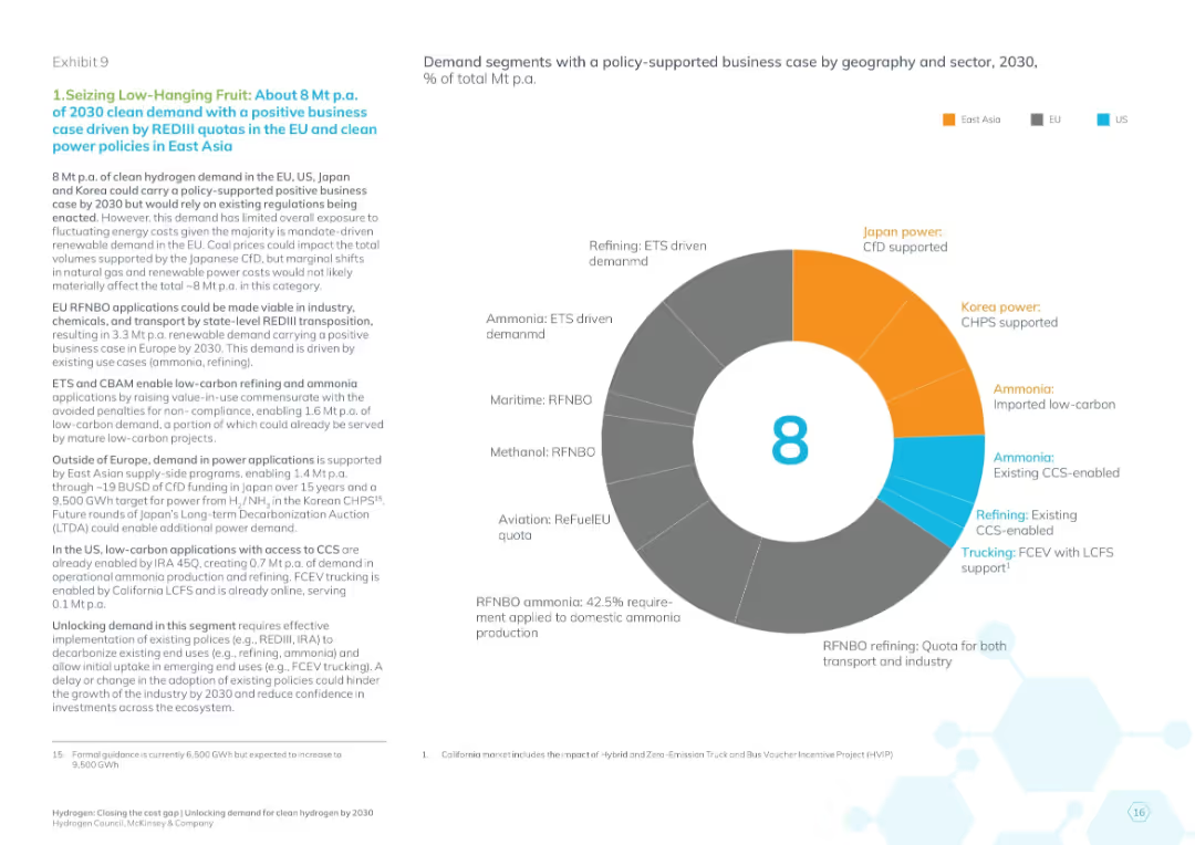
Donut chart categorizing the 8 Mt demand by sector and region; detailed policy analysis in left text panel
Regulatory and Compliance
Energy & Utilities
The slide explains how 8 Mt of hydrogen demand can be realized by 2030 under existing policies like REDIII in the EU and clean energy subsidies in East Asia. It details the sectors (refining, maritime, aviation, etc.) and the type of policy mechanisms (ETS, CfD, CHPS) enabling viability.
policy-supported demand, REDIII, clean hydrogen, ETS, CfD, CHPS, sector breakdown, EU, Japan, Korea
Mixed Chart
McKinsey
Saved
The slide features a bar chart displaying the percentage usage of various channels (OOH, Social Media, TV, Interactive/Online, VOD, etc.) by entrants and winners. Bars are vertically oriented and categorized by type of channel.
Strategic Planning
Media & Entertainment
This slide emphasizes the importance of selecting the right channels for marketing, showing the percentage usage of different channels by winners and entrants to illustrate strategic channel selection.
channel selection, marketing, bar chart, strategic planning, media usage
Mixed Chart
IPSOS
Saved
Features a combination of text and graphics, including column charts that compare assets under custody and administration over a four-year span. The graphics are paired with descriptive text on the left.
Strategic Planning
Financial Services
The slide discusses the growth of the Securities Services division through new business wins, client retention, and market expansion. The charts compare assets under custody and administration from 2015 to 2019, indicating significant growth. This illustrates strategic achievements and market penetration.
growth, strategy, clients, market expansion, assets, custody, administration
Multiple Chart
JP Morgan
Saved
The slide includes two line charts: one comparing the S&P 500 price index vs. earnings through Q3 2023, and another showing bull and bear markets over the post-WWII period.
Investment Analysis
Financial Services
This slide analyzes the S&P 500's performance relative to earnings and highlights the historical trends of bull and bear markets.
S&P 500, price index, earnings, bull market, bear market, historical trends
Multiple Chart
Goldman Sachs
Saved
Slide includes a horizontal timeline from Q3 2022 to future steps with circular milestones. Various initiatives like RD plant commissioning and SAF monetization are mapped across the timeline. Below, a bulleted list discusses next steps for Montana Renewables.
Financial Performance
Energy & Utilities
This slide presents a timeline of key initiatives and future steps for Montana Renewables, focusing on financial and strategic planning in energy. It illustrates milestones like the commissioning of new plants and the monetization of SAF.
renewables, strategy, financial, timeline, energy, monetization, planning, hydrogen, SAF
Linear Flow
Barclays
Saved
The layout includes a title and two columns of text, one for economic contribution details and the other for graphic representation of the same. The design is streamlined, with clear differentiation between sections.
Financial Performance
Government & Public Sector
Provides a comprehensive breakdown of the economic contributions of the Tempest partners’ activities, focusing on job creation and GVA contributions, making it apt for discussions on economic strategies in defense and related financial planning.
Combat Air, Tempest, GVA, Jobs, Economic Strategy, Defense
Text Only
PwC/Strategy&
Saved
Features multiple blue column charts for e-commerce sector growth, with annotations for percentage changes.
Market Analysis and Trends
Retail & E-commerce
This slide analyzes sector-wise growth in e-commerce, with a focus on the significant role e-commerce plays as a growth driver in the economy. It discusses challenges in online travel, offering insights into current trends and future projections, useful for strategic planning in e-commerce and associated industries.
E-commerce, Growth, Sector, Challenge
Multiple Chart
Bain
Saved
Slide features a column chart and a line chart showing mobile and fixed broadband penetration from 2013 to 2020. Annotations and trend lines highlight key data points and policy impacts. Colors blue and gray distinguish between different data types.
Market Analysis and Trends
Telecommunications
The slide details trends in mobile and fixed broadband penetration, highlighting the decline in mobile broadband subscriptions following regulatory changes and the growth in fixed broadband due to infrastructure expansion by Telkom, who holds a significant market share in the industry.
broadband, penetration, subscribers, infrastructure, policy, Telkom, market share
Multiple Chart
BCG
Saved
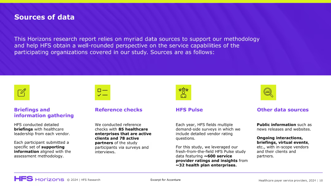
Clean, four-column layout with icons and sections for each data source; bold section headers and supporting text below each icon on a purple-striped background.
Industry Overview
Healthcare & Pharmaceuticals
Summarizes the data sources behind HFS’s healthcare payer service study, including executive briefings, reference checks, HFS Pulse surveys, and public data. Emphasizes the diverse and validated methodology to ensure study reliability.
data sources, HFS Research, healthcare, methodology, surveys
Pillar
Accenture
Saved
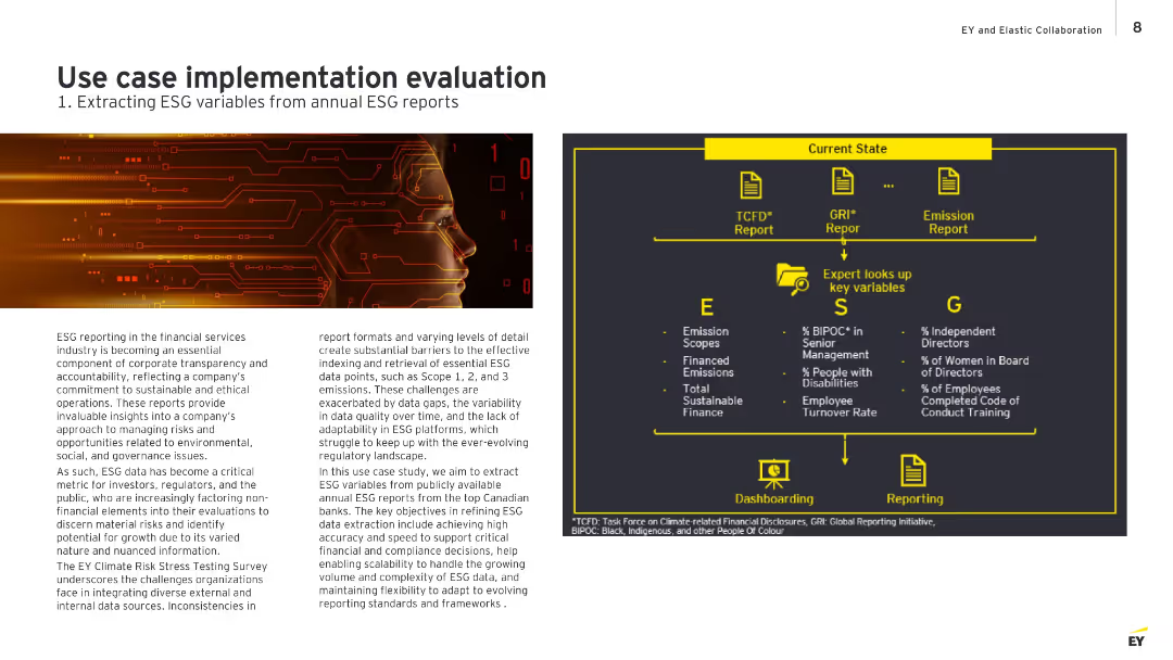
Split layout with left side showing a digital face illustration and descriptive text; right side contains an infographic with current ESG report structure, expert lookup, and dashboard/reporting flow.
Technology and Digital Transformation
Financial Services
Describes the challenge of ESG data extraction from inconsistent report formats and highlights EY's approach to improve efficiency and accuracy in extracting key ESG variables using structured reports from top Canadian banks. It outlines the manual process experts follow and the intended transition to a digital, scalable solution.
ESG, data extraction, financial reports, compliance, automation, sustainability, EY
Diagram
EY
Saved
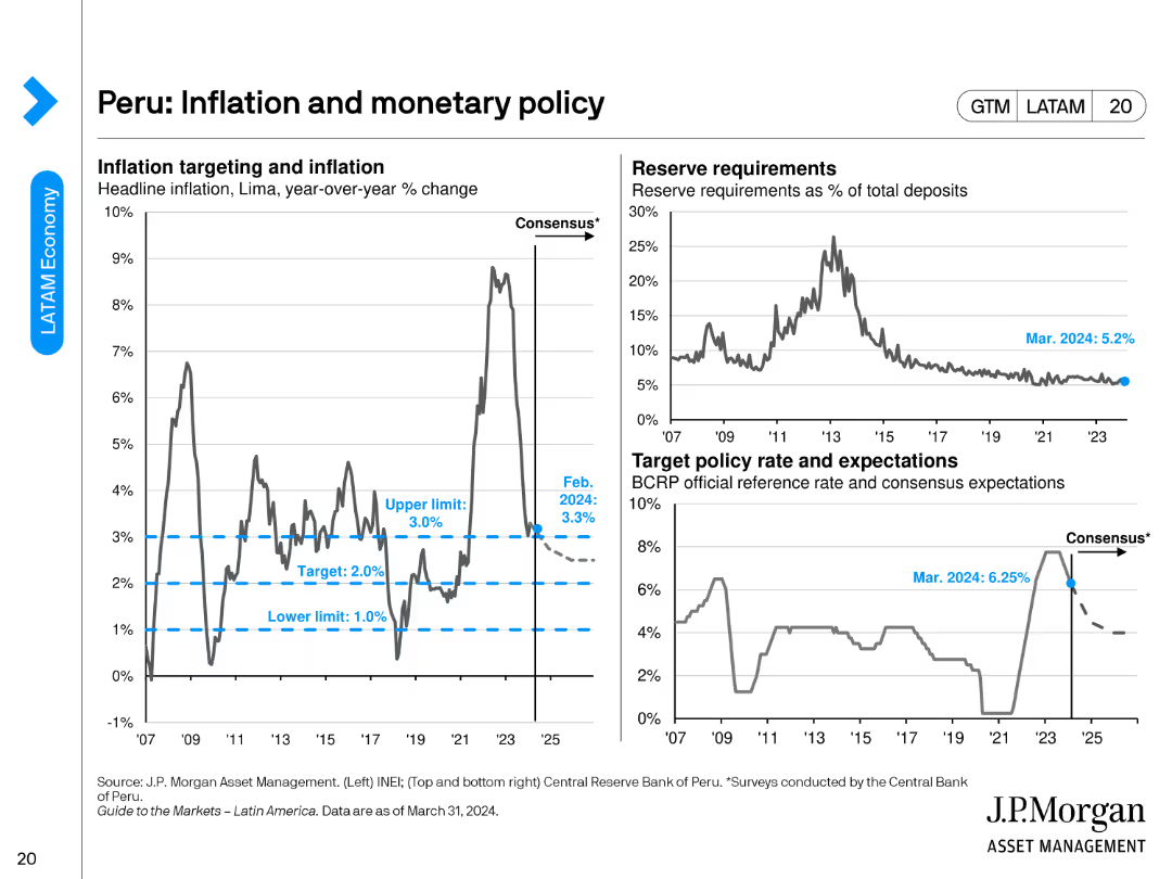
The slide presents three charts: a line chart for inflation targeting, another for reserve requirements, and a chart for target policy rates.
Regulatory and Compliance
Financial Services
This slide focuses on Peru's inflation and monetary policy, detailing inflation targeting, reserve requirements, and target policy rates as of February 2024.
Peru, inflation, monetary policy, reserve requirements, policy rates
Multiple Chart
JP Morgan
Saved
This slide contrasts the enabling functions of quantum communications versus its classical counterpart. It has a clear, two-column format that lists applications on the left and expands on them on the right. Icons are used to visually distinguish different applications of quantum communications, such as quantum-enhanced cryptography and quantum internet.
Technology and Digital Transformation
Technology & Software
The slide explores the innovative disruptions quantum communications could bring to secure data transfer and cryptographic processes. It's targeted towards a technical audience interested in the advancements of quantum technology over classical methods, emphasizing enhanced security and the potential for a quantum internet.
Quantum Communications, Cryptography, Internet, Security, Infrastructure
Header Horizontal
McKinsey
Saved
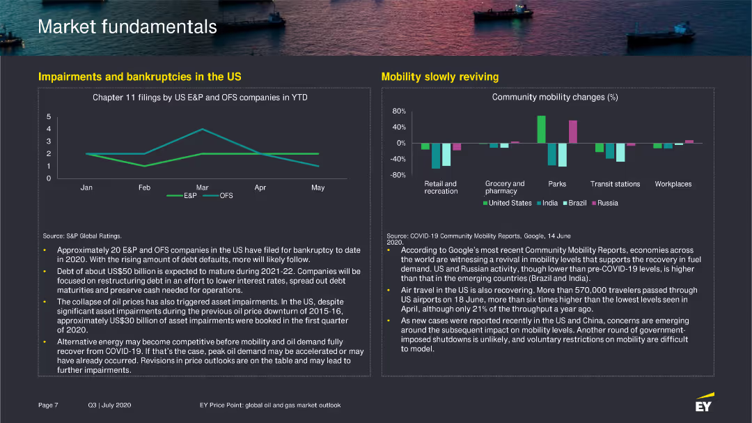
The slide features a line chart showing Chapter 11 filings by US E&P and OFS companies in 2020 and a bar chart illustrating changes in community mobility in various sectors.
Risk Assessment and Management
Financial Services
Discusses the increase in bankruptcies among US E&P and OFS companies, along with an analysis of mobility trends and their impact on economic recovery.
bankruptcies, mobility, US, E&P, OFS, 2020
Multiple Chart
EY
Saved
Column chart showing hospital survey respondent mix by country, type of hospital, and hospital size.
Market Analysis and Trends
Healthcare & Pharmaceuticals
This slide presents survey data from APAC hospital executives on various factors, including respondent roles and hospital types.
hospital, survey, APAC, healthcare, respondents
Single Chart
LEK
Saved
This slide features a column chart showing technology sector PE/VC investments over years, with a line chart indicating the number of deals. It includes two stacked column charts breaking down investments by deal segments in terms of value and number of deals.
Market Analysis and Trends
Technology & Software
The slide highlights PE/VC investment trends in the technology sector, showing investment values and the number of deals over several years. It breaks down investments by deal segments, providing a comprehensive view of the sector's investment landscape.
PE/VC, technology sector, investment trends, deal segments, number of deals
Multiple Chart
EY
Saved
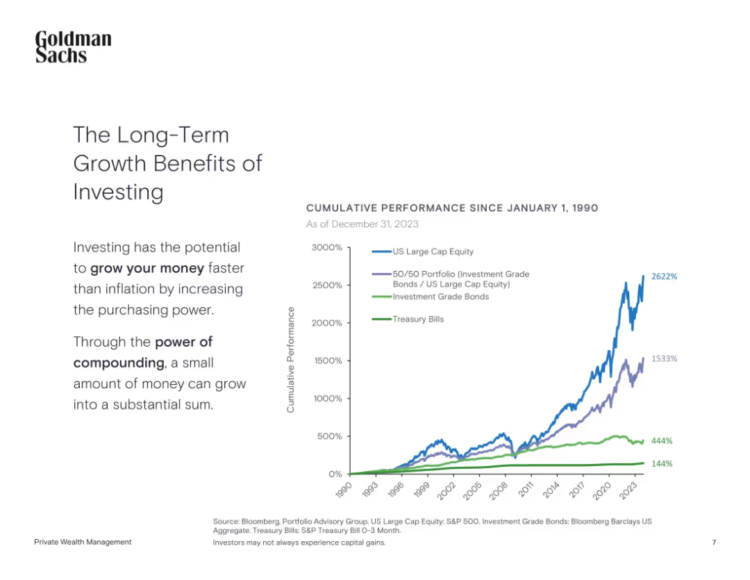
Left-aligned text with a line chart showing cumulative performance since 1990
Investment Analysis
Financial Services
The slide highlights the power of long-term investing by comparing cumulative returns from equities, bonds, and treasury bills since 1990.
Long-Term Investing, Compounding, Equities, Bonds, Treasury, Performance
Mixed Chart
Goldman Sachs
Saved
Features a column chart with a blue bar highlighting the company's ROIC compared to peers, indicated by a dotted line for average.
Investment Analysis
Consumer Goods
Analyzes return on invested capital (ROIC) showcasing superior performance compared to peers, crucial for assessing investment potential.
ROIC, investment, peer comparison, performance, capital
Single Chart
Barclays
Saved
Displays a line chart illustrating the performance of innovative companies during and post a financial crisis.
Strategic Planning
Technology & Software
Evaluates how innovative companies have historically outperformed during and after crises by leveraging innovation, as shown through TSR data from 2007-2012.
innovation, crises, performance, TSR, financial crisis, historical data
Single Chart
BCG
Saved
Slide includes a large header and a grouped bar chart with percentages indicating people's responses about changes in healthcare access during the COVID-19 pandemic. It features images of diverse individuals, possibly representing different demographics affected by the pandemic.
Industry Overview
Healthcare & Pharmaceuticals
This slide offers insights into how healthcare access was perceived to have changed during the pandemic, with a majority reporting no change or improvement. It is relevant for discussions on the resilience of healthcare systems in crises and can be used in healthcare policy and planning discussions to highlight areas of strength and potential improvement.
healthcare access, COVID-19 impact, system resilience, patient experiences, demographic analysis
Mixed Chart
Accenture
Saved
A line chart comparing sectors such as CGS, Auto/IE, LS/Pharma/Biotech, Retail, and Travel/Hospitality in terms of leadership behaviors related to I&D.
Strategic Planning
Retail & E-commerce
Analyzes retail sector's performance in managing talent pipelines and recognizing I&D efforts compared to other sectors.
retail, talent pipelines, I&D, sector comparison, leadership behavior, line chart, performance analysis
Mixed Chart
Accenture
Saved
Previous
Next
If nothing, comes up, please save your slides first
Create a FREE account to continue browsing
Receive Instant Access to 1,000+ slides from companies like McKinsey, Google, and Goldman Sachs
First Name
Last Name
Email
Password
I agree to all
Terms & Privacy Policy
Thank you! Your submission has been received!
Oops! Something went wrong while submitting the form.
Have an account?
Sign in
Column Chart
Heatmap
Chevron
Org Chart
Infographic
Callouts
Timeline
List
Graphic
Picture
Process Flow
Diagram
Paragraph
Map
Table
Framework
Subtitle
Takeaway Box
Icon
Other Chart
Radar Chart
Waterfall Chart
Mekko Chart
Pie Chart
Scatter Plot
Line Chart
Bar chart
Bullet points