Create a FREE Account
Instant access to 1,000+ real slides from top companies like McKinsey, BCG, Goldman Sachs, Google and many more!
First Name
Last Name
Email
Password
I agree to all
Terms & Privacy Policy
Thank you! Your submission has been received!
Oops! Something went wrong while submitting the form.
Have an account?
Sign in
Library
Templates
Courses
Pricing
My Account
My Slides
My Templates
✦ AI
AI Prompt Library
AI Search
Sign in
Start Here
Logout
My Saved Slides
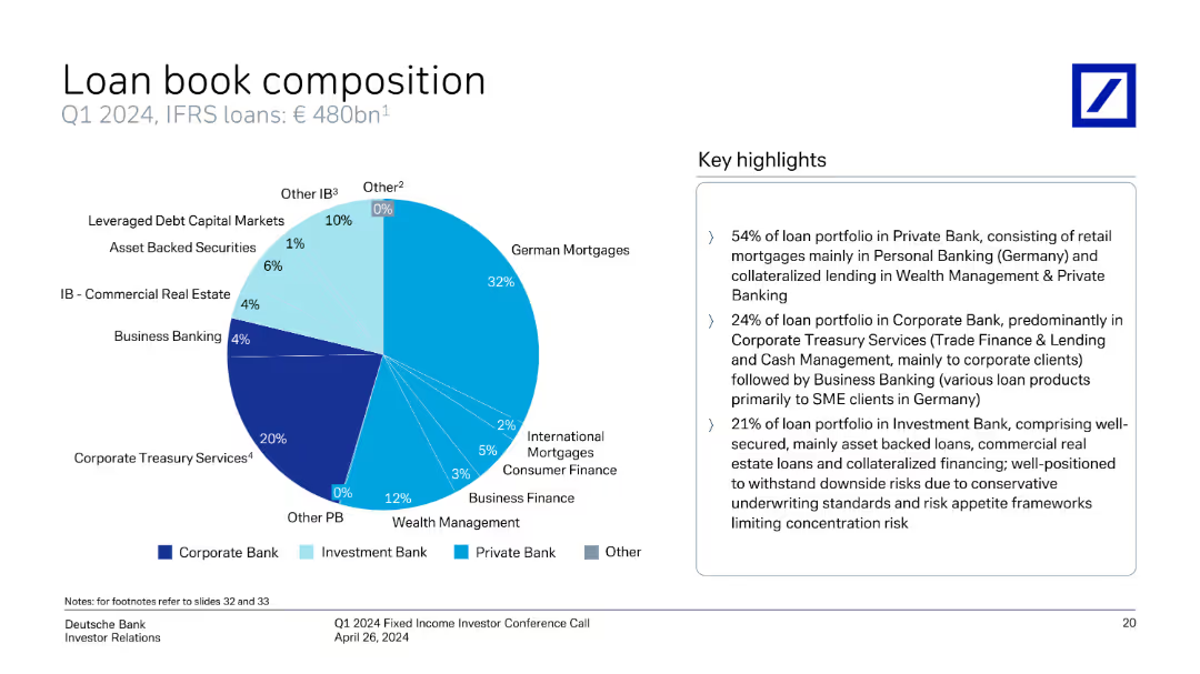
The slide includes a pie chart showing the composition of the loan book for Q1 2024, with key highlights and detailed segment information.
Financial Performance
Financial Services
It explains the composition of Deutsche Bank's loan book, with segments such as corporate treasury services, business banking, and more.
loan book, composition, Q1 2024, corporate treasury, business banking, segments, Deutsche Bank
Mixed Chart
Deutsche Bank
Saved
The slide contains a simple title section and a central list with circular icons connected by a vertical line, representing areas of improvement. There's a blue and teal color scheme with additional icons, and the design is clean with a balanced use of space.
Market Analysis and Trends
Retail & E-commerce
This slide reviews areas for enhancement within digital platforms, pinpointing the need for more promotions, lower fees, and better customer engagement. By identifying these top areas, the slide provides actionable insights for platform improvement and growth, catering to merchant feedback and emphasizing cost-effectiveness and user experience enhancements as pivotal.
digital platforms, improvement, promotions, transaction fees, user engagement, merchant feedback
Vertical Flow
Bain
Saved
This slide combines a line graph and column chart to illustrate the GDP growth from 2011 to 2022, attributing specific portions to the NBN network, with textual annotations for clarity.
Financial Performance
Telecommunications
The slide details the GDP growth enabled by the NBN network, showing how it constitutes a significant portion of Australia's economic growth and productivity, suitable for regulatory discussions and economic assessments.
GDP, growth, NBN, Australia, economic analysis, telecommunications, regulation, productivity
Multiple Chart
Accenture
Saved
Text and graphical data including a table of survey respondents by country and industry, with bar charts showing industry and company size distributions among respondents.
Market Analysis and Trends
Professional Services
This slide provides demographics from the Work Reimagined 2022 Survey, including respondent distribution by country, industry representation, and company size range.
Survey demographics, respondents, country distribution, industry representation, company size
Multiple Chart
EY
Saved
A stacked column chart compare the market share of different generations in the true luxury goods market from 2019 to projections for 2026.
Market Analysis and Trends
Consumer Goods
Analyzes the impact of Millennials and Gen Z on the luxury goods market, highlighting their growing market share and influence. Useful for understanding demographic shifts in consumer behavior within the luxury sector.
luxury, market, Millennials, Gen Z, trends
Multiple Chart
BCG
Saved
Includes a column chart showing the number of CCUS projects dedicated to various industries (chemicals, heavy industries, power generation, hydrogen, oil & gas, clusters).
Market Analysis and Trends
Energy & Utilities
Explores the expansion of CCUS applications to additional large emitting sectors, analyzing the number of projects and their statuses within these industries.
CCUS, application, heavy industries, blue hydrogen, chemicals, project expansion, industry analysis
Mixed Chart
Kearney
Saved
Central circular diagram surrounded by text blocks that emphasize the bank's strengths, with a background of a global map.
Strategic Planning
Financial Services
This slide emphasizes the longstanding global reach and comprehensive services of the bank, portraying it as a reliable financial partner through various market cycles, geared towards future client needs with robust financial strategies.
Heritage, Global, Strategy, Financial Services, Client Needs, Market Cycles, Future
Framework
Deutsche Bank
Saved
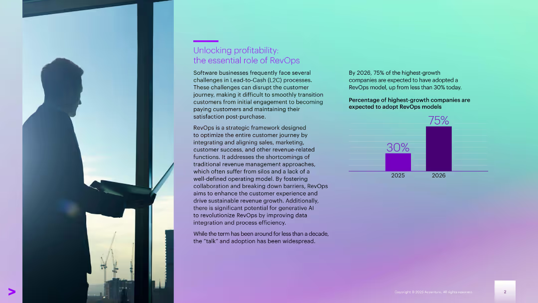
Left-aligned text with a city-view silhouette; right side includes a bar chart comparing 2025–2026 data
Technology and Digital Transformation
Technology & Software
Explains RevOps as a strategic model for optimizing the revenue journey. Notes the expected jump in adoption by high-growth companies (from 30% in 2025 to 75% in 2026). Focus is on aligning internal teams to improve customer success and revenue generation.
customer awareness, interest rates, banking satisfaction, pricing, savings, financial behavior
Mixed Chart
Accenture
Saved
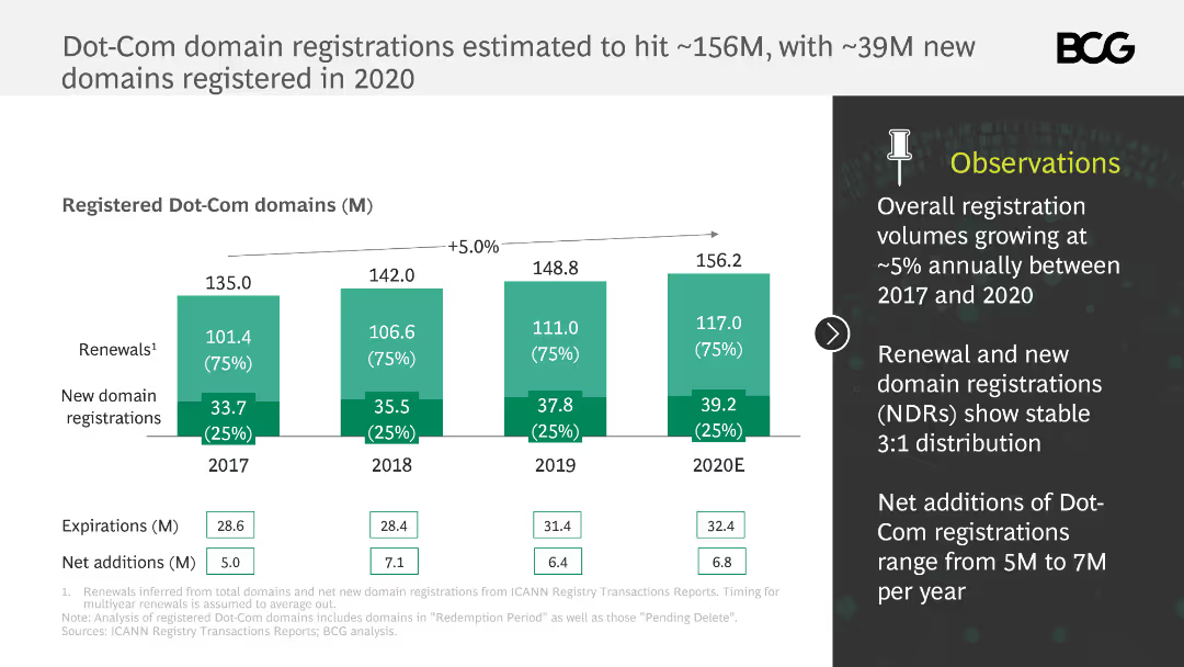
This slide features a column chart tracking the number of registered Dot-Com domains from 2017 to 2020. It uses a green color scheme and annotations to highlight key statistics, with a text box on the right summarizing observations.
Market Analysis and Trends
Telecommunications
The slide provides an overview of Dot-Com domain registrations, showing growth trends and new registrations. It highlights that renewals and new domain registrations maintain a stable 3:1 distribution, with annual net additions ranging from 5M to 7M.
Dot-Com domains, registrations, trends, growth, renewals
Mixed Chart
BCG
Saved
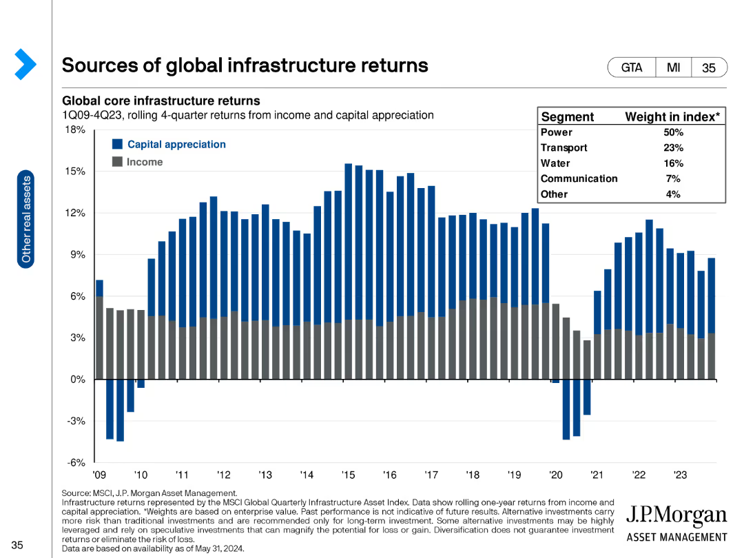
The slide has a column chart showing global core infrastructure returns split between capital appreciation and income from 1Q09 to 4Q23.
Financial Performance
Real Estate & Construction
It provides data on infrastructure returns, segmented by capital appreciation and income, highlighting sector contributions to index weight.
infrastructure, returns, capital appreciation, income, index weight, power, transport, water
Single Chart
JP Morgan
Saved
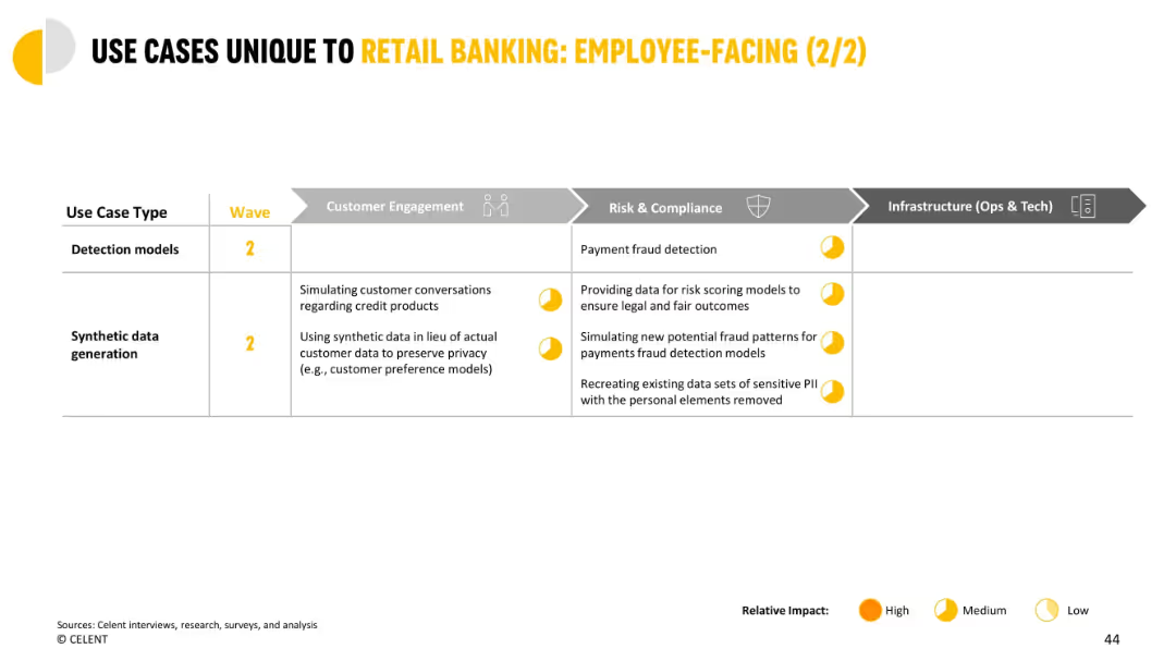
Table format highlighting use cases in detection and synthetic data across departments, with impact markers.
Risk Assessment and Management
Financial Services
Details how GenAI can enhance fraud detection and privacy protection through synthetic data. Covers the impact on customer engagement and compliance through better modeling and anonymized data use.
fraud detection, synthetic data, privacy, risk scoring, financial services, compliance
Single Chart
Oliver Wyman
Saved
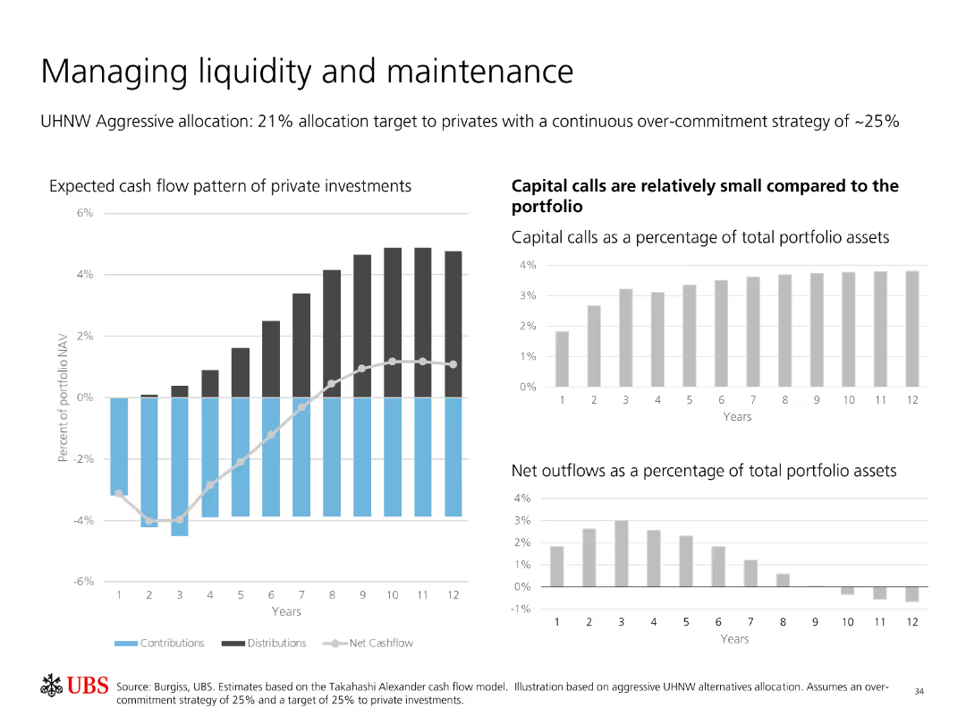
Contains multiple bar charts showing expected cash flow patterns of private investments, capital calls, and net outflows as a percentage of total portfolio assets.
Financial Performance
Financial Services
Analyzes liquidity management and maintenance in private investments, highlighting expected cash flows, capital calls, and net outflows relative to portfolio assets.
Liquidity Management, Private Investments, Cash Flow, Capital Calls, Net Outflows, Portfolio, Strategy, Analysis, Maintenance
Multiple Chart
UBS
Saved
The slide features a column chart comparing electricity generation per capita for various African countries in 2022. Key insights and outlooks discuss Nigeria's investment needs to increase power generation capacity by 2043.
Investment Analysis
Energy & Utilities
The slide discusses Nigeria's requirement for substantial investment to increase power generation capacity by 2043, comparing current electricity generation levels with other African countries. It highlights the implications for economic growth and productivity.
power generation, investment, electricity generation, economic growth, productivity
Mixed Chart
PwC/Strategy&
Saved
The slide features a line chart comparing expected reductions in UK government spending. It includes commentary and implications for corporates.
Regulatory and Compliance
Government & Public Sector
This slide examines the potential contraction in UK public services spending due to government tax cuts. It discusses the impacts on businesses and household finances.
UK, public spending, government policy, financial analysis, regulatory impact
Mixed Chart
Accenture
Saved
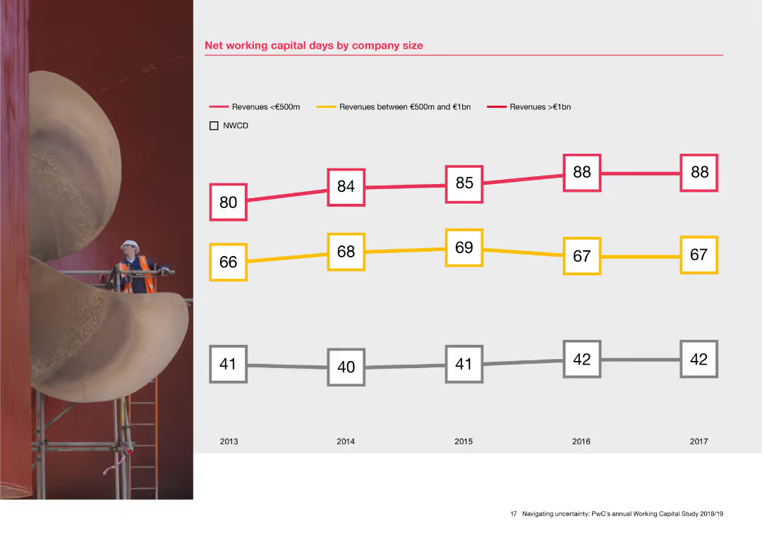
The slide features a line chart with data points showing net working capital days for companies of different sizes from 2013 to 2017. Three lines represent companies with revenues less than €500m, between €500m and €1bn, and greater than €1bn. A background image of an industrial worker is on the left.
Financial Performance
Financial Services
This slide analyzes net working capital days based on company size, presenting data over five years. The line chart helps in understanding how companies with different revenue sizes manage their working capital, offering insights into financial performance and capital efficiency.
Net working capital, company size, financial performance, revenue, line chart, capital efficiency
Mixed Chart
PwC/Strategy&
Saved
This slide is text-dominant with a straightforward layout on a dark background, directing leaders' focus to the benefits and uncertainties associated with engaging with edge computing trends.
Technology and Digital Transformation
Technology & Software
The slide aims at guiding leaders on engaging with edge computing trends, outlining the potential benefits such as improved data latency and compliance, and risks like business model challenges and technical hurdles. It serves as a decision-making framework for leaders to assess opportunities and manage risks in adopting edge computing technologies.
Edge Computing, Leadership Considerations, Business Risks
Boxed
McKinsey
Saved
The slide shows a balance sheet summary with column chart for assets and liabilities, emphasizing different categories with color coding. Key highlights offer insights into the balance sheet management strategies.
Operational Efficiency
Financial Services
This slide outlines the structure of a conservatively managed balance sheet, highlighting key asset and liability segments and their implications for financial stability and growth strategies. It underscores the importance of conservative financial management practices.
balance sheet, assets, liabilities, financial, management
Multiple Chart
Deutsche Bank
Saved
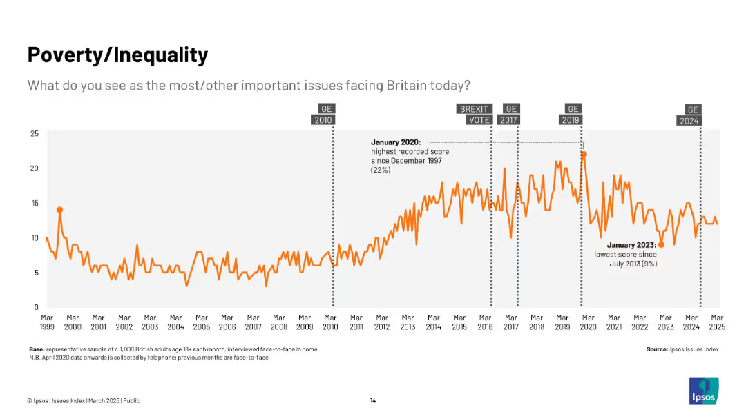
Line graph in orange; vertical spikes over time from 1999 to 2025; annotated with political events.
Market Analysis and Trends
Government & Public Sector
The slide visualizes public concern about poverty and inequality in Britain over time. Concern rises notably around elections and economic events, peaking in January 2020.
poverty, inequality, social issues, Ipsos, UK, trends, economy, general election, public opinion, 2020 peak
Single Chart
IPSOS
Saved
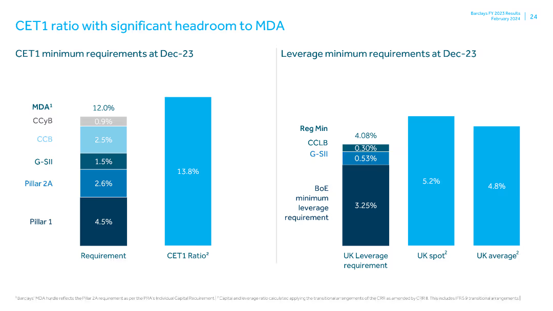
Uses column charts to display CET1 and leverage minimum requirements, comparing actual ratios to regulatory minima.
Regulatory and Compliance
Financial Services
Highlights the CET1 ratio's headroom above the minimum requirements, explaining the regulatory and leverage requirements and the bank's compliance status.
CET1 ratio, MDA, regulatory requirements, leverage ratio, compliance, financial regulation, capital adequacy, headroom, financial health, UK leverage
Multiple Chart
Barclays
Saved
Line graph and table detailing distributor stock performance and M&A activity, color-coded by industry segment.
Investment Analysis
Financial Services
Shows distributor stock performance against the S&P 500 and the number of acquisitions by segment since 2000.
Stock Performance, M&A, Distribution, Acquisition, Benchmark, Industry
Single Chart
EY
Saved
The slide features a Venn diagram showing the relationship between Private Banking, APAC IBCM, and ATS, emphasizing global connectivity.
Strategic Planning
Professional Services
This slide outlines the collaborative approach central to the company's strategy, highlighting the synergy between Private Banking, APAC IBCM, and ATS, along with the emphasis on global connectivity.
Collaboration, Private Banking, APAC IBCM, ATS, Global Connectivity
Framework
Credit Suisse
Saved
Features bar charts and diagrams related to grid optimization and energy aggregation technologies, including real-time data platforms.
Technology and Digital Transformation
Energy & Utilities
Analyzes how digital solutions like real-time load balancing and energy aggregation can enhance grid efficiency and resilience.
grid optimization, energy aggregation, digital solutions, real-time balancing, electricity grid, efficiency, resilience
Mixed Chart
Accenture
Saved
It contains two column charts—one in blue shades, one in green—depicting the percentage agreement from HR leaders and employees over three years. A small pie chart indicating a 9% increase is also present. The layout is simple, with prominent headers and clear, legible text.
Market Analysis and Trends
Financial Services
The slide addresses how equity compensation is perceived as a motivational factor by both HR leaders and employees, with a trend over three years. It's useful for demonstrating shifts in HR strategies and employee satisfaction related to compensation benefits in the financial sector.
equity compensation, motivation, HR leaders, employees, trend
Multiple Chart
Goldman Sachs
Saved
This slide includes a column chart comparing the capital expenditure outlook on medical devices/equipment across different regions over three time periods.
Strategic Planning
Healthcare & Pharmaceuticals
This slide discusses the optimistic outlook on future capital expenditure by hospitals, highlighting expected increases in spending on medical devices and equipment.
capital expenditure, medical devices, equipment, hospital spending, regional comparison
Single Chart
LEK
Saved
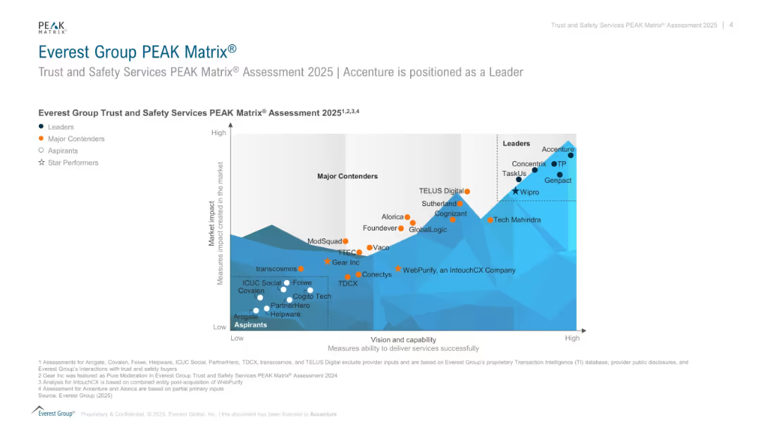
Scatterplot matrix comparing companies on “vision and capability” vs. “market impact” in trust & safety services; color-coded by tier.
Competitive Landscape
Technology & Software
Shows the positioning of companies offering trust and safety services in the 2025 PEAK Matrix. Leaders like Accenture and Concentrix score high in both capability and impact. Includes Major Contenders, Aspirants, and Star Performers.
PEAK Matrix, trust and safety, service providers, Accenture, capability, market impact, rankings
Single Chart
Accenture
Saved
Previous
Next
If nothing, comes up, please save your slides first
Create a FREE account to continue browsing
Receive Instant Access to 1,000+ slides from companies like McKinsey, Google, and Goldman Sachs
First Name
Last Name
Email
Password
I agree to all
Terms & Privacy Policy
Thank you! Your submission has been received!
Oops! Something went wrong while submitting the form.
Have an account?
Sign in
Column Chart
Heatmap
Chevron
Org Chart
Infographic
Callouts
Timeline
List
Graphic
Picture
Process Flow
Diagram
Paragraph
Map
Table
Framework
Subtitle
Takeaway Box
Icon
Other Chart
Radar Chart
Waterfall Chart
Mekko Chart
Pie Chart
Scatter Plot
Line Chart
Bar chart
Bullet points