My Account
My Slides
Search by Category
Templates
View All Templates
Download Template Slides
Leave Feedback
Login
Logout
Get Started
Browse all Slides
Browse all Slides
Create a FREE Account
Instant access to 1,000+ real slides from top companies like McKinsey, BCG, Goldman Sachs, Google and many more!
First Name
Last Name
Email
Password
I agree to all
Terms & Privacy Policy
Thank you! Your submission has been received!
Oops! Something went wrong while submitting the form.
Have an account?
Sign in
Spark Your Next Big Idea with New Presentation Templates
VIEW ALL Templates
Welcome,
Welcome
PRO
Show Featured Only
Checkbox 8
Companies
Mckinsey
Bain
BCG
EY
Deloitte
Accenture
PwC/Strategy&
JP Morgan
Goldman Sachs
Morgan Stanley
Citigroup
Deutsche Bank
Barclays
LEK
KPMG
Kearney
Oliver Wyman
Booz Allen Hamilton
Gartner
IPSOS
Nielsen
Slide type
Text Only
Linear Flow
Vertical Flow
Single Chart
Header Horizontal
Mixed Chart
Header Vertical
Pillar
Multiple Chart
Graphic
Agenda
Title
Table
Framework
Industry
Technology & Software
Artificial Intelligence
Financial Services
Retail & E-commerce
Consumer Goods
Industrial & Manufacturing
Transportation & Logistics
Telecommunications
Real Estate & Construction
Hospitality & Tourism
Professional Services
Education & Training
Media & Entertainment
Agriculture & Food Production
Healthcare & Pharmaceuticals
Environmental Services & Sustainability
Government & Public Sector
Use Case
Mergers and Acquisitions
Performance Metrics and KPIs
Client Case Studies
Competitive Landscape
Corporate Finance and Valuation
Product and Service Analysis
Customer and Market Segmentation
Organizational Structure and Change
Industry Overview
Regulatory and Compliance
Risk Assessment and Management
Investment Analysis
Organizational Structure and Change
Human Resources and Talent Management
Financial Performance
Market Analysis and Trends
Sales and Business Development
Human Resources and Talent Management
Clear all
Thank you! Your submission has been received!
Oops! Something went wrong while submitting the form.
Tag
View slide
A world map marked with various investment locations, accompanied by logos representing different sectors such as private equity and real estate.
Investment Analysis
Financial Services
Elucidates on the diversity and scope of the company's alternative investment platform, indicating different sectors and regions involved in the investment strategy.
Alternative investments, private equity, real estate, global
false
Investment Analysis
Financial Services financial-services
Graphic
Goldman Sachs
View slide
The slide displays stacked column charts for client assets and various icons for future growth strategies. The colors include shades of brown, blue, and green, with clear data annotations.
Strategic Planning
Financial Services
The slide outlines the growth of client assets in alternative investments and the strategic initiatives for future growth in real estate, infrastructure, and private equity.
Alternatives, Innovation, Growth, Client Assets, Investment, Real Estate, Infrastructure, Private Equity, Strategy
false
Strategic Planning
Financial Services financial-services
Multiple Chart
JP Morgan
View slide
The slide features a column chart, a table, and color-coded timelines.
Investment Analysis
Financial Services
The slide presents the history and innovation in investment types over time with a focus on alternatives. It includes historical timelines, net IRR percentages, and growth in asset mix.
Alternatives, Investment, Growth, IRR, Timeline
false
Investment Analysis
Financial Services financial-services
Mixed Chart
JP Morgan
View slide
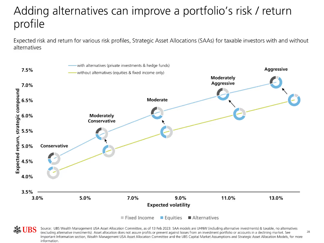
A line graph showing expected returns and volatilities for different risk profiles with and without alternatives. Pie charts are also included.
Strategic Planning
Financial Services
The slide demonstrates the impact of adding alternative investments on a portfolio's risk and return, comparing scenarios with and without these investments.
Alternatives, Portfolio, Risk, Return, Strategic Allocation
false
Strategic Planning
Financial Services financial-services
Single Chart
UBS
View slide
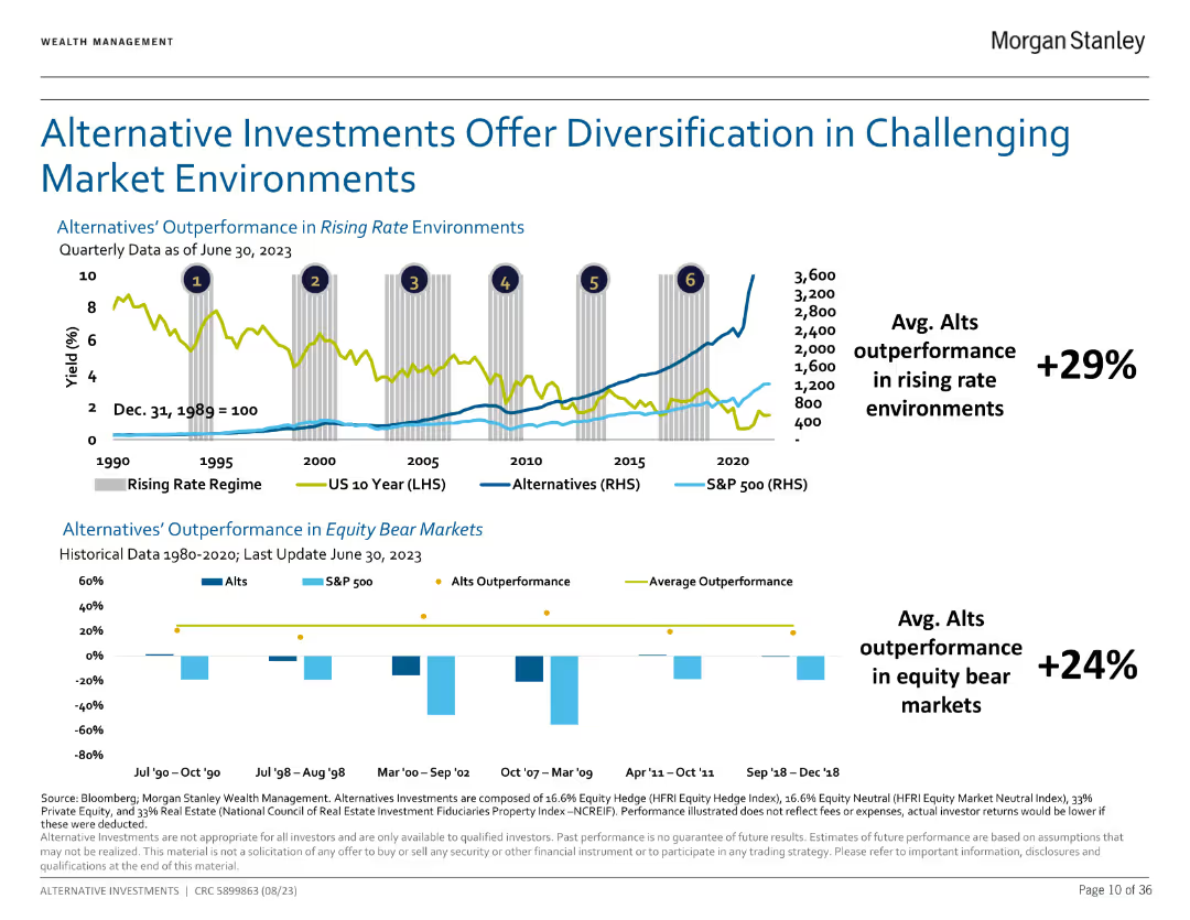
Dual chart illustrating outperformance of alternatives in rising rate environments and equity bear markets.
Market Analysis and Trends
Financial Services
Shows how alternatives have historically outperformed traditional assets in various market conditions.
Alternatives, diversification, performance
false
Market Analysis and Trends
Financial Services financial-services
Multiple Chart
Morgan Stanley
View slide
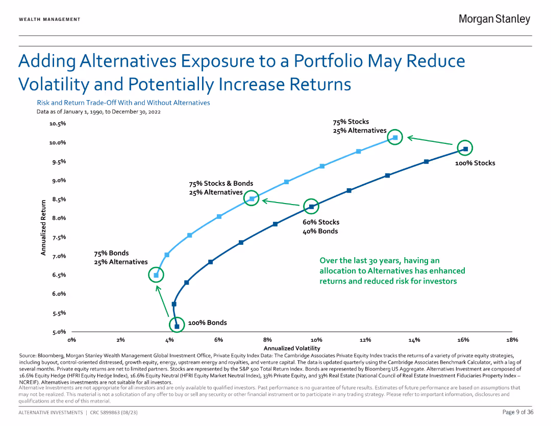
Line chart showing the impact of adding alternatives to a portfolio on risk and returns from 1990 to 2022.
Investment Analysis
Financial Services
Demonstrates how alternatives can reduce portfolio volatility and potentially increase returns over 30 years.
Alternatives, portfolio, risk, returns
false
Investment Analysis
Financial Services financial-services
Single Chart
Morgan Stanley
View slide
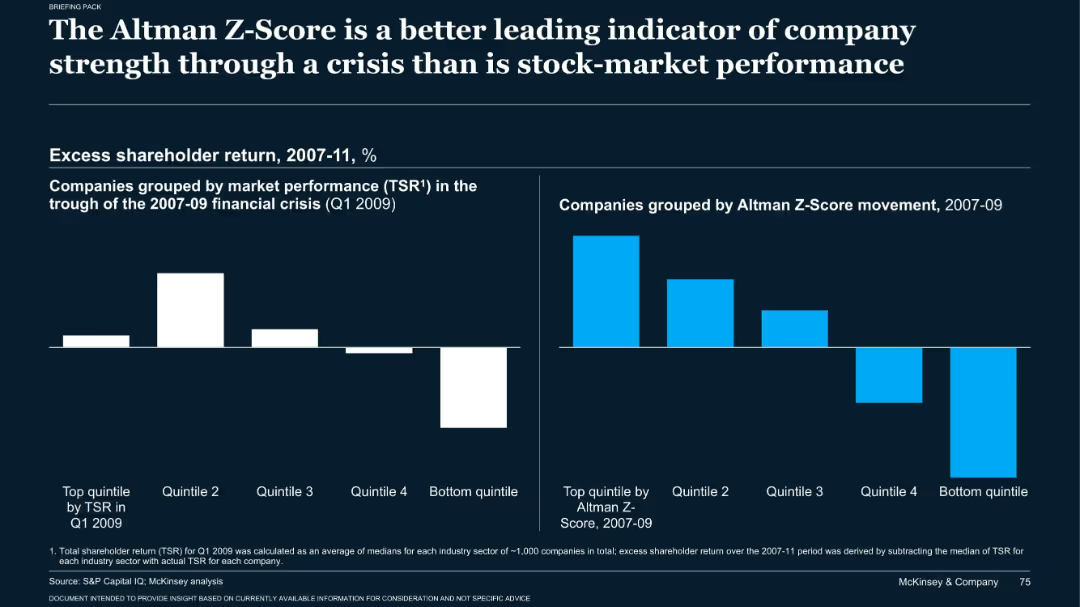
Dark-themed bar charts comparing excess returns based on TSR and Z-Score during 2007–2009
Risk Assessment and Management
Financial Services
The slide emphasizes that Altman Z-Scores were more predictive of company strength during the 2008 crisis than stock performance. Two bar charts show how companies in top Z-score quintiles outperformed in shareholder return from 2007 to 2011.
Altman Z-score, TSR, recession, risk analysis, company strength
false
Risk Assessment and Management
Financial Services financial-services
Single Chart
McKinsey
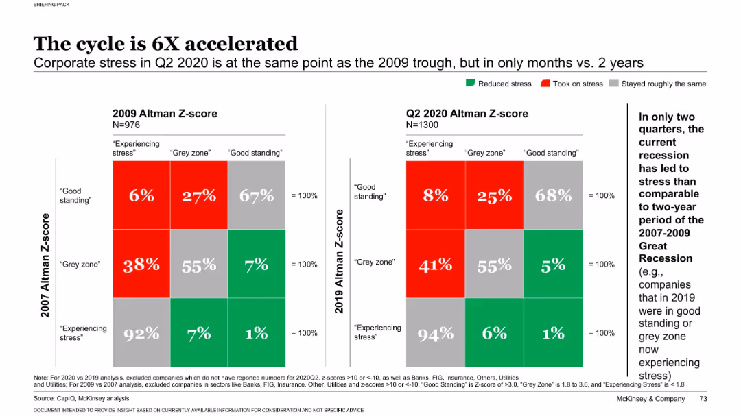
View slide
Dual heatmap chart comparing Altman Z-scores from 2009 vs. 2020 with labeled stress categories
Risk Assessment and Management
Financial Services
This slide shows how rapidly corporate financial stress increased during the COVID-19 recession compared to the 2008 crisis. It uses Altman Z-scores to classify companies' financial health, revealing a sharp acceleration in stress levels across firms.
Altman Z-score, financial stress, recession, corporate risk, COVID-19
false
Risk Assessment and Management
Financial Services financial-services
Multiple Chart
McKinsey
View slide
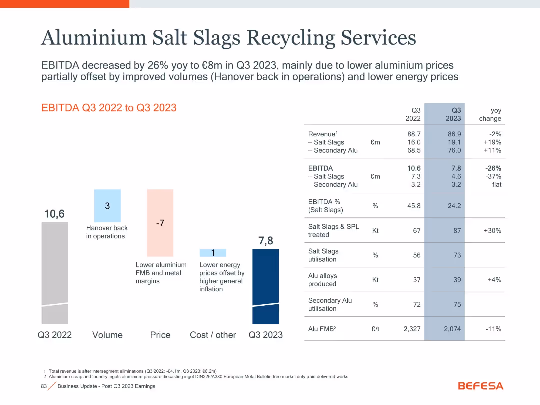
Waterfall bar chart with financial table and YoY comparisons
Operational Efficiency
Industrial & Manufacturing
This slide details the performance of aluminium salt slags recycling operations, showing a decrease in EBITDA due to pricing pressure, partially offset by volume growth.
Aluminium, Recycling, EBITDA, Salt Slags, Energy Prices, Q3 2023
false
Operational Efficiency
Industrial & Manufacturing industrial-and-manufacturing
Mixed Chart
Goldman Sachs
View slide
The slide features a left panel with text analysis and a right panel with a horizontal bar chart showing the percentage of respondents taking action to allow workers to disconnect, by region.
Human Resources and Talent Management
Professional Services
This slide addresses the issue of employees being expected to be 'always on,' highlighting regional differences in efforts to allow workers to disconnect and reduce burnout.
Always on, employee pressure, disconnection, regional differences, burnout
false
Human Resources and Talent Management
Professional Services professional-services
Mixed Chart
PwC/Strategy&
View slide
The slide includes text sections and a column chart showing the frequency of responding to work emails/messages outside normal working hours for Gen Zs and Millennials. It is organized to emphasize the challenges of disconnecting from work.
Operational Efficiency
Professional Services
This slide explores the impact of "always-on" workplaces on Gen Zs and Millennials, highlighting the frequency of responding to work communications outside normal hours and the main reasons behind this behavior, illustrating the struggle to disconnect from work.
Always-on, workplaces, disconnect, work emails, Gen Z, Millennials
false
Operational Efficiency
Professional Services professional-services
Multiple Chart
Deloitte
View slide
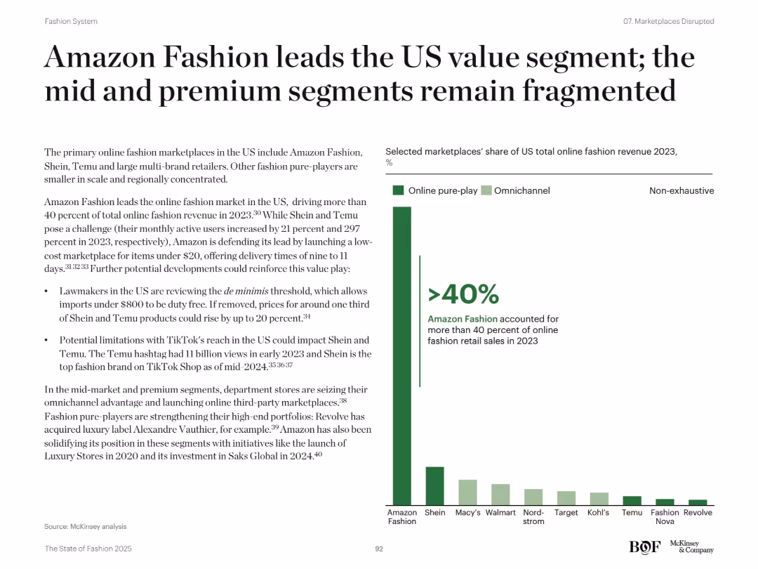
Left-aligned text summary and a bar chart on the right showing market share of major US fashion players
Market Analysis and Trends
Retail & E-commerce
The slide highlights Amazon Fashion's dominance in the US online fashion space, holding over 40% share in 2023. It notes rising threats from Shein and Temu, while department stores and other players like Revolve work to strengthen niche portfolios. The bar chart illustrates revenue share distribution across online pure-play and omnichannel retailers.
Amazon, fashion, US market, Shein, Temu, premium, ecommerce, fragmentation, trends
false
Market Analysis and Trends
Retail & E-commerce retail-and-e-commerce
Mixed Chart
McKinsey
View slide
The slide consists of complex data tables and a map detailing epidemiological and economic statistics. It uses a clean layout with a mixture of red indicators for immediate visual attention and comparative statistics.
Market Analysis and Trends
Government & Public Sector
The slide provides a detailed look at epidemiological trends and policy indicators in the Americas. It can be used to inform decisions on travel restrictions and to gauge the overall state of the pandemic, offering insights into both the health situation and the resulting economic policies.
Americas, Epidemiology, Policies, COVID-19, Health Data, Economic Indicators, Travel, Statistics, Public Sector, Governance
false
Market Analysis and Trends
Government & Public Sector government-and-public-sector
Multiple Chart
McKinsey
View slide
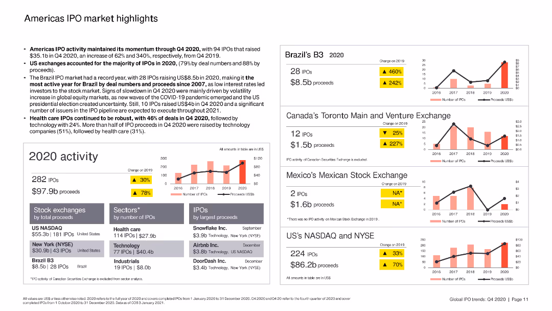
The slide includes column charts and bar charts summarizing IPO activity in the Americas, with specific focus on Brazil, Canada, and the US.
Market Analysis and Trends
Financial Services
The slide highlights key IPO trends in the Americas, focusing on the performance of various stock exchanges, sectors, and top IPOs by proceeds in 2020.
Americas, IPO, Brazil, Canada, US
false
Market Analysis and Trends
Financial Services financial-services
Multiple Chart
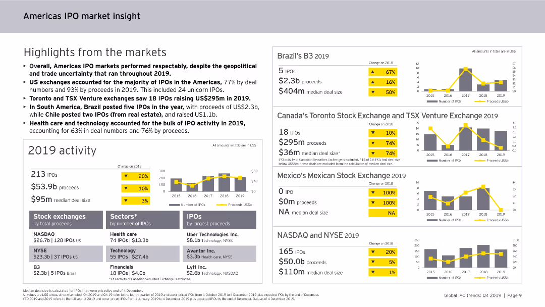
EY
View slide
Contains column charts, data tables, and bullet points. The slide is visually dense, focusing on IPO activities and trends in the Americas for 2019.
Market Analysis and Trends
Financial Services
Highlights the performance of IPO markets in the Americas for 2019, including sector-specific analysis, major exchanges, and trends in IPO deal sizes and proceeds.
Americas, IPO, market insight, 2019, trends
false
Market Analysis and Trends
Financial Services financial-services
Multiple Chart
EY
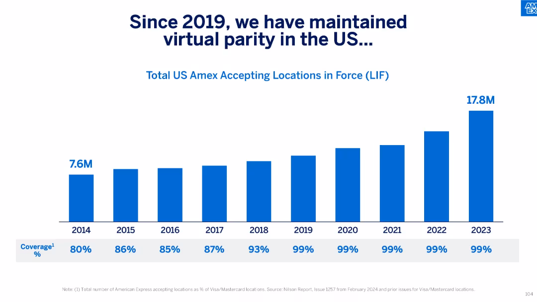
View slide
Horizontal bar chart with annual LIF data from 2014–2023 and corresponding % coverage below.
Performance Metrics and KPIs
Financial Services
The slide tracks the number of US locations accepting Amex from 2014 to 2023, reaching 17.8M and achieving 99% parity with Visa/Mastercard since 2019. It highlights consistent improvements in card acceptance coverage in the US market.
Amex Acceptance, US Market, Coverage, LIF, Visa Parity, Metrics, Annual Growth, KPIs
false
Performance Metrics and KPIs
Financial Services financial-services
Single Chart
McKinsey
View slide
The slide features sections on description, pros, cons, an overview of technology, and key feature estimates. It includes a simple diagram of the Haber-Bosch process and a box listing the conversion and reconversion costs and efficiencies of ammonia.
Product and Service Analysis
Energy & Utilities
This slide provides detailed information on the conversion of ammonia through the Haber-Bosch process. It highlights the advantages and disadvantages of using ammonia for hydrogen conversion, supported by key feature estimates.
Ammonia, Conversion, Hydrogen, Process, Analysis
false
Product and Service Analysis
Energy & Utilities energy-and-utilities
Diagram
Kearney
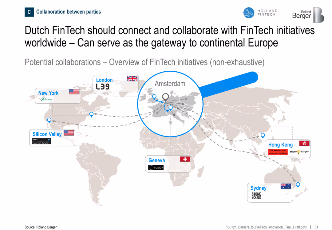
View slide
World map showing major FinTech hubs and their connections to Amsterdam
Sales and Business Development
Financial Services
The slide positions Amsterdam as a central hub in global FinTech collaborations, suggesting potential for Dutch FinTechs to connect with international initiatives across the U.S., Europe, and Asia-Pacific.
Amsterdam, collaboration, global FinTech, gateway, international, initiatives
false
Sales and Business Development
Financial Services financial-services
Uncategorized
Roland Berger
View slide
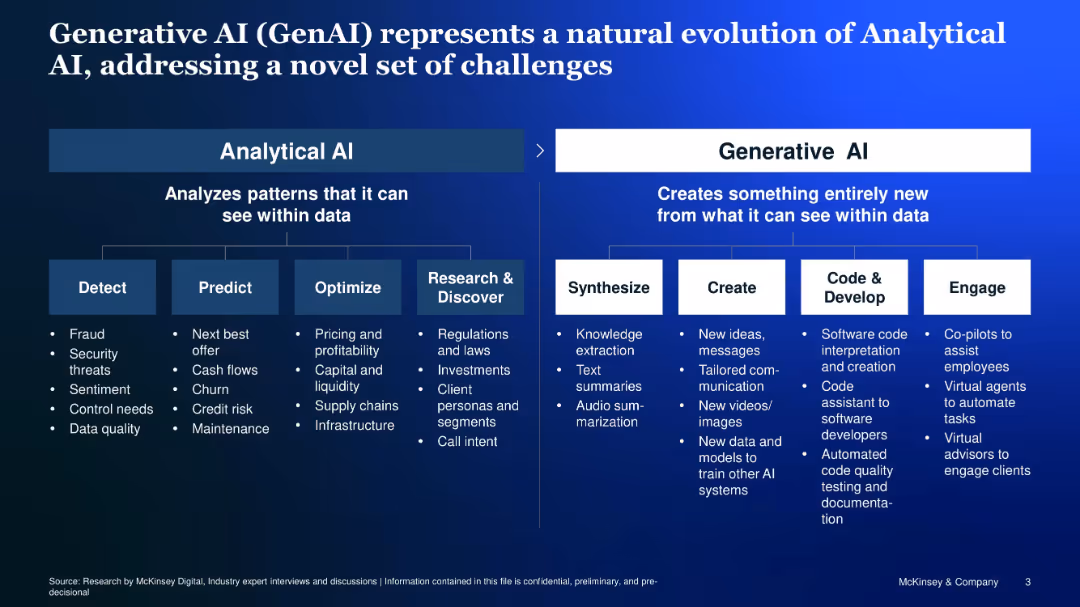
Two-panel comparison of Analytical vs. Generative AI, with icons and structured bullet points
Technology and Digital Transformation
Artificial Intelligence
Compares Analytical AI (focused on detection, prediction, optimization) with Generative AI (focused on synthesis, creation, development, engagement), showcasing how GenAI tackles a new class of problems.
Analytical AI, Generative AI, synthesis, creation, code, co-pilot
false
Technology and Digital Transformation
Artificial Intelligence artificial-intelligence
Diagram
McKinsey
View slide
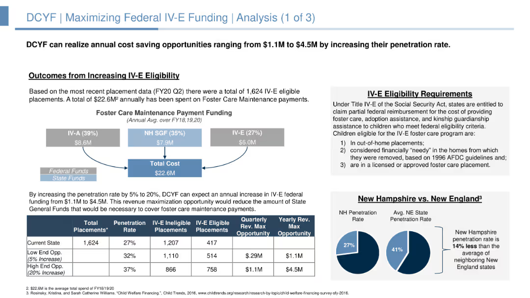
The slide includes a flow diagram illustrating funding distribution and a comparison between New Hampshire and New England penetration rates. The layout is moderately detailed with supporting data in boxes and charts.
Strategic Planning
Government & Public Sector
Slide includes charts, flow diagrams, and text blocks. Displays funding breakdowns and potential revenue opportunities.
Analyzes opportunities for increasing federal IV-E funding, detailing current funding, eligibility requirements, and potential revenue from increased penetration rates.
false
Strategic Planning
Government & Public Sector government-and-public-sector
Mixed Chart
Alvarez & Marsal
View slide
Assumptions in funding models for connectivity
Strategic Planning
Telecommunications
Detailed column charts with cost breakdowns and potential savings across various funding models, highlighting the assumptions made for each scenario. The design uses blue and green shades to represent different costs and savings, making it easy to differentiate.
Analyzes the impact of different funding assumptions on the potential success of school connectivity initiatives in Java, Bali, and Sumatra, emphasizing the role of governmental and community contributions.
false
Strategic Planning
Telecommunications telecommunications
Mixed Chart
BCG
View slide
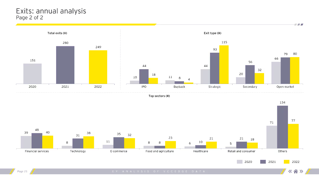
The slide presents two column charts and one bar chart, illustrating total exits by year, exit type, and top sectors. The charts use different colors to represent each year (2020, 2021, and 2022).
Financial Performance
Financial Services
The slide analyzes annual exits, detailing the number of exits per year, types of exits (IPO, buyback, etc.), and top sectors in terms of exit count. This can be used to track industry performance over time.
Annual exits, exit types, sectors, IPO, buyback
false
Financial Performance
Financial Services financial-services
Multiple Chart
EY
View slide
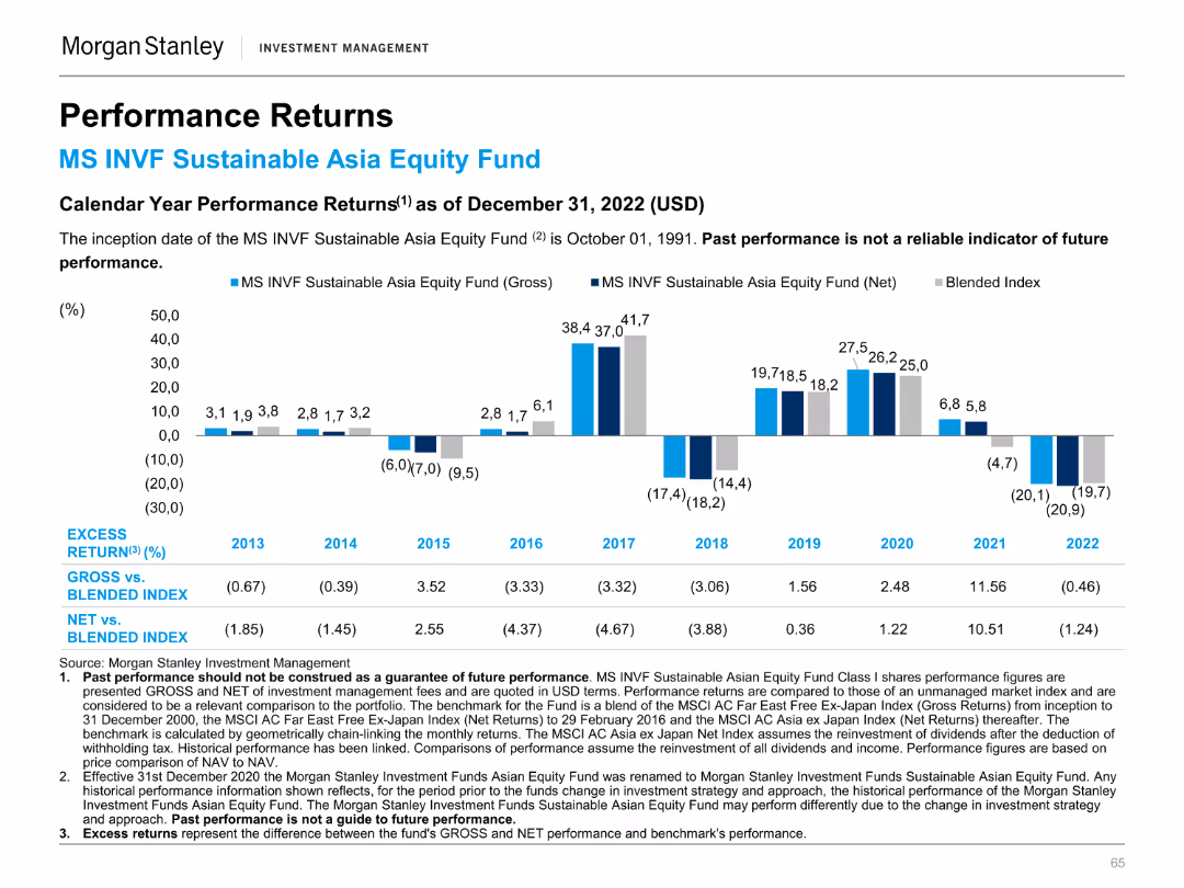
Column chart illustrating calendar year performance returns of the MS INVF Sustainable Asia Equity Fund.
Financial Performance
Financial Services
Highlights annual performance returns, comparing the fund's gross and net returns to a blended index from 2013 to 2022.
Annual, performance, returns, fund, equity
false
Financial Performance
Financial Services financial-services
Mixed Chart
Morgan Stanley
View slide
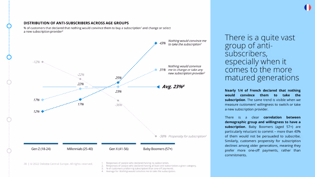
The slide has a column chart and a line graph depicting anti-subscriber rates across different age groups. The column chart shows the percentage of respondents unwilling to subscribe, and the line graph indicates trends in subscription propensity by age group.
Market Analysis and Trends
Consumer Goods
The slide discusses the prevalence of anti-subscribers among different age groups in France, highlighting the significant resistance among older generations. It explains the correlation between age and willingness to subscribe, showing a trend of decreasing commitment with age.
Anti-subscribers, age groups, market segmentation, resistance, subscription trends, generational analysis, consumer behavior, French market
false
Market Analysis and Trends
Consumer Goods consumer-goods
Mixed Chart
Deloitte
View slide
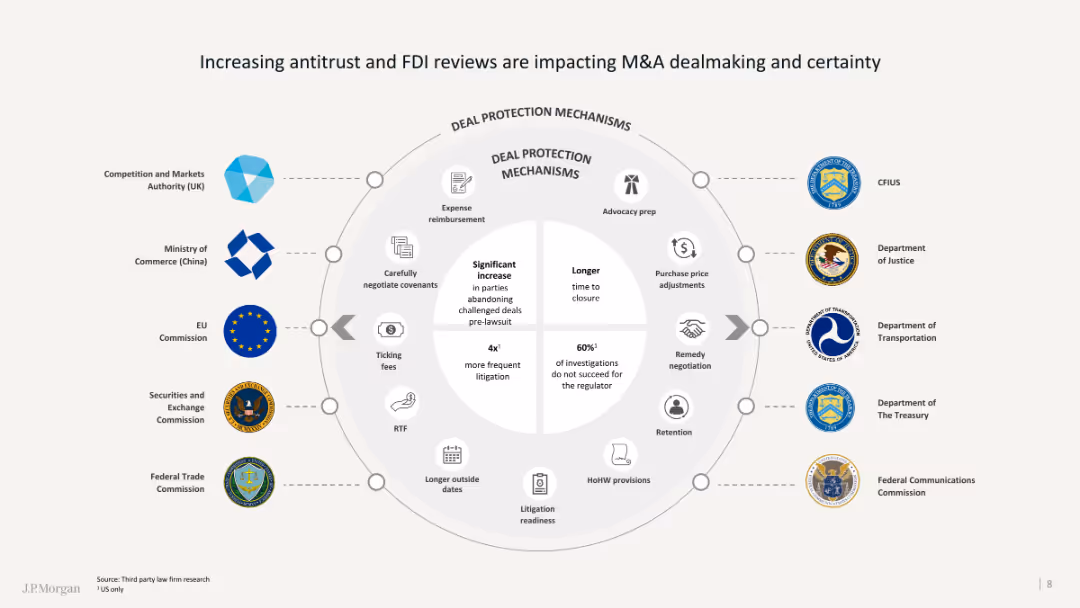
The slide contains a circular diagram detailing various deal protection mechanisms and regulatory bodies involved.
Regulatory and Compliance
Financial Services
It discusses the increasing impact of antitrust and FDI reviews on M&A activities and the associated deal protections.
Antitrust, FDI, M&A, regulatory, deal protection
false
Regulatory and Compliance
Financial Services financial-services
Diagram
JP Morgan
View slide
A bar chart comparing sources of anxiety and stress among Millennials and Gen Z, with categories such as family welfare, financial future, and job prospects.
Market Analysis and Trends
Professional Services
This slide analyzes the primary sources of anxiety and stress among Millennials and Gen Z, comparing various factors like family welfare and financial future.
Anxiety, stress, Millennials, Gen Z, comparison, sources, family welfare, financial future, job prospects
false
Market Analysis and Trends
Professional Services professional-services
Mixed Chart
Deloitte
View slide
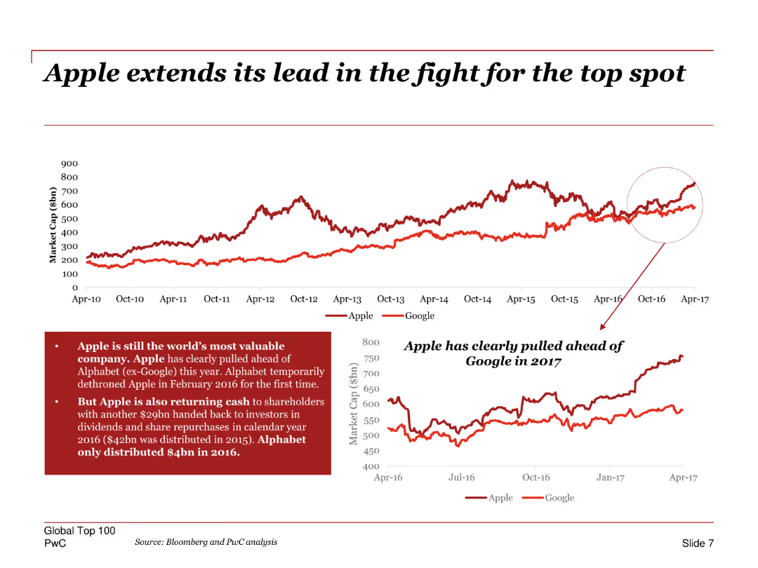
A line chart comparing the market cap of Apple and Google over time, with annotations highlighting key points in their competition.
Competitive Landscape
Technology & Software
Highlights Apple's dominance in market capitalization over Google, emphasizing key periods where Apple pulled ahead. Includes insights on Apple's shareholder returns and dividends.
Apple, Google, market cap, competition, line chart, shareholder returns, dividends, market trends
false
Competitive Landscape
Technology & Software technology-and-software
Multiple Chart
PwC/Strategy&
View slide
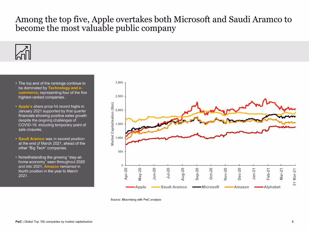
The slide features a line graph comparing the market capitalizations of top tech companies over a year. The visual is clean and focused on trends among the top five companies.
Market Analysis and Trends
Technology & Software
This slide illustrates how Apple surpassed Microsoft and Saudi Aramco to become the most valuable public company, highlighting trends from April 2020 to March 2021.
Apple, Microsoft, Saudi Aramco, market value, tech companies, 2020-2021, comparative analysis
false
Market Analysis and Trends
Technology & Software technology-and-software
Mixed Chart
PwC/Strategy&
View slide
Timeline graphic illustrating Apple's evolution with images of products, financial highlights, and a narrative caption.
Technology and Digital Transformation
Technology & Software
Showcases Apple as a leading example of adopting as-a-service models, depicting their growth and services evolution over time.
Apple, as-a-service, business model, evolution, case study, subscription
false
Technology and Digital Transformation
Technology & Software technology-and-software
Linear Flow
Accenture
View slide
Contains bullet points detailing application modernization and infrastructure modernization with emphasis on cloud adoption and data center consolidation. It uses a purple color scheme and icons to denote different points, including the aim to decommission applications and adopt a multi-cloud strategy.
Operational Efficiency
Technology & Software
Focuses on the bank's initiative to modernize its software development and infrastructure to increase efficiency and cost-effectiveness.
Application Modernization, Infrastructure, Cloud Strategy, Efficiency, Optimization, Data Centers, Security, Financial Services
false
Operational Efficiency
Technology & Software technology-and-software
Table
JP Morgan
Previous
Loading...
Hold On!
We are searching in our database
If nothing, comes up, please try different filters!
Column Chart
Heatmap
Chevron
Org Chart
Infographic
Callouts
Timeline
List
Graphic
Picture
Process Flow
Diagram
Paragraph
Map
Table
Framework
Subtitle
Takeaway Box
Icon
Other Chart
Radar Chart
Waterfall Chart
Mekko Chart
Pie Chart
Scatter Plot
Line Chart
Bar chart
Bullet points
Create a FREE account to continue browsing
Receive Instant Access to 1,000+ slides from companies like McKinsey, Google, and Goldman Sachs
First Name
Last Name
Email
Password
I agree to all
Terms & Privacy Policy
Thank you! Your submission has been received!
Oops! Something went wrong while submitting the form.
Have an account?
Sign in
Upgrade to PRO to Save slides
Advanced Search and Filters
Access to 15,000+ slides
Access to Category Pages
Save/Bookmark Slides
PowerPoint Template Library
Pick a Plan
MONTHLY
$12/month
Billed every month, Cancel anytime.
YEARLY
$9/year
Billed $108 annually, Cancel anytime.
Checkout for $12/month
Checkout for $108/yr
Secured by Stripe | AES-256 bit encryption