My Account
My Slides
Search by Category
Templates
View All Templates
Download Template Slides
Leave Feedback
Login
Logout
Get Started
Browse all Slides
Browse all Slides
Create a FREE Account
Instant access to 1,000+ real slides from top companies like McKinsey, BCG, Goldman Sachs, Google and many more!
First Name
Last Name
Email
Password
I agree to all
Terms & Privacy Policy
Thank you! Your submission has been received!
Oops! Something went wrong while submitting the form.
Have an account?
Sign in
Instant access to the internet's best slides
Get access to 40+ advanced filters and more
Advanced Search and Filters
Access to
10,000+ slides
Access to Category Pages
Save/Bookmark Slides
PowerPoint Template Library (New)
Choose your plan
MONTHLY
$12/month
Billed every month, cancel anytime.
YEARLY
$9/month
Billed $108 annually, cancel anytime.
Checkout for $12/month
Checkout for $108/yr
Secured by Stripe | AES-256 bit encryption
Spark Your Next Big Idea with New Presentation Templates
VIEW ALL Templates
Welcome,
Welcome
Upgrade to SlideStart
Pro
Instant access to 15,000+ slides
Show Featured Only
Checkbox 8
Companies
Mckinsey
Bain
BCG
EY
Deloitte
Accenture
PwC/Strategy&
JP Morgan
Goldman Sachs
Morgan Stanley
Citigroup
Deutsche Bank
Barclays
LEK
Kearney
Oliver Wyman
Booz Allen Hamilton
Gartner
IPSOS
Nielsen
Slide type
Header Horizontal
Framework
Vertical Flow
Single Chart
Single Chart
Text Only
Mixed Chart
Header Vertical
Graphic
Pillar
Multiple Chart
Agenda
Title
Table
Linear Flow
Upgrade to SlideStart
Pro
Instant access to 40+ advanced filters
Industry
Upgrade to SlideStart
Pro
Instant access to 40+ advanced filters
Technology
Healthcare
Financial Services
Consumer Goods
Energy & Utilities
Manufacturing
Retail
E-commerce
Logistics
Telecommunications
Real Estate
Professional Services
Education
Media
Entertainment
Hospitatlity
Tourism
Agriculture
Food Production
Government & Public Sector
Environmental
Sustainability
Use Case
Upgrade to SlideStart
Pro
Instant access to 40+ advanced filters
Sales and Business Development
Mergers and Acquisitions
Corporate Finance and Valuation
Performance Metrics and KPIs
Client Case Studies
Competitive Landscape
Product and Service Analysis
Customer and Market Segmentation
Organizational Structure
Human Resources and Talent Management
Industry Overview
Regulatory and Compliance
Risk Assessment and Management
Agriculture & Food Production
Hospitality and Tourism
Government
Environmental
Sustainability
Clear all
Thank you! Your submission has been received!
Oops! Something went wrong while submitting the form.
Show Featured Only
Checkbox 8
Companies
Mckinsey
Bain
BCG
EY
Deloitte
Accenture
PwC/Strategy&
JP Morgan
Goldman Sachs
Morgan Stanley
Citigroup
Deutsche Bank
Barclays
LEK
Kearney
Oliver Wyman
Booz Allen Hamilton
Gartner
IPSOS
Nielsen
Slide type
Text Only
Linear Flow
Vertical Flow
Single Chart
Header Horizontal
Mixed Chart
Header Vertical
Pillar
Multiple Chart
Graphic
Agenda
Title
Table
Framework
Industry
Technology
Healthcare
Financial Services
Consumer Goods
Energy & Utilities
Manufacturing
Retail
E-commerce
Logistics
Telecommunications
Real Estate
Professional Services
Education
Media
Entertainment
Hospitatlity
Tourism
Agriculture
Food Production
Government & Public Sector
Environmental
Sustainability
Use Case
Sales and Business Development
Mergers and Acquisitions
Corporate Finance and Valuation
Performance Metrics and KPIs
Client Case Studies
Competitive Landscape
Product and Service Analysis
Customer and Market Segmentation
Organizational Structure
Human Resources and Talent Management
Industry Overview
Regulatory and Compliance
Risk Assessment and Management
Agriculture & Food Production
Hospitality and Tourism
Government
Environmental
Sustainability
Clear all
Thank you! Your submission has been received!
Oops! Something went wrong while submitting the form.
Tag
View slide
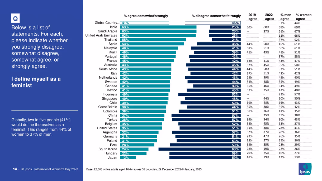
Horizontal bar chart; shows % agreement/disagreement per country; gender-specific agreement percentages; simple and clean layout
Customer and Market Segmentation
Professional Services
This slide reveals the proportion of people globally and by country who identify as feminists. It compares gender agreement levels and includes 2019 and 2022 agreement rates, offering insights into self-identification trends related to feminism.
feminism, identity, self-definition, gender, agreement rates, survey, country-level data, Ipsos
false
I define myself as a feministINTERNATIONAL WOMEN'S DAY 2023
Mixed Chart
IPSOS
View slide
Purple background with white text and a column chart. Includes text on the value of platform strategies
Competitive Landscape
Technology & Software
The slide explains the value of platform strategies, citing examples like Shell and American Express
Platform, Ecosystem, Value, Collaboration, Technology
false
Platform companies have a more visible approach to collective valueLevel Up: Elevate Your Business With a Platform Strategy
Mixed Chart
Accenture
View slide
Two bar charts showing customer and country exposure by percentage of NBV, with associated airline and country flags.
Market Analysis and Trends
Transportation & Logistics
Analyzes Aircastle’s global market distribution by detailing customer base and country-specific aircraft exposure.
aviation, global, market, distribution, customer, airlines, exposure
false
Diversified Customer Base with Broad Geographic DistributionDeutsche Bank 11th Annual Aircraft Finance & Leasing Conference
Multiple Chart
Deutsche Bank
View slide
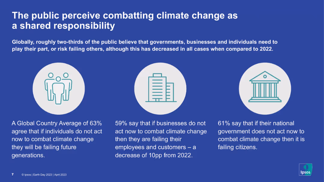
Blue background, three circular icons representing people, buildings, and government; text below each icon summarizing opinions.
Strategic Planning
Environmental Services & Sustainability
The slide communicates that most people globally believe combating climate change is a shared duty among individuals, businesses, and governments. While agreement is still high, it has declined from previous years. Visuals simplify key message segments by stakeholder.
Shared responsibility, Climate change, Individuals, Government, Businesses, Public views
false
The public perceive combatting climate change as a shared responsibilityEARTH DAY 2023
Pillar
IPSOS
View slide
This slide contains a series of horizontal bar charts comparing responses between LGBTQIA+ employees and the overall employee population at Deloitte on various aspects like pride in the company, respect at work, authenticity, and support.
Human Resources and Talent Management
Professional Services
The slide presents survey results showing differences in feelings of authenticity and support at work between LGBTQIA+ professionals and their peers at Deloitte, highlighting a testimonial and the company's commitment to LGBTQIA+ inclusivity.
LGBTQIA+, survey, Deloitte, inclusion, authenticity, support, testimonial, commitment
false
FY2020 talent survey results - LGBTQIA+2021 Diversity, Equity, and Inclusion (DEI) Transparency Report
Mixed Chart
Deloitte
View slide
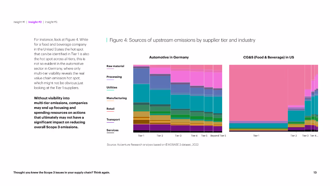
The slide presents two column charts comparing upstream emission sources by supplier tier for Automotive in Germany and CG&S in the US. It is data-dense.
Market Analysis and Trends
Environmental Services & Sustainability
This slide compares the sources of upstream emissions for automotive and food & beverage industries, highlighting differences in emission visibility across tiers.
Emissions, sources, supplier tier, automotive, food & beverage, industry comparison, upstream, Germany, US, sustainability
false
Figure 4: Sources of upstream emissions by supplier tier and industryThought you knew the Scope 3 issues in your supply chain? Think again.
Multiple Chart
Accenture
View slide
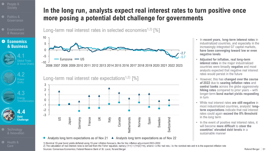
Two-part chart: top shows long-term real interest rates for Eurozone & US; bottom visualizes expectations for major economies; right panel provides analysis
Financial Performance
Government & Public Sector
This slide outlines the shift in real interest rate expectations following inflationary pressures and central bank interventions in 2022. It discusses the implications for managing public debt under higher real rates.
real interest rates, inflation, central banks, public debt, monetary policy, forecasts, G7, long-term yields
false
In the long run, analysts expect real interest rates to turn positive once more posing a potential debt challenge for governmentsTrend Compendium 2050 Six megatrends that will shape the world
Multiple Chart
Roland Berger
View slide
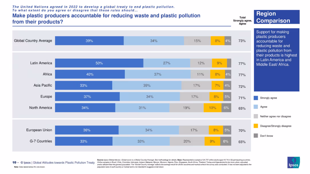
Regional horizontal stacked bar chart with consistent labeling and explanatory sidebar.
Regulatory and Compliance
Environmental Services & Sustainability
This slide aggregates regional support for producer accountability under a plastic treaty. Latin America and Africa show the highest support (77%), while North America and G7 countries lag behind.
global treaty, regional opinion, plastic regulation, corporate responsibility, Ipsos survey, accountability measures, environmental consensus
false
Make plastic producers accountable for reducing waste and plastic pollution from their products?Attitudes towards a global plastic pollution treaty
Mixed Chart
IPSOS
View slide
The slide includes a column chart illustrating concentration levels across different access modes, similar to slide 8201 but under a different approach. Bars are vertically oriented and labeled accordingly.
Market Analysis and Trends
Media & Entertainment
This slide presents an alternative analysis of concentration levels across various access modes, treating all subsequent visits as direct.
concentration, direct visits, column chart, media, alternative analysis
false
Alternative approach 3: Any source within last 5 steps, subsequent visits identified as direct Concentration levels across different access modesIpsos Iris passive monitoring data analysis
Single Chart
IPSOS
View slide
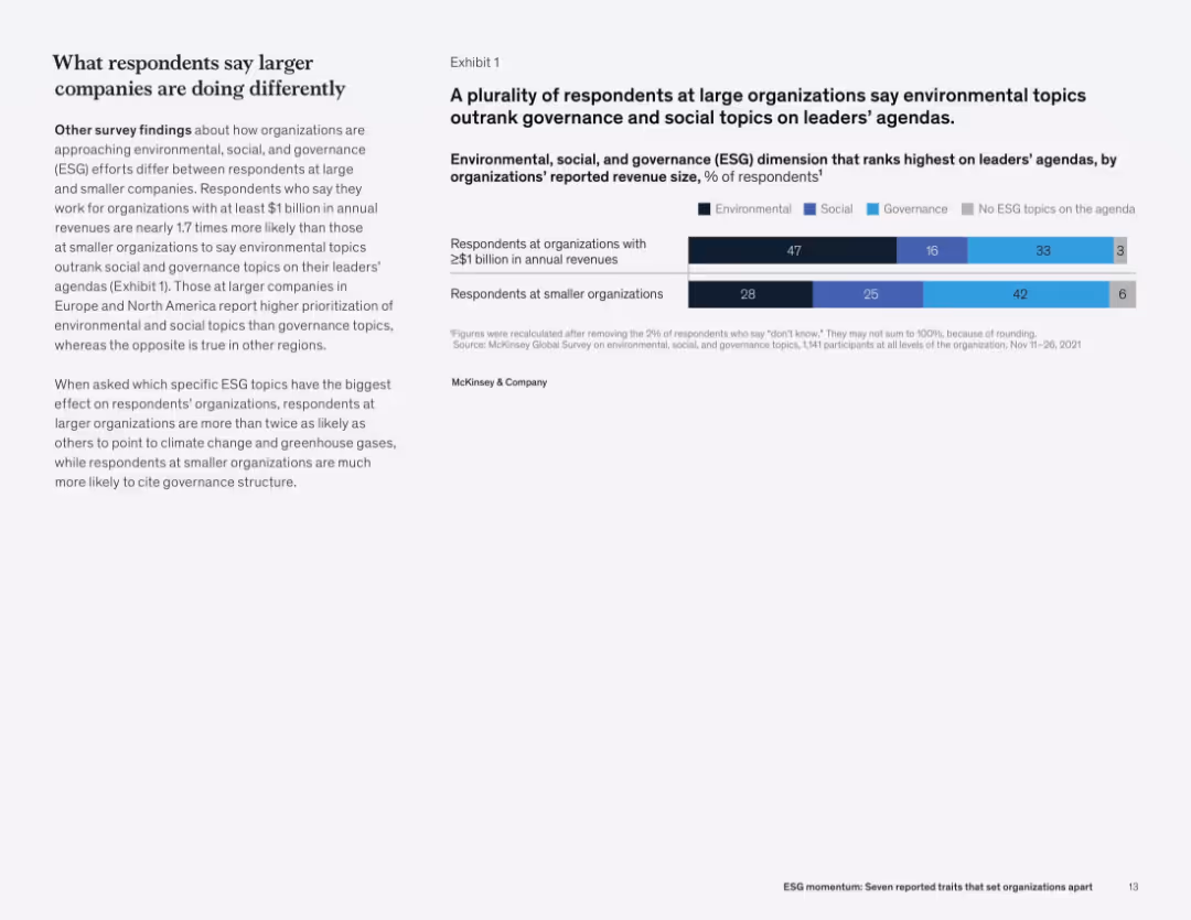
Two-column layout: left side contains text and analysis, right side presents a horizontal stacked bar chart segmented by organization size and ESG topic category.
Market Analysis and Trends
Professional Services
This slide shows that large organizations prioritize environmental issues on leadership agendas more than governance or social topics. Smaller organizations focus more on governance. This distinction is influenced by company size and region, with climate issues more prevalent at large firms.
ESG focus, environmental issues, governance, company size, leadership agenda, survey, revenue, McKinsey
false
A plurality of respondents at large organizations say environmental topics outrank governance and social topics on leaders’ agendasESG momentum: Seven reported traits that set organizations apart
Mixed Chart
McKinsey
View slide
Slide includes a bar chart detailing the focus of various financial organizations on international expansion over the next three years. The design is well-organized, facilitating easy comparison of data across different organization types.
Strategic Planning
Financial Services
Analyzes the strategies of financial institutions planning to expand internationally, highlighting key areas and regions of focus based on emerging market potential.
international expansion, financial institutions, market opportunities, strategic planning, emerging markets
false
Finding cross-border opportunitiesBuilding a Future-Ready Investment Firm
Mixed Chart
Deloitte
View slide
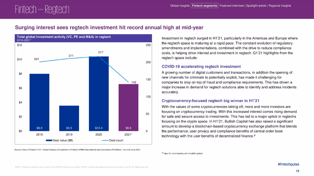
Bar chart on the left showing investment growth, paired with detailed insights on the right.
Risk Assessment and Management
Financial Services
This slide highlights a rise in regtech investment in H1 2021, particularly in the Americas and Europe. It attributes growth to regulatory changes, fraud prevention needs, and cryptocurrency-focused regtech. It also examines pandemic-driven digital transformation.
regtech, fintech compliance, digital fraud, cryptocurrency, investment surge, H1 2021
false
Surging interest sees regtech investment...Pulse of Fintech H1’21
Mixed Chart
KPMG
View slide
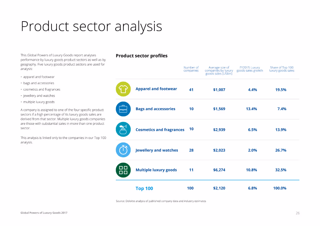
A combination of text and a table on the right, profiling luxury product sectors like apparel, accessories, cosmetics, and jewelry. Each row lists the number of companies, average size, sales growth, and share of top 100 sales for each sector.
Product and Service Analysis
Consumer Goods
This slide analyzes the performance of different luxury product sectors, providing insights into the number of companies, average size by sales, and growth rates for apparel, accessories, cosmetics, and jewelry sectors.
Product, Sector, Analysis, Luxury, Goods
false
Product sector analysisGlobal Powers of Luxury Goods 2017 The new luxury consumer
Table
Deloitte
View slide
Column chart on customer outreach and circular flow diagram for branch team roles. Muted colors with blue highlights.
Strategic Planning
Financial Services
Transition to proactive customer engagement and integrated branch team roles in various banking services.
Customer Outreach, Integrated Teams, Wealth Management, Relationship Development, Proactive Engagement, Branch Network
false
Branches are increasingly serving as hubs for relationship developmentConsumer & Community Banking
Mixed Chart
JP Morgan
View slide
This slide features a series of bar charts evaluating energy and power portfolios based on CTF scores, alongside a comprehensive text breakdown of Barclays' client engagement strategies in transitioning to lower-emission operations.
Client Case Studies
Financial Services
Describes how Barclays assesses and engages with clients on their ESG performance using the Client Transition Framework, offering insights into sector-specific transition plans and executive engagement.
client engagement, ESG performance, transition planning, sector analysis, sustainability, client assessment
false
Engaging clients through our Client Transition FrameworkFY23 ESG Investor Presentation
Multiple Chart
Barclays
View slide
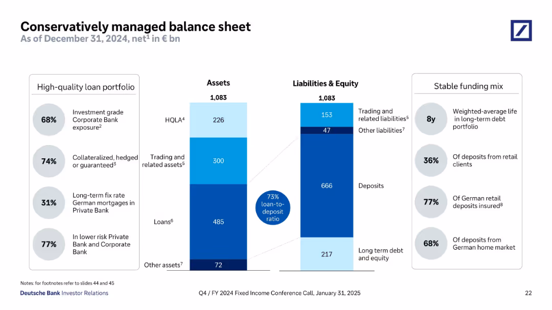
Split panel design showing assets and liabilities side-by-side using stacked bar formats. Flanked by callout bubbles for metrics (loan-to-deposit, quality, maturity). Structured with clean lines and shaded color segments.
Operational Efficiency
Financial Services
This slide provides a breakdown of Deutsche Bank’s assets and liabilities as of December 2024, showcasing a conservative balance sheet. Key data include 73% loan-to-deposit ratio, long average debt maturity, and high levels of investment-grade and collateralized loans. It underscores stability, funding quality, and prudent risk management.
balance sheet, assets, liabilities, loan-to-deposit, collateralized loans, HQLA, long-term debt, Deutsche Bank
false
Conservatively managed balance sheetQ4/FY 2024 Fixed Income Investor Conference Call
Mixed Chart
Deutsche Bank
View slide
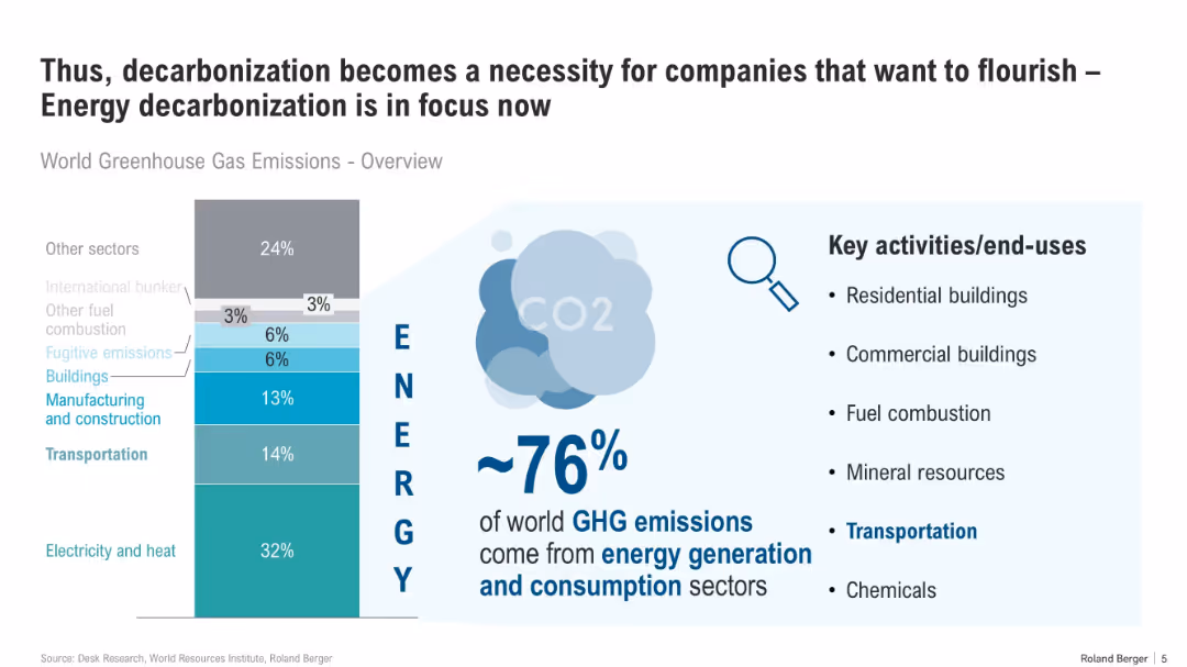
Vertical bar chart centered, split into sectors by emission contribution, with supporting bullet points and infographic elements on the right.
Technology and Digital Transformation
Energy & Utilities
The slide emphasizes that ~76% of global GHG emissions originate from energy generation and use. It highlights key energy-consuming sectors and stresses the need for corporate decarbonization to meet sustainability goals.
decarbonization, GHG emissions, energy, buildings, transportation, commercial, CO2, consumption, sector overview
false
Thus, decarbonization becomes a necessity for companies that want to flourish – Energy decarbonization is in focus nowDecarbonization in ports and shipping
Mixed Chart
Roland Berger
View slide
The slide includes text sections and a column chart with a distinct color scheme for each section, showing the contributions to the financial entity.
Industry Overview
Financial Services
Highlighting the global consumer banking strategy, market presence, and contributions to the overall business, the slide provides a comprehensive overview and financial standing.
Consumer Banking, Strategy, Market Presence, Financial Contributions, Cards, Wealth Management, Digital Capability, Funding
false
Global Consumer Banking Our FranchiseGlobal Consumer Banking
Mixed Chart
Citigroup
View slide
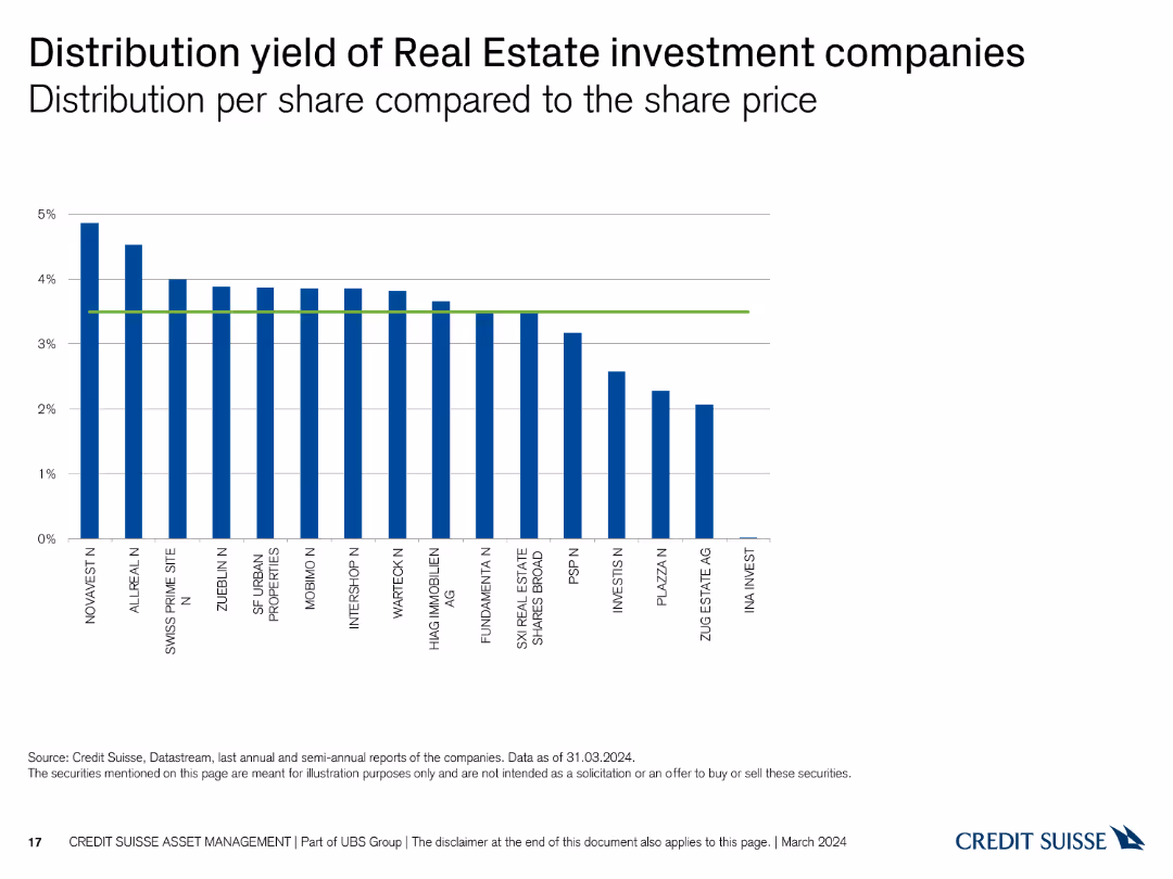
A column chart showing the distribution yield per share of various real estate investment companies. The X-axis lists companies, and the Y-axis represents distribution yield percentages up to 5%.
Financial Performance
Real Estate & Construction
This slide compares the distribution yield per share across different real estate investment companies, highlighting those with the highest and lowest yields.
distribution, yield, real estate, investment, companies, comparison, financial, performance, yield percentage, analysis
false
Distribution yield of Real Estate investment companies Distribution per share compared to the share priceSwiss Real Estate Funds At a glance Switzerland March 2024
Single Chart
Credit Suisse
View slide
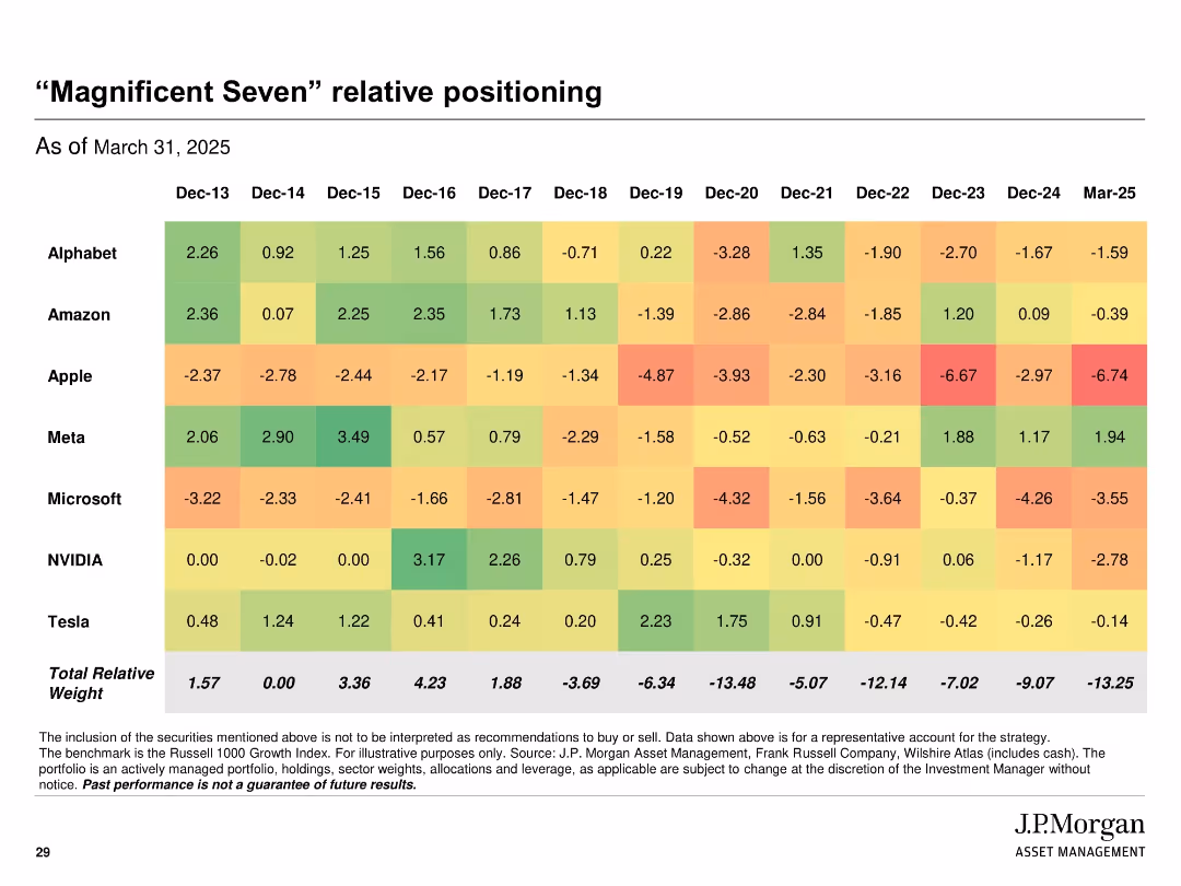
Heatmap table format showing relative stock weightings across years; color-coded cells from green (overweight) to red (underweight)
Product and Service Analysis
Financial Services
Displays the strategy's relative positioning in key large-cap tech names ("Magnificent Seven") over time, from 2013 to 2025. The chart tracks year-by-year portfolio weight differences versus benchmark, providing insights into historical and current exposure trends.
magnificent seven, tech stocks, relative weight, heatmap, positioning, strategy, J.P. Morgan
false
“Magnificent Seven” relative positioningJ.P. Morgan Large Cap Growth Strategy Separately Managed Account
Single Chart
JP Morgan
View slide
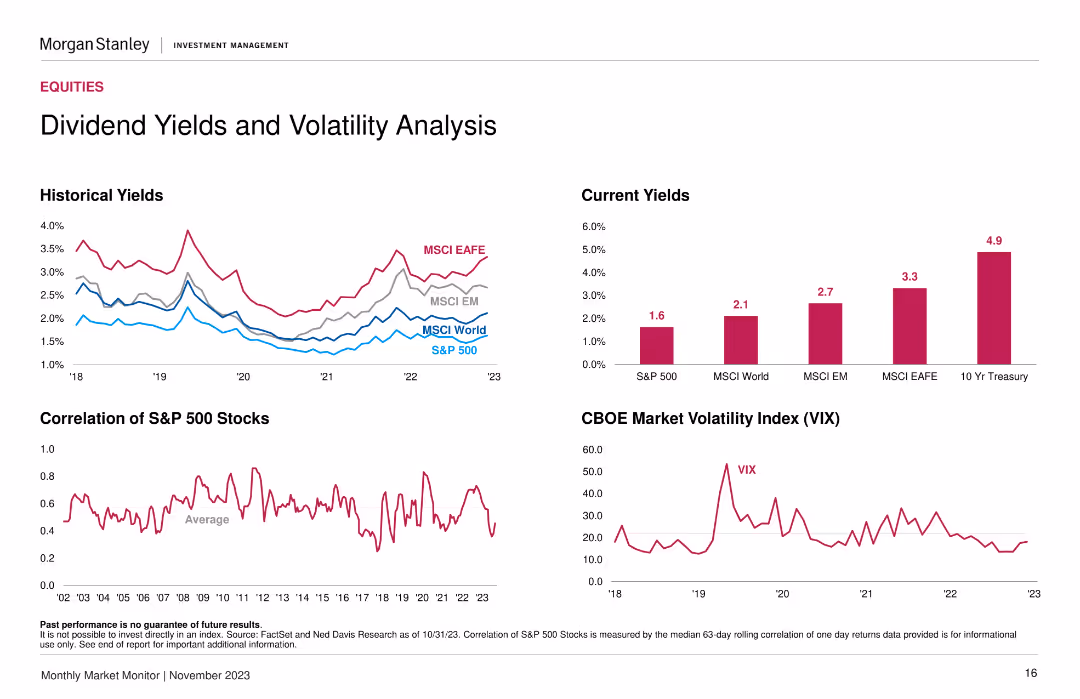
The slide contains four charts: historical yields (line chart), current yields (column chart), correlation of S&P 500 stocks (line chart), and the CBOE Market Volatility Index (line chart).
Market Analysis and Trends
Financial Services
The slide presents a detailed analysis of dividend yields and market volatility, showing trends over time and current statistics for different indices and the VIX.
dividend yields, market volatility, historical yields, current yields, VIX
false
Dividend Yields and Volatility AnalysisMonthly Market Monitor November 2023
Multiple Chart
Morgan Stanley
View slide
The slide features a column chart with annotations, and two iconographic bullet points. Red and grey are the primary colors used in the graphics.
Financial Performance
Financial Services
The slide outlines Leonardo's ESG-linked financial sources, including transactions and key performance indicators aligned with the company's strategy and long-term plans. It emphasizes sustainability in finance.
ESG, finance, sustainability, KPI, funding, credit facility, term loan, CO2 emissions reduction, STEM employment
false
Step up in FOCF in 2021 and 2022Goldman Sachs Investor Meeting
Mixed Chart
Goldman Sachs
View slide
The slide has multiple icons and a comparative table showing the cost increase for various products if they adopt net-zero supply chains. It uses bright colors and bold text to emphasize key statistics and public opinion data.
Market Analysis and Trends
Professional Services
The slide highlights public demand for corporations to adopt environmental considerations and the average cost increase for products with net-zero supply chains. It also shows the percentage of companies committed to reaching net-zero by 2050.
net-zero, cost increase, public demand, corporations, supply chain
false
Facing higher green demands and calls for commitments to move aggressively to net-zeroThe time for climate action is now
Header Vertical
BCG
View slide
This slide has bullet points, growth metrics, and a mix of traditional and alternative assets bar graphs.
Financial Performance
Financial Services
Highlights the decade-long growth of JPMorgan's Asset & Wealth Management and Private Bank sectors, emphasizing its market-leading position with data comparisons and client asset flows in a visually dense layout.
market-leading, growth, JPMorgan, asset management, private bank
false
Powered by two market leading franchisesInverstors Day 2023
Multiple Chart
JP Morgan
View slide
Slide has three separate sections with bulleted lists summarizing key findings from various papers, including employment and business creation due to broadband.
Market Analysis and Trends
Telecommunications
Summarizes research findings linking broadband quality to job creation and business effects, with references to multiple studies and varied geographical impacts.
broadband, employment, business creation, research summary, job market, economic development, regional analysis, studies comparison
false
Literature review – Employment and business effectsThe economic and social impact of investment in the nbn network Methodology Report
Table
Accenture
View slide
A column chart showing the percentage of companies with tech-fluent C-suite and board members. Text elaborates on the importance of tech-savvy leadership in addressing business challenges.
Organizational Structure and Change
Technology & Software
The slide emphasizes the significance of having tech-fluent leadership in the C-suite and board, supported by a column chart comparing tech mindset metrics.
Tech Mindset, Leadership, C-suite, Board, Business Challenges
false
Figure 4. Distribution of tech-forward companies by industryStrategy at the Pace of Technology
Mixed Chart
Accenture
View slide
With a split layout, the left side text emphasizes the pace of change, while the right side showcases a lighthouse graphic representing sensing capabilities.
Market Analysis and Trends
Professional Services
Emphasizes the importance of rapid demand-sensing capabilities in different sectors, attributing the necessity to fast-paced changes and consumer behavior.
change pace, consumer behavior, demand-sensing, sectors, analytics, data
false
Pace and de-averaged nature of change make rapid sensing capabilities a key imperative for leadersCOVID-19 BCG Perspectives Series Global Restart: Key Dynamics
Header Horizontal
BCG
View slide
Includes a balance column chart showing job gains and losses across different industrial trends.
Market Analysis and Trends
Industrial & Manufacturing
Summarizes the net effect of various industrial trends on employment, showing overall stability despite fluctuations caused by factors like technology and offshoring. Provides a comprehensive view of the employment landscape.
Industrial Trends, Employment Stability, Job Gains, Job Losses
false
Sum of trends keeps employment stable ...Changing automotive work environment: Job effects in Germany until 2030
Single Chart
BCG
View slide
This slide visually maps out how employee needs evolve over time, with specific focus on various career stages. It uses a timeline format, complemented by icons representing different workforce segments. The layout includes side texts and a central illustrative panel that details the changing priorities and expectations of employees at each career phase.
Human Resources and Talent Management
Professional Services
Highlights the importance of recognizing the dynamic and diverse needs of employees throughout their careers, suggesting tailored approaches to DEI that address these varying requirements. It encourages companies to adopt flexible and inclusive strategies that acknowledge the unique challenges and aspirations of different employee groups.
DEI, career development, employee needs, workforce diversity, talent management, inclusive strategies
false
Amplify talent impact: recognize the complexity of contexts that can shape how employees’ needs change over timeRethink & Broaden Diversity, Equity, and Inclusion to Create a Competitive Advantage
Linear Flow
BCG
View slide
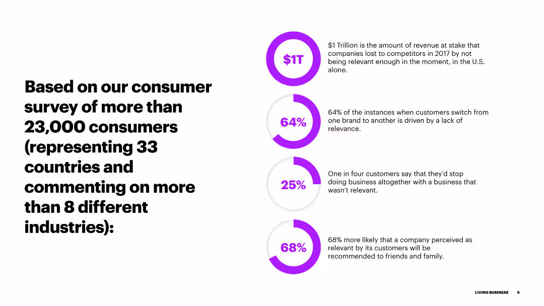
The slide has a heading on the left with a list of key statistics represented in colorful circular progress bars on the right. Each circle has a percentage and brief description next to it.
Market Analysis and Trends
Consumer Goods
The slide presents key statistics from a consumer survey, highlighting the importance of relevance in business. It discusses revenue loss, customer switch rates, and the impact on business.
survey, consumers, relevance, statistics, revenue, customer switch, business impact
false
Based on our consumer survey of more than 23,000 consumersLIVING BUSINESS Achieving Sustainable Growth Through Hyper-Relevance
Multiple Chart
Accenture
View slide
A bar chart and bullet points detailing reasons highly skilled workers consider job changes.
Human Resources and Talent Management
Professional Services
Analyzes the motivations for job changes among highly skilled workers, including pay, career progression, and work environment.
Job change, skilled workers, career progression, work environment
false
Intensifying demands from highly skilled workersRe-focus your talent lens: Abundance awaits
Mixed Chart
Accenture
View slide
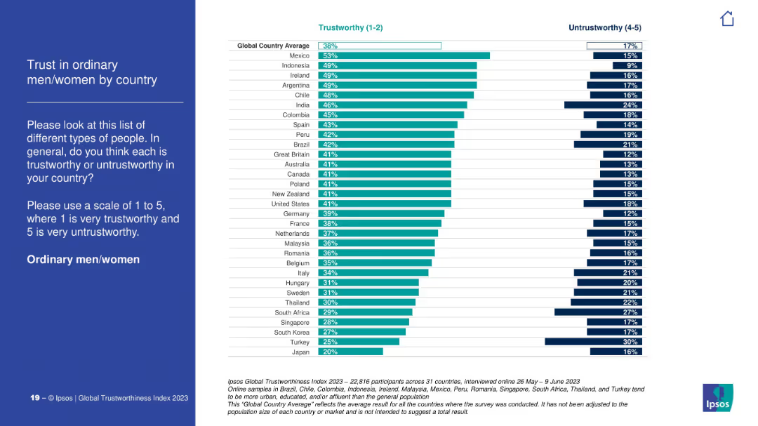
Ranked bar chart showing trust in ordinary citizens by country, with global average noted. Consistent color coding, minimalist visual style.
Customer and Market Segmentation
Government & Public Sector
The slide depicts how ordinary citizens are perceived in terms of trustworthiness across countries. Mexico, Indonesia, and Ireland are highest; Japan and Turkey are lowest. The global average sits at 38%.
ordinary citizens, trust metrics, public perception, Ipsos, social trust, survey results
false
Trust in ordinary men/women by countryIPSOS GLOBAL TRUSTWORTHINESS INDEX 2023
Mixed Chart
IPSOS
View slide
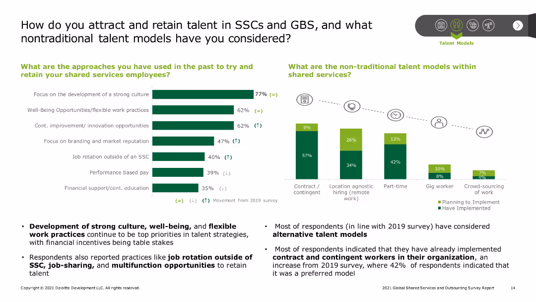
The slide contains a column chart on the left displaying various approaches for talent retention and a bar chart on the right depicting the non-traditional talent models within shared services. Text descriptions highlight key statistics and findings.
Human Resources and Talent Management
Professional Services
The slide discusses strategies for attracting and retaining talent in Shared Services Centers (SSCs) and Global Business Services (GBS), including traditional and non-traditional models. Key points include development of strong culture and flexible work practices.
Talent retention, SSC, GBS, flexible work, non-traditional models
false
How do you attract and retain talent in SSCs and GBS, and what nontraditional talent models have you considered?2021 Global Shared Services and Outsourcing Survey Report
Multiple Chart
Deloitte
View slide
The slide features a line chart showing the volume of raised investment in QT start-ups from 2001 to 2022, with a spike around 2022. Includes text highlighting $2.35B and 75% investment in quantum computing players.
Investment Analysis
Financial Services
This slide discusses the record high of QT start-up investments in 2022, which grew only 1% year-over-year, highlighting the dominance of quantum computing players in investment.
investment, quantum computing, start-ups, annual growth, financial trends
false
level of all-time, though it grew only 1% year over year.¹ McKinsey & Company Total annual QT start-up investment hit the highest level of all-time, though it grew 1 percent year over year.Quantum Technology Monitor
Mixed Chart
McKinsey
View slide
Bar chart showing company priorities for 2019, focusing on areas such as product portfolio, production, controlling & finance, sales & marketing, and procurement.
Strategic Planning
Financial Services
The slide outlines the top priorities for companies in 2019, with a significant focus on the product portfolio. It highlights the growing importance of controlling and finance activities, alongside other strategic areas like production, sales, and marketing, reflecting the key areas where businesses plan to concentrate their efforts.
Company Priorities, Product Portfolio, Strategic Planning
false
In terms of priorities for 2019, >70% of companies focus their activities on the Product Portfolio Controlling & Finance is catching up10th Operations Efficiency Radar
Multiple Chart
Roland Berger
View slide
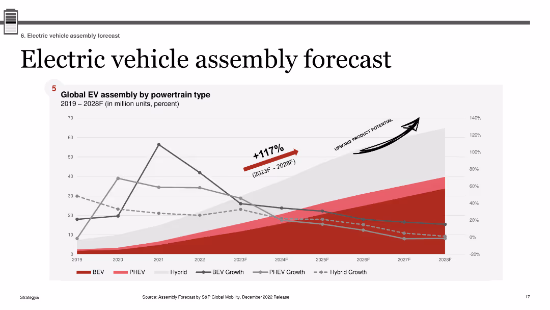
A line chart showing the global EV assembly by powertrain type from 2019 to 2028, with projected growth percentages for various EV types.
Market Analysis and Trends
Transportation & Logistics
Projects global electric vehicle assembly growth across different powertrain types, indicating a significant upward trend through 2028.
EV, assembly, global, forecast, powertrain, growth, market, BEV, PHEV
false
Electric vehicle assembly forecastElectric Vehicle Sales Review Q4 2022
Single Chart
PwC/Strategy&
View slide
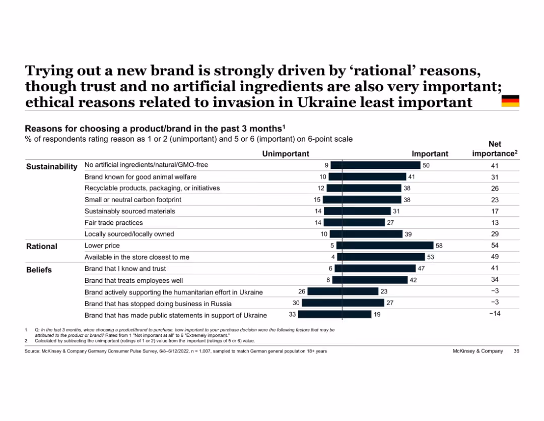
Vertical bar chart with two-part segments (unimportant vs important); grouped by theme (e.g., beliefs)
Market Analysis and Trends
Consumer Goods
Highlights top reasons German consumers tried new brands, with rational factors like price and store availability ranking highest, followed by sustainable and belief-driven factors. Ukraine war-related factors least influential.
rational decision-making, sustainability, trust, Ukraine, brand choice, Germany, ethical purchasing, consumer reasons
false
Trying out a new brand is strongly driven by ‘rational’ reasons, though trust and no artificial ingredients are also very important; ethical reasons related to invasion in Ukraine least importantEuropean Consumer Sentiment Survey: How current events in Europe are shaping consumer behavior
Single Chart
McKinsey
View slide
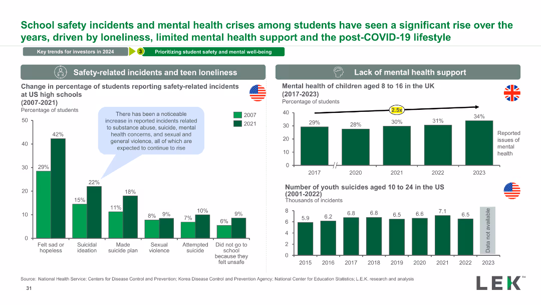
The slide contains two column charts comparing student safety incidents from 2007 to 2021 and mental health issues in children from 2017 to 2023. It includes data on youth suicides and mental health crises.
Risk Assessment and Management
Education & Training
This slide examines trends in school safety incidents and mental health crises among students, highlighting increases in various incidents and mental health issues.
Safety, Mental Health, Students, Incidents, Trends, Data, Analysis, Education, Crisis, Prevention
false
School safety incidents and mental health crises among students have seen a significant rise over the years, driven by loneliness, limited mental health support and the post-COVID-19 lifestyleEducation: 2023 M&A Deal Roundup and Trends to Watch Out for in 2024
Multiple Chart
LEK
View slide
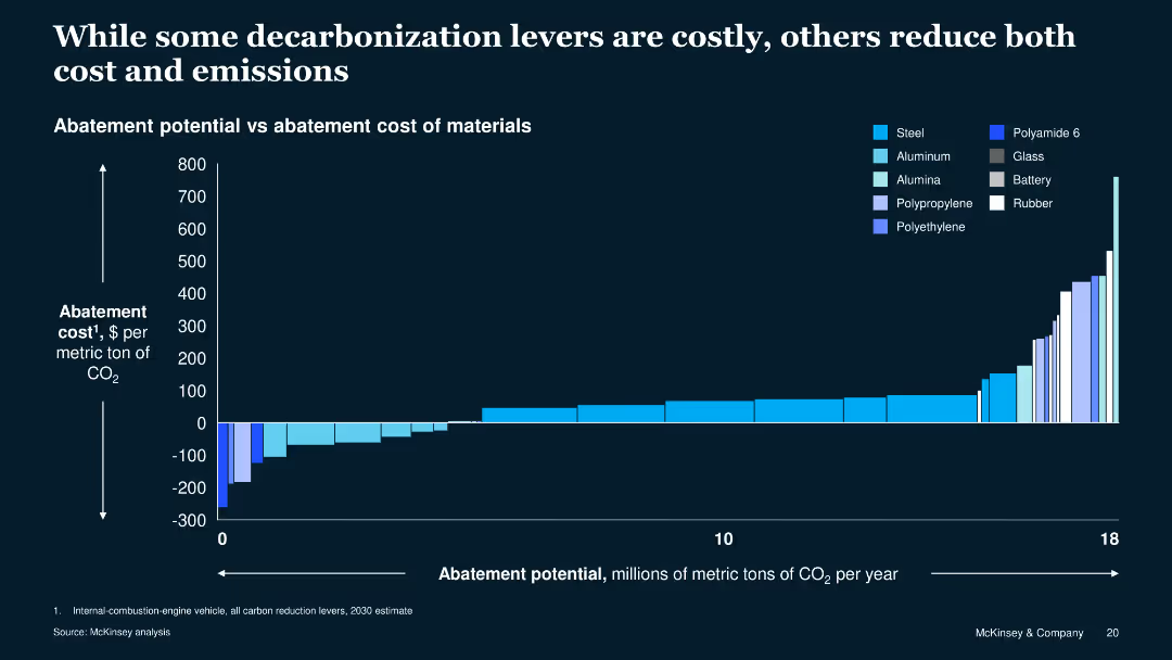
The slide includes a column chart showing abatement potential versus cost for various materials. The chart uses different shades of blue to represent different materials.
Operational Efficiency
Energy & Utilities
This slide compares the cost and potential CO2 reduction of various materials used in manufacturing, illustrating that some options can reduce both costs and emissions.
abatement, cost, emissions, materials, comparison, manufacturing, energy, efficiency, sustainability, decarbonization
false
While some decarbonization levers are costly, others reduce both cost and emissionsBest Practices in Private Sector Sustainable Procurement
Single Chart
McKinsey
View slide
Slide contains a header, with icons indicating types of clients. The centerpiece is a hexagonal arrangement of services provided such as "Risk", "Clearing", and "Payments", highlighted in different colors and surrounded by smaller hexagons.
Strategic Planning
Financial Services
The slide outlines the variety of financial services offered by Goldman Sachs to corporations, institutions, and individuals, emphasizing the multifaceted nature of the bank's offerings and its role as a comprehensive service provider.
financial services, risk, payments, advisory, clearing
false
Goldman Sachs - From Service Provider...Goldman Sachs Investor Day
Diagram
Goldman Sachs
View slide
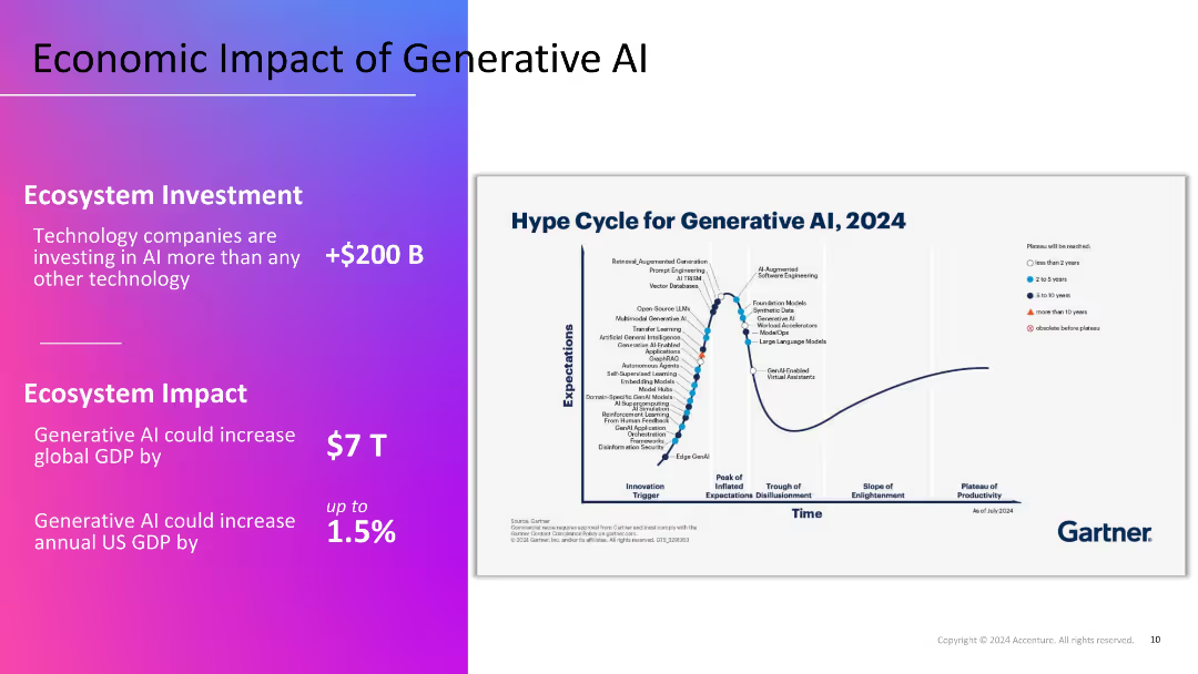
Split layout: left section with gradient background and key economic figures in white text; right section features Gartner's 2024 hype cycle graph on a white background.
Market Analysis and Trends
Artificial Intelligence
Highlights the economic potential of Generative AI, with over $200B in investments and a projected $7T boost to global GDP. The Gartner hype cycle visualizes the maturity of various GenAI technologies, indicating current expectations and future productivity.
GDP impact, investment, hype cycle, GenAI, Gartner, technology trends
false
Economic Impact of Generative AIREINVENTION WITH GENERATIVE AI: CalPERS
Mixed Chart
Accenture
View slide
Includes bar graphs and pie charts analyzing the internet coverage and connectivity needs across Indonesian districts, focusing on school connectivity.
Strategic Planning
Telecommunications
Discusses potential strategies for improving internet coverage and network quality in Indonesian schools, essential for enhancing educational outcomes.
internet coverage, network quality, Indonesia, schools, connectivity improvement, educational outcomes
false
Solutions are required to improve coverage quality to reach better (school) connectivityIndonesia case study
Multiple Chart
BCG
View slide
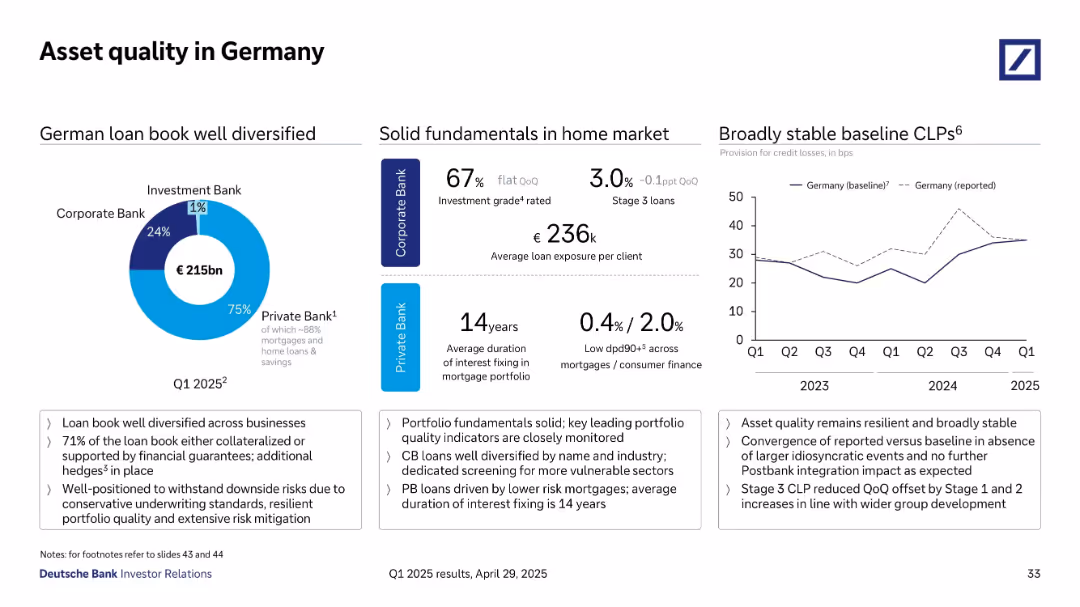
Divided layout with pie chart (loan distribution), data points (ratings, durations), and a line graph showing credit loss trends over time.
Risk Assessment and Management
Financial Services
The slide assesses German asset quality, emphasizing a well-diversified loan book totaling €215bn, predominantly in the Private Bank. Key indicators such as investment grade share, average loan size, and Stage 3 loan percentages are presented, alongside a trend graph showing stable provision for credit losses since 2023.
asset quality, Germany, diversification, CLP trends, loan performance
false
Asset quality in GermanyQ1 2025 results
Multiple Chart
Deutsche Bank
View slide
Contains several data blocks and bullet points explaining the strategic rationale and outcomes of investments.
Investment Analysis
Financial Services
Highlights JPMorgan's strategic investments and acquisitions, including performance metrics and integration of technology platforms.
Strategic investments, acquisitions, market share, banking, investment platforms, digital transformation
false
We have also made complementary acquisitions and investmentsInternational Consumer Growth Initiatives 2022
Table
JP Morgan
View slide
A simple design with four separate sections, each with an icon and a brief description underneath.
Regulatory and Compliance
Government & Public Sector
This slide provides principles for the disbursement of relief funds from a fiscal perspective. It’s meant for leaders to ensure efficient and targeted use of resources, focusing on speed, protection of the vulnerable, liquidity, and compliance.
funds, principles, fiscal, aid, efficiency
false
States may consider potential guiding principles for disseminating federal funds and aid to state agencies, third parties, and individuals1Responding to COVID-19: Addressing the economic impact of the crisis
Header Horizontal
McKinsey
View slide
Slide with a mixed bar and column chart and lists detailing aspects of work-from-home programs and staffing strategies in contact centers. Colors vary between green shades for clarity.
Human Resources and Talent Management
Professional Services
Explores talent management strategies within global contact centers, focusing on work-from-home programs and responses to staffing shortages.
Talent Management, Work-From-Home, Staffing Strategies, Contact Centers, Global Trends, Human Resources
false
Global Themes -Talent InitiativesTrends & AI in the Contact Center
Multiple Chart
Deloitte
View slide
Multiple charts showing various economic indicators, including restructuring cases, profit warnings, volatility, and early warning indicators.
Market Analysis and Trends
Financial Services
The slide presents the initial consequences of a fragile economic environment, using various indicators to highlight trends in restructuring, profit warnings, market volatility, and early warning signals. It emphasizes the impact of these factors on the overall economic outlook and business climate.
Economic Indicators, Fragile Environment, Market Volatility
false
First consequences of the fragile environment are already visible in a number of indicators10th Operations Efficiency Radar
Multiple Chart
Roland Berger
View slide
The slide displays pie charts and tables alongside textual information, breaking down assets under supervision by asset class and region. It uses contrasting colors to delineate various sections and facilitate comprehension of data distribution.
Investment Analysis
Financial Services
It discusses the distribution and changes in assets under supervision, targeting financial analysts and investors analyzing portfolio diversification and regional asset allocation to guide investment decisions.
assets, supervision, investment, portfolio diversification, asset allocation
false
Assets Under SupervisionSecond Quarter 2023 Earnings Results Presentation
Multiple Chart
Goldman Sachs
View slide
With a split-view of bar charts, the slide displays comparative interest rate data for developed and emerging markets through visually distinct tables, highlighting current and prior year rates.
Investment Analysis
Financial Services
The slide acts as an analytical tool for assessing yield variations in sovereign currencies, key for financial strategists and investors monitoring interest rate trends and their impact on global markets.
Interest Rates, Sovereign Yields, Developed Markets, Emerging Markets, Currency, Financial Analysis, Comparative Tables
false
Local Sovereign Currency YieldsMonthly Market Monitor January 2024
Multiple Chart
Morgan Stanley
View slide
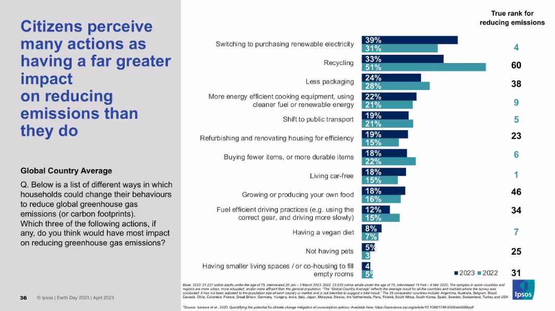
Title left-aligned; right side shows a bar chart comparing perceived vs actual impact ranks of various climate-related actions.
Market Analysis and Trends
Environmental Services & Sustainability
This slide reveals the mismatch between public perception and actual effectiveness of household actions on reducing emissions. Actions like recycling are overrated, while more impactful behaviors like living car-free are underrated. Data is shown across two years with actual ranks.
emissions, public perception, recycling, climate action, emission reduction, behavioral change, global survey, Ipsos, misperception
false
Citizens perceive many actions as having a far greater impact...EARTH DAY 2023
Mixed Chart
IPSOS
View slide
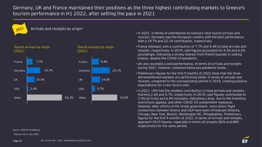
The slide displays bar charts comparing tourist arrivals and receipts by origin in 2021, with supporting text detailing performance by country.
Customer and Market Segmentation
Hospitality & Tourism
This slide analyzes the contributions of different countries to Greece's tourist arrivals and receipts in 2021, highlighting key markets like Germany, France, and the UK.
Tourist arrivals, receipts, market segmentation, country comparison, bar charts
false
Arrivals and receipts by origin*Industry Pulse Report: Travel & Tourism
Multiple Chart
EY
View slide
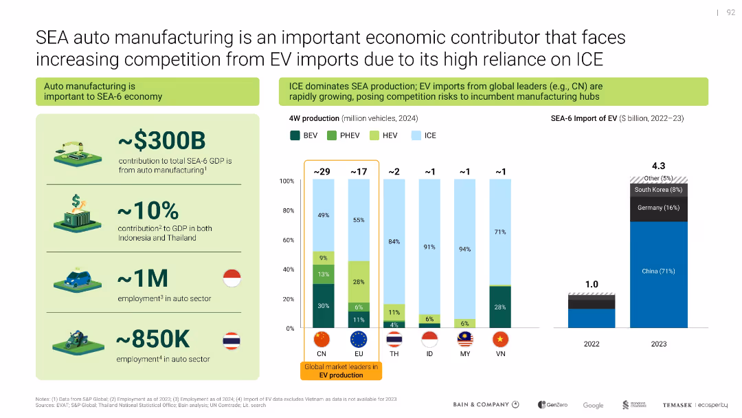
Left side highlights economic contribution; right side contrasts local production with imports via bar graphs and icons
Competitive Landscape
Industrial & Manufacturing
Analyzes the economic importance of auto manufacturing in SEA-6 and the growing competitive pressure from EV imports, especially from China. Compares local ICE-heavy production vs. rising foreign EV supply.
auto manufacturing, ICE, EV imports, SEA economy, competition, China
false
SEA auto manufacturing is an important economic contributor that faces increasing competition from EV imports due to its high reliance on ICESoutheast Asia's Green Economy
Multiple Chart
Bain
View slide
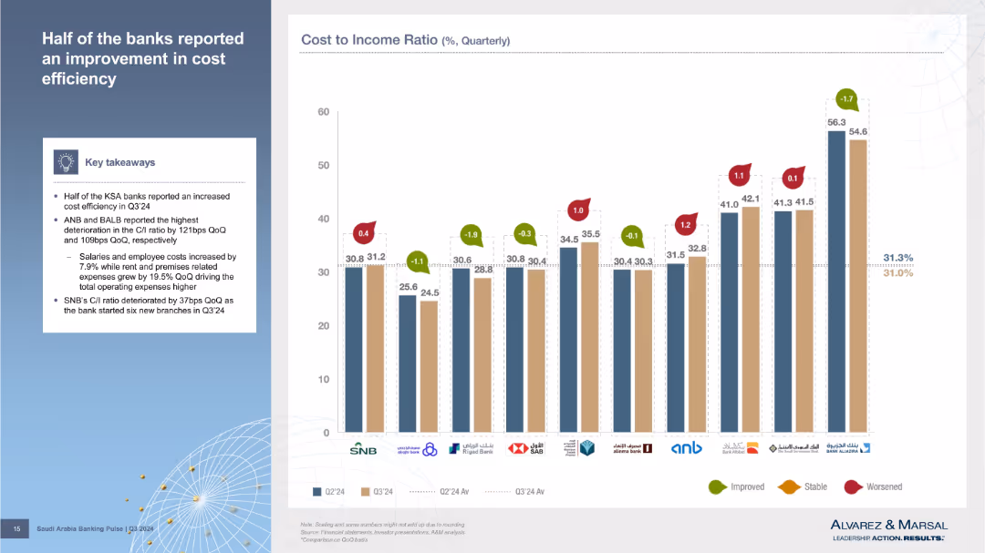
Bar chart showing individual bank C/I ratios for Q2 and Q3’24 with change indicators and a summary box on the left. Each bank's data is represented using color-coded bars and indicators for change direction.
Performance Metrics and KPIs
Financial Services
The chart highlights how various banks performed in terms of cost efficiency, with half showing improvement in their cost-to-income ratios. ANB and BALB had the worst deterioration. Key drivers include increased salaries, rent, and expansion efforts like SNB’s branch openings.
cost efficiency, banks, quarterly comparison, C/I ratio, SNB, ANB, BALB
false
Half of the banks reported an improvement in cost efficiencySaudi Arabia Banking Pulse
Mixed Chart
Alvarez & Marsal
View slide
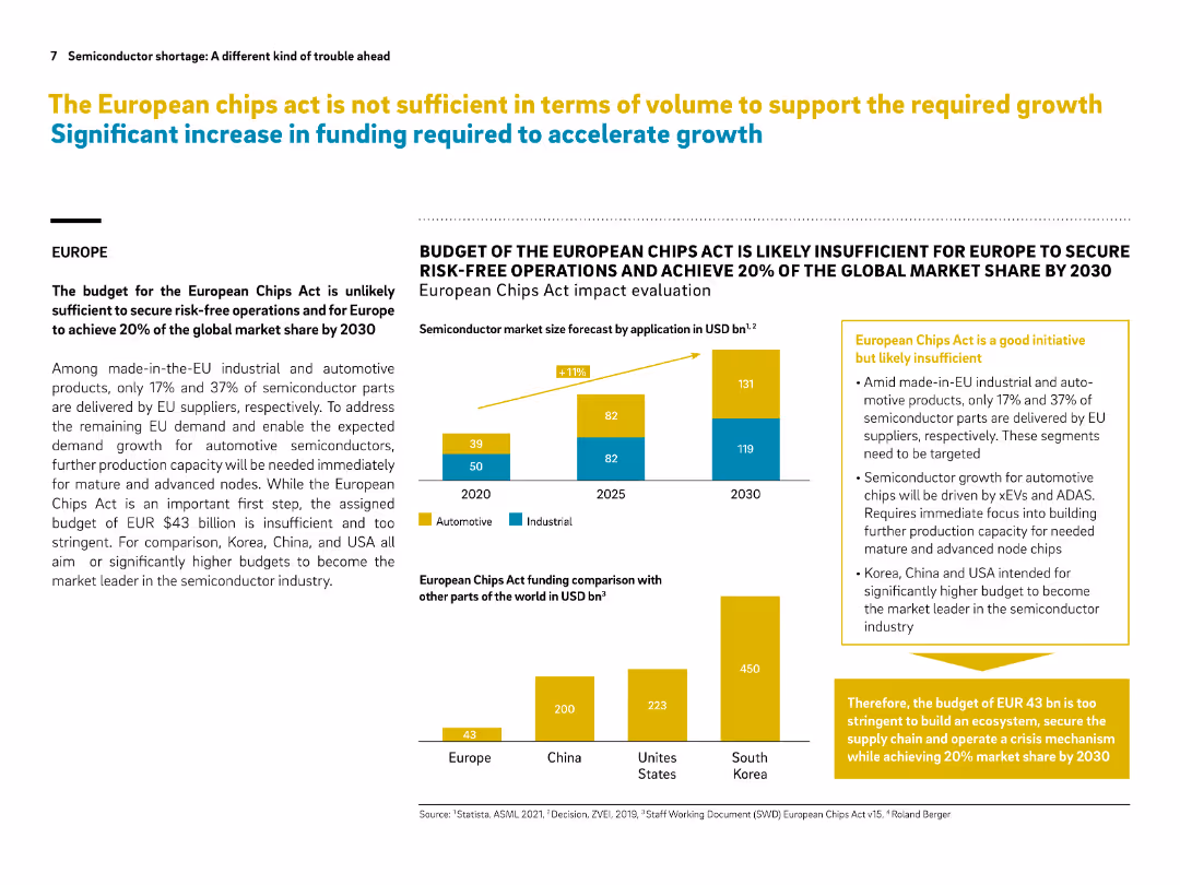
Layout includes text, bar graphs, and callout boxes in yellow. Data visuals compare budgets and market share ambitions.
Regulatory and Compliance
Government & Public Sector
This slide critiques the European Chips Act, indicating its budget is too low to secure 20% global market share by 2030. It compares funding plans across regions, highlighting that Europe’s $43B is dwarfed by the US, Korea, and China. Immediate investment in mature nodes is urged.
European Chips Act, semiconductor, funding gap, market share, automotive chips, EU policy, comparison, risk-free operations
false
The European chips act is not sufficient in terms of volume to support the required growth Significant increase in funding required to accelerate growthSemiconductor shortage: A different kind of trouble ahead
Multiple Chart
Roland Berger
View slide
This slide includes flow diagrams, a column chart, and textual explanations to describe the factors influencing system-wide deposit levels and their interaction.
Financial Performance
Financial Services
It illustrates the impact of quantitative tightening and the reverse repurchase agreement operations on deposit levels, along with customer behavior patterns.
quantitative tightening, deposit levels, reverse repurchase agreements, customer behavior, flow diagram, column chart, financial system
false
System wide deposit levels will depend on how QT interacts with RRP and customer behaviorInverstors Day 2023
Mixed Chart
JP Morgan
View slide
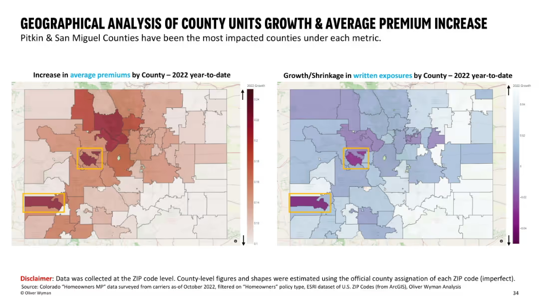
Side-by-side maps with county boundaries; left shows premium increases using a red heatmap, right shows growth/shrinkage in exposures with a blue/purple color scheme. Highlighted counties are boxed in yellow.
Market Analysis and Trends
Financial Services
This slide presents a county-level geographical comparison in Colorado, showing average premium increases and written exposure changes for 2022 YTD. Pitkin and San Miguel counties are highlighted as the most impacted. Visual heatmaps help emphasize regional differences in insurance metrics across ZIP codes mapped to counties.
geographic, premium increase, insurance, county analysis, written exposures, ZIP code, heatmap, Colorado
false
GEOGRAPHICAL ANALYSIS OF COUNTY UNITS GROWTH & AVERAGE PREMIUM INCREASEHomeowner availability study
Multiple Chart
Oliver Wyman
View slide
Multiple line charts display Y/Y growth in four hydraulic markets: Industrial Machinery, Construction Equipment, Farm Machinery, Truck & Bus from 2012 to 2019.
Market Analysis and Trends
Industrial & Manufacturing
Analyzes yearly growth rates across several hydraulic markets, showing trends over time, useful for market analysis and understanding sector health.
hydraulics, industrial, construction, machinery, growth
false
Most key U.S. hydraulics markets continue to show good growthDeutsche Bank Global Industrials & Materials
Single Chart
Deutsche Bank
View slide
A Venn diagram overlaid on a faded gray square grid background with additional descriptive text.
Strategic Planning
Financial Services
Showcases the firm's multifaceted approach in the innovation economy with activities like advising, raising capital, and investing.
innovation economy, strategic approach, advising, capital, investing, co-creation, Goldman Sachs
false
Innovation is Fundamental to Our StrategyGoldman Sachs Investor Day
Framework
Goldman Sachs
View slide
A scatter plot shows the risk/return over 10 years for different market segments, paired with a table detailing the same, to articulate diversification benefits.
Investment Analysis
Financial Services
This slide assesses the risk-return profile of small cap stocks internationally versus emerging markets, underscoring diversification benefits in portfolio management.
risk-return profile, small cap, international markets, emerging markets, diversification, portfolio management, scatter plot
false
International Small Cap Stocks May Offer Attractive Diversification BenefitsMonthly Market Monitor November 2023
Single Chart
Morgan Stanley
View slide
This slide features a detailed comparison of three uncertainty scenarios: Base, Downside, and Upside. It uses icons and color coding for visual distinction.
Risk Assessment and Management
Professional Services
Discusses three potential economic scenarios regarding impacts such as COVID-19, geopolitical risks, and global supply chains. Each scenario (Base, Downside, Upside) includes detailed impacts and macroeconomic driver information. Useful for risk assessment and strategic decision-making.
COVID-19, Geopolitical Risk, Supply Chain, Inflation, GDP, Scenario Analysis, Economic Drivers, Risk Management
false
Step 1: Uncertainty scenariosFletcher Building – economic uncertainty analysis
Table
Deloitte
View slide
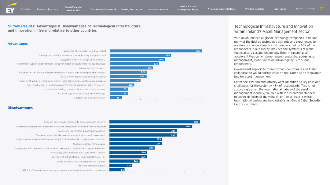
Two horizontal bar charts (Advantages and Disadvantages) on left, descriptive text on right. Blue and grey tones, structured data layout, EY branding.
Market Analysis and Trends
Financial Services
The slide compares perceived advantages and disadvantages of Ireland’s technological infrastructure for asset management, highlighting strengths like skilled talent and innovation, and weaknesses in cybersecurity and data privacy.
Ireland, tech infrastructure, asset management, advantages, disadvantages, innovation
false
Survey Results: Advantages & Disadvantages of Technological Infrastructure and Innovation in Ireland relative to other countriesBuilding a Better Financial Services Ireland: Accelerate to Elevate
Multiple Chart
EY
View slide
The slide features a horizontal bar chart showing the change in agreement with the statement on global brands from 2021 to 2022 in various countries.
Market Analysis and Trends
Technology & Software
The slide highlights an increase in the preference for global brands over the past year across different markets.
Global brands, market preference, survey, public opinion, brand analysis
false
Over the past year, there has been a marked return to global brandsA NEW WORLD DISORDER?
Mixed Chart
IPSOS
View slide
This slide displays a column chart tracking expenses from 2018 to 2019 in billions of dollars, highlighting overhead, revenue-related, and investment areas. The chart has a balance of dark and light blue tones, with green bars for positive changes and red for negative ones.
Financial Performance
Financial Services
The slide analyzes the expense trends for JPMorgan, showing an increase in overall expenses from 2018 to 2019 due to higher revenues and investments in technology and non-tech areas. A bar and column chart illustrates the changes in financial figures, such as overhead ratio and revenue-related expenses, offering insights into the financial planning and budgeting of the firm.
Expenses, Revenue, Investments, JPMorgan, Financial Analysis, Overhead Ratio, Bar Chart, Column Chart, Financial Planning
false
Expenses increased due to higher revenues and additional investmentsCORPORATE & INVESTMENT BANK 2020
Single Chart
JP Morgan
View slide
The slide is divided into a textual description on the left and a line graph on the right that tracks economic and social/political pessimism over four years, differentiating between millennials and Gen Z. It uses blue and green lines against a white background.
Market Analysis and Trends
Technology & Software
This slide explores the growing economic and social/political pessimism among millennials and Gen Z. The line graph shows an increasing trend in negative outlooks from 2018 to 2021. It suggests a correlation with recent global events and the potential long-term impacts on societal attitudes and business strategies.
Pessimism, Millennials, Gen Z, Economic Outlook, Social Political, Line Graph, Trends, Business Strategy
false
Optimism reaches nadirThe Deloitte Global 2021 Millennial and Gen Z Survey
Mixed Chart
Deloitte
View slide
Column charts showing traffic distribution by type, focusing on mobile
Market Analysis and Trends
Technology & Software
Analyzes the predominant focus of luxury consumers on mobile platforms
Luxury, Consumer Attention, Mobile, Traffic Distribution
false
Over 50% of luxury consumer attention is online, mostly on mobile …China Luxury Digital Playbook
Single Chart
BCG
View slide
A combination of descriptive text and graphical examples, featuring QR codes and real-world case studies on channel innovation and tech leverage.
Strategic Planning
Retail & E-commerce
Encourages redefining sales channels through the lens of customer value and technology, showcasing innovative examples from various industries.
Sales Channels, Customer Value, Technology Innovation, New Tech Adoption, Retail Strategy
false
Reinvent traditional sales channels—with a clear customer value proposition, leveraging new technologyBCG Executive Perspectives: The Future of Sales and Marketing is Here
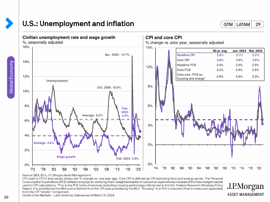
Header Horizontal
BCG
View slide
The slide features two line charts: one showing civilian unemployment rate and wage growth, and another displaying CPI and core CPI changes over time.
Market Analysis and Trends
Financial Services
This slide provides a detailed analysis of unemployment and inflation rates in the U.S., illustrating trends in wage growth and consumer price indices.
unemployment, inflation, wage growth, CPI, core CPI, economic trends
false
U.S.: Unemployment and inflationGuide to the Markets Latin America | 2Q 2024
Multiple Chart
JP Morgan
View slide
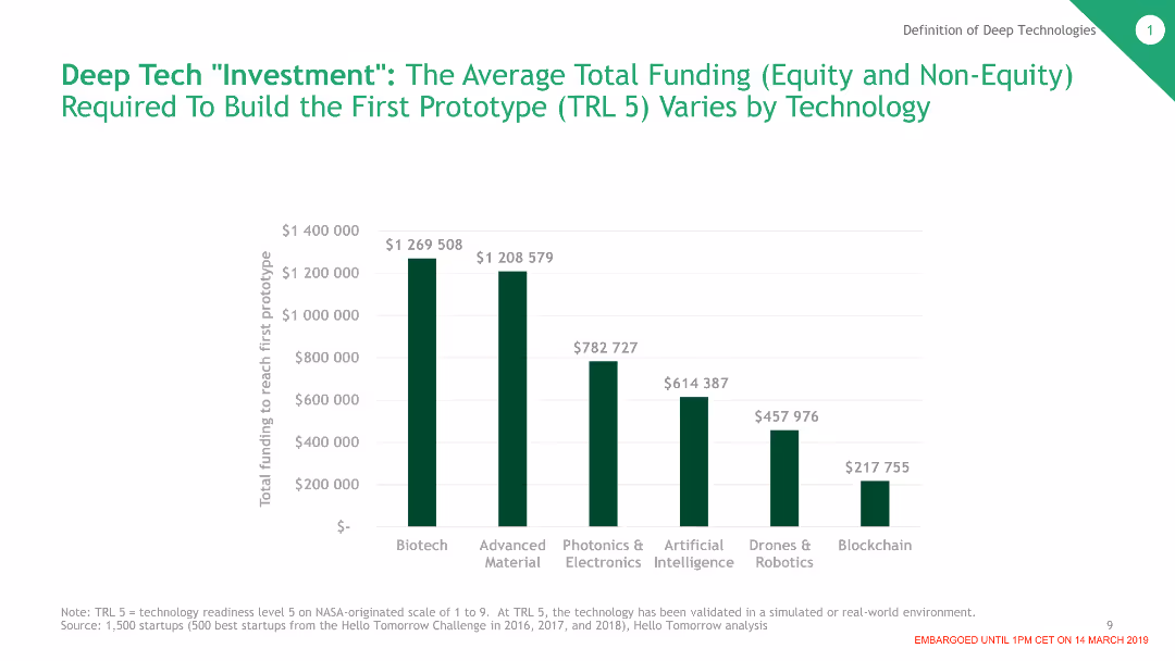
The slide includes a column chart displaying the average total funding required to build the first prototype for various deep tech categories. Each category's funding level is represented by different heights of columns.
Investment Analysis
Financial Services
This slide shows the Average Total Funding (Equity and Non-Equity) Required To Build the First Prototype (TRL 5) Varies by Technology
Deep Tech, Investment, Prototype, Funding, Biotech, AI, Robotics, Blockchain
false
Deep Tech "Investment": The Average Total Funding (Equity and Non-Equity) Required To Build the First Prototype (TRL 5) Varies by TechnologyThe Dawn of the Deep Tech Ecosystem
Single Chart
BCG
View slide
This slide features comparative column charts for litigation provisions and contingent liabilities over several quarters.
Regulatory and Compliance
Financial Services
Focuses on the bank’s financial provisions for litigation and contingent liabilities, indicating trends and changes over recent quarters.
litigation, financial, provisions, liabilities, risk management, trends, banking, compliance
false
Litigation update In € bn, period endQ2 2023 results
Multiple Chart
Deutsche Bank
View slide
Uses timelines and arrows to show progress and completion targets for tech platforms, with icons indicating platform benefits.
Technology and Digital Transformation
Technology & Software
Outlines the status and impact of J.P.Morgan's cloud-native tech platforms, showing expected completion dates and revenue generation.
Cloud-Native, Tech Platforms, Revenue, Development, J.P.Morgan, Real-Time Payments, Liquidity
false
Many of our new, cloud-native, tech platforms are nearing completion and generate revenueCorporate & Investment Bank 2022
Mixed Chart
JP Morgan
View slide
Bar charts showing transportation mode usage for work/study and non-work/non-study travel
Market Analysis and Trends
Transportation & Logistics
Discusses the increase in the use of personal cars for travel, comparing modes of transportation usage
Personal cars, transportation, travel, work, survey
false
Respondents indicate an increase in use of personal cars for both work/study and non-work/non-study travel How frequently do you now travel forEY Mobility Consumer Index (MCI) 2023 study
Multiple Chart
EY
View slide
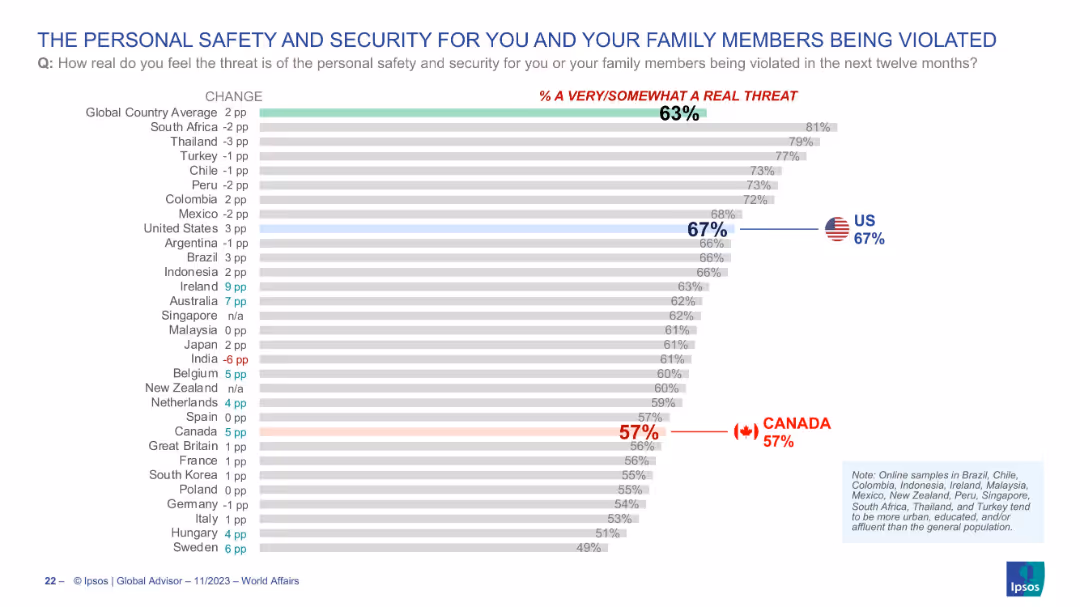
Horizontal bar chart showing country-wise public sentiment on personal/family safety; Canada and US highlighted with flags and bolded percentages.
Risk Assessment and Management
Government & Public Sector
This slide explores public fears regarding personal safety or that of family members being violated within the next year. The US stands at 67% and Canada at 57%, while the global average is 63%. It provides insight into societal perceptions of crime and domestic insecurity.
personal security, family safety, crime risk, perception, Canada, USA, Ipsos, threat, public opinion
false
THE PERSONAL SAFETY AND SECURITY FOR YOU AND YOUR FAMILY MEMBERS BEING VIOLATEDWORLD AFFAIRS 2023
Single Chart
IPSOS
View slide
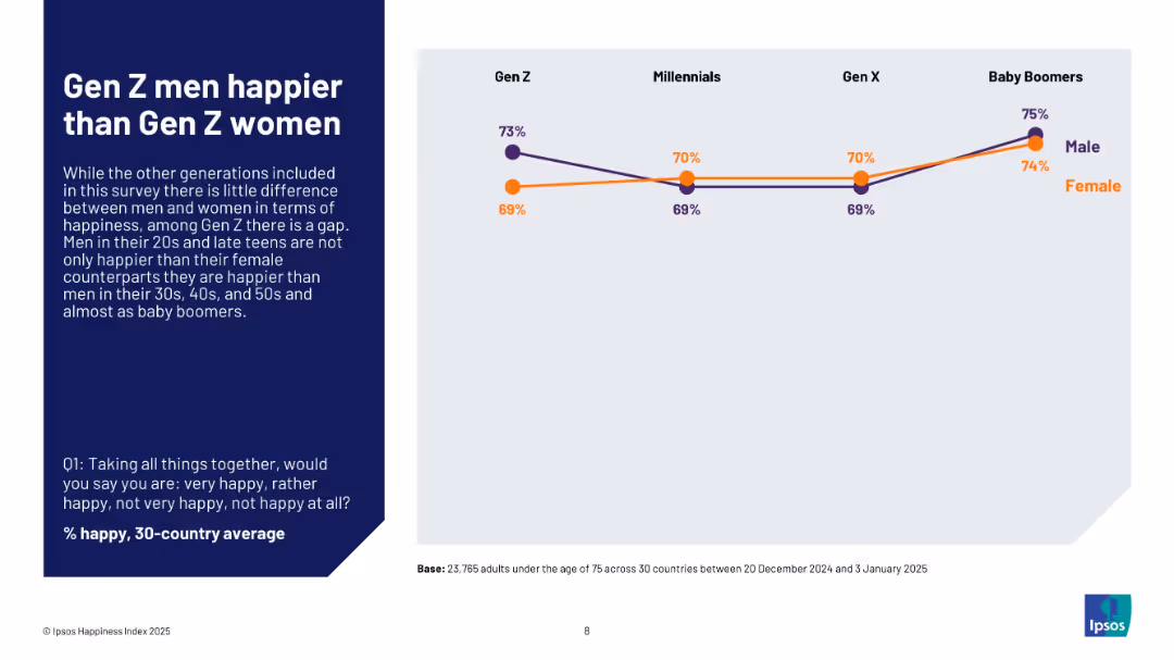
Line chart comparing happiness levels of men and women across generational cohorts; simple design with male/female legend and dark blue text box.
Customer and Market Segmentation
Professional Services
The slide explores generational and gender-based happiness differences. It reveals that Gen Z men are notably happier than Gen Z women, a disparity not observed in other generations. Baby Boomers show similar levels of happiness between genders, with Gen Z males ranking highest in happiness across all groups.
generational happiness, gender gap, Gen Z, Baby Boomers, emotional well-being, Ipsos, male vs female, survey
false
Gen Z men happier than Gen Z womenIPSOS HAPPINESS INDEX 2025
Mixed Chart
IPSOS
View slide
Detailed analysis with multiple small graphs and lists showing financial implications of digital assets across services.
Technology and Digital Transformation
Financial Services
Summarizes how various aspects of financial services are adapting to and profiting from the integration of digital assets.
Financial, Digital Assets, Blockchain, Services, Value
false
In financial services, significant value pools across the digital asset value chain in token issuance, lending, exchange, custody and paymentsBlockchain and Digital Assets
Linear Flow
McKinsey
View slide
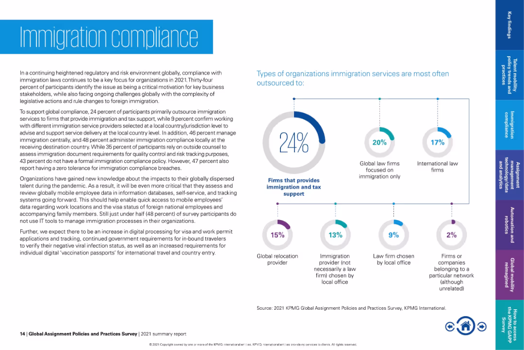
Left-aligned paragraph content; right side contains pie chart and bubble-linked service types.
Regulatory and Compliance
Government & Public Sector
Discusses how firms manage immigration compliance, with 24% outsourcing to firms providing immigration and tax support. Addresses challenges like legislative changes and lack of internal IT tools. Highlights evolving needs post-pandemic for remote worker compliance.
immigration compliance, outsourcing, tax support, visa tracking, mobility services, global regulations, employee relocation
false
Immigration complianceGlobal Assignment Policies and Practices Survey
Mixed Chart
KPMG
View slide
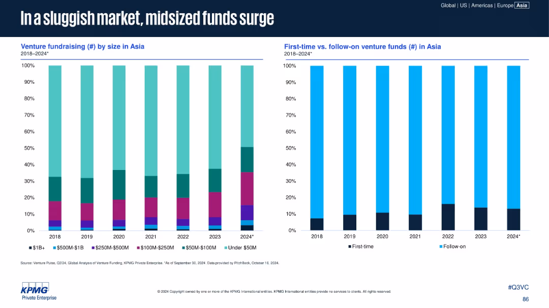
Two vertical stacked bar charts: left shows venture fundraising by size; right compares first-time vs. follow-on funds in Asia (2018–2024).
Market Analysis and Trends
Financial Services
The slide reveals a rise in mid-sized funds ($100M–$500M) and a consistent dominance of follow-on funds over first-time venture funds. The market favors experienced fund managers in a more cautious fundraising environment, with under-$50M funds also growing in proportion in 2024.
midsize funds, first-time funds, follow-on funds, Asia, venture capital, fundraising
false
In a sluggish market, midsized funds surgeVenture Pulse Q3 2024
Multiple Chart
KPMG
View slide
This slide includes a table with bar charts comparing commuting habits, car tenure, and daily travel distances of EV sceptics across APAC, EMEA, and North America. Colors and percentages are clearly marked.
Market Analysis and Trends
Transportation & Logistics
The slide examines the commuting patterns and car ownership tenure of EV sceptics, highlighting differences across regions. It aims to identify key mobility challenges that affect EV adoption.
commuting habits, car tenure, daily travel, EV sceptics, regional analysis
false
Sceptics show substantial differences across the globe requiring a localized approach to convert them into prospects4th edition eReadiness 2023
Multiple Chart
PwC/Strategy&
View slide
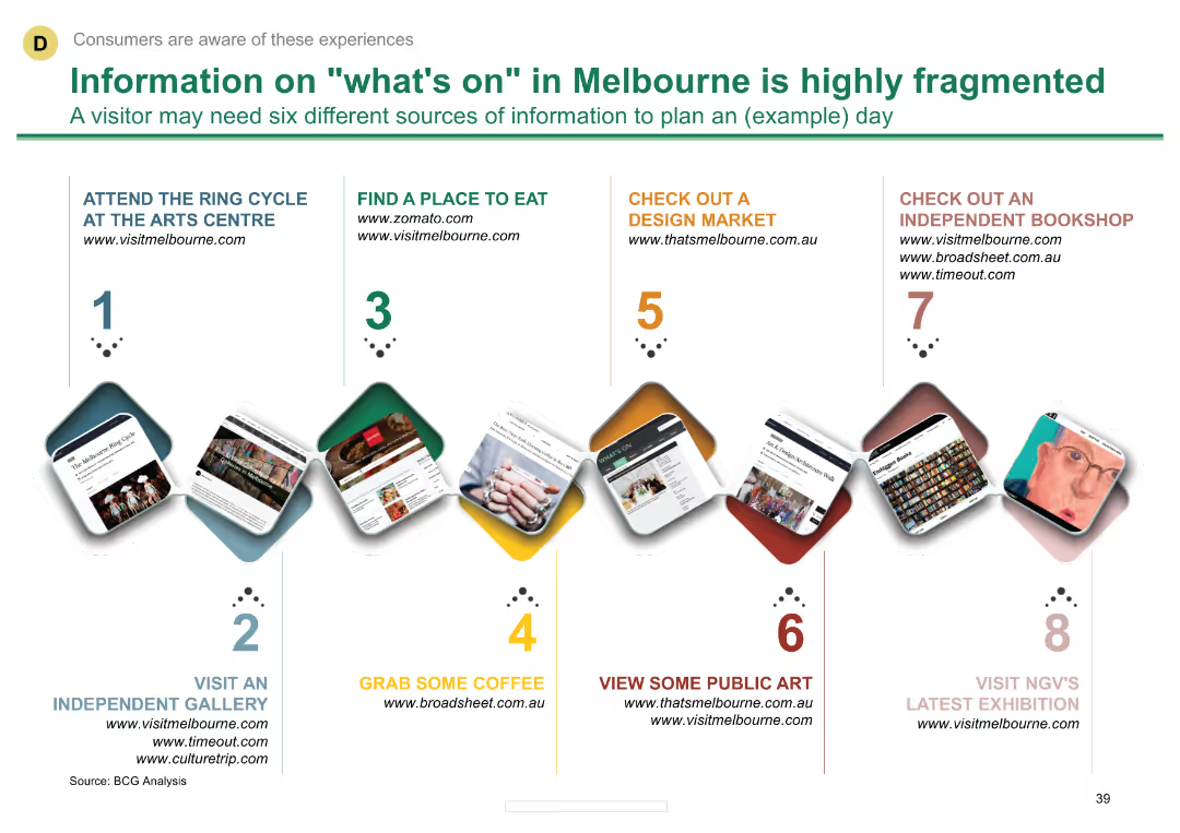
A timeline diagram showing various activities and websites where visitors can find information about Melbourne's attractions. Each step includes a small image and text describing the activity.
Customer and Market Segmentation
Hospitality & Tourism
Highlights the fragmented nature of information sources for tourists in Melbourne and suggests six different sources visitors might need to plan a day.
tourism, Melbourne, attractions, visitor information, websites
false
Information on "what's on" in Melbourne is highly fragmentedMelbourne as a Global Cultural Destination
Vertical Flow
BCG
View slide
Slide with text descriptions and symbolic icons
Market Analysis and Trends
Retail & E-commerce
Discusses key influences on the 2018 holiday season, highlighting the role of Chinese consumers and the impact of economic factors on global retail.
holiday season, retail, Chinese market, economic factors
false
STRONG 2018 HOLIDAY SEASON ALMOST EVERYWHERE ACROSS THE WORLDLUXURY GOODS WORLDWIDE MARKET STUDY, SPRING 2019
Header Vertical
Bain
View slide
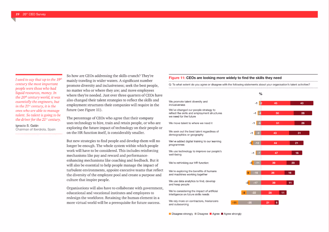
The slide presents a column chart showing the percentage of CEOs agreeing with various statements about their organization's talent activities, such as promoting diversity and using technology to improve well-being.
Human Resources and Talent Management
Professional Services
This slide explores the extent to which CEOs agree or disagree with various talent management strategies, including promoting diversity, changing people strategy, and using technology for employee well-being.
Talent management, diversity, technology, well-being, CEOs, recruitment, HR strategies
false
Figure 11: CEOs are looking more widely to find the skills they need20 years inside the mind of the CEO... What’s next?
Mixed Chart
PwC/Strategy&
View slide
The slide includes a bar chart comparing the usage of various social media platforms (Facebook, Instagram, Twitter, YouTube, Snap, LinkedIn) between non-winners and winners. Bars are vertically oriented with labeled percentages.
Market Analysis and Trends
Media & Entertainment
This slide discusses the role of social media platforms like Facebook and Instagram in effective campaigns, highlighting differences in platform usage between winners and non-winners.
social media, Facebook, Instagram, effective campaigns, bar chart
false
Facebook and Instagram a re often part of effective campaigns2020 Effie UK Report • In partnership withIpsos
Mixed Chart
IPSOS
View slide
Composed of bullet points and a table, the slide compares the company's 2022 key performance indicators against targets set during investor day, with additional notes for context.
Investment Analysis
Financial Services
The slide benchmarks the company's recent performance against the medium-term goals communicated to investors, covering different business areas and their respective KPIs. It's a tool for investors and analysts to assess progress and strategize accordingly.
KPIs, investor targets, performance benchmarking, business analysis
false
2022 KPIs Progress vs. Investor Day Medium-term TargetsEarnings Results Presentation Fourth Quarter and Full Year 2022
Table
Citigroup
View slide
This slide juxtaposes text with icons and diagrams. The left side has bullet points, and the right side displays a flowchart of a digital banking platform ecosystem. The use of space is balanced, with the Macquarie logo at the bottom left.
Technology and Digital Transformation
Financial Services
The slide communicates the bank's commitment to technology, detailing cloud migration strategies and data analytics platforms. It highlights key technological advancements within banking services, emphasizing a move towards cloud-based platforms to enhance service delivery and operations.
digital banking, cloud migration, data analytics, technology, platform, services, strategy
false
Bringing best in class technology to bankingMorgan Stanley Virtual Hong Kong Summit
Header Vertical
Morgan Stanley
View slide
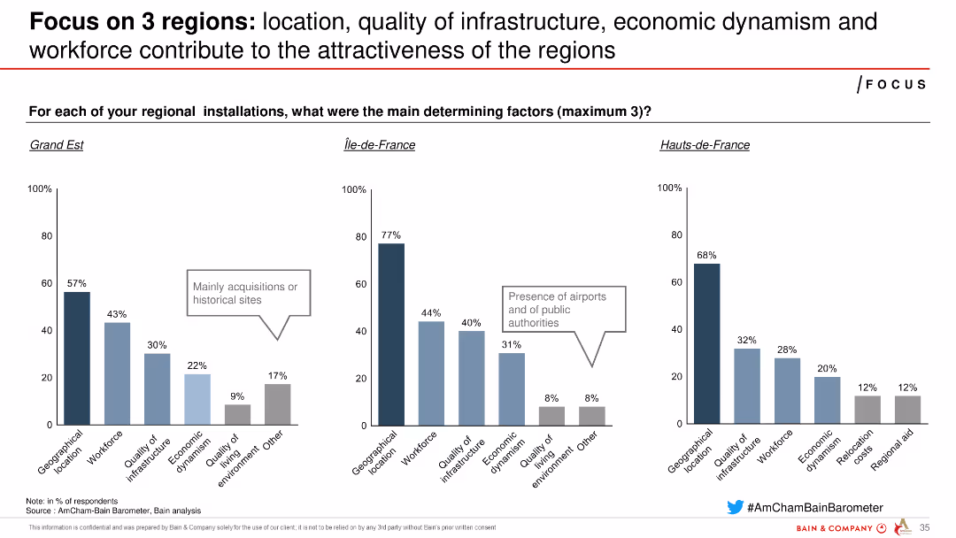
Three column charts comparing determining factors for regional installations in Grand Est, Île-de-France, and Hauts-de-France.
Market Analysis and Trends
Industrial & Manufacturing
Compares the main factors influencing attractiveness in three French regions, focusing on geographical location, infrastructure, economic dynamism, and workforce.
regions, attractiveness, factors, comparison, France
false
Focus on 3 regions: location, quality of infrastructure, economic dynamism and workforce contribute to the attractiveness of the regionsAmCham-Bain Barometer 22nd Edition
Multiple Chart
Bain
View slide
The slide features a line graph depicting capital deployment and TSR performance, along with bar graphs for dividends.
Financial Performance
Financial Services
This slide presents Booz Allen's financial performance in terms of capital deployment and shareholder dividends. It’s useful for financial reviews and showcasing company growth.
Capital, TSR, Dividends, Performance, Value
false
DELIVERING SHAREHOLDER VALUEFiscal Year 2021 First Quarter
Multiple Chart
Booz Allen Hamilton
View slide
This slide features two sections. The left section contains a scatter plot with a trend line showing a positive correlation. The right section contains a column chart showing NPS values.
Market Analysis and Trends
Professional Services
Analyzes the correlation between the number of high value elements a company delivers and its Net Promoter Score (NPS). Intended for strategic business insights and decision making.
NPS, high value elements, correlation, companies, business analysis
false
Companies that score highly on multiple Elements of Value have higher NPSSimple & Digital Customer Experience Model
Multiple Chart
Bain
View slide
The slide features a map of Greece highlighting investment distribution across regions with corresponding percentage values. Images of different regions are shown on the right.
Market Analysis and Trends
Financial Services
This slide illustrates the geographical distribution of foreign direct investments in Greece, showing which regions have attracted the most investment in recent years.
FDI, Greece, geographical distribution, regions, map
false
EY European Investment Monitor dataGreece goes the distance, continuing to win investors’ trust
Mixed Chart
EY
View slide
The slide features a column chart comparing domestic supply chain costs and freight costs for cement supply. The columns are divided into categories such as port, depot, rail, and road.
Operational Efficiency
Industrial & Manufacturing
The slide provides a breakdown of cement supply chain costs, showing that freight constitutes 55% of costs. It highlights different transportation methods and their respective cost percentages.
cement, supply chain, costs, transportation, freight, rail, road, port, depot
false
Freight accounts for c.55% of cement supply chain costs, with road, coastal shipping and rail accounting for c.60%, c.20% and c.20% eachInternational Comparison of Australia’s Freight and Supply Chain Performance Final Report - Cement
Single Chart
LEK
View slide
The slide includes a column chart comparing challenges in upskilling initiatives, with different colors representing the beginning and advanced stages of such programs.
Organizational Structure and Change
Professional Services
Discusses the initial challenges organizations face when starting upskilling programs, such as motivation, resource allocation, and employee retention.
Upskilling Challenges, Resource Allocation, Employee Retention, Skill Development
false
Exhibit 14 At the beginning of an upskilling programme, the biggest challenges are to motivate and align resourcesPwC's 23rd Annual Global CEO Survey
Single Chart
PwC/Strategy&
View slide
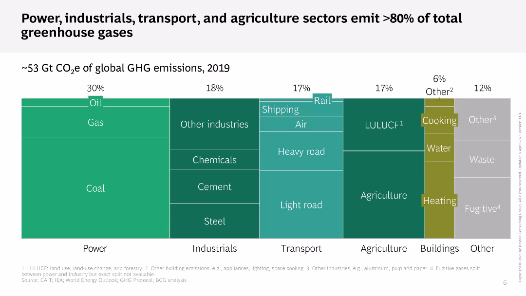
This slide features a treemap chart that shows the percentage of global GHG emissions by different sectors. Each sector is color-coded and divided into sub-sectors. The layout is dense with a lot of information compactly displayed.
Industry Overview
Environmental Services & Sustainability
The slide illustrates the contribution of various sectors, such as power, industrials, transport, and agriculture, to global greenhouse gas emissions in 2019. It highlights that these sectors are responsible for over 80% of total emissions.
GHG emissions, sectors, treemap, power, transport
false
Power, industrials, transport, and agriculture sectors emit >80% of total greenhouse gasesThe time for climate action is now
Single Chart
BCG
1
...
Next
Load More
Hold On!
We are searching in our database
If nothing, comes up, please try different filters!
Create a FREE account to continue browsing
Receive Instant Access to 1,000+ slides from companies like McKinsey, Google, and Goldman Sachs
First Name
Last Name
Email
Password
I agree to all
Terms & Privacy Policy
Thank you! Your submission has been received!
Oops! Something went wrong while submitting the form.
Have an account?
Sign in
Column Chart
Heatmap
Chevron
Org Chart
Infographic
Callouts
Timeline
List
Graphic
Picture
Process Flow
Diagram
Paragraph
Map
Table
Framework
Subtitle
Takeaway Box
Icon
Other Chart
Radar Chart
Waterfall Chart
Mekko Chart
Pie Chart
Scatter Plot
Line Chart
Bar chart
Bullet points