My Account
My Slides
Leave Feedback
Login
Logout
Get Started
Browse all Slides
Browse Slides Pro
Create a FREE Account
Instant access to 1,000+ real slides from top companies like McKinsey, BCG, Goldman Sachs, Google and many more!
First Name
Last Name
Email
Password
I agree to all
Terms & Privacy Policy
Thank you! Your submission has been received!
Oops! Something went wrong while submitting the form.
Have an account?
Sign in
Saved Slides
Total No. of slides saved
0
↻ Refresh
✖ Clear all
A line chart displays U.S. Treasury yield curves for different periods, accompanied by a table with yield and performance data for various securities.
Investment Analysis
Financial Services
Slide features U.S. Treasury yield curves over time, providing insights into market expectations of future interest rates and economic health. The data is essential for financial market analysis and investment decisions.
U.S. Treasury, Yield Curves, Interest Rates, Market Analysis, Investment, Economy
false
Investment Analysis
Financial Services
Mixed Chart
Morgan Stanley
Add to my slides
Remove from favorites
A line chart illustrates the year-on-year CPI inflation rate and its sequential short-term momentum from 2018 to 2023. A highlighted section indicates recent trends. The slide includes a textbox with implications for corporates and commentary on inflation momentum and Federal Reserve policies.
Market Analysis and Trends
Financial Services
The slide examines the persistent inflation momentum in the US despite base effects lowering headline inflation rates. It suggests that further monetary policy tightening may be needed and advises companies to plan for sustained inflation levels in their strategic planning.
CPI inflation, inflation trends, year-on-year, Federal Reserve, monetary policy, inflation momentum, corporate planning, economic analysis, inflation rate, sequential momentum
false
Market Analysis and Trends
Financial Services
Mixed Chart
Accenture
Add to my slides
Remove from favorites
A line chart indicating the trajectory of atmospheric CO2 concentrations approaching critical warming thresholds.
Strategic Planning
Environmental Services & Sustainability
Highlights the approaching critical thresholds of CO2 concentrations, essential for strategic planning in environmental management and policy making.
CO2 concentrations, critical thresholds, strategic planning, climate goals, environmental policy
false
Strategic Planning
Environmental Services & Sustainability
Single Chart
BCG
Add to my slides
Remove from favorites
A line chart presents EPEX spot prices for selected countries (France, Germany, DK1, NO2, SE3), showing prices over 1,000 hours per year. The graph highlights the price peaks for wind and solar in 2030.
Market Analysis and Trends
Energy & Utilities
The slide discusses the opportunistic selling of P2P electricity in the spot market, noting that prices exceed the levelized cost of energy (LCOE) less than 1% of the time.
P2P, electricity, spot market, EPEX, LCOE, prices, wind, solar, energy, storage
false
Market Analysis and Trends
Energy & Utilities
Mixed Chart
Kearney
Add to my slides
Remove from favorites
A line chart showing Eaton's adjusted earnings per share (EPS) from 2000 to 2019, with an upward trend noted as an 8% CAGR.
Financial Performance
Financial Services
Provides a clear view of Eaton's long-term earnings growth, reflecting effective financial management and operational efficiency.
EPS, financial growth, Eaton, CAGR, earnings
false
Financial Performance
Financial Services
Single Chart
Deutsche Bank
Add to my slides
Remove from favorites
A line chart showing historical CO2 concentrations, highlighting significant increases over millennia and recent years.
Regulatory and Compliance
Environmental Services & Sustainability
Offers historical context for current CO2 levels, underscoring the urgency in addressing climate change for policy makers and environmental planners.
CO2 levels, climate change, environmental policy, historical data, sustainability
false
Regulatory and Compliance
Environmental Services & Sustainability
Single Chart
BCG
Add to my slides
Remove from favorites
A line chart showing minutes watched for various TV shows over 13 weeks. The chart includes series like Shameless, NCIS, Cocomelon, Seinfeld, and Criminal Minds.
Performance Metrics and KPIs
Media & Entertainment
The slide tracks the viewing minutes for different TV shows, illustrating their performance stability over time.
line chart, TV shows, viewing minutes, performance, stability, entertainment
false
Performance Metrics and KPIs
Media & Entertainment
Single Chart
Nielsen
Add to my slides
Remove from favorites
A line chart showing the Consumer Price Index (CPI) for different regions, including the US, China, EU, ASEAN, Japan, and the Target. It uses various colors to distinguish between regions.
Market Analysis and Trends
Financial Services
The slide presents a comparative analysis of inflation trends across different regions from 2019 to 2023. It is used to understand regional inflation trends and economic conditions.
Inflation, CPI, Financial Trends, Regional Analysis, Economic Conditions
false
Market Analysis and Trends
Financial Services
Single Chart
Gartner
Add to my slides
Remove from favorites
A line chart showing the carbon abatement cost (CAC) versus CO2 emissions from electricity generation for different countries by 2030. The chart compares costs for grid, grid + wind, and grid + solar setups.
Market Analysis and Trends
Energy & Utilities
The slide highlights that top coal consumers would not reduce CO2 emissions by coupling electrolyzers with the grid, except for the USA and Russia, at a higher cost than renewable energy sources.
CO2 emissions, CAC, coal, grid, wind, solar, electrolyzer, USA, Russia, renewable
false
Market Analysis and Trends
Energy & Utilities
Mixed Chart
Kearney
Add to my slides
Remove from favorites
A line chart showing the difference between central bank policy rates and banks' average deposit rates in the Euro area and the UK over time, with commentary on the right.
Market Analysis and Trends
Financial Services
This slide explains the impact of central bank policy rate changes on bank deposit rates in Europe and the UK, highlighting implications for corporate cash balances and bank earnings.
Deposit pricing, central bank rates, Euro area, UK, bank earnings, corporate implications
false
Market Analysis and Trends
Financial Services
Mixed Chart
Accenture
Add to my slides
Remove from favorites
A line chart showing the viewing trend of top Netflix originals over time. The lines represent different shows like Squid Game, The Witcher, You, Cobra Kai, and Maid (2021), illustrating their rise and fall in viewership.
Market Analysis and Trends
Media & Entertainment
This slide depicts the viewing trends for top Netflix originals, showing how viewership numbers peak and then decline over time. It includes data for shows like Squid Game, The Witcher, You, Cobra Kai, and Maid (2021).
viewing trends, Netflix originals, Squid Game, The Witcher, Cobra Kai
false
Market Analysis and Trends
Media & Entertainment
Single Chart
Nielsen
Add to my slides
Remove from favorites
A line chart shows the CAC versus CO2 emissions from electricity generation by 2030 for various countries, comparing costs for grid, grid + wind, grid + solar, and blue hydrogen CAC setups.
Market Analysis and Trends
Energy & Utilities
The slide evaluates the cost-effectiveness of hydrogen from grid-powered electrolyzers for reducing emissions, noting the carbon footprint threshold for competitive cost.
CO2 emissions, CAC, grid, wind, solar, hydrogen, electrolyzer, cost-effectiveness
false
Market Analysis and Trends
Energy & Utilities
Mixed Chart
Kearney
Add to my slides
Remove from favorites
A line chart tracking the price inflation of WLAN, Comms, Devices, and Phones from 2020 to 2026, normalized to 2020 levels. Multiple lines with different colors represent each category.
Financial Performance
Technology & Software
This slide analyzes the price inflation trends of various IT products from 2020 to 2026, indicating how prices have increased or remained stable over time.
IT Prices, Inflation, Technology Trends, Price Normalization, Market Analysis
false
Financial Performance
Technology & Software
Single Chart
Gartner
Add to my slides
Remove from favorites
A line chart tracks the growth of U.S. data center construction starts from January 2014 to April 2019. The chart features a rising blue line on a green gradient background.
Industry Overview
Technology & Software
This slide shows the increasing investment in U.S. data center construction over several years, highlighting growth trends in the technology sector.
data center, construction, technology, investment, growth
false
Industry Overview
Technology & Software
Single Chart
Deutsche Bank
Add to my slides
Remove from favorites
A line graph and a stacked column chart dominate the slide. It also features numerical annotations and a color-coded key for clarity.
Financial Performance
Financial Services
The slide demonstrates year-over-year loan and deposit growth, and the quarterly average of interest-earning assets, essential for financial growth discussions.
deposit growth, loan growth, assets, optimization
false
Financial Performance
Financial Services
Multiple Chart
JP Morgan
Add to my slides
Remove from favorites
A line graph correlating TCE increases with EBITDA gains, alongside a column chart of yearly EBITDA, illustrating financial leverage across a fleet.
Operational Efficiency
Transportation & Logistics
Demonstrates how adjustments in freight charge rates substantially affect annual earnings, providing insights into strategic financial management.
operating leverage, EBITDA, financial management, freight rates, strategic planning
false
Operational Efficiency
Transportation & Logistics
Multiple Chart
Deutsche Bank
Add to my slides
Remove from favorites
A line graph depicting the trend in debt leverage over several fiscal quarters with targets set for future ratios.
Financial Performance
Financial Services
Describes the company's efforts in reducing debt to maintain a healthy leverage ratio, aiming for investment-grade status.
debt reduction, leverage ratio, financial health, investment grade, line graph
false
Financial Performance
Financial Services
Single Chart
Barclays
Add to my slides
Remove from favorites
A line graph depicts the digital adoption curve over time, contrasting metropolitan areas with tier 2 and 3 cities, alongside descriptive texts.
Strategic Planning
Technology & Software
The slide predicts the digital adoption trends in Indonesia, with tier 2 and 3 cities catching up to the digital habits of tier 1 cities within the next five years.
digital adoption, trend analysis, metropolitan areas, tier cities, Indonesia, technology use
false
Strategic Planning
Technology & Software
Mixed Chart
Kearney
Add to my slides
Remove from favorites
A line graph illustrates the forecasted price trends for lithium-ion battery packs up to 2030, accompanied by detailed text analysis. The graph is set against a dark background with purple and grey lines.
Financial Performance
Energy & Utilities
Discusses the impact of critical material shortages on the future pricing of lithium-ion battery packs, highlighting expected price increases and their implications for the market.
battery prices, lithium-ion, market trends, price increase, economic impact, forecasting
false
Financial Performance
Energy & Utilities
Mixed Chart
Accenture
Add to my slides
Remove from favorites
A line graph illustrating transaction growth with milestones beneath, detailing the development and integration phases of real-time payments, with text annotations.
Strategic Planning
Financial Services
Used to present the growth and strategic rollout of real-time payment services in the U.S., including key use cases and the acceleration phase, useful for illustrating market adoption and product development strategies.
Real-Time Payments, Growth, Strategy, Integration, U.S. Market
false
Strategic Planning
Financial Services
Mixed Chart
JP Morgan
Add to my slides
Remove from favorites
A line graph showing the frequency of strategy topics in earnings calls over time. Text discusses the evolution of strategic focus among CEOs and senior leadership teams.
Strategic Planning
Technology & Software
This slide highlights the renewed focus on strategy among CEOs, with a line graph illustrating the increasing mention of strategy topics in earnings calls.
Strategy, Leadership, Earnings Calls, Evolution, Strategic Focus
false
Strategic Planning
Technology & Software
Mixed Chart
Accenture
Add to my slides
Remove from favorites
A line graph showing the global venture-investing market's growth from 1998 to 2017, marked by key events like company foundations and economic crises. Annotations provide context for significant points on the timeline.
Investment Analysis
Financial Services
The slide illustrates the growth trend of the global venture-investing market, with key historical points such as the dot-com crisis and subsequent recovery, and markers for the founding of major tech companies and their IPOs. It analyzes the resilience of the venture market in the face of global economic challenges and underlines the strong growth in deal values, particularly post-2003.
venture investing, growth, deal value, dot-com crisis, IPO, market trend
false
Investment Analysis
Financial Services
Mixed Chart
Oliver Wyman
Add to my slides
Remove from favorites
A line graph showing the top 10 minutes viewed by P2+ in 2020 versus 2021, with lines representing each year and a noticeable decline in 2021.
Market Analysis and Trends
Media & Entertainment
The slide compares the top 10 minutes viewed in 2020 and 2021, showing a 9% year-over-year decline, reflecting changing viewer engagement patterns.
minutes viewed, comparison, 2020, 2021, decline
false
Market Analysis and Trends
Media & Entertainment
Single Chart
Nielsen
Add to my slides
Remove from favorites
A line graph showing total shareholder return over time, comparing tech-forward companies to others. Text analyzes financial performance trends before, during, and after the pandemic.
Performance Metrics and KPIs
Technology & Software
The slide compares the total shareholder return of tech-forward companies with other companies, using a line graph to illustrate performance over different periods.
Shareholder Return, Financial Performance, Pandemic, Tech-Forward, Comparison
false
Performance Metrics and KPIs
Technology & Software
Mixed Chart
Accenture
Add to my slides
Remove from favorites
A line graph tracking expenditure execution rate over several years, marked with specific years and percentage values at data points.
Financial Performance
Government & Public Sector
Analyzes historical and projected government spending efficiency, which is crucial for fiscal management and accountability assessments.
expenditure rate, fiscal efficiency, government accountability
false
Financial Performance
Government & Public Sector
Single Chart
PwC/Strategy&
Add to my slides
Remove from favorites
A list detailing NFT use cases across industries like Digital Art, Sports, Music, Real Estate, Gaming, and Finance. Each has icons and descriptions.
Industry Overview
Media & Entertainment
Outlines various NFT applications across multiple sectors, emphasizing the breadth of NFT adoption and its impact on different industries. Essential for industry overview presentations on NFTs.
NFTs, Use Cases, Digital Art, Sports, Music, Real Estate, Gaming, Finance
false
Industry Overview
Media & Entertainment
Table
McKinsey
Add to my slides
Remove from favorites
A list format slide with a bold header, followed by four key points each backed by a description.
Corporate Finance and Valuation
Financial Services
Outlines the key success factors of an asset management company, ideal for investor relations or company meetings.
Success, Asset Management, Investment, Global Scale, Performance
false
Corporate Finance and Valuation
Financial Services
Table
Goldman Sachs
Add to my slides
Remove from favorites
A map highlighting Central American countries with icons indicating their roles in the semiconductor production value chain, such as assembly and test or manufacturing equipment.
Human Resources and Talent Management
Education & Training
The slide identifies Central American countries with skilled workforces capable of participating in the semiconductor production value chain, emphasizing roles in assembly, testing, and manufacturing.
Workforce, semiconductor, Central America, skills, map
false
Human Resources and Talent Management
Education & Training
Graphic
Deloitte
Add to my slides
Remove from favorites
A map highlighting customer satisfaction ratings in Europe with associated pie charts displaying average satisfaction ratings by region. The slide is visually organized with distinct color coding for different European regions.
Market Analysis and Trends
Professional Services
Provides a geographic breakdown of customer service satisfaction within Europe, showcasing where companies excel or underperform in customer relations. Essential for businesses operating across Europe to identify regional strengths and weaknesses in customer service.
customer service, Europe, satisfaction ratings, geographic analysis, regional differences
false
Market Analysis and Trends
Professional Services
Multiple Chart
Deloitte
Add to my slides
Remove from favorites
A map highlights the distribution of unicorns across ASEAN, complemented by icons representing industry sectors. The layout is organized, with data points and percentages providing a clear visual summary.
Investment Analysis
Technology & Software
Examines the growth of unicorn companies in the ASEAN region, emphasizing the tripling number in 2021 and the industries they represent. This slide might be used to discuss investment potential and the impact of such companies on local economies and talent needs.
unicorns, ASEAN, growth, industries, investment
false
Investment Analysis
Technology & Software
Boxed
Kearney
Add to my slides
Remove from favorites
A map of China highlighting luxury consumer percentages by province, and pie charts on the right
Market Analysis and Trends
Retail & E-commerce
Analyzes geographical distribution of luxury consumers in China and categorizes city tiers
Luxury, Consumers, China, City Tiers, Geography
false
Market Analysis and Trends
Retail & E-commerce
Multiple Chart
BCG
Add to my slides
Remove from favorites
A map of Europe showing FDI projects by country, with highlighted statistics and an accompanying text box providing context and analysis.
Market Analysis and Trends
Financial Services
The slide provides an overview of FDI projects in Europe by country, highlighting the variations in FDI performance across different regions.
FDI, Europe, investment, projects, map
false
Market Analysis and Trends
Financial Services
Graphic
EY
Add to my slides
Remove from favorites
A map of Southeast Asia highlighting six countries with respective population figures, set against a simple backdrop. It's visually straightforward with a focus on the geographical distribution.
Market Analysis and Trends
Technology & Software
A geographic and demographic overview of Southeast Asia, indicating the total population across six key countries and their relevance to the digital economy of the region.
Southeast Asia, Population, Countries, Digital Economy, Geography, Demographics
false
Market Analysis and Trends
Technology & Software
Uncategorized
Bain
Add to my slides
Remove from favorites
A map of the United States showing the number of states where the F-150 is the best-selling vehicle.
Client Case Studies
Transportation & Logistics
Highlights the dominance of the F-150 as the top-selling vehicle in a vast majority of US states.
F-150, popular vehicle, US states, best-selling
false
Client Case Studies
Transportation & Logistics
Single Chart
BCG
Add to my slides
Remove from favorites
A map showing the REHYNE project overview, detailing the Shell refinery in Wesseling, Germany. The slide includes project details, including hydrogen production, emissions, and future plans.
Strategic Planning
Energy & Utilities
The slide outlines the business case for producing green hydrogen at the Shell refinery in Wesseling, covering current situation, integration of a 10 MW PEM electrolyzer, and future projections.
green hydrogen, Shell, Wesseling, refinery, PEM electrolyzer, Germany, project overview, hydrogen production
false
Strategic Planning
Energy & Utilities
Graphic
Kearney
Add to my slides
Remove from favorites
A map-based slide with callouts detailing Citi's accomplishments in supplier finance across global regions.
Operational Efficiency
Financial Services
Summarizes Citi's milestones in supplier finance, illustrating its geographical reach and financial transactions.
supplier finance, global reach, accomplishments, Citi, finance
false
Operational Efficiency
Financial Services
Graphic
Citigroup
Add to my slides
Remove from favorites
A matrix layout correlates technology trends with their predictability and impact on the mineral industry. Includes icons and labels for various technologies like AI and 3D printing.
Strategic Planning
Technology & Software
Analyzes potential future technologies and their impacts on mineral demand, useful for strategic planning in technology investments and market forecasting.
technology trends, mineral industry, impact analysis, predictability, strategic planning, 3D printing, AI
false
Strategic Planning
Technology & Software
Mixed Chart
McKinsey
Add to my slides
Remove from favorites
A matrix-like table compares characteristics across six different education segments against five attributes. Characteristics are marked with checkmarks, tilde signs, or left blank to indicate presence, partial presence, or absence.
Market Analysis and Trends
Education & Training
This slide categorizes various education segments by their attributes such as revenue visibility and demand-supply dynamics. It aids in assessing the diverse nature of the education market, reflecting on how different segments such as K-12 and vocational education vary in terms of investment characteristics.
Education Segments, Attributes, Comparison, Higher Education, K-12, Vocational, English Language Learning, Transnational
false
Market Analysis and Trends
Education & Training
Table
EY
Add to my slides
Remove from favorites
A minimalist slide design featuring bar charts and pie charts comparing the impact of various factors on mental health-related stress between Gen Z and Millennials. Color distinctions facilitate comparison.
Market Analysis and Trends
Healthcare & Pharmaceuticals
Analyzes how mental health concerns contribute to stress in the workplace, highlighting the need for better support systems in professional settings.
mental health, workplace stress, Gen Z, millennials, professional environment, stress factors, health impact, employee support, comparative analysis, mental well-being
false
Market Analysis and Trends
Healthcare & Pharmaceuticals
Multiple Chart
Deloitte
Add to my slides
Remove from favorites
A minimalist slide with an agenda list on the left and a vibrant image of shipping containers on the right, suggesting a theme related to logistics or global business.
Strategic Planning
Professional Services
Serves to outline the topics of discussion in a business or strategy meeting, with a visual nod to global operations and logistics.
Agenda, Logistics, Global Business, Meeting, Strategy
false
Strategic Planning
Professional Services
Agenda
Morgan Stanley
Add to my slides
Remove from favorites
A minimalist title slide with a dark blue gradient background and the text "Monthly Market Monitor January 2024" on a white background.
Industry Overview
Financial Services
The slide serves as the title page for a report on the monthly market, setting the stage for financial insights and data that follow.
title, market monitor, January 2024, financial, minimalist
false
Industry Overview
Financial Services
Title
Morgan Stanley
Add to my slides
Remove from favorites
A minimalistic design with the title text prominently displayed against a light blue geometric background.
Investment Analysis
Financial Services
This slide presents the fiscal year and quarter, highlighting its purpose as an investor presentation. It is used to set the context for the financial information that will follow.
Fiscal, Quarter, Investor, Presentation, Financial
false
Investment Analysis
Financial Services
Title
Booz Allen Hamilton
Add to my slides
Remove from favorites
A mix of bullet points and small column charts present LANXESS's guidance and outlook. Graphical elements are minimal, focused on showing financial projections.
Financial Performance
Industrial & Manufacturing
The slide provides updated financial guidance, mentioning the economic recovery in specific sectors and the impact of raw material prices on the company’s EBITDA and outlook.
financial guidance, EBITDA, raw material prices, recovery, LANXESS, automotive, agro, construction, aviation, financial outlook
false
Financial Performance
Industrial & Manufacturing
Header Vertical
Morgan Stanley
Add to my slides
Remove from favorites
A mix of checkmarks, icons, and arrows indicate progress and future goals with text describing key milestones, current platforms, and upcoming developments in payment technology.
Operational Efficiency
Financial Services
It highlights the advancements and roadmap for payment platforms, showcasing the progress and future plans to improve global scalability and technology. Useful for operational strategy and tech innovation discussions.
Payments, Milestones, Technology, Scalability, Innovation, Roadmap
false
Operational Efficiency
Financial Services
Table
JP Morgan
Add to my slides
Remove from favorites
A mix of column chart and comprehensive text boxes, depicting various financial metrics.
Operational Efficiency
Financial Services
Overview of company expenses including compensation, transaction, and technology costs with a year-over-year comparison.
Expenses, Operational, Efficiency, Bar Chart, Financial Results, Compensation, Technology, Tax Rate, Comparison
false
Operational Efficiency
Financial Services
Mixed Chart
Goldman Sachs
Add to my slides
Remove from favorites
A mix of column chart, a pie chart, and line graph that give an overview of the bank's customer-centric model, geographical diversification, and resilient earnings.
Market Analysis and Trends
Financial Services
This slide outlines BBVA's business model, showing a customer-focused approach, geographical diversification, and steady income. It’s useful for investor presentations and strategic market positioning discussions.
Business Model, Customer-Centric, Diversification, Resilient Earnings, Geographical Spread, Financial Stability
false
Market Analysis and Trends
Financial Services
Multiple Chart
Morgan Stanley
Add to my slides
Remove from favorites
A mix of text and illustrative graphics depicting seamless integration of sales channels with customer-first view and adaptive strategies, including examples.
Strategic Planning
Professional Services
Urges a customer-first approach in channel strategy, focusing on integrated experiences and continual experimentation for cross-channel success.
Channel Strategy, Customer Experience, Cross-Channel Integration, Seamless Experience
true
Strategic Planning
Professional Services
Header Horizontal
BCG
Add to my slides
Remove from favorites
A mix of text and process diagrams illustrating the Value Engineering Team (VET) concept and its practical applications.
Strategic Planning
Professional Services
Describes the VET concept, detailing structured processes for implementing value engineering decisions efficiently.
Value Engineering Team, VET, strategic planning, process, implementation, efficiency, procurement, structured sessions, concept
false
Strategic Planning
Professional Services
Linear Flow
Kearney
Add to my slides
Remove from favorites
A mix of text, graphics, and data points addressing the need for digital trust technologies due to growing cybersecurity threats.
Technology and Digital Transformation
Technology & Software
Emphasizes the importance of cybersecurity in light of increasing threats, rising costs, and the need for regulatory compliance.
cybersecurity, digital trust, risk management, technology impact
false
Technology and Digital Transformation
Technology & Software
Text Only
McKinsey
Add to my slides
Remove from favorites
A mixed chart showing the short- and long-term impacts of various marketing channels. The chart uses bars and lines to depict the effectiveness of channels like TV, social media, and print in driving sales and brand awareness.
Market Analysis and Trends
Media & Entertainment
This slide analyzes the effectiveness of different marketing channels in driving both short-term sales and long-term brand awareness. It highlights the impact of channels like TV, social media, and print on overall marketing effectiveness.
Channels, Impact, Marketing, Effectiveness, Sales
false
Market Analysis and Trends
Media & Entertainment
Mixed Chart
Nielsen
Add to my slides
Remove from favorites
A mixed format slide, combining column chart, pie charts, and iconographic bullets. The colors are muted tones of gray, green, and blue, highlighting specific metrics and stats.
Market Analysis and Trends
Financial Services
It presents the financial industry's challenges and the strategies to maintain performance, growth in ETFs, and value beyond products, emphasizing strong investment and client experience.
Industry Headwinds, Investment Performance, ETF Growth, Client Experience, Financial Services, Strategy, Value, Solutions
false
Market Analysis and Trends
Financial Services
Multiple Chart
JP Morgan
Add to my slides
Remove from favorites
A moderate design, the slide showcases a title, a table of financial results, column chart illustrating net revenues, and highlights in bullet points. The visual complexity is balanced to aid interpretation.
Operational Efficiency
Financial Services
Outlines the financial outcomes for platform solutions, comparing quarterly and yearly data. It's used for evaluating operational efficiency, financial planning, or in presentations to investors, showing areas such as consumer platforms and transaction banking.
Platform Solutions, Consumer Platforms, Net Revenues, Operational Expenses
false
Operational Efficiency
Financial Services
Mixed Chart
Goldman Sachs
Add to my slides
Remove from favorites
A monochromatic background with a central, bold statement in orange. There's a list of three key opportunities and challenges related to digitization.
Strategic Planning
Professional Services
Serves as a thematic transition in a presentation, setting the stage for discussing how digitization affects growth, globalization, and work. It’s a prompt for deeper analysis on how these opportunities and challenges can be managed for strategic benefits.
opportunities, challenges, digitization, strategy, growth
false
Strategic Planning
Professional Services
Agenda
McKinsey
Add to my slides
Remove from favorites
A more detailed slide featuring three main content sections, each with a distinct icon and bullet points, discussing broad uncertainties affecting Web3 adoption. The design uses a combination of blue, white, and grey.
Risk Assessment and Management
Technology & Software
This slide examines broader uncertainties affecting Web3 adoption, such as evolving regulation, user experience challenges, and ecosystem infrastructure maturity. It's meant to present a critical perspective on Web3's potential impact across various sectors.
Regulation, User Experience, Ecosystem Infrastructure, Web3
false
Risk Assessment and Management
Technology & Software
Boxed
McKinsey
Add to my slides
Remove from favorites
A multi-bar column chart shows the percentage of mortgages in forbearance by type, with a time series comparison from 2020 to 2023.
Risk Assessment and Management
Financial Services
Assesses mortgage-backed securities (MBS) risk by highlighting the sharp reduction in forbearance rates since the pandemic, valuable for financial risk managers.
MBS, forbearance, mortgages, pandemic, risk, reduction, securities, financial, management
false
Risk Assessment and Management
Financial Services
Single Chart
Morgan Stanley
Add to my slides
Remove from favorites
A multi-colored bubble chart for top wheat and soybean producers in 2015, plus a bar chart for corn usage. It also has commentary boxes.
Market Analysis and Trends
Agriculture & Food Production
This slide compares production capabilities of different countries, emphasizing the potential of emerging markets and technology adoption.
wheat, soybeans, corn, production capabilities, emerging markets, technology adoption
false
Market Analysis and Trends
Agriculture & Food Production
Multiple Chart
EY
Add to my slides
Remove from favorites
A multi-colored ranking chart lists ASEAN countries across several skill categories, providing a clear comparison.
Strategic Planning
Technology & Software
Analyzes ASEAN countries' positions in global skill rankings, highlighting areas of strength and needed improvement.
skills, ranking, ASEAN, talent availability, training, education, index
false
Strategic Planning
Technology & Software
Table
Kearney
Add to my slides
Remove from favorites
A multi-graph layout depicting the "Accenture Global Disruption Index" with separate graphs for overall disruption and various factors like Economic, Social, and Technological. The graphs show trends over time, with the overall level of disruption having a notable increase marked "~200%."
Risk Assessment and Management
Technology & Software
This analytical slide presents data on the increasing levels of global disruption influenced by various factors, intending to inform decision-makers about the growing importance of resilience and adaptive strategies in the face of diverse economic, social, and technological challenges.
disruption, global trends, economic, social, technological, Accenture, index
false
Risk Assessment and Management
Technology & Software
Multiple Chart
Accenture
Add to my slides
Remove from favorites
A multi-line chart showing FDI variations across several Central American countries from 2015 to 2022. Each country is represented by a different color.
Investment Analysis
Financial Services
This slide compares the Foreign Direct Investment trends in various Central American countries, indicating significant events and their impact on FDI for each country.
FDI, Central America, country comparison, trends
false
Investment Analysis
Financial Services
Single Chart
Deloitte
Add to my slides
Remove from favorites
A multi-line graph comparing revenue against media spend in different channels, emphasizing superior returns from TV advertising with numbered key insights.
Investment Analysis
Media & Entertainment
Focuses on the comparative ROI from various media channels, particularly highlighting the efficiency of TV advertising in generating higher returns.
TV advertising, media channels, ROI, investment returns, comparative analysis
false
Investment Analysis
Media & Entertainment
Mixed Chart
Accenture
Add to my slides
Remove from favorites
A multi-line graph depicts the spread of CLOs against various ratings, contrasting these with underlying loan spreads.
Risk Assessment and Management
Financial Services
This slide evaluates CLO volatility relative to underlying loans, providing insights for risk management in securitized credit.
CLOs, volatility, loans, risk, securitized credit, spreads, management, analysis, ratings
false
Risk Assessment and Management
Financial Services
Single Chart
Morgan Stanley
Add to my slides
Remove from favorites
A multi-segment column chart with a legend, representing the shift in private funding value across sectors in SEA.
Industry Overview
Financial Services
Depicts DFS overtaking e-commerce as SEA's top investment sector, with transactional data from 2019-2022.
DFS, e-commerce, investment sectors, SEA, private funding, sector shift, transactional data, column chart
false
Industry Overview
Financial Services
Single Chart
Bain
Add to my slides
Remove from favorites
A multi-stacked column chart displays deal values across sectors from 2017 to H1 2021. It’s a complex visual with varied colors for each sector, requiring more focus to interpret the layered information.
Market Analysis and Trends
Financial Services
Provides a detailed breakdown of deal values within sectors such as e-commerce, transport & food, and digital financial services over multiple years, pinpointing the sustained focus and prominence of e-commerce and financial services deals.
Deal Values, Sectors, E-commerce, Financial Services
false
Market Analysis and Trends
Financial Services
Single Chart
Bain
Add to my slides
Remove from favorites
A multi-year column chart presents investment trends in HealthTech, with a distinct color for each year. The layout includes a title at the top, a legend, and a source citation at the bottom.
Investment Analysis
Healthcare & Pharmaceuticals
The slide shows an upward trend in HealthTech investments over several years, highlighting deal numbers and values, which indicates growing financial interest in the sector.
HealthTech, Investments, Trends, Deal Value, Financial Interest, Growth, Sector, Analysis, Multi-Year, Data
false
Investment Analysis
Healthcare & Pharmaceuticals
Single Chart
Bain
Add to my slides
Remove from favorites
A pie chart and bar graphs with percentages in shades of purple. The slide focuses on Australian users' preferences for the nbn™ network over mobile data for internet connection.
Market Analysis and Trends
Telecommunications
It shows a consumer survey's findings on preferences for internet access at home, with a majority favoring the nbn™ network over mobile data for its reliability, affordability, and speed.
Internet, Survey, Preferences, Home Connection, nbn™, Mobile Data, Reliability, Affordability, Speed, Australia
false
Market Analysis and Trends
Telecommunications
Multiple Chart
Accenture
Add to my slides
Remove from favorites
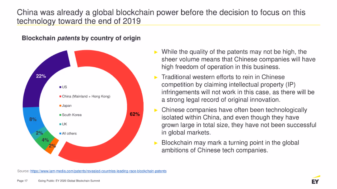
A pie chart depicting the distribution of blockchain patents by country of origin. It is visually dominated by China's portion (62%), followed by the US (22%), Japan (8%), and other countries with smaller percentages. The slide also contains bullet points summarizing the implications.
Market Analysis and Trends
Technology & Software
Highlights China's dominance in blockchain patents, explaining the high volume of patents and their potential impact on global market dynamics and competition strategies.
Blockchain, patents, China, technology, global market, intellectual property, innovation, competition, freedom of operation
false
Market Analysis and Trends
Technology & Software
Mixed Chart
EY
Add to my slides
Remove from favorites
A pie chart detailing the line of business revenue and a column chart displaying volatility. The layout is clean, with a focus on visual data representation in purple tones.
Risk Assessment and Management
Financial Services
Illustrates financial diversification and stability, suitable for discussions on risk management and financial planning, highlighting the benefits of a diverse business model in mitigating market volatility.
business mix, financial stability, risk management, volatility, diversification
false
Risk Assessment and Management
Financial Services
Multiple Chart
Goldman Sachs
Add to my slides
Remove from favorites
A pie chart displaying percentages of respondents who agree, disagree, or don't know if there's sufficient independent investment information available. The chart is accompanied by a text box with additional demographic breakdown information.
Market Analysis and Trends
Financial Services
This slide presents survey results showing that 58% of respondents feel there is sufficient independent investment information, while 38% disagree and 4% don't know. It highlights the age disparity in the responses.
Investment, Survey, Information, Respondents, Independent
false
Market Analysis and Trends
Financial Services
Mixed Chart
IPSOS
Add to my slides
Remove from favorites
A pie chart dominates half the slide, with complementary circular graphics and minimal text for clarity in comparison.
Market Analysis and Trends
Technology & Software
Examines the influx of new digital consumers during the pandemic, offering a breakdown that could influence digital marketing strategies.
digital consumers, pandemic trends, consumer analysis, SEA, pre-pandemic comparison, internet economy
false
Market Analysis and Trends
Technology & Software
Single Chart
Bain
Add to my slides
Remove from favorites
A pie chart dominates this slide, showing the percentage of employees in offices pre-pandemic. A subdued image in the background depicts two individuals in a work setting, adding contextual relevance. The chart's colors correspond to the legend, aiding in data interpretation and visual appeal.
Organizational Structure and Change
Professional Services
Reflecting on the pre-pandemic office presence, this slide offers a statistical breakdown to facilitate discussions on how workplace dynamics have shifted. It could serve as a baseline for measuring the impact of the pandemic on work arrangements and informing future work policies.
Pandemic, Workplace Trends, Pre-Pandemic Office, Employee Statistics, Policy
false
Organizational Structure and Change
Professional Services
Single Chart
EY
Add to my slides
Remove from favorites
A pie chart forecasting the projected share of U.S. TV screen consumption hours in three years. The chart includes segments for Streaming, Cable, Broadcast, and Other, with Streaming projected to reach 49%.
Market Analysis and Trends
Media & Entertainment
This slide forecasts the growth of streaming to nearly 50% of U.S. TV screen consumption hours in the next three years, highlighting the increasing shift from traditional TV to streaming services.
future projection, streaming growth, TV consumption, market trends, U.S. forecast
false
Market Analysis and Trends
Media & Entertainment
Single Chart
Nielsen
Add to my slides
Remove from favorites
A pie chart highlights sales distribution by region, complemented by a column chart showing regional sales development. Red highlights indicate changes.
Market Analysis and Trends
Industrial & Manufacturing
This slide assesses regional sales, showing Asia leading in recovery compared to other regions, with details on sales percentage and operational development.
regional sales, Asia recovery, operational development, LANXESS, sales analysis, Americas, EMEA, Germany, market comparison
false
Market Analysis and Trends
Industrial & Manufacturing
Multiple Chart
Morgan Stanley
Add to my slides
Remove from favorites
A pie chart illustrates corporate lending total credit exposure by sector, accompanied by a list of benefits on the left side, highlighting the strategic approach to lending.
Operational Efficiency
Financial Services
The slide offers an insight into the corporate lending credit exposure, distributed across various sectors, showing a strategic, relationship-focused approach to lending. It stresses on the franchise benefits from lending practices underpinned by diligent risk management, aiming for risk-adjusted returns.
Corporate Lending, Credit Exposure, Strategy, Risk Management, Sectors
false
Operational Efficiency
Financial Services
Multiple Chart
Goldman Sachs
Add to my slides
Remove from favorites
A pie chart illustrating the percentage of U.S. TV screen consumption hours by category in January 2022. The chart includes segments for Streaming, Cable, Broadcast, and Other, with additional breakdowns for specific streaming services.
Market Analysis and Trends
Media & Entertainment
This slide depicts the share of TV screen consumption hours in the U.S. for January 2022, showing that streaming accounts for 29% of total consumption. It includes detailed percentages for major streaming platforms like Netflix, YouTube, Hulu, and others.
TV consumption, streaming, market share, U.S. TV, January 2022
false
Market Analysis and Trends
Media & Entertainment
Single Chart
Nielsen
Add to my slides
Remove from favorites
A pie chart illustrating the proportion of users who confirmed the registration of crypto trading platforms with provincial regulators before purchasing, in 2023.
Regulatory and Compliance
Financial Services
This slide shows the percentage of users who confirmed if crypto trading platforms were registered before purchase, highlighting awareness and due diligence in 2023.
Registration, crypto, trading, platform, compliance, 2023
false
Regulatory and Compliance
Financial Services
Single Chart
IPSOS
Add to my slides
Remove from favorites
A pie chart illustrating the proportion of users who recall receiving risk information from crypto trading platforms in 2023, compared to 2022.
Risk Assessment and Management
Financial Services
This slide shows the percentage of users who remember receiving risk information before purchasing crypto assets, comparing 2023 with 2022.
Risk, information, crypto, trading, platforms, 2023, 2022
false
Risk Assessment and Management
Financial Services
Mixed Chart
IPSOS
Add to my slides
Remove from favorites
A pie chart indicates client coverage across sectors and a parallel comparative table shows global league table rankings from 2010 to 2019. It's visually clean with a light blue theme and organized layout.
Market Analysis and Trends
Financial Services
This slide highlights Goldman Sachs' market leadership and consistent performance over time, contrasting rankings in various financing activities, aimed at market analysts or potential clients to demonstrate the firm's competitive positioning.
Market leadership, client coverage, financial rankings, performance, Goldman Sachs
false
Market Analysis and Trends
Financial Services
Framework
Goldman Sachs
Add to my slides
Remove from favorites
A pie chart labeled "2018 Sales Mix" showing Eaton's business divisions and sales distribution among different sectors such as vehicle, aerospace, and electrical products.
Market Analysis and Trends
Industrial & Manufacturing
Showcases the sales distribution across Eaton's diverse business units, aligning with market trends and highlighting Eaton's strategic positions in multiple sectors.
sales distribution, Eaton, market trends, business units
false
Market Analysis and Trends
Industrial & Manufacturing
Mixed Chart
Deutsche Bank
Add to my slides
Remove from favorites
A pie chart on the left showing net buyers and sellers, with a table on the right detailing their views on unexpected expenses, financial situation changes, and other financial concerns.
Market Analysis and Trends
Financial Services
This slide explores the differences between net buyers and sellers during the pandemic, focusing on unexpected expenses, changes in financial situation, and financial concerns.
net buyers, net sellers, financial, pandemic, views
false
Market Analysis and Trends
Financial Services
Mixed Chart
IPSOS
Add to my slides
Remove from favorites
A pie chart on the left showing passive and active investors, with a table on the right comparing demographics, income, and financial situation changes between the two groups.
Market Analysis and Trends
Financial Services
It provides demographic and financial comparisons between passive and active investors during the pandemic, showing differences in gender, age, income, and financial situation changes.
demographics, income, financial, active, passive
false
Market Analysis and Trends
Financial Services
Mixed Chart
IPSOS
Add to my slides
Remove from favorites
A pie chart on the left showing the proportion of passive and active investors, with another smaller pie chart on the right detailing net buyer, net zero, and net seller percentages.
Market Analysis and Trends
Financial Services
This slide compares passive and active investors during the pandemic, detailing the percentage of net buyers, net zero, and net sellers among active investors.
investors, passive, active, pandemic, comparison
false
Market Analysis and Trends
Financial Services
Multiple Chart
IPSOS
Add to my slides
Remove from favorites
A pie chart representing investment sentiment in Indonesia paired with key insights from interviews, all set against a neutral background.
Investment Analysis
Technology & Software
Discusses the positive investment outlook in Indonesia despite the pandemic, with insights on factors influencing investments.
Investment, Indonesia, pandemic, market outlook, insights, factors
false
Investment Analysis
Technology & Software
Single Chart
Kearney
Add to my slides
Remove from favorites
A pie chart showing an 80% reduction in time spent on payables and expenses, with icons representing benefits such as cost savings and improved control.
Technology and Digital Transformation
Financial Services
Highlights the benefits of automating accounts payable within finance, notably in time savings and enhanced spend visibility and control.
accounts payable, automation, finance, time savings, cost savings, spend visibility, control, digital transformation
false
Technology and Digital Transformation
Financial Services
Mixed Chart
Deloitte
Add to my slides
Remove from favorites
A pie chart showing company size distribution and a world map indicating surveyed countries. Text lists respondent demographics and industries.
Market Analysis and Trends
Professional Services
The slide presents the demographic breakdown of a survey, including company size, industries, and geographical distribution of the respondents.
Demographics, Survey, Company Size, Industries, Global Distribution
false
Market Analysis and Trends
Professional Services
Mixed Chart
Accenture
Add to my slides
Remove from favorites
A pie chart showing the percentage distribution between tax revenue and non-tax revenue for the fiscal year 2019/20. The chart is colored in shades of gray, with a clear distinction between the two categories.
Financial Performance
Government & Public Sector
This slide presents a clear visual representation of the revenue sources for a government, highlighting the overwhelming dependence on tax revenue compared to non-tax sources. It provides a foundational understanding for discussions on fiscal policy and revenue management strategies.
tax revenue, non-tax revenue, fiscal policy, government finance, budget
false
Financial Performance
Government & Public Sector
Single Chart
PwC/Strategy&
Add to my slides
Remove from favorites
A pie chart showing the share of total imports from Costa Rica to the US by product type. The chart uses different colors for each segment, with highlighted sections for significant variations.
Market Analysis and Trends
Transportation & Logistics
This slide provides an overview of the top ten product imports from Costa Rica to the US, highlighting their share of total imports and annual variation from 2021 to 2022.
Imports, Costa Rica, US, pie chart, market trends
false
Market Analysis and Trends
Transportation & Logistics
Single Chart
Deloitte
Add to my slides
Remove from favorites
A pie chart shows 2020 revenue by customer, detailing the percentage of revenue from various automotive manufacturers. It is accompanied by text explaining customer diversity. Color-coding is used to distinguish different customers.
Customer and Market Segmentation
Industrial & Manufacturing
The slide presents the diversified customer base of TI Fluid Systems in 2020, emphasizing the strategic advantage of not relying excessively on any single customer, which helps in maintaining revenue consistency.
automotive, customer diversity, revenue, 2020, pie chart
false
Customer and Market Segmentation
Industrial & Manufacturing
Mixed Chart
Deutsche Bank
Add to my slides
Remove from favorites
A pie chart shows 91% 'Yes' in a bold orange color, alongside a bar chart detailing percentages per sector like Financial Services and Manufacturing, indicating the presence of formal HR functions.
Market Analysis and Trends
Professional Services
Discusses the prevalence of formal HR functions across various sectors, useful for analyzing organizational maturity and HR management practices across industries.
HR, functions, organization, sectors, management, analysis, prevalence
false
Market Analysis and Trends
Professional Services
Multiple Chart
PwC/Strategy&
Add to my slides
Remove from favorites
A pie chart shows the prioritization of different areas by CFOs since the start of COVID-19. The chart uses shades of green and blue to represent areas like cashflow management and people and talent, with cashflow management taking the largest portion (43%).
Risk Assessment and Management
Financial Services
Discusses the shifting priorities of CFOs during the COVID-19 pandemic, emphasizing the focus on cashflow management as the highest priority, followed by forecasting and people management. This indicates a strategic pivot towards essential financial management and resilience building in uncertain times.
CFO, COVID-19, financial priorities, cashflow management, risk management
false
Risk Assessment and Management
Financial Services
Single Chart
Deloitte
Add to my slides
Remove from favorites
A pie chart shows the proportion of SDG-aligned investments against other investments, with associated text blocks. A color-coded list describes contributions to SDG goals.
Regulatory and Compliance
Government & Public Sector
Communicates the company's commitment to sustainability through SDG-aligned investments. It highlights the yearly investment averages and the main areas of contribution, suitable for reports on corporate responsibility and sustainability initiatives.
SDG Goals, Investments, Sustainability, Corporate Responsibility, Innovation
false
Regulatory and Compliance
Government & Public Sector
Table
Goldman Sachs
Add to my slides
Remove from favorites
A pie chart with segments in different shades of red and orange representing different positions within firms, like CEOs and HR managers, indicating the distribution of respondents by position.
Market Analysis and Trends
Professional Services
Provides insights into the distribution of different executive and managerial positions within firms, useful for understanding organizational structures and decision-making hierarchies.
positions, firms, executives, managers, organizational structure
false
Market Analysis and Trends
Professional Services
Single Chart
PwC/Strategy&
Add to my slides
Remove from favorites
A process flow slide with three main sections: Objective, Feedback, and Time Frame, each represented by icons and brief descriptions.
Technology and Digital Transformation
Media & Entertainment
Outlines the objective, feedback process, and timeline for Nielsen ONE Content Alpha, focusing on client collaboration and iterative feedback.
Nielsen ONE, content, feedback, timeline, collaboration, software, versions
false
Technology and Digital Transformation
Media & Entertainment
Pillar
Nielsen
Add to my slides
Remove from favorites
A prominent column chart displays a rising trend in investment banking revenue, complemented by bullet points on the right. There's a good balance between graphical data and text information.
Financial Performance
Financial Services
This slide provides information on investment banking revenue growth, with strategic goals for expanding market share and targeting specific growth areas. It illustrates a compound annual growth rate and future targets, highlighting areas of strategic growth such as the Middle Market and Green Economy.
Investment banking, revenue growth, strategic growth, market share
false
Financial Performance
Financial Services
Mixed Chart
JP Morgan
Add to my slides
Remove from favorites
A quadrant scatter plot categorizes technologies and services based on their market positioning before and after signing contracts. Dots represent companies; color indicates service or goods focus.
Risk Assessment and Management
Technology & Software
Evaluates the challenges in purchasing services versus goods, illustrating the technology landscape's division into pre and post-contract signing phases, focusing on areas like risk and contract management.
Buying, Services, Challenges, Technology, Market
false
Risk Assessment and Management
Technology & Software
Single Chart
Kearney
Add to my slides
Remove from favorites
A radar chart comparing various aspects like employee training, customer experience, and data sovereignty between leaders and laggards. The layout is balanced with text on one side and chart on the other.
Strategic Planning
Professional Services
This slide discusses how leaders create value by focusing on areas such as employee training and data sovereignty. The radar chart highlights differences between leaders and laggards.
Leadership, Employee Training, Data Sovereignty, Customer Experience, Innovation
false
Strategic Planning
Professional Services
Mixed Chart
Accenture
Add to my slides
Remove from favorites
A radar chart dividing trends into Watch, Prepare, and Act categories, with varying sizes of circles representing different trends.
Market Analysis and Trends
Professional Services
Visual representation of trends categorized by their impact and timeframe for adoption, classified into Watch, Prepare, and Act.
TrendRadar, radar chart, watch, prepare, act
false
Market Analysis and Trends
Professional Services
Mixed Chart
Deloitte
Add to my slides
Remove from favorites
A roadmap slide detailing the pivot approach for growing, transforming, and scaling service businesses. The slide uses a horizontal timeline to map focus areas and activities across three phases: Grow the Core, Transform the Core, and Scale the New.
Strategic Planning
Professional Services
This slide outlines a strategic pivot roadmap for service businesses, mapping key focus areas and activities across different phases to achieve growth, transformation, and scaling.
roadmap, strategic planning, growth, transformation, scaling
false
Strategic Planning
Professional Services
Table
Accenture
Add to my slides
Remove from favorites
A roadmap slide with a horizontal timeline detailing the engagement objectives and approach, including mapping of economic landscape, SWOT analysis, value proposition drafting, scenario analysis, and report development.
Strategic Planning
Professional Services
This slide outlines the engagement objectives and approach for a regional economic recovery analysis, detailing each step from initial mapping to final report development.
engagement objectives, roadmap, SWOT analysis, economic recovery
false
Strategic Planning
Professional Services
Linear Flow
Deloitte
Add to my slides
Remove from favorites
A scatter plot chart illustrates the overlap of Procure-to-Pay, eSourcing, and Supplier Governance, highlighting tools like Ariba and Coupa. Key areas such as contract management, financial management, and risk management are detailed.
Operational Efficiency
Technology & Software
Describes the integration of contract management, supplier governance, and P2P systems, detailing functions and technologies used to streamline and enhance supplier interactions and compliance.
Contract, Management, Supplier, Governance, Integration
false
Operational Efficiency
Technology & Software
Diagram
Kearney
Add to my slides
Remove from favorites
A scatter plot chart showing cumulative number of cases per million population juxtaposed against a ratio of total tests to total cases for various countries, within a gradient green background indicating preparedness.
Market Analysis and Trends
Healthcare & Pharmaceuticals
Analyzes countries' testing rates in relation to COVID-19 cases to evaluate readiness for relaxing lockdown measures, providing insights into public health strategies.
COVID-19, lockdown measures, testing rates, public health, cumulative cases, preparedness, relax lockdown
false
Market Analysis and Trends
Healthcare & Pharmaceuticals
Mixed Chart
BCG
Add to my slides
Remove from favorites
Previous
Next
You don't have any favorites yet.
Please wait loading your favorites slides...
Create a FREE account to continue browsing
Receive Instant Access to 7,500+ of the internet's best slides
First Name
Last Name
Email
Password
I agree to all
Terms & Privacy Policy
Thank you! Your submission has been received!
Oops! Something went wrong while submitting the form.
Have an account?
Sign in
Upgrade to PRO to Save slides
Advanced Search and Filters
Access to 8,000+ slides
Access to Category Pages
Save/Bookmark Slides
PowerPoint Template Library
(Coming Soon)
Pick a Plan
MONTHLY
$12/month
Billed every month, Cancel anytime.
YEARLY
$9/year
Billed $108 annually, Cancel anytime.
Checkout for $12/month
Checkout for $108/yr
Secured by Stripe | AES-256 bit encryption