My Account
My Slides
Search by Category
Companies
Slide Type
Use Case
Industry
Pricing
Templates
View All Templates
Download Template Slides
✦ AI
AI Prompt Library
AI Search
Feedback
Login
Logout
Get Started
Browse all Slides
Browse all Slides
Create a FREE Account
Instant access to 1,000+ real slides from top companies like McKinsey, BCG, Goldman Sachs, Google and many more!
First Name
Last Name
Email
Password
I agree to all
Terms & Privacy Policy
Thank you! Your submission has been received!
Oops! Something went wrong while submitting the form.
Have an account?
Sign in
Saved Slides
Total No. of slides saved
0
↻ Refresh
✖ Clear all
Donut chart showing 67% with explanatory message; right side provides key caveat about impact requiring reimagined work models.
Technology and Digital Transformation
Artificial Intelligence
While 67% are exploring autonomous agents, the slide warns that real impact depends on deeper reengineering of workflows, not just adoption.
autonomous agents, AI transformation, reimagining work, BCG, impact, agents, chart, 67%
false
Technology and Digital Transformation
Artificial Intelligence
Single Chart
BCG
Add to my slides
Remove from favorites
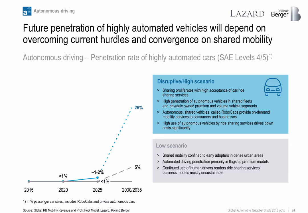
Line chart showing two scenarios for autonomous vehicle penetration (low vs. high); side text compares scenario assumptions.
Technology and Digital Transformation
Industrial & Manufacturing
Projects adoption of highly automated vehicles (SAE Level 4/5) under different market scenarios. Highlights role of shared mobility, ride-hailing, and RoboCabs in accelerating adoption under a disruptive path.
autonomous driving, RoboCabs, mobility, adoption forecast, automation scenarios
false
Technology and Digital Transformation
Industrial & Manufacturing
Mixed Chart
Roland Berger
Add to my slides
Remove from favorites
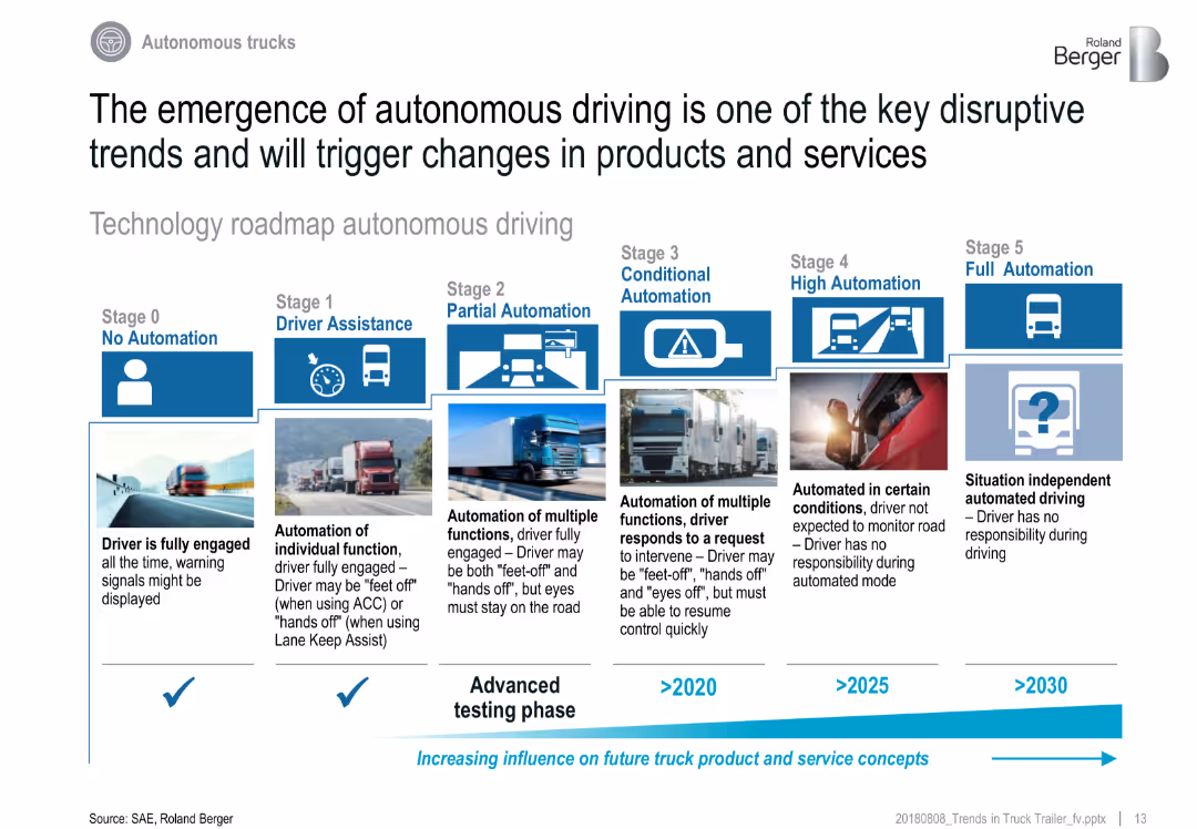
Horizontal roadmap layout with 6 automation levels, each represented with icons, definitions, and timelines
Technology and Digital Transformation
Transportation & Logistics
This slide details the technological roadmap of autonomous trucks, from Stage 0 (No Automation) to Stage 5 (Full Automation). Each stage includes visual and descriptive elements. It emphasizes the gradual but increasing influence of automation on future truck systems.
autonomous driving, SAE levels, automation roadmap, trucking, driverless, technology adoption, logistics future
false
Technology and Digital Transformation
Transportation & Logistics
Linear Flow
Roland Berger
Add to my slides
Remove from favorites
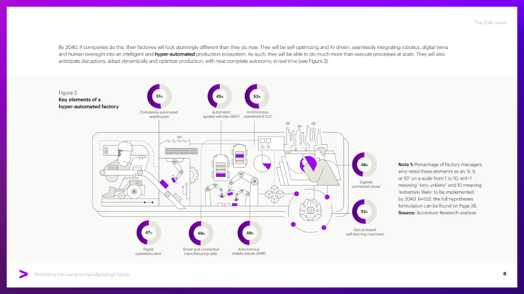
Central factory illustration with icons and annotated percentages arranged around it.
Technology and Digital Transformation
Industrial & Manufacturing
Highlights expected features in future factories including AGVs, AI machines, and digital twins. It includes survey-based stats indicating expected adoption likelihood of each technology by 2040.
Autonomous operations, AGV, AI robots, digital twins, smart factories
false
Technology and Digital Transformation
Industrial & Manufacturing
Single Chart
Accenture
Add to my slides
Remove from favorites
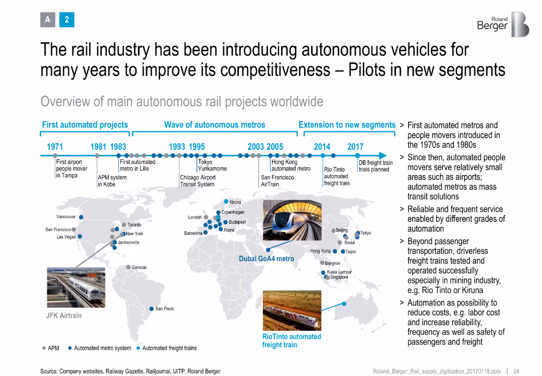
Timeline at top with global map and project milestones, annotated with metro and freight automation icons
Strategic Planning
Transportation & Logistics
Presents a historical and geographic overview of autonomous rail projects, showing evolution from airport movers to advanced freight systems, with benefits like cost reduction and safety.
autonomous rail, metro systems, global map, project timeline, digitalization, cost savings, rail innovation
false
Strategic Planning
Transportation & Logistics
Uncategorized
Roland Berger
Add to my slides
Remove from favorites
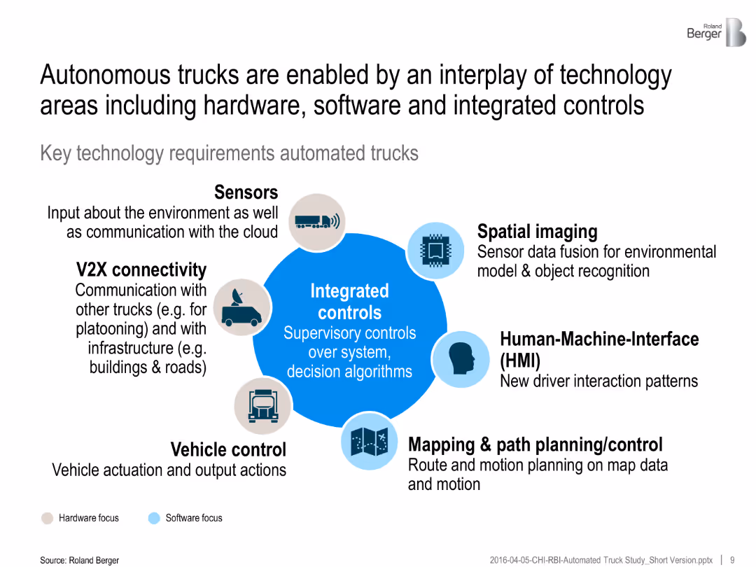
Central graphic with integrated controls surrounded by icons representing key components (e.g., sensors, V2X, HMI). Color-coded for hardware/software focus.
Technology and Digital Transformation
Transportation & Logistics
Key technologies enabling autonomous trucks include sensors, spatial imaging, mapping, V2X communication, and control systems—highlighting interplay of hardware and software.
autonomous trucks, sensors, integrated controls, V2X, HMI, path planning, software systems, transport innovation
false
Technology and Digital Transformation
Transportation & Logistics
Framework
Roland Berger
Add to my slides
Remove from favorites
The slide uses a two-column layout to differentiate function-specific from industry use cases. Each case is bulleted and matched with relevant icons.
Technology and Digital Transformation
Transportation & Logistics
Lists use cases for advanced mobility technologies across industries, providing examples of how these technologies can be applied in real-world scenarios.
autonomous trucks, vehicle-to-grid systems, AI mapping, mobility-as-a-service, insurance
false
Technology and Digital Transformation
Transportation & Logistics
Header Vertical
McKinsey
Add to my slides
Remove from favorites
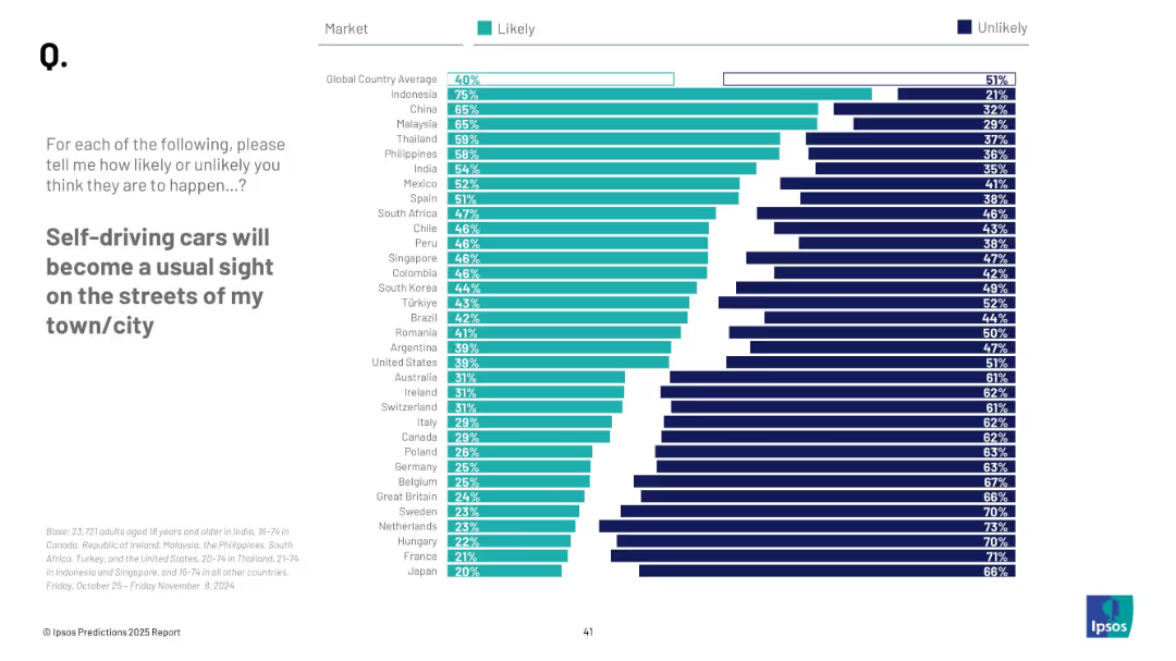
Horizontal bar chart; similar design as previous slide; country ranking with percentages, “Likely” vs “Unlikely”
Technology and Digital Transformation
Transportation & Logistics
This slide visualizes global sentiment on the mainstream emergence of self-driving cars. Indonesia, China, and Malaysia lead in optimism, with 40% global average expecting it likely.
autonomous vehicles, transportation, public opinion, technology, self-driving cars, urban planning, mobility, innovation, survey
false
Technology and Digital Transformation
Transportation & Logistics
Mixed Chart
IPSOS
Add to my slides
Remove from favorites
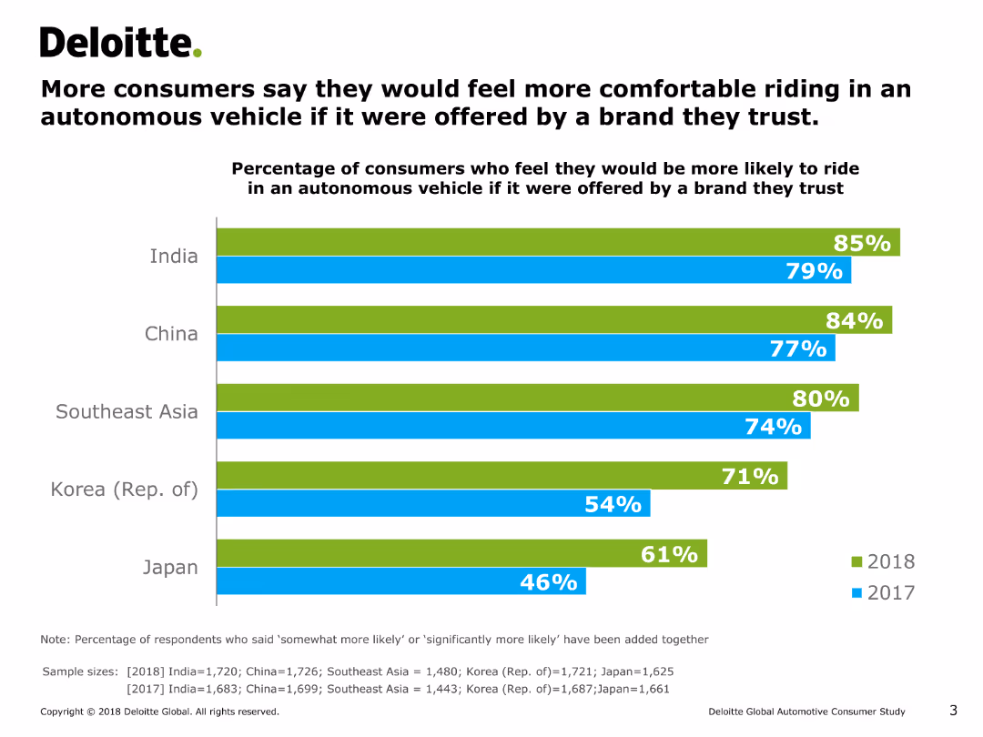
The slide includes a column chart showing the percentage of consumers in various countries who would feel more comfortable riding in an autonomous vehicle if offered by a trusted brand over two years.
Market Analysis and Trends
Transportation & Logistics
It examines consumer comfort levels with autonomous vehicles when provided by trusted brands, comparing responses from multiple countries over two years.
autonomous vehicles, trust, consumer comfort, trends, brands
false
Market Analysis and Trends
Transportation & Logistics
Single Chart
Deloitte
Add to my slides
Remove from favorites
This slide uses a dark background with white and blue text. It includes a list of technologies under categories like ACES and adjacent tech. Visuals include stylized icons representing each technology category.
Technology and Digital Transformation
Transportation & Logistics
It outlines innovative technologies in the mobility sector, such as autonomy and electrification, with descriptions of each. Additional adjacent technologies like lightweight materials are also presented.
autonomy, connectivity, electrification, smart mobility, lightweight technologies, decarbonization
false
Technology and Digital Transformation
Transportation & Logistics
Header Horizontal
McKinsey
Add to my slides
Remove from favorites
Divided into two main sections with bulleted points for 'Ground transportation' and 'Air mobility'. Each topic of debate is highlighted with a question and a brief description.
Regulatory and Compliance
Transportation & Logistics
Presents major topics of debate regarding the future of mobility, including market penetration, the impact of shared mobility, and the timing for aerial transport.
autonomy, shared mobility, air mobility, sustainability, customer expectations
false
Regulatory and Compliance
Transportation & Logistics
Header Vertical
McKinsey
Add to my slides
Remove from favorites
Comparative charts detailing monthly sales changes for passenger vehicles in multiple countries, using color-coded bars.
Market Analysis and Trends
Transportation & Logistics
Reviews the recovery in passenger vehicle sales post-pandemic, useful for market analysis and predicting future consumer behavior in the auto industry.
auto sales, market recovery, pandemic impact, consumer behavior, sales analysis
false
Market Analysis and Trends
Transportation & Logistics
Multiple Chart
BCG
Add to my slides
Remove from favorites
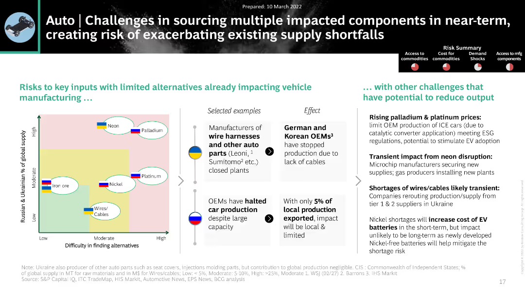
The slide features a matrix chart and bullet points. The design is clean with moderate complexity and relevant icons.
Market Analysis and Trends
Transportation & Logistics
The slide highlights challenges in sourcing components for auto manufacturing due to the Ukraine crisis, focusing on specific materials like neon and palladium.
Auto, Supply Chain, Ukraine Crisis, Neon, Palladium
false
Market Analysis and Trends
Transportation & Logistics
Header Horizontal
BCG
Add to my slides
Remove from favorites
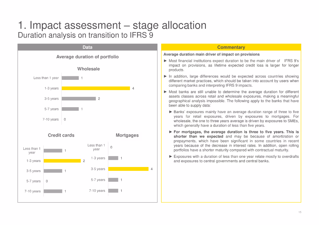
The slide features column charts showing the average duration of the portfolio across Wholesale, Credit cards, and Mortgages, complemented with a commentary box highlighting the main findings and implications.
Risk Assessment and Management
Financial Services
Analyzes the average duration of the portfolio in the context of IFRS 9, discussing how duration affects provisions and the differences expected in various market practices and asset classes.
average duration, IFRS 9, portfolio analysis, credit cards, mortgages
false
Risk Assessment and Management
Financial Services
Multiple Chart
EY
Add to my slides
Remove from favorites
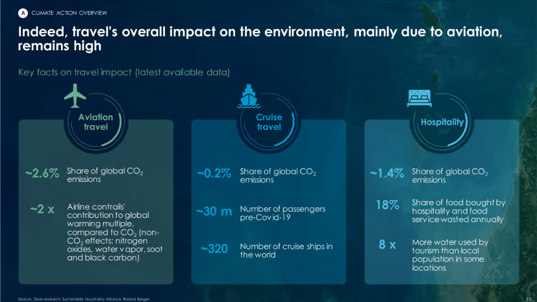
Three-column layout with icons and statistics for aviation, cruise travel, and hospitality sectors, highlighting respective CO₂ emissions.
Risk Assessment and Management
Environmental Services & Sustainability
The slide quantifies the environmental impact of tourism, with aviation responsible for ~2.6% of global CO₂ emissions, cruises for 0.2%, and hospitality for 1.4%. It emphasizes resource overuse and food waste in the sector.
aviation, cruise, hospitality, emissions, tourism impact, CO₂ share
false
Risk Assessment and Management
Environmental Services & Sustainability
Pillar
Roland Berger
Add to my slides
Remove from favorites
Title, detailed bar charts illustrating potential impacts across sub-sectors like "Living Travel Experiences" and "Digital Enterprise".
Market Analysis and Trends
Transportation & Logistics
Analyzes the potential value unlocked by digitalization in the aviation, travel, and tourism sectors, discussing both business and societal impacts.
aviation, digitalization, travel, tourism, societal impact
false
Market Analysis and Trends
Transportation & Logistics
Mixed Chart
Accenture
Add to my slides
Remove from favorites
Left-aligned paragraph with survey chart in center and quote on the right. Yellow and grey theme, structured with chart legends.
Strategic Planning
Transportation & Logistics
Highlights the importance of cross-border business/trade and other factors in making Ireland a financial hub for aviation finance. Survey shows top priorities for fostering future growth in the sector.
aviation finance, Ireland, cross-border, trade, innovation, labor supply, policy
false
Strategic Planning
Transportation & Logistics
Mixed Chart
EY
Add to my slides
Remove from favorites
Two bar charts showing customer and country exposure by percentage of NBV, with associated airline and country flags.
Market Analysis and Trends
Transportation & Logistics
Analyzes Aircastle’s global market distribution by detailing customer base and country-specific aircraft exposure.
aviation, global, market, distribution, customer, airlines, exposure
false
Market Analysis and Trends
Transportation & Logistics
Multiple Chart
Deutsche Bank
Add to my slides
Remove from favorites
The slide features a column chart forecasting aviation energy consumption by fuel type (oil, electricity, biofuels) from 2018 to 2040 under a stated scenario. It also includes a detailed analysis of the industry environment and bioenergy economic competitiveness.
Market Analysis and Trends
Transportation & Logistics
This slide projects energy consumption in the aviation industry, emphasizing the role of biofuels as the only reliable renewable alternative, and analyzing the economic competitiveness and industry environment.
aviation industry, energy consumption, fuel type, biofuels, 2018-2040, economic competitiveness, industry environment
false
Market Analysis and Trends
Transportation & Logistics
Mixed Chart
Kearney
Add to my slides
Remove from favorites
A bar chart showing potential reach of the TV screen by source for different age groups, with a focus on AVOD reach and its incremental gain.
Market Analysis and Trends
Media & Entertainment
The slide highlights that AVOD content has the greatest reach potential among younger viewers, showing significant incremental gains in audience reach.
AVOD, reach, potential, younger viewers, incremental gain
false
Market Analysis and Trends
Media & Entertainment
Multiple Chart
Nielsen
Add to my slides
Remove from favorites
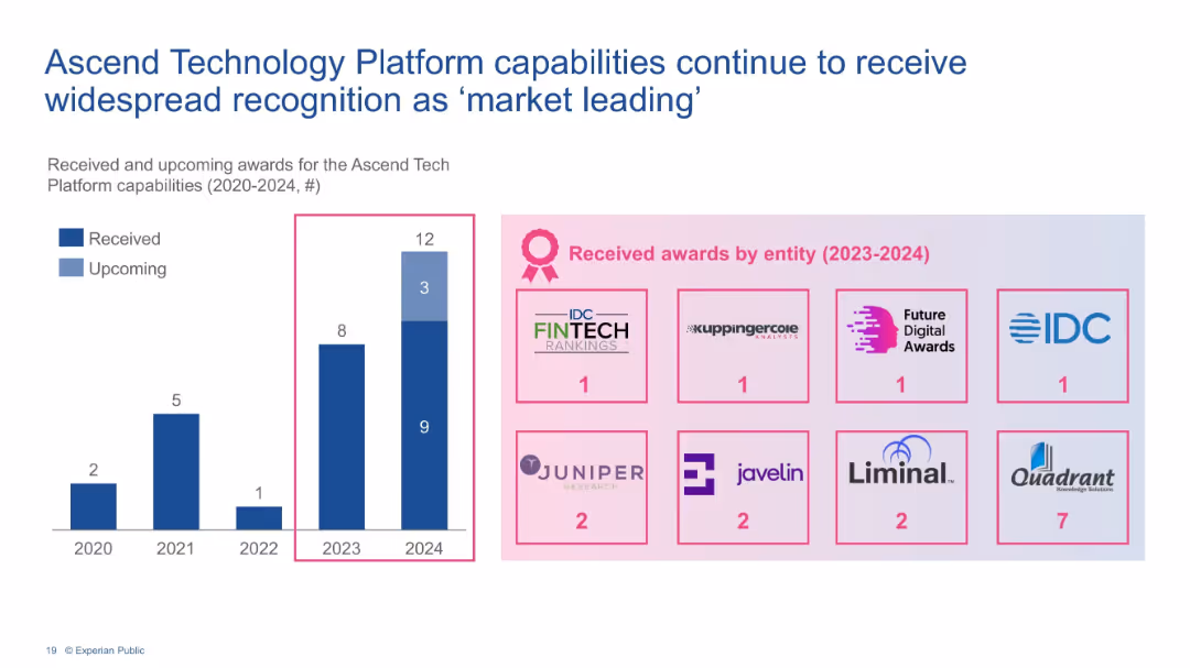
Bar chart of awards (2020–2024) and icons showing award distribution by entity.
Strategic Planning
Financial Services
Outlines recognition of Experian’s Ascend platform capabilities via increasing number of industry awards. Displays total and upcoming recognitions, emphasizing market leadership and technological innovation.
awards, Experian, Ascend platform, recognition, capabilities, industry, tech leadership
false
Strategic Planning
Financial Services
Mixed Chart
Barclays
Add to my slides
Remove from favorites
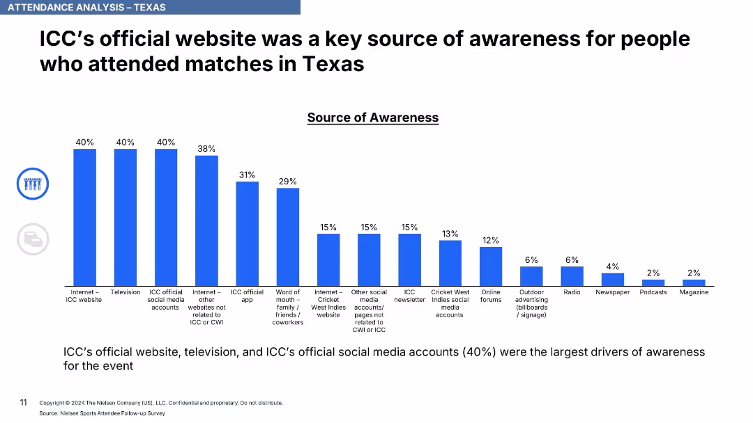
Vertical bar chart with percentages above each bar, ranked sources of awareness in blue bars.
Strategic Planning
Media & Entertainment
This slide details the most effective channels for generating awareness about the matches, with ICC's website, television, and official social media accounts being top sources at 40%. Various other channels follow with lower shares.
awareness channels, ICC, event promotion, digital media, website, television, social media, marketing impact
false
Strategic Planning
Media & Entertainment
Single Chart
Nielsen
Add to my slides
Remove from favorites
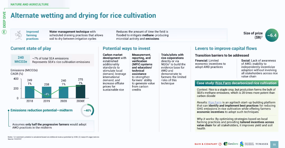
Split into sections with icons and clearly labeled headings. Includes bar chart (emissions), bullet-point lists, and a case study box. Color accents in green and teal reinforce environmental theme.
Operational Efficiency
Agriculture & Food Production
This slide promotes a water management technique for rice cultivation in Southeast Asia (SEA) that reduces methane emissions. It outlines current emissions levels, potential investment pathways, emission reduction potential (~40%), and implementation challenges. A case study (Rize.Farm) demonstrates how optimized local farming practices and incentives can improve soil health and reduce GHG emissions.
AWD, rice cultivation, methane, emissions, investment, case study, farming, SEA, carbon
false
Operational Efficiency
Agriculture & Food Production
Multiple Chart
Bain
Add to my slides
Remove from favorites
This slide has multiple column charts displaying revenue, income, and assets, with key financial metrics highlighted on the right.
Financial Performance
Financial Services
Demonstrates consistent growth in Asset Wealth Management, represented by yearly performance data and growth trends in bar graphs, intending to convey JPMorgan's financial stability and success over a decade.
AWM, financial performance, growth, JPMorgan, bar graphs
false
Financial Performance
Financial Services
Multiple Chart
JP Morgan
Add to my slides
Remove from favorites
The slide displays a pyramid diagram representing the tiered service approach, and bar charts that quantify the firm's market opportunity. The layout is straightforward with a mix of graphics and bullet points.
Corporate Finance and Valuation
Financial Services
Illustrating Ayco's role in providing integrated corporate client services, the slide highlights the scope of Ayco's reach in the market and outlines its full-service offerings across corporate hierarchies.
Ayco, corporate clients, financial planning, market reach
false
Corporate Finance and Valuation
Financial Services
Framework
Goldman Sachs
Add to my slides
Remove from favorites
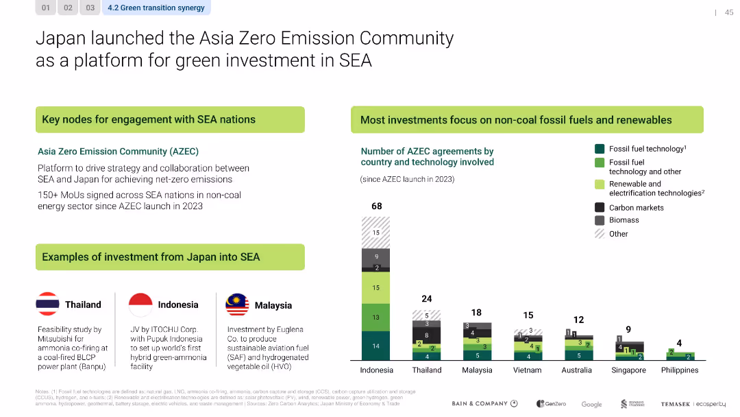
Sectioned layout with bar chart, flag-labeled investment examples, and callout boxes
Strategic Planning
Government & Public Sector
The slide introduces Japan’s Asia Zero Emission Community initiative, promoting over 150 MoUs across SEA in green sectors. Investment examples are provided by country, with a strong emphasis on renewables and fossil alternatives.
AZEC, Japan, SEA, renewable energy, MoUs, net-zero, policy, investment
false
Strategic Planning
Government & Public Sector
Mixed Chart
Bain
Add to my slides
Remove from favorites
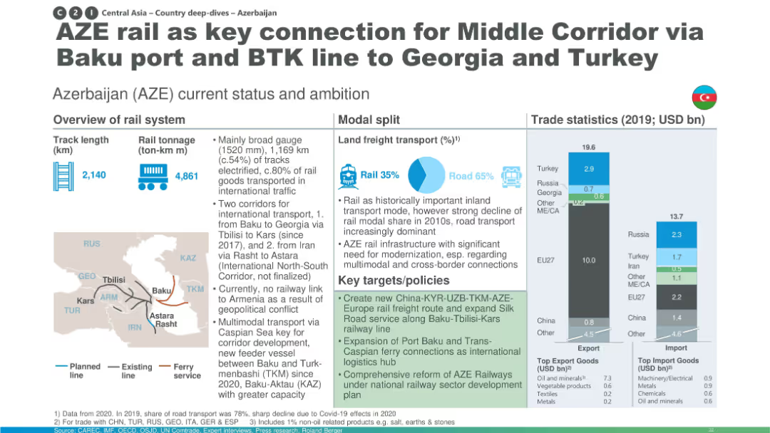
Structured layout with infographics and maps; includes stats on rail length, freight split, and trade data.
Industry Overview
Transportation & Logistics
This slide discusses Azerbaijan’s strategic position in the Middle Corridor, providing vital rail links from Baku to Georgia and Turkey. It shows modal transport data, trade volume (2019), and key initiatives like port and corridor expansions to enhance connectivity.
Azerbaijan, Baku, Middle Corridor, BTK, freight transport, trade, rail infrastructure
false
Industry Overview
Transportation & Logistics
Multiple Chart
Roland Berger
Add to my slides
Remove from favorites
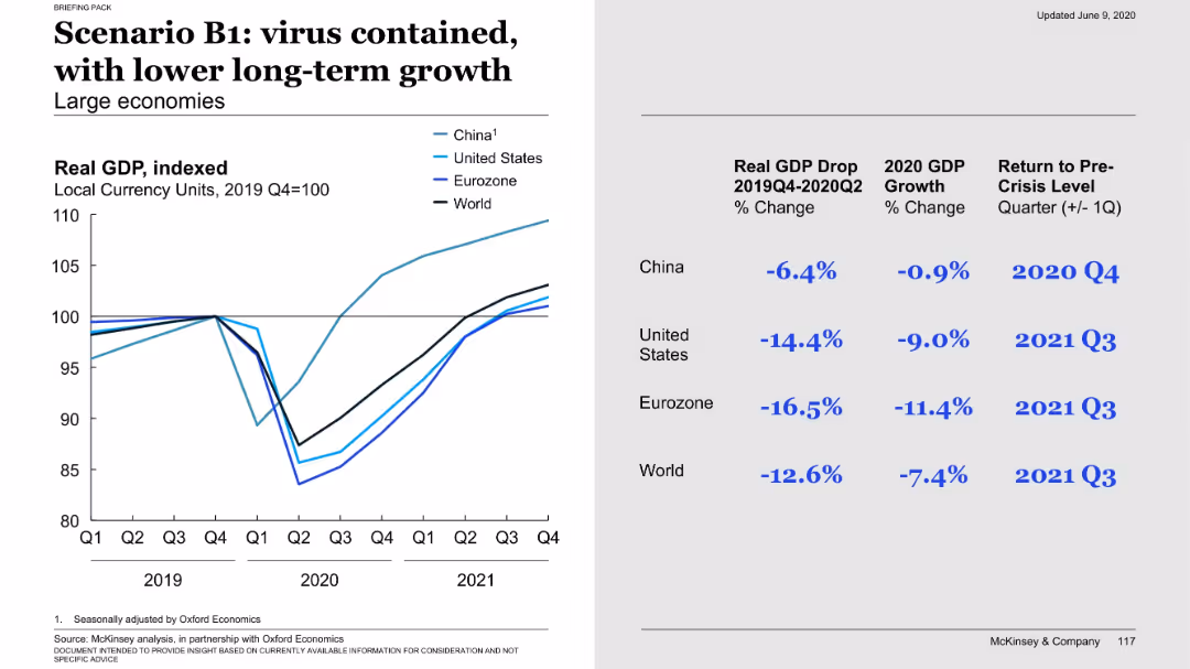
Left graph shows recovery followed by slower long-term trend; right side presents GDP drop and recovery timing across regions.
Financial Performance
Government & Public Sector
The B1 scenario anticipates virus containment but at the cost of sustained economic damage. Though a recovery occurs, long-term growth remains below previous levels. Data highlights severe GDP drops in US and Eurozone with recovery by Q3 2021.
B1, virus containment, long-term growth, GDP impact, economic damage, recovery timing, scenario
false
Financial Performance
Government & Public Sector
Mixed Chart
McKinsey
Add to my slides
Remove from favorites
Column charts showing percentages of company performance indicators like sales, customer retention, and profits.
Market Analysis and Trends
Professional Services
Compares company performance metrics across B2B and B2C sectors, noting particularly strong performance in B2B services.
B2B, B2C, company performance, sales, profits
false
Market Analysis and Trends
Professional Services
Mixed Chart
Deloitte
Add to my slides
Remove from favorites
Bar charts show the size and growth potential in B2B markets like merchant acquiring and SME lending.
Strategic Planning
Financial Services
Discusses growth opportunities in the B2B market, identifying high-growth and moderate-growth segments.
B2B, market growth, opportunities, merchant acquiring, SME
false
Strategic Planning
Financial Services
Single Chart
BCG
Add to my slides
Remove from favorites
The slide contains text and graphical elements, including a large "16 of the top 30" in teal, a pie chart showing 72% of US businesses, and a financial figure for the cloud computing market size. The design is clean and modern.
Sales and Business Development
Professional Services
The slide highlights Ipsos' engagement with top B2B companies, emphasizing the predominance of B2B businesses in the US and the significant market size of cloud computing.
B2B, market opportunity, cloud computing, US, engagement
false
Sales and Business Development
Professional Services
Mixed Chart
IPSOS
Add to my slides
Remove from favorites
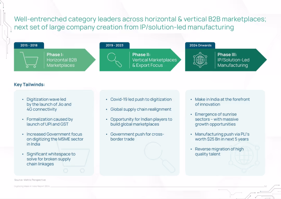
Horizontal timeline across three phases (2015–2024 onwards) with bullet points on key tailwinds underneath
Strategic Planning
Technology & Software
The slide presents a phased evolution of India’s B2B marketplace development, moving from horizontal platforms to IP-driven manufacturing. It identifies key enabling factors like digitization, GST/UPI formalization, Covid-related shifts, and emerging innovation-led sectors. Tailwinds are categorized by era and strategic influence.
B2B, marketplaces, India, digitization, UPI, IP-led, MSME, government policy, manufacturing evolution
false
Strategic Planning
Technology & Software
Pillar
BCG
Add to my slides
Remove from favorites
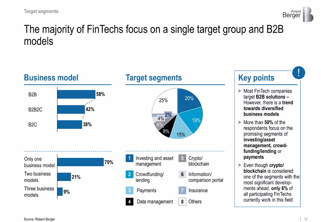
Dual column bar charts and pie chart; B2B and target segments distribution are illustrated
Customer and Market Segmentation
Financial Services
Shows that most FinTechs adopt B2B models and target promising segments like investing and crowdfunding. Despite the buzz, few are active in blockchain.
B2B, target segments, crypto, blockchain, investing, payments
false
Customer and Market Segmentation
Financial Services
Multiple Chart
Roland Berger
Add to my slides
Remove from favorites
Slide includes flow charts and bar charts depicting types of transactions in the informal market and their tender types.
Market Analysis and Trends
Financial Services
Details the prevalence of cash transactions in B2C and B2B sectors within informal markets, highlighting types of payments.
B2C, B2B, cash transactions, informal market, payment types
false
Market Analysis and Trends
Financial Services
Multiple Chart
BCG
Add to my slides
Remove from favorites
The slide compares traditional B2C start-ups' expansion into B2B SME services with example cases and a graphical representation of their original and expanded service offerings.
Market Analysis and Trends
Financial Services
The slide outlines the strategic growth of B2C start-ups into adjacent B2B SME services, providing cases like Gojek and Shopee as examples. It's suitable for analyzing how B2C companies are diversifying into the B2B space to capture additional market segments and enhance value propositions.
B2C, B2B, Expansion, SME Services, Market Strategy, Start-ups
false
Market Analysis and Trends
Financial Services
Linear Flow
Kearney
Add to my slides
Remove from favorites
Uses bar charts to compare market sizes and serviceable addressable market (SAM) across sectors like airtime and electricity.
Market Analysis and Trends
Telecommunications
Analyzes the B2C market dynamics, highlighting sectors with growth potential and those facing decline.
B2C, market dynamics, telecommunications, growth, SAM
false
Market Analysis and Trends
Telecommunications
Single Chart
BCG
Add to my slides
Remove from favorites
Slide uses icons, text, and color blocks to present data.
Market Analysis and Trends
Technology & Software
Highlights the strong performance of B2C product companies in utilizing marketing analytics, compared to overall industry averages.
B2C, Product Companies, Marketing, Analytics, Performance, Comparison, Industry Average, Utilization
false
Market Analysis and Trends
Technology & Software
Table
Deloitte
Add to my slides
Remove from favorites
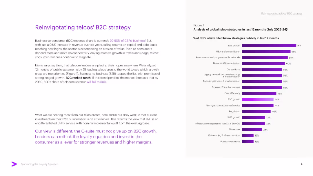
Two-column layout: left side narrative with bold purple callouts; right bar chart ranks CSP growth strategies. Minimalist design.
Strategic Planning
Telecommunications
The slide critiques telcos' overreliance on B2C and recommends pivoting to other growth strategies like B2B. It uses survey data to show that B2C ranks low among strategic priorities and advocates for renewed customer-centric innovation.
B2C Strategy, Telco, B2B Growth, Telecom, CSP, Revenue, Strategy, Efficiency
false
Strategic Planning
Telecommunications
Mixed Chart
Accenture
Add to my slides
Remove from favorites
Bar and line graphs represent quarterly backlog and book-to-bill trends with annotations.
Strategic Planning
Professional Services
Reviews historical financial data, highlighting backlog volumes and book-to-bill ratios.
Backlog, book-to-bill, financial trends, quarterly data, operational metrics
false
Strategic Planning
Professional Services
Multiple Chart
Booz Allen Hamilton
Add to my slides
Remove from favorites
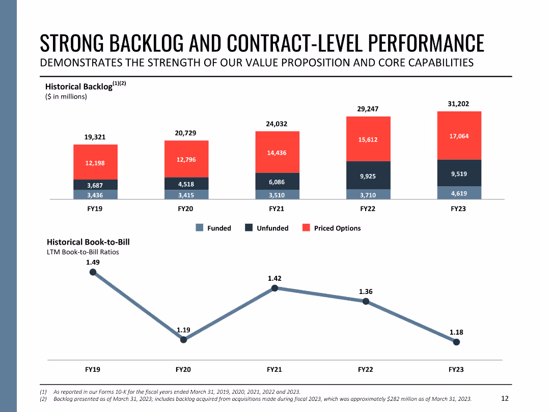
The slide contains two column charts showing historical backlog and book-to-bill ratios from FY19 to FY23. The backlog is divided into funded, unfunded, and priced options. The charts are color-coded and labeled for clarity.
Performance Metrics and KPIs
Government & Public Sector
This slide details Booz Allen's backlog and contract performance, displaying historical backlog amounts and book-to-bill ratios over five fiscal years. It demonstrates the company's robust contract management and sustained growth in contract acquisition.
backlog, contract performance, book-to-bill, fiscal years, growth
false
Performance Metrics and KPIs
Government & Public Sector
Multiple Chart
Booz Allen Hamilton
Add to my slides
Remove from favorites
The slide features a project timeline with key phases and dates, including interviews, data collection, analysis, and reporting. The layout includes text boxes for each phase, detailing activities and objectives, and is visually structured with arrows and icons.
Strategic Planning
Professional Services
The slide features a project timeline with key phases and dates, including interviews, data collection, analysis, and reporting. The layout includes text boxes for each phase, detailing activities and objectives, and is visually structured with arrows and icons.
backlog, contract performance, book-to-bill, fiscal years, growth
false
Strategic Planning
Professional Services
Linear Flow
Alvarez & Marsal
Add to my slides
Remove from favorites
The slide presents a five-step approach to contract review, including reviewing contracts, creating inventories, identifying findings, hypothesizing improvements, and developing next steps. The layout is clear with bullet points and process flow icons.
Regulatory and Compliance
Professional Services
The slide presents a five-step approach to contract review, including reviewing contracts, creating inventories, identifying findings, hypothesizing improvements, and developing next steps. The layout is clear with bullet points and process flow icons.
backlog, contract performance, book-to-bill, fiscal years, growth
false
Regulatory and Compliance
Professional Services
Linear Flow
Alvarez & Marsal
Add to my slides
Remove from favorites
The slide features four column charts with varying bar lengths, representing data over a period from 2012-13 to 2016-17. One chart shows the percentage of pending family law final order cases older than 12 months, and the other shows the 75th percentile transfer time.
Regulatory and Compliance
Government & Public Sector
This slide presents data on the age of pending cases in family law courts, highlighting the issue of growing backlogs. It compares the percentage of cases older than 12 months across different years and cities, and the time taken to transfer cases. It is useful for analyzing court efficiency.
backlog, courts, family law, pending cases, transfer time
false
Regulatory and Compliance
Government & Public Sector
Multiple Chart
PwC/Strategy&
Add to my slides
Remove from favorites
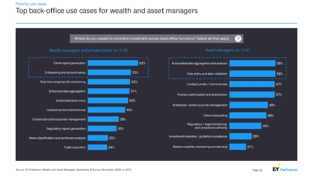
The slide presents two sets of horizontal bar charts: one for wealth managers and private banks, and another for asset managers. These charts display top back-office use cases for investment priorities.
Operational Efficiency
Financial Services
This slide details priority back-office use cases for wealth managers, private banks, and asset managers, indicating where these institutions plan to allocate investment to improve operational efficiency.
back-office, investment, use cases, financial services, wealth managers, asset managers, bar charts, priorities
false
Operational Efficiency
Financial Services
Multiple Chart
EY
Add to my slides
Remove from favorites
Bar chart comparing top back-office use cases for retail and commercial banks.
Operational Efficiency
Financial Services
Shows top back-office use cases, with a focus on fraud detection, predictive analytics, and process optimization.
back-office, retail, commercial, banks, use cases
false
Operational Efficiency
Financial Services
Multiple Chart
EY
Add to my slides
Remove from favorites
The slide includes three donut charts showing managers' views on whether leadership's targets align with employees' preferences for in-office work. An image on the left shows a professional using a shared bike service. The charts use shades of orange and red.
Human Resources and Talent Management
Financial Services
The slide examines the alignment between leadership's targets and employees' preferences for in-office work post-pandemic, indicating a trend towards structured policies for returning to the office.
Back-to-office, post-pandemic, employee preferences, leadership targets, remote work
false
Human Resources and Talent Management
Financial Services
Multiple Chart
EY
Add to my slides
Remove from favorites
Column charts displaying US bailouts in billions, spanning from 1970 to 2020, highlighted with red and black bars, labeled for each major event or bailout.
Risk Assessment and Management
Financial Services
Discusses the trend of privatizing profits and nationalizing losses through U.S. corporate bailouts. It emphasizes the need for corporate resilience. Useful in discussions on corporate governance and financial risk management.
bailouts, corporate governance, risk management, resilience, privatization, financial crisis, US
false
Risk Assessment and Management
Financial Services
Multiple Chart
Bain
Add to my slides
Remove from favorites
A semi-circular gauge chart depicting a balance between corporation and employee focus with a needle at 5-7.
Strategic Planning
Professional Services
This slide is used to illustrate the balance between focusing on corporation interests versus employee interests in a professional setting.
balance, corporation, employee, gauge chart, focus
false
Strategic Planning
Professional Services
Single Chart
PwC/Strategy&
Add to my slides
Remove from favorites
The slide shows three pie charts representing the geographical, sectoral, and client distribution of Ipsos's business.
Strategic Planning
Professional Services
The slide highlights Ipsos's balanced and diversified business approach, with detailed breakdowns of geographies, sectors, and client bases.
Balanced, Diversified, Business, Geographies, Sectors
false
Strategic Planning
Professional Services
Multiple Chart
IPSOS
Add to my slides
Remove from favorites
The slide includes a bar chart and text boxes summarizing key balance sheet figures, with a specific focus on Credit Suisse assets and liabilities.
Financial Performance
Financial Services
It provides an overview of the balance sheet for 2Q23, detailing assets and liabilities, and highlights the contribution of Credit Suisse.
balance sheet, assets, liabilities, Credit Suisse, UBS, 2Q23, financial, coverage ratio, figures
false
Financial Performance
Financial Services
Multiple Chart
UBS
Add to my slides
Remove from favorites
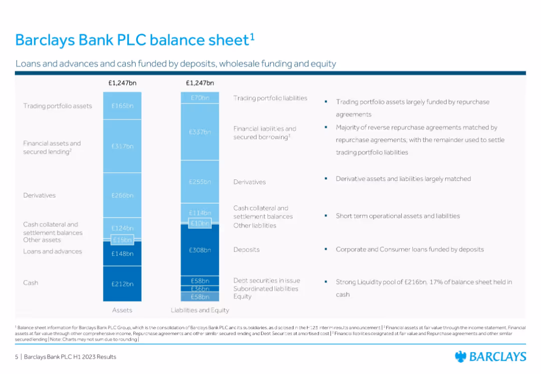
Split vertical chart: Assets vs. Liabilities & Equity; data labels with callouts and notes
Corporate Finance and Valuation
Financial Services
Provides a visual representation of Barclays’ balance sheet in H1 2023, showing the allocation of £1,247bn in both assets and liabilities. Highlights liquidity, deposits, secured lending, and trading liabilities with relevant funding details.
Balance Sheet, Assets, Liabilities, Deposits, Barclays, Valuation, Lending, Trading Portfolio
false
Corporate Finance and Valuation
Financial Services
Mixed Chart
Barclays
Add to my slides
Remove from favorites
Detailed balance sheet with assets and liabilities breakdown, showing various categories like loans, derivatives, and deposits, along with coverage ratio.
Financial Performance
Financial Services
Comprehensive breakdown of UBS's balance sheet for 3Q23, detailing assets, liabilities, and equity with a focus on coverage ratio.
Balance sheet, assets, liabilities, equity, coverage ratio
false
Financial Performance
Financial Services
Multiple Chart
UBS
Add to my slides
Remove from favorites
This slide includes a column chart of assets and liabilities and equity, with text highlights on loan portfolio quality and funding mix.
Financial Performance
Financial Services
It describes Deutsche Bank's balance sheet management, highlighting high-quality loan portfolio, assets, liabilities, equity, and funding.
balance sheet, assets, liabilities, equity, funding mix, high-quality loan portfolio, Deutsche Bank
false
Financial Performance
Financial Services
Multiple Chart
Deutsche Bank
Add to my slides
Remove from favorites
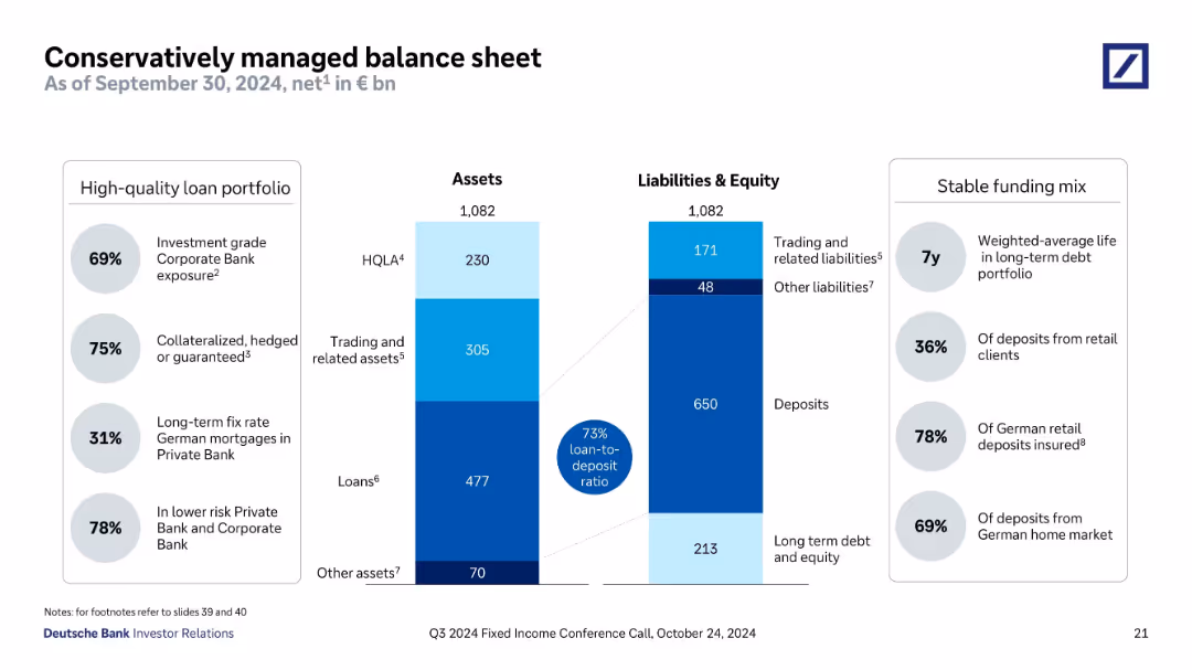
The slide shows a balance sheet summary with column chart for assets and liabilities, emphasizing different categories with color coding. Key highlights offer insights into the balance sheet management strategies.
Operational Efficiency
Financial Services
This slide outlines the structure of a conservatively managed balance sheet, highlighting key asset and liability segments and their implications for financial stability and growth strategies. It underscores the importance of conservative financial management practices.
balance sheet, assets, liabilities, financial, management
false
Operational Efficiency
Financial Services
Multiple Chart
Deutsche Bank
Add to my slides
Remove from favorites
Features a large split column chart showing assets and liabilities balanced at €1.007 trillion as of June 30, 2023.
Financial Performance
Financial Services
Displays the financial stability of Deutsche Bank with a detailed breakdown of assets and liabilities, highlighting liquidity reserves.
balance sheet, assets, liabilities, financial, stability, bar graph, liquidity, banking, June 2023, reserves
false
Financial Performance
Financial Services
Multiple Chart
Deutsche Bank
Add to my slides
Remove from favorites
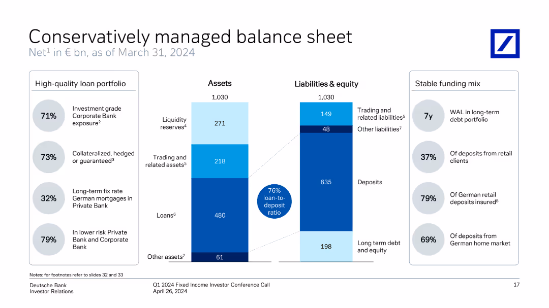
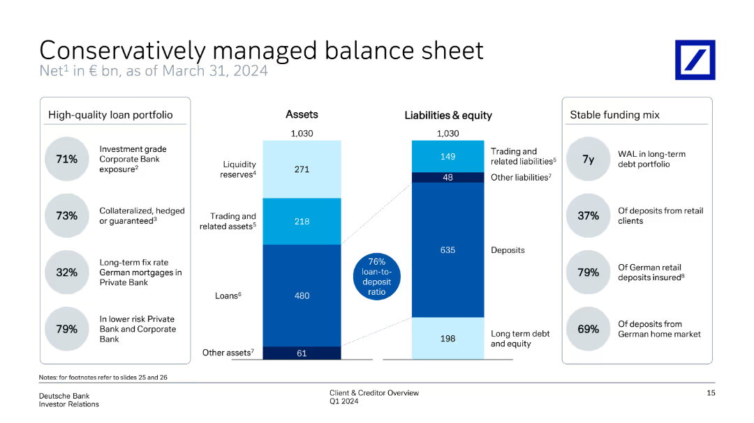
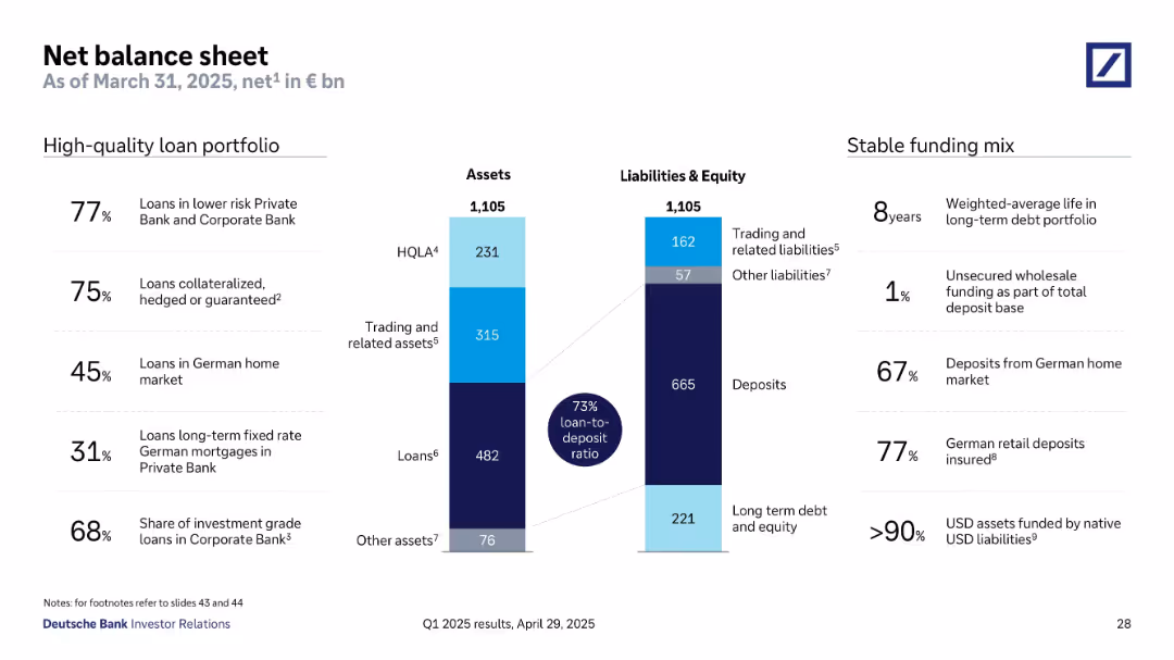
The slide displays a divided column chart representing assets and liabilities & equity as of March 31, 2024. The left side includes a high-quality loan portfolio with percentages, while the right side shows a stable funding mix with key percentages.
Risk Assessment and Management
Financial Services
Highlights the bank's managed balance sheet, detailing asset distribution and liabilities, alongside a stable funding mix. The slide underscores high-quality loan portfolio and the overall balance between assets and liabilities, ensuring financial stability.
balance sheet, assets, liabilities, loan portfolio, funding mix
false
Risk Assessment and Management
Financial Services
Multiple Chart
Deutsche Bank
Add to my slides
Remove from favorites
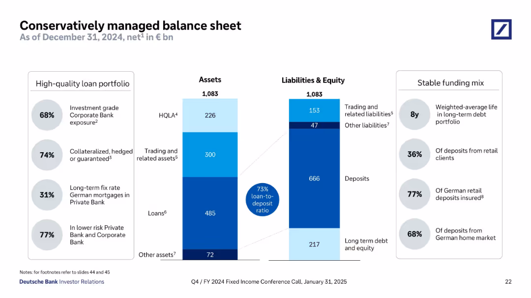
Split panel design showing assets and liabilities side-by-side using stacked bar formats. Flanked by callout bubbles for metrics (loan-to-deposit, quality, maturity). Structured with clean lines and shaded color segments.
Operational Efficiency
Financial Services
This slide provides a breakdown of Deutsche Bank’s assets and liabilities as of December 2024, showcasing a conservative balance sheet. Key data include 73% loan-to-deposit ratio, long average debt maturity, and high levels of investment-grade and collateralized loans. It underscores stability, funding quality, and prudent risk management.
balance sheet, assets, liabilities, loan-to-deposit, collateralized loans, HQLA, long-term debt, Deutsche Bank
false
Operational Efficiency
Financial Services
Mixed Chart
Deutsche Bank
Add to my slides
Remove from favorites
Slide includes comparative column charts and percentage breakdowns of assets, liabilities, and loan quality.
Risk Assessment and Management
Financial Services
Demonstrates conservative financial management through asset distribution and liability management, highlighting stability and risk management.
balance sheet, assets, liabilities, management, finance, stability
false
Risk Assessment and Management
Financial Services
Multiple Chart
Deutsche Bank
Add to my slides
Remove from favorites
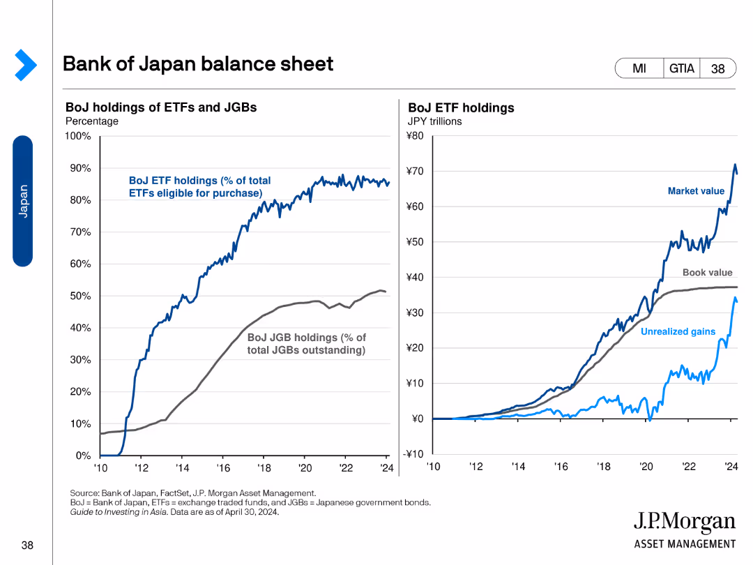
The slide contains two line charts. The left chart shows BoJ holdings of ETFs and JGBs as a percentage of total. The right chart shows the market, book value, and unrealized gains of BoJ ETF holdings in trillions of JPY.
Financial Performance
Financial Services
This slide reviews the balance sheet of the Bank of Japan, detailing ETF and JGB holdings, and market values, book values, and unrealized gains of these assets.
Balance Sheet, Bank of Japan, ETFs, JGBs, Market Value
false
Financial Performance
Financial Services
Multiple Chart
JP Morgan
Add to my slides
Remove from favorites
Column charts showing total loss-absorbing capacity, CET1 capital, and leverage ratios with annotations for 2Q23 requirements.
Financial Performance
Financial Services
Highlights the balance sheet strengths, focusing on capital and leverage ratios, and compliance with financial requirements.
balance sheet, capital, leverage, CET1, TLAC
false
Financial Performance
Financial Services
Multiple Chart
UBS
Add to my slides
Remove from favorites
Column charts showing RWA, LRD, CET1 capital ratio, and total loss absorbing capacity
Risk Assessment and Management
Financial Services
Highlights actions taken to reinforce balance sheet strength and maintain capital ratios
balance, sheet, capital, reinforcement
false
Risk Assessment and Management
Financial Services
Multiple Chart
UBS
Add to my slides
Remove from favorites
Slide with two column charts showing CET1 capital and leverage ratios for 4Q23, along with key metrics for capital and liquidity management.
Financial Performance
Financial Services
The slide emphasizes the strength of UBS's balance sheet, detailing CET1 capital and leverage ratios, and key liquidity metrics.
balance sheet, CET1 capital, leverage ratio, capital management, UBS financial stability
false
Financial Performance
Financial Services
Multiple Chart
UBS
Add to my slides
Remove from favorites
The slide features two column charts comparing different ratios, such as CET1 and leverage ratios, along with key liquidity management metrics like TLAC and LCR.
Strategic Planning
Financial Services
This slide emphasizes the importance of a strong balance sheet and prudent liquidity management as fundamental to the company’s success, showing key financial metrics.
balance sheet, CET1, leverage ratios, liquidity, TLAC
false
Strategic Planning
Financial Services
Multiple Chart
UBS
Add to my slides
Remove from favorites
The slide features a balance sheet summary on the left with a simple table layout, and credit metrics on the right with numerical highlights and explanatory texts. The design includes shaded boxes and clear separation of content areas.
Financial Performance
Financial Services
This slide compares a company's balance sheet and credit profile, with a focus on cash, debt, and capital structure, as well as credit metrics like EBITDA and leverage ratio. It’s tailored for financial analysts or investors looking at company stability, creditworthiness, and financial health.
Balance Sheet, Credit Profile, EBITDA, Net Leverage, Capital, Financial Health
false
Financial Performance
Financial Services
Boxed
Goldman Sachs
Add to my slides
Remove from favorites
This advanced slide contains two vertical stacked column charts representing changes in loan mix and noninterest income from 2012 to the present. It uses shades of blue, green, and other colors to differentiate between segments. Textual content is provided on the right to give context to the graphs, and bullet points below the graphs highlight key takeaways.
Strategic Planning
Financial Services
The slide outlines the strategic diversification of the company’s balance sheet and fee revenue to perform well in different economic environments. It presents changes in loan mix and noninterest income, emphasizing the reduction of cyclical impacts and improving fee diversification. Intended for strategic financial planning.
Balance Sheet, Diversification, Loan Mix, Revenue, Strategic Planning, Noninterest Income, Fee Diversification, Economic Performance
false
Strategic Planning
Financial Services
Multiple Chart
Morgan Stanley
Add to my slides
Remove from favorites
A balanced layout with three pie charts on the left and a list of bullet points on the right. The slide uses consistent color coding to categorize different investment types and geographic allocations.
Financial Performance
Financial Services
This slide examines the diversified portfolio and investment strategies, detailing the benefits for clients and shareholders, along with geographical distribution and asset class breakdown of the firm’s balance sheet investments.
Balance Sheet, Diversification, Portfolio, Investments
false
Financial Performance
Financial Services
Multiple Chart
Goldman Sachs
Add to my slides
Remove from favorites
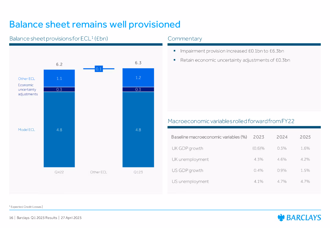
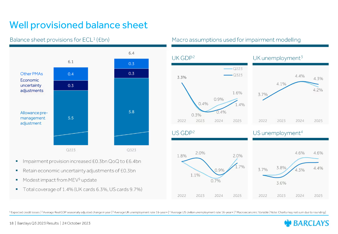
Bar chart displaying balance sheet provisions for ECL, with commentary on the right explaining impairment provision and economic uncertainty adjustments.
Risk Assessment and Management
Financial Services
The slide discusses Barclays' well-provisioned balance sheet, detailing expected credit losses (ECL) and economic adjustments, ensuring financial stability and risk management.
balance sheet, ECL, impairment provision, economic adjustments, risk management
false
Risk Assessment and Management
Financial Services
Mixed Chart
Barclays
Add to my slides
Remove from favorites
This slide presents a balance sheet summary with segmented bars representing different asset and liability categories, alongside key highlights in text for clarity.
Financial Performance
Financial Services
Provides a snapshot of the bank’s financial status as of September 30, 2023, detailing assets, liabilities, and key financial ratios, suitable for financial reporting and analysis.
balance sheet, financial, assets, liabilities, reporting, analysis, status, ratios, summary, categories
false
Financial Performance
Financial Services
Multiple Chart
Deutsche Bank
Add to my slides
Remove from favorites
The slide includes a list of bullet points and two side-by-side data tables comparing financial statistics from two different periods. It's well-structured with a focus on financial data presentation.
Financial Performance
Financial Services
This slide's content offers a detailed view of the company's financial position, showcasing improvements and dividends. It's used for discussing financial health and strategies with stakeholders.
balance sheet, financials, dividends, net cash, assets, liabilities, mining
false
Financial Performance
Financial Services
Table
Morgan Stanley
Add to my slides
Remove from favorites
Contains three comparative snapshots of funded balance sheets from Dec 2018, Sep 2019, and Dec 2019, using color-coded column charts for each category of assets and liabilities.
Corporate Finance and Valuation
Financial Services
The slide asserts Macquarie's financial stability with a comparison of assets and liabilities over three time points. It's valuable for financial analysts and stakeholders concerned with fiscal health.
balance sheet, financial, stability, assets, liabilities, comparison, fiscal, health, analysis, corporate
false
Corporate Finance and Valuation
Financial Services
Multiple Chart
Goldman Sachs
Add to my slides
Remove from favorites
The slide contains a combination of bar graphs, column charts, and textual information, showcasing financial stability through various metrics like deposits and capital ratios.
Financial Performance
Financial Services
Intended to convey the strong financial position and liquidity of the company, the slide serves as an assurance of stability and strength in various market conditions.
balance sheet, financial stability, liquidity, capital ratio, deposits, fortress principle, strength, market conditions
false
Financial Performance
Financial Services
Multiple Chart
JP Morgan
Add to my slides
Remove from favorites
Displays a comprehensive table summarizing the bank's balance sheet over three periods (31.03.2021, 31.12.2021, and 31.03.2022). The table includes assets, liabilities, and equity figures, complemented by a column chart showing the growth in loans to customers. The layout is clear, with distinct sections and headings for easy readability and comparison.
Financial Performance
Financial Services
Provides a detailed snapshot of the bank's financial stability through a balance sheet summary and trends in loan growth. Highlights key changes in assets, liabilities, and equity over specified periods, reflecting strong growth in customer loans and stability in core deposits, contributing to a robust liquidity position amidst dividend and buy-back strategies.
balance sheet, financial stability, loans, assets, liabilities, equity
false
Financial Performance
Financial Services
Mixed Chart
Deutsche Bank
Add to my slides
Remove from favorites
The slide compares 'Funded balance sheet' data between two time periods, showcasing figures in column charts and additional financial statistics to provide a comparative financial analysis.
Financial Performance
Financial Services
Shows Macquarie's funded balance sheet strength, comparing term liabilities and assets over two periods. It’s used for financial analysis and to demonstrate the company's stability to investors or stakeholders.
Balance Sheet, Financial Stability, Term Liabilities, Assets, Comparative Analysis
false
Financial Performance
Financial Services
Multiple Chart
Morgan Stanley
Add to my slides
Remove from favorites
The left side of the slide features a column chart showcasing the balance sheet mix with a positive trend arrow and percentage distribution across categories. On the right, a pie chart delineates the 'Sources of Funding' with a legend explaining the elements within the pie chart.
Financial Performance
Financial Services
This slide provides a visual breakdown of a company's balance sheet and funding sources, indicating a substantial liquidity and a growing balance sheet, useful for financial analysis or investor presentations.
balance sheet, funding sources, liquidity, pie chart, bar chart, financial analysis, trend, asset mix, financial growth, capital management
false
Financial Performance
Financial Services
Multiple Chart
Goldman Sachs
Add to my slides
Remove from favorites
Includes column charts of capital and leverage ratios, and key metrics like TLAC and loan to deposit ratio in tabular form.
Financial Performance
Financial Services
The slide emphasizes the strength of the balance sheet, focusing on capital ratios and efficient funding strategies.
balance sheet, funding, TLAC, leverage ratios, financial stability
false
Financial Performance
Financial Services
Multiple Chart
UBS
Add to my slides
Remove from favorites
The slide includes several line charts showing GDP and unemployment projections, along with a bar chart on balance sheet provisions.
Risk Assessment and Management
Financial Services
The slide covers the balance sheet provisions for expected credit losses, with accompanying projections for GDP and unemployment rates in the UK and US.
balance sheet, GDP, unemployment, credit losses, provisions, financial, risk, line chart, bar chart, projection
false
Risk Assessment and Management
Financial Services
Multiple Chart
Barclays
Add to my slides
Remove from favorites
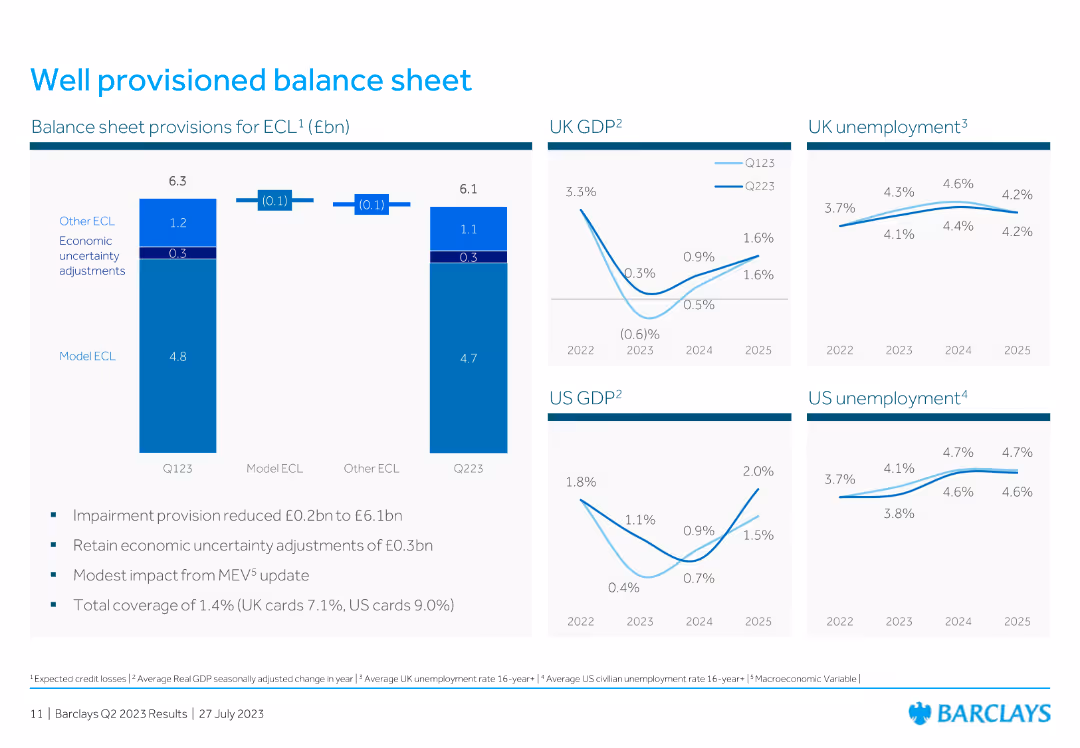
This slide features two vertical column charts and four line charts, all displaying financial data. The layout is clean and organized, with a focus on data visualization.
Financial Performance
Financial Services
The slide provides an overview of the balance sheet provisions for ECL and macro assumptions used for impairment modeling. Key metrics include UK and US GDP, and unemployment rates.
balance sheet, GDP, unemployment, provisions, financial data, impairment, macro assumptions, charts, modeling
false
Financial Performance
Financial Services
Multiple Chart
Barclays
Add to my slides
Remove from favorites
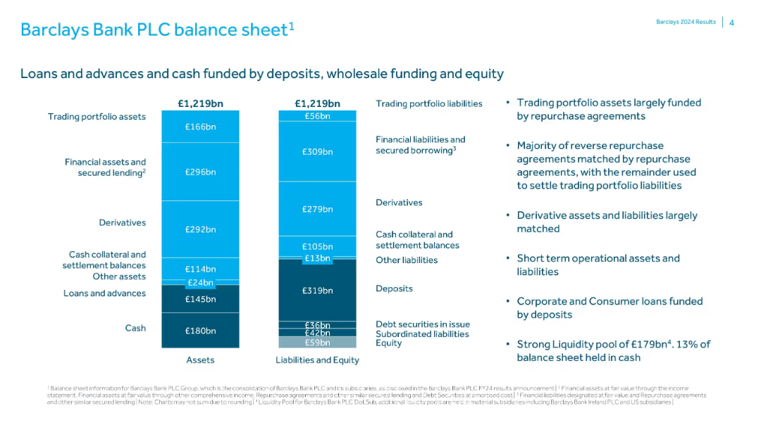
Dual bar chart representing total assets and liabilities/equity for FY24; explanatory text at right outlines funding and liquidity details.
Corporate Finance and Valuation
Financial Services
Details Barclays Bank PLC’s balance sheet structure, showing assets and liabilities each totaling £1,219bn. Describes funding sources like deposits and repurchase agreements, and emphasizes a strong liquidity position with £179bn held in cash.
balance sheet, liquidity, assets, liabilities, Barclays, funding, deposits, equity
false
Corporate Finance and Valuation
Financial Services
Mixed Chart
Barclays
Add to my slides
Remove from favorites
Two-column layout with a table on the left detailing equity and net debt and a column chart on the right showing gross debt maturity profile.
Financial Performance
Financial Services
Provides an overview of the balance sheet and liquidity position as of June 2023, including equity, net debt, gearing ratios, and liquidity with debt maturity projections.
balance sheet, liquidity, equity, debt, financials
false
Financial Performance
Financial Services
Mixed Chart
IPSOS
Add to my slides
Remove from favorites
The slide features a large column chart comparing assets and liabilities, a pie chart depicting the loan-to-deposit ratio, and bullet points listing key highlights. The design is clean with a simple color scheme and clear, legible text.
Financial Performance
Financial Services
This slide presents a summary of a conservative balance sheet management, highlighting liquidity reserves, loan-to-deposit ratio, and a diverse funding profile. It is useful for demonstrating financial stability and strategic funding approaches in banking.
balance sheet, liquidity, funding, finance, stability
false
Financial Performance
Financial Services
Multiple Chart
Deutsche Bank
Add to my slides
Remove from favorites
Side-by-side bar chart showing breakdown of €1,082bn assets vs liabilities/equity; circular callouts and highlights on high-quality loans.
Financial Performance
Financial Services
A comprehensive view of Deutsche Bank’s balance sheet as of Q3 2024, with €1,082bn in both assets and liabilities. Emphasizes a 73% loan-to-deposit ratio and strong HQLA (€230bn). Highlights quality of loan book and stable funding mix, supporting a conservative financial position.
balance sheet, loans, deposits, HQLA, financial position, Deutsche Bank, Q3 2024
false
Financial Performance
Financial Services
Mixed Chart
Deutsche Bank
Add to my slides
Remove from favorites
Two-column layout with central bar graph showing balance sheet breakdown of assets and liabilities. Key stats and metrics listed on the sides, using percentage and bn euro values. Blue shades for asset classes and dark blue for key ratios.
Financial Performance
Financial Services
The slide outlines Deutsche Bank’s net balance sheet as of March 31, 2025, highlighting a 73% loan-to-deposit ratio. It details a high-quality loan portfolio and a stable funding mix, with key metrics such as 77% of loans in lower-risk sectors and 67% of deposits from the German home market. The bar chart visually represents asset and liability structures.
balance sheet, loans, deposits, HQLA, funding mix, liabilities, assets
false
Financial Performance
Financial Services
Mixed Chart
Deutsche Bank
Add to my slides
Remove from favorites
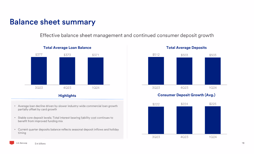
The slide includes two column charts showing total average loan balance and total average deposits over three quarters, along with text highlights on balance sheet management.
Financial Performance
Financial Services
The slide provides an overview of the balance sheet, focusing on effective management of loans and deposits, highlighting the trends in average balances and deposit growth.
Balance, Sheet, Loans, Deposits, Management, Growth
false
Financial Performance
Financial Services
Multiple Chart
Barclays
Add to my slides
Remove from favorites
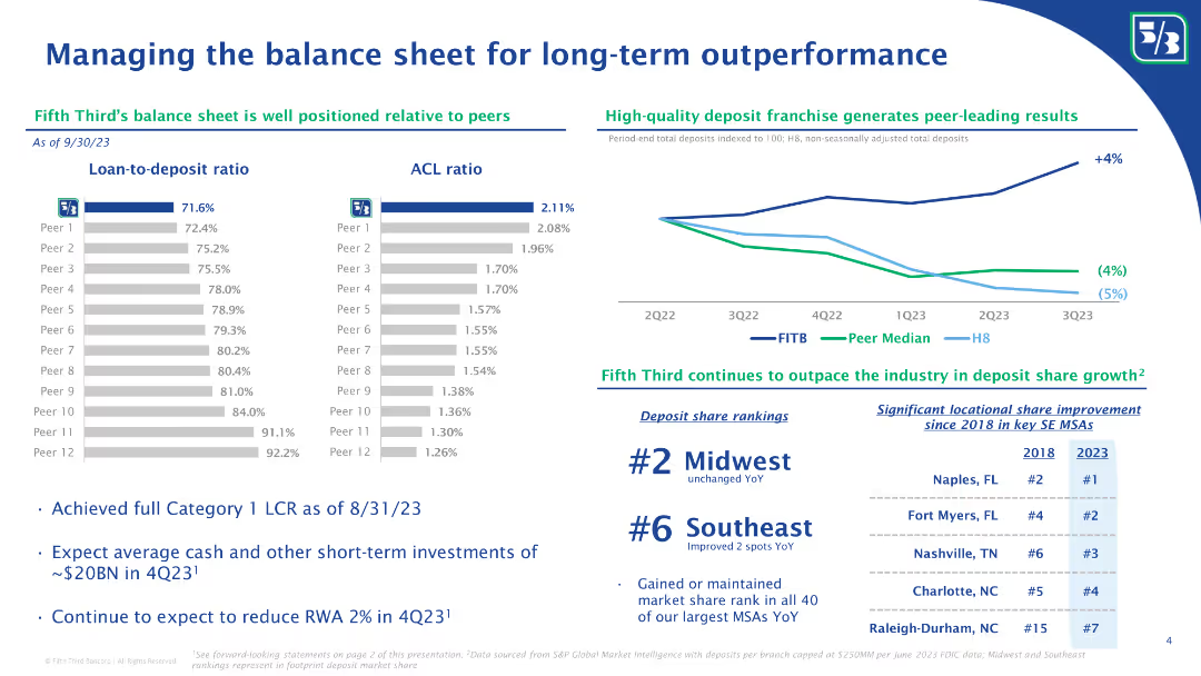
The slide includes a column chart showing loan-to-deposit ratios and ACL ratios of Fifth Third Bank compared to peers. Bullet points below discuss liquidity coverage ratio and other financial metrics.
Risk Assessment and Management
Financial Services
The slide provides an analysis of Fifth Third Bank’s balance sheet management, comparing key financial ratios like loan-to-deposit and ACL ratios with peers. It highlights their liquidity coverage ratio and strategic financial positioning for long-term outperformance.
Balance sheet, long-term performance, financial ratios, loan-to-deposit ratio, ACL ratio, liquidity coverage, Fifth Third Bank, financial metrics, peer comparison, financial strategy
false
Risk Assessment and Management
Financial Services
Multiple Chart
Goldman Sachs
Add to my slides
Remove from favorites
Features a column chart comparing CFO's and treasurer's agenda priorities. Text elaborates on balance sheet management importance.
Financial Performance
Financial Services
Discusses the importance of balance sheet management for treasurers and CFOs, emphasizing cash flow forecasting and capital structure as key priorities.
Balance sheet, management, cash flow, CFO, treasurer
false
Financial Performance
Financial Services
Mixed Chart
PwC/Strategy&
Add to my slides
Remove from favorites
This slide features two graphs—a loan-to-deposit ratio bar graph and an ACL ratio bar graph—alongside a line chart comparing deposit growth and two bullet point sections with key insights. The design employs a clear, professional layout with a blue and green color scheme, enhancing readability and focus on the data presented.
Financial Performance
Financial Services
This slide compares Fifth Third's balance sheet metrics with industry peers and discusses its strong deposit franchise, along with market share rankings. It would be suitable for financial analysts or internal reviews to evaluate the bank's performance and strategy for long-term outperformance, as well as for discussing market positioning.
Balance Sheet, Ratios, Deposit Growth, Market Share, Bar Graph, Line Chart, Financial Services, Comparison, Strategy
false
Financial Performance
Financial Services
Multiple Chart
Goldman Sachs
Add to my slides
Remove from favorites
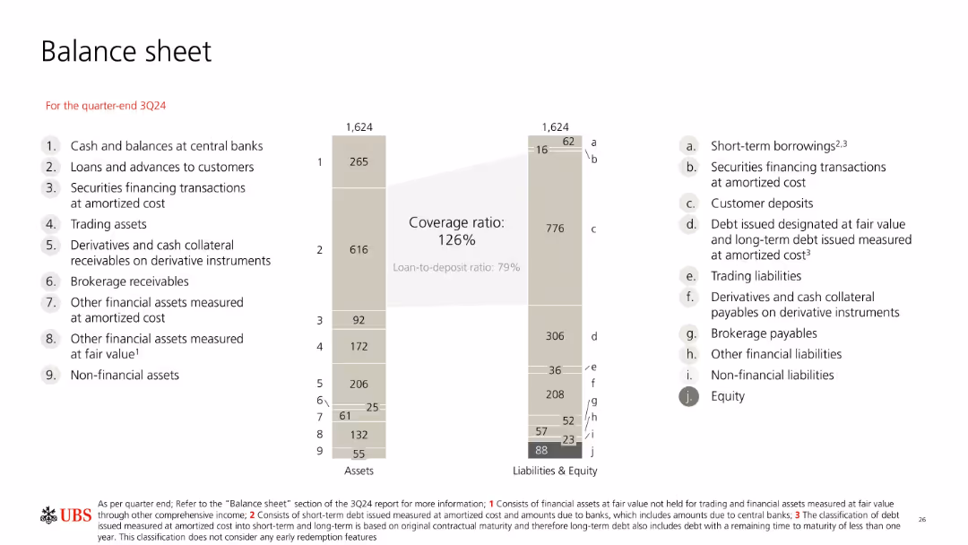
Balance sheet diagram with vertical bars comparing assets and liabilities; clean, grey-themed layout with side annotations.
Corporate Finance and Valuation
Financial Services
The balance sheet for UBS at 3Q24 outlines assets and liabilities totaling 1,624bn CHF. Key ratios include a 126% coverage ratio and 79% loan-to-deposit ratio. Visual groupings help identify major components like customer deposits and loans to customers.
balance sheet, UBS, assets, liabilities, coverage ratio, deposits, equity, financials, 3Q24
false
Corporate Finance and Valuation
Financial Services
Mixed Chart
UBS
Add to my slides
Remove from favorites
Circular diagram showing percentage agreement across age groups for the preference of having local bank branches, accompanied by textual insights.
Customer and Market Segmentation
Financial Services
Discusses consumer preference for local bank branches and the role they play in stability and personal service, supported by age group data.
bank branches, consumer preference, age groups, local branches, stability, personal service, insights, survey
false
Customer and Market Segmentation
Financial Services
Linear Flow
Accenture
Add to my slides
Remove from favorites
Combination of bar charts and tables showing Tier 1 capital ratios and USD liquidity access arrangements
Risk Assessment and Management
Financial Services
This slide compares banking sector capitalization in APAC with the US, detailing central bank FX liquidity programs.
bank capitalization, APAC, liquidity, FX swap, US
false
Risk Assessment and Management
Financial Services
Mixed Chart
Accenture
Add to my slides
Remove from favorites
Slide contains a scatter plot with circles representing various banking roles and their potential for automation and productivity gains from AI.
Financial Performance
Financial Services
Analyzes the impact of AI on specific banking roles, highlighting which positions could see the most significant efficiency improvements and automation potential.
banking, AI impact, productivity, automation, financial roles
false
Financial Performance
Financial Services
Single Chart
Accenture
Add to my slides
Remove from favorites
Slide shows a detailed framework of banking segments like Deposits, Lending, and Investment Management, correlating with AI's estimated impact on these areas.
Financial Performance
Financial Services
Provides a comprehensive view of how generative AI is expected to influence various banking operations from front to back office, serving as a guide for strategic implementation in financial services.
banking, AI use cases, strategic implementation, front office, back office
false
Financial Performance
Financial Services
Diagram
Accenture
Add to my slides
Remove from favorites
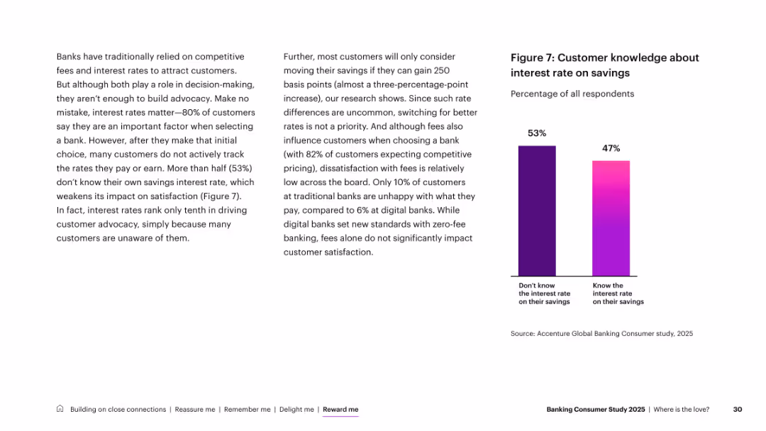
Two-column layout; left has dense explanatory text, right features a simple two-bar comparison chart
Customer and Market Segmentation
Financial Services
Discusses the limited impact of interest rates on advocacy. Although 80% consider rates when selecting banks, 53% don’t know their savings interest rate. Highlights that awareness is low, diminishing satisfaction impact.
banking branches, customer trust, digital, in-person, generational insights, physical presence
false
Customer and Market Segmentation
Financial Services
Mixed Chart
Accenture
Add to my slides
Remove from favorites
Two-column layout: left text-heavy narrative, right simple bar chart with generational comparison
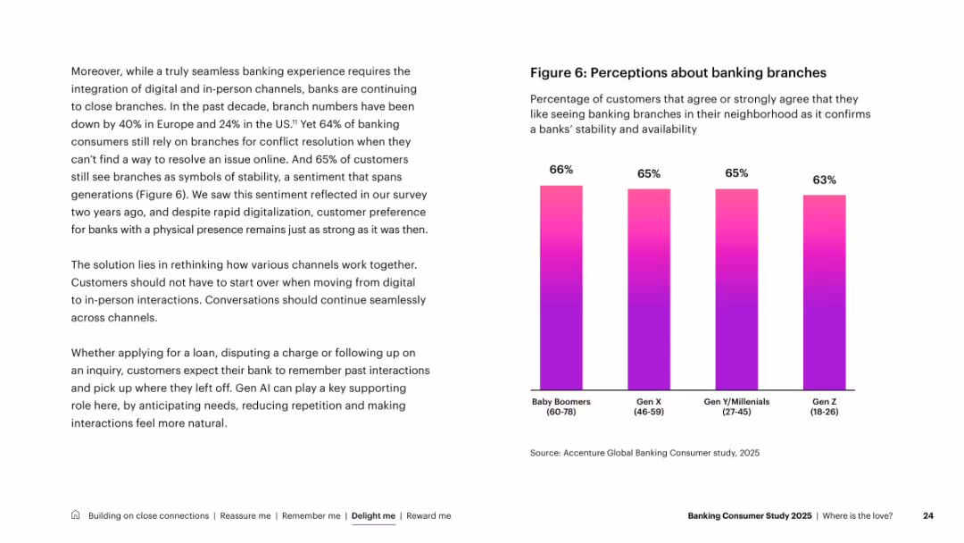
Customer and Market Segmentation
Financial Services
Despite digital trends, physical branches still matter to customers, with 64% citing preference for in-person resolution and 65% associating branches with stability. Includes a generational breakdown showing strong support across all age groups.
banking channels, customer satisfaction, touchpoints, digital, ATMs, mobile apps, experience
false
Customer and Market Segmentation
Financial Services
Mixed Chart
Accenture
Add to my slides
Remove from favorites
Slide includes column charts and textual segments. The layout is balanced, showcasing past performance and future projections within the banking sector.
Industry Overview
Financial Services
The slide details the current status and growth of Barclays UK Corporate Bank, including client relationship longevity, growth in client base, and financial distribution across lending, deposits, and transactional products from 2021 to 2023.
banking, clients, growth, UK, financial distribution
false
Industry Overview
Financial Services
Mixed Chart
Barclays
Add to my slides
Remove from favorites
Text-focused slide with multiple icons illustrating points such as shallow satisfaction, fragmentation, frustration, and digital channels.
Customer and Market Segmentation
Financial Services
Discusses findings from a global banking consumer study, identifying key issues like satisfaction, fragmentation, and digital channel preferences.
banking, consumer, satisfaction, fragmentation, frustration, digital channels, preferences, survey, insights
false
Customer and Market Segmentation
Financial Services
Pillar
Accenture
Add to my slides
Remove from favorites
Includes statistics and pie charts detailing customer segments and income sources.
Industry Overview
Financial Services
Overview of Barclays UK's customer base and income distribution.
banking, customers, income, distribution, Barclays
false
Industry Overview
Financial Services
Multiple Chart
Barclays
Add to my slides
Remove from favorites
Slide with a title at the top, three columns with blue and black text. The left column has monetary values, the middle column has checkmarks and benefits, and the right column has progress details in blue boxes.
Financial Performance
Financial Services
The slide outlines the opportunity, value proposition, and progress plan in building transaction banking services, including deposit balances, onboarding, and team development.
Banking, Deposit Balances, Analytics, Onboarding, Team Building
false
Financial Performance
Financial Services
Table
Goldman Sachs
Add to my slides
Remove from favorites
Pie chart with detailed segments showing distribution of total deposits by customer type.
Financial Performance
Financial Services
Analyzes deposit base stability across different banking sectors, noting insured percentages and business relations longevity.
banking, deposits, stability, customer base, insurance
false
Financial Performance
Financial Services
Mixed Chart
Barclays
Add to my slides
Remove from favorites
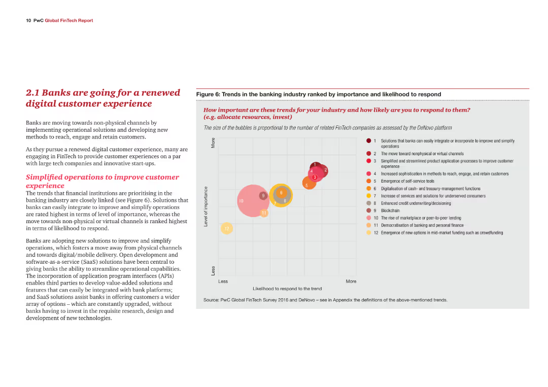
A content slide with text explaining the trends in the banking industry towards digital customer experiences. Includes a bubble chart ranking various trends in terms of importance and likelihood to respond.
Market Analysis and Trends
Financial Services
This slide highlights the shift in the banking industry towards enhancing digital customer experiences. It identifies key trends and their importance, supported by a bubble chart that ranks these trends based on their perceived significance and likelihood of adoption.
Banking, digital customer experience, trends, importance, likelihood to respond, bubble chart
false
Market Analysis and Trends
Financial Services
Mixed Chart
PwC/Strategy&
Add to my slides
Remove from favorites
This slide presents a line chart comparing cost-to-income ratios across the US, Australia, and Euro area from 2000 to 2022, showing minor fluctuations within a confined range.
Operational Efficiency
Financial Services
Explores the stagnation in banks' cost-to-income ratios despite various efficiency improvements like Six Sigma, especially highlighting differences across regions. Ideal for operational strategy discussions.
banking efficiency, cost-to-income ratios, Six Sigma, operational strategies
false
Operational Efficiency
Financial Services
Mixed Chart
Accenture
Add to my slides
Remove from favorites
Previous
Next
You don't have any favorites yet.
Please wait loading your favorites slides...
Create a FREE account to continue browsing
Receive Instant Access to 1,000+ slides from companies like McKinsey, Google, and Goldman Sachs
First Name
Last Name
Email
Password
I agree to all
Terms & Privacy Policy
Thank you! Your submission has been received!
Oops! Something went wrong while submitting the form.
Have an account?
Sign in
Upgrade to PRO to Save slides
Advanced Search and Filters
Access to 15,000+ slides
Access to Category Pages
Save/Bookmark Slides
PowerPoint Template Library
Pick a Plan
MONTHLY
$12/month
Billed every month, Cancel anytime.
YEARLY
$9/year
Billed $108 annually, Cancel anytime.
Checkout for $12/month
Checkout for $108/yr
Secured by Stripe | AES-256 bit encryption