My Account
My Slides
Search by Category
Companies
Slide Type
Use Case
Industry
Pricing
Templates
View All Templates
Download Template Slides
✦ AI
AI Prompt Library
AI Search
Feedback
Login
Logout
Get Started
Browse all Slides
Browse all Slides
Create a FREE Account
Instant access to 1,000+ real slides from top companies like McKinsey, BCG, Goldman Sachs, Google and many more!
First Name
Last Name
Email
Password
I agree to all
Terms & Privacy Policy
Thank you! Your submission has been received!
Oops! Something went wrong while submitting the form.
Have an account?
Sign in
Saved Slides
Total No. of slides saved
0
↻ Refresh
✖ Clear all
This slide features a title, column charts with annotations on case transfers between FCoA and FCC, and a side note about the increase in transfer times. It uses a straightforward design with contrasting colors for differentiation.
Regulatory and Compliance
Government & Public Sector
The slide discusses the transfer of matters between FCoA and FCC, noting an increase in the number and age of transferred cases, and includes specific figures on the transfer duration and counts for a recent year.
case transfers, FCoA, FCC, legal system efficiency, transfer time growth, case management
false
Regulatory and Compliance
Government & Public Sector
Mixed Chart
PwC/Strategy&
Add to my slides
Remove from favorites
The slide features bar charts displaying sources and uses of funds from 2022 to 2025, including projected free cash flow and additional financial debt.
Strategic Planning
Financial Services
It outlines Ipsos's cash allocation plan from 2022 to 2025, detailing funding sources and financial strategies, including debt and investment allocations.
cash allocation, financial planning, Ipsos, funding
false
Strategic Planning
Financial Services
Multiple Chart
IPSOS
Add to my slides
Remove from favorites
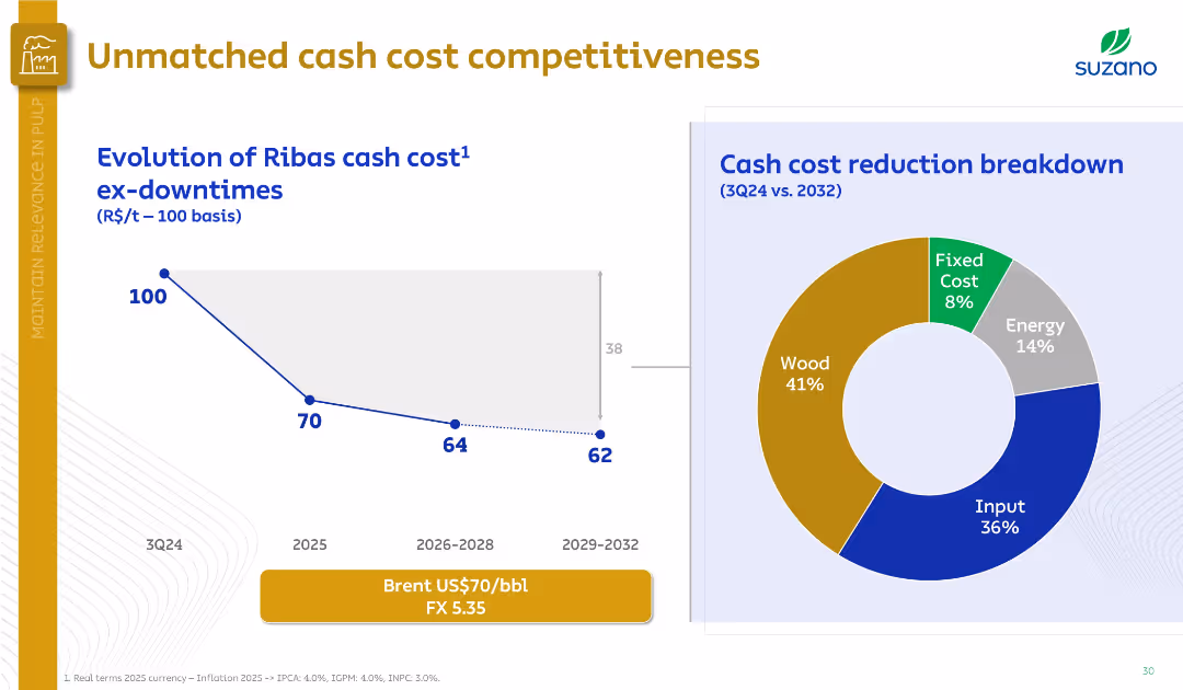
Left side features a downward cost trend graph; right side has a doughnut chart on cost breakdown. Professional, minimalistic design.
Financial Performance
Industrial & Manufacturing
The slide illustrates a projected reduction in Ribas mill cash costs, from 100 in 3Q24 to 62 by 2029–2032. A cost breakdown pie chart highlights wood (41%) and input (36%) as major contributors.
cash cost, Ribas mill, Suzano, wood, input, energy, cost breakdown, competitiveness
false
Financial Performance
Industrial & Manufacturing
Multiple Chart
Goldman Sachs
Add to my slides
Remove from favorites
This slide contains a column chart, representing different financial components, labeled from 1 to 5, in varying heights with different shades of blue. A key explains the elements as Cash & Cash Equivalents, Increase, and Decrease. Below the chart is an explanatory key with detailed notes.
Financial Performance
Financial Services
The slide is used for financial planning, depicting various stages such as current cash and equivalents, cash inflow from business operations, joint venture redemption, debt repayment, and expected funds for future investments. It's for presenting financial status and future funding strategies to stakeholders or investors.
Cash, EBITDA, Leverage, Investment, Growth, Finance, Redemption, Repayment, Liquidity, Planning
false
Financial Performance
Financial Services
Single Chart
Goldman Sachs
Add to my slides
Remove from favorites
This slide displays a stacked column chart for global Cash Equities revenue and two line graphs for share of Cash Equities volumes in the U.S., EMEA, and APAC.
Financial Performance
Financial Services
Reviews the revenue and market volume trends in Cash Equities from 2014 to 2018, showcasing growth and focus areas.
cash equities, revenue, growth, market trends
false
Financial Performance
Financial Services
Multiple Chart
JP Morgan
Add to my slides
Remove from favorites
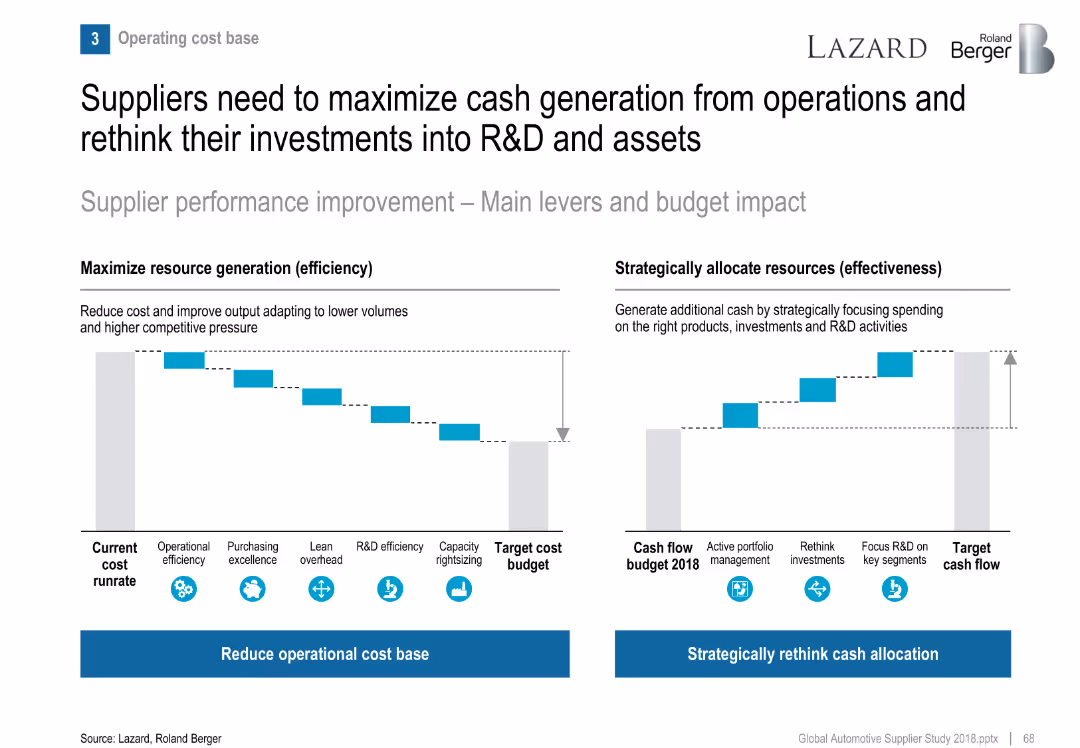
Two waterfall-style bar visuals: cost reduction levers and cash flow reallocation strategies.
Operational Efficiency
Industrial & Manufacturing
Recommends suppliers focus both on reducing operational cost base and reallocating cash to R&D and strategic segments to remain competitive.
cash flow, cost reduction, efficiency, R&D investment, supplier strategy
false
Operational Efficiency
Industrial & Manufacturing
Multiple Chart
Roland Berger
Add to my slides
Remove from favorites
Central diagram focused on free cash flow surrounded by four quadrants detailing business growth, support for dividends, debt leverage, and share repurchases.
Strategic Planning
Consumer Goods
Details strategic financial planning regarding the utilization of cash flow to support dividends, business growth, and other fiscal responsibilities.
cash flow, dividends, debt leverage, strategic planning, share repurchase
false
Strategic Planning
Consumer Goods
Framework
Barclays
Add to my slides
Remove from favorites
The slide presents three interconnected 3D blocks in purple, highlighting key financial strategies: Dividend Growth, Share Repurchases, and Strong Cash Flow. Text overlays provide specific financial metrics and growth rates.
Financial Performance
Financial Services
Focuses on illustrating a company's financial strategy emphasizing dividend growth, share repurchases, and strong cash flow. Useful in analyzing financial health and strategic fiscal management.
Cash flow, Dividend, Share repurchases, CAGR, FCF
false
Financial Performance
Financial Services
Framework
Accenture
Add to my slides
Remove from favorites
Includes a table and a pie chart along with a timeline, presented in a straightforward, easy-to-read format.
Financial Performance
Financial Services
Projects future cash flows, dividend payments, and investment allocations over the upcoming years.
cash flow, dividends, investment, financial forecasting, future projections
false
Financial Performance
Financial Services
Mixed Chart
Deutsche Bank
Add to my slides
Remove from favorites
This slide presents a series of column charts in shades of gray and green, outlining the projected free cash flow and uses for Permian Resources.
Financial Performance
Energy & Utilities
Outlines the financial projections for Permian Resources in 2023, focusing on free cash flow, dividend payments, and strategic financial planning amidst market volatility.
cash flow, financial planning, Permian Resources, 2023, dividends
false
Financial Performance
Energy & Utilities
Multiple Chart
Barclays
Add to my slides
Remove from favorites
A slide with two column charts depicting 'Total Revenues' and 'Adjusted EBITDA' over a six-year period. Blue bars are used to show growth over time, with key figures and annotations providing additional information.
Financial Performance
Financial Services
Discusses the company's strong cash flow generation, using historical data to highlight financial robustness and operational consistency. This slide serves as a basis for discussions on financial strategy and investor relations.
cash flow, financial strategy, operational consistency, investor relations
false
Financial Performance
Financial Services
Multiple Chart
Goldman Sachs
Add to my slides
Remove from favorites
An advanced slide featuring a column chart detailing the end-of-period notional value of cash flow hedges. The graph uses different shades to distinguish between floors, forward starting swaps, and existing swaps. Below the graph, a legend explains the colors used, and text boxes provide further information about swap protection and weighted average receive-fix rate. The design is simple and focuses on presenting the financial data clearly.
Risk Assessment and Management
Financial Services
The slide offers an overview of the company’s cash flow hedges strategy to protect net interest margin (NIM). It details the swap protection plans and their impact on financial stability, aiming to communicate to stakeholders the steps taken for risk mitigation in fluctuating interest rate environments.
Cash Flow Hedges, Net Interest Margin, Risk Mitigation, Financial Strategy, Swap Protection, Interest Rates, Financial Planning
false
Risk Assessment and Management
Financial Services
Single Chart
Morgan Stanley
Add to my slides
Remove from favorites
Column chart depicting cash flow improvement activities with bar lengths showing impact percentage, and pie charts indicating short-term and medium-term impact.
Financial Performance
Transportation & Logistics
This slide presents key cash flow improvement activities and their respective impacts on short and medium terms for medium cost control automotive manufacturing companies.
Cash flow, improvements, activities, short-term, medium-term, column chart, pie chart
false
Financial Performance
Transportation & Logistics
Single Chart
EY
Add to my slides
Remove from favorites
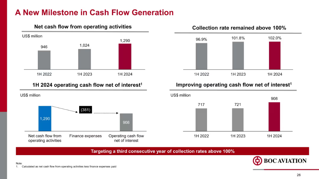
Four mini-charts with bold numbers; horizontal and vertical bar graphs; text boxes highlight improvements
Financial Performance
Financial Services
Demonstrates improved net cash flow from operations, reaching US$1.29B in 1H 2024. Collection rates surpassed 100%, and cash flow net of interest rose to US$908M, reinforcing operational strength and capital efficiency.
cash flow, interest, operating activities, collection rate, finance expense, aviation, liquidity, 2024 performance
false
Financial Performance
Financial Services
Multiple Chart
Goldman Sachs
Add to my slides
Remove from favorites
Horizontal waterfall chart and detailed financial metrics table
Financial Performance
Financial Services
The slide illustrates cash flow movement in Q3 2023, highlighting major components like capex, dividend payouts, and leverage metrics, with changes over time.
Cash Flow, Leverage, Net Debt, Capex, Dividend, EBITDA
false
Financial Performance
Financial Services
Mixed Chart
Goldman Sachs
Add to my slides
Remove from favorites
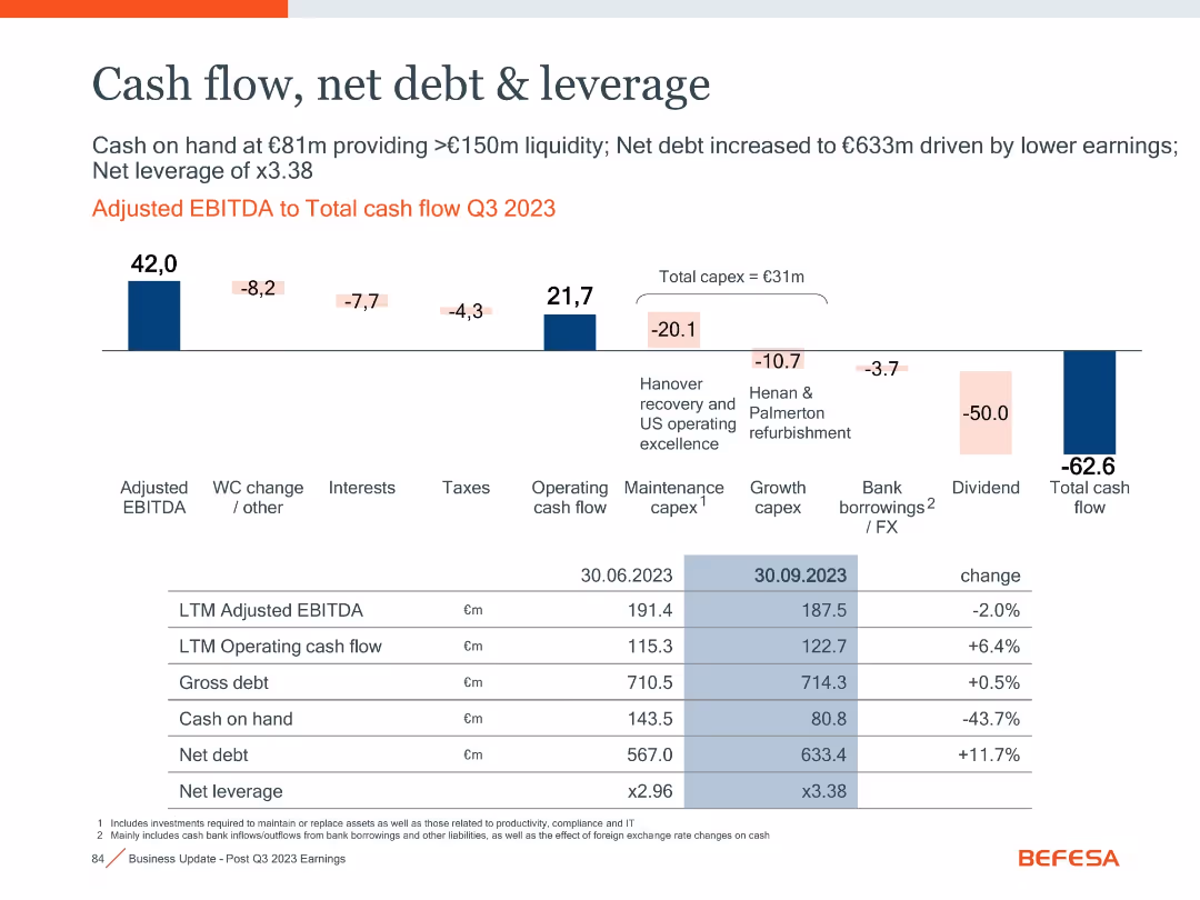
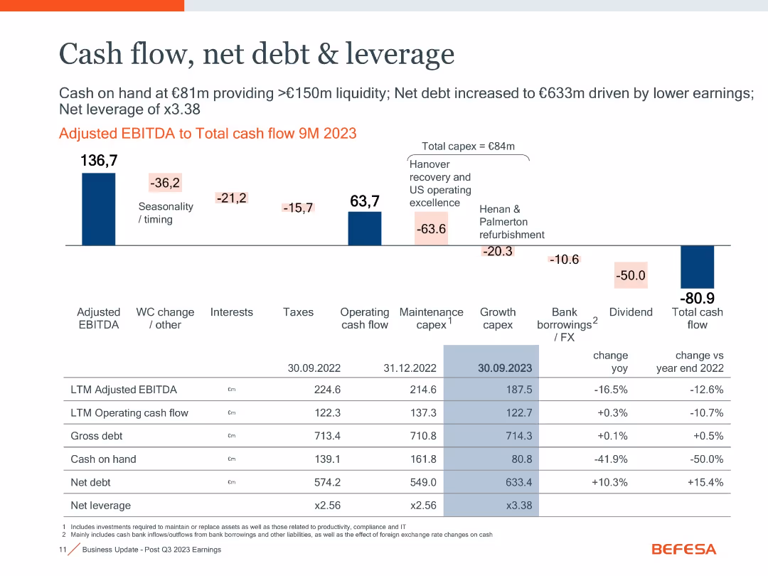
Waterfall chart from EBITDA to total cash flow, financial summary table at bottom with YoY changes.
Financial Performance
Industrial & Manufacturing
Shows cash flow decline to -€80.9m in 9M 2023, driven by capex, taxes, dividends, and seasonality. Net debt increased to €633m, and leverage ratio rose to x3.38. Positive cash flow from operations was not enough to offset outflows.
cash flow, net debt, leverage, capex, EBITDA, working capital
false
Financial Performance
Industrial & Manufacturing
Mixed Chart
Goldman Sachs
Add to my slides
Remove from favorites
Waterfall chart with financial metrics and a table comparing key indicators over time
Financial Performance
Industrial & Manufacturing
Illustrates cash flow changes and leverage metrics. Shows adjusted EBITDA to total cash flow with detailed breakdowns. Net debt increased to €633m due to lower earnings and capex, leading to 3.38x leverage.
cash flow, net debt, leverage, EBITDA, capex, liquidity
false
Financial Performance
Industrial & Manufacturing
Mixed Chart
Goldman Sachs
Add to my slides
Remove from favorites
Two sets of column charts dominate the slide. The left chart, in a dark to light blue gradient, represents 'OPERATING CASH FLOW AFTER INVESTMENTS' across five quarters. The right chart shows 'CASH FLOW OF INVESTMENTS' in the same period, categorized by associated companies and plot investments. The images in the lower right corner give a glimpse into a well-lit office space and a wooden interior, possibly a café or communal area within a business premise, hinting at the corporate setting.
Financial Performance
Financial Services
Highlights a strong cash flow performance, presenting data suitable for discussions in financial strategy meetings or investor briefings on company health.
cash flow, operating cash flow, investment, financial strategy, financial health, quarterly figures, corporate finance, financial services
false
Financial Performance
Financial Services
Multiple Chart
Goldman Sachs
Add to my slides
Remove from favorites
The slide displays a combination of a column chart and a dotted line graph indicating the evolution of Free Cash Flow (FCF) and Segment Operating Income (SOI) over several years. The dotted line represents the percentage change in volumes, whereas the bars represent actual financial figures in euros. It features past data and a projection for 2023. The Michelin logo is present.
Financial Performance
Financial Services
Highlighting the historical performance and future projections of free cash flow and segment operating income against volume changes, this slide visualizes the company's financial resilience and efficiency over time. It is likely used in investor presentations or financial reviews to demonstrate past performance and future expectations.
cash flow, operating income, financials, volumes, Michelin, performance, history, projections, efficiency, resilience
false
Financial Performance
Financial Services
Single Chart
Morgan Stanley
Add to my slides
Remove from favorites
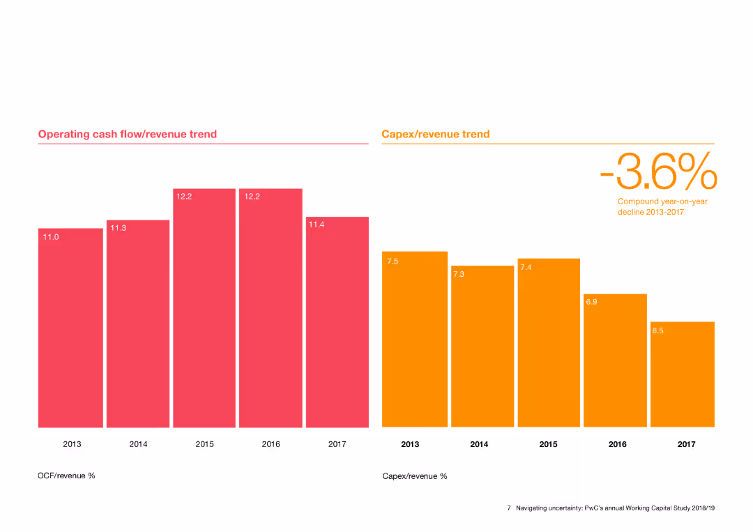
Features column charts showing operating cash flow/revenue and Capex/revenue trends from 2013 to 2017.
Financial Performance
Financial Services
Tracks the trends in operating cash flow and capital expenditure as a percentage of revenue over time, highlighting financial performance and investment levels.
cash flow, revenue trend, Capex, financial performance, investment
false
Financial Performance
Financial Services
Multiple Chart
PwC/Strategy&
Add to my slides
Remove from favorites
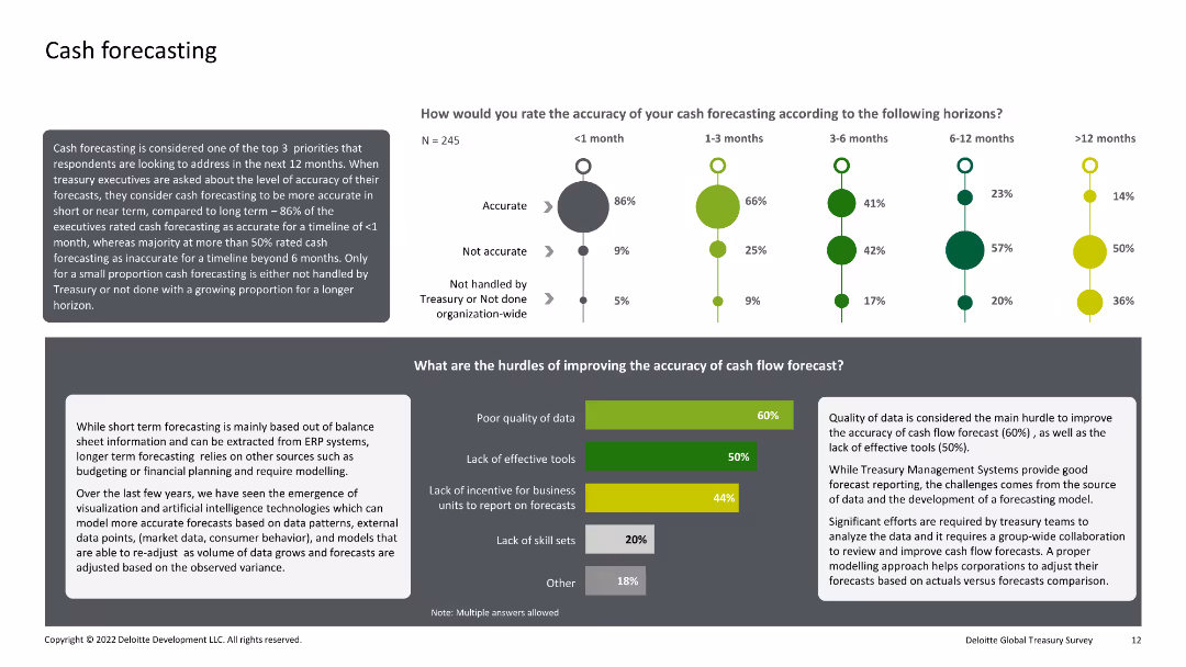
Combination of text, bar charts, and dot plots. The slide evaluates the accuracy of cash forecasting over different time horizons and identifies the main hurdles to improving forecasting accuracy.
Financial Performance
Financial Services
This slide analyzes the accuracy of cash forecasting within organizations over various time horizons and identifies key obstacles to improving this accuracy, such as poor data quality and lack of effective tools.
Cash, Forecasting, Accuracy, Hurdles, Improvement
false
Financial Performance
Financial Services
Multiple Chart
Deloitte
Add to my slides
Remove from favorites
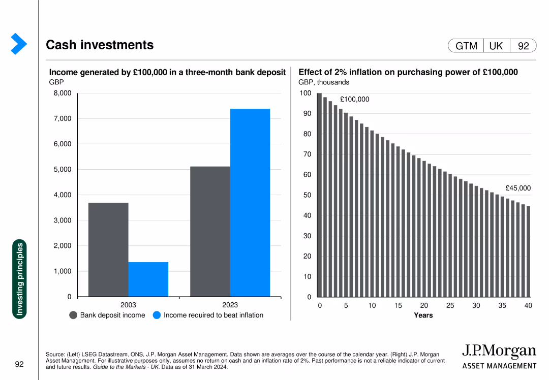
Two charts: one column chart showing income from bank deposits, another showing the impact of inflation on purchasing power.
Financial Performance
Financial Services
Highlights the change in income from bank deposits over time and the effect of inflation on money's value.
Cash investments, bank deposit, inflation, purchasing power, income
false
Financial Performance
Financial Services
Multiple Chart
JP Morgan
Add to my slides
Remove from favorites
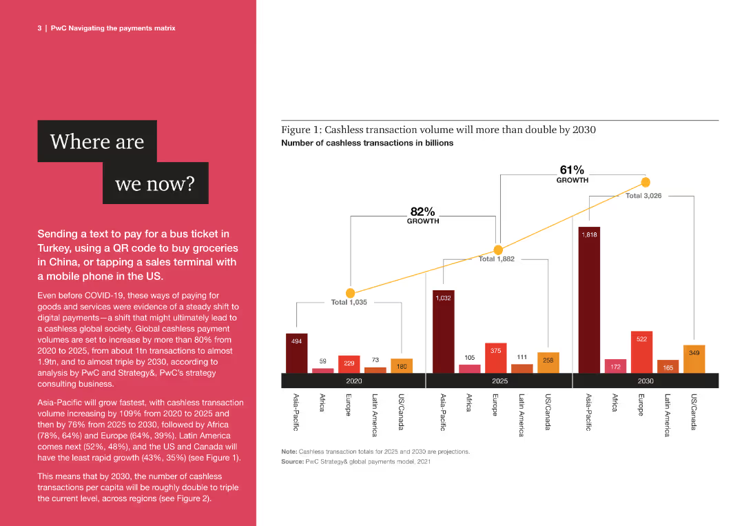
The slide features a column chart with multiple bars representing cashless transaction volumes from 2020 to 2030 across regions.
Market Analysis and Trends
Financial Services
The slide discusses the growth of cashless transactions globally, highlighting projected increases in various regions by 2030.
cashless, transactions, global, growth, projections, financial, trends, 2020, 2030, regions
false
Market Analysis and Trends
Financial Services
Mixed Chart
PwC/Strategy&
Add to my slides
Remove from favorites
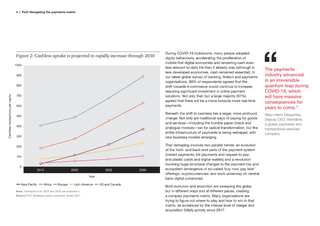
A line chart showing the projected increase in cashless transactions per capita across different regions from 2015 to 2030.
Market Analysis and Trends
Financial Services
This slide explains the projected increase in cashless transactions per capita globally, driven by digital behaviors post-COVID.
cashless, uptake, projection, regions, per capita, 2015, 2030, digital behaviors, COVID
false
Market Analysis and Trends
Financial Services
Mixed Chart
PwC/Strategy&
Add to my slides
Remove from favorites
Contains a comparative bar graph of cash as a percentage of the annual budget for various states, showing legislative and actual cash reserves, complemented by a summary of cash flow sources and budget sizes.
Regulatory and Compliance
Government & Public Sector
Examines the cash limit requirements for NCDOT compared to other states, discussing the challenges in meeting these limits and the implications for fiscal planning, especially regarding the lack of segregated reserve funds.
cash limits, fiscal planning, NCDOT, state comparison, budget management
false
Regulatory and Compliance
Government & Public Sector
Single Chart
McKinsey
Add to my slides
Remove from favorites
This slide has a white and blue color theme with a bubble chart categorizing various cash-related initiatives by their typical EBIT impact and time to cash release. The chart uses different shades to distinguish between receivables, inventory, payables, and cross-cutting measures, with annotations for certain initiatives.
Financial Performance
Financial Services
The slide prioritizes cash-related initiatives based on their EBIT impact and time to cash release. It visually categorizes these initiatives into groups like "immediate cash opportunities" or "structural changes," providing a strategic overview for financial planning and cash flow management.
cash management, EBIT impact, financial planning, cash flow, strategic prioritization
false
Financial Performance
Financial Services
Single Chart
McKinsey
Add to my slides
Remove from favorites
Contains a ring chart showing the percentage of cash visibility and text discussing optimization opportunities.
Financial Performance
Financial Services
Discusses the optimization opportunities for treasury cash management, highlighting the significance of visibility and the challenges in implementing connectivity solutions.
Cash management, optimization, visibility, treasury, connectivity
false
Financial Performance
Financial Services
Multiple Chart
PwC/Strategy&
Add to my slides
Remove from favorites
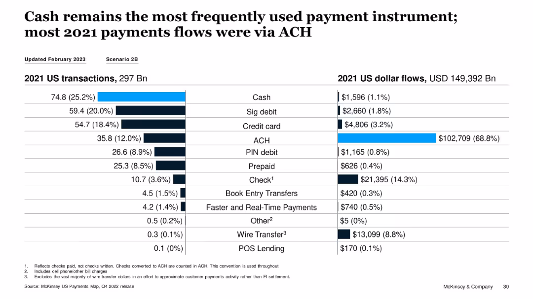
Split bar and table visualization of 2021 transaction volume vs. USD flows by instrument
Performance Metrics and KPIs
Financial Services
The slide highlights that while cash was the most used payment method by volume in 2021, ACH dominated in dollar flows, accounting for 68.8% of total value. This illustrates a divergence between transaction count and transaction value across instruments.
cash usage, ACH, transaction volume, dollar flows, payment instruments, 2021 data
false
Performance Metrics and KPIs
Financial Services
Single Chart
McKinsey
Add to my slides
Remove from favorites
Features column charts detailing reserve releases and underlying reserve volatility for casualty insurance.
Risk Assessment and Management
Financial Services
Details the volatility in reserve releases for casualty at Lloyd's, highlighting specific lines such as General Liability and Directors & Officers insurance, with a focus on significant reserve changes.
Casualty, Reserves, Insurance, Volatility, Changes
false
Risk Assessment and Management
Financial Services
Multiple Chart
PwC/Strategy&
Add to my slides
Remove from favorites
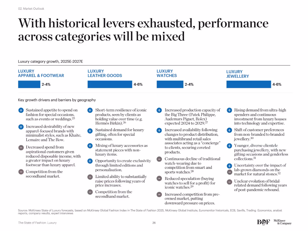
Four-segment layout comparing apparel & footwear, leather goods, watches, and jewellery. Each includes forecasted growth rates and key regional drivers and barriers in bullet format.
Strategic Planning
Consumer Goods
This slide emphasizes diverging performance among luxury categories from 2025–2027. While jewellery and leather goods are expected to grow 4–6%, apparel and watches will see only moderate growth. Key factors include secondhand market pressures, economic shifts, and consumer behavior changes.
category performance, growth forecast, secondhand competition, McKinsey, jewellery, apparel
false
Strategic Planning
Consumer Goods
Mixed Chart
McKinsey
Add to my slides
Remove from favorites
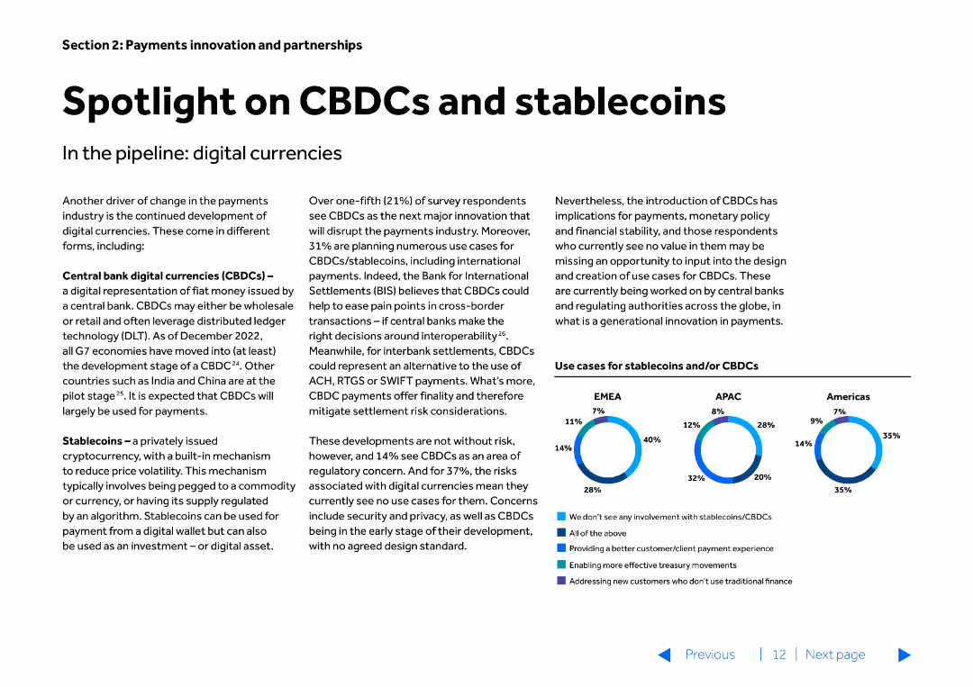
The slide features text-heavy content with a small column chart at the bottom. The slide is divided into two main sections discussing CBDCs and stablecoins, and their implications in digital currencies.
Market Analysis and Trends
Financial Services
Discusses the development and implications of Central Bank Digital Currencies (CBDCs) and stablecoins, highlighting their potential impact on the payments industry.
CBDCs, stablecoins, digital currencies, payments, trends
false
Market Analysis and Trends
Financial Services
Mixed Chart
Barclays
Add to my slides
Remove from favorites
The slide features a world map pinpointing regions of international expansion with a focus on EMEA countries, supplemented by bullet points on strategy. The color contrast and map design aid in focusing on the strategic elements.
Strategic Planning
Financial Services
Provides a strategy for international expansion of the commercial banking model, with a focus on market opportunities and targeted regions. It's useful for global strategic planning and discussing international growth potential with stakeholders.
CB model, international expansion, market opportunity, strategic planning, EMEA, APAC
false
Strategic Planning
Financial Services
Header Vertical
JP Morgan
Add to my slides
Remove from favorites
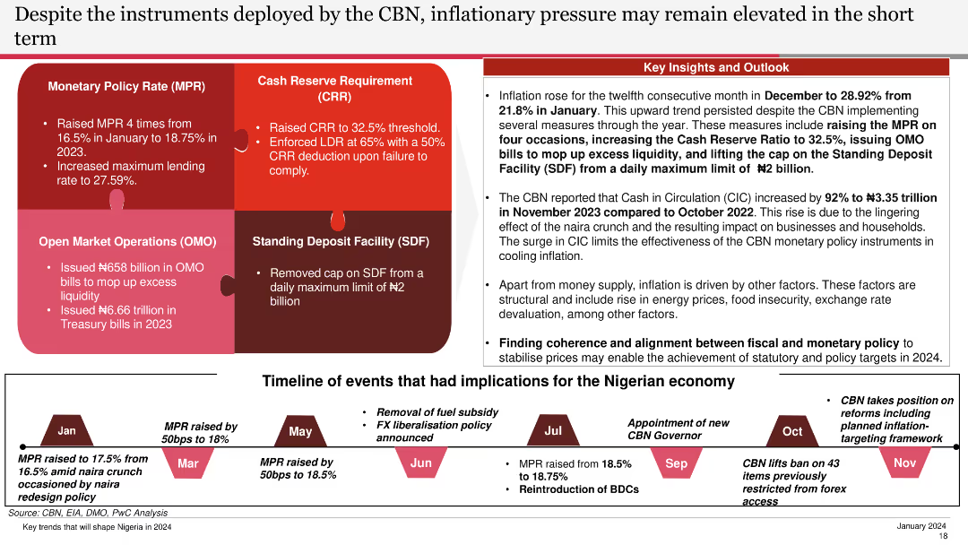
The slide includes text blocks and a timeline of monetary policy events. It is moderately complex, with clear use of color coding and annotations to highlight key measures.
Regulatory and Compliance
Financial Services
This slide details the monetary policy instruments used by the CBN to control inflation, providing a timeline of key events and their impact on the Nigerian economy in the short term.
CBN, Inflation, Policy, Instruments, Timeline
false
Regulatory and Compliance
Financial Services
Linear Flow
PwC/Strategy&
Add to my slides
Remove from favorites
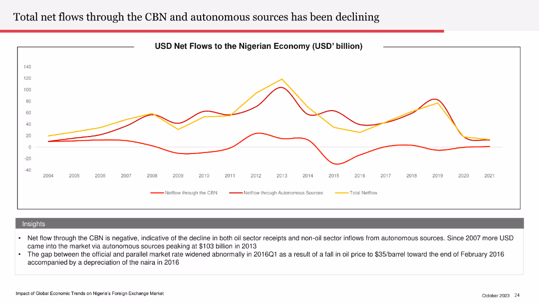
Line chart depicting USD net flows to the Nigerian economy from 2004 to 2021. Multiple lines show net flows through the CBN, autonomous sources, and total net flows.
Financial Performance
Financial Services
The slide details the declining net flows through the CBN and autonomous sources, indicating a negative trend in Nigeria's oil and non-oil sector receipts. It highlights the gap between official and parallel market rates, particularly in 2016.
CBN, net flows, Nigerian economy, oil sector, market rates
false
Financial Performance
Financial Services
Mixed Chart
PwC/Strategy&
Add to my slides
Remove from favorites
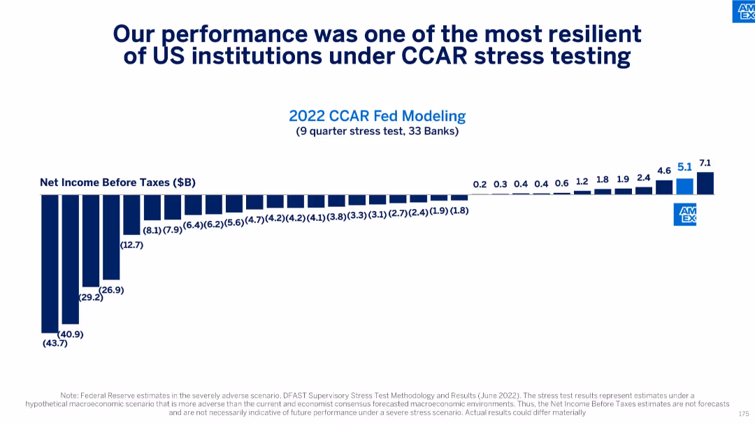
Horizontal bar chart showing Net Income Before Taxes under Fed stress test (2022) for 33 banks
Risk Assessment and Management
Financial Services
Demonstrates American Express’s superior stress-test resilience with the highest modeled net income under Fed CCAR. Indicates strong balance sheet and risk management relative to other U.S. banks.
CCAR, stress testing, net income, financial resilience, Federal Reserve, risk management
false
Risk Assessment and Management
Financial Services
Single Chart
McKinsey
Add to my slides
Remove from favorites
The slide contains a stacked column chart representing CCB investments over time, with annotations detailing areas of growth and investment returns. There's also a sidebar with additional notes on investment focus.
Strategic Planning
Financial Services
Slide presents an overview of JP Morgan Chase & Co.'s Consumer & Community Banking (CCB) investments, highlighting areas of growth and expected returns, making it apt for discussing investment strategies and future planning with stakeholders.
CCB investments, JP Morgan Chase, growth areas, investment returns, strategic planning, stakeholder discussions
false
Strategic Planning
Financial Services
Mixed Chart
JP Morgan
Add to my slides
Remove from favorites
The slide contains a column chart showing changes in CCB revenue from 2012 to 2022 with different factors labeled.
Financial Performance
Financial Services
It presents a decade-long financial trend analysis of the Consumer and Community Banking revenue, including net interest income forecasts.
CCB, revenue, net interest, forecast, financial trend, 2012-2022, JPMorgan Chase & Co, banking
false
Financial Performance
Financial Services
Single Chart
JP Morgan
Add to my slides
Remove from favorites
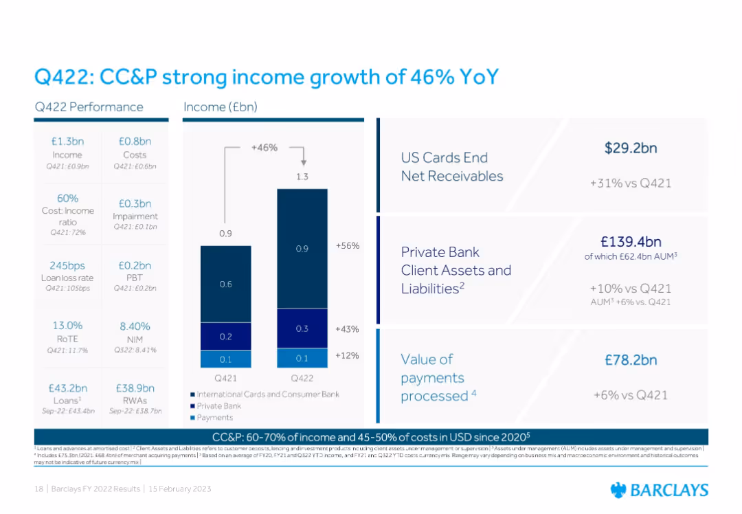
Three-part design: Left has Q422 metrics; center shows YoY income comparison by business area using stacked bars; right provides KPIs like US card receivables, client assets, and payments processed.
Performance Metrics and KPIs
Financial Services
Highlights significant income growth in Consumer, Cards & Payments (CC&P), driven by increased receivables, client assets, and payments. The slide emphasizes cost-income improvements and diversified revenue streams.
CC&P, income growth, payments, private bank, US cards, performance, KPIs, Q422, Barclays
false
Performance Metrics and KPIs
Financial Services
Mixed Chart
Barclays
Add to my slides
Remove from favorites
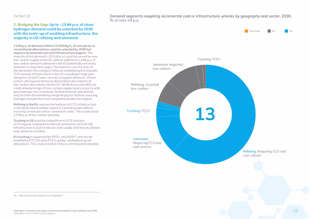
Donut chart of 13 Mt demand by sector and region; text details infrastructure and CCS requirements
Operational Efficiency
Energy & Utilities
This slide focuses on the demand segments that require moderate cost or infrastructure improvements to be viable by 2030. It emphasizes CCS expansion in US and EU for refining, low-carbon ammonia imports, and hydrogen refueling infrastructure for trucking in the US and EU.
CCS, ammonia, infrastructure unlock, cost improvement, hydrogen trucking, refining, 2030 goal, clean energy
false
Operational Efficiency
Energy & Utilities
Mixed Chart
McKinsey
Add to my slides
Remove from favorites
Column chart comparing the unsubsidized capital costs of retrofitted gas combined cycle plants with CCS and new-build power plants with CCS.
Financial Performance
Energy & Utilities
The slide provides a comparison of capital costs for CCS systems, contrasting retrofit and new-build scenarios without subsidies.
CCS, Capital cost, Retrofit, New-build, Unsubsidized
false
Financial Performance
Energy & Utilities
Single Chart
Roland Berger
Add to my slides
Remove from favorites
Column chart comparing the levelized cost of energy for gas combined cycle plants with CCS, under retrofit and new-build scenarios, with and without subsidies.
Financial Performance
Energy & Utilities
The slide compares the costs of gas combined cycle plants with CCS, analyzing both retrofit and new-build scenarios and showing cost differences due to subsidies.
CCS, Gas combined cycle, Cost analysis, Retrofit, New-build
false
Financial Performance
Energy & Utilities
Single Chart
Roland Berger
Add to my slides
Remove from favorites
The slide includes two column charts comparing survey responses from 2017 and 2019 regarding the safety and development of CCS. Below the charts is a summary of key findings from the survey.
Market Analysis and Trends
Environmental Services & Sustainability
This slide presents survey results on public perception of Carbon Capture and Storage (CCS) safety and support for its development, recommending increased public outreach to improve awareness and support for CCS initiatives.
CCS, survey, public outreach, safety, support
false
Market Analysis and Trends
Environmental Services & Sustainability
Multiple Chart
Kearney
Add to my slides
Remove from favorites
An image of ADNOC’s Al Reyadah facility with accompanying descriptive captions.
Client Case Studies
Industrial & Manufacturing
Describes ADNOC's Al Reyadah facility as a self-sustaining CCUS project in the iron & steel industry.
CCUS, ADNOC, Al Reyadah, iron, steel, self-sustaining
false
Client Case Studies
Industrial & Manufacturing
Linear Flow
Kearney
Add to my slides
Remove from favorites
Includes a column chart showing the number of CCUS projects dedicated to various industries (chemicals, heavy industries, power generation, hydrogen, oil & gas, clusters).
Market Analysis and Trends
Energy & Utilities
Explores the expansion of CCUS applications to additional large emitting sectors, analyzing the number of projects and their statuses within these industries.
CCUS, application, heavy industries, blue hydrogen, chemicals, project expansion, industry analysis
false
Market Analysis and Trends
Energy & Utilities
Mixed Chart
Kearney
Add to my slides
Remove from favorites
Two column charts depicting the number of large-scale CCUS projects and total capture capacity (Mtpa).
Market Analysis and Trends
Energy & Utilities
Shows the expected increase in CCUS projects and capacity by 2030, indicating significant industry growth.
CCUS, capacity, projects, energy, growth, trends
false
Market Analysis and Trends
Energy & Utilities
Multiple Chart
Kearney
Add to my slides
Remove from favorites
The slide shows a series of line and area charts illustrating various CO2 emission pathways and the required carbon dioxide removal capacities to meet the 1.5°C target. Each pathway is color-coded for clarity.
Technology and Digital Transformation
Energy & Utilities
The slide explains the need for Carbon Capture, Utilization, and Storage (CCUS) technologies to achieve the 1.5°C climate target, showing different emission reduction pathways and their potential impacts.
CCUS, carbon capture, climate target, CO2 removal, emission pathways
false
Technology and Digital Transformation
Energy & Utilities
Multiple Chart
Kearney
Add to my slides
Remove from favorites
The slide features a flowchart diagram that outlines the main pathways of CCUS technologies, including both utilization (CCU) and storage (CCS) processes. Different applications and processes are clearly labeled.
Technology and Digital Transformation
Energy & Utilities
This slide provides a comprehensive overview of the various pathways through which CCUS technologies can either utilize or store carbon dioxide, illustrating the diversity and complexity of these technologies.
CCUS, carbon utilization, carbon storage, pathways, technology overview
false
Technology and Digital Transformation
Energy & Utilities
Diagram
Kearney
Add to my slides
Remove from favorites
A bubble chart showing cement, iron, and steel productions combined with CCUS projects over time.
Market Analysis and Trends
Industrial & Manufacturing
Highlights recent CCUS projects in the cement, iron, and steel industries, and expected future projects.
CCUS, cement, iron, steel, projects, timeline
false
Market Analysis and Trends
Industrial & Manufacturing
Single Chart
Kearney
Add to my slides
Remove from favorites
A bar chart showing the timeline of various cement and iron & steel projects incorporating CCUS technology.
Market Analysis and Trends
Industrial & Manufacturing
Details the timeline and progress of CCUS projects in the cement and iron & steel industries.
CCUS, cement, iron, steel, projects, timeline
false
Market Analysis and Trends
Industrial & Manufacturing
Single Chart
Kearney
Add to my slides
Remove from favorites
The slide includes a scatter plot chart showing upcoming CCUS clusters by operational year and region.
Strategic Planning
Energy & Utilities
This slide shows the expected development of cross-industries CCUS clusters in Europe and North America.
CCUS, clusters, Europe, North America, operational year
false
Strategic Planning
Energy & Utilities
Single Chart
Kearney
Add to my slides
Remove from favorites
The slide presents a combination of column charts and pie charts that forecast CO2 capture and utilization by different industries for the years 2030, 2050, and 2070. Detailed legends and color-coding aid comprehension.
Strategic Planning
Energy & Utilities
This slide forecasts the development of CCUS technologies across multiple industries over the coming decades, indicating a significant increase in CO2 capture and the predominance of storage solutions.
CCUS, CO2 capture, industry forecast, storage solutions, emission reductions
false
Strategic Planning
Energy & Utilities
Multiple Chart
Kearney
Add to my slides
Remove from favorites
The slide shows a detailed value chain diagram for CCUS technologies, covering the entire process from CO2 sources through separation and capture, transport, and utilization/storage. Each segment is clearly labeled and color-coded.
Technology and Digital Transformation
Energy & Utilities
This slide explains the comprehensive value chain of CCUS technologies, detailing each step from CO2 capture to storage and utilization, showcasing the integrated approach needed to abate CO2 emissions.
CCUS, CO2 capture, value chain, transport, utilization, storage
false
Technology and Digital Transformation
Energy & Utilities
Linear Flow
Kearney
Add to my slides
Remove from favorites
A column chart and a bar chart showing potential CO2 emissions reduction from CCUS on thermal power plants.
Market Analysis and Trends
Energy & Utilities
Illustrates the impact of retrofitting power plants with CCUS on reducing CO2 emissions.
CCUS, CO2 reduction, power plants, retrofitting, emissions
false
Market Analysis and Trends
Energy & Utilities
Multiple Chart
Kearney
Add to my slides
Remove from favorites
A column chart showing the age structure of coal capacity per region as of 2019.
Market Analysis and Trends
Energy & Utilities
Discusses the potential for CCUS development in new coal power plants in China and India.
CCUS, coal power, China, India, development
false
Market Analysis and Trends
Energy & Utilities
Mixed Chart
Kearney
Add to my slides
Remove from favorites
The slide features an area chart showing global energy sector CO2 emission reductions by measure (technology performance, electrification, etc.) up to 2070. The chart is color-coded and has a detailed legend.
Strategic Planning
Energy & Utilities
This slide emphasizes that CCUS technologies need to be combined with other solutions like electrification and technology improvements to decarbonize the energy sector effectively.
CCUS, decarbonization, energy sector, emission reductions, technology solutions
false
Strategic Planning
Energy & Utilities
Mixed Chart
Kearney
Add to my slides
Remove from favorites
The slide shows a table listing various sectors (e.g., agriculture, industry) and their respective gross estimates of greenhouse gas emissions with potential CCUS applications. Different stages of technology maturity are also indicated.
Technology and Digital Transformation
Energy & Utilities
This slide outlines how CCUS technology can significantly reduce CO2 emissions in key sectors responsible for large amounts of greenhouse gases, highlighting its critical role in achieving emission targets.
CCUS, decarbonization, sectors, CO2 emissions, technology maturity
false
Technology and Digital Transformation
Energy & Utilities
Single Chart
Kearney
Add to my slides
Remove from favorites
The slide features a table listing CCUS hubs in Europe with project names, countries, CO2 capacity, and year.
Market Analysis and Trends
Energy & Utilities
The table provides an overview of various CCUS projects in Europe, including their capacities and industries.
CCUS, Europe, hubs, projects, CO2 capacity
false
Market Analysis and Trends
Energy & Utilities
Table
Kearney
Add to my slides
Remove from favorites
The slide features a world map highlighting the locations of CCUS facilities, using color-coded dots to indicate their status (operational, in development, etc.).
Industry Overview
Energy & Utilities
Describes the global distribution of CCUS projects, highlighting the USA as the leader. Details the operational status and geographic spread of these facilities.
CCUS, facilities, global distribution, USA, development, operational, North America, Middle East, Europe
false
Industry Overview
Energy & Utilities
Graphic
Kearney
Add to my slides
Remove from favorites
The slide features an area chart showing the top 11 CCUS financial contributions from OECD countries from 2004-2019, with annotations indicating significant changes. A legend identifies the countries by color.
Financial Performance
Energy & Utilities
This slide highlights the financial contributions to CCUS by various OECD countries, with the United States being a major contributor. It shows trends in funding, noting the US's decreasing share and the increasing contributions from Japan and Norway.
CCUS funding, OECD, United States, financial contributions
false
Financial Performance
Energy & Utilities
Single Chart
Kearney
Add to my slides
Remove from favorites
The slide includes a table matrix showing various heavy industries (e.g., cement, steel) and the potential application of CCUS and other decarbonization technologies. Each cell is color-coded to indicate the maturity of the technology.
Risk Assessment and Management
Industrial & Manufacturing
This slide discusses the importance of CCUS for heavy industries that are hard to decarbonize, showing the potential and maturity of different technologies that can be applied to reduce emissions in these sectors.
CCUS, heavy industries, decarbonization, technology maturity, emission reductions
false
Risk Assessment and Management
Industrial & Manufacturing
Table
Kearney
Add to my slides
Remove from favorites
A bubble chart showing hydrogen production combined with CCUS projects for various industrial applications.
Market Analysis and Trends
Energy & Utilities
Discusses the development of CCUS for blue hydrogen production and its industrial applications.
CCUS, hydrogen, production, industrial, applications
false
Market Analysis and Trends
Energy & Utilities
Single Chart
Kearney
Add to my slides
Remove from favorites
Features a timeline depicting the stages of CCUS development from early stage to possible mature industry, with key milestones and activities for each stage.
Strategic Planning
Energy & Utilities
Discusses the industrialization of CCUS deployment, outlining the progression from early-stage projects to larger, more mature industry clusters, and future development goals.
CCUS, industrialization, development stages, project clusters, timeline, strategic planning, future goals
false
Strategic Planning
Energy & Utilities
Linear Flow
Kearney
Add to my slides
Remove from favorites
Column chart and projected figures indicating global annual investment in CCUS technology, highlighting the substantial financial commitment required by 2040.
Strategic Planning
Environmental Services & Sustainability
Focuses on the financial implications of investing in carbon capture and storage, projecting significant investment needs by 2040 to meet global sustainability goals.
CCUS, investment, sustainability, 2040, finance
false
Strategic Planning
Environmental Services & Sustainability
Single Chart
BCG
Add to my slides
Remove from favorites
This slide has a column chart showing the potential CO2 capture capacity of current announced projects compared to the IEA SDS objectives by 2030. The gap is highlighted in red for emphasis.
Market Analysis and Trends
Energy & Utilities
The slide reveals that current CCUS projects are insufficient to meet the net-zero targets, indicating that the pipeline of projects needs to increase significantly to close the gap by 2030.
CCUS, net zero, CO2 capture, project pipeline, IEA objectives
false
Market Analysis and Trends
Energy & Utilities
Multiple Chart
Kearney
Add to my slides
Remove from favorites
The slide contains a table listing leading CCUS countries by capture capacity, number of operational projects, and type of storage.
Industry Overview
Energy & Utilities
Highlights North America's leadership in CCUS projects, detailing capture capacities, number of projects, and storage types for leading countries.
CCUS, North America, global leadership, capture capacity, operational projects, storage types
false
Industry Overview
Energy & Utilities
Mixed Chart
Kearney
Add to my slides
Remove from favorites
Features a line graph showing the size of carbon capture projects per industry application (1972-2030), with various industries color-coded.
Industry Overview
Energy & Utilities
Analyzes the development of CCUS projects across different industries over time, highlighting oil & gas, power generation, and other sectors leading in CCUS initiatives.
CCUS, oil & gas, power generation, industry application, carbon capture, development trends
false
Industry Overview
Energy & Utilities
Mixed Chart
Kearney
Add to my slides
Remove from favorites
The slide includes an area chart showing the top 10 CCUS patents filed by OECD country producers from 1996-2018, with each country represented by a distinct color. Annotations provide context and highlight significant trends.
Financial Performance
Energy & Utilities
This slide details the number of patents filed for CCUS technologies by various OECD countries, showing the United States leading in patent filings. It highlights the competitive landscape in CCUS R&D and the leading contributors over time.
CCUS patents, United States, OECD, R&D, innovation
false
Financial Performance
Energy & Utilities
Single Chart
Kearney
Add to my slides
Remove from favorites
The slide features a timeline chart showing the political attractiveness curve for CCUS policies from 1996 to 2020, including significant events and milestones.
Regulatory and Compliance
Government & Public Sector
The slide depicts the political support trajectory for CCUS policies from 1996 to 2020. It highlights key events, policy milestones, and shifts in support over time, showing how political attitudes towards CCUS have evolved and the impact of various external factors on this support.
CCUS, political support, timeline, policies
false
Regulatory and Compliance
Government & Public Sector
Single Chart
Kearney
Add to my slides
Remove from favorites
A bubble chart displaying power generation combined with CCUS projects over time.
Market Analysis and Trends
Energy & Utilities
Emphasizes the role of CCUS in retrofitting various power plants to reduce CO2 emissions.
CCUS, power generation, emissions, retrofit, biomass
false
Market Analysis and Trends
Energy & Utilities
Single Chart
Kearney
Add to my slides
Remove from favorites
The slide contains two column charts illustrating the increase in levelized cost of energy production for coal and natural gas power plants with various CO2 capture rates.
Market Analysis and Trends
Energy & Utilities
The slide details how applying CCUS to power plants increases the levelized cost of production, with moderate impacts from higher capture rates. The left chart shows cost increases for coal, and the right for natural gas, highlighting the additional cost burden at different capture rates.
CCUS, power plants, production cost, CO2
false
Market Analysis and Trends
Energy & Utilities
Multiple Chart
Kearney
Add to my slides
Remove from favorites
A bar chart showing the timeline of various power plant projects incorporating CCUS technology.
Market Analysis and Trends
Energy & Utilities
Details the timeline and progress of power plant projects using CCUS equipment for emissions reduction.
CCUS, power plants, projects, timeline, emissions
false
Market Analysis and Trends
Energy & Utilities
Single Chart
Kearney
Add to my slides
Remove from favorites
The slide presents a column chart displaying the number of global CCUS projects over time. It includes different colored bars to indicate operational projects, projects in development, etc.
Market Analysis and Trends
Energy & Utilities
It provides an overview of global CCUS projects, showing trends in operational, developmental, cancelled, and completed projects from 1972 to 2030. It highlights the increase and decline phases.
CCUS projects, global overview, operational projects, development projects, cancelled projects, energy, utilities
false
Market Analysis and Trends
Energy & Utilities
Single Chart
Kearney
Add to my slides
Remove from favorites
Displays a column chart indicating the median CO2 capture capacities of projects (in Mtpa) by region and status (in development, operational, completed, cancelled).
Strategic Planning
Energy & Utilities
Projects significant growth in the size of CCUS projects globally. Provides insights into the future capacities and development of various regions' CCUS initiatives.
CCUS, project size, growth, future development, CO2 capture, regional analysis, strategic planning, trends
false
Strategic Planning
Energy & Utilities
Mixed Chart
Kearney
Add to my slides
Remove from favorites
Bar chart compares the prevalence of CDO roles by digital maturity of the organization.
Organizational Structure and Change
Technology & Software
Examines the trend of appointing Chief Digital Officers in companies at different stages of digital maturity.
CDO, digital transformation, digital maturity, leadership roles, organizational change
false
Organizational Structure and Change
Technology & Software
Multiple Chart
BCG
Add to my slides
Remove from favorites
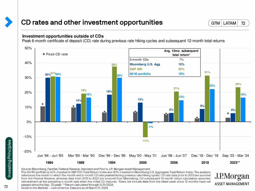
The slide includes a column chart comparing the returns of CDs to other investment opportunities, with historical data for context.
Investment Analysis
Financial Services
The slide evaluates the performance of certificates of deposit (CDs) against other investment options, highlighting potential returns during various market cycles.
CD rates, investment opportunities, historical returns, market analysis, financial comparison, investment strategies, performance metrics
false
Investment Analysis
Financial Services
Single Chart
JP Morgan
Add to my slides
Remove from favorites
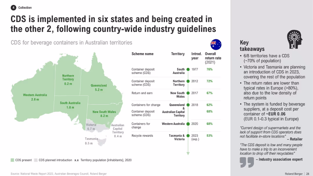
Australia map with CDS presence by state, table of schemes and return rates, and a list of key takeaways
Regulatory and Compliance
Environmental Services & Sustainability
This slide presents a national overview of CDS adoption across Australian territories, including return rates, scheme names, and timelines. It notes that Victoria and Tasmania will close remaining gaps, while explaining reasons for lower return rates vs. Europe.
CDS implementation, Australia map, recycling policy, return rates, state programs, container scheme, beverage recycling
false
Regulatory and Compliance
Environmental Services & Sustainability
Mixed Chart
Roland Berger
Add to my slides
Remove from favorites
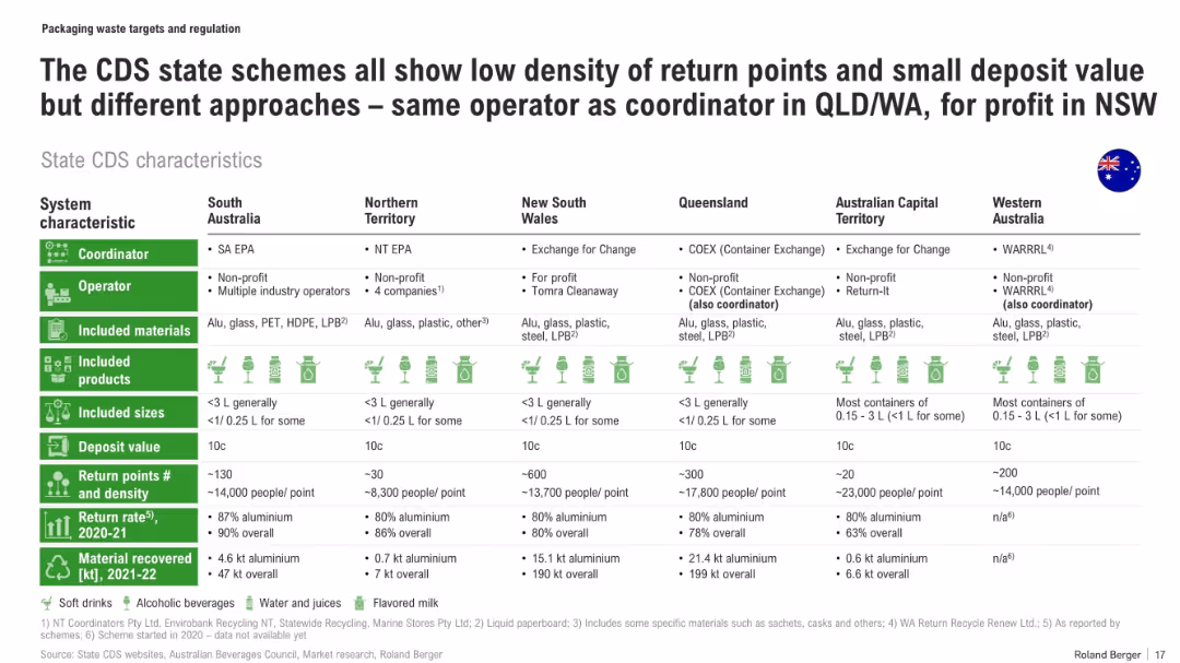
Comparative table of CDS schemes across states with icons, return rates, deposit values, and material recovery volumes
Regulatory and Compliance
Environmental Services & Sustainability
This slide compares state-level CDS (Container Deposit Scheme) characteristics in Australia, including coordinator/operator type, deposit values, material types, return infrastructure density, and recovery performance. It notes disparities in system efficiency and material recovery volumes across regions.
CDS, recycling, deposit schemes, container recovery, state comparison, aluminium, waste infrastructure
false
Regulatory and Compliance
Environmental Services & Sustainability
Table
Roland Berger
Add to my slides
Remove from favorites
Includes text boxes and icons emphasizing the strategic benefits of cell manufacturing in Australia.
Market Analysis and Trends
Energy & Utilities
Advocates for prioritizing cell manufacturing in Australia due to its strategic importance to the battery value chain.
cell manufacturing, strategic importance, Australia, battery industry
false
Market Analysis and Trends
Energy & Utilities
Pillar
Accenture
Add to my slides
Remove from favorites
Stacked bar chart (left) with annotations and labels; icons and bullet list (right); gradient tones in therapy bars
Product and Service Analysis
Healthcare & Pharmaceuticals
This slide focuses on the cell and gene therapy market, forecasting rapid growth through 2026. It highlights opportunities in personalized medicine, long-lasting treatments, and potential cures. The chart breaks down sales by therapy type and projects strong annual growth in this emerging healthcare segment.
Cell Therapy, Gene Therapy, Innovation, Personalized Medicine, Forecast
false
Product and Service Analysis
Healthcare & Pharmaceuticals
Mixed Chart
Roland Berger
Add to my slides
Remove from favorites
The slide features a flow diagram illustrating the concrete manufacturing process from raw materials to the finished product. Each stage is accompanied by relevant images and descriptive text, with a clear visual hierarchy.
Industry Overview
Industrial & Manufacturing
Describes the process of cement production, highlighting the stages from limestone and clay to concrete. Explains the importance of clinker and the industry's move towards more sustainable practices.
Cement, clinker, concrete, manufacturing, sustainability
false
Industry Overview
Industrial & Manufacturing
Linear Flow
LEK
Add to my slides
Remove from favorites
The slide shows a line chart comparing cement import volumes in Australia, the US, and France, with a table summarizing import penetration rates.
Market Analysis and Trends
Industrial & Manufacturing
Examines the differences in cement import reliance between Australia, the US, and France. Highlights import growth trends and provides context on market reliance and supply chain factors.
Cement imports, Australia, US, France, market analysis
false
Market Analysis and Trends
Industrial & Manufacturing
Mixed Chart
LEK
Add to my slides
Remove from favorites
Displays a column chart showing cement and clinker import sources for Australia, the US, and France, along with a table of top import countries.
Market Analysis and Trends
Industrial & Manufacturing
Analyzes the sources of cement and clinker imports for Australia, the US, and France. Provides insights into regional dependencies and major import partners.
Cement imports, clinker, US, France, Australia
false
Market Analysis and Trends
Industrial & Manufacturing
Mixed Chart
LEK
Add to my slides
Remove from favorites
This slide contains a column chart showing cement production and imports over time, along with bullet points summarizing key trends and statistics.
Market Analysis and Trends
Industrial & Manufacturing
Provides an analysis of the Australian cement industry's reliance on imports. Highlights trends in production and import levels, the impact of infrastructure projects, and future market growth projections.
Cement, imports, production, market trends, Australia
false
Market Analysis and Trends
Industrial & Manufacturing
Mixed Chart
LEK
Add to my slides
Remove from favorites
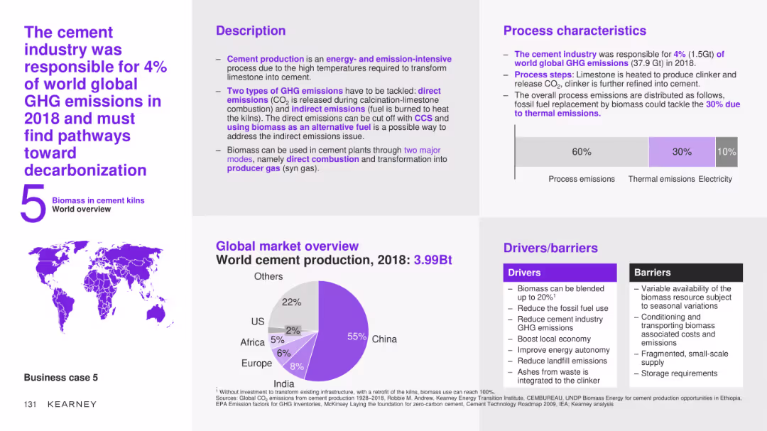
The slide features a detailed case study on the use of biomass in the cement industry, covering the description, process characteristics, global market overview, and drivers/barriers. It includes a pie chart showing world cement production by region for 2018.
Client Case Studies
Industrial & Manufacturing
This slide provides an in-depth analysis of the use of biomass in the cement industry, detailing the process steps, market potential, and the benefits and challenges of integrating biomass to reduce greenhouse gas emissions and improve sustainability.
cement industry, biomass, case study, process description, market overview, drivers, barriers, decarbonization
false
Client Case Studies
Industrial & Manufacturing
Multiple Chart
Kearney
Add to my slides
Remove from favorites
The slide features a column chart comparing domestic supply chain costs and freight costs for cement supply. The columns are divided into categories such as port, depot, rail, and road.
Operational Efficiency
Industrial & Manufacturing
The slide provides a breakdown of cement supply chain costs, showing that freight constitutes 55% of costs. It highlights different transportation methods and their respective cost percentages.
cement, supply chain, costs, transportation, freight, rail, road, port, depot
false
Operational Efficiency
Industrial & Manufacturing
Single Chart
LEK
Add to my slides
Remove from favorites
This slide has high visual complexity with a flow diagram illustrating the components of Continuous Emissions Monitoring Systems (CEMS) and their operation. Accompanying text explains the benefits of CEMS in detail.
Technology and Digital Transformation
Industrial & Manufacturing
The slide presents an in-depth look at Continuous Emissions Monitoring Systems, explaining their operation, the benefits of such systems, and their importance in regulatory compliance and process optimization. It showcases how CEMS can improve efficiency and reduce emissions by providing accurate, real-time data on gas emissions.
CEMS, Emissions monitoring, Real-time data, Process optimization, Regulatory compliance
false
Technology and Digital Transformation
Industrial & Manufacturing
Diagram
LEK
Add to my slides
Remove from favorites
The slide includes a column chart displaying the ratio of direct to distributed traffic according to an alternative central approach, which considers any source within the last 5 steps and excludes subsequent visits. Detailed annotations included.
Market Analysis and Trends
Media & Entertainment
This slide explores the ratio of direct to distributed traffic using an alternative central approach, considering any source within the last 5 steps before reaching news articles and excluding subsequent visits, providing insights into traffic patterns.
Central Approach, Direct Traffic, Distributed Traffic, Column Chart, Traffic Ratio
false
Market Analysis and Trends
Media & Entertainment
Single Chart
IPSOS
Add to my slides
Remove from favorites
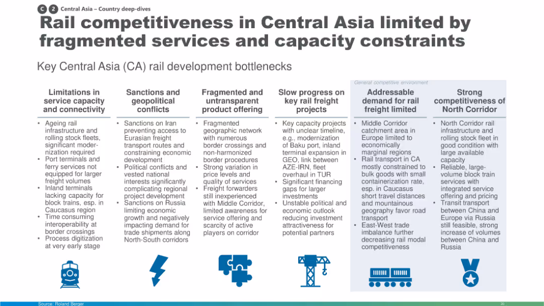
Column-based layout with icons and text boxes summarizing development bottlenecks like infrastructure limits, geopolitics, and fragmented offerings.
Market Analysis and Trends
Transportation & Logistics
The slide identifies major bottlenecks in Central Asia's rail freight development including outdated infrastructure, sanctions, non-transparent services, and weak demand. It also contrasts strong performance in the North Corridor. The insights are segmented under key thematic headers for clarity.
Central Asia, rail, infrastructure, connectivity, bottlenecks, sanctions, corridors
false
Market Analysis and Trends
Transportation & Logistics
Pillar
Roland Berger
Add to my slides
Remove from favorites
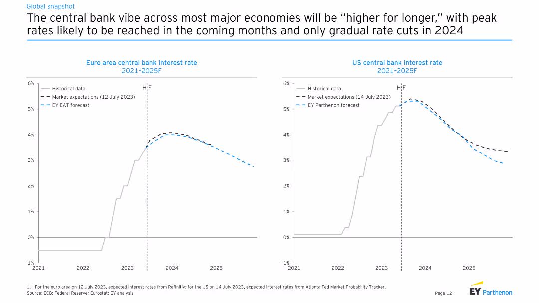
The slide features line charts comparing historical and expected future central bank interest rates for the Euro area and the US from 2021 to 2025F. Different lines represent historical data, market expectations, and EY Parthenon forecasts.
Market Analysis and Trends
Financial Services
The slide discusses the likelihood of higher central bank interest rates for longer periods in major economies, with projections showing gradual rate cuts starting in 2024.
central bank, interest rates, Euro area, US, forecasts
false
Market Analysis and Trends
Financial Services
Multiple Chart
EY
Add to my slides
Remove from favorites
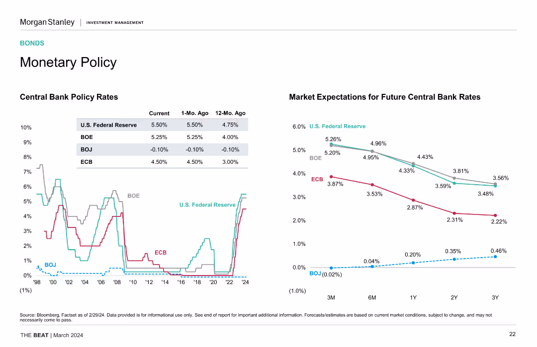
One table showing current policy rates of central banks and one line chart of market expectations for future central bank rates, illustrating rate changes and projections.
Strategic Planning
Financial Services
The slide presents current policy rates of major central banks and projects future rate changes, providing insights into monetary policy trends and market expectations.
Central Bank, Policy Rates, BOE, Fed, ECB, BOJ, Market Expectations, Monetary Policy Trends
false
Strategic Planning
Financial Services
Multiple Chart
Morgan Stanley
Add to my slides
Remove from favorites
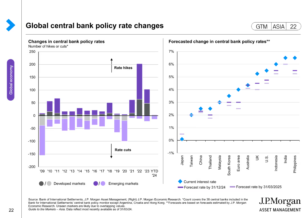
The slide contains two column charts. The left chart shows changes in central bank policy rates for developed and emerging markets. The right chart forecasts changes in central bank policy rates, with separate markers for current and forecasted rates.
Market Analysis and Trends
Financial Services
The slide analyzes changes and forecasts in global central bank policy rates, providing insights into monetary policy trends. It is useful for understanding economic strategies and planning.
central bank, policy rates, economic strategy, financial analysis, developed markets, emerging markets, monetary policy
false
Market Analysis and Trends
Financial Services
Multiple Chart
JP Morgan
Add to my slides
Remove from favorites
Features two line charts. The left chart shows central bank policy rates for the US Fed, BoE, BoJ, and ECB from 1998 to 2024. The right chart shows market expectations for future central bank rates over different time horizons.
Market Analysis and Trends
Financial Services
Discusses current and future central bank policy rates across major economies, emphasizing the impact on global financial markets and expectations for rate adjustments.
Central Bank, Policy Rates, Fed, BoE, BoJ, ECB, Market Expectations, Financial Markets, Global Economy
false
Market Analysis and Trends
Financial Services
Multiple Chart
Morgan Stanley
Add to my slides
Remove from favorites
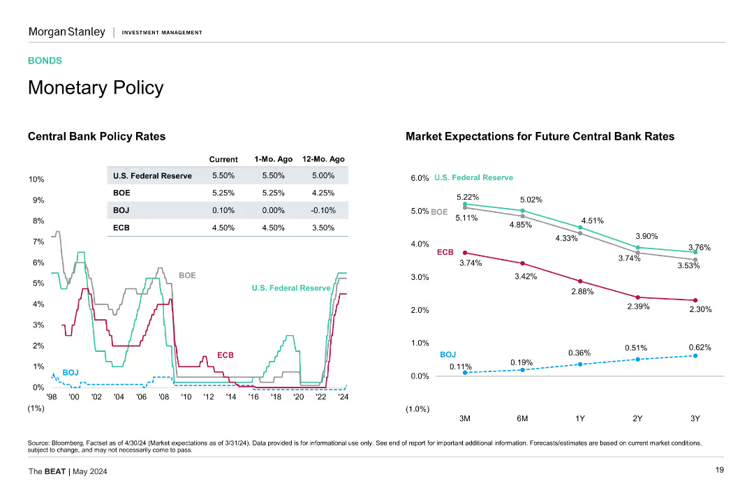
Line chart showing historical central bank policy rates and another line chart showing market expectations for future central bank rates.
Market Analysis and Trends
Financial Services
Displays central bank policy rates over time for US, BOE, BOJ, and ECB, and future market expectations, aiding in understanding monetary policy trends.
Central bank, policy rates, future trends
false
Market Analysis and Trends
Financial Services
Multiple Chart
Morgan Stanley
Add to my slides
Remove from favorites
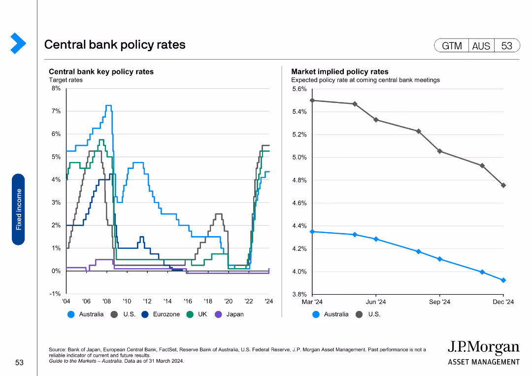
Line chart showing central bank key policy rates for various countries. Another chart shows expected policy rate changes over the next year.
Market Analysis and Trends
Financial Services
Tracks central bank policy rates globally, showing historical trends and expectations for future policy changes.
central bank, policy rates, key rates, changes, expectations
false
Market Analysis and Trends
Financial Services
Multiple Chart
JP Morgan
Add to my slides
Remove from favorites
The slide features a line chart showing Central Bank Policy Rates and another chart showing Market Expectations for Future Central Bank Rates. Colors vary for different banks.
Market Analysis and Trends
Financial Services
The slide presents current, past, and expected future central bank rates for U.S. Federal Reserve, BOE, BOJ, and ECB, providing a comprehensive monetary policy overview.
Central Bank Rates, Monetary Policy, BOE, BOJ, ECB, U.S. Federal Reserve
false
Market Analysis and Trends
Financial Services
Multiple Chart
Morgan Stanley
Add to my slides
Remove from favorites
The slide portrays two line graphs, one depicting the mean and the other the median of central bank balance sheets relative to GDP, spanning over a century. The graphs show an increasing trend, particularly in recent years. The title, subtitle, and quote from the US Federal Reserve are also present.
Regulatory and Compliance
Financial Services
The slide examines central bank balance sheet trends and discusses the innovations in quantitative easing (QE) and Flexible Average Inflation Targeting (FAIT). It can serve to explain modern monetary policy tools and strategies, especially in response to economic crises.
Central Banks, Balance Sheets, GDP, Quantitative Easing, Inflation Targeting, Monetary Policy, Trends
false
Regulatory and Compliance
Financial Services
Single Chart
JP Morgan
Add to my slides
Remove from favorites
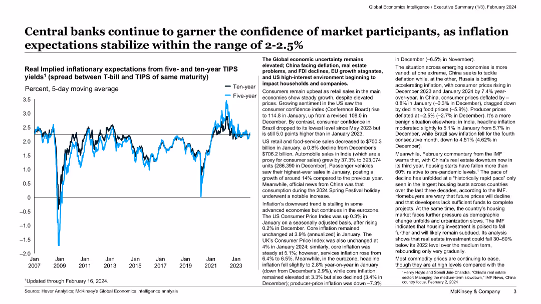
The slide has a white background with a line chart depicting inflation expectations and a text block summarizing economic trends.
Market Analysis and Trends
Financial Services
This slide discusses the stability of inflation expectations and central bank confidence, supported by a line chart showing real implied inflationary expectations for five- and ten-year TIPS.
central banks, inflation, market confidence, economic trends, financial services, analysis, stability, TIPS, expectations, overview
false
Market Analysis and Trends
Financial Services
Mixed Chart
McKinsey
Add to my slides
Remove from favorites
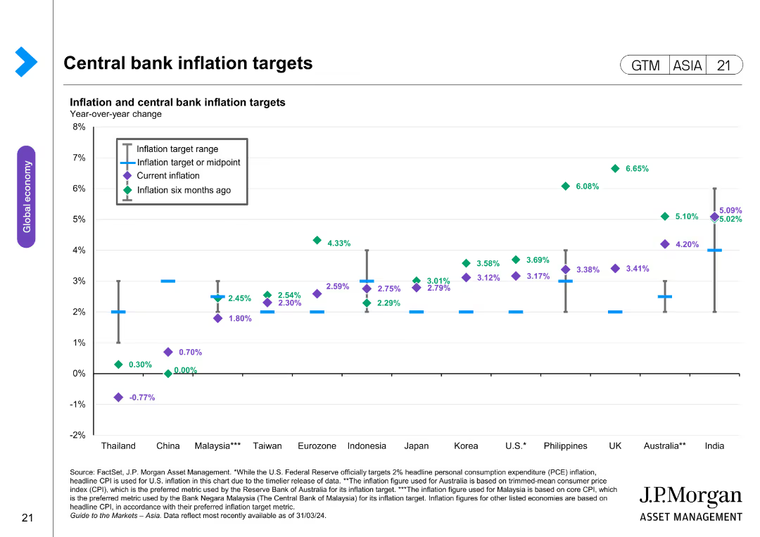
The slide features a scatter plot with lines indicating inflation targets, current inflation, and inflation six months ago for various countries. Different markers are used to differentiate between the data points.
Regulatory and Compliance
Financial Services
The slide compares inflation targets and actual inflation rates across different countries, highlighting changes over time. It is used for regulatory analysis and understanding central bank policies.
central banks, inflation targets, regulatory compliance, economic analysis, country comparison, financial policies, inflation rates
false
Regulatory and Compliance
Financial Services
Single Chart
JP Morgan
Add to my slides
Remove from favorites
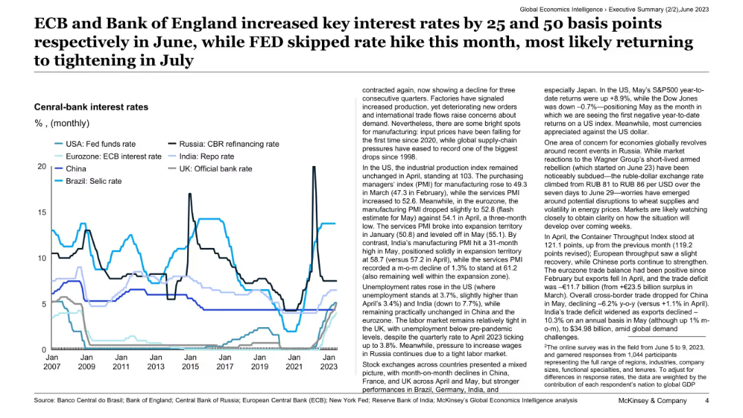
Line chart comparing central bank interest rates across major economies (USA, Eurozone, UK, India, etc.) over time, with text commentary.
Regulatory and Compliance
Financial Services
This slide outlines the recent interest rate decisions by central banks, highlighting increases by the ECB and Bank of England, while the Fed held steady. It provides context on manufacturing trends, unemployment, and global geopolitical factors affecting economic outlooks and exchange rate stability.
central banks, interest rates, ECB, Fed, monetary policy, inflation, regulation, macroeconomics, global risk, exchange rates
false
Regulatory and Compliance
Financial Services
Mixed Chart
McKinsey
Add to my slides
Remove from favorites
Line charts illustrating central bank rates and long-term interest rates from 2006-2024 across different countries.
Regulatory and Compliance
Financial Services
It discusses central bank policies and interest rate trends, indicating cautious easing measures to ensure sustained lower inflation.
central banks, policy, interest rates, inflation, trend, line chart, economic policy, long-term, forecast, 2006-2024
false
Regulatory and Compliance
Financial Services
Multiple Chart
EY
Add to my slides
Remove from favorites
Previous
Next
You don't have any favorites yet.
Please wait loading your favorites slides...
Create a FREE account to continue browsing
Receive Instant Access to 1,000+ slides from companies like McKinsey, Google, and Goldman Sachs
First Name
Last Name
Email
Password
I agree to all
Terms & Privacy Policy
Thank you! Your submission has been received!
Oops! Something went wrong while submitting the form.
Have an account?
Sign in
Upgrade to PRO to Save slides
Advanced Search and Filters
Access to 15,000+ slides
Access to Category Pages
Save/Bookmark Slides
PowerPoint Template Library
Pick a Plan
MONTHLY
$12/month
Billed every month, Cancel anytime.
YEARLY
$9/year
Billed $108 annually, Cancel anytime.
Checkout for $12/month
Checkout for $108/yr
Secured by Stripe | AES-256 bit encryption