My Account
My Slides
Search by Category
Companies
Slide Type
Use Case
Industry
Pricing
Templates
View All Templates
Download Template Slides
✦ AI
AI Prompt Library
AI Search
Feedback
Login
Logout
Get Started
Browse all Slides
Browse all Slides
Create a FREE Account
Instant access to 1,000+ real slides from top companies like McKinsey, BCG, Goldman Sachs, Google and many more!
First Name
Last Name
Email
Password
I agree to all
Terms & Privacy Policy
Thank you! Your submission has been received!
Oops! Something went wrong while submitting the form.
Have an account?
Sign in
Saved Slides
Total No. of slides saved
0
↻ Refresh
✖ Clear all
Four line graphs show U.S. mortgage delinquency rates, subprime mortgage originations, and financial obligation ratios, indicating trends in consumer credit health.
Operational Efficiency
Financial Services
Reviews the financial health of consumers by analyzing mortgage delinquency rates and debt ratios, relevant for operational efficiency in financial services.
consumer, credit, mortgage, delinquency, subprime, obligations, ratios, health, financial services
false
Operational Efficiency
Financial Services
Multiple Chart
Morgan Stanley
Add to my slides
Remove from favorites
This slide has a consistent design with the previous one, using black, white, and blue. It presents bullet points under two sections, each with a respective icon representing innovations and risks.
Strategic Planning
Retail & E-commerce
This part continues the discussion on business disruption with a focus on the retail sector, exploring new models for consumer engagement, customer acquisition, and product categories while also examining potential risks.
Consumer Data, Retail, Digital Assets, Innovation, Risks
false
Strategic Planning
Retail & E-commerce
Boxed
McKinsey
Add to my slides
Remove from favorites
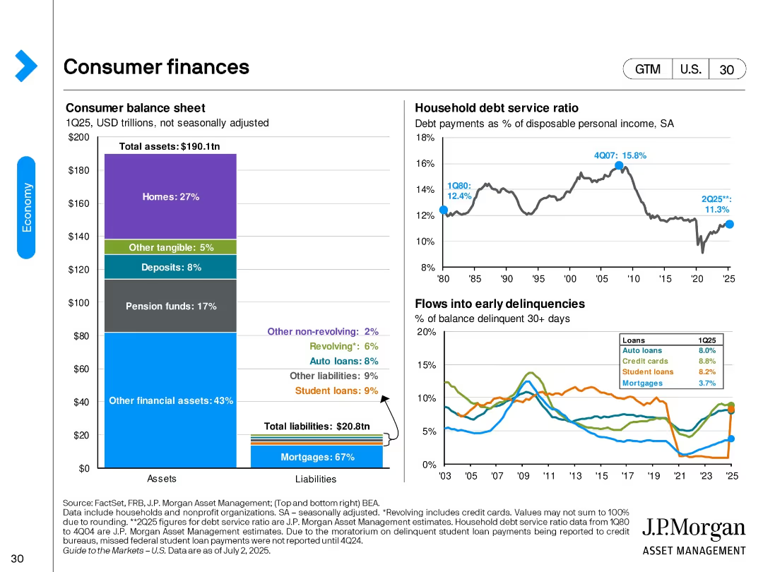
Three-panel design: asset/liability bar chart, household debt service line graph, and delinquency line graph segmented by loan type.
Performance Metrics and KPIs
Financial Services
This slide reviews the U.S. consumer balance sheet for 1Q25, debt service ratio trends, and delinquency rates by loan type. It shows a stable financial position with manageable debt levels and an increase in auto and credit card delinquencies.
consumer debt, household finance, delinquencies, mortgages, loans, balance sheet, debt ratio, financial health
false
Performance Metrics and KPIs
Financial Services
Multiple Chart
JP Morgan
Add to my slides
Remove from favorites
The slide contains a complex table and a graph, contrasting five consumer demographics with their digital adoption stages. A call-out box provides additional insights. The table is detailed, using a blue and white color scheme, and the slide has a side bar with symbolic icons.
Customer and Market Segmentation
Technology & Software
This slide breaks down the Southeast Asian digital population into five consumer demographics based on location, income, and age. It's valuable for segmenting the market and developing targeted digital strategies. The slide also updates the classification method from previous reports, making it relevant for current market analysis.
consumer demographics, digital adoption, SEA, market segmentation, targeted strategies, population analysis
false
Customer and Market Segmentation
Technology & Software
Table
Bain
Add to my slides
Remove from favorites
This slide features a bar graph with annotated percentages to show the consumer distribution across different city tiers in Indonesia, complemented by a brief explanatory text.
Market Analysis and Trends
Technology & Software
This slide provides statistics on consumer distribution across metropolitan, rapid urbanites, and slow adoptors, highlighting the majority of laggards in non-metropolitan areas.
consumer distribution, city tiers, metropolitan, urbanites, laggards, Indonesia, digital adoption
false
Market Analysis and Trends
Technology & Software
Single Chart
Kearney
Add to my slides
Remove from favorites
Dominated by images of consumer durables like appliances and electronics, the slide's clean design focuses on the visual representation of products with no additional data or text.
Product and Service Analysis
Consumer Goods
This slide provides a clear, visual introduction to consumer durables, suitable for beginning discussions on product categories, market segments, or the consumer electronics industry, with its straightforward imagery of household appliances and electronics.
Consumer durables, electronics, appliances
false
Product and Service Analysis
Consumer Goods
Title
BCG
Add to my slides
Remove from favorites
Central pie chart with percentage of internet-using buyers, flanked by bar graphs comparing younger and older offline shopper preferences.
Market Analysis and Trends
Retail & E-commerce
Insights into consumer durable shopping trends, contrasting preferences between online and offline shoppers with a focus on service and repair aspects.
Consumer Durables, Online Shopping, Offline Shopping, Service Concerns, Purchase Triggers
false
Market Analysis and Trends
Retail & E-commerce
Mixed Chart
BCG
Add to my slides
Remove from favorites
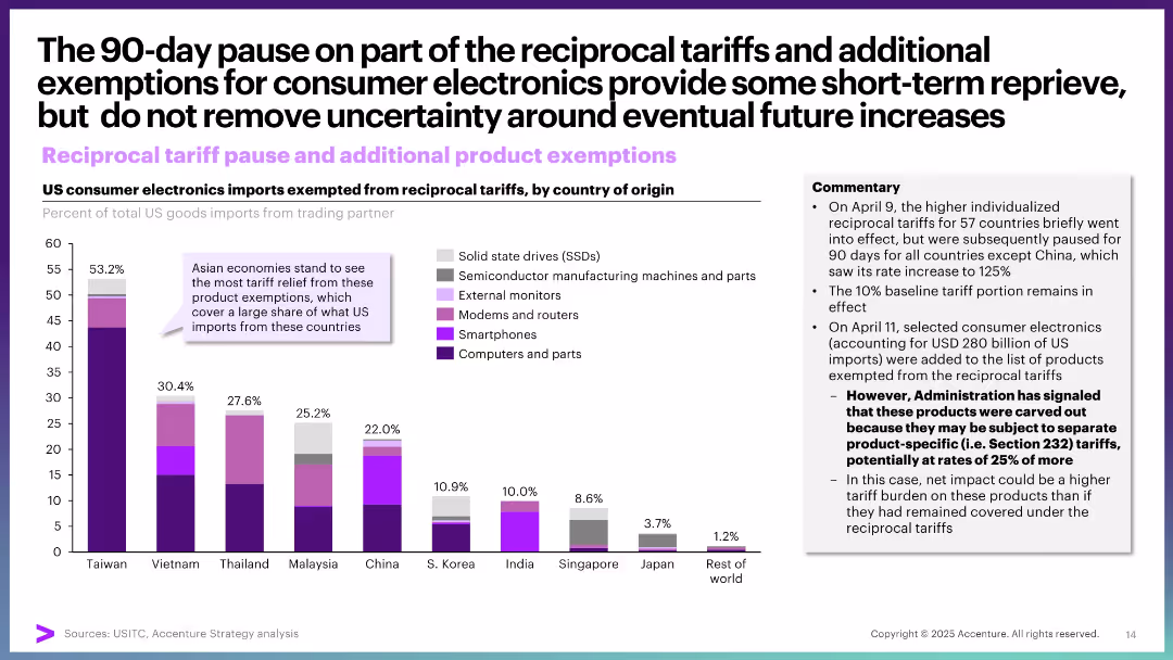
Stacked bar chart showing product exemptions from tariffs by country, supported by commentary on pause and future risks.
Regulatory and Compliance
Consumer Goods
This slide discusses the temporary suspension of tariffs on electronics imports, especially from Asia. It highlights relief for key product categories and signals potential future tariff reinstatement depending on policy shifts.
consumer electronics, tariffs, exemptions, US imports, Asia, 90-day pause, policy relief, semiconductors
false
Regulatory and Compliance
Consumer Goods
Mixed Chart
Accenture
Add to my slides
Remove from favorites
This slide contrasts two pie charts, illustrating the percentage of consumers using video for product discovery and evaluation. A text box provides a relevant quote to emphasize the importance of video content in social media and OTT platforms. The visual elements are well-balanced, with clear labels and legible text, set against a neutral background to enhance readability.
Market Analysis and Trends
Media & Entertainment
The slide provides insights into how consumers use video in the product journey, particularly in product discovery and evaluation. It underscores the influence of video content on consumer decisions, making it suitable for presentations that analyze consumer engagement strategies and the role of video in marketing.
Consumer Engagement, Video Content, Product Discovery, Product Evaluation, Marketing Strategy, Social Media, OTT Platforms, Media Consumption, Audience Insights, Engagement Tactics
false
Market Analysis and Trends
Media & Entertainment
Multiple Chart
Bain
Add to my slides
Remove from favorites
Column charts display the required discount amounts for vehicle purchases within the next 1-2 months across various countries (US, UK, Germany, France, Italy, China, Japan).
Market Analysis and Trends
Transportation & Logistics
Analyzes consumer expectations for discounts on vehicle purchases soon after COVID-19, comparing expectations across multiple countries.
consumer expectations, discounts, automotive, bar chart, international comparison
false
Market Analysis and Trends
Transportation & Logistics
Multiple Chart
McKinsey
Add to my slides
Remove from favorites
Slide with horizontal bars showing consumer expectations for shopping experiences, such as seamless integration and timely delivery.
Customer and Market Segmentation
Retail & E-commerce
Analyzes consumer expectations focusing on seamless shopping experiences and the importance of delivery times despite ongoing supply challenges.
consumer expectations, retailers, shopping experience, seamless, delivery times, strategic planning, supply issues, integration
false
Customer and Market Segmentation
Retail & E-commerce
Multiple Chart
Deloitte
Add to my slides
Remove from favorites
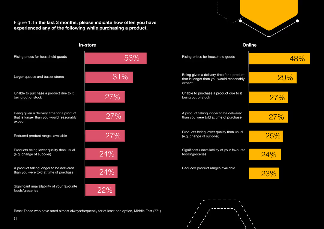
This slide features two bar charts comparing in-store and online consumer experiences over the past three months. The bars represent the percentage of respondents reporting specific issues such as rising prices and stock shortages.
Customer and Market Segmentation
Consumer Goods
The slide details consumer experiences both in-store and online, focusing on issues like rising prices, longer delivery times, stock unavailability, and reduced product ranges.
consumer, experiences, in-store, online, issues, prices, delivery, stock, product
false
Customer and Market Segmentation
Consumer Goods
Multiple Chart
PwC/Strategy&
Add to my slides
Remove from favorites
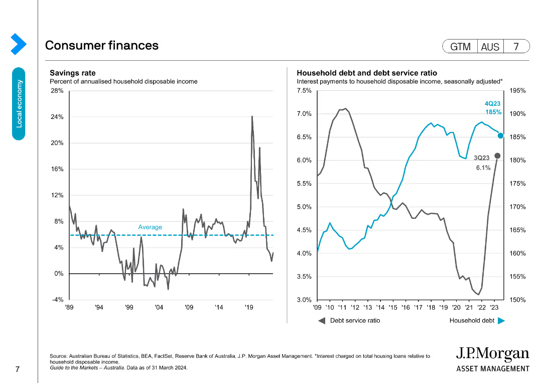
The slide includes a line chart of savings rates and a dual-axis line chart of household debt and debt service ratios, indicating financial health trends.
Market Analysis and Trends
Financial Services
This slide assesses consumer financial health in Australia by analyzing savings rates, household debt levels, and debt service ratios over time.
consumer finances, savings rate, household debt, debt service ratio, Australia
false
Market Analysis and Trends
Financial Services
Multiple Chart
JP Morgan
Add to my slides
Remove from favorites
Circular icons and percentages illustrate the financial sentiments of households, comparing spending, earnings, and savings trends across different countries.
Market Analysis and Trends
Consumer Goods
Provides a snapshot of consumer financial health, emphasizing the increased spending and decreased saving trends among households. Useful for analyzing consumer behavior and economic conditions.
consumer, financial health, spending, savings, trends
false
Market Analysis and Trends
Consumer Goods
Multiple Chart
BCG
Add to my slides
Remove from favorites
This slide consists of multiple horizontal bar charts detailing the percentage of consumers willing to pay more for various types of sustainable food.
Customer and Market Segmentation
Agriculture & Food Production
Shows consumer willingness to pay premiums for food with attributes like GMO-free, fair trade, and organic. Useful for understanding market preferences for sustainable products.
Consumer, Food, Sustainable, Premiums, Preferences
false
Customer and Market Segmentation
Agriculture & Food Production
Single Chart
Deloitte
Add to my slides
Remove from favorites
Visualizes a before and after process flow for consumer goods operations, using purple and white color themes with circles and arrows connecting different stages.
Operational Efficiency
Technology & Software
Highlights the transformation in consumer goods operations due to AI implementation, focusing on efficiency and customer engagement enhancements.
consumer goods, AI integration, process transformation, efficiency, customer engagement, workflow optimization, automation, technology impact, operational improvement
false
Operational Efficiency
Technology & Software
Diagram
Accenture
Add to my slides
Remove from favorites
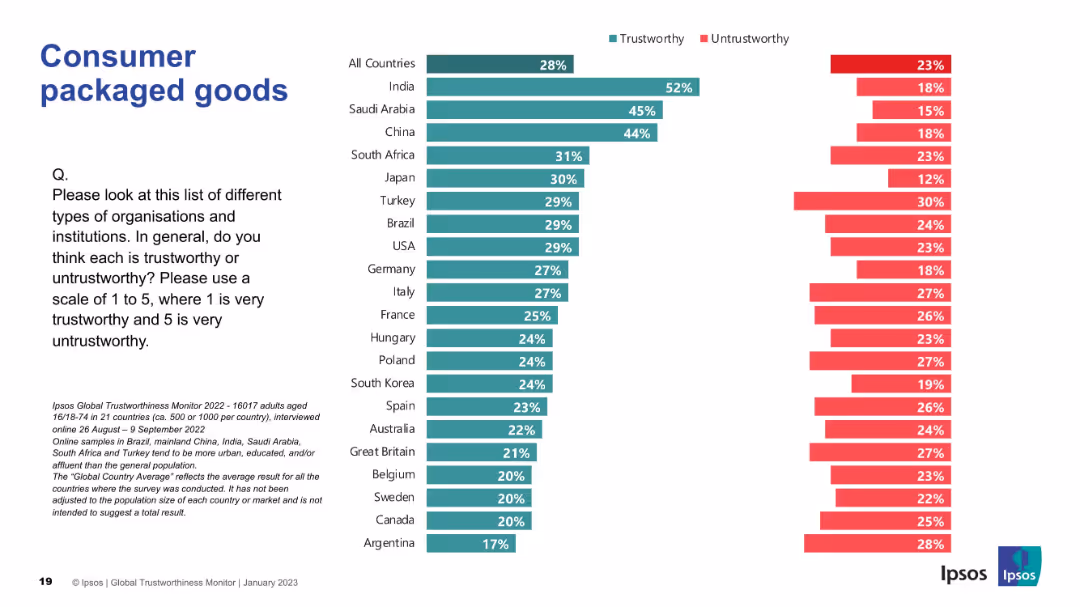
Vertical trust bar chart; color-coded by trustworthy/untrustworthy; countries compared.
Market Analysis and Trends
Consumer Goods
This slide highlights trust levels in consumer packaged goods firms globally. India again leads in public perception of trustworthiness.
consumer goods, packaged, trust, Ipsos, perception, survey, trustworthy, global, data visualization, public opinion
false
Market Analysis and Trends
Consumer Goods
Mixed Chart
IPSOS
Add to my slides
Remove from favorites
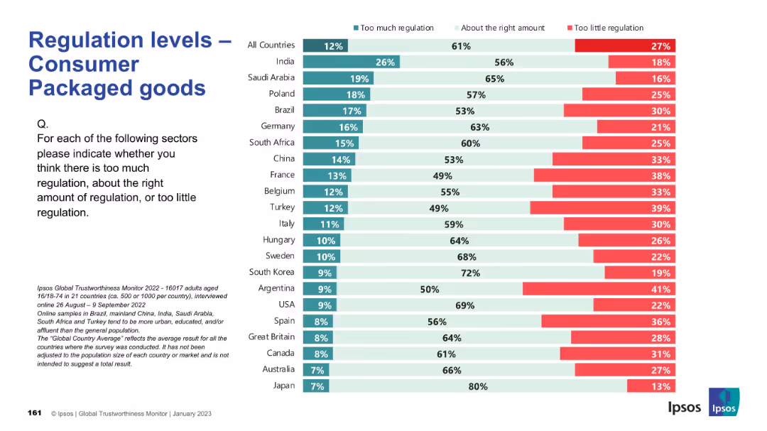
Bar chart structure consistent with other slides; displays perception categories for each country.
Regulatory and Compliance
Consumer Goods
This slide captures public perception about the regulation of consumer packaged goods. Most countries think regulation is at the right level, though Argentina and France show a higher desire for stricter control. Japan stands out as seeing current regulation as largely sufficient.
consumer goods, packaging, regulation, survey, governance, oversight, Ipsos, international comparison, public opinion
false
Regulatory and Compliance
Consumer Goods
Mixed Chart
IPSOS
Add to my slides
Remove from favorites
The slide features a column chart showcasing the growth of Consumer Banking customers over four years, with additional statistics on average deposits and debit card sales. The chart and statistics use a simple color scheme to differentiate the years.
Financial Performance
Financial Services
Highlighting the bank's growth in Consumer Banking, this slide uses a column chart and associated statistics to demonstrate the increase in customers and financial activities like checking accounts, deposits, and debit card sales, showcasing the bank's upward trajectory in customer acquisition and retention.
Consumer growth, Banking customers, Checking accounts, Deposits, Debit card sales, Financial activity
false
Financial Performance
Financial Services
Single Chart
JP Morgan
Add to my slides
Remove from favorites
Bar graph showing digital consumer growth, complemented by color coding and text annotations.
Customer and Market Segmentation
Retail & E-commerce
Visual representation of the growth of digital consumers in Southeast Asia, with projected and actual figures.
consumer growth, digital transformation, Southeast Asia, data visualization
false
Customer and Market Segmentation
Retail & E-commerce
Multiple Chart
Bain
Add to my slides
Remove from favorites
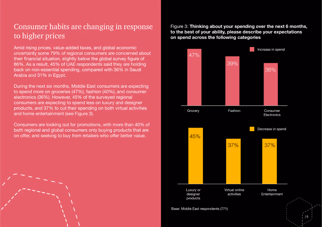
This slide features a bar chart showing the expected increase and decrease in consumer spending across various categories like groceries, fashion, and consumer electronics. The slide also includes a text description summarizing consumer concerns.
Market Analysis and Trends
Consumer Goods
The slide discusses changing consumer habits in the Middle East due to higher prices, predicting spending trends over the next six months in categories such as groceries, fashion, and electronics.
consumer, habits, spending, prices, groceries, fashion, electronics, Middle East
false
Market Analysis and Trends
Consumer Goods
Multiple Chart
PwC/Strategy&
Add to my slides
Remove from favorites
Title at the top with two bar charts below showing changes in consumer behavior, and quotes on the right side for emphasis.
Market Analysis and Trends
Retail & E-commerce
Reflects on how the pandemic has led consumers to reconsider their purchases with an emphasis on sustainability and ethics.
consumer habits, sustainability, ethical purchasing, waste reduction, pandemic impact, testimonials
false
Market Analysis and Trends
Retail & E-commerce
Single Chart
Accenture
Add to my slides
Remove from favorites
Slide includes multiple data presentations: column charts, bar charts, and a line graph comparing income and inflation.
Risk Assessment and Management
Financial Services
Monitors consumers' financial health through median balance levels, cash buffers, and income growth relative to inflation.
consumer health, balance sheets, cash buffers, income growth, inflation, JPMorgan Chase & Co, financial stability
false
Risk Assessment and Management
Financial Services
Multiple Chart
JP Morgan
Add to my slides
Remove from favorites
Two line charts: one showing US household liquid savings by income quintile, and the other displaying US credit card delinquency rates by income group, highlighting growing disparities in consumer financial health.
Market Analysis and Trends
Consumer Goods
The slide analyzes the widening disparities in consumer financial health, showing that higher-income groups have substantial savings while lower-income groups face increasing credit card delinquencies and depleted savings.
Consumer Health, Spending, Savings, Delinquency, Financial Disparities
false
Market Analysis and Trends
Consumer Goods
Multiple Chart
Accenture
Add to my slides
Remove from favorites
Showcases large bubble charts to represent digital initiatives' impact over a decade. Includes descriptions and quantitative data with a clear visual hierarchy.
Market Analysis and Trends
Media & Entertainment
Explores the digitalization in consumer industries potentially unlocking over $10 trillion in industry and societal value, with a focus on e-commerce.
Consumer Industries, Digitalization, E-commerce, Societal Value, Industry Analysis
false
Market Analysis and Trends
Media & Entertainment
Mixed Chart
Accenture
Add to my slides
Remove from favorites
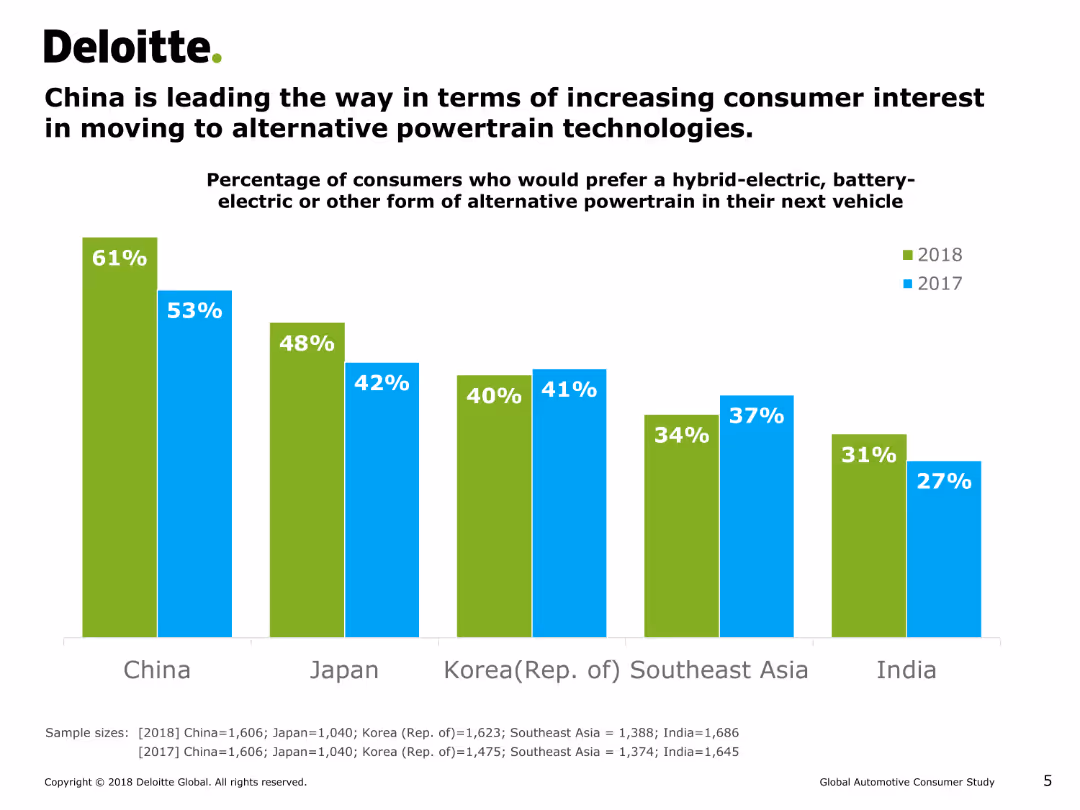
This slide features a vertical bar chart (column chart) comparing the percentage of consumers in different countries who prefer hybrid-electric, battery-electric, or other alternative powertrains in their next vehicle for the years 2017 and 2018.
Market Analysis and Trends
Energy & Utilities
The slide shows that China has the highest percentage of consumers interested in alternative powertrains, followed by Japan, Korea, Southeast Asia, and India. It highlights the growth in interest from 2017 to 2018.
consumer interest, alternative powertrain, hybrid-electric, battery-electric, column chart, market trends, energy, consumer preferences
false
Market Analysis and Trends
Energy & Utilities
Single Chart
Deloitte
Add to my slides
Remove from favorites
The slide uses a funnel diagram to illustrate consumer involvement across the discovery, interest, and engagement stages for LTV, OTT, and Movie Studios. It uses green and white colors and percentage values for each stage and vertical.
Market Analysis and Trends
Media & Entertainment
This slide shows the overall consumer involvement in the media consumption journey, with high percentages in discovery and varying levels in interest and engagement for LTV, OTT, and Movie Studios.
consumer involvement, media consumption, LTV, OTT, Movie Studios, discovery, interest, engagement
false
Market Analysis and Trends
Media & Entertainment
Multiple Chart
BCG
Add to my slides
Remove from favorites
Two sections with text and images, each section explaining diversity and inclusion and the platform & sharing economy.
Market Analysis and Trends
Consumer Goods
Explains trends in consumer diversity and inclusion, and the growing platform and sharing economy.
Consumerism, diversity, inclusion, platform economy, trends
false
Market Analysis and Trends
Consumer Goods
Multiple Chart
Deloitte
Add to my slides
Remove from favorites
Two sections with text and images, each section covering functional foods & beverages and collaboration for innovation.
Market Analysis and Trends
Consumer Goods
Discusses trends in functional foods and beverages, and collaboration for innovation within ecosystems to drive R&D.
Consumerism, functional foods, beverages, innovation, trends
false
Market Analysis and Trends
Consumer Goods
Multiple Chart
Deloitte
Add to my slides
Remove from favorites
Text on the left explaining new consumer behaviors and an image on the right depicting a woman exercising.
Market Analysis and Trends
Consumer Goods
Discusses new consumer behavior trends such as health and wellness, focusing on integrating healthy habits into daily life.
Consumerism, health, wellness, trends, behavior
false
Market Analysis and Trends
Consumer Goods
Mixed Chart
Deloitte
Add to my slides
Remove from favorites
Two sections with text and images, each section on premiumisation and co-creation with consumers.
Market Analysis and Trends
Consumer Goods
Explores trends in premiumisation of products and co-creation with consumers in product development and marketing.
Consumerism, premiumisation, co-creation, trends, marketing
false
Market Analysis and Trends
Consumer Goods
Multiple Chart
Deloitte
Add to my slides
Remove from favorites
Two sections with text and images, each section describing different trends: pricing strategies and experience culture.
Market Analysis and Trends
Consumer Goods
Describes trends in new pricing strategies and the prioritization of consumer experiences in purchasing decisions.
Consumerism, pricing strategies, experience culture, trends
false
Market Analysis and Trends
Consumer Goods
Mixed Chart
Deloitte
Add to my slides
Remove from favorites
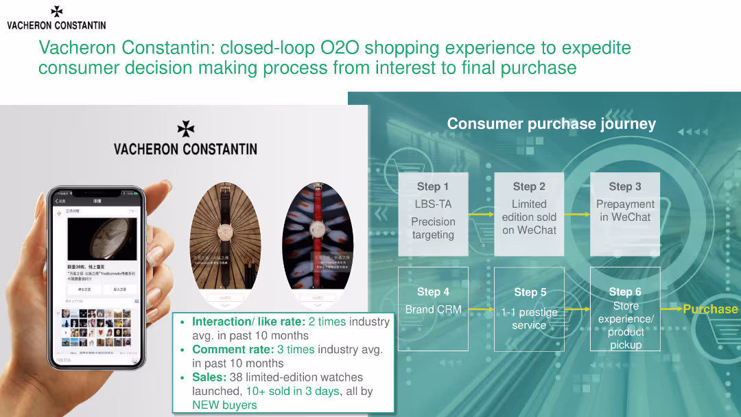
The slide illustrates a consumer purchase journey for Vacheron Constantin, highlighting steps from initial interest to final purchase and showcasing metrics for interaction and sales.
Technology and Digital Transformation
Consumer Goods
This slide details Vacheron Constantin's O2O (online-to-offline) shopping experience, focusing on the consumer purchase journey and key performance metrics such as interaction rates and sales.
consumer journey, O2O shopping, Vacheron Constantin, purchase process, interaction rates
false
Technology and Digital Transformation
Consumer Goods
Header Horizontal
BCG
Add to my slides
Remove from favorites
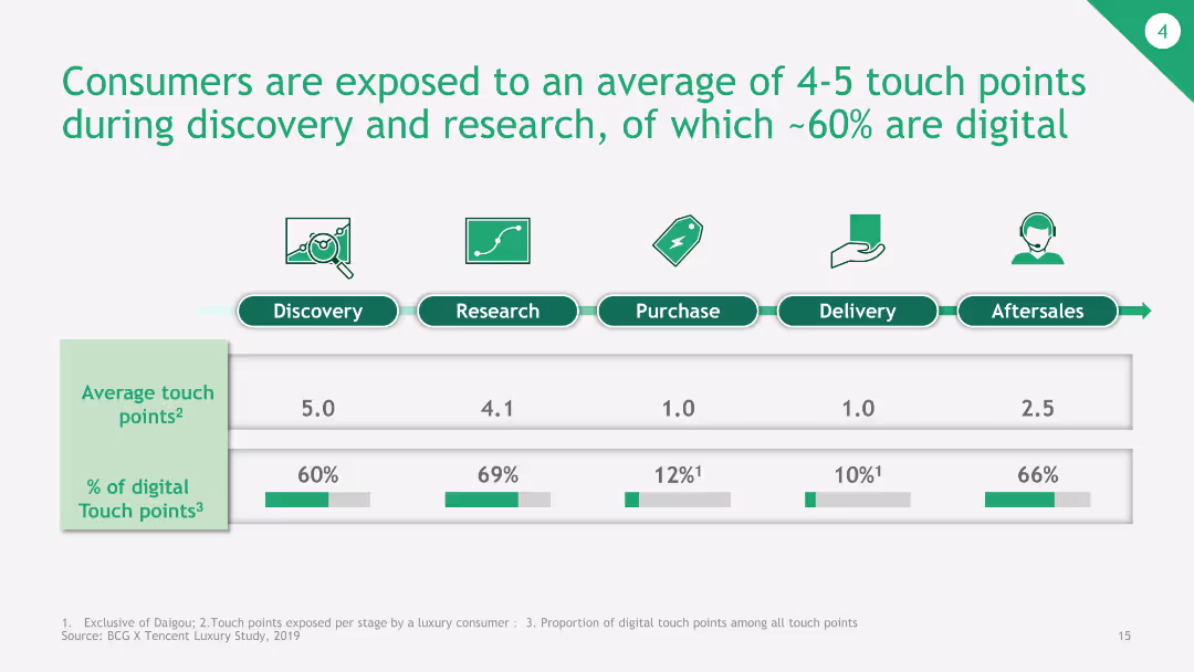
The slide presents a bar chart depicting the average number of touch points during different stages of the consumer journey, with a breakdown of digital touchpoints.
Customer and Market Segmentation
Consumer Goods
This slide shows the average touch points consumers are exposed to during various stages of the buying process, emphasizing the significant role of digital touchpoints.
consumer journey, touch points, digital touchpoints, buying process, average touch points
false
Customer and Market Segmentation
Consumer Goods
Single Chart
BCG
Add to my slides
Remove from favorites
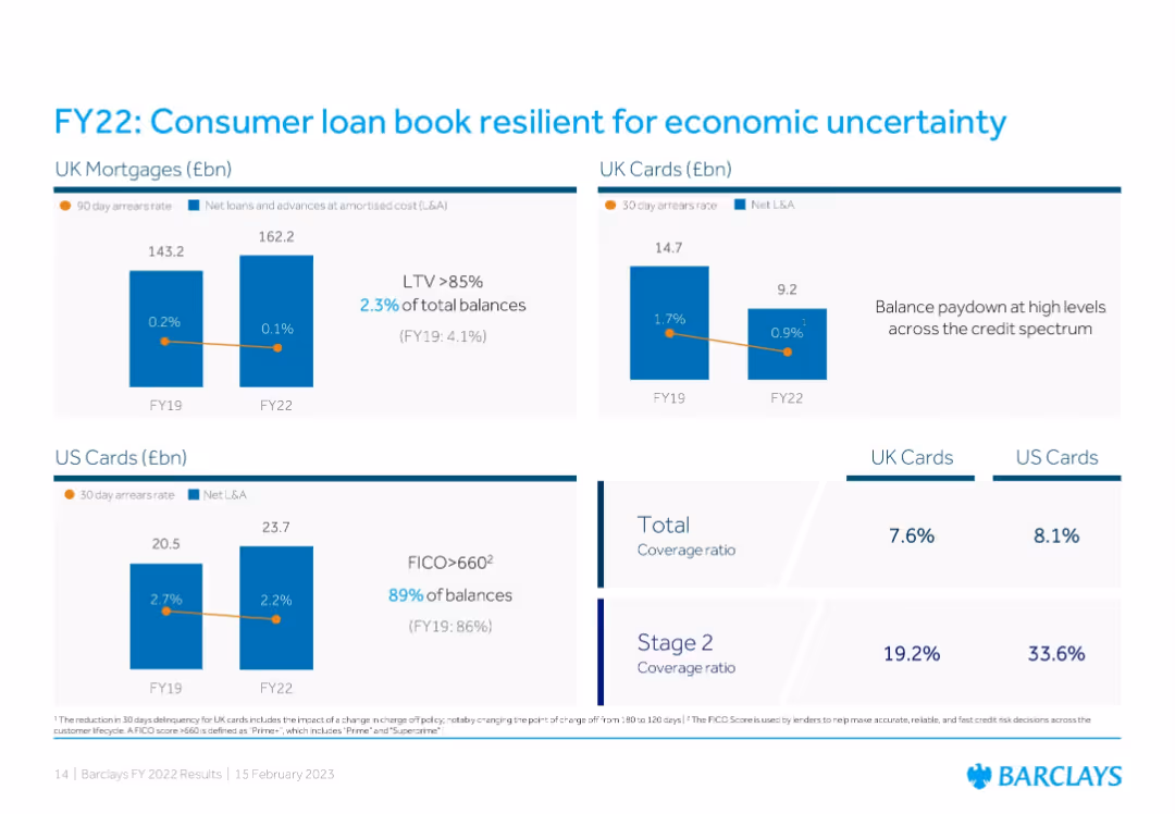
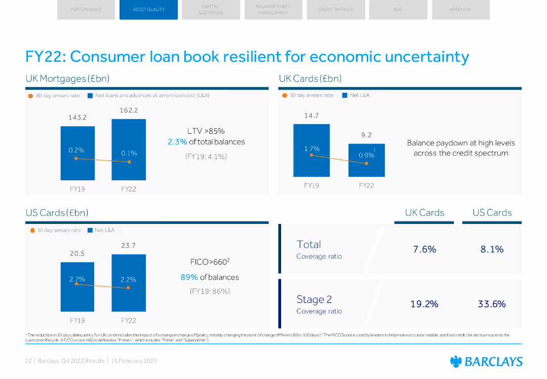
Grid format of three bar chart segments (UK Mortgages, UK Cards, US Cards) showing arrears rates and loan balances from FY19 to FY22; right side includes total and Stage 2 coverage ratio statistics.
Customer and Market Segmentation
Financial Services
Highlights stability and resilience in consumer lending, with improved arrears rates and strong FICO scores. The slide emphasizes prudent underwriting and portfolio strength despite macroeconomic pressures.
consumer loans, arrears, mortgages, credit cards, coverage ratio, FICO, economic uncertainty, lending stability
false
Customer and Market Segmentation
Financial Services
Multiple Chart
Barclays
Add to my slides
Remove from favorites
Pie charts representing FICO scores and homeowner vs renter percentages, alongside column charts for deposit balance changes. Text sections providing additional context.
Risk Assessment and Management
Financial Services
Presentation of the consumer loan portfolio's credit quality, focusing on super prime borrowers and homeowners. Used for discussing risk management and financial stability in lending practices.
consumer loans, credit quality, FICO scores, homeownership, banking, risk management
false
Risk Assessment and Management
Financial Services
Multiple Chart
Morgan Stanley
Add to my slides
Remove from favorites
Column and bar charts with key statistical data, color-coded to distinguish different metrics and types of consumer loans. Simplistic design for easy interpretation.
Market Analysis and Trends
Financial Services
The slide provides an analysis of the consumer loan portfolio, emphasizing key metrics and credit score distribution. It’s often used by financial analysts to assess consumer credit risk and loan performance within a financial institution.
Consumer, Loans, Credit, Risk, Analysis
false
Market Analysis and Trends
Financial Services
Multiple Chart
Morgan Stanley
Add to my slides
Remove from favorites
Column charts showing UK mortgages and US cards' arrears rates and net L&A. Coverage ratios for UK and US cards.
Risk Assessment and Management
Financial Services
Highlights resilience of consumer loan book against economic uncertainty with arrears rates and coverage ratios.
consumer loans, economic uncertainty, arrears rates, UK cards, US cards
false
Risk Assessment and Management
Financial Services
Multiple Chart
Barclays
Add to my slides
Remove from favorites
This slide offers vertical column charts divided by consumer nationality, highlighting their market contributions and trends from 2018 to 2019.
Customer and Market Segmentation
Consumer Goods
Examines the impact of consumer nationality on the luxury goods market in 2019, with a significant focus on Chinese consumers.
Consumer nationality, Market impact, Luxury goods
false
Customer and Market Segmentation
Consumer Goods
Multiple Chart
Bain
Add to my slides
Remove from favorites
The slide features bold purple headers and a large bar graph with percentage changes over time. Data points are highlighted in purple and pink.
Market Analysis and Trends
Financial Services
This slide presents evolving consumer needs, specifically the rising concern for financial security compared to personal health, showcasing the shift in consumer priorities during a specific period.
Consumer needs, Financial security, Personal health, Market trends, Prioritization, Bar graph, Percentage change, Research, Data comparison
false
Market Analysis and Trends
Financial Services
Multiple Chart
Accenture
Add to my slides
Remove from favorites
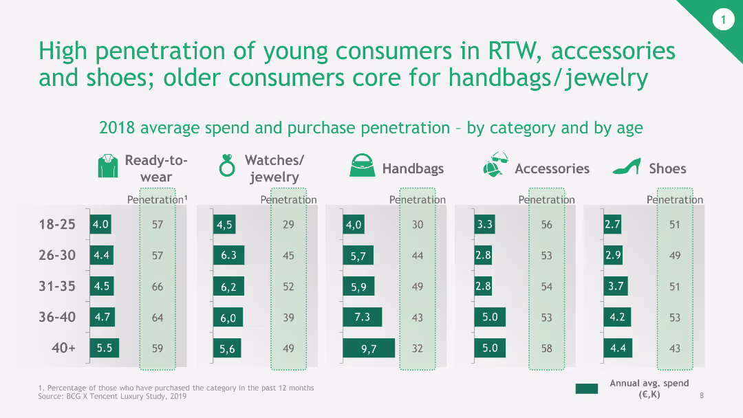
Multiple vertical bar charts showing penetration rates and average annual spend across different product categories and age groups. Green color theme for clarity.
Customer and Market Segmentation
Consumer Goods
The slide analyzes the penetration rates and average spend of young versus older consumers across various luxury categories, such as RTW, accessories, and handbags.
Consumer Penetration, Age Groups, Spending, Product Categories, Luxury Market
false
Customer and Market Segmentation
Consumer Goods
Multiple Chart
BCG
Add to my slides
Remove from favorites
This slide includes a table categorizing consumer personas by various health-related behaviors and preferences, such as digital skills, health data sharing, and virtual care consideration.
Market Analysis and Trends
Healthcare & Pharmaceuticals
It categorizes healthcare consumers into personas based on their digital skills, willingness to share health data, and openness to virtual care, providing insights for engagement strategies.
consumer personas, healthcare, digital skills, health data, virtual care
false
Market Analysis and Trends
Healthcare & Pharmaceuticals
Multiple Chart
EY
Add to my slides
Remove from favorites
The slide shows a bar chart indicating consumer willingness to pay for various connectivity technologies in vehicles. Another bar chart displays preferred payment methods for these technologies.
Market Analysis and Trends
Consumer Goods
This slide presents survey data on consumer preferences and willingness to pay for various car connectivity technologies, highlighting practical use cases such as automated emergency calls and preferred payment methods.
Consumer Preferences, Connectivity, Technology, Payment Methods, Survey Data
false
Market Analysis and Trends
Consumer Goods
Mixed Chart
EY
Add to my slides
Remove from favorites
This slide breaks down digital habits by consumer type across various daily activities, using icons and color coding for clarity and visual appeal.
Customer and Market Segmentation
Technology & Software
Analyzes the digital preferences of different Indonesian consumer types, useful for targeted digital services and marketing.
consumer preferences, digital habits, online activities, segmentation
false
Customer and Market Segmentation
Technology & Software
Header Vertical
Kearney
Add to my slides
Remove from favorites
Slide contains multiple small column charts comparing the use preferences of two age groups (18-25 years, 46+ years) across different channels: social media platforms, virtual reality headsets, and voice assistants. Colors vary in shades of green.
Customer and Market Segmentation
Professional Services
Discusses the shift in consumer preferences, highlighting how younger generations prefer emerging technologies for shopping and interactions. Insights are supported by data from Deloitte's global survey, which notes an increasing trend toward personalization and the use of technology in marketing.
consumer preferences, emerging technology, marketing, personalization, demographics
false
Customer and Market Segmentation
Professional Services
Mixed Chart
Deloitte
Add to my slides
Remove from favorites
Pie charts showing consumer preferences for purchasing financial products from banks vs. non-financial companies, with collaboration insights.
Customer and Market Segmentation
Financial Services
Examines consumer attitudes towards purchasing financial products, emphasizing the importance of banks in the purchase process, even when involving non-financial companies.
consumer preferences, financial products, banks, non-financial companies, collaboration, purchase process, insights, survey
false
Customer and Market Segmentation
Financial Services
Table
Accenture
Add to my slides
Remove from favorites
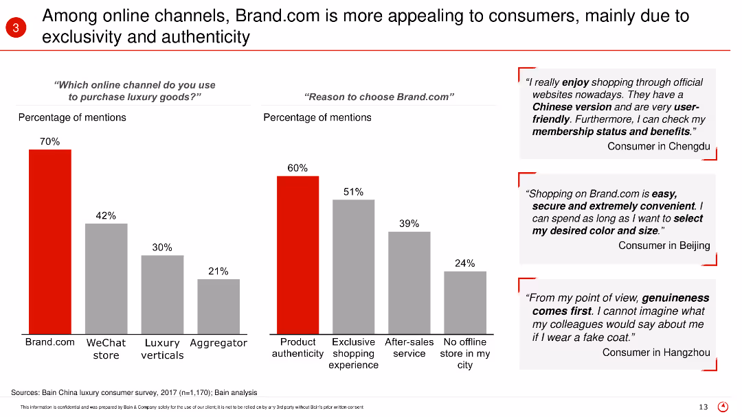
The slide features bar charts showing consumer preferences for different online channels and reasons for choosing Brand.com, with supporting consumer quotes on the right side.
Market Analysis and Trends
Retail & E-commerce
The slide details why Brand.com is favored by consumers over other online channels, focusing on product authenticity, exclusive shopping experiences, and other factors driving consumer choice.
Consumer preferences, online channels, Brand.com, authenticity, exclusivity, survey
false
Market Analysis and Trends
Retail & E-commerce
Multiple Chart
Bain
Add to my slides
Remove from favorites
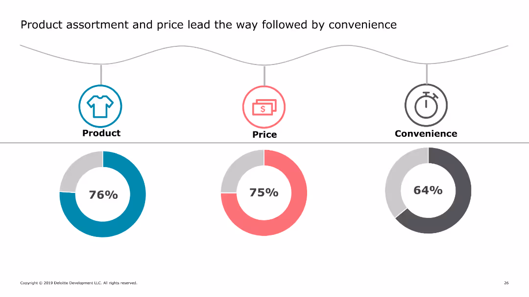
This slide includes three circular icons representing product, price, and convenience, each with a corresponding percentage below it. The icons are color-coded and arranged horizontally across the slide.
Market Analysis and Trends
Retail & E-commerce
The slide highlights key factors influencing consumer purchasing decisions, showing that product assortment, price, and convenience are the top priorities for shoppers.
consumer priorities, product assortment, pricing, convenience, shopping factors
false
Market Analysis and Trends
Retail & E-commerce
Multiple Chart
Deloitte
Add to my slides
Remove from favorites
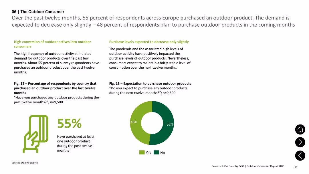
A pie chart and column chart showing the percentage of respondents who purchased outdoor products and future purchase expectations.
Market Analysis and Trends
Consumer Goods
Shows that 55% of respondents purchased outdoor products in the past twelve months and 48% expect to purchase in the next twelve months.
Consumer, Products, Purchases, Future, Outdoor
false
Market Analysis and Trends
Consumer Goods
Mixed Chart
Deloitte
Add to my slides
Remove from favorites
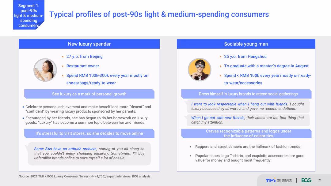
The slide features two detailed consumer profiles with personal information, spending habits, and preferences. It uses a content layout with text and images, providing a vivid portrayal of typical post-90s light & medium-spending consumers. The visual complexity is moderate, with clear, organized sections.
Customer and Market Segmentation
Consumer Goods
This slide presents detailed profiles of two typical post-90s light and medium-spending consumers, including their background, spending behavior, and luxury consumption habits. It aims to humanize market data through relatable examples.
consumer profiles, post-90s, spending habits, luxury market, consumer behavior
false
Customer and Market Segmentation
Consumer Goods
Boxed
BCG
Add to my slides
Remove from favorites
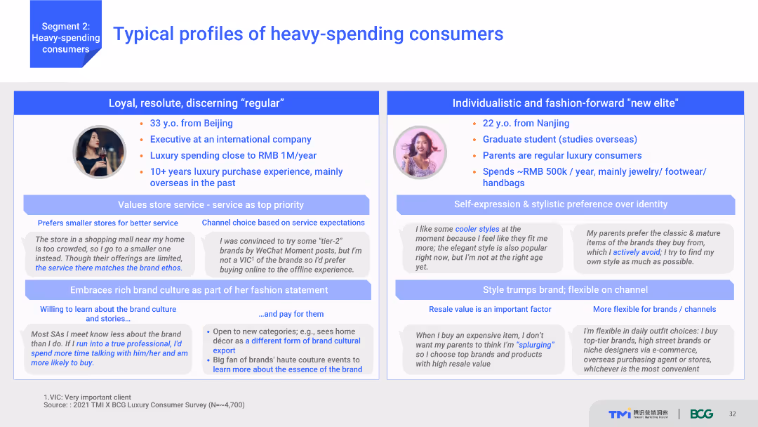
Comparative layout showing two profiles of heavy-spending consumers with detailed descriptions of their demographics, spending habits, and brand preferences. Each profile includes text and supporting graphics.
Market Analysis and Trends
Consumer Goods
Describes typical profiles of heavy-spending consumers, highlighting differences in demographics and spending habits. One profile is a loyal regular consumer, and the other is a fashion-forward new elite.
Consumer profiles, spending habits, demographics, brand preferences, heavy spenders
false
Market Analysis and Trends
Consumer Goods
Boxed
BCG
Add to my slides
Remove from favorites
The slide includes two columns of text with images, and trend assessments.
Technology and Digital Transformation
Technology & Software
Describes consumer profiling and supply chain transparency, highlighting the importance of data analysis and blockchain technology.
Consumer Profiling, Supply Chain, Data Analysis, Blockchain, Transparency, Data Privacy
false
Technology and Digital Transformation
Technology & Software
Multiple Chart
Deloitte
Add to my slides
Remove from favorites
A bar graph on the right compares the number of new digital services adopted by consumers during the pandemic years. The left side details the increase in purchases made in digital services.
Financial Performance
Technology & Software
Examines the growing number of digital service purchases made by existing consumers, indicating market growth and the potential for new service development.
consumer purchases, digital services, pandemic, market growth, service development, adoption rates
false
Financial Performance
Technology & Software
Single Chart
Bain
Add to my slides
Remove from favorites
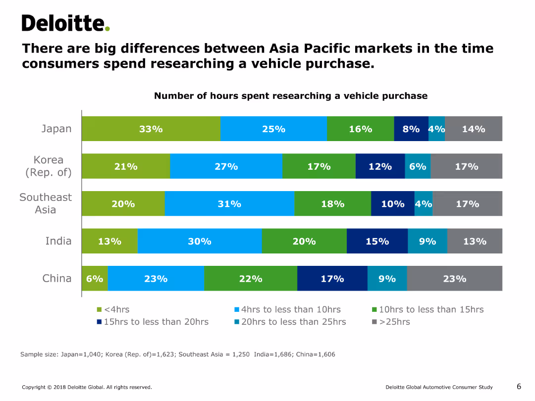
The slide contains a horizontal bar chart (bar chart) depicting the number of hours consumers in different Asia Pacific markets spend researching a vehicle purchase.
Customer and Market Segmentation
Consumer Goods
This slide illustrates the significant differences in the time spent by consumers in Japan, Korea, Southeast Asia, India, and China on researching a vehicle purchase, ranging from less than 4 hours to more than 25 hours.
consumer research, vehicle purchase, bar chart, market segmentation, consumer behavior, automotive industry, Asia Pacific
false
Customer and Market Segmentation
Consumer Goods
Single Chart
Deloitte
Add to my slides
Remove from favorites
A two-column layout with purple headers. Left column has a narrative on customer retention through reliability and value; right column lists the top reasons for promoter and detractor sentiments using numbers. The bottom provides a data source citation. Simple design with textual information and a list.
Market Analysis and Trends
Retail & E-commerce
The slide compares customer retention strategies focusing on reliability and value, illustrating the top reasons customers are promoted to or deterred from a brand. Useful for discussions on marketing strategy and consumer behavior analysis in the retail sector.
consumer retention, reliability, value, promoters, detractors, marketing, brand strategy
false
Market Analysis and Trends
Retail & E-commerce
Agenda
Bain
Add to my slides
Remove from favorites
Contains a column chart highlighting the CAGR for consumer E&M revenue from 2019 to 2024 across multiple countries, with India and Nigeria prominently displayed in red to emphasize their lead. This visual arrangement facilitates quick comparison and trend recognition.
Market Analysis and Trends
Media & Entertainment
This slide underlines the significant growth of consumer E&M revenue in India compared to other global markets, emphasizing India's emerging market status and potential as a primary target for E&M investments. It's particularly useful for stakeholders looking to expand in high-growth regions, offering a strategic overview of promising markets.
consumer revenue, CAGR, India, market growth
false
Market Analysis and Trends
Media & Entertainment
Mixed Chart
PwC/Strategy&
Add to my slides
Remove from favorites
Bar chart comparing the growth rates of different consumer revenue segments in the entertainment and media industry from 2020 to 2025.
Market Analysis and Trends
Media & Entertainment
Forecasts the growth in consumer revenue across various segments, with particular emphasis on OTT video and VR as high-growth areas.
consumer revenue, segment growth, OTT video, VR, 2025 forecast, entertainment, media
false
Market Analysis and Trends
Media & Entertainment
Mixed Chart
PwC/Strategy&
Add to my slides
Remove from favorites
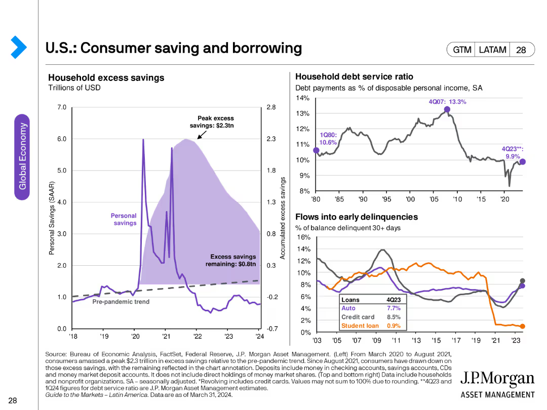
The slide contains three charts: a line chart showing household excess savings, another line chart depicting household debt service ratio, and a line chart for flows into early delinquencies for different loan types.
Market Analysis and Trends
Financial Services
This slide analyzes consumer savings and borrowing trends, highlighting excess savings, debt service ratios, and delinquency rates. Useful for understanding consumer financial health.
consumer savings, borrowing, debt service, delinquencies, financial health, household savings
false
Market Analysis and Trends
Financial Services
Multiple Chart
JP Morgan
Add to my slides
Remove from favorites
Dual panel layout with a large image on the left and a series of bar charts on the right detailing dissatisfaction metrics by generation.
Market Analysis and Trends
Healthcare & Pharmaceuticals
Highlights younger consumers' dissatisfaction with traditional healthcare aspects, including treatment effectiveness and appointment convenience. Used for market analysis.
consumers, dissatisfaction, healthcare, trends, generations
false
Market Analysis and Trends
Healthcare & Pharmaceuticals
Multiple Chart
Accenture
Add to my slides
Remove from favorites
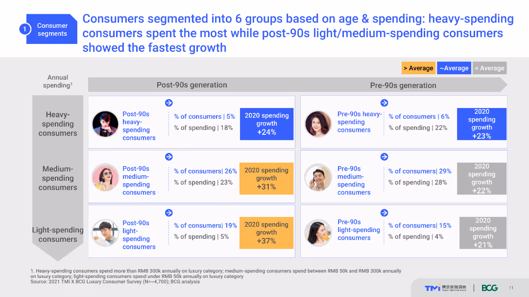
A comparative slide with a table layout, categorizing consumers into six groups by age and spending. It uses various shades of blue and gray for highlighting data points.
Customer and Market Segmentation
Consumer Goods
The slide categorizes consumers into six segments based on age and spending, highlighting their proportions and spending growth for 2020.
Consumer Segments, Age Groups, Spending Patterns, Growth, Segmentation
false
Customer and Market Segmentation
Consumer Goods
Table
BCG
Add to my slides
Remove from favorites
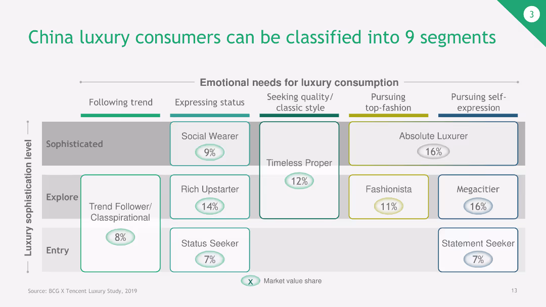
The slide displays a matrix categorizing China luxury consumers into 9 segments based on their emotional needs for luxury consumption and luxury sophistication level.
Customer and Market Segmentation
Consumer Goods
This slide classifies China luxury consumers into nine segments, ranging from trend followers to absolute luxurers, based on their emotional needs and sophistication level.
consumer segments, luxury consumers, China market, emotional needs, luxury sophistication
false
Customer and Market Segmentation
Consumer Goods
Table
BCG
Add to my slides
Remove from favorites
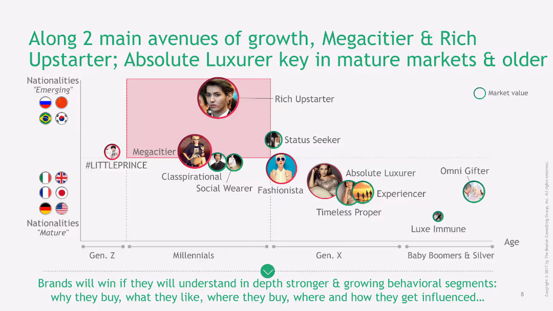
This slide contains a scatter plot with various consumer profiles categorized by generation and nationality. It includes icons and images representing each category, along with labeled axes.
Market Analysis and Trends
Consumer Goods
The slide explores different consumer segments based on age and nationality, highlighting the importance of Megacitier and Rich Upstarter for growth, and Absolute Luxurer in mature markets.
consumer segments, scatter plot, nationality, generation, market analysis
false
Market Analysis and Trends
Consumer Goods
Diagram
BCG
Add to my slides
Remove from favorites
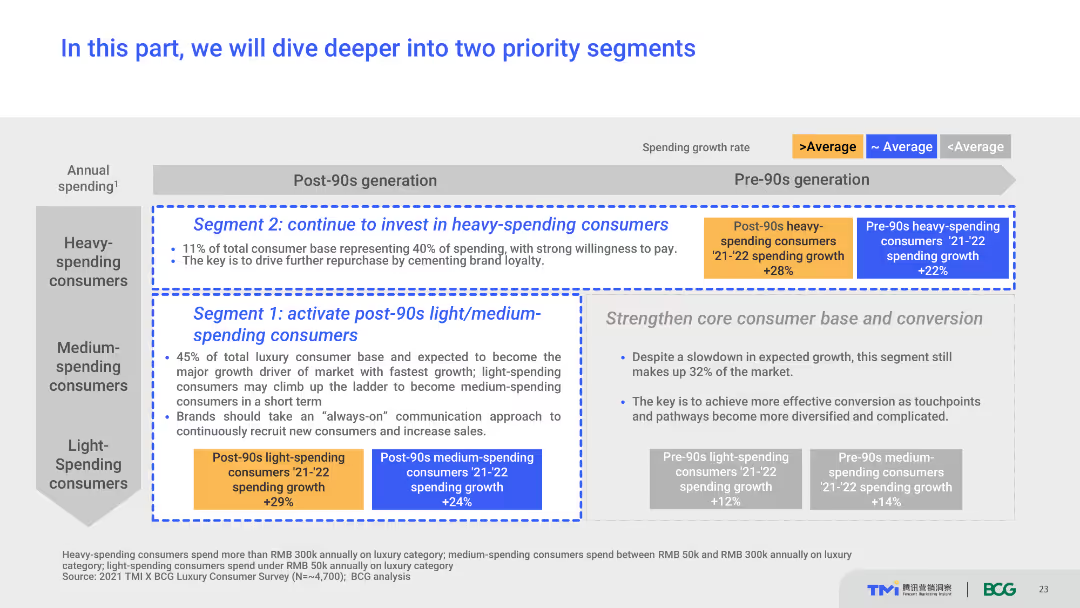
The slide serves as a section header, introducing detailed analysis of two priority consumer segments. It uses a simple layout with text boxes, segment titles, and growth rate indicators. The visual complexity is basic, focusing on text to transition into the next part of the presentation.
Strategic Planning
Consumer Goods
This slide introduces the focus on two priority segments: post-90s light/medium-spending consumers and heavy-spending consumers. It provides a brief overview of the segment characteristics and their significance for the market.
consumer segments, strategic planning, market focus, growth rates, priorities
false
Strategic Planning
Consumer Goods
Table
BCG
Add to my slides
Remove from favorites
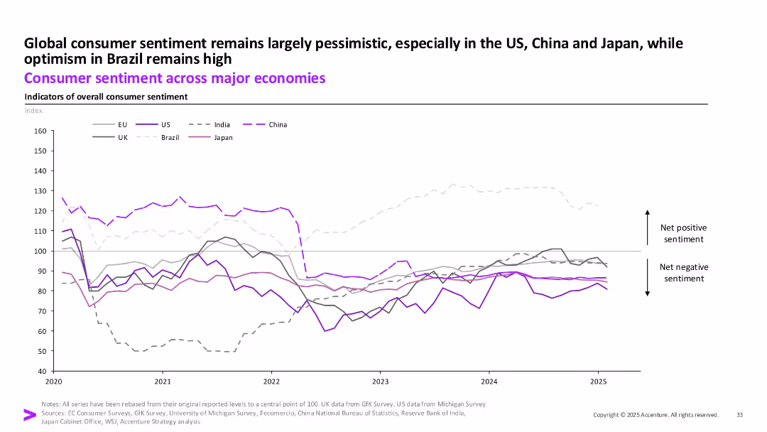
Line chart showing sentiment index trends from 2020 to 2025 across regions (EU, US, India, China, UK, Brazil, Japan).
Strategic Planning
Financial Services
The chart reflects long-term consumer sentiment trends. While Brazil remains optimistic, most other economies like the US, China, and Japan are entrenched in negative sentiment zones, showing low consumer confidence.
Consumer Sentiment, Brazil, Pessimism, Global Outlook, Index, Confidence, 2025
false
Strategic Planning
Financial Services
Single Chart
Accenture
Add to my slides
Remove from favorites
Slide presents survey data on consumer attitudes and spending habits post-COVID in bar charts and a list of top consumer attitudes, emphasizing technology's impact.
Market Analysis and Trends
Financial Services
Analyzes Chinese consumer optimism and spending trends post-COVID, highlighting a significant shift towards online spending. Useful for market sentiment analysis.
consumer sentiment, China, COVID-19, spending habits, technology, online shopping
false
Market Analysis and Trends
Financial Services
Mixed Chart
BCG
Add to my slides
Remove from favorites
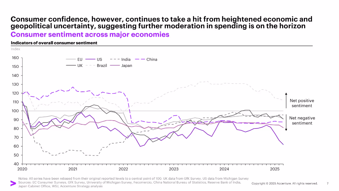
Line chart tracking consumer sentiment across major economies over time (2020–2025), segmented by country.
Market Analysis and Trends
Professional Services
Demonstrates declining consumer confidence since 2022, with major dips in China and Brazil. The chart reflects ongoing geopolitical and economic uncertainties that affect spending behavior globally.
consumer sentiment, confidence, macro trends, global outlook, economy
false
Market Analysis and Trends
Professional Services
Single Chart
Accenture
Add to my slides
Remove from favorites
A stacked bar chart comparing consumer sentiment at various stages of the buyer journey, supplemented by a textual summary on the left detailing the methodology and findings.
Customer and Market Segmentation
Retail & E-commerce
Highlights the discrepancy between consumer experiences and business perceptions in digital services across multiple industries, showing varying degrees of satisfaction.
consumer sentiment, digital commerce, buyer journey, business perception, dissatisfaction, methodology, industries, consumer experience
false
Customer and Market Segmentation
Retail & E-commerce
Mixed Chart
Accenture
Add to my slides
Remove from favorites
The slide contains a line chart of consumer sentiment and a stacked bar chart of household real disposable income growth contributions by source.
Market Analysis and Trends
Financial Services
This slide reviews consumer sentiment trends and household income growth in Australia, providing insights into economic conditions and consumer behavior.
consumer sentiment, disposable income, Australia, economic conditions, household income
false
Market Analysis and Trends
Financial Services
Multiple Chart
JP Morgan
Add to my slides
Remove from favorites
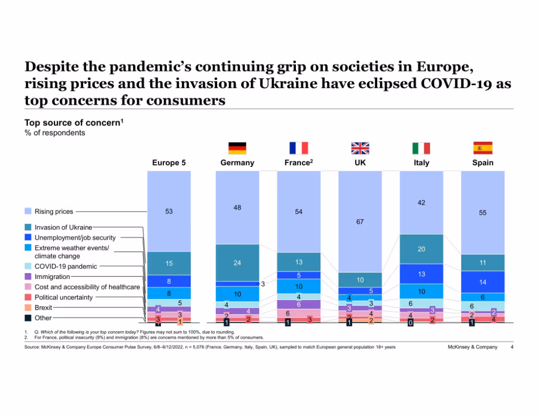
Stacked bar chart comparing top consumer concerns across six European countries. Light-to-dark shades differentiate issues. Flags and country labels at the top.
Market Analysis and Trends
Consumer Goods
This slide presents data on the top consumer concerns across major European markets. Rising prices and the Ukraine conflict have overtaken COVID-19 and other issues as primary concerns. Germany, France, and the UK show variations in prioritization.
consumer sentiment, Europe, inflation, Ukraine war, COVID-19, survey, economic anxiety, regional comparison, concerns ranking
false
Market Analysis and Trends
Consumer Goods
Single Chart
McKinsey
Add to my slides
Remove from favorites
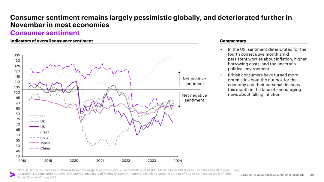
The slide features a line graph showing indicators of overall consumer sentiment for the EU, UK, US, Brazil, India, Japan, and China from 2018 to 2024. Commentary on the right.
Market Analysis and Trends
Consumer Goods
The slide shows largely pessimistic global consumer sentiment with a deterioration in most economies in November.
consumer sentiment, EU, UK, US, Brazil, India, Japan, China, pessimism, line graph
false
Market Analysis and Trends
Consumer Goods
Mixed Chart
Accenture
Add to my slides
Remove from favorites
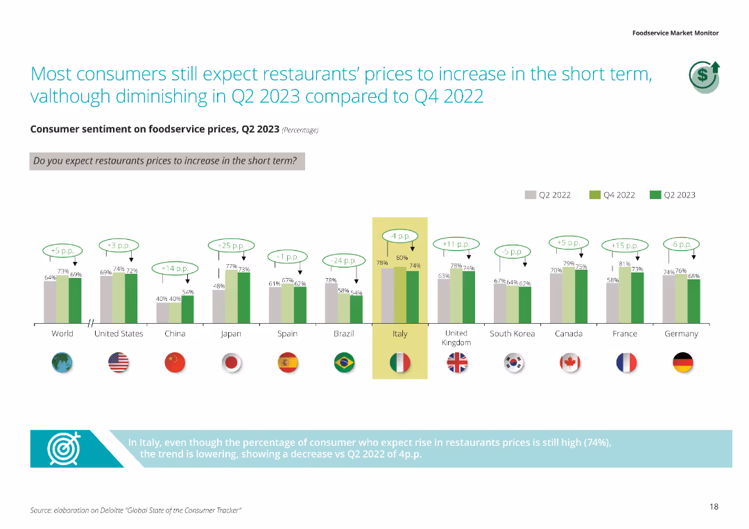
The slide features a column chart comparing consumer sentiment on foodservice prices in Q2 2023 with previous quarters, highlighting the expectations of price increases by country.
Market Analysis and Trends
Hospitality & Tourism
This slide discusses consumer expectations regarding restaurant price increases in the short term, showing a comparative analysis of sentiment across various countries and highlighting Italy's decreasing trend.
Consumer sentiment, foodservice prices, price increase, short term, country comparison
false
Market Analysis and Trends
Hospitality & Tourism
Single Chart
Deloitte
Add to my slides
Remove from favorites
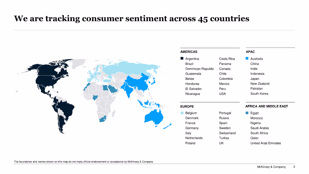
Features a world map highlighting 45 countries being monitored for consumer sentiment, with specific countries marked in different colors.
Market Analysis and Trends
Professional Services
The slide provides an overview of the global consumer sentiment tracking initiative, identifying the countries being analyzed for consumer trends and behaviors.
consumer sentiment, global tracking, market analysis, countries, trends
false
Market Analysis and Trends
Professional Services
Graphic
McKinsey
Add to my slides
Remove from favorites
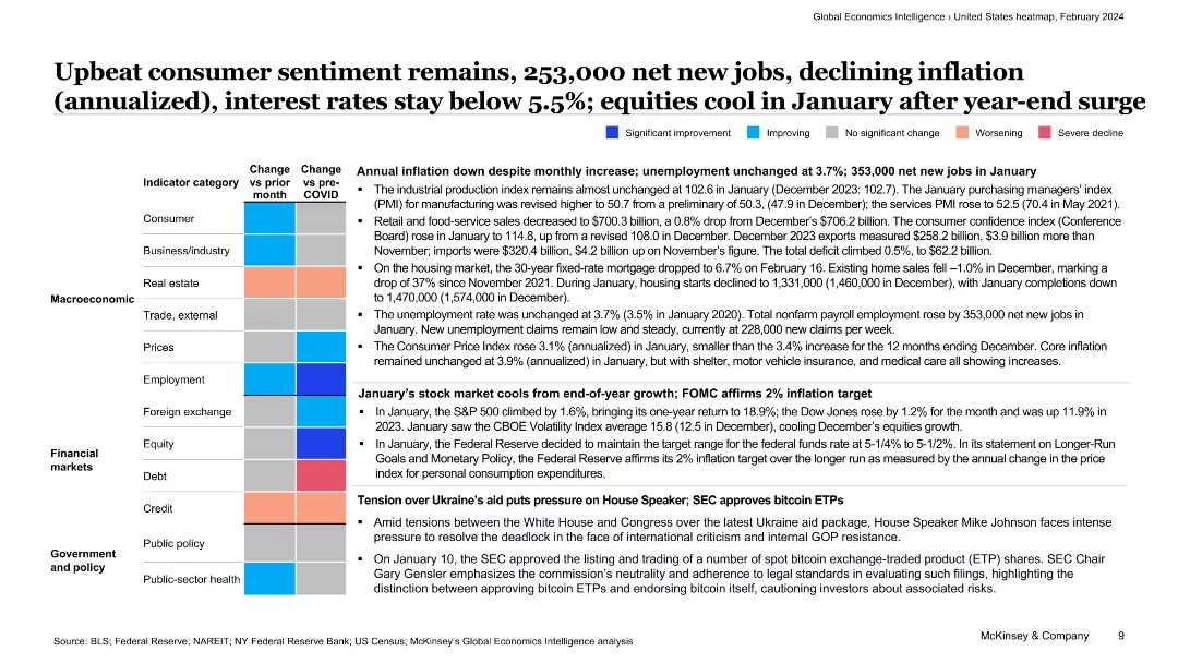
The slide features a colorful table summarizing key economic indicators with text providing context on consumer sentiment, job creation, and inflation trends.
Market Analysis and Trends
Financial Services
This slide presents an overview of the US economy, highlighting consumer sentiment, job creation, and inflation, supported by a detailed table of economic indicators.
consumer sentiment, jobs, inflation, economy, financial services, overview, trends, economic indicators, analysis, market conditions
false
Market Analysis and Trends
Financial Services
Table
McKinsey
Add to my slides
Remove from favorites
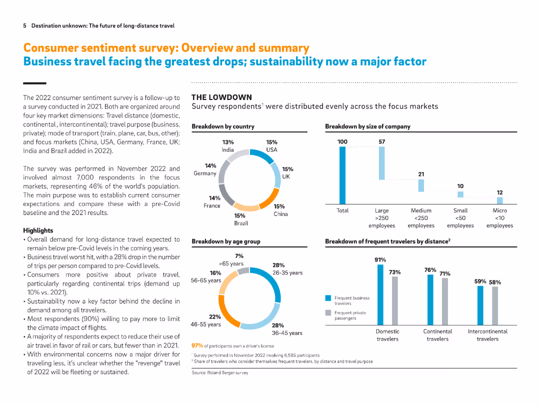
Pie charts and bar graphs with supportive text. Visual breakdowns by geography, company size, age group, and distance of travel.
Market Analysis and Trends
Transportation & Logistics
This slide summarizes consumer sentiment on long-distance travel from a global survey. It highlights generational and geographic insights, emphasizing declines in business travel and growth in private travel intentions. Sustainability and virtual communication emerge as key factors.
Consumer sentiment, long-distance travel, sustainability, virtual communication, business travel, demographics, survey
false
Market Analysis and Trends
Transportation & Logistics
Multiple Chart
Roland Berger
Add to my slides
Remove from favorites
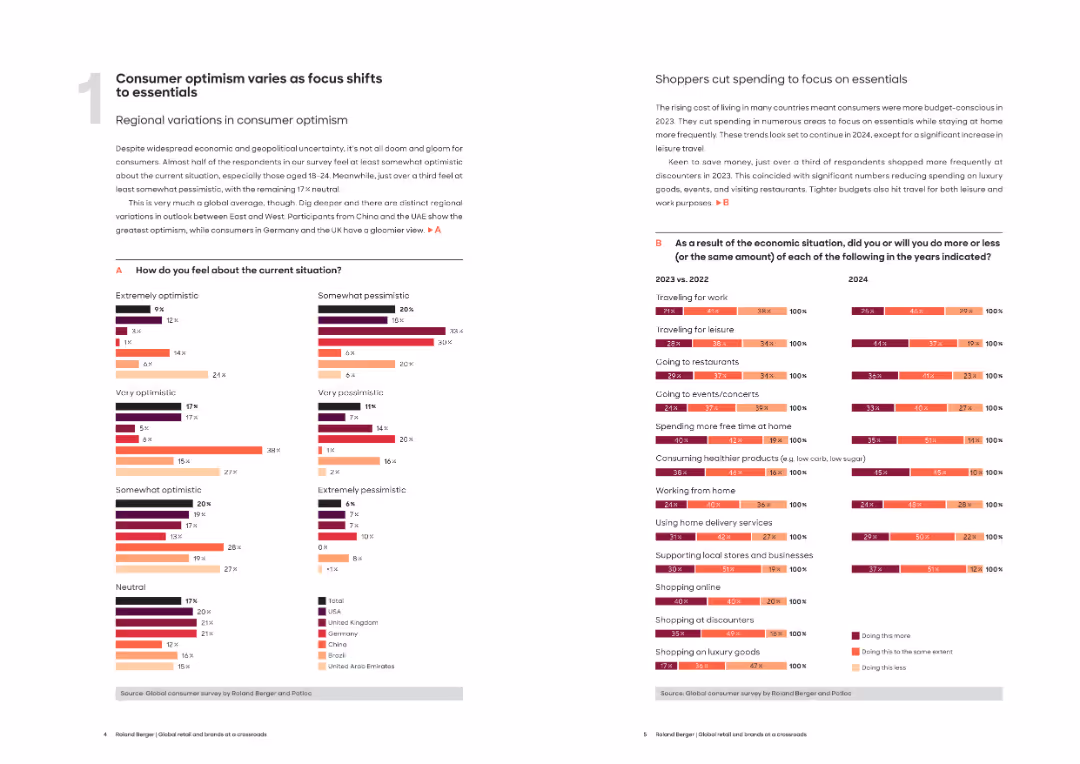
Two-page spread with left page on consumer sentiment (with bar charts) and right page on consumer behavior trends with horizontal bar charts.
Market Analysis and Trends
Consumer Goods
This slide presents regional differences in consumer optimism and behavioral shifts due to economic conditions. Key findings include a focus on essentials and budget-conscious spending across categories like travel, food, and online shopping.
consumer sentiment, optimism, economic outlook, spending trends, essentials, travel, online shopping, cost of living, global survey
false
Market Analysis and Trends
Consumer Goods
Multiple Chart
Roland Berger
Add to my slides
Remove from favorites
Slide features a dual-pane layout with bar charts and percentage statistics.
Market Analysis and Trends
Retail & E-commerce
Examines expected consumer behaviors and potential challenges for retailers in 2022.
consumer sentiment, retail, headwinds, 2022, market analysis
false
Market Analysis and Trends
Retail & E-commerce
Mixed Chart
Deloitte
Add to my slides
Remove from favorites
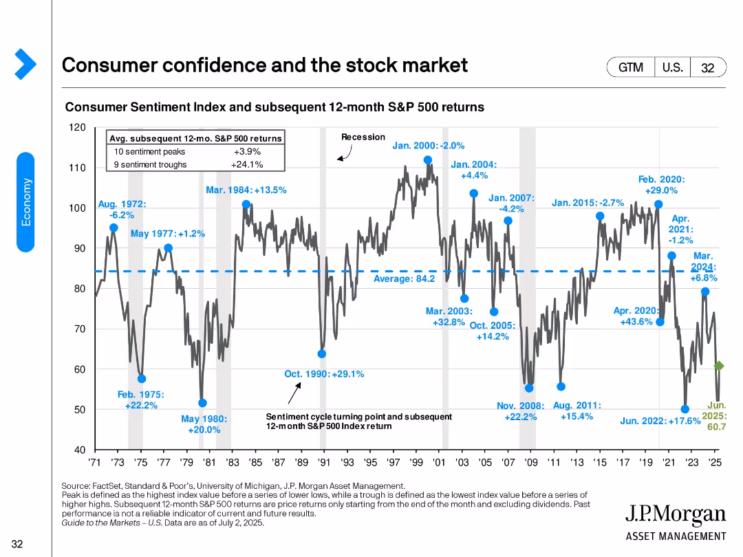
A long-term line chart showing the Consumer Sentiment Index with key peaks/troughs and associated S&P 500 returns over the next 12 months.
Market Analysis and Trends
Financial Services
This slide examines how U.S. consumer sentiment correlates with subsequent 12-month S&P 500 returns. It highlights turning points in sentiment and their implications for market performance, identifying bullish opportunities post-troughs.
consumer sentiment, stock market, S&P 500, market timing, behavioral finance, recession
false
Market Analysis and Trends
Financial Services
Single Chart
JP Morgan
Add to my slides
Remove from favorites
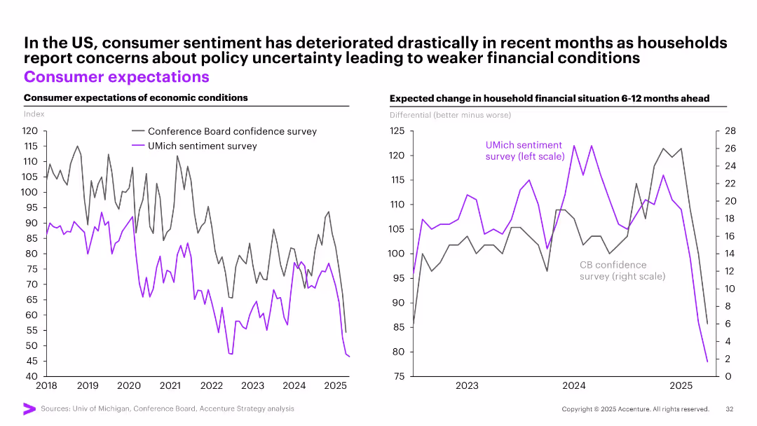
Dual line charts comparing US consumer expectations from two different sentiment surveys over time.
Market Analysis and Trends
Financial Services
The slide shows a marked decline in consumer sentiment in the US based on two major surveys (Conference Board and UMich), reflecting rising concerns over future economic and financial conditions amid policy uncertainty.
consumer sentiment, US economy, surveys, financial outlook, expectations, decline, uncertainty, economic mood
false
Market Analysis and Trends
Financial Services
Multiple Chart
Accenture
Add to my slides
Remove from favorites
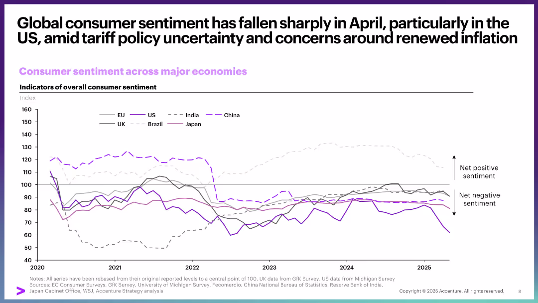
Line chart comparing consumer sentiment across countries from 2020 to 2025. Minimalist layout with gray and purple tones and a sentiment axis.
Market Analysis and Trends
Consumer Goods
The slide depicts a notable decline in US consumer sentiment due to tariff-related policy uncertainty and inflation concerns. It compares trends across global economies, highlighting diverging consumer confidence levels.
consumer sentiment, US, tariffs, inflation, global comparison, trends, economic confidence, surveys
false
Market Analysis and Trends
Consumer Goods
Single Chart
Accenture
Add to my slides
Remove from favorites
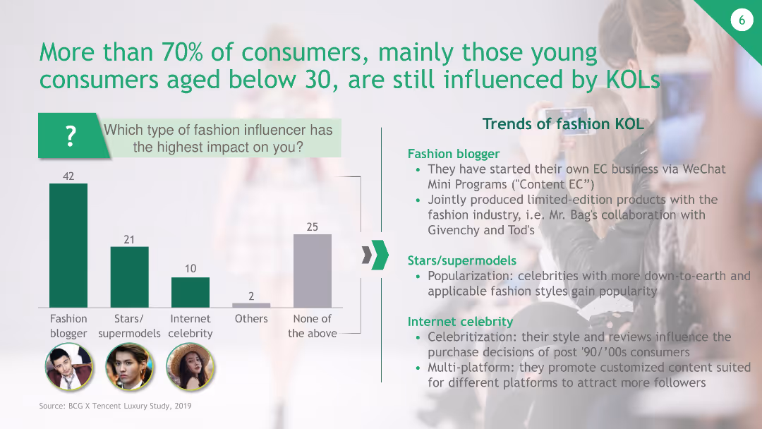
The slide features a column chart indicating the influence of different types of fashion influencers on consumers, especially those under 30. It includes a list of trends for fashion KOLs.
Customer and Market Segmentation
Media & Entertainment
The slide shows that over 70% of young consumers are influenced by KOLs, with fashion bloggers having the highest impact, followed by stars/supermodels and internet celebrities. Trends in fashion KOLs are also discussed.
consumers, KOLs, fashion influencers, young consumers, WeChat
false
Customer and Market Segmentation
Media & Entertainment
Mixed Chart
BCG
Add to my slides
Remove from favorites
Utilizes pie charts to compare consumer and advertising spending in different regions, with a focus on trends and shifts in spending patterns.
Market Analysis and Trends
Media & Entertainment
Discusses trends in consumer and advertising spending within the media industry, noting shifts towards digital platforms and subscription models.
consumer spending, advertising, media, digital platforms, subscription models
false
Market Analysis and Trends
Media & Entertainment
Multiple Chart
PwC/Strategy&
Add to my slides
Remove from favorites
This slide presents a stacked bar chart detailing changes in spending across various categories like broadband, mobile services, and entertainment. Each category is clearly labeled and color-coded for easy interpretation.
Market Analysis and Trends
Technology & Software
Evaluates how economic factors, such as inflation, impact consumer spending on broadband and other digital services, highlighting trends in consumer behavior and market dynamics.
consumer spending, broadband, digital services, entertainment, economic impact, inflation, market analysis, consumer behavior, spending trends, telecommunications
false
Market Analysis and Trends
Technology & Software
Single Chart
Deloitte
Add to my slides
Remove from favorites
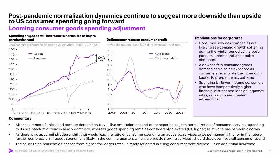
The slide features two line charts comparing real consumer spending on goods vs. services and delinquency rates on consumer credit. Commentary and implications for corporates are included.
Market Analysis and Trends
Consumer Goods
The slide analyzes post-pandemic consumer spending trends and delinquency rates. It forecasts potential adjustments in consumer goods spending and implications for businesses.
consumer spending, credit delinquency, market trends, post-pandemic, financial analysis
false
Market Analysis and Trends
Consumer Goods
Multiple Chart
Accenture
Add to my slides
Remove from favorites
This slide offers a variety of data visualizations, including column and bar charts, detailing spending and credit use.
Risk Assessment and Management
Financial Services
Analyzes consumer spending patterns and credit card usage, providing insights on discretionary and non-discretionary spending.
consumer spending, credit usage, balance sheets, discretionary spending, JPMorgan Chase & Co, financial analysis
false
Risk Assessment and Management
Financial Services
Multiple Chart
JP Morgan
Add to my slides
Remove from favorites
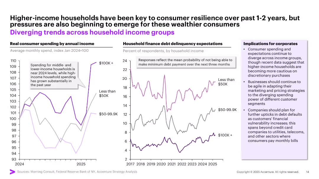
Two-panel layout: line charts on left and right show trends in consumer spending and debt expectations by income level; side note box lists implications; consistent use of purple and gray tones.
Market Analysis and Trends
Financial Services
The slide compares real consumer spending and debt delinquency expectations across three income brackets. It shows that high-income households have driven resilience but are starting to feel pressure, while lower-income groups remain financially vulnerable. Key corporate implications include the need for adaptive marketing and preparation for rising debt defaults.
consumer spending, debt expectations, income groups, financial pressure, corporate planning
false
Market Analysis and Trends
Financial Services
Multiple Chart
Accenture
Add to my slides
Remove from favorites
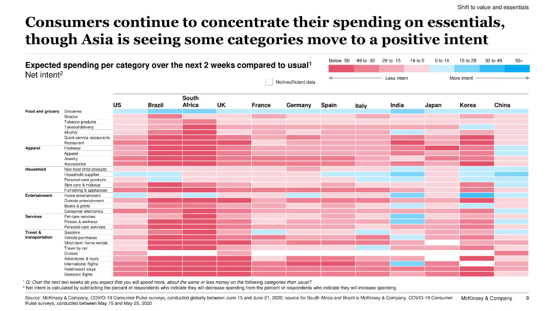
This slide features a heatmap chart showing expected spending per category over the next two weeks compared to usual, across various countries.
Market Analysis and Trends
Retail & E-commerce
The slide analyzes expected consumer spending by category over the next two weeks, noting a concentration on essentials and some positive intent in Asian countries.
consumer spending, essentials, Asia, positive intent, heatmap, spending categories, survey, next two weeks, comparison
false
Market Analysis and Trends
Retail & E-commerce
Table
McKinsey
Add to my slides
Remove from favorites
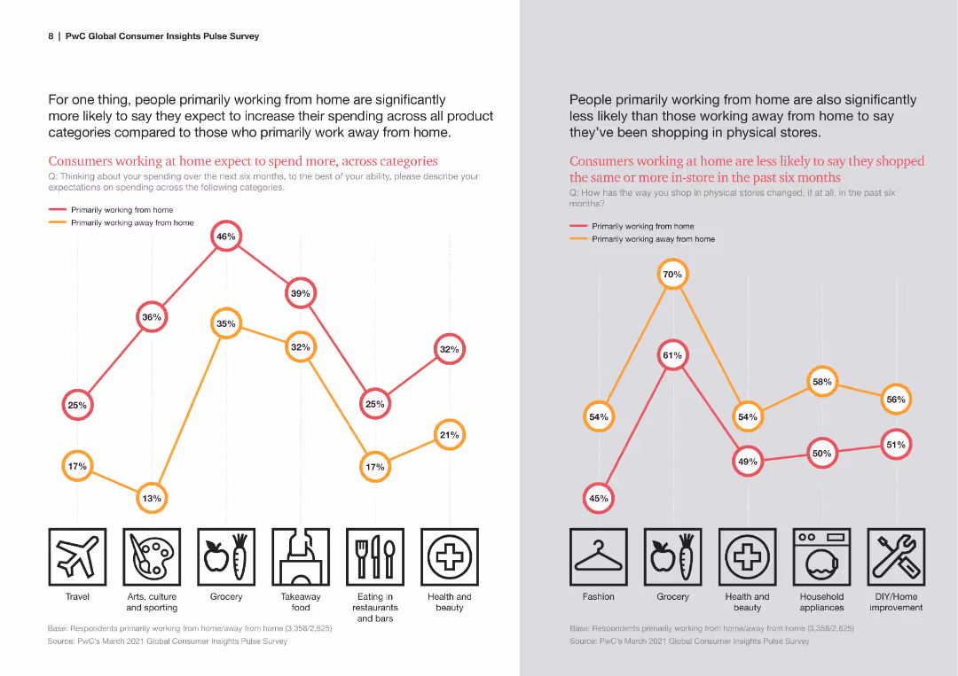
Line chart comparing spending expectations across various categories for those working from home vs. those working away.
Market Analysis and Trends
Retail & E-commerce
This slide analyzes how working from home vs. working away impacts consumer spending expectations in different categories.
consumer spending, expectations, working from home, categories, comparison
false
Market Analysis and Trends
Retail & E-commerce
Multiple Chart
PwC/Strategy&
Add to my slides
Remove from favorites
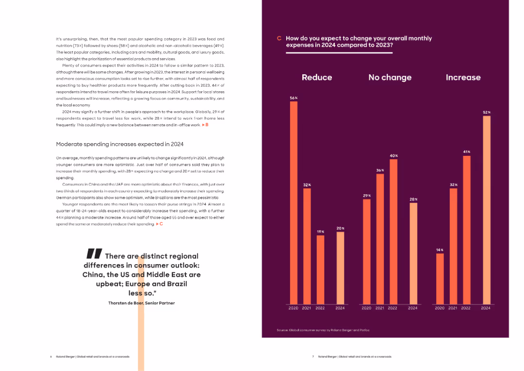
Left side with narrative text, right side features a bar chart comparing expense changes over years. Emphasis on dark background and orange/red bars.
Market Analysis and Trends
Consumer Goods
This slide highlights expected changes in consumer spending behavior for 2024. Over half of respondents expect to maintain or increase spending, particularly younger and optimistic segments in China and the UAE. Visuals show spending evolution since 2020.
consumer spending, expenses, 2024 forecast, optimism, financial outlook, regional variation, income, budgeting, survey
false
Market Analysis and Trends
Consumer Goods
Mixed Chart
Roland Berger
Add to my slides
Remove from favorites
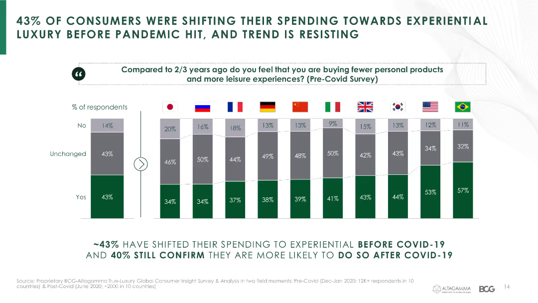
This slide presents a column chart with data on consumer spending shifts towards experiential luxury, comparing pre- and post-COVID-19 trends across various countries.
Market Analysis and Trends
Consumer Goods
It highlights the trend of consumers shifting their spending towards experiential luxury both before and after the pandemic.
consumer spending, experiential luxury, COVID-19, spending trends, country comparison
false
Market Analysis and Trends
Consumer Goods
Multiple Chart
BCG
Add to my slides
Remove from favorites
The slide uses bar charts to show the percentage of spend on various fitness products/services in 2020 versus 2022. It segments the data by at-home, outside of home, and digital categories, with additional focus on differences in spending habits between men and women.
Market Analysis and Trends
Healthcare & Pharmaceuticals
Analyzes shifts in consumer spending on fitness products/services, showing a trend towards at-home and digital solutions. Highlights gender differences and future spending intentions. Useful for understanding consumer allocation of budget in fitness and strategic planning for market positioning.
Consumer spending, fitness products, gender comparison, market analysis, digital solutions
false
Market Analysis and Trends
Healthcare & Pharmaceuticals
Mixed Chart
McKinsey
Add to my slides
Remove from favorites
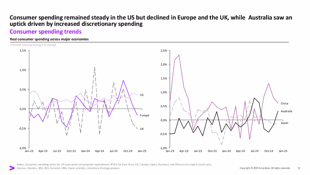
Dual-line charts displaying 3-month moving avg % changes in real consumer spending across major economies from Jan 2023 to Jan 2025.
Market Analysis and Trends
Consumer Goods
This slide compares consumer spending trends across global economies. US spending remains steady, while Europe and the UK decline. Australia shows discretionary-driven growth. China and Japan show volatility.
Consumer Spending, Global Trends, Real Spending, US, UK, Europe, China, Australia, Japan
false
Market Analysis and Trends
Consumer Goods
Multiple Chart
Accenture
Add to my slides
Remove from favorites
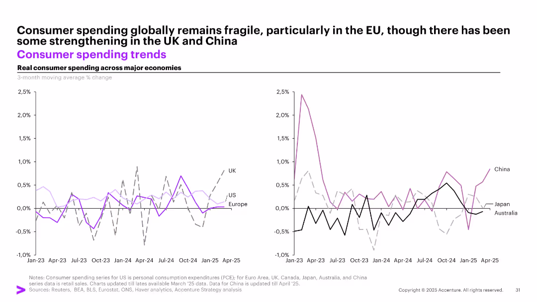
Dual line graphs showing real consumer spending trends for major economies, segmented into Western (left) and APAC (right) regions.
Market Analysis and Trends
Consumer Goods
Real consumer spending trends show fragility in the EU and US, with some rebound in the UK and China. The graphs track 3-month moving average % changes across countries like UK, US, China, and others from Jan 2023 to Apr 2025.
consumer spending, global trends, UK, China, US, retail, APAC, EU, fragility, economic activity
false
Market Analysis and Trends
Consumer Goods
Multiple Chart
Accenture
Add to my slides
Remove from favorites
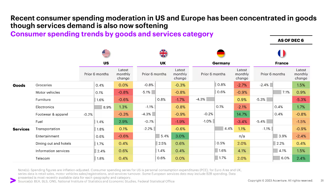
The slide presents a table comparing consumer spending trends in goods and services categories across the US, UK, Germany, and France as of December 6.
Market Analysis and Trends
Consumer Goods
The slide details recent moderation in consumer spending in the US and Europe, highlighting changes in various goods and services.
consumer spending, goods, services, trends, US, UK, Germany, France, table
false
Market Analysis and Trends
Consumer Goods
Multiple Chart
Accenture
Add to my slides
Remove from favorites
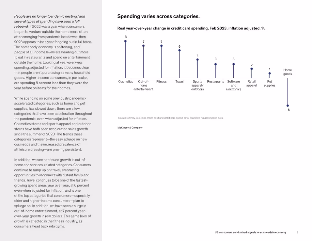
Split layout: left side contains narrative text in paragraph form; right side features a vertical dot plot chart showing % change in credit card spending across various categories. Clean, minimal layout with consistent typography.
Market Analysis and Trends
Consumer Goods
This slide highlights shifting consumer spending patterns in early 2023, showing increased spending in entertainment, travel, fitness, and cosmetics, while spending on home goods and pet supplies declined. The analysis focuses on how inflation-adjusted spending has changed year-over-year, particularly among higher-income consumers.
consumer spending, inflation, categories, travel, entertainment, retail
false
Market Analysis and Trends
Consumer Goods
Mixed Chart
McKinsey
Add to my slides
Remove from favorites
Contains a pie chart showing consumer expenditure weights and a bar chart with month-on-month inflation changes. Includes a summary of key insights and outlook.
Market Analysis and Trends
Consumer Goods
Analyzes the impact of increased costs on consumer spending, highlighting inflation in food and transport sectors, and the influence of energy prices.
consumer spending, inflation, goods, services, 2023, food, transport, energy prices, expenditure
false
Market Analysis and Trends
Consumer Goods
Mixed Chart
PwC/Strategy&
Add to my slides
Remove from favorites
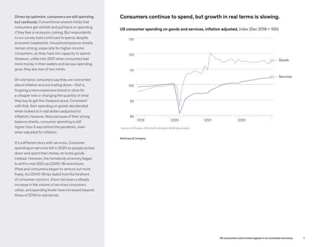
Right side features a dual-line chart (goods vs. services spending), while left side includes a narrative discussing inflation-adjusted trends.
Market Analysis and Trends
Consumer Goods
Despite inflation, consumer spending has remained high, particularly on services. However, inflation-adjusted growth is slowing for goods. This slide outlines the divergent post-pandemic spending trends between goods and services.
consumer spending, inflation, goods vs. services, economic trends, real terms growth, post-pandemic
false
Market Analysis and Trends
Consumer Goods
Mixed Chart
McKinsey
Add to my slides
Remove from favorites
A slide that combines an image capturing consumer interaction with icons and data on consumer spending, effectively communicating the impact of promoter status on spending habits.
Financial Performance
Retail & E-commerce
The slide visually demonstrates the economic impact of promoter customers in the retail sector, indicating their higher spending across various categories, which is valuable for discussions on consumer behavior and targeting strategies.
consumer spending, promoter impact, retail economics, customer behavior, financial analysis, targeting strategies
false
Financial Performance
Retail & E-commerce
Boxed
Bain
Add to my slides
Remove from favorites
Line and bar charts illustrating US nominal and real retail sales indexes and y/y percentage change in real personal consumer expenditures.
Market Analysis and Trends
Consumer Goods
Analyzes how consumer spending slowed at the start of the year due to cost fatigue and softer employment trends, projecting future moderation.
consumer spending, retail sales, personal expenditures, cost fatigue, employment trends, line chart, bar chart, US economy
false
Market Analysis and Trends
Consumer Goods
Multiple Chart
EY
Add to my slides
Remove from favorites
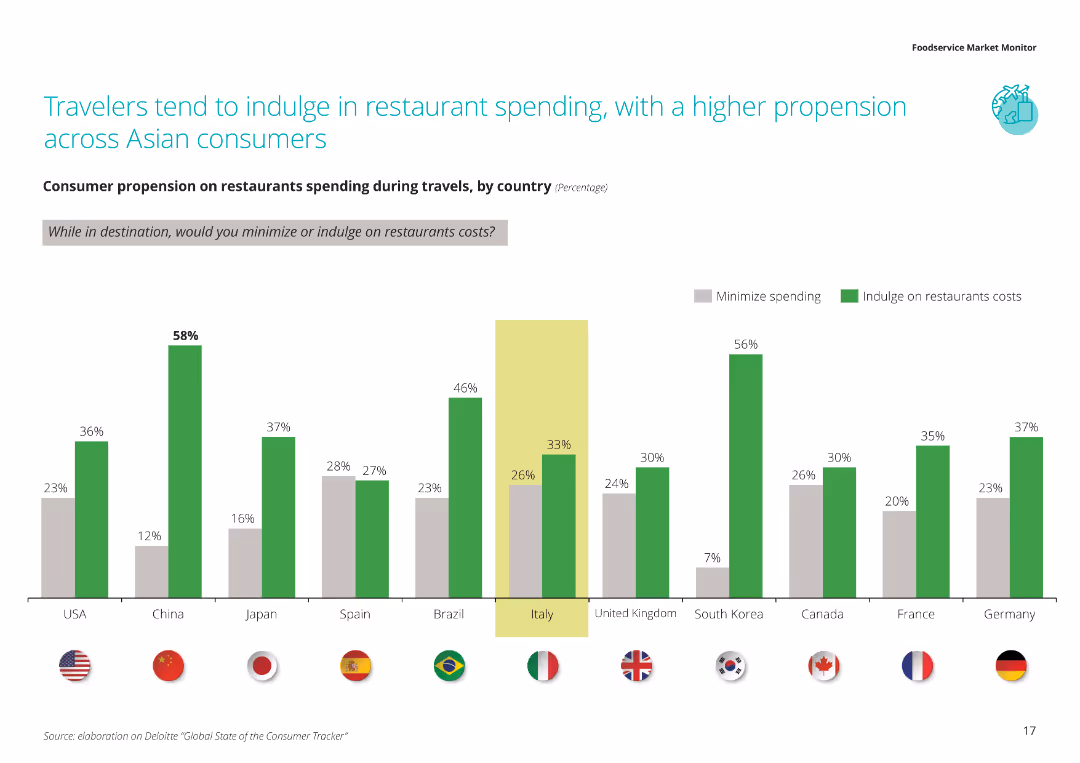
The slide shows a column chart depicting consumer propensity to minimize or indulge in restaurant spending during travels, broken down by country.
Market Analysis and Trends
Hospitality & Tourism
This slide examines consumer spending behavior in restaurants during travel, with a focus on the tendency of Asian consumers to indulge more compared to those from other regions.
Consumer spending, travel, restaurants, spending behavior, country comparison
false
Market Analysis and Trends
Hospitality & Tourism
Single Chart
Deloitte
Add to my slides
Remove from favorites
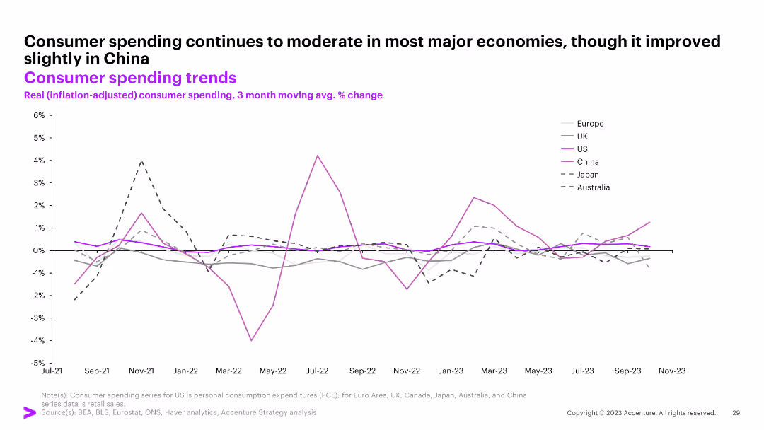
The slide shows a line graph tracking real (inflation-adjusted) consumer spending trends for Europe, UK, US, China, Japan, and Australia from July 2021 to November 2023.
Market Analysis and Trends
Consumer Goods
The slide indicates a moderation in consumer spending across major economies with a slight improvement in China.
consumer spending, trends, inflation-adjusted, Europe, UK, US, China, Japan, Australia, line graph
false
Market Analysis and Trends
Consumer Goods
Single Chart
Accenture
Add to my slides
Remove from favorites
Previous
Next
You don't have any favorites yet.
Please wait loading your favorites slides...
Create a FREE account to continue browsing
Receive Instant Access to 1,000+ slides from companies like McKinsey, Google, and Goldman Sachs
First Name
Last Name
Email
Password
I agree to all
Terms & Privacy Policy
Thank you! Your submission has been received!
Oops! Something went wrong while submitting the form.
Have an account?
Sign in
Upgrade to PRO to Save slides
Advanced Search and Filters
Access to 15,000+ slides
Access to Category Pages
Save/Bookmark Slides
PowerPoint Template Library
Pick a Plan
MONTHLY
$12/month
Billed every month, Cancel anytime.
YEARLY
$9/year
Billed $108 annually, Cancel anytime.
Checkout for $12/month
Checkout for $108/yr
Secured by Stripe | AES-256 bit encryption