My Account
My Slides
Search by Category
Companies
Slide Type
Use Case
Industry
Pricing
Templates
View All Templates
Download Template Slides
✦ AI
AI Prompt Library
AI Search
Feedback
Login
Logout
Get Started
Browse all Slides
Browse all Slides
Create a FREE Account
Instant access to 1,000+ real slides from top companies like McKinsey, BCG, Goldman Sachs, Google and many more!
First Name
Last Name
Email
Password
I agree to all
Terms & Privacy Policy
Thank you! Your submission has been received!
Oops! Something went wrong while submitting the form.
Have an account?
Sign in
Saved Slides
Total No. of slides saved
0
↻ Refresh
✖ Clear all
Dense text and graphics detailing 'Digital Twins' technology, its maturity, and applicability in industries, alongside sidebars for additional insights.
Technology and Digital Transformation
Technology & Software
Offers a deep dive into the technology of digital twins, explaining its functionality, benefits to companies, and industry applications. The slide also assesses the maturity and future development horizons of this technology.
Digital twins, technology analysis, industry application
false
Technology and Digital Transformation
Technology & Software
Header Horizontal
McKinsey
Add to my slides
Remove from favorites
The slide presents a data-driven layout with bullet points, icons, and statistics to showcase the capabilities in digital-underwriting and data analytics.
Technology and Digital Transformation
Financial Services
Describes JPMorgan Chase's data assets and their applications in digital-underwriting, credit line increases, and fraud detection to improve efficiency and customer experience.
Digital-underwriting, data analytics, fraud detection, efficiency, customer experience
false
Technology and Digital Transformation
Financial Services
Pillar
JP Morgan
Add to my slides
Remove from favorites
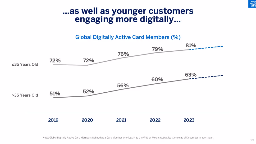
Line chart comparing digital activity by age group (≤35 vs. >35) over time from 2019–2023.
Customer and Market Segmentation
Financial Services
The slide shows that younger card members (≤35 years) are consistently more digitally active than older users, with both segments increasing in activity. It underscores demographic-based strategies for digital engagement.
digital usage, age segments, customer behavior, tech adoption, Amex members, generational trends, user engagement
false
Customer and Market Segmentation
Financial Services
Single Chart
McKinsey
Add to my slides
Remove from favorites
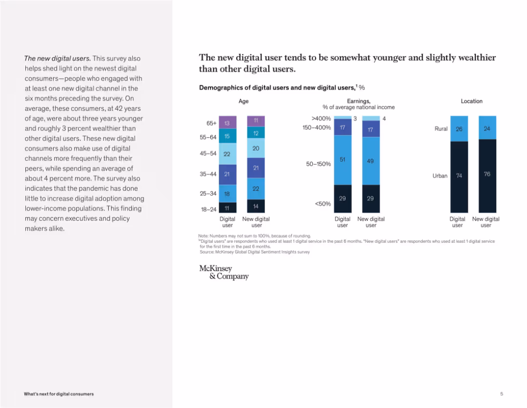
Split layout: text explanation on left, segmented bar charts on right showing age, income, and location comparisons. Minimalist with McKinsey branding.
Customer and Market Segmentation
Technology & Software
The slide outlines demographic traits of new digital users, who are younger and wealthier than traditional users. It uses charts to show differences in age brackets, earnings, and urban vs. rural distribution, highlighting increased digital usage among these newer segments.
digital users, demographics, income, urban, rural, age groups, segmentation, McKinsey, adoption, technology
false
Customer and Market Segmentation
Technology & Software
Mixed Chart
McKinsey
Add to my slides
Remove from favorites
Slide with three column charts showing digital video revenues by device type (desktop vs. mobile) over three years. Red and black colors highlight differences.
Financial Performance
Media & Entertainment
Presents digital video revenue trends from 2018 to 2020, emphasizing the substantial growth in mobile video revenue as a percentage of total digital video earnings.
digital video, revenue, mobile, desktop, trend, 2018-2020
false
Financial Performance
Media & Entertainment
Single Chart
PwC/Strategy&
Add to my slides
Remove from favorites
Gartner Hype Cycle diagram for the digital workplace in 2020, showing different stages from innovation trigger to plateau of productivity.
Technology and Digital Transformation
Technology & Software
The slide presents the Gartner Hype Cycle for the digital workplace, illustrating the impact of the pandemic on accelerating digitalization. It highlights the various stages of workplace technologies and the future expectations for innovations that could enhance productivity and collaboration.
Digital Workplace, Pandemic, Hype Cycle
false
Technology and Digital Transformation
Technology & Software
Mixed Chart
Roland Berger
Add to my slides
Remove from favorites
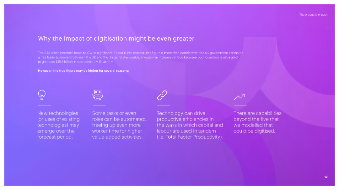
A visually engaging slide with a title, subtitle, and icons representing various reasons why digitisation can have a greater impact. Includes concise text explanations for each point.
Strategic Planning
Technology & Software
The slide argues that the impact of digitisation could be more significant due to new technologies, automation, productivity efficiencies, and capabilities beyond current projections.
digitisation, impact, new technologies, automation, productivity efficiencies
false
Strategic Planning
Technology & Software
Pillar
Accenture
Add to my slides
Remove from favorites
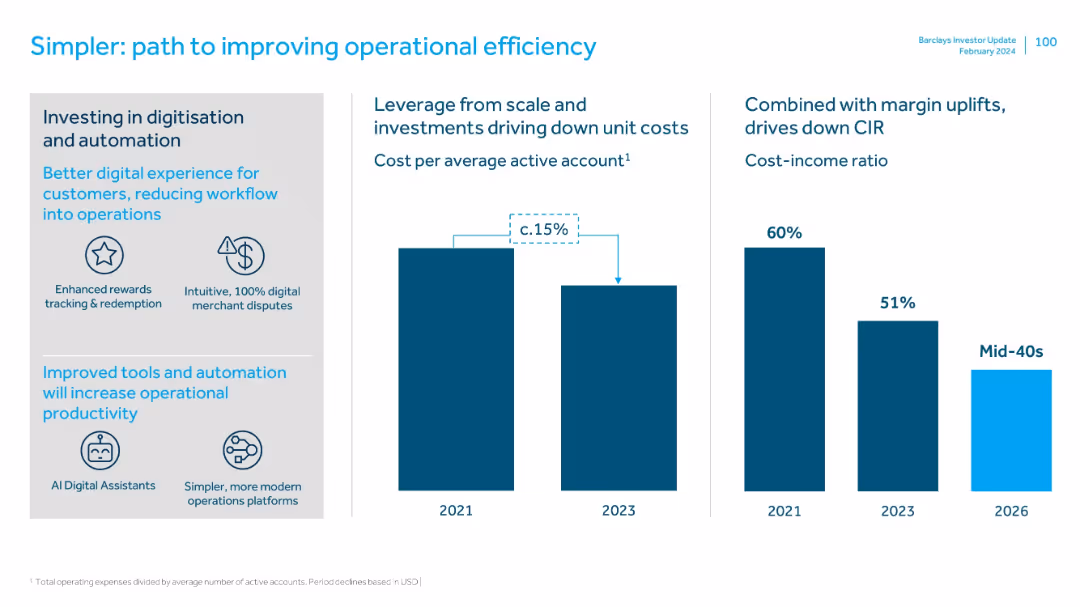
Three-panel layout: investment areas on left, cost impact in center, CIR reduction on right. Uses icons and bar charts.
Operational Efficiency
Financial Services
Describes investments in digitization and automation that are reducing unit costs and operational inefficiencies. Shows cost savings and CIR reduction from 2021 to a projected mid-40s% by 2026.
digitization, automation, cost savings, CIR, operational efficiency, AI tools, scaling
false
Operational Efficiency
Financial Services
Multiple Chart
Barclays
Add to my slides
Remove from favorites
Features a timeline with three column charts at different time intervals, showcasing the growth in digitization. The background and charts use a minimal color palette for clarity.
Market Analysis and Trends
Technology & Software
Examines the increasing digital divide over time, with specific focus on leading sectors versus the rest of the US economy. It provides a clear, historical perspective on the progression of digitization.
digitization, digital divide, leading sectors, growth
false
Market Analysis and Trends
Technology & Software
Single Chart
McKinsey
Add to my slides
Remove from favorites
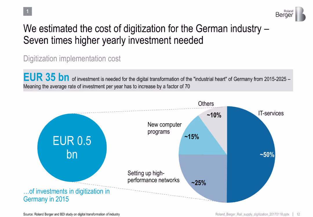
Split design: left side shows current vs required digitization investment; right side pie chart shows digitization spending allocation
Technology and Digital Transformation
Industrial & Manufacturing
Shows the significant gap between current and required investment for digitizing German industry by 2025, detailing categories like IT services and networks.
digitization, German industry, IT investment, digital transformation, capital expenditure, automation, infrastructure
false
Technology and Digital Transformation
Industrial & Manufacturing
Mixed Chart
Roland Berger
Add to my slides
Remove from favorites
The slide features a colorful index grid titled 'MGI Sector Digitization Index' comparing various sectors in terms of digital assets, usage, and labor. Accompanying the grid is a legend explaining the degree of digitization.
Market Analysis and Trends
Technology & Software
The slide provides an analysis of digitization levels across different sectors using an index that evaluates digital assets, usage, and labor. Each sector is color-coded to indicate its relative degree of digitization. This serves as a strategic tool to understand where digitization is most advanced and where there is potential for growth, aiding in decision-making for digital transformation initiatives.
Digitization Index, Sectors, Assets, Usage, Labor, ICT, Media, Finance, Manufacturing, Services, B2B, Technology Adoption
false
Market Analysis and Trends
Technology & Software
Mixed Chart
McKinsey
Add to my slides
Remove from favorites
Slide contains two columns, left column with text, right with a bar chart showing technology investment percentages
Technology and Digital Transformation
Financial Services
Discusses increased investments by wealth management firms in technology for compliance and client data management, highlighting growing trends.
digitization, investment, technology, compliance, data management, wealth management, financial services
false
Technology and Digital Transformation
Financial Services
Mixed Chart
Deloitte
Add to my slides
Remove from favorites
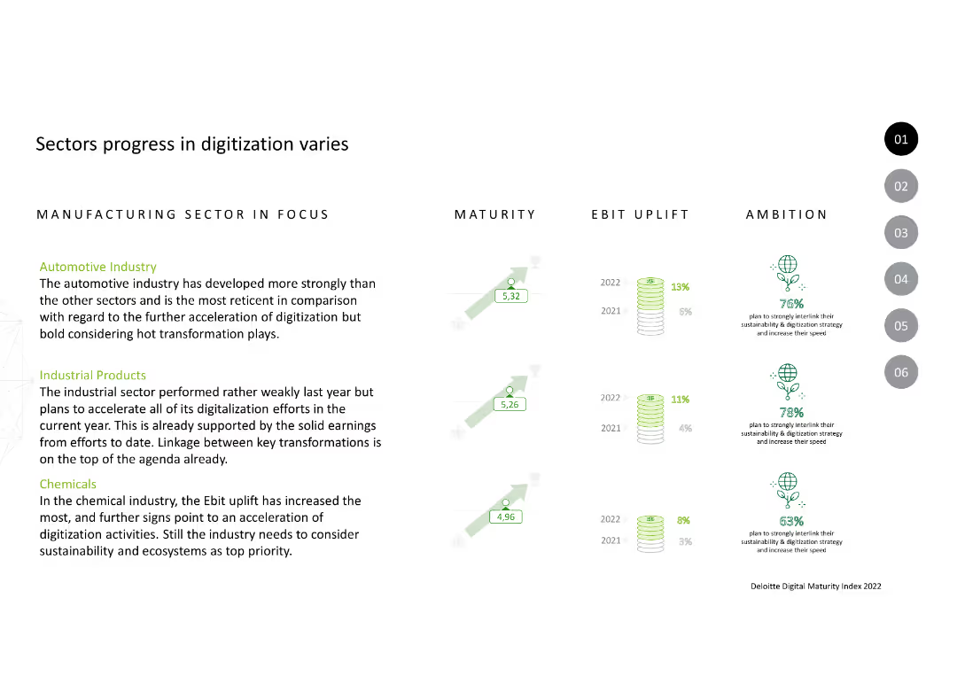
The slide compares three sectors: Automotive, Industrial Products, and Chemicals. It includes text descriptions, maturity ratings, EBIT uplift percentages, and ambition icons for each sector.
Market Analysis and Trends
Industrial & Manufacturing
The slide details how different sectors are progressing in digitization, focusing on maturity, EBIT uplift, and sustainability ambitions.
Digitization, Maturity, EBIT, Automotive, Industrial, Chemicals, Sustainability, Transformation
false
Market Analysis and Trends
Industrial & Manufacturing
Multiple Chart
Deloitte
Add to my slides
Remove from favorites
This slide features a white and orange title against a grayscale molecular design in the background. It lists three opportunities and challenges related to digitization, such as 'Digitization for growth', 'Digitization of Globalization', and 'Digitization of Work', with the third point highlighted.
Strategic Planning
Professional Services
The slide highlights the key areas of focus for digitization strategies. It outlines the main sections of a strategic presentation that will delve deeper into each area, making it suitable for executive briefings or strategic planning sessions focused on digital transformation challenges and opportunities.
digitization, opportunities, challenges, growth, globalization, work, strategy
false
Strategic Planning
Professional Services
Agenda
McKinsey
Add to my slides
Remove from favorites
This slide mirrors the layout of slide 1852 with the same title, list, and background design. However, no particular point is highlighted on this slide.
Strategic Planning
Professional Services
This slide serves a similar purpose as slide 1852, possibly used earlier in a presentation to introduce the upcoming discussion points on digitization without emphasizing a particular focus area.
digitization, opportunities, challenges, introduction, strategic planning, presentation
false
Strategic Planning
Professional Services
Agenda
McKinsey
Add to my slides
Remove from favorites
Graphs, data matrix, and a strong purple and white color theme.
Strategic Planning
Technology & Software
The slide emphasizes the executive focus on digitizing supply chains for transforming business models. It shows a prioritization matrix with different digital transformation aspects rated on importance. Ideal for discussing strategic planning and digital transformation initiatives in the technology industry, where the priority is to enhance supply chain operations through digital advancements.
Digitization, Supply Chain, C-Suite, Transformation, Business Models, Technology, Strategic Planning, Digital Advancements, Operations, Priority
false
Strategic Planning
Technology & Software
Table
Accenture
Add to my slides
Remove from favorites
This slide contains a large pie chart showing the percentage of the US economy impacted by digitization, with a list of examples to its right. Additionally, there is a series of stacked horizontal bars representing different categories of digital engagement, with percentages next to each bar.
Industry Overview
Technology & Software
This slide illustrates the vast impact of digitization on the US economy, denoting that a significant majority is affected. Accompanying examples provide context for various sectors within the economy. The horizontal bar graph categorizes different aspects of digital engagement by percentage, from retail e-commerce to high-speed internet access, emphasizing the pervasive nature of digitization.
Digitization, US Economy, Digital Engagement, E-commerce, ICT Investment, Smartphones, Streaming Services, Technology Adoption
false
Industry Overview
Technology & Software
Multiple Chart
McKinsey
Add to my slides
Remove from favorites
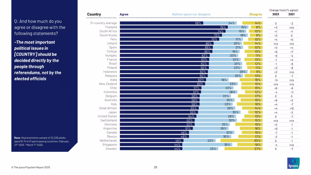
Bar chart ranked by agreement with the statement advocating for referendums over elected officials’ decisions; changes from 2021 are included.
Market Analysis and Trends
Government & Public Sector
This visual shows support for direct democracy (referendums) across countries. Thailand, South Africa, and South Korea have high support, while Sweden and Singapore are lower. Japan sits at 55% agreement.
direct democracy, referendums, political issues, public opinion, Ipsos, governance, 2025, participation, elite
false
Market Analysis and Trends
Government & Public Sector
Mixed Chart
IPSOS
Add to my slides
Remove from favorites
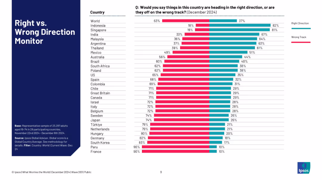
Horizontal bar chart sorted by perception; national data ranked by % saying country is on wrong track.
Strategic Planning
Government & Public Sector
This slide ranks 29 countries by how many citizens feel their country is heading in the wrong vs. right direction. Indonesia and Singapore are most optimistic, while France and South Korea are the most pessimistic.
direction, perception, Ipsos, optimism, pessimism, global comparison, strategic insights, public sentiment, governance, polling
false
Strategic Planning
Government & Public Sector
Mixed Chart
IPSOS
Add to my slides
Remove from favorites
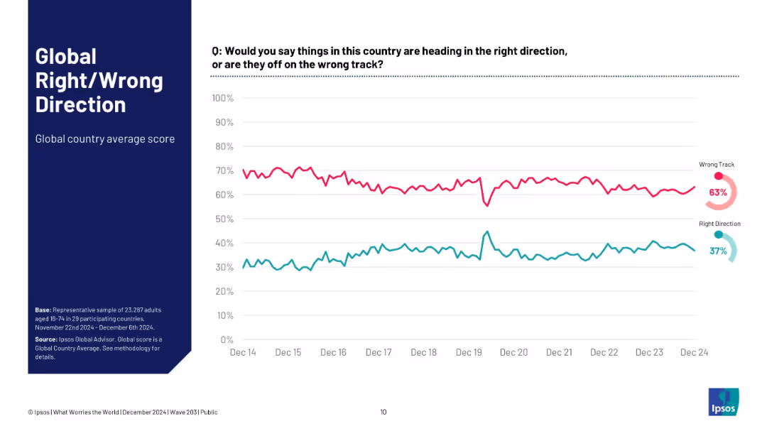
Full-width time-series line chart; visualizes percentage of people believing country is on right/wrong track.
Market Analysis and Trends
Professional Services
This slide tracks a global average of sentiment on national direction over the last 10 years. While there is volatility, a clear long-term trend shows more people believing things are on the wrong track. The gap remains persistent, reflecting ongoing global discontent.
direction sentiment, wrong track, global average, Ipsos, perception trend, dissatisfaction, 10-year trend
false
Market Analysis and Trends
Professional Services
Multiple Chart
IPSOS
Add to my slides
Remove from favorites
Single line chart tracking long-term global averages of direction sentiment; minimal text and clean layout.
Strategic Planning
Government & Public Sector
This slide presents a historical overview of global public sentiment on whether countries are headed in the right or wrong direction. Since 2014, most respondents believe things are off track globally.
direction, wrong track, Ipsos, global sentiment, trendline, public opinion, historical data, perception, pessimism, confidence
false
Strategic Planning
Government & Public Sector
Multiple Chart
IPSOS
Add to my slides
Remove from favorites
The slide features a column chart illustrating the ratio of direct to distributed traffic based on an alternative approach, considering outlet homepages within the last 5 steps and excluding subsequent visits. Detailed annotations included.
Market Analysis and Trends
Media & Entertainment
This slide presents an alternative approach to analyzing the ratio of direct to distributed traffic, focusing on outlet homepages within the last 5 steps before reaching news articles and excluding subsequent visits, highlighting traffic patterns.
Direct Traffic, Distributed Traffic, Alternative Approach, Column Chart, Traffic Ratio
false
Market Analysis and Trends
Media & Entertainment
Single Chart
IPSOS
Add to my slides
Remove from favorites
The slide features a column chart showing the ratio of direct to distributed traffic across different news outlets. Bars are vertically oriented and labeled with different news sources like BBC, MSN, Breitbart, Daily Mail, etc.
Market Analysis and Trends
Media & Entertainment
This slide compares the ratio of direct to distributed traffic among various news sources, highlighting differences in how audiences access content.
direct traffic, distributed traffic, column chart, media, comparison
false
Market Analysis and Trends
Media & Entertainment
Single Chart
IPSOS
Add to my slides
Remove from favorites
The slide features a column chart comparing the ratio of direct to distributed traffic for various news article webpages. It includes detailed annotations explaining the variations in traffic ratios among different news outlets.
Market Analysis and Trends
Media & Entertainment
This slide analyzes the ratio of direct to distributed traffic to news article webpages, highlighting the variations among different news outlets and providing insights into traffic patterns and sources.
Direct Traffic, Distributed Traffic, News Articles, Column Chart, Traffic Ratio
false
Market Analysis and Trends
Media & Entertainment
Mixed Chart
IPSOS
Add to my slides
Remove from favorites
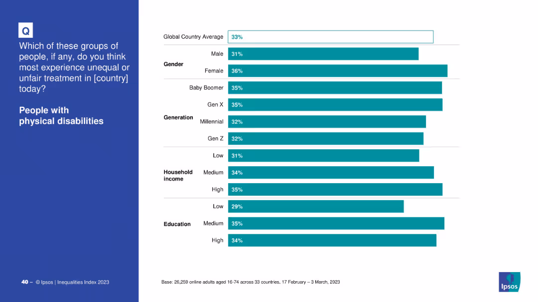
Split layout with left text and right demographic breakdown via horizontal bar chart.
Market Analysis and Trends
Government & Public Sector
Details global survey data by gender, age group, income, and education on perceptions of unfair treatment of people with physical disabilities.
disability, gender, education, age, income, perception, inequality, global average
false
Market Analysis and Trends
Government & Public Sector
Mixed Chart
IPSOS
Add to my slides
Remove from favorites
Bar chart showing share of companies mentioning disability inclusion in 10-K filings, divided into leaders, other participants, and industry peers.
Regulatory and Compliance
Professional Services
Highlights the growing recognition of disability inclusion in corporate filings, noting regulatory readiness and sustainable business practices.
disability, inclusion, 10-K filings, leaders, participants, industry peers, corporate, regulatory, CSRD
false
Regulatory and Compliance
Professional Services
Mixed Chart
Accenture
Add to my slides
Remove from favorites
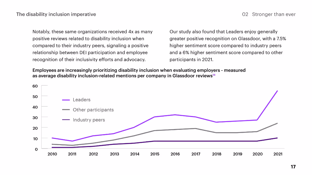
Line chart showing trends in disability inclusion-related mentions on Glassdoor from 2010 to 2021, comparing leaders, other participants, and industry peers.
Regulatory and Compliance
Professional Services
Describes positive recognition for organizations' disability inclusion efforts, showing a relationship between DEI participation and employee sentiment.
disability, inclusion, DEI, employee, recognition, trends, Glassdoor, positive reviews, leaders, participants
false
Regulatory and Compliance
Professional Services
Mixed Chart
Accenture
Add to my slides
Remove from favorites
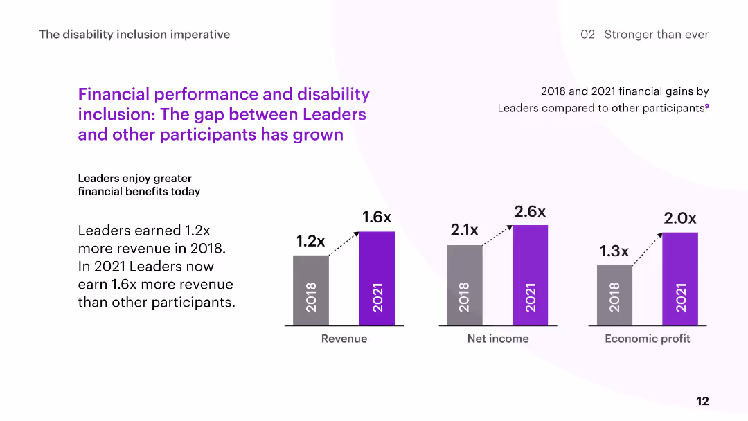
The slide features column charts comparing the financial gains of Disability Inclusion Leaders to other participants in 2018 and 2021, with commentary on the increasing gap.
Human Resources and Talent Management
Professional Services
The slide discusses the growing financial benefits for Disability Inclusion Leaders, showing higher revenue, net income, and economic profit over time compared to other participants.
disability inclusion, financial performance, revenue growth, comparison, leaders
false
Human Resources and Talent Management
Professional Services
Multiple Chart
Accenture
Add to my slides
Remove from favorites
The slide includes column charts showing the financial performance of Disability Inclusion Leaders compared to other participants, highlighting revenue, net income, and economic profit.
Human Resources and Talent Management
Professional Services
The slide illustrates the business gains realized by Disability Inclusion Leaders, emphasizing higher revenue, net income, and economic profit compared to other participants.
disability inclusion, financial performance, revenue, net income, profit
false
Human Resources and Talent Management
Professional Services
Mixed Chart
Accenture
Add to my slides
Remove from favorites
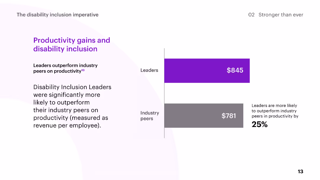
The slide includes a bar chart comparing the productivity of Disability Inclusion Leaders to industry peers, measured as revenue per employee.
Human Resources and Talent Management
Professional Services
The slide highlights the productivity gains of Disability Inclusion Leaders, showing they outperform industry peers in terms of revenue per employee.
disability inclusion, productivity, revenue per employee, leaders, industry peers
false
Human Resources and Talent Management
Professional Services
Mixed Chart
Accenture
Add to my slides
Remove from favorites
The slide features a detailed breakdown of disaster-related spending versus budget allocations over several years, presented in column charts with annotations about specific disasters and their financial impacts.
Regulatory and Compliance
Government & Public Sector
Evaluates the effectiveness of disaster budgeting at NCDOT, focusing on the financial impact of major disasters and snow/ice events, and the discrepancies between budgeted amounts and actual spending.
disaster budgeting, financial evaluation, NCDOT, budget discrepancies, spending analysis
false
Regulatory and Compliance
Government & Public Sector
Multiple Chart
McKinsey
Add to my slides
Remove from favorites
Features blue and white color scheme with a large column chart showing economic benefits from 2018 to 2020, and several flow diagrams depicting various impacts of disaster response enhancements.
Risk Assessment and Management
Financial Services
Focuses on the utilization of Copernicus data for improving disaster response strategies, detailing how enhanced data aids in risk analysis, mapping, and ultimately reduces economic and environmental damages.
disaster response, economic benefits, risk analysis, Copernicus, data utilization
false
Risk Assessment and Management
Financial Services
Mixed Chart
PwC/Strategy&
Add to my slides
Remove from favorites
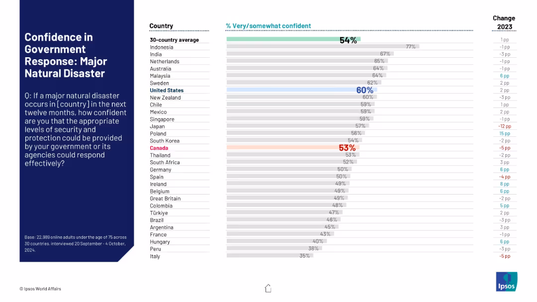
Confidence levels shown via horizontal bar chart; U.S. and Canada marked in contrasting colors.
Risk Assessment and Management
Government & Public Sector
This chart measures public confidence in their government’s ability to respond to a major natural disaster. The U.S. scores 60% and Canada 53%, both close to the 54% global average.
disaster response, government, confidence, Ipsos, 2024, Canada, U.S., emergency preparedness, perception
false
Risk Assessment and Management
Government & Public Sector
Mixed Chart
IPSOS
Add to my slides
Remove from favorites
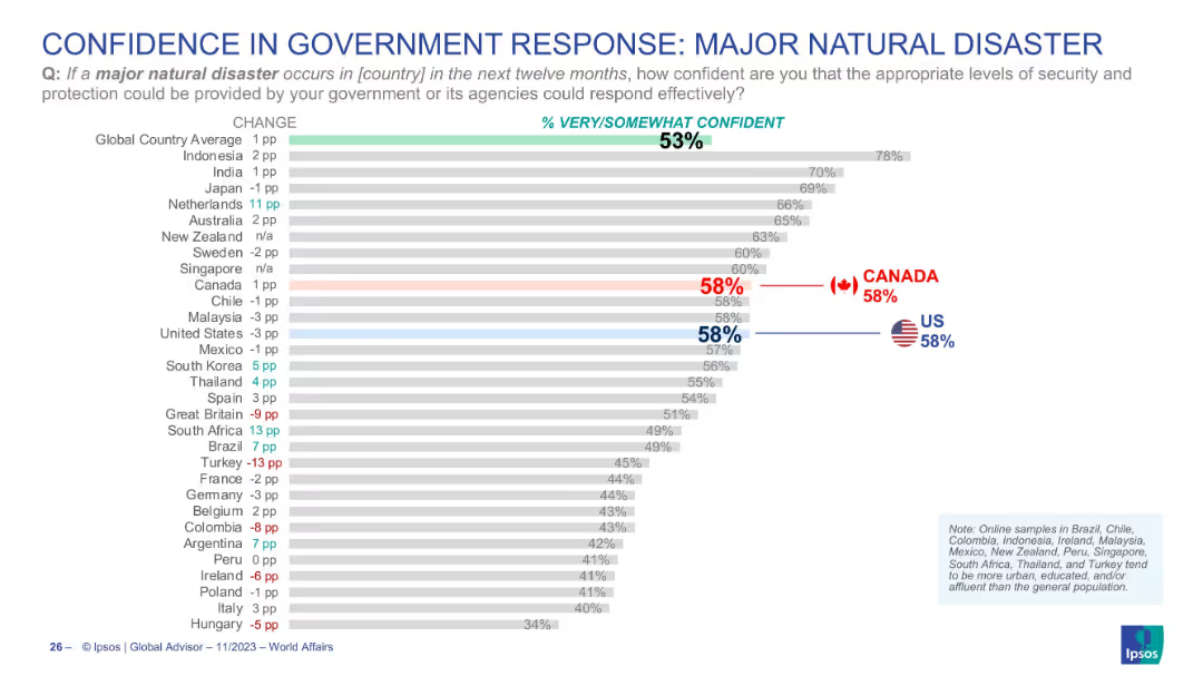
Horizontal bar chart indicating confidence levels in government response to natural disasters; Canada and US highlighted; global average shown.
Regulatory and Compliance
Government & Public Sector
This chart evaluates public confidence in how effectively their government could manage a major natural disaster. Canada and the US are both at 58%, slightly above the global average of 53%. It reflects perceived readiness and trust in national emergency management capabilities.
disaster response, government trust, crisis management, public perception, Canada, USA, Ipsos, emergency
false
Regulatory and Compliance
Government & Public Sector
Single Chart
IPSOS
Add to my slides
Remove from favorites
The slide shows a dark background with a complex layered area chart illustrating net revenue, charge-offs, and reserve changes over a projected timeline.
Financial Performance
Financial Services
Aimed at investors, this slide presents a disciplined growth trajectory in enterprise partnerships, with revenue paths and sensitivity to economic cycles highlighted.
disciplined growth, enterprise partnerships, revenue path, net revenue, charge-offs, net reserves, loan balances, economic sensitivity
false
Financial Performance
Financial Services
Mixed Chart
Goldman Sachs
Add to my slides
Remove from favorites
This slide is split into three sections, each with icons and brief points, complemented by a column chart in the middle section showing growth from 2017 to 2018. It emphasizes daily discipline, model optimization, and future transformation strategies.
Strategic Planning
Financial Services
Designed to convey a company’s dedication to consistent operational discipline while also focusing on growth and innovation strategies, likely used in a strategic business review or stakeholder presentation to highlight past achievements and future directions.
discipline, transformation, future, growth, innovation, strategy, operational efficiency, execution
false
Strategic Planning
Financial Services
Mixed Chart
JP Morgan
Add to my slides
Remove from favorites
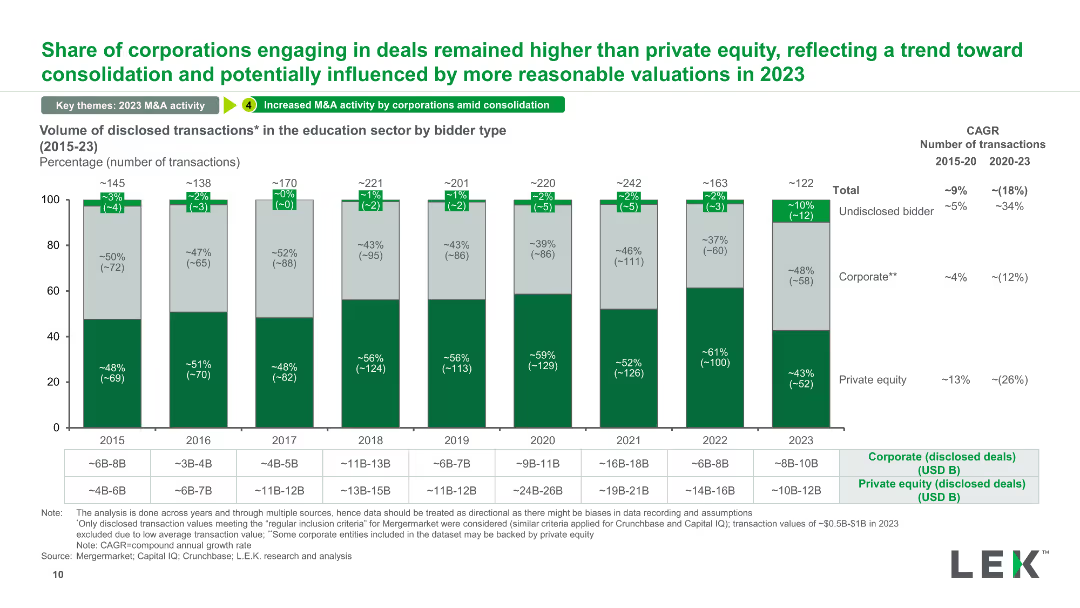
A stacked column chart showing the volume of disclosed transactions in the education sector categorized by bidder type (corporate, private equity, undisclosed) from 2015 to 2023.
Competitive Landscape
Education & Training
This slide categorizes the volume of disclosed transactions in the education sector by bidder type, illustrating trends in corporate vs. private equity involvement and changes over time.
disclosed transactions, bidder type, education sector, corporate, private equity
false
Competitive Landscape
Education & Training
Mixed Chart
LEK
Add to my slides
Remove from favorites
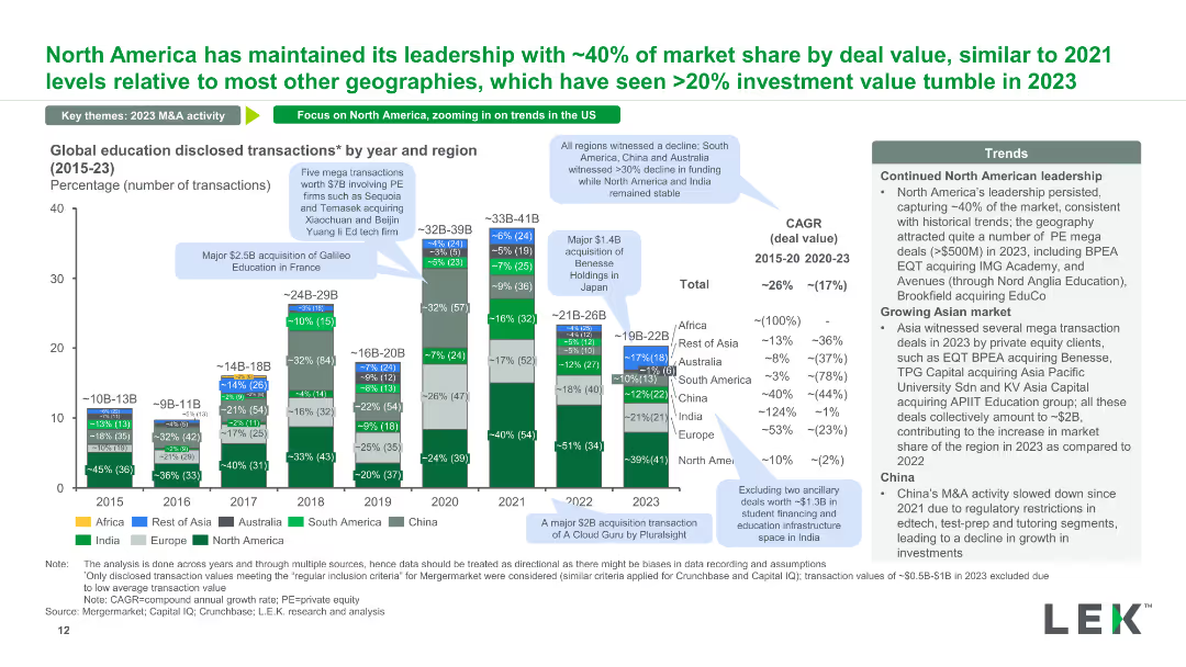
A stacked column chart displaying the number of global education disclosed transactions by year and region from 2015 to 2023. Annotations provide context on significant transactions and regional trends.
Market Analysis and Trends
Education & Training
This slide shows the distribution of disclosed transactions in the education sector across different regions over time, highlighting major deals and geographical trends in investment.
disclosed transactions, global education, regional trends, annual data, major deals
false
Market Analysis and Trends
Education & Training
Mixed Chart
LEK
Add to my slides
Remove from favorites
Features a moody, fog-covered forest in muted tones spanning the entire background, overlaid with a sharp, geometric clear cut in the center, providing a visual metaphor for 'disconnect'.
Market Analysis and Trends
Environmental Services & Sustainability
This slide serves as a thematic introduction to a section focused on identifying and addressing barriers within the environmental sustainability efforts, particularly in green investments and ecological conservation.
disconnect, barriers, environmental sustainability, conservation
false
Market Analysis and Trends
Environmental Services & Sustainability
Title
Bain
Add to my slides
Remove from favorites
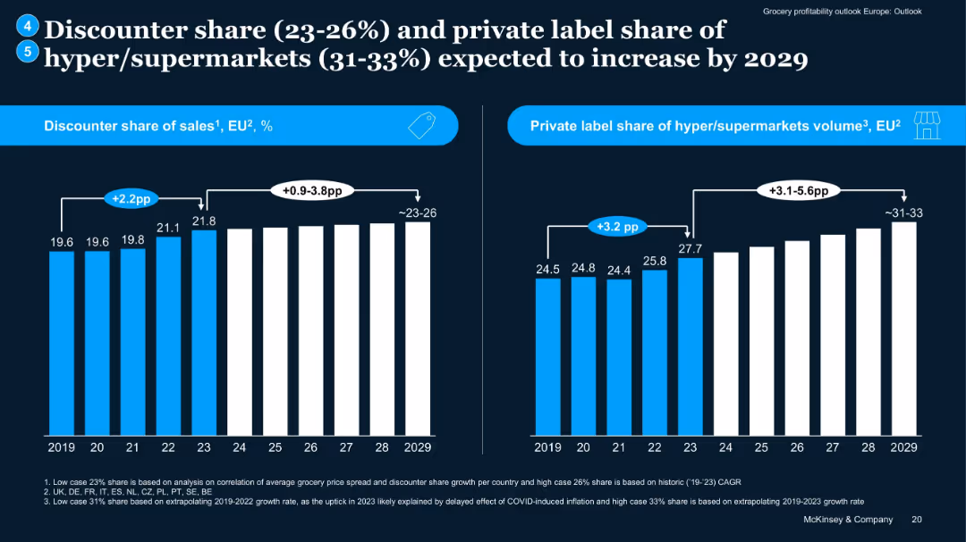
Two bar charts: left for discounter sales share, right for private label volume share, covering 2019–2029.
Market Analysis and Trends
Retail & E-commerce
Projects continued growth in discounter market share and private label volume among hypermarkets. Notes impact of COVID inflation on trend upticks, with forward projections extending to 2029, suggesting increased margin pressure and competition.
discounter growth, private label, projections, grocery trends, EU
false
Market Analysis and Trends
Retail & E-commerce
Multiple Chart
McKinsey
Add to my slides
Remove from favorites
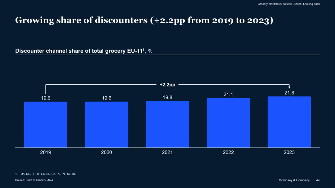
Single bar chart comparing discounter channel share of grocery sales from 2019–2023
Market Analysis and Trends
Retail & E-commerce
Discounter grocery channels have increased their share by 2.2 percentage points across EU-11 countries from 2019 to 2023, suggesting a shift in consumer preference towards cost-saving formats in a high-inflation environment.
Discounters, Grocery Share, EU Market, Cost-Sensitive Shoppers, Trends
false
Market Analysis and Trends
Retail & E-commerce
Single Chart
McKinsey
Add to my slides
Remove from favorites
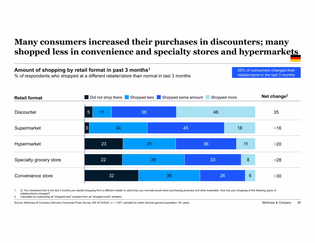
Horizontal bar chart showing % of consumers who shopped more or less at different retail formats, with net change column; blue/purple color scale and German flag
Market Analysis and Trends
Retail & E-commerce
Consumers are increasingly shopping at discount stores, with a net positive change of 35%. Conversely, formats like convenience stores and specialty groceries saw significant drops. This slide reveals consumer migration toward cost-effective options and away from traditional or specialty retail during inflationary pressure.
discounters, retail format, convenience stores, specialty grocery, net change, shopping behavior, inflation, Germany
false
Market Analysis and Trends
Retail & E-commerce
Single Chart
McKinsey
Add to my slides
Remove from favorites
Contains column charts comparing the observation of discount levels on automotive purchases in the US, Europe, and Asia, with distinctions between premium and volume categories.
Market Analysis and Trends
Transportation & Logistics
Discusses changes in consumer observations of discount levels on automotive purchases post-COVID-19, highlighting differences between regions and discount types.
discounts, automotive, bar chart, US, Europe, Asia, consumer behavior
false
Market Analysis and Trends
Transportation & Logistics
Multiple Chart
McKinsey
Add to my slides
Remove from favorites
Slide features a stacked column chart comparing discount levels observed by consumers in different countries over three months. Colors indicate whether discounts are higher, in line, or lower than pre-crisis levels.
Market Analysis and Trends
Technology & Software
This slide examines changes in consumer observed discount levels during COVID-19 across multiple countries, useful for market trend analysis in retail and consumer goods.
discounts, COVID-19, consumer trends, retail, market analysis, e-commerce
false
Market Analysis and Trends
Technology & Software
Multiple Chart
McKinsey
Add to my slides
Remove from favorites
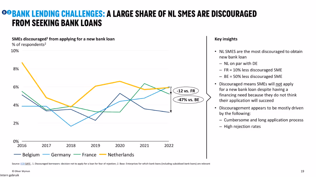
Line chart showing percentage of discouraged SMEs by country over time; key insights explain causes and compare NL to peers.
Risk Assessment and Management
Financial Services
This slide indicates that a significant share of Dutch SMEs avoid applying for loans due to fear of rejection or burdensome processes. It compares discouragement levels across countries, with NL and DE most affected.
discouraged SMEs, loan application, rejection fear, NL, banking barriers
false
Risk Assessment and Management
Financial Services
Mixed Chart
Oliver Wyman
Add to my slides
Remove from favorites
A slide with detailed text analysis on the left and a pie chart on the right illustrating the preferred online discovery channels for consumers.
Market Analysis and Trends
Retail & E-commerce
Analyzes the preferred online channels for product discovery, indicating a high preference for social media and video content as sources for finding new products and making purchasing decisions.
Discovery commerce, social media, video content, consumer preferences, pie chart
false
Market Analysis and Trends
Retail & E-commerce
Single Chart
Bain
Add to my slides
Remove from favorites
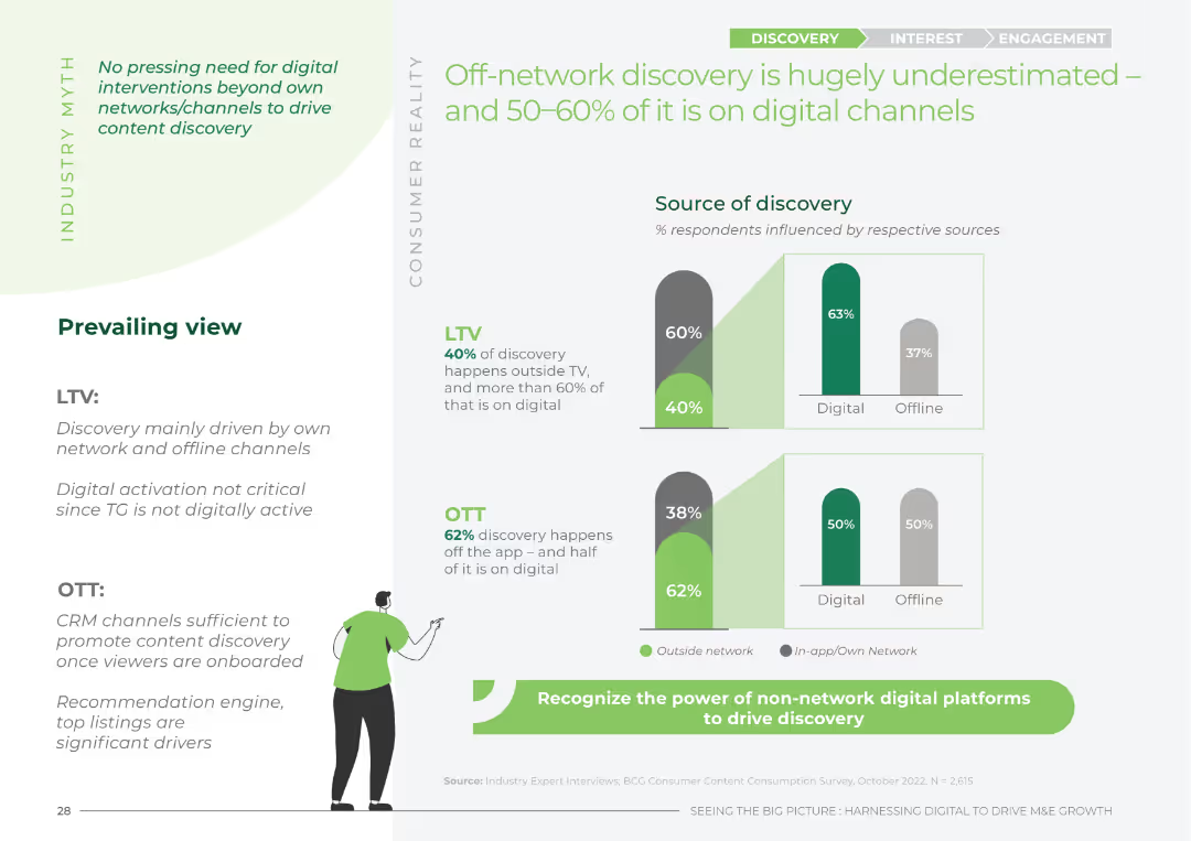
Column chart comparing the sources of discovery (digital vs. offline) for LTV and OTT, with a narrative on industry myths vs. consumer reality.
Market Analysis and Trends
Media & Entertainment
This slide highlights the underestimated impact of off-network discovery on LTV and OTT content, showing the importance of digital channels.
discovery, digital, off-network, LTV, OTT
false
Market Analysis and Trends
Media & Entertainment
Multiple Chart
BCG
Add to my slides
Remove from favorites
Bar chart comparing planned buying vs. discovery-led buying, key message header, and explanatory text.
Customer and Market Segmentation
Retail & E-commerce
Shows consumer shopping behavior in Southeast Asia, particularly discovery-led shopping trends.
discovery-led, shopping behavior, Southeast Asia, market trends, retail
false
Customer and Market Segmentation
Retail & E-commerce
Single Chart
Bain
Add to my slides
Remove from favorites
The slide includes multiple column charts showing the size and forecast growth of the global discrete automation market by geography, end market, and component.
Market Analysis and Trends
Industrial & Manufacturing
The slide provides an overview of the global discrete automation market, detailing its size, growth rate, and segmentation by geography, end market, and component from 2019 to 2025.
discrete automation, market size, growth rate, geography, end market, components
false
Market Analysis and Trends
Industrial & Manufacturing
Multiple Chart
LEK
Add to my slides
Remove from favorites
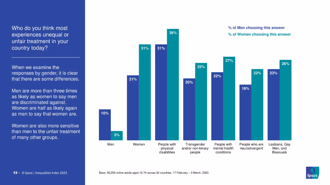
Bar chart comparison of men’s and women’s survey responses across various groups (e.g., people with disabilities, LGBTQ+, neurodivergent individuals). Left-side commentary explains gender differences in perceptions.
Market Analysis and Trends
Government & Public Sector
The slide contrasts how men and women perceive discrimination faced by various groups. Women show higher sensitivity to the unfair treatment of others, while men are more likely to believe that men face discrimination. Significant gender gaps are noted across most categories.
discrimination, gender gap, minorities, disability, LGBTQ+, survey results, public perception, inequality, Ipsos
false
Market Analysis and Trends
Government & Public Sector
Mixed Chart
IPSOS
Add to my slides
Remove from favorites
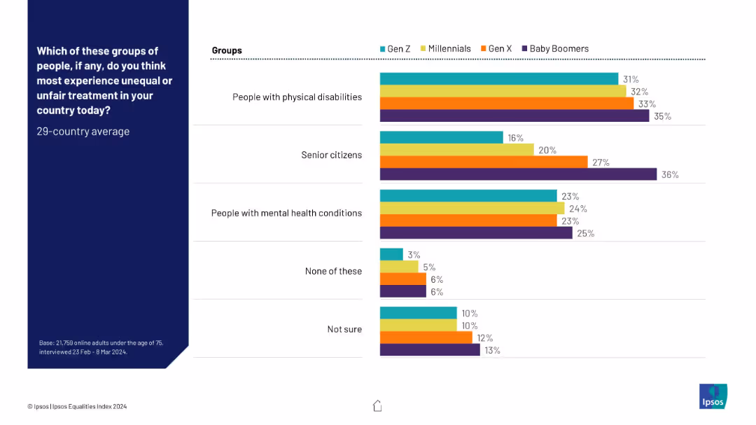
Bar chart with four color-coded generational groups (Gen Z, Millennials, Gen X, Baby Boomers), displaying perceived unfair treatment across various groups. Clean layout, left-aligned question, right-aligned bars.
Market Analysis and Trends
Government & Public Sector
This slide presents generational perceptions of which groups experience unfair treatment, with Baby Boomers consistently selecting "Senior citizens" and "People with physical disabilities" more than other groups. It shows slight generational variation in empathy or awareness levels toward marginalized groups.
discrimination, generational differences, public opinion, inequality, disability, senior citizens, mental health, survey, social justice, Ipsos
false
Market Analysis and Trends
Government & Public Sector
Mixed Chart
IPSOS
Add to my slides
Remove from favorites
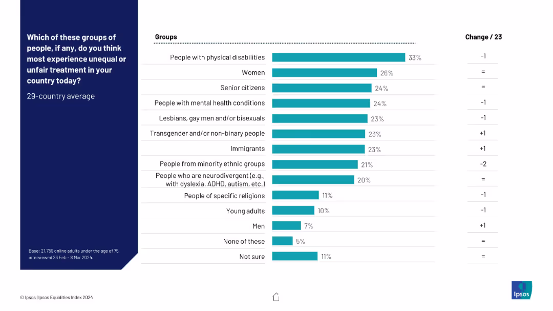
Horizontal bar chart ranking groups by perceived unfair treatment; turquoise bars; change column at right.
Risk Assessment and Management
Government & Public Sector
Respondents identified which groups they believe face the most unequal treatment in their country. People with physical disabilities, women, and senior citizens top the list, while men are seen as least affected.
discrimination, perceived inequality, vulnerable groups, Ipsos, fairness, treatment disparity
false
Risk Assessment and Management
Government & Public Sector
Mixed Chart
IPSOS
Add to my slides
Remove from favorites
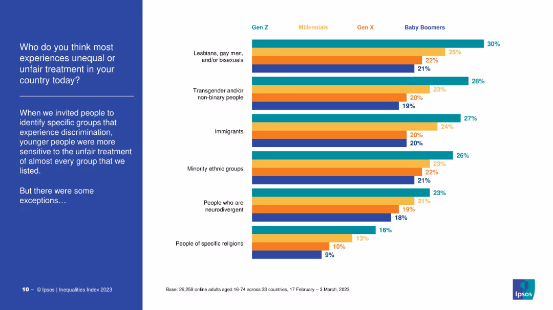
Horizontal bar chart grouped by generation, each group color-coded. Lists six demographics believed to face unfairness.
Market Analysis and Trends
Government & Public Sector
The slide illustrates which groups are seen as facing the most discrimination by different generations. Gen Z is most sensitive to unfairness, ranking LGBTQ+, immigrants, and minorities highest.
discrimination, social groups, sensitivity, Gen Z, survey, bias awareness
false
Market Analysis and Trends
Government & Public Sector
Mixed Chart
IPSOS
Add to my slides
Remove from favorites
The slide uses a balanced combination of text and dual bar charts to compare perspectives of Millennials and Gen Zs on systemic racism. It includes a quote, a descriptive text, and two bar charts with contrasting green shades.
Risk Assessment and Management
Technology & Software
The slide compares how Millennials and Gen Z view efforts against systemic racism, indicating a disparity between perceived potential and actual effort in various sectors.
discrimination, systemic racism, Millennials, Gen Z, survey, societal change
false
Risk Assessment and Management
Technology & Software
Mixed Chart
Deloitte
Add to my slides
Remove from favorites
The slide features a process flow diagram showing current and future states of call center operations. It has a balanced mix of text and visual elements, with clear depiction of process changes.
Operational Efficiency
Professional Services
Slide features a flowchart comparing current and future call center processes, along with text explaining potential improvements.
Discusses redesigning business processes within DEHS to improve efficiency, detailing current and proposed call center workflows and their expected benefits.
false
Operational Efficiency
Professional Services
Linear Flow
Alvarez & Marsal
Add to my slides
Remove from favorites
This slide includes a content layout with an organized table, icons for different aspects (People, Process, Technology), and a timeline outline. The slide is dense with text and data.
Regulatory and Compliance
Government & Public Sector
Slide includes implementation requirements, timeline outline, and risks. Features text blocks and icons for each section.
Discusses the development of in-state ITS residential options for individuals with complex care needs, outlining necessary steps and potential risks.
false
Regulatory and Compliance
Government & Public Sector
Table
Alvarez & Marsal
Add to my slides
Remove from favorites
Financial analysis of connectivity models by region
Strategic Planning
Telecommunications
Bar graphs showing the financial performance of different connectivity funding models for an average school in various regions. The graphs use red and blue to highlight costs and gaps clearly, presenting a direct visual comparison of each model's financial feasibility.
Discusses the financial implications of various connectivity funding models for schools in Kalimantan, Sulawesi, Nusa Tenggara, and Papua, highlighting the differences in potential financial outcomes.
false
Strategic Planning
Telecommunications
Multiple Chart
BCG
Add to my slides
Remove from favorites
This slide has a text section and a bar chart. It visually represents the positive and negative impacts of political and social discussions at work as perceived by employees. The chart uses contrasting colors to differentiate between positive and negative impacts.
Organizational Structure and Change
Government & Public Sector
Explores the specific effects of discussions about political and social issues on employees' work environment, highlighting both the benefits, such as increased empathy and open-mindedness, and the drawbacks, like increased stress and isolation.
discussion impacts, workplace environment, empathy, stress
false
Organizational Structure and Change
Government & Public Sector
Single Chart
PwC/Strategy&
Add to my slides
Remove from favorites
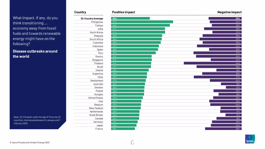
Horizontal bar chart showing positive vs. negative perceptions by country about how energy transition affects disease outbreaks globally.
Technology and Digital Transformation
Environmental Services & Sustainability
The slide visualizes global perceptions of how the transition from fossil fuels might influence disease outbreaks. The Philippines, Türkiye, and India are most optimistic. However, most countries show a lower degree of confidence on this metric.
disease outbreaks, health, perception, renewables, energy shift, bar chart, survey, Ipsos
false
Technology and Digital Transformation
Environmental Services & Sustainability
Mixed Chart
IPSOS
Add to my slides
Remove from favorites
Includes a column chart for ASEAN-6 y/y CPI (2023-2025F), a line chart for unemployment and real earnings growth rate (2016-2025F), and a bar chart for total trade.
Market Analysis and Trends
Financial Services
Analyzes disinflation trends in ASEAN, economic risks, and central bank policies. Discusses inflation, earnings growth, and trade outlook.
Disinflation, ASEAN, CPI, Trade, Earnings
false
Market Analysis and Trends
Financial Services
Multiple Chart
EY
Add to my slides
Remove from favorites
A column chart showing year-over-year percentage change in headline CPI from 2022 to 2025F for global and various regions including the US, Euro area, UK, Japan, China, India, LatAm, ASEAN, MENA, and SSA.
Market Analysis and Trends
Financial Services
The slide forecasts continued disinflation across most economies in 2024, assuming soft demand growth and steady supply conditions.
disinflation, CPI, economic forecast, 2024, demand growth, supply conditions
false
Market Analysis and Trends
Financial Services
Single Chart
EY
Add to my slides
Remove from favorites
Column chart displaying y/y percentage change in headline CPI from 2022 to 2025F across global regions, color-coded for each year.
Market Analysis and Trends
Financial Services
The slide projects disinflationary momentum across most economies, detailing expected CPI changes in regions like the US, Euro area, etc.
disinflation, CPI, economy, projection, global, region, column chart, forecast, supply conditions, demand growth
false
Market Analysis and Trends
Financial Services
Single Chart
EY
Add to my slides
Remove from favorites
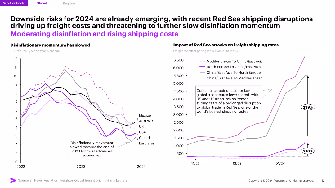
Two line charts: one showing the slowing disinflationary momentum for CPI inflation across key economies, and the other depicting the impact of Red Sea attacks on freight shipping rates, with significant increases in rates.
Risk Assessment and Management
Transportation & Logistics
The slide discusses emerging risks for 2024, including shipping disruptions in the Red Sea affecting global trade routes and increasing freight costs, along with the slowing disinflationary momentum in key economies.
Disinflation, Shipping, Freight, Risks, 2024
false
Risk Assessment and Management
Transportation & Logistics
Multiple Chart
Accenture
Add to my slides
Remove from favorites
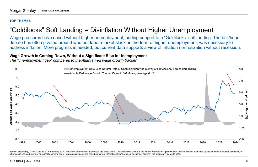
Line chart comparing the unemployment rate with the Atlanta Fed wage growth tracker, showing trends from 1998 to 2024. Includes annotations highlighting key points.
Market Analysis and Trends
Financial Services
Discusses the possibility of achieving disinflation without increasing unemployment, supported by data trends. Useful for economic analysis and policy discussions.
disinflation, unemployment, wage growth, economic analysis, policy discussion
false
Market Analysis and Trends
Financial Services
Single Chart
Morgan Stanley
Add to my slides
Remove from favorites
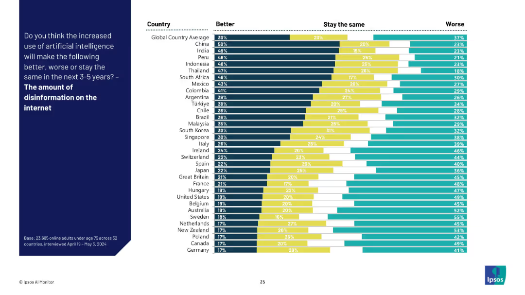
Stacked bar chart with three response categories for each country about AI’s role in internet disinformation.
Risk Assessment and Management
Artificial Intelligence
This slide explores global sentiment about AI’s effect on internet disinformation. While some countries believe AI can help reduce it, many believe it will worsen the problem, especially in Europe and North America.
Disinformation, AI ethics, internet, trust issues, information quality, public perception, AI governance, misinformation risk
false
Risk Assessment and Management
Artificial Intelligence
Mixed Chart
IPSOS
Add to my slides
Remove from favorites
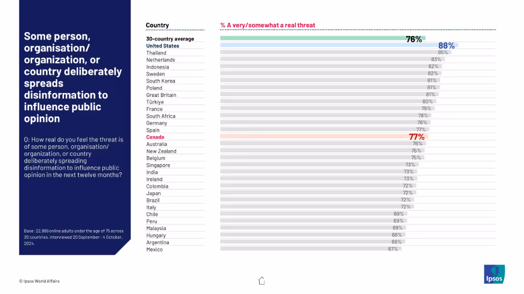
Horizontal bar chart by country with strong pink title emphasis; percentage agreement shown; global average marked.
Risk Assessment and Management
Government & Public Sector
This slide captures public concern about disinformation campaigns. 76% globally see this as a real threat. The United States tops the list at 88%, followed closely by Thailand and the Netherlands. Canada is highlighted at 77%, indicating high awareness across regions.
disinformation, media trust, public opinion, misinformation, perception, security threat, Ipsos, global survey, political influence, digital risk
false
Risk Assessment and Management
Government & Public Sector
Mixed Chart
IPSOS
Add to my slides
Remove from favorites
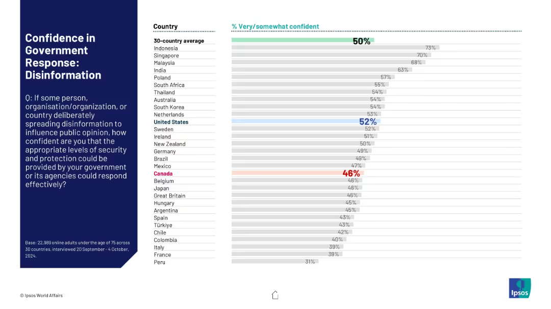
Countries ranked by confidence in government ability to counter disinformation; Canada in lower segment.
Risk Assessment and Management
Government & Public Sector
This slide ranks countries based on confidence in their government’s ability to counter disinformation campaigns. Canada’s confidence sits at 46%, below the 50% global average, with the U.S. at 52%.
disinformation, trust, government, media, public opinion, Ipsos, 2024, Canada, U.S., confidence
false
Risk Assessment and Management
Government & Public Sector
Mixed Chart
IPSOS
Add to my slides
Remove from favorites
Features a line chart tracking the usage of channel partners by companies over a decade. Each point is annotated for clarity, and different sectors are highlighted with distinct colors. The layout includes a text box that provides additional insights and context to the trend depicted.
Operational Efficiency
Retail & E-commerce
The slide analyzes the long-term trend of companies moving towards direct marketing, reducing reliance on channel partners. This is relevant for discussions on operational strategies in marketing and sales, highlighting sector-specific behaviors and strategic shifts.
disintermediation, channel partners, marketing trends, operational strategy, direct marketing
false
Operational Efficiency
Retail & E-commerce
Mixed Chart
Deloitte
Add to my slides
Remove from favorites
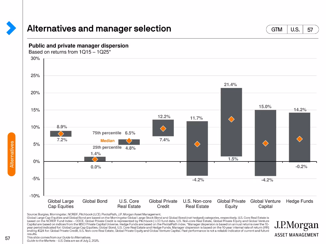
Bar chart with range bars and diamond indicators; category axis at bottom; gray bars and orange markers
Investment Analysis
Financial Services
Shows dispersion of returns among public and private managers across asset classes from Q1 2015 to Q1 2025. Highlights median, 25th, and 75th percentiles, emphasizing greater dispersion in private assets.
dispersion, alternatives, private equity, hedge funds, investment performance, asset classes, median return, risk, manager selection, return spread
false
Investment Analysis
Financial Services
Single Chart
JP Morgan
Add to my slides
Remove from favorites
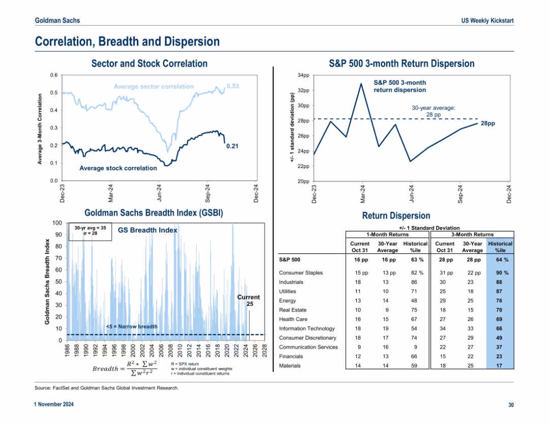
Three-section layout: average sector/stock correlation line chart, breadth index with historical context, and return dispersion stats. Blue gradient for breadth intensity.
Risk Assessment and Management
Financial Services
The slide presents market internals: sector and stock correlations, return dispersions, and the GS Breadth Index. It highlights market concentration and potential risks tied to narrow leadership or broad participation.
dispersion, correlation, breadth, return volatility, S&P 500, stock internals
false
Risk Assessment and Management
Financial Services
Multiple Chart
Goldman Sachs
Add to my slides
Remove from favorites
Slide includes a column chart and a circular diagram detailing global and country-specific data on internally displaced people due to conflict or disasters, supplemented with textual analysis and icons.
Market Analysis and Trends
Government & Public Sector
This slide discusses trends in internal displacement driven by conflict and disasters, providing data to understand regional and global scales of the issue and to support humanitarian and policy responses.
displacement, conflict, disaster, data, global, regional, humanitarian, policy, statistics
false
Market Analysis and Trends
Government & Public Sector
Multiple Chart
Roland Berger
Add to my slides
Remove from favorites
Bar charts and a pie chart detail the status and origins of forcibly displaced people, with emphasis on Syria and Turkey.
Market Analysis and Trends
Government & Public Sector
Highlights the global refugee crisis, focusing on the scale of displacement from Syria.
displacement, refugees, Syria, Turkey, crisis
false
Market Analysis and Trends
Government & Public Sector
Multiple Chart
Roland Berger
Add to my slides
Remove from favorites
Line charts on this slide show the development of annual disposable income in various country clusters, marked by simple graphical elements for clarity.
Market Analysis and Trends
Financial Services
This slide focuses on the projected growth in disposable income, indicating potential changes in consumer markets and economic power shifts.
disposable income, consumer markets, BRICS, economic growth, income analysis
false
Market Analysis and Trends
Financial Services
Multiple Chart
Roland Berger
Add to my slides
Remove from favorites
Line charts showing US y/y average hourly earnings and inflation, and real consumption expenditures and disposable income trends.
Market Analysis and Trends
Consumer Goods
Shows how growth in real disposable income sustains consumer spending, even as the labor market cools.
disposable income, consumer spending, earnings, inflation, consumption, line chart, US economy, labor market, income trends
false
Market Analysis and Trends
Consumer Goods
Multiple Chart
EY
Add to my slides
Remove from favorites
Contains bullet points and a team section with icons representing professional qualifications.
Regulatory and Compliance
Professional Services
Outlines the roles and expertise within disputes and investigations, focusing on litigation, compliance, and forensic accounting, aiming to safeguard client interests and provide tailored solutions.
disputes, investigations, compliance, forensic accounting, consultancy
false
Regulatory and Compliance
Professional Services
Header Vertical
Alvarez & Marsal
Add to my slides
Remove from favorites
Lists in a clean column format, focusing on various dispute resolution areas.
Strategic Planning
Professional Services
Presents detailed approaches to handling complex disputes, including valuation, arbitration, and international legal considerations, aimed at protecting organizational interests and ensuring effective dispute resolution.
disputes, valuation, arbitration, legal, resolution
false
Strategic Planning
Professional Services
Table
Alvarez & Marsal
Add to my slides
Remove from favorites
Utilizes icons and text to illustrate the potential disruptions in various industries due to advanced connectivity.
Market Analysis and Trends
Telecommunications
Outlines the potential impact of connectivity advancements across several key industries.
Disruption, Connectivity, Automotive, Healthcare, Aerospace, Defense, Retail
false
Market Analysis and Trends
Telecommunications
Header Vertical
McKinsey
Add to my slides
Remove from favorites
A multi-graph layout depicting the "Accenture Global Disruption Index" with separate graphs for overall disruption and various factors like Economic, Social, and Technological. The graphs show trends over time, with the overall level of disruption having a notable increase marked "~200%."
Risk Assessment and Management
Technology & Software
This analytical slide presents data on the increasing levels of global disruption influenced by various factors, intending to inform decision-makers about the growing importance of resilience and adaptive strategies in the face of diverse economic, social, and technological challenges.
disruption, global trends, economic, social, technological, Accenture, index
false
Risk Assessment and Management
Technology & Software
Multiple Chart
Accenture
Add to my slides
Remove from favorites
The slide is text-heavy with bullet points under three headers: Depth of disruption, Length of disruption, and Shape of recovery, each with key indicators to monitor.
Strategic Planning
Financial Services
Designed for business strategists, this slide outlines the key indicators to monitor during a crisis for assessing disruption depth, length, and recovery shape.
disruption, indicators, recovery, crisis management, business strategy, monitoring, depth, length, shape
false
Strategic Planning
Financial Services
Header Horizontal
McKinsey
Add to my slides
Remove from favorites
Slide features three overlapping circles in blue, green, and grey, labeled Work, People, and Technology. Within the intersection of all three is a central question about harnessing insights for performance.
Risk Assessment and Management
Technology & Software
Discusses the interplay between work, people, and technology, and how to harness insights to drive performance. Ideal for discussions on managing disruption and leveraging insights in business.
Disruption, Insights, Performance, Technology
false
Risk Assessment and Management
Technology & Software
Diagram
Deloitte
Add to my slides
Remove from favorites
The slide depicts a timeline of alerting, understanding, reacting, and recovery from disruptions in operations, supported by a line graph showing time intervals for different companies.
Technology and Digital Transformation
Industrial & Manufacturing
Explains the timeline and strategies for companies to become resilient against disruptions, detailing the stages from being alerted to fully recovering and the technologies involved.
disruption response, recovery strategies, operational resilience, timeline analysis, technology role, Accenture Research
false
Technology and Digital Transformation
Industrial & Manufacturing
Mixed Chart
Accenture
Add to my slides
Remove from favorites
Utilizes a scatter plot and bar graph to discuss types and frequencies of business disruptions.
Risk Assessment and Management
Industrial & Manufacturing
Analyzes different types of business disruptions and their predictability, offering a framework for understanding the likelihood and impact of various events like pandemics and cyber attacks.
Disruptions, Business, Framework, Predictability, Impact
false
Risk Assessment and Management
Industrial & Manufacturing
Multiple Chart
McKinsey
Add to my slides
Remove from favorites
This slide features two graphs. The left graph is a bar chart showing the NPV of expected losses in various industries over 10 years. The right graph, also a bar chart, displays the frequency of operational disruptions by duration.
Risk Assessment and Management
Financial Services
The slide provides an analysis of the financial impact of operational disruptions across various industries, highlighting the percentage of losses relative to annual EBITDA and the frequency of such disruptions.
disruptions, EBITDA, industry, financial impact, operation
false
Risk Assessment and Management
Financial Services
Multiple Chart
McKinsey
Add to my slides
Remove from favorites
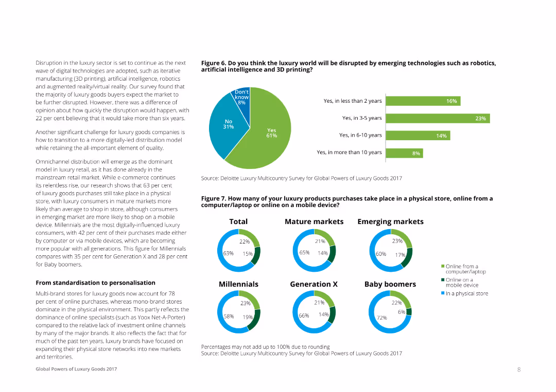
Text on the left discussing disruption, with a pie chart on the right showing opinions on how soon the luxury market will be disrupted by technologies like AI and 3D printing. Another set of pie charts show where luxury purchases are made (store, online).
Market Analysis and Trends
Consumer Goods
This slide addresses the anticipated disruption in the luxury sector due to emerging technologies and the shift towards digital and omnichannel distribution models. It includes survey data on consumer opinions and shopping behaviors.
Disruption, Technology, Luxury, Market, Trends
false
Market Analysis and Trends
Consumer Goods
Multiple Chart
Deloitte
Add to my slides
Remove from favorites
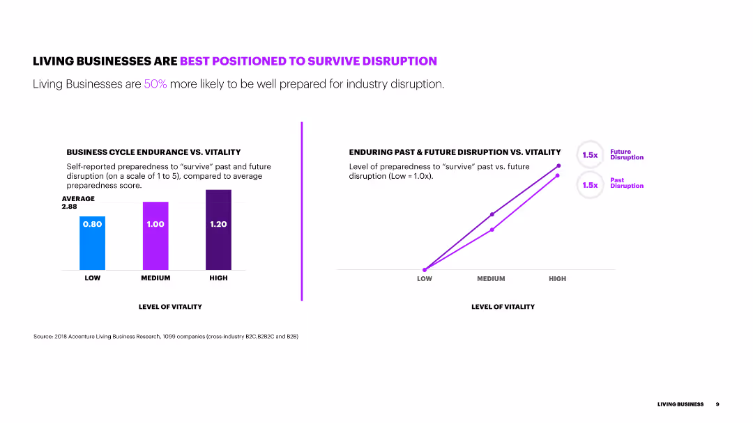
The slide includes two column charts showing the level of vitality and preparedness to survive disruption. It also features a line chart comparing past and future disruption preparedness levels.
Risk Assessment and Management
Financial Services
This slide shows how living businesses are better prepared for industry disruption, with visual data on their vitality levels and preparedness compared to average businesses.
disruption, vitality, preparedness, comparison, data, survival
false
Risk Assessment and Management
Financial Services
Multiple Chart
Accenture
Add to my slides
Remove from favorites
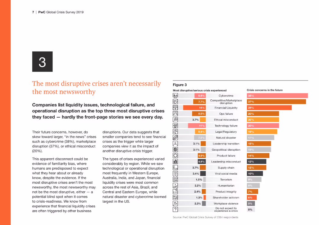
The slide features a column chart on the right comparing the most disruptive/serious crises experienced with future crisis concerns, highlighting cybercrime and financial issues.
Risk Assessment and Management
Financial Services
This slide discusses the disconnect between the most disruptive crises and those most reported, emphasizing the need for attention to operational and tech disruptions.
Disruptive crises, cybercrime, financial, operational, future concerns
false
Risk Assessment and Management
Financial Services
Multiple Chart
PwC/Strategy&
Add to my slides
Remove from favorites
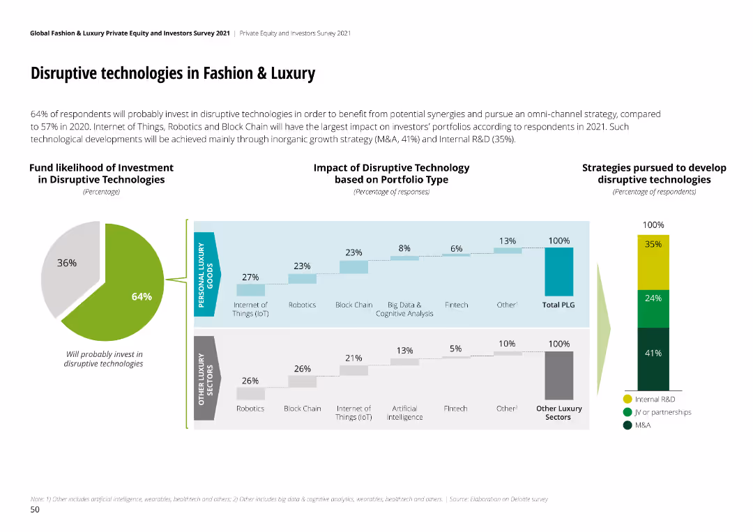
The slide includes a pie chart and multiple column charts analyzing the impact of disruptive technologies on different portfolios and investment strategies.
Technology and Digital Transformation
Technology & Software
This slide explores the likelihood of investment in disruptive technologies within the F&L sector, highlighting impacts and strategic approaches.
disruptive tech, F&L, investment, IoT, blockchain
false
Technology and Digital Transformation
Technology & Software
Multiple Chart
Deloitte
Add to my slides
Remove from favorites
Features a central triangle with each vertex labeled with a question about work, worker, or workplace. It shows the contrast between future and current work options through a graphical element representing a spectrum.
Strategic Planning
Technology & Software
Examines the disruptors in the future of work, focusing on who can do the work, where, and how. This slide is beneficial for strategic planning regarding workforce evolution.
Disruptors, Future of Work, Strategy, Workforce
false
Strategic Planning
Technology & Software
Diagram
Deloitte
Add to my slides
Remove from favorites
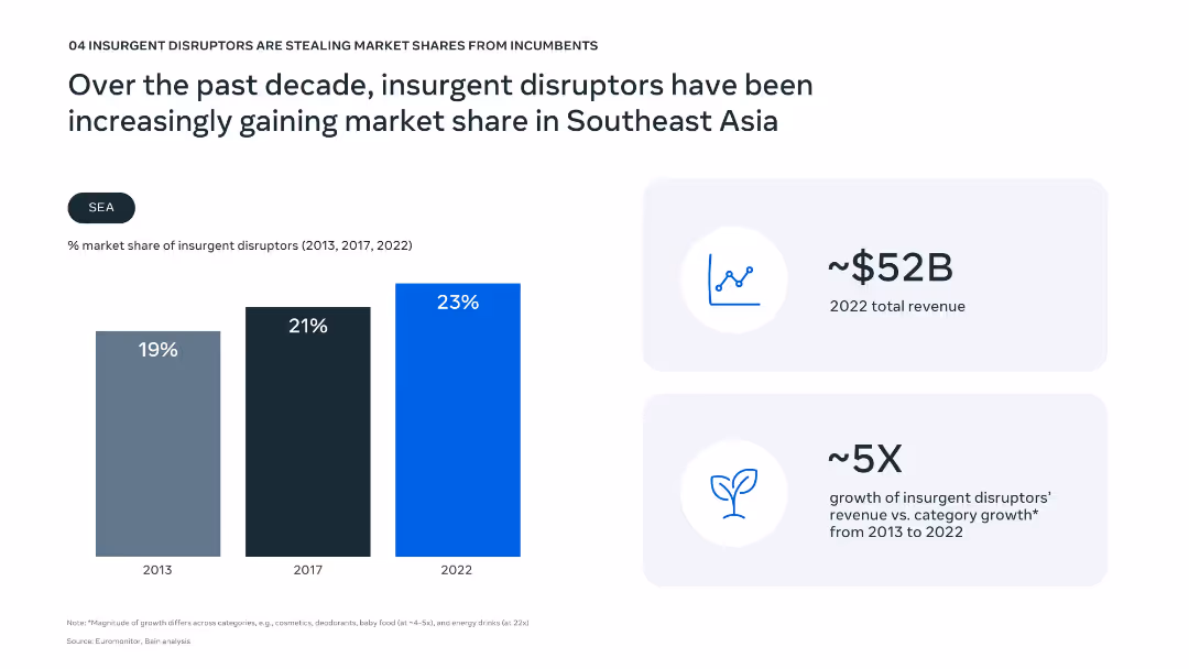
Vertical bar chart showing market share growth from 2013 to 2022; key financial metrics highlighted on right.
Competitive Landscape
Consumer Goods
The slide shows a steady increase in market share for insurgent disruptors over the past decade in SEA, reaching 23% in 2022. It emphasizes their revenue growth (5X compared to category average) and total 2022 revenue ($52B).
disruptors, market share, SEA, insurgent brands, revenue growth, competition, incumbents, consumer goods, innovation, market dynamics
false
Competitive Landscape
Consumer Goods
Mixed Chart
Bain
Add to my slides
Remove from favorites
Column chart displaying dissatisfaction levels across different demographics and product categories, with notable dissatisfaction in online experiences.
Market Analysis and Trends
Consumer Goods
Highlights dissatisfaction with online experiences among various demographics and product categories, emphasizing the digital gap in consumer satisfaction.
Dissatisfaction, digital, demographics, product, analysis
false
Market Analysis and Trends
Consumer Goods
Multiple Chart
BCG
Add to my slides
Remove from favorites
Features a multi-line chart depicting responses on strategic intent for D&I, with specific focus differences by region and demographic, annotated for clarity.
Strategic Planning
Professional Services
Focuses on the perceptions of U.S. non-minority women regarding strategic intent in D&I, suggesting areas for improvement.
D&I, strategic intent, U.S., non-minority women, line chart, improvement areas, demographic focus
false
Strategic Planning
Professional Services
Mixed Chart
Accenture
Add to my slides
Remove from favorites
The slide features a line chart and a box plot related to sovereign debt restructuring. The layout is technical and detailed.
Risk Assessment and Management
Financial Services
The slide discusses the restructuring of distressed debt, emphasizing historical patterns and the value of engaged investors. It presents data on excess returns of sovereign debt and creditor engagement.
distressed debt, restructuring, sovereign debt, investment, risk management
false
Risk Assessment and Management
Financial Services
Multiple Chart
Morgan Stanley
Add to my slides
Remove from favorites
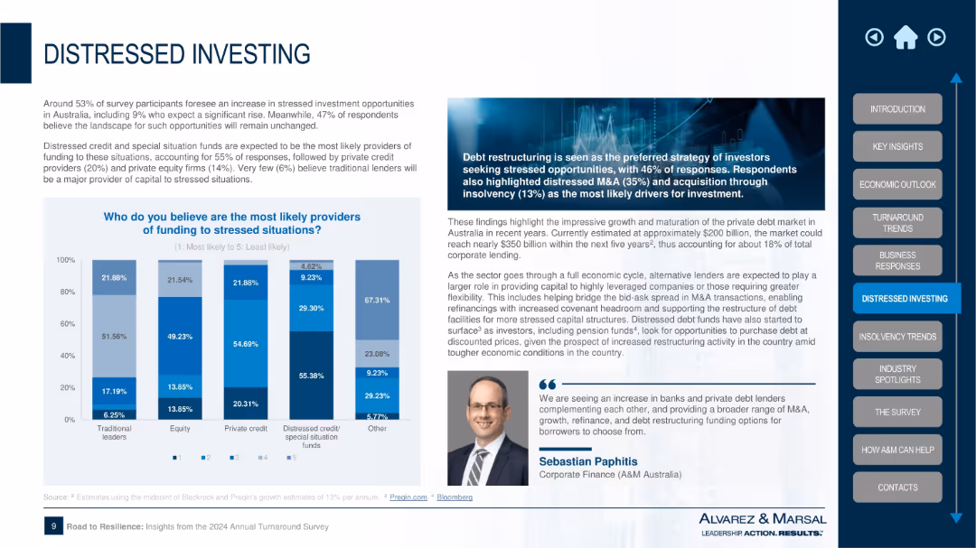
Left-aligned bar chart with funding sources, right-aligned text box with insights and expert quote; image banner and dark theme box top
Investment Analysis
Financial Services
This slide examines likely sources of funding in distressed situations, with distressed credit and private credit as key providers. It highlights debt restructuring as a major investment strategy, with M&A and acquisitions also playing a role. Commentary underscores the growth in private credit markets.
distressed investing, debt restructuring, private credit, M&A, insolvency, funding sources, investment strategy, special situation funds, capital
false
Investment Analysis
Financial Services
Mixed Chart
Alvarez & Marsal
Add to my slides
Remove from favorites
This slide contains two bar charts. The left chart illustrates the U.S. distressed loan volume outstanding in USD billions, while the right chart shows business bankruptcy filings by year from 2008 to 1Q24 in thousands.
Risk Assessment and Management
Financial Services
The slide highlights the volume of distressed loans and the trend in business bankruptcies over time, providing insights into financial distress and economic conditions.
distressed loans, bankruptcy, financial distress, loan volume, economic conditions
false
Risk Assessment and Management
Financial Services
Multiple Chart
JP Morgan
Add to my slides
Remove from favorites
Map of Canada highlighting regions, accompanied by a pie chart and bullet points.
Operational Efficiency
Energy & Utilities
Focuses on the distribution of gas in Canada, emphasizing the low-risk business model and growth opportunities.
distribution, Canada, gas, low-risk, growth
false
Operational Efficiency
Energy & Utilities
Multiple Chart
Barclays
Add to my slides
Remove from favorites
A flowchart depicting the transformation of fund distribution channels from a traditional linear model to an emerging digital (on-chain) distribution model. Includes roles like fund managers, custodians, and transfer agents, with arrows indicating the process flow.
Operational Efficiency
Financial Services
Illustrates the transformation of fund distribution channels, highlighting the shift from traditional linear relationships to integrated digital (on-chain) distribution platforms, promoting efficiency and accessibility for investors.
distribution channels, digital, fund managers, transformation, efficiency
false
Operational Efficiency
Financial Services
Linear Flow
EY
Add to my slides
Remove from favorites
A bar graph comparing gross and EBITDA margins across various distribution companies, titled "Distribution businesses can have very different margin profiles."
Financial Performance
Financial Services
This data-driven slide shows the margin profiles of different distribution companies, highlighting the variability in profitability across the sector.
distribution companies, gross margin, EBITDA, profitability, financial performance, bar graph
false
Financial Performance
Financial Services
Single Chart
EY
Add to my slides
Remove from favorites
Two side-by-side hourglass diagrams labeled "Pharmaceutical distribution dynamics" and "Industrial components," comparing the distribution chain in both sectors with text annotations.
Market Analysis and Trends
Financial Services
This slide compares pharmaceutical and industrial component distribution, highlighting consolidation and fragmentation impacts on distributor value-add opportunities.
distribution, hourglass diagram, pharmaceuticals, industrial components, supply chain, consolidation, fragmentation
false
Market Analysis and Trends
Financial Services
Pillar
EY
Add to my slides
Remove from favorites
Includes column charts and icons indicating changes in luxury goods market distribution channels from 2019 to 2025F.
Market Analysis and Trends
Retail & E-commerce
Explores the transformation of the distribution landscape for luxury goods, emphasizing shifts towards online and direct channels post-COVID-19.
distribution, luxury, market, 2025, online
false
Market Analysis and Trends
Retail & E-commerce
Mixed Chart
Bain
Add to my slides
Remove from favorites
A bullet point list of key summaries with a gray and blue color scheme and dollar symbol graphic.
Strategic Planning
Financial Services
Summarizes the potential of US distribution and maintenance markets, fragmentation, and value-added services.
Distribution, MRO, Fragmentation, Value, Margins, Financial Summary
false
Strategic Planning
Financial Services
Agenda
EY
Add to my slides
Remove from favorites
Previous
Next
You don't have any favorites yet.
Please wait loading your favorites slides...
Create a FREE account to continue browsing
Receive Instant Access to 1,000+ slides from companies like McKinsey, Google, and Goldman Sachs
First Name
Last Name
Email
Password
I agree to all
Terms & Privacy Policy
Thank you! Your submission has been received!
Oops! Something went wrong while submitting the form.
Have an account?
Sign in
Upgrade to PRO to Save slides
Advanced Search and Filters
Access to 15,000+ slides
Access to Category Pages
Save/Bookmark Slides
PowerPoint Template Library
Pick a Plan
MONTHLY
$12/month
Billed every month, Cancel anytime.
YEARLY
$9/year
Billed $108 annually, Cancel anytime.
Checkout for $12/month
Checkout for $108/yr
Secured by Stripe | AES-256 bit encryption