My Account
My Slides
Search by Category
Companies
Slide Type
Use Case
Industry
Pricing
Templates
View All Templates
Download Template Slides
✦ AI
AI Prompt Library
AI Search
Feedback
Login
Logout
Get Started
Browse all Slides
Browse all Slides
Create a FREE Account
Instant access to 1,000+ real slides from top companies like McKinsey, BCG, Goldman Sachs, Google and many more!
First Name
Last Name
Email
Password
I agree to all
Terms & Privacy Policy
Thank you! Your submission has been received!
Oops! Something went wrong while submitting the form.
Have an account?
Sign in
Saved Slides
Total No. of slides saved
0
↻ Refresh
✖ Clear all
The slide features a complex network illustration of partnerships and sector positioning, alongside two blocks describing business strengths.
Strategic Planning
Financial Services
Discusses the company's strategic position in the financial ecosystem, highlighting its partnerships, audience engagement, and a diversified business model that includes a mix of direct consumer relationships and data monetization.
distribution, partnerships, fintech, data monetization, engagement
false
Strategic Planning
Financial Services
Diagram
Barclays
Add to my slides
Remove from favorites
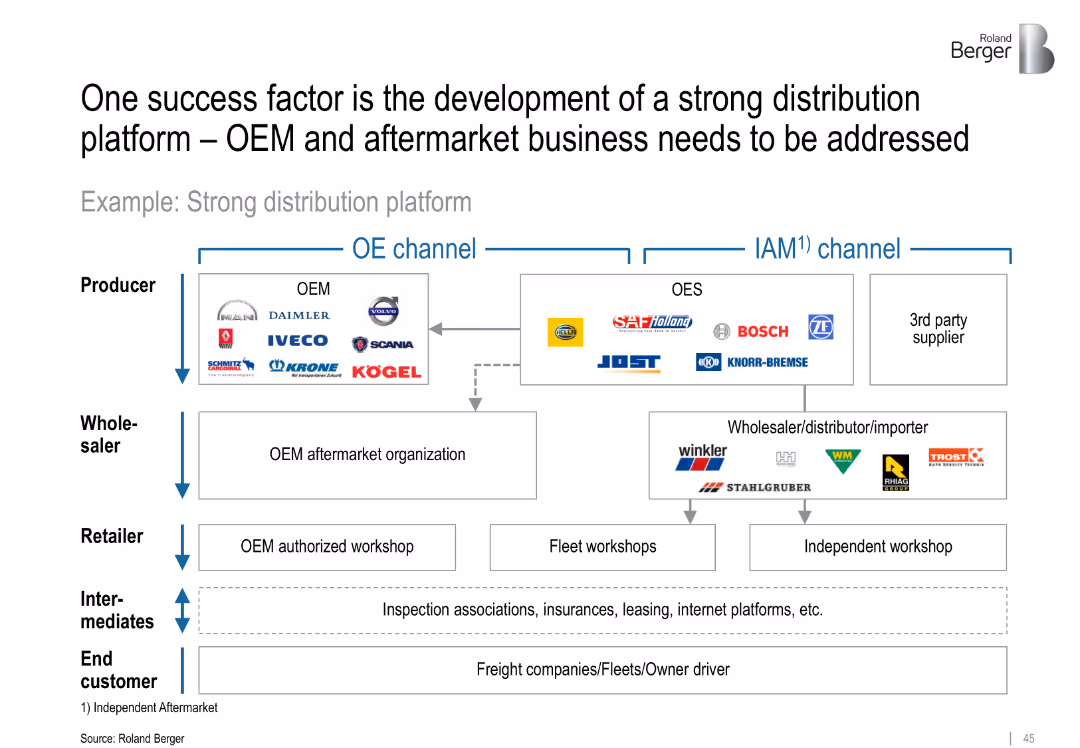
Flow diagram showing structure of OEM and IAM (aftermarket) distribution channels; includes producers, wholesalers, retailers, and end customers
Sales and Business Development
Transportation & Logistics
Describes the value chain in the commercial vehicle component market, emphasizing the importance of robust OEM and IAM distribution platforms. Shows how players like JOST, SAF Holland, and Bosch interact across levels.
distribution platform, OEM, IAM, aftermarket, value chain, sales strategy, component flow, channel structure
false
Sales and Business Development
Transportation & Logistics
Diagram
Roland Berger
Add to my slides
Remove from favorites
Detailed roadmap timeline outlining key milestones from Q4 2020 to the end of 2021 for vaccine distribution under various scenarios.
Regulatory and Compliance
Healthcare & Pharmaceuticals
Analyzes the projected timeline for widespread COVID-19 vaccine distribution in the U.S., including pre-conditions and milestones.
distribution, vaccine, timeline, COVID-19
false
Regulatory and Compliance
Healthcare & Pharmaceuticals
Mixed Chart
BCG
Add to my slides
Remove from favorites
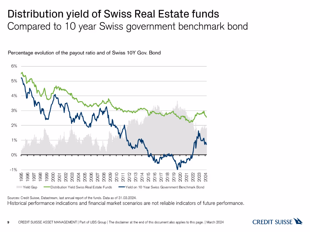
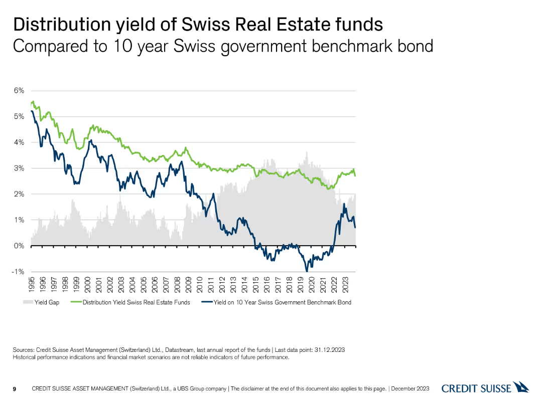
The slide shows a line chart comparing the distribution yield of Swiss Real Estate funds with the yield on the 10-year Swiss government bond from 1995 to 2024, using blue and green.
Investment Analysis
Real Estate & Construction
This slide contrasts the performance of Swiss Real Estate funds' distribution yield with the benchmark yield of the 10-year Swiss government bond, illustrating relative performance.
distribution yield, government bonds, real estate, comparison, performance
false
Investment Analysis
Real Estate & Construction
Single Chart
Credit Suisse
Add to my slides
Remove from favorites
A line chart comparing the distribution yield of Swiss real estate funds to the 10-year Swiss government benchmark bond yield, with a highlighted yield gap.
Financial Performance
Financial Services
This slide analyzes the distribution yield of Swiss real estate funds in comparison to the 10-year Swiss government benchmark bond, highlighting the yield gap over time.
Distribution Yield, Government Bond, Yield Gap, Comparison
false
Financial Performance
Financial Services
Single Chart
Credit Suisse
Add to my slides
Remove from favorites
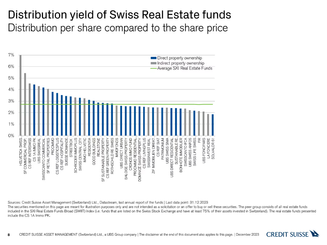
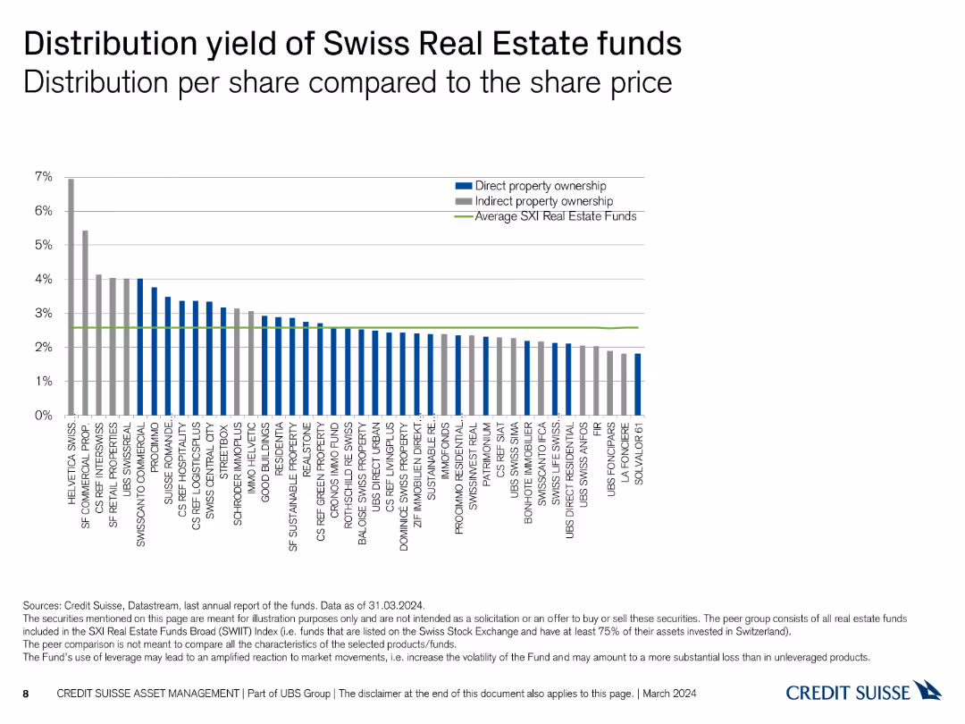
A column chart comparing the distribution yield per share for various Swiss real estate funds, with average yields highlighted.
Financial Performance
Financial Services
This slide compares the distribution yields of Swiss real estate funds, presenting data on direct and indirect property ownership against the average SXI real estate funds.
Distribution Yield, Real Estate Funds, Ownership, Yields
false
Financial Performance
Financial Services
Single Chart
Credit Suisse
Add to my slides
Remove from favorites
The slide features a column chart comparing the distribution yield per share for various Swiss Real Estate funds, with average SXI yield as a reference line in green.
Financial Performance
Real Estate & Construction
This slide compares the distribution yield of Swiss Real Estate funds against the SXI Real Estate Funds average, providing insights into income generation potential.
distribution yield, real estate, funds, SXI, comparison
false
Financial Performance
Real Estate & Construction
Single Chart
Credit Suisse
Add to my slides
Remove from favorites
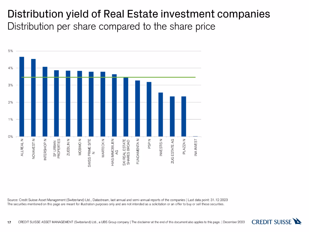
The slide features a column chart showing the distribution yield per share compared to the share price for various companies.
Financial Performance
Real Estate & Construction
This slide illustrates the distribution yields of different real estate investment companies, with the yields compared to their share prices as of December 31, 2023.
distribution, yield, real estate, investment, companies
false
Financial Performance
Real Estate & Construction
Single Chart
Credit Suisse
Add to my slides
Remove from favorites
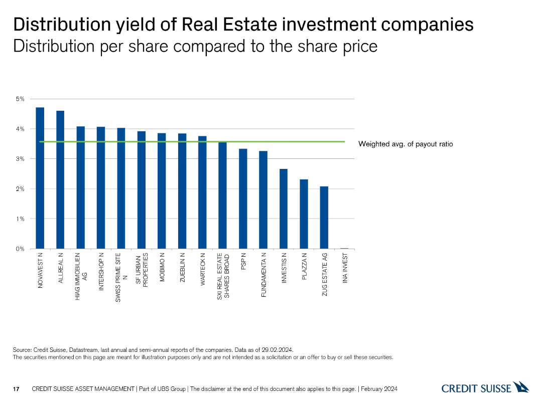
A column chart showing the distribution yield per share of various real estate investment companies. The X-axis lists companies, and the Y-axis represents distribution yield percentages up to 5%.
Financial Performance
Real Estate & Construction
This slide compares the distribution yield per share across different real estate investment companies, highlighting those with the highest and lowest yields.
distribution, yield, real estate, investment, companies, comparison, financial, performance, yield percentage, analysis
false
Financial Performance
Real Estate & Construction
Single Chart
Credit Suisse
Add to my slides
Remove from favorites
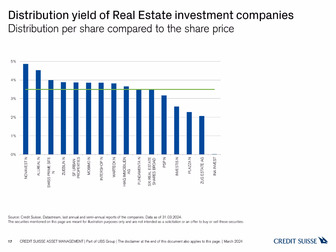
A column chart showing the distribution yield per share of various real estate investment companies. The X-axis lists companies, and the Y-axis represents distribution yield percentages up to 5%.
Financial Performance
Real Estate & Construction
This slide compares the distribution yield per share across different real estate investment companies, highlighting those with the highest and lowest yields.
distribution, yield, real estate, investment, companies, comparison, financial, performance, yield percentage, analysis
false
Financial Performance
Real Estate & Construction
Single Chart
Credit Suisse
Add to my slides
Remove from favorites
The slide includes a column chart showing the distribution yield per share compared to the share price for various Real Estate investment companies.
Financial Performance
Real Estate & Construction
It evaluates the distribution yield of different Real Estate companies, assisting in investment analysis based on yield performance.
distribution yield, Real Estate, investment, companies, share price
false
Financial Performance
Real Estate & Construction
Single Chart
Credit Suisse
Add to my slides
Remove from favorites
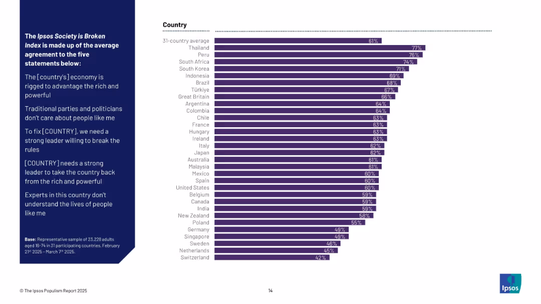
Vertical bar chart ranking countries based on composite agreement with five key political distrust statements; uniform dark purple bars represent total agreement percentages.
Performance Metrics and KPIs
Government & Public Sector
The “Society is Broken” Index reflects how strongly populations across 31 countries agree with five systemic distrust statements. Thailand, Peru, and South Africa show the highest overall agreement, indicating deeper discontent. Switzerland ranks lowest.
distrust, broken society, political sentiment, international ranking, public opinion, governance, Ipsos index
false
Performance Metrics and KPIs
Government & Public Sector
Mixed Chart
IPSOS
Add to my slides
Remove from favorites
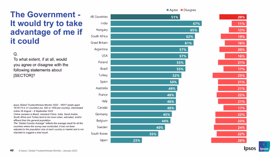
Inverted sentiment slide—agreement here indicates distrust; green bar for agree dominates
Risk Assessment and Management
Government & Public Sector
The slide shows distrust toward government, measuring belief that governments would exploit people if possible. Agreement is highest globally in this negative sentiment.
distrust, exploitation, government behavior, public perception, Ipsos, skepticism, sentiment, international
false
Risk Assessment and Management
Government & Public Sector
Mixed Chart
IPSOS
Add to my slides
Remove from favorites
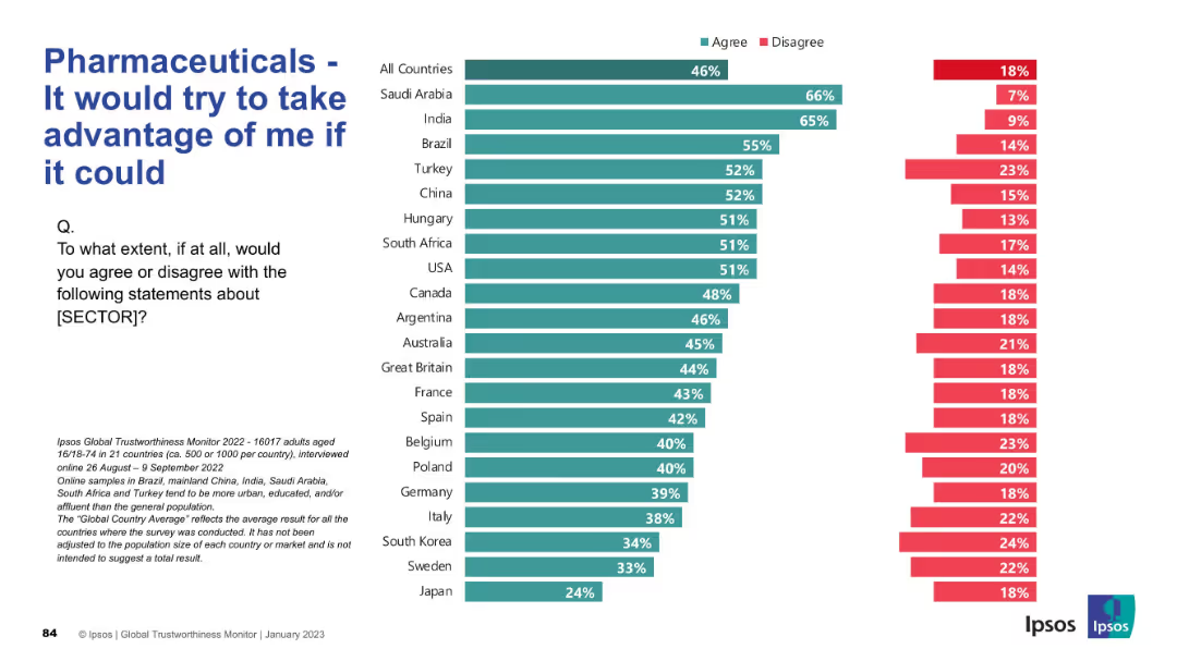
Reverse tone: a negative sentiment statement, measuring suspicion. Design follows same bar chart layout with percentages of agreement/disagreement.
Market Analysis and Trends
Healthcare & Pharmaceuticals
This slide gauges distrust and perceived opportunism in the pharmaceutical sector. Nearly half globally agree with the statement, especially in countries like Saudi Arabia, India, and Brazil. Japan shows lowest agreement. Distrust is prevalent across both developed and emerging economies.
distrust, exploitation, skepticism, pharma sector, perception, global opinion, Ipsos, survey results, suspicion, healthcare
false
Market Analysis and Trends
Healthcare & Pharmaceuticals
Mixed Chart
IPSOS
Add to my slides
Remove from favorites
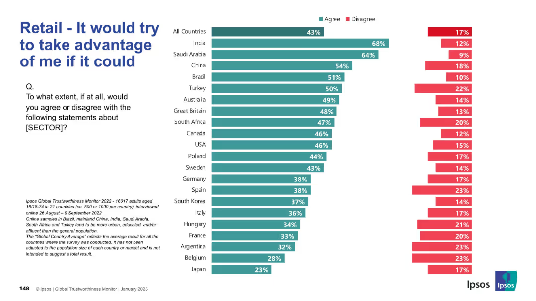
Bar chart depicting skepticism; high “agree” means higher distrust; visual emphasis on concern.
Risk Assessment and Management
Retail & E-commerce
This chart represents distrust in the retail sector, with the statement “It would try to take advantage of me if it could.” Higher scores indicate more consumer skepticism.
distrust, manipulation, consumer opinion, risk, skepticism, Ipsos
false
Risk Assessment and Management
Retail & E-commerce
Mixed Chart
IPSOS
Add to my slides
Remove from favorites
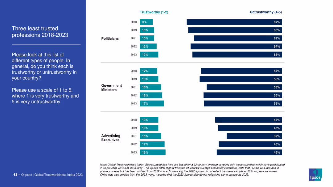
Dual bar chart comparing % of people who consider three professions (politicians, gov’t ministers, ad execs) trustworthy vs. untrustworthy from 2018 to 2023.
Market Analysis and Trends
Government & Public Sector
This slide examines public perception of the least trusted professions, contrasting the proportion of people rating them as trustworthy (1–2) and untrustworthy (4–5). Politicians are consistently ranked the lowest across all years.
distrust, politicians, government, advertising, perception, Ipsos, trust ranking, public opinion
false
Market Analysis and Trends
Government & Public Sector
Mixed Chart
IPSOS
Add to my slides
Remove from favorites
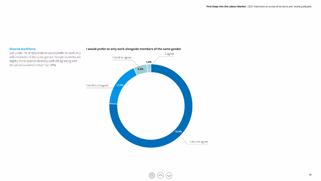
The slide includes a pie chart with segments in blue and green. The text is split into two columns, with a clear distinction between chart interpretation and additional context.
Human Resources and Talent Management
Professional Services
Shows that only 7% of respondents prefer to work with the same gender. Explores diversity preferences among male and female students.
diverse workforce, gender, respondents, preferences, diversity, male, female
false
Human Resources and Talent Management
Professional Services
Mixed Chart
Deloitte
Add to my slides
Remove from favorites
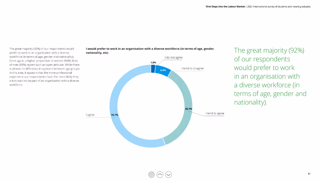
Includes a pie chart with blue and green segments. Text is divided into two columns, offering detailed explanations of the survey results and their implications for workplace diversity.
Human Resources and Talent Management
Professional Services
Indicates that 92% prefer working in a diverse workforce. Discusses the importance of diversity in terms of age, gender, and nationality in the workplace.
diverse workforce, preferences, age, gender, nationality, workplace, respondents
false
Human Resources and Talent Management
Professional Services
Mixed Chart
Deloitte
Add to my slides
Remove from favorites
The slide displays a combination of a column chart and a matrix of colored dots indicating asset classes, products, channels, and regions. It is blue and red themed with a key to symbols.
Financial Performance
Financial Services
This slide illustrates the relationship between JPMorgan's asset diversification and client asset flows over a decade, aiming to show the benefits of diversification.
diversification, asset flows, JPMorgan, column chart, asset classes, client assets, financial analysis
false
Financial Performance
Financial Services
Mixed Chart
JP Morgan
Add to my slides
Remove from favorites
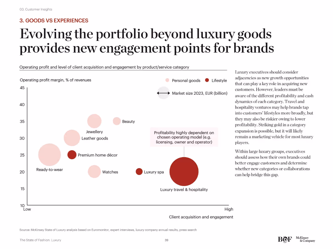
Scatterplot showing operating margin vs. customer engagement across product categories (beauty, spa, décor, etc.). Bubble sizes indicate market size. Pink/red bubbles differentiate lifestyle vs. personal goods.
Strategic Planning
Consumer Goods
This slide urges luxury brands to diversify into experiences (e.g., travel, spa) alongside products. Although some experiential categories have lower margins, they offer high customer engagement, making them useful for long-term strategic brand growth and loyalty.
diversification, category strategy, lifestyle goods, customer engagement, operating margin, growth opportunities
false
Strategic Planning
Consumer Goods
Mixed Chart
McKinsey
Add to my slides
Remove from favorites
Three donut charts showing diversification by source, remaining maturity, and currency, providing a detailed breakdown of the funding structure.
Financial Performance
Financial Services
Detailed view of UBS's long-term wholesale funding diversification across different sources, maturities, and currencies.
Diversification, funding, sources, maturity, currency
false
Financial Performance
Financial Services
Multiple Chart
UBS
Add to my slides
Remove from favorites
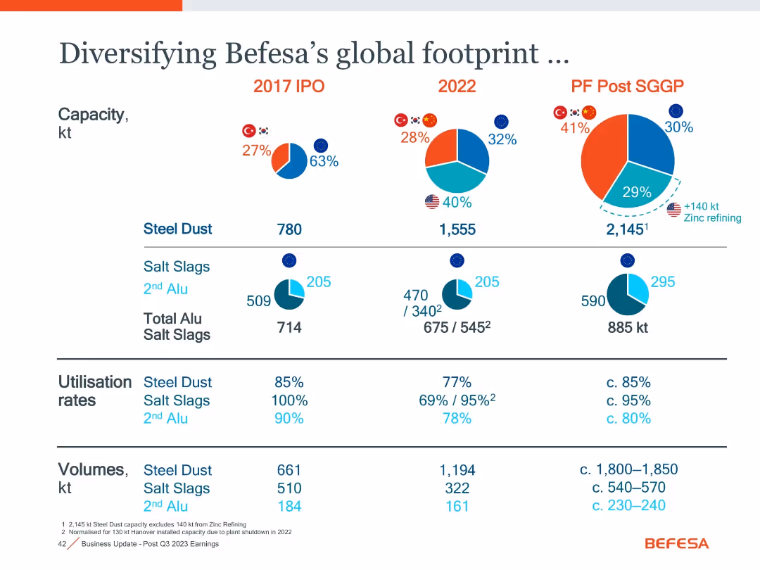
Comparative pie charts (2017, 2022, Post SGGP) showing capacity and regional distribution; includes volumes, utilisation, and material categories
Strategic Planning
Industrial & Manufacturing
Tracks Befesa's regional diversification and capacity evolution from 2017 IPO to post-SGGP. Highlights growth in steel dust and aluminium slag capacities, utilization trends, and volume expansion.
diversification, global footprint, capacity, utilisation, slag, steel dust, SGGP, regional growth
false
Strategic Planning
Industrial & Manufacturing
Single Chart
Goldman Sachs
Add to my slides
Remove from favorites
The slide shows a complex layout with multiple circular diagrams and infographics on business diversification and global presence.
Market Analysis and Trends
Financial Services
Designed to demonstrate the company's diversification across regions, staff distribution, and business mix over time. Suited for presenting to investors or during annual meetings.
Diversification, Global Presence, Annuity, Business Mix, Staff Distribution
false
Market Analysis and Trends
Financial Services
Multiple Chart
Morgan Stanley
Add to my slides
Remove from favorites
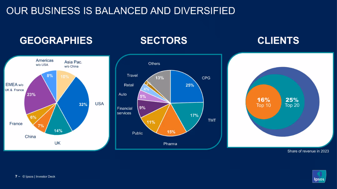
Three pie charts showing breakdown by geography, sector, and client concentration.
Strategic Planning
Professional Services
The slide showcases Ipsos’ business distribution across regions, industry sectors, and clients. It emphasizes the company’s diversified portfolio and minimal client concentration risk.
diversification, global presence, client base, revenue mix, pie chart, sector analysis, geographic split, Ipsos, balanced business
false
Strategic Planning
Professional Services
Multiple Chart
IPSOS
Add to my slides
Remove from favorites
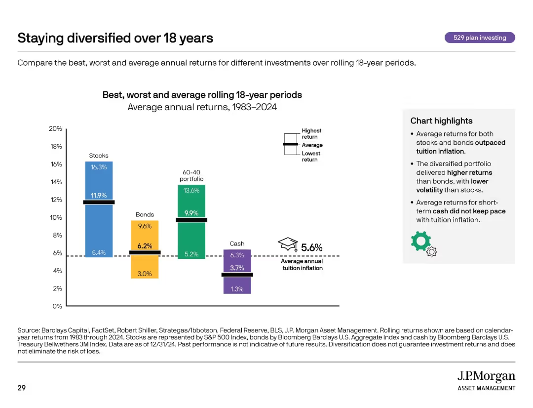
Bar chart comparing returns of different asset classes. Includes icons, dotted lines, and callout text boxes.
Investment Analysis
Financial Services
Compares average, best, and worst returns for stocks, bonds, cash, and diversified portfolios over 18-year rolling periods. Emphasizes that diversification and long-term investing can outperform tuition inflation.
diversification, investment returns, asset classes, inflation, 529 plan
false
Investment Analysis
Financial Services
Mixed Chart
JP Morgan
Add to my slides
Remove from favorites
The slide has moderate complexity, featuring a multi-layered column chart illustrating investment diversification across sectors, labeled with years and sectors.
Market Analysis and Trends
Financial Services
Focuses on investment diversification, showing how funds are allocated across various sectors like e-commerce, online media, and others with a year-on-year comparison.
Diversification, investment, sectors, e-commerce, online media
false
Market Analysis and Trends
Financial Services
Single Chart
Bain
Add to my slides
Remove from favorites
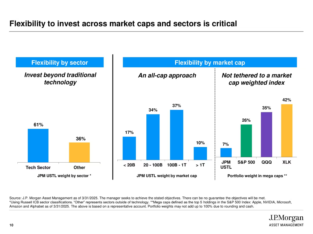
Slide is split into three vertical bar chart sections with labeled headings and blue dividers. Colors differentiate sectors and index groups (blue, orange, purple, green). Includes labels and percentages above each bar. Source notes and disclaimers appear at the bottom.
Strategic Planning
Financial Services
The slide illustrates J.P. Morgan’s diversified investment approach by showcasing flexibility in sector and market cap allocations. It emphasizes not being limited to traditional tech sectors or market-cap-weighted indices. The three sections show allocation by sector (tech vs. others), by market cap, and comparison of mega cap weightings across indices.
diversification, market cap, tech sector, investment strategy, J.P. Morgan, flexibility, portfolio allocation, index comparison, mega caps, strategic planning
false
Strategic Planning
Financial Services
Multiple Chart
JP Morgan
Add to my slides
Remove from favorites
Includes various column charts, textual analysis, and quantitative data showcasing business diversity.
Risk Assessment and Management
Financial Services
Discusses the benefits of diversification across businesses and client geographies in challenging environments.
Diversification, mortgage trading, client geographies, business resilience, economic challenges
false
Risk Assessment and Management
Financial Services
Multiple Chart
JP Morgan
Add to my slides
Remove from favorites
Pie chart showing high quality credit portfolio distribution and strategies for risk management.
Investment Analysis
Financial Services
Details the diversification of Credit Suisse’s portfolio and approaches to enhance risk management.
diversification, portfolio, risk management, credit quality, investment strategies
false
Investment Analysis
Financial Services
Mixed Chart
Credit Suisse
Add to my slides
Remove from favorites
Slide includes pie charts and detailed lists comparing product types and their market share over time.
Financial Performance
Financial Services
Discusses the diversification of financial products over years, analyzing risk-adjusted returns and market growth strategies.
Diversification, Products, Growth, Financial
false
Financial Performance
Financial Services
Multiple Chart
Barclays
Add to my slides
Remove from favorites
This slide includes a blue pie chart detailing net revenue mix, with comparative financial performance data from two consecutive years on a light background.
Financial Performance
Financial Services
Discusses the revenue growth and improvements in key financial metrics over the years, demonstrating the advantages of a diversified franchise.
Diversification, Revenue, Performance, Metrics, Growth, Financial, Franchise
false
Financial Performance
Financial Services
Mixed Chart
Goldman Sachs
Add to my slides
Remove from favorites
The slide features two charts: a scatter plot of realized total return vs. realized volatility, and a bar chart showing risk-adjusted returns by stock allocation.
Investment Analysis
Financial Services
The slide demonstrates the benefits of diversification in reducing volatility and enhancing risk-adjusted returns over different stock allocations.
diversification, risk-adjusted returns, volatility, investment strategy, stock allocation
false
Investment Analysis
Financial Services
Multiple Chart
UBS
Add to my slides
Remove from favorites
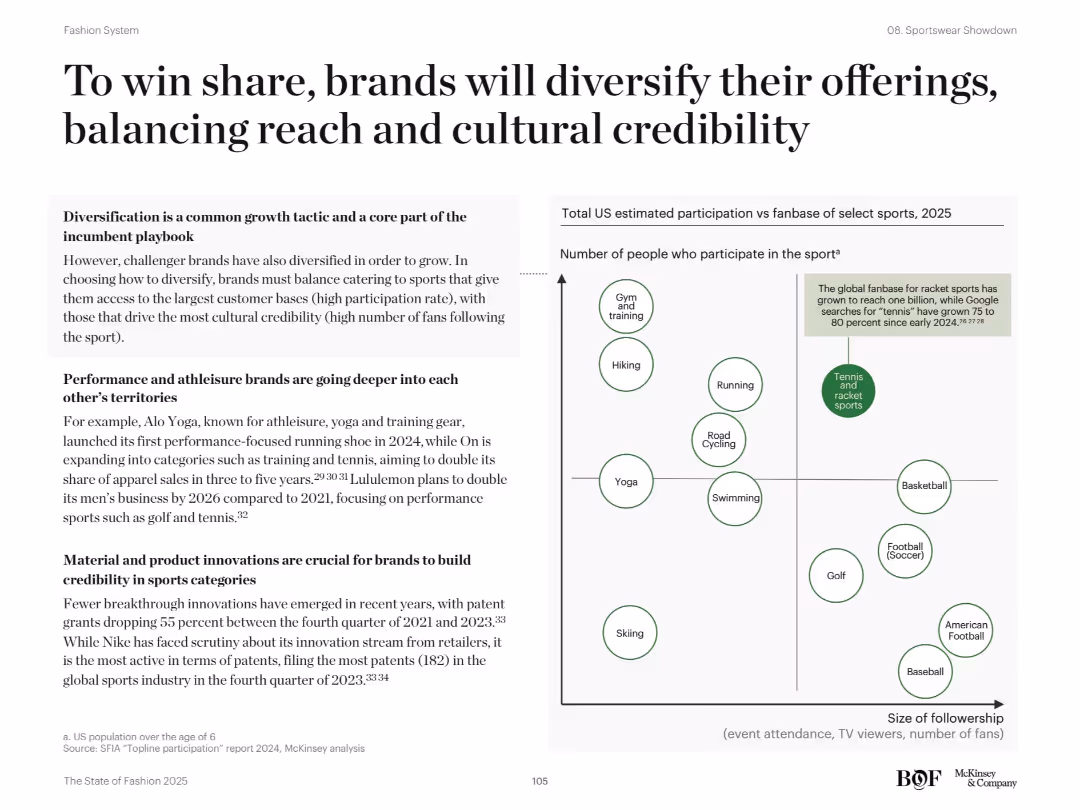
Left section features bullets and examples; right scatter plot maps participation vs followership by sport
Strategic Planning
Consumer Goods
The slide explores how sportswear brands are diversifying into various sports categories. It balances participation rate with cultural popularity to guide brand expansion. A scatter plot categorizes sports like tennis, yoga, basketball, and hiking based on US participation and fanbase. Examples include Alo Yoga’s entry into running and Lululemon’s focus on golf and tennis.
diversification, sportswear, participation, fanbase, Alo Yoga, Lululemon, brand strategy
false
Strategic Planning
Consumer Goods
Mixed Chart
McKinsey
Add to my slides
Remove from favorites
The slide contains four colored boxes with lists, headlines in blue, and subtext. A header sentence spans the top, with a footer sentence below.
Industry Overview
Financial Services
Presents four pillars of a diversified business model, positioning for market outperformance, and foundational principles.
Diversified franchise, client franchises, principles, shareholder value, business practices
false
Industry Overview
Financial Services
Table
JP Morgan
Add to my slides
Remove from favorites
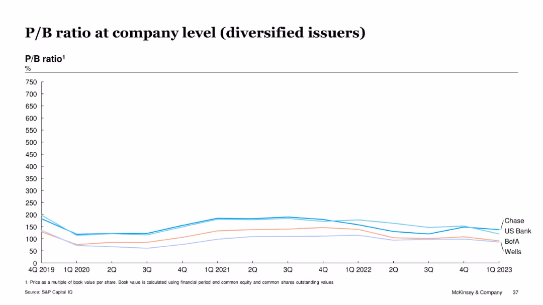
Multi-line chart with a similar format to slide 17241, tracking P/B ratios for Chase, US Bank, BofA, and Wells Fargo from 2019–2023.
Financial Performance
Financial Services
This slide presents the P/B ratio trends for four major diversified financial institutions—Chase, US Bank, BofA, and Wells. It highlights relative performance, with Chase leading in P/B ratio most of the time.
diversified issuers, Chase, Wells Fargo, BofA, P/B ratio, financial valuation, banking sector, equity, performance metrics
false
Financial Performance
Financial Services
Single Chart
McKinsey
Add to my slides
Remove from favorites
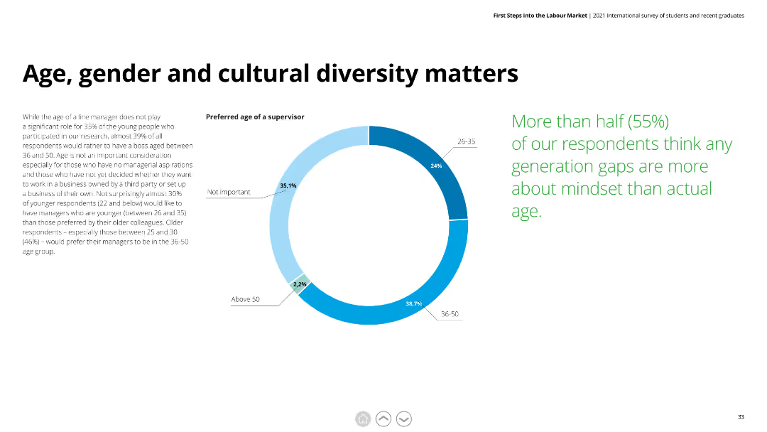
Donut chart showing preferred age of supervisors and detailed text on the importance of age, gender, and cultural diversity in the workplace.
Human Resources and Talent Management
Education & Training
This slide explores preferences for the age of supervisors among young professionals and discusses the significance of mindset over age in workplace diversity.
diversity, age preference, gender, cultural diversity, workplace mindset
false
Human Resources and Talent Management
Education & Training
Mixed Chart
Deloitte
Add to my slides
Remove from favorites
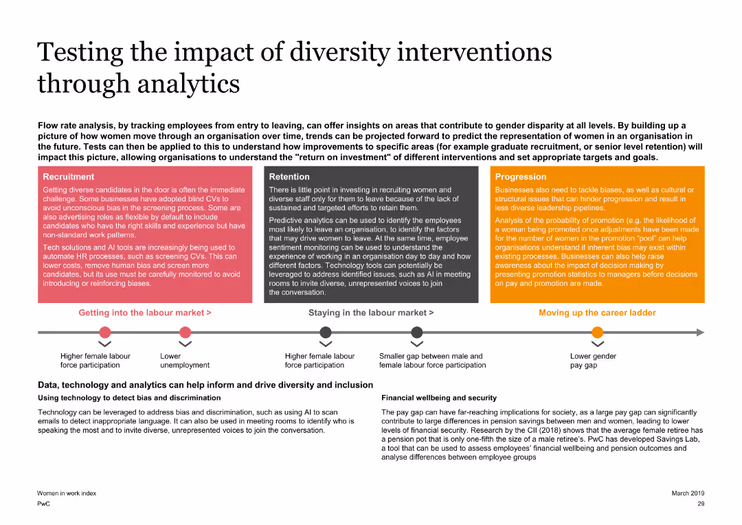
A slide with a three-part flow diagram at the bottom and text boxes at the top, discussing the impact of diversity interventions through analytics. The slide is moderately detailed with visual elements and text explanations.
Operational Efficiency
Professional Services
Explores the impact of diversity interventions in organizations using analytics, covering recruitment, retention, and progression of women in the workforce. It emphasizes the role of technology and analytics in driving diversity and inclusion.
diversity, analytics, recruitment, retention, progression
false
Operational Efficiency
Professional Services
Linear Flow
PwC/Strategy&
Add to my slides
Remove from favorites
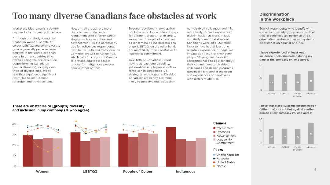
This slide features a column chart and multiple text sections. It uses a combination of light and dark text on a white background, with minimalistic icons and color-coded sections.
Human Resources and Talent Management
Government & Public Sector
The slide discusses the challenges faced by diverse groups in Canadian workplaces, highlighting recruitment, retention, and advancement obstacles. It also compares discrimination experiences.
Diversity, Discrimination, Inclusion, Workplace, Canada, Recruitment, Retention, Advancement, Leadership, Commitment
false
Human Resources and Talent Management
Government & Public Sector
Multiple Chart
BCG
Add to my slides
Remove from favorites
Text-heavy slide with a clear title and several bullet points; includes a timeline highlighting diversity milestones.
Organizational Structure and Change
Professional Services
Discusses the commitment to diversity, equity, and inclusion, showcasing programs and milestones, with the intent of building an inclusive and diverse workforce.
diversity, equity, inclusion, DEI, milestones, talent development, client service, corporate culture
false
Organizational Structure and Change
Professional Services
Table
McKinsey
Add to my slides
Remove from favorites
The slide contains bar graphs comparing gender and ethnic diversity at various levels within the organization against target goals for future years.
Regulatory and Compliance
Financial Services
Illustrates progress in diversity, equity, and inclusion within Barclays, focusing on gender and ethnic diversity at the management and board levels.
diversity, equity, inclusion, gender, management, board, targets, progress, financial services, DEI
false
Regulatory and Compliance
Financial Services
Multiple Chart
Barclays
Add to my slides
Remove from favorites
Features a photo of a diverse team with text on managed flexibility and the principles that guide it.
Strategic Planning
Professional Services
Emphasizes a secure nation supported by diverse perspectives and a shared purpose. Mentions partnerships with suppliers and community organizations.
diversity, flexibility, security, workforce, innovation
false
Strategic Planning
Professional Services
Text Only
Booz Allen Hamilton
Add to my slides
Remove from favorites
This slide features a variety of bar and column charts, and textual data displaying statistics such as gender diversity, cultural origin, and turnover rates among PwC staff. The color scheme is predominantly orange and white.
Regulatory and Compliance
Professional Services
Provides a detailed breakdown of PwC's staff diversity statistics including gender, origin, and turnover, highlighting efforts towards inclusivity and diversity in the workplace. It's valuable for HR professionals and managers focusing on diversity and inclusion strategies.
diversity, human resources, statistics, PwC, inclusion
false
Regulatory and Compliance
Professional Services
Multiple Chart
PwC/Strategy&
Add to my slides
Remove from favorites
The slide is split into two columns with the left side displaying four sections titled 'GLOBAL DISABILITIES', 'GLOBE+', 'MILITARY AND VETERANS', and 'MULTICULTURAL', each with descriptive text. The right column features a single photo of a person with a short description below, emphasizing inclusivity and community. The header and footer are consistent with a corporate design template, and there's a '22' page number in the bottom right. The overall design is professional with a focus on textual information.
Strategic Planning
Professional Services
The slide highlights the company’s dedication to diversity through the description of various Business Resource Groups (BRGs), aiming to create a sense of belonging and champion leadership skills among employees. These initiatives seem to serve as the framework for the company's diversity and inclusion efforts, each targeting different employee groups and supporting their professional development and engagement within the company.
diversity, inclusion, BRGs, leadership, community, engagement
false
Strategic Planning
Professional Services
Text Only
Booz Allen Hamilton
Add to my slides
Remove from favorites
The slide has a background image of a sunset over the sea, with quotes and two column charts showing council members' opinions on diversity and inclusion issues.
Regulatory and Compliance
Media & Entertainment
Addresses the challenges and expectations for companies to take a stance on diversity and inclusion issues.
Diversity, Inclusion, Compliance, Public Perception, Media
false
Regulatory and Compliance
Media & Entertainment
Mixed Chart
IPSOS
Add to my slides
Remove from favorites
The slide showcases column charts and percentages reflecting diversity within the company. The design includes a clean layout with blue tones, and strategic use of white space that aids in focusing on the data presented.
Human Resources and Talent Management
Financial Services
The content emphasizes the strategic importance of diversity within the company, presenting data on gender and ethnic diversity and trends over time. It is likely used to communicate the company's commitment to inclusive practices.
diversity, inclusion, gender, ethnicity, trends, bar graphs, strategic importance
false
Human Resources and Talent Management
Financial Services
Multiple Chart
Goldman Sachs
Add to my slides
Remove from favorites
The slide uses a content layout with bullet points, an embedded image, and a bar chart. The visual design is moderately complex, including various text elements and color coding for clarity.
Organizational Structure and Change
Professional Services
This slide highlights the diversity initiatives and accomplishments within the organization, focusing on gender representation, disability inclusion, and LGBTQ+ support strategies.
Diversity, Inclusion, Gender, LGBTQ+, Strategy
false
Organizational Structure and Change
Professional Services
Mixed Chart
PwC/Strategy&
Add to my slides
Remove from favorites
Various bar charts showing percentages of different demographics (gender, race, ethnicity) among investment professionals and partners, correlated with the presence of diversity strategies.
Risk Assessment and Management
Financial Services
This slide correlates diversity and inclusion strategies with the demographics of investment professionals and partners. It provides insights into the effectiveness of diversity strategies in the financial sector.
diversity, inclusion, gender, race, ethnicity
false
Risk Assessment and Management
Financial Services
Multiple Chart
Deloitte
Add to my slides
Remove from favorites
This slide features a complex line chart with multiple data series. It includes annotations and colored markers to indicate specific data points. The layout is dense with significant textual information on the right side.
Strategic Planning
Professional Services
The slide analyzes differences in focus on diversity targets among different groups within HR, emphasizing gaps in initiatives.
diversity, inclusion, HR, data analysis, line chart, gender gap, organizational focus, disparities
false
Strategic Planning
Professional Services
Single Chart
Accenture
Add to my slides
Remove from favorites
A vibrant graphic representing various diversity dimensions encircles textual explanations, flanked by images portraying diversity in the workplace.
Human Resources and Talent Management
Industrial & Manufacturing
Showcases Michelin's progress in diversity and inclusion for 2022, indicating scores and goals, reinforcing their commitment to a varied and inclusive work environment.
Diversity, Inclusion, Michelin, Work Environment, Corporate Culture, Progress, IMDI Score, Gender Balance, Equal Opportunity, Talent Development
false
Human Resources and Talent Management
Industrial & Manufacturing
Framework
Morgan Stanley
Add to my slides
Remove from favorites
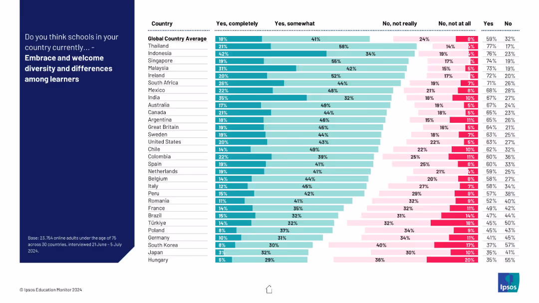
Horizontal stacked bar chart by country; categories range from “Yes completely” to “No, not at all”; teal and pink color coding.
Human Resources and Talent Management
Education & Training
This chart explores public perceptions of how well schools embrace diversity. There is substantial variation, but a general positive trend is seen in countries like Indonesia, Singapore, and Malaysia.
diversity, inclusion, schools, survey, global education, learner differences, perception, cultural context
false
Human Resources and Talent Management
Education & Training
Mixed Chart
IPSOS
Add to my slides
Remove from favorites
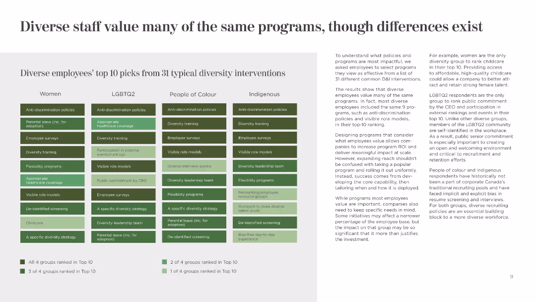
This slide uses a matrix layout to show the top 10 diversity interventions valued by different groups. It uses shades of green and clear headers to distinguish between categories.
Human Resources and Talent Management
Government & Public Sector
The slide lists and compares the top diversity interventions preferred by women, LGBTQ2, people of color, and Indigenous employees, highlighting commonalities and differences.
Diversity Interventions, Value, Comparison, Women, LGBTQ2, People of Colour, Indigenous, Programs, Preferences
false
Human Resources and Talent Management
Government & Public Sector
Table
BCG
Add to my slides
Remove from favorites
Features a combination of icons and text outlining diversity and operational goals, with a clear emphasis on sustainability and inclusion within the firm's strategy.
Organizational Structure and Change
Financial Services
Describes the company's goals for improving operational efficiency and diversity, including specific targets for hiring, energy efficiency, and waste reduction, reinforcing the company's commitment to sustainable operations and an inclusive work environment.
Diversity, Operations, Sustainability, Inclusion, Energy Efficiency, Waste Reduction
false
Organizational Structure and Change
Financial Services
Table
Goldman Sachs
Add to my slides
Remove from favorites
Slide features multiple bar charts and percentage graphics.
Market Analysis and Trends
Professional Services
Displays diversity statistics across various economic sectors by gender, ethnicity, and disability status, highlighting differences in representation in marketing roles.
Diversity, Statistics, Marketing, Economic Sectors, Representation, Gender, Ethnicity, Disability, Comparison, Bar Charts
false
Market Analysis and Trends
Professional Services
Mixed Chart
Deloitte
Add to my slides
Remove from favorites
Contains a detailed list categorizing aspects of diversity, like gender and race, alongside a quote by Mahatma Gandhi, and various symbols representing different societal sectors.
Market Analysis and Trends
Education & Training
Discusses the complexity and importance of diversity in shaping societal values and interactions, serving as an educational tool to enhance understanding and appreciation of diversity in global contexts.
diversity, values, society, education, inclusion, global, culture, unity, individuality, interaction
false
Market Analysis and Trends
Education & Training
Diagram
Roland Berger
Add to my slides
Remove from favorites
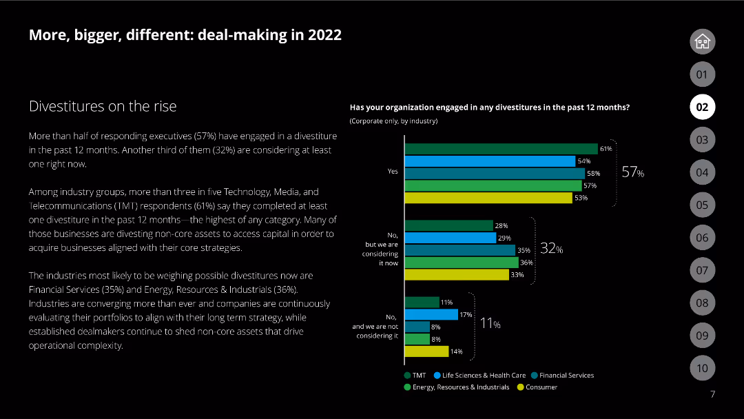
Column chart showing engagement in divestitures by industry, with categories like TMT, financial services, and energy
Mergers and Acquisitions
Financial Services
Discusses the rise in divestitures across various industries, emphasizing the strategic reasons behind these decisions.
Divestitures, industries, strategy, TMT, financial services
false
Mergers and Acquisitions
Financial Services
Mixed Chart
Deloitte
Add to my slides
Remove from favorites
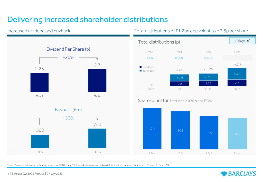
The slide features two vertical bar charts and one horizontal bar chart showing dividend per share, buyback amounts, and share count.
Financial Performance
Financial Services
This slide provides data on shareholder distributions, including dividends and buybacks over different periods, demonstrating an increase in both areas.
dividend, buyback, shareholder, distribution, financial, performance, bar chart, vertical bar, column chart, horizontal bar chart
false
Financial Performance
Financial Services
Multiple Chart
Barclays
Add to my slides
Remove from favorites
The slide shows bar graphs comparing Booz Allen's dividend growth to peer average, alongside textual information.
Financial Performance
Financial Services
Highlights the company's quarterly dividend growth compared to peers, reflecting on Booz Allen's strong performance. Used in investment analysis or shareholder presentations.
Dividend, Growth, Comparison, Performance, Market
false
Financial Performance
Financial Services
Single Chart
Booz Allen Hamilton
Add to my slides
Remove from favorites
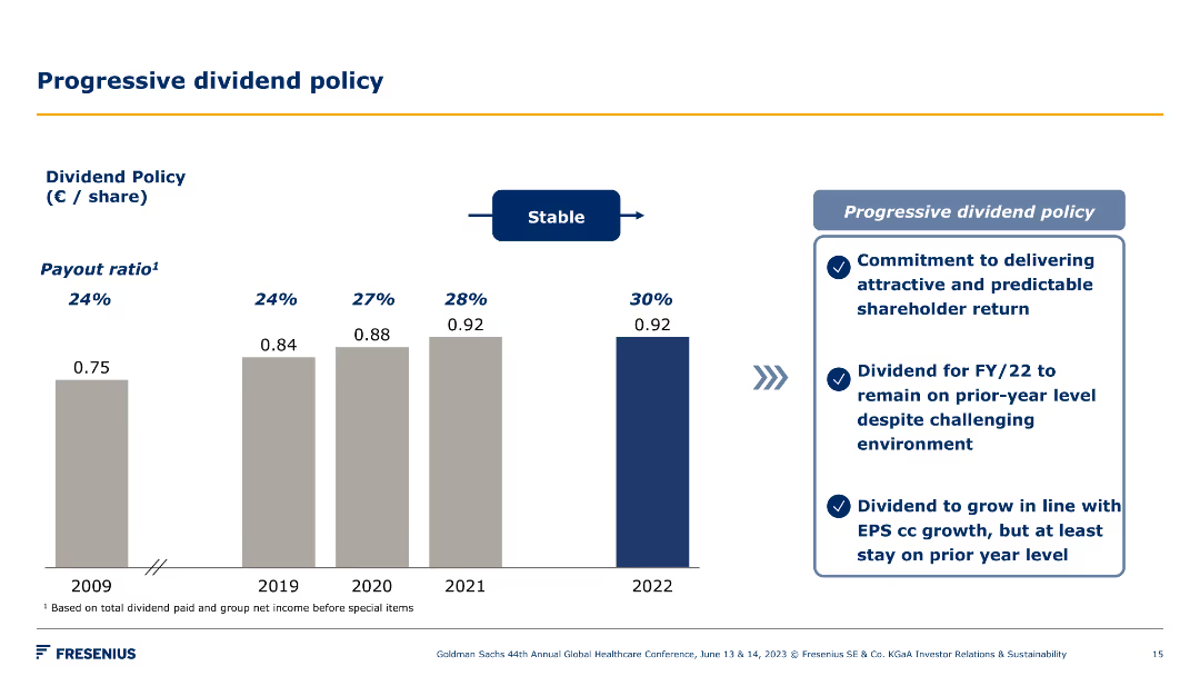
A column chart showing dividend policy payout ratios over years. Key points on dividend policy and shareholder return commitments. Visuals are clear and straightforward.
Financial Performance
Healthcare & Pharmaceuticals
This slide explains Fresenius' progressive dividend policy, illustrating payout ratios over years and highlighting the company's commitment to shareholder returns.
dividend policy, shareholder return, financial performance, payout ratio, growth, strategy, healthcare, Fresenius, stability, commitment
false
Financial Performance
Healthcare & Pharmaceuticals
Mixed Chart
Goldman Sachs
Add to my slides
Remove from favorites
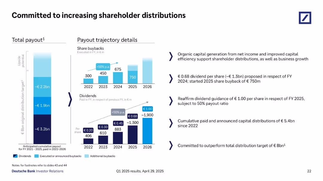
Split into payout charts (left) and detailed payout commentary (right).
Corporate Finance and Valuation
Financial Services
Outlines Deutsche Bank’s trajectory for shareholder distributions, including share buybacks and dividends from 2022–2026. Reaffirms FY 2025 dividend guidance of €1/share and plans to exceed €8B total payout. Highlights capital efficiency.
dividends, buybacks, capital return, shareholder distribution, payout, Deutsche Bank
false
Corporate Finance and Valuation
Financial Services
Multiple Chart
Deutsche Bank
Add to my slides
Remove from favorites
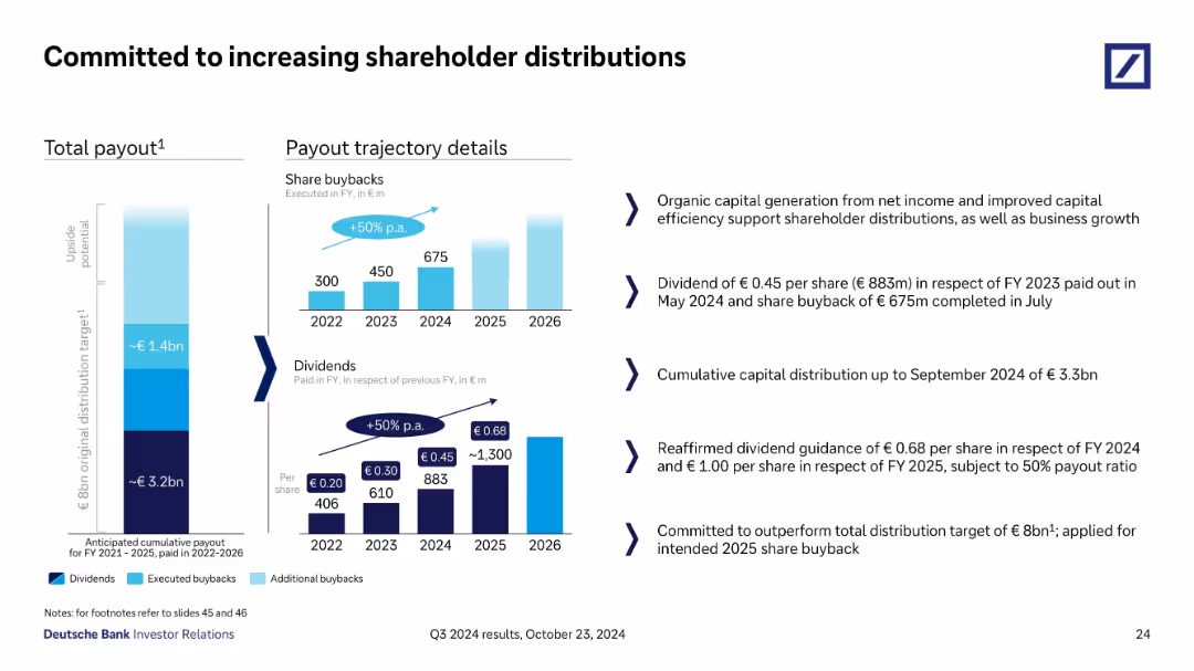
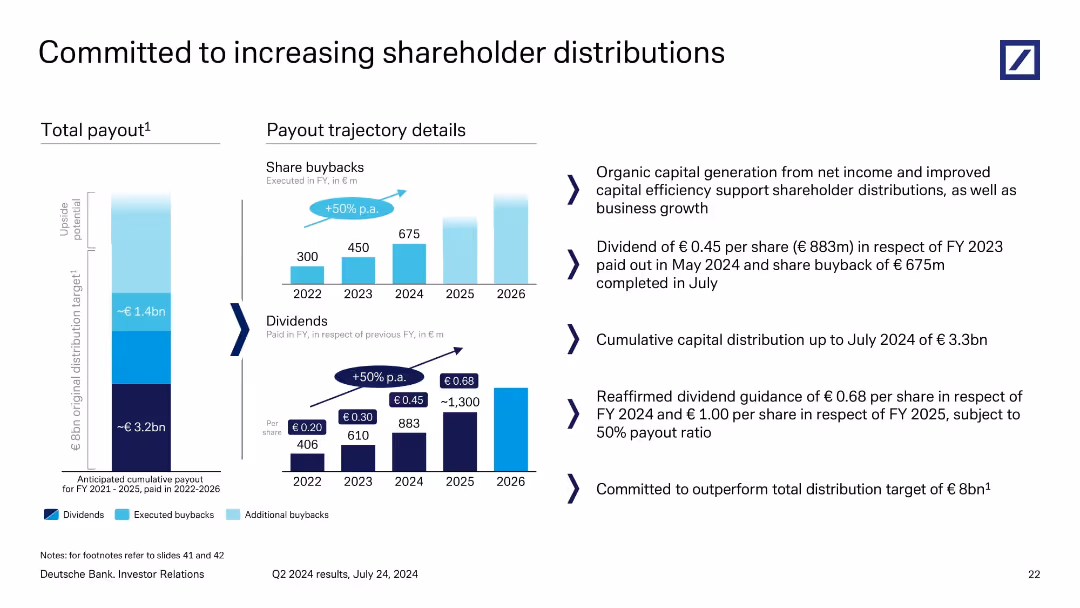
Visual presentation with vertical bar stacks showing total payout targets and historical/future dividends & buybacks, paired with key textual commentary on the right.
Strategic Planning
Financial Services
This slide outlines Deutsche Bank’s strategy for increasing shareholder returns via dividends and buybacks. It shows annual payout progression through 2026 and reaffirms guidance for 2024–2025. A €3.3bn distribution by Q3 2024 is reported, aiming to exceed the €8bn target.
dividends, buybacks, shareholder, payout, capital, return, Q3 2024
false
Strategic Planning
Financial Services
Multiple Chart
Deutsche Bank
Add to my slides
Remove from favorites
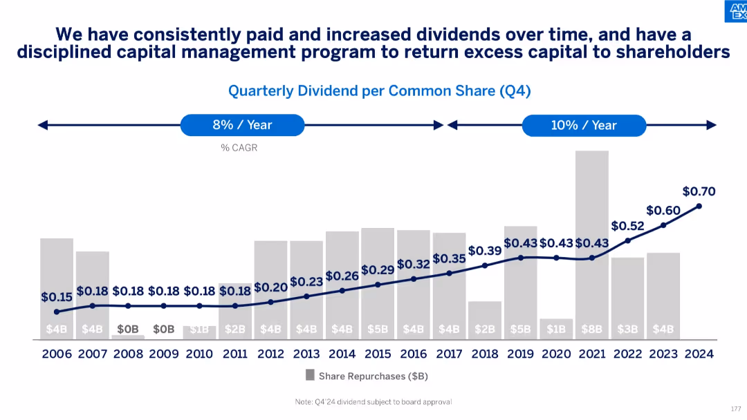
Bar and line chart showing quarterly dividend per share (Q4) and annual share repurchases from 2006–2024
Financial Performance
Financial Services
Depicts American Express’s long-term commitment to shareholder returns through growing dividends and consistent share repurchases. Shows CAGR trends for dividend growth, reflecting disciplined capital allocation.
dividends, capital return, shareholder value, share repurchases, dividend growth, financial strategy
false
Financial Performance
Financial Services
Single Chart
McKinsey
Add to my slides
Remove from favorites
A column chart showing regular and supplemental dividend history from Q2'20 to Q4'23, with corresponding dividend yields.
Financial Performance
Financial Services
This slide illustrates the dividend history of the company over several quarters, indicating the consistency and growth of dividend payouts and their yields.
Dividends, Column Chart, Financial History, Yields, Q2'20-Q4'23
false
Financial Performance
Financial Services
Mixed Chart
Morgan Stanley
Add to my slides
Remove from favorites
Features a combination of column charts showing dividend per share over time and a bar chart representing emission intensity reductions of operations.
Financial Performance
Financial Services
It's likely intended for investors, detailing dividend trends and corporate sustainability efforts.
Dividends, Emission Intensity, Sustainability, Financial, Investments, Shareholders, Trends
false
Financial Performance
Financial Services
Multiple Chart
Goldman Sachs
Add to my slides
Remove from favorites
Slide with column charts depicting dividend yield comparisons among peers and discussions on resiliency through market cycles in neutral and green colors.
Financial Performance
Energy & Utilities
Analyzes the dividend yield and total return metrics for Permian Resources compared to its peers, emphasizing resilience and growth potential in fluctuating markets.
dividends, financial benchmarks, Permian Resources, resiliency
false
Financial Performance
Energy & Utilities
Multiple Chart
Barclays
Add to my slides
Remove from favorites
A column chart showing quarterly dividends from Q4 2021 to Q4 2022 with annotations on dividend amounts and performance statistics.
Financial Performance
Transportation & Logistics
Shows the pattern of dividends declared under a specific corporate strategy with financial outcomes over five quarters, emphasizing steady growth and shareholder value.
dividends, financial performance, shareholder value, quarterly results, value strategy
false
Financial Performance
Transportation & Logistics
Single Chart
Deutsche Bank
Add to my slides
Remove from favorites
Shows a grey column chart comparing the company's dividend yield to peers, marked by a green horizontal line for the average and a special highlight for recent growth.
Financial Performance
Consumer Goods
Discusses the company’s consistent dividend growth over the years, contrasting it with the industry average to highlight its strength in returning shareholder value.
dividends, growth, comparison, shareholder value, industry average
false
Financial Performance
Consumer Goods
Single Chart
Barclays
Add to my slides
Remove from favorites
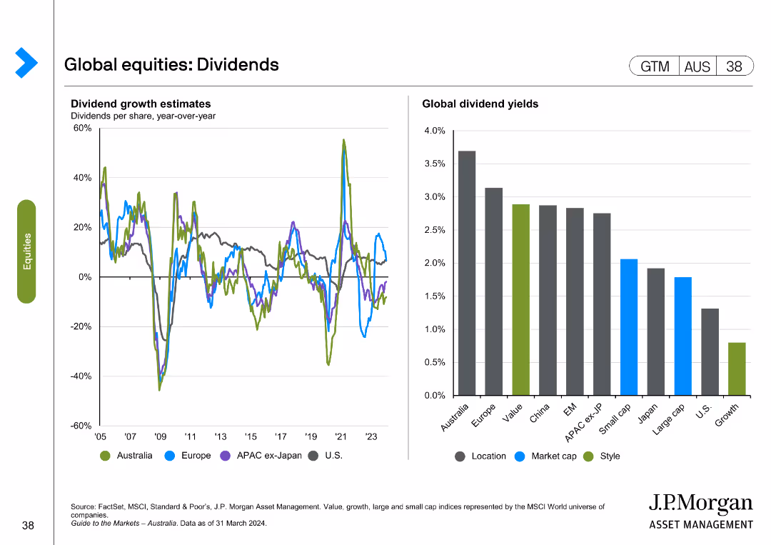
It contains two line charts showing dividend growth estimates for different regions and a column chart comparing global dividend yields across various categories.
Financial Performance
Financial Services
The slide provides insights into dividend growth estimates and global dividend yields by region and market segment.
dividends, growth, estimates, yields, global
false
Financial Performance
Financial Services
Multiple Chart
JP Morgan
Add to my slides
Remove from favorites
Column chart showing projected dividend growth over years. Information rich with forward-looking statements.
Financial Performance
Energy & Utilities
Projects long-term dividend growth, discussing factors that might influence future financial policies.
dividends, growth, financial, outlook, policy
false
Financial Performance
Energy & Utilities
Single Chart
Barclays
Add to my slides
Remove from favorites
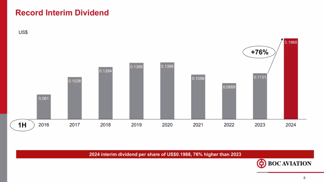
Vertical bar chart showing interim dividend growth over years 2016–2024, with a +76% increase in 2024 highlighted in red.
Financial Performance
Transportation & Logistics
This slide highlights a record interim dividend of $0.1988 per share in 1H 2024, representing a 76% increase over 2023. It shows historical dividend trends and underscores BOC Aviation’s financial strength and shareholder returns.
dividends, interim payout, historical trend, shareholder value, BOC Aviation, financial returns, growth
false
Financial Performance
Transportation & Logistics
Single Chart
Goldman Sachs
Add to my slides
Remove from favorites
Slide includes column charts detailing financial distributions and future projections. Design is structured with clear segmentation and annotations for clarity.
Financial Performance
Financial Services
This slide shows the distribution of dividends and share buybacks over time, highlighting plans and financial forecasts to inform investment decisions.
dividends, share buybacks, financial projections, growth, distribution
false
Financial Performance
Financial Services
Multiple Chart
Deutsche Bank
Add to my slides
Remove from favorites
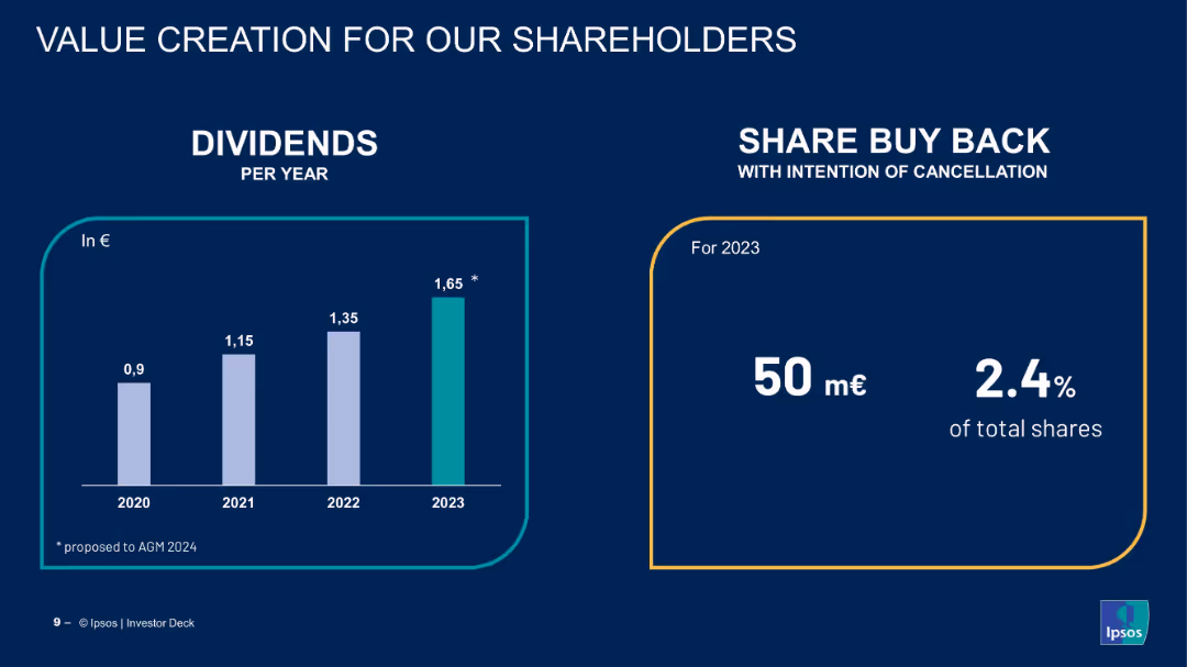
Bar chart of dividends and share buyback statistics for 2023.
Financial Performance
Financial Services
The slide illustrates Ipsos’ shareholder value strategy through increasing dividends and a share buyback program aimed at capital reduction, underscoring financial health and shareholder returns.
dividends, share buyback, shareholders, capital return, value creation, Ipsos, financial metrics, investor relations
false
Financial Performance
Financial Services
Mixed Chart
IPSOS
Add to my slides
Remove from favorites
Split view with stacked bar chart on the left illustrating payout progression and bar graph on the right showing dividends and share buybacks. Bulleted narrative on right side.
Strategic Planning
Financial Services
Outlines Deutsche Bank’s commitment to shareholder returns via dividends and share buybacks. Sets cumulative capital distribution target of €8bn through 2025–26. Confirms recent payouts and provides forward guidance on increased shareholder returns.
dividends, share buybacks, payouts, shareholder distributions, guidance
false
Strategic Planning
Financial Services
Multiple Chart
Deutsche Bank
Add to my slides
Remove from favorites
Contains a two-column layout with a column chart for dividends per year on the left and a block of text with figures on share buybacks on the right.
Financial Performance
Financial Services
Displays dividend payments from 2020 to 2023 and details on share buyback in 2023, emphasizing shareholder value creation through dividends and share buybacks.
dividends, shareholder value, buyback, financials, growth
false
Financial Performance
Financial Services
Mixed Chart
IPSOS
Add to my slides
Remove from favorites
Features a column chart tracking the dividend per share over several years with special highlights on loyalty bonuses and recent increases, depicted in pink and red hues.
Financial Performance
Consumer Goods
Showcases the growth of L'Oréal's dividends over time, emphasizing the loyalty bonus for long-term shareholders, reflecting shareholder value and financial stability.
dividends, shareholder value, loyalty bonus, L'Oréal
false
Financial Performance
Consumer Goods
Single Chart
Deutsche Bank
Add to my slides
Remove from favorites
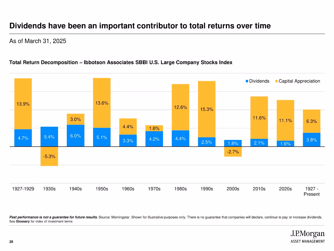
Bar chart decomposition of total return by dividends and capital appreciation by decade from 1927 to present; uses color-coded segments.
Market Analysis and Trends
Financial Services
Historical perspective on the contribution of dividends to total returns of U.S. large company stocks, showing that dividends have been a significant and steady source of return across many decades.
dividends, total return, capital appreciation, historical analysis, SBBI, stock market, returns, decade comparison
false
Market Analysis and Trends
Financial Services
Single Chart
JP Morgan
Add to my slides
Remove from favorites
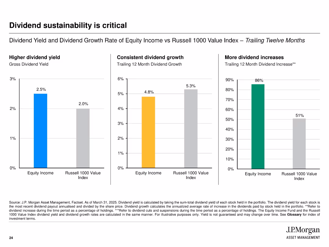
Three-column layout with bar charts comparing Equity Income and Russell 1000 Value Index on dividend yield, growth, and increases; simple design with color-coded bars.
Financial Performance
Financial Services
The slide emphasizes the sustainability of dividends by comparing gross yield, dividend growth rate, and frequency of dividend increases between Equity Income and the Russell 1000 Value Index over the trailing twelve months.
dividends, yield, growth, Russell 1000, equity income, comparison, bar chart, sustainability, income, financial metrics
false
Financial Performance
Financial Services
Multiple Chart
JP Morgan
Add to my slides
Remove from favorites
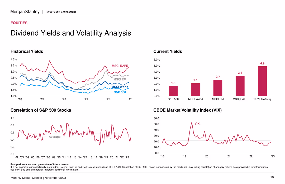
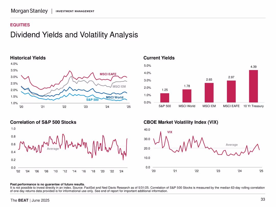
Includes three line graphs for 'Historical Yields' and 'Correlation of S&P 500 Stocks', plus column chart for 'Current Yields' and a line graph for 'CBOE Market Volatility Index (VIX)'. The slide has a clear separation of sections, with color-coded elements and succinct axis labeling.
Investment Analysis
Financial Services
Targeting investors, this slide analyzes dividend yields and market volatility, contrasting historical and current data. It highlights yield trends and the correlation within the S&P 500, alongside the VIX trend, crucial for understanding market stability and potential investment risks.
Dividends, Yields, Volatility, S&P 500, VIX
false
Investment Analysis
Financial Services
Multiple Chart
Morgan Stanley
Add to my slides
Remove from favorites
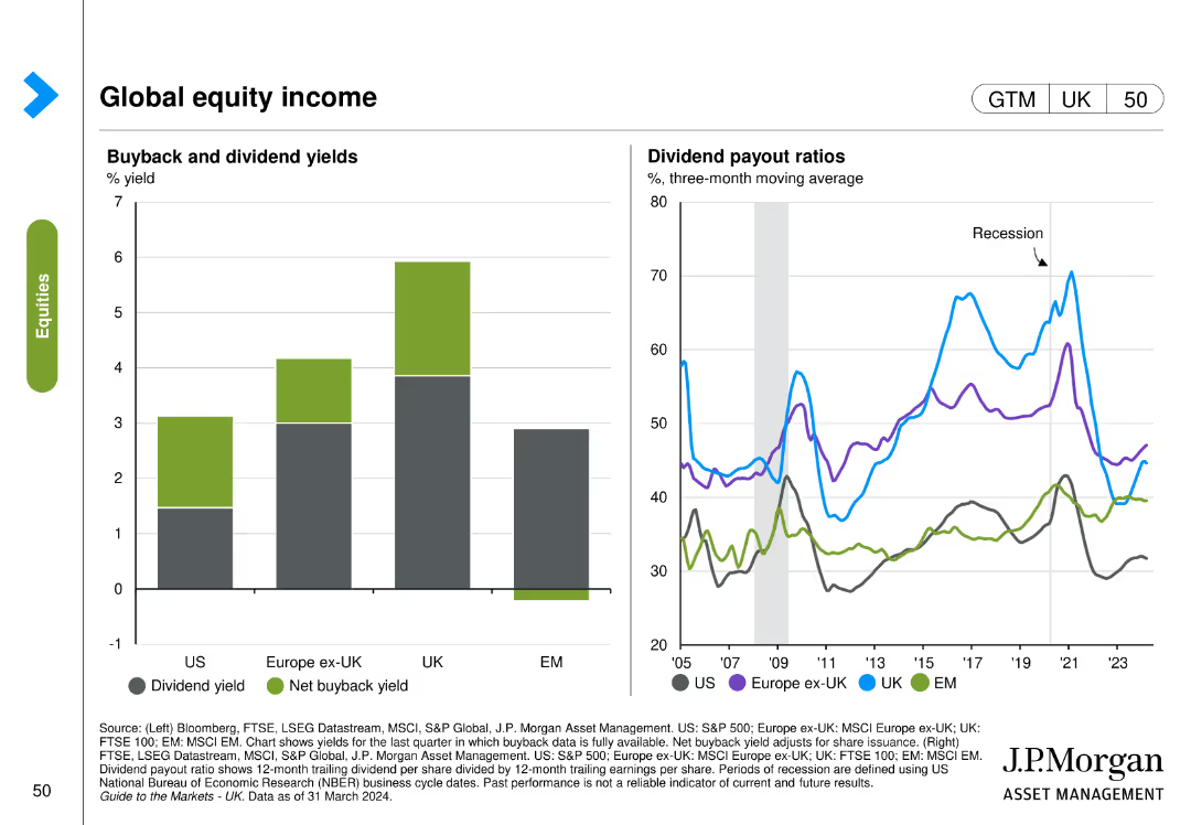
The slide includes two visual elements: a column chart on the left displaying buyback and dividend yields, and a line chart on the right showing dividend payout ratios over time.
Financial Performance
Financial Services
The slide examines global equity income by comparing buyback and dividend yields across regions and tracking dividend payout ratios over time.
dividend yield, buyback yield, payout ratios, equity income, global, financial performance
false
Financial Performance
Financial Services
Multiple Chart
JP Morgan
Add to my slides
Remove from favorites
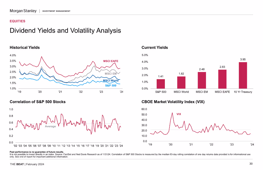
The slide contains four charts: historical yields (line chart), current yields (column chart), correlation of S&P 500 stocks (line chart), and the CBOE Market Volatility Index (line chart).
Market Analysis and Trends
Financial Services
The slide presents a detailed analysis of dividend yields and market volatility, showing trends over time and current statistics for different indices and the VIX.
dividend yields, market volatility, historical yields, current yields, VIX
false
Market Analysis and Trends
Financial Services
Multiple Chart
Morgan Stanley
Add to my slides
Remove from favorites
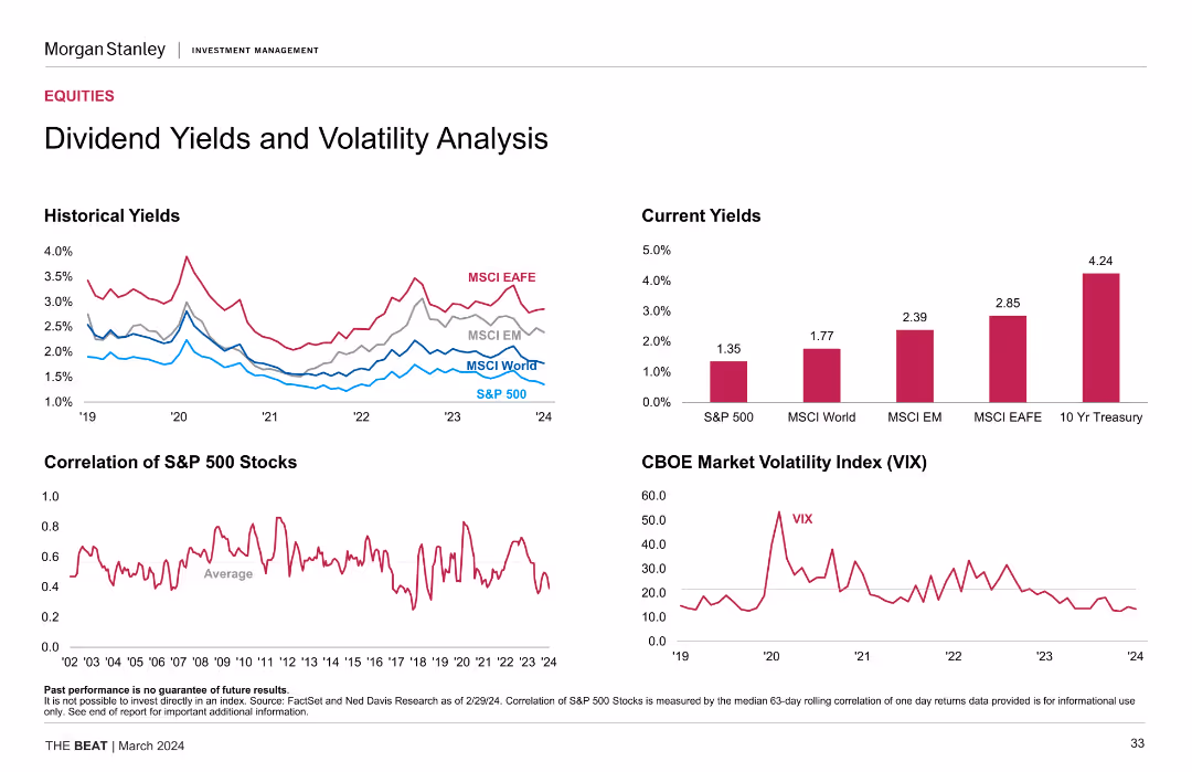
The slide features several charts: a line chart for historical yields, a bar chart for current yields, and a line chart for the CBOE Market Volatility Index.
Financial Performance
Financial Services
This slide analyzes dividend yields and volatility, comparing historical and current yields and showing the market volatility index, aiding investment decisions.
Dividend Yields, Volatility, Historical Yields, Current Yields, VIX
false
Financial Performance
Financial Services
Multiple Chart
Morgan Stanley
Add to my slides
Remove from favorites
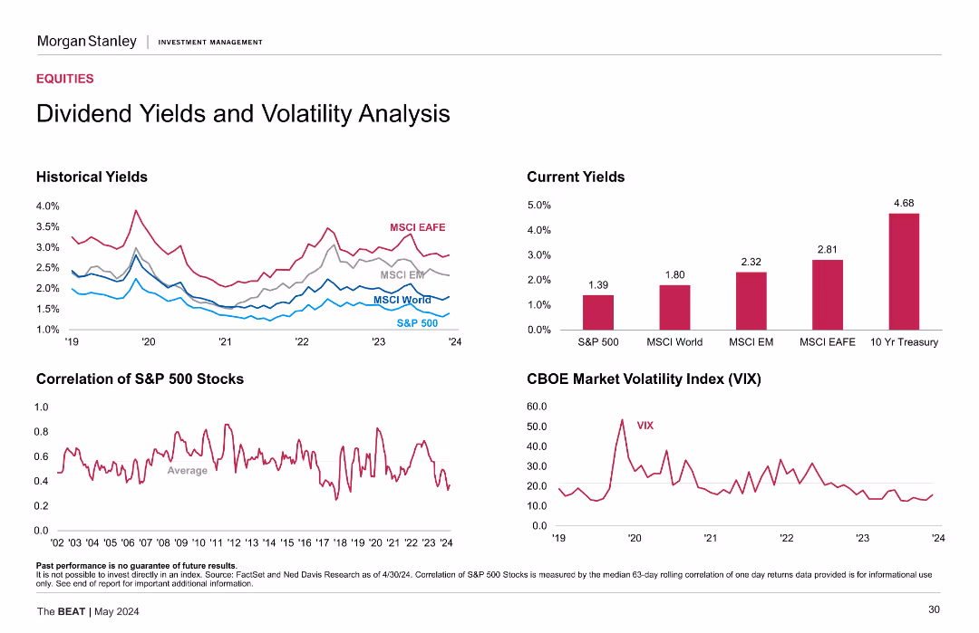
Line charts for historical yields of various indices, a bar chart for current yields, and a line chart for the CBOE Market Volatility Index (VIX).
Market Analysis and Trends
Financial Services
Analyzes dividend yields and market volatility, providing historical and current data for various indices and the VIX.
Dividend Yields, Volatility, Historical Yields, Market Analysis, VIX
false
Market Analysis and Trends
Financial Services
Multiple Chart
Morgan Stanley
Add to my slides
Remove from favorites
The slide includes multiple line graphs tracking historical yields and the volatility index (VIX), with distinct colors for different indices.
Risk Assessment and Management
Financial Services
Provides insight into the market's risk profile by correlating dividend yields with market volatility, valuable for investors managing risk in their portfolios.
dividend yields, volatility, line graphs, market analysis, VIX, risk management
false
Risk Assessment and Management
Financial Services
Multiple Chart
Morgan Stanley
Add to my slides
Remove from favorites
The slide includes line charts showing historical yields and the correlation of S&P 500 stocks, a bar chart of current yields, and a line chart of the CBOE Market Volatility Index (VIX).
Investment Analysis
Financial Services
The slide analyzes dividend yields and market volatility, providing historical and current data. Useful for understanding investment risks and returns.
dividend yields, volatility, S&P 500, correlation, MSCI, VIX, investment analysis
false
Investment Analysis
Financial Services
Multiple Chart
Morgan Stanley
Add to my slides
Remove from favorites
The slide includes multiple line charts and a column chart. The line charts show historical yields for various indices and the correlation of S&P 500 stocks. The column chart displays current yields for S&P 500, MSCI World, MSCI EM, MSCI EAFE, and 10 Yr Treasury. The CBOE Market Volatility Index (VIX) is also plotted as a line chart.
Financial Performance
Financial Services
The slide analyzes dividend yields and market volatility, comparing historical and current yields for various indices, and the correlation of S&P 500 stocks.
Dividend yields, volatility, S&P 500, MSCI, VIX, correlation
false
Financial Performance
Financial Services
Multiple Chart
Morgan Stanley
Add to my slides
Remove from favorites
Multiple small charts: historical/current dividend yields, S&P stock correlation, VIX trend.
Risk Assessment and Management
Financial Services
Highlights dividend yield comparisons across indices (S&P 500, MSCI World, etc.) and explores volatility and stock correlation trends using VIX and median.
dividend yield, volatility, VIX, stock correlation, equities, MSCI, S&P 500, fixed income alternative, market stress
false
Risk Assessment and Management
Financial Services
Multiple Chart
Morgan Stanley
Add to my slides
Remove from favorites
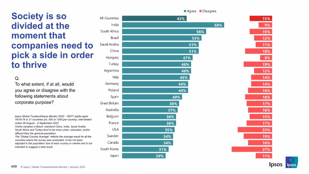
Similar format to previous slide with horizontal bars, percentage comparison by country, text left-aligned
Market Analysis and Trends
Professional Services
This slide measures agreement with the idea that companies must take sides in societal divisions to thrive. India leads in agreement at 68%, while Japan and South Korea show the least support. The global average agreement is 43%.
division, corporate purpose, public opinion, company positioning, Ipsos, social alignment, country comparison
false
Market Analysis and Trends
Professional Services
Mixed Chart
IPSOS
Add to my slides
Remove from favorites
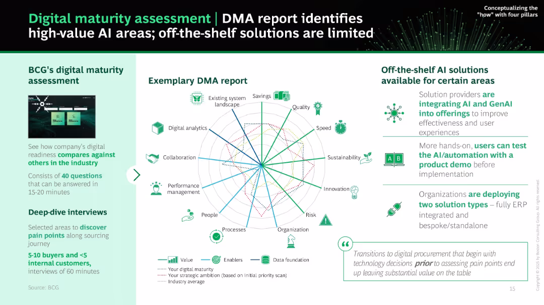
Left panel gives overview of BCG's DMA tool; right panel shows a radar chart with multiple KPIs. Icons and brief explanations summarize off-the-shelf AI solutions and their limitations.
Industry Overview
Technology & Software
This slide promotes BCG’s digital maturity assessment (DMA) to identify strategic AI implementation areas. It highlights the value of evaluating current readiness and pain points via surveys and interviews before choosing AI tools. Charts illustrate current gaps vs. strategic ambitions.
DMA, maturity assessment, radar chart, AI readiness, off-the-shelf, BCG, pain points, procurement tools
false
Industry Overview
Technology & Software
Mixed Chart
BCG
Add to my slides
Remove from favorites
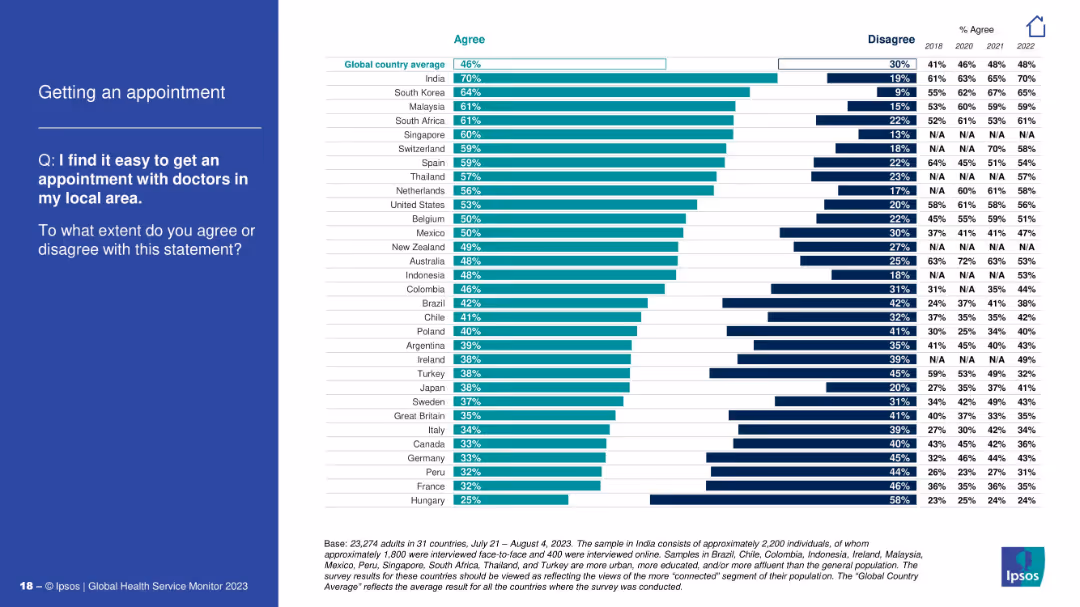
Horizontal bar chart showing agreement on ease of getting local medical appointments; question on the left.
Performance Metrics and KPIs
Healthcare & Pharmaceuticals
The chart measures the perceived ease of scheduling doctor appointments. India, South Korea, and Malaysia report the highest ease, while Hungary and France are at the bottom. The slide helps assess accessibility of primary healthcare services.
doctor appointments, access, primary care, healthcare efficiency, Ipsos, patient experience, global survey
false
Performance Metrics and KPIs
Healthcare & Pharmaceuticals
Mixed Chart
IPSOS
Add to my slides
Remove from favorites
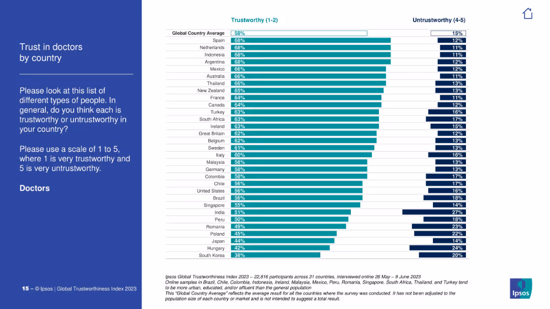
Vertical bar chart ranking countries by % of respondents rating doctors trustworthy (1–2). Includes global average. Light color scheme, country flags not shown.
Customer and Market Segmentation
Healthcare & Pharmaceuticals
The slide compares levels of trust in doctors across various countries, highlighting Spain, Netherlands, and Indonesia at the top. The global average for trust is 58%, with South Korea and Japan showing the lowest scores.
doctors, trust, global comparison, country rankings, healthcare perception, Ipsos, professionals
false
Customer and Market Segmentation
Healthcare & Pharmaceuticals
Mixed Chart
IPSOS
Add to my slides
Remove from favorites
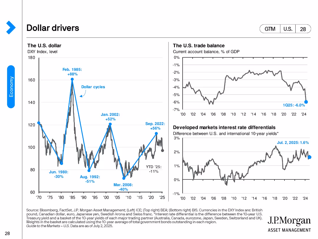
Three-panel layout with line graphs showing the DXY index, U.S. trade balance, and 10-year yield differentials; peak/trough annotations included.
Market Analysis and Trends
Financial Services
The slide explores drivers of the U.S. dollar, including historical dollar index cycles, the trade balance as % of GDP, and interest rate differentials with developed markets. It outlines current trends and historic context.
dollar index, trade balance, yield differential, forex, macroeconomics, DXY, GDP, interest rate
false
Market Analysis and Trends
Financial Services
Multiple Chart
JP Morgan
Add to my slides
Remove from favorites
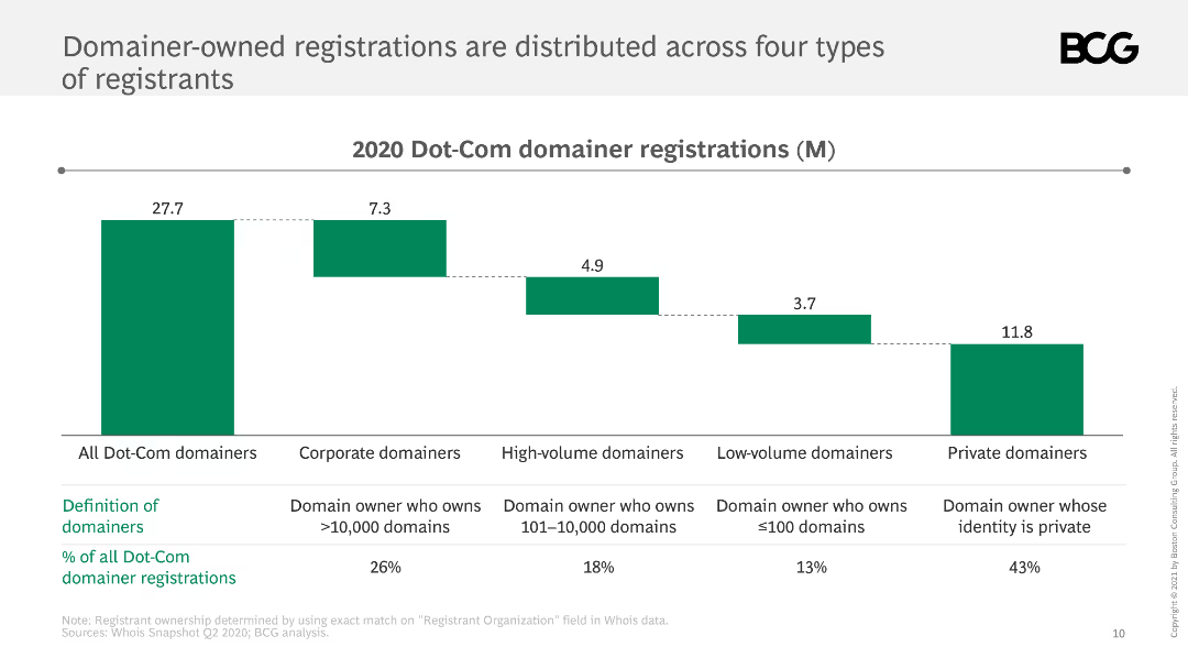
This slide shows a bar chart displaying the distribution of Dot-Com domainer registrations across corporate, high-volume, low-volume, and private domainers.
Market Analysis and Trends
Retail & E-commerce
It analyzes the distribution of domainer-owned Dot-Com registrations, identifying four types of registrants and their respective proportions.
domainers, registrations, distribution, Dot-Com, types
false
Market Analysis and Trends
Retail & E-commerce
Mixed Chart
BCG
Add to my slides
Remove from favorites
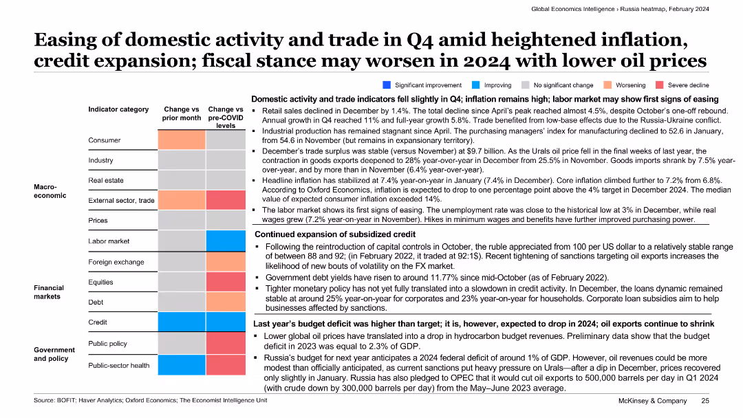
The slide presents a categorized text summary with color-coded economic indicators. It covers aspects like domestic activity, inflation, labor market, and fiscal stance in Russia.
Market Analysis and Trends
Transportation & Logistics
This slide discusses the easing of domestic activity and trade in Q4 amid heightened inflation and credit expansion. It also covers Russia’s fiscal stance and potential economic challenges in 2024.
domestic activity, trade, inflation, credit expansion, fiscal stance
false
Market Analysis and Trends
Transportation & Logistics
Table
McKinsey
Add to my slides
Remove from favorites
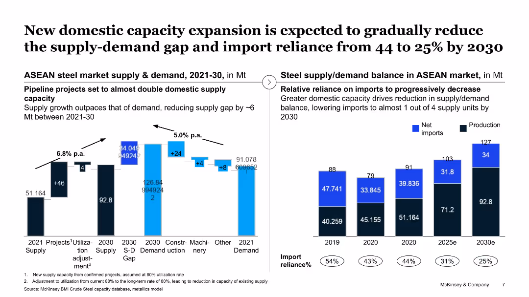
The slide shows a column chart and a line chart displaying supply and demand balance in the ASEAN market, highlighting domestic capacity expansion projects.
Strategic Planning
Industrial & Manufacturing
This slide projects a reduction in the supply-demand gap in the ASEAN steel market by 2030 through new domestic capacity expansions, aimed at reducing import reliance.
domestic capacity, supply-demand gap, ASEAN market, steel, import reliance
false
Strategic Planning
Industrial & Manufacturing
Multiple Chart
McKinsey
Add to my slides
Remove from favorites
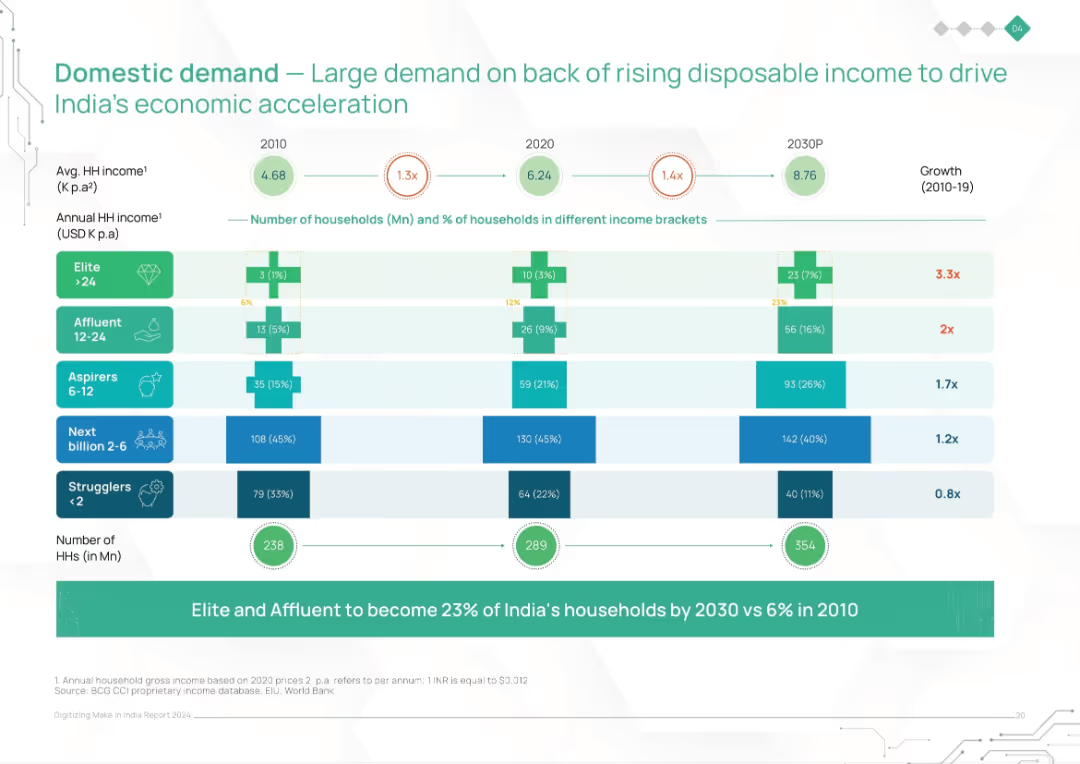
Stacked bar chart with income brackets across years (2010, 2020, 2030P). Shows household distribution and income growth.
Market Analysis and Trends
Consumer Goods
This slide illustrates the rise in Indian household incomes and changing income distribution, projecting a significant increase in affluent and elite households by 2030. It emphasizes rising domestic demand as a major driver of economic growth.
domestic demand, income growth, consumption, India households, income brackets, economic acceleration, rising affluence
false
Market Analysis and Trends
Consumer Goods
Single Chart
BCG
Add to my slides
Remove from favorites
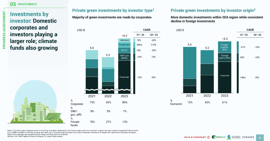
Two side-by-side stacked bar graphs: one by investor type, the other by investor origin; includes CAGR figures and investor role percentages.
Investment Analysis
Financial Services
This slide highlights the shift in green investments toward domestic sources and corporate investors. Corporates dominate recent deals, especially in large-scale and data center projects. Domestic investment grew significantly, while foreign investments declined. Climate funds show strong growth, despite being a smaller segment.
domestic investment, corporate investors, climate funds, SEA green finance, investor origin, financial trends
false
Investment Analysis
Financial Services
Multiple Chart
Bain
Add to my slides
Remove from favorites
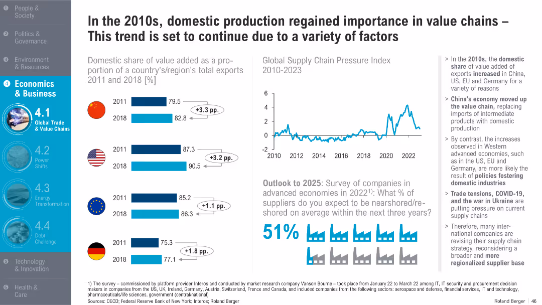
Dual-column layout with horizontal bar charts (left), line graph (top right), and infographic/statistical callouts (bottom right); clean design with icons and shaded highlights
Strategic Planning
Professional Services
This slide discusses the increasing importance of domestic value-added production in exports from 2011 to 2018 across key economies like China, the US, the EU, and Germany. It attributes this shift to structural policy choices, global events like COVID-19, and supply chain pressures. Survey data forecasts further reshoring through 2025.
domestic production, value chains, exports, reshoring, supply chain pressure, trade tensions, COVID-19, Ukraine war, China, EU
false
Strategic Planning
Professional Services
Multiple Chart
Roland Berger
Add to my slides
Remove from favorites
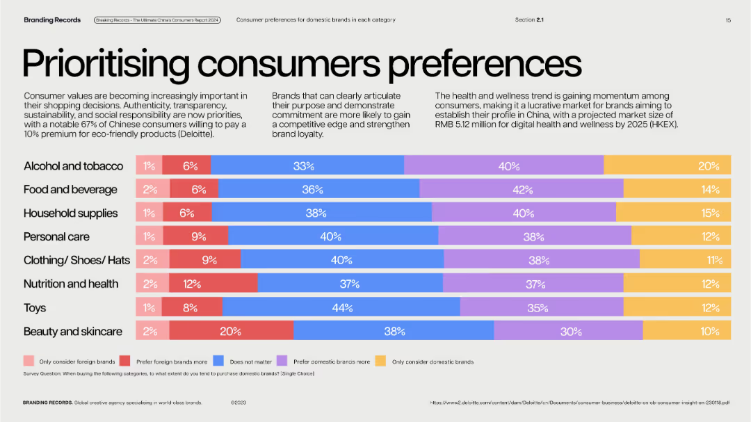
Clean, pastel horizontal bar chart segments on light background; each row color-categorized.
Customer and Market Segmentation
Consumer Goods
Reveals brand preference distribution in multiple product categories. Majority of Chinese consumers lean toward domestic brands, with few preferring foreign brands exclusively. Highlights trend toward eco-conscious shopping.
domestic vs. foreign, brand loyalty, consumer preference, eco-products, category trends
false
Customer and Market Segmentation
Consumer Goods
Single Chart
McKinsey
Add to my slides
Remove from favorites
Slide with a graph and images, blue-green color theme, visualizing the distribution of domestic work.
Technology and Digital Transformation
Professional Services
Highlights gender disparities in domestic responsibilities, using data to show how household tasks are divided among family members.
domestic work, gender disparity, household tasks, family responsibilities, data visualization, equality
false
Technology and Digital Transformation
Professional Services
Mixed Chart
Deloitte
Add to my slides
Remove from favorites
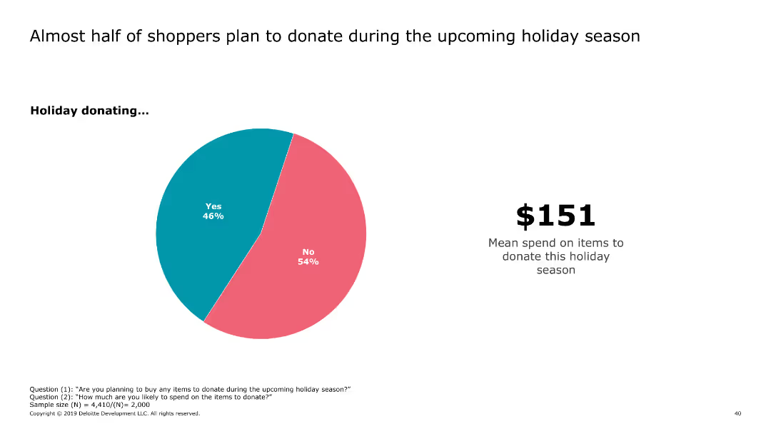
This slide includes a pie chart showing the percentage of shoppers planning to donate during the holiday season, accompanied by text indicating the mean spend on donations.
Market Analysis and Trends
Retail & E-commerce
It presents data on the proportion of shoppers intending to donate during the holiday season and the average amount they plan to spend on donations.
donations, holiday, shoppers, spend, mean
false
Market Analysis and Trends
Retail & E-commerce
Mixed Chart
Deloitte
Add to my slides
Remove from favorites
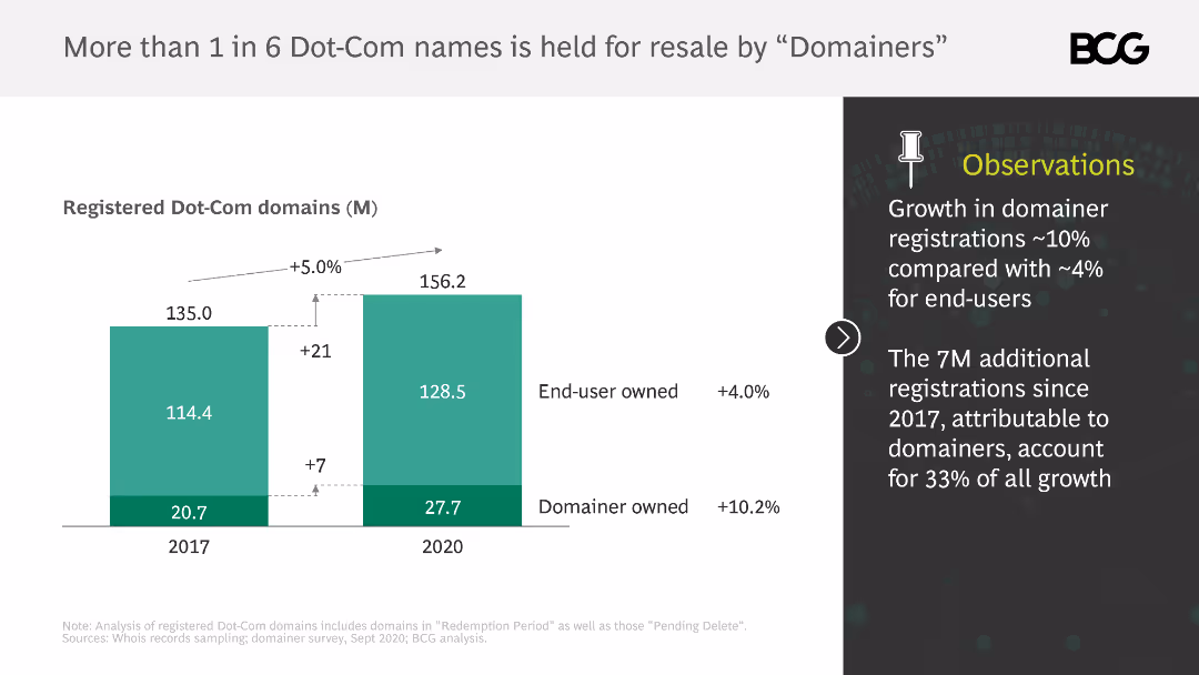
The slide includes a column chart showing the number of registered Dot-Com domains held by end-users and domainers from 2017 to 2020. Observations are listed on the right.
Market Analysis and Trends
Retail & E-commerce
It shows the growth in domainer registrations compared to end-user registrations and highlights the significant proportion of domains held for resale by domainers.
Dot-Com, domainers, resale, end-users, growth, registrations
false
Market Analysis and Trends
Retail & E-commerce
Mixed Chart
BCG
Add to my slides
Remove from favorites
Previous
Next
You don't have any favorites yet.
Please wait loading your favorites slides...
Create a FREE account to continue browsing
Receive Instant Access to 1,000+ slides from companies like McKinsey, Google, and Goldman Sachs
First Name
Last Name
Email
Password
I agree to all
Terms & Privacy Policy
Thank you! Your submission has been received!
Oops! Something went wrong while submitting the form.
Have an account?
Sign in
Upgrade to PRO to Save slides
Advanced Search and Filters
Access to 15,000+ slides
Access to Category Pages
Save/Bookmark Slides
PowerPoint Template Library
Pick a Plan
MONTHLY
$12/month
Billed every month, Cancel anytime.
YEARLY
$9/year
Billed $108 annually, Cancel anytime.
Checkout for $12/month
Checkout for $108/yr
Secured by Stripe | AES-256 bit encryption