My Account
My Slides
Search by Category
Companies
Slide Type
Use Case
Industry
Pricing
Templates
View All Templates
Download Template Slides
✦ AI
AI Prompt Library
AI Search
Feedback
Login
Logout
Get Started
Browse all Slides
Browse all Slides
Create a FREE Account
Instant access to 1,000+ real slides from top companies like McKinsey, BCG, Goldman Sachs, Google and many more!
First Name
Last Name
Email
Password
I agree to all
Terms & Privacy Policy
Thank you! Your submission has been received!
Oops! Something went wrong while submitting the form.
Have an account?
Sign in
Saved Slides
Total No. of slides saved
0
↻ Refresh
✖ Clear all
A concise visual slide outlining various AI use cases, relevant technologies, functions, and industries, paired with benefits highlighted in a box.
Technology and Digital Transformation
Technology & Software
Providing a brief overview of practical AI use cases in different industries and their respective benefits, emphasizing the transformative power of AI.
AI Use Cases, Business Transformation, ML, NLP, Computer Vision, Strategic Planning
false
Technology and Digital Transformation
Technology & Software
Header Vertical
McKinsey
Add to my slides
Remove from favorites
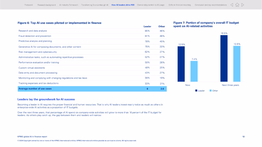
Two-panel layout with a data table on the left and a bar chart on the right; clean and grid-aligned
Product and Service Analysis
Financial Services
This slide lists the most common AI use cases implemented in finance, including research, fraud detection, and document processing. It compares leaders and other organizations in adoption levels and shows IT budget allocation to AI activities now and projected in 3 years.
AI use cases, finance operations, AI leaders, IT budget, fraud detection, predictive planning, automation, investment
false
Product and Service Analysis
Financial Services
Mixed Chart
KPMG
Add to my slides
Remove from favorites
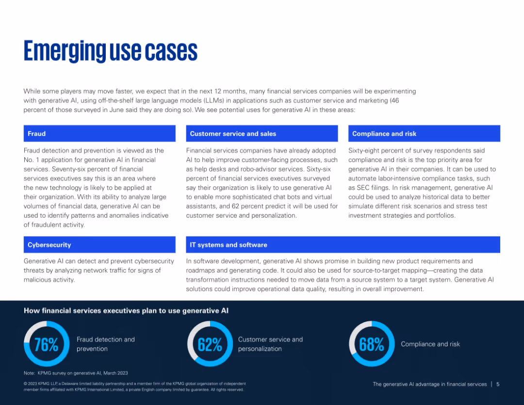
Two-column layout with blue category labels and short paragraphs per use case; footer shows usage statistics.
Product and Service Analysis
Financial Services
Outlines key generative AI use cases in financial services such as fraud detection, customer service, compliance, and IT systems. Supports findings with survey data on AI implementation intentions and perceived value areas.
AI use cases, fraud detection, compliance, customer service, IT transformation, financial tech
false
Product and Service Analysis
Financial Services
Mixed Chart
KPMG
Add to my slides
Remove from favorites
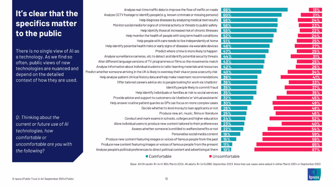
Left: paragraph explaining context dependence; right: bar chart ranking comfort vs discomfort by use case
Customer and Market Segmentation
Artificial Intelligence
Public comfort with AI varies greatly depending on its application. People feel most comfortable when AI supports societal needs (e.g., traffic, healthcare), but uncomfortable with tasks involving content creation, surveillance, or political manipulation.
AI use cases, public comfort, Ipsos, detailed context, segmentation, content creation, healthcare
false
Customer and Market Segmentation
Artificial Intelligence
Single Chart
IPSOS
Add to my slides
Remove from favorites
This slide is divided into two sections: the top section is labeled "The 'cool' part" with a 70% share of conversations, and the bottom section is labeled "The 'hard' part" with a 30% share of conversations. It includes icons and a purple shaded area representing an iceberg.
Industry Overview
Technology & Software
The slide compares state-of-the-art AI use cases with foundational capabilities, emphasizing that organizations often focus more on advanced use cases while neglecting essential foundational elements.
AI, use cases, technology, foundation, organization
false
Industry Overview
Technology & Software
Header Vertical
Kearney
Add to my slides
Remove from favorites
Two-column format with dense text on left and horizontal bar comparison on right (AI users vs non-users).
Performance Metrics and KPIs
Artificial Intelligence
This slide shows that people who use AI are more optimistic about its benefits. AI users report higher perceived positive impact across domains like learning, working, and health, suggesting familiarity drives confidence.
AI user sentiment, usage impact, adoption effects, perception difference, learning, trust
false
Performance Metrics and KPIs
Artificial Intelligence
Mixed Chart
IPSOS
Add to my slides
Remove from favorites
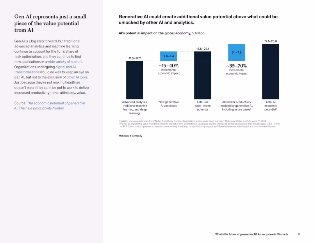
Left text description with bar chart on right showing estimated economic value from various AI categories, including gen AI.
Investment Analysis
Artificial Intelligence
Generative AI, while impactful, is part of a larger AI ecosystem. Traditional AI methods still contribute the majority of economic value. The slide quantifies the incremental and total economic potential.
AI value, economic impact, generative AI, analytics, investment potential, productivity
false
Investment Analysis
Artificial Intelligence
Mixed Chart
McKinsey
Add to my slides
Remove from favorites
A continuation from the previous slide, with pie charts and bar graphs illustrating potential financial value from AI and its correlation with financial performance.
Financial Performance
Technology & Software
This slide continues to highlight the financial importance of AI, showing potential value in various business functions and the correlation between AI maturity and financial performance.
AI Value, Financial Forecast, Market Analysis, AI Maturity, Business Impact, Investment Returns
false
Financial Performance
Technology & Software
Multiple Chart
McKinsey
Add to my slides
Remove from favorites
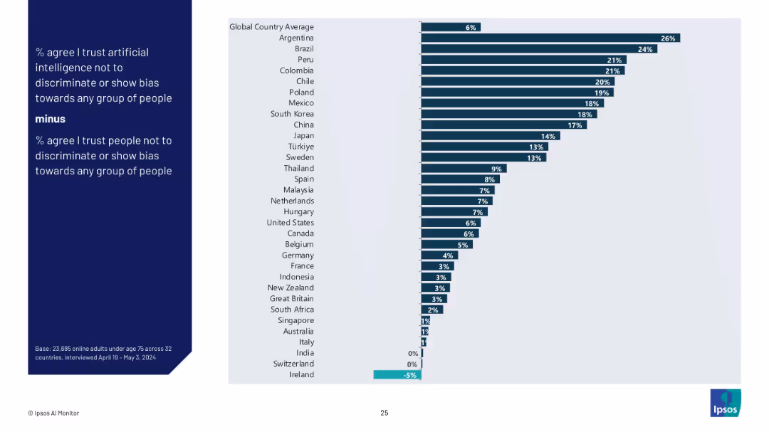
Bar chart showing difference between trust in AI vs trust in people for fairness by country (% AI trust minus % people trust).
Regulatory and Compliance
Artificial Intelligence
This slide visualizes the delta between trust in AI and trust in people to avoid bias, illustrating where AI is perceived as more or less fair than humans. Positive values favor AI; negative values favor people.
AI vs human trust, discrimination, bias perception, fairness, Ipsos, public opinion, country gap, ethical AI
false
Regulatory and Compliance
Artificial Intelligence
Mixed Chart
IPSOS
Add to my slides
Remove from favorites
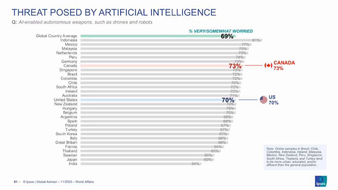
Horizontal bar chart ranking countries by concern over AI-enabled autonomous weapons
Risk Assessment and Management
Artificial Intelligence
This slide shows the percentage of people who are concerned about AI-powered weapons. Canada (73%) and the US (70%) are slightly above the global average (69%) in their concern.
AI weapons, drones, public concern, global comparison, military AI, Ipsos
false
Risk Assessment and Management
Artificial Intelligence
Single Chart
IPSOS
Add to my slides
Remove from favorites
This slide features multiple column charts comparing the impact of generative AI on different countries and industries. It uses shades of purple to differentiate between augmentation and automation potential, with detailed percentage labels for clarity.
Technology and Digital Transformation
Technology & Software
Analyzes the projected impact of generative AI on working hours across various industries and countries.
AI, Work, Automation, Augmentation, Industries, Countries, Impact, Technology, Labor
false
Technology and Digital Transformation
Technology & Software
Multiple Chart
Accenture
Add to my slides
Remove from favorites
This slide presents survey data comparing worker and executive opinions on AI's impacts. It uses contrasting colors to differentiate between groups, and includes key statistics for areas like job security and technology understanding.
Strategic Planning
Technology & Software
Highlights differences in perception between executives and workers regarding the impact of AI on job security and workplace integration.
AI, Workers, Executives, Perceptions, Impact, Job Security, Technology, Survey, Professional Services
false
Strategic Planning
Technology & Software
Mixed Chart
Accenture
Add to my slides
Remove from favorites
Slide features multiple pie charts, and informational text. Predominant colors are blue and grey.
Market Analysis and Trends
Technology & Software
Discusses gaps in harnessing AI to optimize workforce, including leadership roles and investment in AI, contrasting organizations that are advancing in these areas with those that are not.
AI, workforce, leadership, investment, optimization
false
Market Analysis and Trends
Technology & Software
Multiple Chart
Deloitte
Add to my slides
Remove from favorites
Features a large pie chart and supporting text on workforce optimism regarding AI technologies. The design is clean, with green highlights that draw attention to key statistics, facilitating an easy understanding of the data.
Technology and Digital Transformation
Technology & Software
Discusses the positive impact of AI on workforce performance and job satisfaction, noting that 82% of respondents see a beneficial impact. This slide is pertinent for discussions on human resources strategies in tech industries.
AI, workforce optimization, job satisfaction, performance enhancement, human resources, tech industries, impact analysis
false
Technology and Digital Transformation
Technology & Software
Mixed Chart
Deloitte
Add to my slides
Remove from favorites
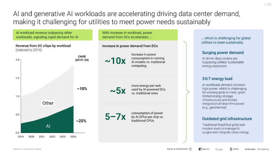
Split layout: left-side line chart on AI chip revenue; right-side infographic of power consumption increases; blue highlight box outlines utility challenges.
Operational Efficiency
Artificial Intelligence
Shows exponential growth in AI workloads, causing power demand to surge (10x more than traditional). Highlights strain on global utilities and grid systems due to constant AI processing and outdated infrastructure.
AI workload, power demand, utilities, grid, GPUs, sustainability
false
Operational Efficiency
Artificial Intelligence
Mixed Chart
Bain
Add to my slides
Remove from favorites
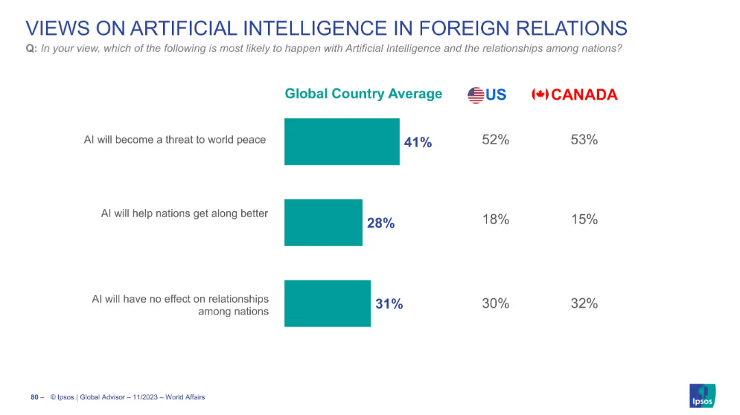
Horizontal bar chart with three response categories and percentages shown for Global Average, US, and Canada
Market Analysis and Trends
Artificial Intelligence
The slide presents survey results about perceptions of AI's effect on foreign relations. Most respondents believe AI will become a threat to world peace, especially in US and Canada.
AI, world peace, foreign relations, public opinion, global survey, US, Canada, Ipsos
false
Market Analysis and Trends
Artificial Intelligence
Single Chart
IPSOS
Add to my slides
Remove from favorites
The slide presents a flowchart focusing on the processing routes for algae, illustrating pathways for conditioning, pretreatment, intermediates, and conversion into various biofuels. Specific processes and their outputs are highlighted.
Technology and Digital Transformation
Energy & Utilities
This slide examines the specific routes for processing algae into biofuels, detailing the conditioning, pretreatment, and conversion steps, and emphasizing the bottlenecks in processing chain.
algae processing, biomass, biofuels, conditioning, pretreatment, intermediates, conversion routes, processing chain
false
Technology and Digital Transformation
Energy & Utilities
Diagram
Kearney
Add to my slides
Remove from favorites
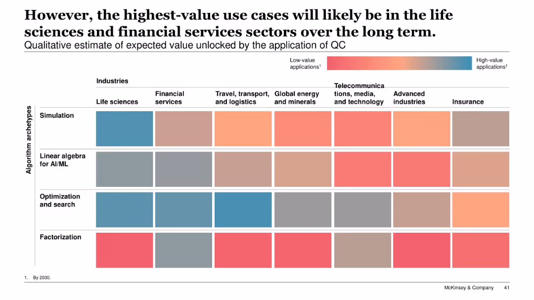
Heatmap with industries as columns and algorithm archetypes as rows; color gradient from low to high value applications; title and legend included.
Technology and Digital Transformation
Artificial Intelligence
A qualitative heatmap assesses expected value unlocked by quantum computing applications. Life sciences and financial services rank highest across algorithm types, especially simulation and optimization. Industries like telecom and advanced manufacturing show lower potential.
algorithm types, value heatmap, simulation, optimization, AI/ML, life sciences, financial services, QC applications
false
Technology and Digital Transformation
Artificial Intelligence
Single Chart
McKinsey
Add to my slides
Remove from favorites
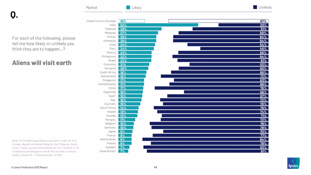
Horizontal bar chart; ranked by country; teal and navy represent likelihood and unlikelihood respectively
Market Analysis and Trends
Government & Public Sector
This slide reflects public belief in extraterrestrial visitation. India and Thailand rank highest in likelihood belief, while European countries are largely skeptical.
aliens, UFO, belief, outer space, public opinion, Ipsos survey, predictions, 2025, extraterrestrial life
false
Market Analysis and Trends
Government & Public Sector
Mixed Chart
IPSOS
Add to my slides
Remove from favorites
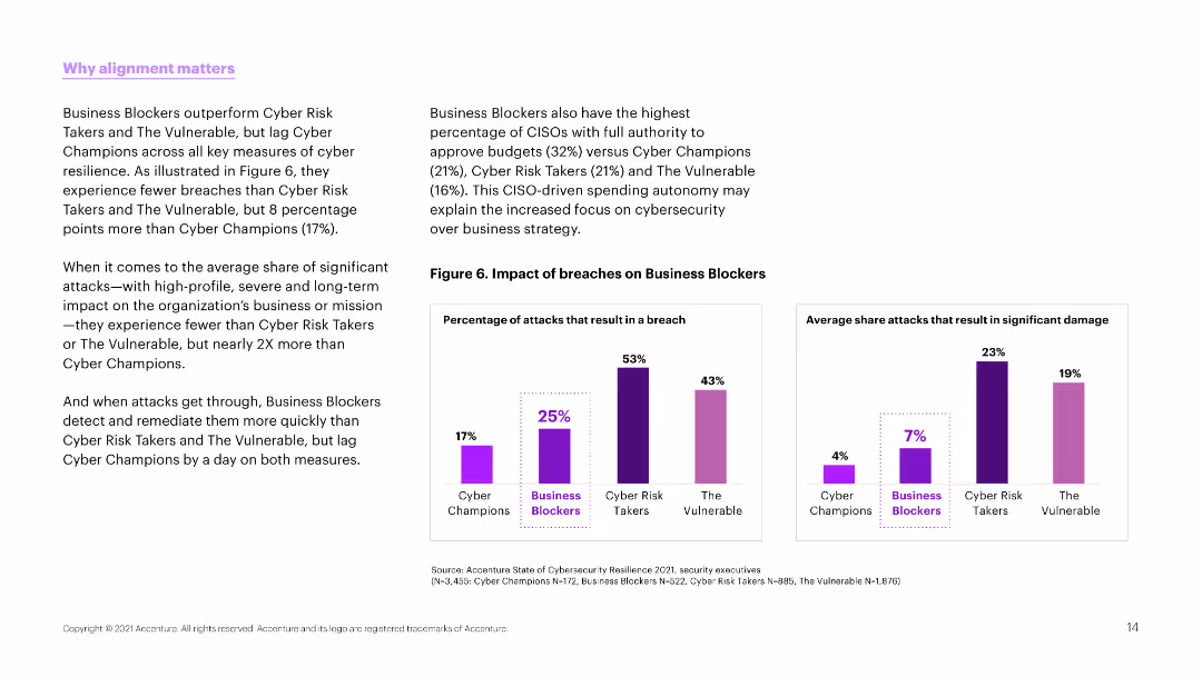
Text and column charts comparing the impact of breaches on different types of organizations. Charts use purple to show percentages of breaches and impacts.
Strategic Planning
Professional Services
The slide emphasizes the importance of alignment in cybersecurity strategies, comparing the breach impacts on different organizational types like Business Blockers and Cyber Champions.
alignment, cybersecurity, breaches, comparison, impact
false
Strategic Planning
Professional Services
Multiple Chart
Accenture
Add to my slides
Remove from favorites
Column chart comparing alignment over time with insights on factors influencing alignment in different sectors.
Strategic Planning
Professional Services
Highlights improvements in alignment between marketing and finance, discussing implications for strategic and financial planning.
alignment, marketing, finance, strategic planning, sector influence
false
Strategic Planning
Professional Services
Mixed Chart
Deloitte
Add to my slides
Remove from favorites
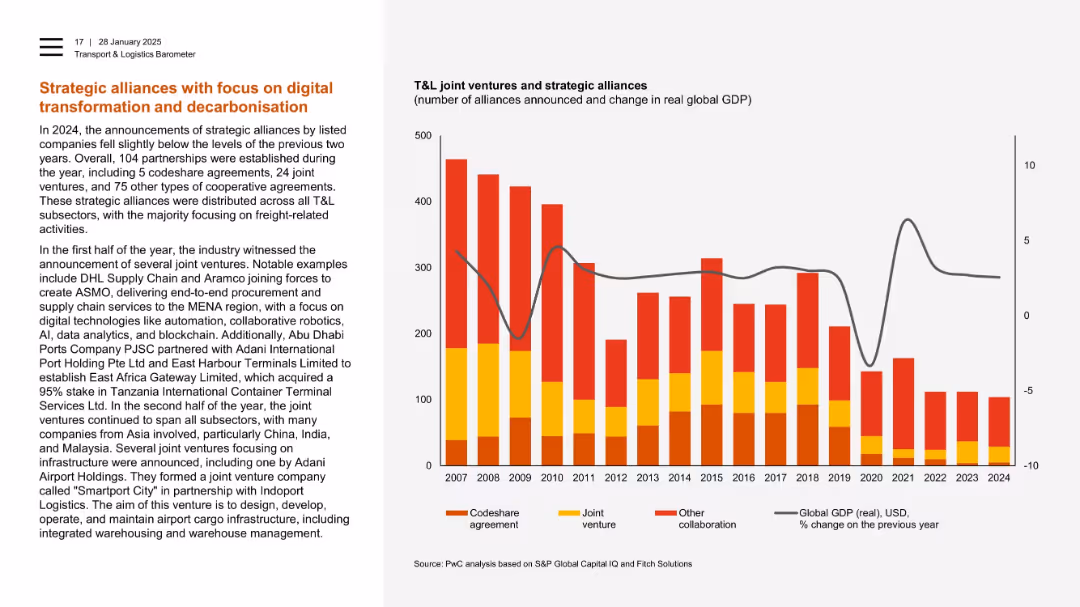
Text-heavy left with stacked bar chart on right showing alliances since 2007.
Strategic Planning
Transportation & Logistics
The slide outlines strategic alliances in 2024 focused on digital and environmental goals, such as AI, blockchain, and robotics. It lists key joint ventures and shows a decline in total alliances over time, correlating with shifts in global GDP.
alliances, joint ventures, digital transformation, decarbonisation, freight, robotics, GDP
false
Strategic Planning
Transportation & Logistics
Mixed Chart
PwC/Strategy&
Add to my slides
Remove from favorites
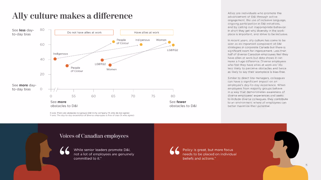
This slide presents a scatter plot comparing the presence of allies at work and the perception of day-to-day bias. It includes quotes and uses simple icons and color-coded data points.
Human Resources and Talent Management
Government & Public Sector
The slide highlights the impact of having allies in the workplace on reducing bias and fostering a more inclusive environment, supported by data and employee quotes.
Allies, Workplace, Bias, Inclusion, Impact, Data, Employee Quotes, Environment, Culture
false
Human Resources and Talent Management
Government & Public Sector
Mixed Chart
BCG
Add to my slides
Remove from favorites
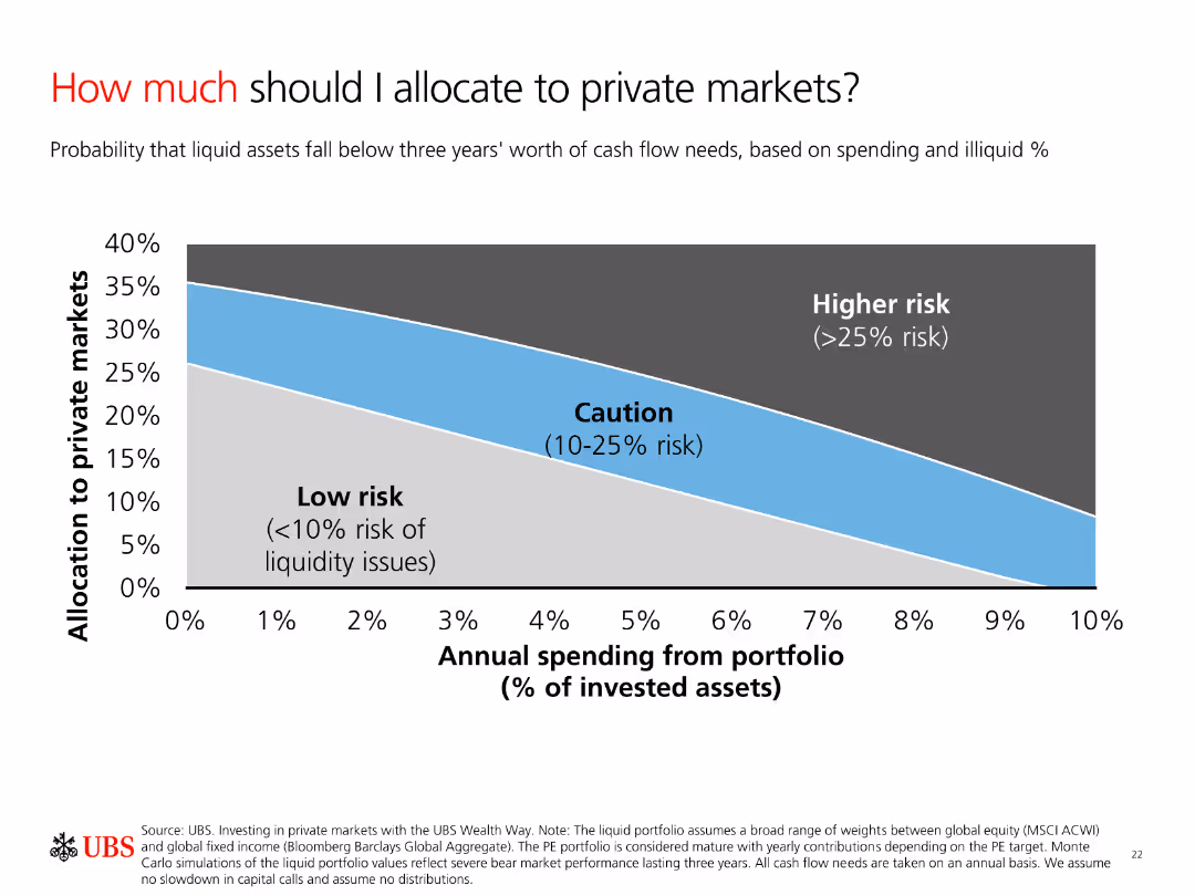
A column chart showing allocation to private markets based on risk levels. The chart categorizes risks into Low risk, Caution, and Higher risk with a smooth gradient background.
Investment Analysis
Financial Services
The slide explains the allocation of investments to private markets based on annual spending and risk levels. It helps investors understand potential liquidity risks.
Allocation, Risk, Private Markets, Spending, Liquidity
false
Investment Analysis
Financial Services
Single Chart
UBS
Add to my slides
Remove from favorites
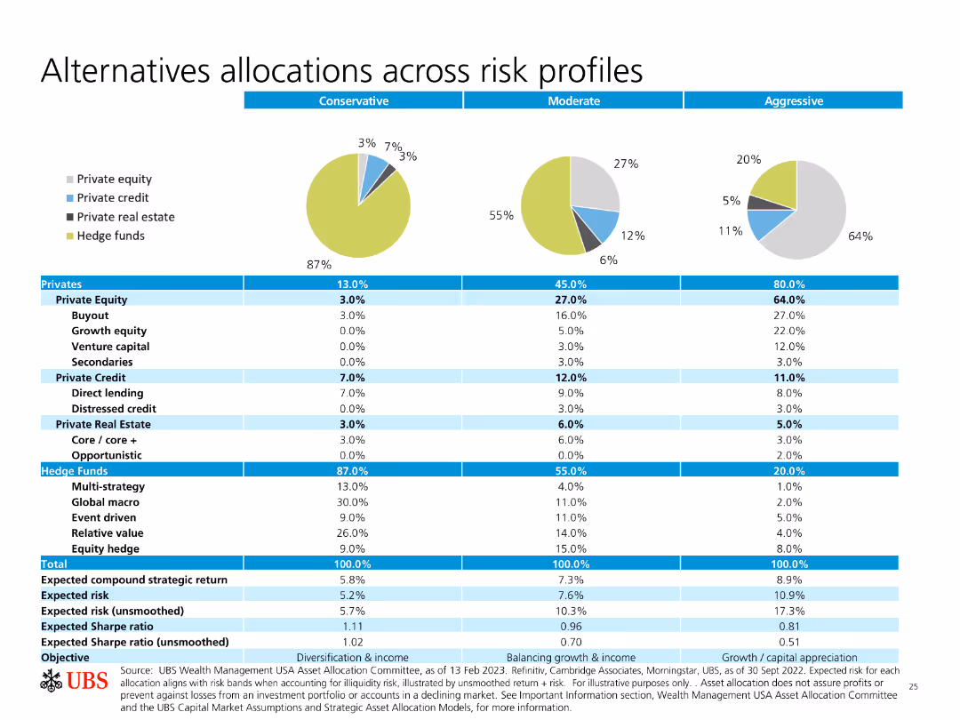
Pie charts and a table showing allocations across different risk profiles (Conservative, Moderate, Aggressive) for various investment types.
Investment Analysis
Financial Services
The slide details how different types of investments (equity, credit, real estate, hedge funds) are allocated based on risk profiles, providing expected returns and risks.
Allocations, Risk Profiles, Private Equity, Hedge Funds, Expected Returns
false
Investment Analysis
Financial Services
Multiple Chart
UBS
Add to my slides
Remove from favorites
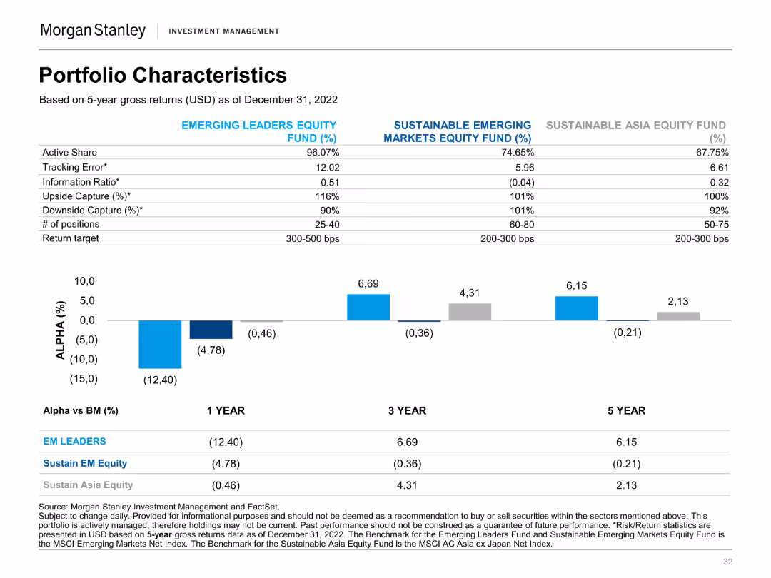
A column chart showing alpha percentages for various funds over 1, 3, and 5-year periods. It includes a table with fund characteristics and target returns.
Financial Performance
Financial Services
This slide provides a comparison of the portfolio characteristics and performance metrics of different equity funds, showing alpha values.
Alpha, Equity Funds, Performance Metrics, Portfolio, Returns, Financial, Comparison, Characteristics, Investment, Analysis
false
Financial Performance
Financial Services
Mixed Chart
Morgan Stanley
Add to my slides
Remove from favorites
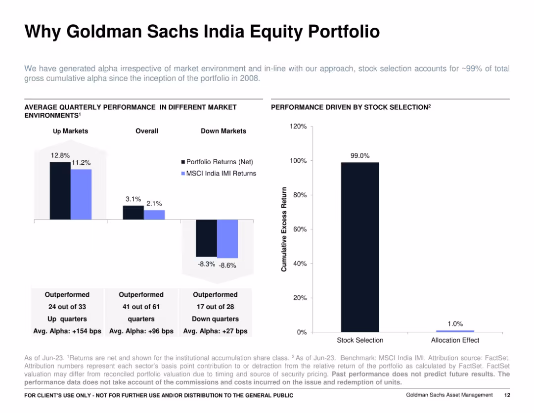
Two side-by-side bar and column charts: left shows average quarterly performance in up/down markets, right shows contribution of stock selection vs. allocation; clear annotations with a minimalist layout.
Investment Analysis
Financial Services
Demonstrates that the Goldman Sachs India Equity Portfolio’s performance is primarily driven by stock selection, not allocation. Highlights strong alpha in various market conditions, emphasizing consistent outperformance across 99% of quarters since inception.
alpha generation, up/down markets, portfolio returns, stock selection, attribution, GS India, MSCI IMI
false
Investment Analysis
Financial Services
Multiple Chart
Goldman Sachs
Add to my slides
Remove from favorites
Featuring two column charts and two pie charts, the slide uses shades of purple and green to compare AUM growth and outperformance over peers in different fund categories.
Financial Performance
Financial Services
The slide highlights JPMAM’s fund performance and growth in equity and fixed income funds, showcasing effective investment strategies over five years.
alpha, growth, JPMAM, equity funds, fixed income, AUM, investment strategy, fund performance
false
Financial Performance
Financial Services
Multiple Chart
JP Morgan
Add to my slides
Remove from favorites
Three-column layout on dark background, each numbered step (01–03) with concise descriptions. Sleek, minimalistic with modern typography.
Strategic Planning
Financial Services
Recommends a three-pronged strategy to maximize returns through embedding tech, equipping teams, and fostering partnerships. Urges structured adoption of new tech beyond ad hoc approaches.
alpha, strategy, ROI, tech adoption, training, partnerships
false
Strategic Planning
Financial Services
Linear Flow
Accenture
Add to my slides
Remove from favorites
The slide contains a column chart showing market concentration levels across different access modes using an alternative approach, which considers outlet homepages within the last 5 steps and excludes subsequent visits. Annotations provided.
Market Analysis and Trends
Media & Entertainment
This slide examines market concentration levels (HHI) by access mode using an alternative approach that includes outlet homepages within the last 5 steps before reaching news articles and excludes subsequent visits, offering insights into media concentration.
Alternative Approach, Market Concentration, HHI, Column Chart, Access Mode
false
Market Analysis and Trends
Media & Entertainment
Single Chart
IPSOS
Add to my slides
Remove from favorites
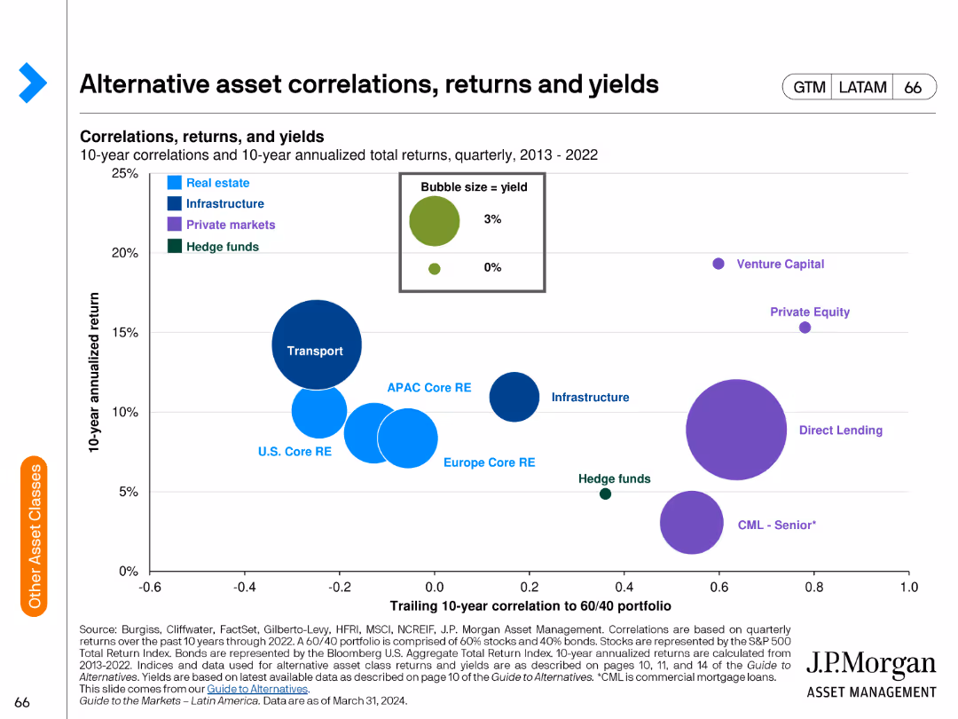
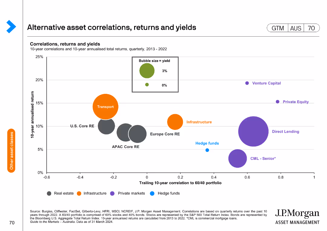
The slide includes a bubble chart showing correlations and returns of alternative assets over a 10-year period. Bubbles are color-coded by asset type.
Investment Analysis
Financial Services
The slide examines the correlations, returns, and yields of various alternative asset classes over a decade, used for evaluating investment strategies.
alternative assets, correlations, returns, yields, investment analysis, financial performance, risk assessment, asset comparison
false
Investment Analysis
Financial Services
Single Chart
JP Morgan
Add to my slides
Remove from favorites
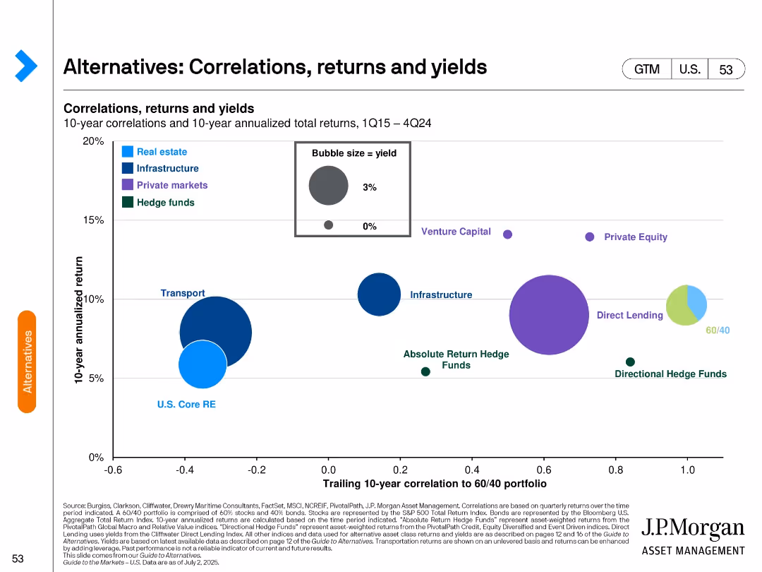
The slide features a bubble chart showing correlations, returns, and yields of alternative assets from 2013 to 2022. The x-axis represents the trailing 10-year correlation to a 60/40 portfolio, and the y-axis shows the 10-year annualized return.
Investment Analysis
Financial Services
This slide provides insights into the performance of various alternative assets, highlighting their correlations, returns, and yields for investment analysis and portfolio management.
Alternative assets, correlations, returns, yields, investment analysis, portfolio management, bubble chart
false
Investment Analysis
Financial Services
Single Chart
JP Morgan
Add to my slides
Remove from favorites
Line chart comparing alternative sites of care being pursued by hospitals in developed and developing markets.
Strategic Planning
Healthcare & Pharmaceuticals
This slide illustrates the alternative care sites hospitals plan to establish to improve healthcare access in the next three years.
alternative care, hospitals, healthcare, APAC, planning
false
Strategic Planning
Healthcare & Pharmaceuticals
Mixed Chart
LEK
Add to my slides
Remove from favorites
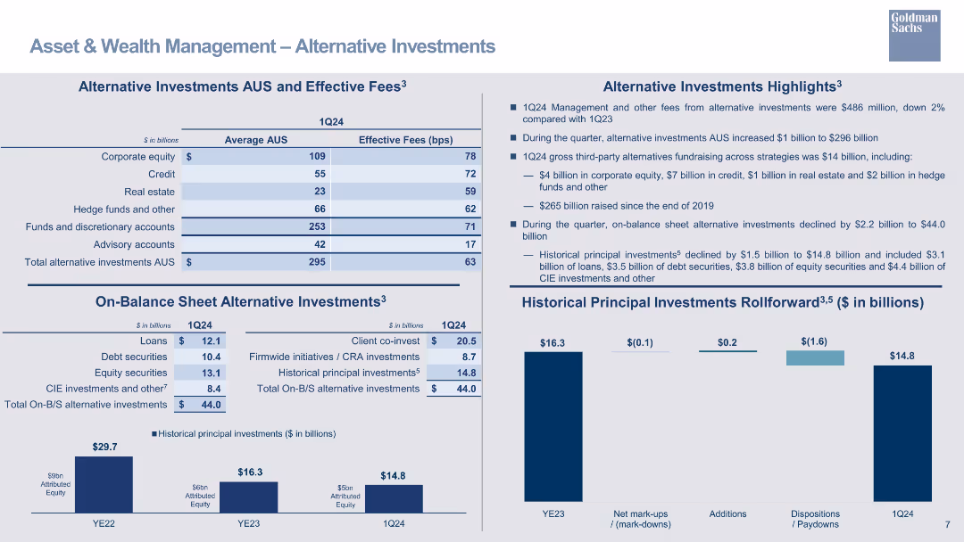
The design integrates column chart, tables, and descriptive text. The use of varying shades of blue differentiates between the categories of alternative investments and their respective average assets under supervision and fees.
Investment Analysis
Financial Services
This slide delves into alternative investments within asset and wealth management, suitable for financial advisors or investors seeking insights into fee structures and investment categories like hedge funds and real estate.
alternative investments, asset management, fees, hedge funds, real estate
false
Investment Analysis
Financial Services
Mixed Chart
Goldman Sachs
Add to my slides
Remove from favorites
Contains tables and bullet points detailing alternative investments, their average AUS, and effective fees, alongside column chart summarizing historical principal investments rollforward.
Investment Analysis
Financial Services
Analyzes the alternative investment portfolio's performance, with a focus on average assets under supervision and fee structures. It's aimed at investors seeking detailed information on the sector's financial dynamics and investment potential.
Alternative Investments, AUS, Effective Fees, Corporate Equity, Hedge Funds, Principal Investments, Investment Portfolio, Fee Structure
false
Investment Analysis
Financial Services
Mixed Chart
Goldman Sachs
Add to my slides
Remove from favorites
Featuring a title, tables with detailed financial data, and a column chart on historical principal investments, the slide has a moderate level of visual complexity appropriate for conveying detailed information.
Investment Analysis
Financial Services
Targets alternative investment performance within asset management, detailing average AUS and effective fees. It's used for assessing investment strategies, updating investors, or guiding financial planning. Includes management fees and fundraising achievements.
Alternative Investments, AUS, Effective Fees, Fundraising
false
Investment Analysis
Financial Services
Mixed Chart
Goldman Sachs
Add to my slides
Remove from favorites
A table outlining alternative investments AUS and effective fees, with bar charts for historical principal investments rollforward.
Investment Analysis
Financial Services
Highlights alternative investments in AUS, detailing effective fees and changes in principal investments over time.
alternative investments, AUS, effective fees, principal investments, bar chart, financial overview
false
Investment Analysis
Financial Services
Multiple Chart
Goldman Sachs
Add to my slides
Remove from favorites
Contains a series of column chart detailing alternative investment asset under supervision and fees, with an emphasis on blue tones. There are also numerical lists presenting additional data on on-balance sheet investments.
Investment Analysis
Financial Services
Highlights the firm's alternative investment strategies, including assets under supervision and associated fees, designed for financial consultants or potential investors looking at alternative investment opportunities and their performance.
Alternative Investments, AUS, Fees, Strategy
false
Investment Analysis
Financial Services
Mixed Chart
Goldman Sachs
Add to my slides
Remove from favorites
This slide includes a column chart and textual data illustrating the strategy for on-balance sheet alternative investments.
Strategic Planning
Financial Services
Designed for strategic planning discussions, showcasing the firm’s approach to optimizing alternative investments on the balance sheet and their intended financial trajectory, with projections and capital allocation.
alternative investments, balance sheet, strategy, capital allocation
false
Strategic Planning
Financial Services
Single Chart
Goldman Sachs
Add to my slides
Remove from favorites
A column chart comparing total alternative investments in billions by major asset managers, with specific notes on fee rates. Bullet points emphasize the firm's strengths and position in the market.
Product and Service Analysis
Financial Services
Compares the firm's performance in alternative investments against other major asset managers, highlighting its position and strengths in the market. It focuses on the firm's 30-year track record and broad market access, providing a competitive analysis within the asset management industry.
alternative investments, competitive analysis, market positioning, asset managers, column chart
false
Product and Service Analysis
Financial Services
Mixed Chart
Goldman Sachs
Add to my slides
Remove from favorites
Bubble chart plotting 10-year return vs. correlation to 60/40 portfolio; bubbles sized by yield and grouped by asset class.
Investment Analysis
Financial Services
Evaluates alternative asset classes based on historical return, correlation with traditional portfolios, and yield. Highlights relative positioning of sectors like private equity, infrastructure, and hedge funds in risk/return space.
alternative investments, correlation, yield, return, private equity, hedge funds, infrastructure, bubble chart
false
Investment Analysis
Financial Services
Multiple Chart
JP Morgan
Add to my slides
Remove from favorites
Mix of tables, column charts, and a summary section, along with textual annotations and headings for each section.
Investment Analysis
Financial Services
Slide analyzes alternative investment assets, fees, and balance sheet allocations. Appropriate for discussions on investment strategy or financial planning.
Alternative Investments, Fees, Asset Allocation
false
Investment Analysis
Financial Services
Multiple Chart
Goldman Sachs
Add to my slides
Remove from favorites
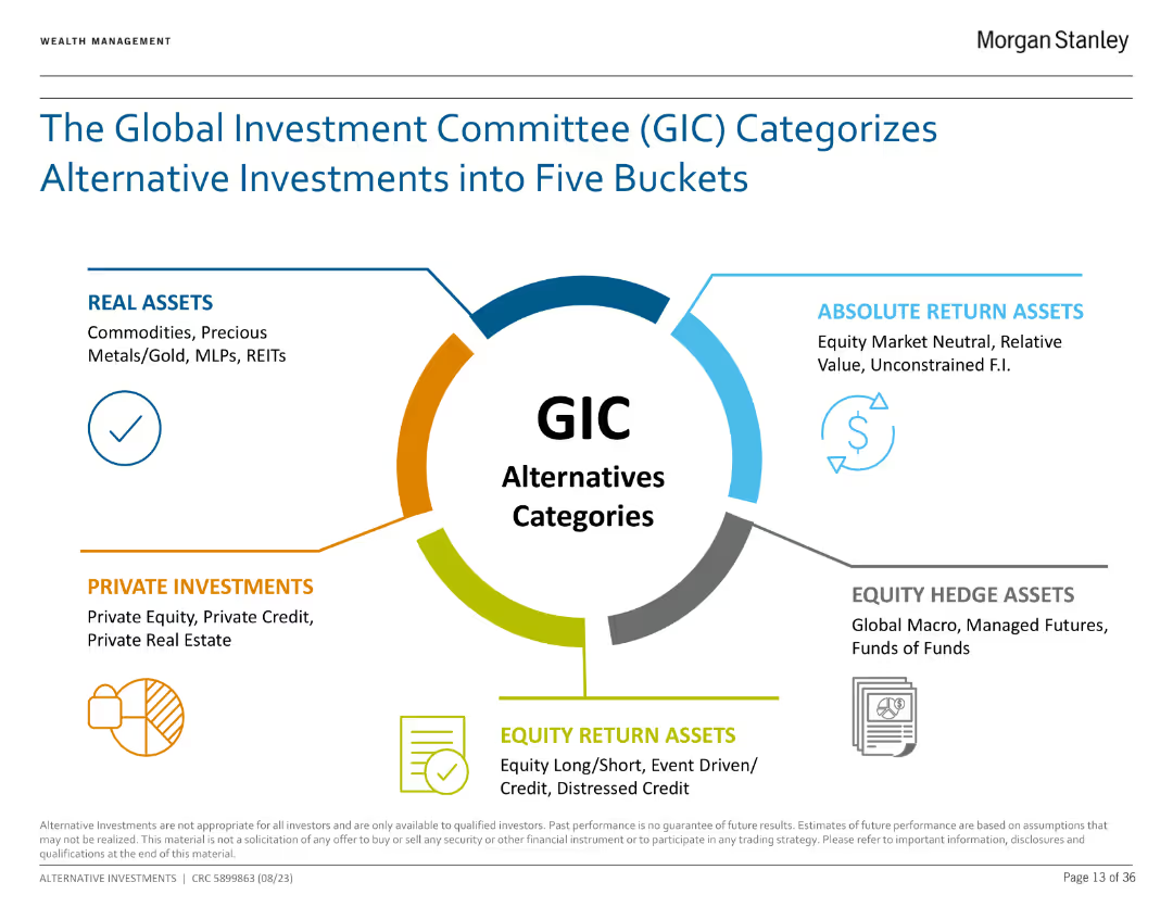
The slide features a circular diagram with five sections representing different categories of alternative investments, each with brief descriptions.
Investment Analysis
Financial Services
The slide explains the five categories of alternative investments as defined by the Global Investment Committee (GIC): Real Assets, Absolute Return Assets, Equity Hedge Assets, Private Investments, and Equity Return Assets.
Alternative Investments, GIC, Real Assets, Equity, Investment Analysis
false
Investment Analysis
Financial Services
Framework
Morgan Stanley
Add to my slides
Remove from favorites
A world map marked with various investment locations, accompanied by logos representing different sectors such as private equity and real estate.
Investment Analysis
Financial Services
Elucidates on the diversity and scope of the company's alternative investment platform, indicating different sectors and regions involved in the investment strategy.
Alternative investments, private equity, real estate, global
false
Investment Analysis
Financial Services
Graphic
Goldman Sachs
Add to my slides
Remove from favorites
A column chart showing ownership model splits and a table detailing profitability across leasing, subscription, rental, and sharing models.
Market Analysis and Trends
Transportation & Logistics
Explores the rise of alternative vehicle ownership models, projecting potential growth and profitability of leasing, subscription, rental, and sharing models by 2035.
alternative ownership, leasing, subscription, rental, sharing
false
Market Analysis and Trends
Transportation & Logistics
Mixed Chart
PwC/Strategy&
Add to my slides
Remove from favorites
Two column charts: Left chart depicts cumulative alternatives fundraising in billions from 2020 to 2024. Right chart shows alternatives management and other fees from 2019 to 2024. An arrow highlights the growth in fees and fundraising targets, accompanied by key financial data.
Product and Service Analysis
Financial Services
Analyzes the firm's growing momentum in the alternatives business sector, with projected fundraising and fee earnings through 2024. It demonstrates the firm's strategic targets for alternatives investments, signifying confidence in the market's growth potential.
alternatives business, growth momentum, fundraising, fees, strategy, column chart
false
Product and Service Analysis
Financial Services
Multiple Chart
Goldman Sachs
Add to my slides
Remove from favorites
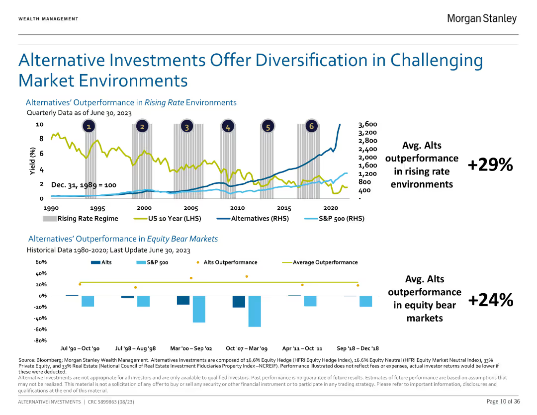
Dual chart illustrating outperformance of alternatives in rising rate environments and equity bear markets.
Market Analysis and Trends
Financial Services
Shows how alternatives have historically outperformed traditional assets in various market conditions.
Alternatives, diversification, performance
false
Market Analysis and Trends
Financial Services
Multiple Chart
Morgan Stanley
Add to my slides
Remove from favorites
The slide displays stacked column charts for client assets and various icons for future growth strategies. The colors include shades of brown, blue, and green, with clear data annotations.
Strategic Planning
Financial Services
The slide outlines the growth of client assets in alternative investments and the strategic initiatives for future growth in real estate, infrastructure, and private equity.
Alternatives, Innovation, Growth, Client Assets, Investment, Real Estate, Infrastructure, Private Equity, Strategy
false
Strategic Planning
Financial Services
Multiple Chart
JP Morgan
Add to my slides
Remove from favorites
Featuring a mixture of column charts and stacked bar graphs, this slide presents AWM client assets, NAV, and net returns for various alternative investment options over several years. The data is segmented by asset type and performance against benchmarks.
Investment Analysis
Financial Services
This slide reviews the growth and scaling of alternative investments, presenting data on net asset value and returns compared to benchmarks. Useful for investor meetings or strategic reviews focusing on diversification and alternative investment strategies.
alternatives, investment, growth, benchmarks, net asset value
false
Investment Analysis
Financial Services
Multiple Chart
JP Morgan
Add to my slides
Remove from favorites
The slide features a column chart, a table, and color-coded timelines.
Investment Analysis
Financial Services
The slide presents the history and innovation in investment types over time with a focus on alternatives. It includes historical timelines, net IRR percentages, and growth in asset mix.
Alternatives, Investment, Growth, IRR, Timeline
false
Investment Analysis
Financial Services
Mixed Chart
JP Morgan
Add to my slides
Remove from favorites
The slide uses column charts to present fundraising and fee trends, with additional information on specific funds.
Investment Analysis
Financial Services
Showcases the robust performance of alternative investments and their contribution to asset under supervision growth, with data on fundraising and fee generation, highlighting recent successful fund closures.
alternatives, investment performance, fundraising, fees, growth
false
Investment Analysis
Financial Services
Multiple Chart
Goldman Sachs
Add to my slides
Remove from favorites
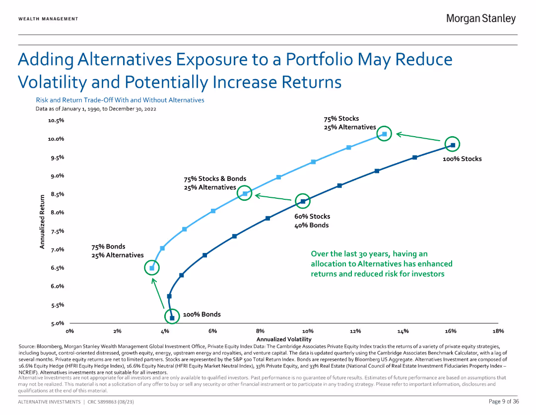
Line chart showing the impact of adding alternatives to a portfolio on risk and returns from 1990 to 2022.
Investment Analysis
Financial Services
Demonstrates how alternatives can reduce portfolio volatility and potentially increase returns over 30 years.
Alternatives, portfolio, risk, returns
false
Investment Analysis
Financial Services
Single Chart
Morgan Stanley
Add to my slides
Remove from favorites
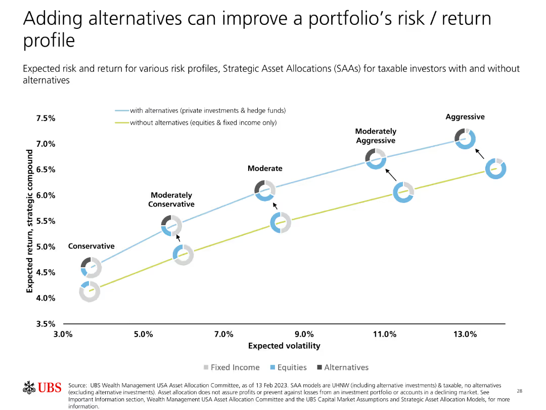
A line graph showing expected returns and volatilities for different risk profiles with and without alternatives. Pie charts are also included.
Strategic Planning
Financial Services
The slide demonstrates the impact of adding alternative investments on a portfolio's risk and return, comparing scenarios with and without these investments.
Alternatives, Portfolio, Risk, Return, Strategic Allocation
false
Strategic Planning
Financial Services
Single Chart
UBS
Add to my slides
Remove from favorites
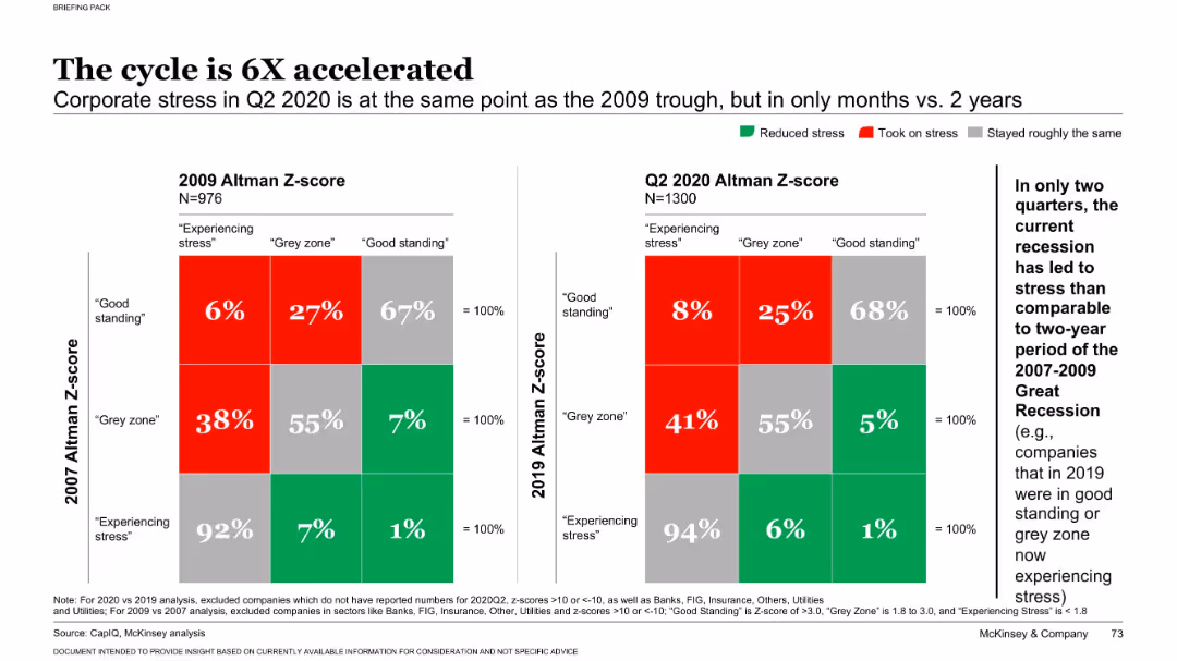
Dual heatmap chart comparing Altman Z-scores from 2009 vs. 2020 with labeled stress categories
Risk Assessment and Management
Financial Services
This slide shows how rapidly corporate financial stress increased during the COVID-19 recession compared to the 2008 crisis. It uses Altman Z-scores to classify companies' financial health, revealing a sharp acceleration in stress levels across firms.
Altman Z-score, financial stress, recession, corporate risk, COVID-19
false
Risk Assessment and Management
Financial Services
Multiple Chart
McKinsey
Add to my slides
Remove from favorites
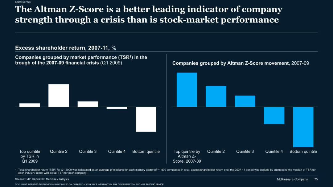
Dark-themed bar charts comparing excess returns based on TSR and Z-Score during 2007–2009
Risk Assessment and Management
Financial Services
The slide emphasizes that Altman Z-Scores were more predictive of company strength during the 2008 crisis than stock performance. Two bar charts show how companies in top Z-score quintiles outperformed in shareholder return from 2007 to 2011.
Altman Z-score, TSR, recession, risk analysis, company strength
false
Risk Assessment and Management
Financial Services
Single Chart
McKinsey
Add to my slides
Remove from favorites
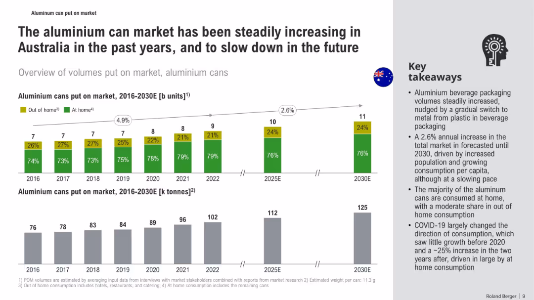
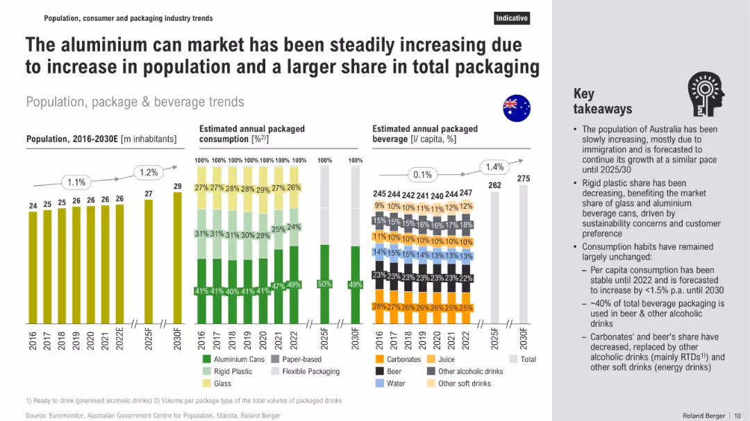
Three-section layout with vertical bar graphs on population, packaging, and beverage consumption trends, supported by a side panel of key takeaways
Market Analysis and Trends
Consumer Goods
The slide explains growth in the aluminium can market in Australia, driven by population growth and shifts in packaging material preferences. Graphs show population increases, packaging type trends (aluminium, plastic, glass), and per capita beverage consumption, while text highlights sustainability-driven market changes and stable consumption habits.
aluminium cans, packaging, beverage trends, population growth, sustainability, rigid plastic, consumption habits, market share
false
Market Analysis and Trends
Consumer Goods
Multiple Chart
Roland Berger
Add to my slides
Remove from favorites
Horizontal bar-flow layout showing costs and revenues across three scrap types. Includes financial data, profit calculation, and bullet-point takeaways on right.
Investment Analysis
Industrial & Manufacturing
The slide evaluates the economic feasibility of collecting aluminium cans via CDS and MRFs. It compares acquisition and processing costs with potential revenues, showing that high-grade CDS material offers better profitability due to cleanliness and deposit returns.
aluminium, CDS, profitability, recycling, MRFs, costs, revenues, scrap, value chain, investment
false
Investment Analysis
Industrial & Manufacturing
Mixed Chart
Roland Berger
Add to my slides
Remove from favorites
Triple-panel bar charts on EV sales, aluminium per car, and total demand growth projections
Market Analysis and Trends
Industrial & Manufacturing
Forecasts rising aluminium demand due to EV growth in Europe. EV sales expected to grow 5x by 2030, with 75kg more aluminium per car and a 2 million tonne increase in demand. Highlights recycling needs.
aluminium demand, EV, Europe, recycling, auto industry, growth
false
Market Analysis and Trends
Industrial & Manufacturing
Mixed Chart
Goldman Sachs
Add to my slides
Remove from favorites
Bar chart of aluminium per car from 2006–2030e with explanatory bullet points; clean design with blue gradient bars
Market Analysis and Trends
Environmental Services & Sustainability
Shows steady rise in aluminium content per vehicle to meet lightweighting and electrification goals. Highlights impact on demand and implications for recycling and secondary metal processing.
aluminium, EV, light-weighting, electrification, vehicle materials, demand growth
false
Market Analysis and Trends
Environmental Services & Sustainability
Mixed Chart
Goldman Sachs
Add to my slides
Remove from favorites
Sankey-style material flow chart with green process stages and country-specific export destinations
Operational Efficiency
Environmental Services & Sustainability
The slide maps aluminium can flows through collection, recovery, and export stages, pointing out losses from sorting and the lack of domestic recycling. It includes detailed pathways from residential and commercial sources to export destinations like Korea, Thailand, and EU.
aluminium flow, CDS, recycling export, material recovery, can-to-can, sorting, Australia, sustainability
false
Operational Efficiency
Environmental Services & Sustainability
Mixed Chart
Roland Berger
Add to my slides
Remove from favorites
Flow diagram with metrics on collection, recovery, export, landfill, and C2C processing, with takeaways on right side
Risk Assessment and Management
Environmental Services & Sustainability
The slide outlines aluminium can flows in Australia, emphasizing strong collection/recovery rates but no local closed-loop recycling (C2C). It shows reliance on export markets, highlights gaps in local remelting, and presents inefficiencies in sorting and CDS participation.
aluminium recycling, collection, recovery, export, C2C, waste flow, landfill, Australia
false
Risk Assessment and Management
Environmental Services & Sustainability
Multiple Chart
Roland Berger
Add to my slides
Remove from favorites
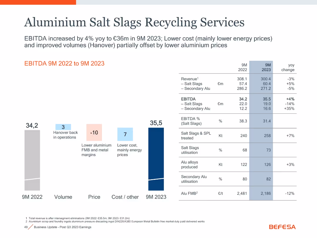
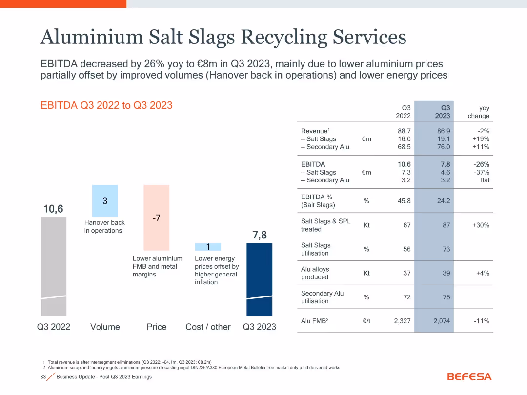
Waterfall bar chart with financial table and YoY comparisons
Operational Efficiency
Industrial & Manufacturing
This slide details the performance of aluminium salt slags recycling operations, showing a decrease in EBITDA due to pricing pressure, partially offset by volume growth.
Aluminium, Recycling, EBITDA, Salt Slags, Energy Prices, Q3 2023
false
Operational Efficiency
Industrial & Manufacturing
Mixed Chart
Goldman Sachs
Add to my slides
Remove from favorites
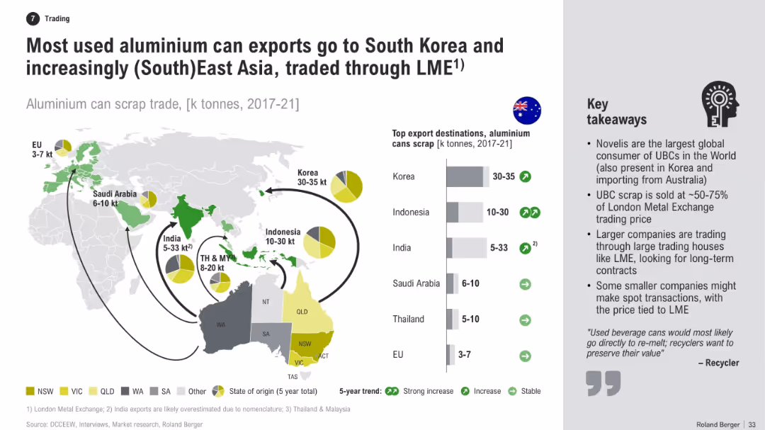
World map with flow arrows showing export volumes of aluminium can scrap, accompanied by bar chart and pie charts indicating top destinations. Right side includes key takeaways in bullet points.
Market Analysis and Trends
Industrial & Manufacturing
This slide illustrates Australia’s export destinations for used aluminium cans, emphasizing major trading partners in Asia. It highlights trade volume trends, the role of the LME, and the business models of companies involved in aluminium scrap exports.
aluminium, scrap, exports, Korea, LME, trading, recycling, Asia, destinations, trends
false
Market Analysis and Trends
Industrial & Manufacturing
Multiple Chart
Roland Berger
Add to my slides
Remove from favorites
Similar flow diagram to previous slide, but based on unit counts instead of tonnes, with same structure and annotations
Operational Efficiency
Environmental Services & Sustainability
This slide mirrors the previous one but tracks the same aluminium can material flows in billions of units rather than kilotonnes. It reaffirms the flow of waste through CDS, sorting, and exports while emphasizing export destinations and sources of material inefficiencies.
aluminium units, flow chart, recycling units, CDS export, waste tracking, sustainability, Australia
false
Operational Efficiency
Environmental Services & Sustainability
Mixed Chart
Roland Berger
Add to my slides
Remove from favorites
Bar graphs showing units and weight of aluminum cans over time with a takeaway text box on the side. Clean, visual-heavy layout.
Market Analysis and Trends
Consumer Goods
The slide tracks the aluminum can market in Australia from 2016 to 2030E, showing growth and projected stabilization. It highlights consumption trends, including the COVID-19 shift to at-home use, and packaging material shifts.
aluminum cans, market trends, Australia, beverage packaging, consumption, COVID-19, forecast, market growth
false
Market Analysis and Trends
Consumer Goods
Multiple Chart
Roland Berger
Add to my slides
Remove from favorites
Bar and waterfall chart left, detailed comparison table right with volume, margin, and utilization metrics.
Performance Metrics and KPIs
Industrial & Manufacturing
Displays a 4% YoY rise in EBITDA to €35.5m in 9M 2023 driven by cost improvements (mainly energy), despite lower aluminum prices and margins. Hanover’s return to operations also supported volume gains.
aluminum, EBITDA, salt slags, utilization, margins, energy cost
false
Performance Metrics and KPIs
Industrial & Manufacturing
Mixed Chart
Goldman Sachs
Add to my slides
Remove from favorites
The slide features a left panel with text analysis and a right panel with a horizontal bar chart showing the percentage of respondents taking action to allow workers to disconnect, by region.
Human Resources and Talent Management
Professional Services
This slide addresses the issue of employees being expected to be 'always on,' highlighting regional differences in efforts to allow workers to disconnect and reduce burnout.
Always on, employee pressure, disconnection, regional differences, burnout
false
Human Resources and Talent Management
Professional Services
Mixed Chart
PwC/Strategy&
Add to my slides
Remove from favorites
The slide includes text sections and a column chart showing the frequency of responding to work emails/messages outside normal working hours for Gen Zs and Millennials. It is organized to emphasize the challenges of disconnecting from work.
Operational Efficiency
Professional Services
This slide explores the impact of "always-on" workplaces on Gen Zs and Millennials, highlighting the frequency of responding to work communications outside normal hours and the main reasons behind this behavior, illustrating the struggle to disconnect from work.
Always-on, workplaces, disconnect, work emails, Gen Z, Millennials
false
Operational Efficiency
Professional Services
Multiple Chart
Deloitte
Add to my slides
Remove from favorites
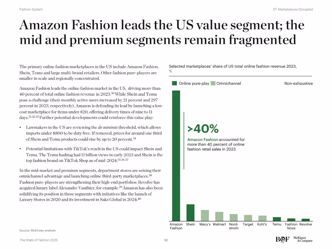
Left-aligned text summary and a bar chart on the right showing market share of major US fashion players
Market Analysis and Trends
Retail & E-commerce
The slide highlights Amazon Fashion's dominance in the US online fashion space, holding over 40% share in 2023. It notes rising threats from Shein and Temu, while department stores and other players like Revolve work to strengthen niche portfolios. The bar chart illustrates revenue share distribution across online pure-play and omnichannel retailers.
Amazon, fashion, US market, Shein, Temu, premium, ecommerce, fragmentation, trends
false
Market Analysis and Trends
Retail & E-commerce
Mixed Chart
McKinsey
Add to my slides
Remove from favorites
Features a balance of text and images, with a bar graph and a symbolic key visual on the right.
Strategic Planning
Professional Services
It illustrates key factors driving success in organizational ambition, highlighting organizational commitment as the top influencer.
ambition, factors, commitment, success, organizational
false
Strategic Planning
Professional Services
Single Chart
Bain
Add to my slides
Remove from favorites
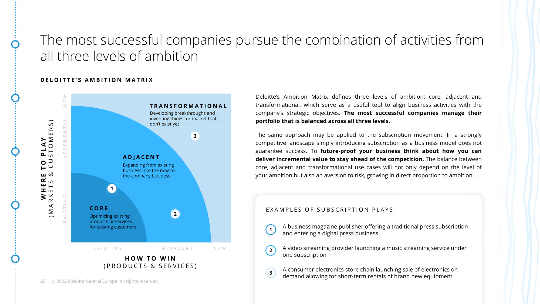
The slide includes a matrix diagram categorizing activities into core, adjacent, and transformational levels of ambition. It also provides examples of subscription strategies within these categories.
Strategic Planning
Consumer Goods
This slide presents a strategic framework for subscription models, categorizing activities into core, adjacent, and transformational ambitions. It advises companies on balancing their portfolio across these levels.
ambition matrix, subscription models, strategic planning, core activities, adjacent activities, transformational activities, ecommerce, retail
false
Strategic Planning
Consumer Goods
Diagram
Deloitte
Add to my slides
Remove from favorites
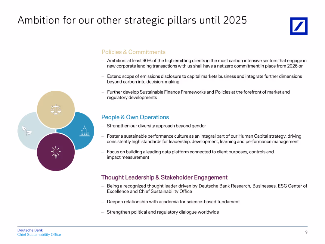
The slide contains a title, four bullet points in different colors representing various strategic pillars, and descriptions below them.
Strategic Planning
Financial Services
Explains Deutsche Bank's strategic ambitions for policies, operations, and stakeholder engagement until 2025, focusing on sustainability.
ambition, strategic, policies, operations, sustainability
false
Strategic Planning
Financial Services
Header Vertical
Deutsche Bank
Add to my slides
Remove from favorites
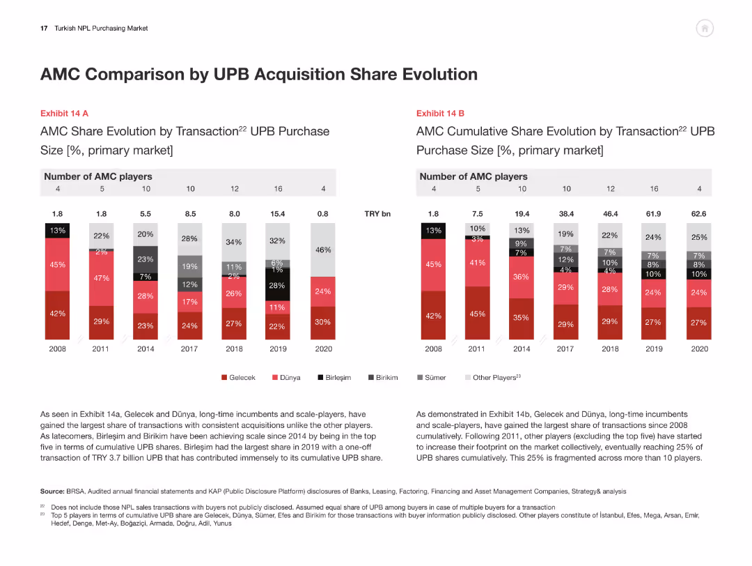
Two bar charts comparing AMC share evolution by transaction size and cumulative share from 2008-2020.
Competitive Landscape
Financial Services
This slide compares AMCs in terms of UPB acquisition share, illustrating market share changes and competitive positioning.
AMC, UPB acquisition, market share, competitive analysis, Turkey
false
Competitive Landscape
Financial Services
Multiple Chart
PwC/Strategy&
Add to my slides
Remove from favorites
The slide consists of complex data tables and a map detailing epidemiological and economic statistics. It uses a clean layout with a mixture of red indicators for immediate visual attention and comparative statistics.
Market Analysis and Trends
Government & Public Sector
The slide provides a detailed look at epidemiological trends and policy indicators in the Americas. It can be used to inform decisions on travel restrictions and to gauge the overall state of the pandemic, offering insights into both the health situation and the resulting economic policies.
Americas, Epidemiology, Policies, COVID-19, Health Data, Economic Indicators, Travel, Statistics, Public Sector, Governance
false
Market Analysis and Trends
Government & Public Sector
Multiple Chart
McKinsey
Add to my slides
Remove from favorites
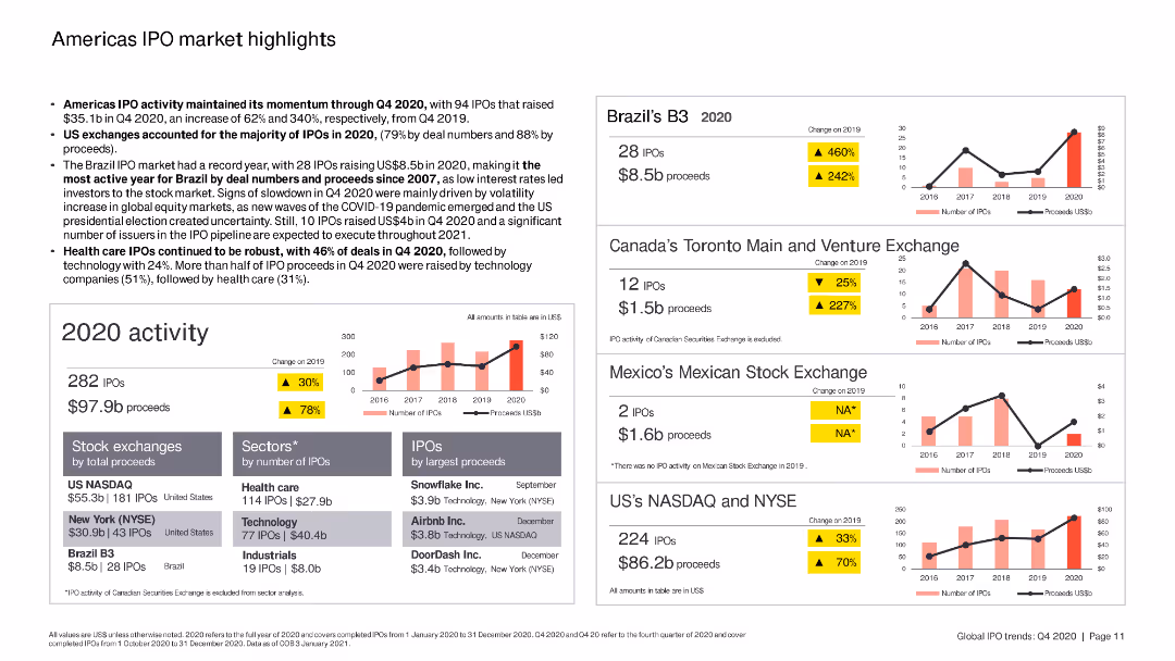
The slide includes column charts and bar charts summarizing IPO activity in the Americas, with specific focus on Brazil, Canada, and the US.
Market Analysis and Trends
Financial Services
The slide highlights key IPO trends in the Americas, focusing on the performance of various stock exchanges, sectors, and top IPOs by proceeds in 2020.
Americas, IPO, Brazil, Canada, US
false
Market Analysis and Trends
Financial Services
Multiple Chart
EY
Add to my slides
Remove from favorites
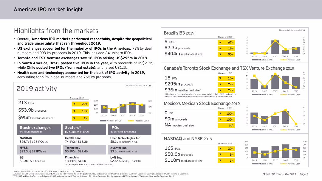
Contains column charts, data tables, and bullet points. The slide is visually dense, focusing on IPO activities and trends in the Americas for 2019.
Market Analysis and Trends
Financial Services
Highlights the performance of IPO markets in the Americas for 2019, including sector-specific analysis, major exchanges, and trends in IPO deal sizes and proceeds.
Americas, IPO, market insight, 2019, trends
false
Market Analysis and Trends
Financial Services
Multiple Chart
EY
Add to my slides
Remove from favorites
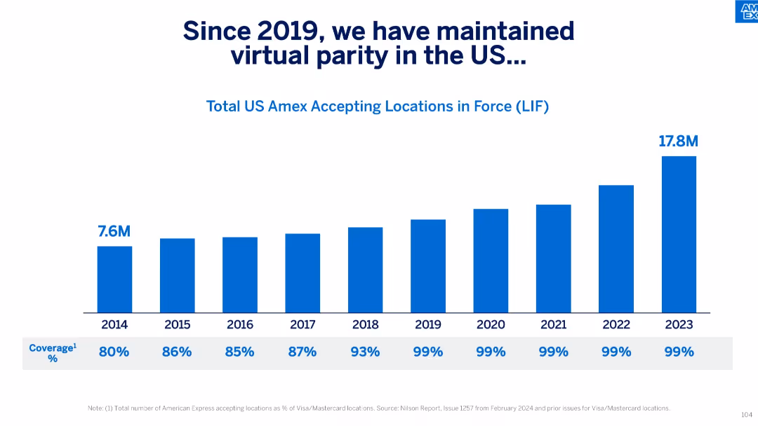
Horizontal bar chart with annual LIF data from 2014–2023 and corresponding % coverage below.
Performance Metrics and KPIs
Financial Services
The slide tracks the number of US locations accepting Amex from 2014 to 2023, reaching 17.8M and achieving 99% parity with Visa/Mastercard since 2019. It highlights consistent improvements in card acceptance coverage in the US market.
Amex Acceptance, US Market, Coverage, LIF, Visa Parity, Metrics, Annual Growth, KPIs
false
Performance Metrics and KPIs
Financial Services
Single Chart
McKinsey
Add to my slides
Remove from favorites
This slide includes multiple column charts comparing the monthly reach of AM/FM radio versus other music services among different age groups.
Market Analysis and Trends
Media & Entertainment
The slide compares the monthly reach percentages of AM/FM radio to various streaming services, showing the dominance of radio across all age groups in the U.S.
AM/FM radio, audio reach, column chart, age groups, streaming
false
Market Analysis and Trends
Media & Entertainment
Mixed Chart
Nielsen
Add to my slides
Remove from favorites
The slide features sections on description, pros, cons, an overview of technology, and key feature estimates. It includes a simple diagram of the Haber-Bosch process and a box listing the conversion and reconversion costs and efficiencies of ammonia.
Product and Service Analysis
Energy & Utilities
This slide provides detailed information on the conversion of ammonia through the Haber-Bosch process. It highlights the advantages and disadvantages of using ammonia for hydrogen conversion, supported by key feature estimates.
Ammonia, Conversion, Hydrogen, Process, Analysis
false
Product and Service Analysis
Energy & Utilities
Diagram
Kearney
Add to my slides
Remove from favorites
Utilizes column charts to compare potential ammonia markets by 2030, highlighting key importers and consumption levels.
Investment Analysis
Energy & Utilities
Evaluates export opportunities for Chile in ammonia, focusing on markets like China, EU, and USA.
ammonia, exports, Chile, market analysis, China, EU, USA, consumption
false
Investment Analysis
Energy & Utilities
Single Chart
McKinsey
Add to my slides
Remove from favorites
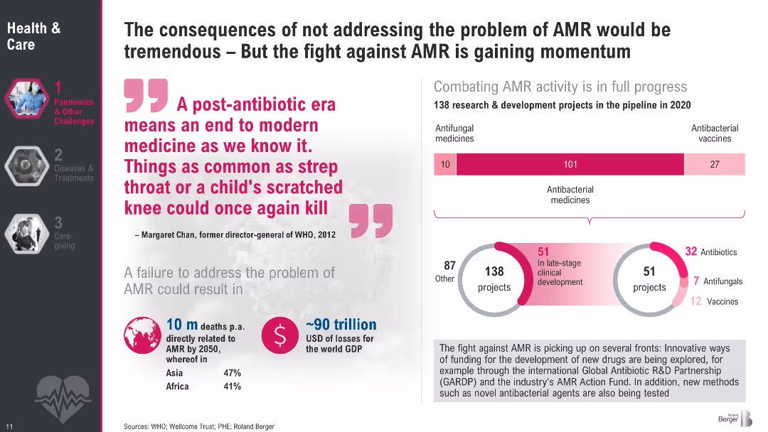
Two-section layout: left side features a large quote and key stats; right side includes two infographics—bar graph and circular breakdown—on AMR R&D activities; uses magenta and gray tones; clean visual hierarchy.
Regulatory and Compliance
Healthcare & Pharmaceuticals
Highlights the grave risks of antimicrobial resistance (AMR), including high death tolls and economic losses if left unaddressed. Emphasizes the growing momentum in R&D, with 138 projects in development. Showcases the breakdown of antifungal, antibacterial, and vaccine initiatives and promotes a sense of urgency around AMR-related healthcare investment and innovation.
AMR, antibiotics, R&D, resistance, global health, WHO, economic loss, vaccines, antibacterial, antifungal
false
Regulatory and Compliance
Healthcare & Pharmaceuticals
Multiple Chart
Roland Berger
Add to my slides
Remove from favorites
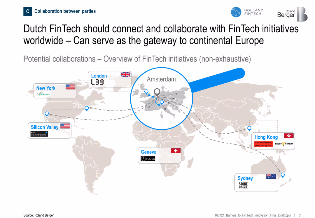
World map showing major FinTech hubs and their connections to Amsterdam
Sales and Business Development
Financial Services
The slide positions Amsterdam as a central hub in global FinTech collaborations, suggesting potential for Dutch FinTechs to connect with international initiatives across the U.S., Europe, and Asia-Pacific.
Amsterdam, collaboration, global FinTech, gateway, international, initiatives
false
Sales and Business Development
Financial Services
Uncategorized
Roland Berger
Add to my slides
Remove from favorites
Side-by-side comparison of Analytical vs Generative AI with use case examples illustrated underneath.
Industry Overview
Government & Public Sector
Contrasts analytical AI’s efficiency in data processing with generative AI’s creative capacities. Showcases practical examples like sentiment analysis and digital assistants to highlight expanded potential in public services.
analytical AI, generative AI, citizen services, sentiment analysis, public sector, code gen
false
Industry Overview
Government & Public Sector
Boxed
McKinsey
Add to my slides
Remove from favorites
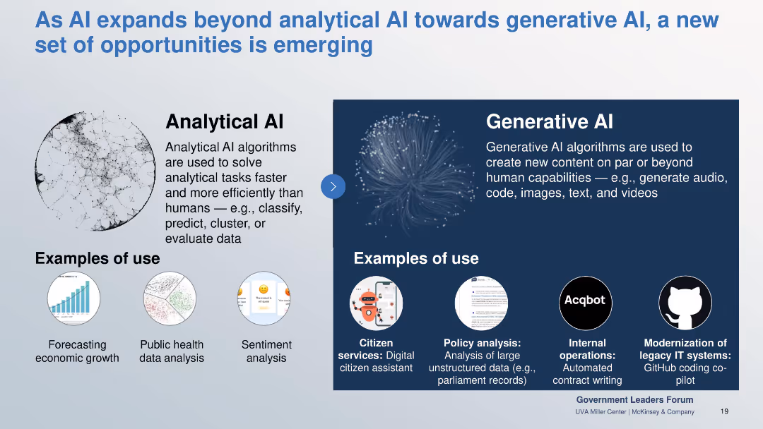
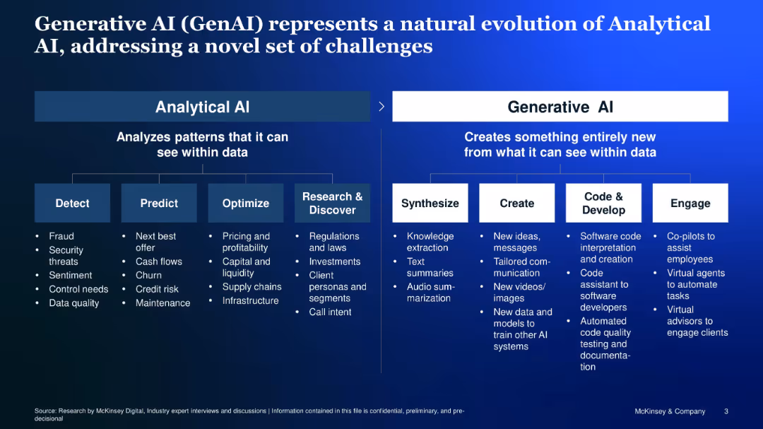
Two-panel comparison of Analytical vs. Generative AI, with icons and structured bullet points
Technology and Digital Transformation
Artificial Intelligence
Compares Analytical AI (focused on detection, prediction, optimization) with Generative AI (focused on synthesis, creation, development, engagement), showcasing how GenAI tackles a new class of problems.
Analytical AI, Generative AI, synthesis, creation, code, co-pilot
false
Technology and Digital Transformation
Artificial Intelligence
Diagram
McKinsey
Add to my slides
Remove from favorites
Flowchart showing the evolution of analytics maturity from data modeling to machine learning, natural language processing, and AI. Includes annotations on data input and human intervention.
Technology and Digital Transformation
Technology & Software
Explains the stages of analytics maturity, from structured data modeling to advanced AI, and their impact on companies' operations and value creation.
analytics maturity, AI, data modeling, machine learning, NLP
false
Technology and Digital Transformation
Technology & Software
Linear Flow
Kearney
Add to my slides
Remove from favorites
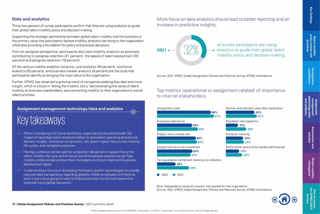
Text-heavy layout with pie chart on top right and bar graphs at bottom.
Performance Metrics and KPIs
Technology & Software
Emphasizes how only 32% of organizations currently use analytics in mobility decision-making. Lists top metrics such as assignment costs and employee satisfaction. Underscores the need for better data transparency and strategic alignment with business goals.
analytics, mobility KPIs, assignment cost, employee satisfaction, talent insights, strategic mobility
false
Performance Metrics and KPIs
Technology & Software
Multiple Chart
KPMG
Add to my slides
Remove from favorites
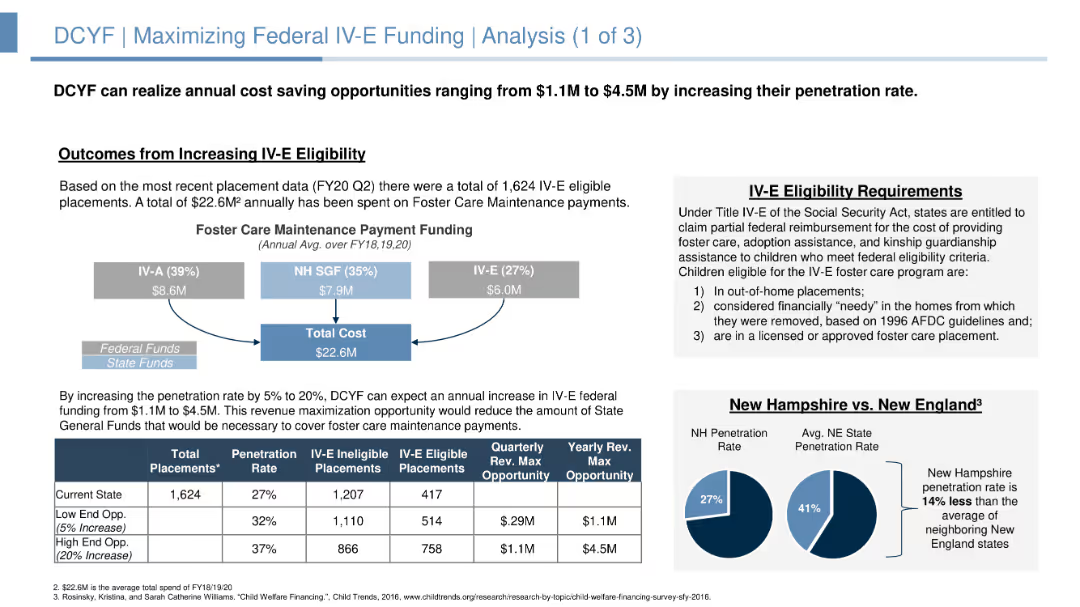
The slide includes a flow diagram illustrating funding distribution and a comparison between New Hampshire and New England penetration rates. The layout is moderately detailed with supporting data in boxes and charts.
Strategic Planning
Government & Public Sector
Slide includes charts, flow diagrams, and text blocks. Displays funding breakdowns and potential revenue opportunities.
Analyzes opportunities for increasing federal IV-E funding, detailing current funding, eligibility requirements, and potential revenue from increased penetration rates.
false
Strategic Planning
Government & Public Sector
Mixed Chart
Alvarez & Marsal
Add to my slides
Remove from favorites
Assumptions in funding models for connectivity
Strategic Planning
Telecommunications
Detailed column charts with cost breakdowns and potential savings across various funding models, highlighting the assumptions made for each scenario. The design uses blue and green shades to represent different costs and savings, making it easy to differentiate.
Analyzes the impact of different funding assumptions on the potential success of school connectivity initiatives in Java, Bali, and Sumatra, emphasizing the role of governmental and community contributions.
false
Strategic Planning
Telecommunications
Mixed Chart
BCG
Add to my slides
Remove from favorites
Column charts comparing angel investment amounts between the US and Brazil from 2010 to 2019, highlighting growth multiples.
Investment Analysis
Financial Services
Discusses trends in angel investments in Brazil compared to the US, showcasing the significant growth and the existing investment gap.
angel investment, US, Brazil, investment trends, growth analysis
false
Investment Analysis
Financial Services
Single Chart
McKinsey
Add to my slides
Remove from favorites
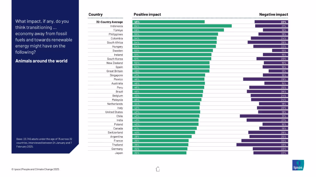
Similar design to 19391: two-column bar chart; countries ranked by positive impact perception.
Market Analysis and Trends
Environmental Services & Sustainability
The slide illustrates perceptions from 32 countries regarding the effect of a fossil fuel transition on global animal welfare, showing strong positive outlooks.
animals, environment, biodiversity, climate change, public perception, renewable energy, survey data, global transition, Ipsos
false
Market Analysis and Trends
Environmental Services & Sustainability
Mixed Chart
IPSOS
Add to my slides
Remove from favorites
The slide features a diagram and detailed table presenting the total potential of animal waste feedstock for energy production by 2060, including theoretical, technical, and sustainable potentials, and various factors affecting its scalability and sustainability constraints.
Technology and Digital Transformation
Energy & Utilities
This slide provides a deep-dive into the potential of animal waste as a feedstock for energy production, analyzing its total potential by 2060 and highlighting the scalability issues and sustainability constraints associated with its use.
animal waste, feedstock, total potential, energy production, 2060, scalability, sustainability constraints
false
Technology and Digital Transformation
Energy & Utilities
Mixed Chart
Kearney
Add to my slides
Remove from favorites
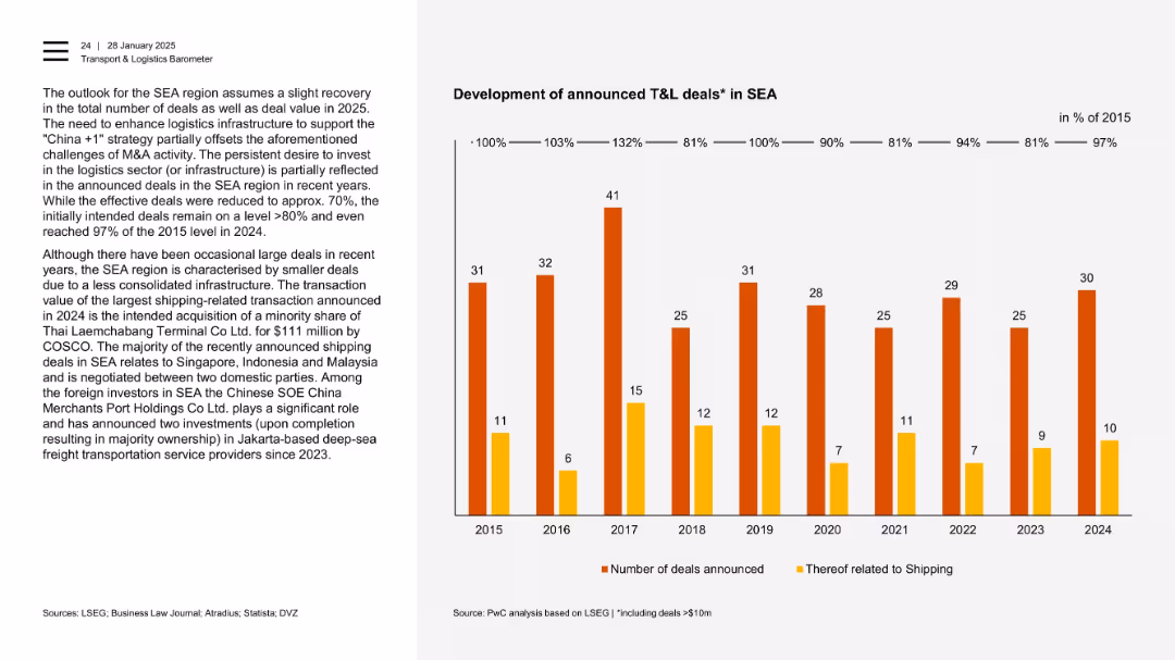
Two-column format with a bar chart showing number of deals (shipping and total) over 2015–2024.
Mergers and Acquisitions
Transportation & Logistics
This slide outlines the intent versus realization of T&L deals in SEA. It shows resilience in deal announcements despite fewer large transactions. Shipping dominates deal topics, especially in countries like Singapore, Indonesia, and Malaysia.
announced deals, SEA, shipping, infrastructure, foreign investors, COSCO, logistics
false
Mergers and Acquisitions
Transportation & Logistics
Mixed Chart
PwC/Strategy&
Add to my slides
Remove from favorites
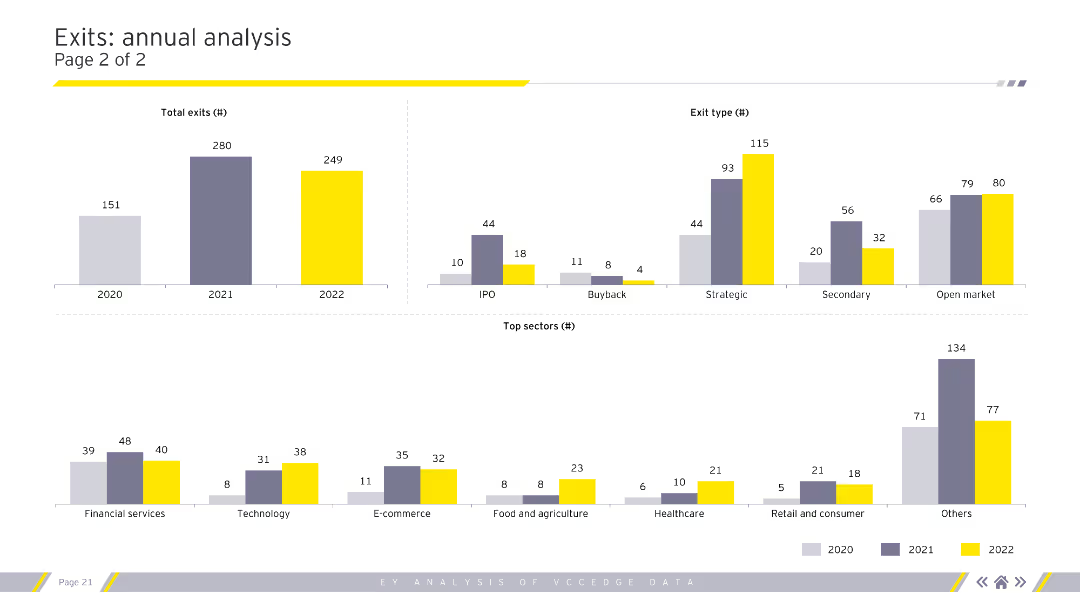
The slide presents two column charts and one bar chart, illustrating total exits by year, exit type, and top sectors. The charts use different colors to represent each year (2020, 2021, and 2022).
Financial Performance
Financial Services
The slide analyzes annual exits, detailing the number of exits per year, types of exits (IPO, buyback, etc.), and top sectors in terms of exit count. This can be used to track industry performance over time.
Annual exits, exit types, sectors, IPO, buyback
false
Financial Performance
Financial Services
Multiple Chart
EY
Add to my slides
Remove from favorites
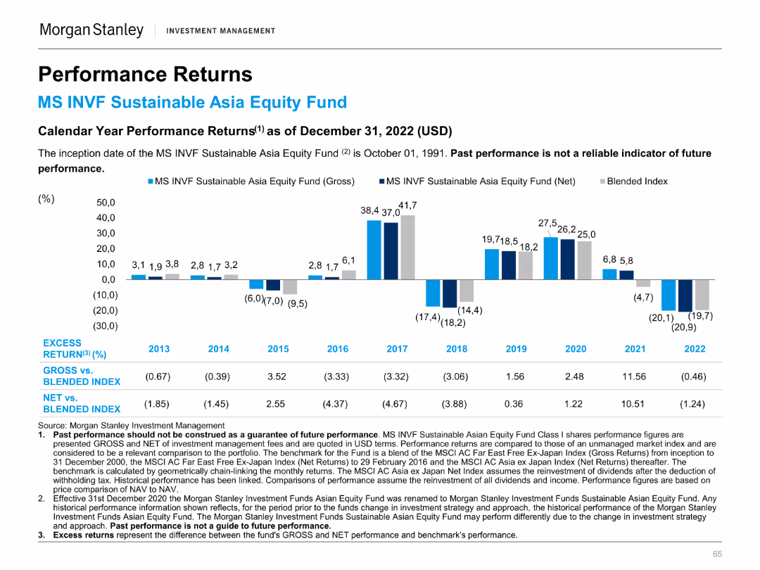
Column chart illustrating calendar year performance returns of the MS INVF Sustainable Asia Equity Fund.
Financial Performance
Financial Services
Highlights annual performance returns, comparing the fund's gross and net returns to a blended index from 2013 to 2022.
Annual, performance, returns, fund, equity
false
Financial Performance
Financial Services
Mixed Chart
Morgan Stanley
Add to my slides
Remove from favorites
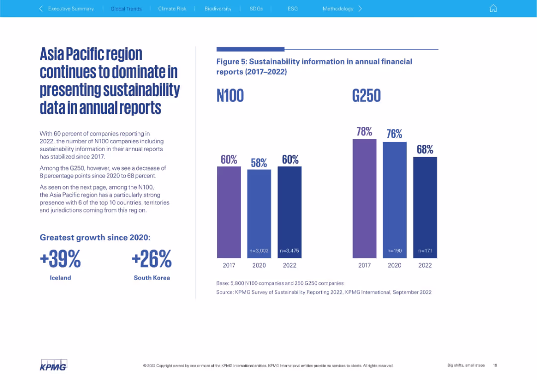
Left-aligned text block with bold statistics; right side features dual vertical bar charts comparing N100 and G250 (2017–2022)
Performance Metrics and KPIs
Professional Services
This slide focuses on the inclusion of sustainability data in annual financial reports. It contrasts N100 and G250 trends, showing a plateau for N100 and a decline for G250. The Asia Pacific region is highlighted as dominant in data presentation.
annual reporting, N100, G250, sustainability data, Asia Pacific, transparency, trend analysis
false
Performance Metrics and KPIs
Professional Services
Mixed Chart
KPMG
Add to my slides
Remove from favorites
The slide features a blend of pie charts, bar graphs, and detailed textual information, using a mix of red, blue, and grey shades.
Financial Performance
Industrial & Manufacturing
The slide summarizes Leonardo's 2021 annual results, highlighting significant achievements such as revenue growth, backlog, and order value, along with a special focus on financial metrics.
annual results, revenue growth, financial metrics, backlog, orders, FOCF, ROIC, commercial momentum, EBITA
false
Financial Performance
Industrial & Manufacturing
Multiple Chart
Goldman Sachs
Add to my slides
Remove from favorites
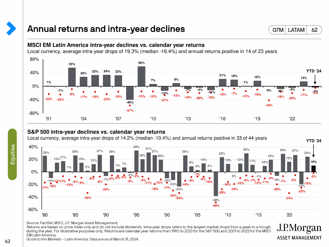
The slide consists of two bar charts showing intra-year declines vs. calendar year returns for MSCI EM Latin America and S&P 500.
Market Analysis and Trends
Financial Services
This slide examines the annual returns and intra-year declines for MSCI EM Latin America and S&P 500, providing a historical perspective on market volatility and performance.
annual returns, intra-year declines, MSCI EM, S&P 500, market performance
false
Market Analysis and Trends
Financial Services
Multiple Chart
JP Morgan
Add to my slides
Remove from favorites
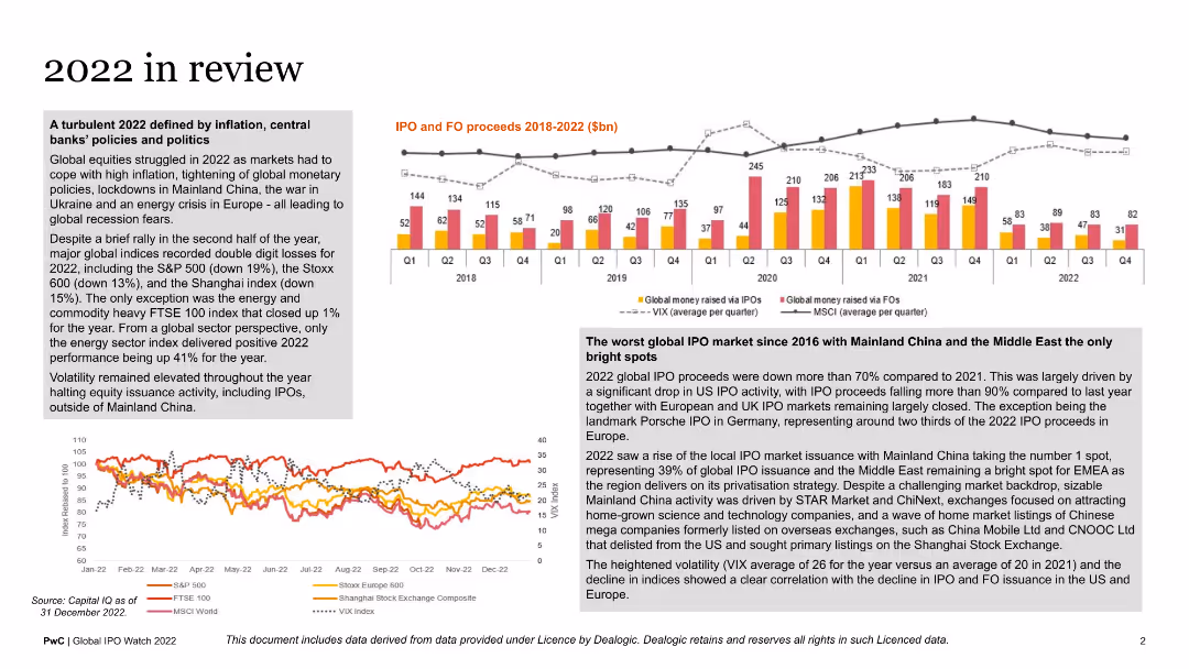
This slide includes multiple graphs: a column chart showing IPO and FO proceeds, a line graph indicating market indices performance, and various text blocks summarizing key financial events of 2022. The layout is dense with a mix of visuals and text.
Market Analysis and Trends
Financial Services
The slide reviews financial market performance in 2022, covering significant events, IPO and FO proceeds, and market indices. It provides an annual summary for stakeholders interested in the financial health and trends of global markets.
annual review, financial markets, IPO proceeds, market indices, 2022
false
Market Analysis and Trends
Financial Services
Multiple Chart
PwC/Strategy&
Add to my slides
Remove from favorites
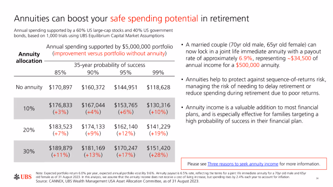
A slide with a table and text explaining how annuities can boost safe spending potential in retirement. The table compares income with and without annuities across different probabilities.
Financial Performance
Financial Services
The slide illustrates the benefits of annuities for enhancing retirement spending potential, using a table to compare income outcomes with and without annuities under various scenarios.
annuities, retirement income, safe spending, financial planning, income stability
false
Financial Performance
Financial Services
Table
UBS
Add to my slides
Remove from favorites
Presents a bar chart comparing the percentage of pregnant women receiving antenatal care in Nigeria with other countries. The layout is straightforward, facilitating easy comparison.
Performance Metrics and KPIs
Healthcare & Pharmaceuticals
Provides critical data on antenatal care coverage in Nigeria compared to other nations, emphasizing areas for improvement in healthcare services and performance metrics in maternal health.
antenatal care, healthcare comparison, Nigeria, maternal health, performance metrics
false
Performance Metrics and KPIs
Healthcare & Pharmaceuticals
Single Chart
BCG
Add to my slides
Remove from favorites
Previous
Next
You don't have any favorites yet.
Please wait loading your favorites slides...
Create a FREE account to continue browsing
Receive Instant Access to 1,000+ slides from companies like McKinsey, Google, and Goldman Sachs
First Name
Last Name
Email
Password
I agree to all
Terms & Privacy Policy
Thank you! Your submission has been received!
Oops! Something went wrong while submitting the form.
Have an account?
Sign in
Upgrade to PRO to Save slides
Advanced Search and Filters
Access to 15,000+ slides
Access to Category Pages
Save/Bookmark Slides
PowerPoint Template Library
Pick a Plan
MONTHLY
$12/month
Billed every month, Cancel anytime.
YEARLY
$9/year
Billed $108 annually, Cancel anytime.
Checkout for $12/month
Checkout for $108/yr
Secured by Stripe | AES-256 bit encryption


![Material flows of aluminium cans, 2020-21 [k tonnes2)3), (% of total POM volume)]](https://cdn.prod.website-files.com/654e70fb59937215cac87b19/689997436b32b0cd9e0c4857_7YZK0pFUL0hdEI1C-xPhBmRT2ZzE0QBX_kA8xtuEf3M.avif)
![Material flows of aluminium cans, 2020-21 [b units2)3), (% of total POM volume)]](https://cdn.prod.website-files.com/654e70fb59937215cac87b19/689997460727c755a84b1b56_l0hZ3kB9Q_LwuRdExYq8z5mX-iOzLyBOemY7QuSpKTk.avif)