My Account
My Slides
Search by Category
Companies
Slide Type
Use Case
Industry
Pricing
Templates
View All Templates
Download Template Slides
✦ AI
AI Prompt Library
AI Search
Feedback
Login
Logout
Get Started
Browse all Slides
Browse all Slides
Create a FREE Account
Instant access to 1,000+ real slides from top companies like McKinsey, BCG, Goldman Sachs, Google and many more!
First Name
Last Name
Email
Password
I agree to all
Terms & Privacy Policy
Thank you! Your submission has been received!
Oops! Something went wrong while submitting the form.
Have an account?
Sign in
Saved Slides
Total No. of slides saved
0
↻ Refresh
✖ Clear all
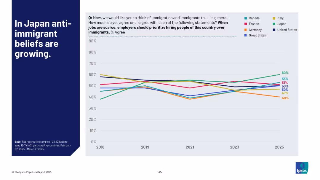
Line chart showing % agreement over time (2016–2025) by country; countries are color-coded; bold title on left in blue block
Market Analysis and Trends
Government & Public Sector
This slide highlights the increasing percentage of people in Japan who believe locals should be prioritized over immigrants during job shortages. It compares this belief across G7 countries from 2016 to 2025, showing Japan's notable upward trend while others remain steady or decline.
anti-immigrant, Japan, G7 countries, job scarcity, trends, Ipsos, belief tracking, nationalism, workforce, timeline analysis
false
Market Analysis and Trends
Government & Public Sector
Mixed Chart
IPSOS
Add to my slides
Remove from favorites
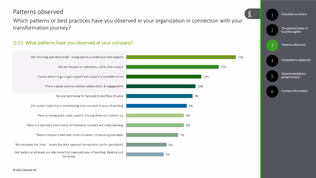
The slide features a column chart depicting various antipatterns observed in the transformation process.
Risk Assessment and Management
Professional Services
This slide presents a survey on observed antipatterns during the transformation process, highlighting key issues.
antipatterns, survey, transformation, issues, risks
false
Risk Assessment and Management
Professional Services
Single Chart
Deloitte
Add to my slides
Remove from favorites
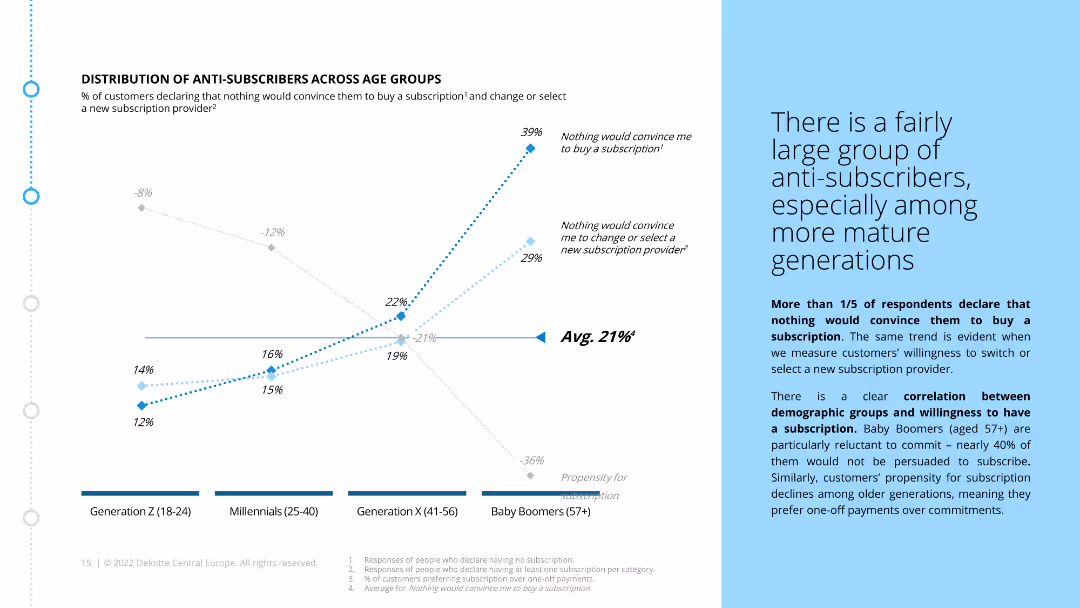
The slide includes a line chart that shows the percentage of anti-subscribers across different age groups. It also contains a text box explaining the correlation between age and subscription reluctance.
Market Analysis and Trends
Consumer Goods
The slide highlights the demographic distribution of customers who are reluctant to subscribe, particularly among older generations. It shows a clear correlation between age and subscription resistance.
anti-subscribers, age groups, market segmentation, customer demographics, subscription reluctance, generational differences, ecommerce, retail
false
Market Analysis and Trends
Consumer Goods
Mixed Chart
Deloitte
Add to my slides
Remove from favorites
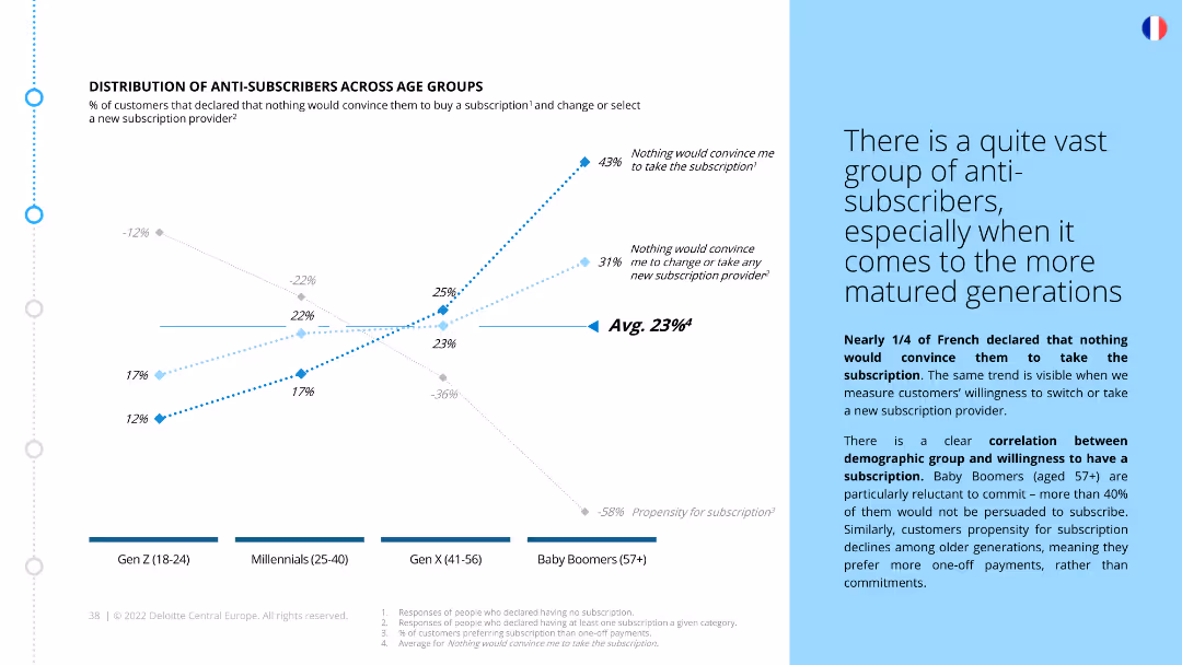
The slide has a column chart and a line graph depicting anti-subscriber rates across different age groups. The column chart shows the percentage of respondents unwilling to subscribe, and the line graph indicates trends in subscription propensity by age group.
Market Analysis and Trends
Consumer Goods
The slide discusses the prevalence of anti-subscribers among different age groups in France, highlighting the significant resistance among older generations. It explains the correlation between age and willingness to subscribe, showing a trend of decreasing commitment with age.
Anti-subscribers, age groups, market segmentation, resistance, subscription trends, generational analysis, consumer behavior, French market
false
Market Analysis and Trends
Consumer Goods
Mixed Chart
Deloitte
Add to my slides
Remove from favorites
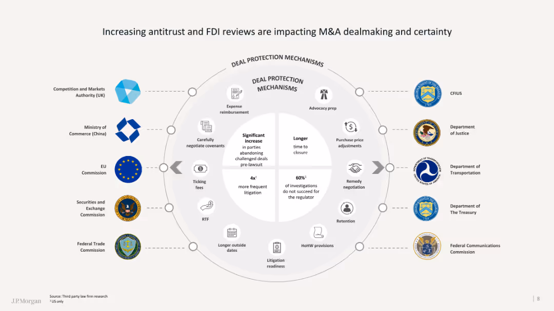
The slide contains a circular diagram detailing various deal protection mechanisms and regulatory bodies involved.
Regulatory and Compliance
Financial Services
It discusses the increasing impact of antitrust and FDI reviews on M&A activities and the associated deal protections.
Antitrust, FDI, M&A, regulatory, deal protection
false
Regulatory and Compliance
Financial Services
Diagram
JP Morgan
Add to my slides
Remove from favorites
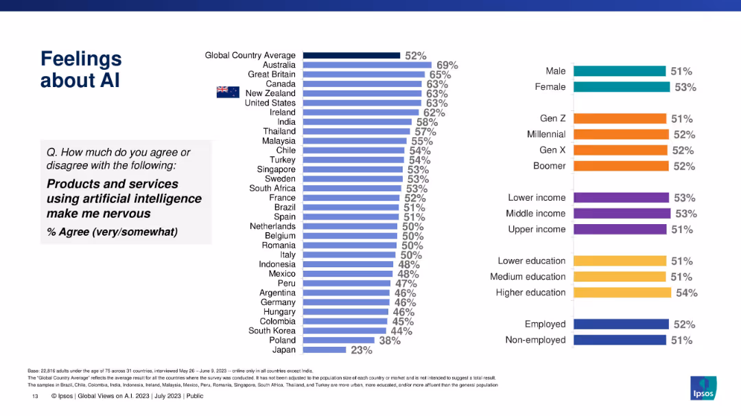
Bar chart layout showing nervousness toward AI across countries and demographic categories.
Market Analysis and Trends
Artificial Intelligence
This slide visualizes the extent to which individuals feel nervous about AI usage in products and services, with global averages and demographic segment breakdowns.
anxiety, nervousness, AI risks, public perception, international survey, Ipsos, gender, generation, education
false
Market Analysis and Trends
Artificial Intelligence
Multiple Chart
IPSOS
Add to my slides
Remove from favorites
A bar chart comparing sources of anxiety and stress among Millennials and Gen Z, with categories such as family welfare, financial future, and job prospects.
Market Analysis and Trends
Professional Services
This slide analyzes the primary sources of anxiety and stress among Millennials and Gen Z, comparing various factors like family welfare and financial future.
Anxiety, stress, Millennials, Gen Z, comparison, sources, family welfare, financial future, job prospects
false
Market Analysis and Trends
Professional Services
Mixed Chart
Deloitte
Add to my slides
Remove from favorites
The slide features a column chart showing the distribution of anxiety scores on a scale of 0-10, comparing data from May and December. Key scores and mean scores are highlighted in text boxes.
Customer and Market Segmentation
Healthcare & Pharmaceuticals
This slide presents survey results on anxiety levels, showing the distribution of scores on a scale of 0-10, comparing May and December data, with a focus on mean scores.
anxiety, survey, scores, comparison, distribution, column chart, public opinion, time periods, healthcare
false
Customer and Market Segmentation
Healthcare & Pharmaceuticals
Single Chart
IPSOS
Add to my slides
Remove from favorites
This slide features a four-part breakdown of adaptability metrics, each with an icon and description. There is a balance between text and visual elements, with green highlights for emphasis.
Technology and Digital Transformation
Professional Services
Presents four new metrics developed to assist Adaptable Organizational Network Analysis (AONA) in the professional services sector, highlighting how organizations can measure and improve their adaptability.
AONA, adaptability, metrics, innovation, organization, professional services
false
Technology and Digital Transformation
Professional Services
Pillar
Deloitte
Add to my slides
Remove from favorites
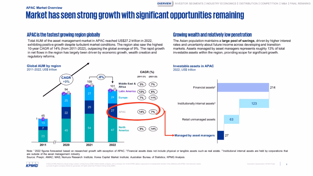
Dual-section layout with bar charts and data callouts. Emphasis on APAC growth and low penetration.
Market Analysis and Trends
Financial Services
Emphasizes the rapid growth of asset management in APAC, noting a high CAGR and wealth accumulation. Includes AUM data by region and shows untapped opportunities due to low penetration by asset managers.
APAC, AUM, market growth, asset managers, penetration, CAGR
false
Market Analysis and Trends
Financial Services
Multiple Chart
KPMG
Add to my slides
Remove from favorites
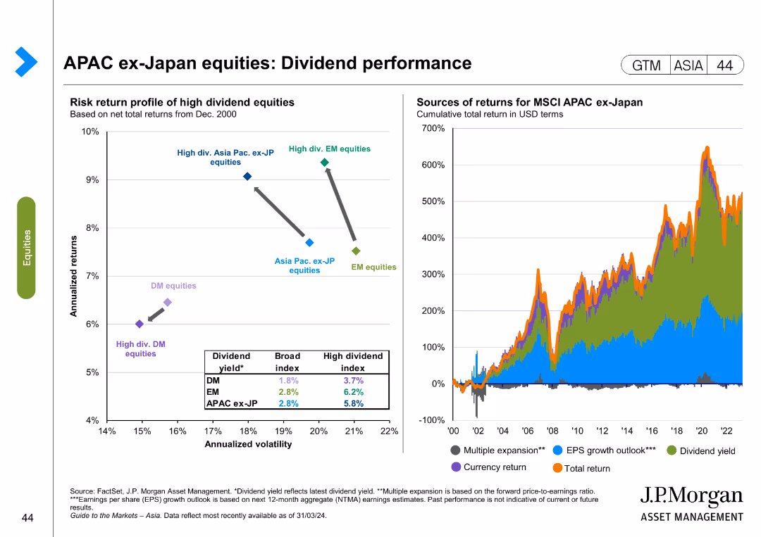
The slide includes a scatter plot showing the risk-return profile of high dividend equities and a line chart depicting sources of returns for MSCI APAC ex-Japan equities. Color coding is used to differentiate data points.
Financial Performance
Financial Services
This slide evaluates dividend performance for APAC ex-Japan equities, comparing risk-return profiles and sources of returns. It is useful for financial performance analysis and investment strategy development.
APAC, dividend performance, risk-return, equities, MSCI, financial analysis, investment strategy
false
Financial Performance
Financial Services
Multiple Chart
JP Morgan
Add to my slides
Remove from favorites
The slide features two column charts. The first chart shows the number of companies yielding greater than 4% by yield level, and the second chart shows the number of companies yielding greater than 4% by region.
Financial Performance
Financial Services
The slide details dividend sources for APAC ex-Japan equities, highlighting the number of companies with high dividend yields by yield level and region. It is used for financial performance evaluation and dividend strategy planning.
APAC, dividend sources, yield level, region, financial performance, dividend strategy
false
Financial Performance
Financial Services
Multiple Chart
JP Morgan
Add to my slides
Remove from favorites
The slide contains two column charts. The first chart shows earnings growth by market for 2024 and 2025, and the second chart shows earnings growth by sector. Each chart uses color coding to differentiate between years.
Financial Performance
Financial Services
This slide provides earnings growth expectations for APAC ex-Japan equities, broken down by market and sector, for the years 2024 and 2025. It is used for financial performance analysis and investment planning.
APAC, earnings growth, market, sector, 2024, 2025, financial performance, investment planning
false
Financial Performance
Financial Services
Multiple Chart
JP Morgan
Add to my slides
Remove from favorites
The slide includes two line charts. The left chart shows earnings trends for domestic vs. export-oriented companies, while the right chart shows growth in nominal exports and earnings per share.
Market Analysis and Trends
Financial Services
This slide explores earnings trends by revenue source and exports for APAC ex-Japan equities, providing insights into market behavior and performance based on revenue derivation.
APAC, earnings trend, revenue source, exports, market behavior, performance, domestic, export-oriented
false
Market Analysis and Trends
Financial Services
Multiple Chart
JP Morgan
Add to my slides
Remove from favorites
This slide features a mix of text and a column chart. The text is on the left side, while the chart is on the right. The chart highlights various performance optimization approaches by percentage.
Investment Analysis
Financial Services
The slide discusses different approaches APAC family offices plan to implement to optimize performance and measure success, focusing on ESG factors and sustainability initiatives.
APAC, family offices, performance, optimization, ESG
false
Investment Analysis
Financial Services
Mixed Chart
EY
Add to my slides
Remove from favorites
The slide includes four sections with textual and visual content discussing wealth and regulation, digital transformation, risk and reputation, and strategy.
Market Analysis and Trends
Financial Services
The slide examines key concerns for family offices in the APAC region, highlighting trends in regulation, digital transformation, risk management, and strategy.
APAC, family offices, regulation, digital transformation, risk management
false
Market Analysis and Trends
Financial Services
Multiple Chart
EY
Add to my slides
Remove from favorites
Bar chart showing percentages of APAC family offices' regulatory concerns, accompanied by text explanation.
Regulatory and Compliance
Financial Services
Discusses the concerns of APAC family offices about various regulatory issues, highlighting significant concern percentages.
APAC, family offices, regulatory issues, transparency, compliance
false
Regulatory and Compliance
Financial Services
Mixed Chart
EY
Add to my slides
Remove from favorites
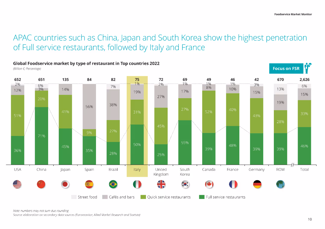
The slide shows a column chart with data on the market penetration of different types of restaurants (street food, cafés, quick service, full service) across top countries in 2022. Each country is represented by a flag.
Market Analysis and Trends
Hospitality & Tourism
This slide highlights the dominance of full-service restaurants in APAC countries compared to other regions. It shows the type of restaurants prevalent in each country and their market shares in 2022.
APAC, full service restaurants, market penetration, restaurant types, 2022 data
false
Market Analysis and Trends
Hospitality & Tourism
Single Chart
Deloitte
Add to my slides
Remove from favorites
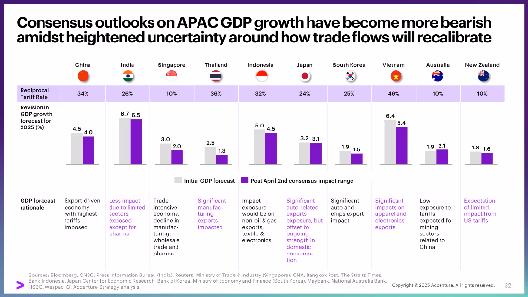
Grid of flags with GDP forecast comparisons and impact rationale. Structured into columns with visual and text elements.
Market Analysis and Trends
Government & Public Sector
This slide presents the revised GDP forecasts for major APAC economies following US tariff impacts. It contrasts initial forecasts with post-April 2nd consensus and includes rationales for impact, ranging from manufacturing dependence to sectoral sensitivities.
APAC, GDP forecast, US tariffs, Asia-Pacific, economic impact, manufacturing, trade
false
Market Analysis and Trends
Government & Public Sector
Single Chart
Accenture
Add to my slides
Remove from favorites
The slide features a mix of tables, column charts, and text boxes to present IPO data across APAC markets.
Market Analysis and Trends
Financial Services
It highlights the number and proceeds of IPOs in the APAC region, focusing on the strong performance of Greater China and South Korea.
APAC, Greater China, South Korea, IPOs, performance
false
Market Analysis and Trends
Financial Services
Multiple Chart
EY
Add to my slides
Remove from favorites
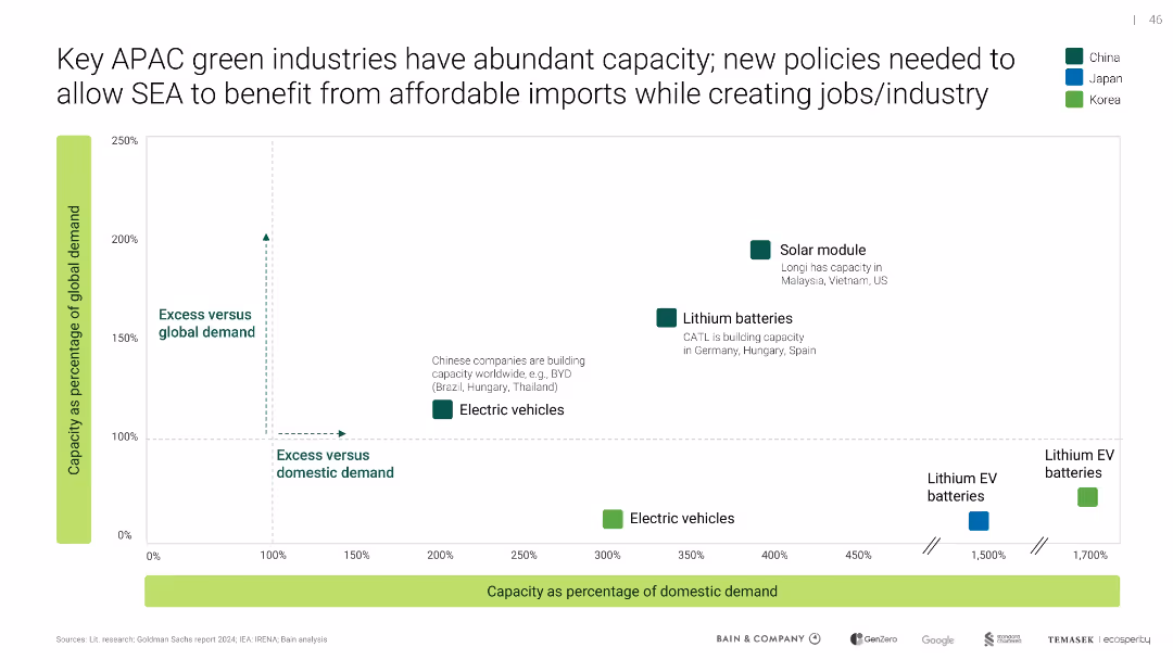
Scatter plot showing domestic vs global demand; color-coded by country (China, Japan, Korea)
Market Analysis and Trends
Artificial Intelligence
APAC countries, particularly China, have significant excess capacity in green sectors like solar modules and EV batteries. The slide argues for policy support to allow SEA to import green tech and build local industry.
APAC, green industry, overcapacity, imports, SEA, EV, solar, policy
false
Market Analysis and Trends
Artificial Intelligence
Single Chart
Bain
Add to my slides
Remove from favorites
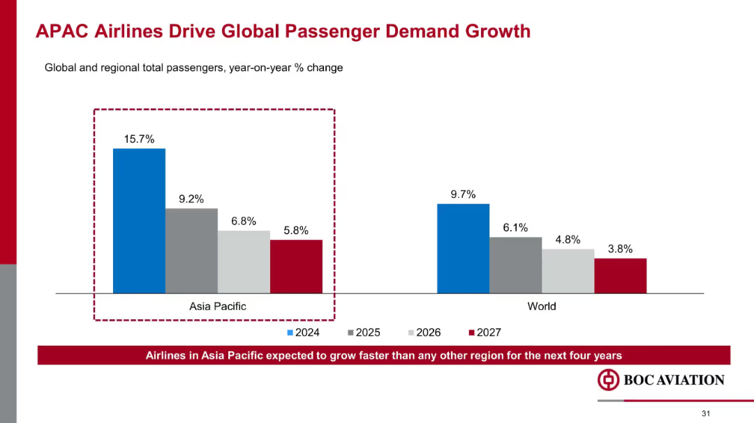
Comparative bar chart; color-coded by year and region; highlight box emphasizes Asia Pacific performance
Market Analysis and Trends
Transportation & Logistics
Projects strong growth in passenger demand across Asia-Pacific through 2027, with 2024 seeing a 15.7% YoY increase. Establishes the region as the primary driver of global air travel growth, reinforcing market opportunity focus.
APAC growth, passenger demand, global air travel, YoY change, aviation trends, Asia Pacific, demand forecast
false
Market Analysis and Trends
Transportation & Logistics
Mixed Chart
Goldman Sachs
Add to my slides
Remove from favorites
The slide includes multiple column charts showing the adoption of fundamental systems like EMR, billing, patient administration, and ancillary systems in hospitals across different APAC markets.
Technology and Digital Transformation
Healthcare & Pharmaceuticals
The slide details the penetration of back-end IT systems in hospitals across the APAC region, highlighting the adoption rates of electronic medical records, billing, patient administration, and ancillary systems, with Japan leading in EMR adoption.
APAC, hospitals, IT systems, EMR, billing
false
Technology and Digital Transformation
Healthcare & Pharmaceuticals
Multiple Chart
LEK
Add to my slides
Remove from favorites
Contains comparative column charts showing advisory and underwriting share of wallet, APAC IBCM gross revenues, and key differentiators.
Competitive Landscape
Financial Services
The slide highlights the competitive strengths of the Credit Suisse APAC IBCM franchise, including market share, revenue growth, and key differentiators in the region.
APAC IBCM, Competitive Strengths, Market Share, Revenue Growth, Differentiators
false
Competitive Landscape
Financial Services
Multiple Chart
Credit Suisse
Add to my slides
Remove from favorites
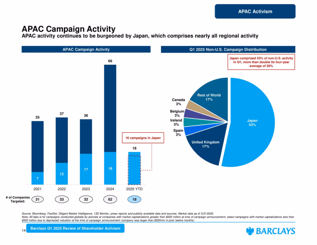
Vertical bar chart and a pie chart. Divided into left (historical trend) and right (regional share) panels. Clear blue/white style.
Market Analysis and Trends
Financial Services
Shows APAC shareholder activism from 2021 to 2025 YTD, emphasizing Japan’s growing dominance in Q1 2025, accounting for 53% of regional activity—double the four-year average. Includes campaign count and regional share pie chart.
APAC, Japan, Activism, Campaigns, Trends, Regional, Shareholder, 2025, Barclays
false
Market Analysis and Trends
Financial Services
Multiple Chart
Barclays
Add to my slides
Remove from favorites
The slide displays a column chart showing the global foodservice market outlook by geography from 2019 to 2027, including CAGR and YoY growth rates.
Market Analysis and Trends
Hospitality & Tourism
The content predicts APAC leading market growth in foodservice, reversing a negative trend, with detailed market size and growth rates by region from 2019 to 2027.
APAC, Market Growth, Foodservice, CAGR, YoY
false
Market Analysis and Trends
Hospitality & Tourism
Mixed Chart
Deloitte
Add to my slides
Remove from favorites
The slide includes two column charts depicting revenue and asset growth in CHF bn, with notable CAGR and net new assets figures. Bullet points detail the record growth and strategic initiatives driving organic expansion in the APAC region.
Market Analysis and Trends
Financial Services
The slide showcases the strong organic growth in APAC wealth management, highlighting significant revenue and asset increases. It discusses the strategic initiatives and market conditions that have contributed to this record growth, emphasizing the region's potential.
APAC, organic growth, wealth management, revenue, assets
false
Market Analysis and Trends
Financial Services
Multiple Chart
Credit Suisse
Add to my slides
Remove from favorites
The slide features column charts that present the adoption rates of patient-facing digital solutions in hospitals across various APAC markets, including patient information systems and remote patient monitoring.
Technology and Digital Transformation
Healthcare & Pharmaceuticals
The slide illustrates the usage of patient-facing digital solutions in hospitals across APAC, focusing on systems like patient information and booking, in-room patient systems, specialty care consultations, and remote patient monitoring.
APAC, patient-facing, digital solutions, hospitals, adoption
false
Technology and Digital Transformation
Healthcare & Pharmaceuticals
Multiple Chart
LEK
Add to my slides
Remove from favorites
The left side of the slide features a scatter plot showing the relationship between price-to-book ratio and subsequent returns, while the right side shows a line chart comparing APAC ex-Japan equity performance to the USD index.
Market Analysis and Trends
Financial Services
The slide analyzes performance drivers for APAC ex-Japan equities, focusing on price-to-book ratios and their impact on returns, as well as the relationship between equity performance and the USD index.
APAC, performance drivers, price-to-book, returns, equity performance, USD index, market analysis
false
Market Analysis and Trends
Financial Services
Multiple Chart
JP Morgan
Add to my slides
Remove from favorites
The slide shows column charts representing the adoption rates of physician support systems, such as medication management systems and clinical decision support tools, in hospitals across different APAC regions.
Technology and Digital Transformation
Healthcare & Pharmaceuticals
The slide focuses on the adoption of physician support systems like medication management systems, clinical workflow management systems, and clinical decision support tools across hospitals in APAC, noting lower adoption rates in Japan.
APAC, physician support, hospitals, adoption, digital tools
false
Technology and Digital Transformation
Healthcare & Pharmaceuticals
Multiple Chart
LEK
Add to my slides
Remove from favorites
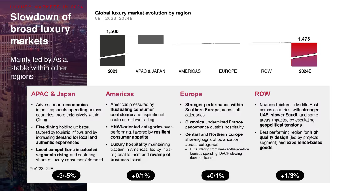
Regional breakdown of luxury market changes with a bar chart (2023 vs 2024E) and bullet insights by region. Uses black, grey, and red for contrast.
Market Analysis and Trends
Consumer Goods
Highlights geographical divergence in luxury market performance, with APAC & Japan declining due to macroeconomic pressure, while Europe and the Americas remain stable. ROW (Rest of World) sees modest growth. Bullet points describe local drivers, including tourism, consumer confidence, and regional tensions.
APAC, regional trends, luxury markets, macroeconomics, tourism, consumer confidence
false
Market Analysis and Trends
Consumer Goods
Mixed Chart
Bain
Add to my slides
Remove from favorites
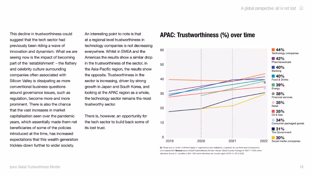
Left side presents a detailed narrative about trust trends in APAC; right side shows a line graph of trust in sectors from 2019–2022.
Market Analysis and Trends
Technology & Software
This slide focuses on the Asia-Pacific region, showing increased trust in technology companies despite global downturns. Strong growth is also observed in pharmaceuticals and food sectors. The visual highlights sector-specific trust improvements, especially in Japan and South Korea.
APAC, regional trends, trust growth, technology trust, sector comparison, public opinion, Asia data
false
Market Analysis and Trends
Technology & Software
Mixed Chart
IPSOS
Add to my slides
Remove from favorites
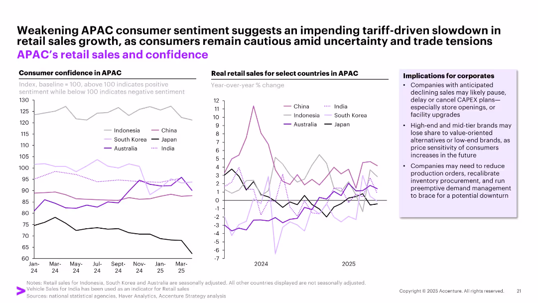
Dual-panel chart format showing consumer confidence (left) and retail sales trends (right) for select APAC countries; annotated lines and color-coded countries; side panel with corporate insights.
Market Analysis and Trends
Retail & E-commerce
This slide highlights weak consumer confidence in APAC countries, especially South Korea and China, alongside a mixed outlook for retail sales. Companies are advised to prepare for tariff-driven slowdowns and adopt flexible CAPEX and pricing strategies to address rising price sensitivity.
APAC, retail trends, consumer confidence, tariffs, inventory planning, CAPEX
false
Market Analysis and Trends
Retail & E-commerce
Multiple Chart
Accenture
Add to my slides
Remove from favorites
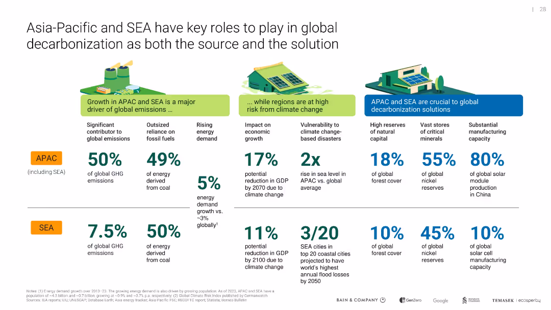
Horizontal comparison with three segments and APAC/SEA stats; infographic style with numerical emphasis and icons
Market Analysis and Trends
Environmental Services & Sustainability
Emphasizes the dual role of APAC and SEA as major GHG contributors and vital actors in decarbonization due to natural resources, critical minerals, and production capacity, reinforcing their pivotal role in the global climate agenda.
APAC, SEA, emissions, forest cover, decarbonization, minerals, solar
false
Market Analysis and Trends
Environmental Services & Sustainability
Table
Bain
Add to my slides
Remove from favorites
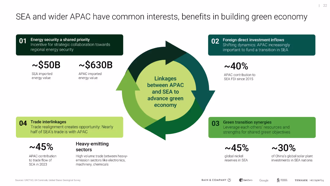
Circular flow arrow graphic surrounded by data-rich quadrants with trade, FDI, and sector stats
Industry Overview
Environmental Services & Sustainability
Demonstrates how APAC-SEA cooperation can support energy security, investment, and transition synergies via trade, FDI, and shared resources in high-emitting sectors.
APAC, SEA, green economy, energy security, FDI, trade interlinkages
false
Industry Overview
Environmental Services & Sustainability
Vertical Flow
Bain
Add to my slides
Remove from favorites
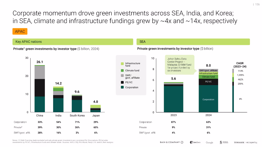
Dual bar charts for APAC and SEA investment by investor type, color-coded with clear segmentation
Investment Analysis
Environmental Services & Sustainability
Analyzes investor-type contributions to private green investments across key APAC nations and SEA. Corporate investors led in 2023; in 2024, private and government-related investors showed sharp growth, particularly in Malaysia.
APAC, SEA, Investor types, Green funding, Corporations, PE/VC, Climate funds, Infrastructure, Growth, Malaysia
false
Investment Analysis
Environmental Services & Sustainability
Multiple Chart
Bain
Add to my slides
Remove from favorites
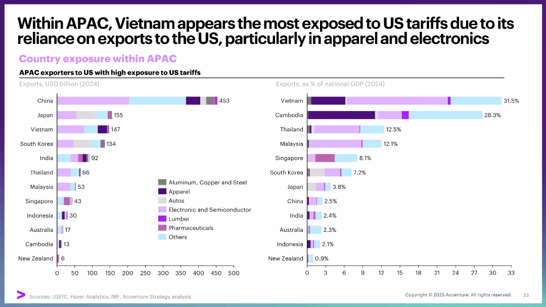
Dual bar charts: exports to US in USD and as % of GDP. Color-coded by sector with clear visual comparison.
Market Analysis and Trends
Government & Public Sector
This slide analyzes APAC countries' exposure to US tariffs, both by export volume and GDP percentage. Vietnam and Cambodia are highlighted as highly exposed due to heavy apparel and electronics exports. The chart also breaks down key sectors by color.
APAC, US tariffs, exports, exposure, apparel, electronics, GDP share, Vietnam
false
Market Analysis and Trends
Government & Public Sector
Multiple Chart
Accenture
Add to my slides
Remove from favorites
Column chart showing the percentage of organizations currently using API management solutions, those planning to use, and those with no plans. The majority currently use API management solutions.
Operational Efficiency
Technology & Software
The slide presents statistics on the adoption of API management solutions by organizations, indicating that over two-thirds currently use these solutions, with a smaller percentage planning to adopt them in the future.
API management, adoption, organizations, statistics
false
Operational Efficiency
Technology & Software
Single Chart
Gartner
Add to my slides
Remove from favorites
Column chart showing the demand projection for various API-related roles over the next 12 months, including Software Developer, DevOps Engineer, and API Engineer, with a breakdown of current roles and future plans.
Human Resources and Talent Management
Technology & Software
The slide analyzes the demand for different API-related roles in software development, indicating which roles are likely to see increased hiring and which ones will remain stable or decrease.
API roles, demand, software development, projections
false
Human Resources and Talent Management
Technology & Software
Single Chart
Gartner
Add to my slides
Remove from favorites
Column chart detailing the usage plans for different types of APIs, including Internal APIs, APIs by third parties, Private APIs, and Public APIs. The chart segments into categories: No plans, Plan to use, and Currently use.
Operational Efficiency
Technology & Software
The slide presents a survey result showing the adoption rates and future plans for various types of APIs, highlighting the predominance of internal APIs and public/external APIs.
APIs, survey, internal, external, adoption
false
Operational Efficiency
Technology & Software
Multiple Chart
Gartner
Add to my slides
Remove from favorites
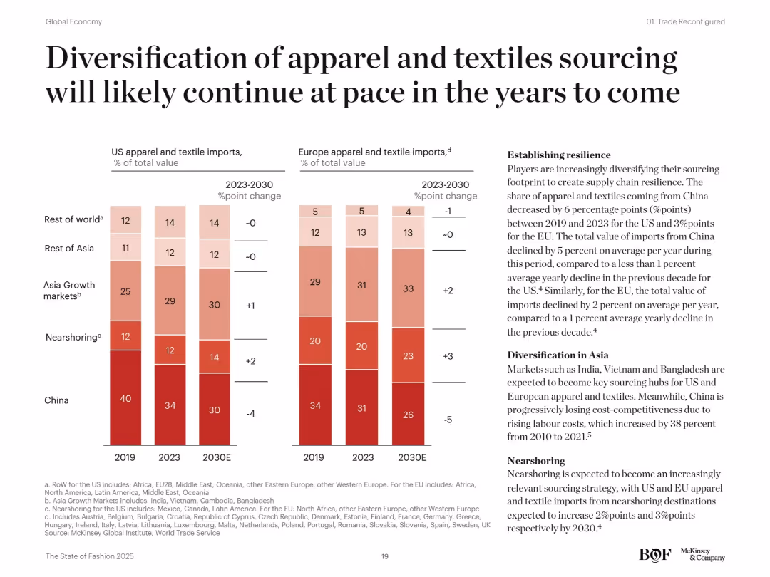
Two sets of vertical stacked bar charts (US and EU) on sourcing composition changes from 2019 to 2030. Text box explains drivers of change. Soft red and pink color palette.
Strategic Planning
Consumer Goods
This slide analyzes shifting sourcing patterns in apparel and textiles from China to Asian growth markets and nearshoring regions. It highlights resilience-building strategies, such as reduced reliance on China, increased sourcing from India, Vietnam, and others, and a growing preference for nearshoring in the US and EU.
apparel sourcing, China, nearshoring, Asia growth, diversification, US, EU, textiles, supply chain resilience, import patterns
false
Strategic Planning
Consumer Goods
Mixed Chart
McKinsey
Add to my slides
Remove from favorites
The slide presents a mix of textual information and graphical data, including a column chart with color-coded categories and a side-by-side bar graph comparison. Layout is clear with distinct sections for text and graphics.
Operational Efficiency
Government & Public Sector
This slide analyzes the types of applications processed by the Appeal Division, their resolution methods, and the time taken to finalize these applications, emphasizing operational details and procedural efficiency.
appeal division, applications, finalization, judicial, efficiency
false
Operational Efficiency
Government & Public Sector
Multiple Chart
PwC/Strategy&
Add to my slides
Remove from favorites
Contains a pair of column charts with a notable use of color coding to differentiate between various appeal origins. Textual content is balanced with visual data.
Operational Efficiency
Government & Public Sector
This slide explores the typical practices of the Appeal Division, including the use of three-judge benches and statistics on appeal origins, which aids in understanding division operations and decision-making.
appeal division, three-judge bench, case management, practices
false
Operational Efficiency
Government & Public Sector
Mixed Chart
PwC/Strategy&
Add to my slides
Remove from favorites
Timeline graphic illustrating Apple's evolution with images of products, financial highlights, and a narrative caption.
Technology and Digital Transformation
Technology & Software
Showcases Apple as a leading example of adopting as-a-service models, depicting their growth and services evolution over time.
Apple, as-a-service, business model, evolution, case study, subscription
false
Technology and Digital Transformation
Technology & Software
Linear Flow
Accenture
Add to my slides
Remove from favorites
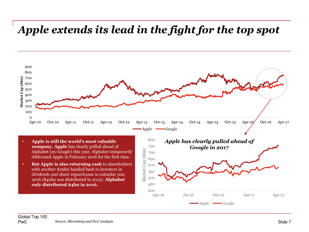
A line chart comparing the market cap of Apple and Google over time, with annotations highlighting key points in their competition.
Competitive Landscape
Technology & Software
Highlights Apple's dominance in market capitalization over Google, emphasizing key periods where Apple pulled ahead. Includes insights on Apple's shareholder returns and dividends.
Apple, Google, market cap, competition, line chart, shareholder returns, dividends, market trends
false
Competitive Landscape
Technology & Software
Multiple Chart
PwC/Strategy&
Add to my slides
Remove from favorites
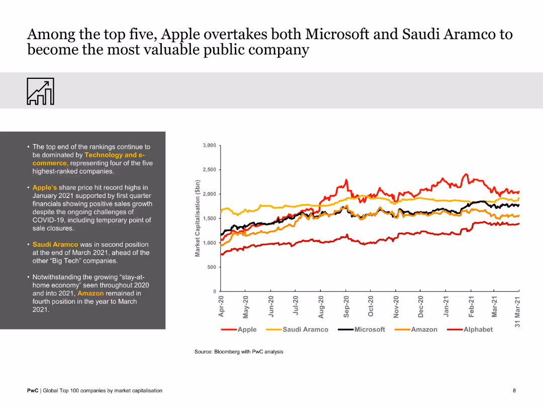
The slide features a line graph comparing the market capitalizations of top tech companies over a year. The visual is clean and focused on trends among the top five companies.
Market Analysis and Trends
Technology & Software
This slide illustrates how Apple surpassed Microsoft and Saudi Aramco to become the most valuable public company, highlighting trends from April 2020 to March 2021.
Apple, Microsoft, Saudi Aramco, market value, tech companies, 2020-2021, comparative analysis
false
Market Analysis and Trends
Technology & Software
Mixed Chart
PwC/Strategy&
Add to my slides
Remove from favorites
Contains bullet points detailing application modernization and infrastructure modernization with emphasis on cloud adoption and data center consolidation. It uses a purple color scheme and icons to denote different points, including the aim to decommission applications and adopt a multi-cloud strategy.
Operational Efficiency
Technology & Software
Focuses on the bank's initiative to modernize its software development and infrastructure to increase efficiency and cost-effectiveness.
Application Modernization, Infrastructure, Cloud Strategy, Efficiency, Optimization, Data Centers, Security, Financial Services
false
Operational Efficiency
Technology & Software
Table
JP Morgan
Add to my slides
Remove from favorites
Features a bar chart comparing the percentage of enterprises using over 500 applications in Growth Markets versus globally. Utilizes purple and light gray colors with a clear, concise layout.
Technology and Digital Transformation
Technology & Software
Highlights the prevalence of multi-application environments in Growth Markets, useful for discussions on technology infrastructure and strategic IT planning in businesses operating in these regions.
applications, Growth Markets, technology infrastructure, strategic planning, IT
false
Technology and Digital Transformation
Technology & Software
Mixed Chart
Accenture
Add to my slides
Remove from favorites
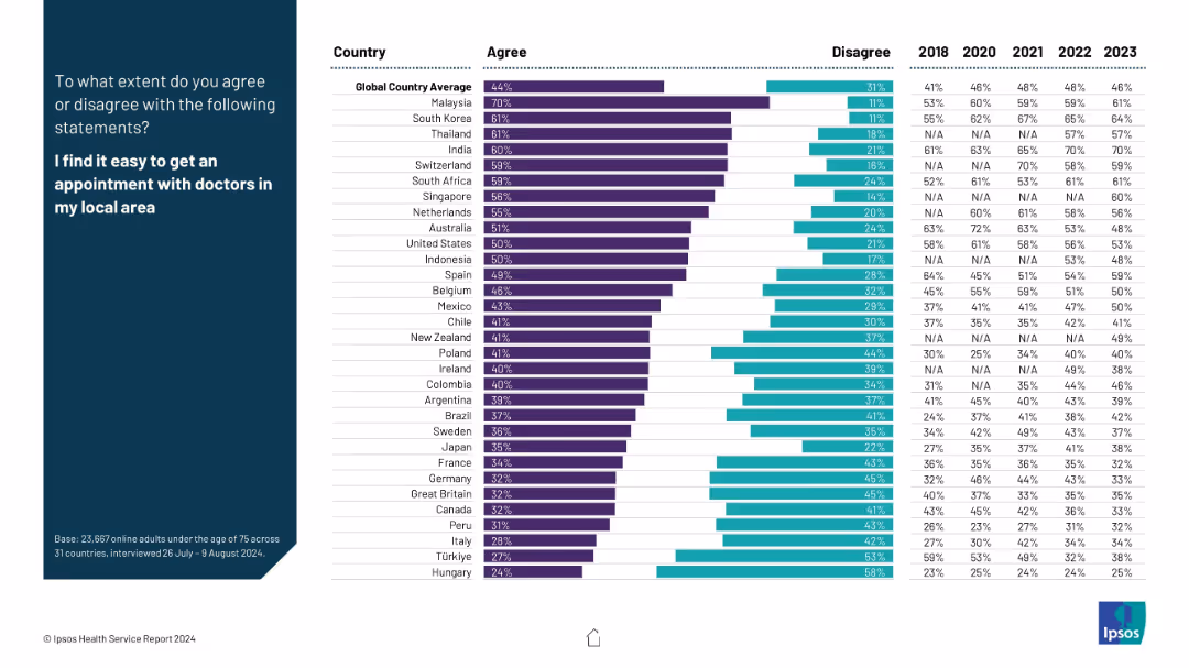
Consistent design with bar charts and a left-aligned headline statement. Comparative data from 2018 to 2023 is included.
Market Analysis and Trends
Healthcare & Pharmaceuticals
This slide assesses how people from different countries perceive the ease of scheduling doctor appointments. It reflects structural capacity, accessibility, and administrative efficiency in healthcare systems, using multi-year trend data for comparison.
appointment, doctors, accessibility, scheduling, healthcare efficiency, Ipsos, survey, public experience
false
Market Analysis and Trends
Healthcare & Pharmaceuticals
Mixed Chart
IPSOS
Add to my slides
Remove from favorites
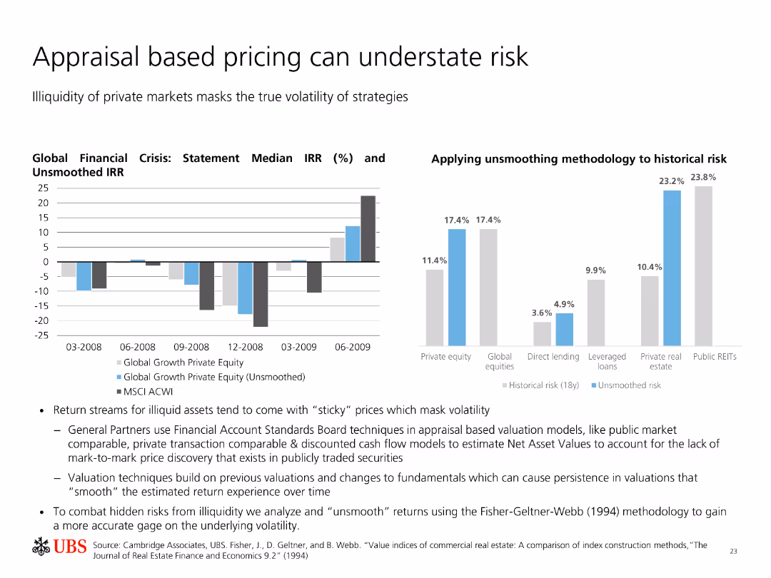
Two charts: one column chart showing IRR during the financial crisis, and another column chart comparing historical risk with unsmoothed risk.
Risk Assessment and Management
Financial Services
The slide discusses how illiquidity in private markets can mask true volatility. It shows the difference in performance when using smoothed vs. unsmoothed valuation models.
Appraisal, Risk, Volatility, Private Equity, Financial Crisis
false
Risk Assessment and Management
Financial Services
Multiple Chart
UBS
Add to my slides
Remove from favorites
The slide includes imagery, a large figure highlight, and a side column for detailed text explanation, with a moderate visual complexity.
Investment Analysis
Education & Training
It details the apprenticeship opportunities the Tempest programme will offer, highlighting the importance of skill development and its impact on the UK economy.
apprenticeships, skill development, Tempest programme, BAE Systems, MBDA, STEM education, UK economy, training
false
Investment Analysis
Education & Training
Boxed
PwC/Strategy&
Add to my slides
Remove from favorites
The slide includes a vertical column chart showing the number of apprentices organizations typically host per year, segmented into five categories. A separate horizontal bar chart shows the types of support services apprentices receive, with four categories.
Human Resources and Talent Management
Professional Services
The slide highlights that organizations leveraging apprenticeships typically host between 11 and 30 apprentices per year. It also shows the support services provided to apprentices, such as mentorship, employability training, career counseling, and mental health services.
apprenticeships, support services, mentorship, training, career counseling, mental health
false
Human Resources and Talent Management
Professional Services
Multiple Chart
Accenture
Add to my slides
Remove from favorites
Features multiple bar charts comparing app usage across different company sizes and sales volumes, with industry categorization.
Technology and Digital Transformation
Professional Services
Discusses app adoption rates across varying company sizes and sales volumes, key for digital strategy in retail and tech sectors.
app usage, company size, sales volume, retail, technology, adoption, digital strategy, comparison, industry, rate
false
Technology and Digital Transformation
Professional Services
Multiple Chart
Deloitte
Add to my slides
Remove from favorites
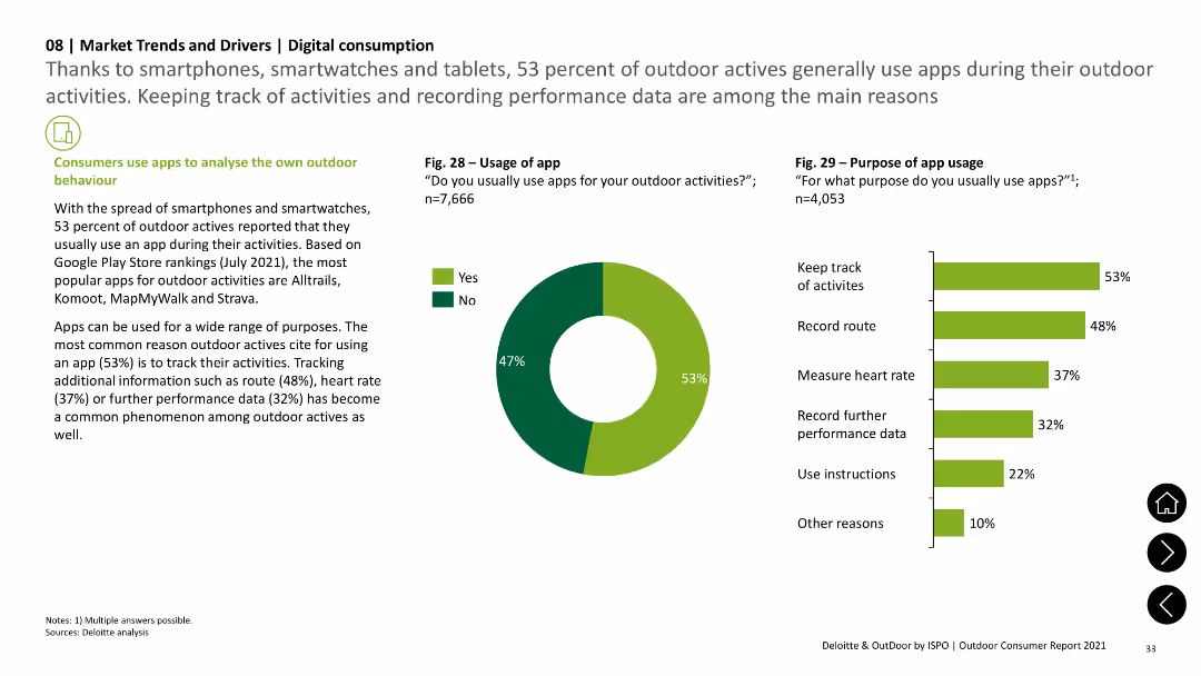
The slide features a pie chart showing app usage during outdoor activities and a column chart detailing the purposes of app usage, such as tracking activities and recording performance data. Text sections add context.
Technology and Digital Transformation
Technology & Software
The slide examines the use of apps by outdoor enthusiasts, highlighting the main purposes for app usage, including tracking activities, recording routes, and measuring heart rates, based on survey data.
app usage, digital tools, outdoor activities, tracking, performance data
false
Technology and Digital Transformation
Technology & Software
Multiple Chart
Deloitte
Add to my slides
Remove from favorites
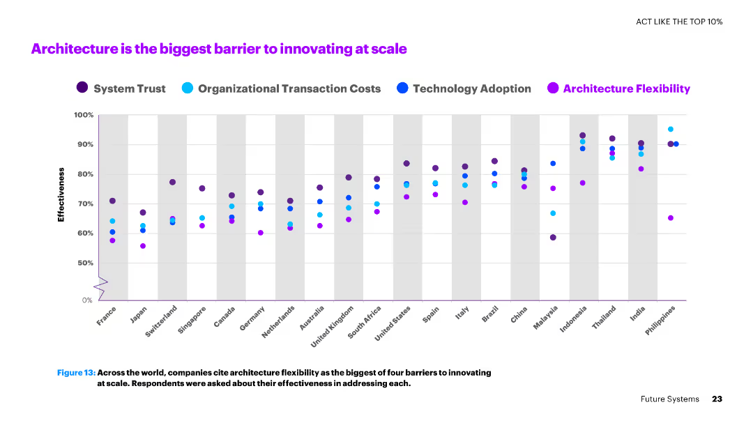
The slide shows a dot plot chart with multiple series representing various countries and their effectiveness in addressing barriers like architecture flexibility.
Operational Efficiency
Technology & Software
The slide discusses the major barriers to innovation at scale, with a focus on architecture flexibility as the biggest challenge faced by companies globally.
architecture, innovation, barriers, scale, countries, flexibility, effectiveness, technology
false
Operational Efficiency
Technology & Software
Single Chart
Accenture
Add to my slides
Remove from favorites
This slide shows a detailed diagram of an IT architecture, featuring components like SAP BTP Analytics, SAP S/4HANA, and cloud connectors, organized in a structured layout.
Technology and Digital Transformation
Technology & Software
The slide presents the architecture of a business technology platform, highlighting the integration of various components like SAP Analytics Cloud and connectivity services.
architecture, SAP, BTP, technology, cloud
false
Technology and Digital Transformation
Technology & Software
Diagram
EY
Add to my slides
Remove from favorites
Features a column chart and three pie charts to depict Arion Bank’s international exposure and loan exposure in the Arctic region, alongside a timeline showing growth in loan exposure from 2020 to 2022. The slide effectively uses visual elements to highlight the growth and strategic importance of the Arctic region for the bank’s international portfolio.
Regulatory and Compliance
Financial Services
Focuses on Arion Bank's growing international exposure in the Arctic region, detailing significant investment opportunities due to abundant natural resources and tourism potential. The slide showcases the bank's commitment to diversifying its portfolio and highlights the strategic importance of the Arctic region in its overall international expansion strategy.
Arctic, banking, international exposure, investment opportunities
false
Regulatory and Compliance
Financial Services
Multiple Chart
Deutsche Bank
Add to my slides
Remove from favorites
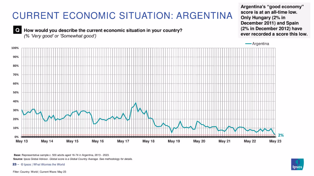
Line graph tracking Argentina’s economic sentiment over time (2013–2023); includes explanatory text in top right.
Strategic Planning
Financial Services
This historical chart shows Argentina’s declining public perception of its economy, reaching an all-time low of 2% in May 2023. The graph displays consistent long-term pessimism with brief periods of improvement. Text highlights how this ties for lowest global record alongside Hungary and Spain.
Argentina, economic crisis, sentiment trend, historical data, public opinion, Ipsos, lowest score, economic outlook
false
Strategic Planning
Financial Services
Single Chart
IPSOS
Add to my slides
Remove from favorites
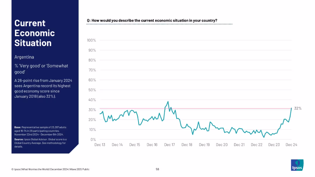
Single-line time series chart focused on Argentina; left-aligned sidebar text with a key stat.
Market Analysis and Trends
Financial Services
Highlights a 26-point surge in Argentina’s economic sentiment since January 2024, reaching its highest rating (32%) since 2018, as visualized on the line graph.
Argentina, economic improvement, sentiment rise, 2024 spike, Ipsos data, long-term chart, positive trend, macroeconomic view
false
Market Analysis and Trends
Financial Services
Mixed Chart
IPSOS
Add to my slides
Remove from favorites
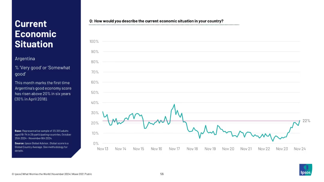
Single-country (Argentina) line chart tracking sentiment since 2013; highlight at 22% in Nov 2024.
Financial Performance
Financial Services
Argentina’s economic sentiment surpasses 20% for the first time since 2018. The line chart chronicles fluctuation in perceived economic health, underscoring recent improvement and renewed public confidence.
Argentina, economic improvement, trend, Ipsos, sentiment, public confidence, financial outlook, long-term chart
false
Financial Performance
Financial Services
Single Chart
IPSOS
Add to my slides
Remove from favorites
The slide features a line chart and a column chart illustrating Argentina's foreign reserves and USD shortage for dollarization. It includes commentary and implications for corporates.
Market Analysis and Trends
Financial Services
This slide examines Argentina's economic policy changes, focusing on foreign reserves and dollarization challenges. It outlines potential impacts on businesses and economic stability.
Argentina, economic policy, foreign reserves, dollarization, financial analysis
false
Market Analysis and Trends
Financial Services
Multiple Chart
Accenture
Add to my slides
Remove from favorites
The slide has four charts: two column charts showing real GDP and inflation, a line chart for international reserves, and another for Argentina's economic data.
Market Analysis and Trends
Financial Services
This slide provides an overview of Argentina's economic situation, including real GDP changes, inflation rates, and international reserves data up to March 2024.
Argentina, economic snapshot, GDP, inflation, reserves, economic data
false
Market Analysis and Trends
Financial Services
Multiple Chart
JP Morgan
Add to my slides
Remove from favorites
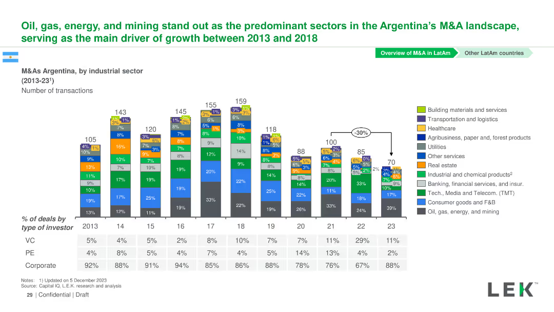
Column chart showing the number of M&A transactions by industrial sector in Argentina from 2013-2023. Sectors are color-coded and detailed in a legend.
Market Analysis and Trends
Financial Services
This slide focuses on M&A transactions in Argentina from 2013-2023, analyzing the leading sectors like oil, gas, and energy.
Argentina, M&A, Industrial Sectors, Transactions, Trends
false
Market Analysis and Trends
Financial Services
Mixed Chart
LEK
Add to my slides
Remove from favorites
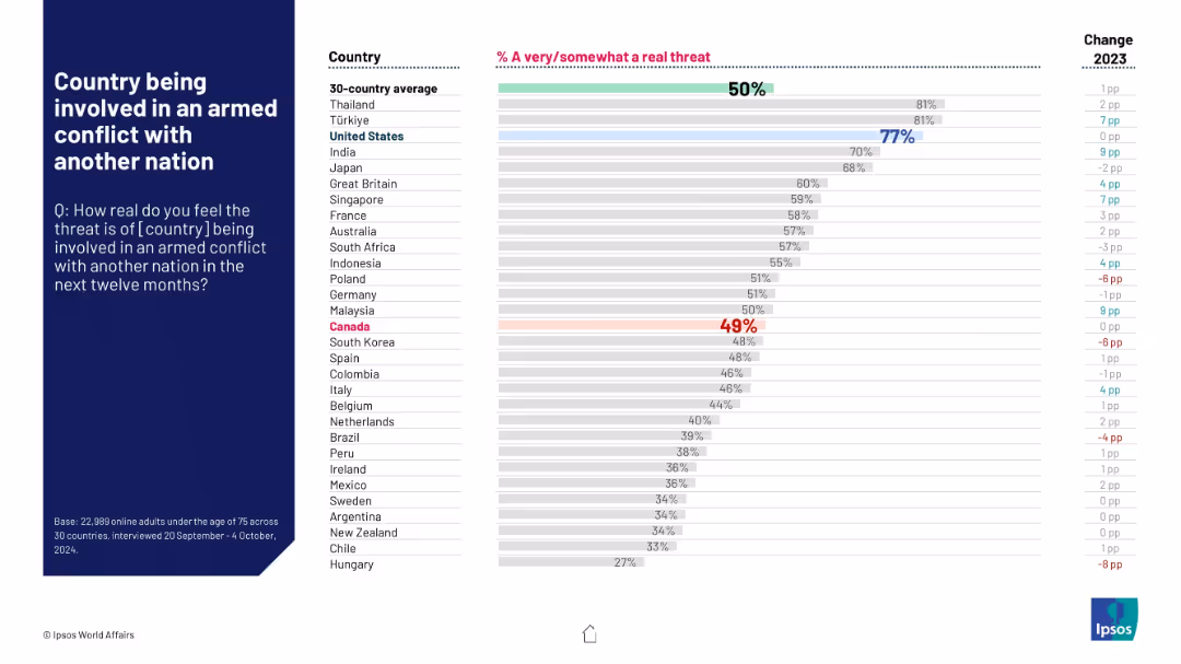
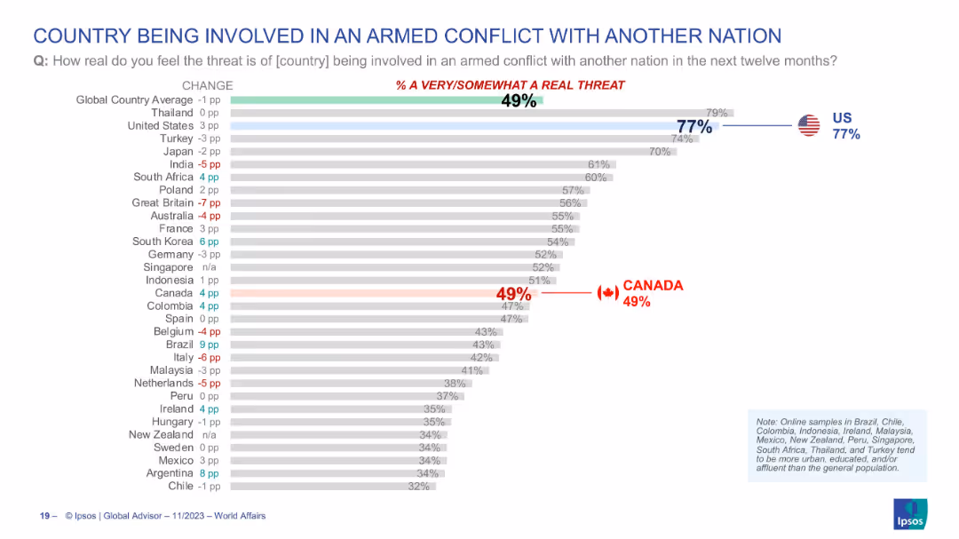
Horizontal bar graph showing public concern over potential armed conflicts; Canada slightly below average.
Risk Assessment and Management
Government & Public Sector
The slide ranks perceived threats of armed conflict across countries. The U.S. shows high concern (77%), contrasting with Canada’s 49%, which is marginally below the 50% global average.
armed conflict, international tensions, perception, Ipsos, 2024, survey, public opinion, Canada, U.S., war
false
Risk Assessment and Management
Government & Public Sector
Mixed Chart
IPSOS
Add to my slides
Remove from favorites
Similar bar chart format; countries ranked by perceived threat of armed conflict with another nation; US and Canada highlighted; change in % noted on the left.
Risk Assessment and Management
Government & Public Sector
This chart presents public sentiment regarding the risk of their country being involved in an armed conflict with another nation in the next twelve months. The global average is 49%, with the US at 77% and Canada at 49%. It reflects national security concerns and geopolitical tensions perceived by the population.
armed conflict, war, perception, international risk, global security, Ipsos, survey, USA, Canada, opinion
false
Risk Assessment and Management
Government & Public Sector
Single Chart
IPSOS
Add to my slides
Remove from favorites
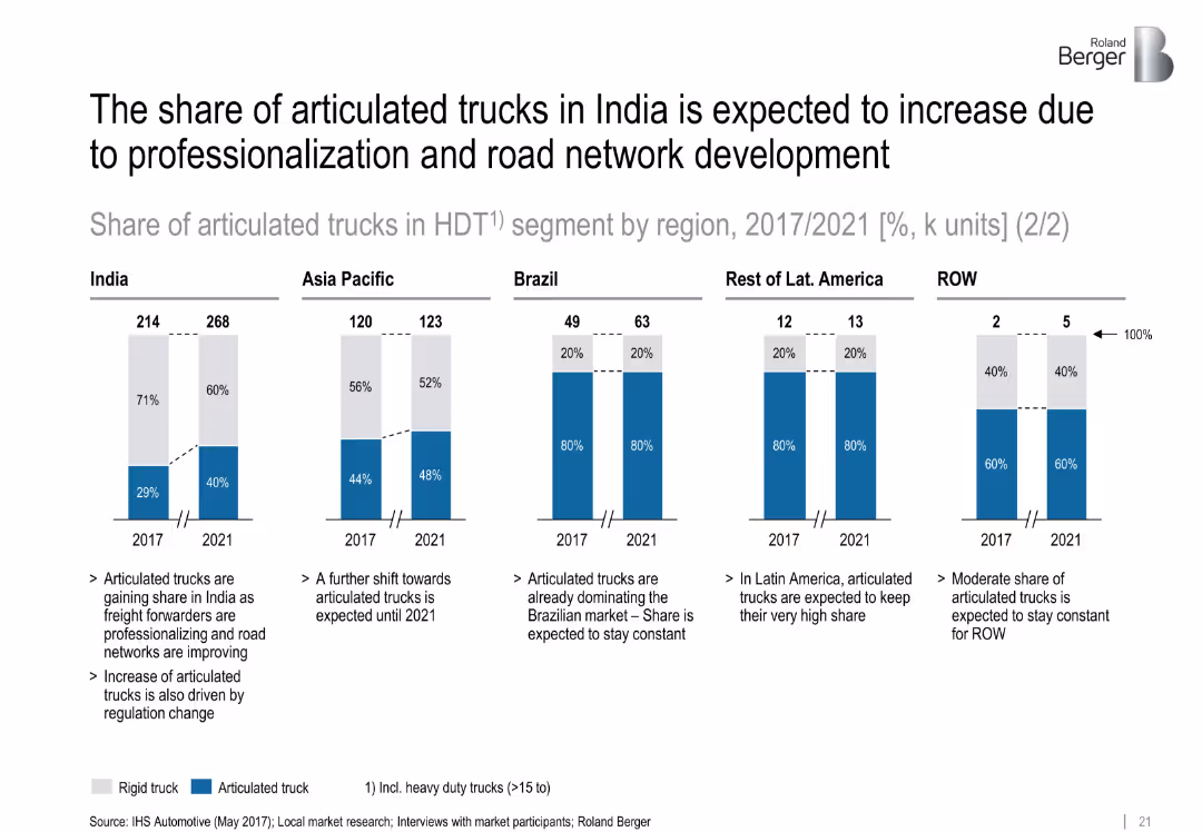
Five segmented bar charts showing articulated vs. rigid truck shares (2017 vs. 2021) by region with brief explanatory bullet points below
Market Analysis and Trends
Transportation & Logistics
This slide compares the market share of articulated vs. rigid heavy-duty trucks across five regions, highlighting India’s significant projected growth in articulated trucks due to road infrastructure improvements and professionalization. It presents both numerical data and qualitative drivers.
articulated trucks, India, professionalization, road network, freight, HDT, regional comparison
false
Market Analysis and Trends
Transportation & Logistics
Mixed Chart
Roland Berger
Add to my slides
Remove from favorites
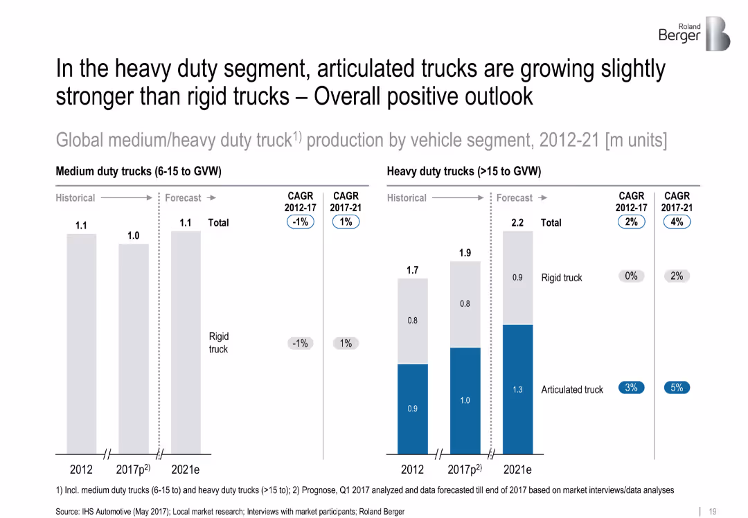
Side-by-side bar charts split by truck type and time period. Forecast period clearly indicated with CAGR metrics.
Product and Service Analysis
Transportation & Logistics
The chart compares growth trends in medium and heavy-duty truck production, emphasizing the rising preference for articulated trucks over rigid trucks in the forecast period (2017–2021).
['articulated trucks', 'rigid trucks', 'segment analysis', 'heavy duty', 'vehicle production', 'CAGR', 'forecast']
false
Product and Service Analysis
Transportation & Logistics
Multiple Chart
Roland Berger
Add to my slides
Remove from favorites
A slide that incorporates various icons and bullet points detailing technological trends such as AI, AR/VR, NFTs, and cryptocurrency, with case examples and potential applications.
Technology and Digital Transformation
Retail & E-commerce
Outlines the influence of AI, AR/VR, NFTs, and cryptocurrencies on sales and marketing, and the opportunities for hyperpersonalization and enhanced customer experiences.
Artificial Intelligence, AR, VR, Metaverse, NFTs, Cryptocurrency, Hyperpersonalization, Automation, Customer Engagement, Technological Trends
false
Technology and Digital Transformation
Retail & E-commerce
Graphic
BCG
Add to my slides
Remove from favorites
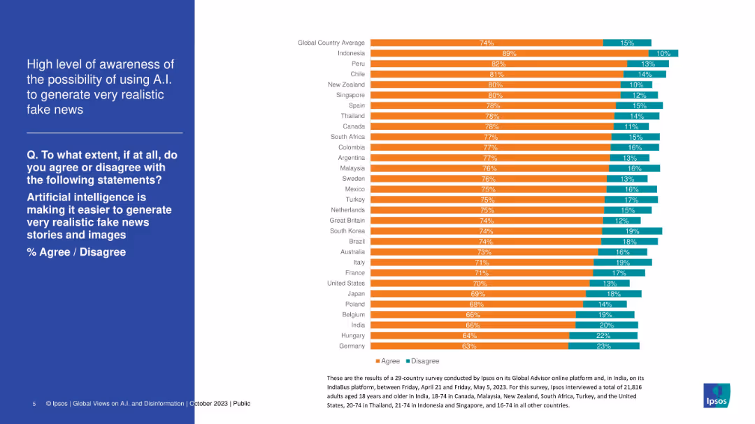
Stacked bar chart displaying country-level agreement that AI makes fake news creation easier. Nearly all bars show high agreement (orange).
Risk Assessment and Management
Artificial Intelligence
This slide reveals overwhelming global awareness of the risks AI poses in generating realistic fake news. Most countries show over 70% agreement, highlighting public concern about deepfakes and AI-generated misinformation, particularly in Indonesia, Peru, and Chile.
artificial intelligence, fake news, public concern, misinformation, AI risk, deepfake, survey, Ipsos
false
Risk Assessment and Management
Artificial Intelligence
Mixed Chart
IPSOS
Add to my slides
Remove from favorites
This slide contains a circular diagram centering on artificial intelligence, branching out to subfields like machine learning and NLP, complemented by descriptions and use cases.
Technology and Digital Transformation
Technology & Software
Focusing on AI, the slide breaks down its notable technologies and subfields, such as machine learning and NLP, with real-world applications like facial recognition and speech assistance.
Artificial Intelligence, Machine Learning, NLP, Computer Vision, Deep Learning, Technology Trends
false
Technology and Digital Transformation
Technology & Software
Mixed Chart
McKinsey
Add to my slides
Remove from favorites
Three-column layout comparing AR/VR impact over time, with isometric graphics of AR and VR, and a maturity level bar.
Market Analysis and Trends
Technology & Software
Discusses AR and VR trends with a timeline from near to long-term impact, focusing on the transition from enterprise to consumer use and enhanced interaction in the real world.
AR, VR, trends, enterprise, consumer, interaction, timeline
false
Market Analysis and Trends
Technology & Software
Header Vertical
McKinsey
Add to my slides
Remove from favorites
A vibrant abstract image paired with a centered, bold numbered heading and descriptive text below.
Strategic Planning
Technology & Software
Discusses the shift to as-a-service models in the high-tech industry, highlighting the need for customer-centric, integrated experiences.
as-a-service, high-tech, customer experience, industry shift, integrated experiences
false
Strategic Planning
Technology & Software
Title
Accenture
Add to my slides
Remove from favorites
Features a timeline graphic showing the progression of contract values over years, along with icons representing different business sectors.
Market Analysis and Trends
Technology & Software
This slide presents the growth of Experian's Ascend platform, illustrating its increasing contract value over time and its potential in the analytics market.
Ascend platform, market growth, analytics, contract value, business expansion
false
Market Analysis and Trends
Technology & Software
Linear Flow
Barclays
Add to my slides
Remove from favorites
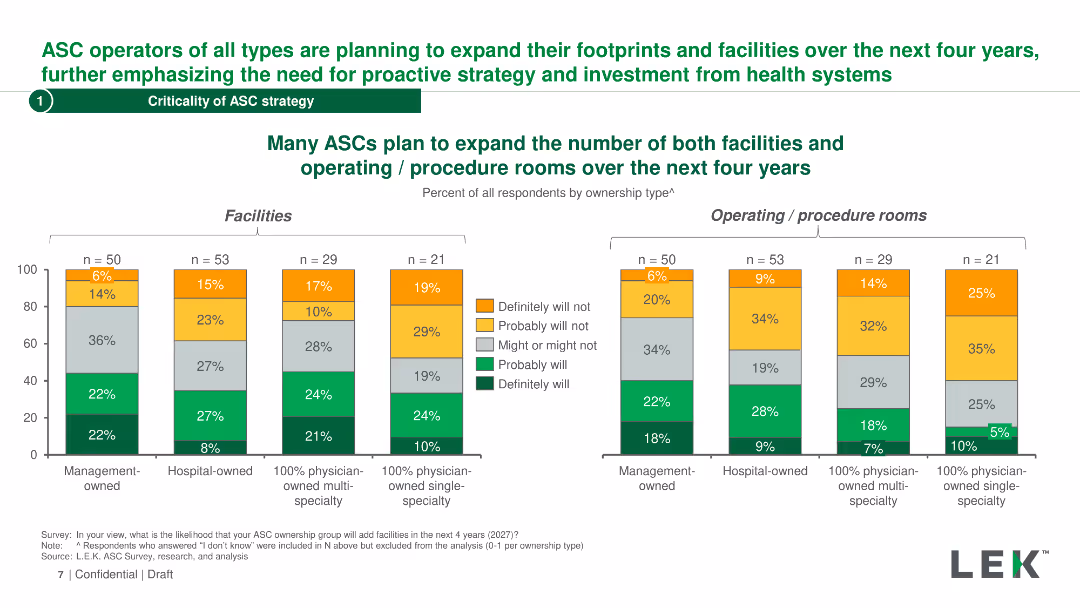
The slide contains two bar charts showing the expansion plans for ASCs in terms of facilities and operating rooms over the next four years, segmented by ownership type.
Strategic Planning
Healthcare & Pharmaceuticals
It highlights the future expansion plans for ASCs, detailing the expected growth in facilities and operating rooms, based on ownership types.
ASC expansion, facilities, operating rooms, ownership type, growth plans
false
Strategic Planning
Healthcare & Pharmaceuticals
Multiple Chart
LEK
Add to my slides
Remove from favorites
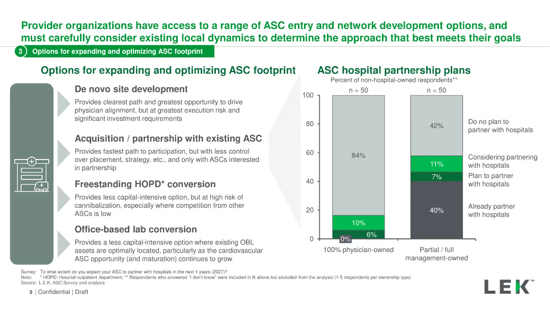
The slide features a mix of text and a column chart. The left side lists four options with icons, and the right side shows a column chart of ASC hospital partnership plans.
Strategic Planning
Healthcare & Pharmaceuticals
The slide discusses various options for expanding and optimizing the ASC footprint, including site development, partnerships, conversions, and lab conversions.
ASC, hospital, partnership, optimization, strategy
false
Strategic Planning
Healthcare & Pharmaceuticals
Mixed Chart
LEK
Add to my slides
Remove from favorites
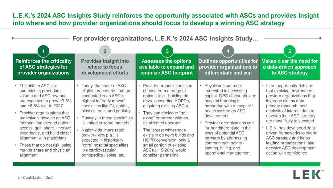
The slide has a multi-column layout with five sections highlighting key insights from the ASC Insights Study, including strategies for provider organizations and development efforts.
Strategic Planning
Healthcare & Pharmaceuticals
This slide provides a comprehensive overview of the ASC Insights Study, emphasizing the strategic importance for provider organizations to focus on ASC strategies.
ASC Insights, provider organizations, strategic planning, development, focus areas
false
Strategic Planning
Healthcare & Pharmaceuticals
Linear Flow
LEK
Add to my slides
Remove from favorites
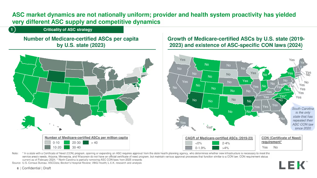
The slide displays two maps of the US, one showing the number of Medicare-certified ASCs per capita by state, and the other showing growth and CON laws from 2019-2023.
Market Analysis and Trends
Healthcare & Pharmaceuticals
This slide explores the geographic dynamics of the ASC market in the US, including the number of Medicare-certified ASCs per capita and the impact of CON laws on growth.
ASC market dynamics, Medicare, certified ASCs, CON laws, state comparisons
false
Market Analysis and Trends
Healthcare & Pharmaceuticals
Graphic
LEK
Add to my slides
Remove from favorites
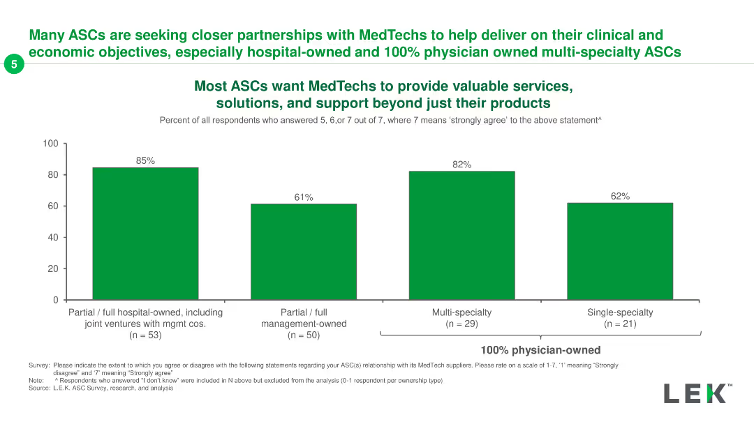
The slide includes three column charts showing ASC preferences for MedTech partnerships across different ownership models.
Client Case Studies
Healthcare & Pharmaceuticals
It presents survey data indicating the desire of ASCs for MedTech partnerships, highlighting the importance of services and support beyond just products.
ASC, MedTech, partnerships, services, survey
false
Client Case Studies
Healthcare & Pharmaceuticals
Single Chart
LEK
Add to my slides
Remove from favorites
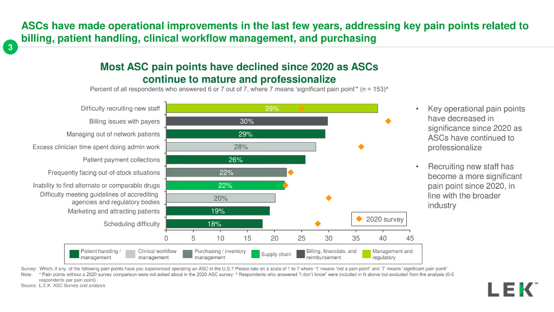
This slide shows a stacked column chart comparing ASC pain points from 2020 to recent years, categorized by different operational areas.
Operational Efficiency
Healthcare & Pharmaceuticals
It highlights the decline in operational pain points for ASCs since 2020, showing improvements in various areas such as patient handling and workflow management.
ASC, pain points, operational, improvement, decline
false
Operational Efficiency
Healthcare & Pharmaceuticals
Mixed Chart
LEK
Add to my slides
Remove from favorites
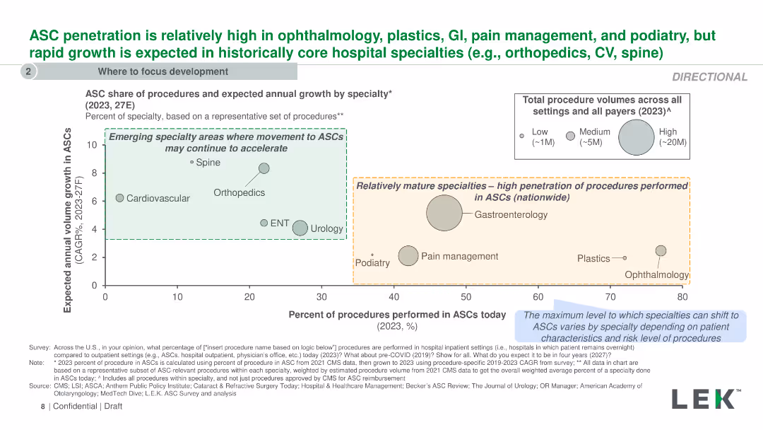
The slide features a scatter plot showing the expected annual volume growth of ASC procedures by specialty, alongside the current share of procedures performed in ASCs.
Market Analysis and Trends
Healthcare & Pharmaceuticals
This slide provides an analysis of ASC penetration across various medical specialties, projecting future growth and current procedure shares.
ASC penetration, specialty growth, procedure volume, medical specialties
false
Market Analysis and Trends
Healthcare & Pharmaceuticals
Single Chart
LEK
Add to my slides
Remove from favorites
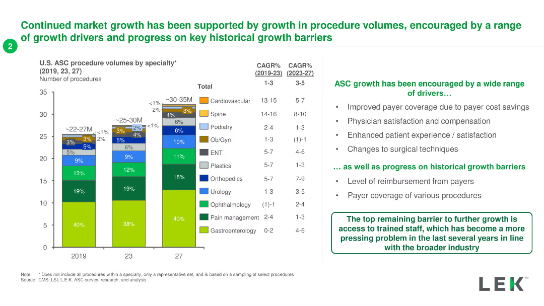
The slide features a clustered column chart showing the number of procedures by specialty from 2019 to 2027, with different colors for each specialty.
Market Analysis and Trends
Healthcare & Pharmaceuticals
It presents data on the volume of ASC procedures by specialty, including growth rates and future projections, highlighting key growth drivers and barriers.
ASC, procedure, specialty, volume, growth
false
Market Analysis and Trends
Healthcare & Pharmaceuticals
Mixed Chart
LEK
Add to my slides
Remove from favorites
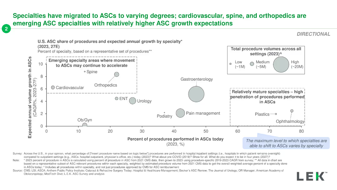
The slide contains a bubble chart mapping specialties by procedure share and expected growth, with additional commentary on migration to ASCs.
Market Analysis and Trends
Healthcare & Pharmaceuticals
It shows the share of procedures and expected annual growth for various ASC specialties, highlighting the areas with the highest growth expectations.
ASC, share, procedures, growth, specialties
false
Market Analysis and Trends
Healthcare & Pharmaceuticals
Single Chart
LEK
Add to my slides
Remove from favorites
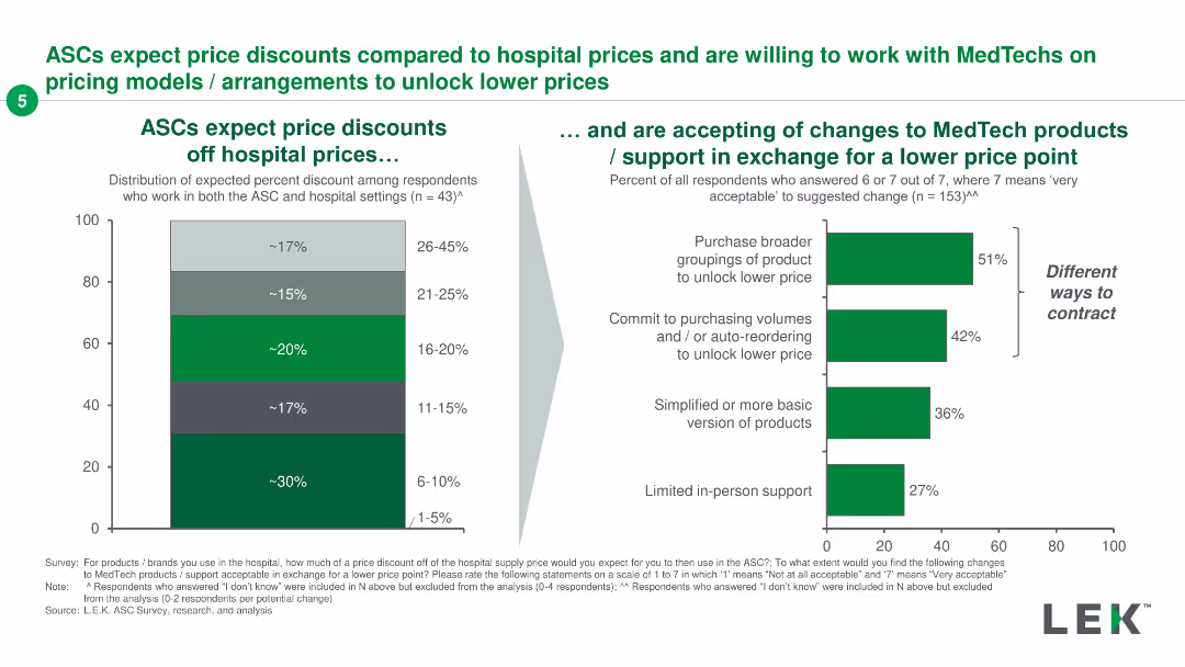
Two-part slide with a column chart showing expected price discounts off hospital prices and a horizontal bar chart detailing acceptability of changes for a lower price point.
Pricing Strategies
Healthcare & Pharmaceuticals
The slide shows expected price discounts ASCs want off hospital prices and the acceptance of changes in MedTech products/support for lower prices, emphasizing different contracting methods.
ASCs, MedTech, pricing models, discounts, price point
false
Pricing Strategies
Healthcare & Pharmaceuticals
Multiple Chart
LEK
Add to my slides
Remove from favorites
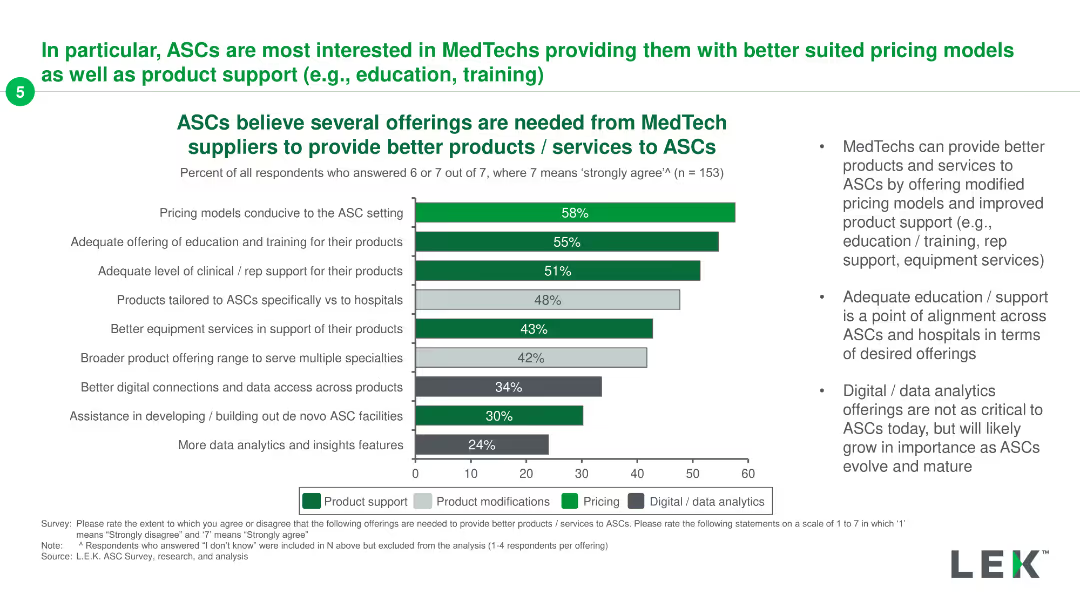
Horizontal bar chart with multiple categories like product support, product modifications, pricing, and digital/data analytics, each represented with different colored bars.
Product and Service Analysis
Healthcare & Pharmaceuticals
The slide presents survey data on what offerings ASCs need from MedTech suppliers, highlighting product support, modifications, pricing, and digital/data analytics.
ASCs, MedTech, product support, pricing, data analytics
false
Product and Service Analysis
Healthcare & Pharmaceuticals
Mixed Chart
LEK
Add to my slides
Remove from favorites
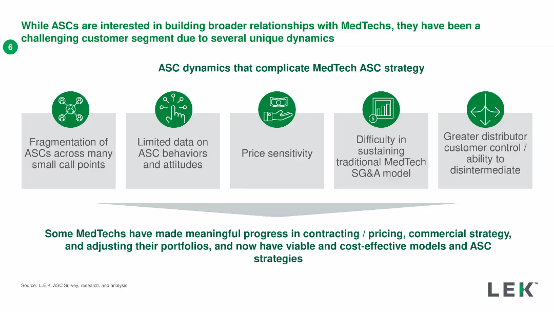
Diagram with icons and text boxes explaining ASC dynamics such as fragmentation, limited data, price sensitivity, traditional model sustainability, and distributor control.
Strategic Planning
Healthcare & Pharmaceuticals
Highlights complexities in ASC strategies for MedTechs, including fragmentation, data limitations, price sensitivity, traditional model issues, and distributor control.
ASCs, MedTech, strategy, dynamics, fragmentation
false
Strategic Planning
Healthcare & Pharmaceuticals
Pillar
LEK
Add to my slides
Remove from favorites
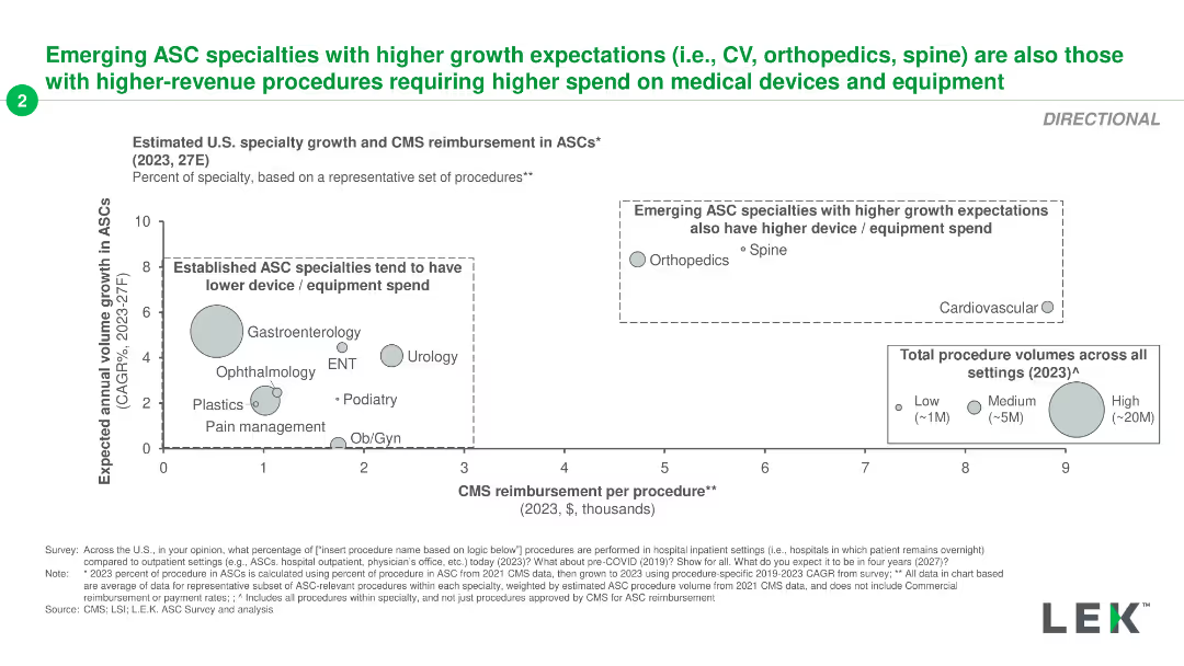
The slide features a scatter plot comparing CMS reimbursement per procedure with expected growth for different ASC specialties.
Market Analysis and Trends
Healthcare & Pharmaceuticals
It examines the relationship between CMS reimbursement and growth expectations for ASC specialties, noting higher spend for emerging specialties like orthopedics.
ASC, specialties, growth, reimbursement, CMS
false
Market Analysis and Trends
Healthcare & Pharmaceuticals
Single Chart
LEK
Add to my slides
Remove from favorites
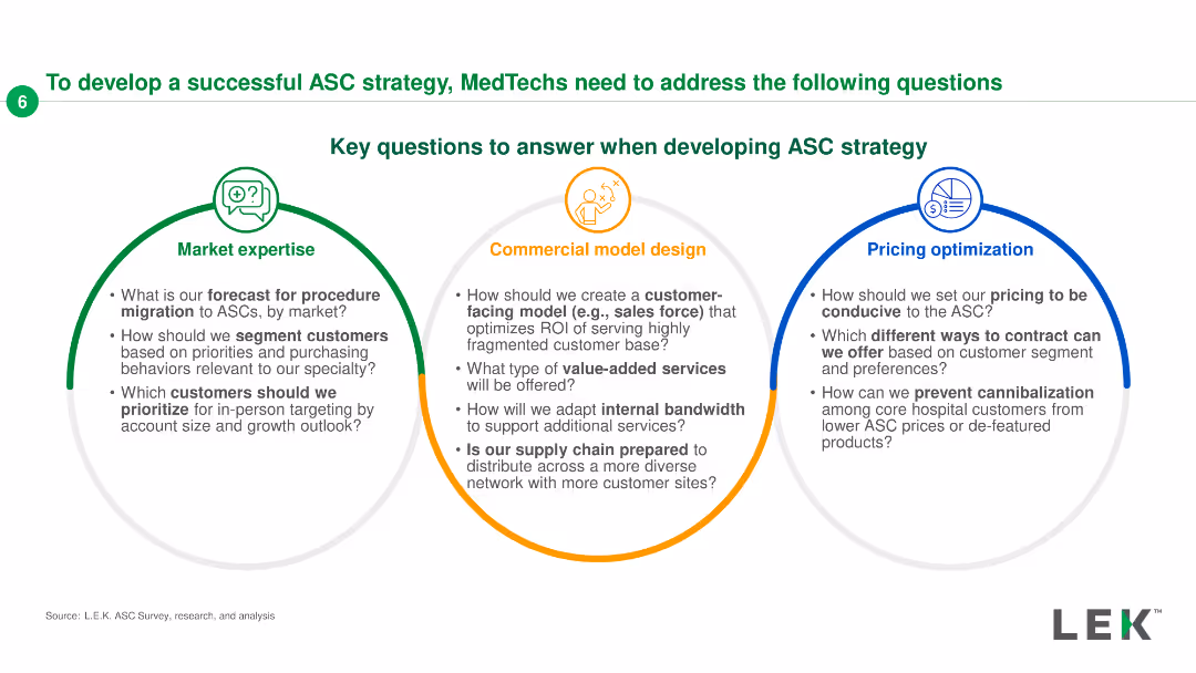
Three-section layout with icons and text, each section focusing on market expertise, commercial model design, and pricing optimization.
Strategic Planning
Healthcare & Pharmaceuticals
Provides key strategic questions for developing ASC strategies, covering market forecasting, customer segmentation, commercial model design, and pricing optimization.
ASCs, strategy, market expertise, commercial design, pricing
false
Strategic Planning
Healthcare & Pharmaceuticals
Pillar
LEK
Add to my slides
Remove from favorites
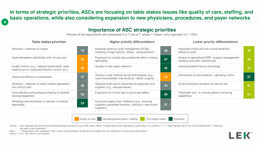
The slide features a two-column chart listing table stakes priorities and higher priority differentiators for ASC strategies, with emphasis on various operational aspects.
Strategic Planning
Healthcare & Pharmaceuticals
It outlines the strategic priorities for ASCs, emphasizing critical areas like staffing, patient care, and operational improvements, along with high-priority differentiators.
ASC, strategic, priorities, staffing, care
false
Strategic Planning
Healthcare & Pharmaceuticals
Table
LEK
Add to my slides
Remove from favorites
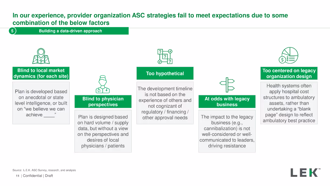
This slide has a five-column layout with icons and text explaining factors that affect ASC strategies, such as market dynamics and physician perspectives.
Operational Efficiency
Healthcare & Pharmaceuticals
It outlines the common pitfalls in ASC strategies due to various factors like ignoring market dynamics, hypothetical plans, and legacy business impacts.
ASC, strategy, data-driven, approach, pitfalls
false
Operational Efficiency
Healthcare & Pharmaceuticals
Pillar
LEK
Add to my slides
Remove from favorites
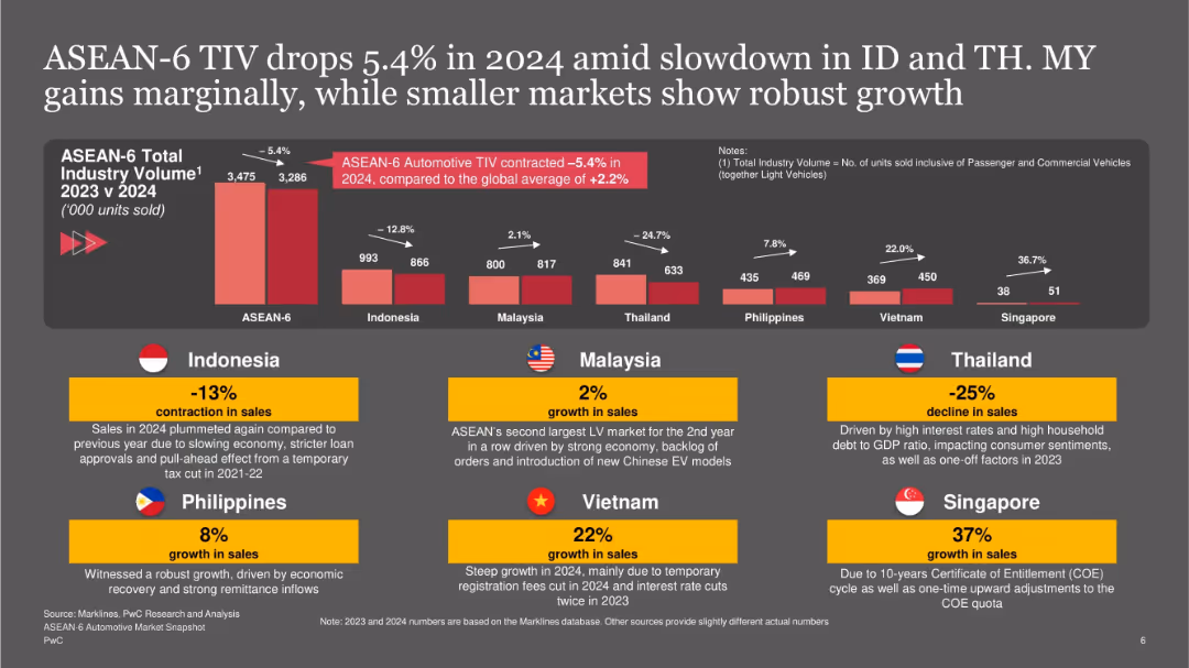
Central bar chart with red bars shows volume change by country; bottom row has yellow country boxes with growth/decline stats and explanations; dark background with bold white title.
Market Analysis and Trends
Industrial & Manufacturing
Provides a breakdown of ASEAN-6 Total Industry Volume changes from 2023 to 2024. Highlights significant contractions in Indonesia and Thailand, while countries like Vietnam and Singapore saw robust growth. It emphasizes local economic and policy factors behind these shifts in vehicle sales.
ASEAN-6, automotive sales, TIV, Indonesia, Malaysia, Thailand, growth, decline, 2024
false
Market Analysis and Trends
Industrial & Manufacturing
Mixed Chart
PwC/Strategy&
Add to my slides
Remove from favorites
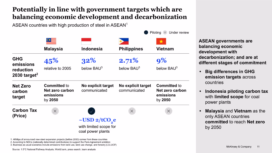
The slide features a table comparing GHG emission reduction targets, net-zero commitments, and carbon tax policies for ASEAN countries, with a descriptive sidebar.
Regulatory and Compliance
Government & Public Sector
This slide compares ASEAN countries' commitments to economic development and decarbonization, highlighting differences in GHG emission targets, net-zero goals, and carbon tax implementation.
ASEAN, economic development, decarbonization, GHG targets, carbon tax
false
Regulatory and Compliance
Government & Public Sector
Boxed
McKinsey
Add to my slides
Remove from favorites
Three large interconnected circles with statistics and an ASEAN logo in the center against a bold red background.
Market Analysis and Trends
Financial Services
This slide projects ASEAN's economic growth, demographic details, and future outlook, with a focus on the young working population and literacy rates. It's suitable for illustrating ASEAN's potential as a growing economic power and discussing investment opportunities.
ASEAN, economic growth, demographics, young population, literacy, investment opportunities, outlook, economic power
false
Market Analysis and Trends
Financial Services
Boxed
Kearney
Add to my slides
Remove from favorites
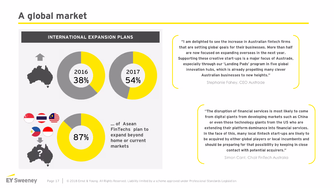
The slide features three circular graphs showing percentages of international expansion plans for ASEAN FinTechs, and two quotes.
Market Analysis and Trends
Financial Services
The slide discusses the increase in international expansion plans among ASEAN FinTech firms, highlighting statistics for 2016 and 2017, and includes expert quotes.
ASEAN, FinTech, expansion, global, market analysis, trends, international, quotes, statistics, 2017
false
Market Analysis and Trends
Financial Services
Multiple Chart
EY
Add to my slides
Remove from favorites
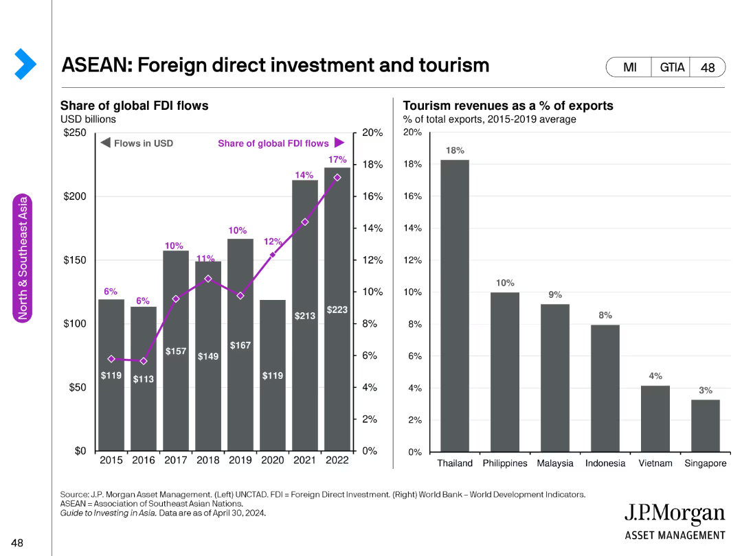
The left side of the slide features a bar chart showing the share of global FDI flows from 2015 to 2022. The right side has a bar chart depicting tourism revenues as a percentage of total exports for ASEAN countries.
Investment Analysis
Financial Services
This slide analyzes foreign direct investment trends and tourism revenues in ASEAN countries, providing insights into economic inflows and their impact on regional economies.
ASEAN, foreign direct investment, tourism, economic analysis, regional inflows
false
Investment Analysis
Financial Services
Multiple Chart
JP Morgan
Add to my slides
Remove from favorites
The slide contains a column chart showing GDP breakdown by industry for 2023 and two bar charts. The left bar chart presents real GDP growth from 2014 to 2023, and the right bar chart shows GDP per capita for various ASEAN countries.
Market Analysis and Trends
Financial Services
This slide provides an overview of GDP growth across ASEAN countries, comparing industry contributions, real GDP growth rates, and GDP per capita to analyze regional economic performance.
ASEAN, GDP growth, industry breakdown, real GDP growth, GDP per capita
false
Market Analysis and Trends
Financial Services
Multiple Chart
JP Morgan
Add to my slides
Remove from favorites
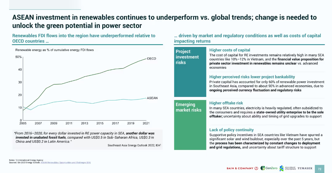
Left-aligned line graph comparing OECD and ASEAN renewable FDI flows over time; right side contains risk factors in two categories with bullet points.
Market Analysis and Trends
Energy & Utilities
Compares ASEAN renewable energy investment trends to OECD nations, showing underperformance. It attributes the gap to high costs of capital, regulatory uncertainty, offtake risks, and lack of policy continuity. Reinforces how risk perception hampers bankability of renewable projects and the need for improved regulatory clarity.
ASEAN, renewable energy, FDI, investment risk, policy continuity, regulatory risk, capital costs, energy sector, OECD
false
Market Analysis and Trends
Energy & Utilities
Mixed Chart
Bain
Add to my slides
Remove from favorites
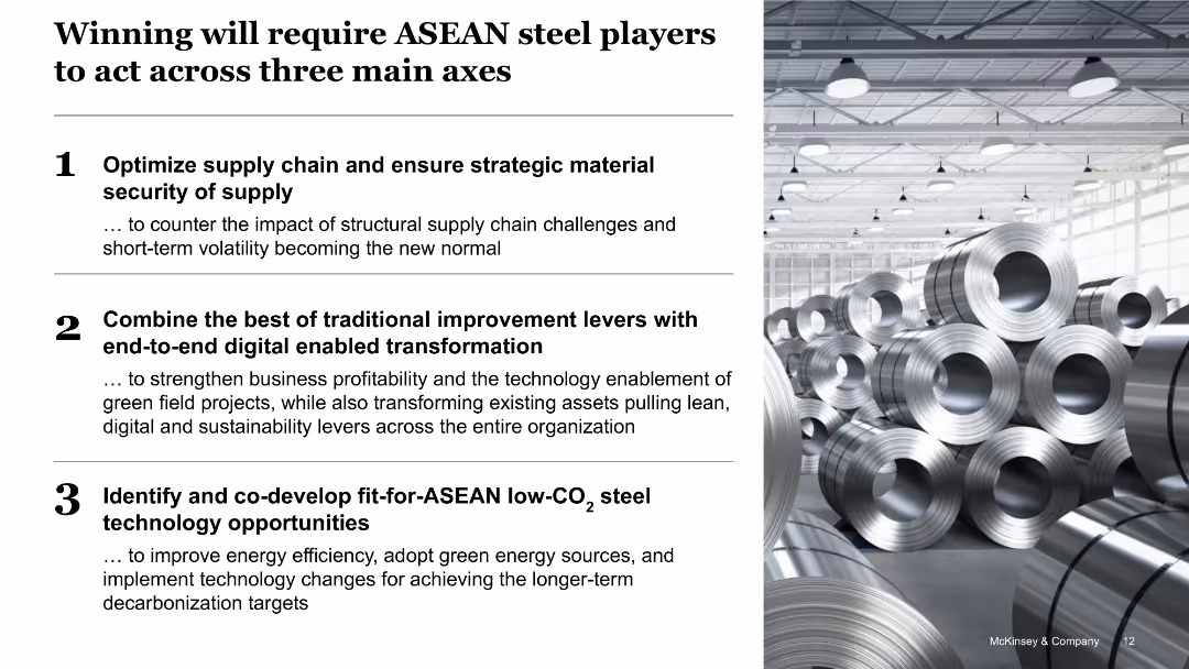
The slide has a white background with black text. It includes three numbered points and a large image of rolled steel on the right side.
Strategic Planning
Industrial & Manufacturing
The slide outlines three main strategies for ASEAN steel players: optimizing supply chain, combining traditional and digital transformation, and co-developing low-CO2 technology.
ASEAN, steel, supply chain, digital transformation, CO2 technology
false
Strategic Planning
Industrial & Manufacturing
Vertical Flow
McKinsey
Add to my slides
Remove from favorites
A vibrant, illustrative cover with bold lettering and a detailed isometric graphic depicting various business scenes.
Organizational Structure and Change
Professional Services
This cover slide introduces a playbook on talent management within the ASEAN region, emphasizing growth and scalability. It's designed to grab attention with its striking visual elements, setting the stage for a discussion on human resources and talent retention strategies.
ASEAN, talent management, growth, scale, playbook, human resources, retention, cover slide, illustration
false
Organizational Structure and Change
Professional Services
Title
Kearney
Add to my slides
Remove from favorites
Organized in a three-column table listing different aspects of operational assessment, improvement, and restructuring across various companies in Asia.
Investment Analysis
Professional Services
This slide showcases a selection of performance improvement projects managed by Alvarez & Marsal in Asia, highlighting different sectors and approaches used.
Asia, Case Studies, Performance, Improvement, Projects
false
Investment Analysis
Professional Services
Table
Alvarez & Marsal
Add to my slides
Remove from favorites
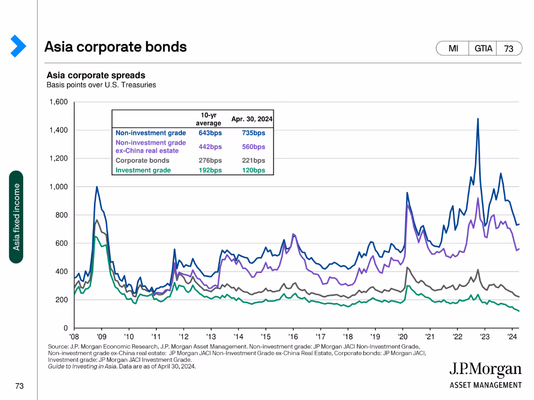
The slide has a line chart showing the spreads of Asia corporate bonds over U.S. Treasuries with different grades of bonds color-coded.
Market Analysis and Trends
Financial Services
Analyzes the basis points over U.S. Treasuries for various types of Asia corporate bonds, indicating trends over time.
Asia, corporate bonds, spreads, U.S. Treasuries, trends
false
Market Analysis and Trends
Financial Services
Single Chart
JP Morgan
Add to my slides
Remove from favorites
Previous
Next
You don't have any favorites yet.
Please wait loading your favorites slides...
Create a FREE account to continue browsing
Receive Instant Access to 1,000+ slides from companies like McKinsey, Google, and Goldman Sachs
First Name
Last Name
Email
Password
I agree to all
Terms & Privacy Policy
Thank you! Your submission has been received!
Oops! Something went wrong while submitting the form.
Have an account?
Sign in
Upgrade to PRO to Save slides
Advanced Search and Filters
Access to 15,000+ slides
Access to Category Pages
Save/Bookmark Slides
PowerPoint Template Library
Pick a Plan
MONTHLY
$12/month
Billed every month, Cancel anytime.
YEARLY
$9/year
Billed $108 annually, Cancel anytime.
Checkout for $12/month
Checkout for $108/yr
Secured by Stripe | AES-256 bit encryption