My Account
My Slides
Search by Category
Companies
Slide Type
Use Case
Industry
Pricing
Templates
View All Templates
Download Template Slides
✦ AI
AI Prompt Library
AI Search
Feedback
Login
Logout
Get Started
Browse all Slides
Browse all Slides
Create a FREE Account
Instant access to 1,000+ real slides from top companies like McKinsey, BCG, Goldman Sachs, Google and many more!
First Name
Last Name
Email
Password
I agree to all
Terms & Privacy Policy
Thank you! Your submission has been received!
Oops! Something went wrong while submitting the form.
Have an account?
Sign in
Saved Slides
Total No. of slides saved
0
↻ Refresh
✖ Clear all
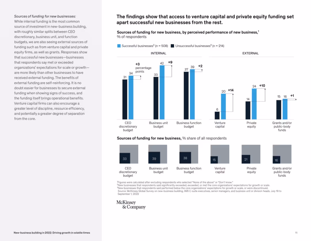
Bar graph layout comparing successful vs. unsuccessful businesses on internal/external funding sources.
Corporate Finance and Valuation
Financial Services
The slide compares sources of funding (CEO, business unit, venture capital, etc.) for successful vs. unsuccessful new businesses. It reveals external sources like VC and private equity correlate with higher business success rates.
funding, venture capital, private equity, startup success, internal vs external, McKinsey, new business
false
Corporate Finance and Valuation
Financial Services
Mixed Chart
McKinsey
Add to my slides
Remove from favorites
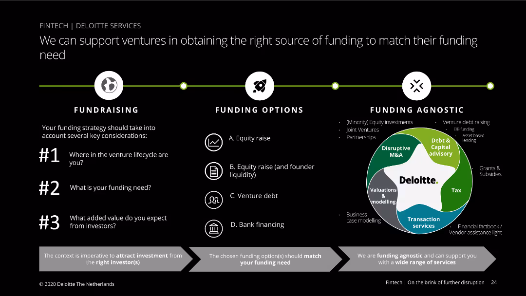
The slide features a diagram with three main funding categories: Fundraising, Funding Options, and Funding Agnostic. It includes bullet points and a circular diagram to explain different funding sources and strategies. Visual complexity is moderate.
Financial Performance
Financial Services
This slide explains the various funding options available for ventures, highlighting key considerations in the fundraising process and detailing different funding sources such as equity raise, venture debt, and bank financing.
Funding, ventures, options, equity, debt, bank, Deloitte
false
Financial Performance
Financial Services
Linear Flow
Deloitte
Add to my slides
Remove from favorites
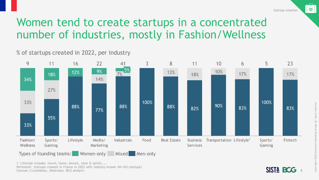
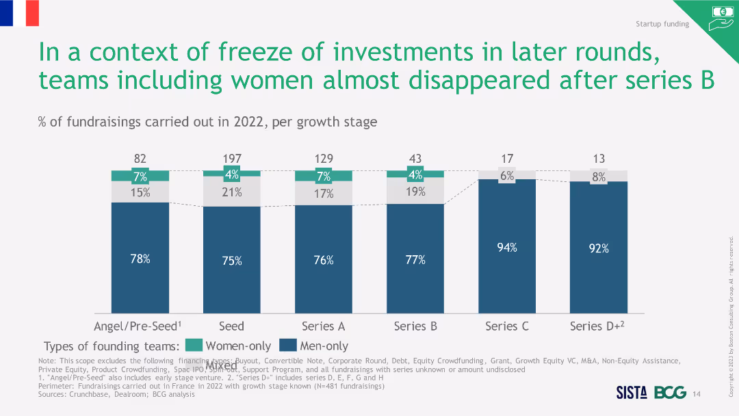
Column chart showing the percentage of total funds raised by different types of founding teams from 2008 to 2022, highlighting the improvement in 2022.
Investment Analysis
Financial Services
The slide shows that despite a market contraction, access to funds for startups with women founders improved in 2022 compared to previous years.
funding, women entrepreneurs, market contraction, 2022
false
Investment Analysis
Financial Services
Single Chart
BCG
Add to my slides
Remove from favorites
Contains column charts, textual information, and bullet points highlighting key metrics, with a dashed outline box.
Financial Performance
Financial Services
Slide shows strong performance and inflows in asset and wealth management, with a focus on alternatives fundraising surpassing targets. Likely used in investor relations or financial strategy meetings.
Fundraising, Asset Management, Performance, Inflows
false
Financial Performance
Financial Services
Mixed Chart
Goldman Sachs
Add to my slides
Remove from favorites
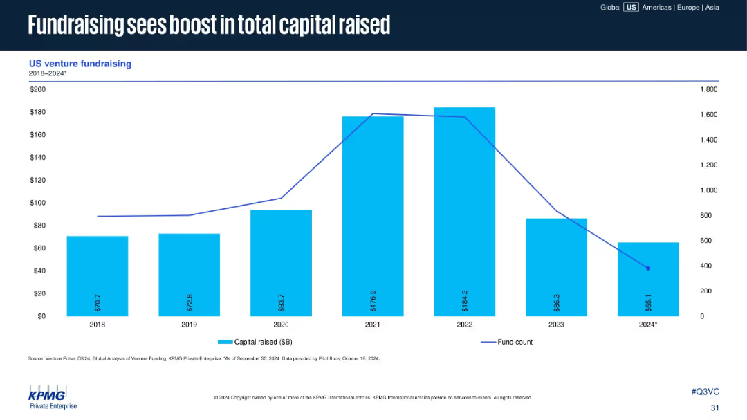
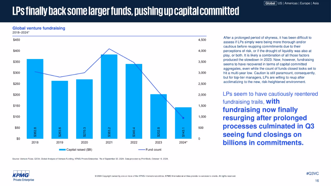
Bar-line combo chart with blue bars for capital raised ($B) and a line showing fund count. Covers years 2018–2024*.
Investment Analysis
Financial Services
Despite fewer funds being raised in 2024, total capital raised saw a notable increase, suggesting fewer but larger funds. The chart indicates peak capital in 2021–2022, followed by a decline in fund count through 2024.
fundraising, capital raised, fund count, VC funds, 2024 trend, venture capital, large funds, investment cycle
false
Investment Analysis
Financial Services
Single Chart
KPMG
Add to my slides
Remove from favorites
Column chart showing percentage of fundraisings in 2022 per growth stage. The slide uses a combination of blue and green bars to differentiate between women-only, men-only, and mixed founding teams.
Investment Analysis
Financial Services
This slide highlights the declining trend in fundraisings involving women after Series B funding stages in 2022. It shows the percentage distribution of different team types across various growth stages.
Fundraising, Investment, Women, Teams, Stages
false
Investment Analysis
Financial Services
Single Chart
BCG
Add to my slides
Remove from favorites
Bar chart with overlay line showing capital raised vs. fund count, 2018–2024; right column of text offers commentary; blue theme throughout.
Strategic Planning
Financial Services
The slide details global venture fundraising trends, showing a recovery in capital raised in 2024 despite a drop in the number of funds closed. Commentary explains LPs are cautiously returning, backing larger funds after a period of risk aversion and liquidity concerns.
fundraising, LPs, venture capital, capital committed, fund count, 2024 rebound, investor confidence, capital deployment, risk appetite
false
Strategic Planning
Financial Services
Mixed Chart
KPMG
Add to my slides
Remove from favorites
Features line and column charts depicting fundraising trends by total funds raised and the number of funds raised over different quarters. Visual complexity is moderate.
Investment Analysis
Financial Services
Analyzes trends in private equity and venture capital fundraising, showing variations in the amount and number of funds raised quarterly. Essential for fundraising strategists and investors.
fundraising, PE, VC, trends, financial, analysis
false
Investment Analysis
Financial Services
Single Chart
EY
Add to my slides
Remove from favorites
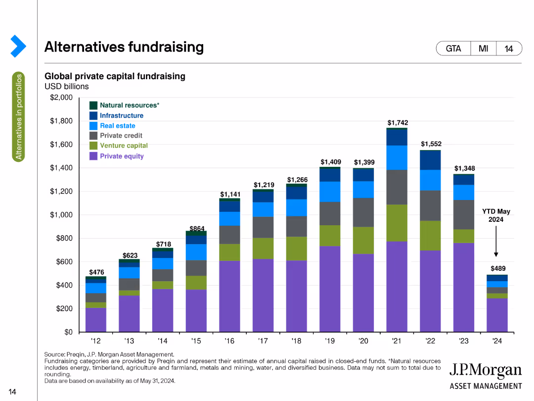
This slide contains a stacked column chart illustrating global private capital fundraising amounts in USD billions from 2012 to 2024. Different colors represent categories like natural resources, infrastructure, and private equity.
Market Analysis and Trends
Financial Services
The slide tracks global private capital fundraising by asset class over time, highlighting the amounts raised annually from 2012 to 2024, with a breakdown by categories such as natural resources, infrastructure, and private equity.
Fundraising, Private Capital, Asset Classes, USD Billions, Trends
false
Market Analysis and Trends
Financial Services
Single Chart
JP Morgan
Add to my slides
Remove from favorites
The slide displays a stacked bar chart titled "Global private capital raised" with segments for different types of funds from 2003 to 2022. A decrease is highlighted in 2022, emphasized with "$1.3T".
Investment Analysis
Financial Services
Focuses on the challenges of fundraising in the private equity space, showing a year-on-year comparison of capital raised, which is essential for strategic planning and investment forecasting.
Fundraising, Private Equity, Capital Raised, Strategic Planning, Investment Forecasting
false
Investment Analysis
Financial Services
Single Chart
Bain
Add to my slides
Remove from favorites
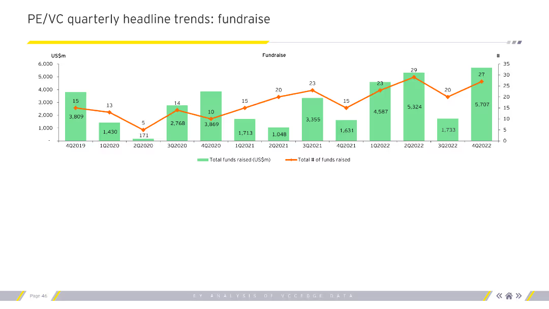
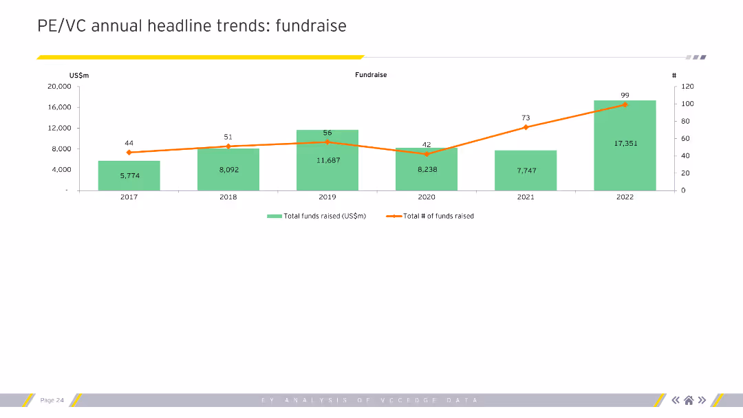
The slide features a column chart with a line graph overlay. The green columns represent the total funds raised (US$m), and the orange line represents the total number of funds raised.
Market Analysis and Trends
Financial Services
This slide shows the annual fundraising trends in private equity and venture capital from 2017 to 2022, indicating growth in total funds raised and number of funds over the years.
Fundraising, trends, PE/VC, funds raised, annual
false
Market Analysis and Trends
Financial Services
Single Chart
EY
Add to my slides
Remove from favorites
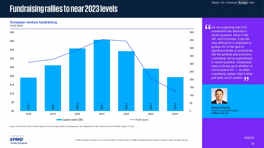
Bar chart of capital raised with line showing fund count, with a commentary sidebar featuring expert quote
Corporate Finance and Valuation
Financial Services
European VC fundraising rebounds in 2024, nearly reaching 2023 levels. Despite a drop in fund count, capital raised is substantial. Commentary highlights how macroeconomic uncertainty affects corporate VC strategies and cautionary pullbacks.
fundraising, VC funds, capital raised, CVC, uncertainty, investor trends
false
Corporate Finance and Valuation
Financial Services
Mixed Chart
KPMG
Add to my slides
Remove from favorites
It showcases a combination of column charts, star ratings, and graphical icons, using a color palette of blues, grays, and oranges. Each section provides data points and rankings.
Product and Service Analysis
Financial Services
Demonstrating asset management across various funds and strategies, this slide offers a comprehensive view on fund performance, AUM, and ranking, highlighting the franchise's cross-asset income strength.
Funds, Asset Management, Performance, AUM, Ranking, Franchise, Cross-Asset, Income Strategy, Infrastructure
false
Product and Service Analysis
Financial Services
Multiple Chart
JP Morgan
Add to my slides
Remove from favorites
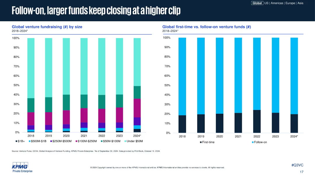
Two stacked bar charts: left by fund size, right by first-time vs. follow-on; consistent visuals and layout; timeline from 2018–2024.
Corporate Finance and Valuation
Financial Services
This slide analyzes venture fund closings by size and type. Larger and follow-on funds dominate recent years, with first-time funds making up a smaller proportion. It suggests investor preference for proven fund managers and larger, more stable vehicles.
fund size, follow-on funds, venture fundraising, first-time funds, VC trends, capital allocation, institutional preference, fund data
false
Corporate Finance and Valuation
Financial Services
Multiple Chart
KPMG
Add to my slides
Remove from favorites
A simple design with four separate sections, each with an icon and a brief description underneath.
Regulatory and Compliance
Government & Public Sector
This slide provides principles for the disbursement of relief funds from a fiscal perspective. It’s meant for leaders to ensure efficient and targeted use of resources, focusing on speed, protection of the vulnerable, liquidity, and compliance.
funds, principles, fiscal, aid, efficiency
false
Regulatory and Compliance
Government & Public Sector
Header Horizontal
McKinsey
Add to my slides
Remove from favorites
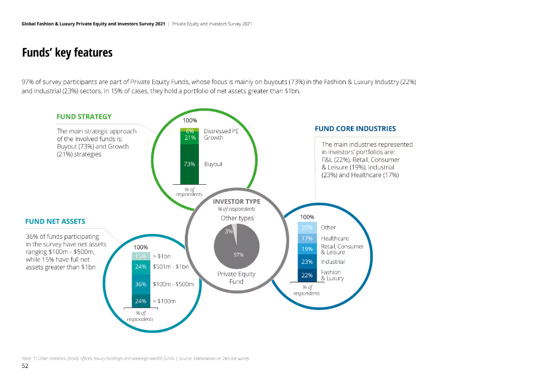
The slide includes diagrams highlighting fund strategy, net assets, investor types, and core industries of private equity funds.
Strategic Planning
Financial Services
This slide provides an overview of key features of funds, including strategies, asset sizes, investor types, and core industries in F&L.
funds, strategy, F&L, private equity, assets
false
Strategic Planning
Financial Services
Multiple Chart
Deloitte
Add to my slides
Remove from favorites
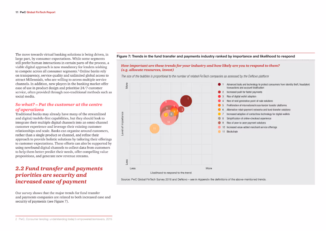
The slide contains a bubble chart and a text section. The bubble chart ranks trends by importance and likelihood to respond.
Market Analysis and Trends
Financial Services
The slide discusses the major trends for fund transfer and payments companies, focusing on security and ease of payment.
Fund transfer, payments, security, ease of payment, trends
false
Market Analysis and Trends
Financial Services
Mixed Chart
PwC/Strategy&
Add to my slides
Remove from favorites
Slide features heatmap showing career aspirations in younger generations.
Market Analysis and Trends
Professional Services
Discusses evolving career aspirations among the next generation, emphasizing non-traditional roles.
future careers, generational change, management roles, aspirations, survey data
false
Market Analysis and Trends
Professional Services
Table
BCG
Add to my slides
Remove from favorites
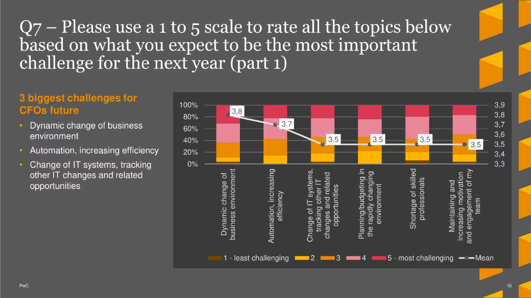
The slide includes a column chart showing anticipated challenges for CFOs, focusing on business environment changes and automation.
Market Analysis and Trends
Financial Services
This slide presents the top three expected challenges for CFOs in the coming year: dynamic business changes, automation, and IT system changes.
Future Challenges, CFOs, Column Chart, PwC, Survey, 2022, Automation
false
Market Analysis and Trends
Financial Services
Mixed Chart
PwC/Strategy&
Add to my slides
Remove from favorites
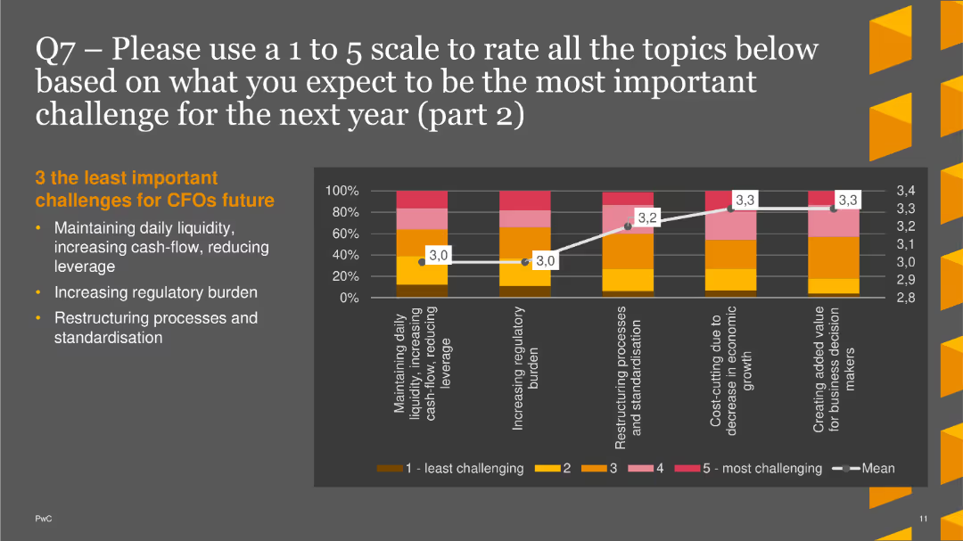
The slide features a column chart showing less significant expected challenges, including liquidity management and regulatory burden.
Market Analysis and Trends
Financial Services
This slide highlights the least important expected challenges for CFOs in the next year: daily liquidity, regulatory burden, and restructuring processes.
Future Challenges, CFOs, Column Chart, PwC, Survey, 2022, Regulatory Burden
false
Market Analysis and Trends
Financial Services
Mixed Chart
PwC/Strategy&
Add to my slides
Remove from favorites
Three interconnected circular nodes with icons, titled 'The Future of Enterprise', 'The Future of the Workforce', and 'How Work Gets Done'. The slide has a futuristic and clean design.
Technology and Digital Transformation
Professional Services
Presents an interconnected analysis of the future of enterprises, workforce, and work processes, with emphasis on disruptive forces and innovation.
future, enterprise, workforce, work processes, disruptive innovation
false
Technology and Digital Transformation
Professional Services
Linear Flow
Deloitte
Add to my slides
Remove from favorites
Contains a column chart comparing the importance of future food priorities to businesses and the applications companies are working on, such as plant-based proteins and conservation.
Strategic Planning
Agriculture & Food Production
Explores corporate strategies towards future food trends, revealing that most companies prioritize sustainable practices but recognize a need for capabilities improvement. It also highlights areas like conservation and plant-based innovations.
future food trends, sustainability, corporate strategies, priorities
false
Strategic Planning
Agriculture & Food Production
Mixed Chart
Deloitte
Add to my slides
Remove from favorites
Projection chart with future scenarios
Strategic Planning
Hospitality & Tourism
Discusses the future potential and growth projections for high-end tourism in Europe, with strategic insights on market expansion and value creation.
future, growth, tourism, projections, strategy
false
Strategic Planning
Hospitality & Tourism
Mixed Chart
Bain
Add to my slides
Remove from favorites
The slide features a professional setting with individuals in a discussion. The text highlights the need for collaboration and the development of future risk leaders within businesses. It emphasizes the importance of aligning risk management strategies with business goals to foster organizational growth and resilience.
Strategic Planning
Professional Services
This slide discusses the strategic approach to nurturing future leaders in risk management, focusing on integrating risk considerations into broader business strategies and decision-making processes. It advocates for a proactive and integrated approach to risk management as essential for sustainable business growth and competitive advantage in a volatile business environment.
future leaders, risk management, strategic planning, collaboration, business growth, professional, discussion
false
Strategic Planning
Professional Services
Mixed Chart
Accenture
Add to my slides
Remove from favorites
A bold design focusing on future prospects with minimalistic text and high contrast colors, emphasizing forward-looking statements.
Strategic Planning
Financial Services
A visionary presentation slide signaling strategic directions and new initiatives for Lloyd's, emphasizing adaptation and innovation in the insurance sector.
future, Lloyd's, strategic direction, insurance industry, innovation
false
Strategic Planning
Financial Services
Multiple Chart
PwC/Strategy&
Add to my slides
Remove from favorites
The slide uses a dark background with a yellow text box for the quote. Below, there is a question and four circular charts with percentages reflecting future expectations.
Market Analysis and Trends
Healthcare & Pharmaceuticals
The slide provides insights into Australian consumers' beliefs about the future of technology in healthcare, including AI, virtual presence, and digital monitoring.
Future of healthcare, technology, AI, virtual presence, Australia
false
Market Analysis and Trends
Healthcare & Pharmaceuticals
Mixed Chart
EY
Add to my slides
Remove from favorites
The slide uses a dark background with a yellow text box for the quote. Below, there is a question and four circular charts with percentages reflecting future expectations.
Market Analysis and Trends
Healthcare & Pharmaceuticals
The slide provides insights into Canadian consumers' beliefs about the future of technology in healthcare, including AI, virtual presence, and digital monitoring.
Future of healthcare, technology, AI, virtual presence, Canada
false
Market Analysis and Trends
Healthcare & Pharmaceuticals
Mixed Chart
EY
Add to my slides
Remove from favorites
The slide presents a bar chart showing the importance of factors like compensation and job fulfillment when considering a job change, based on responses from a global workforce survey.
Market Analysis and Trends
Professional Services
This slide analyzes workforce concerns such as compensation, meaning in work, and autonomy, suggesting how important these factors are in retaining or attracting employees. It serves as a tool for companies to align their HR strategies with employee expectations.
future of work, compensation, autonomy, job satisfaction, workforce strategy
false
Market Analysis and Trends
Professional Services
Single Chart
PwC/Strategy&
Add to my slides
Remove from favorites
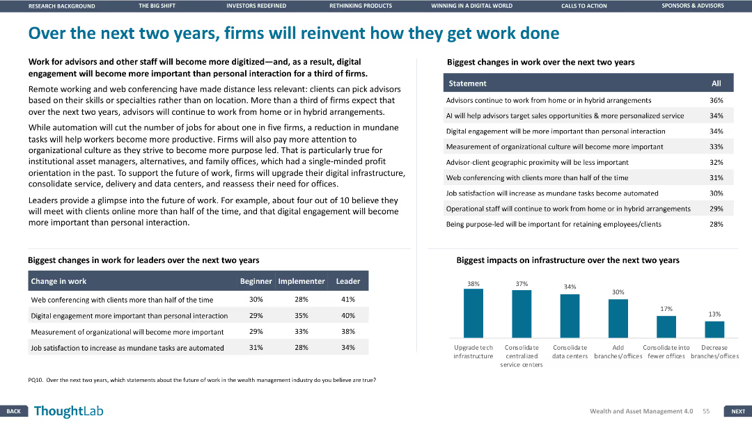
The slide features a column chart and a table, with a layout that presents future changes in work and infrastructure impacts clearly.
Strategic Planning
Financial Services
The slide discusses how firms plan to reinvent their work processes over the next two years, focusing on changes in work for leaders, the biggest impacts on infrastructure, and the adoption of digital engagement.
Future of work, digital engagement, infrastructure impacts, work changes
false
Strategic Planning
Financial Services
Mixed Chart
Deloitte
Add to my slides
Remove from favorites
A unique spherical image of a cityscape with the title 'Future of Work' atop a stark white background. The slide's visual draws attention with its intricate design and spacing, intended to intrigue and introduce.
Industry Overview
Professional Services
This creative title slide introduces a section or presentation focused on the Future of Work, setting the stage for a discourse on evolving work patterns influenced by technology and globalization. Its eye-catching visual metaphor suggests a world reoriented by new work paradigms, appropriate for thought leadership conferences or strategy sessions.
Future of Work, Introduction, Technology, Globalization, Work Patterns, Strategy, Thought Leadership
false
Industry Overview
Professional Services
Title
Deloitte
Add to my slides
Remove from favorites
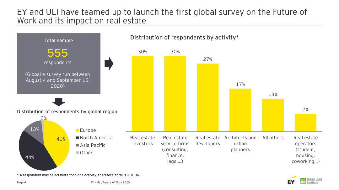
A pie chart showing the global distribution of respondents and a column chart showing respondents' activities.
Market Analysis and Trends
Real Estate & Construction
This slide presents the global distribution and activity breakdown of respondents in a survey on the future of work and its impact on real estate.
Future of Work, Real Estate, Survey, Respondents, Global Distribution
false
Market Analysis and Trends
Real Estate & Construction
Multiple Chart
EY
Add to my slides
Remove from favorites
A split design with infographics and key statistics.
Technology and Digital Transformation
Professional Services
The slide presents a comparative analysis of how technology is changing work practices and the implications for organizations.
Future of Work, Technology, Organizations, Change, Comparative Analysis
false
Technology and Digital Transformation
Professional Services
Framework
Deloitte
Add to my slides
Remove from favorites
This is a timeline slide representing key events from 2015 to 2022 with corresponding icons and a brief description of each event. The design is minimalistic with red and white colors, allowing for easy readability. Each event on the timeline is linked with a dotted line for visual flow.
Strategic Planning
Professional Services
The slide outlines a historical perspective of significant events influencing the future of work, from advancements in technology to changes in labor dynamics. It's useful for illustrating trends, forecasting future developments, and understanding the evolution of work practices over time.
future of work, timeline, technological advancement, labor trends
false
Strategic Planning
Professional Services
Pillar
PwC/Strategy&
Add to my slides
Remove from favorites
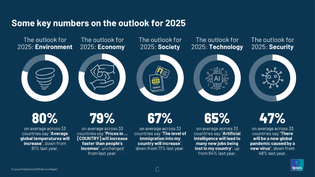
Horizontal layout with five circular infographic elements representing five outlook areas: Environment, Economy, Society, Technology, and Security.
Strategic Planning
Professional Services
This slide captures global sentiment on five key domains for 2025: rising global temperatures (80%), price inflation (79%), immigration (67%), job impact of AI (65%), and the risk of a new pandemic (47%). Percentages reflect average agreement across 33 countries.
future outlook, 2025 predictions, climate change, inflation, AI jobs, immigration, pandemic risk
false
Strategic Planning
Professional Services
Single Chart
IPSOS
Add to my slides
Remove from favorites
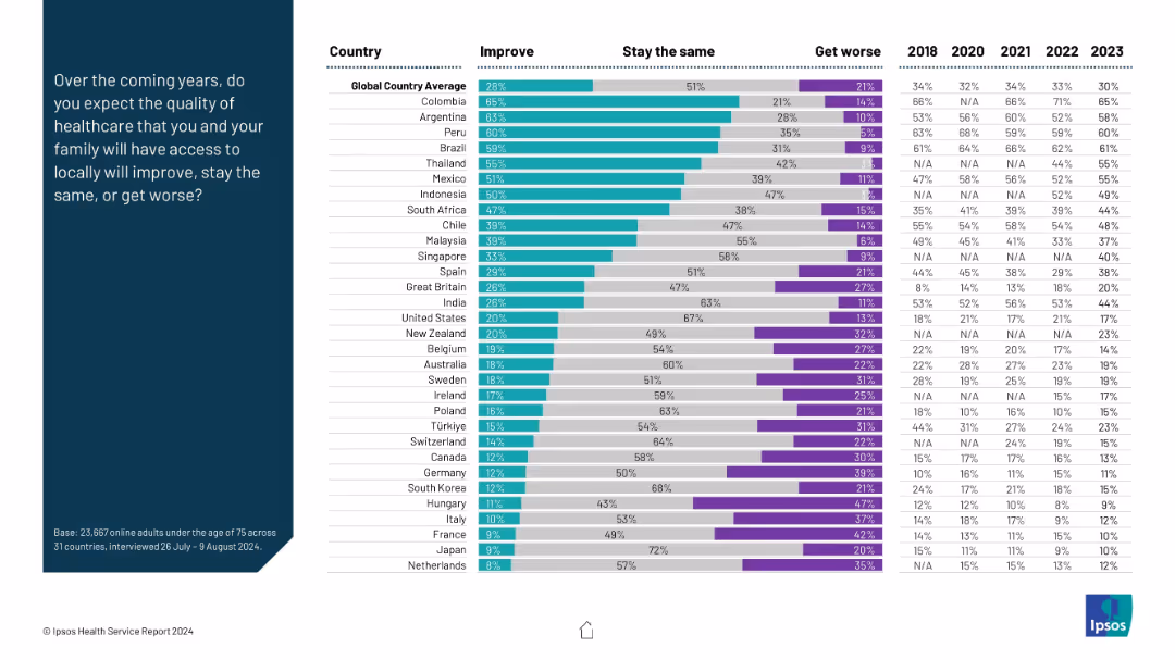
Stacked bar chart with three sentiment categories: Improve, Stay the Same, Get Worse; prompt on left.
Market Analysis and Trends
Healthcare & Pharmaceuticals
The chart illustrates expectations for future healthcare quality. Colombia and Argentina are most optimistic, while developed nations like Netherlands and France show pessimism or low optimism. It compares sentiment across time from 2018–2023.
future outlook, healthcare improvement, optimism, expectations, survey
false
Market Analysis and Trends
Healthcare & Pharmaceuticals
Mixed Chart
IPSOS
Add to my slides
Remove from favorites
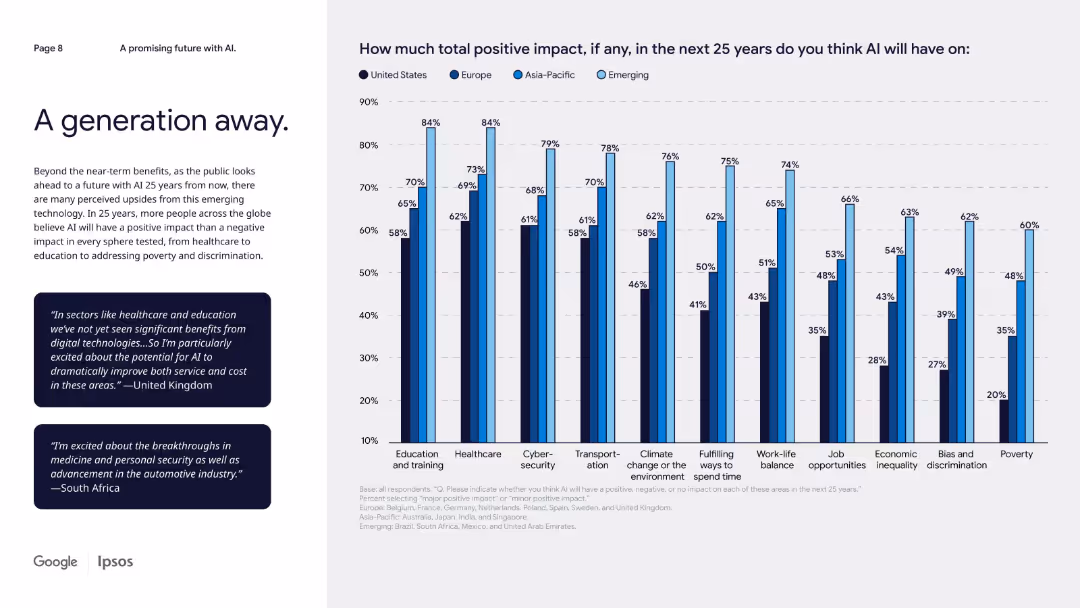
Left-aligned text with two quote boxes, and a multi-bar chart on the right showing 25-year AI impact by domain/region.
Market Analysis and Trends
Artificial Intelligence
The slide looks 25 years into the future, highlighting optimism about AI's long-term impact across education, healthcare, cybersecurity, climate, and inequality. Emerging and Asia-Pacific markets again show stronger belief in AI’s benefits.
future outlook, long-term impact, domain-specific AI, regional optimism, global trends
false
Market Analysis and Trends
Artificial Intelligence
Mixed Chart
IPSOS
Add to my slides
Remove from favorites
This slide presents four blocks of bullet points for future planning in retail. The colors are blue and white, giving a clean, corporate look.
Risk Assessment and Management
Retail & E-commerce
Suggesting key areas for businesses to focus on, including customer behaviors, technology, sustainability, and industry transformations in the face of future disruptions.
future planning, customer behaviors, technology, sustainability, industry transformations
false
Risk Assessment and Management
Retail & E-commerce
Boxed
Bain
Add to my slides
Remove from favorites
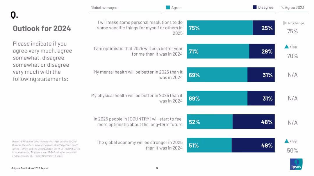
Stacked bar chart showing agreement vs disagreement with six future-focused statements about 2025, paired with 2023 % change.
Strategic Planning
Professional Services
This slide shows global agreement levels with positive expectations for 2025. Three-quarters plan personal resolutions, while 71% are optimistic about 2025 being better. Mental and physical health, economic strength, and long-term optimism are also assessed.
future planning, optimism, health outlook, economic forecast, mental health, public attitudes
false
Strategic Planning
Professional Services
Mixed Chart
IPSOS
Add to my slides
Remove from favorites
A pie chart forecasting the projected share of U.S. TV screen consumption hours in three years. The chart includes segments for Streaming, Cable, Broadcast, and Other, with Streaming projected to reach 49%.
Market Analysis and Trends
Media & Entertainment
This slide forecasts the growth of streaming to nearly 50% of U.S. TV screen consumption hours in the next three years, highlighting the increasing shift from traditional TV to streaming services.
future projection, streaming growth, TV consumption, market trends, U.S. forecast
false
Market Analysis and Trends
Media & Entertainment
Single Chart
Nielsen
Add to my slides
Remove from favorites
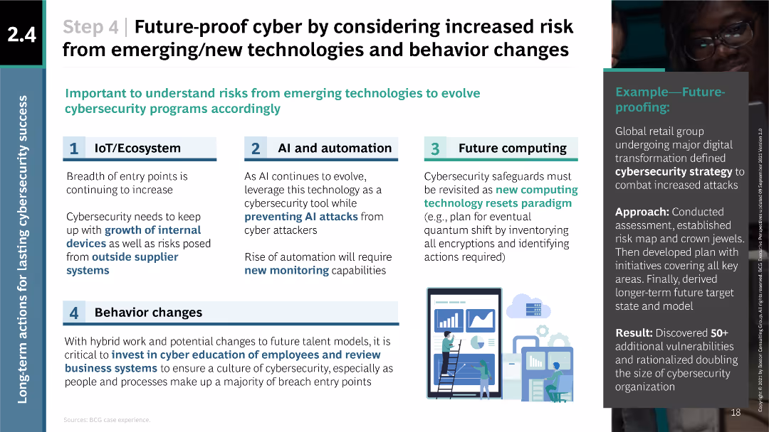
The slide is structured with numbered sections and icons representing IoT/Ecosystem, AI and automation, future computing, and behavior changes. It uses a balanced layout of text and icons to convey information clearly.
Strategic Planning
Technology & Software
The slide discusses the need for future-proofing cybersecurity strategies by considering risks from emerging technologies and behavior changes. It outlines four key areas to focus on, providing specific strategies and examples of future-proofing efforts by global companies.
future-proofing, IoT, AI, automation, computing, behavior
false
Strategic Planning
Technology & Software
Linear Flow
BCG
Add to my slides
Remove from favorites
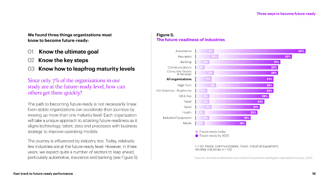
A bar chart displaying future-readiness levels across various industries. Bars represent readiness today and projected for 2023, with different colors indicating the timeline.
Market Analysis and Trends
Professional Services
This slide compares the future-readiness of different industries, showing current levels and projections for 2023. It highlights how sectors like automotive and insurance are expected to progress.
future-readiness, industries, projections, 2023, current levels
false
Market Analysis and Trends
Professional Services
Mixed Chart
Accenture
Add to my slides
Remove from favorites
The slide includes multiple bar charts with percentage values representing future-ready organizations excelling in various business areas. These bars are colored differently to represent categories such as operational efficiency, customer experience, and innovation.
Operational Efficiency
Technology & Software
This slide presents statistical data showing improvements in operational efficiency, customer experience, speed of product and service innovation, employee engagement, and business value generated from data over three years. The focus is on illustrating the progress and efficiency of future-ready organizations compared to others.
future-ready, operational efficiency, customer experience, innovation, data-driven, business improvement, comparison, survey data, Accenture Research
false
Operational Efficiency
Technology & Software
Multiple Chart
Accenture
Add to my slides
Remove from favorites
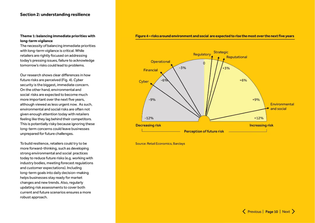
Left-aligned narrative text with right-side semicircle chart showing expected change in risk perception. Clean yellow and white layout.
Strategic Planning
Retail & E-commerce
Discusses the need to balance short-term and long-term risk priorities. Cyber risks are top short-term concern, while environmental and social risks are expected to increase significantly. Advises proactive risk management for future readiness.
future risk, environmental, cyber, resilience, long-term planning
false
Strategic Planning
Retail & E-commerce
Mixed Chart
Barclays
Add to my slides
Remove from favorites
Includes a detailed forecast model of potential funding gaps due to changes in mobility, with column charts showing projected funding from various sources and textual analysis of the risks associated with decreased vehicle-related revenues.
Regulatory and Compliance
Government & Public Sector
Projects the impact of future mobility trends on NCDOT's revenue, emphasizing the financial risks associated with reduced vehicle-related revenues and the potential funding gaps for road maintenance and construction.
future risks, mobility trends, revenue forecasting, NCDOT, funding gaps
false
Regulatory and Compliance
Government & Public Sector
Multiple Chart
McKinsey
Add to my slides
Remove from favorites
The slide uses column charts and bar charts to compare opinions on the future role of crypto assets in the financial ecosystem between 2023 and 2022, with detailed demographic breakdowns.
Market Analysis and Trends
Financial Services
It examines changing opinions on the future significance of crypto assets in the financial ecosystem, highlighting trends and shifts in beliefs over the year across different demographics.
future role, crypto assets, financial ecosystem, trends, opinions
false
Market Analysis and Trends
Financial Services
Mixed Chart
IPSOS
Add to my slides
Remove from favorites
A dark background with column charts showing future technology trends in healthcare, with white and yellow text.
Technology and Digital Transformation
Healthcare & Pharmaceuticals
It predicts future trends such as digital health monitoring, hospital-at-home models, and virtual hospitals.
future technology, healthcare, digital trends, survey, England
false
Technology and Digital Transformation
Healthcare & Pharmaceuticals
Mixed Chart
EY
Add to my slides
Remove from favorites
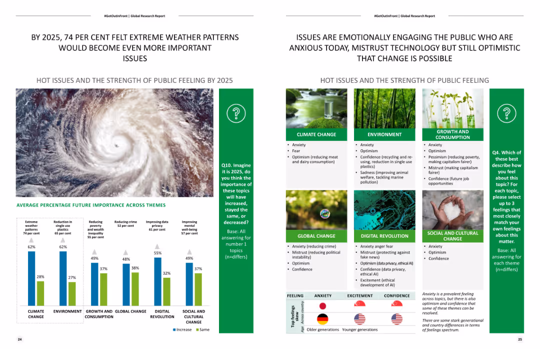
Features a column chart and a list of themes with percentages showing expected future importance of various issues. It also includes a large image of a hurricane.
Strategic Planning
Environmental Services & Sustainability
Predicts the future importance of various global issues by 2025, with a focus on extreme weather patterns and public sentiment analysis on environmental changes.
Future trends, extreme weather, environmental impact, strategic planning, public sentiment
false
Strategic Planning
Environmental Services & Sustainability
Mixed Chart
Deloitte
Add to my slides
Remove from favorites
A visionary slide showcasing futuristic concepts with images and text, focusing on how luxury brands can harness creativity and innovation. It presents a forward-looking perspective with inspirational quotes and graphics.
Strategic Planning
Consumer Goods
This slide envisions the future of the luxury market in 2030, advocating for brands to embrace cultural and creative excellence. It suggests strategies for brands to reimagine their roles through innovation, creativity, and deeper consumer engagement, aiming to drive future growth and market dominance.
future trends, luxury market, innovation, creativity, brand strategy
false
Strategic Planning
Consumer Goods
Mixed Chart
Bain
Add to my slides
Remove from favorites
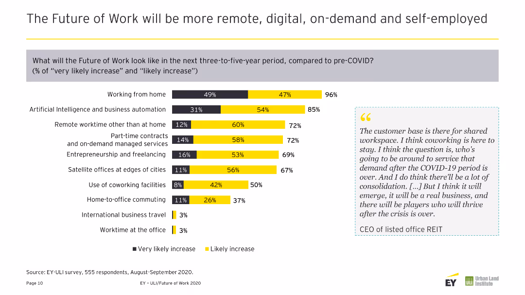
A column chart showing the likely increase in various work trends post-COVID-19, such as remote working, AI, and business automation.
Market Analysis and Trends
Technology & Software
The slide discusses anticipated work trends over the next three to five years, including remote work, AI, and increased reliance on digital tools and on-demand services.
Future Trends, Remote Work, AI, Digital Tools, On-Demand Services
false
Market Analysis and Trends
Technology & Software
Mixed Chart
EY
Add to my slides
Remove from favorites
Engaging workplace setting with screens displaying virtual participants, yellow accents.
Strategic Planning
Technology & Software
The slide serves as a title slide for a section on the future of the workplace, indicating a focus on the evolution of work environments influenced by technology. It could be a conversation starter for discussions on hybrid work models, remote work policies, and technological integration in the professional services and tech industries.
Future, Workplace, Index, Technology, Hybrid Model, Remote Work, Professional Services, Evolution, Policies, Integration
false
Strategic Planning
Technology & Software
Title
EY
Add to my slides
Remove from favorites
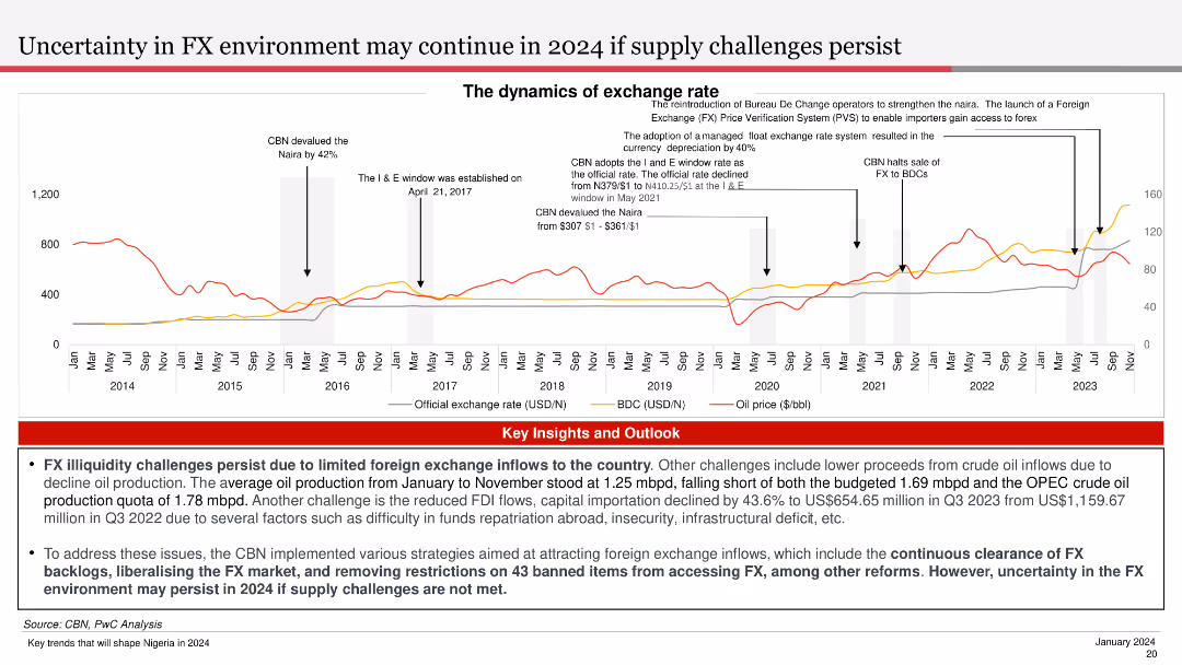
The slide features a line chart showing the exchange rate trends and oil price over time. It is visually complex, designed to provide a clear comparative analysis of key financial metrics.
Market Analysis and Trends
Financial Services
The slide discusses the dynamics of the exchange rate environment, highlighting challenges due to limited foreign exchange inflows and the impact of oil production and other factors.
FX, Exchange Rate, Oil Price, Trends, Dynamics
false
Market Analysis and Trends
Financial Services
Mixed Chart
PwC/Strategy&
Add to my slides
Remove from favorites
The slide includes a column chart showing USD inflows to the Nigerian economy, distinguishing between CBN and non-CBN sources, with a trend line for annual inflows.
Market Analysis and Trends
Financial Services
The slide analyzes the proportion of FX inflows to Nigeria from autonomous sources, noting a significant rise and its implications for the economy.
FX inflows, autonomous sources, CBN, Nigeria, financial analysis
false
Market Analysis and Trends
Financial Services
Mixed Chart
PwC/Strategy&
Add to my slides
Remove from favorites
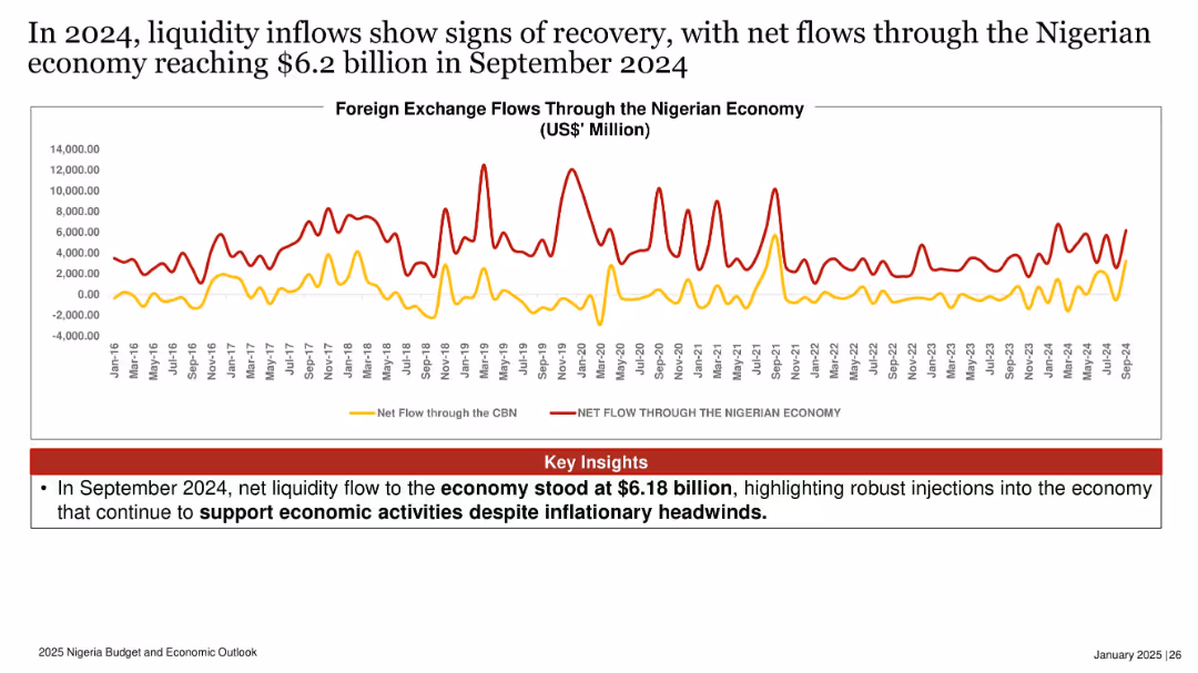
Time series chart comparing net foreign exchange flows through CBN and broader economy from 2016 to 2024.
Operational Efficiency
Government & Public Sector
Net liquidity into the Nigerian economy reached $6.2 billion in September 2024, reflecting robust foreign exchange inflows. The slide highlights ongoing efforts to sustain economic activity despite inflationary pressures.
FX inflows, liquidity, economy, Nigeria, foreign exchange, CBN, recovery
false
Operational Efficiency
Government & Public Sector
Mixed Chart
PwC/Strategy&
Add to my slides
Remove from favorites
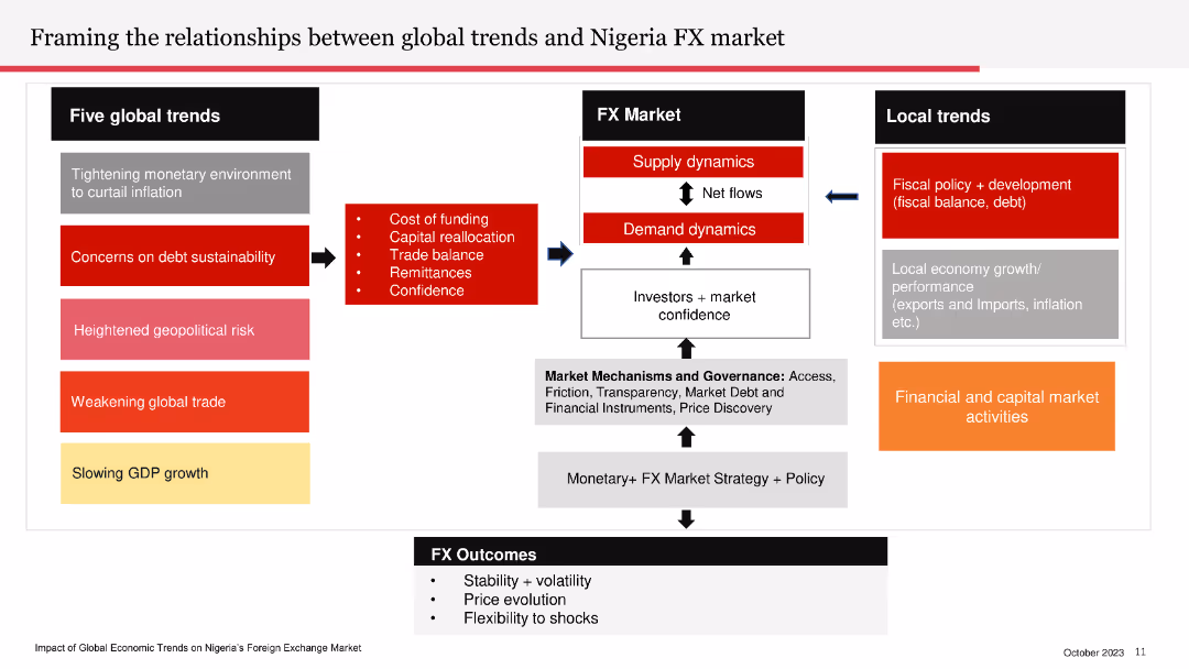
The slide contains a flowchart linking global trends to Nigeria’s FX market, local trends, and FX outcomes. The flowchart uses arrows and color-coded boxes to differentiate between different elements.
Market Analysis and Trends
Financial Services
The slide explains the impact of global trends on Nigeria's foreign exchange market, covering local fiscal policies and financial activities.
FX market, global trends, Nigeria, local trends, fiscal policy, financial activities
false
Market Analysis and Trends
Financial Services
Diagram
PwC/Strategy&
Add to my slides
Remove from favorites
The slide presents a line chart showing FX outflows over time, highlighting different components such as WDAS/RDAS utilisation and other official payments.
Market Analysis and Trends
Financial Services
The slide details the significant role of WDAS/RDAS utilisation and FX interventions in Nigeria’s FX outflows, with comprehensive data analysis.
FX outflows, WDAS/RDAS, FX intervention, Nigeria, financial trends
false
Market Analysis and Trends
Financial Services
Mixed Chart
PwC/Strategy&
Add to my slides
Remove from favorites
The slide includes a line chart showing trends in USD/LCU exchange rates for various currencies from 2020 to 2025, indicating volatility and headwinds for the USD in 2022, with projected trends up to 2025.
Market Analysis and Trends
Technology & Software
The slide provides an overview of exchange rate trends for various currencies, highlighting increased volatility through 2025 and the expected impact on USD, with detailed line charts for visual clarity.
FX overview, volatility, exchange rates, USD, currencies, trends, 2020-2025, line chart, headwinds, projection
false
Market Analysis and Trends
Technology & Software
Mixed Chart
Gartner
Add to my slides
Remove from favorites
The slide uses a mix of text, checklists, and a column chart to illustrate current capabilities and growth. Colors include blues and an accent of gray.
Financial Performance
Financial Services
Demonstrates the firm's current FX payments capabilities and future growth opportunities through market partnerships.
FX payments, market growth, partnerships, corporate payments, financial services, FX-as-a-Service, global mass pay
false
Financial Performance
Financial Services
Mixed Chart
JP Morgan
Add to my slides
Remove from favorites
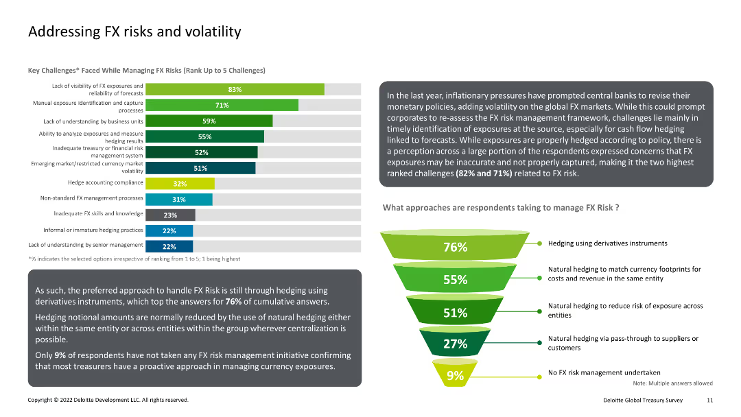
Bar chart and funnel diagram showing key challenges in managing FX risks and the approaches taken to mitigate them. The chart uses various shades of green and blue for visual differentiation.
Risk Assessment and Management
Financial Services
This slide discusses the main challenges faced in managing foreign exchange (FX) risks and volatility, and presents the preferred approaches used by respondents to address these challenges, including hedging strategies.
FX, Risks, Volatility, Hedging, Management
false
Risk Assessment and Management
Financial Services
Multiple Chart
Deloitte
Add to my slides
Remove from favorites
This slide consists of column charts and detailed financial data tables. It shows annual financial results, comparing current year with previous year, in a clear, structured manner using contrasting blue shades for different divisions.
Financial Performance
Financial Services
The slide provides a year-end review of Deutsche Bank's financial results for 2023, comparing it with 2022 data. It includes details on profits, losses, and divisional revenues, offering a comprehensive annual financial overview.
FY 2023, annual review, financial results, comparison
false
Financial Performance
Financial Services
Mixed Chart
Deutsche Bank
Add to my slides
Remove from favorites
High-contrast slide with infographics highlighting key fiscal year highlights, flanked by selected awards and certifications, exhibiting data and recognition.
Operational Efficiency
Professional Services
It showcases fiscal year accomplishments, like diversity in leadership and reductions in emissions, aligned with awards that affirm the company's values.
FY22, Highlights, Awards, Sustainability, Diversity
false
Operational Efficiency
Professional Services
Agenda
Booz Allen Hamilton
Add to my slides
Remove from favorites
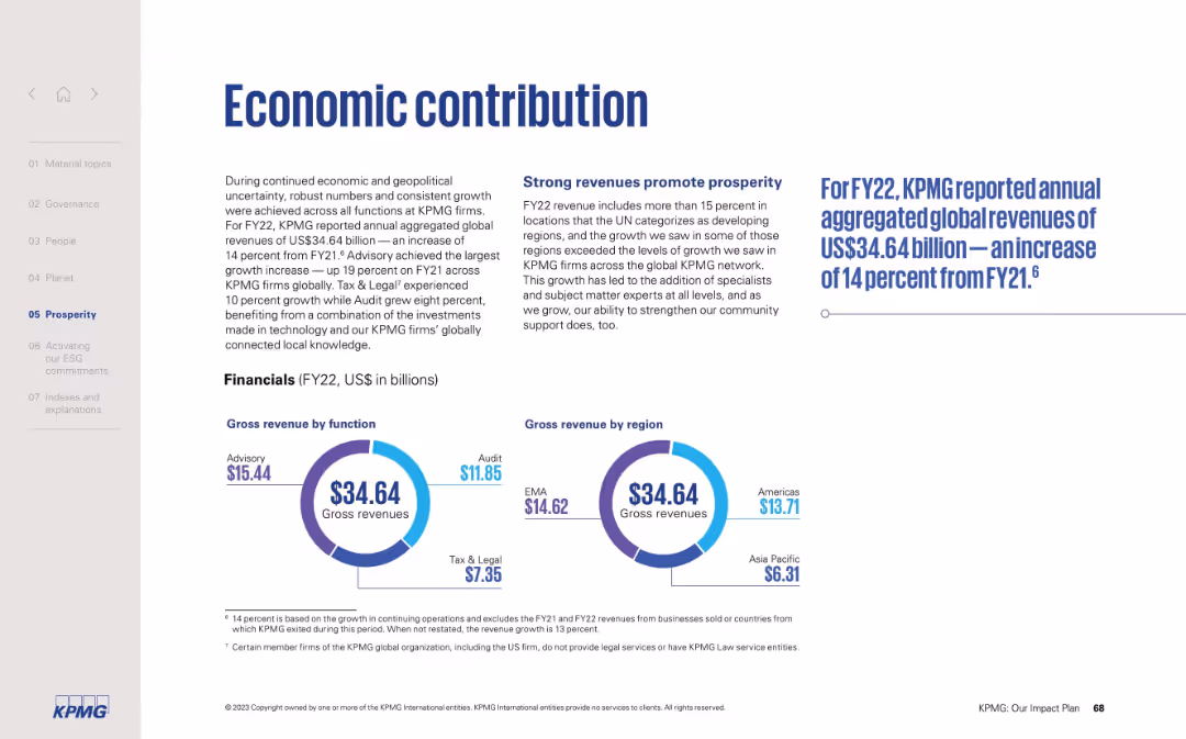
Split-page layout with text on the left and two circular diagrams on the right showing revenue by function and region.
Financial Performance
Professional Services
The slide summarizes KPMG’s FY22 financial results, with US$34.64B in global revenues—up 14% from FY21. It highlights growth by business function (Advisory, Audit, Tax & Legal) and regional breakdowns, stressing strong performance in developing markets.
FY22 revenue, KPMG growth, global revenue, regional revenue, financial results, advisory, audit, prosperity
false
Financial Performance
Professional Services
Mixed Chart
KPMG
Add to my slides
Remove from favorites
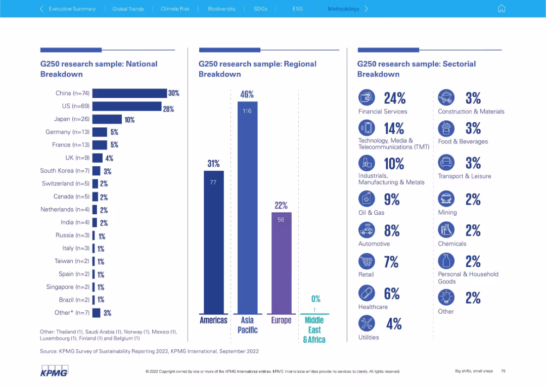
Three-column layout with vertical bar charts and icons for national, regional, and sectoral breakdowns
Market Analysis and Trends
Professional Services
Displays the geographic and sectoral breakdown of the G250 sample for sustainability reporting. Includes national (by country), regional (Americas, Asia Pacific, Europe, MEA), and sectoral (by industry) proportions.
G250, national breakdown, regional breakdown, sector analysis, bar chart, KPMG, sustainability, survey, sample demographics, industry sectors
false
Market Analysis and Trends
Professional Services
Multiple Chart
KPMG
Add to my slides
Remove from favorites
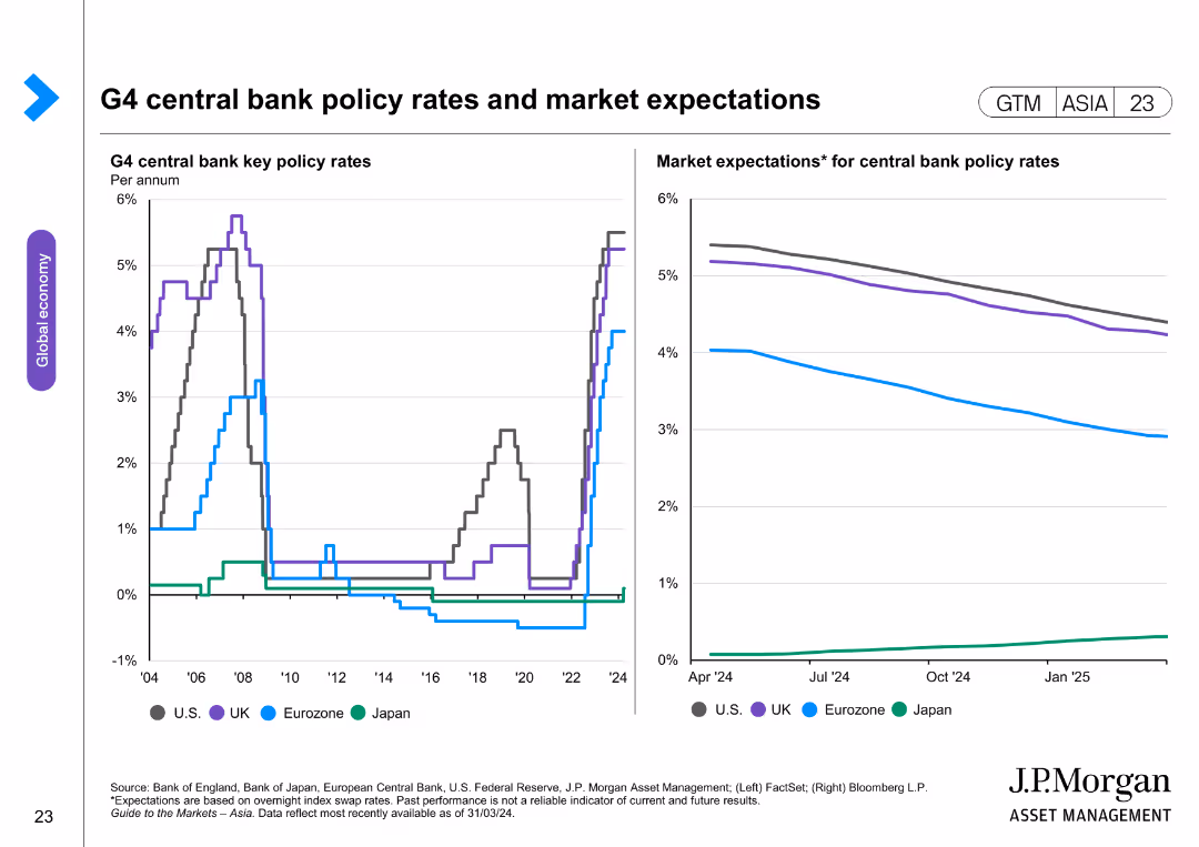
The slide features two line charts. The left chart displays key policy rates of G4 central banks (US, UK, Eurozone, Japan) over time. The right chart shows market expectations for these policy rates, with forecasted trends.
Market Analysis and Trends
Financial Services
The slide provides an analysis of G4 central bank policy rates and market expectations, highlighting monetary policy trends. It is used for financial market analysis and strategic planning.
G4 central banks, policy rates, market expectations, US, UK, Eurozone, Japan, monetary trends, financial analysis
false
Market Analysis and Trends
Financial Services
Multiple Chart
JP Morgan
Add to my slides
Remove from favorites
Vertical grouped bar chart for G7 countries showing likelihood of five key economic developments; color-coded by country.
Market Analysis and Trends
Financial Services
The slide compares the economic sentiment of G7 nations on five financial outcomes such as inflation, taxes, and unemployment. It highlights significant cross-country variation in perceptions.
G7, economic comparison, inflation, unemployment, tax outlook, interest rates, Ipsos, 2025
false
Market Analysis and Trends
Financial Services
Mixed Chart
IPSOS
Add to my slides
Remove from favorites
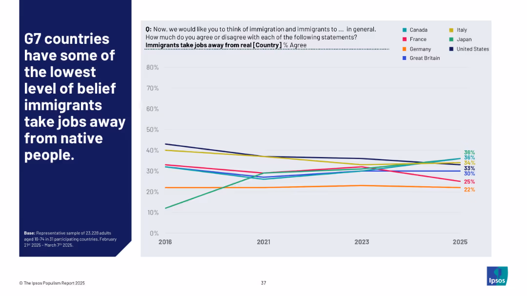
Line chart showing agreement % from 2016 to 2025 for G7 countries; legend on right; bold white text on blue background
Market Analysis and Trends
Government & Public Sector
This slide compares belief trends in G7 nations regarding whether immigrants take jobs from natives. The data suggests a general downward trend in agreement across most countries, except for Japan, where belief in job displacement by immigrants has risen significantly.
G7, immigration, job loss belief, trend analysis, comparative politics, Ipsos, public sentiment, international comparison
false
Market Analysis and Trends
Government & Public Sector
Mixed Chart
IPSOS
Add to my slides
Remove from favorites
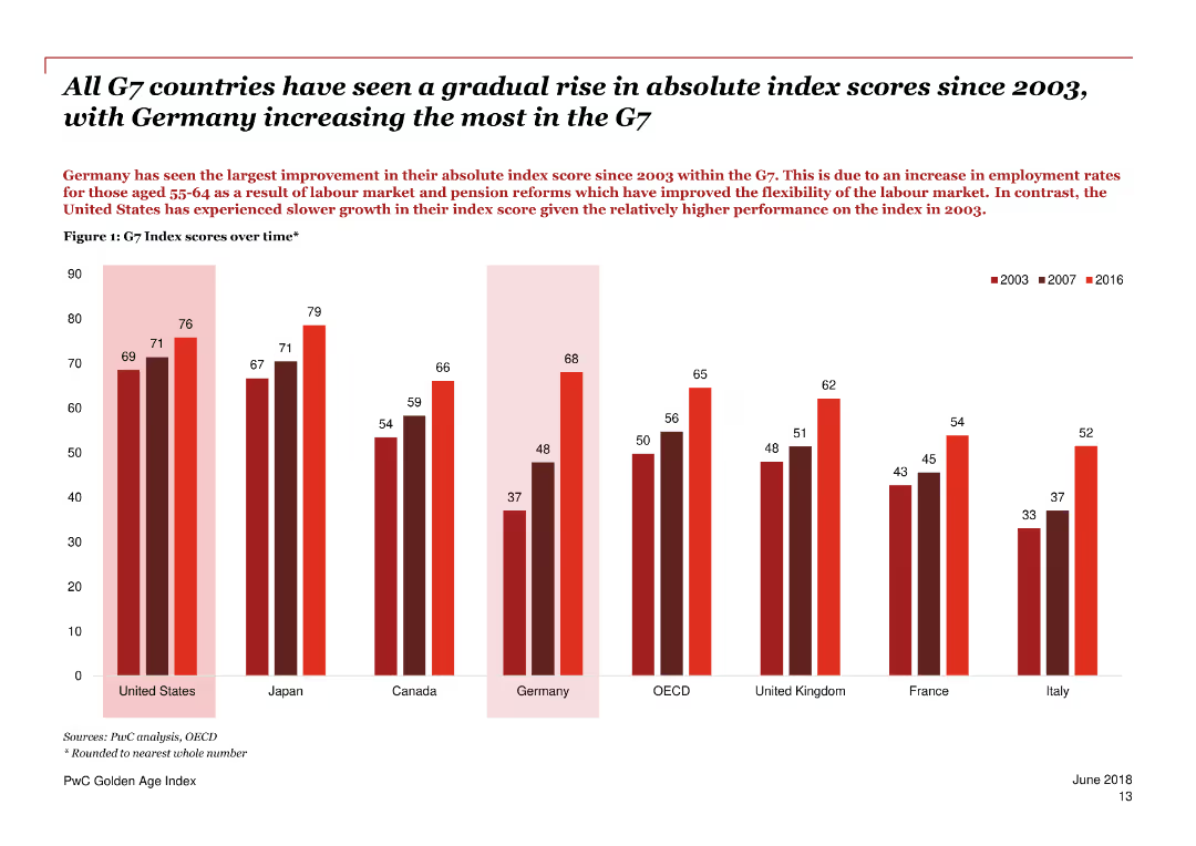
A series of column charts showing the G7 Index scores over time, comparing different countries.
Market Analysis and Trends
Government & Public Sector
Highlights the gradual rise in absolute index scores for G7 countries since 2003, with Germany showing the largest improvement.
G7 Index, scores, Germany, improvement, comparison, countries, trends, employment, older workers, economic performance
false
Market Analysis and Trends
Government & Public Sector
Single Chart
PwC/Strategy&
Add to my slides
Remove from favorites
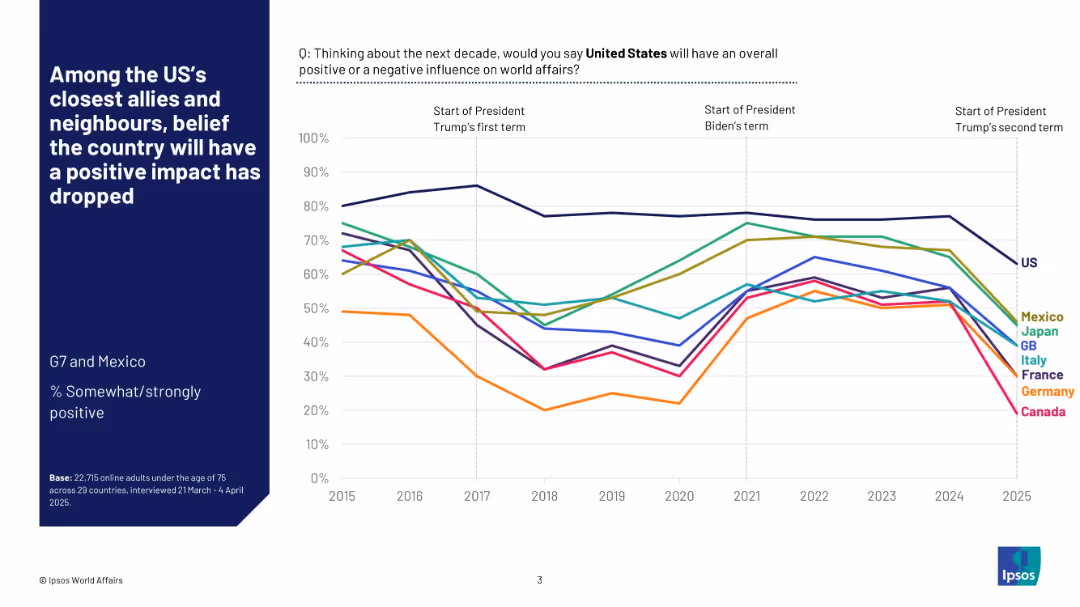
Line graph showing longitudinal data (2015–2025) across several countries regarding their views on U.S. influence.
Market Analysis and Trends
Government & Public Sector
This slide shows how perceptions of U.S. influence have changed over a decade in G7 countries and Mexico. It reveals a declining trend in positive sentiment, with major drops around transitions between U.S. presidential terms.
G7, Mexico, U.S. foreign policy, sentiment trend, line chart, global relations, public opinion, international trust, Ipsos, time series
false
Market Analysis and Trends
Government & Public Sector
Mixed Chart
IPSOS
Add to my slides
Remove from favorites
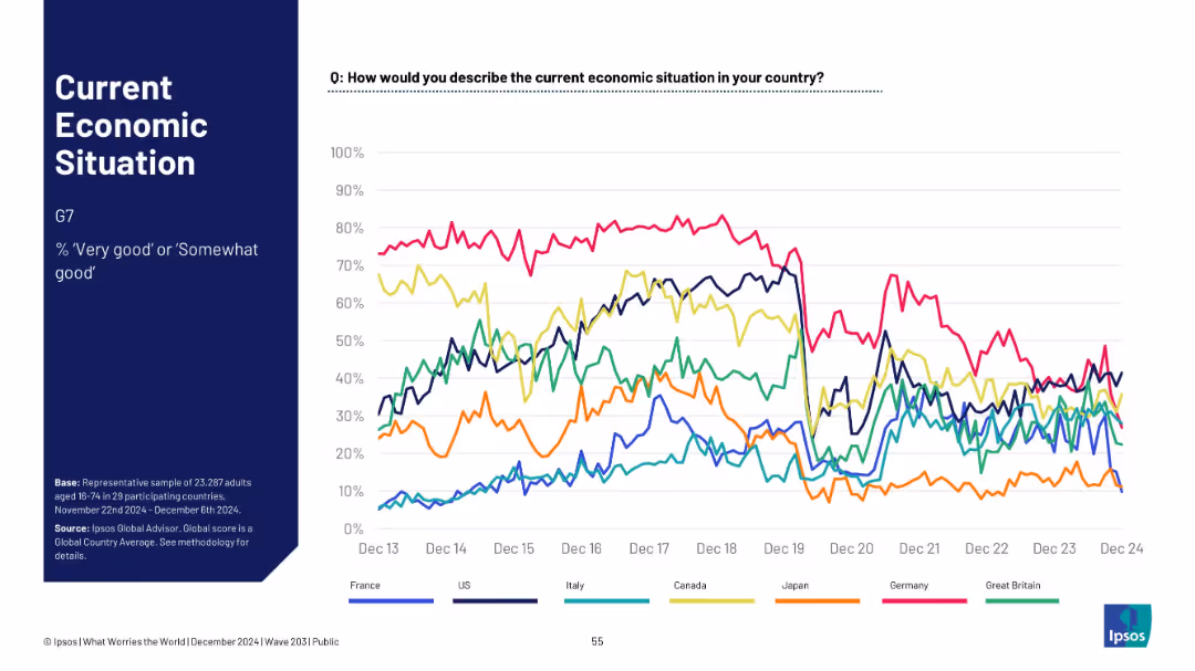
Multi-line trend chart showing % “very good” or “somewhat good” for G7 countries over time; clean line graph.
Market Analysis and Trends
Financial Services
This line chart tracks the economic sentiment over time for G7 nations from Dec 2013 to Dec 2024, showing trends in perceived economic positivity.
G7, trend lines, economic sentiment, long-term data, country comparison, Ipsos, 2024, line graph, public perception, macro trends
false
Market Analysis and Trends
Financial Services
Mixed Chart
IPSOS
Add to my slides
Remove from favorites
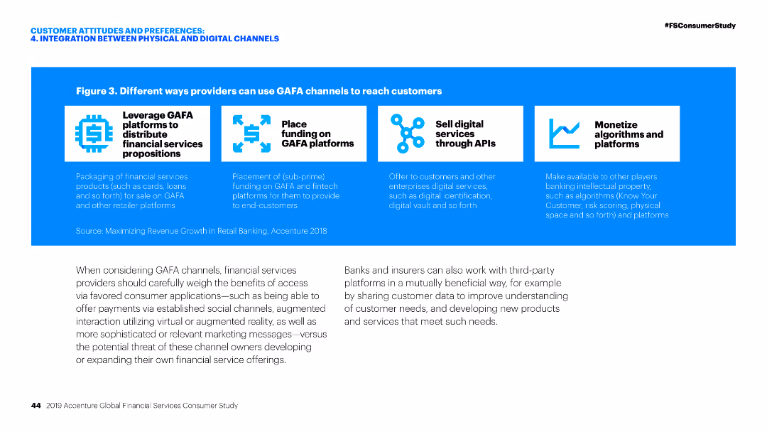
Diagram illustrating different ways financial service providers can leverage GAFA platforms for distributing services, funding, selling services, and monetizing algorithms.
Technology and Digital Transformation
Financial Services
The slide describes various strategies for financial service providers to use GAFA channels, focusing on distribution, funding, digital services, and monetization through algorithms.
GAFA channels, Financial services, Digital transformation, Distribution, Monetization
false
Technology and Digital Transformation
Financial Services
Pillar
Accenture
Add to my slides
Remove from favorites
The slide features two column charts showing the percentages of participants who experienced gains or losses from crypto assets and crypto investment funds.
Financial Performance
Financial Services
This slide provides insights into the financial outcomes (gains or losses) for participants holding crypto assets and investment funds.
Gains, losses, crypto assets, investment funds, financial outcomes
false
Financial Performance
Financial Services
Multiple Chart
IPSOS
Add to my slides
Remove from favorites
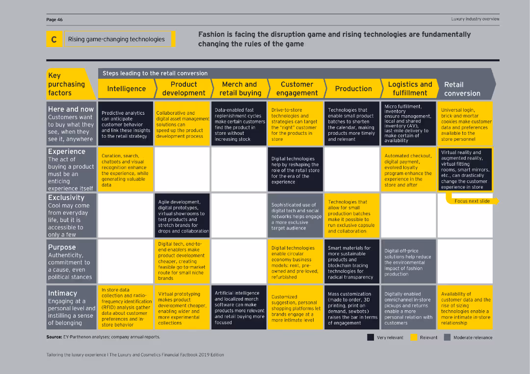
Matrix chart showing steps leading to retail conversion with key purchasing factors and corresponding technologies across different stages.
Technology and Digital Transformation
Technology & Software
Details how emerging technologies are revolutionizing retail by enhancing various aspects from intelligence to retail conversion strategies.
game-changing technologies, retail conversion, key purchasing factors, intelligence, customer engagement, production, logistics, matrix chart
false
Technology and Digital Transformation
Technology & Software
Table
EY
Add to my slides
Remove from favorites
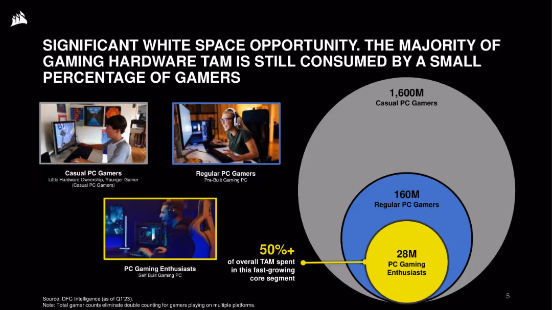
Visual layout: images of user types on left; concentric circle Venn diagram on right showing TAM breakdown. Black background with blue and yellow highlights.
Market Analysis and Trends
Technology & Software
This slide emphasizes the opportunity in the gaming hardware market, where a small core of 28M enthusiasts account for over 50% of TAM. It categorizes the gamer market by engagement level and hardware ownership, suggesting strong growth potential.
gaming hardware, TAM, market opportunity, PC gamers, segmentation, enthusiasts, casual users, growth
false
Market Analysis and Trends
Technology & Software
Single Chart
Goldman Sachs
Add to my slides
Remove from favorites
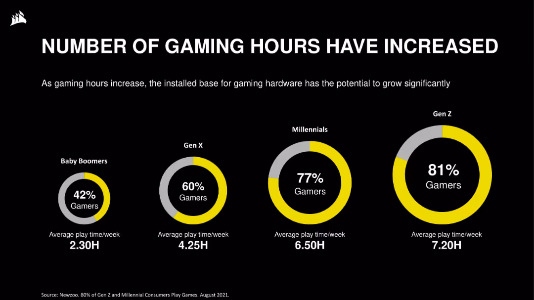
Circular infographics for generational comparison across Baby Boomers to Gen Z, showing % of gamers and average weekly playtime. Clean visual hierarchy on dark background.
Customer and Market Segmentation
Technology & Software
The slide highlights gaming adoption and engagement across age groups. Gen Z leads with 81% gamers and the highest average weekly playtime. The data suggests a growing user base and potential for hardware adoption tied to rising usage.
gaming hours, demographics, Gen Z, Millennials, playtime, gamer segmentation, user engagement, trends
false
Customer and Market Segmentation
Technology & Software
Single Chart
Goldman Sachs
Add to my slides
Remove from favorites
This slide presents column charts showing the growth of gaming revenues in Hong Kong and Singapore from 2020 to 2025, differentiating between traditional and social/casual gaming with red and grey bars. The slide layout is clear with annotations explaining shifts due to the pandemic.
Market Analysis and Trends
Media & Entertainment
Discusses the shifting dynamics of the gaming industry in Hong Kong and Singapore between 2020 and 2025, highlighting how pandemic-related changes affected traditional and social/casual gaming revenues. It points out Singapore's rise as a gaming hub due to policy support.
gaming industry, Hong Kong, Singapore, revenue trends, pandemic impact
false
Market Analysis and Trends
Media & Entertainment
Multiple Chart
PwC/Strategy&
Add to my slides
Remove from favorites
This slide features a column chart comparing revenue forecasts for different gaming segments from 2019 to 2024, alongside a line graph depicting consumer spending in these segments. The visualization aids in understanding the scale and growth trajectory of gaming in India, marked by clear, distinct colors for each segment.
Market Analysis and Trends
Media & Entertainment
Explores the rapid expansion of the gaming sector in India, breaking down revenue projections by segment and consumer spending patterns. It's crucial for stakeholders in the gaming industry for evaluating market potentials, identifying high-growth segments, and planning strategic initiatives to capture market share in a fast-evolving landscape.
gaming, market growth, India, consumer spending
false
Market Analysis and Trends
Media & Entertainment
Multiple Chart
PwC/Strategy&
Add to my slides
Remove from favorites
A bar chart compares the time spent on gaming during and after the pandemic across various consumer segments. The design is straightforward with a clear visual distinction between the periods.
Market Analysis and Trends
Media & Entertainment
Examines changes in gaming behavior post-pandemic across different consumer groups, emphasizing a decrease in gaming time compared to pandemic peaks.
gaming, pandemic, consumer behavior, time spent, affluent users, digital natives, suburban users
false
Market Analysis and Trends
Media & Entertainment
Single Chart
Bain
Add to my slides
Remove from favorites
A two-section slide with a medium level of detail. The top half categorizes industries using Web3 with icons and brief descriptions, while the bottom half lists details for each industry with icons, all against a blue background.
Market Analysis and Trends
Technology & Software
Highlights industries like media, retail, and financial services that are beginning to adopt Web3 technologies. It outlines how each sector is leveraging these innovations for gaming, digital art, retail experiences, and decentralized finance.
Gaming, Retail, DeFi, Digital Art, Innovation
false
Market Analysis and Trends
Technology & Software
Header Horizontal
McKinsey
Add to my slides
Remove from favorites
The slide contains two line charts showing the growth of contract value and free cash flow over the years, with key data points marked from 2013 to 2023.
Financial Performance
Professional Services
It presents Gartner’s historical financial performance, highlighting the consistent growth in contract value and free cash flow over a decade, indicating robust performance.
Gartner, financial performance, contract value, free cash flow, growth, historical performance
false
Financial Performance
Professional Services
Multiple Chart
Gartner
Add to my slides
Remove from favorites
Slide with three pie charts showing 2024 revenue guidance by segment, 2023 gross margin mix, and 2023 revenue by geography.
Financial Performance
Professional Services
This slide breaks down Gartner's financial performance, presenting revenue guidance, gross margin mix, and revenue distribution by geography.
Gartner, financial performance, revenue guidance, gross margin, geography
false
Financial Performance
Professional Services
Multiple Chart
Gartner
Add to my slides
Remove from favorites
The slide presents a timeline of Gartner's company history and strategic acquisitions, highlighting key milestones and market opportunities from 1979 to 2024 & beyond.
Strategic Planning
Professional Services
It outlines Gartner's history of organic growth and strategic acquisitions, showing significant milestones and market opportunities that have driven their expansion.
Gartner, growth, strategic acquisitions, timeline, market opportunities
false
Strategic Planning
Professional Services
Linear Flow
Gartner
Add to my slides
Remove from favorites
The slide includes a Gartner Emerging Technologies Hype Cycle graph, showing various technologies at different stages of maturity and adoption. Key points about the technologies’ current state and future potential are noted on the right side.
Strategic Planning
Technology & Software
The slide uses the Gartner Hype Cycle to illustrate the current and projected adoption stages of various emerging technologies, stressing the timely importance of blockchain development amidst fluctuating market perceptions.
Gartner Hype Cycle, technology adoption, blockchain, market trends, strategic timing
false
Strategic Planning
Technology & Software
Mixed Chart
EY
Add to my slides
Remove from favorites
The slide has three sections detailing growth, margin expansion, and free cash flow, with icons and bullet points highlighting key financial metrics and strategies.
Investment Analysis
Financial Services
It explains why investors value Gartner, focusing on growth, margin expansion, and free cash flow as key financial performance indicators and investment attractions.
Gartner, investors, growth, margin expansion, free cash flow, financial performance
false
Investment Analysis
Financial Services
Pillar
Gartner
Add to my slides
Remove from favorites
The slide features two line charts showing quarterly revenue and contribution margin trends. Text explains Gartner's research services for executives and their teams.
Industry Overview
Professional Services
It provides an overview of Gartner's research services, highlighting ongoing access to research, on-demand response, and support for major enterprise functions.
Gartner, research, revenue, contribution margin, executives, services, trends
false
Industry Overview
Professional Services
Multiple Chart
Gartner
Add to my slides
Remove from favorites
The slide contains a donut chart showing the subscription mix of Gartner's research revenue. The chart highlights that 92% of revenue is subscription-based.
Financial Performance
Professional Services
It highlights the dominance of subscription revenue in Gartner’s research segment, indicating a stable and recurring revenue model.
Gartner, research, subscription, revenue, recurring, financial performance, model
false
Financial Performance
Professional Services
Single Chart
Gartner
Add to my slides
Remove from favorites
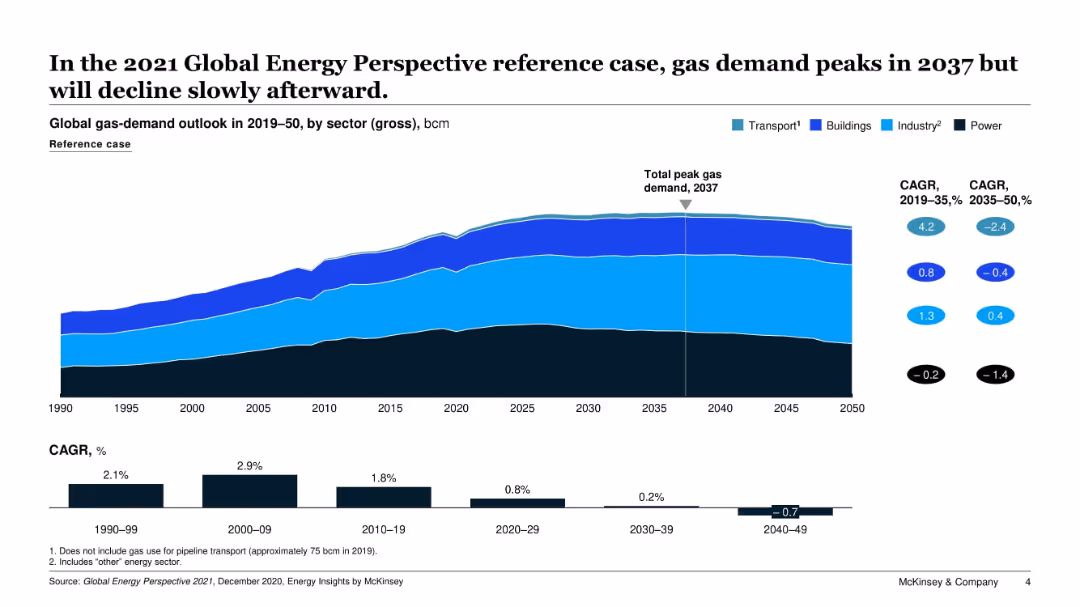
Area chart showing global gas-demand outlook from 1990 to 2050, segmented by sector (Transport, Buildings, Industry, Power). Includes CAGR statistics and a peak demand marker.
Market Analysis and Trends
Energy & Utilities
This slide presents a long-term forecast of global gas demand, showing that total demand will peak in 2037 and gradually decline afterward. The graph breaks down demand by sector and highlights compound annual growth rates (CAGR) across different periods, emphasizing shifts in demand across sectors.
gas demand, forecast, CAGR, transport, industry, power, buildings, energy outlook, decline, peak
false
Market Analysis and Trends
Energy & Utilities
Multiple Chart
McKinsey
Add to my slides
Remove from favorites
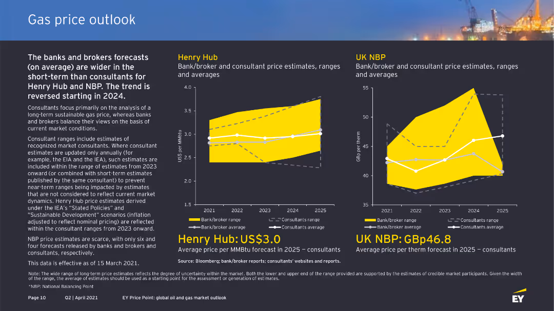
Two column charts displaying Henry Hub and UK NBP gas price estimates. The charts show bank/broker and consultant ranges from 2020 to 2024.
Market Analysis and Trends
Energy & Utilities
This slide presents higher gas price forecasts for Henry Hub compared to UK NBP. Consultant ranges suggest prices based on sustainable development scenarios.
Gas, price, forecast, Henry Hub, UK NBP, bank, broker, consultant, estimate, range
false
Market Analysis and Trends
Energy & Utilities
Multiple Chart
EY
Add to my slides
Remove from favorites
The slide shows column charts for Henry Hub and UK NBP gas price estimates by banks/brokers and consultants. It uses clear color coding and labels for different forecast ranges and averages.
Market Analysis and Trends
Energy & Utilities
This slide compares gas price forecasts for Henry Hub and UK NBP by banks, brokers, and consultants, noting a wider forecast range in the short term for banks and brokers and trend reversals starting in 2024.
gas price, Henry Hub, UK NBP, forecast, consultants
false
Market Analysis and Trends
Energy & Utilities
Multiple Chart
EY
Add to my slides
Remove from favorites
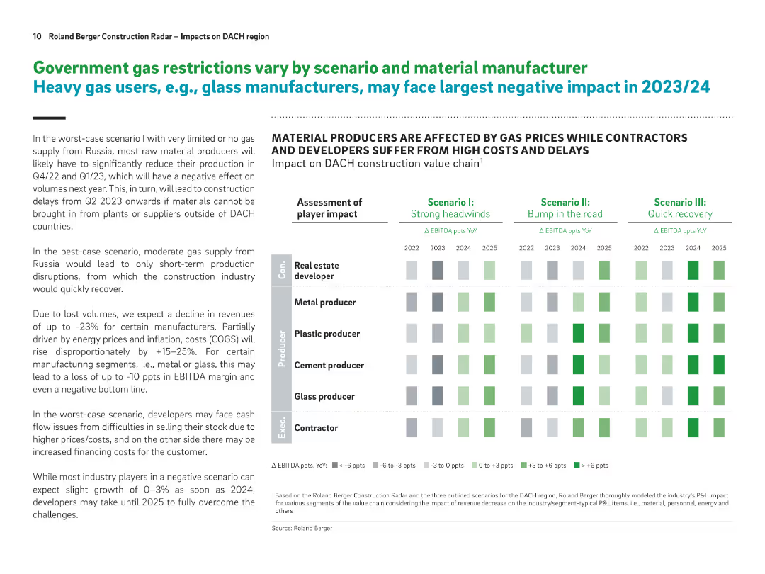
Split layout with text on the left and a heatmap-style matrix on the right. Uses bold headers, shaded boxes, and a structured grid to show impacts across scenarios.
Risk Assessment and Management
Industrial & Manufacturing
This slide assesses the impact of gas supply restrictions on various construction-related industries, focusing on how material manufacturers and developers will be affected under different scenarios. It presents EBITDA impacts across years and scenarios, indicating heavy losses for glass and metal producers in worst-case scenarios.
gas supply, EBITDA impact, construction, scenario planning, raw materials, manufacturing, cost pressures, DACH, delays, recovery
false
Risk Assessment and Management
Industrial & Manufacturing
Table
Roland Berger
Add to my slides
Remove from favorites
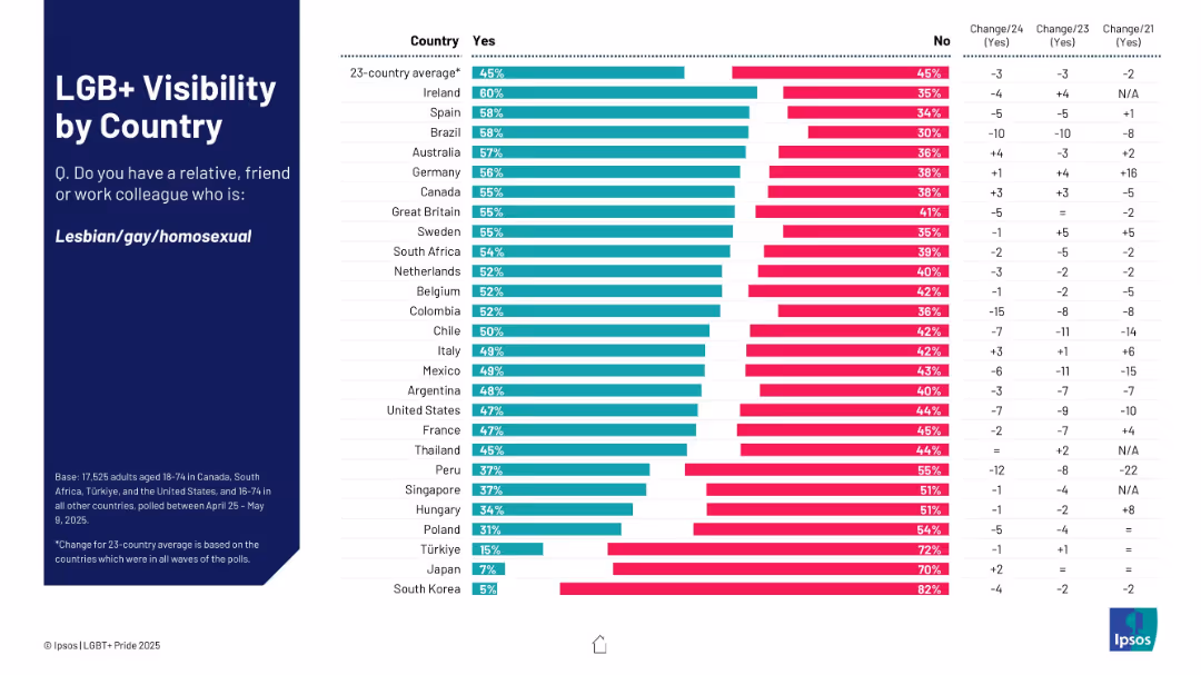
Horizontal bar chart format; lists % of respondents who know someone gay; right side shows changes over time.
Market Analysis and Trends
Government & Public Sector
This slide measures personal visibility of LGB+ individuals by country, based on respondents knowing someone who is gay. Ireland, Spain, and Brazil lead; South Korea and Japan rank lowest.
gay, relationships, visibility, survey, countries, Ipsos, familiarity
false
Market Analysis and Trends
Government & Public Sector
Mixed Chart
IPSOS
Add to my slides
Remove from favorites
A visually balanced slide with a two-part structure; one side discusses the strategic priorities for GBM, while the other shows a column chart illustrating the growth in financing revenues from equities and FICC from 2013 to 2022. The data is easy to interpret with clear labeling and contrasting colors.
Sales and Business Development
Financial Services
Reviews growth in financing within GBM and how it aligns with strategic priorities, making it pertinent for financial strategy reviews and performance analysis.
GBM, financing growth, strategic priorities
false
Sales and Business Development
Financial Services
Mixed Chart
Goldman Sachs
Add to my slides
Remove from favorites
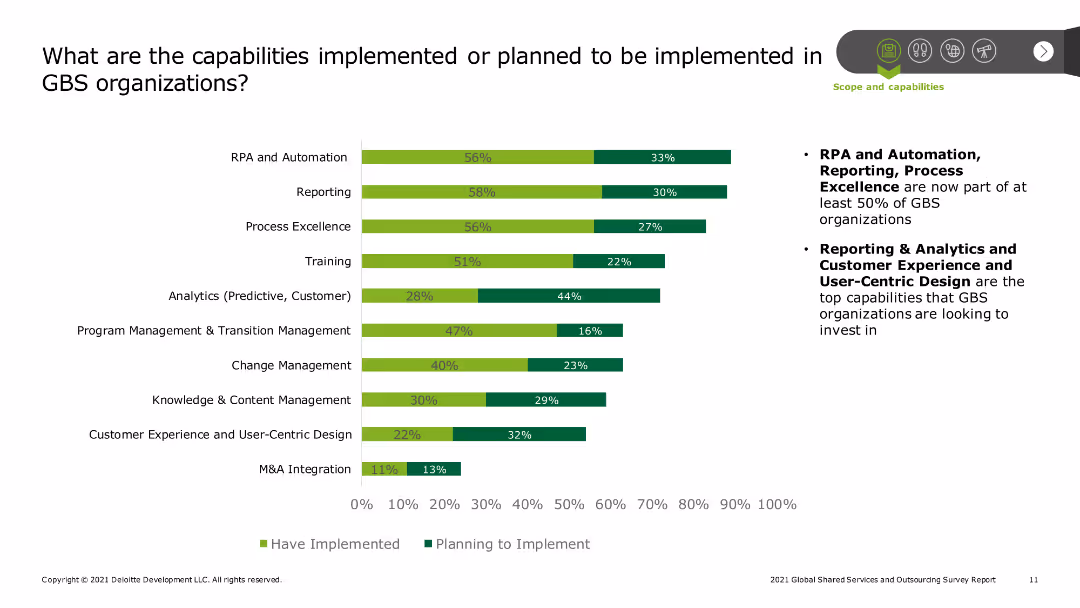
The slide contains a bar chart showing the implementation status of various capabilities in GBS organizations, such as RPA and automation, reporting, process excellence, training, analytics, and customer experience design, with percentages for implemented and planned capabilities.
Technology and Digital Transformation
Professional Services
The slide outlines the current and planned capabilities within Global Business Services (GBS) organizations. It highlights key areas of focus like RPA, reporting, process excellence, and customer experience design, showing the extent of implementation and future plans.
GBS capabilities, implementation status, RPA, automation, reporting, process excellence, training, analytics, customer experience, digital transformation
false
Technology and Digital Transformation
Professional Services
Mixed Chart
Deloitte
Add to my slides
Remove from favorites
Presents bar charts showing the percentage of GBS organizations implementing various capabilities like Process Excellence and Intelligent Automation.
Strategic Planning
Professional Services
Discusses current and future strategic capabilities within GBS organizations, emphasizing automation and process optimization.
GBS, capabilities, process excellence, automation, strategic planning
false
Strategic Planning
Professional Services
Mixed Chart
Deloitte
Add to my slides
Remove from favorites
Features stacked bar charts comparing centralization of decision support areas between general accounting and strategic support.
Financial Performance
Professional Services
Highlights trends in GBS capability centralization and its impact on decision support effectiveness.
GBS, centralization, capabilities, decision support, trends
false
Financial Performance
Professional Services
Mixed Chart
Deloitte
Add to my slides
Remove from favorites
Discusses challenges in implementing GBS models with bar graphs (Figure 8) showing challenge ratings.
Strategic Planning
Professional Services
Focuses on overcoming cultural, technological, and strategic challenges in GBS operations.
GBS, challenges, strategy, culture, technology
false
Strategic Planning
Professional Services
Mixed Chart
Deloitte
Add to my slides
Remove from favorites
Features three pie charts illustrating different metrics for chargebacks in GBS across stages: overall, startup, and mature.
Financial Performance
Professional Services
Discusses how chargeback metrics within global business services (GBS) vary across different stages of business maturity, focusing on various operational and financial metrics.
GBS, chargebacks, metrics, stages
false
Financial Performance
Professional Services
Multiple Chart
Deloitte
Add to my slides
Remove from favorites
Utilizes pie charts and bar charts to assess challenges in customer interactions and current strategies employed by GBS organizations to enhance customer experience.
Customer and Market Segmentation
Professional Services
Analyzes challenges and steps taken by GBS organizations to improve customer service and engagement.
GBS, customer experience, service improvement, engagement strategies, challenges
false
Customer and Market Segmentation
Professional Services
Multiple Chart
Deloitte
Add to my slides
Remove from favorites
This slide includes bar charts and lists ranking key digital enablers and their projected focus areas in the next few years, such as automation and ERP systems.
Technology and Digital Transformation
Professional Services
Explores the core technological and strategic enablers used by GBS organizations to drive efficiency and innovation.
GBS, digital enablers, automation, ERP, technology adoption
false
Technology and Digital Transformation
Professional Services
Mixed Chart
Deloitte
Add to my slides
Remove from favorites
Text-heavy with a column chart (Figure 1) showing the percentage increase in GBS functions.
Operational Efficiency
Professional Services
Explains GBS expansion strategies and benefits, focusing on function and geographic diversification.
GBS, expansion, functions, geography, strategy
false
Operational Efficiency
Professional Services
Mixed Chart
Deloitte
Add to my slides
Remove from favorites
Contains multiple horizontal bar charts showing the percentage of respondents engaging in various business functions like Finance, HR, IT, and more. There is also a comparative analysis of these functions over the years 2019, 2021, and 2023.
Market Analysis and Trends
Professional Services
Presents a breakdown of key functions within GBS organizations, tracking changes in function focus and importance over time.
GBS, functions, finance, HR, IT, trend analysis
false
Market Analysis and Trends
Professional Services
Mixed Chart
Deloitte
Add to my slides
Remove from favorites
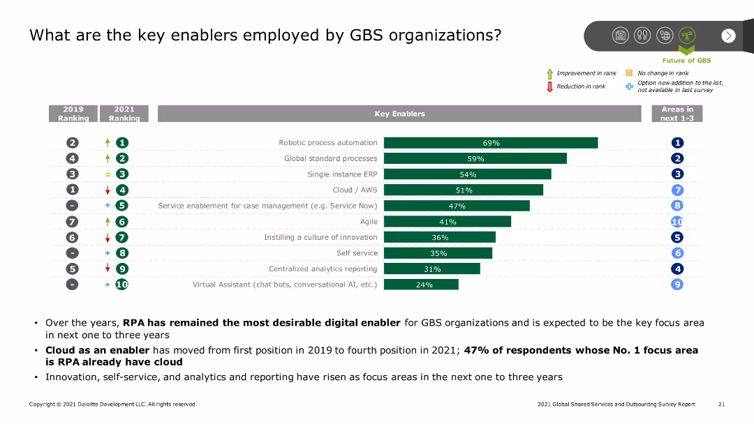
A bar chart ranks key enablers employed by GBS organizations, such as robotic process automation and cloud services, with indicators of rank changes from 2019 to 2021. Additional text provides context and key findings.
Technology and Digital Transformation
Professional Services
The slide identifies key enablers for GBS organizations, highlighting the importance of robotic process automation, cloud services, and global standard processes, along with changes in their ranking over time.
GBS, key enablers, RPA, cloud services, ranking changes
false
Technology and Digital Transformation
Professional Services
Mixed Chart
Deloitte
Add to my slides
Remove from favorites
Previous
Next
You don't have any favorites yet.
Please wait loading your favorites slides...
Create a FREE account to continue browsing
Receive Instant Access to 1,000+ slides from companies like McKinsey, Google, and Goldman Sachs
First Name
Last Name
Email
Password
I agree to all
Terms & Privacy Policy
Thank you! Your submission has been received!
Oops! Something went wrong while submitting the form.
Have an account?
Sign in
Upgrade to PRO to Save slides
Advanced Search and Filters
Access to 15,000+ slides
Access to Category Pages
Save/Bookmark Slides
PowerPoint Template Library
Pick a Plan
MONTHLY
$12/month
Billed every month, Cancel anytime.
YEARLY
$9/year
Billed $108 annually, Cancel anytime.
Checkout for $12/month
Checkout for $108/yr
Secured by Stripe | AES-256 bit encryption