My Account
My Slides
Search by Category
Companies
Slide Type
Use Case
Industry
Pricing
Templates
View All Templates
Download Template Slides
✦ AI
AI Prompt Library
AI Search
Feedback
Login
Logout
Get Started
Browse all Slides
Browse all Slides
Create a FREE Account
Instant access to 1,000+ real slides from top companies like McKinsey, BCG, Goldman Sachs, Google and many more!
First Name
Last Name
Email
Password
I agree to all
Terms & Privacy Policy
Thank you! Your submission has been received!
Oops! Something went wrong while submitting the form.
Have an account?
Sign in
Saved Slides
Total No. of slides saved
0
↻ Refresh
✖ Clear all
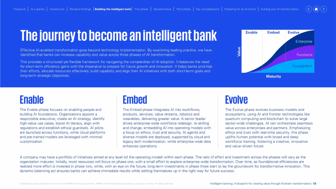
Large headline over a blue background, with a three-part journey (Enable, Embed, Evolve) explained in columns below. Includes a value vs. maturity curve chart at the top right. Consistent color theming and layout.
Technology and Digital Transformation
Financial Services
This slide introduces a framework for banks to become "intelligent" via AI. It explains three progressive phases—Enable, Embed, and Evolve—each focusing on building foundations, integrating AI into workflows, and transforming ecosystems. It emphasizes the balance between short-term results and long-term innovation for AI success.
intelligent bank, AI journey, enable, embed, evolve, transformation, framework
false
Technology and Digital Transformation
Financial Services
Mixed Chart
KPMG
Add to my slides
Remove from favorites
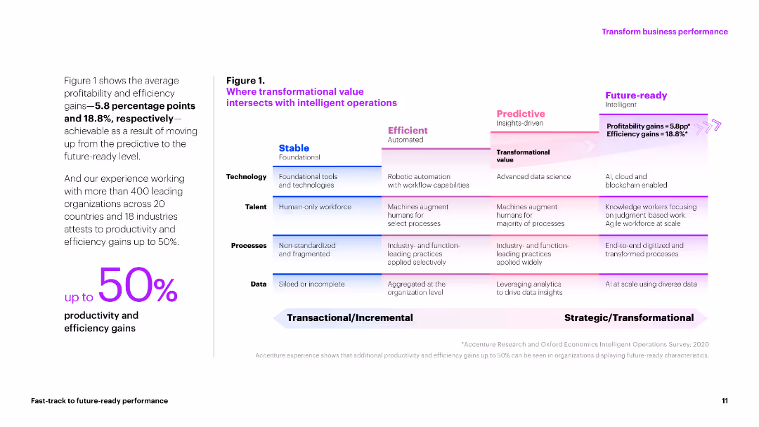
The slide contains a chart depicting the progression from stable to future-ready operations, with explanatory text on technology, talent, processes, and data.
Technology and Digital Transformation
Technology & Software
This slide explains how intelligent operations can lead to significant productivity and efficiency gains, highlighting the path to becoming future-ready.
intelligent operations, productivity, efficiency gains, future-ready, technology transformation
false
Technology and Digital Transformation
Technology & Software
Table
Accenture
Add to my slides
Remove from favorites
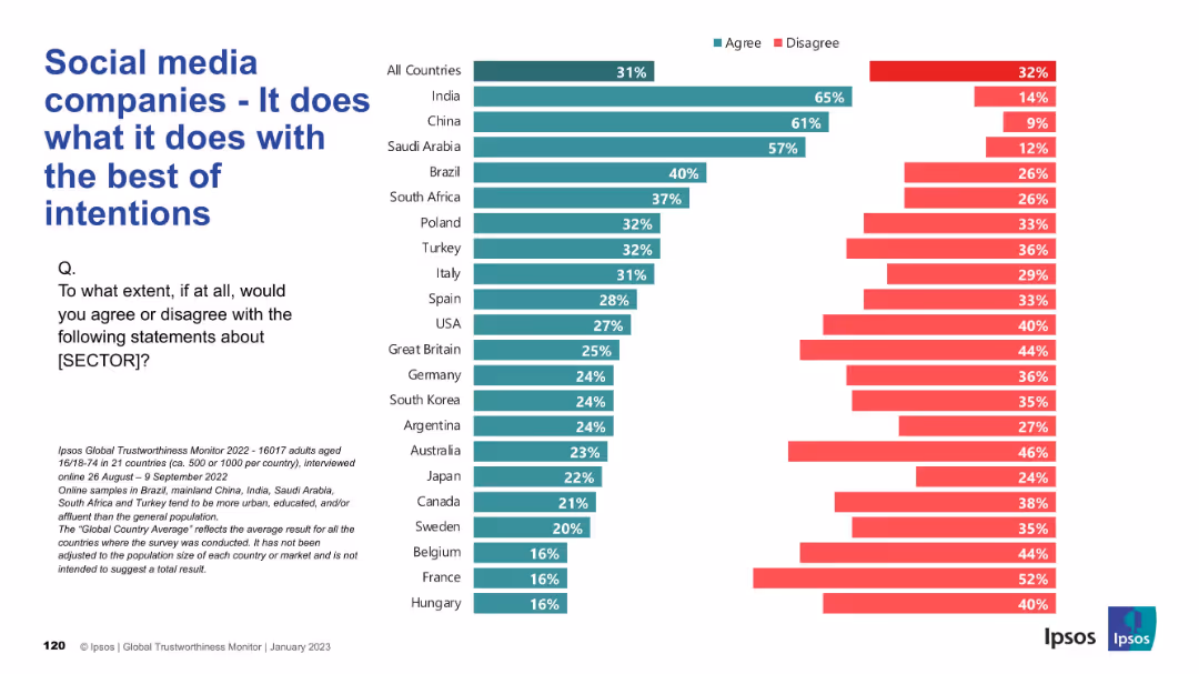
Horizontal chart of agreement/disagreement with country-wise breakdown; red indicates high disagreement.
Risk Assessment and Management
Technology & Software
This slide captures perceptions of social media companies’ intentions. Although some countries like India and China show faith in their good intentions, many Western countries express significant doubt, with disagreement rates often surpassing agreement.
intentions, ethics, social media, public trust, perception, Ipsos, countries, risk, survey, global opinions
false
Risk Assessment and Management
Technology & Software
Mixed Chart
IPSOS
Add to my slides
Remove from favorites
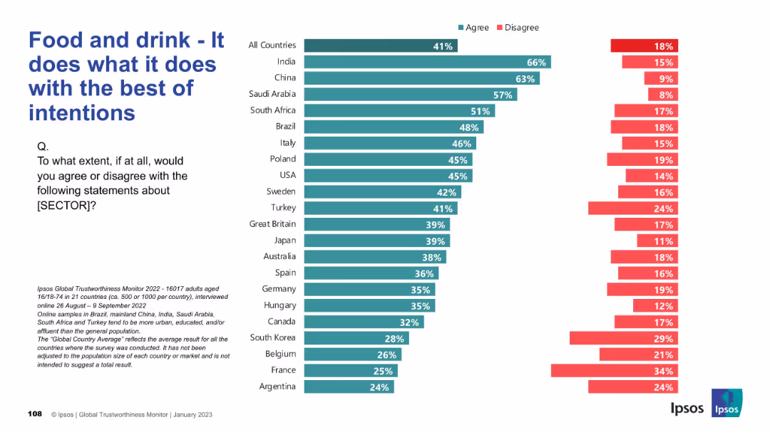
Bar chart visualization; ranks agreement with positive intent behind sector actions.
Customer and Market Segmentation
Consumer Goods
Evaluates public belief that the food and drink industry acts with good intentions. Results show a divide between emerging and developed countries. Suggests room for improvement in ethical perception and consumer alignment.
intentions, food sector, ethics, perception, Ipsos, customer trust, segmentation
false
Customer and Market Segmentation
Consumer Goods
Mixed Chart
IPSOS
Add to my slides
Remove from favorites
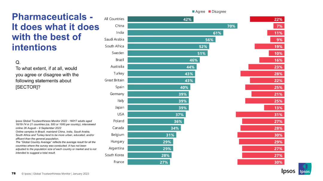
Bar chart ranked by country showing agreement/disagreement levels. Left panel has question and explanation; right has agreement levels in teal and disagreement in red.
Market Analysis and Trends
Healthcare & Pharmaceuticals
This slide evaluates whether people believe the pharmaceutical sector acts with good intentions. Agreement is highest in China and India, but falls significantly in countries like France and South Korea. Distrust appears prevalent in many Western countries.
intentions, public opinion, trust, ethics, pharmaceuticals, Ipsos, sector image, survey, reputation, healthcare
false
Market Analysis and Trends
Healthcare & Pharmaceuticals
Mixed Chart
IPSOS
Add to my slides
Remove from favorites
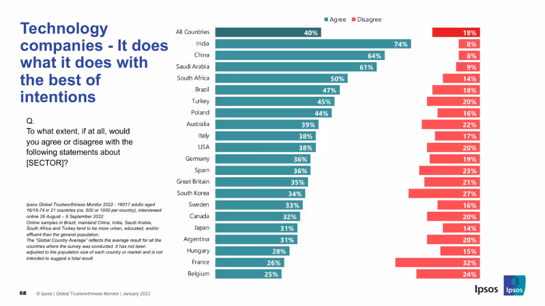
Simple bar graph on the right; large text title and survey question on the left.
Strategic Planning
Technology & Software
This slide assesses public perceptions of the intentions behind tech companies' actions, reflecting whether they are seen as operating with good intentions across countries.
intentions, technology, ethics, survey, public perception, Ipsos, global trust, corporate responsibility, transparency, sentiment
false
Strategic Planning
Technology & Software
Mixed Chart
IPSOS
Add to my slides
Remove from favorites
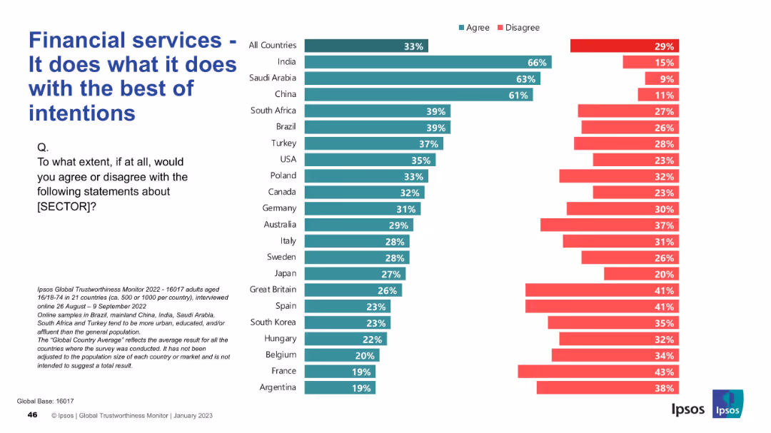
Similar format: segmented bar chart by country; concise layout with left-aligned question and title
Risk Assessment and Management
Financial Services
The slide explores trust in the intentions behind financial services. India, Saudi Arabia, and China top agreement levels, while Western countries show skepticism. The chart shows divergence in trust by region.
intentions, trust, financial services, Ipsos, public opinion, risk, bar chart, countries, perception
false
Risk Assessment and Management
Financial Services
Mixed Chart
IPSOS
Add to my slides
Remove from favorites
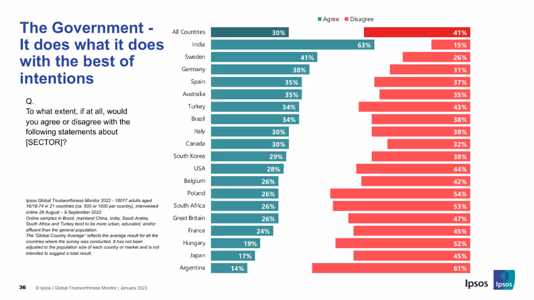
Similar split bar layout as Slide 19193 with agree/disagree; sorted by agreement
Strategic Planning
Government & Public Sector
This slide gauges whether people believe governments act with good intentions. India again leads in agreement, while disagreement remains high in many countries.
intentions, trust, governance, Ipsos, public opinion, values, international, agree/disagree, global perspective
false
Strategic Planning
Government & Public Sector
Mixed Chart
IPSOS
Add to my slides
Remove from favorites
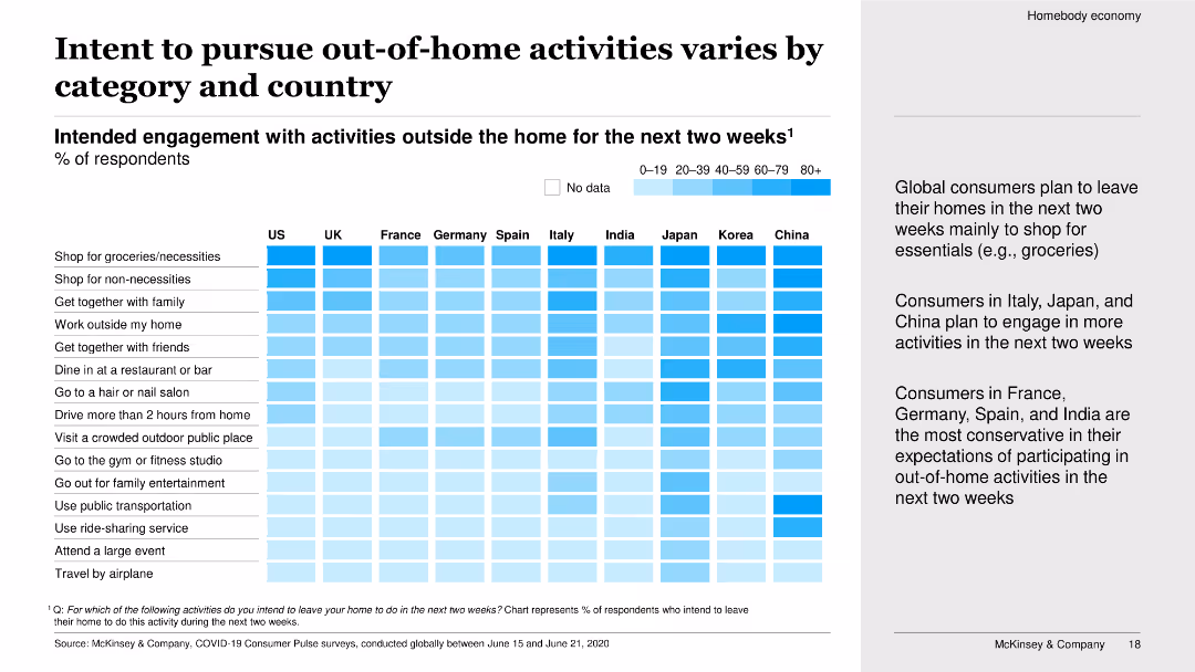
The slide features a heat map showing the intended engagement with various out-of-home activities over the next two weeks by respondents from different countries. It uses a gradient color scheme to represent different levels of engagement.
Market Analysis and Trends
Consumer Goods
The slide outlines the varying intentions of consumers in different countries to engage in out-of-home activities in the next two weeks. It highlights activities like shopping for necessities, dining out, and attending large events, showing significant differences between countries.
Intent to engage, out-of-home activities, heat map, country comparison, consumer intentions, short-term plans, COVID-19 impact, market analysis
false
Market Analysis and Trends
Consumer Goods
Boxed
McKinsey
Add to my slides
Remove from favorites
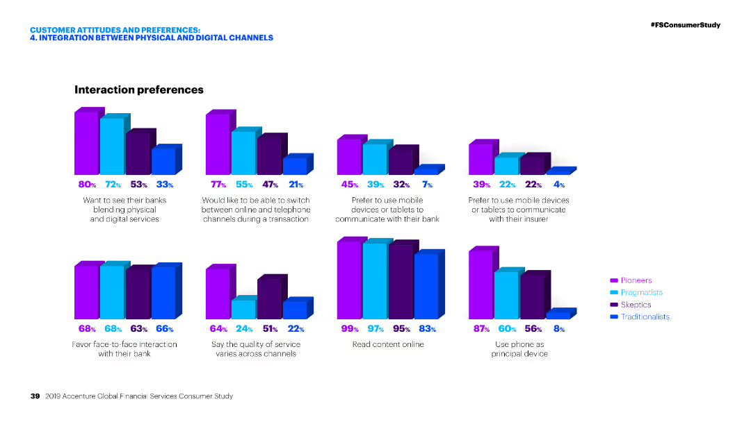
Multiple column charts depicting interaction preferences of different customer segments in banking and insurance contexts.
Customer and Market Segmentation
Financial Services
This slide presents various interaction preferences of customers when engaging with financial services, emphasizing the integration between physical and digital channels.
Interaction preferences, Financial services, Digital channels, Banking, Insurance
false
Customer and Market Segmentation
Financial Services
Multiple Chart
Accenture
Add to my slides
Remove from favorites
The slide features a combination of column charts and two pie charts. It's designed with annotations and a clear legend, providing an analytical comparison of data from different years.
Market Analysis and Trends
Financial Services
The slide presents a comparative financial analysis showing trends in interchange fees, fund types, and capital growth. It's used to explain market shifts and financial predictions.
interchange fees, equity funds, revenue pool, capital growth
false
Market Analysis and Trends
Financial Services
Multiple Chart
JP Morgan
Add to my slides
Remove from favorites
This slide shows a series of column charts displaying changes in the use of various intercity travel modes like airplanes, trains, and private vehicles across different countries.
Market Analysis and Trends
Transportation & Logistics
Examines how intercity travel preferences have shifted towards private vehicle use post-crisis.
intercity travel, mode shift, private vehicles, crisis
false
Market Analysis and Trends
Transportation & Logistics
Multiple Chart
McKinsey
Add to my slides
Remove from favorites
The slide presents column charts comparing the anticipated changes in the use of private vehicles and trains for intercity travel, split by current vehicle ownership status.
Market Analysis and Trends
Transportation & Logistics
Analyzes anticipated changes in vehicle use for intercity travel, considering vehicle ownership.
intercity travel, vehicle usage, ownership, projections
false
Market Analysis and Trends
Transportation & Logistics
Multiple Chart
McKinsey
Add to my slides
Remove from favorites
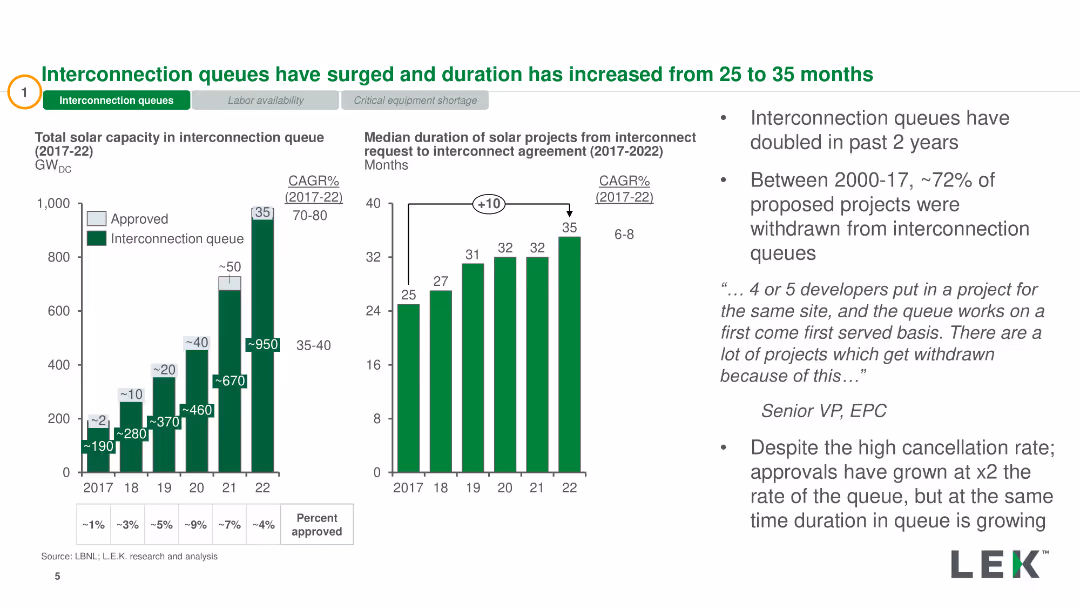
Column charts showing total solar capacity in interconnection queue and duration from request to agreement
Market Analysis and Trends
Energy & Utilities
Highlights the increase in interconnection queues and duration for solar projects, with relevant data from 2017 to 2022
interconnection queues, solar capacity, duration, market analysis, energy
false
Market Analysis and Trends
Energy & Utilities
Multiple Chart
LEK
Add to my slides
Remove from favorites
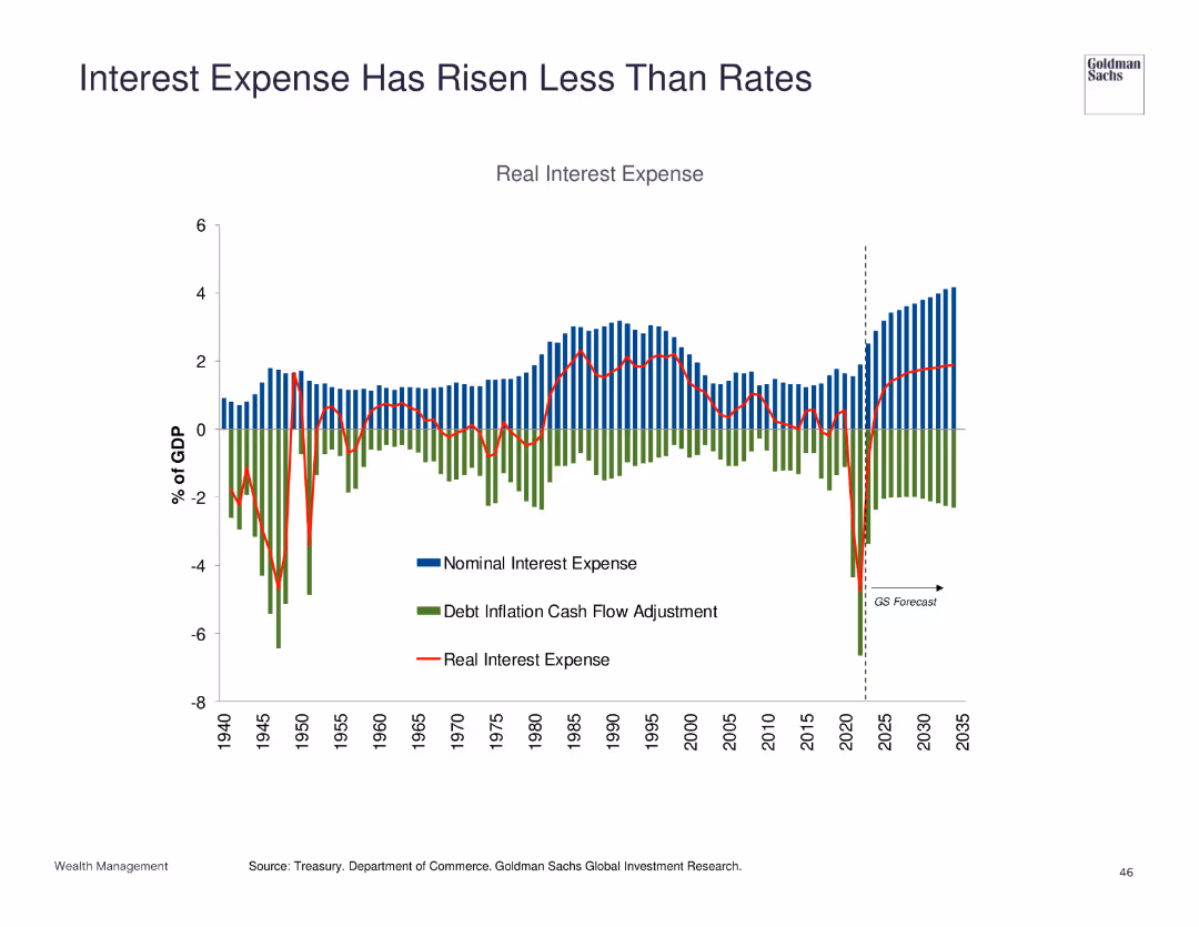
Stacked bar chart showing nominal interest expense, debt inflation cash flow adjustment, and real interest expense as a percentage of GDP.
Financial Performance
Financial Services
Reviews the trend of interest expenses relative to rates, suggesting that expenses have risen less rapidly than rates.
interest expense, rates, GDP, financial performance
false
Financial Performance
Financial Services
Single Chart
Goldman Sachs
Add to my slides
Remove from favorites
Features multiple line graphs and column charts detailing NIM and NII developments across different banking segments, with a comparative analysis included on the right side.
Financial Performance
Financial Services
This slide presents the development of net interest margin (NIM) and net interest income (NII) across corporate, private, and financing sectors of the bank during Q4 2023. It provides insights into the financial performance and strategic positioning of the bank's core segments, emphasizing profitability and interest income optimization strategies.
Interest Income, Banking Segments, NIM, NII, Financial Analysis
false
Financial Performance
Financial Services
Multiple Chart
Deutsche Bank
Add to my slides
Remove from favorites
Slide includes a column chart segmented by segment and loans, accompanied by tables and descriptive texts.
Financial Performance
Financial Services
Focused on net interest income by business segment and detailed loan breakdown, complemented by metrics and lending highlights.
Interest, Income, Loans, Bar Charts, Metrics, Segments, Performance, Corporate, Wealth Management, Real Estate
false
Financial Performance
Financial Services
Mixed Chart
Goldman Sachs
Add to my slides
Remove from favorites
Features column charts and a complex table. The design utilizes shades of blue, gray, and white and is dense with both graphics and text.
Financial Performance
Financial Services
It provides a detailed account of net interest income and loan distribution, offering insights into the financial health and lending practices of the firm.
Interest, Income, Loans, Financial, Health, Lending, Practices, Insights, Distribution, Firm
false
Financial Performance
Financial Services
Mixed Chart
Goldman Sachs
Add to my slides
Remove from favorites
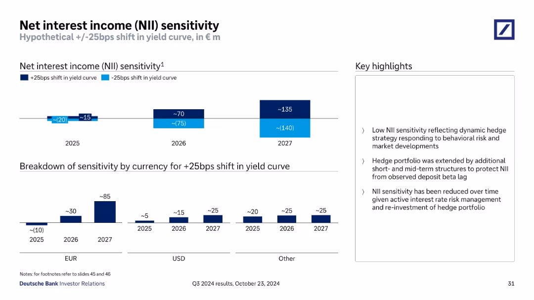
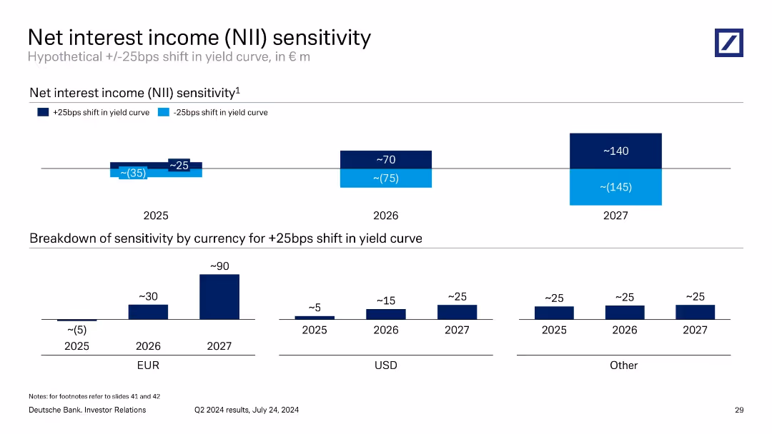
Dual-bar chart projection of NII impact under +/–25bps yield curve shifts (2025–2027), with breakdown by currency and highlights on risk management approach.
Risk Assessment and Management
Financial Services
The slide estimates the net interest income sensitivity of Deutsche Bank under interest rate changes. It highlights low sensitivity due to hedging, showing euro and USD components, and forecasts modest positive income impact in rising rate scenarios by 2026–2027.
interest income, yield curve, risk, NII, hedging, euro, USD
false
Risk Assessment and Management
Financial Services
Multiple Chart
Deutsche Bank
Add to my slides
Remove from favorites
Slide displays line graphs and column charts tracking interest margins and income over time. Design is clean with data clearly differentiated by color.
Financial Performance
Financial Services
Overview of interest income trends, vital for financial forecasting and performance assessment.
interest margin, net interest income, financial trends, forecasting, performance
false
Financial Performance
Financial Services
Multiple Chart
Deutsche Bank
Add to my slides
Remove from favorites
Features line graphs and bar charts illustrating trends in net interest margins for different banking divisions, alongside data on interest-earning assets.
Financial Performance
Financial Services
This slide presents the trends in net interest margins across different bank divisions, highlighting stable financial management practices and the impact of external economic factors on performance metrics.
Interest Margins, Financial Stability, Banking Divisions, Economic Impact, Performance Metrics
false
Financial Performance
Financial Services
Multiple Chart
Deutsche Bank
Add to my slides
Remove from favorites
Slide includes a column chart representing interest repayments over time as a percentage of Namibia's expense budget from 2017/18 to 2024/25. Each year is represented by a bar, with a line graph overlay showing the trend of interest payments and borrowing-related charges as a percentage.
Financial Performance
Government & Public Sector
Discusses trends in Namibia's interest repayments, analyzing their impact on the overall budget. Useful for financial planning and assessing fiscal sustainability in the public sector.
Interest Payments, Fiscal Planning, Debt Management, Namibia, Budget Analysis
false
Financial Performance
Government & Public Sector
Single Chart
PwC/Strategy&
Add to my slides
Remove from favorites
Two-panel graph: left = net interest payments as share of profits, right = bank lending standards index (US, EU, UK)
Financial Performance
Financial Services
The slide shows that US corporates benefit from the Fed's rate cuts, as net interest payments decrease significantly. Concurrently, bank lending standards remain relatively loose, especially compared to EU and UK conditions, supporting continued investment activity.
interest payments, US corporates, investment, lending standards, Fed policy, rate cuts
false
Financial Performance
Financial Services
Multiple Chart
Accenture
Add to my slides
Remove from favorites
The slide has two donut charts showing 2023 and 2022 responses on interest rates and bond prices, with key data points.
Market Analysis and Trends
Financial Services
It illustrates the percentage of Canadians who correctly understood the impact of interest rates on bond prices, comparing 2022 to 2023.
Interest Rate, Bond Price, Knowledge, Canadians, Percentage, 2023, 2022, Chart, Financial, Trends
false
Market Analysis and Trends
Financial Services
Multiple Chart
IPSOS
Add to my slides
Remove from favorites
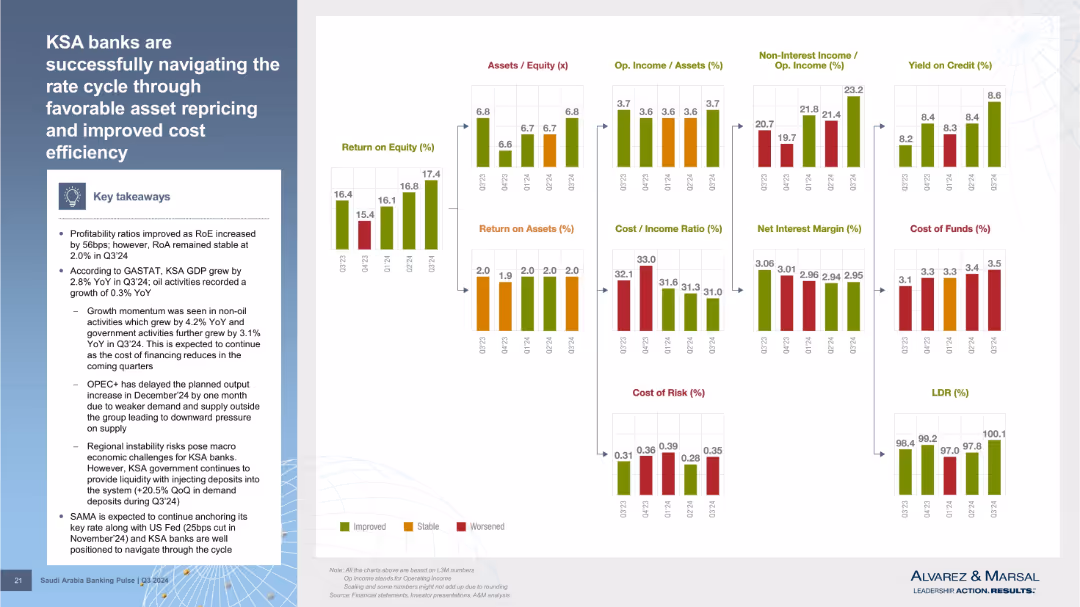
Multi-chart panel layout showing metrics like ROE, ROA, cost/income ratio, NIM, cost of funds, etc. Summary box on the left. Color-coded indicators show trends for each KPI.
Strategic Planning
Financial Services
Summarizes how KSA banks managed profitability during the interest rate cycle. ROE improved, while ROA remained stable. Various financial indicators such as NIM, yield, cost of funds, and LDR are displayed, supporting the overall narrative of resilience and adaptation.
interest rate, cost efficiency, asset repricing, profitability, LDR, NIM, yield
false
Strategic Planning
Financial Services
Mixed Chart
Alvarez & Marsal
Add to my slides
Remove from favorites
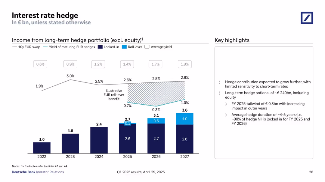
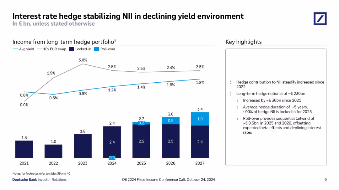
Combination of bar chart and line graph showing hedge income and average yields over time.
Risk Assessment and Management
Financial Services
Demonstrates income contribution from long-term interest rate hedges through 2027. Illustrates locked-in and roll-over income effects. Hedge income is expected to grow steadily with limited short-term rate sensitivity.
interest rate hedge, NII, income, locked-in, yield, risk strategy, roll-over
false
Risk Assessment and Management
Financial Services
Mixed Chart
Deutsche Bank
Add to my slides
Remove from favorites
Line and stacked bar chart displaying yield trends and hedge portfolio income by year. Callouts describe hedge strategy components (locked-in vs. rollover). Sidebar includes key strategy metrics.
Risk Assessment and Management
Financial Services
Focuses on how Deutsche Bank's hedge strategy offsets yield declines and stabilizes NII. Displays projected hedge income through 2027 with increasing contributions from rollovers, and explains hedge portfolio size, duration, and income stability.
interest rate hedge, NII, yield environment, hedge duration, rollover, locked-in, hedge income, 2027 forecast
false
Risk Assessment and Management
Financial Services
Mixed Chart
Deutsche Bank
Add to my slides
Remove from favorites
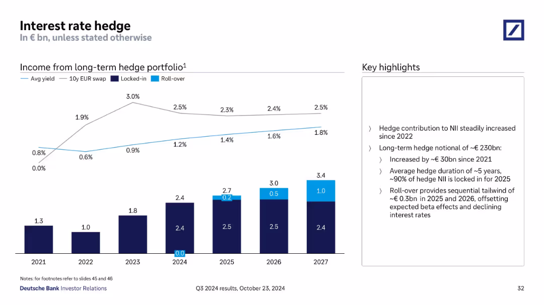
Line and stacked bar chart illustrating hedge income from long-term portfolio (2021–2027), showing locked-in and roll-over values; commentary highlights hedge strategy and benefits.
Risk Assessment and Management
Financial Services
This slide presents Deutsche Bank’s hedge income trends and projections. It shows a growing contribution to NII, with a ~€230bn notional hedge portfolio. Roll-overs in 2025–26 are expected to offset declining rates. Duration averages 5 years with 90% locked for 2025.
interest rate, hedge, portfolio, income, duration, NII, rollover
false
Risk Assessment and Management
Financial Services
Mixed Chart
Deutsche Bank
Add to my slides
Remove from favorites
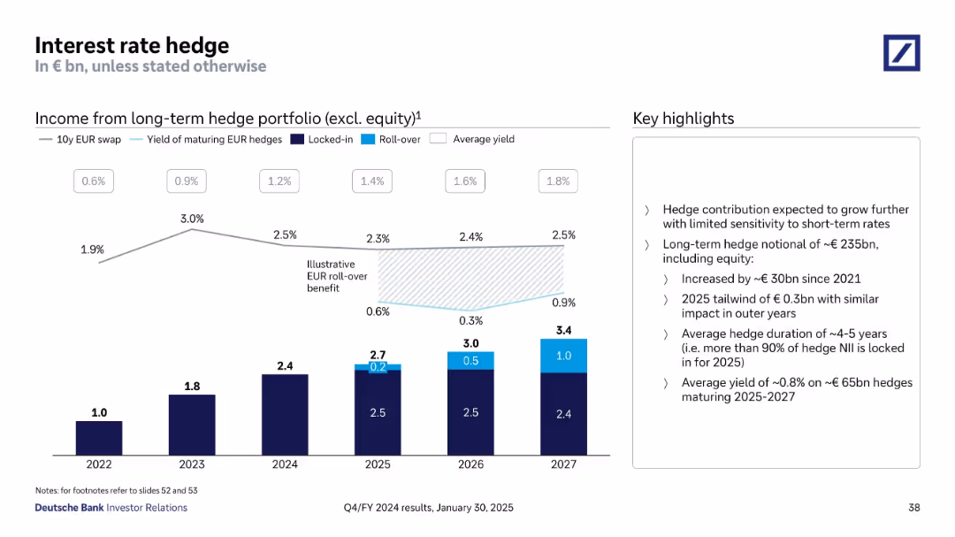
Bar and line charts showing income from long-term hedges with supporting bullet insights
Risk Assessment and Management
Financial Services
This slide explains the structure and benefits of Deutsche Bank’s long-term interest rate hedge portfolio, excluding equity. The chart highlights locked-in and rollover components, and the narrative emphasizes minimal short-term sensitivity, duration of ~4-5 years, and a €0.3bn expected benefit in 2025.
Interest Rate Hedge, Yield, Portfolio, Rollover, Locked-in, Duration
false
Risk Assessment and Management
Financial Services
Mixed Chart
Deutsche Bank
Add to my slides
Remove from favorites
Two pie charts illustrating Canadians' knowledge of interest rates, showing the correct response rates and comparisons between 2023 and 2022.
Human Resources and Talent Management
Financial Services
This slide assesses the understanding of interest rates among Canadians, showing the percentage of correct answers and comparing data from 2023 to 2022.
Interest, rate, knowledge, Canadians, 2023, 2022
false
Human Resources and Talent Management
Financial Services
Multiple Chart
IPSOS
Add to my slides
Remove from favorites
The slide features a donut chart displaying responses to a question about interest rates, with a breakdown of correct and incorrect answers on the left. The layout is moderately complex.
Performance Metrics and KPIs
Financial Services
This slide assesses Canadians' knowledge about interest rates, revealing that 52% answered correctly. It aims to gauge the public's understanding of financial concepts, specifically interest rates.
interest, rate, knowledge, financial, Canadians
false
Performance Metrics and KPIs
Financial Services
Single Chart
IPSOS
Add to my slides
Remove from favorites
The slide includes multiple charts, including a line chart, bar chart, and column chart. It shows trends over time.
Market Analysis and Trends
Financial Services
This slide analyzes the impact of interest rate changes on M&A activities, showing historical data and future forecasts.
Interest rate, leveraged finance, M&A, charts, trends
false
Market Analysis and Trends
Financial Services
Multiple Chart
JP Morgan
Add to my slides
Remove from favorites
Slide with five sets of column charts displaying 'Floating Loan Mix', 'Strong Retail Franchise', 'S&P Debt Ratings', and 'Core NIM' data. The charts compare TFC with peer medians and averages, using shades of purple and teal.
Risk Assessment and Management
Financial Services
The slide presents data on how the company manages interest rate risk, with comparisons to industry peers. It offers a look into various financial metrics that indicate the company's strategic positioning in terms of debt ratings and net interest margin.
Interest Rate, Risk Management, Financial Metrics, Debt Ratings, Net Interest Margin
false
Risk Assessment and Management
Financial Services
Multiple Chart
Goldman Sachs
Add to my slides
Remove from favorites
This slide is divided into two main sections. On the left is a column chart depicting the Net Interest Income for four years with a dashed line projecting the first quarter of the next year. Beneath, a smaller column chart compares the NII contribution with four peers. The right side lists bullet points under 'Rate Sensitivity', detailing interest rate risk management and sensitivity.
Risk Assessment and Management
Financial Services
The slide conveys financial data and strategies regarding the management of interest rate risk. It depicts past NII, compares with peers, and outlines expectations and strategies for rate sensitivity, aimed at financial professionals or stakeholders monitoring fiscal health.
interest rate, risk management, sensitivity, NII, financial data, projection, peer comparison, column chart, fiscal health, strategy
false
Risk Assessment and Management
Financial Services
Multiple Chart
Goldman Sachs
Add to my slides
Remove from favorites
Two-part slide: bar charts showing NII sensitivity to ±25bps yield curve shifts across years, with currency breakdown for +25bps in lower section.
Risk Assessment and Management
Financial Services
Evaluates Deutsche Bank’s NII sensitivity to interest rate shifts from 2025–2027. Projects growing positive impact from a +25bps shift. EUR drives the largest exposure. Useful for forecasting interest rate risk and net income variability.
interest rate risk, NII, yield curve, sensitivity, EUR, forecast
false
Risk Assessment and Management
Financial Services
Multiple Chart
Deutsche Bank
Add to my slides
Remove from favorites
Two data tables, line graph on rate assumptions; left-to-right timeline progression; clean, blue-white layout
Risk Assessment and Management
Financial Services
This slide models Barclays’ sensitivity to a -25bps rate change over three years, projecting Group income impact. It compares February 2024 and 2025 plans and includes swap and base rate projections. The assumption includes stable balance sheet reinvestment over time.
interest rate risk, swap rates, base rates, income sensitivity, macroeconomic trends
false
Risk Assessment and Management
Financial Services
Multiple Chart
Barclays
Add to my slides
Remove from favorites
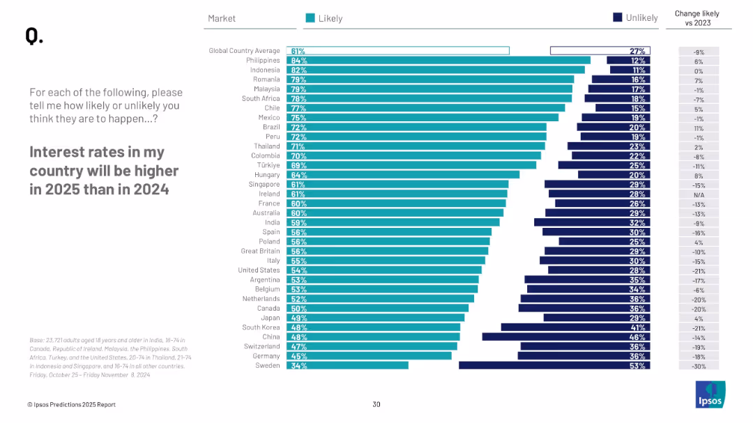
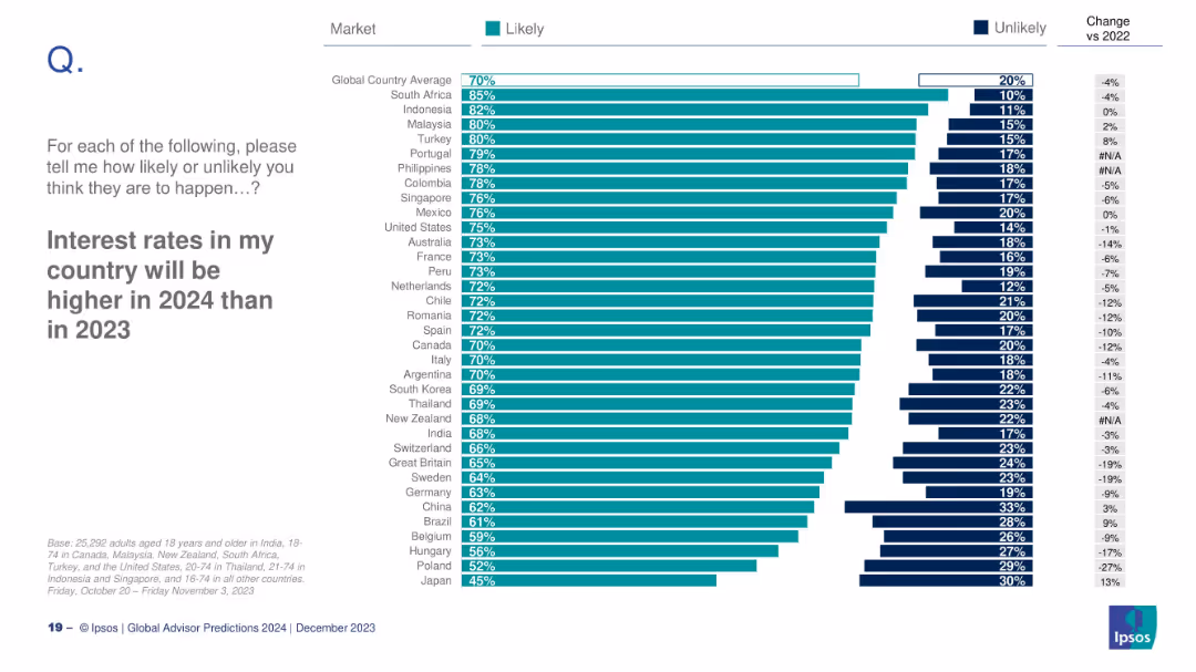
Horizontal bar chart similar in structure to 18772, showing “likely” and “unlikely” shares by country with changes from 2023.
Market Analysis and Trends
Financial Services
This slide highlights public perceptions regarding rising interest rates in 2025. It includes country-level data and trends compared to 2023. The Philippines, Indonesia, and Romania are among the countries with the highest perceived likelihood of rate increases.
interest rates, 2025, financial forecast, public sentiment, Ipsos
false
Market Analysis and Trends
Financial Services
Mixed Chart
IPSOS
Add to my slides
Remove from favorites
The slide features a column chart with multiple bars representing different bond maturities and their forecasted interest rates.
Financial Performance
Financial Services
The slide projects forward interest rates for various bond maturities, emphasizing the attractiveness of fixed-rate loans with rising short-term rates.
interest rates, bond maturity, fixed-rate loans, forecast, short-term rates
false
Financial Performance
Financial Services
Single Chart
UBS
Add to my slides
Remove from favorites
The slide features a donut chart showing responses to a question about the relationship between interest rates and bond prices, with breakdowns of correct and incorrect answers. The layout is moderately complex.
Performance Metrics and KPIs
Financial Services
This slide assesses knowledge about the impact of interest rates on bond prices, showing mixed understanding among Canadians. It aims to evaluate public knowledge on financial concepts.
interest rates, bond prices, knowledge, financial, Canadians
false
Performance Metrics and KPIs
Financial Services
Single Chart
IPSOS
Add to my slides
Remove from favorites
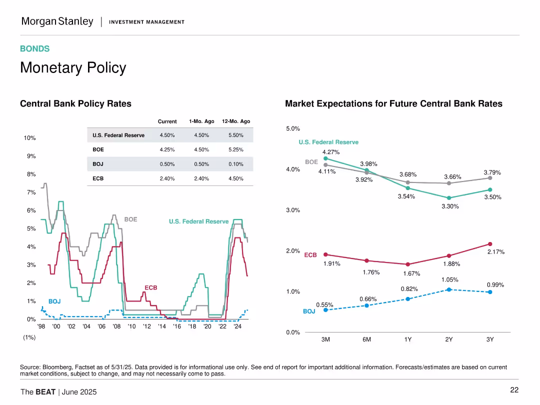
Split layout with historical policy rates line chart on left and projected rate expectations line chart on right.
Strategic Planning
Financial Services
This slide compares central bank policy rates historically (Fed, BOE, ECB, BOJ) and projects future rate expectations over different timeframes (3M to 3Y).
interest rates, central banks, BOE, ECB, BOJ, Fed, rate forecast, monetary policy, future projections, trends
false
Strategic Planning
Financial Services
Multiple Chart
Morgan Stanley
Add to my slides
Remove from favorites
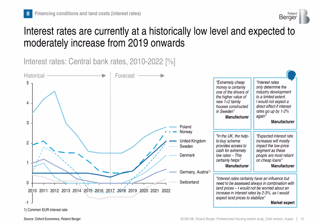
Line graph showing central bank rates from 2010–2022 with annotations from industry experts on the right.
Investment Analysis
Real Estate & Construction
This slide illustrates central bank interest rate trends and forecasts across multiple countries. Expert commentary adds context on the implications for the housing sector, particularly the affordability and attractiveness of prefabricated housing.
interest rates, central banks, construction financing, housing affordability, economic trends, investment outlook
false
Investment Analysis
Real Estate & Construction
Mixed Chart
Roland Berger
Add to my slides
Remove from favorites
Two line charts: one showing Euro area central bank interest rate from 2021 to 2025F and one showing US central bank interest rate for the same period, with historical data, market expectations, and forecasts.
Market Analysis and Trends
Financial Services
This slide discusses how easing inflation and slowing economic momentum will push central banks to recalibrate policies, with gradual rate cuts expected instead of rapid reductions.
interest rates, central banks, inflation, economic momentum, rate cuts, forecast
false
Market Analysis and Trends
Financial Services
Multiple Chart
EY
Add to my slides
Remove from favorites
Line charts of CHF 10y swap rate evolution and CHF forward yield curve, with bullet points on macroeconomic dynamics and implications.
Market Analysis and Trends
Financial Services
Analyzes the current interest rate environment, focusing on the trends in swap rates and yield curves, and their business implications.
Interest rates, CHF swap rate, yield curve, macroeconomics, business implications
false
Market Analysis and Trends
Financial Services
Multiple Chart
Credit Suisse
Add to my slides
Remove from favorites
Two-panel line chart: Left shows US corporate net interest payments and profit share; Right shows bank lending standards for US, EU, UK.
Corporate Finance and Valuation
Financial Services
The slide examines US financial conditions, emphasizing reduced corporate interest burdens due to rate cuts and easing lending standards. It shows a favorable environment for business investment and financing.
interest rates, corporate finance, investment, lending standards, US, rate cuts
false
Corporate Finance and Valuation
Financial Services
Multiple Chart
Accenture
Add to my slides
Remove from favorites
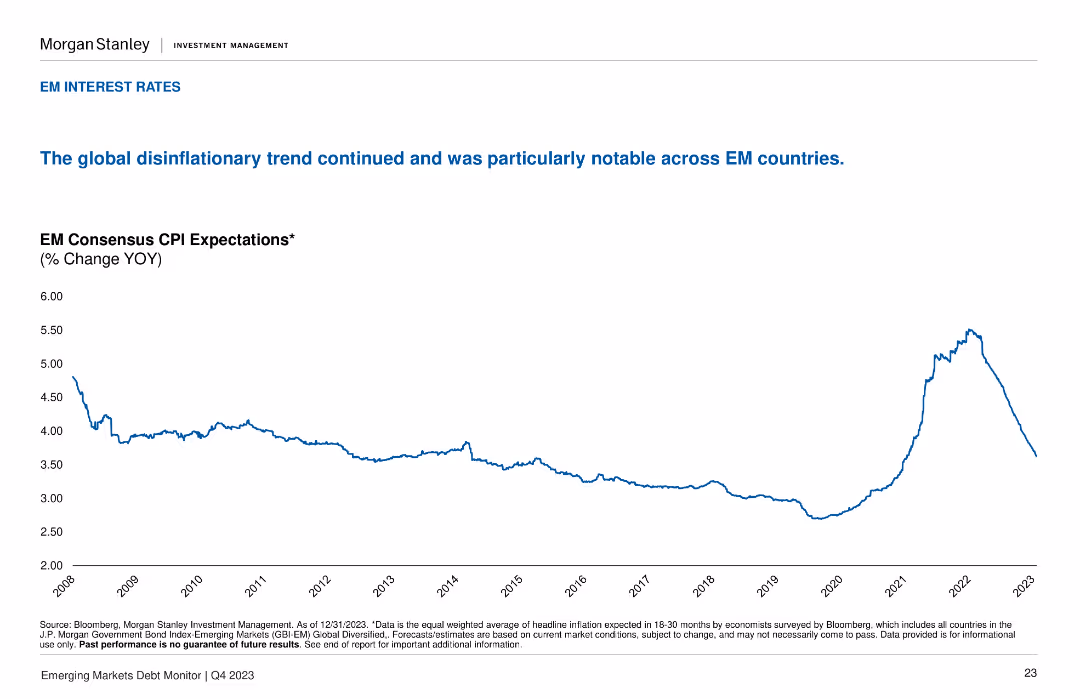
The slide presents a line chart showing EM consensus CPI expectations over time. The layout is simple and focused on the data trend.
Market Analysis and Trends
Financial Services
The slide highlights the ongoing disinflationary trend across emerging markets, with detailed data on CPI expectations and implications for interest rates.
interest rates, disinflation, CPI expectations, emerging markets, economic trends
false
Market Analysis and Trends
Financial Services
Single Chart
Morgan Stanley
Add to my slides
Remove from favorites
Horizontal bar chart ranking countries by likely/unlikely expectations of rising interest rates
Market Analysis and Trends
Financial Services
A visual representation of global sentiment toward expected interest rate increases in 2024. The slide breaks down likely vs. unlikely perceptions by country and includes year-over-year change from 2022.
interest rates, economic forecast, monetary policy, countries, trend
false
Market Analysis and Trends
Financial Services
Mixed Chart
IPSOS
Add to my slides
Remove from favorites
Bar charts showing banks' debt securities as % of total assets, with a column chart for debt securities portfolio composition
Risk Assessment and Management
Financial Services
The slide discusses interest rate risk on securities portfolios for APAC banks, comparing them to US and European banks. It highlights the implications for corporates.
interest rate, securities, APAC banks, debt, risk
false
Risk Assessment and Management
Financial Services
Multiple Chart
Accenture
Add to my slides
Remove from favorites
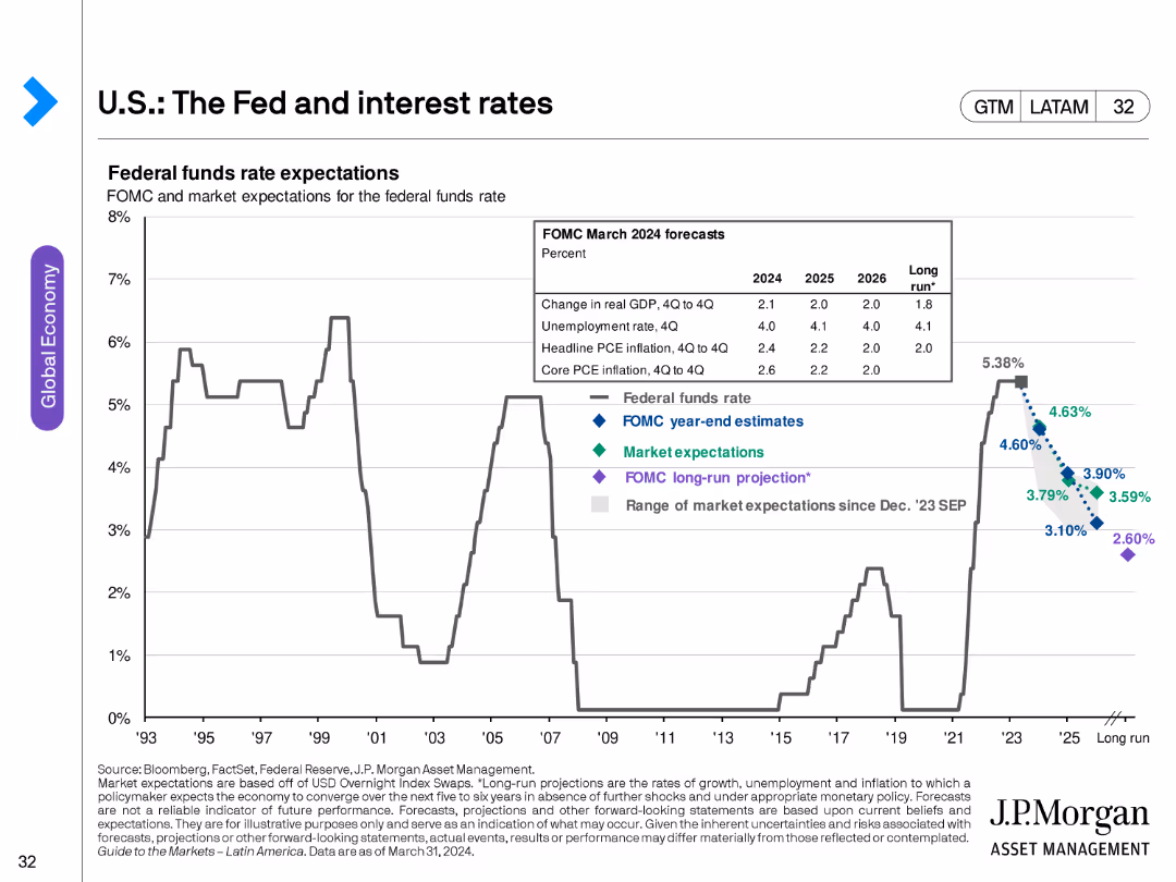
The slide contains a line chart showing federal funds rate expectations from FOMC and market projections, with historical data for context.
Market Analysis and Trends
Financial Services
This slide analyzes expectations for the federal funds rate, providing insights into monetary policy projections and their implications for the economy.
interest rates, Fed, FOMC, market projections, monetary policy, economic forecast
false
Market Analysis and Trends
Financial Services
Single Chart
JP Morgan
Add to my slides
Remove from favorites
Features column charts displaying hypothetical shifts in net interest income due to changes in the yield curve.
Risk Assessment and Management
Financial Services
This analytical slide explores the sensitivity of net interest income to changes in interest rates, presenting data projections up to 2026. It's designed for financial risk managers and analysts to assess the potential impact of interest rate fluctuations on the bank's earnings, aiding in strategic financial planning and risk mitigation efforts.
Interest Rates, Financial Risk, Projections, Banking, Sensitivity Analysis
false
Risk Assessment and Management
Financial Services
Multiple Chart
Deutsche Bank
Add to my slides
Remove from favorites
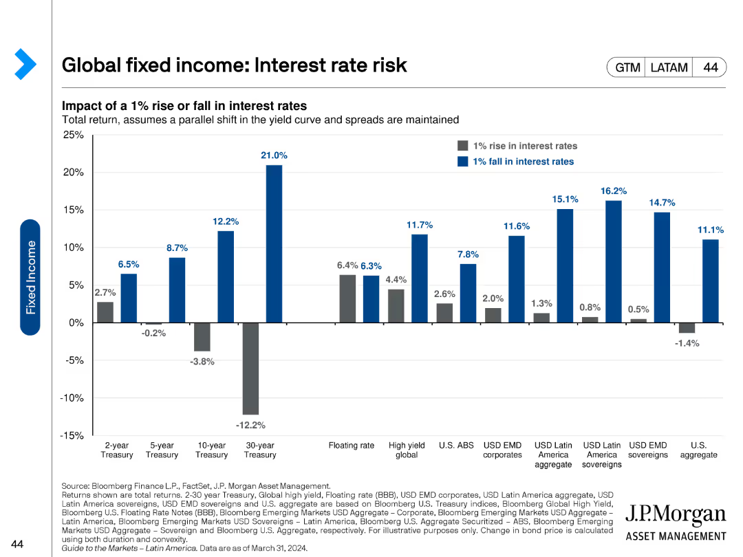
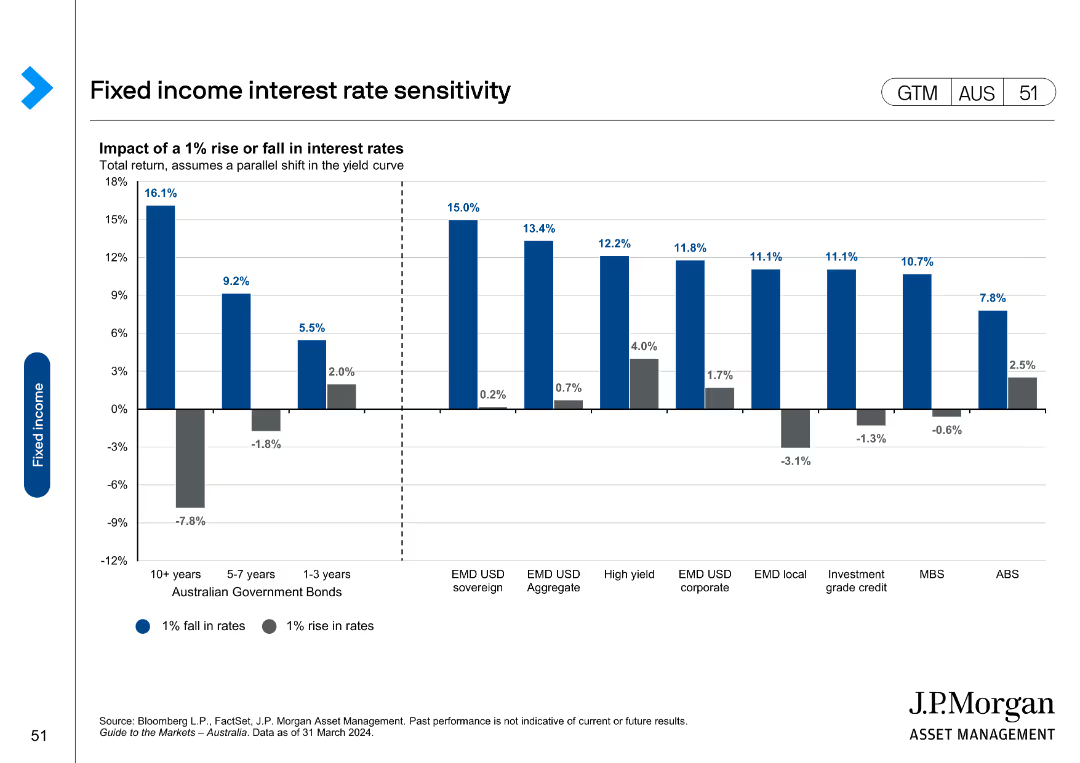
A column chart depicting the impact of a 1% rise or fall in interest rates on various fixed income assets. The chart includes blue and gray bars representing the rise and fall respectively, with detailed values for each asset category on the x-axis.
Risk Assessment and Management
Financial Services
This slide illustrates the potential effects of a 1% interest rate change on the total return of different fixed income instruments, highlighting the sensitivity of various assets like treasuries, corporates, and sovereigns to interest rate fluctuations.
Interest rates, fixed income, total return, sensitivity, risk
false
Risk Assessment and Management
Financial Services
Single Chart
JP Morgan
Add to my slides
Remove from favorites
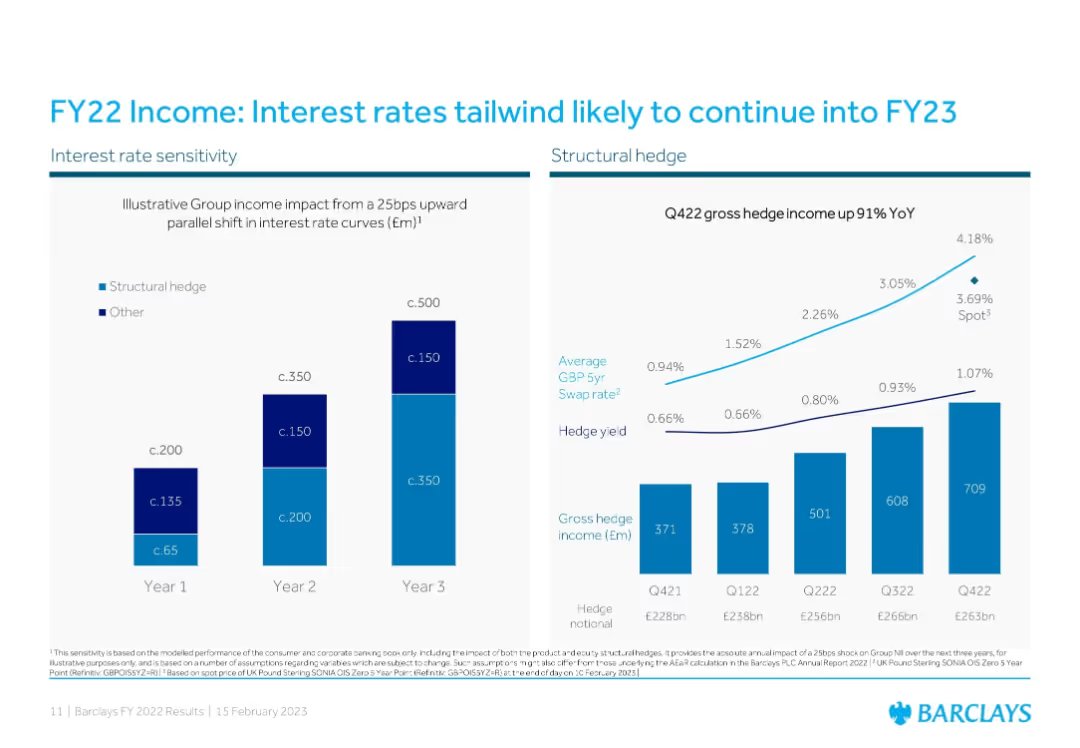
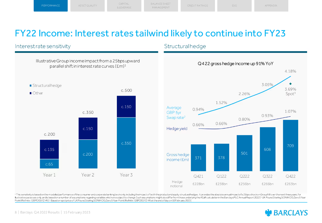
Two-panel layout: Left panel illustrates income sensitivity to interest rate shifts using stacked bar charts over three years; right panel features a line graph comparing hedge yield and swap rate trends with a bar chart showing quarterly hedge income.
Financial Performance
Financial Services
The slide shows Barclays' expected income increase from interest rate changes and highlights the significant YoY growth in gross hedge income. It emphasizes the benefit from structural hedges and interest rate swaps, projecting continued income support into FY23.
interest rates, hedge, income growth, FY22, FY23 forecast, swap rate, structural hedge, Barclays, financial performance, rate sensitivity
false
Financial Performance
Financial Services
Multiple Chart
Barclays
Add to my slides
Remove from favorites
Detailed slide with mixed column and line charts showing gross hedge income projections and percentage changes.
Investment Analysis
Financial Services
Evaluates the smoothing effects of interest rate hedges on net interest income, mentioning specific financial impacts and hedging strategies.
interest rates, hedges, NII, finance, projections, strategies
false
Investment Analysis
Financial Services
Mixed Chart
Deutsche Bank
Add to my slides
Remove from favorites
Displays a combination of line charts and column chart detailing interest rate hedges over time, using smooth curves and shaded areas for visual distinction.
Financial Performance
Financial Services
Provides an overview of interest rate hedging strategies and their financial impact from 2021 to projected 2025.
interest rates, hedging strategies, financial planning, 2025 forecast, risk management
false
Financial Performance
Financial Services
Mixed Chart
Deutsche Bank
Add to my slides
Remove from favorites
The slide has two main charts: one showing interest rate sensitivity and another displaying hedge income growth. It uses blue tones with a structured layout.
Market Analysis and Trends
Financial Services
The slide analyzes the impact of interest rates on Barclays' income, projecting continued benefits into FY23, supported by hedge income growth data.
interest rates, income, Barclays, FY22, market analysis
false
Market Analysis and Trends
Financial Services
Multiple Chart
Barclays
Add to my slides
Remove from favorites
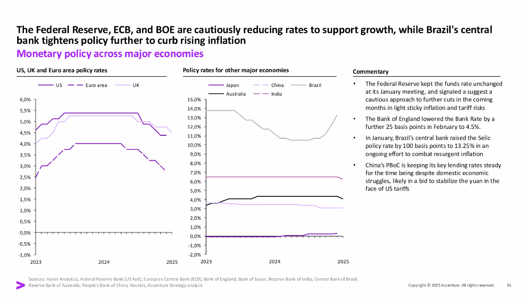
Two comparative line charts by region on policy rates with textual commentary.
Strategic Planning
Financial Services
The slide contrasts monetary policy decisions across major economies in response to inflation and growth concerns. The Fed, ECB, and BOE show rate reductions, while Brazil tightens and China remains steady.
Interest rates, inflation, central banks, Fed, ECB, BOE, Brazil, China, monetary policy
false
Strategic Planning
Financial Services
Multiple Chart
Accenture
Add to my slides
Remove from favorites
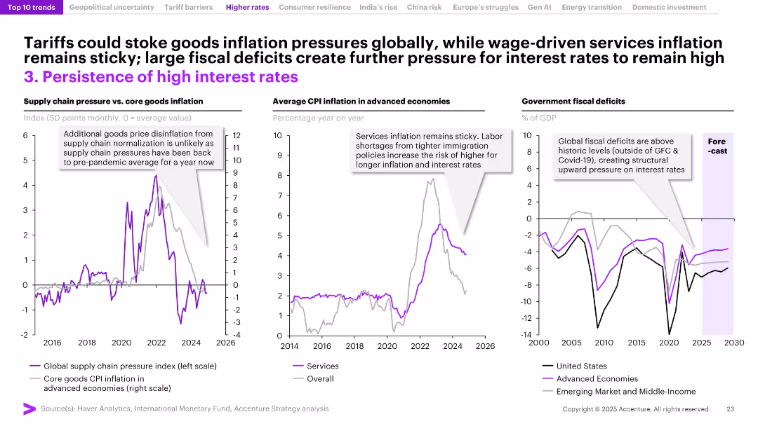
Three-panel layout with annotated line graphs on supply chain pressure vs. inflation, CPI inflation, and fiscal deficits. Purple accents highlight key data trends.
Market Analysis and Trends
Financial Services
This slide explores the persistence of high interest rates globally, driven by sticky services inflation, limited supply chain disinflation, and rising fiscal deficits. It emphasizes that structural factors like labor shortages and government debt are contributing to sustained inflationary pressure, preventing interest rates from dropping.
interest rates, inflation, fiscal deficits, supply chain, services CPI, global economy, sticky inflation, monetary policy, labor shortages, advanced economies
false
Market Analysis and Trends
Financial Services
Multiple Chart
Accenture
Add to my slides
Remove from favorites
Line charts depicting changes in interest rates over time.
Financial Performance
Financial Services
Highlights SEA countries' interest rate adjustments in response to inflation. Key for financial analysis and understanding economic measures.
interest rates, inflation, SEA, financial analysis, economic measures
false
Financial Performance
Financial Services
Multiple Chart
Bain
Add to my slides
Remove from favorites
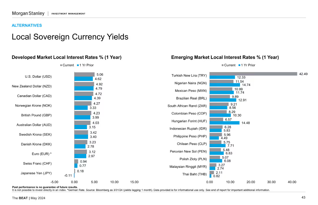
Two column charts comparing developed and emerging market local interest rates (1 year) with current and 1-year prior rates. Bars are vertical.
Market Analysis and Trends
Financial Services
Compares local interest rates for developed and emerging markets. Developed markets include USD, NZD, CAD, etc., while emerging markets include TRY, NGN, MXN, etc.
Interest rates, local currency, market
false
Market Analysis and Trends
Financial Services
Multiple Chart
Morgan Stanley
Add to my slides
Remove from favorites
This slide displays two bar charts comparing current and 1-year prior local interest rates for developed and emerging market currencies. The bars use different shades to distinguish between current rates and rates from the previous year.
Market Analysis and Trends
Financial Services
The slide analyzes local sovereign currency yields by comparing current and previous year interest rates for developed and emerging markets, helping in understanding trends and changes in interest rates across different economies.
interest rates, local currency yields, developed markets, emerging markets, financial analysis, currency comparison
false
Market Analysis and Trends
Financial Services
Multiple Chart
Morgan Stanley
Add to my slides
Remove from favorites
Contains multiple line charts comparing different interest rates over time.
Market Analysis and Trends
Financial Services
Shows trends in market-implied interest rates including the ECB deposit facility rate and the Federal Reserve interest on reserve balances, reflecting how market expectations have shifted over time.
interest rates, market trends, ECB, Federal Reserve
false
Market Analysis and Trends
Financial Services
Multiple Chart
Deutsche Bank
Add to my slides
Remove from favorites
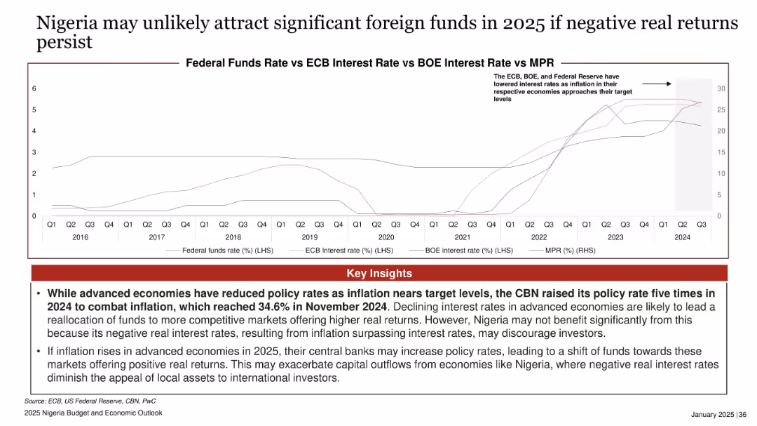
Line chart comparing MPR vs Fed/ECB/BOE interest rates; red insights box at bottom; timeline from 2016 to 2024.
Risk Assessment and Management
Financial Services
Discusses disparity between Nigeria’s high MPR and declining rates in advanced economies, creating negative real returns and discouraging foreign investment. Warns of potential capital outflows if inflation rises in advanced economies in 2025.
interest rates, MPR, negative real return, foreign funds, inflation, advanced economies, Nigeria, investment risk
false
Risk Assessment and Management
Financial Services
Mixed Chart
PwC/Strategy&
Add to my slides
Remove from favorites
The slide presents a line chart comparing Federal Funds Rate with MSCI Index for developed, emerging, and frontier markets, highlighting trends and key insights.
Market Analysis and Trends
Financial Services
The slide discusses how increased interest rates may cause capital reallocation from frontier markets to developed markets, with specific data and analysis.
interest rates, MSCI Index, frontier markets, capital reallocation, financial trends
false
Market Analysis and Trends
Financial Services
Mixed Chart
PwC/Strategy&
Add to my slides
Remove from favorites
Features multiple column charts in blue tones, analyzing sensitivity to interest rate changes across currencies.
Financial Performance
Financial Services
Details how shifts in interest rates affect net interest income, used in strategic financial planning and risk management.
Interest rates, net interest income, sensitivity, financial planning, currency, risk management, banking
false
Financial Performance
Financial Services
Multiple Chart
Deutsche Bank
Add to my slides
Remove from favorites
The slide features a column chart comparing net interest income under different interest rate scenarios and a line chart of historical interest rates.
Risk Assessment and Management
Financial Services
The slide explains the impact of interest rate changes on net interest income over a three-year period, using illustrative examples.
interest rates, sensitivity, financial, performance, net interest income, risk management
false
Risk Assessment and Management
Financial Services
Multiple Chart
UBS
Add to my slides
Remove from favorites
Column chart showing the impact of a 1% rise or fall in interest rates on total returns across various fixed income categories.
Market Analysis and Trends
Financial Services
Examines sensitivity of different fixed income categories to interest rate changes, showing potential returns and losses.
interest rates, sensitivity, fixed income, returns, impact
false
Market Analysis and Trends
Financial Services
Single Chart
JP Morgan
Add to my slides
Remove from favorites
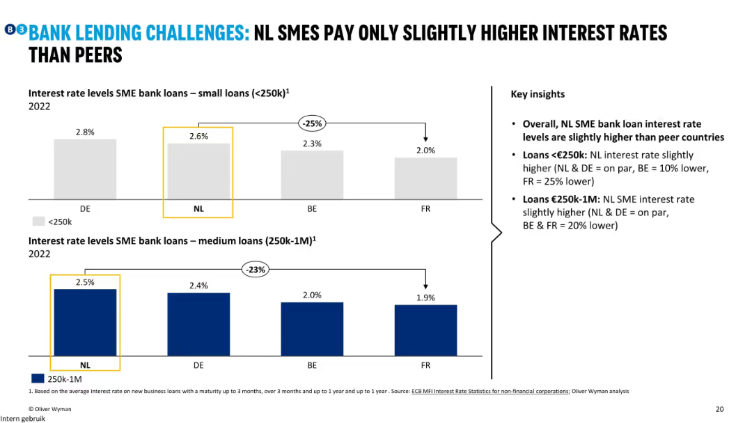
Two bar charts comparing interest rates for small (<€250k) and medium (€250k–1M) SME loans across four countries; annotated with deltas.
Financial Performance
Financial Services
The slide shows that Dutch SMEs pay slightly higher interest rates than peers, particularly for medium-sized loans. Despite being slightly more expensive, the difference is not large, especially compared to France and Belgium.
interest rates, SME loans, NL, DE, FR, BE, small loans, medium loans
false
Financial Performance
Financial Services
Multiple Chart
Oliver Wyman
Add to my slides
Remove from favorites
With a split-view of bar charts, the slide displays comparative interest rate data for developed and emerging markets through visually distinct tables, highlighting current and prior year rates.
Investment Analysis
Financial Services
The slide acts as an analytical tool for assessing yield variations in sovereign currencies, key for financial strategists and investors monitoring interest rate trends and their impact on global markets.
Interest Rates, Sovereign Yields, Developed Markets, Emerging Markets, Currency, Financial Analysis, Comparative Tables
false
Investment Analysis
Financial Services
Multiple Chart
Morgan Stanley
Add to my slides
Remove from favorites
Line chart depicting the ISG forecast for the 10-year US Treasury yield from 2019 to 2024, highlighting key rate projections.
Market Analysis and Trends
Financial Services
Discusses the expected decline in the US 10-year Treasury yield to 3.5-3.9% by year-end 2024, impacting intermediate Treasury bonds and duration risk over credit risk.
interest rates, US Treasury, forecast, bonds, financial market
false
Market Analysis and Trends
Financial Services
Mixed Chart
Goldman Sachs
Add to my slides
Remove from favorites
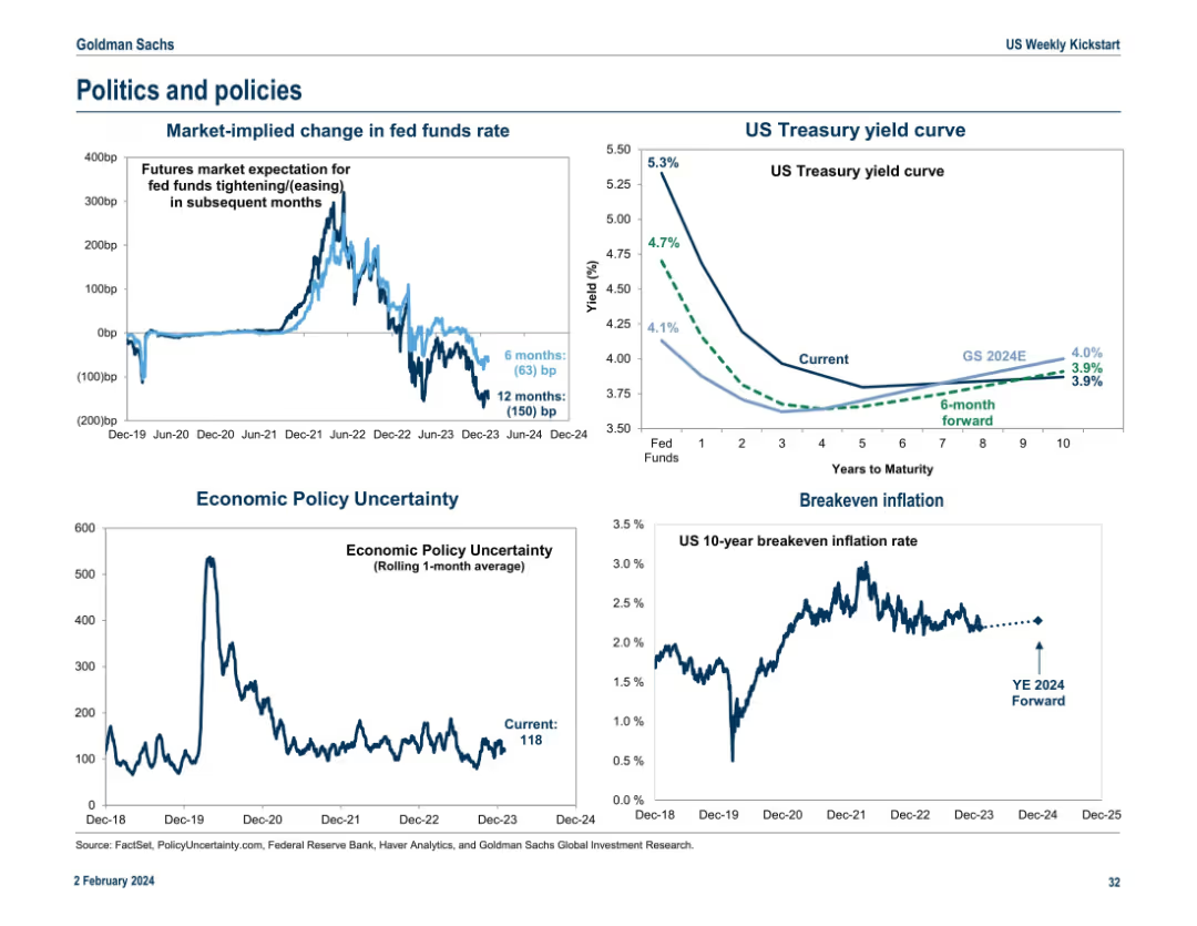
Four-part layout showing charts on fed funds expectations, Treasury yield curve, economic policy uncertainty, and breakeven inflation. Clean, with emphasis on policy impact indicators.
Regulatory and Compliance
Government & Public Sector
This slide illustrates the market's expectations for changes in interest rates, the yield curve, economic policy uncertainty, and breakeven inflation. It’s focused on projecting policy-related market impacts and assessing forward-looking economic and inflation expectations.
interest rates, yield curve, inflation, policy uncertainty, regulation
false
Regulatory and Compliance
Government & Public Sector
Multiple Chart
Goldman Sachs
Add to my slides
Remove from favorites
Two charts: one displays UK real wage growth with a forecast, and the other shows UK mortgages exposed to higher rates categorized by fixed and floating rates.
Risk Assessment and Management
Financial Services
The slide focuses on the sensitivity of the UK economy to interest rate changes, detailing real wage growth trends and the exposure of UK mortgages to higher rates. Used for economic impact analysis and risk assessment.
Interest rate, wage growth, mortgages, UK
false
Risk Assessment and Management
Financial Services
Multiple Chart
JP Morgan
Add to my slides
Remove from favorites
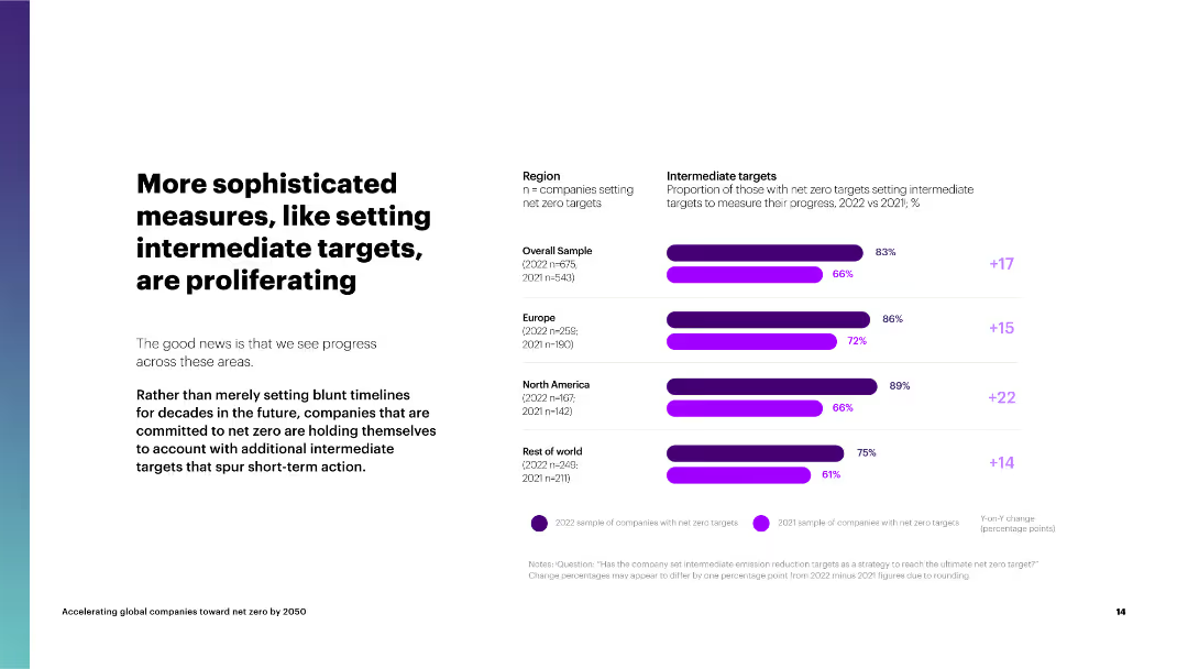
The slide features a column chart on the right comparing the proportion of companies setting intermediate targets by region and their progress.
Strategic Planning
Environmental Services & Sustainability
The slide highlights the increasing trend of companies setting intermediate targets for net zero, emphasizing the importance of short-term goals to spur action.
intermediate targets, net zero, regions, overall sample, Europe, North America, rest of world, progress
false
Strategic Planning
Environmental Services & Sustainability
Mixed Chart
Accenture
Add to my slides
Remove from favorites
This slide features a bar chart displaying the incremental cost to firm intermittent renewable resources across different regions, alongside the levelized cost of energy for gas peaking and combined cycle.
Risk Assessment and Management
Energy & Utilities
The slide examines the cost of firming intermittent renewable energy sources, comparing it with conventional gas peaking and combined cycle plants to highlight the challenges of integrating renewables.
Intermittency, Firming Cost, Renewable Energy, Comparison, Gas Peaking
false
Risk Assessment and Management
Energy & Utilities
Mixed Chart
Roland Berger
Add to my slides
Remove from favorites
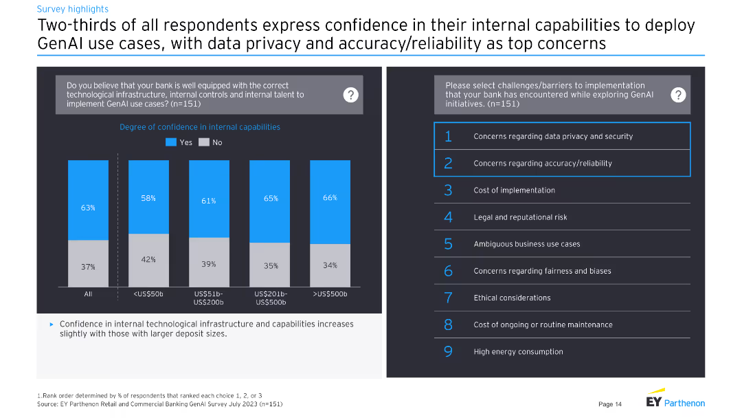
Left: stacked column chart on internal capability confidence. Right: list of top challenges in implementing GenAI.
Operational Efficiency
Financial Services
Highlights confidence in internal capabilities among banks, with data privacy and accuracy as top concerns.
internal capabilities, data privacy, security, GenAI
false
Operational Efficiency
Financial Services
Multiple Chart
EY
Add to my slides
Remove from favorites
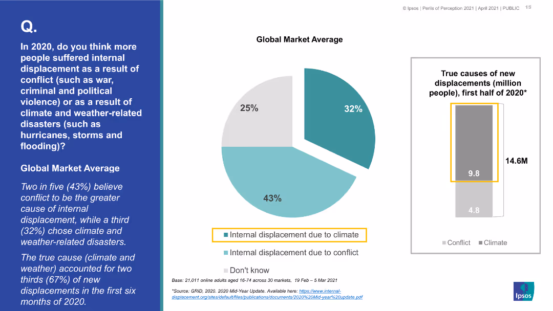
A pie chart showing the global market average of perceived causes of internal displacement (conflict vs. climate/weather-related), with a bar chart on the right providing actual displacement data in millions.
Market Analysis and Trends
Environmental Services & Sustainability
The slide examines public perceptions versus actual data on the causes of internal displacement in 2020, highlighting a common underestimation of climate and weather-related displacement compared to conflict.
internal displacement, conflict, climate disasters, public perception, actual data, global market average
false
Market Analysis and Trends
Environmental Services & Sustainability
Mixed Chart
IPSOS
Add to my slides
Remove from favorites
A comparative bar chart showing the perceived causes of internal displacement (conflict vs. climate/weather-related) for various countries, with Great Britain highlighted.
Market Analysis and Trends
Environmental Services & Sustainability
This slide contrasts public perceptions across different countries regarding the primary causes of internal displacement in 2020, comparing conflict and climate/weather-related disasters, with Great Britain highlighted.
internal displacement, conflict, climate disasters, public perception, country comparison, Great Britain
false
Market Analysis and Trends
Environmental Services & Sustainability
Multiple Chart
IPSOS
Add to my slides
Remove from favorites
Two-column layout with icons and text explaining internal QT market size vs external value impact
Strategic Planning
Artificial Intelligence
The slide defines "internal market size" as the value of QT infrastructure and services, and "value at stake" as the broader economic impact on non-QT sectors like finance and energy. It clarifies QT’s economic ecosystem.
Internal Market, Value at Stake, QT Impact, Economic Potential, Use Cases
false
Strategic Planning
Artificial Intelligence
Boxed
McKinsey
Add to my slides
Remove from favorites
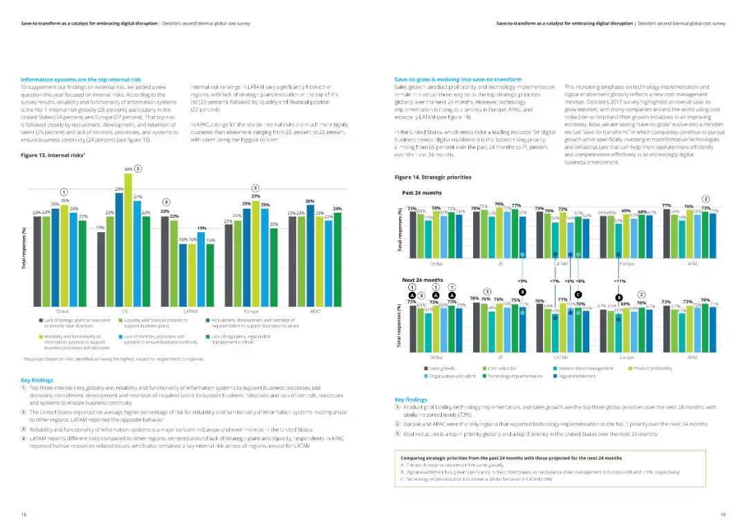
This slide contains two column charts, each showing data for different regions (Global, US, LATAM, Europe, APAC) on internal risks and strategic priorities. Key findings are highlighted in text boxes.
Risk Assessment and Management
Financial Services
The slide analyzes internal risks and strategic priorities in various regions. It highlights the top internal risks and strategic priorities for the past and next 24 months.
Internal risks, strategic priorities, regions, analysis, financial services
false
Risk Assessment and Management
Financial Services
Multiple Chart
Deloitte
Add to my slides
Remove from favorites
The slide contains a mix of pie charts, bar graphs, and a global perspective table showing various digital strategies and their impacts.
Operational Efficiency
Technology & Software
The slide details various digital strategies that have had a positive impact on organizations, focusing on improved customer experiences, employee productivity, and adapting to remote work.
internal technology, efficiency, digital strategies, customer experiences, employee productivity
false
Operational Efficiency
Technology & Software
Mixed Chart
EY
Add to my slides
Remove from favorites
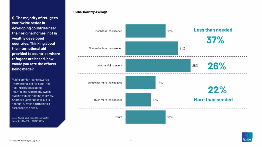
Horizontal bar chart with five answer categories, segmented into three color-coded opinion clusters (less than needed, just right, more than needed). Explanatory paragraph on the left.
Risk Assessment and Management
Government & Public Sector
This slide evaluates public opinion on the adequacy of international aid to countries hosting refugees. Responses are grouped by perception of sufficiency, revealing a general sense that support is less than needed.
international aid, refugee support, public perception, adequacy, global opinion, Ipsos, host countries, sufficiency, bar chart
false
Risk Assessment and Management
Government & Public Sector
Mixed Chart
IPSOS
Add to my slides
Remove from favorites
Contains a set of column charts evaluating the impact of international conflicts, elections, and the 2024 Olympics on business investments in France, supplemented by executive insights.
Risk Assessment and Management
Government & Public Sector
Assesses how international conflicts, political events, and major sporting events like the 2024 Olympics influence corporate investments in France.
international conflicts, political events, investment impact, France, 2024 Olympics, business risk, geopolitical risk, economic outlook, corporate strategy
false
Risk Assessment and Management
Government & Public Sector
Multiple Chart
Bain
Add to my slides
Remove from favorites
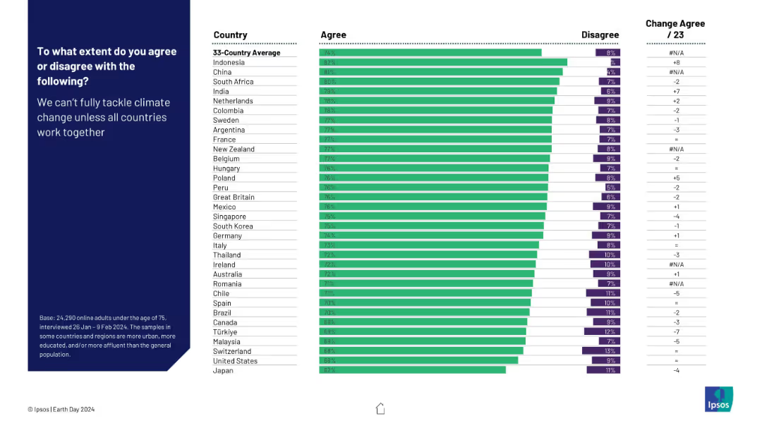
Horizontal bar chart showing agreement levels by country on global cooperation being essential for tackling climate change.
Strategic Planning
Environmental Services & Sustainability
This slide demonstrates widespread consensus on the need for international cooperation to address climate change. Agreement is high across all countries, led by Indonesia and China. The data reflects global acknowledgment that climate change requires collective, cross-border solutions.
international cooperation, climate action, global strategy, public opinion, environmental unity, policy consensus, Ipsos, Earth Day
false
Strategic Planning
Environmental Services & Sustainability
Mixed Chart
IPSOS
Add to my slides
Remove from favorites
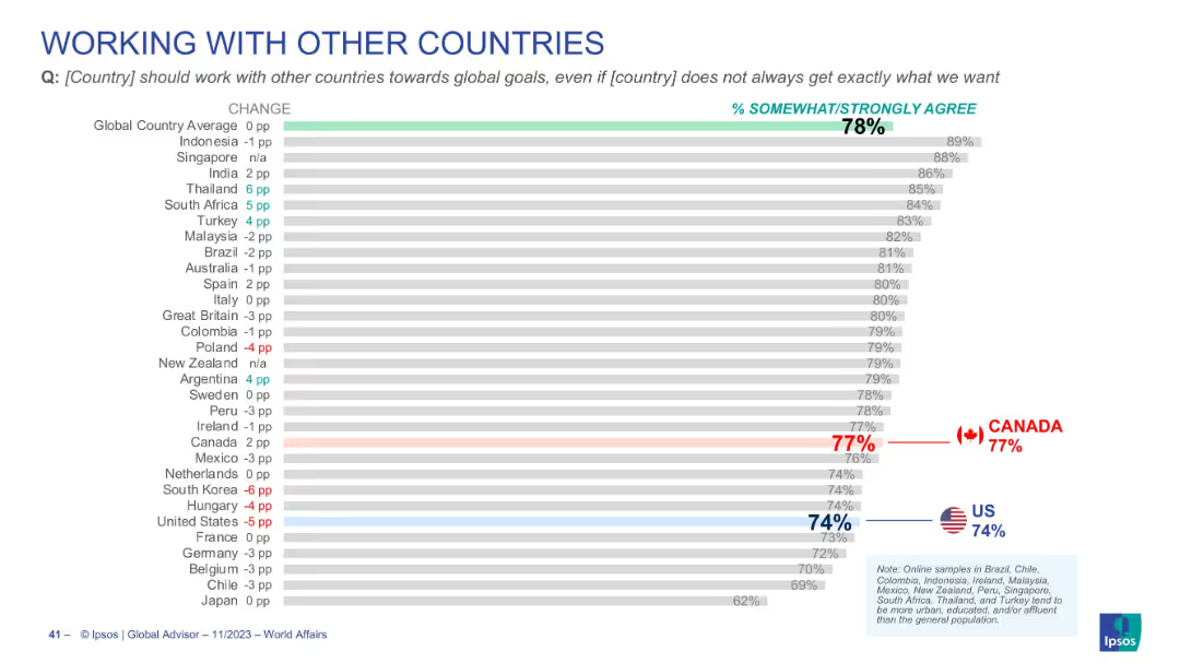
Bar chart visualizing agreement on global cooperation, global average is 78%, Canada 77%, U.S. 74%
Strategic Planning
Government & Public Sector
Highlights citizen agreement with global cooperation even at the cost of not always achieving national objectives. Emphasizes internationalism, with Canada and the U.S. near the global average.
international cooperation, diplomacy, global goals, foreign policy, Canada, US, Ipsos
false
Strategic Planning
Government & Public Sector
Single Chart
IPSOS
Add to my slides
Remove from favorites
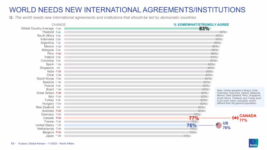
Detailed bar chart showing % agreement per country; red/blue highlights for Canada and US; consistent format with other slides.
Strategic Planning
Government & Public Sector
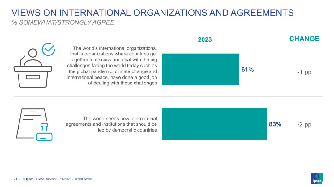
Focuses on support for new international agreements led by democracies. 83% globally agree; Canada and US slightly below average at 77% and 76% respectively. Chart reflects cross-country sentiment and how it has changed over time.
international cooperation, new institutions, democracy, global opinion
false
Strategic Planning
Government & Public Sector
Single Chart
IPSOS
Add to my slides
Remove from favorites
Slide includes a bar chart detailing the focus of various financial organizations on international expansion over the next three years. The design is well-organized, facilitating easy comparison of data across different organization types.
Strategic Planning
Financial Services
Analyzes the strategies of financial institutions planning to expand internationally, highlighting key areas and regions of focus based on emerging market potential.
international expansion, financial institutions, market opportunities, strategic planning, emerging markets
false
Strategic Planning
Financial Services
Mixed Chart
Deloitte
Add to my slides
Remove from favorites
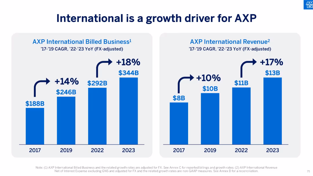
Dual-bar chart slide showing growth in billed business and revenue from 2017 to 2023.
Market Analysis and Trends
Financial Services
The slide illustrates AXP’s strong international growth, with billed business rising from $188B to $344B and revenue increasing from $8B to $13B. It reflects compounded annual growth rates (CAGR) and year-over-year (YoY) increases post-2022.
international growth, AXP, CAGR, billed business, revenue, financial growth, global expansion, FX-adjusted, business strategy
false
Market Analysis and Trends
Financial Services
Single Chart
McKinsey
Add to my slides
Remove from favorites
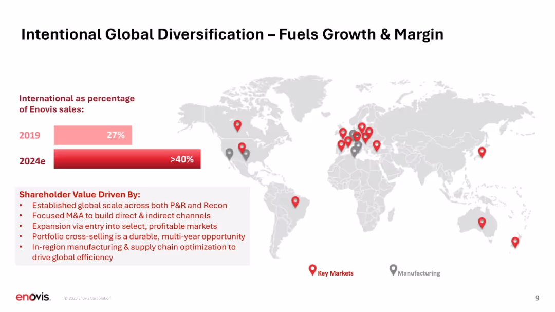
World map with location pins and bar chart comparison (2019 vs. 2024e); text box at bottom.
Strategic Planning
Healthcare & Pharmaceuticals
Demonstrates Enovis's international expansion, with a projected rise in global sales percentage from 27% to over 40%. Highlights shareholder value drivers including M&A, market entry, cross-selling, and supply chain optimization.
international growth, diversification, global strategy, shareholder value, supply chain
false
Strategic Planning
Healthcare & Pharmaceuticals
Mixed Chart
JP Morgan
Add to my slides
Remove from favorites
A world map highlighting specific regions with markers, annotated with revenue, headcount, and office numbers from 1990. Minimal text and clean design.
Industry Overview
Financial Services
Illustrates the initial international presence and expansion of the company, showing early-stage revenues, headcount, and the number of offices.
International growth, expansion, revenue, headcount, offices
false
Industry Overview
Financial Services
Graphic
Goldman Sachs
Add to my slides
Remove from favorites
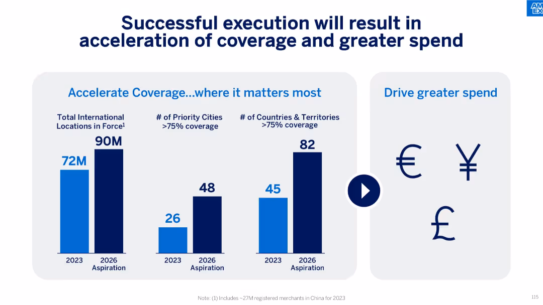
Triple bar chart on the left (locations, cities, countries) with currency icons on the right; blue gradient theme.
Strategic Planning
Financial Services
The slide communicates the company’s aspiration to increase international LIF coverage and drive spending. It forecasts growth in total locations, number of priority cities with >75% coverage, and countries meeting the same metric by 2026.
international growth, priority cities, spending increase, LIF expansion, future goals, merchant locations, Amex strategy
false
Strategic Planning
Financial Services
Mixed Chart
McKinsey
Add to my slides
Remove from favorites
Split bar chart showing agreement with two statements, labeled by year and change. Includes simple line art icons and bold text headers.
Industry Overview
Government & Public Sector
This slide outlines 2023 global agreement levels with two sentiments: satisfaction with current international orgs (61%) and the perceived need for new ones led by democratic nations (83%). Indicates slight decline from previous year.
international organizations, democratic leadership, global policy, Ipsos
false
Industry Overview
Government & Public Sector
Single Chart
IPSOS
Add to my slides
Remove from favorites
This slide features a column chart showing growth in international revenue, marked by percentages and a trend line. There is also narrative text explaining strategic goals and comparisons to peers. It utilizes a simple blue and white color palette.
Market Analysis and Trends
Financial Services
The slide communicates the growth strategy in international revenue, comparing past performance and future targets with industry peers. It's useful for investors assessing global expansion efforts and market penetration.
international revenue, growth, market penetration, strategy
false
Market Analysis and Trends
Financial Services
Mixed Chart
Goldman Sachs
Add to my slides
Remove from favorites
The slide has a clean design with bullet points outlining the strategy for international market engagement. It includes flag icons representing various countries and infographics for visual representation of the number of targeted prospects and the scope of countries in the strategic plan. The use of space and imagery is effective and visually engaging.
Strategic Planning
Financial Services
This slide outlines the strategy for international expansion, focusing on targeting non-U.S. headquartered global companies and establishing teams across various regions. It details the elements of brand recognition, global solutions, risk management, and discipline in building a presence in new markets, using flags and infographics to visually support the strategic points.
international strategy, global companies, discipline, team establishment, target prospects, risk management, expansion, growth
false
Strategic Planning
Financial Services
Header Vertical
JP Morgan
Add to my slides
Remove from favorites
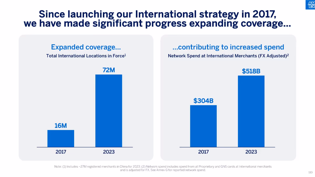
Two vertical bar charts: one for expanded international locations, another for network spend growth at international merchants.
Strategic Planning
Financial Services
This slide shows the outcome of the 2017 international strategy, highlighting significant increases in locations (from 16M to 72M) and FX-adjusted network spend (from $304B to $518B) at international merchants by 2023.
International Strategy, Merchant Spend, FX Adjusted, Location Growth, Global Expansion
false
Strategic Planning
Financial Services
Single Chart
McKinsey
Add to my slides
Remove from favorites
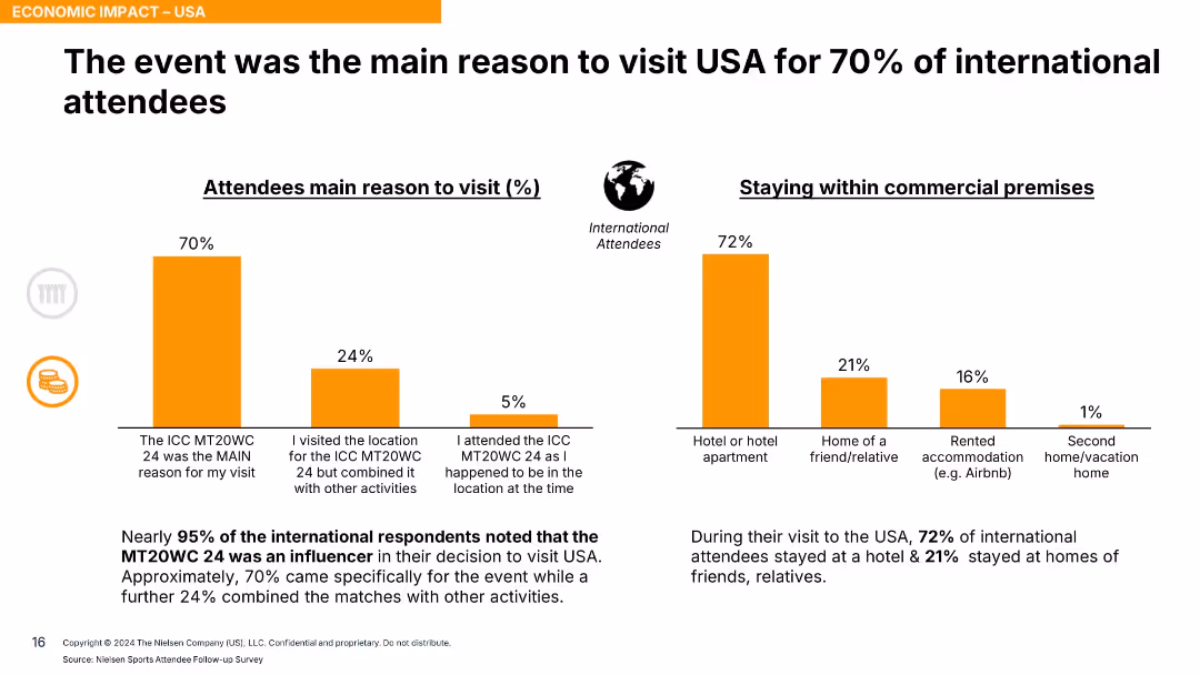
Dual bar charts with orange bars; one for visit reason, one for accommodation type; clear labeling and explanation.
Customer and Market Segmentation
Hospitality & Tourism
This slide shows that 70% of international attendees came to the USA specifically for the event, with most staying in hotels. It emphasizes the event's significance in attracting international tourism.
international tourism, ICC event, primary reason, accommodation, hotels, audience motivation
false
Customer and Market Segmentation
Hospitality & Tourism
Single Chart
Nielsen
Add to my slides
Remove from favorites
A bar chart shows the percentage of urban consumers intending to travel internationally, compared over two years. There is a clear visual distinction between the years.
Market Analysis and Trends
Hospitality & Tourism
Investigates the intent of consumers from various SEA countries to travel internationally, showing a significant rise and projecting future trends.
international travel, SEA, Singapore, Malaysia, consumer intent, urban consumers, travel trends
false
Market Analysis and Trends
Hospitality & Tourism
Mixed Chart
Bain
Add to my slides
Remove from favorites
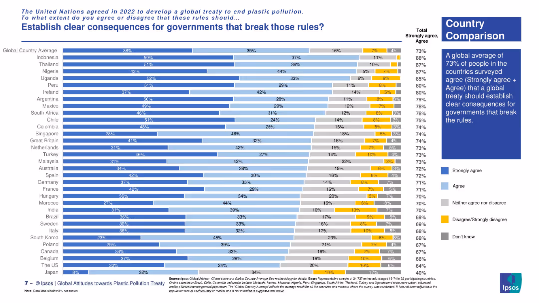
Horizontal stacked bar chart comparing country-level agreement rates. Text box summarizes key insight with visual on the right.
Regulatory and Compliance
Environmental Services & Sustainability
The slide presents country-by-country agreement levels on establishing consequences for rule-breaking governments under a global plastic treaty. Highest support is seen in Indonesia, Uganda, and Thailand, with a 73% global average.
international treaty, plastic rules, accountability, country comparison, environmental regulation, Ipsos survey, global consensus, compliance
false
Regulatory and Compliance
Environmental Services & Sustainability
Mixed Chart
IPSOS
Add to my slides
Remove from favorites
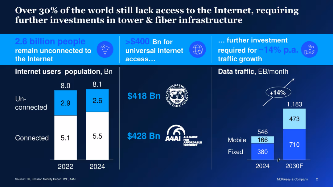
Dark-themed layout; two bar charts; icons and large headline text
Technology and Digital Transformation
Telecommunications
Illustrates global internet access gap, showing 2.6B people unconnected; underscores need for over $400B investment and 14% annual growth in data infrastructure to meet demand.
internet access, connectivity gap, fiber, infrastructure, investment, data traffic, unconnected population
false
Technology and Digital Transformation
Telecommunications
Multiple Chart
McKinsey
Add to my slides
Remove from favorites
Donut charts comparing sub-segments of internet advertising in Scandinavia for 2018 and projected for 2023, showing growth in revenues.
Market Analysis and Trends
Media & Entertainment
Discussing the dynamics of internet advertising in Scandinavia, this slide forecasts growth driven by mobile and video advertising.
internet advertising, mobile advertising, video advertising, Scandinavian market
false
Market Analysis and Trends
Media & Entertainment
Multiple Chart
PwC/Strategy&
Add to my slides
Remove from favorites
Includes a line graph and pie charts, showing the global internet advertising revenue and the shift towards mobile display.
Market Analysis and Trends
Media & Entertainment
Details the trends in internet advertising with a focus on the rise of mobile display ads, driven by advancements in 5G and IoT.
internet advertising, mobile display, global, 5G, IoT
false
Market Analysis and Trends
Media & Entertainment
Multiple Chart
PwC/Strategy&
Add to my slides
Remove from favorites
Provides a column chart showing the rise in global and Indian internet advertising revenues from 2020 to 2025.
Market Analysis and Trends
Media & Entertainment
Details the rapid growth of internet advertising, highlighting India as the fastest-growing market in this segment.
internet advertising, revenue growth, global market, India, 2025 forecast, digital marketing
false
Market Analysis and Trends
Media & Entertainment
Multiple Chart
PwC/Strategy&
Add to my slides
Remove from favorites
Two pie charts show home internet connection status and data download sources. Text blocks provide explanatory notes.
Market Analysis and Trends
Telecommunications
Discusses the prevalence of home internet in Australia and the dominant use of home broadband for data downloads, highlighting technological reach and utility.
internet, Australia, broadband, connectivity, data usage, mobile, technology, pie charts
false
Market Analysis and Trends
Telecommunications
Multiple Chart
Accenture
Add to my slides
Remove from favorites
Previous
Next
You don't have any favorites yet.
Please wait loading your favorites slides...
Create a FREE account to continue browsing
Receive Instant Access to 1,000+ slides from companies like McKinsey, Google, and Goldman Sachs
First Name
Last Name
Email
Password
I agree to all
Terms & Privacy Policy
Thank you! Your submission has been received!
Oops! Something went wrong while submitting the form.
Have an account?
Sign in
Upgrade to PRO to Save slides
Advanced Search and Filters
Access to 15,000+ slides
Access to Category Pages
Save/Bookmark Slides
PowerPoint Template Library
Pick a Plan
MONTHLY
$12/month
Billed every month, Cancel anytime.
YEARLY
$9/year
Billed $108 annually, Cancel anytime.
Checkout for $12/month
Checkout for $108/yr
Secured by Stripe | AES-256 bit encryption