My Account
My Slides
Search by Category
Templates
View All Templates
Download Template Slides
✦ AI Search
Feedback
Login
Logout
Get Started
Browse all Slides
Browse all Slides
Create a FREE Account
Instant access to 1,000+ real slides from top companies like McKinsey, BCG, Goldman Sachs, Google and many more!
First Name
Last Name
Email
Password
I agree to all
Terms & Privacy Policy
Thank you! Your submission has been received!
Oops! Something went wrong while submitting the form.
Have an account?
Sign in
Saved Slides
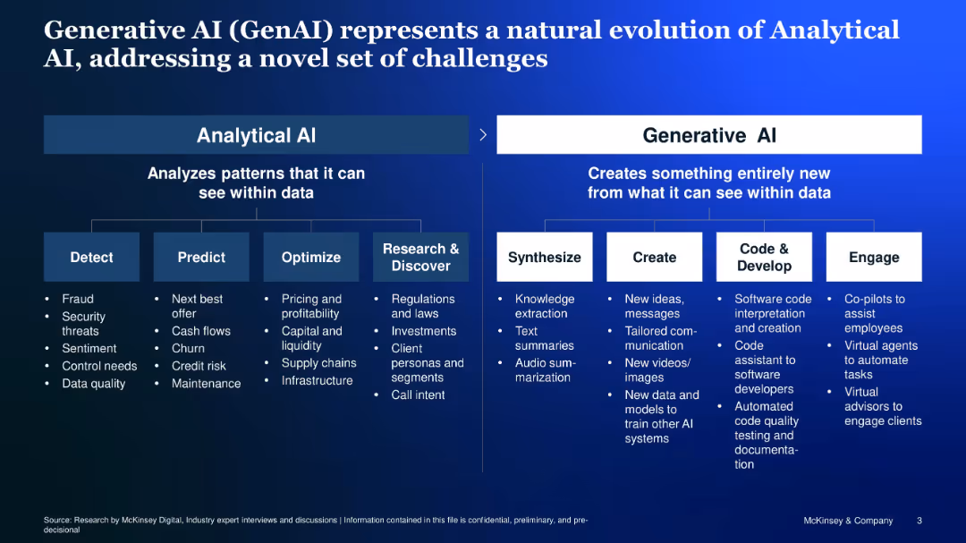
Two-panel comparison of Analytical vs. Generative AI, with icons and structured bullet points
Technology and Digital Transformation
Artificial Intelligence
Compares Analytical AI (focused on detection, prediction, optimization) with Generative AI (focused on synthesis, creation, development, engagement), showcasing how GenAI tackles a new class of problems.
Analytical AI, Generative AI, synthesis, creation, code, co-pilot
Diagram
McKinsey
Saved
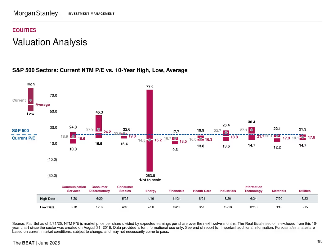
Bar chart comparing Current, Average, and High/Low 10-Year NTM P/E ratios across S&P 500 sectors. Includes color-coded bars and dashed reference lines.
Market Analysis and Trends
Financial Services
This slide compares the current NTM P/E ratios of S&P 500 sectors with their 10-year high, low, and average values. It highlights how the current valuations sit relative to historical trends, with Energy showing an extreme deviation (note: not to scale). S&P 500's current P/E is marked for comparison.
P/E ratios, valuation, equities, sector analysis, S&P 500, historical averages, extremes, earnings, financial metrics, data visualization
Mixed Chart
Morgan Stanley
Saved
Circular icons and text describing four strategic approaches for banks to unlock value: improving existing services, expanding reach, offering non-financial products, and exploring new frontiers.
Strategic Planning
Financial Services
Outlines four key strategic initiatives for banks to enhance customer relationships and unlock potential growth opportunities.
strategic plays, banking, customer relationships, value, expansion, non-financial products, new frontiers, growth
Multiple Chart
Accenture
Saved
Contains column chart and bullet points demonstrating revenue trajectories and growth drivers for upcoming years. Emphasizes areas like Corporate Bank and Investment Bank, with annotations for projected growth.
Financial Performance
Financial Services
Details the bank's strategic positioning and expected revenue growth, focusing on specific financial services sectors and strategies for diversification and resilience in market positioning.
financial planning, revenue growth, strategic positioning, diversification, banking
Mixed Chart
Deutsche Bank
Saved
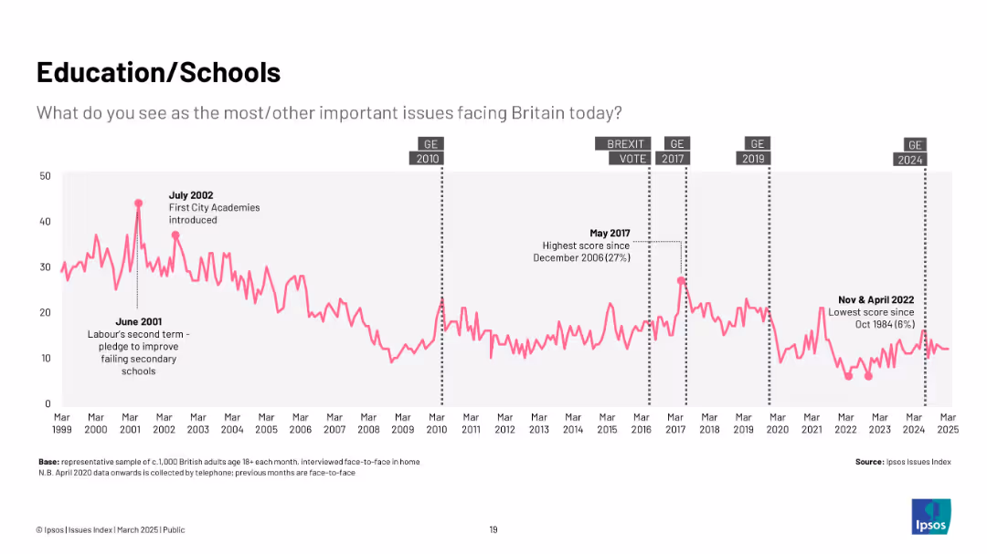
Pink line graph from 1999–2025, highlighting key education reforms and concern levels.
Market Analysis and Trends
Education & Training
Displays changing public concern about education, with spikes during reforms like the introduction of City Academies. Concern has decreased steadily since 2020.
education, schools, public concern, UK policy, Ipsos, reform, secondary education, Labour government
Single Chart
IPSOS
Saved
A slide featuring a bar chart showing an 80% revenue growth in ITS collaboration revenues from 9M16 to 9M18, and another chart showing the penetration of structured products among private banking clients.
Strategic Planning
Financial Services
This slide highlights the growth in ITS collaboration revenues and the penetration of structured products among private banking clients, indicating significant progress and future opportunities.
ITS collaboration, revenue growth, structured products, private banking, financial services, market penetration, strategic planning, growth opportunity
Multiple Chart
Credit Suisse
Saved
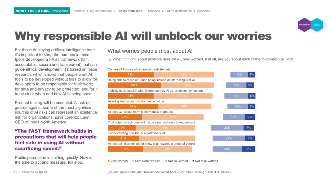
Left panel text; right panel horizontal bar chart indicating worry levels; categories use color-coded segments.
Risk Assessment and Management
Artificial Intelligence
Lists top public concerns regarding AI (e.g., privacy, bias, misinformation). Visual data shows levels of worry using segmented bar charts to represent varying degrees of concern from "Very worried" to "Not worried". Tied to Ipsos' FAST (fair, accountable, secure, transparent) framework.
AI ethics, public concerns, privacy, misinformation, bias, accountability, FAST framework
Mixed Chart
IPSOS
Saved
Slide includes horizontal bar graphs in purple, detailing automation levels across different premium segments and lines of business.
Operational Efficiency
Financial Services
Explores the extent of automation in underwriting processes across various segments and business lines.
automation, underwriting, business lines, premiums
Single Chart
Accenture
Saved
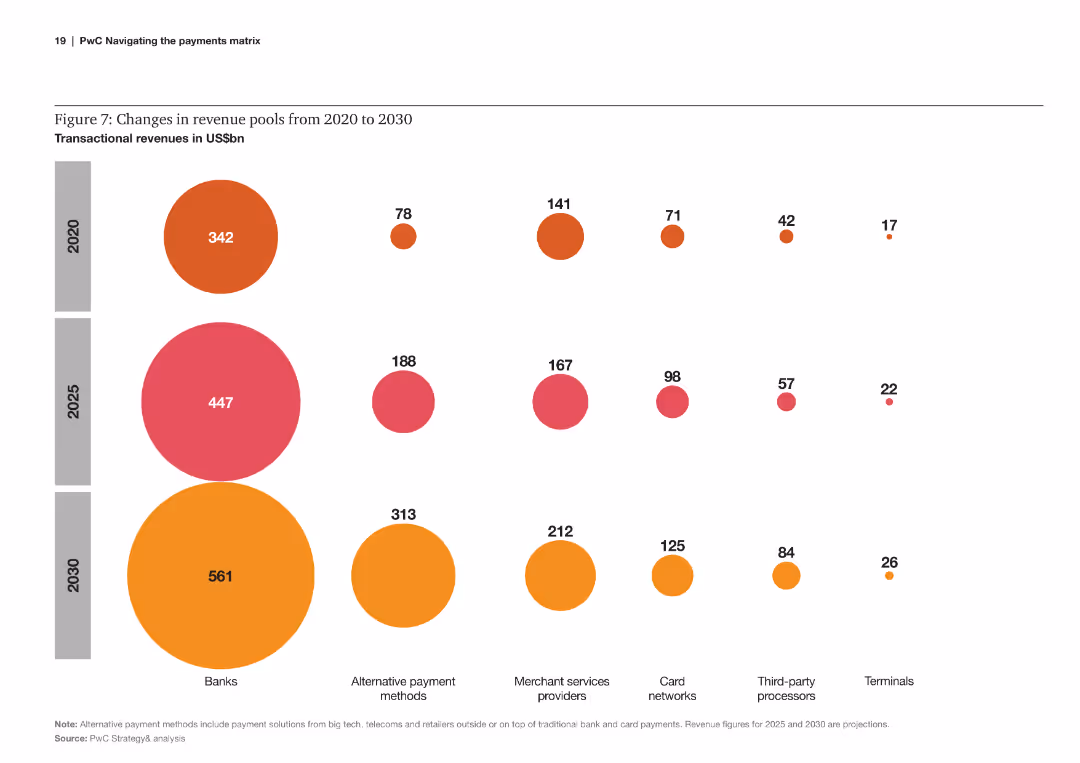
Bubble chart comparing changes in transactional revenues across various payment sectors from 2020 to 2030.
Financial Performance
Financial Services
The slide analyzes the changes in revenue pools within different payment sectors, projecting significant shifts by 2030.
revenue, pools, transactional, changes, payment sectors, 2020, 2030, projections
Multiple Chart
PwC/Strategy&
Saved
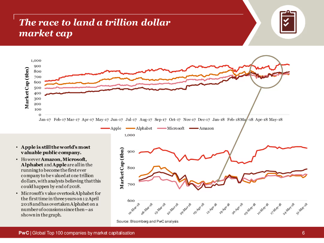
The slide features a line chart tracking the market caps of Apple, Alphabet, Microsoft, and Amazon from 2017 to 2018. The lines are color-coded for each company, with a magnified section highlighting recent trends. The layout includes a brief text summary on the left, explaining the race to a trillion-dollar valuation.
Market Analysis and Trends
Financial Services
This slide analyzes the market cap trends of major tech companies competing to reach a trillion-dollar valuation. The line chart provides a visual comparison of Apple, Alphabet, Microsoft, and Amazon over time, highlighting the competitive landscape and significant milestones in their market cap growth.
Trillion-dollar market cap, tech companies, market trends, Apple, Alphabet, Microsoft, Amazon, line chart
Multiple Chart
PwC/Strategy&
Saved
This slide features multiple line charts tracking the net interest margin development for Corporate and Private Banks. It includes column charts showing group NIM development. There's a side panel with key highlights in bullet points.
Financial Performance
Financial Services
The slide illustrates the development of net interest margins within a financial institution, comparing corporate and private banking sectors over several quarters.
NIM, banking, financial analysis, interest rates, quarterly performance
Multiple Chart
Deutsche Bank
Saved
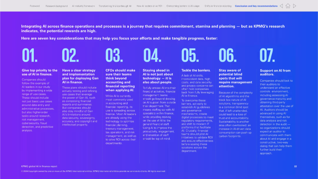
Full-slide infographic style with large numbered blocks and brief text per section; purple gradient background
Strategic Planning
Financial Services
This slide summarizes seven strategic considerations for implementing AI in finance, covering priorities like planning, technology, transparency, and the role of auditors. It serves as a checklist or guide for finance teams integrating AI.
AI strategy, implementation, finance checklist, Gen AI, transparency, planning, auditing, governance
Linear Flow
KPMG
Saved
Diagram of agile principles and their impact on management, with color-coded sections and descriptive text.
Operational Efficiency
Professional Services
Details how agile methodologies influence manager and team dynamics, focusing on alignment, trust, and transparency, beneficial for implementing agile practices in companies.
agile methodology, team dynamics, management efficiency, organizational change, professional services, alignment, trust, transparency
Diagram
BCG
Saved
Describes the expected impact of ML industrialization across various sectors, with representative icons for each.
Technology and Digital Transformation
Technology & Software
Explores the potential impact of ML industrialization across a variety of industries and how it could offer competitive advantages.
ML, industries, impact, tech trend, competitive advantage
Header Vertical
McKinsey
Saved
The slide contains a column chart comparing gender diversity percentages across various professional levels. It includes textual explanations and a footnote defining "women of color."
Human Resources and Talent Management
Professional Services
This slide presents statistics on gender diversity within investment professionals, emphasizing the underrepresentation of women and the higher burden of dependent care among female employees.
Gender diversity, Investment professionals, Women in VC, Dependent care, Diversity statistics
Mixed Chart
Deloitte
Saved
This slide features three column charts comparing the "Worst case," "Base case," and "Best case" scenarios for 2019 with data points and percentages.
Market Analysis and Trends
Consumer Goods
Analyzes different growth scenarios for the luxury goods market in 2019 based on the holiday season's performance, Hong Kong's situation, and the US/China trade war.
Market scenarios, Growth impact, Trade war
Multiple Chart
Bain
Saved
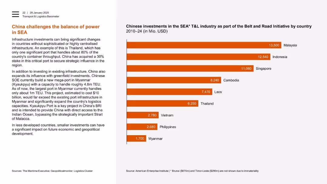
Left-aligned text with horizontal bar chart on right ranking investments by country.
Strategic Planning
Transportation & Logistics
China’s influence in Southeast Asia’s logistics is illustrated through investments in strategic ports. A chart ranks Malaysia, Indonesia, and Singapore as top recipients. Myanmar’s Kyaukpyu port is a key future asset, underscoring China’s regional ambitions.
SEA, Chinese investment, ports, Myanmar, Kyaukpyu, Thailand, infrastructure, geopolitical influence
Mixed Chart
PwC/Strategy&
Saved
The slide features a bar chart on the left showing the share of global CO2 emissions by country and a column chart on the right showing global CO2 emissions per capita.
Market Analysis and Trends
Environmental Services & Sustainability
It presents the distribution of CO2 emissions by country and compares per capita emissions, offering insights into the global contributions to greenhouse gas emissions.
CO2 emissions, global warming, environmental impact, greenhouse gases, country comparison, per capita emissions, J.P. Morgan, climate data, sustainability, carbon footprint
Multiple Chart
JP Morgan
Saved
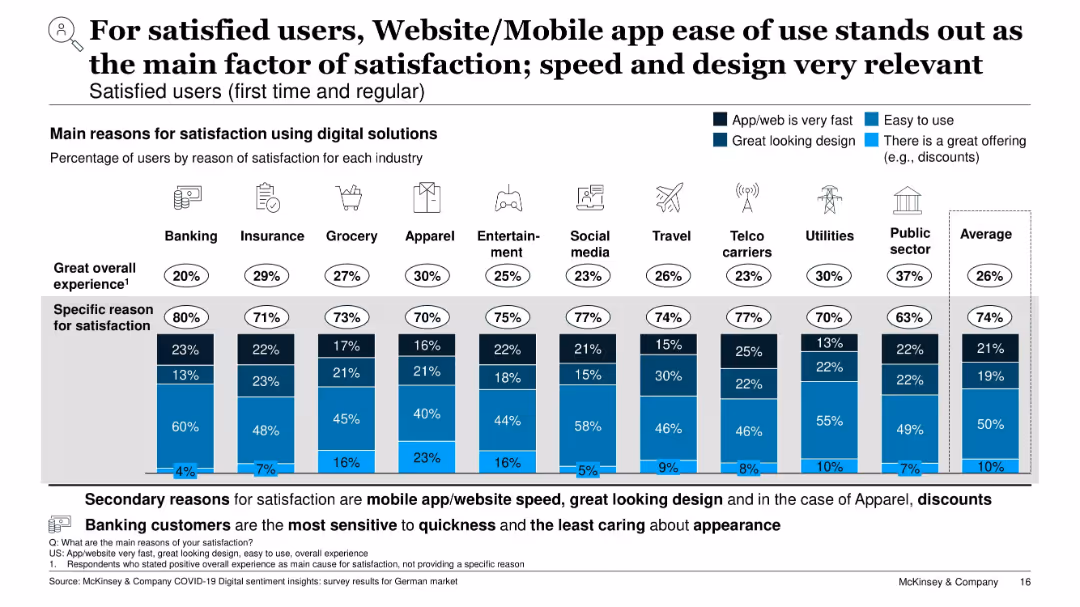
Stacked bar chart by industry; reasons for satisfaction coded by color (ease of use, speed, design, offers, overall)
Performance Metrics and KPIs
Technology & Software
The slide outlines key reasons for digital satisfaction. Ease of use is the most cited factor across all industries, followed by speed and attractive design. Each bar shows the breakdown of reasons given by satisfied users, with Banking customers valuing speed most and Apparel customers influenced by offers.
ease of use, digital satisfaction, mobile design, app speed, customer experience, performance drivers, KPIs
Single Chart
McKinsey
Saved
A diamond-shaped quadrant with four segments shows Goldman Sachs services, juxtaposed with Orsted’s services on the right.
Organizational Structure and Change
Financial Services
Describes Goldman Sachs' comprehensive service structure and how it supports a local client with global capabilities through different services.
Goldman Sachs, Global Markets, Asset Management, Investment Banking, Client Services, Orsted, Financing, Advising
Header Vertical
Goldman Sachs
Saved
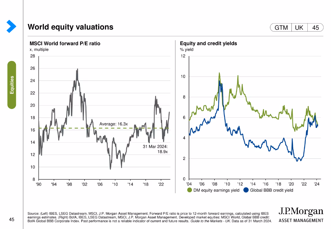
Two charts: one shows the MSCI World forward P/E ratio, and the other depicts equity and credit yields comparing developed market equity earnings yield with global BBB credit yield.
Investment Analysis
Financial Services
This slide provides an overview of global equity valuations, comparing forward P/E ratios and yields for equity and credit. Used for investment evaluation and portfolio management.
Equity, valuations, P/E ratio, yields, MSCI
Multiple Chart
JP Morgan
Saved
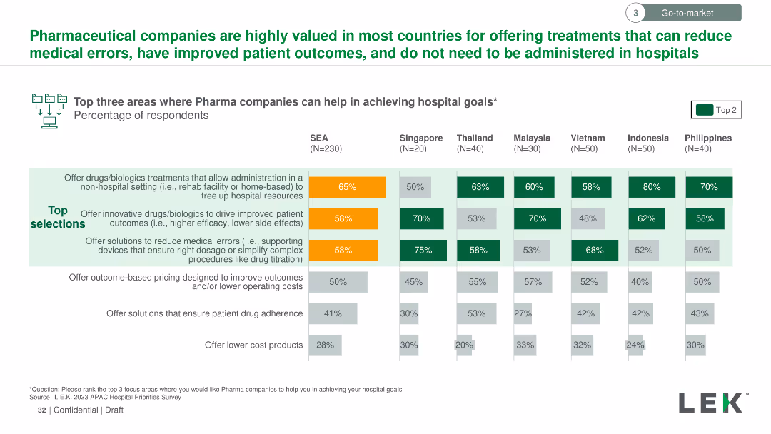
The slide uses a column chart to show the percentage of respondents selecting top areas where pharmaceutical companies can help achieve hospital goals across multiple countries. Key areas highlighted with orange and green colors.
Strategic Planning
Healthcare & Pharmaceuticals
The slide illustrates the top three areas where pharmaceutical companies can aid hospitals, focusing on non-hospital drug administration, innovative drug solutions, and medical error reduction. Data is broken down by country in Southeast Asia.
Pharmaceutical, hospitals, goals, respondents, percentage, non-hospital, innovative, error reduction
Multiple Chart
LEK
Saved
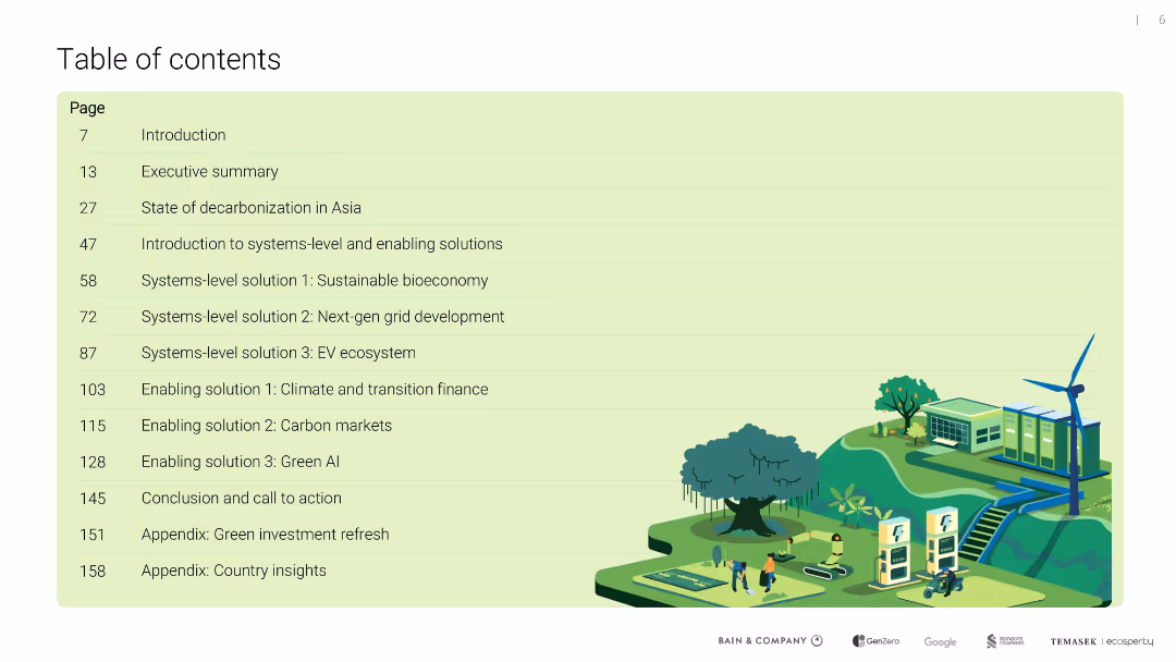
Full-page green-tinted slide with a clean tabular list of page numbers and section titles; illustrated bottom area with eco-themed imagery (windmill, EV, solar panel)
Strategic Planning
Environmental Services & Sustainability
Provides a structured overview of the report’s sections, covering decarbonization strategies, enabling technologies, climate finance, and regional green investment insights in Asia.
table of contents, decarbonization, systems-level solutions, finance, green AI
Agenda
Bain
Saved
The slide includes a map of Asia with annotations and percentages indicating market positions and growth. Awards and key strengths are listed on the right side.
Market Analysis and Trends
Financial Services
This slide showcases the company's strong regional footprint in Asia, highlighting market positions, growth percentages, and recent awards, emphasizing strengths in APAC IBCM and PB.
Regional Growth, APAC, Market Position, Awards, Strengths
Graphic
Credit Suisse
Saved
Text and stacked column charts detailing fee preferences among different age groups of investors
Technology and Digital Transformation
Financial Services
Discusses fee preferences among young and older investors, focusing on performance-based fees and the shift in pricing structures.
investor fees, performance-based, age differences, financial services
Mixed Chart
Deloitte
Saved
Previous
Next
If nothing, comes up, please save your slides first
Create a FREE account to continue browsing
Receive Instant Access to 1,000+ slides from companies like McKinsey, Google, and Goldman Sachs
First Name
Last Name
Email
Password
I agree to all
Terms & Privacy Policy
Thank you! Your submission has been received!
Oops! Something went wrong while submitting the form.
Have an account?
Sign in
Column Chart
Heatmap
Chevron
Org Chart
Infographic
Callouts
Timeline
List
Graphic
Picture
Process Flow
Diagram
Paragraph
Map
Table
Framework
Subtitle
Takeaway Box
Icon
Other Chart
Radar Chart
Waterfall Chart
Mekko Chart
Pie Chart
Scatter Plot
Line Chart
Bar chart
Bullet points