My Account
My Slides
Search by Category
Templates
View All Templates
Download Template Slides
✦ AI Search
Feedback
Login
Logout
Get Started
Browse all Slides
Browse all Slides
Create a FREE Account
Instant access to 1,000+ real slides from top companies like McKinsey, BCG, Goldman Sachs, Google and many more!
First Name
Last Name
Email
Password
I agree to all
Terms & Privacy Policy
Thank you! Your submission has been received!
Oops! Something went wrong while submitting the form.
Have an account?
Sign in
Saved Slides
Compares the weekly study hours before and after solar power adoption in Nigerian boarding schools, using column charts to visualize the data.
Strategic Planning
Education & Training
Highlights the effectiveness of solar power in increasing study hours at night, presenting data that shows enhanced educational outcomes and improved academic performance among students.
education, solar power, Nigeria, boarding schools, study hours, night studies, academic improvement
Mixed Chart
BCG
Saved
The slide uses a scatter plot to display the distribution of organizations based on their AI capabilities. Different colors indicate various categories of AI proficiency.
Performance Metrics and KPIs
Technology & Software
It identifies different levels of AI adoption among organizations, categorizing them into Achievers, Builders, Innovators, and Experimenters based on their AI capabilities and performance.
AI achievers, capabilities, scatter plot, performance, categorization
Mixed Chart
Accenture
Saved
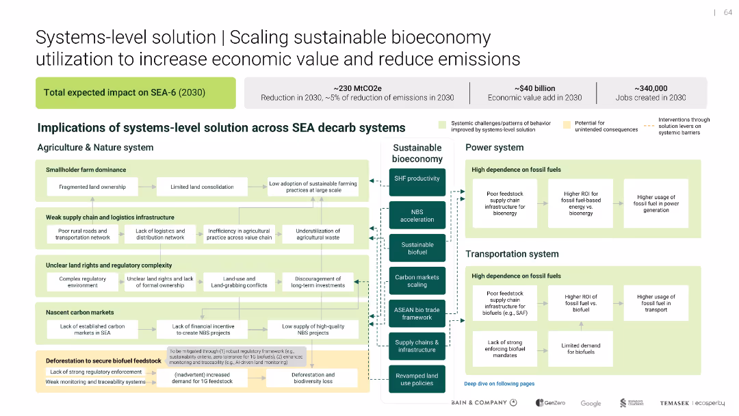
Scaling sustainable bioeconomy utilization
Technology and Digital Transformation
Environmental Services & Sustainability
Technology and Digital Transformation
Maps how a sustainable bioeconomy can impact agriculture, energy, and transport systems in SEA. Identifies system inefficiencies and outlines intervention points to unlock ~$40B value and reduce emissions by ~230 MtCO2e.
Uncategorized
Bain
Saved
Contains a pie chart, using contrasting colors (green, purple, black) to highlight differences in perceptions between frontline employees and leaders.
Human Resources and Talent Management
Technology & Software
Highlights the variance in trust levels regarding responsible AI use between frontline employees and organizational leaders.
trust, AI, perception, employees, leaders
Multiple Chart
BCG
Saved
The slide features a comprehensive table and icons showing policy strategies, enablers, and interventions for developing the battery industry in Australia.
Competitive Landscape
Energy & Utilities
This slide presents six key policy strategies needed to establish a competitive battery industry in Australia. It categorizes strategies and their impact on industry facilitation and regional partnerships.
Australia, battery industry, policy strategies, international competition, speed and scale
Table
Accenture
Saved
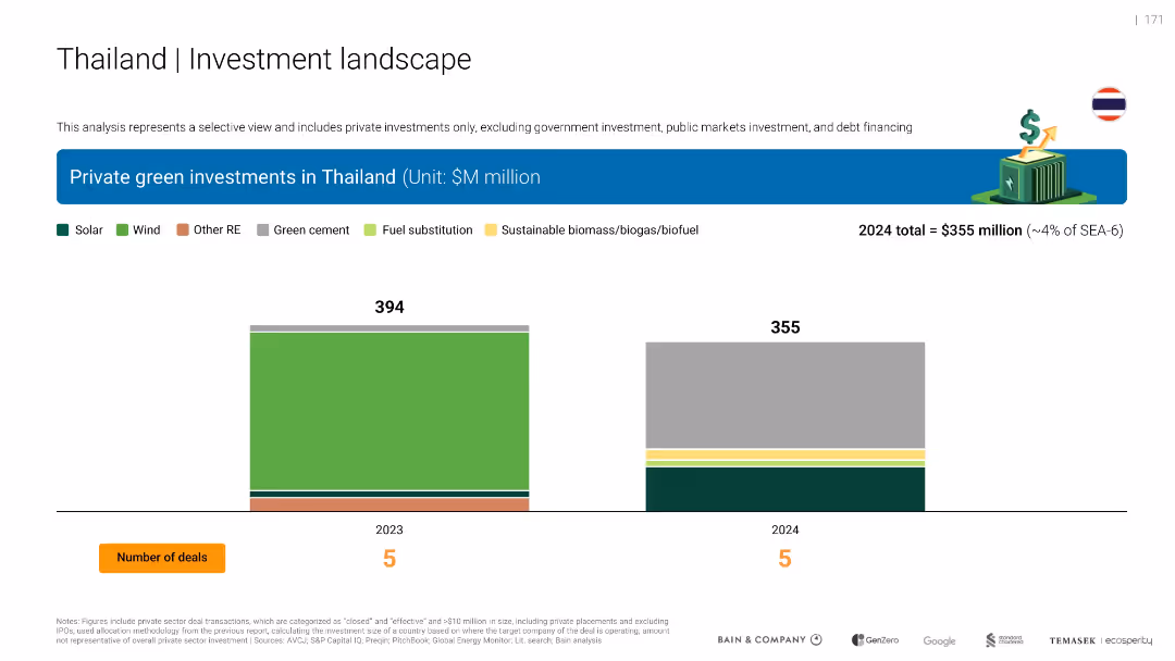
Dual bar chart for 2023 and 2024 green private investments in Thailand, broken down by solar, wind, and other RE. Color-coded bars and number of deals included.
Investment Analysis
Environmental Services & Sustainability
Compares Thailand’s private green investments from 2023 ($394M) to 2024 ($355M), showing a slight decline. Investment sectors include solar, wind, biomass, and cement. Each year had 5 deals.
Thailand, solar, wind, RE, investment decline, biomass, cement, 2024
Single Chart
Bain
Saved
A column chart showing the reduction in cost per private transaction over time, with significant drops from the prototype stage to Nightfall introduction and further with batching. Includes bullet points about the technological progress and regulatory compliance features.
Technology and Digital Transformation
Technology & Software
Details the technological advancements made in reducing transaction costs on public blockchains, highlighting significant milestones and the role of regulatory compliance.
Technological progress, private transactions, business agreements, public blockchains, cost reduction, regulatory compliance
Mixed Chart
EY
Saved
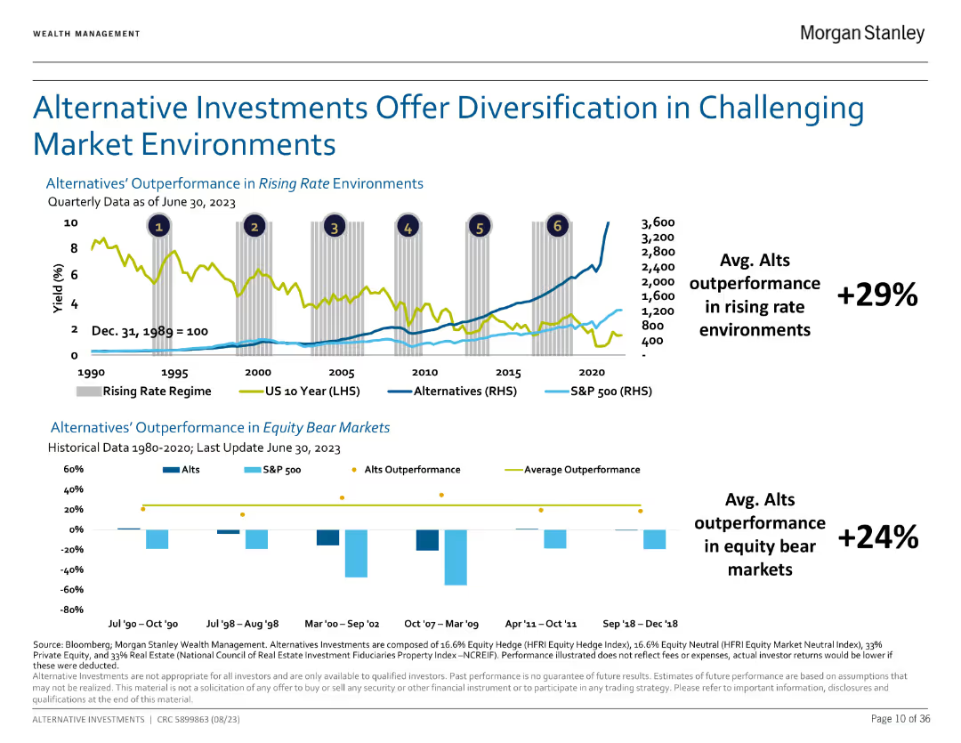
Dual chart illustrating outperformance of alternatives in rising rate environments and equity bear markets.
Market Analysis and Trends
Financial Services
Shows how alternatives have historically outperformed traditional assets in various market conditions.
Alternatives, diversification, performance
Multiple Chart
Morgan Stanley
Saved
Includes column charts with red accents and annotations for EBITA and profitability, along with text explanations and a projection outlook.
Financial Performance
Industrial & Manufacturing
Summarizes the aircraft sector's performance, showing order and revenue trends and EBITA. Outlines expectations related to specific aircraft programs and R&D activities.
aircraft, EBITA, profitability, orders, revenue trends, R&D activities, EFA Kuwait, M-345/M-346, Tempest
Multiple Chart
Goldman Sachs
Saved
Contains multiple bar graphs and a small text section comparing the effects of different treatments on COVID-19 patient outcomes, highlighting dexamethasone and remdesivir.
Product and Service Analysis
Healthcare & Pharmaceuticals
Evaluates the effectiveness of various treatments like dexamethasone and remdesivir on COVID-19, useful for medical professionals and health service planners.
COVID-19, treatment outcomes, dexamethasone, remdesivir, therapeutics, patient care
Multiple Chart
McKinsey
Saved
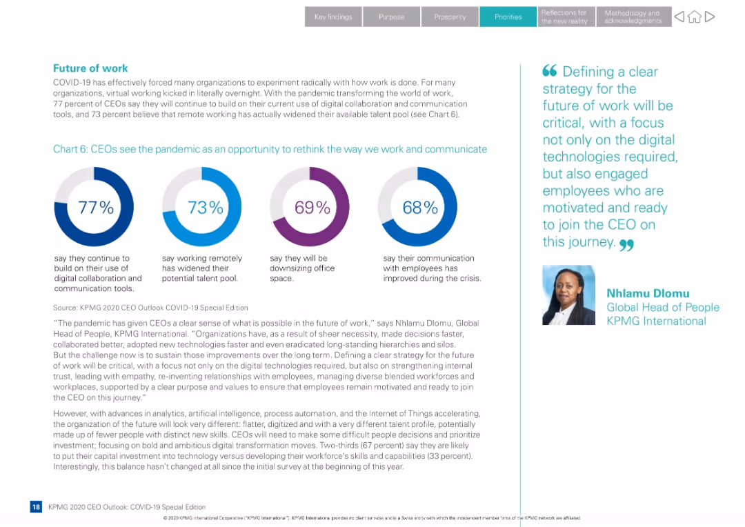
Layout with four circular infographics and supporting text; quote from KPMG Global Head of People on the right
Human Resources and Talent Management
Professional Services
CEOs reflect on how COVID-19 changed work. Majority plan to continue remote work tools and see an expanded talent pool. Slide also explores communication improvements and office downsizing.
remote work, future of work, digital tools, talent pool, communication, office space, KPMG, employee strategy
Mixed Chart
KPMG
Saved
Column charts and tables are used to illustrate the number of IPOs and proceeds in Europe, including main and junior markets.
Market Analysis and Trends
Financial Services
It details the performance of IPOs in Europe, highlighting major stock exchanges, sectors, and notable IPOs by proceeds.
Europe, IPOs, main markets, junior markets, stock exchanges
Multiple Chart
EY
Saved
The slide contains a pie chart detailing revenue distribution across market segments in 2018. There are also three images illustrating each sector—subsea robotics, wind turbines, and offshore cables.
Industry Overview
Energy & Utilities
This slide provides a breakdown of a company's revenue across different market segments in 2018, highlighting its diversification and strength in areas like subsea operations and renewable energy solutions.
revenue, market segments, energy, subsea, renewables
Mixed Chart
Barclays
Saved
Column charts displaying total TLAC, CET1 capital, and leverage ratios
Financial Performance
Financial Services
Shows capital and leverage ratios, including CET1 capital ratio guidance and leverage ratio guidance
TLAC, CET1, leverage, ratios, capital
Multiple Chart
UBS
Saved
Slide with a comparison chart showing the purchase decisions in the fitness industry related to initial consideration, active evaluation, and loyalty. It compares fitness with other industries like airlines, hotels, and streaming entertainment.
Competitive Landscape
Healthcare & Pharmaceuticals
Highlights the importance of brand consideration and loyalty in the fitness industry, showing how fitness ranks among other industries in consumer purchase decisions. Useful for strategic planning in marketing and customer loyalty enhancement within the fitness sector.
Fitness industry, consumer loyalty, purchase decisions, competitive analysis, brand strategy
Mixed Chart
McKinsey
Saved
Table layout describing key measures and commitments of Germany's Hydrogen Strategy with icons illustrating different sectors like generation and infrastructure.
Regulatory and Compliance
Energy & Utilities
Describes Germany's hydrogen strategy with an emphasis on infrastructure, partnerships, and regulations to enhance the use of hydrogen as a sustainable energy source.
Germany, hydrogen, strategy, infrastructure, partnerships, 2020-2030
Multiple Chart
McKinsey
Saved
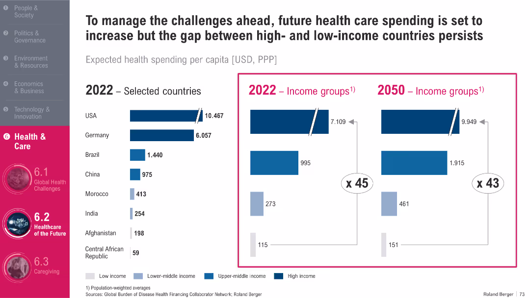
Dual charts: bar chart (left) for country data, bar chart (right) for income groups; strong contrast in bar coloring
Strategic Planning
Healthcare & Pharmaceuticals
This slide compares healthcare spending per capita across countries and income groups (2022 vs. 2050). It shows a widening gap between high- and low-income nations, despite overall increases in global healthcare investment. The disparity suggests persistent inequities in healthcare access and quality.
Healthcare Spending, Inequality, Forecast, PPP, Global Health Systems
Single Chart
Roland Berger
Saved
Line graph detailing quarterly podcast advertising revenue from Q1 2015 to Q4 2016, illustrating a steady increase. A compound quarterly growth rate (CQGR) is noted, showing the progression of growth.
Market Analysis and Trends
Media & Entertainment
Focuses on the detailed quarterly growth of podcast advertising revenue, highlighting consistent increases and providing a compound growth rate. Useful for detailed financial analysis and planning in media.
podcast, quarterly, revenue, CQGR
Single Chart
PwC/Strategy&
Saved
Column chart show deposit amounts and percentages by channels from Q4 2019 to Q1 2022 and deposit target goals for 2024. An arrow indicates a significant increase in deposits through strategic channels, accompanied by explanatory text.
Financial Performance
Financial Services
Showcases the increase in deposits over time, focusing on the strategic channels contributing to growth. It sets forth target goals for consumer and transaction banking deposits by 2024, reflecting the company's ambitions and market analysis efforts.
deposit growth, strategic channels, 2024 targets, market analysis, column chart
Mixed Chart
Goldman Sachs
Saved
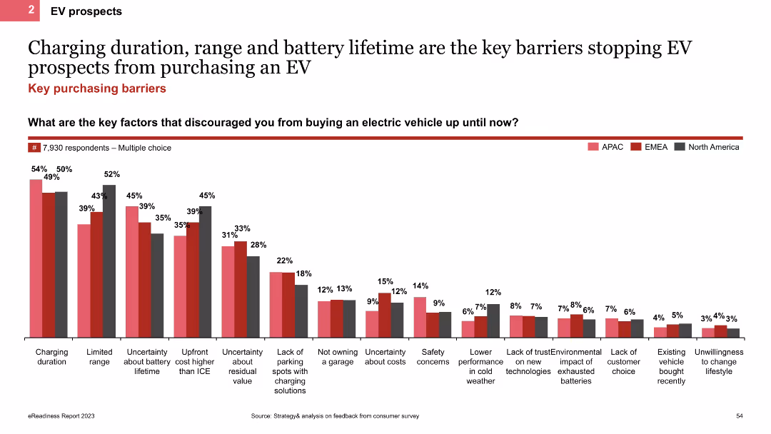
The slide uses a column chart to show the main barriers preventing EV purchases, such as charging duration, range, and battery lifetime. It includes regional comparisons indicated by colored bars for APAC, EMEA, and North America.
Market Analysis and Trends
Transportation & Logistics
This slide analyzes the key barriers to EV adoption, focusing on issues like charging duration, range, and battery lifetime. It provides regional data to show how these barriers vary across different areas.
EV barriers, column chart, charging duration, battery lifetime
Single Chart
PwC/Strategy&
Saved
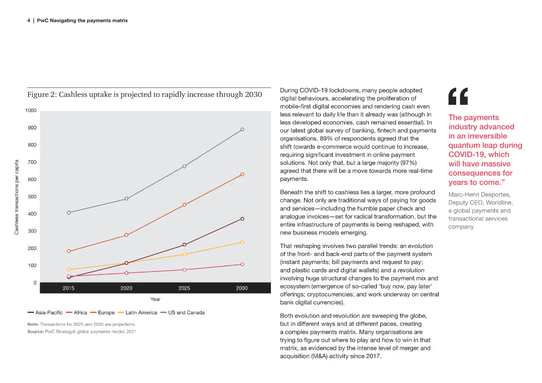
A line chart showing the projected increase in cashless transactions per capita across different regions from 2015 to 2030.
Market Analysis and Trends
Financial Services
This slide explains the projected increase in cashless transactions per capita globally, driven by digital behaviors post-COVID.
cashless, uptake, projection, regions, per capita, 2015, 2030, digital behaviors, COVID
Mixed Chart
PwC/Strategy&
Saved
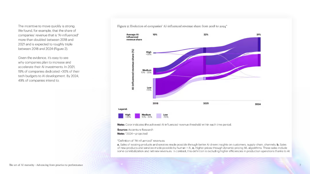
The slide features a large section of text explaining the importance of AI maturity, accompanied by a column chart illustrating the projected time for AI transformation compared to digital transformation.
Market Analysis and Trends
Technology & Software
This slide emphasizes the critical role of AI in gaining competitive advantage, highlighting survey data on the importance of AI, and showing a projection of AI transformation timelines.
AI maturity, competitive advantage, transformation, digital transformation, survey data
Pillar
Accenture
Saved
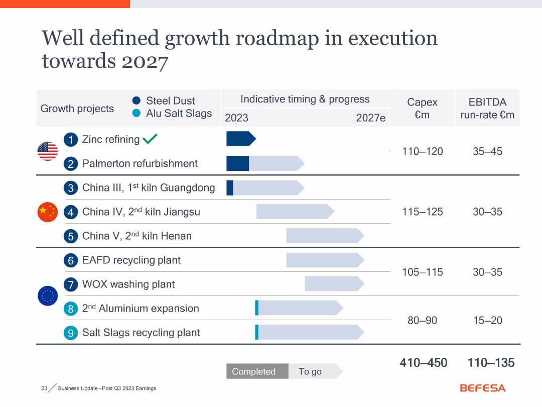
Identical layout as slide 18021; duplicate showing project timelines, status, Capex, and EBITDA across growth initiatives.
Strategic Planning
Industrial & Manufacturing
Repeats the visual and data of slide 18021: summarizing strategic initiatives through 2027, with emphasis on progress tracking and return expectations for steel dust and aluminum slag projects globally.
growth roadmap, strategy, Capex, recycling, aluminum, steel dust, 2027
Single Chart
Goldman Sachs
Saved
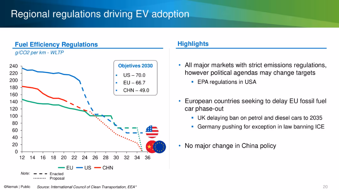
Line graph on the left and bullet point highlights on the right, using flags and color-coded emission trend lines.
Regulatory and Compliance
Industrial & Manufacturing
The slide compares emission regulations across the US, EU, and China, showing declining CO₂ per km targets through 2030. It discusses political influences on timelines, such as delays in Europe and regulatory stance in China and the U.S.
emissions, regulation, EV, fuel efficiency, CO₂ targets, policy
Mixed Chart
Barclays
Saved
The slide includes a circular diagram showing Ipsos' competitors by sectors and specialties.
Strategic Planning
Professional Services
The slide emphasizes Ipsos' unified and modular offerings for decision makers across various sectors.
decision makers, competitors, sectors, specialties, Ipsos, modular offerings
Diagram
IPSOS
Saved
Previous
Next
If nothing, comes up, please save your slides first
Create a FREE account to continue browsing
Receive Instant Access to 1,000+ slides from companies like McKinsey, Google, and Goldman Sachs
First Name
Last Name
Email
Password
I agree to all
Terms & Privacy Policy
Thank you! Your submission has been received!
Oops! Something went wrong while submitting the form.
Have an account?
Sign in
Column Chart
Heatmap
Chevron
Org Chart
Infographic
Callouts
Timeline
List
Graphic
Picture
Process Flow
Diagram
Paragraph
Map
Table
Framework
Subtitle
Takeaway Box
Icon
Other Chart
Radar Chart
Waterfall Chart
Mekko Chart
Pie Chart
Scatter Plot
Line Chart
Bar chart
Bullet points