Create a FREE Account
Instant access to 1,000+ real slides from top companies like McKinsey, BCG, Goldman Sachs, Google and many more!
First Name
Last Name
Email
Password
I agree to all
Terms & Privacy Policy
Thank you! Your submission has been received!
Oops! Something went wrong while submitting the form.
Have an account?
Sign in
Library
Templates
Courses
Pricing
My Account
My Slides
My Templates
✦ AI
AI Prompt Library
AI Search
Sign in
Start Here
Logout
My Saved Slides
This slide features a column chart comparing the delivered levelized cost of low-carbon ammonia across various regions. It distinguishes between 'green' hydrogen (renewable energy) and 'blue' hydrogen (carbon capture) across the pre-IRA and post-IRA periods. The slide background is dark with text and graph elements highlighted in green, blue, and gray, showcasing clear visual distinctions between different data points.
Market Analysis and Trends
Energy & Utilities
The slide analyzes the cost competitiveness of low-carbon hydrogen in North Asia, contrasting pre and post-Inflation Reduction Act scenarios in the U.S. and other regions. It highlights how U.S. hydrogen production becomes more competitive internationally post-IRA, affecting global energy market dynamics.
low-carbon hydrogen, North Asia, IRA, energy market, competitiveness, renewable energy, carbon capture, cost analysis
Mixed Chart
BCG
Saved
Features bar charts showing the difference in data and business intelligence maturity between leaders and laggards.
Operational Efficiency
Technology & Software
Discusses the integration of data sources and the use of analytics in making business decisions, highlighting gaps in daily practices.
data integration, analytics, business intelligence, decision-making, bar chart
Multiple Chart
BCG
Saved
Diagrams and icons illustrating changes in management behavior and career path strategies within agile frameworks.
Strategic Planning
Professional Services
Outlines the extensive changes required at individual and organizational levels to adopt agile, including new roles and learning paths, essential for strategic transformation initiatives.
agile transformation, management change, professional services, strategic planning, career paths, learning development, organizational change
Header Horizontal
BCG
Saved
The slide has a column chart with multiple stages indicated for different financial factors affecting RoCET1, alongside key levers for achieving the target.
Financial Performance
Financial Services
This slide outlines the steps and key financial levers required to achieve a 15% return on common equity tier 1 capital by 2026, detailing cost efficiencies and optimizations.
RoCET1, financial levers, cost efficiencies, optimization
Mixed Chart
UBS
Saved
Three main sections with icons and brief bullet points illustrate the company's commitment to Environmental, Social, and Governance (ESG) principles. Clear and straightforward layout with a balance of text and graphics.
Regulatory and Compliance
Financial Services
Slide illustrates company values in ESG, demonstrating the initiatives and achievements in social responsibility. Could be used to underscore the ethical framework and operational philosophy of the company.
ESG, corporate values, social responsibility, governance, sustainability
Pillar
Goldman Sachs
Saved
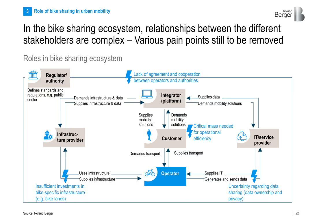
Flowchart-style diagram showing stakeholder interactions in the ecosystem with directional arrows, text boxes, and pain points highlighted in blue.
Operational Efficiency
Transportation & Logistics
The slide maps out interactions among key stakeholders in bike sharing—operators, customers, regulators, integrators, and IT providers—highlighting collaboration pain points like regulation, infrastructure, and data issues.
bike sharing, ecosystem, stakeholder roles, pain points, infrastructure, IT providers, mobility
Diagram
Roland Berger
Saved
A visually balanced slide with text sections and a central infographic illustrating the organization's strategy. The graphic is divided into three main areas, each with concise bullet points.
Strategic Planning
Government & Public Sector
The slide presents a strategic framework focusing on environmental, social, and governance aspects. It could be utilized to communicate a firm’s comprehensive strategy for sustainable and inclusive growth.
ESG, Environmental, Social, Governance, Strategy, Sustainable Growth
Framework
McKinsey
Saved
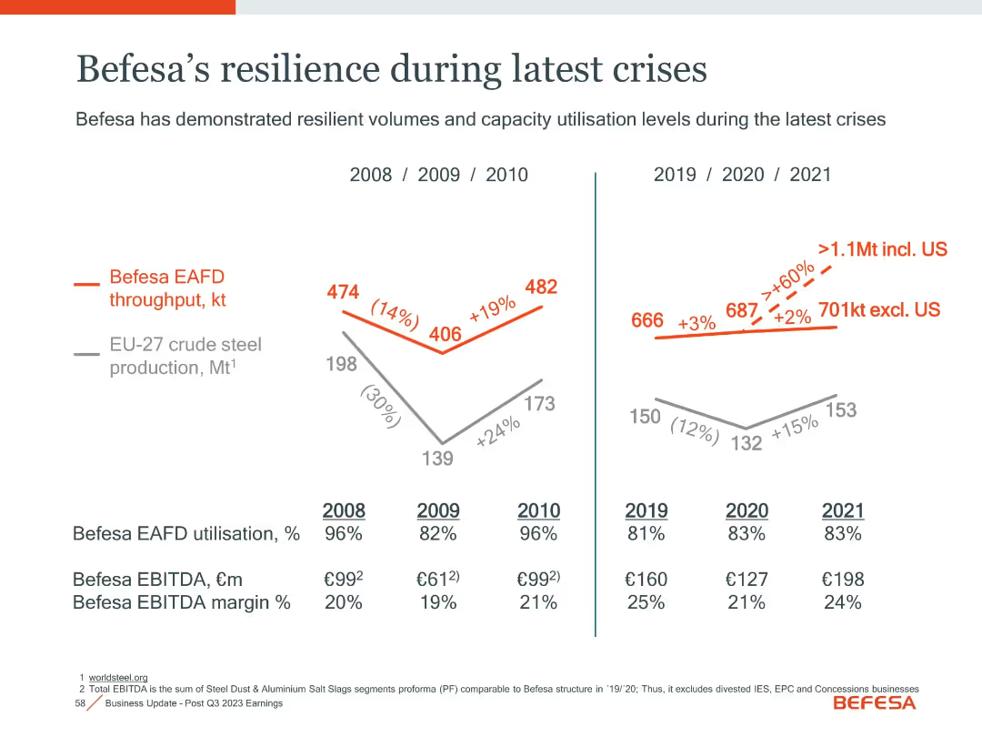
Dual time-series charts comparing steel production vs. Befesa throughput, with utilization and margin tables.
Risk Assessment and Management
Industrial & Manufacturing
Highlights Befesa’s operational stability during economic downturns (2008–2010, 2019–2021), maintaining high utilization and EBITDA margins despite steel production declines.
crisis resilience, utilization, EBITDA margin, steel production, stability
Single Chart
Goldman Sachs
Saved
The slide features a detailed process diagram for hydrogen-based direct reduction of iron and text on using hydrogen to lower emissions in steel production.
Market Analysis and Trends
Energy & Utilities
The slide explains how adopting hydrogen and other low carbon energy sources can help decarbonize steel production, supported by a detailed process diagram and explanatory text.
hydrogen, steel, decarbonization, reduction, emissions, process diagram, low carbon
Diagram
Kearney
Saved
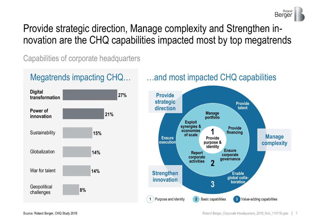
Two-section layout: bar chart showing megatrends impacting CHQ and a radial diagram highlighting CHQ capabilities grouped by theme.
Strategic Planning
Professional Services
This slide identifies digital transformation and innovation as key megatrends affecting corporate headquarters. It connects these trends with core CHQ capabilities such as strategic direction, complexity management, and innovation.
corporate strategy, CHQ capabilities, megatrends, innovation, digital transformation, headquarters, organizational strategy
Mixed Chart
Roland Berger
Saved
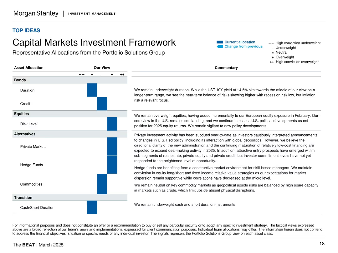
Matrix table layout with asset categories on the left, conviction scale (+/−), and commentaries on the right. Blue arrows show change in allocation. Each segment (Bonds, Equities, Alternatives, Transition) is discussed with corresponding text.
Strategic Planning
Financial Services
This slide outlines Morgan Stanley’s current capital markets positioning by asset class. It shows a tilt toward equities and private markets, with underweights in bonds and cash. Commentary addresses macro conditions such as recession risk, inflation, and geopolitical developments.
asset allocation, investment strategy, capital markets, equities, private markets, fixed income, alternatives, inflation risk, geopolitics
Table
Morgan Stanley
Saved
A comparative slide with a heatmap design, split into two sections: Core Service Offerings and New Service Offerings. The heatmap indicates the extent to which each service category offers specific services.
Product and Service Analysis
Professional Services
This slide analyzes the service focus of different categories, showing the breadth of core and new service offerings provided by Champions, Leaders, Strivers, and Traditionalists.
service offerings, heatmap, core services, new services, analysis
Table
Accenture
Saved
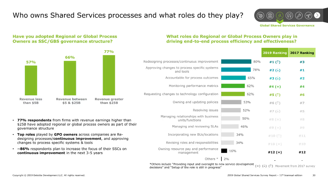
The slide has a column chart and bar chart. The column chart shows the adoption of process owners by revenue, and the bar chart shows roles by rank.
Human Resources and Talent Management
Professional Services
This slide discusses the ownership of shared services processes and the roles of global process owners. It highlights the adoption rate by company size and key roles.
Shared Services, processes, roles, governance, adoption
Multiple Chart
Deloitte
Saved
Features a bar chart displaying budget and expenditure metrics.
Financial Performance
Government & Public Sector
Provides an overview of Namibia's budget, focusing on operational expenditure, revenue vs. expenditure, and tax vs. non-tax revenue, highlighting fiscal metrics.
Namibia, budget, finance, government, expenditure
Single Chart
PwC/Strategy&
Saved
Compares industry implications with icons and headers, using a blue and white color theme for readability.
Operational Efficiency
Environmental Services & Sustainability
Outlines sustainable tech's impact across industries. Ideal for operational strategy meetings.
sustainability, industry impact, technology adoption, operational strategy, automotive
Header Vertical
McKinsey
Saved
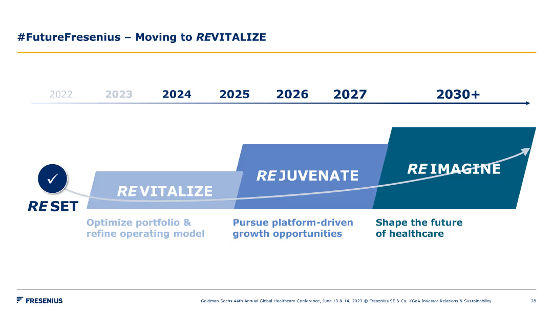
A timeline chart spanning from 2022 to 2030+, showing phases such as Reset, Revitalize, Rejuvenate, and Reimagine. Each phase is marked with key focus areas.
Strategic Planning
Healthcare & Pharmaceuticals
The slide outlines Fresenius's strategic roadmap for revitalizing, rejuvenating, and reimagining the future of healthcare through various stages and key initiatives.
timeline, revitalization, strategy, healthcare, future
Linear Flow
Goldman Sachs
Saved
Pie charts showing average weekly reach potential by demographic segments, highlighting changes in linear reach potential and AVOD reach.
Market Analysis and Trends
Media & Entertainment
The slide shows the average weekly reach potential by demographic groups, emphasizing changes in linear reach and the growing impact of AVOD.
weekly reach, demo, linear reach, AVOD, potential
Multiple Chart
Nielsen
Saved
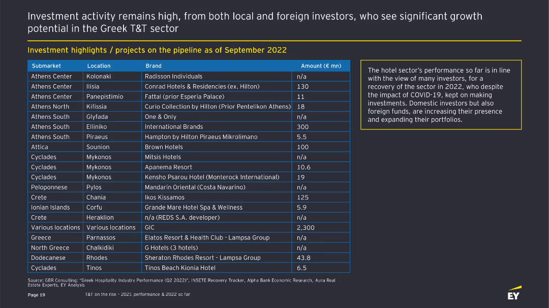
The slide contains a table listing various investment projects in the Greek T&T sector, detailing submarkets, locations, brands, and investment amounts. There is a text box on the right summarizing the hotel sector's performance.
Investment Analysis
Hospitality & Tourism
Highlights investment projects in the Greek T&T sector as of September 2022. It shows submarkets, locations, brands, and investment amounts. The text box explains the positive outlook for the hotel sector despite the impact of COVID-19.
Investment, Greek T&T, Projects, Hotels, COVID-19
Table
EY
Saved
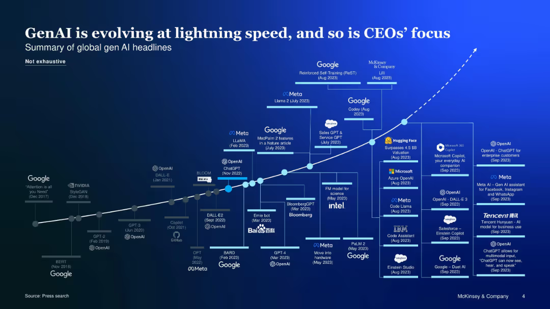
Curved timeline chart with logos and milestones showing GenAI evolution and corporate interest
Market Analysis and Trends
Artificial Intelligence
A visual timeline of key GenAI advancements and corporate initiatives, emphasizing rapid development and increased CEO attention toward AI-driven strategies.
GenAI evolution, timeline, CEOs, corporate focus, tech companies
Uncategorized
McKinsey
Saved
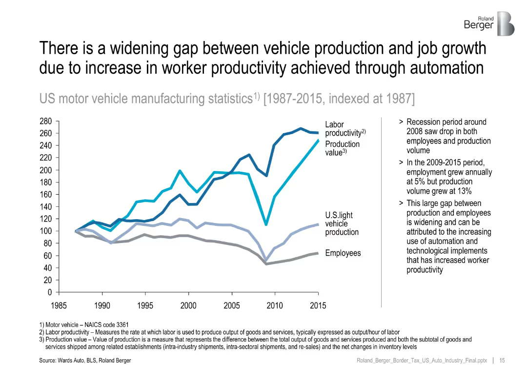
Line chart (1987–2015) comparing labor productivity, production value, and employment.
Human Resources and Talent Management
Industrial & Manufacturing
Illustrates how rising productivity and automation have decoupled vehicle production from employment growth, especially after the 2008 recession.
labor productivity, automation, job gap, vehicle manufacturing, employment
Mixed Chart
Roland Berger
Saved
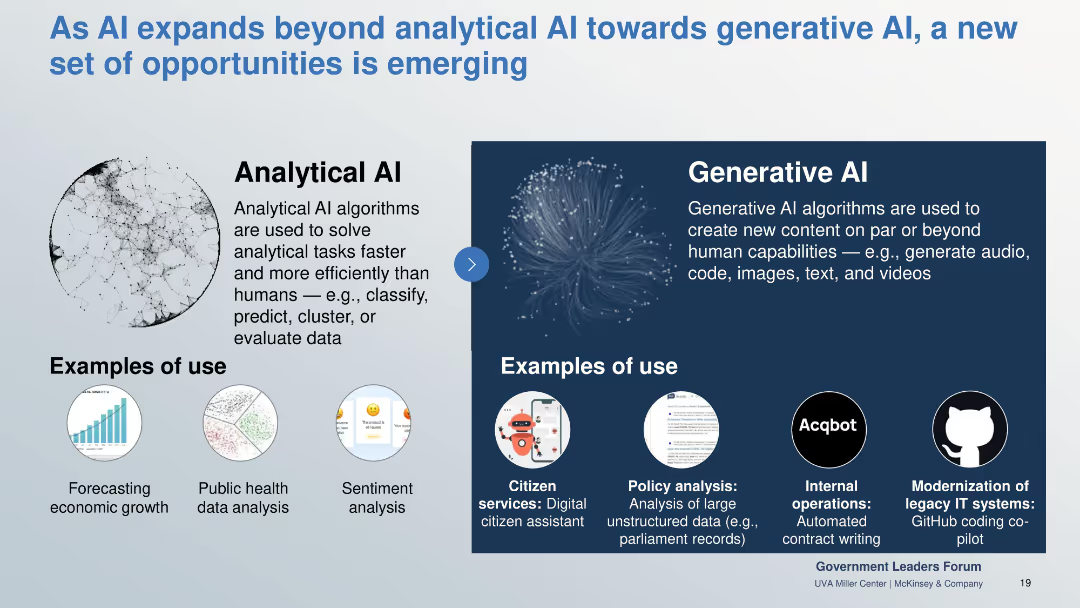
Side-by-side comparison of Analytical vs Generative AI with use case examples illustrated underneath.
Industry Overview
Government & Public Sector
Contrasts analytical AI’s efficiency in data processing with generative AI’s creative capacities. Showcases practical examples like sentiment analysis and digital assistants to highlight expanded potential in public services.
analytical AI, generative AI, citizen services, sentiment analysis, public sector, code gen
Boxed
McKinsey
Saved
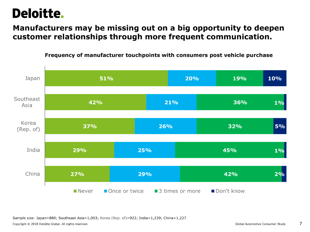
This slide features a horizontal bar chart (bar chart) showing the frequency of manufacturer touchpoints with consumers post vehicle purchase across various regions.
Customer and Market Segmentation
Consumer Goods
The slide shows the frequency of post-purchase interactions between manufacturers and consumers in Japan, Southeast Asia, Korea, India, and China. It suggests that manufacturers may be missing opportunities for deeper customer relationships.
manufacturer touchpoints, customer relationships, post-purchase interaction, bar chart, consumer behavior, automotive industry, Asia
Single Chart
Deloitte
Saved
Dual bar chart groups: “Top 10” cities and “Megacities”, with rankings and text commentary.
Market Analysis and Trends
Government & Public Sector
Compares the sustainability scores of major global cities, highlighting that megacities score significantly lower due to imbalance in environmental, social, and economic dimensions.
megacities, sustainability, urban planning, global cities, environmental index
Mixed Chart
Roland Berger
Saved
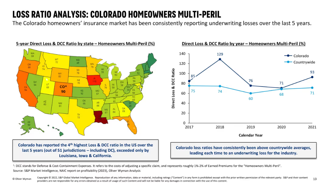
Left: US map color-coded by state loss ratio; right: line chart comparing Colorado vs countrywide over 5 years; blue callout boxes summarize insights; color scheme emphasizes high-loss states.
Financial Performance
Financial Services
This slide highlights Colorado's consistently high Loss & DCC ratios in the Homeowners Multi-Peril segment. Ranked 4th highest in the U.S. over five years, Colorado has persistently exceeded national average loss ratios, driving underwriting losses. Both visual and textual elements emphasize Colorado’s outlier position in insurance performance.
loss ratio, homeowners insurance, Colorado, state comparison, DCC, underwriting losses, insurance profitability, national ranking
Mixed Chart
Oliver Wyman
Saved
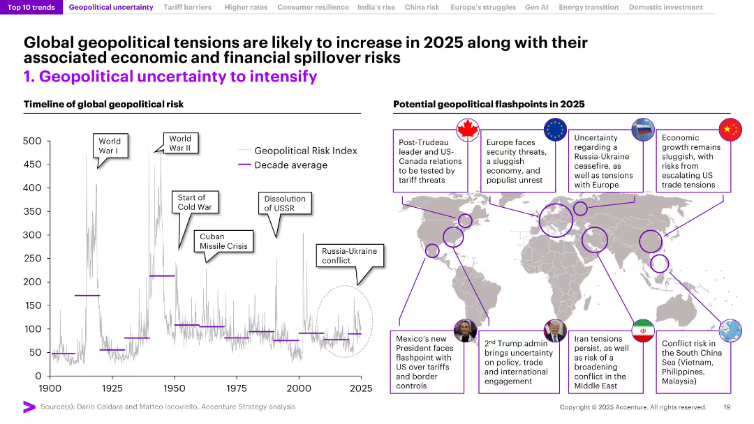
Timeline chart of geopolitical risk index on the left; world map with callouts of flashpoints on the right. High visual density with clearly labeled regions and historical context.
Risk Assessment and Management
Government & Public Sector
The slide explores rising geopolitical risks using a historical risk index graph and annotated world map pinpointing expected flashpoints in 2025 (e.g., US, Europe, China, Middle East). Emphasizes potential economic and political spillover effects from instability.
Geopolitical Risk, Flashpoints, 2025, Conflict Zones, Global Risk, Economic Spillover, War, Trade Tensions, Index
Mixed Chart
Accenture
Saved
Previous
Next
If nothing, comes up, please save your slides first
Create a FREE account to continue browsing
Receive Instant Access to 1,000+ slides from companies like McKinsey, Google, and Goldman Sachs
First Name
Last Name
Email
Password
I agree to all
Terms & Privacy Policy
Thank you! Your submission has been received!
Oops! Something went wrong while submitting the form.
Have an account?
Sign in
Column Chart
Heatmap
Chevron
Org Chart
Infographic
Callouts
Timeline
List
Graphic
Picture
Process Flow
Diagram
Paragraph
Map
Table
Framework
Subtitle
Takeaway Box
Icon
Other Chart
Radar Chart
Waterfall Chart
Mekko Chart
Pie Chart
Scatter Plot
Line Chart
Bar chart
Bullet points