My Account
My Slides
Search by Category
Templates
View All Templates
Download Template Slides
✦ AI Search
Feedback
Login
Logout
Get Started
Browse all Slides
Browse all Slides
Create a FREE Account
Instant access to 1,000+ real slides from top companies like McKinsey, BCG, Goldman Sachs, Google and many more!
First Name
Last Name
Email
Password
I agree to all
Terms & Privacy Policy
Thank you! Your submission has been received!
Oops! Something went wrong while submitting the form.
Have an account?
Sign in
Saved Slides
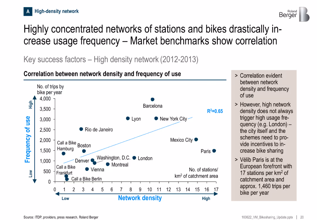
Scatter plot showing correlation between station density and usage frequency; key observations summarized in side box
Performance Metrics and KPIs
Transportation & Logistics
There’s a clear correlation between the density of bike stations and the frequency of use. Cities like Barcelona and New York show high use with dense networks. Paris, despite high density, shows moderate usage, suggesting incentives matter too.
bike sharing, usage frequency, network density, correlation, transportation, Paris, KPIs, stations
Mixed Chart
Roland Berger
Saved
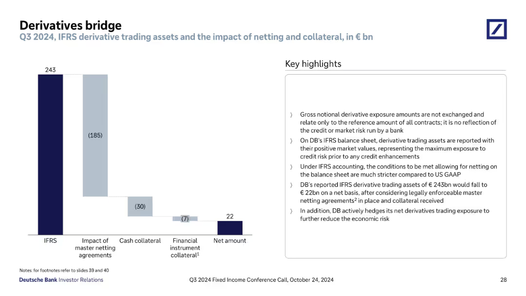
Waterfall chart on left and explanatory bullet points on right; simple, segmented bars; dark-to-light blue gradient shows reduction stages
Financial Performance
Financial Services
The slide explains how Deutsche Bank’s derivative trading assets are adjusted from IFRS-reported values to net amounts through master netting agreements and collateral. It emphasizes risk reduction strategies and accounting treatment.
derivatives, IFRS, netting, collateral, credit risk, financial exposure, accounting, Deutsche Bank, Q3 2024, trading assets
Mixed Chart
Deutsche Bank
Saved
This slide shows a series of column charts displaying changes in the use of various intercity travel modes like airplanes, trains, and private vehicles across different countries.
Market Analysis and Trends
Transportation & Logistics
Examines how intercity travel preferences have shifted towards private vehicle use post-crisis.
intercity travel, mode shift, private vehicles, crisis
Multiple Chart
McKinsey
Saved
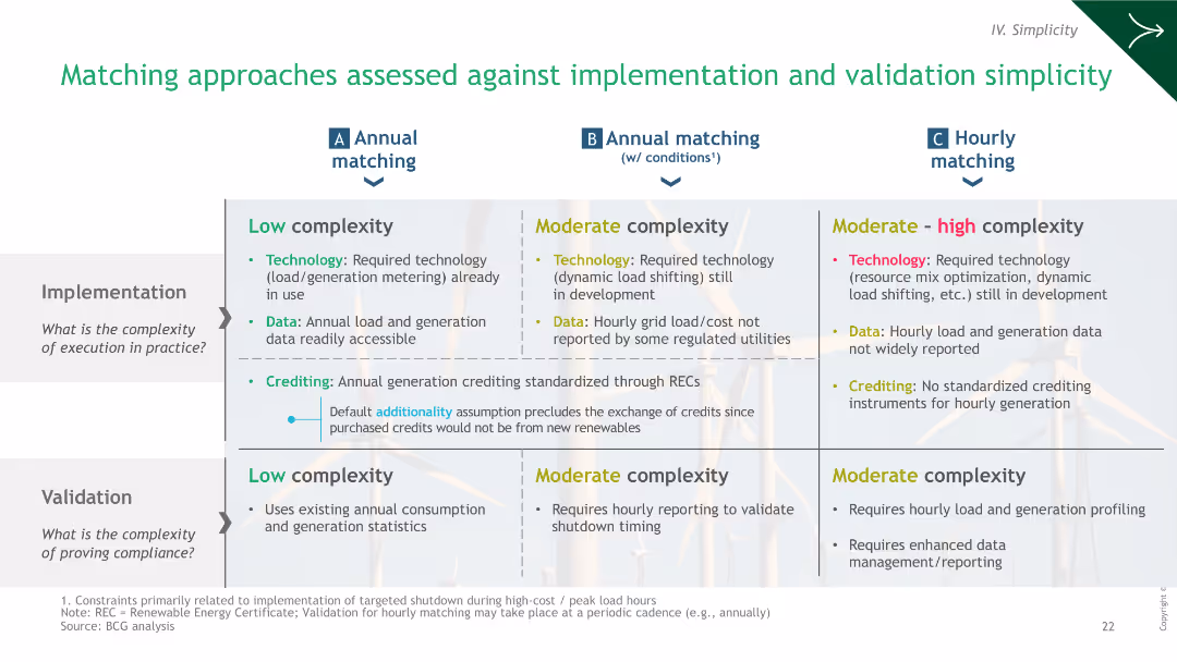
A comparative table evaluating the complexity of implementation and validation of different green hydrogen matching strategies.
Operational Efficiency
Energy & Utilities
The slide evaluates the implementation and validation complexities of different hydrogen matching approaches, assessing technology, data, and crediting.
hydrogen, implementation, validation, strategies, complexity
Table
BCG
Saved
This slide presents a single column chart tracking the revenues from FICC intermediation over several years. The visual is clear with bold labeling for each year, and a consistent blue color scheme representing data. The simplicity of the design aids in focusing on the trend of revenue durability.
Sales and Business Development
Financial Services
Assesses the stability of revenues in Global Banking & Markets, highlighting the trends in FICC intermediation, suitable for discussions on financial stability and long-term revenue planning.
FICC, revenue stability, long-term trend
Single Chart
Goldman Sachs
Saved
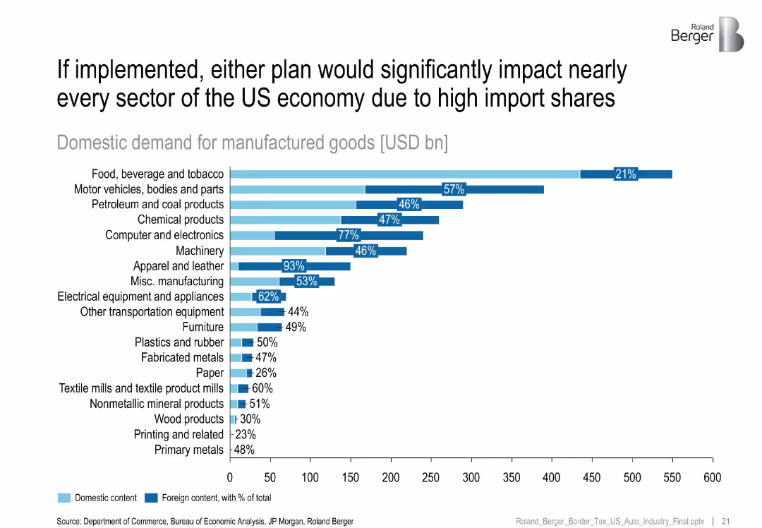
Horizontal bar chart with light blue and dark blue segments representing domestic and foreign content of manufactured goods across industries; labeled with percentages and USD bn values
Strategic Planning
Industrial & Manufacturing
This slide illustrates the heavy reliance on imports across US manufacturing sectors, showing that many sectors—especially apparel, computers, and vehicles—have high foreign content shares, making them vulnerable to policy changes like border taxes.
import dependency, foreign content, domestic demand, manufacturing, border tax, industrial sectors, policy impact, supply chain
Single Chart
Roland Berger
Saved
The slide uses multiple small images and graphics to discuss trends in food production and its environmental impacts, including charts on GHG emissions.
Market Analysis and Trends
Agriculture & Food Production
Explores significant trends in the food industry, focusing on environmental impacts and market changes, emphasizing the need for sustainable practices.
food industry, environmental impact, market trends, sustainability, GHG emissions
Boxed
Deutsche Bank
Saved
The slide displays a large pie chart in the center with colored segments indicating the cost breakdown of raw materials like natural rubber, synthetic rubber, chemicals, and more. To the right, there are three images that presumably relate to the materials: tapped rubber tree, a pile of rubber, and workers in protective gear.
Financial Performance
Industrial & Manufacturing
This slide presents a breakdown of raw material costs for H1 2023, totaling €3.2BN. The chart shows the percentage share of each material, such as natural rubber, synthetic rubber, steel cord, and others. It is likely used for a financial overview or cost analysis within the automotive or manufacturing industry.
raw materials, cost breakdown, pie chart, H1 2023, automotive industry
Single Chart
Morgan Stanley
Saved
The slide presents bar graphs comparing current and future use of digital services. It has a title, a subtitle, and a source citation at the bottom.
Market Analysis and Trends
Retail & E-commerce
The slide shows the usage of digital services during COVID-19, with an expectation that consumers will continue using these services post-pandemic.
Omnichannel, Retail, COVID-19, Digital Services, Consumer Behavior, Future Trends, Bar Graphs, Usage Statistics
Mixed Chart
Accenture
Saved
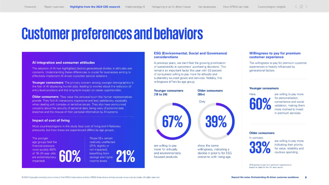
Three-column layout with infographics, text boxes, and circular data visualizations on ESG and cost-of-living impact.
Customer and Market Segmentation
Professional Services
Examines generational attitudes toward AI, cost-of-living sensitivity, and ESG preferences. Younger consumers are more impacted and more willing to pay for personalization and sustainability.
AI attitudes, ESG, generational segmentation, personalization, premium experience, cost of living, consumer behavior, sustainability
Mixed Chart
KPMG
Saved
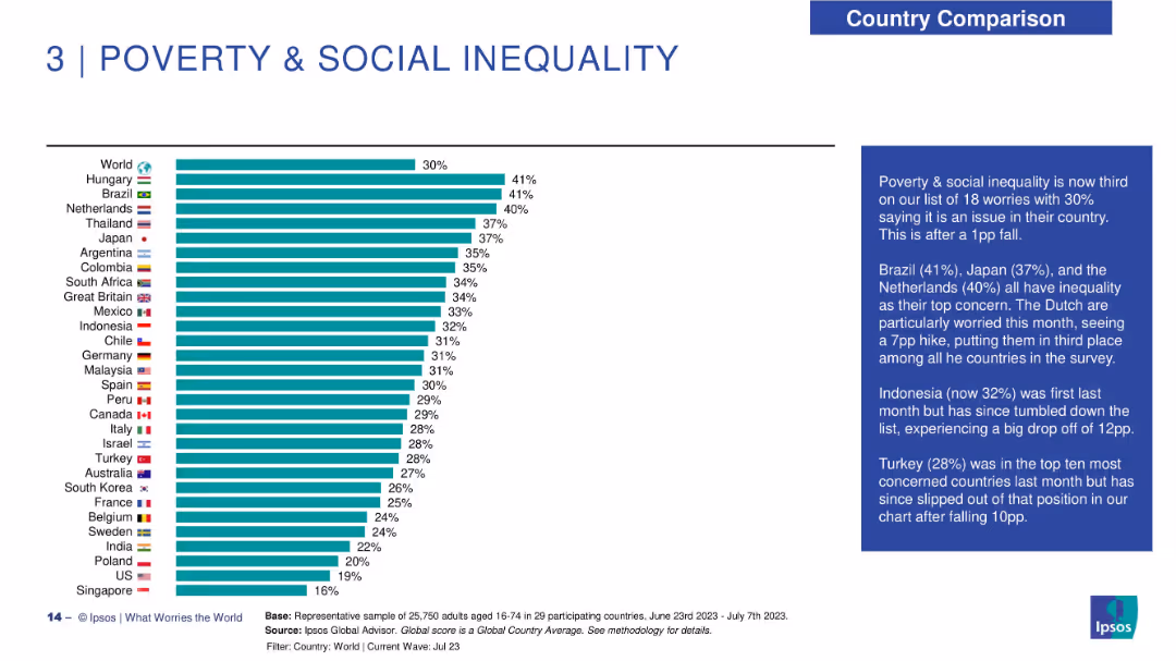
Horizontal bar chart ranking countries by concern over poverty and inequality; descriptive text panel on right.
Customer and Market Segmentation
Government & Public Sector
Poverty and social inequality is now the third most common global concern. The slide ranks countries based on concern level, highlighting shifts in Brazil, Japan, Netherlands, and Indonesia.
renewable energy, public opinion, energy transition, Ipsos, climate impact, sustainability, economic outlook, environment
Mixed Chart
IPSOS
Saved
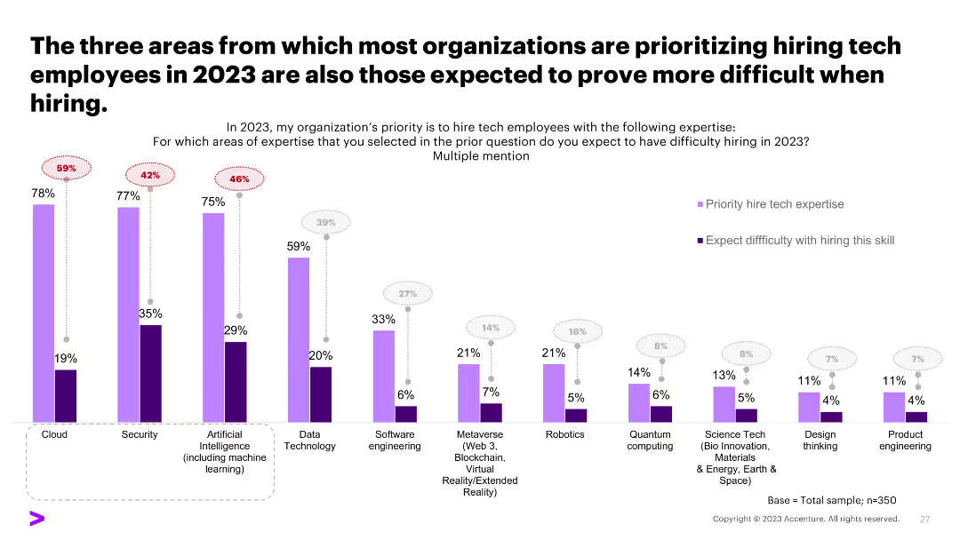
A column chart comparing the prioritization and difficulty of hiring tech skills, showing a discrepancy between priorities and hiring challenges.
Human Resources and Talent Management
Professional Services
The slide compares areas prioritized for tech hiring in 2023 with the expected difficulty in hiring, highlighting potential recruitment challenges.
hiring challenges, tech skills, recruitment, priorities
Single Chart
Accenture
Saved
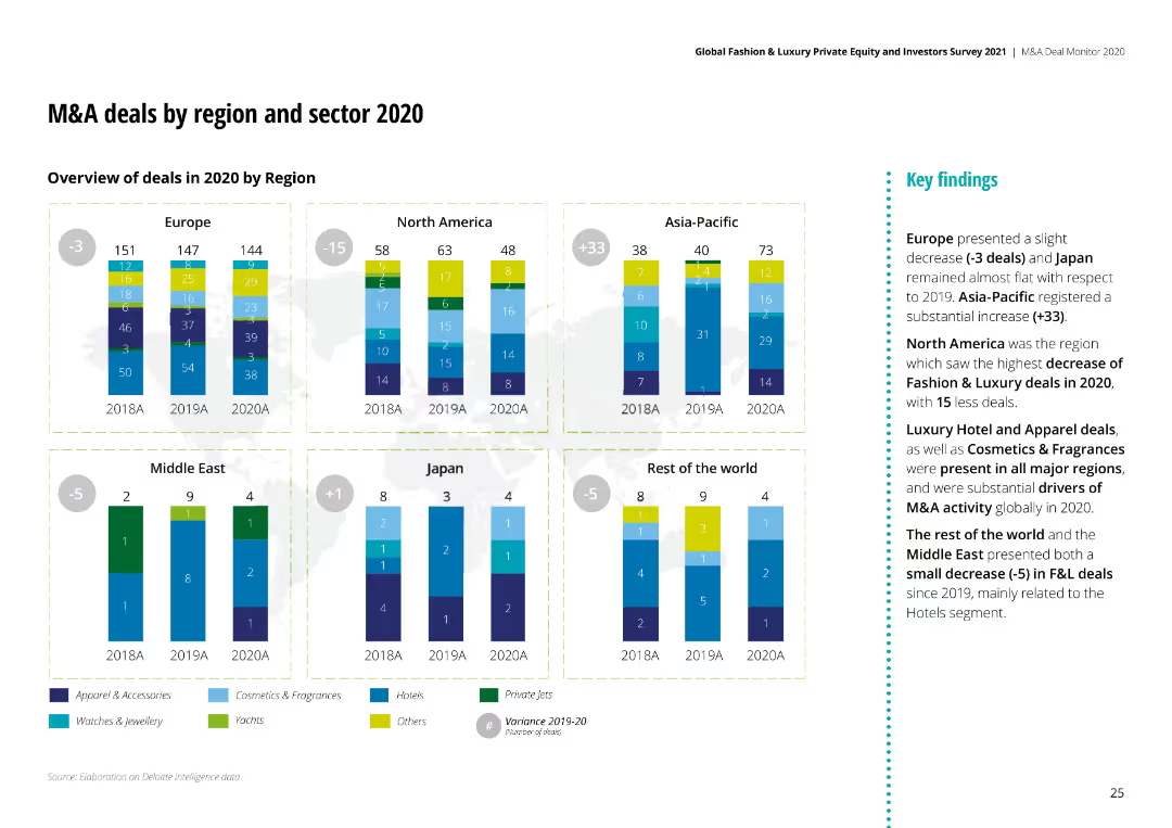
The slide shows column charts for M&A deals in 2020 by region, comparing different sectors like Apparel, Cosmetics, and Hotels.
Market Analysis and Trends
Consumer Goods
It analyzes M&A deals across different regions and sectors, showing the number of deals and the key findings from the data.
M&A, Region, Sector, 2020, Analysis, Apparel, Cosmetics
Multiple Chart
Deloitte
Saved
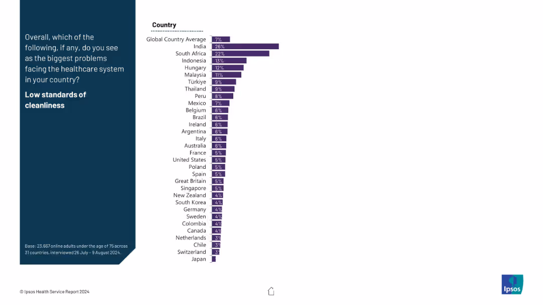
Two-column layout; left side features the question in white on dark blue background; right side has a horizontal bar chart ranking countries by percentage identifying low cleanliness standards as a major healthcare issue.
Risk Assessment and Management
Healthcare & Pharmaceuticals
This slide presents global public opinion on whether low cleanliness standards are a key healthcare issue. India (26%) and South Africa (22%) report the highest concern, far above the global average of 7%. Data is from a survey conducted across 31 countries.
healthcare, cleanliness, public opinion, global comparison, Ipsos, survey, healthcare issues, risk, standards
Mixed Chart
IPSOS
Saved
This slide includes a horizontal bar chart displaying growth rates for various E&M segments from 2019 to 2024. Each bar is color-coded for different regions (India and Global), with segments like OTT video and VR exhibiting the highest growth. The design is straightforward with clear labels for easy comprehension.
Market Analysis and Trends
Media & Entertainment
Analyzes growth rates across different E&M segments, with a particular focus on high-growth areas such as OTT and VR, indicating potential investment or development areas. It serves to guide decisions on where businesses might focus their resources to capitalize on rapid market changes, especially in the context of emerging technologies in media.
growth rates, E&M segments, OTT, VR, market
Single Chart
PwC/Strategy&
Saved
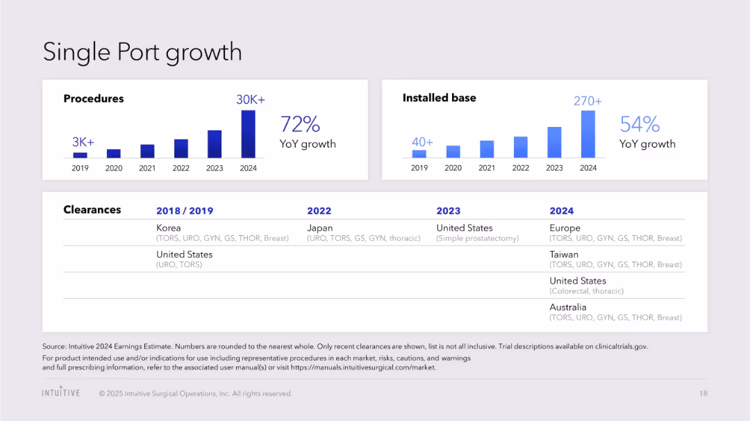
Bar charts for procedures and installed base; global regulatory clearance table
Product and Service Analysis
Healthcare & Pharmaceuticals
Reviews the expansion of Single Port technology with YoY growth in procedures and installations, supported by a timeline of regional clearances.
Single Port, procedures, regulatory approvals, installations, da Vinci, global growth, healthcare robotics
Multiple Chart
JP Morgan
Saved
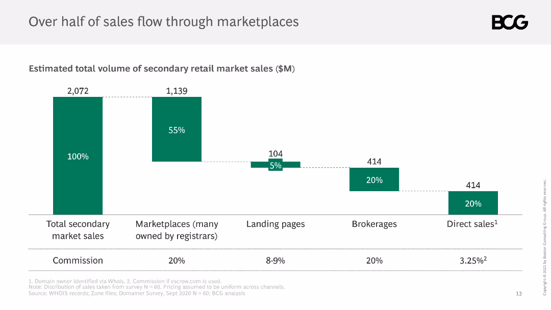
The slide shows a column chart breaking down the total volume of secondary retail market sales, with segments for marketplaces, landing pages, brokerages, and direct sales.
Market Analysis and Trends
Retail & E-commerce
It details the distribution of sales through various channels in the secondary market, noting that marketplaces account for over half of total sales, with commissions listed.
sales distribution, marketplaces, secondary market, channels, volume
Single Chart
BCG
Saved
Depicts multiple bar charts showing the increase in online adoption across various retail categories, with a particular focus on groceries.
Market Analysis and Trends
Retail & E-commerce
Details the significant increase in online retail adoption in Southeast Asia, with an emphasis on the rapid rise of online grocery shopping.
Online adoption, retail categories, Southeast Asia, groceries, bar chart
Multiple Chart
Bain
Saved
This slide has moderate visual complexity, featuring two pie charts to represent survey data on female millennials' attitudes toward international experience as a factor in employment. The design uses a consistent color scheme of red and grey to maintain visual coherence.
Human Resources and Talent Management
Professional Services
This slide discusses the importance of international assignments in attracting and retaining female talent, highlighting how such opportunities are crucial for employer branding. It emphasizes the need for organizations to incorporate international mobility into their employee value proposition.
Female talent, Millennials, Employer branding, International assignments
Multiple Chart
PwC/Strategy&
Saved
Three-column layout with text describing capabilities and services, ecosystem partnerships, and value to stakeholders, accompanied by relevant icons and minimal visual elements.
Technology and Digital Transformation
Technology & Software
The slide explains how cloud and ecosystem partnerships accelerate time-to-market and deliver transformation, highlighting capabilities, partnerships, and value to stakeholders.
cloud, partnerships, transformation, capabilities, services
Pillar
Credit Suisse
Saved
Displays column charts detailing assets under management by business unit and product group, with clear textual annotations.
Financial Performance
Financial Services
Details the growth and distribution of assets under management within the private banking sector, highlighting net flows and product distribution.
assets, management, banking, financial, growth, distribution, private, investment
Multiple Chart
Deutsche Bank
Saved
Contains a column chart highlighting the CAGR for consumer E&M revenue from 2019 to 2024 across multiple countries, with India and Nigeria prominently displayed in red to emphasize their lead. This visual arrangement facilitates quick comparison and trend recognition.
Market Analysis and Trends
Media & Entertainment
This slide underlines the significant growth of consumer E&M revenue in India compared to other global markets, emphasizing India's emerging market status and potential as a primary target for E&M investments. It's particularly useful for stakeholders looking to expand in high-growth regions, offering a strategic overview of promising markets.
consumer revenue, CAGR, India, market growth
Mixed Chart
PwC/Strategy&
Saved
The slide presents a line chart showing FX outflows over time, highlighting different components such as WDAS/RDAS utilisation and other official payments.
Market Analysis and Trends
Financial Services
The slide details the significant role of WDAS/RDAS utilisation and FX interventions in Nigeria’s FX outflows, with comprehensive data analysis.
FX outflows, WDAS/RDAS, FX intervention, Nigeria, financial trends
Mixed Chart
PwC/Strategy&
Saved
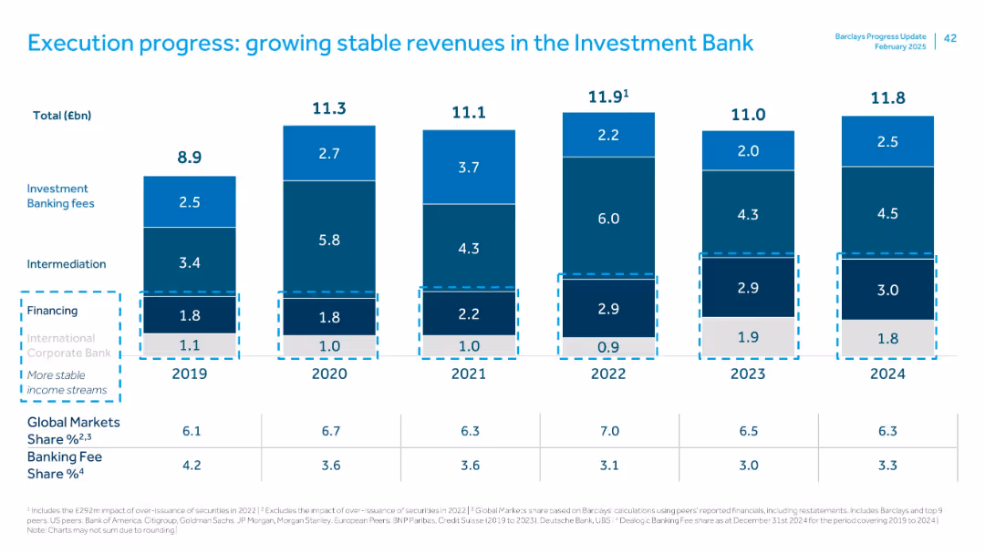
Stacked bar chart with segments labeled by revenue sources from 2019–2024. Color-coded by segment.
Financial Performance
Financial Services
Demonstrates stable investment bank revenue sources (fees, intermediation, financing) across 6 years. Shows relative share of Global Markets and Banking Fees across peer groups. Highlights consistent revenue contributions and peer comparisons.
investment bank, fees, financing, intermediation, peer comparison, revenue stability
Single Chart
Barclays
Saved
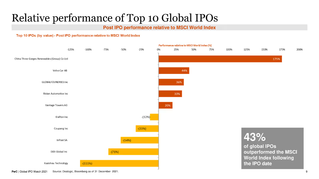
This slide includes a horizontal bar chart displaying the post-IPO performance of the top 10 global IPOs relative to the MSCI World Index as of December 2021.
Market Analysis and Trends
Financial Services
It highlights the performance of major IPOs, showing the percentage change in value compared to a global market index, useful for investment analysis.
IPO performance, MSCI World Index, investment analysis, top IPOs, post-IPO performance
Single Chart
PwC/Strategy&
Saved
Previous
Next
If nothing, comes up, please save your slides first
Create a FREE account to continue browsing
Receive Instant Access to 1,000+ slides from companies like McKinsey, Google, and Goldman Sachs
First Name
Last Name
Email
Password
I agree to all
Terms & Privacy Policy
Thank you! Your submission has been received!
Oops! Something went wrong while submitting the form.
Have an account?
Sign in
Column Chart
Heatmap
Chevron
Org Chart
Infographic
Callouts
Timeline
List
Graphic
Picture
Process Flow
Diagram
Paragraph
Map
Table
Framework
Subtitle
Takeaway Box
Icon
Other Chart
Radar Chart
Waterfall Chart
Mekko Chart
Pie Chart
Scatter Plot
Line Chart
Bar chart
Bullet points