Create a FREE Account
Instant access to 1,000+ real slides from top companies like McKinsey, BCG, Goldman Sachs, Google and many more!
First Name
Last Name
Email
Password
I agree to all
Terms & Privacy Policy
Thank you! Your submission has been received!
Oops! Something went wrong while submitting the form.
Have an account?
Sign in
Library
Templates
Courses
Pricing
My Account
My Slides
My Templates
✦ AI
AI Prompt Library
AI Search
Sign in
Start Here
Logout
My Saved Slides
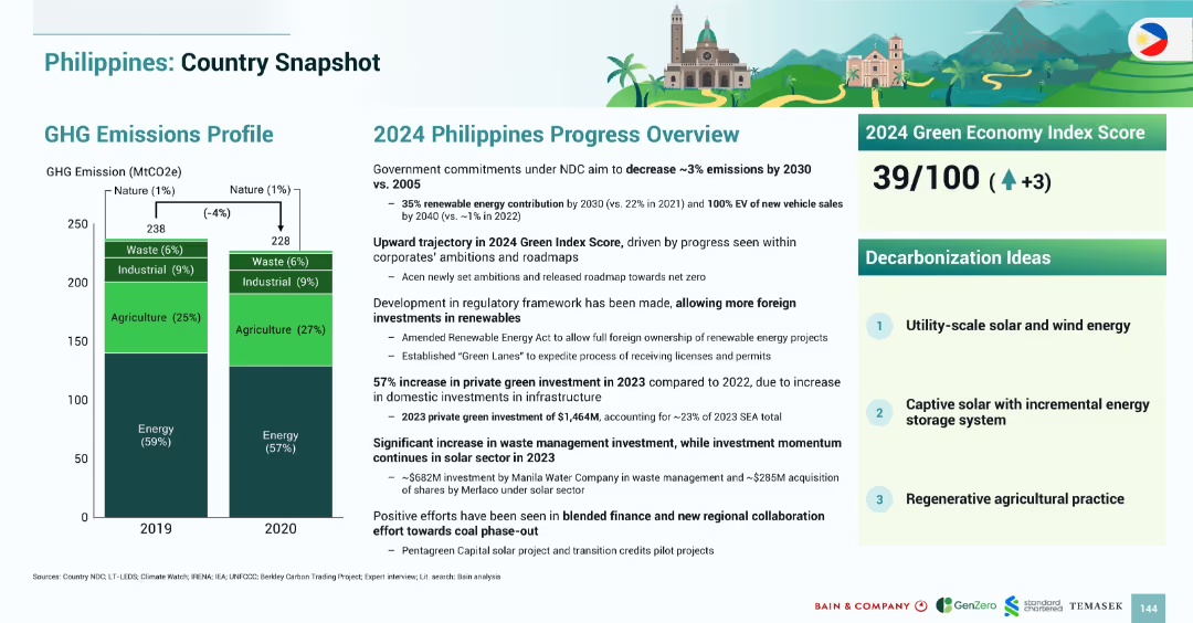
Similar structure to Malaysia snapshot with bar chart on left and textual progress overview and Green Index Score on right.
Strategic Planning
Government & Public Sector
The slide highlights the Philippines’ GHG emissions profile and national progress in 2024. Emissions dropped by 4% from 2019 to 2020. The 2024 Green Economy Index Score rose to 39. Foreign renewable investment has increased due to favorable policy changes. Key decarbonization priorities include utility-scale solar/wind and regenerative agriculture.
Philippines, emissions, renewable energy, policy, 2024, solar, agriculture, Green Index
Mixed Chart
Bain
Saved
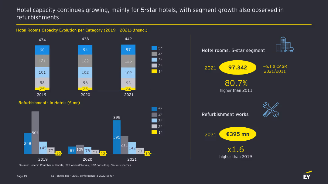
The slide features bar charts showing the evolution of hotel room capacities and refurbishments from 2019 to 2021, with text providing additional context.
Operational Efficiency
Hospitality & Tourism
This slide presents data on hotel room capacity evolution and refurbishment activities, highlighting growth in the 5-star segment and significant investments in refurbishments.
Hotel capacity, refurbishments, operational efficiency, tourism sector, bar charts
Multiple Chart
EY
Saved
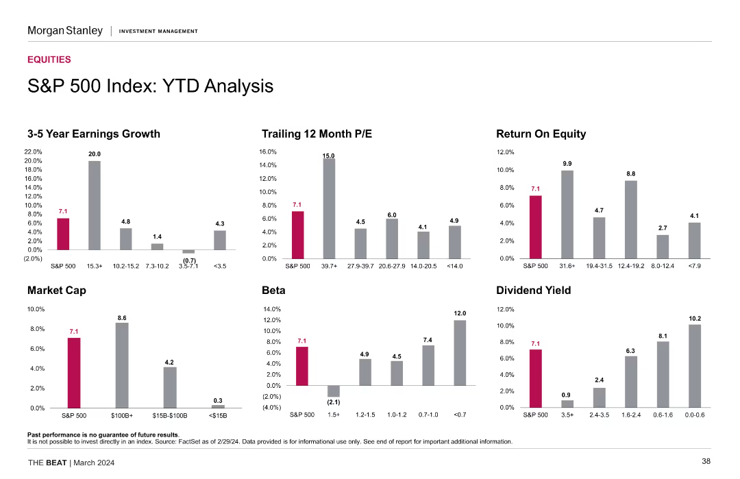
The slide includes multiple column charts that analyze the S&P 500 Index's year-to-date (YTD) performance. Metrics such as earnings growth, trailing 12-month P/E, return on equity, market cap, beta, and dividend yield are displayed in distinct colors.
Financial Performance
Financial Services
This slide details the YTD performance of the S&P 500 Index, presenting various financial metrics such as earnings growth, P/E ratio, return on equity, market cap, beta, and dividend yield to provide a comprehensive performance overview.
YTD analysis, S&P 500, financial metrics, earnings growth, market cap, P/E ratio, beta, dividend yield, return on equity
Multiple Chart
Morgan Stanley
Saved
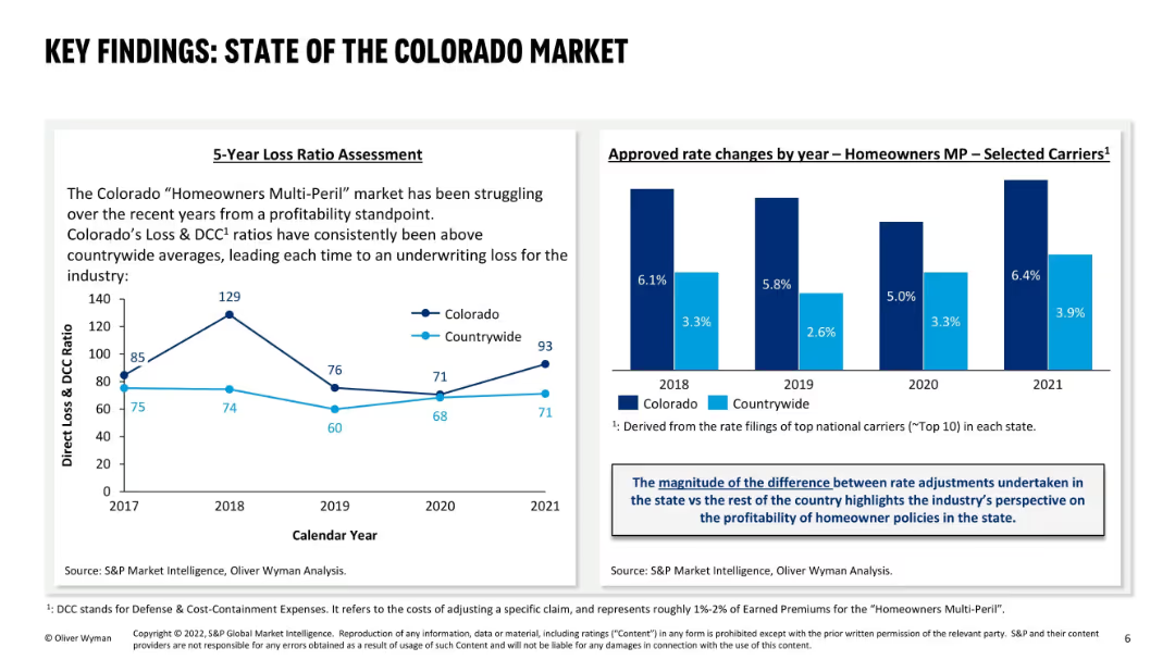
Two-column layout: left side has a 5-year loss ratio line graph; right side has a bar graph of approved rate changes; uses dark and light blue for comparison between Colorado and countrywide; includes explanatory text boxes.
Market Analysis and Trends
Financial Services
This slide evaluates Colorado’s “Homeowners Multi-Peril” insurance market, revealing persistent underwriting losses due to higher loss ratios compared to national averages. It also shows a consistent trend of higher rate increases in Colorado, reflecting industry efforts to offset losses.
Colorado market, loss ratio, homeowners insurance, rate changes, underwriting loss, profitability, MP, state comparison, DCC, carrier performance
Multiple Chart
Oliver Wyman
Saved
Simple design with a title and subtitle, vibrant blue background with abstract shapes, and the logos of the collaborating companies.
Market Analysis and Trends
Technology & Software
Introduces the 'e-Conomy SEA 2021' report, indicating a focus on the digital economy of Southeast Asia during the 2020s.
e-Conomy, SEA, digital decade, market overview, technology, 2021, collaboration
Title
Bain
Saved
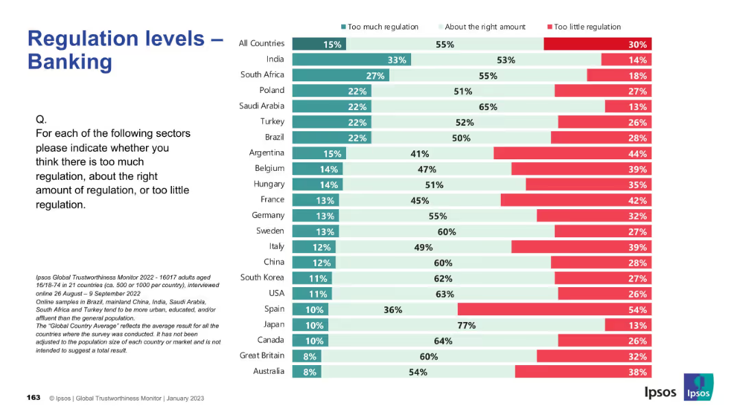
Standard layout and colors; bar chart showing global and country-specific sentiment on banking regulation.
Regulatory and Compliance
Financial Services
This slide presents public opinion on the regulation of the banking sector. Overall, most respondents believe the level of regulation is about right, but Argentina, France, and Belgium reflect greater concern over insufficient regulation. Japan and Canada exhibit the highest levels of perceived regulatory adequacy.
banking, finance, regulation, compliance, public sentiment, Ipsos, governance, financial sector, oversight, global survey
Mixed Chart
IPSOS
Saved
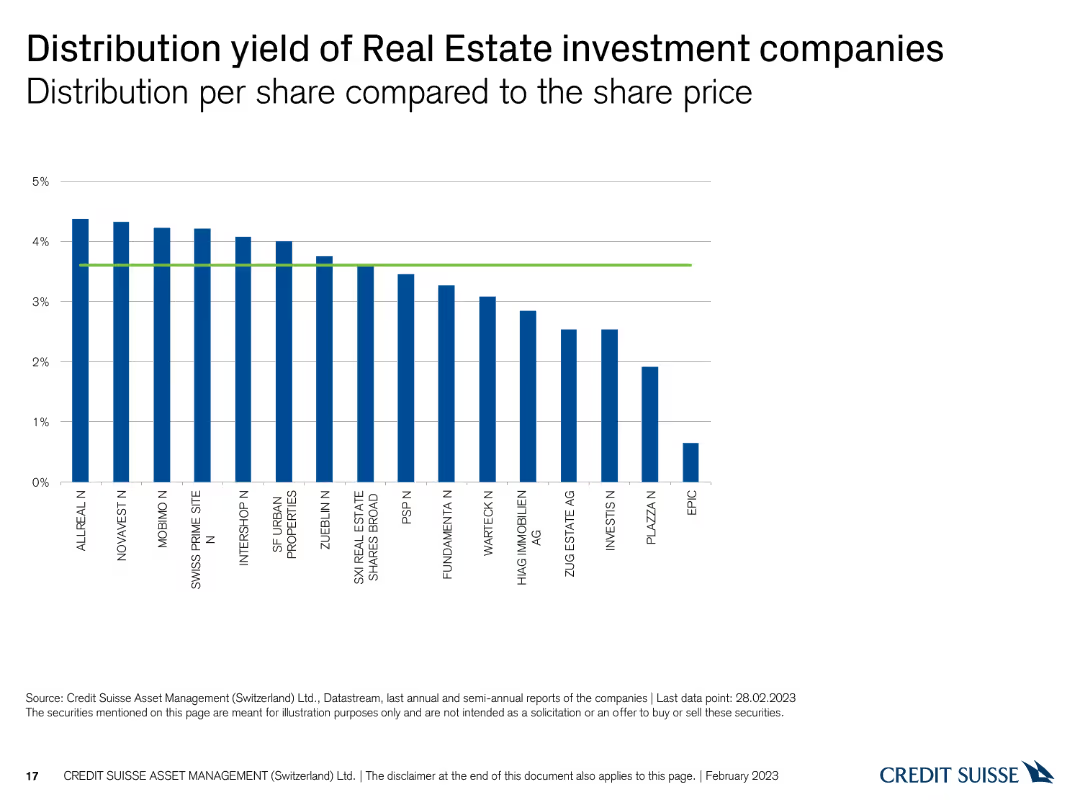
This slide displays a column chart showing the distribution yield per share for Swiss real estate investment companies, with vertical bars representing yield percentages and a green reference line.
Financial Performance
Real Estate & Construction
The slide presents the distribution yields of real estate investment companies, comparing their returns. It is used for evaluating income potential and investment performance.
Real estate, distribution yield, investment companies, returns, comparison
Single Chart
Credit Suisse
Saved
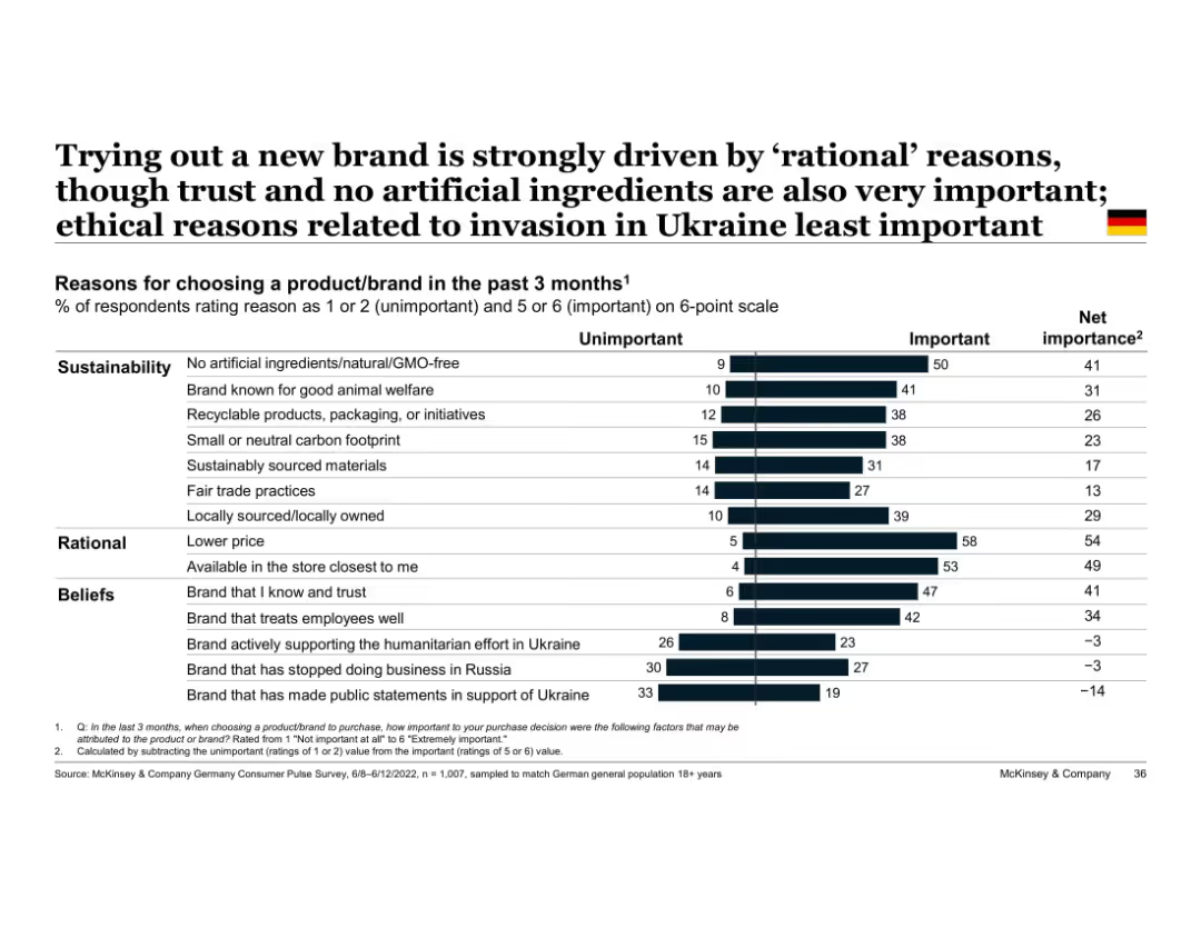
Vertical bar chart with two-part segments (unimportant vs important); grouped by theme (e.g., beliefs)
Market Analysis and Trends
Consumer Goods
Highlights top reasons German consumers tried new brands, with rational factors like price and store availability ranking highest, followed by sustainable and belief-driven factors. Ukraine war-related factors least influential.
rational decision-making, sustainability, trust, Ukraine, brand choice, Germany, ethical purchasing, consumer reasons
Single Chart
McKinsey
Saved
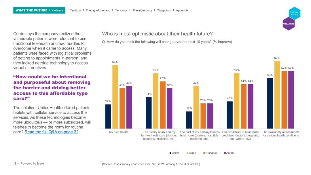
The slide features a column chart comparing optimism about health futures among different ethnic groups across several health-related categories.
Market Analysis and Trends
Healthcare & Pharmaceuticals
This slide presents survey data on optimism regarding future health across different ethnic groups in the U.S., highlighting disparities in expectations about personal health, healthcare quality, and availability.
Health optimism, ethnic groups, survey, healthcare, future trends
Mixed Chart
IPSOS
Saved
The slide features a large red column chart showing growth rates of maximalist and minimalist brands in the luxury market from 1996-2019, juxtaposed against key historical periods and trends.
Market Analysis and Trends
Consumer Goods
This slide examines trends in the luxury market, focusing on the growth of maximalist versus minimalist brands, suggesting a shift towards more self-expressive consumption patterns.
luxury, market trends, brand growth, consumer behavior, maximalism, minimalism, self-expression
Mixed Chart
Bain
Saved
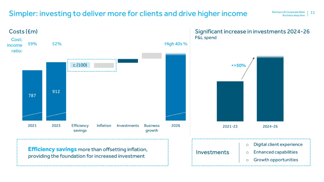
Dual bar charts on left (cost trends 2021–2026) and right (investment increase 2024–26). Highlight boxes detail efficiency savings and investment areas.
Operational Efficiency
Financial Services
Illustrates cost management with reduced cost-income ratio and increased investment plans. Emphasizes that efficiency savings will enable reinvestment in digital experience, capability building, and business growth.
efficiency savings, cost-income ratio, investment, digital experience, business growth, operational efficiency, financial planning
Multiple Chart
Barclays
Saved
Features a graph titled "Figure 7", a sidebar with additional text and headers, and a purple footer. The graph shows changes in skill importance over time.
Technology and Digital Transformation
Technology & Software
Highlights the evolving importance of various skills for science and engineering roles, implying a trend towards increasing value in creativity and social skills.
Skills Evolution, Science and Engineering, Data Analysis, Creativity, Social Skills
Single Chart
Accenture
Saved
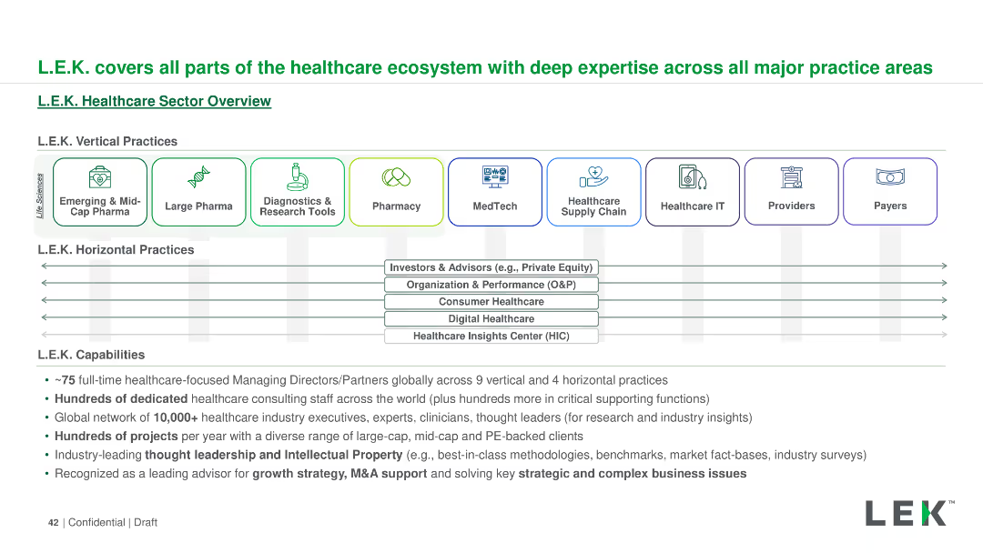
The slide outlines L.E.K.'s healthcare sector capabilities using a horizontal layout. It includes icons and text boxes to detail vertical and horizontal practices, capabilities, and global reach. Colors and icons are used for visual categorization.
Industry Overview
Professional Services
The slide provides an overview of L.E.K.'s comprehensive involvement in the healthcare ecosystem, covering vertical and horizontal practices, capabilities, and their global network. It highlights their expertise and range of services in the healthcare sector.
L.E.K., healthcare, ecosystem, vertical practices, horizontal practices, capabilities, global reach, services
Diagram
LEK
Saved
The slide features a dark background, a quote in a yellow text box, and a question followed by a bar chart showing performance ratings of healthcare system aspects.
Customer and Market Segmentation
Healthcare & Pharmaceuticals
This slide presents Canadian consumers' ratings of the healthcare system's performance in optimizing experiences regardless of personal circumstances.
Healthcare experience, performance, consumer ratings, equitable treatment, Canada
Mixed Chart
EY
Saved
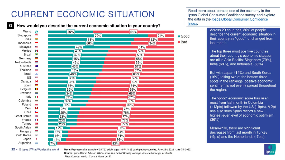
Bar chart comparing percentage of people in 29 countries describing the economy as "Good" vs "Bad", with annotations.
Market Analysis and Trends
Financial Services
This slide visualizes global public sentiment about the current economic situation, showing a 36% global average rating of "good". Singapore, India, and Indonesia lead in optimism, while Japan and Argentina have the lowest. Commentary highlights regional trends and month-over-month changes.
economic sentiment, global comparison, Ipsos, economic perception, survey, bar chart, economic optimism, Asia-Pacific, country ranking, economic trends
Mixed Chart
IPSOS
Saved
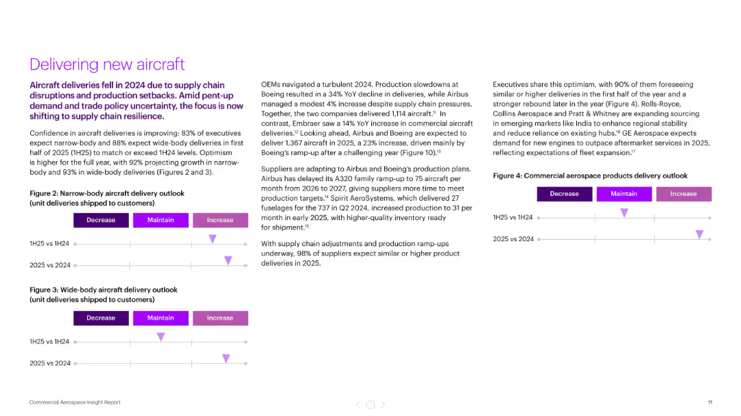
Three-column layout with bullet points and delivery outlook charts (narrow and wide-body aircraft)
Performance Metrics and KPIs
Industrial & Manufacturing
The slide focuses on improving aircraft delivery confidence for 2025, with 83–93% of executives expecting growth. It highlights OEM production plans and supply chain adjustments following a turbulent 2024, and features delivery outlook visuals segmented by aircraft type and year comparison.
aircraft delivery, OEMs, production, supply chain, Boeing, Airbus, KPIs
Mixed Chart
Accenture
Saved
Consists of blue column charts for different sectors of digital financial services (DFS), including digital payments and lending. Each chart has clear labels and growth percentages. Source by Bain analysis.
Market Analysis and Trends
Financial Services
This slide details the rapid growth trajectory of Vietnam's DFS against a previously low baseline, highlighting potential areas for digital innovation and investment in the financial sector.
Vietnam, Digital Financial Services, Growth Analysis, Digital Payments, Digital Lending, Insurance, Wealth, Market Trends, Innovation, Financial Technology
Multiple Chart
Bain
Saved
Diagram illustrating the methodology for Waiver 1 population with cost containment measures.
Strategic Planning
Government & Public Sector
Discusses the benefits of a two-waiver model in managing support needs and controlling costs, providing a detailed methodology and potential savings from cost containment measures.
waiver model, support needs, cost containment, methodology, NH's DD population, strategic planning, funding models, cost savings
Mixed Chart
Alvarez & Marsal
Saved
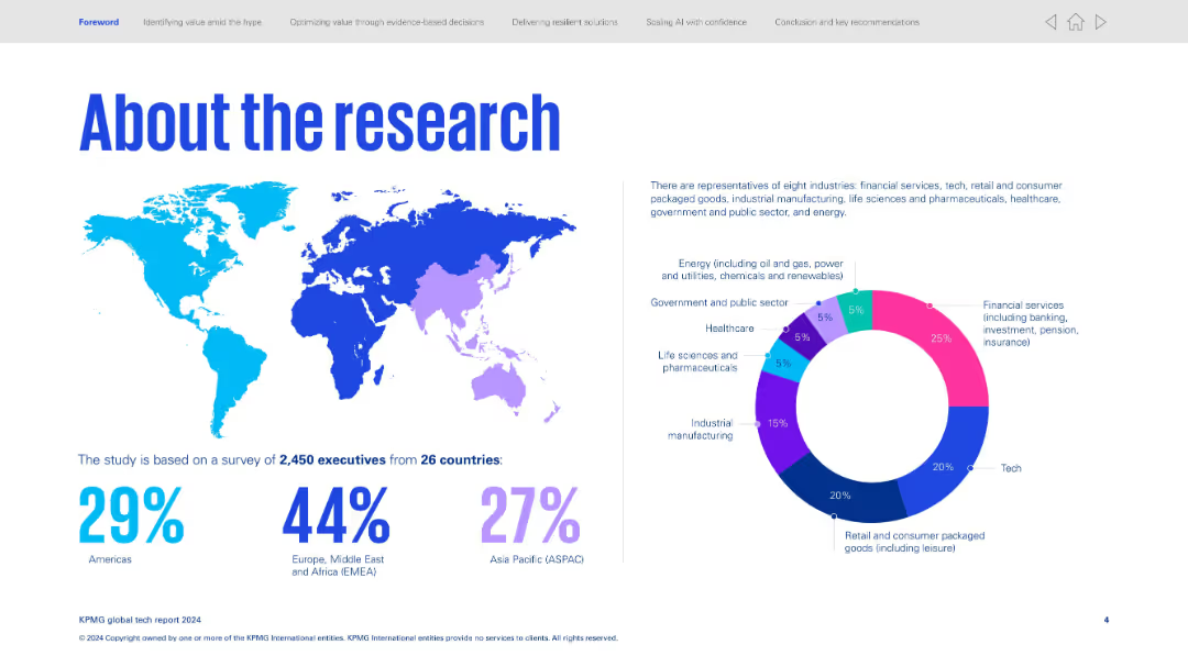
Map on the left shows global participant distribution. Right side features a donut chart of surveyed industries.
Industry Overview
Professional Services
Explains the global scope of the survey: 2,450 executives from 26 countries across eight industries. Provides geographic breakdown (EMEA, Americas, ASPAC) and industry share, with financial services, tech, and retail being top segments.
survey, global scope, industry breakdown, participants, demographics
Mixed Chart
KPMG
Saved
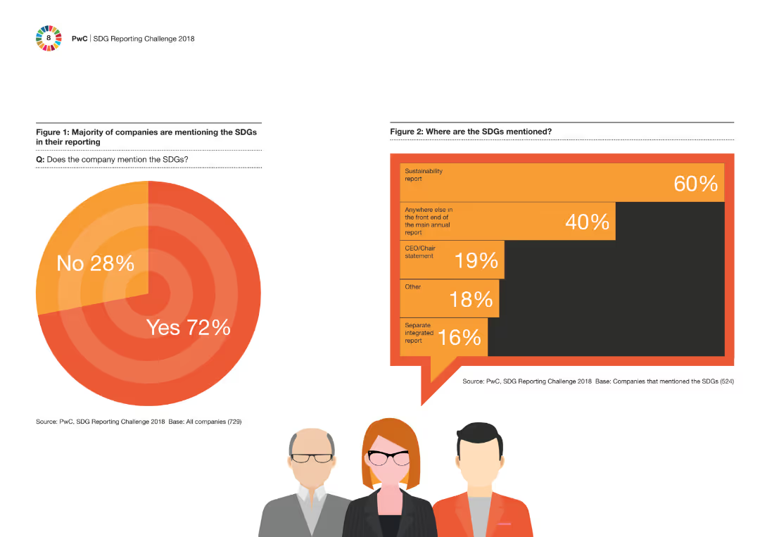
Two column charts presenting data on the extent of SDG mention in company reporting and where they are mentioned. Simple visual layout with one column chart on each side of the slide.
Regulatory and Compliance
Financial Services
This slide shows that the majority of companies mention the Sustainable Development Goals (SDGs) in their reporting, detailing where within the reports these mentions are most frequently found.
SDGs, reporting, companies, compliance, sustainability
Multiple Chart
PwC/Strategy&
Saved
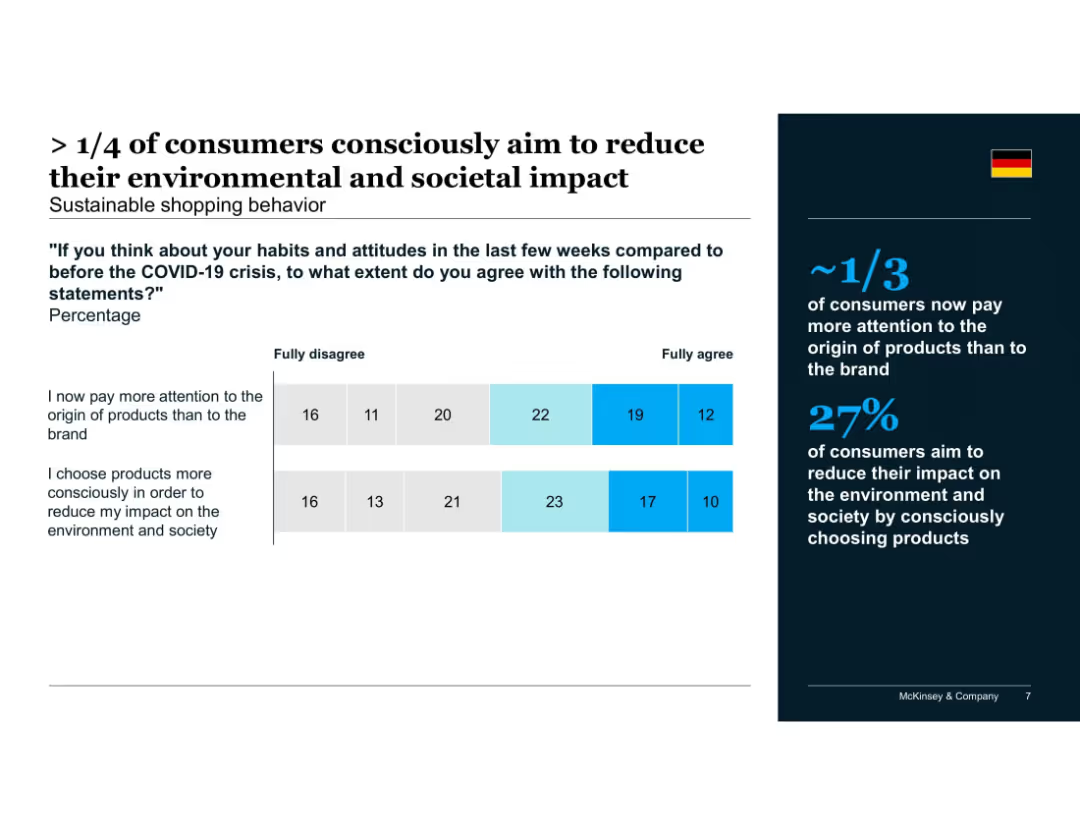
Two horizontal bar charts with segmented scales (from "fully disagree" to "fully agree") and a highlighted summary box on the right
Customer and Market Segmentation
Consumer Goods
Highlights how COVID-19 influenced consumers' product choices, with over 27% choosing more sustainable options. About one-third focus more on product origin than brand, indicating rising awareness of sustainability in buying behavior.
sustainability, consumer behavior, product origin, environmental impact, COVID-19, conscious choices, McKinsey, brand perception, Germany, shopping habits
Mixed Chart
McKinsey
Saved
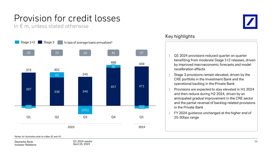
Bar chart with stacked bars showing quarterly data for Stage 1+2 and Stage 3 provisions; highlights on right
Risk Assessment and Management
Financial Services
Displays Deutsche Bank's credit loss provisions over five quarters, detailing movements in Stage 1+2 and Stage 3 losses. Highlights note factors driving the provisions and outlook for FY2024, including macroeconomic improvements and CRE challenges.
credit losses, Stage 3, macroeconomic, CRE, forecast, Q1 2024, provisions
Mixed Chart
Deutsche Bank
Saved
This slide is populated with a series of flow diagrams and small graphs detailing the distribution of solar radiation on Earth, showing how much energy is absorbed by land, oceans, and the atmosphere.
Market Analysis and Trends
Energy & Utilities
Explores the distribution of solar energy on Earth and its potential to meet global energy demands. The slide emphasizes the significant surplus of solar energy available compared to current fossil fuel consumption, underlining the importance of solar energy in future energy strategies.
solar energy, distribution, consumption, Earth, potential
Diagram
Roland Berger
Saved
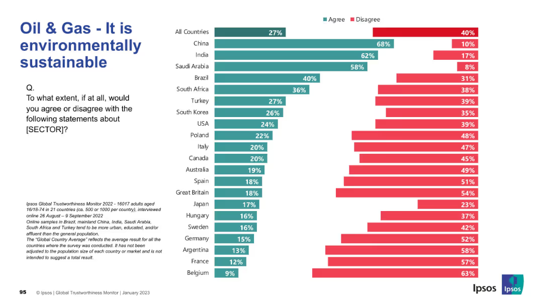
Horizontal bar chart showing public belief in environmental sustainability of oil & gas. Dark green = agree; red = disagree.
Market Analysis and Trends
Energy & Utilities
This slide examines how environmentally sustainable the public perceives the oil & gas sector to be. China, India, and Saudi Arabia report high agreement, while European countries overwhelmingly disagree with the claim.
Environmental Sustainability, Oil & Gas, Climate Impact, Public Sentiment, Energy Sector, Ipsos, Green Practices, Survey Data
Mixed Chart
IPSOS
Saved
The slide features column charts showing portfolio recovery returns with and without leverage, alongside margin call thresholds. It uses a combination of text, numerical data, and graphical elements.
Investment Analysis
Financial Services
The slide illustrates the benefits of using leverage to enhance growth during market recoveries, comparing different portfolio strategies and their performance.
leverage, growth, recovery, portfolio, financial analysis
Single Chart
UBS
Saved
Previous
Next
If nothing, comes up, please save your slides first
Create a FREE account to continue browsing
Receive Instant Access to 1,000+ slides from companies like McKinsey, Google, and Goldman Sachs
First Name
Last Name
Email
Password
I agree to all
Terms & Privacy Policy
Thank you! Your submission has been received!
Oops! Something went wrong while submitting the form.
Have an account?
Sign in
Column Chart
Heatmap
Chevron
Org Chart
Infographic
Callouts
Timeline
List
Graphic
Picture
Process Flow
Diagram
Paragraph
Map
Table
Framework
Subtitle
Takeaway Box
Icon
Other Chart
Radar Chart
Waterfall Chart
Mekko Chart
Pie Chart
Scatter Plot
Line Chart
Bar chart
Bullet points