My Account
My Slides
Search by Category
Templates
View All Templates
Download Template Slides
✦ AI Search
Feedback
Login
Logout
Get Started
Browse all Slides
Browse all Slides
Create a FREE Account
Instant access to 1,000+ real slides from top companies like McKinsey, BCG, Goldman Sachs, Google and many more!
First Name
Last Name
Email
Password
I agree to all
Terms & Privacy Policy
Thank you! Your submission has been received!
Oops! Something went wrong while submitting the form.
Have an account?
Sign in
Saved Slides
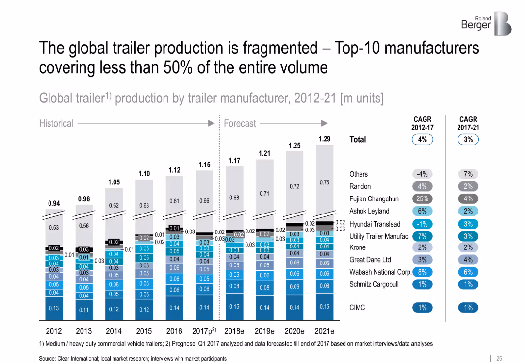
Stacked bar chart showing trailer production by manufacturer (2012–2021) with CAGR per company
Competitive Landscape
Industrial & Manufacturing
This slide emphasizes the fragmentation of the global trailer manufacturing market, where even the top 10 players account for less than 50% of volume. Detailed stacked bars show annual production by brand and CAGR metrics.
trailer manufacturers, fragmentation, global market, production trends, top 10, CAGR
Linear Flow
Roland Berger
Saved
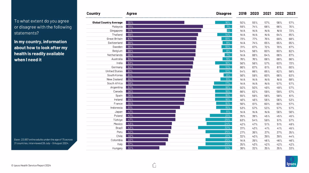
Similar layout as previous; left blue panel with bold white statement, right side includes bar charts showing agreement/disagreement levels across countries with historical comparison data from 2018–2023.
Market Analysis and Trends
Healthcare & Pharmaceuticals
This slide illustrates public perception across countries on whether health-related information is readily available. It includes agreement levels and five-year trend data, reflecting access to health literacy and public health communication efficiency.
health information, availability, literacy, awareness, survey, trends, public opinion, countries, Ipsos, access
Mixed Chart
IPSOS
Saved
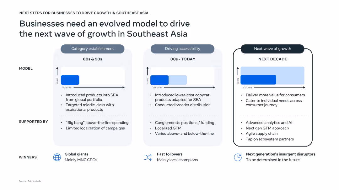
Three-panel vertical layout comparing historical, current, and future business models with text, arrows, and value-volume graphs. Clean design with light blue and white background tones, icons for winners, and dotted line dividers.
Strategic Planning
Professional Services
The slide outlines the evolution of business models in Southeast Asia from the 80s to the projected next decade. It highlights key characteristics, support structures, and market winners for each phase. The upcoming phase emphasizes AI, agile supply chains, and individual consumer targeting to drive future growth.
Southeast Asia, business growth, evolution model, AI, localization, consumer value, strategy
Single Chart
Bain
Saved
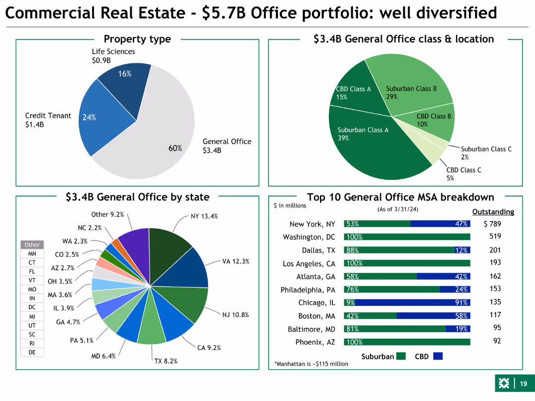
Pie charts and bar charts showing property types, office class & location, and MSA breakdown. Uses various colors to distinguish different data segments.
Market Analysis and Trends
Financial Services
This slide focuses on the commercial real estate office portfolio, showing the distribution of property types, class, and geographic breakdown. It highlights diversification.
commercial real estate, office, property types, diversification, geographic
Multiple Chart
Barclays
Saved
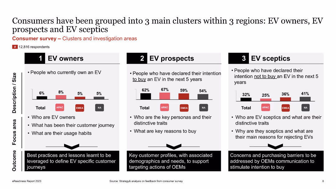
The slide presents a comparative analysis of three consumer clusters (EV owners, EV prospects, EV sceptics) using column charts and text boxes. It highlights key traits and focus areas for each group.
Customer and Market Segmentation
Consumer Goods
The slide categorizes consumers into three clusters based on their EV ownership and intentions: EV owners, EV prospects, and EV sceptics. It identifies the key traits, usage habits, and reasons for or against buying EVs, providing insights for targeted marketing strategies.
Consumer Survey, Clusters, EV Owners, EV Prospects, EV Sceptics, Market Segmentation, Traits, Focus Areas
Multiple Chart
PwC/Strategy&
Saved
Features two line graphs showing year-over-year industrial production growth in the U.S. and EU. The slide uses red and blue lines against a light green background for clarity.
Operational Efficiency
Industrial & Manufacturing
Discusses recent trends in manufacturing and industrial production in the U.S. and EU, highlighting changes in growth rates. This slide is beneficial for understanding sectoral health and economic conditions.
Manufacturing, Industrial Production, US, EU, Growth Rates
Single Chart
Deutsche Bank
Saved
A line graph and a stacked column chart dominate the slide. It also features numerical annotations and a color-coded key for clarity.
Financial Performance
Financial Services
The slide demonstrates year-over-year loan and deposit growth, and the quarterly average of interest-earning assets, essential for financial growth discussions.
deposit growth, loan growth, assets, optimization
Multiple Chart
JP Morgan
Saved
The slide contains a column chart showing GDP breakdown by industry for 2023 and two bar charts. The left bar chart presents real GDP growth from 2014 to 2023, and the right bar chart shows GDP per capita for various ASEAN countries.
Market Analysis and Trends
Financial Services
This slide provides an overview of GDP growth across ASEAN countries, comparing industry contributions, real GDP growth rates, and GDP per capita to analyze regional economic performance.
ASEAN, GDP growth, industry breakdown, real GDP growth, GDP per capita
Multiple Chart
JP Morgan
Saved
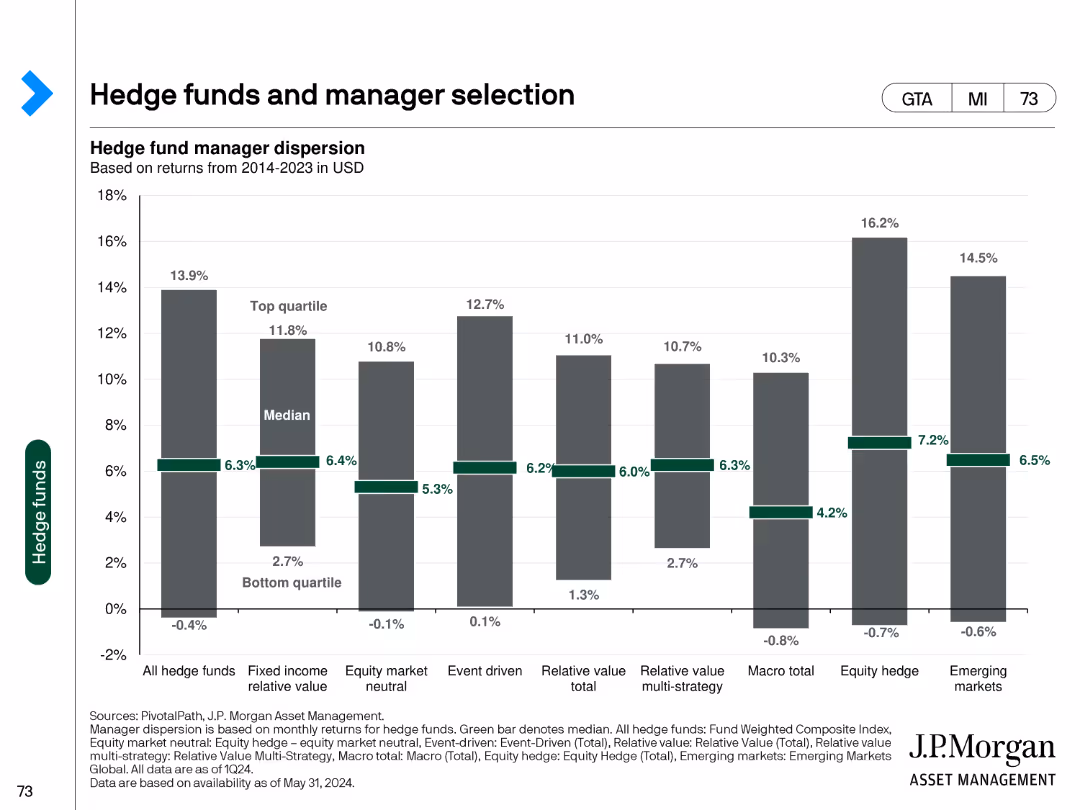
This slide features a column chart showing hedge fund manager dispersion based on returns from 2014-2023 in USD. It compares the performance of top quartile, median, and bottom quartile managers across different hedge fund strategies.
Investment Analysis
Financial Services
The slide examines hedge fund performance dispersion, providing a comparative analysis of returns across various hedge fund strategies over a multi-year period.
hedge funds, manager selection, returns, performance, dispersion
Single Chart
JP Morgan
Saved
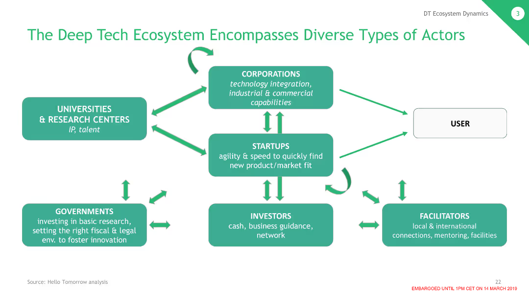
The slide features a flowchart with different types of actors in the deep tech ecosystem, including corporations, startups, investors, and governments, connected by arrows indicating interactions.
Strategic Planning
Technology & Software
This slide illustrates the deep tech ecosystem, showing the various actors and their roles in fostering innovation and technological advancements through collaboration and support.
Ecosystem, Actors, Deep Tech, Collaboration, Roles
Single Chart
BCG
Saved
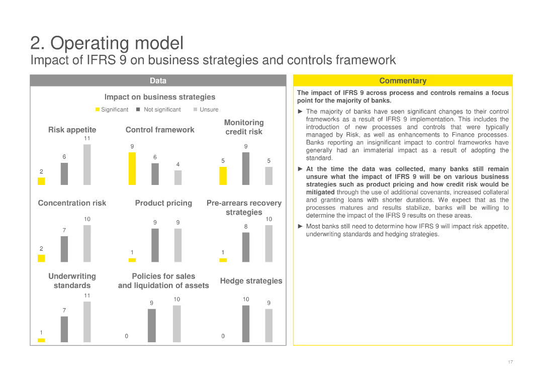
Includes column charts evaluating the impact of IFRS 9 on various business strategies like risk appetite, control framework, product pricing, and more, with a commentary box discussing overall impacts and uncertainties.
Operational Efficiency
Financial Services
Assesses the impact of IFRS 9 on different business strategies and controls framework, highlighting changes in risk appetite, control practices, and business strategies among banks post-implementation.
IFRS 9, business strategies, impact assessment, risk appetite, control framework
Multiple Chart
EY
Saved
A world map highlighting specific regions with markers, annotated with revenue, headcount, and office numbers from 1990. Minimal text and clean design.
Industry Overview
Financial Services
Illustrates the initial international presence and expansion of the company, showing early-stage revenues, headcount, and the number of offices.
International growth, expansion, revenue, headcount, offices
Graphic
Goldman Sachs
Saved
A column chart showcasing growth in podcast advertising revenue from 2015 to 2017 with a projection for 2017. The growth percentages are highlighted above each bar.
Market Analysis and Trends
Media & Entertainment
This slide analyzes the growth trends in podcast advertising revenue, showing significant increases year over year with future projections. Useful for discussions on media market trends and revenue strategies.
podcast, advertising, revenue growth, media
Single Chart
PwC/Strategy&
Saved
The slide has moderate complexity, featuring a multi-layered column chart illustrating investment diversification across sectors, labeled with years and sectors.
Market Analysis and Trends
Financial Services
Focuses on investment diversification, showing how funds are allocated across various sectors like e-commerce, online media, and others with a year-on-year comparison.
Diversification, investment, sectors, e-commerce, online media
Single Chart
Bain
Saved
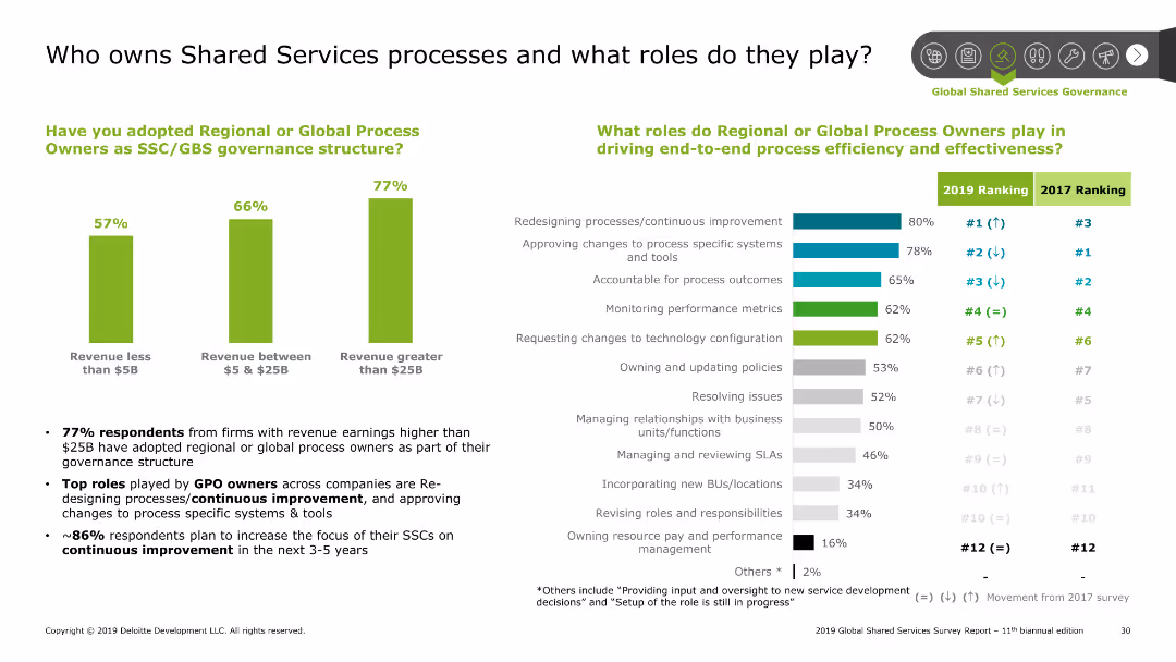
The slide has a column chart and bar chart. The column chart shows the adoption of process owners by revenue, and the bar chart shows roles by rank.
Human Resources and Talent Management
Professional Services
This slide discusses the ownership of shared services processes and the roles of global process owners. It highlights the adoption rate by company size and key roles.
Shared Services, processes, roles, governance, adoption
Multiple Chart
Deloitte
Saved
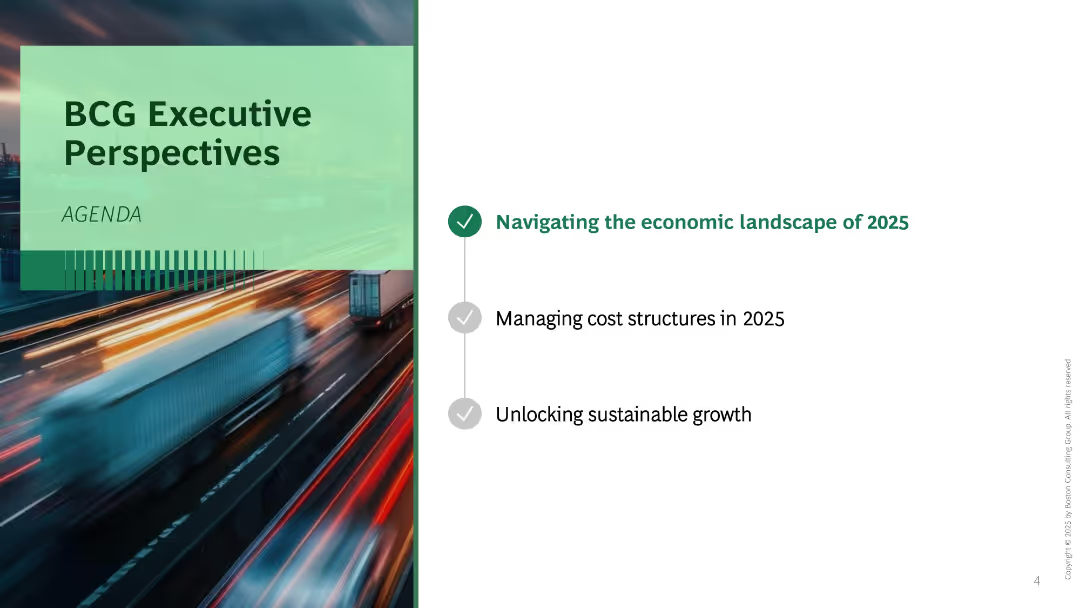
Split layout with blurred motion background photo on the left and agenda list on the right. Three bullet points listed vertically with one highlighted.
Industry Overview
Professional Services
This is an agenda slide introducing three focus areas for the presentation: economic landscape, cost structure, and sustainable growth in 2025. A motion-blurred image of trucks on a highway implies urgency or transformation.
agenda, executive perspective, 2025, growth, economy, transformation, BCG
Agenda
BCG
Saved
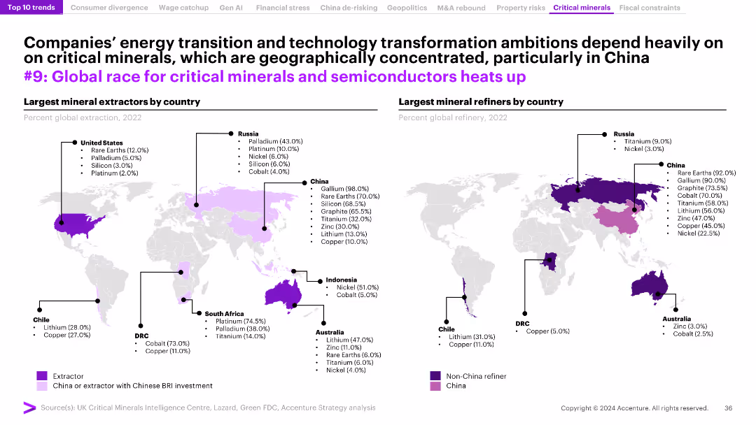
The slide features two world maps showing the largest mineral extractors and refiners by country in 2022, with commentary on the implications for global supply chains.
Market Analysis and Trends
Environmental Services & Sustainability
The slide explores the global competition for critical minerals and semiconductors, emphasizing the geographical concentration of resources and their importance for technology and energy transitions.
critical minerals, semiconductors, global supply chains, extraction, refining
Graphic
Accenture
Saved
Contains column chart and detailed financial metrics, focusing on banking and wealth management sectors.
Financial Performance
Financial Services
Evaluates financial performance in personal banking and wealth management, focusing on net income and revenues.
personal banking, wealth management, financial performance
Mixed Chart
Citigroup
Saved
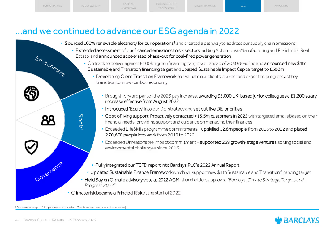
A mix of text and an infographic wheel illustrating ESG progress across Environment, Social, and Governance.
Regulatory and Compliance
Financial Services
Summarizes Barclays' ESG advancements in 2022, including renewable energy sourcing, DEI initiatives, and support for social and environmental ventures.
ESG, renewable energy, DEI, social impact, governance
Diagram
Barclays
Saved
Contains four sections with headers and bullet points, each illustrated with an icon, detailing obstacles in innovation at scale within established companies.
Strategic Planning
Professional Services
This slide discusses key reasons why established companies face difficulties in scaling innovation, such as focusing on short-term goals and a lack of validated ideas.
innovation, challenges, scale, strategy, value proposition, launch, culture, incumbents
Pillar
McKinsey
Saved
A slide with two sections: a map highlighting global reach and a side panel outlining execution priorities. It includes numerical data and textual information in bullet points.
Market Analysis and Trends
Financial Services
The slide provides an overview of the firm's global network, including revenues, offices, employees, and prioritizes strategic growth areas such as advisory services and corporate footprint.
Global Network, Client Relationships, Revenues, Execution Priorities
Table
Goldman Sachs
Saved
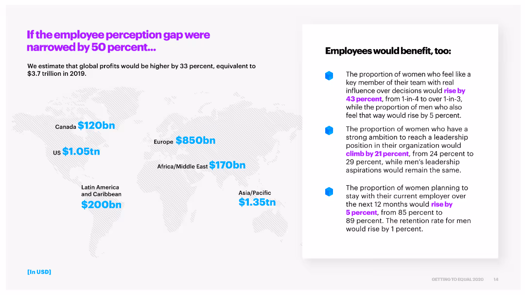
This slide includes a world map with regional profit increase estimates and a bullet point list of the potential benefits to employees if the perception gap is narrowed by 50%.
Risk Assessment and Management
Professional Services
It estimates that narrowing the employee perception gap would significantly increase global profits and outlines the benefits to employees, such as higher influence and leadership ambition.
perception gap, global profits, employee benefits, regional impact
Header Horizontal
Accenture
Saved
This slide combines text explanations with a diagram illustrating production-based and consumption-based CO2 accounting. The diagram uses simple geometric shapes to differentiate between the accounting methods and their implications.
Technology and Digital Transformation
Government & Public Sector
It describes the two main methods of CO2 accounting: production-based, which assesses emissions generated within a country's borders, and consumption-based, which evaluates emissions based on the country's demand. It discusses the potential for carbon leakages and the importance of accurate CO2 accounting for effective climate policies.
CO2 Accounting, Production, Consumption, Climate Policy, Carbon Leakage
Diagram
EY
Saved
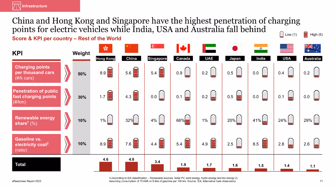
Column chart comparing EV charging infrastructure metrics across countries
Market Analysis and Trends
Energy & Utilities
This slide compares the penetration of EV charging points and renewable energy share across countries like China, Hong Kong, and Singapore, highlighting their advanced infrastructure compared to others
EV charging points, penetration, renewable energy, comparative analysis, international comparison
Multiple Chart
PwC/Strategy&
Saved
This slide has a dark background with a header, body text, and a column chart displaying percentages. Four circular percentage indicators show key insights related to consumer expectations in healthcare technology in Ireland.
Market Analysis and Trends
Healthcare & Pharmaceuticals
The slide presents the cautious optimism among Irish consumers regarding emerging healthcare technologies like AI and virtual presence. It outlines expected trends in digital health technologies, hospital-in-the-home models, and precision medicine.
healthcare, technology, AI, virtual presence, Ireland
Mixed Chart
EY
Saved
Previous
Next
If nothing, comes up, please save your slides first
Create a FREE account to continue browsing
Receive Instant Access to 1,000+ slides from companies like McKinsey, Google, and Goldman Sachs
First Name
Last Name
Email
Password
I agree to all
Terms & Privacy Policy
Thank you! Your submission has been received!
Oops! Something went wrong while submitting the form.
Have an account?
Sign in
Column Chart
Heatmap
Chevron
Org Chart
Infographic
Callouts
Timeline
List
Graphic
Picture
Process Flow
Diagram
Paragraph
Map
Table
Framework
Subtitle
Takeaway Box
Icon
Other Chart
Radar Chart
Waterfall Chart
Mekko Chart
Pie Chart
Scatter Plot
Line Chart
Bar chart
Bullet points