My Account
My Slides
Search by Category
Templates
View All Templates
Download Template Slides
✦ AI Search
Feedback
Login
Logout
Get Started
Browse all Slides
Browse all Slides
Create a FREE Account
Instant access to 1,000+ real slides from top companies like McKinsey, BCG, Goldman Sachs, Google and many more!
First Name
Last Name
Email
Password
I agree to all
Terms & Privacy Policy
Thank you! Your submission has been received!
Oops! Something went wrong while submitting the form.
Have an account?
Sign in
Saved Slides
Heatmap and bar chart showing correlations between Asian and global equities, and beta values of different equity markets to the MSCI AC World Index.
Risk Assessment and Management
Financial Services
Investigates correlations and volatility among Asian and global equities, providing insights into risk and market behavior through correlation and beta analysis.
correlation, volatility, equities, heatmap, beta values, risk assessment, MSCI, financial analysis, market behavior
Mixed Chart
JP Morgan
Saved
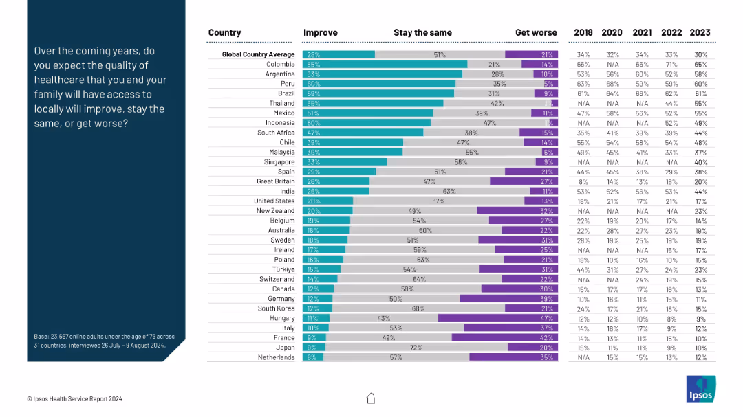
Stacked bar chart with three sentiment categories: Improve, Stay the Same, Get Worse; prompt on left.
Market Analysis and Trends
Healthcare & Pharmaceuticals
The chart illustrates expectations for future healthcare quality. Colombia and Argentina are most optimistic, while developed nations like Netherlands and France show pessimism or low optimism. It compares sentiment across time from 2018–2023.
future outlook, healthcare improvement, optimism, expectations, survey
Mixed Chart
IPSOS
Saved
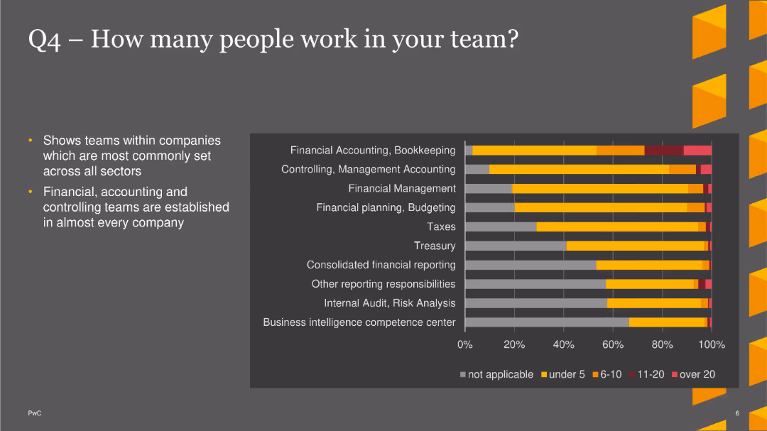
The slide features a bar chart showing the number of people in different teams across various sectors, highlighting common team sizes.
Market Analysis and Trends
Financial Services
This slide shows that financial, accounting, and controlling teams are common across companies, with detailed distribution of team sizes.
Team Size, Financial, Accounting, Bar Chart, PwC, Survey, 2022
Mixed Chart
PwC/Strategy&
Saved
The slide includes a stacked bar chart showing how respondents manage their investments, with different categories.
Operational Efficiency
Financial Services
The slide discusses the various methods respondents use to manage their investments, including advisors and self-directed approaches.
Management, Investments, Advisors, Self-Directed, Pension
Single Chart
IPSOS
Saved
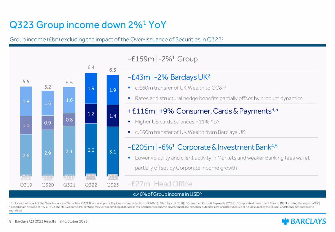
The slide contains a column chart displaying group income (£bn) excluding the impact of over-issuance of securities from Q319 to Q323. There is a breakdown of financial impacts for different divisions on the right side.
Financial Performance
Financial Services
The slide reports a 2% year-over-year decrease in Barclays' group income for Q323, providing a detailed financial impact analysis for various divisions such as Barclays UK, Consumer, Cards & Payments, and Corporate & Investment Bank.
income, YoY, Q323, Barclays UK, divisions
Mixed Chart
Barclays
Saved
The slide showcases multiple column charts representing various financial metrics over time, with a clear labeling system and visual cues for easy interpretation.
Financial Performance
Financial Services
This slide offers insight into the robustness of the client business, with operating income and client numbers trends. The depiction of regulatory capital also illustrates the financial health and compliance of the division, serving as a basis for analyzing market stability and growth potential.
client business, operating income, regulatory capital, market analysis, financial health, trends
Multiple Chart
Morgan Stanley
Saved
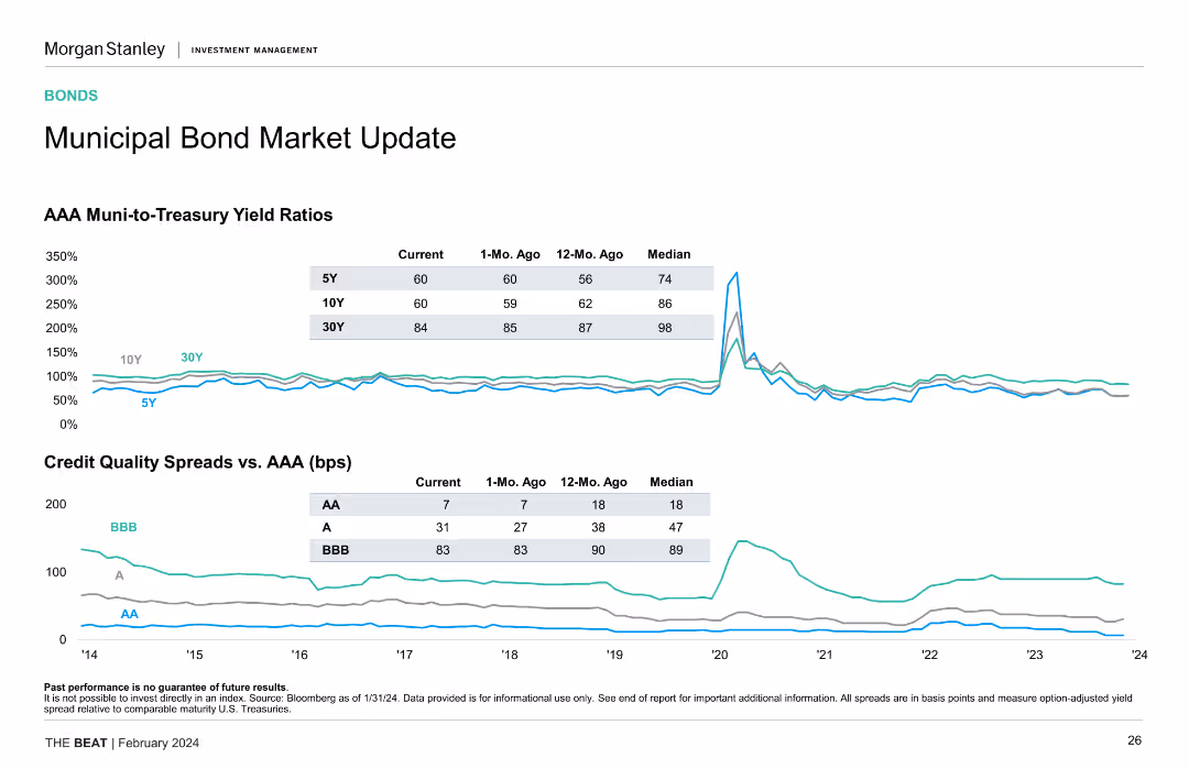
Two line charts are shown: one for AAA muni-to-treasury yield ratios and one for credit quality spreads versus AAA. Data is color-coded by bond rating.
Market Analysis and Trends
Financial Services
The slide updates on the municipal bond market, comparing AAA muni-to-treasury yield ratios and credit quality spreads, highlighting bond performance metrics.
Municipal Bonds, Yield Ratios, Credit Quality, Bond Ratings, Performance
Multiple Chart
Morgan Stanley
Saved
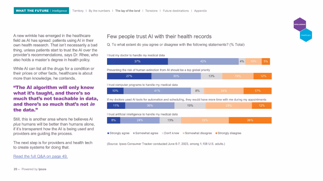
Horizontal bar chart with five multi-colored statements; left side features expert commentary and quote.
Risk Assessment and Management
Healthcare & Pharmaceuticals
Focuses on public attitudes about AI’s role in healthcare, specifically trust in handling medical data. Most people still prefer human doctors over AI systems for managing health data. Includes concerns about automation and human extinction risk related to AI.
healthcare AI, trust, medical data, patient opinion, privacy, Ipsos, automation, public sentiment
Mixed Chart
IPSOS
Saved
The slide is composed of a central text section flanked by two horizontal sections with icons and brief text. The upper section has three groups of three icons, each depicting macro-environment, market forces, and competitive landscape factors. The lower section has three columns listing strategic actions underlined by colored segments saying 'GLOBAL', 'COMPLETE', 'DIVERSIFIED'.
Strategic Planning
Financial Services
This slide outlines a strategic approach focusing on maintaining discipline, optimizing the current model, and transforming for the future, with the aim of maintaining leadership in a competitive landscape through efficient financial management and technology investment. The slide is likely used for executive presentations or investor briefings.
resilience, optimization, leadership, strategy, financial management
Linear Flow
JP Morgan
Saved
The slide features a combination of column charts and horizontal bar charts. It shows familiarity levels with crypto assets in 2023 and 2022, highlighting high and low familiarity percentages.
Market Analysis and Trends
Financial Services
This slide compares the familiarity of Canadians with crypto assets over two years, breaking down the familiarity into high, moderate, and low categories, with demographic insights.
familiarity, crypto assets, Canadians, demographics, comparison
Mixed Chart
IPSOS
Saved
Slide with text and images comparing Canada and Ukraine to Australia in terms of wheat production and export, highlighting similarities in supply chains and efficiency.
Competitive Landscape
Agriculture & Food Production
The slide compares Australia's wheat supply chain to Canada and Ukraine, using these countries as benchmarks for efficiency and export market similarities.
benchmarking, wheat supply chain, Canada, Ukraine, Australia
Graphic
LEK
Saved
This slide features multiple line graphs representing GDP forecast levels for various regions (US, Europe, China, Japan, India) indexed to 2019 values. Each region's graph is color-coded, with different years marked by points and accompanied by percentage values, illustrating GDP changes over 2019, 2020, and 2021. The layout is divided into columns for each region, clearly labeled and with forecast ranges at the bottom. This structured arrangement aids in comparative analysis of economic trends across different geopolitical areas.
Market Analysis and Trends
Financial Services
The slide is used to compare GDP forecasts across different regions, illustrating economic downturns and recovery predictions. The indexed values to 2019 serve as a baseline for understanding the impact of economic events over the years, making it suitable for financial analysis and strategic planning. This can guide decisions in financial and investment planning, highlighting regions with resilient economic structures or significant downturns.
GDP, forecasts, economic downturn, recovery, financial analysis, strategic planning, 2020, 2021
Multiple Chart
BCG
Saved
Contains a central graphic with futuristic elements, including robots and humans interacting, surrounded by large circular statistics in blue tones.
Risk Assessment and Management
Professional Services
Highlights the discrepancy in organizational preparedness for future workplace models, with emphasis on the importance of right models to success.
readiness, future, workplace, organizational success, preparedness, technology, innovation
Multiple Chart
Deloitte
Saved
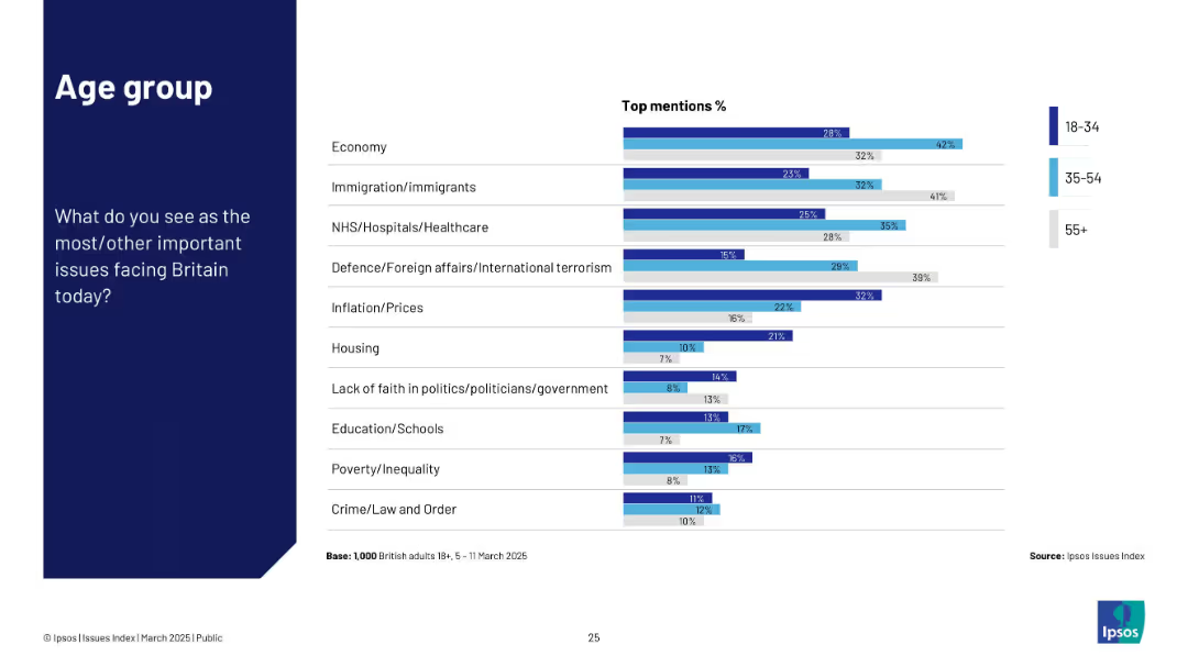
Uses three-tone color-coded bars representing age groups (18–34, 35–54, 55+). Structured bar chart with issue list and age-wise response percentages.
Customer and Market Segmentation
Government & Public Sector
Breaks down concerns by age group. Older respondents (55+) show stronger concern for defence and immigration; younger groups emphasize housing, education, and inequality.
age segmentation, generational views, UK issues, Ipsos, public concerns
Mixed Chart
IPSOS
Saved
Slide presents a bar chart assessing the quality of underwriting processes across various criteria like strategy and tools, with varying shades indicating quality levels.
Operational Efficiency
Financial Services
Reviews the current quality of underwriting processes within a company, showing areas of strength and those needing improvement across various functions.
underwriting quality, assessment, process improvement, strategic quality, tool effectiveness
Mixed Chart
Accenture
Saved
It includes a large column chart with data points in blue, visual representations of percentages, and a series of bullet points on a white and blue background.
Financial Performance
Financial Services
This slide shows the financial outcomes of personal banking and wealth management, including net interest income, revenues, and net income, accompanied by key performance indicators. Suitable for assessing the health and trends of personal banking and wealth management services.
wealth management, personal banking, net interest, revenue, credit costs
Mixed Chart
Citigroup
Saved
The slide includes a combination of a line chart showing gas prices and a column chart comparing TCO of Opel Corsa ICE vs. BEV. It has text in two columns with analysis and explanations.
Market Analysis and Trends
Energy & Utilities
The slide discusses the potential threat to the total cost of ownership (TCO) advantage of BEVs in Germany due to waning government incentives and rising electricity prices. It uses Opel Corsa as a case study for analysis.
BEV, TCO, Germany, Opel Corsa, incentives, analysis
Multiple Chart
PwC/Strategy&
Saved
This slide displays three sets of column charts showing trends over fiscal years for net profit contribution, base fees, and assets under management (AUM). The design is clean with a focus on data presentation, using contrasting greens to differentiate data points. The layout is simple and effective.
Financial Performance
Financial Services
The slide is a financial performance review for Macquarie Asset Management, tracking net profit, fees, and AUM over several years. It is typically used for financial analysis, showcasing growth and financial health to stakeholders, and supporting discussions on strategic financial decisions.
financial review, Macquarie Asset Management, net profit, fees, assets under management, growth trends, strategic planning, financial health
Multiple Chart
Morgan Stanley
Saved
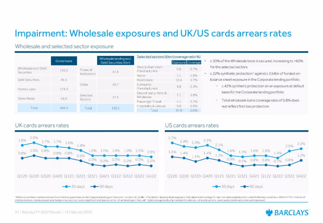
Tabular data on wholesale lending exposure, coverage ratios by sector, and two line charts displaying UK and US cards arrears over time for 30-day and 90-day periods.
Risk Assessment and Management
Financial Services
The slide outlines Barclays’ wholesale and sector loan exposures and impairment coverage, showing UK and US credit card arrears trends. It notes the secured portion of the wholesale book, synthetic protections, and impairment rate stabilization, illustrating credit quality and risk management efforts.
impairment, wholesale loans, arrears rates, coverage, credit risk
Multiple Chart
Barclays
Saved
Features an extensive flowchart diagram with different financial services offered by the firm, divided by client needs, and includes some numerical data points.
Organizational Structure and Change
Financial Services
Details the comprehensive offerings by the firm to support clients during IB transactions and the depth of relationships.
Collaboration, Franchise, Client Support, IB Transactions, Services Offering, Commercial Banking
Table
JP Morgan
Saved
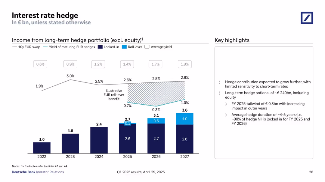
Combination of bar chart and line graph showing hedge income and average yields over time.
Risk Assessment and Management
Financial Services
Demonstrates income contribution from long-term interest rate hedges through 2027. Illustrates locked-in and roll-over income effects. Hedge income is expected to grow steadily with limited short-term rate sensitivity.
interest rate hedge, NII, income, locked-in, yield, risk strategy, roll-over
Mixed Chart
Deutsche Bank
Saved
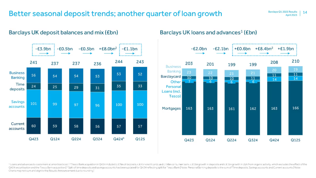
Dual stacked bar charts tracking deposit balances/mix and loans/advances over time, segmented by category.
Performance Metrics and KPIs
Financial Services
Compares quarterly trends in deposits and loan growth. Deposit balances show seasonal shifts, while loans and advances have seen consistent growth. Breakdowns include business banking, savings, current accounts, and personal loans including Tesco.
Deposits, Loans, Barclays UK, Seasonal Trends, Tesco, Q125, Personal Banking, Advances, Balances
Multiple Chart
Barclays
Saved
This slide presents a comparative analysis with two distinct sections. The left side displays a blue column chart depicting 'ADJUSTED OPERATING PROFIT' in euros for five quarters. Beside it, a pie chart illustrates the 'Q1 adjusted operating profit margin.' The right side shows a column chart breaking down profits by business segment. Images of a modern office space are shown in the upper and lower right corners, offering a visual context for the financial data.
Financial Performance
Financial Services
Compares profitability across different business segments, highlighting improvements and variations, relevant for financial segment analysis or presentations to investors.
profitability, financial segments, adjusted operating profit, profit margin, quarter comparison, financial data, segment analysis, real estate, construction, financial services
Multiple Chart
Goldman Sachs
Saved
A column chart compares the ownership of various investment products between 2022 and 2023 among Canadians.
Market Analysis and Trends
Financial Services
It lists the most common investment products held by Canadians and compares the ownership rates between 2022 and 2023.
Investment, Products, Ownership, Canadians, 2023, 2022, Column Chart, Financial, Trends
Mixed Chart
IPSOS
Saved
Detailed with column chart and table explanations, the slide offers a comparison of banking and market revenues. Colored columns represent different financial segments, providing a visual breakup of data for clear analysis.
Market Analysis and Trends
Financial Services
The slide analyzes global banking and market revenues, providing insights into areas like investment banking and equities. It’s used to discuss performance drivers and strategic business decisions with stakeholders familiar with financial markets.
global banking, market revenues, investment banking, equities, financial analysis
Mixed Chart
Goldman Sachs
Saved
Previous
Next
If nothing, comes up, please save your slides first
Create a FREE account to continue browsing
Receive Instant Access to 1,000+ slides from companies like McKinsey, Google, and Goldman Sachs
First Name
Last Name
Email
Password
I agree to all
Terms & Privacy Policy
Thank you! Your submission has been received!
Oops! Something went wrong while submitting the form.
Have an account?
Sign in
Column Chart
Heatmap
Chevron
Org Chart
Infographic
Callouts
Timeline
List
Graphic
Picture
Process Flow
Diagram
Paragraph
Map
Table
Framework
Subtitle
Takeaway Box
Icon
Other Chart
Radar Chart
Waterfall Chart
Mekko Chart
Pie Chart
Scatter Plot
Line Chart
Bar chart
Bullet points